The Illustrated World of Charles Dickens
←
→
Page content transcription
If your browser does not render page correctly, please read the page content below
The Illustrated
                                                                             World of
                                                                             Charles Dickens
                                                                             November 4 – December 6

In honor of PlayMakers production of Nicholas Nickleby, the Ackland Art Museum will exhibit a selection
of original drawings, illustrations, and prints that illuminate the early Victorian world and literary culture of
Dickens’ England. Drawn from the Museum’s permanent collection, the installation includes works by
Dickens’ chief artistic collaborators: George Cruikshank, “Phiz”, and John Leech. Installed in the
Ackland’s new second floor Study Gallery, the works invite questions about the dynamic relationship
between literature, art, and theatre.

                                  Special Event:
                                  “Scibblings, Sketches, and Stagings: The Progress of Dickens’s Art in
                                  the Victorian Popular Consciousness.”
                                  by Marc Napolitano, PhD (UNC Chapel Hill, Department of English and
                                  Comparative Literature)
                                  Lunch with One: Wednesday, December 2, 2009, 1-2pm
                                  Ackland Art Museum (for more details www.ackland.org)
                                  “Bring lunch and enjoy an hour of inspiration and information during a
                                  lunch hour lecture.”
Hablot Knight Browne, called Phiz, British, 1815-
1882
“Capt Mickey Free Relating His Heroic Deeds”
etching
Anonymous Loan
L 1997.001.0136

Source: Charles O’Malley, the Irish Dragoon;
Volume II, Chapter XLI
Author: Charles Lever
Publication Date: 1841

From the Novel:

“Seated in a large arm-chair, a smoking tumbler of mulled port before him, sat my friend
Mike, dressed in my full regimentals, even to the helmet, which, unfortunately however
for the effect, he had put on back foremost; a short ‘dudeen’ graced his lip, and the
trumpet so frequently alluded to lay near him.

Opposite him sat a short, puny, round-faced little gentleman with rolling eyes and a
turned up nose. Numerous sheets of paper, pens, etc. lay scattered about; and he
evinced, by his air and gesture, the most marked and eager attention to Mr. Free’s
narrative, whose frequent interruptions caused by the drink and the oysters, were viewed
with no small impatience by the anxious editor.”

Though Phiz is best remembered for his collaborations with Dickens, he actually
produced far more illustrations for Lever than for Dickens over the course of his career.
John Harvey notes that “this partnership makes a useful parallel to the better-known one
in that it enables one to assess just what effect a particular author had on the illustrator’s
style and method” (13). In comparison to Dickens, Lever granted Phiz a greater level of
creative freedom—a freedom which seemed to match the boisterous comedy and
tumultuous action of the author’s early novels. However, Phiz oftentimes had to rush
when completing plates for Lever, as the author lacked Dickens’s meticulousness and
tireless work ethic; thus, Lever was oftentimes late in providing Phiz with the information
he needed in order to create the illustrations.

Valerie Browne Lester writes that “Phiz’s work for Lever was uneven but always lively,
rather like the writing of Lever himself” (112). Lever and Phiz are likewise connected in
terms of their somewhat obscure statuses, particularly when they are placed in the all-
consuming shadow of Dickens. Though Phiz’s illustrations of Dickens’s novels have
guaranteed his immortality, they have likewise impeded his legacy—Browne may have
created the plates for Dickens’s novels, but the plates themselves, as “Dickensian”
illustrations, have always eclipsed him in stature. Similarly, though Lever adopted
Dickens’s serialized approach to the novel, he is oftentimes viewed as one of the
forgotten novelists of the Victorian period; S.P. Haddelsey’s recent biography of Lever is
tellingly entitled Charles Lever: The Lost Victorian.

Lever and Phiz had a close friendship, though they were in some ways opposites: Lever
was boisterous and dynamic in comparison to the reserved and mild-mannered Phiz.
Nevertheless, Phiz oftentimes found himself an accomplice in Lever’s adventures:
“Phiz’s children always looked forward to their father’s return from trips with Lever
because he came back overflowing with anecdotes about the kind of hilarious pranks that
appeal to young people” (Lester 109). When Lever was given the opportunity to collect
his early comedic sketches, The Confessions of Harry Lorrequer, and transform them into
an illustrated novel, he initially hoped to engage George Cruikshank. Ultimately, Phiz
was the artist hired for this particular novel. Cruikshank would go on to illustrate just
one of Lever’s texts, Arthur O’Leary, while Phiz would collaborate with Lever on nearly
eighteen literary projects.

The above illustration is taken from Charles O’Malley, Lever’s second novel (and
arguably, his most popular). Indeed, Harry Lorrequer and Charles O’Malley have
virtually served to define Lever’s literary legacy, for better or for worse. This novel is set
during the Peninsular War and recounts a young Irish dragoon’s adventures on the
Continent during the campaign. Mickey Free, shown above in the assumed role of
“Captain Mickey,” has been labeled by some as an Irish incarnation of Dickens’s great
Cockney hero, Sam Weller—an understandable comparison given that both men are
boisterous servants to the lead characters of their respective novels. Furthermore, when
commenting on Mickey, Lever wrote: “Of Mickey Free I had not one, but one thousand
types…in my late visit to Dublin [I chanced] on a living specimen of the ‘Free’
family…The fellow was ‘boots’ at a great hotel in Sackville Street, and he afforded me
more amusement and some heartier laughs than…a party of wits” (qtd. in Downey, 358).
The fact that Sam Weller serves as “boots” at the hotel where Mr. Jingle attempts to
elope with Rachael Wardle fortifies the connection between the two characters, and
Lester notes that Phiz drew Mickey to resemble Mr. Pickwick’s faithful manservant, right
down to the trademark striped waistcoat (115).

One of the stumbling blocks that Lever faced throughout his career (and one which has
unfortunately contributed to his secondary status amongst the novelists of the era) relates
to the controversy engendered by his portrayal of the Irish in his texts. As the son of an
Englishman and an Irish woman, Lever was viewed with suspicion by Irish nationalists
who feared that he would utilize the negative stereotypes and caricatures that defined the
Victorian representation of the Irish. Phiz unwittingly contributed to Lever’s tribulations
in this regard, as the artist’s somewhat exaggerated and freewheeling illustrations for
Harry Lorrequer and Charles O’Malley reinforced the abovementioned stereotypes:
“Phiz’s early illustrations of Irish peasant characters resembled those seen on the English
stage—drunken, red-nosed troublemakers—the only type to which he had been exposed
until he visited Ireland” (Lester 114). To this day, Lever’s reputation has been plagued
by these accusations of stereotyping the Irish. Ironically, most of the critics who have
censured Lever’s writings are only familiar with his two most famous works, Lorrequer
and O’Malley, which presents us with an ironic situation given that the two works that
have basically made Lever’s reputation have likewise served to hamper it: “Harry
Lorrequer and Charles O’Malley simultaneously made and blasted his reputation: it was
these novels and their immediate successors in the same genre which established him as a
popular novelist and which also attracted the adverse criticism of William Carleton and
other Nationalists” (Haddelsey 24).
George Cruikshank, British, 1792-1878
“A Bustling Woman”
print
The William A. Whitaker Collection
70.31.278

Publication Date: 1829

Cruikshank’s penchant for creating memorable caricatures was ideally suited for the era
in which he first came to prominence, as the foppery and frivolity of Regency England
gave him a myriad of subjects for his exaggerated etchings. This “Bustling Woman” is
one of countless caricatures created by Cruikshank which exaggerate the outrageous
fashions of the period. Cruikshank’s “Fashionable Monstrosities” series, produced on a
semi-annual basis from 1816 through 1827, focused almost exclusively on the absurdly
over-the-top fashion senses of the English populace: “The full comicality of odd fashions
is lost with the passing of years, for almost everything becomes indistinguishably quaint.
But a close look at Regency clothes shows that things were odder than usual, not to say
queer” (Wardroper 55). By exaggerating the clothing worn by his caricatures,
Cruikshank did indeed manage to transform these individuals into “Monstrosities.”

Nevertheless, the women in the above etching fare slightly better than most of their
Cruikshankian counterparts. In several of his caricatures, women are shown tightening
their corsets to a point where they are making themselves colic, and their pained
expressions correspond perfectly with their distorted bodies. Though clearly ridiculous
the bustle shown above is not inflicting any pain on its wearer. Furthermore, the general
depiction of the two women is comparatively attractive when set against the hideous
women who populate many of Cruikshank’s drawings.
George Cruikshank, British, 1792-1878
“Faith, Hope, and Charity”
print
The William A. Whitaker Collection
70.31.288

George Cruikshank, British, 1792-1878
“Comfortable Couple”
print
The William A. Whitaker Collection
70.31.289

The sharp contrast between the emaciated beggar and
the “Comfortable Couple” shown above reinforces the
extremes dictated by Cruikshank’s approach to
caricature. The contrast is likewise evocative of Oliver
Twist, as the beggar resembles the skeletal residents of the workhouse (including young
Oliver) while the comfortable couple shows signs of the portliness that defines many of
the hypocritical workhouse overseers, most notably, Mr. Bumble and Mrs. Corney. Of
course, the unpleasant characteristics of the parish beadle and the workhouse matron are
absent from the above drawing, though, as we learn in Oliver Twist, the middle-class
domestic comforts of Mrs. Corney’s parlor provide little in the way of true comfort for
Mr. Bumble, who quickly finds himself henpecked and humiliated by his shrewish wife.

Cruikshank’s attention to detail regarding the clothing worn by the above characters
(whether it is the tattered rags of the beggar, or the comfortable finery of the corpulent
couple) is similarly reminiscent of Twist, as clothing proves to be an important symbol
and reoccurring motif throughout the novel. Oliver is initially defined by his clothing, as
the narrator forebodingly notes in the first chapter that the romanticism of the child of
mysterious birth is immediately quashed by the ragged parish uniform he is forced to
wear:

       What an excellent example of the power of dress, young Oliver Twist was!
       Wrapped in the blanket which had hitherto formed his only covering, he might
       have been the child of a nobleman or a beggar; it would have been hard for the
       haughtiest stranger to have assigned him his proper station in society. But now
       that he was enveloped in the old calico robes which had grown yellow in the same
       service, he was badged and ticketed, and fell into his place at once—a parish
       child—the orphan of a workhouse—the humble, half-starved drudge—to be cuffed
       and buffeted through the world—despised by all, and pitied by none.

Later, Oliver’s transition from rags to riches (and back to rags when he is abducted by
Fagin) reinforces this motif. Mr. Bumble himself is perhaps the best example of sartorial
characterization on Dickens’s part, as his obsession with his parish uniform illustrates the
way in which his parochial vocation defines his entire personality. The loss of his
parochial uniform, following his marriage to Mrs. Corney, is nothing less than the loss of
his entire identity:
The laced coat, and the cocked hat; where were they? He still wore knee-
breeches, and dark cotton stockings on his nether limbs; but they were not the
breeches. The coat was wide-skirted; and in that respect like the coat, but, oh
how different! The mighty cocked hat was replaced by a modest round one. Mr.
Bumble was no longer a beadle.
There are some promotions in life, which, independent of the more substantial
rewards they offer, require peculiar value and dignity from the coats and
waistcoats connected with them. A field-marshal has his uniform; a bishop his
silk apron; a counsellor his silk gown; a beadle his cocked hat. Strip the bishop
of his apron, or the beadle of his hat and lace; what are they? Men. Mere men.
Dignity, and even holiness too, sometimes, are more questions of coat and
waistcoat than some people imagine.
In continuing with the assessment of the links between the above drawings and Oliver
Twist, it is worthwhile to note that most of the characters depicted by Cruikshank in Twist
display the same sort of extremes embodied by the beggar and his corpulent counterparts;
interestingly, these extremes are present in both the good and wicked characters, and,
despite Dickens’s depiction of a morally polarized universe, the good characters in Twist
are not necessarily more attractive than their antagonists. Henry James commented on
this paradox in A Small Boy and Others, stating that he found the novel’s good characters
just as frightening as the wicked ones: “It is understandable that James was as frightened
by the supposedly ‘nice’ people and ‘happy’ moments in the plates as by the ‘low and
awkward’ ones. Certainly the artist did not sustain Dickens’ idealization of the virtuous
characters. Most are physically malproportioned if not downright unattractive. If Fagin
is too thin, so is Oliver. Bumble is too fat, but so is Brownlow” (Cohen 24). While
Dickens was certainly capable of incorporating the grotesque into his writing, it is almost
always associated with wickedness or supreme pathos (particularly in the early novels);
Cruikshank, however, subverts Boz’s tendency to link goodness to beauty. Indeed, there
are similar subversions above given that the portliness of the comfortable couple does not
correlate to any sense of innate cruelty in the characters.George Cruikshank, British, 1792-1878 “Studies of Various Heads” Watercolor and pencil Sheet: 4 ½ x 7 3/8 (11.43 x 18.73 cm) Lent by Joseph F. McCrindle L2007.35.389 One common complaint regarding Cruikshank’s drawings was that the heads of his characters were too large…a complaint that is difficult to verify in the above illustration given that the heads are all we have to work with! Nevertheless, Cruikshank’s heads were ideally suited for his caricature-based approach to illustration, for this allowed him to place emphasis on the exaggerated facial features of the individuals he drew. Like many artists, Cruikshank sometimes used himself as a model, studying his own features in the mirror. Humorously, whenever Cruikshank actively engaged in the art of self- portrait, he tended to misrepresent himself: “In many of his innumerable representations of himself…the artist portrayed himself as an elegantly dressed gentleman with dark hair, flashing dark eyes, and an aristocratically long nose” (Cohen 23), a portrayal which Jane Cohen labels “somewhat self-flattering.”
George Cruikshank, British, 1792-1878
“Two Studies of the same scene”
pencil, ink and wash on paper
Frame: 8 3/4 x 14 1/2
Lent by Joseph F. McCrindle
L2007.35.390

The fact that these two drawings seem to be reverse images of
one another helps to reveal some of the inevitable
complications that illustrators faced in the nineteenth century.
While the initial creation of a drawing was fairly
straightforward (with the artist setting pen or pencil to paper),
the creation of wood engravings or etchings based on these
illustrations automatically made the process more difficult.
In order to create a wood engraving, the original drawing was
traced onto a block of wood—the engraver then carved it out
against the wooden background. Thus, it was necessary that
the engraver employ great care if the printed illustration were
to maintain the linear and structural integrity of the original
drawing.

Etching was a more mechanized and scientific process, as steel or copper plates were
coated with a waxy substance called ground. The drawing was then drawn on the wax (in
reverse) using a special sort of needle called an échoppe. Finally, the plate was
submerged in acid: the wax prevented the metal from eroding except in those areas where
the illustration had been cut into the ground via the échoppe. Thus, the lines of the
drawing were burned into the metal plate via the acid, and the illustrations were printed
off the plates. Unfortunately, given the large demand for serialized novels, plates were
quickly worn through, thus necessitating that the drawing be etched again (which
accounts for why there are sometimes slight differences between drawings in various
Victorian texts).

As mentioned, the above illustrations by Cruikshank reveal one of the difficulties
involved in etching. Etching required that a picture be transferred to the ground in
reverse, and failure to do so would leave one with a mirror image of the intended
illustration, as shown here (note that the positioning and movements of the characters are
turned around due to a failure to reverse). This is a common error in several Victorian
novels, including Dickens’s Dombey and Son. Beloved comic character, Captain Cuttle,
is a one-handed seaman, but his hook changes hands a few times throughout the novel
due to the reversing errors discussed above.
William Hogarth, British, 1697-1764
The Harlot’s Progress, Plate 1: An Innocent Young Girl Just Arriv’d from the
Country in a Wagon to An Inn in London
etching and engraving
Overall: 16 7/8 x 23 in. (42.9 x 58.4 cm)
The William A. Whitaker Foundation Art Fund
92.6.1

Source: The Harlot’s Progress
Publication Date: 1732

Despite the fact that they worked in different
mediums and lived in different centuries, Hogarth was an important inspiration to
Dickens: “Dickens himself knew so well the work of the caricaturists and of their
founding father, Hogarth, that certain idiosyncrasies of the Dickensian ‘vision’ were
simply the natural result of his immersion in graphic satire” (Harvey 44). The influence
of Hogarth is fundamental to the very concept of Victorian illustration, and many
Dickensian scholars, including Robert Patten, have acknowledge Hogarth as the greatest
instance of graphic readability; Patten once went so far as to label him the “true father of
English book illustration” (qtd. in Paulson “Comic”, 35). Hogarth was clearly the
foremost example of combining character, scene, background, and theme into a unified
whole so as to underscore narrative.

Unsurprisingly, Hogarth did his best work at the same time that the English novel first
began to emerge, and the relationship between the two art forms is important. Notably,
both can be traced back to Cervantes’s masterpiece, Don Quixote: Hogarth’s engravings
and the novels of Fielding, Sterne, Richardson, and Smollett might never have come to
fruition without Cervantes. Don Quixote served as the primary vehicle for the emergence
of the eighteenth-century British novel, and likewise, for the emergence of comic
illustration: artists like Hogarth could capture the incongruous relationship between the
knight errant battling giants and the foolish old man battling windmills (Paulson “Comic”
41). Fielding, Sterne, and Smollett were likewise responding to Don Quixote in their
adoption and adaptation of the literary format employed by Cervantes:

       What Don Quixote embodied was the essence of comic structure, the
       incongruous. It was constructed on a combined intellectual and formal
       incongruity, which was to structure much of eighteenth-century comic writing an
       art, setting both Hogarth and Fielding on their respective ways. This was an
       incongruity between the aspiration or illusion of a Don Quixote and the reality of
       his surroundings, between the image of a knight-errant and his heroic steed and
       the tall, bony, decrepit old shapes of both Quixote and Rosinante; and in formal
       terms between these lanky shapes and the short, earthy, well-fed shape of Sancho
       (Paulson “Comic” 41).
It is important note that in spite of his use of graphics instead of prose, Hogarth was
heavily focused on narrative (though it would be an oversimplification to label his
engravings as “illustrations.”) The Hogarthian “progress” follows a rational, linear
storyline; if one were to rearrange the plates and place them in a different order, the
meaning would immediately be lost. In the case of the “Harlot’s Progress,” the
engravings:
convey a pattern of temporal progression, of cause and effect or act and
consequence, and of beginning, middle and end. The harlot comes to London,
goes into keeping, is expelled and declines from prostitution to prison, disease and
death. Past, present and future also proceed from left to right across the plate: the
harlot’s arrival in London is implied by the York wagon on the left, in the
immediate present she is listening attentively to the bawd Mother Needham in the
centre, and her future is indicated by Colonel Charters and his pimp waiting on
the right (Paulson “Garden” 84).
The interplay between visual and narrative elements in Hogarth’s work was critical to the
emergence of Dickens given the novelist’s use of the serialized format; this particular
method of publishing established the criticality of illustrations to novelistic success:
“Finally, with the advent of the serial publication of the Pickwick Papers and Oliver
Twist, which launched the remarkable Dickens combination of text and illustration, the
two became chronologically co-present for the first time” (Paulson “Comic” 56).
Hogarth’s particular style of narrative, the “Progress,” clearly resonated with Dickens,
and though the episodic structure of Dickens’s early works may seem more Hogarthian
than the tightly plotted novels from his middle and late career, John Harvey notes that the
idea of the “progress” remained an important tool for Dickens: “For a man anxious to
tighten the rein on a genius for improvisation, the progress offered the clarity of outline
and the large, simple structure of a story in which a protagonist with one moral
characteristic moves steadily in one direction to his consummation in either worldly
success or ignominious death” (52).
Critics and readers in the Victorian period immediately noted some of the links between
Dickens and Hogarth, which was fairly revolutionary given the fact that a major novelist
was being connected to a major graphic artist. From the beginning, however, Dickens
established a Hogarthian perception of his fictional universes. Dickens’s first great
narrative persona, the “Inimitable Boz,” is defined by a tri-part role: observer, interpreter,
and reporter. Throughout the early sketches, Boz views London much in the same way
that audiences viewed Hogarth’s texts: “Dickens moved from a Hogarth print to the
London around him and read it in the same way; both are images of a hidden text, and the
writer’s task is to interpret it” (Paulson “Comic” 57). The very idea that Dickens’s first
pieces were called “sketches” seems to indicate that they were deliberately pictorial. It is
likewise fitting that Cruikshank provided the illustrations for the sketches, given that he
was universally viewed as Hogarth’s heir apparent in the Georgian, Regency, and
Victorian periods. Even without Cruikshank’s drawings, however, the sketches are
Hogarthian in their narrative shape. Cohen notes that Dickens did not simply admire
Hogarth’s style—he actively tried to emulate it in his own art: “Admiring, for example,the economy with which Hogarth could hint at a complete sequence and extend one engraving in time if not space, he sought its verbal equivalent. In the many narrative sequences in the Sketches, Dickens achieved a ‘Hogarthian’ ability to anticipate the final destiny of a character or object while representing only the intermediate stages; Cruikshank creatively followed suit” (18). Perhaps the most obvious connection between Dickens and the world of popular engraving is in the emphasis on crowd scenes. Crowd scenes are essential to caricature because of the ability to incorporate large numbers of different types of characters. Though the crowded scenes in Hogarth’s etchings seem chaotic at first glance, the narrative sophistication and thematic underscoring lurking beneath the surface are undeniable: “Highlights are dispersed along the crowd and we must pick out, one by one, the various subplots and variations on a central theme” (Hunt 126). In his role as Boz, Dickens presented a similar technique of focusing in on a large crowd, and then, singling out individual figures through brief anecdotes: “Just as Hogarth’s and Gillray’s mob are held…by the frame of their engravings, so Dickens’s crowds are given coherence by their presence at some focal point or by the author’s imposition of his own specific framework” (Hunt 126). Dickens would employ the same sort of journalistic technique in his first novel, The Pickwick Papers, in which he assumes the narrative role of a harried editor stuck with the unenviable task of compiling and synthesizing the “Posthumous Papers of the Pickwick Club” into a coherent text; the Pickwickian activities chronicled throughout the novel are highly visual, and again, Dickens delights in crowd scenes.
John Leech, British, 1817-1864
graphite on paper: What Master Tom did…
1853, 1853
graphite
sheet 4 3/4 x 6 5/8 in. (12.07 x 16.83 cm)
Lent by Joseph F. McCrindle
L2007.35.406

John Leech, British, 1817-1864
Pencil on paper: Schoolboys in a Tavern
Pencil
sheet 4 x 5 in. (10.16 x 12.7 cm)
Lent by Joseph F. McCrindle
L2007.35.407

Source: Punch

In spite of Dickens’s tendency to frustrate his
illustrators, and in spite of the gradual deterioration
of his relationships with Phiz and Cruikshank, his
friendship with artist John Leech withstood the test
of time, most likely because of Leech’s infinite
patience and exceedingly open nature. Leech never
illustrated a major Dickensian novel; rather, he
served as the principal illustrator of Dickens’s
Christmas books. Most notably, he is responsible
for the original illustrations to A Christmas Carol, pictures which still capture our
imagination to this day and which have likewise served to define our mental pictures of
Ebenezer Scrooge and his ghostly visitors. The enduring power of Leech’s
interpretations, in spite of the story’s tendency to transcend the printed page, is a
testament to his talents as an artist.

Leech was one of several artists whom Dickens considered as a replacement for Seymour
on The Pickwick Papers; Dickens eventually settled on Phiz, but this did not stop Leech
from trying to capture Dickens’s attention. The young artist even went so far as to create
an illustration for one of the “Interpolated Tales” featured in Pickwick: “The Bagman’s
Story.” Dickens forwarded the picture to his editors but did not much care for the
rendering himself (Cohen 141-142). Nevertheless, Leech’s persistent determination to
work with Boz would eventually pay off, though not until Leech had established himself
as a gifted and popular comic artist. By the early 1840s, Leech’s work as the comic
illustrator for the irreverent new magazine, Punch, had earned him both popularity and
critical praise. Dickens originally proposed that Leech and Phiz collaborate on the
illustrations for Martin Chuzzlewit, but this plan was eventually rejected; Jane Cohen
speculates that “Browne discouraged this arrangement, for he had recently turned down
an offer to join the staff of Punch, partly because he disliked competing with Leech”
(142). Nevertheless, since Dickens undertook A Christmas Carol whilst writing
Chuzzlewit, he could employ Leech as illustrator for the Christmas book while Phiz was
at work on the Chuzzlewit drawings.

What is perhaps most notable about the Carol illustrations was the use of color; Dickens
insisted on four color illustrations and four black-and-white engravings. Leech’s task
was to create the prints for all of the illustrations, and then, give the copyist instructions
about which colors to use in each picture. Interestingly, Leech was somewhat
disappointed with the results of this collaboration, though the public response was
overwhelmingly positive, and the colored illustrations have clearly withstood the test of
time. Leech would go on to illustrate Dickens four other Christmas Books: The Chimes,
The Cricket on the Hearth, The Battle of Life, and The Haunted Man.

Whereas Phiz’s reputation was built almost entirely on his collaborations with Dickens,
Leech’s work on Punch was fundamentally responsible for his fame within his own era.
It was through his friendship with Leech that Dickens grew close with the writers and
publishers responsible for Punch, and indeed, many members of the Dickens circle were
heavily involved with the publication of Punch. Humorously, Dickens’s illustrations
found new life within the pages of Punch, as Leech and other artists adapted these
pictures (which, like Dickens’s characters, were thoroughly entrenched in the popular
culture of the day) into satirical cartoons addressing various social and political
controversies of the period. Dickens appreciated Leech’s ingenuity in this regard; he
likewise appreciated the artist’s more “gentle” form of caricature. Whereas Cruikshank
relied on exaggeration and the grotesque, Leech was more restrained and realistic…and
likewise, more capable of (or at least more open to) incorporating beauty into his satirical
drawings. It was not often that Dickens wrote up artistic criticism, but, as Cohen notes in
her text, Boz’s description of Leech’s talents reveals his appreciation for the
abovementioned trait: “Dickens, at Forster’s request, readily wrote one of his rare artistic
criticisms for The Examiner….He felt the principal illustrator of his Christmas books
merited special praise for being the first English comic artists to consider beauty
compatible with satire” (149).
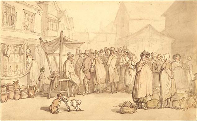
Thomas Rowlandson, British, 1756-1827
A Market Scene
pen and brown ink, brush and brown wash, and watercolor washes over graphite on
cream wove paper
Overall: 5 9/16 x 9 1/4 in. (14.1 x 23.5 cm)
Ackland Fund
64.24.1

If Hogarth was the founding father of the English
graphic narrative, then Thomas Rowlandson was one
of his descendants. Rowlandson acknowledged Hogarth as an important inspiration to
him, though his own art lacked the scope and breadth of Hogarth’s “progresses.”
Furthermore, whereas James Gillray (another descendant of Hogarth) inspired a
generation of artists including Cruikshank, Rowlandson lacked the widespread influence
of his counterpart. Nevertheless, Rowlandson was undoubtedly a gifted artist, and, in
spite of his sometimes grotesque caricatures, he was likewise capable of incorporating a
gentleness and beauty in his illustrations that contradicted the rougher qualities of his art.
John Harvey describes Rowlandson as “a delicate penman and water-colourist, with a
sensitive feeling for landscape” (28), and the colorations of many of his pieces reflect this
delicacy.

Like his fellow graphic satirists, Rowlandson was a master of caricature, and he
frequently lampooned familiar society types of the late eighteenth- and early nineteenth-
century, exaggerating their dominant features and playing up their humorous qualities.
Though trained as a painter, Rowlandson’s penchant for caricature provided him with
greater financial stability. Rowlandson also illustrated editions of novels by many of the
great novelists of the eighteenth century, including Tobias Smollett, Oliver Goldsmith,
and Laurence Sterne. Notably, though Rowlandson used copper plates to create his
etchings, all of the final prints were colored by hand.
Thomas Rowlandson, British, 1756-1827
Dr. Syntax Painting a Portrait, from ‘The Second Tour of Dr. Syntax, in Search of
Consolation,” #18, ca. 1810
Handcolored etching
Overall: 4 5/8 x 7 7/16 in. (11.8 x 18.9 cm)
Gift of Dorothy and S.K. Heninger, Jr.
99.1.33

In a strange way, Dr. Syntax seems the forebear to
some of our most beloved comic-strip characters
given that, from the very beginning, he was a hero
who existed more completely in the visual realm (as opposed to the realm of the written
word). Rowlandson’s drawings of Dr. Syntax’s misadventures always came before
William Coombe’s poetic write-ups of these scenes: “The verse itself would be written to
fit the artwork. Rather than the pictures made to fit the verse — Rowlandson would put
Syntax in a funny situation, and Coombe would make the story fit what he had drawn”
(Markstein par. 6).

Of course, even though Dr. Syntax was more comic hero than literary hero, he was very
much defined by the conventions of the picaresque and sentimental traditions which
characterized the eighteenth-century English novel. Like so many of the protagonists
from the novels of this period, Dr. Syntax has a Quixotic quality to him; his status as a
curate also links him to Fielding’s infinitely well-meaning but hopelessly unlucky Parson
Adams, as depicted in Joseph Andrews. Like the abovementioned characters, Syntax is
an important precursor to Dickens’s Mr. Pickwick, though the lean and angular curate
may seem the exact opposite of the portly and round Mr. Pickwick at first glance.
Nevertheless, in both instances the man of learning (whose unwavering naiveté and
childlike simplicity negates whatever intellectual gifts he has attained through education)
is put into ridiculous situations which serve to undermine his dignity while
simultaneously reinforcing his loveable qualities. Though Dickens himself was more
drawn to Hogarth than to either Gillray or Rowlandson (arguably Hogarth’s most
important successors besides Cruikshank), Rowlandson’s prints, like Hogarth’s, were not
simply meant to be viewed—they were meant to be read. Even without Coombe’s
verses, there is an episodic narrative to Dr. Syntax’s adventures, and as we watch the
doctor “progress,” we become caught up in the story.
Hablot Knight Browne, called Phiz, British,
1815-1882
“Miss Bella’s Court”
etching
Anonymous Loan
L 1997.001.0137

Source: Davenport Dunn: A Man of Our Day;
Volume II, Chapter XIV
Author: Charles Lever
Publication Date: 1859

From the Text: “To such an extent had her influence spread that it became at last well-
nigh impossible to conclude any bargain for land without her co-operation. Unless her
award had decided, the peasant could not bring himself to believe that his claim had met
a just or equitable consideration; but whatever Miss Bella decreed was final and
irrevocable. From an early hour each morning the suitors to her court began to arrive.
Under a large damson-tree was placed a table, at which she sat busily writing away, and
listening all the while to their long-drawn-out narratives. It was her rule never to engage
in any purchase when she had not herself made a visit to the spot in question, ascertained
in person all its advantages and disadvantages, and speculated how far its future value
should influence its present price. In this way she had traveled far and near over the
surrounding country, visiting localities the wildest and least known, and venturing into
districts where a timid traveller had not dared to set foot. It required all her especial
acuteness, oftentimes to find out—from garbled and incoherent descriptions—the strange
and incoherent descriptions—the strange and out-of-the-way places no map had ever
indicated. In fact, the wild and untravelled country was pathless as a sea, and nothing
short of her ready-witted tact had been able to navigate it.”

Though George Cruikshank’s legacy has always eclipsed Phiz’s in both popular and
critical discourse (in spite of the fact that the latter was far more prolific in terms of his
collaborations with Dickens), most critics would agree that Phiz surpassed Cruikshank in
his visual representation of women. Jane R. Cohen notes that Cruikshank “often had
trouble depicting sympathetic or attractive characters, especially women and children,
perhaps because such tame subjects did not feature in the Hogarthian tradition” (22).
Conversely, Phiz had the gift of being able to preserve female beauty in illustration, a
trait which served him well in depicting such Dickensian heroines as Kate Nickleby,
Little Nell, Florence Dombey, Esther Summerson, and Amy Dorrit, along with several of
Lever’s heroines like Miss Bella, shown above.

As the above passage, with its emphasis on business dealings and speculation, indicates,
Davenport Dunn addresses numerous subjects explored by Dickens in Little Dorrit. The
titular character of Dunn the financier repeatedly invokes the specter of Dickens’s shady
financial wizard, Mr. Merdle. As in Little Dorrit, the oftentimes corrupt connections
between the business world and the political sphere are alluded to frequently, and the
financial crises of the late 1850s, brought about by rampant speculation, drive several
developments in the plot; Dunn is indeed a “man of his time.”

The serious subject matter explored by Lever in this novel is in keeping with his
development as a writer. Like Dickens, Lever’s start to novel-writing was fairly
disjointed: “Lever began contributing his first major work, The Confessions of Harry
Lorrequer (a series of sketches not originally intended to be a novel) in monthly parts to
the Dublin University Magazine” (111). The popularity of the sketches led to their being
reprinted in novel form with illustrations (a development akin to Dickens’s initial work
on Sketches by Boz and The Pickwick Papers.) Like virtually every novelist in the
Victorian era, Lever was inspired by Dickens’s serialization technique, though he
likewise resented the pressures and frustrations inherent in this intensive approach to
publishing. In the preamble to Arthur O’Leary, Lever satirizes the Pickwick boon, as the
fictional editor, Harry Lorrequer, jokes: “Was I to exhibit in ludicrous situations and
extravagant incidents, with ‘illustrations by Phiz’, because I happened to be fat and fond
of rambling?” (Harvey 13), thus comparing himself with Dickens’s Mr. Pickwick.
Lorrequer breaks the “fourth wall” between himself and the reader with his joke about
hiring Phiz to do the illustrations (ironically, Phiz illustrated all of Lever’s other novels
while Cruikshank did the illustrations on O’Leary.)

The centrality of the illustrations to the serialized technique utilized by Dickens was
particularly influential in shaping the methods of Lever and other serial novelists: “If it
had not been for Pickwick, Lever would not have written fiction of this kind, or made a
large use of illustration” (Harvey 13). Whereas illustrations were unnecessary in the
three volume novels published by the likes of Walter Scott in the generation before
Dickens, serial novels necessitated illustration. Many publishers required that authors
include scenes that were highly visual so as to be conducive to pictures. The illustrations
were essential to the marketing of the novels, as the pictures were displayed in the shop
windows whenever each new episode appeared; it was thus necessary that they catch the
eye of the reader. Illustrations could likewise supplement the overall project of the novel,
particularly in regard to the artist’s ability to depict physical comedy; this trait was
particularly important to Dickens and Lever’s early works which featured the kind of
madcap, picaresque comedy that proved so conducive to these types of illustrations.
However, as the writing styles of both men shifted, and the basic structures of their
novels became more centralized, such illustrations became less essential.

While Dickens’s gradual maturation as a novelist brought him some of his greatest
successes in the middle and later parts of his career, Lever’s late works are somewhat
uneven due to the fact that the author tried to blend his freewheeling comedy with more
serious and rigid subjects. These works thus “teeter between the comic dash and
conversation of his early work and the more serious plotting and construction of his later
novels” (Lester 122). This shift also made things difficult for Phiz, who was more suited
to comical and exaggerated drawings as opposed to serious illustrations; it is for this
same reason that Dickens and Phiz eventually ended their longtime partnership, as Phiz’s
style simply did not correlate to the intense subject matter of novels like Little Dorrit and
A Tale of Two Cities.
The difficulties that Lever faced in the latter part of his career were particularly
frustrating due to his overarching lack of confidence in his own abilities and his tendency
to take criticism personally. In the year following Davenport Dunn, Lever began a new
serial novel, The Day’s Ride, for Dickens’s journal: All the Year Round. The monthly
numbers sold poorly, however, and Dickens was thus forced to inform Lever that the
novel should be discontinued. The delicate wording of Boz’s letter to Lever clearly
indicates that Dickens knew of his friend’s sensitivity, and Boz did his best to break the
news gently: “I have waited week after week, for these three or four weeks, watching for
any sign of encouragement. The least sign would have been enough. But all the tokens
that appear are in the other direction” (24). Dickens was thus prompted to try and save
the journal by revising his plans for the novel that would go on to become his magnum
opus, Great Expectations: “I had begun a book which I intended for one of my long
twenty number serials. I must abandon that design and forego its profit (a very serious
consideration you may believe), and shape the story for these pages” (25). In spite of his
attempted delicacy, Dickens’s letter undoubtedly upset Lever, as is indicated by
Dickens’s follow-up note in which he acknowledges some of the hurt feelings alluded to
in his friend’s missive. Still, their friendship remained in tact, and Dickens would later
write to Lever about his frightful experience during the Staplehurst Railway disaster in
1865.
George Cruikshank, British, 1792-1878
“Christian Passing Through the Valley of the Shadow
of Death,” from Pilgrim’s Progress, 1871
lithograph
Burton Emmett Collection
58.1.1038

Source: The Pilgrim’s Progress
Author: John Bunyan
Publication Date: 1903 (Frowde edition)

From the Text: Now, at the end of this valley was another, called the Valley of the
Shadow of Death, and Christian must needs go through it, because the way to the
Celestial City lay through the midst of it. Now, this valley is a very solitary place. The
prophet Jeremiah thus describes it:--'A wilderness, a land of deserts and of pits, a land of
drought, and of the shadow of death, a land that no man' (but a Christian) 'passed
through, and where no man dwelt.' Now here Christian was worse put to it than in his
fight with Apollyon, as by the sequel you shall see. I saw then in my dream, that when
Christian was got to the borders of the shadow of Death, there met him two men, children
of them that brought up an evil report of the good land, making haste to go back; to
whom Christian spake as follows:--

Chr. Whither are you going?

Men. They said, Back! back! and we would have you to do so too, if either life or peace is
prized by you.

Chr. Why, what's the matter? said Christian.

Men. Matter! said they; we were going that way as you are going, and went as, far as we
durst; and indeed we were almost past coming back; for had we gone a little further, we
had not been here to bring the news to thee.

Chr. But what have you met with? said Christian.

Men. Why, we were almost in the Valley of the Shadow of Death; but that, by good hap,
we looked before us, and saw the danger before we came to it.

Chr. But what have you seen? said Christian.

Men. Seen! Why, the Valley itself, which is as dark as pitch; we also saw there the
hobgoblins, satyrs, and dragons of the pit; we heard also in that Valley a continual
howling and yelling, as of a people under unutterable misery, who there sat bound in
affliction and irons; and over that Valley hangs the discouraging clouds of confusion.
Death also doth always spread his wings over it. In a word, it is every whit dreadful,
being utterly without order.
Chr. Then, said Christian, I perceive not yet, by what you have said, but that this is my
way to the desired haven.

Men. Be it thy way; we will not choose it for ours. So, they parted, and Christian went on
his way, but still with his sword drawn in his hand, for fear lest he should be assaulted.

John Bunyan’s The Pilgrim’s Progress (v. I, 1678; v. II, 1684) had a ubiquitous presence
in Victorian society; along with the Bible, it was a text that could be found in virtually
every household. Though not a true “novel” in the strictest sense of the term, Bunyan’s
allegory served as an important precursor to the emergence of the eighteenth-century
British novel tradition. The text recounts the story of Christian, an everyman who,
burdened by sin, undertakes a long and dangerous pilgrimage from the City of
Destruction to the Celestial City. His trek involves passage through such places as the
Valley of Humiliation, Doubting-Castle, Vanity Fair, and of course, the Valley of the
Shadow of Death depicted above. Christian likewise encounters a wide variety of
allegorical figures including Mr. Worldly Wiseman, Mr. By-Ends, Giant Despair, and
Ignorance.

Given the prominence of Bunyan’s piece, it is not surprising that there are numerous
allusions to The Pilgrim’s Progress in many Victorian novels; William M. Thackeray’s
masterpiece, Vanity Fair, takes its title from the allegory. Dickens himself alludes to the
story many times throughout his canon, and one could view The Old Curiosity Shop
(arguably his most allegorical work) as a variation on Bunyan’s story: like Christian, Nell
and her grandfather are pilgrims, and the villainous characters they meet, including the
diabolical dwarf Daniel Quilp, are traditional vice figures. Paul Schlicke documents
other prominent Dickensian allusions to Bunyan in the Oxford Reader’s Companion to
Dickens (64).

Given Cruikshank’s prominence it is understandable that he would have created
illustrations for the omnipresent Pilgrim’s Progress; indeed, it was a work to which he
would return numerous times throughout his long and distinguished career. As early as
1816, Cruikshank contributed a vignette to a Regency era edition of the text. In 1827, he
created several woodcuts based on Bunyan’s allegory; he likewise designed two elaborate
etchings depicting the Vanity Fair episode, one in 1838 and another in 1854. Perhaps
most notably, a new edition of the text was published by Henry Frowde in 1903. The
Frowde text featured a full twenty-five woodcuts created by Cruikshank, all of which had
been donated by his friend, Edwin Truman: “The drawings for the illustrations in this
edition of the Pilgrim’s Progress were made by my friend George Cruikshank more than
forty years ago and have been in my possession for upwards of thirty-tree years. They
are now produced for the first time” (v). Truman’s collection included the above
illustration.

Cruikshank’s work with Bunyan’s text is distinct from many of his other illustrations
given the fact that The Pilgrim’s Progress was more than just a book—it was an
institution. Cruikshank had tremendous artistic freedom, as he was not simply illustrating
what appeared on the page, but simultaneously, subjectively responding to an amorphous
cultural tradition. Furthermore, the allegorical nature of the piece granted him great
license. The illustrations for this particular text understandably have a good deal in
common with his drawings for Grimm’s fairytales, and the terrifying and fantastic
creatures shown above have their counterparts in Cruikshank’s renderings of the Grimm
stories. Ironically, despite the fact that they were both incredibly fond of fairy stories, it
was Cruikshank’s revisionist and allegorically moralistic work with fairytales (following
his immersion in the teetotaler movement) that would create a permanent rift between
himself and Dickens.
George Cruikshank, British, 1792-1878
A Brush with Shakespeare. The Bard in Painting: 1780-1910, 1857-1858
“Pistol Informing Sir John Falstaff of the Death of Henry the Fourth”
graphite and watercolor
Overall: 4 5/16 x 6 13/16 in. (11 x 17.3)
The William A. Whitaker Foundation Art Fund
65.29.1

Source: The Life of Sir John Falstaff
Author: Robert Barnabas Brough
Publication Date: 1857
Shakespearean Source: Henry IV, Part 2 (V.iii)

From the Text: “Pshaw! The very name of the messenger was proof to the contrary. Pistol
was, doubtless, in the neighbourhood; had heard of his patron’s whereabouts; and tracked him,
as usual, in the hope of a flagon, a supper, and a piece of silver! Sir John was a philosopher,
and was engaged in the digestion of his own supper. He would not allow that vital process to be
prejudiced by the excitement of a possibly fallacious hope. He fell back upon the garden seat,
and ordered Pistol to be admitted. Pistol strode into the orchard, looking daggers around him.
Pistol was in the habit of looking daggers, as I might be in the habit of looking fifty pound notes.
The process was by no means a proof that he had one about him to make use of when called
upon. He said——But you shall hear what he said, and what was said to, and about, him, in the
dramatic chronicler’s own words, with such unwritten elucidations, or ‘stage directions,’ as
your humble servant may consider himself justified in venturing upon.”

Shakespeare was a towering figure in the Victorian era and artists responded to him in a variety
of ways and through a variety of media. Onstage, Shakespeare seemed synonymous with
spectacle, and while this sometimes made for wildly over-the-top productions, it was likewise
clear that the Victorians had a tremendous respect (one might even go so far to say, a cultural
obsession) with the Bard’s works and characters. Though the Victorian era was the era in which
the novel became the dominant literary form, there was something inherently novelistic about
Shakespeare’s writing; Adrian Poole notes that Shakespeare’s novelistic tendencies manifest
themselves through his characters, who “have such complex being-in-time. In their own minds
they live in imagined pasts and futures as well as here and now on stage” (82). For certain, many
of Shakespeare’s characters seemed to escape the plots of their plays and attain an independent
existence in the culture of the time period (82-87). Sir John Falstaff is perhaps the most
noteworthy example.

It is somewhat ironic that Cruikshank was so interested in the drunkard Falstaff given his own
obsession with the temperance movement. Nevertheless, Cruikshank must have identified with
Sir John to a certain extent, perhaps most obviously in his lust for life, his egotism, and his sense
of being underappreciated by the narrow-minded fools who surrounded him. In the subtitle to an
illustration that appears in the preface to his Life of Falstaff, Cruikshank included a quote from
Henry IV, Part 2 in which Falstaff laments: “Men of all sorts take a pride to gird at me: the brain
of this foolish-compounded clay, man, is not able to invent anything that tends to laughter, more
than I invent or is invented on me: I am not only witty in myself, but the cause that wit is in other
men” (I.ii.5).

The Life of Sir John Falstaff presents a fictional biography of Shakespeare’s great comic
character, derived not only from the onstage antics of the knight, but likewise, from the
imagination of Cruikshank himself. Cruikshank designed a full twenty etchings to go with the
text. He also created a beautiful frontispiece featuring Sir John in all of his glory. This
particular picture may have been based on Cruikshank’s friend Henry Barrett, an actor who had
played Falstaff onstage and who offered to pose for Cruikshank when the artist began work on
the piece (which would correlate with the Victorian interest in creating portraits of actors playing
Shakespearean parts). Cruikshank wrote out some ideas for Falstaff’s biography but left the
actual composition of the piece to Brough.

Sadly, the project proved a failure due to a wide variety of factors. Brough was in poor health at
the time and had trouble keeping on schedule: “As the year wore on, he missed deadlines.
Irregularity of issue further damped sales” (Patten 376). Poole notes that the project was
likewise ill-conceived given Sir John’s theatricality; though he may transcend the plots of the
various plays in which he figures prominently, Falstaff is still bound by the tenets of
performance, “and any life he might have off the stage will need to rival this sense of live
presence” (89).

Nevertheless, there is much to admire in Cruikshank’s illustrations, including the backgrounds,
which seem to transcend the limitations of stage. The charming and picturesque depiction of the
English countryside stands in contrast to the squalid depiction of urban London found in many of
his other illustrations. Moreover, the very fact that the project reached fruition reinforces the
Victorian cultural fixation on Shakespeare, and, perhaps more specifically, Shakespearean
characters: “Once Shakespeare’s characters are liberated from their dramatic contexts—into
other media, into other words—there is no knowing what they may help to unleash” (Poole 79).
George Cruikshank, British, 1792-1878
“Monks and the Jew,” 1838
graphite with touches of watercolor
Overall: 9 1/8 x 7 5/16 in. (23.2 x 18.6 cm)
The William A. Whitaker Foundation Art Fund
65.29.2

Source: Oliver Twist (Chapter XXXIV)
Author: Charles Dickens
Publication Date: 1838

From the Text:

“One beautiful evening, when the first shades of twilight were beginning to settle upon
the earth, Oliver sat at this window, intent upon his books. He had been poring over
them for some time; and, as the day had been uncommonly sultry, and he had exerted
himself a great deal, it is no disparagement to the authors, whoever they may have been,
to say, that gradually and by slow degrees, he fell asleep.

There is a kind of sleep that steals upon us sometimes, which, while it holds the body
prisoner, does not free the mind from a sense of things about it, and enable it to ramble at
its pleasure. So far as an overpowering heaviness, a prostration of strength, and an utter
inability to control our thoughts or power of motion, can be called sleep, this is it; and
yet, we have a consciousness of all that is going on about us, and, if we dream at such a
time, words which are really spoken, or sounds which really exist at the moment,
accommodate themselves with surprising readiness to our visions, until reality and
imagination become so strangely blended that it is afterwards almost matter of
impossibility to separate the two. Nor is this, the most striking phenomenon incidental to
such a state. It is an undoubted fact, that although our senses of touch and sight be for
the time dead, yet our sleeping thoughts, and the visionary scenes that pass before us,
will be influenced and materially influenced, by the mere silent presence of some external
object; which may not have been near us when we closed our eyes: and of whose vicinity
we have had no waking consciousness.

Oliver knew, perfectly well, that he was in his own little room; that his books were lying
on the table before him; that the sweet air was stirring among the creeping plants
outside. And yet he was asleep. Suddenly, the scene changed; the air became close and
confined; and he thought, with a glow of terror, that he was in the Jew's house again.
There sat the hideous old man, in his accustomed corner, pointing at him, and whispering
to another man, with his face averted, who sat beside him.

'Hush, my dear!' he thought he heard the Jew say; 'it is he, sure enough. Come away.'

'He!' the other man seemed to answer; 'could I mistake him, think you? If a crowd of
ghosts were to put themselves into his exact shape, and he stood amongst them, there is
something that would tell me how to point him out. If you buried him fifty feet deep, and
You can also read