The Interaction of Image and Text In Modern Comics - Brill
←
→
Page content transcription
If your browser does not render page correctly, please read the page content below
240 Lambeens And Pint
Chapter 12
The Interaction of Image and Text In Modern
Comics
Tom Lambeens and Kris PintLambeens and Pint
Introduction
The combination of image and text is undoubtedly one of the most typical
features of the comic strip genre. This combination in itself is, of course, far
from new. Sequential images were already combined with textual elements in
Egyptian hieroglyphs or medieval manuscripts and paintings.1 The comic strip
as such evolved in the first half of the nineteenth century, with artists like
Rodolphe Töpffer (influenced by William Hogarth), Wilhelm Busch and Pehr
Nordquist, all of whom created stories that were easy to reproduce and com
bined words and images, albeit still strictly separated from each other. Inspired
by the American newspaper comics of the early twentieth century, like Frede
rik Burr Opper’s Happy Hooligan (1900) and Alphonse and Gaston (1901), the
European comic strip started to integrate speech balloons into the image itself,
with Hergé’s Les Aventures de Tintin as its most prominent and best-known ex
ponent.2 Initially conceived for the youth supplement of a Belgian newspaper,
Tintin proved so successful that his adventures were soon published in book
form as well. The emergence of real comic books meant an important evolu
tion of comics, a move away from the rather transitory medium of the newspa
per. Yet for a long time, comic books were mostly seen as children’s entertain
ment. In the seventies, this view began to change with the emergence of the
so-called “graphic novel,” which featured more mature content and, at times, a
more experimental style of drawing as well. A successful, recent example of
this emancipation of the comic book genre is Logicomix (2008), by Apostolos
Doxiadis, Christos Papadimitriou, and Alecos Papadatos. The book is con
ceived as a complex account of both the theories and the lives of the founders
of modern mathematics and logics, like Bertrand Russell and Ludwig Wittgen
stein – a far cry from the light-footed newspaper gags which gave “comics” their
name.
1 See Lefèvre (2006) and Dierick and Lefèvre (1998) 13–22.
2 For a comprehensive discussion of the “history” of the speech balloon, see Lefèvre (2006).
© Tom Lambeens and Kris Pint, 2015 | doi 10.1163/9789004270848_014
This is an open access chapter distributed under the terms of the Creative Commons Attribution-
Noncommercial 3.0 Unported (CC-BY-NC 3.0) License. Tom Lambeens and Kris Pint - 9789004270848
Downloaded from Brill.com11/07/2020 01:33:52PM
via free access
The Interaction Of Image And Text In Modern Comics 241
The large number of recent films based on comic books, like David Cronen
berg’s A History of Violence (2005), Frank Miller’s and Robert Rodriguez’ Sin City
(2005), Zack Snyder’s 300 (2006, also based on a graphic novel series by Frank
Miller) and more recently, Steven Spielberg’s The Adventures of Tintin (2011),
seems to reveal the close affinity between both media. They can both be cate
gorised as visual narratives and often use similar techniques (montage, point
of view, split screen). But as Hans-Christian Christiansen argues in his “Comics
and Film: A Narrative Perspective” (2000), this mutual influence should not
cause us to forget the important aesthetic differences between both media.3
One of the distinctive features of mainstream comics seems to be precisely
that co-presence of written text and image, or as Robert C. Harvey puts it in his
“Comedy at the Juncture of Word and Image” (2007): “the essential characteris
tic of ‘comics’ – the thing that distinguishes it from other kinds of pictorial
narratives – is the incorporation of the verbal content.”4
Precisely because of this characteristic combination of text and image, the
readers of comics are caught between the act of perceiving and the act of read
ing. Not only the medium itself, but also the relatively new theoretical research
on the genre continues to struggle with this duality between text and image.5
This often inhibits an exploration of the full potential of the interaction be
tween text and image so crucial to the genre. In this paper, we introduce an
other duality, one between code and sensation. We argue that exploring the
interaction between both axes (the axis of word/image and that of code/sensa
tion) provides interesting perspectives for both the analysis and creation of
comics. We will illustrate this by examining the works of two of the founding
fathers of European comics, Hergé and Franquin, and those of some contem
porary, Western avant-garde artists like Jochen Gerner, Dominique Goblet, Bert
Van der Meij, and Chris Ware, and by discussing Front Back, an experimental
comic book by Tom Lambeens, co-author of this paper.
Word versus Image
We will start with a discussion of the first axis, word-image. In his standard
work The System of Comics (1999, translated in 2007), Thierry Groensteen dis
tinguishes between the image zone, which creates an illusion of three-dimen
3 Christiansen (2000) 107–23.
4 Harvey (2007) 75.
5 See especially Groensteen (1997, 2007 and 2008), Lefèvre and Baetens (1993), McCloud (1993)
and Peeters (1991).
Tom Lambeens and Kris Pint - 9789004270848
Downloaded from Brill.com11/07/2020 01:33:52PM
via free access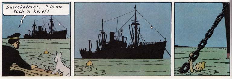
242 Lambeens And Pint
sionality, and the text zone, which remains faithful to the “bi-dimensional
materiality of the writing surface.”6
Such an approach, which clearly separates word from image, can be very
fruitful for the analysis of the works of someone like Hergé. In Les Aventures de
Tintin we see how neatly he splits the narration into different panels and how,
within each panel, he separates the visual and the verbal elements. The visual
elements are predominantly located in the lower half of the panel. The back
ground of the image is often filled with details, while the figures in the fore
ground lack detailing. The words are restricted to the captions and the speech
balloons, which are almost invariably placed at the upper half of the panel. The
same neutral typography is used to render the words of friends and foes, young
and old, male and female. This indicates that the text is only there to be read,
like one would read words in a novel. Nonetheless, it is interesting to note that
the text, with its typographic “stir” of curves and straight lines, visually corre
sponds with the busy detailing in the background of the images, while the
ample spacing of the words in the captions and speech balloons corresponds
with the “airy” figuration of the characters (Figure 12.1). Yet despite this careful,
nuanced harmony between text and image, both zones remain strictly sepa
rated from each other.
In the works of another important master of the genre, Franquin, the op
position between the zones becomes far less self-evident. In Franquin’s typical
“busy” style of drawing we see more verbal elements appearing in the image
zone. If we look at comic strips like his Gaston Lagaffe series about a lazy yet
inventive office clerk, we can see that word clouds are placed in a more dy
namic, fanciful way than in Hergé’s works and that grotesque onomatopoetic
forms (indicating e.g. shouting, explosions and other noises) play an active
part in the overall figurative composition of the panel.7
In some contemporary avant-garde comic books, created by artists like e.g.
Dominique Goblet and Bert Van der Meij, the merging of the two zones is
pushed to its limits, by integrating into the visual composition not only ono
matopoetic forms, but “normal” words as well. Figure 12.2 illustrates this radi
cal blending in Goblet’s Faire Semblant C’est Mentir (2007) [Faking is Lying
too]. We see how Goblet rejects the uniform rendering of words in a single
font. The text also escapes the tyranny of the speech balloon and sometimes
even pushes the visual representation to the background of the panel. In con
trast with the neutral fonts used by artists like Hergé, the typography Goblet
and Van der Meij use is frequently adapted to the specific context of the image.
6 Groensteen (2007) 69–70.
7 Franquin (2009) 39.
Tom Lambeens and Kris Pint - 9789004270848
Downloaded from Brill.com11/07/2020 01:33:52PM
via free access
The Interaction Of Image And Text In Modern Comics 243
Figure 12.1 Hergé, De Zonnetempel (Doornik: Casterman, 1977), p. 17.
© Hergé/Moulinsart, 2012
It is here that the analytical framework of Groensteen reveals its limits. It
cannot completely grasp the specific interaction between the verbal and visual
elements in Franquin, Goblet and Van der Meij, precisely because of its overly
exclusive focus on the opposition between word and image. When we want to
understand how textual elements start to function visually and an image starts
to function as a text, we should take two other notions into consideration: sen
sation and code.
Sensation Versus Code
The notion “code” has the advantage of transcending the classic duality be
tween word and image. Words are just one (linguistic) form of code. When we
read comic strips, we must also decode the images: we use narrative and cul
tural codes to make sense of the depicted actions and scenes, but also visual
codes to recognize the different characters and locations. Just like other codes,
a visual code works by conventions and (internal) analogies, an operation that
bans the difference and repeats and stresses the general, the similar. The coded
image can refer to another set of images. A drawing of Garfield primarily refers
to other, similar drawings of this cartoon figure, allowing us to recognize it as
the same character in different cartoons, but can also refer to a referent in real
ity: the drawn cat has some general features in common with a real cat. In his
Understanding Comics. The Invisible Art (1993), Scott McCloud points out that
this “codification” of the image is gradual, going from a photorealistic, detailed
rendering to an archetype and, in extremis, to an abstract sign.8 Yet even that
8 McCloud (1993) 52–53.
Tom Lambeens and Kris Pint - 9789004270848
Downloaded from Brill.com11/07/2020 01:33:52PM
via free access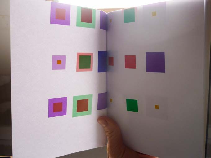
244 Lambeens And Pint
Figure 12.2 Goblet, D., Faire Semblant C’est Mentir (Paris: L’Association, 2007), p. 21.
© Dominque Goblet & L’Association, 2007
sort of view on the relation between text and image as a gradual transition,
rather than a strict opposition (as with Groensteen), still ignores what it is in
this codification that resists the code or even disrupts it: visual sensation. It is
striking that the medium of comics, which belongs to the plastic arts, is so
seldom analysed from a visual perspective. Pascal Lefèvre already pointed out
this important omission in the theoretical reflection on the medium in his “Re
covering Sensuality in Comic Theory” (1999).9 By adding the term “sensation”
to the toolbox of comic strip theory, we want to provide an instrument to ex
amine this neglected visual, plastic component of the genre.
Unlike “decoding,” which refers to a mental activity, an act of reading that
abstracts from the actual perception of the code or the materiality of the me
dium, “sensing” is far more physical: a sensation affects the body, making one
aware of the physical act of experiencing something. Every sensation is unique,
as it is related to a specific body at this specific time-space, and thus differs
from any other sensation. This difference obscures the construction of a code
9 Lefèvre (1999) 141.
Tom Lambeens and Kris Pint - 9789004270848
Downloaded from Brill.com11/07/2020 01:33:52PM
via free access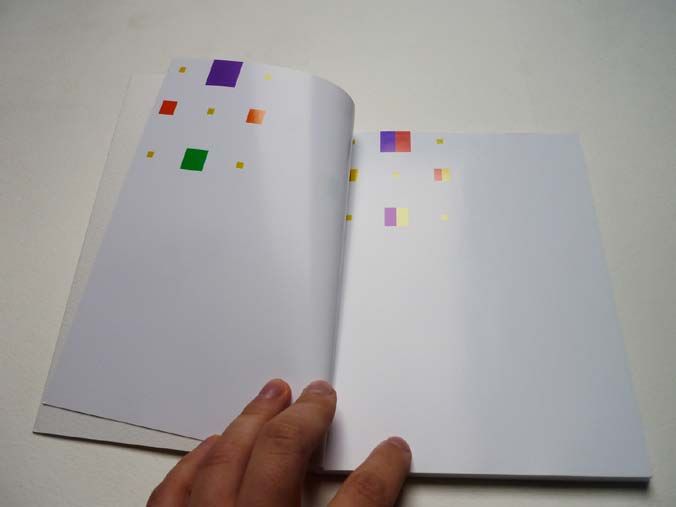
The Interaction Of Image And Text In Modern Comics 245
that represses the dissimilar. In his Francis Bacon: The Logic of Sensation (1981,
translated in 2003), Deleuze’s interpretation of sensation goes further than the
“sensual reading” Lefèvre advocates. Rather than merely an aesthetic, bodily
experience, sensation arises in a confrontation with forces that undo our nor
mal outlook and present the perceiving body with unknown affects that can
not be reduced to familiar (hence “coded”) emotional or aesthetic schemata.
Deleuze uses the notion of sensation to analyse modern art as a way of explor
ing “percepts” and “affects” that no longer mimetically refer to an external real
ity or an internal psychological state. Even if modern art possesses referential
ity – e.g. interpreted along the lines of a mimetic code, the black strokes in
Wheatfield with Crows (1890), one of Vincent Van Gogh’s final paintings, refer to
the birds we all know, just as, within the framework of a psychological/bio
graphical code of interpretation, these evocative strokes can be “decoded” as
the expression of Van Gogh’s mental discomfort– it simultaneously presents
the difference too.10 In modern painting, artists reveal this difference by not
hiding brush-strokes or clots of paint, but actually accentuating their material
ity. At the representational level, they try to deform what is depicted, to over
load it with detail or to supplement it with a specific visual rhythm, so we can
only perceive it as a sensation, and not read it as a code. We can see this e.g. in
the work of Cézanne, who exaggerates colours and forms, or in the work of
Bacon, who depicts the human body almost beyond recognition, and, in so do
ing, stirs a strong response in his spectators.11
The Deleuzian interpretation of the notion of “sensation” can be linked to
the that of “defamiliarisation” or ostranenie, discussed by Victor Shklovsky in
his “Art as Technique” (1917). Through repeated dealings with the same objects
or situations, our sensual perception becomes infected by a hidden coding,
causing us to ignore all the different experiences they evoke. For Shklovsky, art
tries to disrupt this codification of the experience by searching for formula
tions that allow us to see familiar things and situations as if they were experi
enced for the very first time: “And art exists that one may recover the sensation
of life; it exists to make one feel things, to make the stone stony. The purpose of
art is to impart the sensation of things as they are perceived and not as they are
known.”12 Shklovksy’s remark makes clear that it would be incorrect to simply
equate the axis of code/sensation with the axis of realism/non-realism. The
point Shklovksy makes is precisely that a non-realistic artistic representation
of a stone can in fact be a more real evocation of a stone than an easily recog
10 Deleuze (2003) 61–69, 80.
11 Ibid., 25–31, 79.
12 Shklovsky (1965) 12.
Tom Lambeens and Kris Pint - 9789004270848
Downloaded from Brill.com11/07/2020 01:33:52PM
via free access246 Lambeens And Pint
nizable photograph or drawing. Likewise, the splashes of paint on a non-figu
rative painting can be seen as more “real” than any “normal” representation,
which implies illusion. And there is also no reason why a seemingly “realistic”
painting could not evoke sensation by showing, in the representation of the
familiar, the “coded” reality, the non-evident, the unknown, the unreality of
actual sensual experience. We can easily recognize the mimetic code of the
crows and the rural setting in van Gogh’s Wheatfield, yet through their actual
materiality and position on the canvas emerges a sensation that goes beyond
the realistic representation of a typical rural landscape.
Obviously, such sensations that escape from the code are much easier to
create in paintings, where the narrative and referential aspects can be reduced
to a minimum. In a comic strip, these possibilities quickly come to a dead end,
because the sequence of images inevitably installs narrative sequentiality, rep
etition and hence code. Most comic strips use characters, and we can only rec
ognize a character if it reappears in a fairly recognizable – hence coded – way
throughout the different panels. The genre of the comic strip, therefore, can
not do without code. Pure sensation without any code is, indeed, simply im
possible.
In contemporary avant-garde comics, we can distinguish two different reac
tions to this interaction between code and sensation. Some artists try to avoid
this duality altogether by extending the anti-sensual realm of the text to the
images themselves and striving for an ever more purified code, with as little
“sensual” surplus as possible. Due to the semiotic and narratological back
ground of comic strip theory, which emerged from literature and film studies,
it is not surprising that near exclusive attention has been given to such artists,
like Hergé and more recently Chris Ware, whose “coded” works effectively il
lustrate the theoretical schemes.
If we are to give a quick overview of the development in what we could call
the “school of repetition,” we should, again, take Les Aventures de Tintin as a
starting point. We have already discussed the absence of detail in Hergé’s fore
ground figures, which makes them akin to the pictograms of Arntz and Neu
rath. With their Isotype (International System of Typographic Picture Educa
tion), they have tried to develop a universal language of pictograms in which
the image completely coincides with a semantic concept, as we can see in Fig
ure 12.3, Arntz’s image of a boat. If we compare this image with Hergé’s render
ing of a boat in e.g. Le Temple du Soleil (1949) (Figure 12.4), we see the same kind
of reductionism that preserves only the volume and the contour lines of the
ship.
Inspired by Hergé’s famous ligne claire-style and the pictograms of Arntz,
Jochen Gerner’s TNT en Amérique (2002) brings this “codification” of images to
Tom Lambeens and Kris Pint - 9789004270848
Downloaded from Brill.com11/07/2020 01:33:52PM
via free accessThe Interaction Of Image And Text In Modern Comics 247
Figure 12.3 Arntz, G., Pictogram of a boat (1930).
Accessible at http://www.gerdarntz.
org/isotype
Figure 12.4 Hergé, De Zonnetempel (Doornik: Casterman, 1977), p. 6.
© Hergé/Moulinsart, 2012
a climax that flirts with abstraction. In this work – an adaptation of the famous
Tintin en Amérique – Gerner covers entire panels with black paint, sparing only
the most necessary words and images. The few images that escape the black
pigment are reduced to pictograms which create playful variations on Arntz’s
famous set. This ironic operation breaks up both the code of the classical com
ic strip and the pictogram, but only to replace it with a third, idiosyncratic code
– a strange pictorial universe that is Gerner’s own creation (Figure 12.5).
In a more accessible, “mimetic” style than Gerner, Chris Ware, too, searches
for the ultimate limits of codification by taking full advantage of the formal
possibilities of the medium. A good example of this is Ware’s Jimmy Corrigan:
The Smartest Kid on Earth (2000). Ware tries to construct a clear overall struc
ture for his story by using the same set of colours that are symbolically inter
related, and by copying identical curves and sometimes even whole panels
throughout the strip, as we can see in Ware’s Jimmy Corrigan, p. 117. Just like
Hergé, he strives for visual purity, and digitally generated colouring offers him
the ideal alternative to the unavoidable imperfections of manual colouring,
which would reveal the materiality of the image. Ware aims to render a flower
in a manner so conventional and “neutral” that the readers can project their
Tom Lambeens and Kris Pint - 9789004270848
Downloaded from Brill.com11/07/2020 01:33:52PM
via free access248 Lambeens And Pint
Figure 12.5 Gerner, J., TNT en Amérique (Paris: L’ampoule, 2002), p. 41.
© L’ampoule, 2002
own subjective flower to fill in the image.13 Yet those coded images could never
have a strong emotional effect, precisely because they lack surprise and thus
sensation. The image is supplemented by the personal memory of the reader
(to the pictogram-like flower he or she adds the knowledge of how real flowers
look and smell), but this memory only activates what is already known, already
experienced. The “sensual” power of the image emerges only when the expec
tation, i.e. the imagination of the reader, is surpassed and unsettled and a to
tally new experience is provoked. Therefore, we believe that the evocative,
“sensational” power of Ware’s Jimmy Corrigan is to be found on another level.
Precisely by evacuating every visual sensation from the work itself, by using
13 See Peeters and Samson (2010) 133 -35.
Tom Lambeens and Kris Pint - 9789004270848
Downloaded from Brill.com11/07/2020 01:33:52PM
via free accessThe Interaction Of Image And Text In Modern Comics 249
the same codified forms over and over again and by using pure, computer-gen
erated areas of colour, the panels of Jimmy Corrigan evoke a sensation of de
spair, sadness and claustrophobia. This sensation cannot be visually located in
the panels themselves, but instead resides in the reader’s bodily resistance
against this codification, against this closed, neurotic universe that does not
provide a means of escape.
When we move away from the shadowless and dematerialised, “clean”
worlds of Ware and Hergé and instead look for artists who no longer try to
tame the sensual force of the image, we are brought back to Franquin as a key
figure. His painstakingly detailed figures of the Gaston Lagaffe or Spirou-series
are drawn with a whimsical line that varies in size. This “rhizomatic” style of
drawing, so typical for Franquin, is the exact opposite of Hergé’s absolute and
neat ligne claire. Contrary to the static nature of a panel in a comic book, Fran
quin’s dynamic line evokes a certain vitalistic agility and reveals the materiality
of the drawing, namely ink on paper, something that is “repressed” in Hergé’s
perfect line. Obviously, Franquin also needs codification, and Gaston Lagaffe,
just like Tintin, is a character that we can immediately recognize because of
the coded repetition of certain features (his gigantic nose, green pullover and
typical, stooped gait). Yet by cramming his panels full of details, Franquin also
disrupts this code. For instance, he will never depict Gaston in profile: his tra
jectory never runs parallel with that of the image plane. This friction creates a
sense of depth and accentuates the liveliness. When Gaston walks, rather un
realistically, you always see the tops and/or soles of his shabby slippers.14
These details function as visual “barbs” that turn the reader into a viewer
who is arrested by the things he or she sees on the panel. Just like Hergé, Fran
quin’s images are mimetic, but unlike Hergé’s, they never belong to a universe
of almost archetypical, unchanging figures and objects. They are simultane
ously utterly unrealistic and perfectly recognizable. Franquin overloads them
with details and never tries to mask the imperfections of his drawings, nor the
imperfections in the story-world he evokes: his depicted objects are suscepti
ble to decay and full of flaws. This makes his comic strips look less coded, be
cause the code is always overtaken by the chaotic fluidity that marks the
universe of Gaston & co. We can easily illustrate this difference when we com
pare e.g. a boat from Hergé with a more “swinging” example by Franquin. Fran
quin’s boat can initially be drawn “tighter” than Hergé’s, but when, in an
ensuing panel, it collides with a rock, it appears to be as liquid as the surround
ing water itself (Figure 12.6). With Franquin things are never fixed into a single,
clearly defined essence: depending on each situation, they acquire other attri
butes and reveal another transformation which never solidifies into a code.
14 Franquin (2009) 39.
Tom Lambeens and Kris Pint - 9789004270848
Downloaded from Brill.com11/07/2020 01:33:52PM
via free access250 Lambeens And Pint
Figure 12.6 Franquin, Zwartkijken (Doornik: Glad ijs/Casterman, 2008), p. 56.
© Casterman s.a.
This constant flow of sensations can be achieved not only by constantly
changing the form and the movement of the figures and objects, highlighting
the difference between each appearance of these elements, but also by accu
mulating codes, overloading codes with other codes, hopping from one code to
another in a never-ending motion. In line with Franquin, an artist like Blutch
has developed other techniques to fight codification. He uses different codes,
like Franquin uses different strokes and line sizes, to defy a clear-cut codifica
tion of his characters. Blutch does this by combining different styles of drawing
in one strip and by switching between visual clichés and cultural conventions.
He combines a typical pose from fashion photography with a film still and a
contrapposto from the classical arts, or joins visual features to create an animal
that can, at a time, be a cat, a horse and a dog, and thus can never be reduced
to a single referent.15 In Le petit Christian (1999–2008), the main character con
stantly takes different shapes, ranging from realistically drawn movie heroes
like John Wayne, Bruce Lee, and Marlon Brando to other comic strip characters
like Lucky Luke and Tintin.16 By combining a multitude of codes in the same
panel, he creates an sense of “overkill” that disrupts a clear reference to reality
and that favours the sensation of the images themselves.
15 Blutch (2002) 11.
16 Blutch (1999) 27.
Tom Lambeens and Kris Pint - 9789004270848
Downloaded from Brill.com11/07/2020 01:33:52PM
via free accessThe Interaction Of Image And Text In Modern Comics 251
Not just the images, but also the linguistic code of words can be made “sen
sual.” Again we have to mention Franquin, who used to autograph his Gaston
Lagaffe gags. This signature combines text with image in a unique conjunction:
letters get lured away from their symbolical referentiality and become active
characters in a kind of micro-gag.17 The same kind of “sensual” typography, in
which the visual, active aspect becomes as important or sometimes even more
important than the meaning of the words, can be found in the works of Van der
Meij and Goblet. As we can see in the opening panel of De Winnaar, Van der
Meij adapts the typography of his words to the onomatopoetic forms.18 The
large, bold letters evoke the loud roaring of the motor, while the more subtle
sound of loose screws is presented in a smaller font. What we get here is a kind
of synaesthesia, where auditive impressions can be experienced visually. Of
course, this synaesthetic sensation quickly turns into a code: the dominance of
the words in the panels indicates “loudness,” the size of the words indicates the
increasing volume, and their repetition over different panels throughout the
strip inevitably codes the visual impact of the typography.
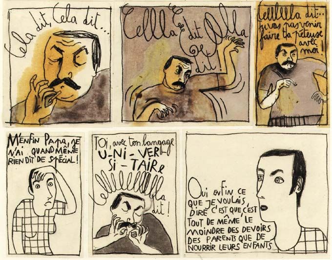
Another good example can be found in Goblets Faire Semblant C’est Mentir.
Figure 12.2 is a panel in which main character Dominique has an argument
with her alcoholic father, who is irritated by her “academic language,” specifi
cally the way she uses the formal phrase “cela dit” [notwithstanding]. When
Dominique pronounces the word, the typography is conventional and neutral.
But when her father repeats this word five times, it is visually supplemented
with curls and fringes, and becomes more erratic with every iteration. This in
turn activates an act of decoding: the frills that we see are the visual manifesta
tion of the accusation that his daughter is “putting on frills,” and the size of the
fonts reflects the increasing volume of his voice and the violent emotional im
pact on his daughter. But at the same time the panel creates a predominantly
visual sensation, in which the typographic forms evoke a disturbing, oppres
sive atmosphere, a feeling of humiliation and frustration that is all in all “felt”
more than it is “decoded.”
In order to illustrate that the axis of code/sensation is not only a useful sup
plement for the analysis of comics, but also for their creation, we want to con
clude with a short discussion of Front Back (2009), an experimental comic by
Tom Lambeens that explores this very interaction between code and image.
Even a brief glance at this comic book reveals that an analysis using the classic
opposition of “word” and “image” is rendered impossible, as the “panels” only
consist of squares of fully saturated primary and secondary colours. The
17 Franquin (2009) 39.
18 Van der Meij (2005) 1.
Tom Lambeens and Kris Pint - 9789004270848
Downloaded from Brill.com11/07/2020 01:33:52PM
via free access252 Lambeens And Pint
Figure 12.7 Lambeens, Front Back (Hasselt: UHasselt/Het Onrijpheid, 2009), p. 2.
narrative sequence, divided into three chapters respectively entitled “yellow,”
“red” and “blue,” consists of the changing of these squares’ colour, size and po
sition on the spread. The immediate assumption is that the sequence of these
squares is no coincidence, so one begins to “read” the squares and their chang
ing position, colour and shape, as a code. At first glance, Front Back takes the
coding of colour and form that can also be found in Jimmy Corrigan, to the
extreme. And indeed, different “clues” to its decoding can be found: the size of
the squares is influenced by the used colour (small for yellow, larger for blue),
the set of squares rotate along a pattern of a cross and a lozenge, a secondary
colour is divided into its primary colours in an ensuing page and the spread of
the squares follows certain proportions with utmost precision (Figure 12.7).
One can even construct a narrative: the sequence of squares can be “decoded”
as a radical abstraction of a life story. In the first “yellow” chapter, all squares
are situated at the top of the page, and on each page five small, vibrantly yellow
squares return. The brightness of yellow and the relative simple rotations of
the squares could be said to resemble the optimistic beginnings of life. The fi
nal chapter, by contrast, is dominated by the colour blue. The squares have
now become bigger and have “sunk” to the bottom of the page, suggesting pas
sivity and death (Figure 12.8). It also seems to be no coincidence, then, that the
Tom Lambeens and Kris Pint - 9789004270848
Downloaded from Brill.com11/07/2020 01:33:52PM
via free accessThe Interaction Of Image And Text In Modern Comics 253
Figure 12.8 Lambeens, Front Back (Hasselt: UHasselt/Het Onrijpheid, 2009), p. 54.
back of the book is entirely black, while the cover is white: whatever the story
might be, the ending is surely not a happy one. All these aspects seem to invite
the reader to try and “crack the code” – but at the same time, sensations begin
to interact with the codes and interfere with the neat sequence of squares and
colours. These sensations are created by taking advantage of the specificity of
the medium of comics. Front Back tries to make clear that this specificity does
not primarily lie in the combination of written text and images, as Harvey ar
gues, but in these medium-specific possibilities to create sensations that inter
act with the codes.
Some of these sensations are created by the decision to use a different kind
of paper for each chapter: coated (“compressed” fibers) and bright white, glossy
paper for the first chapter, uncoated (“open” fibers) and rough, mild yellowish
paper for the last one, while the neutral paper of the second chapter functions
as a transition between these two extremes. Unlike movies or paintings, a book
form allows us to hold the work in our hands, allowing a tactile perception.
Literature, of course, uses the same form of the book, but only works with
words. In the genre of comic books, however, the quality of the paper can influ
ence the visual perception of the images and hence the “content” of the visual
narrative. By using the grain and the thickness of the paper as operative ele
Tom Lambeens and Kris Pint - 9789004270848
Downloaded from Brill.com11/07/2020 01:33:52PM
via free access254 Lambeens And Pint
Figure 12.9 Lambeens, Front Back (Hasselt: UHasselt/Het Onrijpheid, 2009), p. 83.
ments of the work itself, interesting side effects are created. Especially in the
second, “red” chapter, where the colours on the verso-side already shine
through on the recto-side. Because the sheets were deliberately bound before
the ink had dried completely, the ink has also stained the opposite page. This
creates a “halo” around some of the squares that becomes part of the overall-
composition of the spread (Figure 12.9). Another sensation is the result of the
fact that in a comic book more than one image is present on one and the same
page. The combination of different sizes and colours creates a strong visual
rhythm that transcends the strict codification and appears to resemble Fran
quin’s whimsical style.
Of course, all of these sensations can be reduced to a “code,” whereby (e.g.)
the smooth, shiny paper represents the vitality of youth, the more rough, thick
paper the ruggedness of old age, and the ink stains the imperfections of life.
But just like in the work of Blutch, it is this very multitude of codes that can
be found in the work, that eventually prevents any clear-cut solution to the
“puzzle.”
Tom Lambeens and Kris Pint - 9789004270848
Downloaded from Brill.com11/07/2020 01:33:52PM
via free accessThe Interaction Of Image And Text In Modern Comics 255
Conclusion
Our analysis of the work of Blutch, Van der Meij, Goblet and Lambeens makes
clear that the inherent duality between word and image in comic books should
not be seen as an insoluble conflict between reading and perceiving. Many
experiments in current avant-garde comics focus on the point where both
zones become indiscernible, and the sensation starts to disrupt the code and
affect the reader/viewer. Their works demonstrate how an intelligent combi
nation of code and sensation in fact reveals the distinctive possibilities of the
comic genre in comparison to other, more established genres like film, litera
ture or painting. We hope to have demonstrated that in order to fully grasp
these possibilities, comic strip theory needs to extend its predominantly semi
otic vocabulary by taking into account the pictorial qualities of comic book
images. Therefore, a notion like “sensation” should not be restricted to a strict
ly philosophical, Deleuzian approach of high modernist art, but can also be
turned into an interesting conceptual tool to analyse and create modern com
ics.
Secondary Literature
Christiansen, H.-C., “Comics and Film: A Narrative Perspective,” in Comics & Culture:
Analytical and Theoretical Approaches to Comics, eds. A. Magnussen and H.-C.
Christiansen (Copenhagen, 2000), pp. 107–23.
Deleuze, G., Francis Bacon: The Logic of Sensation [translated by D.W. Smith] (New York,
2003 [1981]).
Dierick, Ch. and P. Lefèvre, 1998. “Introduction,” in Forging a New Medium. The Comic
Strip in the Nineteenth Century, eds. Ch. Dierick and P. Lefèvre (Brussels, 1998), pp.
9–36.
Groensteen, Th., “Un premier bouquet de contraintes,” in OuPus 1 / OuBaPo (Ouvroir de
Bande Dessinée Potentielle) (Paris, 1997), pp. 13–59.
––––––, The System of Comics, trans. B. Beaty and N. Nguyen (Jackson, Miss., 2007 [1999]).
––––––, La Bande Dessinée: Mode d’Emploi (Brussels, 2008).
Harvey, R.C., “Comedy at the Juncture of Word and Image: the Emergence of the Modern
Magazine Gag Cartoon Reveals the Vital Blend,” in The Language of Comics: Word
and Image, eds. R. Varnum and Ch. T. Gibbons (Jackson, Miss., 2007), pp. 75–96.
Lefèvre, P. and J. Baetens, Strips anders lezen (Amsterdam/Brussels, 1993).
––––––, “Recovering Sensuality in Comic Theory,” in International Journal of Comic Art
1(1) (1999), pp. 140–49.
Tom Lambeens and Kris Pint - 9789004270848
Downloaded from Brill.com11/07/2020 01:33:52PM
via free access256 Lambeens And Pint
––––––, “The Battle over the Balloon: The Conflictual Institutionalization of the Speech
Balloon in Various European Cultures,” in Image and Narrative 14 (2006). Accessible
at: http://www.imageandnarrative.be/inarchive/painting/pascal_levevre.htm
McCloud, S., Understanding Comics. The Invisible Art (Northampton, Mass., 1993).
Peeters, B., Case, planche, récit. Comment lire une bande dessinée (Tournai, 1991).
Peeters, B. and J. Samson, Chris Ware: La bande dessinée réinventée (Brussels, 2010).
Shklovsky, V., “Art as Technique,” in Russian Formalist Criticism: Four Essays, eds. L.T.
Lemon and M.J. Reis (Lincoln, 1965), pp. 5–24.
Comics Cited
Arntz, G., Pictogram of a boat (1930). Accessible at http://www.gerdarntz.org/isotype
Blutch, Le cavalier blanc numéro 2 (Chatenay Malabry: Alain Beaulet, 2002).
––––––, Le Petit Christian, tome 1 (Paris: L’Association, 1999).
Franquin, Zwartkijken (Doornik: Glad ijs/Casterman, 2008).
––––––, Die Reuze Flater (Brussel: Dupuis, 2009).
Gerner, J., TNT en Amérique (Paris: L’ampoule, 2002).
Goblet, D., Faire Semblant C’est Mentir (Paris: L’Association, 2007).
Hergé, De Zonnetempel (Doornik: Casterman, 1977).
Lambeens, T., Front Back (Hasselt: UHasselt/Het Onrijpheid, 2009).
Van der Meij, B., De Winnaar (Amsterdam: Sherpa, 2005).
Ware, Ch., Jimmy Corrigan: The Smartest Kid on Earth (New York: Pantheon, 2000).
Tom Lambeens and Kris Pint - 9789004270848
Downloaded from Brill.com11/07/2020 01:33:52PM
via free accessThe Interaction Of Image And Text In Modern Comics 257
part 4
Reception and Literary Infrastructure
∵
Tom Lambeens and Kris Pint - 9789004270848
Downloaded from Brill.com11/07/2020 01:33:52PM
via free accessYou can also read