The Vanity of Small Differences Grayson Perry - Education information pack - Arts Council Collection
←
→
Page content transcription
If your browser does not render page correctly, please read the page content below
The Vanity of Small Differences
Grayson Perry
An exhibition from the
Arts Council Collection

Education information pack
The Vanity of Small Differences exhibition venues, 2018:

Royal Hibernian, Dublin; 18 January - 18 March 2018
Bristol Museum and Art Gallery; 30 March - 24 June 2018
2021, Scunthorpe; 07 July – 08 September 2018
The Grundy, Blackpool; 27 September - 15 December 2018

                                                                         Front cover image:

                                                                              Grayson Perry
                                          The Annunciation of the Virgin Deal (2012) (Detail)
                                            Wool, cotton, acrylic, polyester and silk tapestry
                                                                                200 × 400cm
                                                                                  © the artist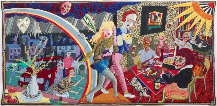
Pack contents:                               Page

How to use this pack                         2

The Arts Council Collection                  3

Background to the exhibition                 4

Grayson Perry biography                      8

The six tapestries                           12

Looking at the tapestries                    26

Themes and project ideas                     28

Additional essays
      Grayson Perry                          44
      Suzanne Moore                          49
      Adam Lowe                              53

Further reading and sources of information   56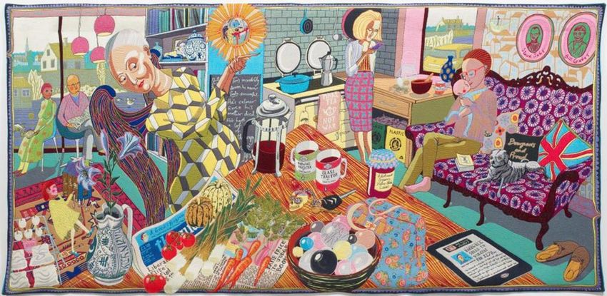
How to use this pack
This pack is designed for use by teachers and other educators including gallery education
staff. As well as providing background information about Grayson Perry and the creation
of the tapestries, the pack explores the tapestries through a number of different themes
inspired by the work, offering ideas for educational projects and activities. The tapestries
provide particularly rich inspiration for learning in art, geography and citizenship. There are
also many links to literacy.
The activity suggestions are targeted primarily at Key Stage 2 and 3 pupils though could
be adapted for older and younger pupils. They may form part of a project before, during or
after a visit to see the tapestries. Ideas are informed by National Curriculum requirements
and Ofsted subject guidance. Much of the information in this pack will also be of relevance
to pupils at Key Stage 4. In particular, the essays included at the end of the pack provide
more detailed insights into the work that will of value to GCSE and ‘A’ levels students.
This research pack is intended as a private resource, to be used for internal educational
purposes only. As such, the images included within this pack are for internal use only
and may not be copied, distributed or used for any other purposes without appropriate
permissions being sought. To obtain Arts Council Collection images for other uses
please contact grace.beaumont@southbankcentre.co.uk.
This pack was commissioned by the Arts Council Collection, Southbank Centre and
was researched and written by Fiona Godfrey, Arts & Education Consultant
(www.fionagodfrey.org.uk).

                                                                                                  2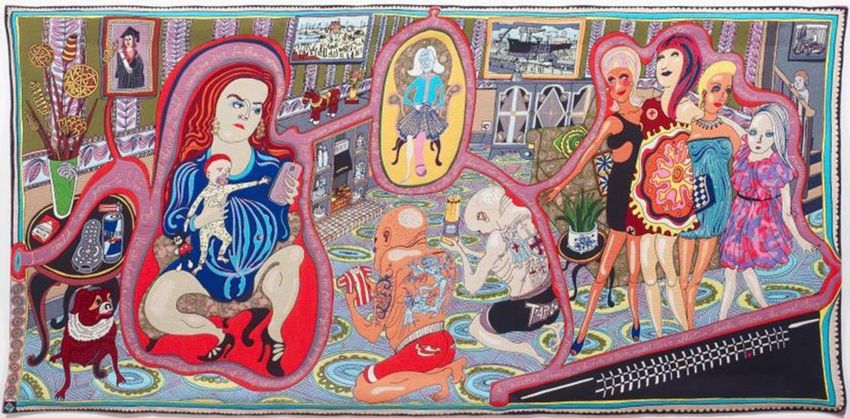
The Arts Council Collection
The Arts Council Collection supports artists in this country through the purchase and
display of their work. Since it was founded in 1946, the Collection’s acquisitions policy has
always been characterised by a spirit of risk taking combined with an informed appraisal of
current practice. As a consequence the Arts Council Collection is now the largest national
loan collection of modern and contemporary British art in the world, and includes fine
examples of work by all of this country’s most prominent artists. It is the most widely
circulated of all of Britain’s national collections and can be seen in exhibitions in museums
and galleries across the UK and abroad.

The Arts Council Collection is managed by the Southbank Centre, London, on behalf of
Arts Council England and has a base in London and at Longside, Yorkshire Sculpture
Park. The base at Longside enables the Arts Council Collection team to extend its
sculpture conservation and research programmes and to increase public access to the
sculpture collection through increased lending and exhibition initiatives. A diverse and
stimulating range of exhibitions from the Collection, including displays of some of the most
recent acquisitions, can be seen in the adjacent Longside Gallery.

Visit www.artscouncilcollection.org.uk to find out more about us, to search our
entire holdings online, or to make your own selection from the Collection.

Follow the Arts Council Collection on social media:
Twitter: A_C_Collection
Instagram: artscouncilcollection

                                                                                                3
Background to the exhibition
The six tapestries in the exhibition The Vanity of Small Differences came about as a result
of Grayon Perry making a series of documentaries with Channel 4 called All in the Best
Possible Taste; screened in summer 2012. Perry had worked previously with the director
Neil Crombie and the idea formed as result of discussions between them, as described by
Perry:

‘We’d been talking about making a series of TV programmes about taste and it seemed
sensible for some art works to come out of the series. We were wondering what sort of art
works would be fitting. Pots would have seemed a rather small-scale outcome; whereas
tapestries, being large, could work on a public scale. We could produce a series that would
fit with the number of programmes we were planning – 3 social classes, 3 programmes, 6
tapestries. Also, compared with pots, tapestries are actually relatively quick to produce.’

The three Channel 4 programmes followed Perry as he investigated the taste of those
traditionally considered working class, middle class and upper class. Perry’s investigations
involved him visiting working class communities in Sunderland, middle class communities in
Tunbridge Wells and upper class families living in grand homes in the Cotswolds.

Perry’s particular interest was in the emotional attachments we make to objects, and how
the judgments we make about our own and other peoples’ taste are often delineated along
class lines. In order to gather material, he spent time in the company of different groups;
interviewing them, photographing them and making sketchbook drawings and notes. In
each of the three locations he gained further insights by dressing up as a woman of the
class group he was visiting.

In Sunderland, he was curious to investigate aspects of working class taste that are
sometimes deemed ‘tacky’ or ‘tasteless’. He observed the pleasure that women took in
dressing up for a night out on the town, and the enjoyment the young men took in
displaying their cars. He noticed how these displays create an almost tribal sense of
belonging. He discovered how much emotional affection people have for the objects in their
homes and he also saw an enduring and nostalgic allegiance to the industries that had
given the town a sense of unity in the past.

In middle class Tunbridge Wells Perry discovered two distinct ‘taste tribes’. The first group
he spent time with was the new affluent middle class whose homes were filled with signs of
wealth. Here the emphasis was often on owning brand new, designer things. People in this
group seemed concerned to fit in by surrounding themselves with objects that conformed to
a social norm typified by smartness and newness. In contrast, the second middle class
group Perry identified gravitated more towards the individual; surrounding themselves with
all things vintage, shabby-chic, hand-made and organic. He sensed among this group a
desire to be individual; yet this individuality still had to fit within a particular set of norms.
Among this group he noticed a lot of anxiety about health and the environment.
He also noted that the second group placed more value on owning books than the first
group.

Among the upper class estates in the Cotswolds, Perry found a sense of poverty and
decay. This was a group of people who seemed content to live with the shabbiness of

                                                                                                 4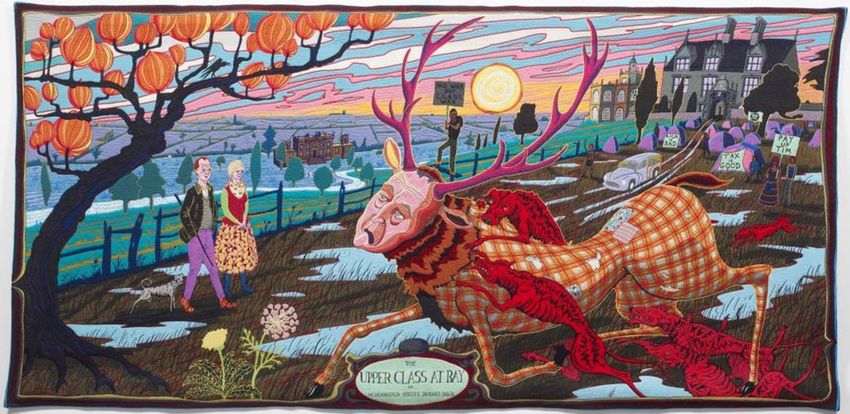
antiquity. Here he met families burdened by their assets; crippled by taxes and lacking the
money needed to stop the decay of their buildings or to lavish on their own comforts. He
sensed the huge weight of responsibility bestowed on this class by their inheritance. He
also met those determined to find new ways to bring new life, creativity and investment to
the historic buildings and countryside in their ownership.

The photographs and drawings that Perry made as a result of these investigations were
amalgamated into a series of compositions.

Each of these six compositions was then interpreted as a tapestry; designed on Photoshop
and then woven by computer operated machinery at the Flanders Tapestries in Belgium.
The labour of making the tapestries was in the designing, with Perry taking around two
weeks to turn his drawings into compositions. It then took three months to adapt his
computer files, and programme the computers that control the looms. Yarns had to be
specially sourced and dyed to carefully match the colours in Perry’s drawing. Different yarn
combinations had to be trialled to ensure a good colour match. Threading a loom ready for
weaving took about 4 days. With the design finalised, the actual process of weaving each
tapestry then took about 5 hours. Several copies of each tapestry were produced; each run
of the same design is known as an ‘edition’. An edition of six was produced of each design,
                                                                                              5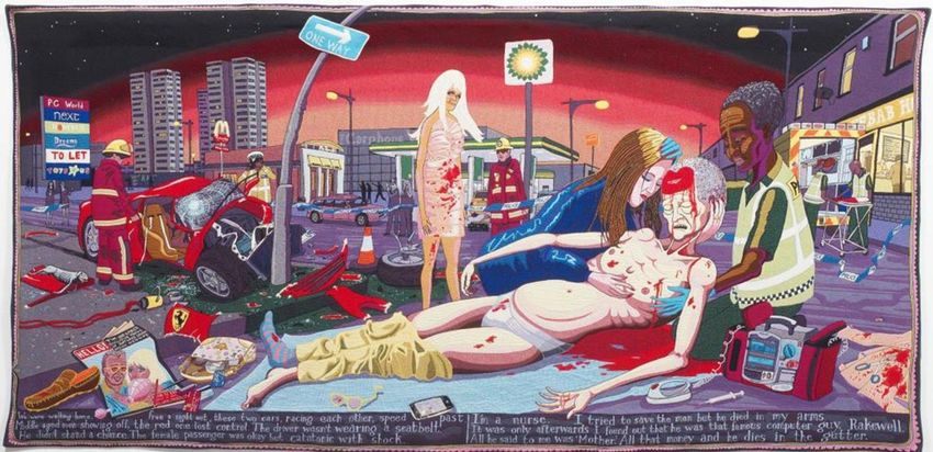
plus two trials, known as ‘artist’s proofs’.

Perry’s decision to immortalise his visits and observations in a series of tapestries was
partly inspired by the history of tapestry making as a traditional means of recording stories,
as well as by their associations with wealth and grandeur. Interviewed for Channel 4, Perry
said:

‘Why tapestries? I always work with traditional media. Each historic category of object has
accrued over time intellectual and emotional baggage. I depend on this to add inflection to
the content of the works. Tapestry is the art form of grand houses. On my television taste
safari I only saw tapestries hanging in stately homes. They depicted classical myths,
historical and religious scenes or epic battles like Hannibal crossing the Alps. I enjoy the
idea of using this costly and ancient medium to show the commonplace dramas of modern
British life.’1

Perry’s six tapestries tell a story of twenty-first century social mobility. In them we see Tim
Rakewell; a man rising from a working class birth, making money, marrying into the middle
classes, experiencing the crippling financial burdens of the upper classes, and finally dying
an untimely death.

Perry’s tapestries make direct reference to the series of paintings called A Rake’s Progress
by William Hogarth (1697-1764), which hang in the John Soane Museum in London.
Hogarth has long been an influence on Perry’s work. The eight paintings in Hogarth’s
series tell the story of Tom Rakewell, a young man who inherits a fortune from his father
and who thenceforth goes on to squander his inheritance on fashionable pursuits. Tom
marries for money, gambles away his second fortune, is imprisoned for his debts and finally
ends his life in ‘the madhouse’.

1
 http://www.channel4.com/programmes/in-the-best-possible-taste-grayson-perry/articles/the-vanity-of-small-
differences

                                                                                                             6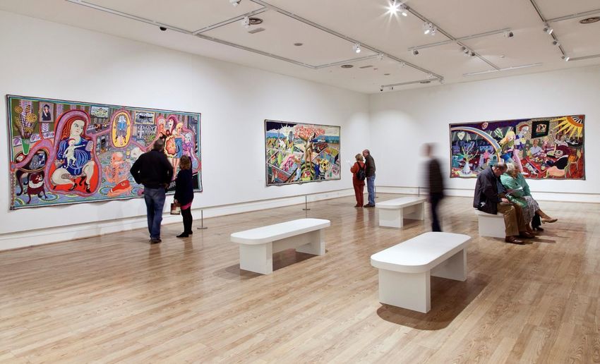
Hogarth, William
                                                   A Rake’s Progress IV: The Arrested, Going to Court
                                                   (1733)
                                                   Courtesy of the Trustees of Sir John Soane's Museum,
                                                   London / The Bridgeman Art Library

The tapestries also pay homage to early Renaissance painting; another favourite art form of
Perry’s.

For those interested in more detailed commentary and analysis, the essays at the end of
the pack provide further insight into Perry’s investigations, reflections and working
processes.

The Vanity of Small Differences is owned by the Arts Council Collection, Southbank Centre
and the British Council Collection. It is a gift of the artist and Victoria Miro Gallery with the
support of Channel 4 Television, the Art Fund and Sfumato Foundation with additional
support from Alix Partners.

                                                                                                          7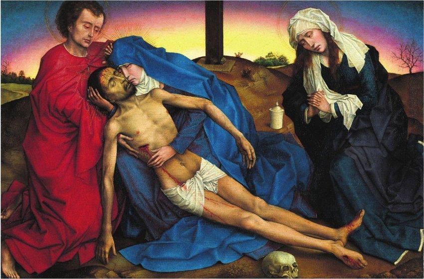
Grayson Perry biography
Grayson Perry came to public attention when he won the Turner Prize in 2003. He was
born into a working class family in 1960, and spent the first years of his life in Chelmsford,
Essex, attending Broomfield Primary School. When he was five his father left home, leaving
his mother to marry the milkman with whom she had been having an affair. They had two
more children, a boy and a girl. At this point Perry’s father disappeared out of his life. When
he was eight he moved with his mother and stepfather to the village of Bicknacre and he
changed schools to Woodham Ferres C of E Primary.

Perry’s secondary schooling was at King Edward VI Grammar School in Chelmsford.
During this time, the family moved again to a new house built by his stepfather in Great
Bardfield. Shortly after this, Perry renewed contact with his father, at which his mother
threw him out, insisting he go and live with him. Unfortunately this didn’t work out either,
and he returned to his mother and stepfather’s until he was 18. He joined the Art
Foundation course at Braintree FE College and then applied for a BA in Fine Art at
Portsmouth Polytechnic, believing he was unlikely to be accepted by the top London art
collages. He left with a 2:1 degree in 1982. During these years, he was welcome at neither
his mother nor his father’s homes and spent much of his holidays living in squats in
Portsmouth and London, getting involved in a life where creativity pervaded all aspects of
existence, from conversations to parties, dress and décor.

Perry talks openly about how the difficult times of his childhood and how these experiences
have fed into his work. His stepfather created a world of violence and fear and Perry’s
survival tactic was to retreat into an imaginary world of play; a world of island kingdoms,
wars and rebellion, in which the central hero was his teddy bear Alan Measles. (Alan
Measles now has his own website and twitter account.) In this world, Perry’s creative spirit
flourished as inventor, maker and designer – of guns, planes, cranes and vehicles.
Between the ages of five and fifteen, this became Perry’s place of refuge from the unstable
and sometimes violent world of his family. He also discovered his ability to represent this
world through his skills in drawing. Another influence on Perry’s creativity was the early
memory of his father’s shed. This was a world of cobbled together cupboards and drawers;
with mismatched drawer knobs, improvised tools and a colourful wall where his father tried
out different paints. In his autobiography, Perry describes how these experiences shaped
his appreciation and enjoyment of his own creativity.

‘My own creativity and art practice has been a mental shed – a sanctuary as well as a place
of action – where I’ve retreated to make things. It gives me a sense of security in a safe
enclosed space while I look out of the window onto the world.’2

When he about eleven, Perry began to become aware of his enjoyment of women’s clothes
and discovered the thrill inherent in dressing up. He has become almost as well-known for
his sub-personality Claire as for himself, as he often publicly dresses as Claire in
outrageously girly costumes and frocks. This discovery was somewhat at odds with his
more conventional teenage interests in model aeroplanes, motorbikes, punk music and

2
    Jones, Wendy Grayson Perry, Portrait of the Artist as a Young Girl, Vintage 2007 p23

                                                                                               8
girls. For a while he wanted to train as an army officer. Instead he was encouraged to
pursue his abilities in art.
Another influence on Perry’s work during his time at art college was the work of so called
‘outsider’ artists. An exhibition called Outsiders was shown at the Hayward Gallery in 1979.
The exhibition comprised pictures and sculptures by people with no formal art training;
many living on the fringes of society. Perry saw the exhibition and was particularly drawn to
the work of Henry Darger; a reclusive eccentric, much of whose childhood had been spent
in a psychiatric hospital. Perry describes the influence of Darger on his work.
Henry Darger (1892-1973)
Untitled (Idyllic landscape with children)
Watercolour, pencil, carbon tracing and collage on pieced paper
24 x 106 ½ ‘’
Collection American Folk Museum, New York
Museum purchase with funds generously provided by John and Margaret Robson, 2004
© Kiyoko Lerner
Photo by James Prinz
‘Darger is the artist I identify with most in terms of his creative pathways. I feel a kindred
spirit with how his imagination worked, the way he sought refuge in a fantasy world in the
same way that I secreted my imagination and artistic practice into a shed where I retreated
to do my work in an enclosed, secure environment while observing the world. I see in Henry
Darger’s work that the real world was too painful to bear, so he made an alternative.’3
Perry’s first experience of success as an artist came in 1980, at the end of his first year at
art college, when he made a small sculpture that appeared something like a gutted fish or a
boat, with a wigwam roof. This was accepted for an annual exhibition of art student work
organised by the Institute of Contemporary Arts called The New Contemporaries.
On leaving art college, Perry moved back to a squat in London with fellow students from
Portsmouth, living on the dole and supplementing this income by life-modelling. During this
time he became involved with a group called the Neo-Naturists, who staged anarchistic
nude performance art events, revisiting the spirit of nudism that had been alive in the
1960s. During this time, Perry remained committed to becoming an artist, and had been
continuing to make small sculptures from junk as well as filling sketchbooks with detailed
collages.
3
ibid, p.126
9‘The collages’ obsessive detail, busyness and horror vacui4 set the tone for the work I make
now: even it is a pot that doesn’t have detail on it has to have a texture; it has to have
marbling or crackle. I find it difficult to leave empty space, my instinct is to cover up
emptiness and always elaborate, to my detriment sometimes. It’s part of my psychological
make-up that I’m a detail freak.’5
In 1982, Perry decided to join a pottery class, and took great delight in the skills, techniques
and possibilities of ceramics, as well as discovering a wealth of examples of decorative
pottery, such as in the V&A museum, including slipware. Perry’s work at this time was
provocative and angry; sculptural pieces incorporating bits of broken pottery and glass. This
work was shown in a mixed exhibition in a little gallery opposite the British Museum.
It wasn’t until the 1990s that Perry really began to realise that pottery was his métier. He
had thought that the glamorous world of film-making might be more in keeping with his
lifestyle. However, part of the attraction of pottery for Perry was its low status as an art
form and also its British wholesomeness, against which he could play with being
provocative. Pottery also has wide associations in folk art and is a form on which stories
have often traditionally been told, as in for example the vases of Ancient Greece.
His work developed into making the large pots for which he is perhaps best known, and
which sell for many thousands of pounds. These are one-off pieces, often on large scale,
hand built with the traditional method of coiling. He uses colourful glazes and underglaze
colours, lustres and photographic transfers to decorate his pots with motifs and figures that
often suggest narratives, maps and family trees. These symbolic combinations often sum
up experiences of the absurdity, curiosity and pain of everyday human experience. He
describes in his autobiography how he never likes to do trials. Trials take place on the pot
itself, maybe in a new combination of colours, glazes and transfers. He often ‘bodges’ with
gold lustre when something goes wrong. He sees ‘bodging’ as part of being human.
Grayson Perry
Spirit Jar, 1994
Earthenware
45.7 x 20.3cm
Arts Council Collection, Southbank Centre, London
© the artist
4
A term used in art to denote the filling of an entire space with detail, from the Latin meaning ‘fear of the
empty’.
10
5
Ibid, p183Though pottery continues to play a central role in Perry’s work, he also makes work using a
wide range of other art forms including printmaking, film and embroidery. His first work
using tapestry was in 2009. The Walthamstow Tapestry is a detailed depiction of modern
day life, including hundreds of familiar brand names.
Grayson Perry
The Walthamstow Tapestry, 2009
wool and cotton tapestry
300 x 1500 cm
Courtesy the Artist and Victoria Miro, London
© the artist
Perry’s first solo exhibition was in Amsterdam in 2002, followed by a solo show at the
Barbican in London in the same year. He has also had solo shows in Pittsburgh (2006),
Japan (2007) and Luxembourg (2008). In 2008, Perry curated the exhibition Unpopular
Culture, selecting works from the Arts Council Collection. In 2011, he curated the exhibition
The Tomb of the Unknown Craftsman at the British Museum. This combined Perry’s own
work in pottery, textiles and sculpture with objects by unknown craftsmen and women from
the museum’s collection. In the same year, he was elected a member of the Royal
Academy of the Arts.
Perry lives in London with his wife Phillippa and their daughter Florence, as well as
spending some of his time near Eastbourne where he has a cottage and studio.
11The six tapestries
This section provides detailed information on each of the tapestries, along with explanations
of the art works that inspired them. The quotations in italics are Grayson Perry’s own
descriptions.
All the tapestries measure 200 x 400 cm. All works are reproduced courtesy Arts Council
Collection, Southbank Centre London and British Council Collection. Gift of the artist and
Victoria Miro Gallery with the support of Channel 4 Television, The Art Fund and Sfunato
Foundation with additional support from Alix Partners. All photographs copyright Grayson
Perry.
Grayson Perry
The Vanity of Small Differences (installation view)
Sunderland Art Gallery, 2013
12The Adoration of the Cage Fighters
Grayson Perry
The Adoration of the Cage Fighters, 2012
Wool, cotton, acrylic, polyester and silk tapestry
200 × 400
One from edition of six plus two artist’s proofs
‘The scene is Tim’s great-grandmother’s front room. The infant Tim reaches for his mother’s
smartphone – his rival for her attention. She is dressed up, ready for a night out with her
four friends, who have perhaps already ‘been on the pre-lash’. Two ‘Mixed Martial Arts’
enthusiasts present icons of tribal identity to the infant: a Sunderland A.F.C. football shirt
and a miner’s lamp. In the manner of early Christian painting, Tim appears a second time in
the work: on the stairs, as a four-year-old, facing another evening alone in front of a screen.
Although this series of images developed very organically, with little consistent method, the
religious reference was here from the start: I hear the echo of paintings such as Andrea
Mantegna’s The Adoration of the Shepherds (c. 1450).’
13Text (in the voice of Tim’s Mother): ‘I could have gone to Uni, but I did the best I could,
considering his father upped and left. He (Tim) was always a clever little boy, he knows how
to wind me up. My mother liked a drink, my father liked one too. Ex miner a real man, open
with his love, and his anger. My Nan though is the salt of the earth, the boy loves her. She
spent her whole life looking after others. There are no jobs round here anymore, just the
gym and the football. A normal family, a divorce or two, mental illness, addiction, domestic
violence… the usual thing…. My friends they keep me sane… take me out… listen… a
night out of the weekend in town is a precious ritual.’
Historical art references
Perry’s composition was inspired by Mantegna’s painting The Adoration of the Shepherds.
Mantegna was an early prodigy of the Italian Renaissance, and this painting was made
when he was only in his early twenties. Artists at the time were just working out how to use
perspective to create a sense of distance. Although the perspective is flawed in some
places (for example the bars on the building) we can see Mantegna experimenting with and
demonstrating his skills. He also shows off his skills by foreshortening the figure of the
infant Christ. He uses architectural detail in the foreground to show closeness and a
carefully detailed landscape to show distance. The way the scene in shown is typical of a
trend at the time that encouraged worshippers to think about biblical scenes in everyday
terms. Hence shepherds are tatty in dress and ugly in appearance. The way he depicts the
holy family also shows his love of the ‘classical’6 art of the Ancient Greeks, who had been
interested in the ideals of human beauty, excellence and architectural perfection.
Andrea Mantegna (c.1430 - 1506)
The Adoration of the Shepherds, c.1450
Tempera on canvas, transferred from wood
Metropolitan Museum of Art, New York
© The Metropolitan Museum of Art/ Art
Resource/Scala, Florence
In the scene, Mary worships her new-born, while Joseph sleeps in the left of the painting.
The bare tree that stands out above the shepherds in the right of the painting perhaps
suggest the cross on which Jesus’ life will end. The orchard on the left has been read to
symbolise Mary’s fertility.
6
The description ‘classical’ come from the Latin word ‘classis’ which means of a superior class.
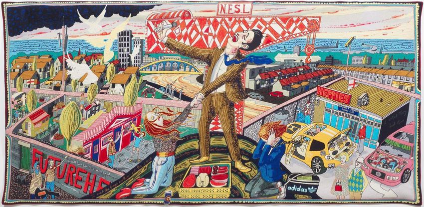
14The Agony in the Car Park
Grayson Perry
The Agony in the Car Park 2012
Wool, cotton, acrylic, polyester and silk tapestry
One from edition of six plus two artist’s proofs
‘This image is a distant relative of Giovanni Bellini’s The Agony in the Garden (c. 1465).
The scene is a hill outside Sunderland – in the distance is the Stadium of Light. The central
figure, Tim’s stepfather, a club singer, hints at Matthias Grünewald’s Isenheim Altarpiece. A
child-like shipyard crane stands in for the crucifix, with Tim’s mother as Mary – once again
in the throes of an earthly passion. Tim, in grammar school uniform, blocks his ears,
squirming in embarrassment. A computer magazine sticks out of his bag, betraying his
early enthusiasm for software. To the left, a younger Tim plays happily with his step-
grandfather outside his pigeon cree on the allotments. To the right, young men with their
customised cars gather in the car park of ‘Heppie’s’ social club. Mrs T and the call centre
manager await a new recruit into the middle class.
Text (in the voice of the Tim’s stepfather): ‘I started as a lad in the shipyards. I followed in
my father’s footsteps. Now Dad has his pigeons and he loves the boy [Tim]. Shipbuilding
bound the town together like a religion. When Thatcher closed the yards down it ripped the
heart out of the community. I could have been in a rock band [above graffiti of Sunderland
band The Futureheads]. I met the boys’ mother at the club. I sing on a Saturday night
between the bingo and the meat raffle. Now I work in a call centre, the boss says I am
management material. The money’s good, I could buy my council house, sell it and get out.
I voted Tory last time.’
15Historical art references
This is Bellini’s painting from which Perry took his inspiration. Brother-in-law to Mantegna,
Giovanni Bellini was also an Italian artist who worked in Venice from around 1459 onwards
and who continued painting until not long before he died in 1516. One of the most
important Venetian artists, Giovanni Bellini came from a family of artists and was admired
for his sensitive paintings of the Virgin. He and Mantegna both painted versions of the
Agony in the Garden, and it has been suggested that they both worked from a drawing by
Bellini’s father Jacobo, who was also an artist.
Giovanni Bellini (c.1430 - 1516)
The Agony in the Garden, c.1465
Tempera on panel
National Gallery, London UK / The
Bridgman Art Library
The painting portrays Christ kneeling in prayer on the Mount of Olives, knowing of his
impending arrest and crucifixion, while Judas and the soldiers approach across the distant
landscape. An angel appears in the sky, holding a cup, as a symbol of strength and
comfort. Although the central focus of the painting is Christ on the rock, the white Italian city
at the left of the picture is also a focus, perhaps suggesting the heavenly city. Meanwhile
beneath this heavenly scene, the more earthly disciples Peter, James and John sleep close
by with all their human flaws; too tired to stay awake. Bellini was particularly skilled at
depicting the effect of light, and the dawn light creates an unearthly atmosphere, which
creates a more hopeful effect that in Mantegna’s harsher version.
16Expulsion from Number 8 Eden Close
Grayson Perry
Expulsion from Number 8 Eden Close 2012
Wool, cotton, acrylic, polyester and silk tapestry
One from edition of six plus two artist’s proofs
‘Tim is at university studying computer science, and is going steady with a nice girl from
Tunbridge Wells. To the left, we see Tim’s mother and stepfather, who now live on a private
development and own a luxury car. She hoovers the AstroTurf lawn, he returns from a
game of golf. There has been an argument and Tim and his girlfriend are leaving. They
pass through a rainbow, while Jamie Oliver, the god of social mobility, looks down. They
are guilty of a sin, just like Adam and Eve in Masaccio’s The Expulsion from the Garden of
Eden (c. 1425). To the right, a dinner party is just starting. Tim’s girlfriend’s parents and
fellow guests toast the new arrival.’
Text (in the voice of Tim’s girlfriend):
‘I met Tim at College, he was Such a Geek. He took me back to meet his mother and
Stepfather. Their house was so clean and Tidy, not a speck of dust... or a book, apart from
her god, Jamie. She Says I have turned Tim into a Snob. His parents don’t appreciate how
bright he is. My father laughed at Tim’s accent but welcomed him onto the sunlit uplands of
the middle classes. I hope Tim loses his obsession with money.’
Historical art references
In figures of Tim and his girlfriend, Perry make’s direct reference to Masaccio’s painting
Adam and Eve banished from Paradise. Masaccio was another early Renaissance artist
who only lived to the age of 27. The name Masaccio is a nickname meaning ‘hulking Tom’.
17During his short life, his particular interest was in the mastery of the human figure, creating
the effect of solidity through the use of light and shade.
Tommaso Masaccio (1401 – 1428)
Expulsion for the Garden of Eden, c.1425
Fresco (post restoration) Brancacci Chapel, Santa Maria del
Carmine, Florence /
The Bridgeman Art Library
These frescoes of the Brancacci Chapel in Florence, painted with Masolino in the mid-
1420s, are considered to be his masterpiece. In this fresco, Adam and Eve are expelled
from the Garden of Eden, having tasted the fruit they were forbidden to eat. Above them
hovers an angel pointing to the outside world. Eve clearly experiences grief as well as
shame at her nudity, while Adam covers his face in remorse. Masaccio’s work typified a
new movement in art at the time, from rather static depictions of human figures to a greater
emphasis on emotion, expression and muscularity.
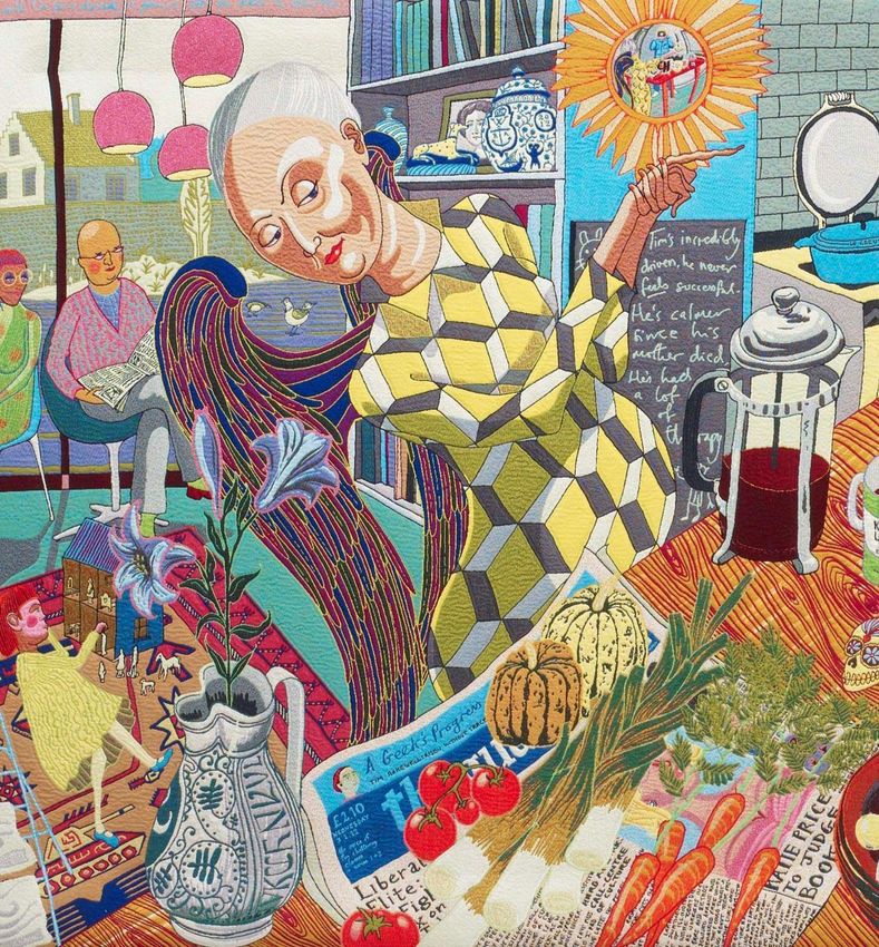
18The Annunciation of the Virgin Deal
Grayson Perry
The Annunciation of the Virgin Deal 2012
Wool, cotton, acrylic, polyester and silk tapestry
One from edition of six plus two artist’s proofs
‘Tim is relaxing with his family in the kitchen of his large, rural (second) home. His business
partner has just told him that he is now an extremely wealthy man, as they have sold their
software business to Richard Branson. On the table is a still life demonstrating the cultural
bounty of his affluent lifestyle. To the left, his parents-in-law read, and his elder child plays
on the rug. To the right, Tim dandles his baby while his wife tweets. This image includes
references to three different paintings of the Annunciation by Carlo Crivelli (the vegetables)
Matthias Grünewald (his colleague’s expression) and Robert Campin (the jug of lilies). The
convex mirror and discarded shoes are reminders of that great pictorial display of wealth
and status, The Arnolfini Portrait (1434) by Jan van Eyck.’
[Text (in the voice of Tim’s business partner):
‘I have worked with Tim for a decade, a genius, yet so down to earth. Tim’s incredibly
driven, he never feels successful. He’s calmer since his mother died. He’s had a lot of
therapy. He wants to be good.’
(on copy of The Guardian used to wrap organic vegetables): ‘A Geek’s Progress, Tim
Rakewell: risen without trace’
(on iPad): ‘Rakewell sells to Virgin for £270m’]
19Historical art references
In this tapestry, Perry makes reference to the famous Arnolfini Marriage by Jan van Eyck,
which makes a conscious display of wealth. The mirror and the chandelier are centrally
placed, and attention is given to the rich fabrics in which the couple are dressed. Oranges
(under the window) were a very expensive and prized fruit at the time. The small dog is a
symbol of loyalty, and its rare breed (an Affenpinscher) also suggests wealth. The text
above the mirror literally translates from Latin as ‘Jan Van Eyck was here’, which also links
to Grayson Perry’s use of text in the tapestries.
Jan van Eyck (c.1390 - 1441)
The Portrait of Giovanni (?) / Arnolfini and his Wife Giovanna
Cenami (?)/
(The Arnolfini Marriage), 1434
Oil on panel
National Gallery, London, UK / The Bridgeman Art Library
In this tapestry Perry also makes reference to three different paintings of the Annunication.
His inclusion of fruit and vegetables references this detail from Carlo Crivelli’s painting on
this theme.
(detail)
Carlo Crivelli (1430/5 - c.1494)
The Annunciation, with Saint Emidius, 1486
Tempera and oil on canvas
The National Gallery, London / The Bridgeman Art Library
The expression on the face of Tim’s colleague is influenced by Matthias Grűnewald’s
Painting of the Annunciation. The painting is one panel of twelve that made up an alterpiece
that hung in the monastery of St Anthony in Isenheim. The outer wings of the altarpiece
20were opened for important festivals, and the Annunciation is on the left wing. In it, the virgin
is shown in a chapel, reflecting the sacred nature of the event.
(Detail)
Mathias Grűneweld (1475 - 1528)
The Annunciation
Detail from the Isenheim Altarpiece, c1515
Oil on panel
De Agostini Picture Library / The Bridgeman Art Library
The jug of lilies makes reference to Robert Crampin’s version of the Annunciation. Many of
the objects in his painting were chosen for their symbolism. Here, the lilies in the ceramic
jug represent Mary’s virginity.
(Detail)
Master of Flemalle, identified as Robert Campin (1375-
1444)
Central panel of Annunciation Triptych (Merode Altarpiece),
1425
Oil on panel
De Agostini Picture Library / The Bridgeman Art Library
21The Upper Class at Bay
Grayson Perry
The Upper Class at Bay 2012
Wool, cotton, acrylic, polyester and silk tapestry
One from edition of six plus two artist’s proofs
‘Tim Rakewell and his wife are now in their late forties and their children are grown. They
stroll, like Mr And Mrs Andrews in Thomas Gainsborough’s famous portrait of the landed
gentry (c. 1750), in the grounds of their mansion in the Cotswolds. They are new money;
they can never become upper-class in their lifetime. In the light of the sunset, they watch
the old aristocratic stag with its tattered tweed hide being hunted down by the dogs of tax,
social change, upkeep and fuel bills. The old land-owning breed is dying out. Tim has his
own problems; as a ‘fat cat’ he has attracted the ire of an ‘Occupy’-style protest movement,
who camp outside his house. The protester silhouetted between the stag’s antlers refers to
paintings of the vision of Saint Hubert, who converted on seeing a vision of a crucifix above
the head of a stag.’
Historical art references
In The Upper Class at Bay Tim Rakewell and his wife stroll like Mr and Mrs Andrews in
Gainsborough’s famous painting Mr and Mrs Andrews. Painted soon after the Andrews’
marriage, Gainsborough shows the couple at Auberies, their estate on the Suffolk-Essex
boarder, near Gainsborough’s native Sudbury. It is a conversation piece, a genre
fashionable in the eighteenth century, showing groups of people in a rural or domestic
setting. The large area of meadows and rolling hills on the right allowed Gainsborough to
demonstrate his skill as a landscape painter, which was unusual at the time. Mrs Andrews
22sits on an elaborate bench and it has been suggested that the unfinished section of her lap
might have been intended for a child. Behind the couple stands an oak tree, a symbol of
stability and continuity, and, to their left, sheaves of corn, a symbol of fertility. Gainsborough
was, with Reynolds, the leading portrait painter in eighteenth-century England. This is an
early work, executed before he developed his later more feathery brushwork.
Thomas Gainsborough
(1727 - 88)
Mr and Mrs Andrews, c.1748-9
Oil on canvas
National Gallery, London, UK /
The Bridgeman Art Library
23Lamentation
Grayson Perry
Lamentation 2012
Wool, cotton, acrylic, polyester and silk tapestry
One from edition of six plus two artist’s proofs
‘The scene is the aftermath of a car accident at an intersection near a retail park. Tim lies
dead in the arms of a stranger. His glamorous second wife stands stunned and
bloodstained amidst the wreckage of his Ferrari. To the right, paramedics prepare to
remove his body. To the left, police and firemen record and clear the crash scene.
Onlookers take photos on their camera phones to upload to the internet. His dog lays dead.
The contents of his wife’s expensive handbag spill out over a copy of Hello magazine that
features her and Tim on the cover. At the bottom of Rogier van der Weyden’s Lamentation
(c. 1441), the painting that inspired this image, is a skull; I have substituted it with a
smashed smartphone. This scene also echoes the final painting of Hogarth’s A Rake’s
Progress, where Tom Rakewell dies naked in The Madhouse.’
[Text (in the voice of a female passer-by): ‘We were walking home from a night out, these
two cars, racing each other speed past. Middle aged men showing off, the red one lost
control. The driver wasn’t wearing a seatbelt. He didn’t stand a chance. The female
passenger was okay but catatonic with shock. I’m a nurse. I tried to save the man but he
died in my arms. It was only afterwards I found out that he was that famous computer guy,
Rakewell. All he said to me was “Mother”. All that money and he dies in the gutter.’]
Historical art references
Perry’s final tapestry Lamentation draws on Rogier Van Der Weyden’s painting of the same
name, painted around 1441. The Virgin Mary and John the Evangelist hold the body of the
24crucified Christ. Mary Magdalene looks on, also mourning. The skull in the foreground
reminds us that we are at Golgotha (which translates as ‘place of the skull’).
Rogier van der Weyden (c.1399-1464)
The Lamentation, c.1441
Oil on panel
Royal Museum of Fine Arts,
Brussels
Van der Weyden was apprenticed to Robert Campin and came to be renowned for the
pathos and naturalism he used in his portraits and religious subjects. Late medieval
religious art often depicted the humanity of Jesus in a way that was intended to evoke
empathy and understanding in the viewer, leading them to greater sense of devotion.
25Looking at the tapestries
When looking at the tapestries in the gallery, you may find these suggestions for general
discussion points and activities useful.
Discussion points
Use the sentence stem ‘I can see…’ to invite pupils to look really carefully into the
detail of each of the tapestries. Challenge pupils to keep finding more and more
detail. (This starting point is good for developing the powers of careful observation.)
Use the sentence stem ‘I feel…’ to invite pupils to share their emotional reactions to
one or more of the tapestries. (This starting point is good for encouraging pupils to
acknowledge their felt response and express their own responses.)
Use the sentence stem ‘I think… to invite pupils to share their ideas about the
tapestries. (This starting point is good for encouraging pupils to express their
opinions and ideas about art works and how and why they were made.)
Use the sentence stem ‘I wonder….’ to invite pupils to pose questions about the
tapestries. Support pupils by suggesting question words they could use such as
‘where…’, ‘how…’, ‘who…’, ‘why…’ etc. (This starting point is good for encouraging
curiosity and further research.)
Talk about the different classes represented in the six tapestries. Find out what
pupils themselves understand about class and discuss their own thoughts about the
taste of each class. What understanding do they have of different social classes?
What associations or prejudices do they have about with the three classes Perry
deals with in the tapestries?
Activity ideas
Ask pupils to go and stand by the tapestry they like the best. Ask them to respond to
the objects and environment in the tapestry in terms of what interests or appeals to
them. Pupils could make drawings in sketchbooks of the objects they are drawn to.
Observe how pupils group themselves. Invite each group to talk about and note
down what they like in the tapestry they’ve chosen. Do their choices link them in
some way? What words would they use to describe the world depicted in the
tapestry they’ve chosen?
Ask pupils to find and sketch all the different facial expressions that can be found in
the tapestries. Pupils could be asked to annotate these drawings with words
describing the emotions and / or the personalities of the people they’ve sketched.
Ask them to make speech bubbles and thought bubbles telling more of what they
think is going on in the minds of the people represented in the tapestries.
26 Ask pupils to choose one of the tapestries and create their own story idea from it. As
them to identify what style of story the tapestry might suggest. Get them to think
about title, characters and plot. They could be challenged to tell an improvised story
on the spot, or they could tell a story by going round the group and adding a
sentence each. Their story could be written in more detail back at school.
Pupils could be provided with postcards or prints of the historical art works that
Grayson Perry made reference to when designing the tapestries, including the
paintings from Hogarth’s A Rake’s Progress. Ask pupils to see if they can work out
which elements of each of these paintings Perry makes reference to in the
tapestries.
27Themes and project ideas
This section of the pack outlines some of the themes explored in the tapestries that might
be investigated further through classroom projects. Each section provides background
information and offers ideas for discussion points and activities.
Activity ideas are geared primarily at Key Stage 2 and 3 pupils.
The themes are as follows:
The tapestry making tradition
Objects, choices, tribes and belonging
The human figure - character and emotion
Places, local traditions and culture
Imaginary worlds and stories
27The tapestry making tradition
Curriculum links: art, design and technology, geography, history
Keywords: Ancient Greece, castles, textiles, The Tudors, weaving
Ideas to explore
Tapestry is a form of weaving. In a woven piece
of cloth, warp threads run top to bottom and weft
threads run horizontally. In many woven cloths,
the weft threads continue from one side of the
piece right across to the other edge, creating stripes
or checks. In a tapestry the threads fill blocks of
colour to create shapes and images. Tapestry
usually refers to a woven piece cloth in which this
method is used to create a picture.
Traditionally, tapestries were hand-woven on a loom. However, fabric pieces made by
embroidery have also, confusingly, been described as tapestries. For example, the famous
Bayeux tapestry was stitched onto a background fabric. Needlepoint is also often described
as tapestry. This is a technique where coloured yarns are used to stitch through a stiff open
weave fabric. There are clear similarities, in that the ‘under and over’ process of sewing is
very similar to the ‘under and over’ process of weaving. In needlepoint, the two are
perhaps at their most closely related.
The tradition of making tapestries can be traced back in time and across cultures.
Tapestries exist that date back hundreds of years, fragments having been found during the
excavation of Ancient Greek sites.
In Homer’s Odyssey, Penelope whiles away three years waiting for her husband
Odysseus’ return by weaving a burial shroud for her father-in-law Laertes. She agrees that
she will accept another suitor’s hand in marriage when her weaving is finished. To keep
these other suitors at bay, she undoes a little of the weaving each night.
29Tapestries were particularly popular in Tudor times. By the 16th century, Flanders had
become the centre of European tapestry production and it was here that tapestries were
woven for Henry VIII It was also Flemish weavers who had come to Norfolk in the 12 th
century and established the woollen industry there. The name comes from the French word
tapisser which means to cover or carpet. Many French tapestries followed the mille Fleur
tradition (literally meaning ‘a thousand flowers’); a stylistic convention in which the
background was carpeted in flowers.)
Mille fleur tapestry
Woven in wool and silk
Flanders region c.1500
Victoria and Albert Museum, London
One of the reasons that tapestries have been popular is that they can be taken down, rolled
up and carried around. Tapestries have been associated with castles and stately homes,
where they fulfilled a role both for decoration and insulation. In churches, tapestries were
brought out for special religious occasions. Traditionally, tapestries have been associated
with wealth. The tapestries that hung in Henry VII’s apartments at Hampton Court would
have cost about the same amount as a battleship to produce!
In the early 19th century, the French weaver Joseph Marie Jacquard first demonstrated his
mechanical loom, now known as a Jacquard loom. Grayson Perry’s tapestries were woven
on Jacquard looms by the company Flanders Tapestries. Traditionally, this loom operated
by a series of punched cards, each of which corresponded to a row of weaving. The holes
in the card would determine where hooks could penetrate to pick up the harness carrying
the weft thread. In this way blocks of colour could be created. The use of punched cards for
the Jacquard loom was instrumental in the early evolution of the computer! Modern
Jacquard looms are operated by computers. Compared to the laborious process of hand-
weaving, these work at incredible speed.
Discussion points
Invite pupils to talk about the textiles that can be seen around them. Which are
woven? What other ways are there of constructing textiles (eg knitting, crocheting
and felt-making)? Which are the most commonly found? Why do pupils think this is so?
Find out what pupils know about tapestry. Discuss where they’ve seen tapestries
and what they know about their history and how they’re made.
30Activity ideas
Pupils could research the history of tapestry (for example tapestries in Tudor times)
or the wool and weaving industry in the UK. They could create a presentation, for
example using PowerPoint. Alternatively pupils could undertake geographical
research into different tapestry traditions across the world and in different cultural
traditions.
Pupils could be invited to try different weaving techniques. Get them to time
themselves completing a given size, or measure how much weaving they’re able to
produce in a given time, say 15 minutes. Invite them to use their maths skills to
calculate roughly how long it would take them to produce a tapestry the size of
Grayson Perry’s.
Pupils could be invited to imagine that they live in a castle or stately home and asked
to design a tapestry to hang on a wall in their home. They could use felt tips for their
design (as Grayson Perry does) or collage to experiment with bold blocks of colour.
They could take inspiration from the mille fleur tradition. Invite them to look at their
designs from a distance as well as close up to assess their visual impact.
Pupils could explore how different coloured warp and weft threads can combine to
create new colours, in the style of a Jacquard weaving. This is a useful way to
explore colour mixing. Using for example coloured pencil, felt-tip pen or watercolour
paint, pupils could make sketchbook experiments combining warp and weft threads.
They could start with the same colour for the weft and then experiment with adding
different colours for the warp.
Pupils could be invited to create their own needlepoint designs by drawing with
coloured felt tip pen on binca and then use tapestry wools or embroidery silks to fill in
their design.
Pupils could create large scale tapestry designs by weaving into plastic mesh (such
as the sturdy plastic pond mesh available from hardware stores) using recycled
materials such as cut-up strips of coloured plastic bags. They could create a bold
coloured painted design first on paper using large brushes to use as a guide for
filling areas of their weaving.
Useful resources
Examples of different tapestries can be found in the V&A’s online collection at:
http://collections.vam.ac.uk/
31Objects, choices, tribes and belonging
Curriculum links Art, citizenship, geography, literacy, PSHE
Key words Class, fashion, portraits, taste, tribes
Ideas to explore
In his tapestries, Grayson Perry examines the different tribes to which we may belong and
how our choices in dress and possessions give us a sense of allegiance or kinship.
The first two tapestries denote working class taste. Women dress up for a night out, while
the men display their cars. People collect objects for their homes that have a sentimental
attachment for them. They enjoy making a statement and putting on a display.
The second two tapestries depict middle class taste. This class is divided in their cultural
choices. On the one hand there are those who enjoy buying smart houses and belongings,
belonging to the golf club and wearing designer clothes. For this group, there is an element
of conformity, of neatness and perfection. Then there’s another group; those who seek
individuality in the home-made, the vintage and the organic.
32The fifth and sixth tapestries in the series depict the taste of the upper classes. Often it
would seem, upper class taste is based on what is old and has been in the family for years.
Age old traditions and understated wealth count more than shows of ostentation.
Among all three classes, the objects people choose to have around them give them a
sense of belonging to a particular group or tribe. It seems that whether we choose to wear
the colours of a particular football team, drive a particular car or fill our kitchens with a
particular style of utensil, more often than not we are consciously or unconsciously
influenced by the particular tribe to which we feel we belong.
There are many examples in art history of portraits where the sitter is painted either in an
environment, or surrounded by objects, that tell the viewer something about their wealth,
status or interests.
There are also similarities with how different tribes around the world denote their
allegiances. There are traditions in many countries where tribal belonging is denoted by
particular forms of dress, jewellery, tattooing or scarring.
Discussion points
Pupils could be invited to discuss the choices they make in terms of the clothes,
décor and objects they surround themselves with. What objects do they cherish that
say something about who they are? Who influences their choices? Their friends?
Their family?
Pupils could explore their thoughts about what they consider fashionable and
desirable, or bad taste or undesirable? How do pupils think they have come to hold
these views? What influences their choices? Do they for example prefer old things
or new things? Is there agreement across the group? Do they respect difference or
hold a prejudiced view about other peoples’ taste?
33 Pupils could discuss their own experiences of feeling they belong to a group or of
being an outsider. Discuss how groups and gangs at school form their own sense of
belonging, perhaps through dress, language or behaviours.
Discuss with pupils the ethics of tribal marking. In Nigeria for example, children are
scarred at an early age to denote the tribe to which they belong. The Nigerian
government has made moves to outlaw the practice. What do pupils think about
outlawing ancient traditions? What views do pupils have about tattooing in our own
country?
Activity ideas
Pupils could be asked to paint a self-portrait wearing clothes and surrounded by
belongings that say something about them. They could look at Jan van Eyck’s
Arnolfini Marriage painting as a starting point and find out about the objects in
the picture that denote wealth and status.
Pupils could be asked to look at the still life tradition and put together a still life
arrangement of objects that mean something to them. They could work in groups to
agree on a selection of objects that says something about their life today. As a
sketchbook / homework pupils could be asked to draw objects in their home or
bedroom that they consider particularly special to them.
Pupils could be asked to bring in an object that has a particular value for them (such
as an old teddy bear or a special birthday present). They could draw their object and
write about the stories and associations that give this object value for them.
Pupils could research the tribal traditions of a particular country, including
contemporary and ancient practices. How do people across the world denote their
sense of belonging? They could work in groups focusing on different themes such as
dress, shoes, jewellery, body-markings or make-up.
Useful resources
Images of objects from different cultures can be found in the British Museum collections
database at:
http://www.britishmuseum.org/research/search_the_collection_database.aspx
34Depicting the human figure –
character and emotion
Curriculum links art, drama, literacy, PSHE, RE
Key words emotion, life drawing, human figure, narrative painting
Ideas to explore
In his tapestries Grayson Perry uses both posture and facial expression to capture the
mood, feelings and personality of the characters he depicts. An example is the club singer
depicted in The Agony in the Car Park, pouring out emotion in his song. To capture these
moments of feeling and drama, Perry worked from photographs of the people he met as
they went about their lives.
There is long history in art of artists attempting to capture emotion in their work. Perry
depicts a whole range of emotions; from love, affection and pride to nostalgia, anxiety,
horror and sorrow.
Some artists have focused on capturing human suffering. Many paintings in the Christian
tradition (including some of those that Perry was inspired by in designing the tapestries)
sought to help ordinary people get in touch with the suffering that Christ went through.
There are also many artists in more recent times who’ve attempted to capture feelings of
sadness and suffering. Think of Frieda Kahlo’s self-portraits which capture the physical pain
she endured, Edward Munch’s famous Scream, or Picasso’s Weeping Woman. Other artists
have sought to draw people’s attention to the suffering inflicted on humans by each other.
Examples are Goya’s depictions of war or the powerful drawings and woodcuts made by
German artist Käthe Kollwitz.
(Detail)
Masaccio, Tommaso (1401-28)
Expulsion for the Garden of Eden c.1427
Fresco Brancacci Chapel, Santa Maria del Carmine, Florence
The Bridgeman Art Library
35There are also many artists who have sought to capture the emotions of peace, love,
affection and joy. Good examples are Marc Chagall and Gustav Klimt, who often depicted
lovers. In the Christian tradition, there are many examples of art depicting religious feelings
such as saintliness, ecstasy and serenity. In the tradition of Russian socialist art,
expressions of contentment, happiness and pride were used as propaganda, in an attempt
to persuade people of the glories of living in the Soviet regime. We can think too about how
positive emotions are often depicted in advertising.
Discussion points
Discuss with pupils how good they think they are at judging people’s emotions. Can
they describe the facial changes that create different expressions and moods?
What emotions do pupils think they can identify in Perry’s tapestries? Discuss with
pupils the emotional stories and dynamics depicted in the tapestries. What details of
posture and facial expression create the impression of different emotional states?
Discuss with pupils the ethical issues that are raised when the depiction of emotions
are used to persuade people of a particularly viewpoint, as for example in
propaganda art and in advertising. How do these examples compare to the kind of
religious paintings that Perry has taken inspiration from in his tapestries?
Activity ideas
Using sketchbooks, pupils could be asked to make drawings of all the different facial
expressions in Perry’s tapestries and annotate these with notes about the feelings
represented. Ask them to use their process of drawing to try to work out how Perry
has created a particular expression.
You could invite pupils to look at the Grayson Perry tapestries and choose a single
character. You could ask them to use their imagination to write a written description
of this person, aided by the clues given in the tapestry.
Pupils could search the internet for examples of art works in which people are
depicted in a way that captures mood or personality. Pupils could also be invited to
collect examples of faces showing different emotions from newspapers and
magazines (the sports pages are great for this.) Using sketchbooks, pupils could
make drawings of each other or of themselves (using a mirror) to practice drawing
faces that show different emotions.
You could invite pupils to dress up as different characters and strike a pose that
captures something of the mood or personality of that character. Using a timer, invite
pupils to make quick, expressive drawings of each other that attempt to capture this.
Local churches usually contain all sorts of art works depicting different emotions (for
example pain, love, horror and adulation). You could use the idea of moods and
emotions as the focus for a visit to your local church. Take sketchbooks in order to
find and record all the different emotions depicted in for example carvings,
gargoyles, paintings and tapestries.
36You can also read