Typographic Dialogues: Local-Global - Typoday 2020
←
→
Page content transcription
If your browser does not render page correctly, please read the page content below

Typographic Dialogues: Local-Global
http://www.typoday.in

Tough Spots- A ‘Glocal’ Webcomic Of Subtle
Typographic Dialogue
Sayali Milind Phadke, University Of The Arts London (UAL), smp.phadke@gmail.com

Abstract: The art of story-telling in comic books, storyboards and graphic dialogue in
general has always been made more effective to audiences across local and global cultures
through the one element, which ties two visuals together- text! Across local and global
cultures it reacts, interjects, makes noise, supports the impact of a visual but at the same
time occupies the least visual weightage in each frame. Typography is seldom in the
limelight, being restricted to a certain point size, bound to a certain part of the frame,
trapped in traditional layout structures, which show frame-by-frame progression of the
typographic dialogue, allowing pictures and visuals to take over the responsibility of visual
appea. All in all, typography has been a very subtle and subdued element in the visual
storytelling of comics. However, currently when every single platform of typographic
dialogue right from the daily newspaper to printed books has reached digital screens, the
traditional local comics too have taken the form of webcomics to reach global cultures.
Despite the technological evolution, why is it then that the typographic dialogue of this
medium is still restricted to old structures of typography? For instance, basic minimum
point sizes for convenient legibility are no longer required as the zoom function exists on
screens. Frame-to-frame flow of typography can be avoided as one can ‘swipe’ through
multiple frames. Many such factors which previously were a mandate are now hardly
necessary. In fact, typography no longer needs to be a supporting element in visual
storytelling. Text is capable of continuing visual dialogue even in the absence of visuals.

Typography Day 2020                                                                             1
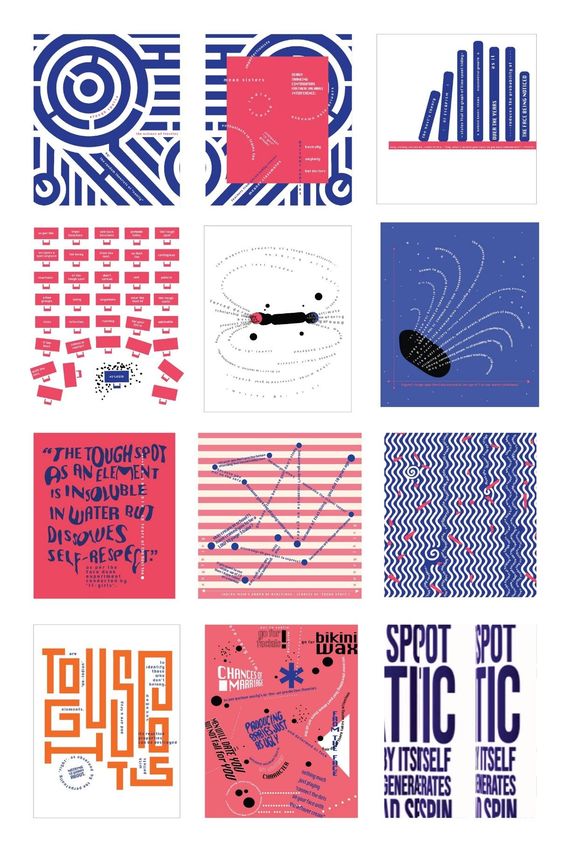
Like visuals, letters too are forms first. If letters are treated as forms instead of narrative
text, which supports visuals, globally relatable typographic dialogue can be achieved.
Thus, taking advantage of the global nature of typography and its ability to continue pure
typographic dialogue, I created a webcomic called ‘Tough Spots’ as an experiment to bring
linguistics and visual form together, breaking all the traditional rules of typographic
dialogue, for social media platforms. This paper discusses the emphasis on the idea of
creating a webcomic entirely made up of the narrative text, which is otherwise just a
supporting element, creating a ‘glocal’ (global+local) typographic dialogue. The webcomic
is based on ‘tough spots’, that is, a colloquial term for freckles, perceived to be a
deformity on the face. The design concept of subtle typography with experimental layout
structures was to visually convey how freckles and skin deformities are a subtle part of
one’s persona, but are dramaticized by the idealists of beauty. The typographic dialogue
in this project thus evolves from subtle to dramatic.
This paper also aims at demonstrating the power of using expressive, but non-literal word
pictures to subdue the visual harshness while portraying an otherwise hard-hitting subject
like social interference and appearance-shaming. The paper also brings to light the fact
that to be in focus, typography need not always be full of forced literal expression. Even
the subtle can be bold and expressive if one experiments with layout structures.

Key words: Typographic Evolution, Global Webcomics, ‘Glocal’, Text-Weightage,
Word Pictures, Experimental Layouts

1. Introduction
Comic books have been evolving in their form and tone. The dialogue of comic books has
always been inspired by the local and global cultures of those particular time periods. As
the cultural scenario across the globe evolved, the story-telling of comics didn’t just stay
restricted to standalone books, but also became a part of weekly magazines, daily
newspapers etc. From the images below we see a demonstrated history of how comics
from across cultures are inspired by the ‘current day’ scenarios of that period as well as
the culture of a place. One observes a paradigm shift in the way comics are designed.
However the typographic dialogue of comic books has remained unaffected by these
paradigm shifts in the design language of comics. Typography occupies the least visual
weightage in each frame probably because it existed in tangible publishing design, which
followed the conventional and less developed methods of printing. The observed
typographic dialogue of comics is very local and rarely global since different parts of the
world find different type orientation convenient and relate to different functions of
typographic dialogue. For example as seen in the images below, in German comics from

Typography Day 2020                                                                               2
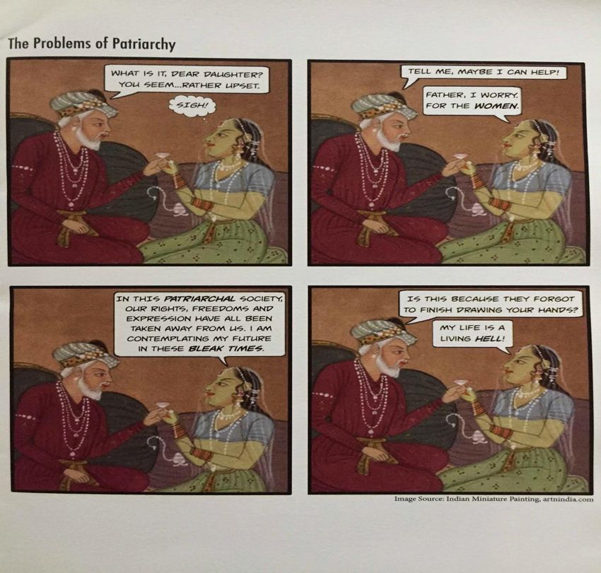
1935 to as late as the post-war period, the use of typographic dialogue is sparse- it is used
in the form of interjections, made bolder to indicate louder sound. Whereas in Indian
comics, each and every frame contains the typographic dialogue in a speech bubble in
most cases.

Figure.1 Example of story-telling through typographic intonation in political cartoon comic reel.

Figure.2 Example of typographic weightage in a comic book frame.

Typography Day 2020                                                                                 3
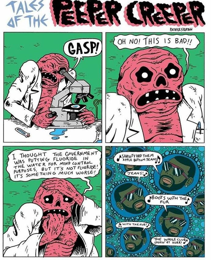
Figure.4 Example of typographic dialogue in German comic ‘Father and son’ by O.E. Plauen from
1935

Figure.5 Example of typographic dialogue in German comic ‘Nick The Spaceman’ by Hansrudi
Wascher, 1953

Typography Day 2020                                                                             4
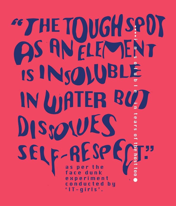
Figure.6 Example of typographic dialogue in an Indian comic ‘Amar Chitrakatha’ by Anant Pai, 1960

However, the developed printing methods today allow for a lot more flexibility and
experiments when it comes to typography. In fact, the application of typography is not
just in tangible prints, but in digital screens as well. The traditional comic takes the form
of a ‘webcomic.’ Despite the technological evolution, why is it then that the typographic
dialogue of webcomics is still restricted to old structures of typography? In the examples
below of popular webcomics in today’s era, we still see the old ‘comic-ness’ of
typographic dialogue.

Typography Day 2020                                                                                 5
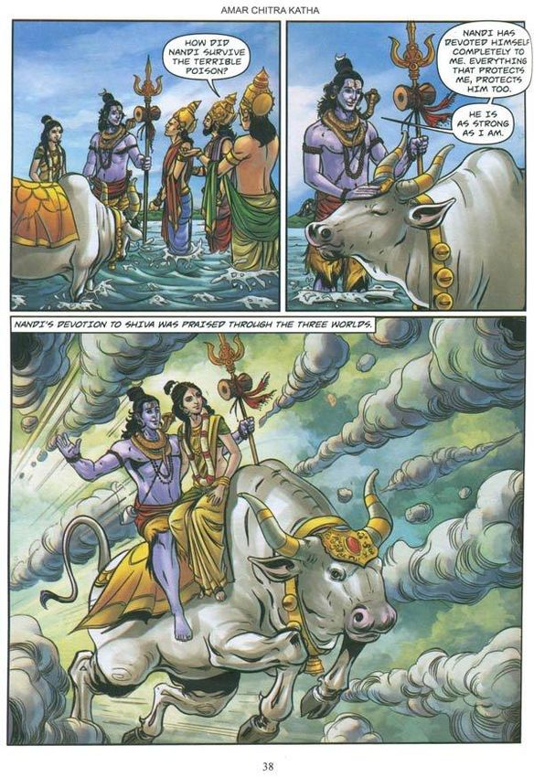
Figure 7: Typographic dialogue in the webcomic ‘The Royal Existentials’

Typography Day 2020                                                       6
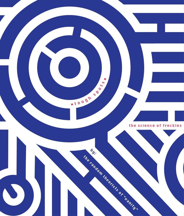
Figure 8. Typographic dialogue from webcomic ‘Brainded India’

The storytelling is led by visuals. The text is simply a supporting element that enhances the visuals.
We can have globally relatable typographic dialogue by treating the letters as what they are – forms

first, instead of narrative text that supports visuals .

I created a webcomic called ‘Tough Spots’ as an experiment to bring typography and visual
form together as ‘word pictures’. The idea was to have a narrative text-based webcomic
and create a ‘glocal’ typographic dialogue, rather than treating text as a supporting
element.

Typography Day 2020                                                                                      7
2. Method of execution
2.1 Analyzing the polar opposite of ‘subtle’ typography to explore typographic
treatment:
The term ’dialogue’ is associated with messages that are meant to be understood.
However, in this project, typographic dialogue was not defined by literal denotation,
which potentially causes monotony. Expressive typography if made literal and denotative
can sometimes look forced and can kill the typographic dialogue by making the denotative
typographic visual the main focus and the rest of the text just a supporting element. The
idea was to explore what happens when there is no differentiation between language and
visual form. As Massimo Vignelli once said, “I don’t think that type should be expressive at
all. I can write the word 'dog' with any typeface and it doesn't have to look like a dog. But
there are people that think that when they write 'dog' it should bark.” For example, in the
images below it can be observed that the typographic visual is the literal form of the
word, which makes the typographic dialogue too direct and forced.

Figure 9. Example of literal expressive typographic dialogue.

Moreover, in a webcomic it is necessary to engage the viewer in typographic dialogue with
curiosity. The ‘literal-ness’ of expressive typography hence does not serve the purpose in
this project.

2.2 Developing the typographic grammar for the narrative
The focus for the narrative was on ‘tough spots’, that is, a colloquial term for freckles
that are stereotypically perceived to be a deformity on the face. The idea of subtle
typography with experimental layout structures was to visually convey how freckles and
skin deformities are a subtle part of one’s persona, but are looked down upon by the social
dictators of beauty. The typographic dialogue in this project evolves from subtle to

Typography Day 2020                                                                             8
dramatic with multiple steps in between. Multiple frames together form one unified
webcomic containing various short narratives, which form one continuous dialogue.

Figure 10. Progression of typographic dialogue from minimal to dramatic.

Typography Day 2020                                                                  9
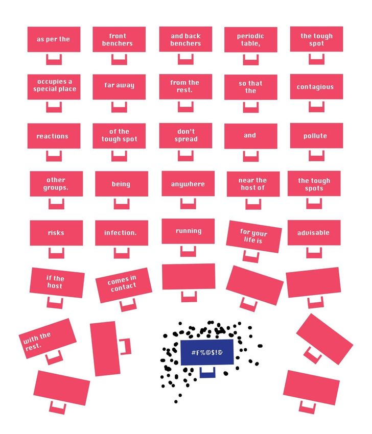
Figure 11. First frame with minimal and suggestive typographic dialogue.

Typography Day 2020                                                        10
Figure 12. Slightly expressive, non-literal typographic dialogue in the second.

2.2 Using the scope of webcomic frames and digital media for typographic dialogue
In a conventional comic and for convenience in printing, it can be observed that the whole
frame has to be broken down into multiple frames for maximum storytelling in a single
page. This results in very less space being available for typographic dialogue and eye
movement. However, webcomics are viewed on a digital medium. The entire area

Typography Day 2020                                                                          11
occupied by the screen is available as a frame for experiments with typographic dialogue.
This provides scope to offer variety in visual movement.

Figure 13. Comparison between layout structures of a comic versus a webcomic

Hence, to build up the narrative of the extremity of the hostile comments and theories of
appearance shaming, the layout structures build up the pace of eye movement in each
frame of the webcomic through subtle, but bold, dramatic layout structures in typographic
dialogue.

2.3 Considering human interaction with gadgets to weave typographic narratives
The aspect of human interaction on digital media is very different from conventional
comics. Convenience, legibility, minimum leading and kerning etc are a major concern
while creating typographic dialogue in storytelling. However, screens allow for designers to
explore various movements of humans like subconscious scrolling, swiping, clicking,
zooming in and out of frames when they are viewing a webcomic.
Legibility is not a concern in this project or a bother even when text is as small as 8 point.
Visuals on the digital interface are scalable to any size. When the kerning and the point
sizes are reduced, the text does not ‘bleed’ like it does in print media. The viewer can
read the text by simply zooming in. Thus, I experimented with the mandate of basic
minimum point sizes for legibility of text. The idea was to use the text at small point sizes
as forms in a word picture to lead the viewer into reading the text. The method of
creating a word picture with irregular, varied kerning and leading between text was hence
explored.

Typography Day 2020                                                                              12
Figure 14. The use of text as a ‘word picture’ in a frame.

Typography Day 2020                                          13
Figure 15. Use of varied point sizes and kerning for an exaggerated word picture.

Typography Day 2020                                                                 14
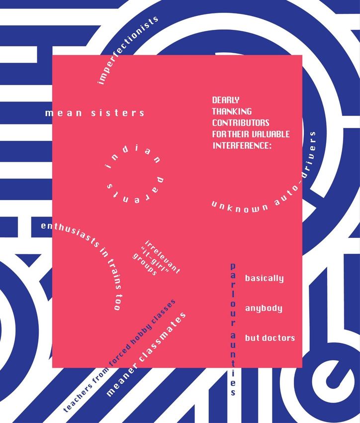
Figure 16. Narrative created by varied point sizes and kerning

2.4 Reversing the role of text and visuals
As visuals have previously been in the forefront to carry on the function of story-telling,
typographic dialogue has been a supporting element. Typographic dialogue in most comics
uses the form of a thought bubble or a speech blurb. In this project, the attempt was to
explore what happens when visuals are used as a supporting element and type is treated
as the main element to lead the typographic dialogue. The attempt was to use different
visual forms and formats to support the typographic dialogue.

Typography Day 2020                                                                           15
Figure 17. Use of geometric shapes supporting typographic dialogue.

Typography Day 2020                                                   16
Figure 18. The use of lines as a supporting element for typographic dialogue

Typography Day 2020                                                            17
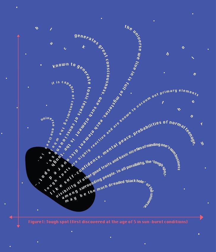
Figure 19. Use of statistical graph format to support typographic dialogue

The observed result however is that when type is experimented with for visual movement,
visuals turn into blind spots. For example, in the images below, visual forms too have been
given a larger weightage. But the large weightage of forms acts as contrast to allow the
focus to be on typographic dialogue.

2.5 Adding dynamism to subtle typography
As they are viewed on a digital medium, webcomics allow the combination of subtle
typographic dialogue with motion. A narrative text, even if kept still, has the power to
conjure the vision of the story for the viewer. However, digital media are not handled the
exact same way by all the viewers as some viewers just scroll through their screens

Typography Day 2020                                                                           18
unconsciously. A still narrative can hence turn into a blind spot in the visual clutter of
digital media. A moving GIF or a video autoplays on screens even when the viewer
unsconsciously scrolls, thereby creating interest in the typographic dialogue and breaking
the visual clutter of digital interfaces. The images below are examples of how plain text
gains the status of typographic dialogue by adding motion to it.

Figure 20. Static text versus scrolling text frames

Figure 21.Static text composition versus part animated text frames

Figure 22. Staticblock of text versus composition of text in animated frames.

3. Conclusion

Typography Day 2020                                                                          19
The conclusion of this project is not a statement, but a series of provoked questions about
typographic dialogue: How does typographic storytelling evolve when the design language
of comics evolves from local cultures to global cultures? As demonstrated, paradigm shifts
in design keep occurring and will continue to do so. Graphic storytelling is constantly
evolving. This paper brings to light the possibilities of what happens when typography is
pushed to evolve along with graphic narratives. The paper demonstrates how type can
take over the responsibility of visual storytelling when linguistics are combined with
visuals. This paper also provokes a question about how expressive typography is used for
storytelling. Do the terms ‘expressive’ typography and ‘dialogue’ have the same definition
today? Or do we need to revisit them in terms of meaning? Today’s expressive typography
can become subtle typography tomorrow as the form of typography keeps evolving from
print to screens and then to further developed media. This paper also addresses how
subtle typography can be re-addressed as expressive typography by giving it a new
dynamism using the scope of new media.

Acknowledgement
    -   I gratefully acknowledge the support and feedback of my mentors Sadhna Jain
        (University of The Arts, London), Gangadharan Menon and Manasi Shekhar Keni
        (Rachana Sansad College of Applied Art and Craft, Mumbai) for this project.

    -   I thank Typoday 2020 and The Faculty of Arts and Design, University of Applied
        Sciences, Jordan for providing me this platform.

References

Habib, K. (2014) The powerful mpact of piolitical cartoons [Online article]. Available at
https://www.elephantjournal.com/2014/05/the-powerful-impact-of-political-cartoons-katie-dawn-
habib/ [Accessed 6 February 2020]

The Guardian (2017) The Marvel age of comics 1961-1978 in pictures [Online article] Available
athttps://www.theguardian.com/books/gallery/2017/oct/02/the-marvel-age-of-comics-1961-1978-
in-pictures [Accessed 10 February 2020]

Europe Comics (2019) The history of German comics- Part 1 [Online Article] Available at
http://www.europecomics.com/history-german-comics-part-1/ [Accessed 10 February 2020]

Typography Day 2020                                                                             20
Menon, M. (2017) The complete timeline- Evolution of comic books in India (1962- Present) [Online Article] Available at https://homegrown.co.in/article/21898/a-complete-timeline-the-evolution-of- comic-books-in-india-1926-present [Accessed 12 February 2020] Parathasarathy, A. (2014) The Royal Existentials [Online Webcomic} Available at https://www.royalexistentials.com/ [Accessed 13 February 2020] Sparrow, P. (2019) Tales of the Peeper Creeper [Online Webcomic] Available at https://www.adultswim.com/comics/tales-of-the-peeper-creeper-patrick-sparrow [Accessed 13 February 2020] Hustwit, G. (2015) A rare interview with graphic design lead Massimo Vignelli [Online article] Available at https://www.fastcompany.com/3044133/a-rare-interview-with-graphic-design-legend- massimo-vignelli [Accessed 10 September 2019] Typography Day 2020 21
You can also read