Typography in the US Topo Redesign
←
→
Page content transcription
If your browser does not render page correctly, please read the page content below
Typography in the US Topo Redesign
Elaine Guidero

Pennsylvania State University, Geography–University Park, PA, USA

Abstract. The creation and maintenance of a distinct cartographic identity
(in the context of an official map series) contributes to a national identity;
cartographic identities are established by map style, one of the most salient
elements of which is its typography. At the core, then, of typeface choice in
a national map series is the dilemma of establishing a recognizable identity
through map design, while allowing the labels and other text to be displayed
the same way—to maintain the identity—in different applications. The
topographic map redesign team at the United States Geological Survey
(USGS) faces some challenges in its attempt to create a map design that
establishes a distinct identity, and is legible, while preserving cross-
platform compatibility for map users. I explore solutions to creating such
an identity in an authoritative national topographic series while satisfying
the needs of a wide user base.

Keywords: typography, cartography, national mapping

1.   The Construction of Cartographic and National
     Identity
Wood defined the essence of cartographic identity: “mapped images have
become essential to our sense of the world, to our place within it, to much of
our identity; to our national identity certainly, but even to our sense of com-
ing from a particular place…to our sense of how we are, of what we’re doing,
of where we’re going” (2010: 17). In this paper, I argue that national identi-
ty is built through cartographic identity, including both content—what is
mapped, generally the sovereign claims of land by a country, but also what
is not mapped—and a visual style, or sign system (after Wood 2010).
Cartography in service of nation- and identity-building began in the 1400s
with navigational charts for lucrative trade routes, and topographic maps of
domestic fortifications or invasion routes, both of which were national se-
crets (Biggs 1999). Through the Renaissance, maps established the legiti-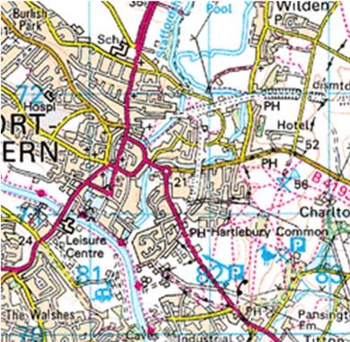
macy of European states via their presumed unbiased presentation of the
world (Biggs 1999, Harley 2001), although early European mapmaking had
only a thin veneer of scientific legitimacy, the practice being “utilitari-
an…and… ideological…serving national identity-building, colonial, and oth-
er interests” (Wood 2010: 22). Maps reified the connection between “land
and political power” in the domestic realm (Harley 2001: 118), establishing
the primacy of land ownership, and consolidating taxation (and thus, state)
authority. When these speakings and silences are incorporated into a na-
tional, official map, they establish a certain identity for the country (Harley
2001).This is just as true now with national topographic map series as it
was for fifteenth-century portolans.
A map design consists of many elements: line color, weight, and pattern; fill
color and pattern; point symbols; generalization; relief representation; and
typography (Kent & Vujakovic 2009). Together these form the “cartograph-
ic sign system” (Wood 2010: 282), and the sign system is the map’s style
and thus its cartographic identity, although Wood asserts that identity can-
not be simply reduced to its component stylistic elements—cartographic
identity results from the interplay of cartographic signs into a “recognizable
whole” (2010: 282). Yet one can pick out component elements, some of
which are more visually salient than others (such as brightly colored ex-
pressways, relief representation, and typeface). The singular Swiss topo-
graphic maps would likely not be as instantly recognizable if the land cover
color scheme was altered and the italicized serifs replaced by a roman hu-
manist sans serif.
In a fit of patriotism, Voisin (1976) wrote about maps for “the American
people,” that the American spirit of cartography was marked by a lack of a
national identity, and that its national map series (by and for government
organizations and military branches) were driven by guidelines rather than
by a set style. Even at the time of his publication, the production of USGS
topographic maps was in full swing; for whatever reasons, these maps nei-
ther merited a mention nor constituted a national cartographic identity for
Voisin. However, he did note that commercial atlas cartography had a dis-
tinct American identity; being the president of Rand McNally, his paper
essentially constituted an apologia for commercial atlas cartography. He
advocated a unified cartographic style that would immediately establish for
the viewer that she or he was looking at an American map. Woodward’s
1982 paper was the first synthesis of map design, typography, and national
identity, and he similarly argued that American commercial cartography
had a style distinct from Europe, but this is not the same as a national
American style—an official American map that speaks for the state and con-
structs it visually.
2.   Typography as a Part of Cartographic Identity
First, a few definitions are necessary. A typeface is a set of characters with
the same design. For example, Helvetica is a typeface, and all Helvetica let-
ters have the same “feel.” A font is a single size, weight, and variation of a
typeface, e.g., Helvetica Light Italic at 40 points. In a digital context, a font
is a computer program, a set of instructions used to render individual let-
ters. A font includes letter outlines created by Bézier curves, which are
mathematically defined lines, accompanied by several tables that describe
the metrics of the font, such as kerning (Microsoft Corporation 2012). Gen-
erally a typeface has one font per weight (e.g., bold, light, book) by variation
(e.g., extended, condensed, italic); software scales the sizes appropriately.
Typography, as opposed to hand-drawn lettering, is a general term for text
created or rendered by machine (Smeijers 1996).
Aside from photography and illustration, nearly every visual product uses
type; cartography is no exception. All maps, especially highly detailed na-
tional topographic maps, need labels. Albert Kapr, a typographic designer
from Dresden, linked typography to national identity through writing. “The
form of lettering should be observed with interest for writing is a vehicle of
language and thought” (Kapr 1983: 8). “Writing played an important part in
the formation of national languages as it stabilized the constantly-changing
dialects and anchored them to the main language” (9); language is, of
course, the ne plus ultra of systems that encode and transmit national iden-
tity. Typography is essential to maps and highly salient, and in a nationally
branded map series, the type speaks—it makes the national identity. Addi-
tionally, in exhorting type designers to make good typefaces which “make
the text legible and transmit emotional impressions as well” (10), Kapr rec-
ognized that lettering was an art as well as a trade, and fulfills a dual pur-
pose. Aesthetics are as important as technicalities, and both are equally
important in a national cartographic identity.
Map series created by national mapping organizations have their own na-
tional style, of which typography is a part. Perhaps the best example is the
British Ordnance Survey (OS) maps. The current 1:25,000 design uses Gill
Sans, a sans serif typeface designed by British typographer Eric Gill, which
closely resembles and was inspired by Johnston Sans, the lettering created
by Edward Johnston for the London Underground (Kinross 2002, Wood-
ward 1982) (Figure 1, left). The 1:50,000 design uses a custom-made vari-
ant of Univers with curved terminals on the lowercase T and L (Woodward
1982) (Figure 1, right).
Figure 1. Ordnance Survey maps: left, 1:25,000 (Ordnance Survey 2005); right,
1:50,000 (Ordnance Survey 2011).

These typefaces form part of what seems to be a British transportation de-
sign canon: Johnston Sans for the London Underground, Transport, de-
signed by Jock Kinneir and Margaret Calvert (Kinross 2002), for highway
signage and for the official UK government website, gov.uk, and Gill Sans
and Univers for OS maps (Terrett 2012). These distinctly British typefaces,
seen in Figure 2, create a national visual identity. Arguably little else re-
mains in the OS design that contributes as powerful an identifying mark to
the map, despite the numerous cartographic dissimilarities pervasive
throughout the London public transport system (Burke & McLaren 1981).
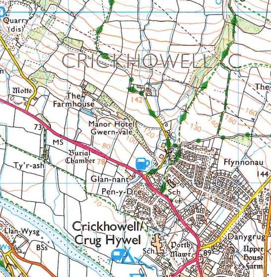
Figure 2. From top to bottom, Transport (Department for Transport 2013), John-
ston Sans (Typekit 2013), and Gill Sans.

3.   Cartographic and Typographic Identity in US Topo
USGS creates the national topographic 1:24,000 scale map series of the
United States and its territories, as part of its mission to “provide reliable
scientific information to describe the Earth” (United States Geological Sur-
vey 2011). Its current form, US Topo, an all-digital, full-coverage set of 7.5’
x 7.5’ minute quadrangles as geo-tagged PDFs (GeoPDFs), modernized the
printed series, which was last redesigned in the early 1970s.
Since the 1970s, the map series used only two typefaces: ITC Souvenir in
Light and Demi weights for place names and hydrological features, and
Univers in 55 and 56 weights for point features and roads, because they
were available in a wide range of weights and printed well (Figure 3).
Figure 3. Central Park US Topo quad (USGS 2011b).

However, Souvenir and Univers are proprietary typefaces, and not distrib-
uted with MacOS or Windows. In the 1970s this was not a relevant concern,
as the topographic map was a paper map not subject to post-production
modification. However, in the twenty-first century, widespread desktop
cartography and concomitant changes in technology mean that the map is
no longer an inviolate product. The technical justification for choosing
these typefaces no longer holds, and there are now thousands of well-
designed typefaces that can be employed well in cartographic environ-
ments. Beyond technical questions, as Kapr asserted, aesthetics should not
be forgotten, especially when a national visual identity is at stake. For one,
fonts show their age. Souvenir has so much flair that it is visually tied to a
date range; much like another highly artistic typeface, Harlow, which
strongly evokes the 1920s and thus is difficult to use in other contexts (Fig-
ure 4).
Figure 4. ITC Souvenir Demi (top), Harlow (bottom).

Woodward railed against Souvenir, calling out its “weakness of structure”
and “instability of design,” a lack of contrast between thick and thin strokes,
and a range of weights “not as useful as it might seem” (1982: 342). His
critique was technical as well as aesthetic, with a claim that its “serifs are
short and stubby, and they almost disappear when reduced to the smaller
sizes, thus making it impossible to aid the structure” (344). More damning
still is Woodward’s critique of the typeface with respect to corporate style:
“[Souvenir] is almost never used for official documents calling for an au-
thoritative style, and on the contrary is frequently used by large institutions
or firms that wish to downplay their authority in a given situation…It is
questionable if this image is appropriate for the nation’s official topographic
map” (345).Woodward called for more “sensitivity” to typographic issues,
urging designers to support the desired corporate (in this case, national)
identity, and to be chary of typefaces that would quickly become outmoded
(346).

4.   Maintaining Identity while Meeting User Needs
In the past few years, US Topo has been redesigned (Figure 5). A redesign
team for which I briefly worked advocated replacing ITC Souvenir
Light/Demi with Georgia, and Univers 55/56 with Trebuchet MS, to solve a
number of issues with Souvenir and Univers; our solution has become the
next typographic identity for US Topo. Georgia and Trebuchet are legible,
support extended character sets for diacritics, and are widely available on
MacOS and Windows. Most users will have no trouble displaying labels set
in these typefaces, as they will not have to install a typeface.
Figure 5. Central Park quad, US Topo (USGS 2013).

Georgia was designed by Matthew Carter in 1996, commissioned by Mi-
crosoft to provide a pleasant on-screen reading experience with a serif type-
face (Microsoft Corporation 2013a). Many serif typefaces designed for print
have small x-heights, and can appear distorted or compressed on-screen at
sizes used for body text, 8–16 points. To avoid this, Georgia has a relatively
wide character form and high x-height (Microsoft Corporation 2013a).
Trebuchet MS, also intended for on-screen use, was designed by Vincent
Connare in 1996 of Microsoft (Microsoft Corporation 2013b). Trebuchet has
small, curled terminals on the lowercase T and lowercase L, which gives it
some character and distinguishes it from other sans serif faces. Trebuchet,
like Georgia, has a high x-height (Figure 6).
Figure 6. Georgia (top), Trebuchet MS (bottom).

The combination of Georgia and Trebuchet is not ideal. Although US Topo
is now designed to be viewed primarily on-screen, the intensive labeling
needs of US Topo are not well served by Georgia. Dense urban areas can
have hundreds of point symbols which need to be labeled, along with roads
and place polygons. Such labels cannot support a typeface with the dimen-
sions of Georgia. Both Georgia and Trebuchet are somewhat generic type-
faces, simply because they are widely distributed as part of the default set of
installed fonts on every Macintosh and Windows operating system since
1999. Such a widespread typeface dilutes the identity of any design using it.
Part of the reason the OS maps are so recognizable is that the typeface is
specific to the map. The British custom variant of Univers is not used on
millions of websites. OS does not distribute their custom typeface, but they
also do not provide free, large-scale topographic maps to the extent that the
USGS does.
The geological science community, a significant portion of the USGS user
base, uses GeoPDFs as basemaps, in lieu of constructing their own maps
from downloadable data. They layer geologic data on top of the GeoPDF,
and separate the individual data layers of the GeoPDF to add new labels,
remove symbols, and perform other modifications. This is not a common
usage of GeoPDFs, but this particular user community has specifically re-
quested that USGS continue to supply GeoPDFs that can be used in such a
way. Unfortunately, this usage precludes the use of any typeface other than
the most widely available, generic typefaces. To explain why requires some
definition of font embedding and permissions. Font embedding is the tech-
nology that allows fonts to be saved inside a document. When the document
is sent to a remote user that does not have that font installed on their com-
puter, the embedded font can be installed temporarily or permanently on
the remote user’s system to allow correct viewing of the document (Mi-
crosoft Corporation 2012). Permissions are the rights that specify the level
of installation on the remote machine from the document.
There are four basic levels of permissions: Installable, Restricted License,
Preview & Print, and Editable (Microsoft Corporation 1995; Microsoft Cor-
poration 2011). Installable means the font is fully and permanently install-
able on the remote system. Restricted License fonts “must not be modified,
embedded or exchanged in any manner without first obtaining permission
of the legal owner;” Preview & Print fonts “may be embedded, and tempo-
rarily loaded on the remote system…no edits can be applied to the docu-
ment;” Editable fonts “may be embedded but must only be installed tempo-
rarily on other systems…documents containing Editable fonts may be
opened for reading, editing is permitted, and changes may be saved” (Mi-
crosoft Corporation 2011). OpenType fonts also allow bitmap embedding,
in which only the images of the letters are embedded; the font itself is not
embedded and cannot be used to generate further text (Microsoft Corpora-
tion 2011).
The challenge facing USGS is how to maintain an identity while reasonably
meeting the needs of its users. In choosing a solution, USGS must identify
how far it wants to go in serving the public, or even the requests of just one
user group. But, as a public institution, USGS has a responsibility to its user
base to provide them with “scientific products that lead to solutions,” in-
cluding cartographic data (USGS 2011).

5.   Solutions
The problem can be approached in two ways: changing the way USGS meets
user needs, or changing technology. In the first approach, USGS can influ-
ence how people use US Topo by educating them about the data delivery
services that it already offers, so that users can construct their own US Topo
basemap in GIS software, modifying for their needs as they wish. However,
this approach is a bit cold-hearted. US Topo maps are convenient and sim-
ple and ready to download; why not allow users to add data to them, as
needed? Thus it makes sense to address this from a technology perspective.
A common solution is to embed a custom or proprietary typeface in the Ge-
oPDF. At first this seems simple; when the user imports the PDF into de-
sign software to pick apart the layers and generate new labels, s/he can
simply use the embedded type. The problem here is the jump from the Ge-
oPDF to the design software. A typeface that could be used in such a way,
packaged with the GeoPDF but usable in another program, would need an
installable embedding permission. For USGS to license a typeface that
would theoretically be distributed with full rights to anyone anywhere in the
world who wished to download it, USGS would essentially need to purchase
a worldwide multi-million-user font license. This is financially infeasible.
And, font embedding at the more common editable or preview & print lev-
els does not allow the end user the flexibility to create new labels that would
match the national cartographic identity.
Rarely are commercial fonts distributed with an installable embedding
permission. Georgia and Trebuchet, two of the most widely available Mi-
crosoft typefaces (distributed with Microsoft Windows XP and later ver-
sions, and Microsoft Office 2000 and later) are editable, not installable.
Unless the user already has them installed (which is highly likely), these
fonts will not be usable outside the GeoPDF. USGS has assumed that most
users, especially the geological sciences users, are running a Microsoft op-
erating system, or have a Microsoft product installed, giving them the abil-
ity to use the fonts specified in US Topo. While it is probably a safe assump-
tion, it shows that even the current system of embedding a typeface in the
GeoPDF and hoping the end user will have the appropriate font already
installed, is somewhat flawed.
If the emphasis is on keeping a custom typeface in the map, one possible
solution is to turn the typeface into vector objects or bitmap images. If the
font is no longer a series of instructions that can be used to display text, but
is instead an image, the copyright issues disappear. Of course, the user will
not be able to make changes to the text at all, and further labels will be con-
structed in a font arbitrarily substituted by the operating system, adulterat-
ing the visual identity of the map.
These solutions introduce hurdles for the end user or USGS. I propose three
feasible solutions. The first is to turn to open source fonts. An open source
font with a GPL license eliminates all copyright restriction and embedding
problems. While it introduces the problem of the user needing administra-
tive rights on their computer to install the typeface, keep in mind that very
few people intend to use the GeoPDF in such an extended usage. Those not
wishing to take apart the data layers from a GeoPDF will be able to view the
map as it was originally intended using existing font embedding technology,
without having to actually install the typeface.
However, perhaps it is worthwhile to consider going beyond fonts, and to
rethink the idea of a national cartographic identity. Is it possible, or desira-
ble, for a national mapping organization to establish a cartographic identity
despite using regular typefaces, saving identifying marks for other carto-
graphic elements (using line style, for example) or for the map collar and
other perimap elements, the paraphernalia and information surrounding
the cartographic content (Wood & Fels 2008). As long as the other carto-
graphic elements are styled well, this could work. But if all custom typogra-
phy is relegated to the perimap, or doesn’t exist at all, then the mapmaker
falls into the trap of a generic map style. The perimap will not always be
included with the map when it is redistributed. GeoPDFs are fairly large,
and printing at full size including the perimap requires a plotter. Screen-
shots and printouts of portions of the map are more common ways of dis-
tributing the map. In this case, the identifying mark of the national map-
ping organization will be lost to the end user.
Finally, I take the example of Ordnance Survey. They offer on their web-
service the official print version, complete with custom fonts, as an uned-
itable underlay. It can be printed or saved, or data can be added on top of
the map, such as routes or markers, but there is clearly no attempt to pro-
vide a capability like the GeoPDF. It seems that there is little concern for
whether user-added labels will change the identity of the map—perhaps
because the identity is already quite strong. A similar solution for USGS
would incorporate a well-designed custom typeface that cements map style
and thus the national identity, with continued production of GeoPDFs, but
with the entire map, or at least some essential layers, as an unchangeable
basemap. Additional labels could be set in a generic typeface that matches
the custom design, and as the OS example shows, that may not detract too
much from the cartographic identity.

References
Biggs, M (1999) Putting the State on the Map: Cartography, Territory, and Europe-
  an State Formation. Comparative Studies in Society and History 41(2): 374–405
Burke M, McLaren I (1981) London’s Public Transport Diagrams—Visual Compari-
 sons of Some Graphic Conventions. Information Design Journal 2 (2): 103–112
Department for Transport (2013) Traffic Signs Image Database. Department for
 Transport: Transport Topics.
 http://www.dft.gov.uk/trafficsignsimages/index.php. Accessed 6 April 2013
Flood JL (1993) Nationalistic Currents in Early German Typography. The Library
  s6-15(2): 125–141
Harley JB (2001) The New Nature of Maps: Essays in the History of Cartography.
 The Johns Hopkins University Press, Baltimore
Kent AJ, Vujakovic P (2009) Stylistic Diversity in European State 1 : 50 000 Topo-
 graphic     Maps.      The     Cartographic       Journal     46(3):     179–213.
 doi:10.1179/000870409X12488753453453
Kinross, R (2002) Unjustified Texts. Hyphen Press, London
Microsoft Corporation (1995) The TrueType Font File. Redmond, WA.
 http://www.microsoft.com/typography/SpecificationsOverview.mspx. Accessed
 6 April 2013
———. (2011) OS/2 and Windows Metrics. OpenType Specification.
 http://www.microsoft.com/typography/otspec/os2.htm. Accessed 6 April 2013
———.     (2012)   OpenType      Specification.   Specifications:    Overview.
 http://www.microsoft.com/typography/otspec/. Accessed 6 April 2013
———.     (2013a)   Georgia.   Microsoft    Typography:    Font   Families.
 http://www.microsoft.com/typography/fonts/family.aspx?FID=4. Accessed 7
 April 2013
———. (2013b) Trebuchet MS. Microsoft Typography: Font Families.
 http://www.microsoft.com/typography/fonts/family.aspx?FID=2. Accessed 7
 April 2013
Ordnance Survey (2005) Brecon Beacons National Park (Eastern Area): OS Explor-
 er Map. Ordnance Survey, London
———. (2011) Stourport-on-Severn. Kidderminster and Wyre Forest: OS Landran-
 ger Map. http://www.worcestershire.gov.uk/cms/images/ordnance-survey-map-
 ful.gif. Accessed 14 April 2013
Smeijers F (1996) Counterpunch. Ed. Robin Kinross. Hyphen Press, London
Terrett B (2012) A Few Notes on Typography. Government Digital Service.
  http://digital.cabinetoffice.gov.uk/2012/07/05/a-few-notes-on-typography/.
  Accessed 5 April 2013
Typekit (2013) P22 Underground. https://typekit.com/fonts/p22-underground.
  Accessed 14 April 2013
United States Geological Survey (2011a) About USGS. United States Geological
 Survey. http://www.usgs.gov/aboutusgs/. Accessed 6 April 2013
———. (2011b) Central Park, NY-NJ. U.S. Geological Survey, Reston, VA
———. (2013) Central Park, NY-NJ. U.S. Geological Survey, Reston, VA
Wood D (2010) Rethinking the Power of Maps. The Guilford Press, New York
Wood D, Fels J (2008) The Natures of Maps: Cartographic Constructions of the
 Natural World. University of Chicago Press, Chicago
Woodward D (1982) Map Design and the National Consciousness: Typography and
 the Look of Topographic Maps. In Technical Papers of the 42nd Annual Meeting
 of the American Congress on Surveying and Mapping, 339–347. Denver, CO
You can also read