INTERNATIONAL MAGAZINE FOR BRICK ARCHITECTURE - #23 - Wienerberger
←
→
Page content transcription
If your browser does not render page correctly, please read the page content below
I N T E R N AT I O N A L M AG A Z I N E F O R B R I C K A RC H I T EC T U R E

          IN THIS ISSUE:
            Contemporary roofs & façades
            Unusual aesthetic solutions
            Custom-made products

#23
01 2018
      www.architectum.com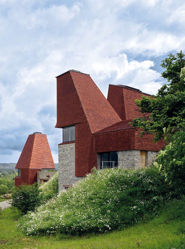
2 EDITORIAL
  XXX

                                        CHRISTOF DOMENIG
                                        CEO Clay Building Materials Europe

UNLEASH YOUR CREATIVITY
WITH CERAMIC MATERIALS                                                                                                         24

The use of clay bricks, blocks, and tiles is a key trend in contemporary architecture. As
these highly versatile materials can be combined in countless ways, they are a great source
of inspiration for creative minds. Moreover, because clay building materials are perfect for
construction projects, they do not limit creativity – they enhance and boost it. Modern
architects enjoy the freedom of exploring working with bricks and tiles and continue to use
them to construct outstanding buildings.
There are many ways to use ceramic materials to create unusual aesthetic solutions: form-
ing brick screens, integrating relief effects, laying special masonry bonds, unusual colour
choices, and using roof tiles for a façade are just some of the possibilities. We work in part-
nership with architects to develop innovative products and deliver truly unique solutions.
Thanks to our extensive experience, we are able to help craft vibrant new building mate-
rials – custom-made to suit contemporary architecture. From special glazing, and unique
structures or profiles, to whole new formats – we love creating exciting new solutions for
architects. Facing bricks and roof tiles are materials that lend themselves to innovation,                                     20
and which will continue to impress. Take a look at our featured projects to see for yourself
the effects that can be achieved – the results are remarkable!

Enjoy reading!

Christof Domenig

                                                                                                                               28
IMPRINT
EDITOR Wienerberger AG, 1100 Wien PUBLISHING HOUSE Starmühler Agentur & Verlag GmbH, 1010 Wien, www.starmuehler.at
CHIEF EDITORSHIP Andrea Blama (Wienerberger AG) CO-OPERATION Alexa Uplegger (GER), Arnaud Mounier-Duchamp (FR),
Galina Barinova (RU), Sabine Merlevede (BE), Singer Li (CH), Tanja Bongers (NL), Veronique Auger (UK) GRAPHICS & DESIGN
Starmühler Agentur & Verlag GmbH, Artdirector: Thomas Tuzar, www.starmuehler.at PRINTING Ueberreuter Print & Packaging GmbH,
Industriestrasse 1, 2100 Korneuburg PRODUCTION Ueberreuter Print & Packaging GmbH
PHOTO COVER James Morris PHOTO REAR SIDE Compagnie-O architects
WIENERBERGER AG CLAY BUILDING MATERIALS EUROPE, A-1100 Wien, Wienerberg City,
Wienerbergstraße 11, T +43 (1) 601 92-10551, marketing@wienerberger.com,
twitter.com/architectum, youtube.com/wienerbergerofficial

www.architectum.com

                     01|2018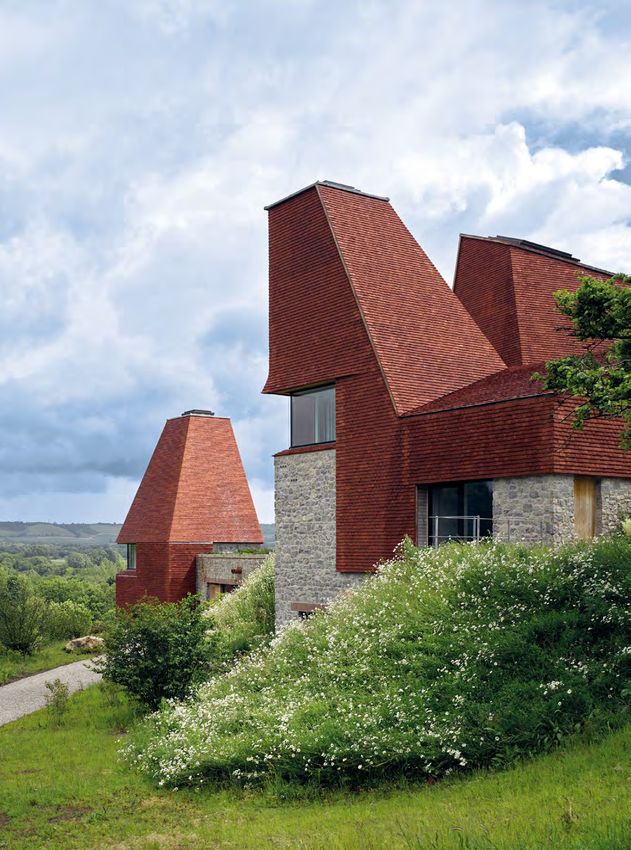
CONTENTS
                                                                               XXX 3

                10     04

     16

                                            MULTI FAMILY
                                            16	STUNNING FACADES FOR A
                                                RESIDENTIAL COMPLEX
                                                Russia

                                            20	FLOWING FAÇADES FOR STUDENTS
                                                The Netherlands

                                            22	GREY BRICK SCREENS
                                                FOR A FORMER WORKSHOP
                                                United Kingdom

                                            PUBLIC
                                            24	A SCHOOL CLOAKED IN CRAYONS
          STANDARDS                             France

                                            28	VIBRANT TEMPLE OF SPORT
          04	NEWS
                                                Belgium
          05	NIKOLAJ HARVING – Interview
                                            30	A PLACE FOR MODERN RESEARCH
                                                MADE FROM TRADITIONAL RED BRICK
                                                China
34
          SINGLE FAMILY                     34	COVERED IN IRIDESCENT
          08	MATCHING ROOF AND FAÇADE          AND SHIMMERING LAVA
              Belgium                           France

          10	HANDMADE CLAY TILES           36	TASTEFUL INTERIOR
              BREATHE LIFE INTO THIS HOME       FOR A RESTAURANT
              United Kingdom                    Belgium

          14	SHINING GREEN FACADE          38	CUTTING-EDGE ARCHITECTURE
              FOR A HOUSE EXTENSION             PERFECT FOR THE OLD CITY
              Belgium                           Germany

                                                               01|2018
4 NEWS

METAAL FACING BRICK SERIES
EXTENDED WITH SHADES OF GREY
Aluminium, Cesium, Chroom, Kobalt and Nikkel are the
five new shades of grey that Wienerberger Netherlands
has added to its ‘Metaal’ facing bricks series to fulfil the
growing demand for subtler colour schemes.
The series of grey metallic shades includes bricks pro-
duced in different textures, such as hand moulded and                                                                               The variety of textures
formed. The Aluminium, Cesium, Kobalt and Nikkel bricks                                                                                is what makes the
                                                                                                                                     ‘Metaal’ facing brick
are enriched with coal, which gives them a distinctive pat-     The shades range from cool to warm tones, with hints of
                                                                                                                                         series so special.
tern. They are sintered either on or in the bricks.             beige or brown, a total of 13 different colours are available
                                                                coming in different textures – grained or smooth, sanded
                                                                or unsanded in an even or mixed batch.
                                                                The ‘Metaal’ series is not an everyday solution, the facing
                                                                bricks are produced only on specific customer order.

                                                                STRIKING COLOURS FOR ROOF AND FAÇADE –
                                                                ALÉONARD GLAZED TILES
                                                                These colourful tiles are an impressive piece of craftsmanship. They have been
                                                                manufactured in France using traditional techniques for almost 140 years.
                                                                Aléonard roof tiles are hand-glazed and lend themselves to a wide range of
                                                                creative applications. Choose from 10 different styles, 12 colour variants, and
                                                                36 different effects to give your roof, façade, or interior a unique and contem-
                                                                porary look that best reflects your personal architectural style.

                                                                Aléonard glazed tiles create
                                                                vibrant, eye-catching surfaces.

             ULTIMA TFP LOW PITCH ROOF TILE
             A new patented innovation from France is now available for high-performance roof-
             ing with a low pitch. The Ultima TFP fits perfectly to pitches as low as 12 degrees
             (with underlay) for a truly contemporary flat roof look.
             The interlocking tiles have a deep headlap to guarantee water tightness, ensuring
             the durability of your roof. They can be laid in straight or staggered courses. Availa-
             ble in three colours – slate grey, black titanium and grey titanium.

                                                                              High-performance roofing with a low
                                                                                   pitch and a contemporary look.

                01|2018
INTERVIEW 5
REDEVELOPMENT OF
HISTORIC SITE IN MODERN BRICK
The historic warehouses and storehouses in Copenhagen Harbor count among the most beautiful industrial
areas in Denmark. Krøyers Plads remained untouched for a long time: Many project developers got engaged
in the abandoned area and proposed concepts that were all rejected by the local population. In the end,
the decision was made to develop the compound in a participative and direct democratic manner.
Nikolaj Harving, Project Manager of COBE Architects Denmark talks about their successful approach.
Y
ou have won several awards for your pro- ground floors, where there is retail space. This way,
© Photos: Rasmus Hjortshøj - COAST, Helene Høyer Mikkelsen, COBE architects.
ject Krøyers Plads in Copenhagen. Could the ground floor is an inviting, public space that stim-
you tell us more about the project? ulates urban life in the neighbourhood.
Our project was based on the question: how can
we design an interesting housing development? We Before your proposal was accepted, a lot of
wanted to create an alternative to the usual concept other suggestions were turned down. Could
of replicating a given apartment model. So we devel- you describe your successful approach? What
oped 105 different apartments! Small ones and big- made the difference?
ger ones, so families, individuals, or couples could Before our concept was accepted, there had been on-
choose a size and design to suit their needs. Krøyers going discussions and plans for more than a decade.
Plads is a refreshing alternative to the usual, monot- Our design was convincing for several reasons. One
onous apartment buildings. When we started, the of them was adapting to fit the historic setting. Our
intention was that two thirds of the buildings would strong focus on the surrounding buildings, and the
be used as office space. Now, all of the buildings fact that we incorporated the district’s atmosphere
are used exclusively for apartments, except for the and history into our design, was key. Involving the <
01|2018
6 INTERVIEW

           Krøyers Plads comprises 105
          apartments featuring between
          80 and 250 square meters of
          living space, numerous shops
            and restaurants, as well as a
                           supermarket.

< neighbourhood in a participatory process was an
important factor. We had to contend with a lot of reg-
ulations, because the development site is in a central
location and forms part of Copenhagen’s historic city
centre. Ultimately, we were successful because we
managed to unite scale, materials, and architectural
context in our plans.

What were the challenges involved in integrat-
ing a modern design into the surrounding his-
toric structures of the harbour?
Krøyers Plads blends in perfectly with the historic ur-
ban environment of Copenhagen’s harbour front and
the streetscape. Façade proportions, roof heights
and, of course, orientation of the building complex,        older buildings. The location also posed a challenge:
all play a key role in balancing the architectural heavi-   due to its proximity to the city centre, the area is very
ness. Inspired by the surrounding historic warehouse        expensive. Therefore, we didn’t want to just construct
buildings along the harbour, and their rough brick-         a generic building there; rather, we wanted to include
work, we initiated a dialogue between the new and           residents in the planning – a democratic process. The
old buildings. The choice of materials was important.       strict conformity of the surroundings presented a fur-
It was at a very early stage that we decided the build-     ther challenge – the site is between warehouses with a
ings should be constructed in brick.                        very high degree of symmetry. For example, although
                                                            the roofs vary in colour, they appear to have been cut in
Where there any challenges during the design                one piece. That was one of the reasons why we chose         Nikolaj Harving, Project Manager,
process?                                                    to use the same materials for both the roof and façade.     COBE Architects Denmark.
There were many. At COBE, we always want to chal-           We wanted to preserve this impression of a monolith.
lenge the “usual way” of doing things. We had to blend
modern architecture into a historical context. What         All the tiles look slightly different and therefore
we did was to reinvent the warehouse-style buildings        create a special aesthetic on the building’s fa-
of 300 years ago. We analysed their proportions and         cade – how was that achieved?
designed the new buildings accordingly. So the cor-         The differences are very subtle. The bricks are in
nices of our buildings match those of the surrounding       red and black, the roof tiles have more of a blackish

                  01|2018
INTERVIEW 7

                                                          In collaboration with Wienerberger, a
                                                          shingle-like brick, which covers the
                                                          entire roof landscape and parts of
                                                          the façade, was not only produced
                                                          but also developed.

                                                                            shade – they match the surroundings. We designed
                                                                            them ourselves; the surface of the tiles is roughened
                                                                            with sandpaper to create a varied structure.

                                                                            Why was it necessary to create a new product
                                                                            for this project?
                                                                            We wanted to be able to design our own individual
                                                                            bricks, to ensure a perfect fit. We found the idea of
                                                                            completely red buildings super interesting. We wanted
                                                                            the roof & façade to be constructed from the same
                                                                            material, and there was no doubt that we would work
                                                                            with bricks. When visiting a Wienerberger brick factory
                                                                            in the Netherlands, we found out about the many de-
                                                                            sign possibilities they offer. And at an affordable price.
                                                                            It was the starting point of our journey. The process
                                                                            of collaboration was an enjoyable experience, and we
                                                                            found bricks to be an inspiring material.

                                                                            Could you describe how your office collaborat-
                                                                            ed with Wienerberger during that process?
                                                                            Dan Stubbergaard (Creative Director and founder
                                                                            of COBE) and I, together with our partners, Vilhelm
                                                                            Lauritzen Architects, visited the production site sev-
                                                                            eral times. The process was very sophisticated; we
                                                                            felt like ceramic artists. We started playing with clay
                                                                            to find out about its different characteristics. We were
                                                                            working like ceramists: scratching the surface, and
                                                                            tossing it in different kinds of powder to affect the
                                                                            surface. During the whole process of developing a
                                                                            new material, we found Wienerberger’s approach
                                                                            very open-minded, very responsive to our demands
                                                                            and ideas.

                                                                            Why do you like working with ceramic materials?
                                                                            Before, I had the impression that working with bricks
                                                                            would mean putting together pre-fabricated pieces
 »Thanks to the different bricks, and their equally                         of material. But it is the opposite. You can create
                                                                            your own material. The texture of ceramic materials
varied structures, we were able to respond to the                           is very special, and every brick is unique. Develop-
surroundings and prompt a dialogue between old                              ing a special material for a project ties in well with
     and new, between lightness and heaviness.«                             COBE’s idea of challenging the traditional ways of
                                        COBE Architects                     doing things. >

                                                                                                             01|2018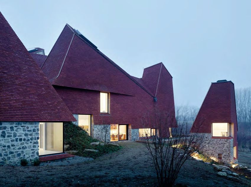
8 SINGLE FAMILY

MATCHING ROOF
AND FAÇADE
This single-family house in Veurne, Belgium combines a
business premises and a family home at the same time.
The roof and the façade blend into each other and were
realised with ceramic materials.

T
      he client needed office space for his engineer-      FACTS & FIGURES
      ing agency as well as a home for his family.
                                                           Project name
      The dwelling architect Peter Verhaeghe creat-        Living room with a view,
ed offers enough space for both. To ensure privacy         Veurne, Belgium
the two parts are clearly separated from each other        Architect
by the concrete carport, located in the middle. This       Peter Verhaeghe
position also grants direct access from both parts of      Client
the house.                                                 Private
                                                           Products used
LIVING AND WORKING BY THE WATER The “Living room           Terca Caracterra Hectic en
                                                           Koramic Tegelpan 301 Amarant

                                                                                          © Photos: Peter Verhaeghe
with a view” dwelling is situated on a corner plot with
a view over the canal. Advantage of this unique lo-        Year of completion
cation was taken by creating a generous sitting area       2014

with large viewing windows. It is partly covered by the
building, offering shade and protection when needed.

RELAXED STYLE The client wanted a modern, but
above all calm architecture. The structure is contem-
porary, but at the same time it is serene – creating a
laid back and feel-good atmosphere. This is also re-
flected in the choice of natural materials that envelope
the building – ceramic facing bricks and roof tiles.
Both blend together, providing additional tranquillity.

A PERFECT COMBINATION The architect had already
successfully worked with the same facing bricks.
So, he was looking for a small-scale, plain tile for the
‘tone-on-tone’ look of the façades and the roof. Plain
smooth clay tiles in the colour Amarant proved to be
the most successful combination.
The result is a stunning and pleasantly subtle house
that fulfils all of the client’s requirements. >

                01|2018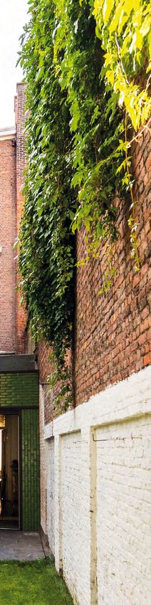
SINGLE FAMILY 9

The client wanted a modern, but above all calm architecture.
The structure is contemporary, but at the same time it is
serene – creating a laid back and feel-good atmosphere.

                                                  01|2018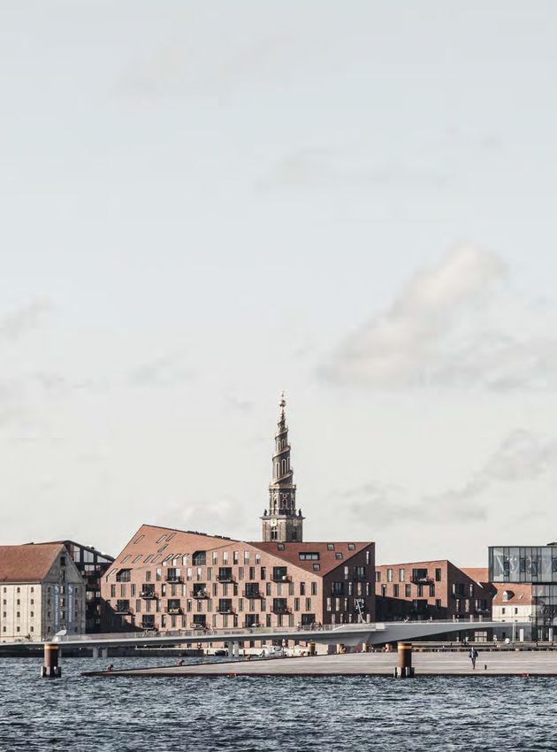
10 SINGLE FAMILY

HANDMADE CLAY TILES
BREATHE LIFE INTO THIS HOME
Caring Wood is an extensive country home project set in 84 acres of scenic Kentish countryside in the United
Kingdom. It is a magnificent house with the space for three generations of the same family, incorporating formal,
communal and private spaces. The project was recently the winner of 2017 RIBA House of the Year.

T
      he architects faced a challenging brief: to em-   NO ORDINARY ROOF Their roofing design involved a
      body the spirit of the English country house in   combination of shapes and angles that demanded
      a design which would embrace its context and      a durable and adaptable roof tile product. After an
landscape, while simultaneously providing a carbon      extensive search comparing suppliers and products,        Caring Wood was designed
neutral response to climate change. Aesthetic am-       architects James Macdonald Wright and Niall Max-          to accommodate three
bitions, practical needs and sustainable principles     well agreed on handmade clay roof tiles.                  generations, and the building
                                                                                                                  comprises four towers
dictated every choice of material and fundamental       The architects chose traditional tiles for two reasons.   set around a central inner
element, especially the roof.                           Firstly, they liked the natural aesthetic, which is <     courtyard.

               01|2018
SINGLE FAMILY 11 01|2018
12 SINGLE FAMILY

           Inspired by the traditional oast
             houses of Kent, Caring Wood
               revives local building crafts
          and traditions, including locally
            sourced handmade clay tiles,
             locally quarried ragstone and
              coppiced chestnut cladding.

               01|2018
SINGLE FAMILY 13
< imbued with a distinctive finish and warmth of col- FACTS & FIGURES house and cottage achieving the best local energy
our. And secondly, the design made handling and rating. The design of the house and landscaping
Project name
laying a simple and easy process for contractors. Caring Wood, Kent, United were jointly considered to contribute to, protect and
The architects were meticulous in their detailing and Kingdom enhance the local environment.
planning and so were attracted to these specific tiles Architect Caring Wood’s sustainability is addressed through
because of their dedicated and flexible service. James Macdonald Wright and a low energy design and the use of clean green
Niall Maxwell technologies, but also in the application of regional
DRIVEN BY DESIGN The project team worked hard to Client building form, material choices and detailing. Having
Private
ensure that nothing was left to chance – every angle created the framework for the house and estate, it
and shape was specifically detailed and modelled Products used will now evolve to suit changing family needs, while
Keymer County Peg Antique
in advance. It was a very design-led construction - the material will maintain their performance and aes-
the architects had a site office and were on hand to Year of completion thetic integrity. >
2017
fix, help, advise and look at all the different details
working closely with the contractor Complete Roof-
ing Contractors. The 153,000 tiles added together to
create a striking appearance for the country home’s
roof. They were gradually delivered throughout each »Beyond the impression of sublime craftsmanship
stage of the project and were produced using tradi-
and spatial grandeur this house offers, Caring Wood
© Photos: James Morris
tional handmade techniques over a period of a year.
leads us to fundamentally question how we might
BEAUTIFUL AND SUSTAINABLE The finished property live together in the future.«
boasts exceptional sustainability, with both the main RIBA House of the Year 2017 jury chair, Deborah Saunt.
01|201814 SINGLE FAMILY
01|2018
© Photos: P8-ArchitectenSINGLE FAMILY 15
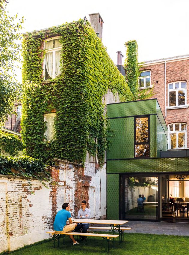
SHINING GREEN
FACADE FOR A
HOUSE EXTENSION
The town house in Zurenborg, Belgium consists of traditional
brick; the rear extension is covered in the same material but
thanks to its glazing shines in bright green. It matches well
with the green garden scenery in the back yard.
G
FACTS & FIGURES reen is in. A green roof, a green façade etc.,
there is no shortage of creative ideas. House
Project name
Town house in Zurenborg,
plants and plant motifs are back, combining
Belgium urban flair with natural accents. The colour green ra-
Architect
diates calm, it gives strength and energy. The outer
P8-Architecten, Hansi Ombregt, shell of this town house´s extension also follows this
Schoten trend. On the street side the building looks classical
Client but in the rear garden an exciting contrast can be
Private seen. A contemporary facade solution fits perfectly
Products used between the existing old dividing walls.
Terca Green glazed
Vertical masonry was used and
some of the bricks where rotated Date of completion NEW REAR BUILDING To create more space in the tra-
90° so that the continuous beds 2015 ditional structure an extension was needed. It hous-
are vertical, a good option when
es a new kitchen and a dining room for the whole
designing expressive façades.
family. The Art Nouveau tiles inside the dining room
also have a green tint. The choice of the same colour
for the rear building was quickly made.
In the back yard, the rear façade was brought back
to the line of the original building. This created the
much-needed space to build another floor for the
newly built extension. The existing windows were
kept where possible to provide maximum daylight.
SPECIAL COLOUR AND VERTICAL MASONRY Besides its
fresh colour, the glazed bricks also add a touch of
plasticity to the façade. Vertical masonry was used
and some of the bricks where rotated 90° so that the
continuous beds are vertical, a good option when
designing expressive façades. The volume ties in
beautifully with the climbing plants growing against
the rear building over the dividing walls. It forms a
fresh, green space within an urban environment. >
01|201816 MULTI FAMILY
STUNNING
FACADES
FOR A
RESIDENTIAL
COMPLEX
The Park Rublevo project is a premi-
um, new-build residential complex
located in parkland, just 20 minutes
from downtown Moscow, Russia. All
the building units were covered with a
customised brick that was developed
in cooperation with the architects.
I
n close proximity to the city, but surrounded by
nature, this prestigious residential project embod-
ies modern living. The project includes 22 resi-
dential buildings with 480 flats and is located near
the Moskva river. The apartments have terraces or
garden views. The buildings are arranged in pairs to
share underground parking most efficiently. The de-
velopment itself is a car-free zone.
MORE THAN HOUSING The complex has a unique land-
scaping design, situated near the water and within
a park, and was constructed using only high-quality
materials. It fulfils the criteria for a premium devel-
opment, and all residents have access to sever- <
01|2018MULTI FAMILY 17
The architects designed their own
brick especially for the project.
01|201818 MULTI FAMILY
»We tried to create the
feeling of a ruined house
with the covered window
niches, to make a link
between our project and the
surrounding area, to put it
into context and embrace
The project includes 22 residential
buildings with 480 flats, and is
the diversity of the area.«
located near the Moskva river. Tsimailo lyashenko & partners
© Photos: Wienerberger Russia, Tsimailo lyashenko & partners
< al sports facilities, including a tennis court. Play- the natural surroundings. After construction, the
grounds, leisure areas, jogging and bicycle lanes, park was finished with additional, decorative trees,
and a jetty on the river, all complement the leisure shrubs, and flower beds.
offerings of the complex. The whole area is surround-
ed by trees that are hundreds of years old, and which CUSTOM-MADE BRICKS This prestigious project need-
have been preserved. The locations of the buildings ed a special brick. The architects already had a
were carefully selected to minimise their impact on precise colour in mind, and worked together with
01|2018MULTI FAMILY 19
The custom-made bricks were laid
using a special relief technique.
FACTS & FIGURES Wienerberger to create their own façade brick. The
naturally beautiful material was laid using a special
Project name
relief technique to create a contemporary, yet time-
Park Rublevo, near Moscow,
Russia less aesthetic.
Architect
Tsimailo lyashenko & PRIZE-WINNING The Park Rublevo development has
partners been much praised by property market experts and
Client has been recognised as the best housing devel-
OPIN opment in several categories at many of the most
Products used prestigious residential property architectural awards
Terca customised design in Russia and Europe. Most recently, it was named
Year of completion “The Best Residential Property” in the European
2016 Property Awards 2016-2017. >
01|201820 MULTI FAMILY
»During a visit the five
investors all picked their
own type of brick.«
FLOWING FAÇADES FOR STUDENTS
The city of Utrecht in the Netherlands houses a lot of students. Affordable accommodation is hard to get.
That´s why five parents took matters into their own hands and founded an initiative to build houses for
sixteen students. The students share a joint living room, kitchen and a beautiful brick façade.
F
ive parents who preferred investing their mon- FACTS & FIGURES ed backwards slightly. During a visit to the brick
ey in real estate rather than putting their money manufacturer the five investors all hand-selected
Project name
in the bank were mainly seeking a return on Ryelanden student housing, Utrecht, their own type of brick – one for each student home.
their investment. The entire building shell, including The Netherlands
the internal shell elements, was made of prefabri- Architect INDIVIDUAL FLOW The most remarkable variation is the
cated concrete. At the same time, these ‘collective Bureau Kroner architects flowing masonry work, which gives each building its
private clients’ had quality in mind: that’s why they Parent Initiative own personal flow. In consultation with the bricklay-
chose a beautiful and customised brick façade for Pickkers Consult BV ers the stones were placed in a 3D model by the
their project. Client architects with variations of 2.5 millimetres and more.
Stichting The façade bricks were cut in a customised man-
DIVERSITY AND UNITY Familiar features include stag- Studentengroepswoningen.nl ner and laid in place professionally. The south-facing
gered windows and masonry bonds. The architect, Products used façade ensures a striking play on shadows – de-
Bureau Kroner, examined the work at a more ab- Terca Pioenroos, Terca Douro Porto pending on the position of the sun.
© Photos: Teo Krijgsman
Reduced, Terca Dinkelrood Reduced,
stract level and opted for diversity and unity at the Terca Rutiel, Terca Tigris Flash, Terca Although they seem different from the outside, be-
same time. For instance, the façades differ in height Dommelrood Reduced hind the dynamic façades are five identical houses,
and alternate in depth. Three houses are positioned Year of completion based on prefab elements, providing 16 students
along the building line, whilst two houses were shift- 2017 with beautiful and affordable housing. >
01|2018MULTI FAMILY 21
The five different staggered façade bricks and the differently
flowing masonry work create a special dynamic.
A concept that provides a distinction between the façades but also
creates unity when it comes to the whole building block.
01|201822 MULTI FAMILY
GREY BRICK SCREENS
FOR A FORMER
WORKSHOP
Foundry Mews is a newly-built mixed-use development on an 800 m2
back land site in Barnes, West London, United Kingdom. It includes
residential apartments and commercial units, both covered with mod-
ern grey brick façades with perforated brick screens.
T
ucked away behind a traditional range of shop
buildings, the site was a long abandoned car
workshop. The brief for this sensitive site was
to create studios and housing. The architects chose
to take the model of the artisan mews where studios
and living space share an intimate courtyard setting.
The scheme comprises six duplex dwellings above
a plinth of studio workspaces with two additional
units and an apartment in the gabled northern block.
While the brick gables and slate roofs merge into the
surrounding street-scape, contemporary screens
formed within the brickwork shield the terraces of
the apartments.
WORKSHOP CHARACTER The main design concept is the
FACTS & FIGURES
idea of a courtyard running the length of the site, al-
lowing ground floor access to the commercial units as Project name
Foundry Mews, London,
well as the residential areas. Two external stairways United Kingdom
provide access up to the residential units, empha-
Architect
sising the ‘workshop’ character of the scheme. The Project Orange, UK
duplex apartments are arranged with the living space
© Photos: Jack Hobhouse
Products used
on the lower floor and bedroom and bathroom above. Terca Eastfield Grey brick
Penter Hague Cream DF
A REFERENCE TO THE INDUSTRIAL PAST Grey brick is Year of completion
the predominant material, harmonizing with the local 2016
01|2018MULTI FAMILY 23
Grey brick is the predominant material, harmonizing with the
local stock brick and referencing the site’s industrial past.
stock brick and referencing the site’s industrial past.
Matching clay pavers were selected to create uni-
formity. At first floor level the brickwork forms perfo-
rated brick screens – an inventive response to plan-
ning concerns which developed into a key feature of
the scheme.
SUSTAINABLE CONSTRUCTION Sustainable design fea-
tures were integrated into the project including a flat
green roof, photovoltaic cells flush with the pitched
roofs, mechanical ventilation heat recovery units in
the flats and a centralised gas heating system. >
01|201824 PUBLIC
7,000 ceramic panels
were used to create this
outstanding façade.
© Photos: M.Takuji Shimmura
01|2018PUBLIC 25
A SCHOOL
CLOAKED IN
CRAYONS
When the Ecole Mistral school in Villiers-sur-Marne –
France was redeveloped and renamed the architect
wanted to give the façade´s appearance a look that
resembles a set of coloured pencils – an effect that he
achieved with the use of enamelled ceramic cladding.
L
ocated in an area that falls under an urban re-
generation programme and which is undergo-
ing major redevelopment, it was hoped that the
new school would form a contrast to the harshness
of the neighbouring buildings. Architect Laurent
Fournet conceived a building that would be sug-
gestive of childhood, awakening and creativity, with
multi-coloured façade cladding. The lively façade
“stands for opening up to a world of culture”, says its
designer. The geometric design of the school flows
FACTS & FIGURES
into a curve and adds an extra sense of vitality to the Project name
structure. Ecole Mistral school,
Villiers-sur-Marne, France
FINDING THE RIGHT TONE Laurent Fournet did his re- Architect
Agence Laurent Fournet
search to find the right product, and ultimately, it was Architectes
enamelled ceramic cladding that fulfilled his needs.
Client
He liked “the warmth and acidic tone of the enam- Tassone Bâtiment
elled terracotta and the wide range of colours avail-
Products used
able”. A pallet of samples was prepared for approv- enamelled Argeton Barro
al by the City Council, and then a frame combining cladding
different colours was designed with several levels of Year of completion
bars, each measuring a metre in height. < 2017
01|201826 PUBLIC
The school was given a playful design,
in bright colours, to create a feel-good
atmosphere for the children.
01|2018PUBLIC 27
»The lively façade represents
the idea of opening up to a
world of culture.«
Agence Laurent Fournet Architecte
< DELICATE CONSTRUCTION A specialist with experi-
ence in working with this type of cladding was need-
ed for the job of putting in place the 7,000 pieces
of this outstanding façade. The challenge lay in re-
specting the specific layout of the panels across the
whole building, walls and roof. The curved elements
were particularly difficult to implement. The shingles
were put in place one at a time, while the fixtures
were hidden in the shadow of the product. The result
was deeply satisfactory and the team particularly ap-
preciated the clarity and durability of the enamelling.
A cladding that combines the warmth of terracotta
with the lustre of enamel – quality sure to stand the
test of time – a place where children can play, learn
and enjoy. >
01|201828 PUBLIC
VIBRANT TEMPLE
OF SPORT
The Top Sports School in Wilrijk / Antwerp, Belgium is a place
of education for young sporting talents. The school´s design
is unusual; even the corridor to the changing room draws all
eyes to it – thanks to the shining green glazed roof tiles.
T
FACTS & FIGURES he elite school in Wilrijk is one of three main
sports schools in the region. It offers 20 hours
Project name
a week of regular education. On top of that,
Top Sports School, Wilrijk /
Antwerp, Belgium each student trains 12 hours a week in his/her pre-
ferred discipline. The students are carefully select-
Architect
Compagnie-O architects, Joke ed by sport federations and to attend you must be
Vermeulen & Francis Catteeuw named as a top young athlete. The focus lies on
Products used swimming, judo, tennis and hockey, although other
Koramic Aléonard green glazed in sports are also offered.
two shades
base with sports facilities gives the building spatial
Year of completion EXCELLENT INFRASTRUCTURE autonomy within a natural context. On top of the
2017
The site was chosen because of the excellent sur- concrete base sits the school complex like an edu-
rounding infrastructure; an ice hockey field, a swim- cational “hub” on the top floor.
ming pool, sports halls and tennis courts are all lo-
cated nearby. It is not only the students who benefit GLAZED TILES TURN A CORRIDOR INTO A PIECE OF ART
from the facilities; the school’s facilities are also open The plain tiles draw the green of the outside inwards.
outside school hours to local sports groups – so the The two shades of green glazing turn a generally
whole region benefits. charmless players’ corridor into a vibrant area. The
structure, colour, tactility and reflection create a wall
© Photos: Compagnie-O architects
A SENSE OF COMMUNITY of scales, in strong contrast to the skin-like pink col-
The Top Sports School stands for openness and our of the adjacent changing rooms.
community. Its open character is mirrored in the ar- The school ensures that young sporting hopefuls can
chitecture itself. There are long corridors and both develop their talents in the best environment – details
reflective and transparent surfaces that let people like the vibrant green tiles ensure that the surround-
observe and be observed. The sculptured concrete ing stays beautiful too. >
01|2018PUBLIC 29
Contemporary design with traditional
products. The handmade tiles transform
the school corridor into a piece of art.
01|201830 PUBLIC
A PLACE FOR MODERN
RESEARCH MADE FROM
TRADITIONAL RED BRICK
Located in China, Beijing Nutrichem Research Centre takes up an area
of around 20,000 m2 on a flat terrain. It is equipped with office space,
an R&D centre and other supporting functions. The combination of
traditional red brick and modern-style titanium-zinc sheets and
glazing reflects the spirit of innovation, based on experience.
01|2018PUBLIC 31
Eighteen 20 metre-tall, shuttle-shaped,
brick columns guard the main entrance
at the front of the building.
T
he client, a company specializing in the devel- FACTS & FIGURES
opment of crop protection products, wanted
Project name
more than just a place to work for their per- Beijing Nutrichem Research
sonnel. The building should not only represent the Center, Beijing, China
corporate image, but also create a feel-good at- Architect
mosphere. The client´s visions for this project right Fang Yunfei, Tsinghua Unversity
from the start was that it should be a first-class R&D Client
center that enables staff to work in the best and most Nutrichem Co., Ltd
innovation-friendly environment. Products used
Terca Litanie PHM, Terca, Penter
IT HAD TO BE BRICK Without hesitation, both the client Blue & Westfalen
and the architect had their minds on red brick. It is Year of completion 2017
a key element in this project. The colour and texture
of handmade red bricks provide a comfortable feel-
ing and blend perfectly into the surroundings without
losing their own character.
ONE MATERIAL – DIFFERENT STYLES In this project, the
diverse characters of red bricks are represented
through different masonry laying methods. The “brick
courtyard” is where this element is used to its fullest.
Besides the arched red brick installations and the ma-
sonry of a red brick stairway, the brick-blinds to the
side of the R&D building is undoubtedly the most <
01|201832 PUBLIC
First floor plan.
The H-shaped Beijing
Nutrichem Research
Center has a total floor
area of 36,218.27
square metres.
© Photos: Yao Li
01|2018PUBLIC 33
Red brick transforms
the building from a rigid
corporate presence to
a modern office space
where people can roam
and feel comfortable.
< eye-catching detail. The 20-metre high brick-blinds BRICK INSIDE AND OUTSIDE The red brick element in
cascades reach down from the top. On a sunny day, facade design is extended to the interior. The 4-sto-
sunlight and breeze pass through and are filtered into rey-high wing at the end of the office area highlights a
geometric shades on the building’s inner façade, while red brick wall. During the day, sunlight shines through
the green leaves thriving in the courtyards form a bright the latticed brick wall towards the hallway, casting
contrast with the red bricks. The material is used here dotted shadows, which together with the warmth of
to add a soft and warm touch to the building. the red colour, create a lively, relaxing atmosphere. >
01|201834 PUBLIC
COVERED IN
IRIDESCENT AND
SHIMMERING LAVA
When planning the restoration of the Bioclinical Research
Centre (CRBC) in Clermont-Ferrand, France, the architect
immediately thought of the volcanoes in the local area, and
of terracotta. The inspiration for this special shimmering
lava-terracotta façade came from an Art Deco vase.
A
nne-Françoise Jumeau, from Périphériques FACTS & FIGURES
Architectes, had to work around tight con-
Project name
straints during construction of the Research Bioclinical Research Centre
Centre, a project which gathers together, under one (CRBC), Clermont-Ferrand,
roof, lecture theatres for students, laboratories for re- France
searchers and a business centre. Architect
The project, which involved an element of redevelop- Anne-Françoise Jumeau for
Peripheriques Architectes
ment and the building of two extensions, stretches
over 80 metres, with a very long façade, which fea- Client
Sarl FCI in CEBAZAT
tures repeated horizontal layers of solid and glazed (department Puy-de-Dôme)
panels, designed to align with the internal spaces
Products used
(offices, laboratories). Petrol-coloured Argeton
cladding
RESEARCHING “HER” MATERIAL Fascinated by terra- Year of completion
cotta, Jumeau imagined gently sculpting a material 2017
that would evoke volcanic lava, but iridescent, and
shimmering with a thousand colours. “Our initial point
of reference was a black enamelled vase that came
© Photos: Luc Boegly
from an art deco shop”. Armed with the vase, she
set out to find a specialist in terracotta who would be
able to provide her with a coating that would mim-
ic its aesthetics. The solution was a special ceramic
cladding, reprofiled.
01|2018PUBLIC 35
»Another strength of this material is the way that the light in it
varies depending on the time of day and the weather, creating
›a dialogue between the building and its environment.‹«
Anne-Françoise Jumeau, PERIPHERIQUES Architectes
The design of the facade panels featured a special shape
and glazing, so they were custom-made for the project,
in collaboration with the architect.
WORKING TOGETHER The architect recalls that, “I went
to visit the producer, where they were able to offer
a surface with the effect I was looking for, thanks
to a process of double-baking the enamelling”. The
enamel used, simultaneously black and colourful,
turned out to have a very similar look to that of the
vase. Anne-Françoise Jumeau designed a cus-
tom-made wave pattern for the project. The result is
a long façade, which gives the impression of move-
ment, with waves that are indeed evocative of vol-
canic lava. The vertical and the horizontal lines are in
harmony with one another, the black enamel of the
cladding fits well to the varied gold and champagne
hues of the many frames and windows. >
01|201836 PUBLIC
The restaurant won
the Prize for Best
Commerce Design in
Brussels in 2015.
© Photos: Fred Sablon
01|2018PUBLIC 37
TASTEFUL INTERIOR
FOR A RESTAURANT
The Colonel restaurant in Brussels, Belgium presents itself as
a “beef specialist”. Besides the high-quality food and service,
it offers its guests an eye-catching interior made with red
bricks, laid in a special bond.
T
he Colonel is dedicated to quality meat, beef in FACTS & FIGURES
particular, and pays tribute to regions in France
Project name
that are well known for exceptional meat like Restaurant Colonel, Brussels, Belgium
Charolaise, Aubrac, Salers, Normande etc. You will
Architect
find a wide variety of different sorts of meat on the Dirk De Leeuw architects, Brussels in
menu, which are prepared in the open kitchen. collaboration with Diego Carrion and
Cécile Grosjean
ADDING A SPECIAL TOUCH But that´s not the only thing Client
that makes the Colonel unique. Strong values such BVO Food sprl
as a can-do attitude and craftsmanship are blend- Product used
Terca Egala Koraalrood
ed with a contemporary design. In the decoration
of the building, reference is made to the raw basic Year of completion
2015
product, red beef. The choice of a terracotta tile floor
and the striking red brick wall are therefore evident.
It reinforces the customer’s sensual experience and
provides a feel-good atmosphere. The brick wall
pays homage to the BBQ and grill culture. The use
of metals and the claustra masonry bond of the brick
screen are reminiscent of a grill. The claustra effect
also creates unique shades of light.
INGENIOUS LACEWORK Claustra, also known as Bra-
zilian bond, stands for masonry in which only the
ends of the facing bricks rest on the brick below.
This creates openings that give the façade or wall a
transparent character. The result is a combination of
aspects that are oppositional: privacy and transpar-
ency, mass and emptiness, light and blinds, closure
and ventilation. A special solution for a special res-
taurant. >
01|201838 PUBLIC
© Photos: Oliver Heissner
Generous windows
create deliberate
contrasts in the façade.
01|2018PUBLIC 39
CUTTING-EDGE ARCHITECTURE
PERFECT FOR THE OLD CITY
The newly-built Katharinenquartier in Hamburg, Germany, combines contemporary architecture
with a traditional environment. This is made possible by using bricks in the façade design.
D
o you live and work near to the Port of Ham- FACTS & FIGURES grouped around a turfed internal square that is open
burg, the historic Speicherstadt and the mod- to the public during the day. The building façades are
Project name
ern harbour city? Residents, visitors and staff Katharinenquartier, Hamburg, formed by bricks that are typical to the region.
appreciate the mix of the traditional and modern Germany
within the project. “With the Katharinenquartier, we Architect EXCLUSIVE THANKS TO BRICKS FIRED IN CIRCULAR KILNS
have proven that modern, high-quality architecture KPW Papay Warncke und Partner “In line with the Hamburg tradition, only brickwork
revives historic design and reflects the commonali- Products used façades would do for the façade design,” said
ty between living and working”, said architect Niels Terca Bockhorn Roßlau bright the architect. This meant high-quality bricks with
Vagt from KPW Papay Warncke und Partner. red clinker and Terca Bockhorn structured surfaces and rich colours that fit the
Steglitz black clinker
cityscape. The selection ultimately came down to
EXCITING PROSPECTS A quarter has been created on the Year of completion two different façade bricks made in a circular kiln
2015
property around St. Catherine’s church with a residen- in bright red and black. Carbon lumps, bonding
tial share of 60 percent, plus business and office spac- surfaces and traces of sinter are desired for these
es can also be found on the new site. The flats are rustic variants and add a certain level of exclusivity
and individuality thanks to their unusual look. They
were built in a rustic pattern.
AESTHETICS AND VALUE RETENTION However, the se-
lection of the façade material was not based on vis-
uals alone. When using bricks, painting is unneces-
sary and maintenance costs are minimised. They are
weather resistant and protect the underlying insula-
tion. With their high-quality look, they also add to the
timelessly beautiful Katharinenquartier. >
The Katharinenquartier
was named after nearby
St Catherine’s church.
01|2018www.architectum.com
You can also read