ALIA ALI OF PATTERN FOTO RELEVANCE HOUSTON TEXAS | JUL 9, 2021 - SEP 4, 2021
←
→
Page content transcription
If your browser does not render page correctly, please read the page content below
ALIA                                                     ALI
CARTOGRAPHIES
OF                           PAT T E R N
F O T O R E L E VA N C E H O U S T O N T E X A S | J U L 9, 2 02 1 - S E P 4 , 2 02 1
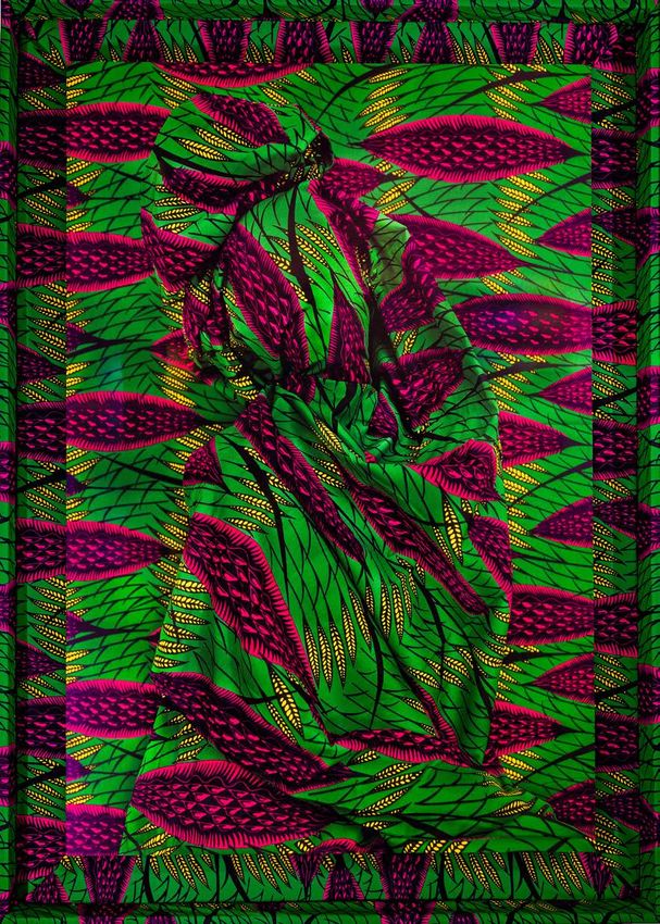
Cover Image: Crossing, MIGRATION Series, 2021
pigment print with UV laminate mounted on aluminum dibond in wooden frame upholstered in
Dutch wax print sourced from Senegal
49 in x 35 in x 3 in // 124.5 cm x 89 cm x 7.5 cm (framed)
Edition of 5 + 1 EP + 1 AP
ALIA                                                               ALI
CARTOGRAPHIES
OF                             PAT T E R N

Transformation is fundamental and arguably inevitable. People of the diaspora know it all too
well, both in motion and emotion. The horizontal transgressions across natural and manmade
borders create multiple cognitive shifts that can only be organized as layered experiences
accessible all at once. This inability to translate causes a rippling perspective effect, which can
only be interpreted through symbols of familiar and invented languages and the sounds of
mythical places and creatures.

                                                                                           — Alia Ali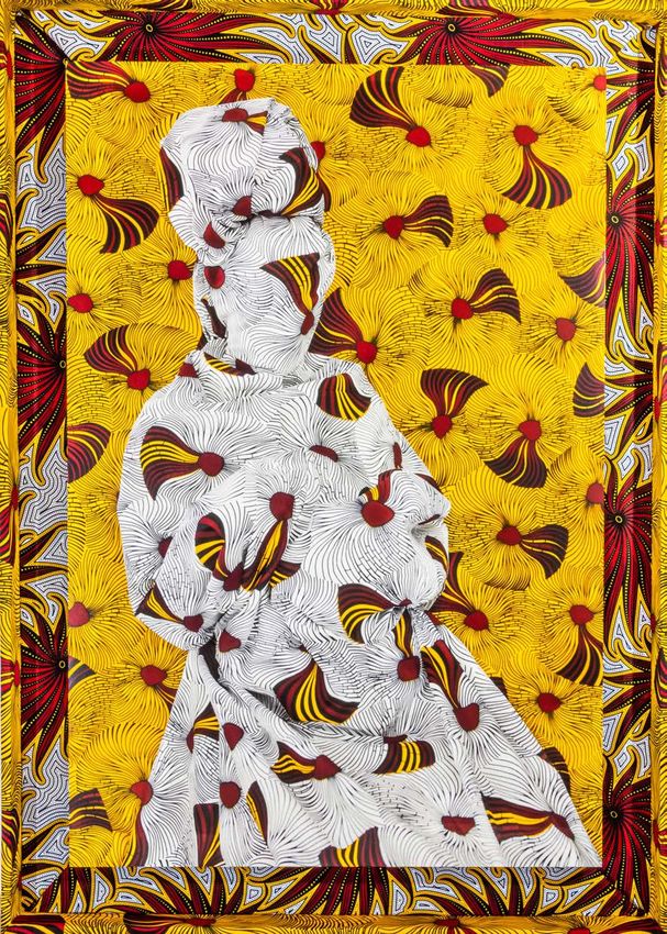
CARTOGRAPHIES                                             OF           PAT T E R N
THE WORK OF ALIA ALI
                                  GEOFFREY C. KOSLOV

Alia Ali uses a global palette of fabrics and photography to map culture and history. She is
a US multimedia artist, photographer, and a global traveler with a Yemeni-Bosnian heritage,
who is fascinated by the use and meaning of language and the patterns of hand woven
indigenous fabric. As Ali expresses it: “Textile unites and divides us, both physically and
symbolically.” Her art reflects on the politics of borders, colonization, language, and the non-
verbal passage of traditions and cultural stories through fabrics created by master artisans
from around the world. As a purposeful artist on a mission, Ali has made a concerted effort
to meet the craftspeople who create these fabrics. She has traveled extensively to learn
about meaning and processes associated with the fabric, patterns and pigments. While the
fabrics are regional, the appreciation and production has become global. In BORDERLAND,
the series originates in Yemen. In FLUX, in Côte D’Ivoire, MIGRATION in Senegal and in FLOW,
Uzbekistan. The INDIGO series highlights a natural blue color used by many cultures, and the
    ( ḥub) // LOVE series is a fabric of Ali’s own creation, using the Arabic word for
“love.” As an artist, Ali conveys all of this through non-verbal imagery that speaks loudly of
these underlying currents. On the surface, these may plainly look like an exciting colorful
presentation, but what is covered and explored in the exhibition “Cartographies of Pattern” is a
deeper journey, guided by Alia Ali’s imagery, into the story behind each threaded weave of her
BORDERLAND, FLUX, MIGRATION, FLOW, INDIGO, and              ( ḥub) // LOVE series.

Alia Ali’s journey began with the BORDERLAND project around 2015. It is here that Ali begins
to describe her sense of people, and begins her non-verbal critique with viewers of how
humankind creates barriers and uses our unique cultures and characteristics to divide. As Ali
describes it: “The term “borderland” is most commonly referred to as the crossroads where
nations collide. It is a porous zone that diffuses outward from an artificially imposed human-
made punctuation called a border.” In BORDERLAND, Ali wraps her models in fabrics that are
from particular geographic regions, created by artisans in this artwork. The fabric completely
covers the person beneath. She refers to these models as “-cludes.” “-Cludes” is not a word
by itself, but an add-on to words that carry a meaning to include or exclude. We are shut out
from seeing who is enclosed in the fabric and imposing our pre-programmed biases. We can
wonder whether Ali uses sitters with regard to their gender, ethnic, or racial identity to sit
for her in the posture they assume. In each of these images, in any of these five bodies of
work, the posture is a revealing expression of an emotion through these silhouettes of people
wrapped in textile. This is a recurring theme for Ali. A sense of non-verbal lore passed down
through generations in a tradition of pattern in fabric and craftsmanship. A sense of mysticism
from the ancient past that is an element of identity of a people carried into the future. The
sense of place and land in the patterns where borders are defined and separated create
different identity and hence different patterns. A pure form of body language.

Ali’s work opens an expressive use of one art form within another. Her works are a beautiful
combination of photography, textile and the hand craftsmanship of the frames. “Textile is
significant as it is something that we are born into, we sleep in it, we eat on it, we define
ourselves by it, we shield ourselves with it and, eventually, we die in it. … The use of textile is
significant as it’s sourced from the earth to be woven into something that protects, defines,
unifies, and divides us–– it becomes a point of departure from where we all begin.” It is rare
to have an artist with a body of work that literally expands the globe. In “Cartographies of
Pattern,” Ali’s work invites the viewer to be a time traveler, anthropologist, sociologist, and
simultaneously have our eyes widely opened. These fabrics take us around the globe in a
fashion without borders. Within the appreciation of the beauty of the textiles in each of these
creations, we share an experience with other people, regardless of origin. The works of Alia Ali,
without our knowing it, have placed us in a space that is borderless with appreciation of what is
also unique and special.

(aldhat) 3,    ((ḥub) // LOVE Series, 2021
fine art UV flatbed print on aluminum dibond with aluminum subframe
42 in x 28 in // 107 cm x 72 cm
Edition of 6 + 1AP + 1 EP
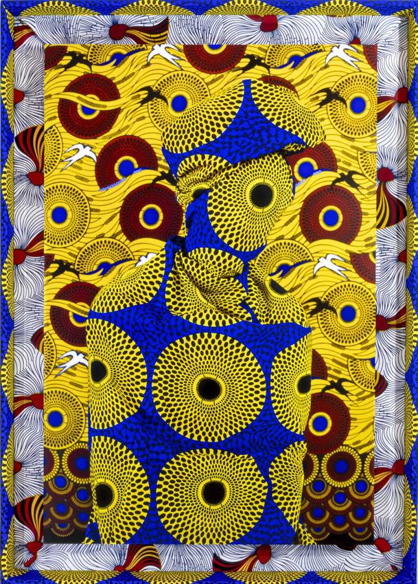
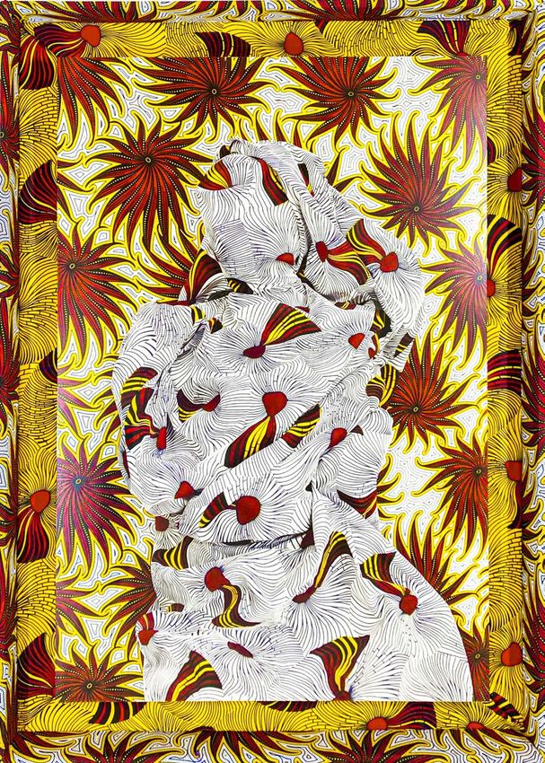
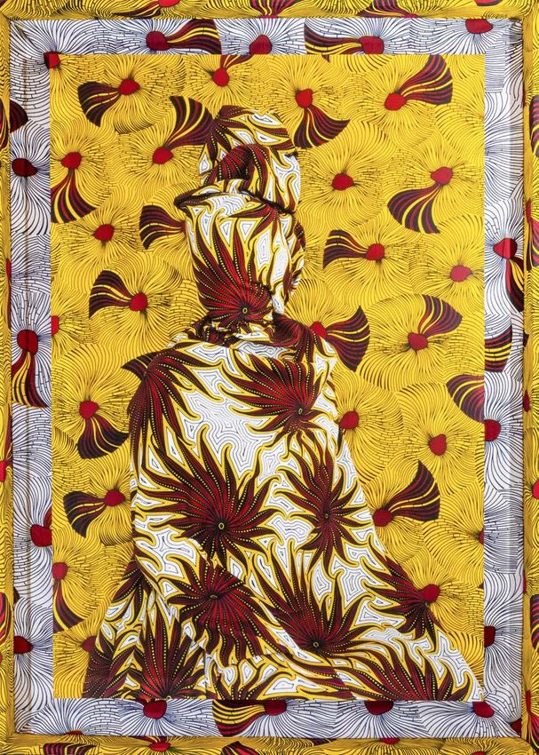
INTRODUCTION
Throughout life we are presented with endless examples in which individuals and groups have been
excluded from communities based on appearances, beliefs and actions. When this happens, there
must always be two, those who impose standards, the decision makers, the ‘included,’ and those
they exclude. Communication can be used to both connect and divide, evolve and regress, educate
and destroy. Inclusion is, therefore, engaging someone in a dialogue, but not necessarily a verbal
one.

Cartographies of Pattern invites the viewer to analyze their subjective perception in regards to
inclusion and exclusion, and the threshold in which the transition between the two, occurs. What
are the parameters that define each? The various series exhibited highlight the immediate duality
that occurs in any given situation; to have one, you must have the other for either to exist. In this
case, understanding inclusion requires us to be critical of what it means to be excluded. In order to
be included, must one come from a state of exclusion or vice versa? The theme of duality extends
to questioning the moment in which the mysterious becomes apparent, restraint becomes freedom,
the underneath becomes the above, and illusion becomes reality.

The characters in the portraits, called —cludes, are wrapped in layers of fabric that shield them
from interrelating with anything beyond the material. What are these fabricated barriers in society
that inhibit the incorporation of others? Or are the obstacles just that: ideas, intuitions, fear,
discriminations and ‘understandings’? Does inclusion mean acceptance? If so, does this definition
lend itself to exclusion meaning rejection? Or do they both mean different points on the spectrum of
tolerance?

What side of the fabric are we on and can we be on both sides at once? When we exclude, does
it come from the fear of being excluded ourselves? Isn’t exclusion a form of security, as well? If
so, what is it that we fear from discovering that lies beneath the cloth and behind the curtain? By
remaining indifferent, and uncommunicative, do we become like one of them, dehumanized? Or are
we the ones enclosed and what we see is an illusive barrier that we have bestowed on them?

Does the material set a power dynamic? It certainly creates a boundary, but who holds the power;
them, for their anonymity, or us, for their confinement?

Who are the ‘includes’ and who are the ‘excludes’?

BORDERLAND, 2017-ONGOING

Two things are for sure:
as long as there is humanity,
violence is certain
and art will always be created from its sparks.

The term “borderland” is most commonly referred to as the crossroads where nations collide.
It is a porous zone that diffuses outward from an artificially imposed human made punctuation
called a border. Borders enact violence on the geography and identity of those living in
borderlands. They are both imprints of power and scars of destruction. Borderlands, on the
other hand, are the result of naturally occurring interactions among people and of nature
trying to forge an existence in proximity to what is around them. BORDERLAND (2017-ongoing)
re-examines these demarcated zones as territories of exploration drawing attention to them as
transient physical spaces and a contemporary phenomenon from which the body of artwork is
presented and the viewer is a participant.

Who is on the other side of the fabric questions the very nature of belonging and interrogates
the binary of home and exile. Is the subject the one who imposes the standards, the decision
maker, the ‘include’? Or the ‘exclude’? In the human act of processing our surroundings,
we unconsciously categorize. We separate good from evil; familiar from unfamiliar; threat
from safety; alien from native… We, influenced by categorizations, create these dichotomies
ourselves. The theme of duality extends to questioning the moment in which the mysterious
becomes apparent, freedom becomes restraint, and illusion becomes reality.

Seeing is an act of power, but so is being seen. Are the -cludes hiding or are they being
hidden? Is it an active form of anonymity or a passive one? When confronting the -cludes, we
are forced to confront the ways we include and exclude others in our daily lives. Is exclusion
motivated by a primitive fear and search for security? A form of self-preservation? A
metamorphosis of the outcast into villain?

The fabric, like borders, is narrow but long, defined physically and yet interpretative in identity-
both have a capacity of exploration. Textiles are products of the earth, canvases through which
culture manifests itself at the surface, and objects that become a part of us. Aren’t borders as
well? Or are they simply spaces of blankness?
BORDERLAND was inspired by the aggressive push to block access, coupled with a strong
nationalistic phenomenon taking precedence over providing security and refuge for those
in greatest need. This discourse has already begun to build walls around the globe while
simultaneously eroding communities built on diversity.

The -cludes are “undocumented” characters- their names are ambiguous and their exact
location, a mystery. They are unidentifiable, except for the details displayed such as color,
symbolism and texture eventually and simultaneously drawing on a sense of connection and
alienation. Their existence questions what the human is and what lies outside and within it.

Fabric, ancient in its invention, is archival with the passage of time. The fabric, like the human
beneath it, or the border it symbolizes within this body of work, is also vulnerable to the
elements and to time. When all is said and done, borders shift and textiles disintegrate, but if
well preserved and nurtured with culture, knowledge and grace they remain intact.

Borderlands, like textiles, are territories of exploration and zones in which we will be judged for
our humanity.

Kadia, BORDERLAND Series, 2017
pigment print with UV laminate mounted on aluminum dibond in black wooden float frame
42 in x 28 in // 107 cm x 72 cm
13.5776° N, 44.0178° E
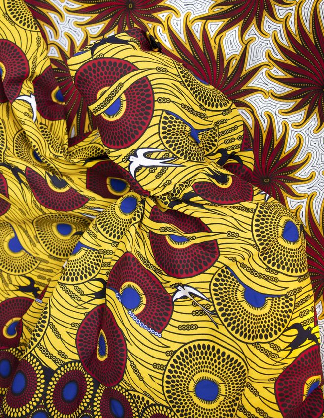
Edition of 5 + 1 EP + 1 APFLUX, 2019-21 While its functional purposes of textile are evident, its indexical capacities are not. FLUX (2019-2021) draws the viewer’s attention to the textile as a document in which politics, economics and histories collide. Focusing specifically on wax print, this series addresses the naming and origin of these textiles. Wax print—a wax-resistant dyeing technique—exists under various monikers, including African wax print, Dutch wax prints, Ankara and batik. These names reveal that colonial histories and economic reactions are woven into the processes and patterns that define the print. A vibrant aesthetic obscures an iniquitous past and embodies a dynamic narrative which accentuates the complex conditions by which these textiles have come into existence. FLUX is a series of shifting photographic artworks that embody silhouettes that are warped and warped by textile, saturated in colors and a medley of motifs. Each frame is uniquely upholstered with wax print sourced from Cote d’Ivoire, Senegal, Nigeria and the Netherlands. While some of the images distort visibility, others create hypervisibility almost negating themselves into animated forms of camouflage. The outburst of saturated colors and hyperoptic motifs in these images, lend themselves to vibrating results obscuring the complex and sometimes iniquitous conditions by which these textiles came into fruition, thus destabilizing the source(s) from where they came from. The multiple dimensionality creates a kaleidoscope of perspectives, horizontally and vertically. Horizontally, in that this material has come into existence across borders over land and water, and vertically in that they draw from and evoke cosmic, mythical and religious inspirations. Furthermore, these particular wax prints are a key to mapping the colonial trade routes. While they certainly can be seen as escapist dreamscapes, they are also objects of oppression and capitalism. In most cases the fabric is defined by its maker, but these fabrics in flux are an exception. Who names them? Is it the entity who produces the cloth, or the entity who consumes it? Or is it, perhaps, the one who ensures their passage into a new geographic coordinate? Just like denim raises the question of being French or American, or because of its use of indigo, is it Japanese, Indian or Ghanaen? One could follow a similar line of questioning with wax print: is it Indian, Chinese, Javanese, Dutch or West African, and if so, then what part of West Africa, exactly? What is clear is that these particular wax prints present a literal and conceptual space with hidden stories and promised potentiality. They conjure pride and pity, celebration and rejection, power and greed. While the classification of this cloth is complex, its origins are not. Wax prints have come into existence by a variety of cultures, first seen in India, China and Java. With the colonial trading that took place within the region, between the British and the Dutch, objects, ideas, and humans were consistently being
traded, and it was by water that this passage would occur. Fabric requires water, not only for the growth
and harvesting of the fibers and dyeing techniques, but for their migration, as well. The trans-global
trade routes networked across the oceans and seas from Europe, around Africa, along the Arabian
coast, through South Asia reaching East Asia, and back.

In the mid 19th century, the Dutch would engage new technologies to mass-produce wax fabrics to sell to
the Javanese market. The look of the batik would be seemingly similar, ultimately different in that it was
not as refined as the labor-intensive handcrafted textiles made by batik masters in Java. In the process,
a “crackling” effect would occur, causing the pigment to seep into the fabric in unintended places. While
these batiks were rejected in Java, markets on other parts of the trade routes, particularly along the
African coastline, embraced them. The fabric fever caught on and today these fabrics are widely found
in Ghana, Nigeria, Senegal, Cote d’Ivoire and Namibia, and yet, to this day, the majority of the design and
production takes place in the Netherlands.

These fabrics in flux are a commodity once considered as precious and as commonplace as gold,
frankincense, myrrh, jewelry and, as previously mentioned, humans. FLUX questions the very nature of
how things get named, how they are translated, and how, eventually, are reinterpreted. Furthermore, it
questions the intention of their production. If it is not for the preservation of heritage, then is it for the
propagation of economic wealth? And for that matter, whose wealth?
Magenta Leaves, FLUX Series, 2021
pigment print with UV laminate mounted on aluminum dibond in wooden frame upholstered in
wax print sourced from Côte d’Ivoire
49 in x 35 in x 3 in // 124.5 cm x 89 cm x 7.5 cm (framed)
Edition of 5 + 1 EP + 1 AP
Orchidian Orb, FLUX Series, 2021
pigment print with UV laminate mounted on aluminum dibond in wooden frame upholstered in
                                                         wax print sourced from Côte d’Ivoire
                                  49 in x 35 in x 3 in // 124.5 cm x 89 cm x 7.5 cm (framed)
                                                                    Edition of 5 + 1 EP + 1 AP
Constellation, FLUX Series, 2019 pigment print with UV laminate mounted on aluminum dibond in wooden frame upholstered in wax print sourced from Côte d’Ivoire 49 in x 35 in x 3 in // 124.5 cm x 89 cm x 7.5 cm (framed) Edition of 5 + 1 EP + 1 AP
Atomic Flower, FLUX Series, 2019
pigment print with UV laminate mounted on aluminum dibond in wooden frame upholstered in
                                                         wax print sourced from Côte d’Ivoire
                                  49 in x 35 in x 3 in // 124.5 cm x 89 cm x 7.5 cm (framed)
                                                                    Edition of 5 + 1 EP + 1 AP
Warp, FLUX Series, 2019 pigment print with UV laminate mounted on aluminum dibond in wooden frame upholstered in wax print sourced from Côte d’Ivoire 49 in x 35 in x 3 in // 124.5 cm x 89 cm x 7.5 cm (framed) Edition of 5 + 1 EP + 1 AP
Warrior Lips, FLUX Series, 2019
pigment print with UV laminate mounted on aluminum dibond in wooden frame upholstered in
                                                         wax print sourced from Côte d’Ivoire
                                  49 in x 35 in x 3 in // 124.5 cm x 89 cm x 7.5 cm (framed)
                                                                    Edition of 5 + 1 EP + 1 AP
MIGRATION, 2021 Transformation is fundamental and arguably inevitable. People of the diaspora know it all too well, both in motion and emotion. The horizontal transgressions across natural and manmade borders create multiple cognitive shifts that can only be organized as layered experiences accessible all at once. This inability to translate causes a rippling perspective effect, which can only be interpreted through symbols of familiar and invented languages and the sounds of mythical places and creatures. From the oasis to the desert, our Eutopia of terraced mountains, ancient architecture, jewelry, textile, frankincense and myrrh has become a dystopia of explosions, famine, disease, and suffering. Our land was looted of our most precious artifacts, which bear witness to this cruelty that we have endured. Like us, they are nomads, not by choice but rather by consequence. And yet, there is a cosmic juncture: As children we were told of stories and myths, we stargazed and imagined the proximity of our ancestors by the simple fact that we contemplated under the same galactic horizons. We inherited myths to expand our imagination, which would become the landscapes of our dreams and futures. It would become a sign that we exist not only here in the present, but also there in the past and future. Our collective odyssey negates placelessness and alienation, as our existence lies within our crossings, not our destination. How can we ever imagine an existence on a horizontal axis? Productive citizens of our homelands, we were forcefully pushed or pulled into the realms of our respective Diasporas only to be consumed by our adopted lands as slaves and laborers. Here we are considered to be aliens, only to be naturalized into further alienship. We are the dreamers, the thinkers, and the believers whose contributions are remembered, but identities disappeared. We reach our destination, only to discover that we have been moving in the wrong direction. A few of us exist trying to assimilate expectations of our new nations. To do so, we must change our names, papers, accents, and all the processes are engaging in the active erasure of thousands of years. The frequencies of our land and our languages which have vibrated through our DNA for hundreds, if not thousands of years, will soon slip away, along with our memories of the past and dreams of our futures. MIGRATION (2021) is a rupture to the dystopic present in which migrants are caged within rigid structures designed for their ultimate failure. Rather than accepting these conditions, this body of work pushes one to reimagine their own narrative by breaking free from the bounds of the systems that have failed them. It serves as a celebration and a call to carve out unique spaces: ones in which we are not only travelers over physical planes but temporal ones, as well. As time travelers, we embody interlacing constellations of myths, histories, memories, dreams, and realities that address complex discourses. By expanding on the movement through time and place, MIGRATION invites other aliens to reimagine their futures rather than settling on the present as a final destination. It proposes an alternative space that addresses painful political histories while simultaneously inventing different horizons for existence. MIGRATION was inspired by Sun Ra and June Tyson’s musical and theatrical collaboration, Enlightenment (1980)1. “If Sun Ra was the king of Afro-futurism, then Arkestra vocalist June Tyson was the queen...”2 Ra, was an American
jazz composer, philosopher, and poet known for his experimental music. Tyson (aka the Saturnian Queen) was
a vocalist, a poet, a dancer and costume designer; she would be the only woman invited into Sun Ra’s Arkestra
between 1968 and her death in 1992. Her voice activates Sun Ra’s poetry and lyrics:

The Sound of Thought is Enlightenment
The Magic Light of Tomorrow
Backwards are those of Sadness
Forward and Onward are those of Gladness
Enlightenment is my Tomorrow
It has no planes of sorrow
Hereby, my Invitation
I do invite you be of my Space World
                                    Sun Ra, Enlightenment3

Tyson and Ra would be prolific in their output as futurist thinkers and creatives by subverting narratives and
reorienting their audiences to expansive thinking beyond this world, fraught with trauma of war, colonization,
incarceration, slavery, apartheid and genocide. Collectively and individually, they would set the foundations for other
communities to carve out their own radically imagined futures on their own respective terms. Examples include
Indigeouns Futurism, Sino Futurism, Palestinian Futurism and Yemeni Futurism.

This series is dedicated to the travelers and thinkers, like Ra and Tyson, who spearheaded other Futurist thought by
reconsidering our respective landings. By repositioning ourselves on multiple “starry dimensions,” we reassess how
we think of home –– from the physical to the metaphysical, earthly to cosmic, and linear to non-linear. The double
existence of the literal and the poetic are not competing; from their (con)fusion emerge acute cosmic temporalities.

In Crossing, Odyssey and Horizon, the -cludes have one eye on the viewer and the other elsewhere pointing to the
multiple existences experienced at once; this is the migrant. Collectively the -cludes are suspended in a continually
“warping space” measured by the movement of the sun.4

MIGRATION engages a global dialogue, highlighting patterns of trauma, erasure, and reconstructed identities
experienced by numerous nations and diasporic communities across the globe. Collectively the photographic
sculptures in the series create a distorted constellation of imagery intended to suspend the viewer the multiple
horizons of possibilities.

_________________________
1
    Ra, Sun & tyson, June. “Enlightenment, Sun Ra: Live in Rome 1980”. https://www.youtube.com/watch?v=bawnDSRuMAY&ab_channel=Pharomba
2
    Freeman, Phillip. “Sun Ra Arkestra’s June Tyson Was the Queen of Afrofuturism”. Bandcamp. November 26, 2019. https://daily.bandcamp.com/
features/sun-ra-arkestras-june-tyson-was-the-queen-of-afrofuturism
3
    Ra, Sun. Enlightenment lyrics. Enterplanetary Koncepts. 1954
4
    Ra, Sun (Herman Poole Blount and Charles Plymell). Profetika: Book 1 (New York: Kicks Books, 2014)
*These textiles sourced from Senegal and produced by Dutch companies are a reminder that the danger of assimilation will only lead to ultimate
erasure.
Rhythmic Equations, MIGRATION Series, 2021 pigment print with UV laminate mounted on aluminum dibond in wooden frame upholstered in Dutch wax print sourced from Senegal 49 in x 35 in x 3 in // 124.5 cm x 89 cm x 7.5 cm (framed) Edition of 5 + 1 EP + 1 AP
Starry Dimensions, MIGRATION Series, 2021
pigment print with UV laminate mounted on aluminum dibond in wooden frame upholstered in
                                                       Dutch wax print sourced from Senegal
                                  49 in x 35 in x 3 in // 124.5 cm x 89 cm x 7.5 cm (framed)
                                                                   Edition of 5 + 1 EP + 1 AP
Cosmic Vibrations, MIGRATION Series, 2021 pigment print with UV laminate mounted on aluminum dibond in wooden frame upholstered in Dutch wax print sourced from Senegal 49 in x 35 in x 3 in // 124.5 cm x 89 cm x 7.5 cm (framed) Edition of 5 + 1 EP + 1 AP
Odyssey, MIGRATION Series, 2021
pigment print with UV laminate mounted on aluminum dibond in wooden frame upholstered in
                                                       Dutch wax print sourced from Senegal
                                  49 in x 35 in x 3 in // 124.5 cm x 89 cm x 7.5 cm (framed)
                                                                   Edition of 5 + 1 EP + 1 AP
Horizon, MIGRATION Series, 2021 pigment print with UV laminate mounted on aluminum dibond in wooden frame upholstered in Dutch wax print sourced from Senegal 49 in x 35 in x 3 in // 124.5 cm x 89 cm x 7.5 cm (framed) Edition of 5 + 1 EP + 1 AP
Crossing, MIGRATION Series, 2021
pigment print with UV laminate mounted on aluminum dibond in wooden frame upholstered in
                                                       Dutch wax print sourced from Senegal
                                  49 in x 35 in x 3 in // 124.5 cm x 89 cm x 7.5 cm (framed)
                                                                   Edition of 5 + 1 EP + 1 AP
FLOW, 2021 FLOW (2021) is a photographic sculptural series that references intertwining histories, cultural narratives, and creative processes associated with ikat, borrowed from the Indonesian word meaning “to bind.” While its origins are believed to be in Java, the fabric maintains roots across the globe including India, Uzbekistan, Argentina, Bolivia, Mexico, Yemen, and Central and South East Asia. Across the world, ikat is known by different monikers and carries varying degrees of significance. Ikat is also known as endek to Indonesians, kasuri to the Japanese, atlas to the Uyghurs, matmi to the Thai, jaspe to Oaxaquenos, pochampally to Hydrabadis, patola to Gujaratis, darayee to Iranians, and tiraz to Yemenis. Regardless of the differing names that each community uses to reference it, the process is consistent. This particular cloth, considered to be one of the “holy weaves,” is regarded as a fabric of the wealthy and/or the sacred. Today, it is most commonly referred to as ikat and has been adopted into other Anglo- European languages where the practice was never developed, but rather appropriated. Ikat employs a complex process of production using a resist dye process, similar to that of batik which also originated in Java, but dissimilar in that the dying process takes place before the threads are woven together. The process by which Ikat is created, engages a team of Master artisans and time tested methods. Once the cotton or silk is rendered from the cotton tree or silk worm’s cocoon, artisans create long threads that are wrapped around two wooden bolts. This process is referred to as “the weave.” The weave is then brought to a specialized artisan who sets the Ikat’s design. This process is achieved by dividing the bolts of threads into equal parts, encasing parts with wax or wrapping them with tape, and then dipping each portion into specific dyes to create a dye resistant result. The wax is then boiled off or the tapes removed. Finally the unbound threads are carefully and systematically lined up to reveal exceptional patterns which evoke dramatic visual shifts. An opposing thread, known as “the weft,” is used on the loom to produce the horizontal stitching. While the width of the fabric is restricted to the loom, the length is not — therefore offering repeated sequences rippling across potentially endless lengths of vibrantly rich cottons and silks. FLOW draws the viewer’s attention to the highly enigmatic textile, and also questions ikat’s vulnerability to the historical and geopolitical implications of its production, especially in the context of an ever- consuming capitalist and globalized world. As originally, the fabric’s migration to Europe in the 20th Century emerged from Dutch colonization of the West Indies, Indonesia.
As a child I was exposed to some of the most exquisite textiles through travels with my mother. Ikats
were among the many textiles that I encountered along these journeys and I would encounter them
mostly in textile markets. The patterns enthralled me as my eyes vibrated across the flowing gowns and
garments of those who wore them. It was only years later, in my adulthood that I discovered that my
native land, Yemen, was famous for the weave and renowned across the Muslim world for the high skilled
workmanship that the Yemeni Masters produced. Ikat was once found throughout Yemen in silks and
cotton, which often included gold leaf. According to the Cleveland Museum of Art, some of the oldest
forms of Ikat can be traced back to textile workshops in Sana’a, Yemen in the 9th and 10th centuries.
This form of Ikat is referred to as cotton warp-ikat tiraz, and often includes shades of indigo, tan, and
ivory, embellished with inscriptions. The Cleveland Museum of Art notes that many surviving pieces of
Yemeni Ikat fabrics were found in ancient middens at Forstat in Egypt. Unfortunately this part of our
heritage would be erased –– a repercussion of colonization, war, and the fragmentation of our people
with our diaspora spread across the globe.1

In 2016, the allure of the textile would draw me in once again deep into the Fergana Valley of Uzbekistan,
in a town called Margillon. I spent several weeks there with Master Ikat designers, dyers and weavers,
in what is considered to be one of the oldest and longest existing ikat factories along the Silk Road.
This area served as a crossroads between cultures, and became a vibrant place where the exchange of
textiles, stories, myths, and symbolism took place across time.

Today, Margillon is a sleepy town that attracts occasional tourists who make their way off the beaten
track from the otherwise renowned Samarkand and Bukhara. Its last claim to fame was in 2013, when
famed fashion designer Oscar de la Renta sourced his fabrics for his Fall 2013 collection. While the
kaleidoscopic designs of versicolored textiles took the fashion industry by storm, Margillon remains
unchanged. The pattern continued to be appropriated by the fashion industry, and its origin confused
and co-opted as something other than Uzbek. It has been drastically removed from its source(s), and
as such is widely recognized to be associated primarily with “Eastern’’ cultures. In many instances, when
searching online for example, ikat is often misattributed to Turkey or Morocco, when in fact it’s sourced
in Uzbekistan. Ultimately, FLOW reminds the viewer of where the fabric originates, and signifies the
unseen master artisans themselves.

____________________________
1
 Mackie, Louise W. Symbols of Power: Luxury Textiles from Islamic Lands, 7th-21st Century. Cleveland; New Haven: Cleveland Museum of Art; Yale
University Press, 2015. Reproduced: p. 104: Mentioned: p. 105, 215
Furthermore, what goes amiss in the wide consumption of the textile is how pattern functions as a
lexicon. The team of Master artisans engage in a highly mathematical and organizational system to
produce the cloth, requiring each of them to be highly skilled and fluent in the entire lexicon of Ikat
symbolism. Artisans memorize the entire canon of motifs present in the ikat fabrics, understanding
the meaning of each symbol and it’s mathematical measurements. Examples include rams horns,
pomegranates, the evil eye, blueberries, snakes, and paisley. Fabrics with particular symbols are worn
for different occasions, both daily and ceremonially. The symbols are thus activated as expressions of
specific qualities and narratives, and most importantly as protection. It becomes a shield, not for the fine
quality of the cotton or silk being used, but rather for the power of the symbol that is portrayed within.
Visually, the movement within the fabric, and the shifting shapes in the textiles, can cause a rupture in
the viewer’s perception. The fluctuations within the fabric, the oscillating symbols and colors trouble
notions of categorization and fixed definition.

FLOW conceptualizes this collaboration of thread, dye and meaning –– wherein the cloth itself takes on
frequencies of the individual and of the materials –– that lend to the sense of movement present in the
final creation. What is rendered is a hyperoptic result that allows the textile, and ultimately the wearer,
to stand out while simultaneously camouflaging the curves and lines of the body. Ikat is also used in
the decoration of interior spaces where entire rooms are upholstered from floor to ceiling, including
furniture and those living within, creating dreamlike experiences. Ikat manifests into an expression of the
land from which the materials are harvested and the imagination of those who exist upon it.
Kaleidoscope Cascades, FLOW Series, 2021
pigment print with UV laminate mounted on aluminum dibond in wooden frame upholstered with a blend of
                                                          cotton and silk ikat sourced from Uzbekistan
                                                      55 in x 27 x 3 in // 140 x 68.5 x 7.5 cm (framed)
                                                                              Edition of 5 + 1 EP + 1 AP
Jan, FLOW Series, 2021 pigment print with UV laminate mounted on aluminum dibond in wooden frame upholstered with a blend of cotton and silk ikat sourced from Uzbekistan 55 in x 27 x 3 in // 140 x 68.5 x 7.5 cm (framed) Edition of 5 + 1 EP + 1 AP
Jin, FLOW Series, 2021
pigment print with UV laminate mounted on aluminum dibond in wooden frame upholstered with a blend of
                                                          cotton and silk ikat sourced from Uzbekistan
                                                      55 in x 27 x 3 in // 140 x 68.5 x 7.5 cm (framed)
                                                                              Edition of 5 + 1 EP + 1 AP
INDIGO, 2019-ONGOING Reorient (v): “to reacquaint someone, especially oneself, with a situation or environment.” INDIGO (2019-ongoing) is a photographic series that explores the multiplanar capacities of the dynamic indigo plant, pigment, and array of blues that it renders. It unites us physically and cosmically as our bodies are composed of 80% water and our gazes are drawn to the blue sky from birth, connecting us to the earth and to each other. As the sun moves through the sky, and light refracts across the atmosphere, the shifting hues of blue mark the passage of time. It is no surprise then, that the color has been understood throughout history and across different cultures as something that allows us to transcend and connect our physical bodies to the celestial. It is a constant for us all, whether we are settled or migratory, imprisoned or free. Indigo, a dark blue dye rendered from a tropical plant belonging to the pea family, was once widely cultivated and traded globally. It is now used in textiles and holds cultural significance across the world from Japan, Mexico, Yemen, India, Senegal and Vietnam, China, and Lao. The production and practice of its harvesting and usage draws a constellation, mapping various functions of indigo across individual cultures that produce it. In Japan for example, indigo, also known as aizome, was traditionally worn by the lower social classes. Japanese farmers wore it to repel snakes, mosquitos, and pests, while firefighters wore it for its fire resistant properties. The INDIGO series thus reflects textiles’ capacity to divide us, while also revealing the unifying power of the pigment itself and the artisanal process, across cultures and continents. In Yemen, for example, the indigo process was mastered by Jewish artisans who had ties to the Jewish community in Uzbekistan, likely united through the trade routes of the Silk Road and Mecca, which not only served as a religious center but also an economic one. In Uzbekistan and Yemen, Master weavers who wanted something dyed in indigo would take the fibers to Jewish Master dyers. These communities, though fragmented through religion, collaborated on the same cloth. These interwoven relationships transcended beyond the textile, and echoed across different communities in Asia and North Africa. Despite seemingly disparate backgrounds, cultures and terrain, we are all in fact connected through historical production of textile and symbolic meaning.
In 2015, I found myself in a near fatal circumstance driving in the Himalayas. At the moment
of fully submitting myself to the circumstance, I closed my eyes only to feel awash in Indigo.
When opening them again, everything in sight bled the color of indigo. This perpetuated a
pronounced sense of reorientation - the oscillating moving from extreme disorientation into full
orientation. In further travels, I would hear from fellow travellers and migrants who have had
similar traumatic experiences, whether in a moment of crisis or extreme pain, felt themselves
similarly connected to the wash of indigo. In a variety of cultures, indigo is referenced as “the
third eye”, “the brow”, and “third chakra”. It is repeatedly referenced in this state of vertical
travel, wherein one finds themselves removed from linear time frames and physical existence––
the borderlands between and beyond varying planes of consciousness.

INDIGO invites the viewer to reorient their relationship and understanding of the potentialities
of color. It posits that color itself can serve as a means to embrace that which cannot be legible
through a lexicon, but can only articulate a state of being - the space existing between.
Dots I, INDIGO Series, 2019
pigment print with UV laminate mounted on aluminum dibond in white wooden float frame
33 in x 33 in // 84 cm x 82 cm
Edition of 5 + 1 EP + 1 AP
Stripes, INDIGO Series, 2019
pigment print with UV laminate mounted on aluminum dibond in white wooden float frame
                                                       33 in x 33 in // 84 cm x 82 cm
                                                            Edition of 5 + 1 EP + 1 AP
Diagonal, INDIGO Series, 2021 pigment print with UV laminate mounted on aluminum dibond in white wooden float frame 33 in x 33 in // 84 cm x 82 cm Edition of 5 + 1 EP + 1 AP
Chevron, INDIGO Series, 2019
pigment print with UV laminate mounted on aluminum dibond in white wooden float frame
                                                       33 in x 33 in // 84 cm x 82 cm
                                                            Edition of 5 + 1 EP + 1 AP
(HUB) // LOVE, 2021
The photographic series, ( ḥub) // LOVE (2021), pushes back against the forced reorientation
of my native tongue, Arabic, and sparks a dialogue with one word, , reclaiming the beauty and
nonviolence of the language. By employing photography, textile, and text, this body of work presents
various points of entry to complex notions of inclusion, exclusion, erasure, and the politicization
of the body and language. Through multiple gradations of color, single images are refracted
across five surfaces demonstrating expanded interpretations of love– its expression, reception
and acceptance. The use of textile is significant as it’s sourced from the earth to be woven into
something that protects, defines, unifies, and divides us–– it becomes a point of departure from
where we all begin, like language, itself. The fluctuation of the word between foreground and
background questions the array of relational power within and among micro and macro societal
structures.
The beginning of the century was marked by the attacks of September 11th, the illegal invasion
of Iraq, Abu Ghraib, and the media’s subsequent portrayal of Arabs as either victims or villains.
Arabic became a signifier of violence where Arabophones refrained from speaking in public in fear
of being removed from airplanes, fired from jobs, harassed at schools, and tracked by government
agencies for “suspicious behavior.” People changed their names and children’s names in order to
protect themselves. In doing so, children lost their native tongue leading to the erasure of an entire
generation’s stories, heritage, and connection to their roots. Others would find ways to reinvent
their inherited languages, such as English or French, as an act of defiance and a mechanism of
empowerment claiming it their own by manipulating it into newly evolved dialects, creating barriers
between them and authority figures.
Central to this body of work, ( ḥub) // LOVE is the reinterpretation of Arabic words by
politicians and the media to fit particular agendas. When the words (taliban) and
(madrassa) are entered into Google search, different information is presented depending on how
the words are typed: in Arabic script, English transliteration, and English translation. The word
(taliban) is defined by Google as “a brutal, fundamentalist religious group that held power
over most of Afghanistan during the late 1990s.” (madrassa) as, “An Islamic religious
school…” also noting, “...many of the Taliban were educated in Saudi-financed madrassas in Pakistan
that teach Wahhabism, a particularly austere and rigid form of Islam which is rooted in Saudi
Arabia.” An image search portrays fundamentalist Islamic schools for boys and children holding
guns. However, with a deeper search one finds that taliban and madrassa are, in fact, the onlyArabic words for “student” and “school”– nowhere are they words that are limited to Islam, boys, or
violence. Someone saying nahnu taliban fil madrassa, “We are students in school” runs the danger
of being understood as “We are terrorists in a terrorist training camp.”
This pattern of misinformation and language abduction caused radical shifts in the language.
Immigrants from Arabic-speaking countries would be forced to find replacements for these
words by using the French and English counterparts, thus erasing the Arabic version from their
vocabulary entirely–– like a glitch rooted in fear.
( ḥub) // LOVE is an intervention to this pattern, subverting fear through beauty by expanding
the capacity of language rather than accepting its limitations. , derived from two letters, and
, is repeatedly hand painted on the fabric which when put together carries multiple meanings,
including seed, fruit, affection and love. is not static in its meaning or expressions–– it is infinite,
flexible, and fluid. The titles of each of the works expand on the meaning of including
further demonstrating its ubiquity and the
endless ways a word can radically alter our thought processes and ways of existing.
Lexicon
(raḥa)
(ra - comfort, rest, relief, leisure, repose, ease
(latf) - kindness, courtesy, gentleness, friendliness, softness, civility
(aldhat) - self, ego, person, essence
(tadhḥiya)
(tadh - sacrifice, offering
(ikhtiyar) - option, choice, preference, liberty
(‘ikhlas) - sincerity, dedication, loyalty, devotion, fidelity, honesty
(a’amal) - effort, potential, labor
(asl) - origin, descent, parent, root, ancestry, principle
(roowḥ)
(roow - spirit, soul, life, essence
___________________________________
1
“Adam Saleh removed from plane ‘for speaking Arabic’”, Al Jazeera, December 22, 2016
2
Google Search: “Verlan,” February 29, 2021
3
Google Image Search: “taliban”, February 13, 2020
4
Google Image Search: “madrassa”, February 13, 2020(asl) 2, ((ḥub) // LOVE Series, 2021 fine art UV flatbed print on aluminum dibond with aluminum subframe 42 in x 28 in // 107 cm x 72 cm Edition of 6 + 1AP + 1 EP
(ikhtiyar) 1,    ((ḥub) // LOVE Series, 2021
fine art UV flatbed print on aluminum dibond with aluminum subframe
                                       42 in x 28 in // 107 cm x 72 cm
                                             Edition of 6 + 1AP + 1 EP
(‘ikhlas) 3, ((ḥub) // LOVE Series, 2021 fine art UV flatbed print on aluminum dibond with aluminum subframe 42 in x 28 in // 107 cm x 72 cm Edition of 6 + 1AP + 1 EP
(roowḥ)) 3,
                         (roow           ((ḥub) // LOVE Series, 2021
fine art UV flatbed print on aluminum dibond with aluminum subframe
                                       42 in x 28 in // 107 cm x 72 cm
                                             Edition of 6 + 1AP + 1 EP
(tadhḥiya)
(tadh iya) 4, ((ḥub) // LOVE Series, 2021
fine art UV flatbed print on aluminum dibond with aluminum subframe
42 in x 28 in // 107 cm x 72 cm
Edition of 6 + 1AP + 1 EPALIA ALI
THE ARTIST
Alia Ali (Arabic: // Sabean: ) is a Yemeni-Bosnian-US multi-media artist. A child of migrant
linguists, Ali has traveled to sixty-seven countries, lived in and between seven, and grown up among five languages.
Her migrations have led her to process the world through interactive experiences and the belief that the damage
of translation and interpretation of written language has dis-served particular communities, resulting in the threat
of their exclusion, rather than a means of understanding. As an artist who exists on the borders of identifying as
West Asian, Eastern European, a United States citizen, queer, culturally Muslim yet spiritually independent, her
work explores cultural binaries, challenges culturally sanctioned oppression, and confronts the dualistic barriers
of conflicted notions of gender, politics, media, and citizenship. Through her practice, Ali critiques linguistics
and inherited political structures and narratives, while simultaneously attempting to counter the polarization
and miscommunication that imperils communities across the world, encouraging viewers to confront their own
prejudices.
Working between photography, video, and installation, Ali’s work addresses the politicization of the body, histories
of colonization, imperialism, sexism, and racism through projects that take pattern and textile as their primary motif.
Textile, in particular, has been a constant in Ali’s practice. Her strong belief that textile is significant to all of us,
reminds us that we are born into it, we sleep in it, we eat on it, we define ourselves by it, we shield ourselves with it,
and eventually, we die in it. While it unites us, it also divides us physically and symbolically. Her work broadens into
immersive installations utilizing light, pattern, and textile to move past language and offer an expansive, experiential
understanding of self, culture, and nation.
Ali’s research and practice are also informed by discourses of criminality, Yemeni Futurism, and feminist theory,
all of which are tools to unpack practices of refusal and rupture. Ali calls upon oral histories to conceptualize these
narratives, while reflecting on contemporary circumstances, in her native land Yemen, her adopted land the United
States and the endless places and people that continue to inspire her. Ali is currently expanding her practice by
drawing on stories from Yemen including the nostalgic past of Queen Belquis of Saba (also known as the Queen of
Sheba). By investigating histories of the distant past, she addresses the realities of the dystopian present in order to
carve out spaces for radically imagined possibilities for the future in what has evolved to be Yemeni Futurism.
Her work has been featured in the Financial Times, Le Monde, Vogue Arabic, Art Review, and Hyperallergic. Her work
is in collections at Princeton University, the New Orleans Museum of Art, and numerous international private
collections. Ali is a graduate of Wellesley College and the California Institute of the Arts. She lives and works in Los
Angeles and Marrakech, and is currently in residency at the Roswell Artist-in-Residence Program (RAiR) in New
Mexico.FOTO
R E L E VA N C E
Since 2016, Foto Relevance cofounders Geoffrey C. Koslov and Bryn Larsen have focused
on the exhibition and acquisition of museum quality contemporary fine art photography and
photography-based work. Foto Relevance is dedicated to providing a platform for an innovative
selection of American and international photographic artists pushing the boundaries of
photography. The gallery has mounted monographic exhibitions as well as group shows to
investigate current trends and themes in contemporary art, showcasing a broad range of both
darkroom and digital photographic techniques. In addition to promoting the work of artists,
Foto Relevance provides guidance, educating individual collectors and corporations in the
acquisition and sale of art. Foto Relevance is a member of the Houston Art Gallery Association
(HAGA). The gallery is located in the historic Museum District of Houston, Texas.
4411 Montrose Blvd.
Suite C
Houston, TX 77006
713.505.1499
FotoRelevance.comYou can also read