Amazon App 2020 Redesign:
Smart Ways for Driving
Conversion with E-Commerce UX
by Valentina Berois, Principal UX Designer at intive
←
→
Page content transcription
If your browser does not render page correctly, please read the page content below
Amazon App 2020 Redesign: Smart Ways for Driving Conversion with E-Commerce UX by Valentina Berois, Principal UX Designer at intive
A
       great e-commerce user experience is the key to the success of an online retail
       shop. It’s no secret that Amazon is usually the first company that pops up
when it comes to the most successful e-commerce business nowadays.

Amazon ‘s success is evidence of its competitiveness, and its growth & expansion is
the result of the company’s intensive strategies for growth.

Market Development, Market penetration, Product development and Diversification;
these are the four main strategy pillars and part of the reason why Amazon has gone
beyond its competition and succeeded in becoming a world leader in the online
retailing sector, staying true to its vision statement:
“
Our mission is to be Earth’s most customer-centric company,
where customers can find and discover anything they might
want to buy online, and endeavours to offer customers the
lowest possible prices.

For the last 15 years, Amazon has maintained a continuously exponential growth in
their annual net revenue, showing us that the sky is definitely not the limit, in fact,
this is barely the beginning. The business model and main differentiator of Amazon
in the larger market is still unbeatable by any other company out there, and it drags
more and more users every day.

The special service that Amazon offers is focused on the efficiency in the shipping
time of an article and guarantee of receipt by articles sent straight from their bases,
in addition to a fair price and a variety of supply. But this comes at a high cost for the
company, in fact, they have reported losses in shipping costs many times, but as they
say:

                                                                                             2
“
Amazon doesn’t care about losing money on delivery if it keeps
customers happy.

Now let’s get real here, there is no company that wants to keep customers happy at a
loss without a long-term growth goal or another strategy up its sleeve. They continue to
do that because their stock price continues to hover near $2,000 and this questionable
allocation of spending doesn’t seem to bring its stock price down.
This is how through the effective implementation of its generic competitive strategy
and intensive strategies for growth, Amazon.com succeeds in the global e-commerce
market and it’s not planning on stopping anytime soon.

                                                                                           3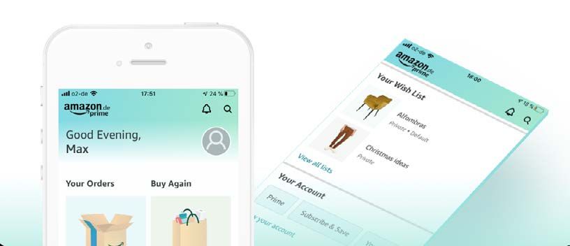
_E-Commerce
 UX Driving Conversion
 So, if Amazon is doing that well so far… why do they continue to focus on offering
 more user-friendly e-commerce experiences?
 “
 Research shows that, on average, every 1$ invested in UX brings
 $100 in return. That’s an ROI if a whopping 9,900%.— Forrester

 Well, that is exactly the thought that many other companies had in the past, before
 they eventually perished. A good known example is the gold era for eBay more than
 a decade ago, and the mistake of this company was something that Amazon is
 focusing on doing best: “reinventing business growth and rethinking their model
 within the market while being Earth’s most customer-centric company”. We could
 call it the “Madonna” of e-commerce.

 In their vision we can already spot how critical UX for e-commerce really is, as it
 ensures that customers can easily navigate your site/retail App, find exactly what
 they are looking for, make the purchase and move on.

 A bad UX is like entering a very messy and disorganised retail store, from which you
 will likely leave before attempting to buy anything.

 The more transparent and easier the purchase process is, the more frequently those
 customers will buy, and the more likely they will recommend your product to other
 potential users. This is not a minor thing at all, according to the CEO of Amazon, Jeff
 Bezos, if you build a great experience, customers tell each other about that. Word of
 mouth is very powerful.

                                                                                           4
_Amazon’s
Overall UX Performance
Amazon’s overall e-commerce UX performance (based on an exhaustive performance
review of 620 design elements) is mediocre. This is mainly due to good On-Site Search
and Order Tracking & Returns while simultaneously having poor Cart & Checkout.
On this performance analysis we can clearly see there is plenty of space for Amazon
to keep improving products and achieve its vision, and we have been witnessing this
process since 1994.
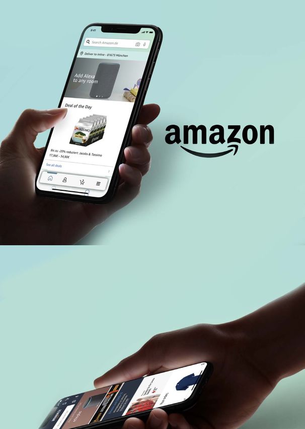
_Amazon
iOS App Redesign 2020
This is why during Easter this year, Amazon rolled out its iOS App version 15.8 in
Germany with a redesigned start screen and revised main menu. Two features that
require a slight reorientation after the first start of the app.
It’s worth mentioning that some users have already seen this new design a few months
ago, as they do A/B testing for new solutions they want to explore. According to Amazon,
“
Experiments can help you statistically find the best A+ content
for your listings, improve future content, and help drive more
sales
For this redesign, two key crucial factors were taken into account:
5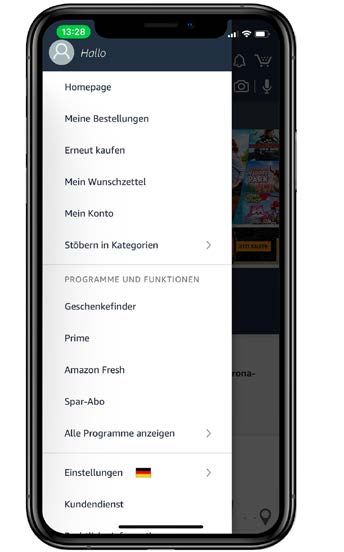
1. Navigation and operational simplicity
2.High-performing search experience (also easy to reach and use, including sub-
 functionalities such as search through code scan and voice)

Here we’ll explain to you what has changed and the benefits of these investments on
UX Design for e-commerce shops.

Simplified primary navigation

The biggest innovation is a floating navigation bar at the bottom of the screen,
which enables quick access to the shopping cart, profile, main menu and start
page no matter where you are standing in the App. At the same time, the menu
can no longer be extended to the left, but has moved downwards.

The famously known “Hamburger
menu”, or most commonly known
as “Navigation drawer” (originated
by Material Design) was the most
usual mobile navigation solution;
only until 2014 when Apple sparked
a fundamental change in thinking
on how mobile navigation should
work and established the “Bottom
Tab Bar” navigation as a key best
practice to offer users the best
experience. Since then, Google has
introduced the bottom navigation
to their design guidelines as well
and it has The tab bar is visible on every screen and therefore offers users

                                                                                      6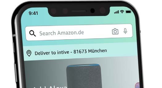
a clear visual orientation at all times, while it fulfils all 3 main requirements for
a good user experience:
_Where I am? (within the information architecture of the App)
_Where else can I go? (other tabs—not highlighted)
_What will I find when I get there? (icons and descriptive labels).

Tailored content on home start

                           Personalisation is a key UX pillar in e-commerce stores,
                           it gives the user control to the site and this can enhance
                           users’ experience.

                            This new start screen personalised content is done
                            down at the individual level which means that
                             suggestions are based on past browsing and purchase
                             history.
                             The main goal of personalisation is to provide
                              content and features that meet the specific needs or
                              interests of each user. The system profiles the user
                              and adjusts the interface according to this profile
                               (so that different visitors see different things on
                               the “same” page). Personalisation also simplifies

                                                                                        7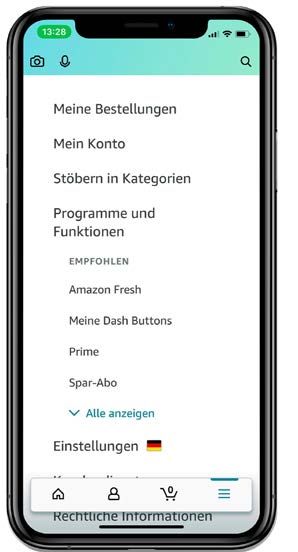
transactions and processes by storing information about a user, which is helps to
make the checkout process a lot faster and simpler for registered users.
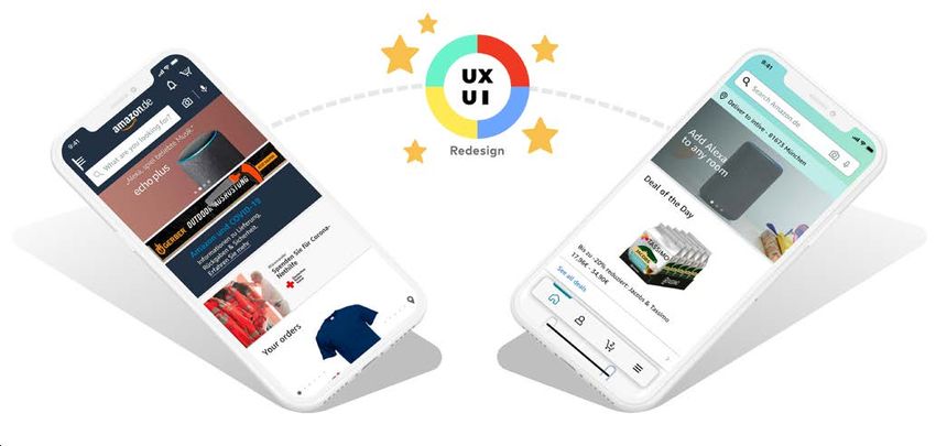
Delivery address on start and shopping cart
The shipping address chosen
as preferred by the user is
now always visible on top
of the Home screen and
Shopping cart, which can
save time for the user at the
checkout process, as he no
longer needs to confirm the delivery address on an extra separate step.
By just tapping over this element shown below the search bar, the user can
easily change the preferred delivery address to any other saved in the past, enter
a single postal code or deliver outside of Germany. These options can affect the
recommendations and product search results upon delivery restrictions.
Search Bar
Amazon’s search function is “state-of-the-art,” according to a recent study by
the research group Baymard Institute. The autocomplete search, filtering, and
guidance functionality excels at finding what visitors want.
The algorithm also personalises the homepage content to the user’s search
interactions in order to better enable future purchases.
The search bar now contains icons for integrated features such as “camera scan”
(scan to search) and “microphone” (voice command search).
8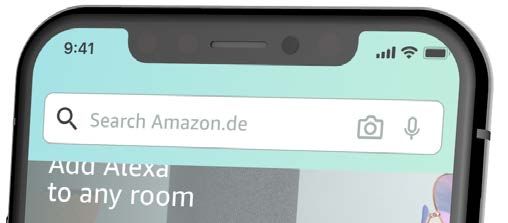
These feature elements used to be positioned outside of this element, taking
predominance away from the search bar (diminished size) and somehow
separating     features     that
belong together (these are all
 ways of searching
for an item). This new approach
is correctly complying with
the “Law of Proximity”, which
states that proximity helps to
establish a relationship with nearby objects and helps users understand and
organise information faster and more efficiently.

Other improvements on this feature:
_UX Writing: Simplified and concise hint text on the search bar: “What are you
 looking for?” => “Amazon.de search”
_Search icon colour: Dark colour switch, bringing more affordance to this main
 feature iconography.

Shopping Cart access

This feature needs to be on-sight and easy to reach the whole time, as its the
main connector for users to concrete a purchase. That’s why this single feature
can determine the success or failure of an e-commerce site.

Amazon has taken a wise decision here to move the Shopping cart from the main
App Header to the new Bottom Navigation Tab Bar.

E-Commerce user experience is all about the perception a user has after
interacting with your online store — whether it be positive or negative.

                                                                                  9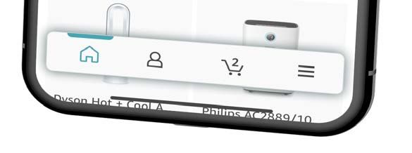
In recent studies, we can see that 76 out of every 100 of all
visitors end up abandoning their cart. And the reason is
simple — they aren’t impressed at all.

Personalised Profile Section

_Engaging start with personal salutation (Personalisation present once more).

_Clear categories for all main features related to each user’s behaviour and history.

_“My orders”, “Order again”, “Wish List” and “My account” main features & settings:
 Prime, Subscribe & Save, Browsing History and Gift Cards — as well as a direct
 link to all account-related content (Orders, Settings, Message Centre, Dash
 Buttons, Personalisation and Preferences).

Other Changes on UI

1.   Icons: Paths refined and tones darkened to correctly contrast the bright new
     colour palette, which is also working harmoniously against the fully white
     background from the new Navigation bottom bar.

                                                                                        10
2. Colour Palette: As for main solid highlight colour, used in some subtitles and
icon highlighted on the tab bar, they have decided to go for one of the green
tones conforming the gradient introduced on the main App Header bar.
3. Gradients introduction: The top header is now with a vibrant aquamarine-
tone gradient instead of the usual dark blue which is part of the Amazon Logo
since the biggest late redesign.
4. Font sizes: adjusted to fit the importance of elements/features.
5. Thin/Light font typo completely scratched out: this change leaves only
font weights from Regular to Bold: thin and light font weights were part of
a tendency mainly started by iOS 10 Design which is lately being scratched
to offer solid readability instead of a riddle to decipher, starting by iOS itself.
The Amazon App only uses its own typography called “Ember” that’s still
maintained and part of their unique Brand CI.
6. White space increased: Whitespace around the highlighted items tends to
help make these standout and look more prominent, driving users to create a
focal point where you want them to.
7. Brand presence: Logo present on the profile page header taking the place of the
search bar which is hidden behind the search icon on the top right (the only
page accessible from the tab bar where this switch of predominance occurs).
8. Shadows usage: these provide visual cues that allow users to easily understand
what is happening. In particular, they allow providing users with a “hint” about
objects’ relationships with each other, as well as potential interactions with
these objects.
11_UX Investment ≈ Money Well Spent
In e-commerce, millions of customers abandon goods at the checkout due to poor
user experience. The figures are quite staggering. The industry could have saved $1.42
trillion just by implementing better checkout flow and design which would result in
a 25% improvement in conversion rates. Here is where Amazon excels at, investing
constantly on the smallest (or biggest) design improvements assures them a reduced
complexity for users, increased application usage, reduced bugs, reduced dropout rate
during checkout process and therefore increased up-sells.
It’s no secret this e-commerce king understands the value of a continuous user centric
optimisation of their products and the return of investment on UX has on companies.
Their usual A/B testing allows Amazon to make careful changes to their user
experiences while collecting data on the results. This lets them construct hypotheses,
and to learn better why certain elements of their experiences impact user behaviour.
In another way, they can be proven wrong — their opinion about the best experience
for a given goal can be proven wrong through an A/B test. This together with the
adoption of standard platform patterns and sticking to the most up-to-date design
best practices, enables Amazon to stick to its long-term growth strategy and true to
their vision.
The power of UX on e-commerce should never be underestimated, and Amazon is life
proof of this.
12_Are you ready to see
the return on investment on
UX Design on your own product?
CONTACT US: Stefan Reisinger
VP Sales, Products at intive
stefan.reisinger@intive.com
intive.com
About intive
intive is a global digital powerhouse headquartered in Munich, Germany. With a challenging, exploratory and agile
mindset and international teams of software, design and business experts, intive partners with market leaders in
accelerating digital transformation for products and services of tomorrow. intive’s solutions driven by world-class
innovation add value along the whole application lifecycle – from product conceptualization to its maintenance.
The company’s operations include 12 development centers and 6 design studios in Germany, Poland and Argentina,
as well as regional offices in the UK and the USA. intive won the trust of the world’s largest companies such as
Audi, BASF, BMW, Credit Suisse, Discovery, Disney, Esprit, Facebook, Google, ING, Viacom and Vorwerk. Learn more
at www.intive.com
2020 intive. All rights reserved. This document is provided for information purposes only, and the contents hereof
are subject to change without notice.You can also read