AUDIBLE HEALTHCARE ONLINE - ELLINOR BAKHUIZEN ACCESSIBLE FOR USERS OF SCREEN READERS - DIVA PORTAL
←
→
Page content transcription
If your browser does not render page correctly, please read the page content below

DEGREE PROJECT IN COMPUTER SCIENCE AND ENGINEERING,
SECOND CYCLE, 30 CREDITS
STOCKHOLM, SWEDEN 2021

Audible Healthcare Online
Towards Online Digital Healthcare Services
Accessible for Users of Screen Readers

ELLINOR BAKHUIZEN

KTH ROYAL INSTITUTE OF TECHNOLOGY
SCHOOL OF ELECTRICAL ENGINEERING AND COMPUTER SCIENCE
Audible Healthcare Online

Towards Online Digital Healthcare Services
Accessible for Users of Screen Readers

ELLINOR BAKHUIZEN

Degree Programme in Computer Science and Engineering
Date: June 16, 2021
Supervisor: Mario Romero
Examiner: Joakim Gustafsson
School of Electrical Engineering and Computer Science
Host company: Kry International AB
Swedish title: Att anpassa digital vård för skärmläsare
Swedish subtitle: Tillgänglighet hos digitala vårdtjänster för
personer med synnedsättningar
Audible Healthcare Online    /   Att anpassa digital vård för
skärmläsare

© 2021   Ellinor Bakhuizen
Abstract | i

Abstract
In the last few years, and especially since the start of the COVID-19 pandemic,
healthcare services have been moving online. Today, patients can book
appointments with doctors and read their medical records in apps and web
services. It is important that these services are equally accessible to all
patients, regardless of for example disability. This study aims to identify
opportunities and challenges in adapting these digital healthcare services
towards increasing accessibility for screen reader users with visual impairments.
    Eight people with visual impairments participated in the study, whereof
five had complete vision loss and three had low vision. First, the participants
were interviewed about their experiences of using screen readers as well as
their views on digital healthcare. Secondly, a usability test was conducted on
an existing system at the online health service provider Kry.
    The interviews indicated that screen reader users face a lot of accessibility
barriers online, and therefore might be hesitant towards using digital healthcare.
Yet, accessible digital healthcare can bring positive consequences such as
making people with visual impairments more independent in handling medical
documents and communication with clinicians. Many of the common barriers
mentioned, such as unlabelled buttons and missing alternative text for images
were found in the usability test of the Kry app. Some barriers even caused
dead ends, resulting in that only three out or eight tasks in the usability test
were completed by all the participants.
    From the results of the interviews and usability test, this study proposes a
set of recommendations for achieving screen reader friendly online services.
The recommendations include for example prioritising simple navigation,
always providing alternative text and to test with assistive technology. The
recommendations are applicable to other types of services as well, although
they might be extra important in the digital healthcare sector where accessibility
is of extra high importance.

Keywords
Visual impairment, Screen reader, Telemedicine, Digital healthcare, Accessibility
ii | Sammanfattning
Sammanfattning
De senaste åren och speciellt sedan COVID-19 tog fart har delar av sjukvården
börjat flytta ut på internet. Idag finns det en rad olika appar som patienter
kan använda för att träffa läkare och för att läsa sina journaler. Det är
väldigt viktigt att dessa tjänster är tillgängliga för alla patienter, oavsett om
man till exempel har en funktionsnedsättning. Denna studie undersöker vilka
möjligheter och utmaningar den digitala sjukvården står inför vad gäller
tillgänglighetsanpassning för personer med synnedsättningar som använder
skärmläsare.
Åtta personer deltog i studien varav tre hade nedsatt syn och fem helt
saknade synperception. Deltagarna blev först intervjuade om sina erfarenheter
av att använda skärmläsare samt sin syn på digital vård. Efter det fick de göra
ett användbarhetstest av den digitala vårdappen Kry.
Intervjuerna visade att personer med synnedsättningar stöter på många
olika typer av tillgänglighetsproblem på internet. Därför är vissa personer
tveksamma till att använda digitala vårdtjänster. Om digitala vårdtjänster var
väl anpassade för skärmläsare skulle de däremot kunna hjälpa personer med
synnedsättningar att bli mer självständiga vad gäller till exempel hantering
av medicinska dokument och kommunikation med läkare. Många av de
vanligaste tillgänglighetsproblemen på internet, så som omärkta knappar och
utebliven alternativ text, påträffades under användbarhetstestet av Kry-appen.
Vissa av problemen var så pass allvarliga att de ledde till att deltagarna fastnade
i appen. Detta gjorde i sin tur att endast tre av de åtta uppgifterna som var del
av testet löstes av samtliga deltagare.
Baserat på resultaten från intervjuerna och användbarhetstestet föreslår
denna studie en rad rekommendationer för att göra digitala tjänster bättre
anpassade för skärmläsare. Rekommendationerna innebär bland annat att
prioritera enkel navigation, att alltid ha alternativ text till bilder samt att aktivt
testa digitala tjänster med skärmläsare. Rekommendationerna är applicerbara
på de flesta typer av digitala tjänster, men är extra viktiga att använda inom
digital vård eftersom det måste vara tillgängligt för alla.
Nyckelord
Synnedsättning, skärmläsare, digital vård, nätläkare, tillgänglighetAcknowledgments | iii Acknowledgments I would like to thank my supervisors Mario and Jens for their guidance throughout the project. I would also like to thank all of the people at SRF and US who have taught me so much about what it’s like to live with a visual impairment, and for helping me recruit participants for the study. To all my colleagues at Kry, especially Anna, Mohammad, Lasse and Ines, thank you for your support and for always showing great interest in my work. Finally, a big thank you to everyone who participated in the study, none of this would have been possible without you. Stockholm, June 2021 Ellinor Bakhuizen
iv | Acknowledgments
CONTENTS | v

Contents

1   Introduction                                                                                                     1
    1.1 Research question . . . . . . . . . . . . . . . . . . . . . . . .                                            2
    1.2 Delimitations . . . . . . . . . . . . . . . . . . . . . . . . . .                                            2

2   Background                                                                                                        4
    2.1 Theoretical background . . . . . . . . . . . . . .                               .   .   .   .   .   .   .    4
        2.1.1 Screen reader technology . . . . . . . . .                                 .   .   .   .   .   .   .    4
        2.1.2 Digital healthcare . . . . . . . . . . . . .                               .   .   .   .   .   .   .    5
        2.1.3 Designing for accessibility . . . . . . . .                                .   .   .   .   .   .   .    7
    2.2 Related Work . . . . . . . . . . . . . . . . . . .                               .   .   .   .   .   .   .    8
        2.2.1 Apps for people with visual impairments                                    .   .   .   .   .   .   .    8
        2.2.2 Problems and guidelines . . . . . . . . .                                  .   .   .   .   .   .   .    8
        2.2.3 Automated accessibility software . . . .                                   .   .   .   .   .   .   .    9
        2.2.4 User studies with screen readers . . . . .                                 .   .   .   .   .   .   .   10
    2.3 Motivation . . . . . . . . . . . . . . . . . . . . .                             .   .   .   .   .   .   .   11

3   Method                                                                                                           12
    3.1 Recruiting participants .    .   .   .   .   .   .   .   .   .   .   .   .   .   .   .   .   .   .   .   .   12
    3.2 Interviews . . . . . . . .   .   .   .   .   .   .   .   .   .   .   .   .   .   .   .   .   .   .   .   .   15
        3.2.1 Analysis . . . . .     .   .   .   .   .   .   .   .   .   .   .   .   .   .   .   .   .   .   .   .   15
    3.3 Usability test . . . . . .   .   .   .   .   .   .   .   .   .   .   .   .   .   .   .   .   .   .   .   .   16
        3.3.1 Tasks . . . . . .      .   .   .   .   .   .   .   .   .   .   .   .   .   .   .   .   .   .   .   .   16
        3.3.2 Closing interview      .   .   .   .   .   .   .   .   .   .   .   .   .   .   .   .   .   .   .   .   17
        3.3.3 Setup . . . . . .      .   .   .   .   .   .   .   .   .   .   .   .   .   .   .   .   .   .   .   .   17
        3.3.4 Analysis . . . . .     .   .   .   .   .   .   .   .   .   .   .   .   .   .   .   .   .   .   .   .   18

4   Results                                                                19
    4.1 Interviews . . . . . . . . . . . . . . . . . . . . . . . . . . . . 19
         4.1.1 Experiences of high screen reader compatibility . . . . 19
         4.1.2 Experiences of low screen reader compatibility . . . . 20
vi | Contents
4.1.3 Views on digital healthcare . . . . . . . . . . . . . . . 21
4.2 Usability test . . . . . . . . . . . . . . . . . . . . . . . . . . 22
4.2.1 Barriers found through usability testing . . . . . . . . 23
4.2.2 Closing interview . . . . . . . . . . . . . . . . . . . . 30
5 Discussion 34
5.1 Opportunities and challenges . . . . . . . . . . . . . . . . . . 34
5.2 Recommendations . . . . . . . . . . . . . . . . . . . . . . . . 35
5.3 Limitations of the method . . . . . . . . . . . . . . . . . . . . 36
5.3.1 Setup . . . . . . . . . . . . . . . . . . . . . . . . . . 36
5.3.2 Participants . . . . . . . . . . . . . . . . . . . . . . . 37
5.4 Sustainability and ethics . . . . . . . . . . . . . . . . . . . . 38
6 Conclusions and Future Work 40
6.1 Conclusions . . . . . . . . . . . . . . . . . . . . . . . . . . . 40
6.2 Future work . . . . . . . . . . . . . . . . . . . . . . . . . . . 41
References 43
A Interview Questions 49
A.1 Swedish . . . . . . . . . . . . . . . . . . . . . . . . . . . . . 49
A.2 English translation . . . . . . . . . . . . . . . . . . . . . . . 53
B Usability test - Tasks and Questions 56
B.1 Swedish . . . . . . . . . . . . . . . . . . . . . . . . . . . . . 56
B.2 English translation . . . . . . . . . . . . . . . . . . . . . . . 63List of acronyms and abbreviations | vii
List of acronyms and abbreviations
1177 1177 Vårdguiden
AAT automatic alt-text
alt text alternative text
CAPTCHA Completely Automated Public Turing tests to tell Computers and
Humans Apart
PVI people with visual impairments
SRF The Swedish Association of the Visually Impaired
US Riksorganisationen Unga med synnedsättning
WCAG Web Content Accessibility Guidelinesviii | List of acronyms and abbreviations
Introduction | 1

Chapter 1

Introduction

In the last few years the global market for telemedicine, health-related services
that are accessible from a distance, has grown exponentially, especially since
the start of the COVID-19 pandemic [1] [2]. In particular, digital services that
provide video consultations with doctors, psychologists and other clinicians
have become very popular. This new type of technology has increased
accessibility of primary healthcare by letting patients talk to clinicians from
home, often within an hour from logging in to the service on their phone [2].
    Before the COVID-19 pandemic, people who experienced barriers when
accessing digital healthcare services could simply go and see a clinician in
person if they needed to. However, this was not always the case during
2020 due to lockdowns and social distancing. Digital healthcare is predicted
to become a common alternative to physical consultations rather than a
complement, even after the pandemic [2].
    As telemedicine has gained popularity it has also become clear that digital
healthcare providers have a long way to go before their services are accessible
to all users, regardless of factors like age and disability [2]. One of the
user groups that has been much overlooked so far when it comes to digital
healthcare is the visually impaired, especially those with complete or nearly
complete vision loss. A study from 2010 estimates that there are around 285
million people with visual impairments around the world, out of which 39
million are blind [3]. User experience design today often focuses a lot on pure
graphics, making websites and apps visually appealing and easy to navigate,
things that do not apply to users with complete or nearly complete vision loss.
    Most people who have complete or nearly complete vision loss navigate
websites and apps with screen readers. A screen reader is a type of assistive
technology that basically translates a visual interface into text, presenting the
2 | Introduction
service to the user through auditory or tactile output. Designers and developers
often know very little about this interface. Therefore, keeping the screen reader
users in the loop while designing and evaluating new user interfaces is indeed
important for accessibility [4]. This applies especially to areas like healthcare,
since it is very important for society that these services are accessible to
everyone.
The goal of this study was to get a better understanding of what it is like to
use digital healthcare with a screen reader. The study investigated the screen
reader accessibility of the European healthcare provider Kry, and based on that
produced a set of recommendations on how to adapt online digital healthcare
services. By applying these recommendations, the services can become more
accessible to users with visual impairments who use screen readers to navigate
their smartphones.
1.1 Research question
What are the greatest opportunities and challenges in adapting online health
services currently provided through in-app consultations with doctors towards
increasing accessibility for users with visual impairments utilising mobile
devices with screen readers, as measured by a user study of an existing system
at a European online health service provider?
The first part of the study consisted of a set of interviews with visually
impaired screen reader users. In the interviews, the participants were asked
about their experiences of using screen readers online as well as their views
on digital healthcare. The results from the interviews were then used to
design a usability test evaluating the current state of accessibility in the digital
healthcare app Kry.
1.2 Delimitations
The study is limited to digital healthcare services where the patient can access
their electronic medical records or is actively seeking help from a clinician
through an online interface. The study does not look into other aspects
of digital healthcare, such as for example pure health information websites,
wearables or other smart devices for medical use. When studying the usability
of the Kry app, the study does not include the video meeting between the
patient and the clinician, but rather focuses on the interface surrounding theIntroduction | 3
video meeting.
The study only includes participants with high or complete vision loss.
Furthermore, the participants are active users of screen readers, meaning that
they are not new to the assistive technology itself and use it on a daily basis.4 | Background
Chapter 2
Background
This section presents theoretical background and relevant related work on
the field of designing for accessibility. It also provides a motivation for this
specific study, building from the state-of-the-art.
2.1 Theoretical background
This section provides background knowledge on the field of designing for
accessibility, particularly for the use of screen readers. Screen reader technology
and use will be covered, followed by a definition of digital healthcare. Finally,
universal design and the Web Content Accessibility Guidelines (WCAG) will
be presented.
2.1.1 Screen reader technology
A screen reader is an assistive technology that converts the content on a
computer screen or a mobile device into information that can be displayed
through synthetic speech or braille output [5]. Screen readers are widely
used by people with complete vision loss or low vision [5] [6], for the latter
sometimes in combination with screen magnifiers. On desktops, keyboards
are used to control the screen reader instead of a computer mouse [5]. The
most common desktop screen readers are JAWS1 and NVDA2 [6] [4].
There are a number of different screen readers for mobile devices, such
as TalkBack, KickBack and SoundBack for Android [7] and VoiceOver for
iPhone [8]. These screen readers are quite similar in their functionality,
1
https://www.freedomscientific.com/products/software/jaws/
2
https://www.nvaccess.org/download/Background | 5
allowing the user to navigate the device with gestures, get audible feedback
and even use a on-screen braille keyboard [9] [10]. Gestures include touching
anywhere on the screen or swiping one way to move between items on the
screen and double tapping to activate an item. TalkBack, the most common
Android screen reader, also lets the the user navigate with angle gestures
(swiping one way and then another with a 90-degrees angle) [11], while
VoiceOver provides a function called Rotor that allows the user to adjust
VoiceOver settings such as volume or speaking rate by rotating two fingers
as if turning a dial on the screen [12]. VoiceOver also provides a so called
caption panel. When turned on, the caption panel displays what VoiceOver is
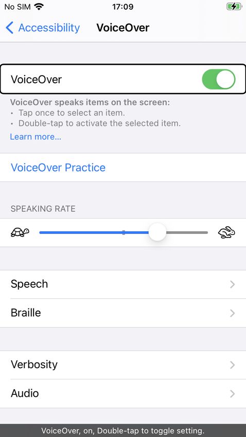
speaking at the bottom of the screen. Figure 2.1 shows the VoiceOver settings
on iPhone with VoiceOver and caption panel turned on, a black box marking
what part of the screen is currently in focus.
Several studies have shown that VoiceOver is much more popular among
visually impaired users today than TalkBack [6] [13] [14] [4]. The Swedish
Association of the Visually Impaired (SRF) made a survey in 2019 in which 63
of the 92 participants stated that they used iPhone and VoiceOver, while only
six people used TalkBack [4]. Buzzi et al. mean that one explanation for this
may be that VoiceOver was released before TalkBack and that the accessibility
features of VoiceOver are more mature [13] [14].
2.1.2 Digital healthcare
In this study, digital healthcare refers to online services where patients can
receive medical advice or access information about their health situation,
such as electronic medical records or online clinics where clinicians can
meet with the patient over video. In Sweden, 1177 Vårdguiden is the
national infrastructure for telemedicine, providing medical information via
their website and by telephone. There are a number of private companies
providing healthcare through video meetings with clinicians such as doctors,
nurses and psychologists, the three largest ones being Kry3 , Doktor.se4 and
Min Doktor5 . Moreover, there are a number of Swedish regions that have
their own telemedicine services, such as Alltid Öppet by Region Stockholm6 ,
3
Kry, https://www.kry.se/
4
Doktor.se, https://www.doktor.se/
5
Min doktor, https://www.mindoktor.se/
6
Region Stockholm,
https://www.slso.sll.se/vard-hos-oss/vardcentralerhuslakarmottagningar/
appen-alltid-oppet/6 | Background
Figure 2.1 – An example of using VoiceOver on iPhone. The black box marks what
part of the screen is currently in focus. The caption panel is displayed at the bottom
of the screen.
Mitt vårdmöte by Västra Götalandsregionen7 and Bra liv nära by Region
Jönköping8 .
7
Västra Götalandsregionen,
https://www.vgregion.se/f/habilitering-och-halsa/patient/
mitt-vardmote/
8
Region Jönköping,
https://rjl.se/vardcentralernabraliv/Utbud-och-tjanster/
bralivnara/Background | 7
2.1.3 Designing for accessibility
This section introduces principles for designing for accessibility, starting with
universal design and then describing the web accessibility standard WCAG.
Universal design
The term “Universal Design” was introduced in the 1970’s by architect Ron
Mace [15]. Since then, the term has been given different names and definitions,
but the essence is that design should be equal and accessible for all, regardless
of factors like disabilities, without adjustments of the design [15] [16]. In
1997, researchers at the Center for Universal Design at North Carolina State
University defined seven principles for universal design, all accompanied by a
number of guidelines on how to implement them. The principles are Equitable
Use, Flexibility in Use, Simple and Intuitive Use, Perceptible Information,
Tolerance for Error, Low Physical Effort and Size and Space for Approach
and Use [17] [16].
WCAG
An important standard that is often referred to when speaking of web accessibility
is the Web Content Accessibility Guidelines (WCAG). The standard is developed
by the World Wide Web Consortium (W3C) and defines guidelines for
designing and implementing accessible web services based on four principles,
i.e. Perceivable, Operable, Understandable and Robust [18]. Each principle
has a number of guidelines on how to implement the principle, accompanied
by a success criteria that can be used to test the level of accessibility, and a
number of techniques that are sufficient or advised in order to meet the success
criteria [18].
The first principle, Perceivable, refers to ensuring that users can perceive
all components present in the interface. For screen reader users, this includes
for example providing alternative text (alt text) for all non-text content like
images, graphics and buttons and having audio descriptions for pre recorded
videos. Operable includes making sure that all parts of the interface are
navigable, for example that all functionality is reachable from a keyboard.
The third principle, Understandable, refers to making sure that all information
and operation is understandable, including for example that the default page
language can be programmatically determined, that the navigation is consistent
and providing meaningful link labels. The last principle, Robust, means that
the interface should be compatible with current and future technologies as well8 | Background
as assistive technologies, such as screen readers [18].
2.2 Related Work
This section presents the state-of-the-art of designing for people with visual
impairments and screen readers in particular. It covers present applications,
guidelines, automated software for accessibility and usability testing.
2.2.1 Apps for people with visual impairments
There are a number of mobile applications, commonly known as apps,
developed specifically for people with visual impairments (PVI). Some of
them, like TapTapSee, help blind users to identify objects by using image
recognition. A similar app is LookTel Money Reader that identifies currency,
and KNFB Reader that converts printed text to speech. However, far from all
of the approximately 5 billion apps on App Store and Google Play [19] are
accessible to PVI, something that must be changed in order for them to fully
participate in society today [20] [4] [19].
2.2.2 Problems and guidelines
In 2014, researchers in the Netherlands [21] conducted a user study with 40
PVI, letting them complete a number of tasks on websites that compiled with
the first priority level of WCAG 1.0 guidelines and with dutch accessibility
standards. The results showed that PVI need much more support in learning
technical skills than they currently get [21]. A survey by The Swedish
Association of the Visually Impaired (SRF) agrees that more support is
needed, but also points out that screen reader software needs to improve [4].
According to Billah et al. [22] screen readers vary a lot in functionality and
performance when used with different web browsers and applications. Many
screen readers are not robust to software crashes, and often operate only in one
language, which is very inconvenient when for example studying in a foreign
language [22] [4].
However, most accessibility problems for PVI are related directly to the
design and code of websites and mobile apps. Ballantyne et al. [23] compiled
a set of guidelines based on WCAG 2.0 and additional literature for making
mobile interfaces more accessible to people with disabilities. Followingly,
they made a heuristic evaluation of the 25 most popular apps on Google Play
against these guidelines. The most violated guidelines related to screen readersBackground | 9
were missing labels and alt text, resulting in the screen readers ignoring the
content. For example, screen readers had problems identifying text in Google
maps and stickers in Facebook Messenger, and navigation buttons in Snapchat
lacking alt text [23].
Similarly to Ballantyne et al., Park et al. [24] propose a set of ten guidelines
for designing mobile interfaces accessible to PVI. In a walkthrough of a
number of popular Korean apps, four PVI rated the severity of violations
towards the ten guidelines. The results showed that the most important
guidelines where (1) providing alt text for all components, (2) making sure
every object can be focused on by as screen reader, (3) providing a logical
focus flow, (4) making sure that gestures in the app and screen reader actions
do not overlap and (5) not playing background sound automatically [24].
2.2.3 Automated accessibility software
Researchers at Facebook have developed and evaluated automatic alt-text
(AAT), identifying objects, faces, colors and sentiments in pictures [25]. The
feature was developed in an iterative workflow including in-lab user tests with
PVI. The study also included a pilot study with 9000 PVI, showing that AAT
improved engagement significantly, making Facebook feel more inclusive to
PVI [25].
In 2016, Yoon et al. [26] compared usability testing to automated testing
for accessibility with the evaluation tool AChecker. AChecker takes the source
code of a website and evaluates it towards guidelines and standards like WCAG
2.0 and generates an accessibility report. In this study there was almost no
correspondence between issues identified by the users and by the software [26].
A similar study by Mateus et al. [27] compared issues found by a previous
user study with blind and low vision users to those found by the automated
tools MATE and Accessibility Scanner. In this study 36 types of problems
were found only by the users, eleven were found only by the software and
only three types of issues were found by both. The issues found only by the
users were generally more complex, including problems related to inconsistent
navigation and inadequate feedback [27]. Both Yoon et al. and Mateus et al.
stress the importance of user involvement, as their studies show that automated
testing is not enough [26] [27].10 | Background
2.2.4 User studies with screen readers
Already back in 2007 Lazar et al. [28] had 100 blind people document
their frustrations using the web. Compiling these diaries showed that the top
frustrations among PVI using the web were bad page layout, conflicts between
screen readers and website, poorly designed forms, missing alt text, misleading
links, screen reader crashes and inaccessible PDFs. The users also reported
losing approximately 30% of their time online due to poorly designed web
interfaces [28].
In 2019, SRF surveyed 92 users of screen readers about accessing digital
content [4]. The participants of the study reported various problems they
had encountered while surfing the web. Among the most common issues
were illogical navigation patterns, incorrect use of HTML labels and headings
and non-descriptive link names. Other common problems were CAPTCHAs
without auditive alternatives, checkboxes that were ignored by the screen
reader and software updates leading to decreasing accessibility [4].
Multiple studies have been made with PVI, borrowing methods from
usability testing to investigate the accessibility of specific websites. In 2016
Yoon et al. observed six blind users interacting with American library websites
using JAWS and VoiceOver [26]. The participants were given a number of
tasks to complete on the website and were asked to think aloud along the
way. Interviews were completed with each participant prior to the testing as
well as afterwards [26]. A Turkish study used similar methods to evaluate
the accessibility of a university website with blind students [29]. In 2018
ten Korean health-related websites were tested by PVI and evaluated against
a Korean version of the WCAG guidelines [30]. The tasks given to the
participants in the three studies included things like exploring the home page of
the relevant website, using a search function and finding specific information
by navigating through the site.
In the study of American library websites, most issues were related to
navigation. In some cases, the HTML was not structured in the same way
as the visual representation, leading to an inconvenient flow when the page
content was linearized by the screen reader. The users experienced problems
with misleading links leading to time consuming detours, and due to lack
of hierarchical heading structure navigation became tedious [26]. On the
Korean health-related websites, violations against WCAG were found for
all four principles, the most common ones being missing adequate alt text
for images, not having all functionality available from keyboard commands,
poorly organized sequences of content and bad link labels. According toBackground | 11
the researchers all issues could be easily resolved, if only developers were
educated about them [30]. The study of the Turkish university website
concluded that students had issues registering for courses. This was mainly
due to visuals they could not interact with as well as links with non-descriptive
titles. For this reason blind students preferred asking for help to complete
actions that other students could do by themselves [29].
Park et al. [24] conducted user tests on iPhone using the VoiceOver screen
reader. Four PVI were given a number of tasks to complete related to settings,
using the Safari web browser, using a messaging app, a commuter app and a
search engine. The results showed that the apps lacked logical focus sequences
when interacting with VoiceOver, as well as missing alt text.
Some studies have tried to answer how to best design for accessibility
by building mobile apps specifically for PVI. Kim et al. [31] prototyped a
camera app and tested it on blind and low-vision users. The study showed
that consistency in layout is important since PVI often rely on memory when
navigating. Another research team designed and evaluated a screen reader
friendly calendar app [32]. This research showed that simple design with a top-
to-bottom layout is key to accessibility in smartphone apps, and that interfaces
should provide multiple ways of interaction, like audible and tactile feedback
and voice commands.
2.3 Motivation
Even though telemedicine has been around for a while it wasn’t until the
COVID-19 pandemic breakout that the field exploded. Telemedicine is no
longer just a complement to in-person care, it has now become an alternative
[2], and therefore it is very important that everyone is given equal access
to it. According to Annaswamy et al. [2] very few telemedicine platforms
today have custom features to ease the use of digital healthcare services for
PVI, which could potentially lead to limited freedom in choosing a healthcare
provider.
However, we do not know much about telemedicine accessibility since
the field is very new, and therefore studies like this one are important.
Accessibility can be tested in different ways, but previous studies have shown
that involving the end user in usability testing is crucial for finding a broad
range of issues [27] [26] [4]. It is also important that assistive technology
like screen readers is used in usability testing and by developers during
implementation, so that more issues can be addressed at an early stage [4].12 | Method
Chapter 3
Method
Recall that the research question is: What are the greatest opportunities and
challenges in adapting online health services currently provided through in-
app consultations with doctors towards increasing accessibility for users with
visual impairments utilising mobile devices with screen readers, as measured
by a user study of an existing system at a European online health service
provider?
In order to evaluate the research question, visually impaired screen reader
users participated in interviews as well as usability testing of the existing
digital healthcare service Kry. The goal of the interviews was to gather
experiences of using screen readers online and to understand the participants’
attitude towards digital healthcare. The results of the interviews were then
taken into consideration when choosing the tasks for the usability test. Due
to the ongoing COVID-19 pandemic, interviews and usability tests were done
online through video calls.
3.1 Recruiting participants
As expected, recruiting participants was one of the most challenging parts of
this research. First of all, The Swedish Association of the Visually Impaired
(SRF) was contacted. SRF helped out by spreading the word about the research
initiative in their Facebook groups for members. A similar association,
but for young visually impaired people in Sweden, Riksorganisationen Unga
med synnedsättning (US), also assisted in recruiting participants by sending
out information in Facebook groups as well as in their newsletter. Funka,
the department that coordinates compensatory support for students with
disabilities at KTH, sent out an email to visually impaired students at KTH.Method | 13
Furthermore, I also reached out to my own network, and the recruited
participants were in turn asked to spread the word about the study to their
friends.
The goal was to recruit a minimum of five participants. This number
was based on research findings made by Nielsen and Landauer in 1993,
showing that the detection of usability problems as a function of the number of
participants can be modelled as a Poisson process, according to the following
equation
N (1 − (1 − L)n ) (3.1)
where N is the total number of usability problems in the system, L is
31% (the typical proportion of usability problems discovered by a single user)
and n is the number of users [33], see Figure 3.1. According to Nielsen and
Landauer, 85% of the total usability problems is detected when user testing is
done with five participants [33].
Figure 3.1 – According to Nielsen and Landauer, the number of usability problems
found can be described as a function of the number of participants. 85% of the total
usability problems are found with 5 test users.
In the end, eight participants, called P1-P8, were recruited. All participants
were native Swedish speakers, just like the researcher. P1-P6 were interviewed
before the usability test was designed and P7-P8 were recruited, and thus also14 | Method
interviewed, later on. All participants except for P6 proceeded to participate
in the usability test. The participants were between 13 and 44 years of age,
seven men and one woman. The one participant that was underage, P8, had a
sighted parent present during the full interview, referred to as P8a.
Five participants were fully blind and three had low vision. Two of the
participants with low vision, P2 and P7, always use the screen reader on their
phone. P5 primarily turns the screen reader on when there is a lot of text.
All eight participants used JAWS or NVDA for Windows and VoiceOver for
iPhone as their main screen readers. Table 3.1 summarises information about
the participants’ visual impairments and use of assistive technology.
Table 3.1 – Participants
Participant Visual impairment . Screen reader and other
. assistive technology .
P1. Fully blind since age of 3. JAWS, VoiceOver, Refreshable
braille display.
P2. Low-vision since teenage. JAWS, VoiceOver, Screen
Can see contrasting colors, magnifier.
contours, but no details.
P3. Fully blind since birth. JAWS, VoiceOver, Refreshable
braille display.
P4. Fully blind since birth. JAWS, VoiceOver, Refreshable
braille display.
P5. Low-vision since birth. Has JAWS, VoiceOver, Screen
issues with seeing details and a magnifier.
longer reaction time on visual
input.
P6. Fully blind since birth. JAWS, NVDA, VoiceOver,
Refreshable braille display.
P7. Low-vision since birth. Can JAWS, VoiceOver, Refreshable
see bright colours and contours braille display.
in bright lightings on one eye.
Fully blind on the other eye.
P8. Fully blind since birth. NVDA, JAWS, VoiceOver,
Refreshable braille display.
Eight participants, P1-P8, took part in the study. The table lists their visual impairment
and what assistive technology they use for computers and smartphones.
Six participants expressed that they have a high interest and knowledge in
using technology. P4 and P6 are not as interested as the others, but P6 meantMethod | 15
that you have to be open to learning to use new technology if you want to
participate in today’s society. All participants have used screen readers for
at least 10 years, with the exception of P8 who has been using it since they
started school. The participants use their computers and phones at work, in
school during their free-time. The most popular apps among the participants
are social media such as Facebook, Messenger and YouTube, news apps, music
and podcast apps.
3.2 Interviews
The goal of the interviews was to understand how the participants utilize
screen readers in their daily lives, their views on what makes a digital service
accessible to screen reader users, and their attitude towards, and experiences
of digital healthcare. All interviews were held online, using the video
conferencing service Zoom1 , and lasted for about one hour each. The reason
for choosing Zoom was that it was widely used in the community of PVI at
the time, and that it provided good screen reader accessibility, according to an
ombudsman at SRF. Prior to each session, the participant received a consent
form, and consent to participate was then given verbally at the beginning of
the session. All interviews were recorded in order to be transcribed later.
The interviews were semi-structured, using the interview questions as a
framework rather than a strict checklist in order to allow new ideas to be
explored from the stories told by the participant. All interviews were held
in Swedish and the questions are listed in Appendix A.
3.2.1 Analysis
After being transcribed, the interviews were analysed using thematic analysis
[34]. Initially, the transcripts were read several times, letting the researcher
familiarize with the data. In the next step, segments of text touching on the
same topics were grouped together. Each group was assigned a code, and
codes were then grouped together into themes. This method made it possible
to identify the similarities and differences between the participants’ answers
and to sort out what was relevant to answer the research question.
1
Zoom, https://zoom.us/16 | Method
3.3 Usability test
In order to test the compatibility between digital healthcare and screen reader
usage in practice, the current state of the digital healthcare service Kry was
evaluated through usability testing. Usability testing can be seen as a type
of debugging method [33] and is a widely accepted technique in Human-
Computer Interaction where the researcher observes the usability of a product
while it is being used. Kry is currently one of the leading digital healthcare
providers in Europe and provides an app-based service where patients can have
video appointments with doctors, a service that is very representative of the
market area.
The results from the interviews were taken into consideration when designing
the usability tests, in order to decide what themes to focus on. The interviews
showed that most of the problems PVI experience when using digital services
are related to basic accessibility issues, such as non-labeled buttons and
non-focusable components. Therefore, the usability test was designed for
identifying such barriers in the Kry app. The results of the interviews are
presented in Chapter 4 Results.
3.3.1 Tasks
In the first part of the usability test, the participant was asked to complete eight
different tasks in the app that were central for the service, such as logging
in, booking an appointment and reading a message from the doctor. I chose
these tasks based on an analysis of the most common actions that users need
to perform in the system. Testing instructions were scripted beforehand to
ensure that all participants received the same information before starting the
task. Table 3.2 lists the tasks. A more detailed description of the tasks can be
found in Appendix B.
While completing the tasks, the participant was asked to think aloud. That
is, they were asked to verbalise their thoughts, both before, while and after
completing an action, throughout the usability test. The method is useful for
identifying what the subject is focusing on, and how the subject structures the
information when solving a task [35]. The think aloud protocol was slightly
modified as the participant had to listen to the screen reader, but they were
encouraged to pause as often as they could to tell the researcher about their
thoughts.Method | 17
Table 3.2 – The eight tasks attempted by the participants.
Task number. Task.
1. Log in.
2. Sign up.
3. Explore the app.
4. Book an appointment.
5. Find information about preparing for the appointment.
6. Read a message from the doctor.
7. Add information about an allergy.
8. Log out.
3.3.2 Closing interview
After attempting all the eight tasks, the participant once again participated in
an interview where they were asked a number of closing questions to follow up
on the experience of interacting with the app. The first seven questions were
answered with a number on the scale 1-5, each number asked to be followed
up with a motivation and some further questions. The questions were inspired
by the questions asked in the System Usability Scale 2 , a scale used to measure
usability of a system, but modified to fit the topic of accessibility. Lastly, a
few questions about digital healthcare were asked. A full list of the questions
can be found in Appendix B.
3.3.3 Setup
Just like the interviews, the usability test was conducted using the video
meeting service Zoom. The participant joined the call from the smartphone
or tablet where they had the Kry-app downloaded and shared their screen
throughout the session. Note that as screen sharing was activated, the
researcher could only see the participant’s screen and not their face. Furthermore,
the researcher could not hear the sound from the screen reader. Therefore, the
participant was asked to turn on the caption panel for VoiceOver.
Consent to participate was given verbally at the beginning of the session.
Each usability test lasted between one and two hours and the full session was
recorded with both audio and video. Access was provided to a test environment
of the app in which the usability tests took place. In the test environment no
2
Usability.gov, https://www.usability.gov/how-to-and-tools/
methods/system-usability-scale.html18 | Method
previous medical records were accessed, ensuring that the participant did not
have to share any private information about their medical history.
Unfortunately, switching to the test environment in the iOS app was not
possible when having the screen reader turned on. Therefore, the participants
had to get help from a sighted person in order to prepare for the usability test.
In some cases when the participant could not get help from a family member
or friend, I guided them. However, for those who did not feel comfortable
with navigating their phone with the screen reader turned off, a web client
version of the Kry app was used as a backup, instead of the iOS app. The web
app had the same visual and structural interface as the iOS app, and provided
the same functionalities. However, it is important to note that the web app
was interacted with through a web browser, and its frontend was implemented
separately from the iOS app. Therefore, the accessibility barriers might vary.
In the end, five participants completed the usability test using the iOS app, and
two participants used the web app in Safari.
3.3.4 Analysis
When the usability tests were completed, all recordings were transcribed.
Then, the transcripts were read several times in detail, in order to familiarise
with the material. The tasks were then reviewed in order to decide task
completion rates and to identify the severe barriers that lead to task failure.
After that, all the accessibility barriers found by the participants were listed.
Each occurance of an accessibility barrier was given a severity rating, according
to the following scale used by Yoon et al [26].
• Minimal - the barrier was mentioned as a potential problem;
• Slight - the barrier was easily overcome in a short amount of time;
• Moderate - the barrier presented a major slowdown, but participants
worked around it and managed to complete the task on their own;
• Severe - participants could not finish the task on their own, resulting
either in facilitator intervention or simply giving up on the task.
Followingly, all the occurrences of accessibility barriers were grouped into
different types of barriers. Each barrier type was given a severity rating based
on the ratings given to the individual occurrences.
Finally, the closing interviews were analysed using thematic analysis, just
like when analysing the initial interviews.Results | 19
Chapter 4
Results
4.1 Interviews
This section will cover the findings from the interviews. First, different
experiences of using mobile apps and websites will be presented, followed
by the participants’ experiences of and views on digital healthcare. Many of
these findings were used when designing the usability test.
4.1.1 Experiences of high screen reader compatibility
When asked about good experiences of using apps with screen readers, all
eight participants said that apps should be easy to navigate and that all
components should be operable and clearly communicate their purpose. This
included for example headings and links being easily identified and navigated
between, being able to focus on all relevant elements with the screen reader
and that all components with visual information have alt text. As P3 said,
“You should be able to access the functionalities that you expect the service
to provide”.
Several apps and websites were pointed out as good examples. Five
participants explicitly mentioned Facebook as highly accessible and easy to
navigate. Reasons for this included locating the menu at the bottom of the
screen, labelling all buttons and providing automatic alt text to images. Several
participants mentioned Apple’s own apps like iTunes, App Store and Notes to
be highly compatible with VoiceOver, and P7 said that Gmail was easy to use
since it has clear headings, links and button labels.20 | Results
4.1.2 Experiences of low screen reader compatibility
The participants had many examples of low screen reader compatibility.
Unlabelled buttons stood out as one of the most common problems, mentioned
by seven out of eight participants. Some participants said that they can
learn what a particular button does, especially if the rest of the app is
accessible. However, P2 emphasised that unlabelled buttons are one of the
biggest problems with screen reader usage.
“When VoiceOver can’t read the text on buttons in an app the app becomes
completely useless to me” - P2
Similar to unlabelled buttons, unlabelled images, icons, tables and other
graphics is a common issue according to the participants. P7 expressed a
worry about potentially missing out on important information when images
and graphics are not described in text. P1 and P3 also mention CAPTCHAs
without non-graphic alternatives as a big problem. They meant that this often
leads to PVI getting stuck and having to wait for help to move along.
Several participants had experienced apps that were not compatible with
screen readers at all, leaving the screen completely blank for VoiceOver. P2
and P6 said that the process of finding apps that work is often time consuming
and tiring since they sometimes have to download many different apps before
they find something that works. Four participants mention that accessibility
problems often arise when new updates of apps are released. For example, P7
experienced a problem on Facebook when the “go back” button disappeared
during a couple of weeks, and P3 mentions that both Foodora and Filmstaden
have gone from fully functional to completely blank.
Other common accessibility problems mentioned by the participants include
non-focusable continue buttons, inaccessible checkboxes and forms that cannot
be filled with a screen reader.
Consequences of low screen reader compatibility
The participants mention a number of ways of coping with the accessibility
barriers they meet online. Some of them, like P1 and P4, seek help from
other PVI by reading or posting in online forums or Facebook groups, or
simply call a friend. Four participants say that they sometimes call customer
support to describe the issue and hopefully get it fixed. However, the process is
cumbersome, so often they just stop using the app or website and find another
solution.Results | 21
P5 still has enough vision to solve most of the issues they face by turning off
VoiceOver or using a screen magnifier. The rest of the participants, however,
often have to ask for help from a sighted family member or friend, something
that several of them express to be frustrating. P3, who lives alone, said that
“I usually wait until I can ask someone for help. It can take several days,
especially now during the pandemic, and I live alone”.
For many of the participants, having to rely on others to use an online
service leads to being and feeling less independent, something that can be
very frustrating. P1 said that “I have siblings who can help me [when I get
stuck], but it would be nice to be able to do it myself. That’s the way it should
be”. Similarly, P2 expressed that “some apps I can only use when someone
else in my family is present, and that is very limiting”.
Other than not being independent, accessibility barriers also make the
participants feel different, left out or even ignored. P1, P4 and P7 mention
problems with using popular social media platforms and mobile games where
many of their friends hang out. P7 said that classmates chat a lot on Snapchat,
a platform that is very hard to navigate with VoiceOver. P7 also often has
to find alternative software for doing school work. “It’s sad when something
doesn’t work in school. I don’t want to be different, I want to be just like my
peers”, P7 said.
Furthermore, P3 expresses that it is seldom prioritised to fix issues that
only PVI experience. “They can fix it [accessibility barriers], but sometimes
they don’t since we [PVI] are so few. Not fixing it doesn’t matter to society, but
it matters a lot to us as individuals”.
4.1.3 Views on digital healthcare
All eight participants say that they do not meet a doctor often, perhaps once
or twice a year. Five participants usually call their health center and three
participants book appointments via 1177 Vårdguiden (1177). All participants
except one have used 1177 and agree that basic accessibility is in place.
However, P3 and P7 think that 1177 is cumbersome to navigate due to many
headings and an illogical flow. P4 has used Mitt vårdmöte, but could not book
a meeting in the app so P4 still has to call to book a meeting. P2, P7 and P8a
(the parent of P8) have used Kry before, and P2 has also tried out Min Doktor.
All three think that the services were easy to use and see it as a good alternative
to in-person care.22 | Results
Possibilities with digital healthcare for PVI
Seven out of eight participants were positive about the idea with digital
healthcare, and one participant didn’t have an opinion. The advantages brought
up in the interviews include getting help quickly, being more independent and
improved privacy, since digitalisation of medical records and documents from
doctors makes PVI less dependent on sighted people who can help them. P7
and P8a said that digital healthcare reduces the need for using transportation
services and spending a lot of time finding your way around a hospital. P8a
also means that it feels safe to know that P8, P8a’s underage child, will be able
to easily get in contact with a doctor when they grow up.
Challenges with digital healthcare for PVI
Even though seven participants were positive about digital healthcare, not all
of them said that they would use it for themselves. One participant would
not use digital healthcare services run by private companies for ideological
reasons. Two participants were concerned about having to video chat with
the doctor, since they would not be fully aware of what they are filming
and would not know if they were pointing the camera in the right direction.
Some participants expressed worries about having to upload pictures prior to
booking an appointment, something that they would not be comfortable with
because they cannot see.
Furthermore, several of the participants were concerned about the elderly
PVI being left behind as more and more services are digitalised. They meant
that elderly often have a harder time using their assistive technology, as
well as using technology in general. Therefore, several participants stressed
the importance of in-person healthcare still remaining an equally accessible
resource. As for the younger PVI, none of the participants had any concerns
other than common accessibility barriers as mentioned earlier.
4.2 Usability test
The following section will go through the results from the usability test. First,
the results from solving the tasks in the Kry app will be presented, including
task completion and accessibility barriers found. Furthermore, the results
from the closing interviews will be covered.Results | 23
Table 4.1 – Task completion.
Task. P1*. P2. P3*. P4. P5. P7. P8.
Task 1 (Log in). Yes. Yes. Yes. Yes. Yes. Yes. No.
Task 2 (Sign up). Yes. Yes. No. Yes. Yes. Yes. Yes.
Task 3 (Explore). Yes. Yes. Yes. Yes. Yes. Yes. Yes.
Task 4 (Book appointment). Yes. No. Yes. No. Yes. No. No.
Task 5 (Prepare for appointment). No. Yes. Yes. Yes. Yes. Yes. No.
Task 6 (Read message). Yes. Yes. Yes. Yes. Yes. Yes. Yes.
Task 7 (Add allergy). Yes. Yes. Yes. Yes. Yes. Yes. -
Task 8 (Log out). Yes. No. Yes. No. Yes. No. -
Note that P8 could not do task 7 and 8 due to technical issues.
*P1 and P3 used the web app in Safari, while the rest attempted the tasks in the iOS app.
4.2.1 Barriers found through usability testing
P2 and P4-P8 attempted the tasks using the Kry iOS app. P1 and P3 used
the Kry web app in Safari. As indicated in table 4.1, the participants solved a
majority of the tasks on their own. Note that P8 could not complete task 7 and
8 due to technical issues in the app. Task 3, 6 and 7 went very smoothly for
all participants, but as for the rest of the tasks at least one participant per task
experienced severe issues preventing them from completing it. In those cases,
the researcher interfered and gave further instructions on how to get past the
barrier. However, the task was only considered completed if the participant
did not receive any help.
Other than the more severe barriers found, the participants also experienced
a large number of less severe accessibility barriers. All the barriers found both
in the iOS app and in the web app are listed in table 4.2. The issues only found
in the web app as well as those only found in the iOS app are listed in table 4.3
and table 4.4 respectively.24 | Results
Table 4.2 – Accessibility barriers found both in the iOS app and in the web
app.
Type of barrier. Severity Number of Number of
rating1 . occurrences. users (out
of 7).
Navigation.
Unlabelled button. Slight. 2. 4.
Unlabelled search field. Moderate. 1. 3.
Communication of visual
information.
Button/checkbox not signalling if Moderate. 1. 3.
selected/not selected.
Unclear if single or multiple choice Slight. 1. 3.
question.
Table 4.3 – Accessibility barriers found in web app only.
Type of barrier. Severity Number of Number of
rating1 . occurrences. users (out
of 2).
Navigation.
Unlabelled button. Slight. 2. 2.
Button/ link not marked as button/ Slight. 1. 1.
link.
Lack of heading structure. Minimal. 1. 1.
Communication of visual
information.
Poorly labelled button. Minimal. 1. 1.
Misc.
Inaccessible checkbox. Severe. 1. 1.Results | 25
Table 4.4 – Accessibility barriers found in iOS app only.
Type of barrier. Severity Number of Number of
rating1 . occurrences. users (out
of 5).
Navigation.
Unlabelled button. Slight. 6. 4.
Button/link not focusable. Severe. 8. 5.
Unlabelled search field. Moderate. 1. 1.
Button/ link not marked as button/ Slight. 2. 2.
link.
Lack of heading structure. Moderate. 1. 2.
Page not automatically scrolling to Slight. 1. 3.
top.
Problem finding button. Slight. 1. 1.
Communication of visual
information.
Unlabelled image/ icon. Minimal. 7. 3.
Button/ checkbox not signalling if Moderate. 3. 2.
selected/ not selected.
Button not marked as enabled/ Severe. 3. 4.
disabled.
Poorly labelled input field. Slight. 3. 2.
Misc.
Number input component not Moderate. 1. 1.
scrollable.
Could not proceed after using Severe. 2. 4.
number input component.
Could not proceed without Severe. 1. 1.
uploading picture.
Number of unread messages Slight. 1. 2.
and "Inbox" tab are not grouped
together in the bottom tabs.
1
Severity ratings as in Yoon et al. [26]
Minimal - the barrier was mentioned as a potential problem;
Slight - the barrier was easily overcome in a short amount of time;
Moderate - the barrier presented a major slowdown, but participants worked around it and
managed to complete the task on their own;
Severe - participants could not finish the task on their own, resulting either in facilitator
intervention or simply giving up on the task.26 | Results
Severe barriers
The task with the smallest success rate was task 4, to book an appointment
with a doctor. The process of booking an appointment in the app always starts
with answering a form with a number of questions, and many of these forms
include entering body temperature or weight. Interaction with the number
input component in question was not an issue, but when the participants used
the component with VoiceOver in the iOS app, the “Next” button remained
disabled, see figure 4.1. As P5 relies a bit on visual input, P5 could get past
the obstacle by turning VoiceOver off to set the body temperature, click “Next”
and then turn VoiceOver on again. However, P2, P4, P7 and P8 were stuck and
could not move along. P1 and P3, who used the web app did not experience
this issue.
P4 also got stuck in the form while exploring the app. While trying to
book an appointment for eye infection symptoms, P4 was asked to upload an
image of their eye. Being fully blind, P4 was not comfortable with taking and
uploading pictures, so P4 tried to skip the question. However, uploading an
image was mandatory, something that was signalled visually by the “Next”
button being disabled, see figure 4.2. This information was not read by the
screen reader, so after trying to press the button a few times P4 gave up booking
an appointment.
Task 8, logging out, was also unsuccessful for the iOS app users. The log
out option was located on the settings screen, which in turn was accessed by
clicking the gear icon present in the profile tab. This icon was not focusable
with VoiceOver in the iOS app, so the iOS app users simply could not notice
or use it, see figure 4.3. Once again, P5 solved the task by turning VoiceOver
off to click the icon.
Furthermore, P8 had issues signing in to Kry due to an input placeholder
visually signalling the format for inputting your Swedish personal identity
number. The placeholder, “ÅÅÅÅMMDD-NNNN”, was not read by VoiceOver
in an understandable way. Even though P8 knew that the input field was meant
for entering personal identity number, P8 could not know what exact format
to write the number on and therefore gave up after trying a few times.
P3 was initially prevented from signing up as the checkbox for accepting
the terms and conditions was hard to check using VoiceOver. “At this point I
would have given up, it does not work”, P3 said, and indicated that they would
have used some other service for seeking healthcare instead.
P1 did not find the information about preparing for the meeting, although
reading the button labelled “Show details” on the appointment card on theYou can also read