Brandeis University Identity Manual - Brandeis University " O#ce of Communications
←
→
Page content transcription
If your browser does not render page correctly, please read the page content below

Brandeis University
        Identity Manual

   Brandeis University | Office of Communications
2    Introduction

Visual Identity Guidelines      4    Key Components of the Visual Identity

                                6    The Brandeis Logotype

                                10   The Brandeis Seal

                                12   The Official Brandeis Stationery

                                14   Use of the Brandeis University Logotype with
                                     a School, Department, or Institute

                                15   The Logotype When Used As Part of the
                                     Name of a Program

                                17   Page Format

                                18   Typefaces

                                19   Type Usage

                                20   Sample Format of a Standard Invitation

                                22   Examples of Guideline Use

Editorial Identity Guidelines   28   Use of Discrimination and Disability Statements

                                29   Punctuation

                                30   Composition Titles

                                30   Hyphenation

                                30   Numbers

                                31   Capitalization

                                32   Abbreviations

                                32   Terminology and Usage

                                33   Titles and Names

                                33   Miscellaneous
Introduction   Although there is no official             materials are designed by an outside
               policy mandating the use of the           agency or by an individual in a
               Office of Communications for the          department other than publications.
               design of university publications,
               it is the university’s goal that its      What follows are the stylistic
               publications maintain certain stylistic   guidelines deemed most critical.
               standards. Such standards ensure          Wherever possible, we have included
               that the university’s public identity     examples that conform to Brandeis
               will be consistent, even when             University standards, as well as usage
                                                         that should be avoided.

2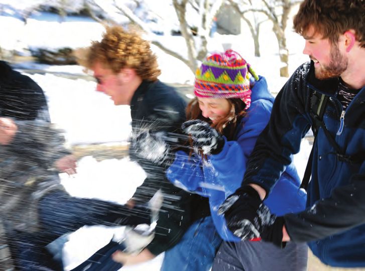
Visual Identity Guidelines

                             3
Key Components of the   The Brandeis University logotype,                Except in the most formal materials,
Visual Identity         in its most official and complete                such as stationery, business cards,
                        form, consists of the words Brandeis             Commencement materials, and the
                        University and the Brandeis seal.                like, the name portion of the logo
                                                                         may appear without the seal.
                        The specifications for the appearance
                        of the official logotype are detailed
                        on this and the following seven pages.

Brandeis University
                        Bauer Bodoni, Roman      InDesign                Quark
                                                 The tracking value      The tracking value
                        Kerned optically         should equal -40%       should equal as
                                                 of the point size       closely as possible
                        Letter spacing/          of the logotype.        -8% of the point size
                        tracking set at the      For example, the        of the logotype.
                        values shown at right    logotype size above     For example, the
                                                 is 60 points, and the   logotype size above
                                                 tracking value is set   is 60 points, and the
                                                 at -24.                 tracking value is set
                                                                         at -5.

                        The university seal
                        does not have to
                        appear on every
                        publication and
                        poster. It is used
                        primarily for official
                        materials such as
                        the stationery,
                        business cards,
                        Commencement
                        materials, and other
                        such “formal” pieces.

4
Whenever possible, but especially    Pantone 294 is the official color of
when it appears on covers, posters   Brandeis University. On most
or in headlines, the name Brandeis   formal materials, the logotype should
University should be written as      be printed in the official color.
the logotype, usually without the
seal. This does not apply when the
university name appears in normal
body text.

Brandeis Blue
                                                                                  Brandeis Blue   Pantone 294
                                                                                  spot color

                                                100% cyan                14%
                                                                         yellow

                                                                                  Brandeis Blue   100c 86m 14y 24k
                                                                                  process color

                                      24%                            86%
                                      black                          magenta

                                                                                                                     5
The Brandeis Logotype       Brandeis University should be written
                            with initial capitals only, never all
                            capitals, and the two words may be
                            combined only as shown below.

                            Brandeis University
                                                                            X equals the point
                                                                        X   size of the logotype.

                                                                            No other words,
                                                       X                    symbols or crowding
                                                                            design elements may

                            Brandeis University
                                                                            come within X of
                        X                                           X       the logotype.
                                                                            Anything that
                                                                            detracts from the
                                                       X
                                                                            logotype’s visibility
                                                                            must be avoided.

Brandeis University
                                                                            The university
                                                                            logotype is usually
                                                                            written out in full.

             Brandeis
                                                                            The university
                                                                            logotype may be
                                                                            written as one
                                                                            line or two. When
                                                                            written as two,

                 University
                                                                            alignment must
                                                                            be as shown with
                                                                            no line spacing.

                            Brandeis
                                                                            It is permissible
                                                                            to drop the word
                                                                            university from
                                                                            the logotype when
                                                                            design purposes
                                                                            warrant.

6
BRANDEIS
             Never use all caps.

brandeis
             Never use all
             lowercase.

Brandeis
             Never use italics or
             skew the shape.

Brandeis
             Never alter the
             proportion.

Brandeis
             Never use
             letterspacing
             other than what is
             specified on page 4.

Brandeis     Never use alignment
             other than what is
             specified on page 6.

University
                                    7
Brandeis
               Never move the
               letterforms outside
               of their normal
               position.

    Brandeis
               Never add
               components like
               drop shadows.

    Brandeis
               Never superimpose
               the logotype on the
               seal or any other
               image.

    Brandeis
               Never substitute
               another typeface
               or typestyle for
               the Bauer Bodoni,
               Roman specified for
               the logotype.

    Brandeis
               Never add a border
               to the logotype

    Brandeis
               Never apply 3D,
               outline, or other
               effects to the
               logotype.

8
Brandeis
              Never use the
              logotype in a color
              that does not stand
              out strongly from its
              background.

Brandeis
              Never present the
              logotype within a
              shape.

Brandeis
              Never apply the
              logotype to complex
              backgrounds or
              those on which the
              logotype does not
              stand out.

              Never use low
              resolution electronic
              files of the logotype.

Brandeis U.
              Never abbreviate the
              word university in
              the logotype.

                                       9
The Brandeis Seal When used, the seal of the university seal displays the name Brandeis with
must appear in a color that stands an uppercase letter “B.” A previous
out clearly from its background. version of the seal displayed the name
Under no circumstances can the in all uppercase letters. Where you
seal be altered from its original still find the old seal in use, it should
form. Please note: The university be replaced with the current seal.
X equals half the
diameter of the seal.
X
X
X X
X
10Never alter the seal Never use low
in any way. resolution electronic
files of the seal.
Never apply a Never superimpose
different background the logotype or
to the inside of the any other words or
seal than to the
outside.
elements on the seal.
Brandeis
Never use the seal in Never apply the
a color that does not seal to complex
stand out strongly backgrounds or
from its background. those against which
the seal does not
stand out.
Never use the seal Never add
with the name of a components like
constituent of Brandeis drop shadows.
University unless the
Brandeis logotype
is present, and it is
clear that the seal
is that of Brandeis Office of Communications
University and not of
the constituent.
11The Official All academic departments and
Brandeis Stationery administrative offices must use
the official Brandeis stationery
according to the model shown to the
right. Stationery should be ordered
through the university Copy Center,
extension 64530.
42 points
42 points
Brandeis University 28 points
The diameter of the
seal equals 1 1/2 times
the point-size of the
logotype. Although
this size ratio of
seal to logotype
is sometimes not
appropriate, it can
act as a guide.
The distance between
the seal and the
logotype equals the
diameter of the seal.
Brandeis
The cap height of
the logotype aligns
with the top of the
shield in the seal.
12Brandeis University
Office of Department Mailstop 000 781-736-0000
Waltham, Massachusetts 781-736-0000 Fax
02454-9110 781-736-0000 TTY/TDD
Brandeis University
Office of Department Mailstop 000
Waltham, Massachusetts
02454-9110
Brandeis University
Janie M. Doenut
Administrative Assistant
and Executive Vice President
Office of Department Mailstop 000
Waltham, Massachusetts
02454-9110
781-736-0000 781-736-0000 FAX
janiedoenut@brandeis.edu
13Use of the Brandeis The name Brandeis University must Somewhere on the brochure,
University Logotype with appear prominently on any poster poster etc., the university’s address
a School, Department, and on the front cover of any (at least Waltham, Massachusetts)
or Institute brochure. It may be subordinate to should appear with the name of
the name of a school, program or the university.
center, but it must appear in either
the largest or second-largest type
size on the page.
Brandeis University Environmental
Studies Program
Brandeis University
The Rabb School
of Summer and
Continuing Studies
14The Logotype When Programs and centers with their own them on publications. When using an
Used as Part of the Name distinctive symbols or logotypes individual logo, be sure to also include
of a Program (the Summer School, Summer the Brandeis logotype, but do not
Odyssey, Genesis, and the Brandeis additionally use the university seal.
University National Women’s
Committee, for example) may display
Brandeis Summer Odyssey
Center for German and European Studies at Brandeis University
Genesis at Brandeis University
156 1/2 pica unit
1 pica
interval
1 1/2 pica unit
1 pica interval
16Page Format
Pages should be formatted on the
structure of a grid. While allowing
ample flexibility of design, the grid
ensures some adherence to the
aesthetic precepts that lend Brandeis
University publications a unified
appearance. The grid is based on
a 1 1/2 pica-unit system with 1 pica
intervals. If a simplified version of
the grid is preferred, 6 1/2 pica x 6 1/2
pica units with 1 pica intervals may
be used.
Captions may be used the photo to the
to identify groups right might best be
Photographic images should occupy of photographs, in identified in a single,
which case they may two-column caption.
complete units vertically and comprise enough text
horizontally. to warrant a multi-
column arrangement.
Here, for example,
the photo above and
Text frames should occupy complete
units horizontally, but may end
anywhere vertically. In fact, Brandeis
often uses a rag bottom effect,
which, when used properly, will
achieve a desirable rhythm.
Short captions
may be positioned
like this one.
17Typefaces Typefaces are families of type. The Brandeis University logotype
Within typeface families are styles must always be written in Bauer
such as bold, italic and condensed. Bodoni. Do not use Bauer Bodoni
Bauer Bodoni, Bodoni, Gotham for body text, however, as it
and Adobe Garamond are the is difficult to read in small sizes.
typefaces to be used for Brandeis
publications.
Bauer Bodoni Bauer Bodoni
Bauer Bodoni Italic
Bauer Bodoni Bold
Bauer Bodoni Bold Italic
Bauer Bodoni Black
Bauer Bodoni Black Italic
Bodoni Bodoni Book
Bodoni Book Italic
Bodoni
Bodoni Italic
Bodoni Bold
Bodoni Bold Italic
Gotham Gotham Thin
Gotham Thin Italic
Gotham Book
Gotham Book Italic
Gotham Medium
Gotham Medium Italic
Gotham Bold
Gotham Bold Italic
Gotham Black
Gotham Black Italic
Gotham Ultra
Gotham Ultra Italic
Adobe Garamond Adobe Garamond Regular
Adobe Garamond Italic
Adobe Garamond Semibold
Adobe Garamond Semibold Italic
Adobe Garamond Bold
Adobe Garamond Bold Italic
18Type Usage Use initial capitals only. Do not Paragraphs should not be
capitalize entire words, titles, indented, but should be separated
or headlines. If emphasis is by a line space.
needed, use bold, italics, or larger
type size. There should be only one space
between sentences.
The Brandeis style is flush left,
ragged right. Type should never Any quotation marks, line numbers,
be centered. or bullets that appear at the left-
hand edge of text should be hung
outside the normal alignment.
Excellence at Brandeis
“Brandeis University is recognized The Brandeis
style is flush left,
as one of the premier institutions
ragged right,
of higher education in the country,” initial caps only,
says the latest college survey. and quotation
marks hung to
Committed to learning that comes
the left.
from the personal encounter of
teacher and student, Brandeis
maintains a 9 to 1 student-faculty
ratio and an academic and research
faculty of the highest caliber. In
keeping with its mission of social
justice, Brandeis admits students
on a need-blind basis assuring that E XC E L L E N C E AT BRANDEIS
no student who qualifies will be
denied a superior education. Its “Brandeis University is recognized
faculty and student body reflect as one of the premier institutions of
the cultural, religious, and political higher education in the country,” says
diversity of the American and the latest college survey. Committed to
international landscape. learning that comes from the personal
encounter of teacher and student,
Brandeis maintains a 9 to 1 student-
faculty ratio and an academic and
research faculty of the highest caliber.
In keeping with its mission of social
justice, Brandeis admits students on
Never center or
a need-blind basis assuring that no justify text.
student who qualifies will be denied Never capitalize
entire words.
a superior education. Its faculty and
student body reflect the cultural,
religious, and political diversity of the
American and international landscape.
19Sample Format The sample on these pages shows the Note that all elements are flush left,
of a Standard Invitation front and inside pages of a simple, yet every bit as formal and elegant as
invitation in the Brandeis style. the traditional, centered styles.
Brandeis University
Employee
Recognition Awards
Dinner
Friday
December 10, 2010
6 p.m.
20President Jehuda Reinharz
cordially invites
you and your guest to the
Brandeis University
Employee Recognition
Awards Dinner
Friday
Dec. 10, 2010
6 p.m.
The Faculty Center
Brandeis University
RSVP by Nov. 1, 2010
21Examples of Guideline Use The samples of Brandeis publications afford a unified “look” while yet
that follow illustrate how adherence allowing the creative flexibility to
to the university’s design guidelines meet a variety of design needs.
These posters requirements warrant.
illustrate how Note, however, that
typefaces other the Brandeis logotype
than those prescribed remains unaltered.
for Brandeis
publications may be
used when design
22Brochure for
Graduate School of
Arts and Sciences
23Additional poster requirements warrant. examples of how Note, however, that typefaces other the Brandeis logotype than those prescribed remains unaltered. for Brandeis publications may be used when design 24
25
26
Editorial Identity Guidelines

                                27
Use of Discrimination
and Disability Statements
Any Brandeis University publication Any publication announcing a Any course catalog must include
used for the recruitment of students, university-sponsored event, whether section 2B of chapter 151C of the
faculty or staff must include the or not it is open to the public, must Massachusetts General Laws.
following statement: include the following statement
for those persons who may need Section 2B of chapter 151C of
It is the policy of Brandeis University reasonable accommodation because the Massachusetts General Laws
not to discriminate against any of a disability. provides that: “Any student [...] who
person on account of race, color, is unable, because of his religious
ancestry, religious creed, gender, If the venue is entirely accessible, the beliefs, to attend classes or to
national or ethnic origin, sex, sexual wheelchair symbol, used alone, is participate in any examination, study
orientation, age, genetic information, sufficient indication. or work requirement on a particular
disability, veteran status, or any other day shall be [so] excused..., and shall
category protected by federal or If not, and prior arrangements be provided with an opportunity
state law. The following person has must be made by persons needing to make up such examination,
been designated to handle inquiries assistance, the wheelchair symbol study or work requirement that he
regarding the nondiscrimination and a contact person’s name and may have missed because of such
policies: Vice President of Human phone number must appear on the absence on any particular day;
Resources, Bernstein-Marcus publication. provided, however, that such makeup
building, 781-736-4464. examination or work shall not create
an unreasonable burden upon such
Jane Doe 781-555-5555 school. No fees of any kind shall be
charged...for making available to the
said student such opportunity. No
adverse or prejudicial effects shall
result to any student because of his
availing himself of the provisions of
this section.”
28Style Guidelines Punctuation
As of July 2010, all university Serial commas: Do not use serial Appositives: Appositives are usually
publications will adhere to the commas, including the one before set off by commas (dashes or
Associated Press Stylebook 2010. “and,” unless to avoid ambiguity. parentheses are also used): His wife,
You can purchase a copy by going to Elizabeth, is running for office. When
www.apstylebook.com. In addition, Use one space between sentences using dashes to set off an appositive,
the AP Stylebook defers to Webster’s after a period. use the em dash with spaces before
New World College Dictionary (2004 and after it.
edition, available at Barnes & Noble) Names of states: A comma should
for spelling and usage answers that set off the names of states in the With quotation marks: Commas and
are not specifically addressed by AP. text: “She now lives in Medford, periods always fall inside quotation
In these pages, we have attempted Mass., with....” When they stand marks without exception.
to cover some of the questions that alone, names of states are written
arise most frequently. Please note, out; when accompanied by a city, Closed quotes should be used
the university now follows the AP they are abbreviated using the before class years, not the open
Stylebook instead of the Chicago longer abbreviations (not the postal quotes that programs normally
Manual of Style. abbreviations, i.e., Mass., not MA). provide: ’99 not ‘99.
Eight states are never abbreviated:
Alaska, Hawaii, Idaho, Iowa, Maine,
Ohio, Texas, and Utah. Note: Certain
large cities, spelled out under
the “Datelines” section in the AP
Stylebook, do not require a state
designation.
Month and year: Do not use commas
to separate month and year:
September 1985. But always set off
the year by commas when using the
full date (i.e., “The September 11,
2001, bombing of the World Trade
Center‥.”).
29Composition Titles Hyphens Numbers
Use quotation marks when referring In compound words, use one For numbers 10 and above,
to the following: hyphen, with no space before or use numerals.
after: on-campus enrollment.
Titles and subtitles of published Spell out nine and below except for
books, pamphlets, proceedings and In telephone numbers, use hyphens semester hours and ages. Follow
collections between the parts: 781-647-2318. the same rule with ordinal numbers,
unless it is part of a name. When
Titles of articles and features in Do not hyphenate cochair, using ordinal numbers, please make
periodicals and newspapers, chapter crosslisted, gradepoint, audiovisual, sure your “superscript” feature is
titles and part titles, titles of short corequisite, premedical, prelaw, turned off.
stories, essays, and individual predental, predoctoral or
selections in books postdoctoral. Check Webster’s Gradepoint averages are expressed
Dictionary for hyphenation. to two decimal places—2.00, 3.50.
Titles of collections of poetry and of
poems published separately Sums of money: in text, delete .00; in
tables, use .00.
Titles of songs, albums, motion
pictures, television and radio Time of day: 8 a.m., not 8:00 a.m.
programs
References to centuries and
Titles of paintings, drawings and decades: Lowercase, spelling out
other works of art, as well as art numbers less than 10 (first century,
exhibitions. Exception: Sculptures 20th century). Use Arabic figures to
are capitalized, set in roman, no indicate decades of history. Use an
quotations. apostrophe to indicate numerals that
are left out; show plural by adding
See full listing in AP Stylebook under the letter s; the 1890s, the ’90s, the
“Composition Titles.” 1920s, the mid-1930s.
Use no quotes or italics for the names
of newspapers or magazines.
Capitalize the “The” in newspaper
names if that is how the publication
does it. Do not capitalize the “m” in
magazine, unless part of the formal
title (i.e., Time magazine; Brandeis
Magazine).
30Capitalization
Capitalize only the complete formal Named chairs are always capped and organization names that are general
names of bona fide organizations, must be used: Jane Smith, Leo Jones and in common usage: the board of
institutions, departments, Professor of History. trustees, the library committee, the
publications, agencies, committees, executive committee.
offices, programs, and Brandeis The titles that appear in the Brandeis
departments (Department of University Bulletin are the accepted Lowercase the “s” in “studies” for
Biology, but biology department; and official titles for all officers of American studies, women’s studies.
Office of the Registrar, but registrar’s instruction of the university.
office). Uppercase Internet and World
Black is not capitalized unless it is Wide Web, but lowercase e-mail
On second and later reference, do part of the complete title of a and website.
not uppercase any fragmentary title, program, organization, etc., as in
such as the center, the college, Black Student Organization.
the university.
Academic semesters or terms—
Majors, minors, emphases, areas lowercase general registration,
of concentration and subject areas add/drop.
are lowercase.
Section or chapter numbers in text:
For lists of courses or references uppercase Chapter 1, Section 3.7.
to course titles and/or descriptions,
use the form established in the latest In referring to books, movies, plays
Brandeis University Bulletin for and other compositions (see full
capitalization, punctuation, wording, list in AP Stylebook), capitalize the
etc. The catalog is the authority for first word, as well as the principal
names of courses, programs, etc. words, including prepositions and
conjunctions of four or more letters.
Positions: Lowercase dean of the
graduate school, vice president Capitalize the principal words in
for development. However, if used the name of organizations when
before the person’s name, capitalize those names are unique and fully
the first letter: Dean Smith, Vice spelled out: Brandeis National
President Jones. Committee, Brandeis University
Board of Trustees. Do not capitalize
The title is lowercase if it follows
a name: Jacob Smith, dean of the
graduate school.
31Abbreviations Terminology and Usage
Abbreviations should be avoided Dates: Spell out names of days in To avoid awkwardness, use alumni
in text except where convention text, and months when they stand rather than alumni/ae.
dictates otherwise. alone or with just a year (January
2010); abbreviate the following Capitalize “c” in class year:
Use abbreviations as necessary in months only when used with a Class of 1980.
tabular materials and lists. specific date (i.e, Nov. 14, Nov. 14,
2010): Jan., Feb., Aug., Sept., Oct., Do not use a comma between a
Use standard abbreviations as noted Nov., Dec. person’s name and class year: John
in the AP Stylebook. Doe ’80. But, Jane Doe, Ph.D.’82.
Titles: Spell out individuals’ titles
Most two letter abbreviations are in publications text: President Do not use coed to refer to
set with periods (exception: postal Reinharz, Colonel Sanders, Professor female students.
abbreviations), three or more Jones. They may be abbreviated
letters without periods: U.S., U.N., in tables. Do not use female gender or
AFT, GRE, SAT. Use periods for all diminutive word forms such as
degrees: B.S., M.S.Ed., B.F.A., Ph.D. Campus addresses: Use building authoress, poetess, usherette,
name followed by room number: aviatrix (exception: actress, instead
Use a.m. and p.m. Gryzmish 116. of actor, may be used for females).
GPA can be used for gradepoint Do not use the ampersand to replace Use first-year student rather
average after the first reference in a “and” unless it is the proper formal than freshman.
publication or section thereof. Use title or name of something (A&P).
this way the first time: gradepoint Use international student rather than
average (GPA). foreign student.
Addresses: Use the abbreviations Use “graduate” in the active voice:
Ave., St. and Blvd. only with Debra Messing graduated from
a numbered address: 1600 Brandeis, not Debra Messing was
Pennsylvania Ave. Spell them out graduated from Brandeis.
and capitalize when part of a formal
street name without a number:
Pennsylvania Avenue. Lowercase
and spell out when used alone or
with more than one street name:
Massachusetts and Pennsylvania
avenues. Refer to the “Addresses”
section of the AP Stylebook for
more guidelines.
32Titles and Names Miscellaneous
Titles of persons: Do not use the title Be sure to include the proper
Dr. before the name of an individual, TTY/TDD number on all publications
even if the person referred to holds that give a number to call for
a Ph.D. or Ed.D. degree. (It should information.
be used, however, for a person with
an M.D. or other medically related Be sure to include the copyright
degree.) notice: ©(year published) Brandeis
University.
Other related terminology: One
earns a bachelor’s degree or a The possessive form of Brandeis
baccalaureate degree; a master’s is Brandeis’.
degree; a law degree or Juris Doctor
degree; a doctoral degree or a The final authority for all official
doctorate. Do not use a possessive to university names (buildings,
say that someone earned a degree. faculty, administrators, staff, titles,
(“He earned a bachelor’s degree,” departments, etc.) is the current
not “his bachelor’s degree.”) Brandeis University Bulletin.
Capitalize the formal degree Use italic or bold, rather than
as Master of Arts, Bachelor of underlining, for emphasis.
Science, etc.
An art show is called an exhibition; an
Department abbreviations: exhibit is an item in an exhibition.
A standard set of abbreviations
is used with the course titles in Health care is always two words, no
all catalogs, bulletins, and class hyphen in all uses.
schedules. They are set in solid caps
with no periods. Fundraising is always one word, no
hyphen in all uses.
Office of Communications
©2013 Brandeis University
33You can also read