CORPORATE GLOBAL BRAND MANUAL - 2020 SIMPLIFIED VERSION - FEBRERO 2018 - LALIGA
←
→
Page content transcription
If your browser does not render page correctly, please read the page content below
Corporate
Global Brand
Manual
2020
Simplified Version

Febrero 2018         p.1
p.2
WHAT ARE OUR GOVERNING VALUES?

                                    Authenticity
                                   Responsibility
                                      Evolution
                                   Transparency
                                      Integrity
                                     Teamwork
                                 Self-improvement

                                                    p.3
BRAND MANUAL

Aim

To make LaLiga a great brand, and not just a great
competition, by telling a relevant story through a
powerful and differentiating visual landscape, and
achieving greater consistency across all touchpoints.

                                                        p.4
BRAND MANUAL

Introduction

/ This manual establishes the basic principles of LaLiga’s corporate identity as an organisation.

/ In the opening sections we will show the main graphic elements that make up our new visual
   style, such as the logo, colour and typography, and how to manage them.

/A
  description is also given of how to combine them with other elements, such as photography,
 pictograms and the visual universe.

/O
  ur title sponsor, Santander, has its own logo application rules in co-branded pieces and
 projects, and these can be consulted in the specific manual.

/ Finally, we apply all of these devices to digital environments, events and corporate applications.

                                                                                                        p.5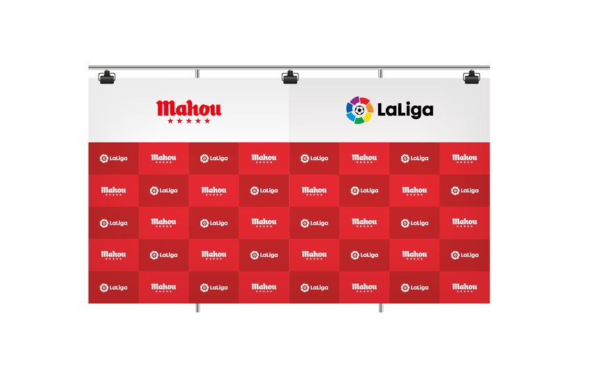
Contents   1.
           2.
                The beat
                Logo
                                           p.07
                                           p.17
           3.   Claim                      p.27
           4.   Colour                     p.32
           5.   Typography                 p.37
           6.   Co-branding and projects   p.48
           7.   Merchandising              p.63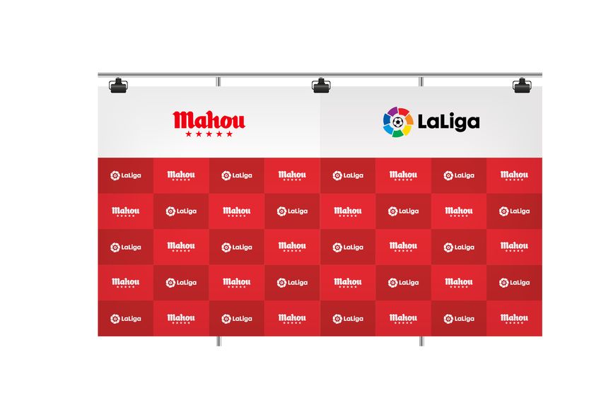
1.         1.
           2.
                The beat
                Logo
                                           p.07
                                           p.17

The beat   3.
           4.
                Claim
                Colour
                                           p.27
                                           p.32
           5.   Typography                 p.37
           6.   Co-branding and projects   p.48
           7.   Merchandising              p.63

                                                  p.7
THE BEAT

Insight

           It’s time to feel
           the excitement

                               p.8
THE BEAT

Insight

           It’s time to
                feel
             connect
             surprise
               enjoy
            celebrate

                          p.9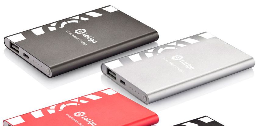
THE BEAT

Insight

           It’s time for
               LaLiga

                           p.10
THE BEAT
Insight
It’s time
to beat
p.11THE BEAT
Principles
At LaLiga,
hearts beat
Because LaLiga is: Because LaLiga is NOT: LaLiga expresses itself with:
Emotive Apathetic or artificial Empathy
Passionate Neutral or cold High contrast
Energetic Passive or static Dynamism
Moving Indifferent Saturation
Intense Weak Force
Responsible Exclusionary Inclusiveness
p.12A simple and powerful creative idea
the beat
p.13THE BEAT
Principles
Manifiesto of
the beat
Our Brand Manifesto summarises the source of our graphical devices
in an aspirational and poetic way.
The Manifesto is not a text for commercial use; rather something that everyone
should internalise and that describes an attitude based on a lifestyle and
genuinely experiencing LaLiga: uniting hearts and football. It is something we
should be renowned for all over the world.
p.14W I T H O U T A B E A T , T H E R E ’ S N O H E A R T .
W H I T O U T A H E A R T , T H E R E ’ S N O P A S S I O N .
W H I T O U T P A S S I O N , T H E R E ’ S N O E M O T I O N .
W H I T O U T E M O T I O N , T H E R E ’ S N O F O O T A B A L L .
p.15F E E L T H E
H E A R B E A T
#feeltheheartbeat
p.162. 1.
2.
The beat
Logo
p.07
p.17
Logo 3.
4.
Claim
Colour
p.27
p.32
5. Typography p.37
6. Co-branding and projects p.48
7. Merchandising p.63
p.17LOGO
Positive
Colour Version
This is our logo. It is our signature and the Positive horizontal colour version Positive vertical colour version
organisation’s guarantee. It is the graphical
synthesis of our values and serves as an
identifier for everyone who represents us,
for everything we do and say.
The logo is an asset of great value to
LaLiga. It must not be altered or modified,
and it must be applied in the way specified
in this manual.
As it is our most recognisable element, it
must be used consistently, visibly and
clearly.
Whenever possible we must prioritise the
horizontal version over the vertical one.
Our logo, as has been the case up until
now, is composed of the wordmark (LaLiga
text) and a symbol (the graphic), which are
always inseparable.
The colours must be used consistently to
reinforce the brand value. The order of the
colours within the logo and their opacity
level must not be altered.
Symbol Wordmark
p.18LOGO
Negative
Colour Version
When we need to apply our Negative horizontal colour version Negative vertical colour version
logo on dark backgrounds, we use
the negative version.
The logo should never be transformed
from positive to negative automatically,
because the “ball” graphic suffers an
alteration that modifies the optimal
perception of the logo.
p.19LOGO
Monochrome
versions
We will use the monochrome version as the Horizontal monochrome version Vertical monochrome version
preferred option. PREFERRED USE
The logo should never be transformed
from positive to negative automatically,
because the “ball” graphic suffers an
alteration that modifies the optimal
perception of the logo.
p.20LOGO
Construction
Our logo, as has been the case up until
now, is composed of the wordmark (the
word LaLiga) and a symbol (the
accompanying graphic), which are always
inseparable.
The horizontal version of the logo
guarantees that it is correctly interpreted
and read in any format.
The LaLiga logo must always be applied
maintaining its original proportions. 4.5X
As such, it is recommended to always X
use the final artwork.
We must pay special attention not to 0.5X
confuse the current horizontal version with
X
the old one, which had a smaller proportion
between the wordmark and the symbol. 1.5X 0.25X 3X
In the current version, the LaLiga wordmark
acquires greater weight to give it more 4.5X
emphasis in the composition.
X
3X 0.5X 4.5X
p.21LOGO
Protection Area
The protection area establishes the
minimum distance between our logo and
external text or graphical elements.
This protection area is constructed in
terms of “X”.
X
X
0.5X
X
0.5X
X
Minimum size
1.5cm
To ensure adequate readability
of the logo, it should not be reproduced 2cm | 80px
in sizes smaller than 20 mm wide for the
horizontal version and 15 mm high for the
vertical version.
p.22LOGO Reproduction on backgrounds We will only apply the colour version of the logo on a black or white background. On all other backgrounds, both from our own colour palette and those that do not belong to our brand, we will use the monochrome version. We will use the positive or negative version based on which one guarantees the greatest visibility and contrast. Whenever possible, we must prioritise the horizontal version over the vertical one.
LOGO

Reproduction
on photographs

On photographic backgrounds we will
always use the monochrome version.

Over light images:
We recommend the use of the positive
version (in black). The negative version
(in white) will have worse contrast and
legibility over light backgrounds.

The possibility of using the colour versions
will depend on the contrast generated over
the background.

Over dark images:
We recommend the use of the negative
version (in white). The positive version
(in black) will have worse contrast and
legibility over dark colours.

The possibility of using the colour versions
will depend on the contrast generated over
the background.

                                               p.24
LOGO
Use of the symbol
Use of the logo as a separate feature
is limited exclusively to the App icon –
always its monochrome version (positive or
negative depending on visibility) – and the
Fav icon where, because it is small, we will
use the colour version so it can be quickly
identified.
Any other use of the symbol by itself is not
permitted.
If you have any doubts about the use of the
icon, check with the Brand Department.
The symbol should never be transformed
from positive to negative automatically,
because the “ball” graphic suffers an
alteration that modifies the optimal
perception of the logo.
Symbol Symbol
positive version negative version
p.25LOGO
Incorrect use
Maintaining and applying the graphical
rules when implementing the logo ensures
that it is easily identified.
Any modification of the logo that is not
set out here is not permitted either.
1. On colour backgrounds, we must always apply
the monochrome version of the logo.
2. We must select the positive or negative version
that best contrasts with the images. 1. 2. 3.
3. Never apply shadows or any other effect to the
logo.
4. The logo should never be transformed from
positive to negative automatically, because the
“ball” graphic suffers an alteration that
modifies the optimal perception of the logo.
5. Never use elements of the logo separately,
other than the specified exceptions.
6. Select the monochrome version of the logo in
the colour that best contrasts with the image.
7 Do not modify, rotate, distort or alter the design
of the logo.
4. 5. 6.
8. Do not change the composition of the logo or
create different versions to the ones shown in
this manual.
9. Do not use different fonts to remake the logo.
Always use the final artwork.
7. 8. 9.
p.263. 1.
2.
The beat
Logo
p.07
p.17
Claim 3.
4.
Claim
Colour
p.27
p.32
5. Typography p.37
6. Co-branding and projects p.48
7. Merchandising p.63
p.27CLAIM
Essential aspects Spain and Spanish speaking countries USA/Japan Europe/Africa/Asia/Oceania
No es fútbol. Es LaLiga. It’s not soccer. It’s LaLiga. It’s not football. It’s LaLiga.
One of the main aims is turning LaLiga into
a strong, benchmark brand, not only in the
No es fútbol. It’s not soccer. It’s not football.
world sports markets but also in the global Es LaLiga. It’s LaLiga. It’s LaLiga.
entertainment market.
LaLiga is more than a sports competition.
LaLiga is more than football. LaLiga is not No es fútbol. It’s not soccer. It’s not football.
just another sporting spectacle; it is a brand Es LaLiga. It’s LaLiga. It’s LaLiga.
with a difference, and it has the capacity to
positively impact on the lives if millions of
people around the world.
“It´s not football. It´s LaLiga” will be our new
positioning and tagline. It will serve as a
new vehicle through which to communicate
with the world, allowing us to talk to people
We will always use the lowercase version since it lays out
of all ages and cultures. better with our typographic logo: LaLiga.
Both “fútbol” “soccer” and “football” will be entirely in lower case.
With this new positioning, we will be able to
amplify our playing field, making it possible
for LaLiga to sign off on any initiative that
No es fútbol. Es LaLiga. It’s not soccer. It’s LaLiga. It’s not football. It’s LaLiga.
it embarks on, whether within the football
environment or away from it.
Our Typo is:
Core Sans C It will always end with a full stop.
65Bold Never with a comma.
No es fútbol, es LaLiga. It’s not soccer, it’s LaLiga. It’s not football, it’s LaLiga.
p.28CLAIM
Essential aspects
For better visibility and when there is
enough space, there should be an exclusion
zone of 100% the size of the tagline both
above it and below it.
p.29CLAIM
Audiovisual material. End LaLiga Santander: End LaLiga SmartBank:
End of corporate
videos.
These are some of the recommendations
for using the claim and logo at the end of
sponsorship audiovisuals.
p.30CLAIM
Audiovisual material. End LaLigaSportsTV: End LaLigaIcons:
Corporate ending
These are some of the recommendations for
using the claim and logo at the end of other
audiovisual projects.
p.314. 1.
2.
The beat
Logo
p.07
p.17
Colour 3.
4.
Claim
Colour
p.27
p.32
5. Typography p.37
6. Co-branding and projects p.48
7. Merchandising p.63
p.32COLOUR
Colour
principles
/ LaLiga is a brand that pulsates, with passion, with high contrast, with
saturation, without gradations.
/ The principal colours of LaLiga are the primary colours: red, yellow and blue,
combined with black or white.
/N
o more than two colours can be used at the same time (+ photography
when applicable).
/T
he coloured beat is adapted to the colours of each club, maintaining the
specified principles.
p.33COLOUR
Colour
principles
LaLiga pulsates with the colour
p.34COLOUR
Principal colour
palette
Our principal colours are the primary
colours: red, yellow and blue, which are
complemented by black or white. Red. Yellow. Blue. Black. White.
As a rule, no more than three colours can
Pantone® 186C Pantone® 7408C Pantone® 3005C Pantone® 426C
be used at the same time in a single
CMYK: 0 / 93 / 79 / 0 CMYK: 0 / 29 / 100 / 0 CMYK: 100 / 31 / 0 / 0 CMYK: 90 / 75 / 53 / 90
communication piece.
RGB: 200 / 16 / 46 RGB: 246 / 190 / 0 RGB: 0 / 119 / 200 RGB: 37 / 40 / 42
HTML: D20028 HTML: F6BE00 HTML: 0077C8 HTML: 25282A
When we use the beat as a graphical RAL: 3020 RAL: 1003 RAL: 5015 RAL: 8022
device, we darken it by adding 20% black
to the corresponding colour values.
p.35COLOUR
Complementary
colour palette
The colour palette is complemented by four
secondary colours that have been defined
to give chromatic support to the brand. Orange. Green. Light blue. Purple.
Only use these colours as an enhancement
Pantone® 1645C Pantone® 339C Pantone® 311C Pantone® 2096C
and never in greater proportion than the
CMYK: 0 / 65 / 75 / 0 CMYK: 80 / 0 / 58 / 0 CMYK: 65 / 0 / 13 / 0 CMYK: 76 / 75 / 0 / 0
principal colours to prevent them from
RGB: 255 / 106 / 57 RGB: 0 / 178 / 136 RGB: 5 / 195 / 222 RGB: 101 / 78 / 163
becoming too prominent. HTML: FF6A39 HTML: 00B388 HTML: 05C3DE HTML: 654EA3
When we use the beat as a graphical
device, we darken it by adding 20% black
to the corresponding colour values.
p.365. 1.
2.
The beat
Logo
p.07
p.17
Typography 3.
4.
Claim
Colour
p.27
p.32
5. Typography p.37
6. Co-branding and projects p.48
7. Merchandising p.63
p.37LaLiga
pulsates
with
its
written
voice
p.38TYPOGRAPHY
Our
fonts
Core Sans
Dynamic with geometric shapes, the
“Core Sans” font family is a fundamental
asset in our communications.
Our font has 9 weights that meet the
needs for creating hierarchies in text.
Thin / Extra Light / Light
As such, we can use the heavier weights
to write headlines and large highlighted
items.
Regular / Medium / Bold
For the rest of the texts we have
various lighter weights, with their
italic versions.
Extra Bold / Heavy / Black
System font
For compatibility reasons, a system
font is needed that can be displayed
on any computer.
We use Arial when we work with
documents that we share with
third parties in editable format. abcdefghijklmnopqrstuvwxyz abcdefghijklmnopqrstuvwxyz abcdefghijklmnopqrstuvwxyz
ABCEDEFGHIJKLMNOPQRSTUVWXYZ ABCEDEFGHIJKLMNOPQRSTUVWXYZ ABCEDEFGHIJKLMNOPQRSTUVWXYZ
If the document will be shared on PDF 1234567890 1234567890 1234567890
format we will keep our corporate ¿?!¡”$%&/(=+*-:;>@#[{ ¿?!¡”$%&/(=+*-:;>@#[{ ¿?!¡”$%&/(=+*-:;>@#[{
font Core Sans
If collaborators need to work with abcdefghijklmnopqrstuvwxyz abcdefghijklmnopqrstuvwxyz abcdefghijklmnopqrstuvwxyz
The document, but it’s an own ABCEDEFGHIJKLMNOPQRSTUVWXYZ ABCEDEFGHIJKLMNOPQRSTUVWXYZ ABCEDEFGHIJKLMNOPQRSTUVWXYZ
document of LaLiga, we will facilitate 1234567890 1234567890 1234567890
them the corporate font. ¿?!¡”$%&/(=+*-:;>@#[{ ¿?!¡”$%&/(=+*-:;>@#[{ ¿?!¡”$%&/(=+*-:;>@#[{
abcdefghijklmnopqrstuvwxyz abcdefghijklmnopqrstuvwxyz abcdefghijklmnopqrstuvwxyz
ABCEDEFGHIJKLMNOPQRSTUVWXYZ ABCEDEFGHIJKLMNOPQRSTUVWXYZ ABCEDEFGHIJKLMNOPQRSTUVWXYZ
1234567890 1234567890 1234567890
¿?!¡”$%&/(=+*-:;>@#[{ ¿?!¡”$%&/(=+*-:;>@#[{ ¿?!¡”$%&/(=+*-:;>@#[{
p.39TYPOGRAPHY
Our
fonts
Core Sans
Firstly, we prioritise the use of the following
font weights:
- Core Sans Regular: for writing body text or
titles in small spaces.
Thin / Extra Light / Light
- Core Sans Bold: to stand out over Regular
weight.
- Core Sans Extra Bold: for composing
large-format titles.
Regular / Medium / Bold
- Core Sans Bold: to stand out over Extra
Bold weight.
Extra Bold / Heavy / Black
abcdefghijklmnopqrstuvwxyz abcdefghijklmnopqrstuvwxyz abcdefghijklmnopqrstuvwxyz
ABCEDEFGHIJKLMNOPQRSTUVWXYZ ABCEDEFGHIJKLMNOPQRSTUVWXYZ ABCEDEFGHIJKLMNOPQRSTUVWXYZ
1234567890 1234567890 1234567890
¿?!¡”$%&/(=+*-:;>@#[{ ¿?!¡”$%&/(=+*-:;>@#[{ ¿?!¡”$%&/(=+*-:;>@#[{
abcdefghijklmnopqrstuvwxyz abcdefghijklmnopqrstuvwxyz abcdefghijklmnopqrstuvwxyz
ABCEDEFGHIJKLMNOPQRSTUVWXYZ ABCEDEFGHIJKLMNOPQRSTUVWXYZ ABCEDEFGHIJKLMNOPQRSTUVWXYZ
1234567890 1234567890 1234567890
¿?!¡”$%&/(=+*-:;>@#[{ ¿?!¡”$%&/(=+*-:;>@#[{ ¿?!¡”$%&/(=+*-:;>@#[{
abcdefghijklmnopqrstuvwxyz abcdefghijklmnopqrstuvwxyz abcdefghijklmnopqrstuvwxyz
ABCEDEFGHIJKLMNOPQRSTUVWXYZ ABCEDEFGHIJKLMNOPQRSTUVWXYZ ABCEDEFGHIJKLMNOPQRSTUVWXYZ
1234567890 1234567890 1234567890
¿?!¡”$%&/(=+*-:;>@#[{ ¿?!¡”$%&/(=+*-:;>@#[{ ¿?!¡”$%&/(=+*-:;>@#[{
p.40TYPOGRAPHY
Font use
hierarchy
Main
These are some recommendations for 1.
the use of different font weights.
1. Heading:
Core Sans 65 Bold and Core Sans 85
Heavy to emphasise a word in the
heading.
heading
2. Subhead or emphasised text:
Core Sans 65 Bold.
3. Body Copy:
2. Subhead or second-level
As a general rule, body copy shall be emphasised information
written in Core Sans 45 Regular. When
we wish to emphasise text, we will do
so in Core Sans 65 Bold and apply italic
text for the names of works, foreign 3. Body text. Lorem ipsum dolor sit amet, consectetur
words, etc.
adipiscing elit. Praesent malesuada mauris eu pretium
Line spacing: the use of automatic mollis. Donec sit amet dictum justo. Aliquam erat volutpat. In
line spacing is recommended in all cases. placerat consequat est, id rutrum ex gravida nec. Aliquam sed
augue rhoncus, posuere ante a, fermentum velit. Vestibulum
nec eros vel est egestas porta. Maecenas malesuada nulla id
velit fringilla consequat.
Aenean in velit vel diam suscipit feugiat at in ipsum. Donec
facilisis, dolor commodo congue semper, magna metus
tempus nisi, vitae tempor sem arcu eget arcu. Suspendisse
vitae tincidunt libero. Fusce a tellus scelerisque, placerat mi
et, sagittis mauris. Donec sed nibh tellus. Morbi accumsan
dolor nisl, vel lobortis justo luctus vitae. Donec semper, metus
quis auctor rutrum, ante ipsum blandit enim, et efficitur nulla
magna sed neque. Curabitur laoreet pretium velit eu porttitor.
p.41TYPOGRAPHY
Font
usage
In order to obtain maximum performance
from the font, basic use cases have been
developed that ensure the visibility and
legibility of the fonts in all of their
manifestations.
/O
ur font is Core Sans, which is used as both a desktop and
webfont.
/T
he boldest fonts are used for headings and large-format
emphasis.
/ We always apply automatic line spacing.
/W
hen composing text, we write in lowercase and maintain left
justification.
/ Arial must be used as the system font for sharing documents.
p.42TYPOGRAPHY
Our
fonts
Noto Sans CJK Cairo
LaLiga expresses itself in multiple languages.
As such, we also have fonts for writing our
communications in Arabic and Chinese.
Font for Asian markets:
Noto Sans CJK
Noto Sans comprehensively covers simplified
Chinese, traditional Chinese, Japanese and
Korean characters.
Its simplified lines improve visibility even at
small sizes. It has seven weights, which meet
LaLiga’s communication needs.
Arabic font:
Cairo
The Cairo font family balances classic and
我喜欢踢足球并在电视上观看 我喜欢踢足球并在电视上观看
contemporary strokes while maintaining easy
فغضسدئب٣٤ۓھگپ فغضسدئب٣٤ۓھگپ
123456789!?+@#¢$+() 123456789!?+@#¢$+()
readability. The lighter weights are used for
body text, while the bolder weights are 123456789!?+@#¢$+() 123456789!?+@#¢$+()
perfect for headings and emphasis.
It includes a wide range of glyphs that allow
for text in Arabic, Farsi and Urdu languages.
我喜欢踢足球并在电视上观看 فغضسدئب٣٤ۓھگپ فغضسدئب٣٤ۓھگپ
123456789!?+@#¢$+() 123456789!?+@#¢$+() 123456789!?+@#¢$+()
我喜欢踢足球并在电视上观看 我喜欢踢足球并在电视上观看 فغضسدئب٣٤ۓھگپ فغضسدئب٣٤ۓھگپ
123456789!?+@#¢$+() 123456789!?+@#¢$+() 123456789!?+@#¢$+() 123456789!?+@#¢$+()
p.43F B m i L G M b p.44
TYPOGRAPHY

Beat
through repetition

We have a graphical device created with
our font. Based on a series of repetitions of
the same word, we achieve the typographic       we know what
beat effect.                                     we want to

This device can only be used on words
(never on a phrase), which should be no
more than 6 characters long if possible, and
are always written in uppercase. This
provides us with greater impact and avoids
saturation.

                                                     we became legends
                                                         with every

                                                           we take

                                                                         p.45
TYPOGRAPHY
LaLiga as a written
brand
LaLiga
When we have to write LaLiga in text
bodies or headings, we do so with the two
“L’s” in uppercase and always together
(no space between the words).
The LaLiga brand adopts the font and
weight being used in the graphic we are
developing. We should not emphasise it in
Bold to avoid turning it into a logotype.
As a general rule, within uppercase text, LaLiga is allways written
LaLiga will maintain the composition with two capital LS
of the headline, if it is in uppercase, and no space between La and Liga.
it will be in uppercase.
laliga
la liga
La Liga
La liga
la Liga
LALIGA
p.46TYPOGRAPHY
LaLiga as
a written brand
Examples in different media
We always apply this criterion, regardless
of the type of font we are using. This way,
we unify the style.
El Barça mantiene viva
la lucha para LaLiga
El At. Madrid líder
de LaLiga Femenina
Iberdrola
p.476. 1.
2.
The beat
Logo
p.07
p.17
Co-branding 3.
4.
Claim
Colour
p.27
p.32
and projects 5.
6.
Typography
Co-branding and projects
p.37
p.48
7. Merchandising p.63
p.48CO-BRANDING
Introduction
/ We have a colour version and a monochrome version of the composite logo.
/ Our title sponsor, Santander, has its own logo application rules in co-branded
pieces and projects, and these can be consulted in the specific manual.
/ We have four levels of sponsorship:
official sponsor, official supplier, official product and event partner
p.49CO-BRANDING
Composite
X X 1/2X 1/2X
The composite logo acts as our official seal
and it is therefore important that the rules
of use and proportions shown below are
always respected. X
1/4X DE SC R IP TOR PAT ROC IN ADOR
The creation of any other category must 1/2X
be consulted and approved by the Brand
Department. X 1 pt dividing line 1/2X
The department that requests it must 1/4X D E S C R IP TO R PAT RO C IN A D O R
1/2X
provide all the necessary information to
find the name of the most appropriate
X 1 pt dividing line X
association.
This category descriptor will be written in
the font Core Sans 75 ExtraBold and always
in uppercase.
In this case, and as an exception, we X X 1/2X 1/2X
applied tracking of 100 between the
characters for improved legibility.
X
1/4X DE SC R IP TOR PAT ROC IN ADOR
1/2X
X 1 pt dividing line 1/2X
1/4X D E S C R IP TO R PAT RO C IN A D O R
1/2X
X 1 pt dividing line X
p.50CO-BRANDING
All composite
versions Example
OFFICIAL GLOBAL PARTNER
OFFICIAL GLOBAL PARTNER
OFFICIAL GLOBAL PARTNER
OFFICIAL GLOBAL PARTNER
OFFICIAL GLOBAL PARTNER
OFFICIAL GLOBAL PARTNER
p.51CO-BRANDING
All composite
versions Example
OFFICIAL GLOBAL PARTNER
OFFICIAL GLOBAL PARTNER
OFFICIAL GLOBAL PARTNER
OFFICIAL GLOBAL PARTNER
OFFICIAL GLOBAL PARTNER
OFFICIAL GLOBAL PARTNER
p.52CO-BRANDING
Composite
signature
The size of the composite logo should be
proportional to the format in which it is
applied, and it must have a height of 5% of
the longest side in the case of the horizontal
version and 7% for the vertical version.
The position is flexible, given that the
composite logo is present alongside other
elements and logos in the applications.
Whenever the composition of the format
permits, it should be on the left, and it may
be placed at the top or bottom.
7% X
In the event that there are other logos on BALÓN OFICIAL
the left, we can move it to the right.
5% X
X
X
7% X
BALÓN OFICIAL
5% X
p.53CO-BRANDING
Composite
signature
The position of the composite logo is
flexible, given that it is present alongside
other elements and logos in the
applications. Whenever the composition of
the format permits, it should be on the left,
and it may be placed at the top or bottom.
In the event that there are other logos on
the left, we can move it to the right.
When the composite logo is placed on a
white background, it has no outline.
p.54CO-BRANDING
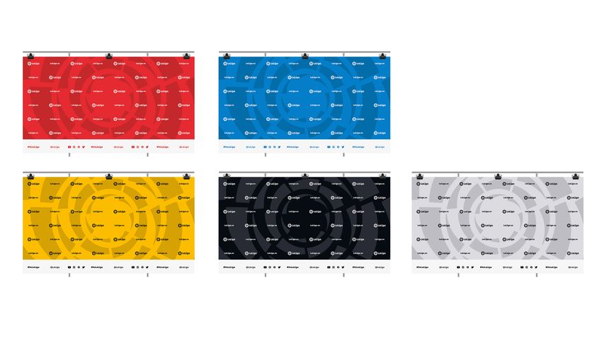
Photocall
LaLiga + web + social media
We have different composition options for
the photocall based on usage, the event,
the characteristics and the sponsorship
agreements.
We can use the entire LaLiga colour palette
to adapt to the needs of each event.
Whenever possible, we will use the
recommended version of the logo, except
when some special feature of the
composition makes it preferable to use the
vertical version.
p.55CO-BRANDING
Photocall
LaLiga + sponsor + social media
We have different composition options for
the photocall based on usage, the event,
the characteristics and the sponsorship
agreements.
We can use the entire LaLiga colour palette
to adapt to the needs of each event.
p.56CO-BRANDING
Photocall
LaLiga + sponsor with header
We have different composition options for
the photocall based on usage, the event,
the characteristics and the sponsorship
agreements.
We can use the entire LaLiga colour palette
to adapt to the needs of each event.
p.57CO-BRANDING
Photocall
Competitions
We have different composition options for
the photocall based on usage, the event,
the characteristics and the sponsorship
agreements.
We can use the entire LaLiga colour palette
to adapt to the needs of each event.
p.58CO-BRANDING
Photocall
Competitions + event heading
We have different composition options for
the photocall based on usage, the event,
the characteristics and the sponsorship
agreements.
We can use the entire LaLiga colour palette
to adapt to the needs of each event.
p.59CO-BRANDING
Photocall
Competitions + sponsors,
monochrome version
We have different composition options for
the photocall based on usage, the event,
the characteristics and the sponsorship
agreements.
We can use the entire LaLiga colour palette
to adapt to the needs of each event.
p.60CO-BRANDING
Photocall
Competitions + sponsors,
colour version V1
We have different composition options for
the photocall based on usage, the event,
the characteristics and the sponsorship
agreements.
We can use the entire LaLiga colour palette
to adapt to the needs of each event.
p.61CO-BRANDING
Photocall
Competitions + sponsors,
colour version V2
We have different composition options for
the photocall based on usage, the event,
the characteristics and the sponsorship
agreements.
We can use the entire LaLiga colour palette
to adapt to the needs of each event.
p.627. 1.
2.
The beat
Logo
p.07
p.17
Merchandising 3.
4.
Claim
Colour
p.27
p.32
5. Typography p.37
6. Co-branding and projects p.48
7. Merchandising p.63
p.63MERCHANDISING
Audiences
LaLiga competes for our entertainment
time and in order to capture our attention
it appeals to emotions.
Merchandise Corporate gift
At LaLiga we are experts at eliciting
emotions.
• More affordable items • High-priced items
To ensure that the same terminology
is used throughout the company, we have • Mass consumption items • Not for mass consumption
to differentiate between two main product • High turnover • Requires definition of the
categories:
purpose and recipient
• Designed to create “1 to 1”
public relations
• Institutional ability to give gifts
Greater brand visibility Less brand visibility
(logo + Brand World)
/ The correct application of the logo and the Brand World is essential both for merchandise
and for corporate gifts.
/ Nevertheless, while merchandise must be immediately identifiable, corporate gifts must be
identified more discreetly.
p.64MERCHANDISING
Reinforcing
Our identity
Corporate gifts and merchandise are
brand tools and a unique opportunity
to communicate our values. Leadership Innovation Quality and Ethical Future of energy
that excites performance responsibility and the
and commitment environment
towards people
Objective
LaLiga is the best To be perceived as an To be renowned as To be considered a
league in the world, innovative brand, that an organisation that brand committed to
To be perceived as
meaning that it must leads others and is up offers quality products the environment,
an organisation that
stand out as a leading to date with the latest and entertainment, that works to reduce
acts in a manner that is
organisation, with a technological advances. which creates financial its environmental impact
ethical, responsible and
global presence and value today and in and promotes renewable
committed to the
expertise in eliciting the future. energy.
well-being of society
emotions.
and its customers.
/ A gift can be an object, but it can also be something / Search for quality / Include several suppliers / Propose eco-friendly
intangible or an experience that invites us to become materials and attention in proposals and products and packaging
excited. to detail. tenders.
Activation
/ Pay special attention to
/ Corporate gifts are a brand tool and they should / Propose products linked / Try to collaborate with product development in
therefore be unique. We should try to choose to our activity (and which charity organisations the local country.
differentiating items and check with the suppliers to go a step further too). or to include in-house
ensure our competitors are not offering the same item. initiatives, whenever / Propose technologically
possible. relevant products.
p.65MERCHANDISING
Reinforcing
Our identity
Corporate gifts and merchandise are
brand tools and a unique opportunity
to communicate our values. The following products are not recommended:
/ Items that may be discriminatory on grounds of race, nationality, religion, gender or sexual orientation.
/ Items that may incite violence, harmful behaviour and/or illegal behaviour.
/ Items that may be considered offensive or that might hurt the feelings of certain groups.
/ Items that may promote behaviours that damage the environment.
/ Items that might encourage the consumption of substances harmful to human health. We recommend avoiding the link with strong alcoholic
beverages and tobacco (for example: cigars, lighters, corkscrews, etc.).
/ Items that may promote the use of drugs and similar.
General examples: lighters, wastepaper baskets, knives, handkerchiefs, wine glasses, products with non-rechargeable batteries, spray
deodorants, etc.
Supplier selection:
Although the final decision will depend on the quality, price and contractual conditions, it should be attempted to select a supplier that
supports and improves the values of the LaLiga brand and image. As a general rule, the selected supplier must be:
/ Renowned as a company that offers quality products and services.
/ Renowned as a company that acts ethically and responsibly.
/ Renowned as a company committed to the environment.
/ Renowned as a company with ethical, responsible and transparent business practices.
p.66MERCHANDISING
Beautiful
utility
Functionality. Protection. Movement.
It is important to define materials and
brands that are aligned with LaLiga’s
values.
Products that excite through their
excellence in design, because they fulfil a
clear function, because they include
intelligent materials.
They simplify, protect, inform and
accompany our movement and,
furthermore, are carefully designed and
aesthetically executed.
p.67MERCHANDISING
Technology
and accessories
Devices that facilitate work, incentivise
movement and are part of technological
progress:
LaLiga is part of this progress.
Utility or quality with meticulous design.
Examples:
LED Brazalete
Wireless Charger
Bluetooth auricular
Office
Tools that provide functionality, are useful
for performing tasks better and,
furthermore, have meticulous aesthetics
using quality materials.
Examples:
Notebook A5 deluxe
Pen Prodir (QS04 Curve)
Reference images without licence for use.
p.68MERCHANDISING
Travel items
LaLiga is a global brand and these items
go hand in hand with people who are
continually on the move, facilitating the
transport of their materials.
Functionality. Protection. Movement.
Examples:
Bagpack
Suitcase indentifier
Computer Case
Textiles and sport
More specific to the area of sports
competitions and projects.
Examples:
Sportwear Jacket
Water sack
Reference images without licence for use.
p.69MERCHANDISING
Balls
LaLiga balls are emblematic and
everyone wants one. They should be
delivered in containers that increase
their value and make them a really
iconic gift.
The official Nike ball is a gift that
identifies us, is unique and is different
every season.
Examples:
Container for deflated ball
Special edition ball
Container for ball
Reference images without licence for use.
p.70MERCHANDISING
Bags
Reference images without licence for use.
Our calling card, constructing a brand
wherever they go and consolidating our
presence.
The fabric must be high quality, with textile
drawstrings.
Reference images without licence for use.
p.71MERCHANDISING
Partner
shirts
Reference images without licence for use.
For shirts featuring our partners, we will
select technical and sports materials,
placing the partner logo on the sleeve.
Functionality. Protection. Movement.
Reference images without licence for use.
p.72OTHER ELEMENTS
Ball pedestal
p.73OTHER ELEMENTS
Labels
p.74OTHER ELEMENTS
LaLiga
position
Lanyards may comein the
4 principal colours.
p.75OTHER ELEMENTS
TV compound
España
LaLiga + Claim /
LaLiga Santander /
LaLiga SmartBank
TV compounds may come
in the 5 principal colours.
p.76OTHER ELEMENTS
TV compound
International
LaLiga / Claim
TV compounds may come in
the 4 principal colours.
p.77MERCHANDISING
More than
football
LaLiga is more than football and, to
reinforce the fact that it is a lifestyle
brand, it is important that its Brand World
and visual devices can go further and
become decorative elements or souvenirs
that transmit the brand’s values.
Reference images without licence for use.
Reference images without licence for use.
p.78p.79
Thank you

If you have any doubts about the content of
this manual or about the application of the
brand in cases not covered here, contact the
LaLiga Brand Department.

This Manual is update on March 2020

                                               p.80
You can also read