Our BRAND: INSTRUCTION MANUAL - V 1.1 July 2019 - Collyer Bristow
←
→
Page content transcription
If your browser does not render page correctly, please read the page content below

our
BRAND:
INSTRUCTION
MANUAL

V 1.1 July 2019
disclaimer!
    These guidelines have been designed
  primarily for online use. As a result all
colours and logos used throughout are RGB
               (i.e digital).*

 If you print the guidelines the logos and
       colours won’t look accurate.

   *Until you get to the CMYK colours in the ‘How we look’ section.
what’s
 included

Brand Instruction manual   3
CONTENTS

                             what you ne ed
                               who we a re
                              how we look
     logos // colours // fonts // art direction // image sizes

                           materials we use
                                Business card // powerpoint

                             how we sound
                                       FAQS
                            who to speak to
Brand Instruction manual                                     4
what you
 need

Brand Instruction manual   5
NOTE:
                                                                   All available from the BD and marketing team at
                                                                   businessdevelopment@collyerbristow.com

what you’ll
need before
you get
started
    Logos                                   Patterns
    •   Digital versions in JPG, EPS, SVG   •   Digital versions in EPS and
        and PNG formats                         Adobe Illustrator formats
    •   Print versions in EPS formats in    •   Print versions in EPS format in
        CMYK and Pantone C and U                CMYK and Pantone C and U

    Fonts                                   colours
    •   On-going Creative Cloud             •   Digital - RGB and HEX
        subscription with synced fonts      •   Print - CMYK and Pantone
    •   Alternatively, purchased fonts
        licence

Brand Instruction manual                                                                                             6
who
                 we are

Brand Instruction manual   7
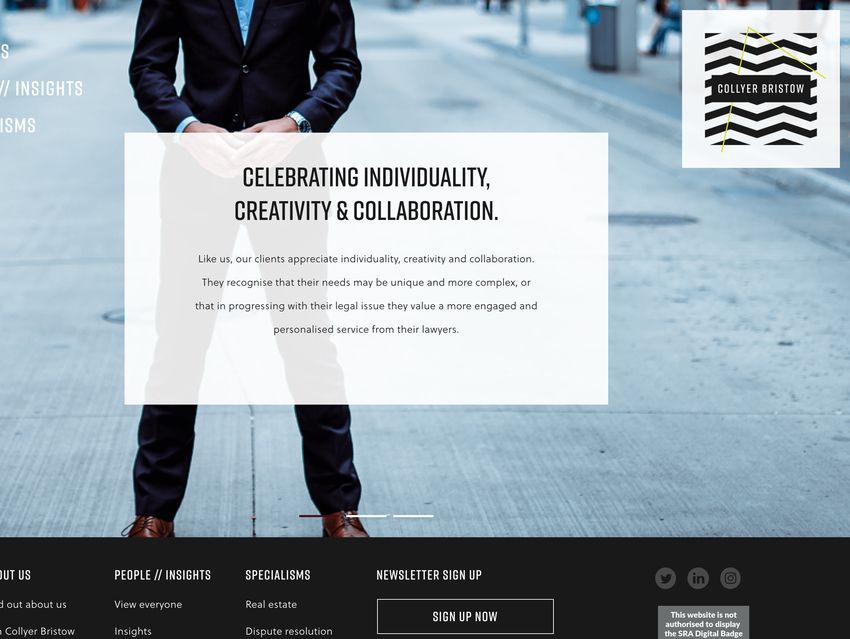
the collyer bristow vision

“TO BE THE
RECOGNISED
AND PREFERRED
LAW FIRM FOR
THOSE THAT VALUE
INDIVID UALITY
CREATIVITY AND
COLLABORATION”.
Brand Instruction manual     8
what
do we
do and
   Collyer Bristow is a
    premium brand.

    We provide high
   quality legal advice
    tailored for every

how do
  client and often with
    ongoing partner
    involvement. Our
   service is priced to
      reflect a more
       hands-on,
    personalised and
      collaborative

we do
     approach whilst
  providing our clients
  clear value for money.

it?
who
are we
    We recognise that
     certain types of
  clients will particularly
      appreciate our
    approach and for
     them our Vision
      statement will
      most resonate.

here
       We represent
     businesses and
   wealthy individuals
       and families
     that are driven,
   entrepreneurial and
     ambitious. Every

for?
    client is different,
   but they all demand
   high quality advice
   and premium client
          service.
WHAT DOES THAT MEAN FOR OUR CLIENTS? what distinctive and differentiating qualities can they expect from their experience with collyer bristow? Brand Instruction manual 11
our values

 individuality
   creativity
  engagement
collaboration
    ambition
     pride
our values
INDIVIDUALITY
Recognising that one size doesn’t fit all, we celebrate diversity and
respect the unique and distinctive qualities of clients and colleagues.
Brand Instruction manual 13our values
CREATIVITY
We think innovatively and entrepreneurially, challenging conventions to
find new and better solutions for our clients and the firm.
Brand Instruction manual 14our values
engagement
With a ‘can do’ attitude, we invest ourselves fully in all that we do.
Brand Instruction manual 15our values
collaboration
Promoting a culture of inclusion we work together with shared purpose,
valuing the input of others in a consultative and supportive way.
Brand Instruction manual 16our values
ambition
Individually and together we share a common drive
to progress and succeed.
Brand Instruction manual 17our values
pride
We take pride in the quality of our work, providing a service delivered
with integrity and attentiveness, to the highest possible standard.
Brand Instruction manual 18how we
look
Brand Instruction manual 19a flexible
identity
system
The Collyer Bristow brand is unique because
we’ve created an identity system that can be
dialled up or dialled down depending on the
target market. This is a much more sophisticated
way of communicating than most law firms
adopt.
There are, however, some rules to how this works.
In this section we breakdown the identity system
and how it can be used.
Brand Instruction manual 20Our flexible identity system is made up of the
following ten components.
components
the frame
This is the typographic element of
the logo, contained centrally within
a ‘Classic Black or ‘Citron Green’
The default The alternative
rectangle.
the patterns
A series of four patterns that ‘The
Frame’ sits centrally within. The
straight lines represent the rules
and restrictions of the law. The default The variations
the ‘Citron green’ lines
Four lines that bounce and break
out of the square patterns in
different directions to represent
us thinking unconventionally and
outside the box. The default The variations
Brand Instruction manual 21THE FULL family OF LOGOS
*important
This is our full family of logos, that in most The ‘Citron Green’ typographic logo is only
to be used as a backstop and in extenuating
instances, you are able to pick and choose
circumstances. It will be employed at the discretion
between. We have eight patterned logos; these of the Business Development and Marketing
have ‘Classic Black’ straight lines to represent Director.
the rules and restrictions of the law, and each
pattern has its own accompanying diagonal
‘Citron Green’ line. This represents our ability
to think in lateral ways and bring creative
solutions to our clients’ problems.
We also have a typographic logo in ‘Classic
Black’ and white. These are our baseline
logos for times when you need a simple, yet
high quality, mark. As well as a ‘Citron Green’
version for extenuating cirmcumstances.
Brand Instruction manual 22how to
use the
logos
Brand Instruction manual 23corporate // diagonal logo - the default logo
*little tip
The ‘Citron Green’ line alters per patterned logo,
so you’ll need to double check the placement / size
if you swap out the logos within documents - they
change shape and may cut some of the line off.
1
The Frame. 3
Centrally contained white
text within a ‘Classic Black’ The ‘Citron Green’ line.
rectangle. (The ‘Classic A two directional line that
Black’ typographic logo). starts, changes direction
Placed centrally within the and finishes outside
patterned square. the patterned square.
IMPORTANT: You must only
use this specific ‘Citron
Green’ line for this pattern.
2
The Pattern.
15 ‘Classic Black’ straight
lines at a 45 degree angle,
equally spaced, masked
into a square.
Components:
1
also available in
2 This logo is also available with The
Frame in ‘Citron Green’.
3
Brand Instruction manual 24typographic logo
We also sometimes just use the pure
typographic version when there are limitations
on print or where it feels more appropriate for
our audience or individuals.
also available in
This logo is also available with The
Frame in white and text in ‘Classic
Black’ for when used on an image,
video, ‘Classic Black’ or ‘Citron Green’
background.
Brand Instruction manual 25typographic logo - specials
1 2
‘Citron Green’ typographic logo. Mono // Registration black logos,
This logo is only to be used as a backstop and in extenuating Sometimes the logo will be required for external instances at 100%
circumstances. It will be employed at the discretion of the Business coverage for four colour process printing. Assets have been created
Development and Marketing Director. for these instances, but should not be used as a regular logo choice or
alternative option.
also available in
This logo is also available with The Frame in white and text in 100%
black, for when externally used on an image, video, or coloured
background.
the difference between ‘classic black’ and mono // registration black
CLASSIC BLACK mono // registration BLACK
Print Digital Print Digital
C 73 // M 67 // Y 65 // K 78 R 26 // G 26 // B 26 Hex #1A1A1A C 100 // M 100 // Y 100 // K 100 R 0 // G 0 // B 0 Hex #000000
Brand Instruction manual 26variation logo - horizontal
*little tip
The ‘Citron Green’ line alters per patterned logo,
so you’ll need to double check the placement / size
if you swap out the logos within documents - they
change shape and may cut some of the line off.
2
1 The Pattern.
17 ‘Citron Black’ straight,
The Frame.
horizontal lines, equally
Centrally contained white
spaced, masked into a
text within a ‘Classic Black’
square.
rectangle. (The ‘Classic
Black’ typographic logo).
Placed centrally within the
patterned square.
3
The ‘Citron Green’ line.
A two directional line that
starts, changes direction
and finishes outside
the patterned square.
IMPORTANT: You must only
use this specific ‘Citron
Components:
Green’ line for this pattern.
1
also available in
2 This logo is also available with The
Frame in ‘Citron Green’.
3
Brand Instruction manual 27variation logo - vertical
*little tip
The ‘Citron Green’ line alters per patterned logo,
so you’ll need to double check the placement / size
if you swap out the logos within documents - they
change shape and may cut some of the line off.
1
The Frame. 2
Centrally contained white
text within a ‘Classic Black’ The Pattern.
rectangle. (The ‘Classic 22 ‘Classic Black’ straight,
Black’ typographic logo). vertical lines at two
Placed centrally within the different weights. Equally
patterned square. spaced and masked into
a square.
3
The ‘Citron Green’ line.
A two directional line that
starts, changes direction
and finishes outside
the patterned square.
IMPORTANT: You must only
use this specific ‘Citron
Green’ line for this pattern.
Components:
1
also available in
2 This logo is also available with The
Frame in ‘Citron Green’.
3
Brand Instruction manual 28variation logo - zigzag
*little tip
The ‘Citron Green’ line alters per patterned logo,
so you’ll need to double check the placement / size
if you swap out the logos within documents - they
change shape and may cut some of the line off.
1
The Frame. 3
Centrally contained white
The ‘Citron Green’ line.
text within a ‘Classic Black’
A two directional line that
rectangle. (The ‘Classic
starts, changes direction
Black’ typographic logo).
and finishes outside
Placed centrally within the
the patterned square.
patterned square.
IMPORTANT: You must only
use this specific green line
for this pattern.
2
The Pattern.
8 Almost Black straight,
zigzag lines placed
horizontally. Equally
spaced, masked into
a square.
Components:
1
also available in
2 This logo is also available with The
Frame in ‘Citron Green’.
3
Brand Instruction manual 29exclusion zones
*important
We have restrictions around leaving plenty of space
The exclusion zone is measured from the four edges
around the logos to maintain legibility and retain of the pattern - NOT the ‘Citron Green’ line.
impact.
NB: We do not have set rules around the maximum
required amount of space around the logos.
The minimum required
space around the logos
should be equal to the
height of The Frame.
Brand Instruction manual 30logo placement
Although we like to be flexible with our identity, we
like to keep the placement of the logo consistent
throughout all of our brand material, and stick to one
of three placements.
1
Top right corner.
The primary location for the logo, which can be
found on the website, letterhead and in the PPT
slides.
2
Centrally aligned.
The secondary location for the logo, which can be
found on the website and on our business cards.
3
Bottom right corner.
The last location for the logo, which is used on the
front page of this ‘Brand Instruction Manual’.
Brand Instruction manual 31don’ts
note:
We have rules to follow when using our logos
Never re-create the logo. Always use supplied
to ensure consistency and quality. assets and files.
COLLYER BRISTOW
1 2 3
Text. Stacking. Framing device // rectangle.
Do not alter the font, weight, size, angle or Do not stack the text on top of one another. Do not alter the size, angle, placement or use
placement of the text within The Frame. another shape instead of the rectangle.
4 5 6
Colour. The Frame. The ‘Citron Green’ line.
Do not change the colour of any components Do not remove or change the size, angle or Do not remove or change the stroke, size, angle
within the logo. placement of The Frame. It should always be the or placement of the lines. It should always be
top layer when used in the patterned logos. the middle layer when used in the patterned
logos. Each pattern has it’s own line - use it.
7 8
Pattern. Background.
Do not remove or change the size, angle, Do not forget to use a white square when
placement or use another pattern. It should placing the patterned logos on an image, video
always be the bottom layer when used in the or coloured background.
patterned logos.
Brand Instruction manual 32image // video // green background
*important
We have one rule when placing the patterned logos
Always follow the previous rule around the exclusion
on an image, video, ‘Classic Black’ or ‘Citron Green’ zones when sizing the white box.
background: the logo must be placed within a white
square. This retains the impact of the logo and maintains
legibility when the backgrounds become busier and
involve movement.
NB: This does not apply when using the typographic
logos.
Square box.
The logo must sit centrally within the
white box, adhering to the exclusion
zone rules. It can either be solid
white at 100% opacity, or allow for
some of the background to be seen
through at 90% opactity.
Brand Instruction manual 33minimum size
note:
We have restrictions around the minimum sizing of
We do not have set rules around the maximum
our logo to ensure legibility across all devices and size of the logo. See the ‘Materials we use’
section for how the logos are used on our
documents.
brand collateral pieces.
Print
8mm 33.5mm 8mm
29.5mm
33.5mm
Digital
8mm 140px
160px
140px
16px
16px
Brand Instruction manual 34social media - twitter
We have two versions of the logo that we use on social *little tip
media. The Marketing Department decides on which Although Twitter profile pictures are square,
they show in a circle, so ensure the text doesn’t
version can be used.
bleed off the image at all.
NB: Social media is the ONLY instance where you
will find that the ‘Citron Green’ line does not extend
outside of the squared pattern. This decision has
been made so that The Frame follows the minimum
size rules to allow for legibility across all devices and 400px
screen sizes.
400px
Brand Instruction manual 35social media - linkedin
We have two versions of the logo that we use on social
media. The Marketing Department decides on which
version can be used.
NB: Social media is the ONLY instance where you
will find that the ‘Citron Green’ line does not extend
outside of the squared pattern. This decision has
been made so that The Frame follows the minimum
size rules to allow for legibility across all devices and 400px
screen sizes.
400px
Brand Instruction manual 36THE
IMPORTANCE
AROUND
COLOUR
Our brand identity is comprised
of three primary colours:
• ‘Classic Black’
• White, and
• ‘Citron Green’
Black and white are colours known to convey
quality, trust and reputability. Most premium
brands are black and white.
The green represents our individuality and
creativity and is used in small doses to bounce
off the Almost Black and White, creating
personality. *important
It’s important to liase with your printer
These three colours are the only colours you can regarding print management due to different
paper stocks and printer set ups.
use when producing brand materials for our firm.
This is very important.
Brand Instruction manual 37designers pay attention We’ve deliberately chosen RGB, CMYK and Pantone references that achieve how we want the brand palette to appear online and in print. This has been a thorough decision making process and has meant choosing dedicated references (i.e not references set as default in any individual programme). In order to maintain consistency it’s important that you always use the specific references we’ve provided. Brand Instruction manual 38
disclaimer!
  The following pages show ALL of the possible
  colour variations (i.e RGB, CMYK and Pantone).

As you’re viewing the document online, only the RGB
  versions will be most accurate on your screen.

  to see the correct PRINTed palette, print those
specific pages via four colour process printing or
   produce wet proofs of the pantone swatches.
digital colours
                                            Primary colours

                                                               citron
                                                               green
classic
black

                                  white
 R 26 // G 26 // B 26                R 255 // G 255 // B 255   R 215 // G 223 // B 38

 Hex #1A1A1A                         Hex #ffffff               Hex #D7DF26

                        Secondary colours

SCARLET grey
RED                                                            *important
                                                               The colours on this page:
                                                               •   Are for digital use only
                                                               •   Should not be printed
 R 75 // G 9 // B 23                 R 230 // G 230 // B 230
                                                               •   Are the most accurate visual
 Hex #4B0917                         Hex #E6E6E6                   representation for on-screen
Tertiary colours
R 46 // G 38 // B 223 R 153 // G 149 // B 239 R 140 // G 140 // B 140
Hex #2E26DF Hex #9995EF Hex #8C8C8C
CLASSIC BLACK
These colours complement ‘Classic Black’
R 9 // G 75 // B 61 R 23 // G 189 // B 154 R 207 // G 14 // B 62
Hex #094B3D Hex #17BD9A Hex #CF0E3E
scarlet red
These colours complement ‘Scarlet Red’
*important
We’ve identified a series of tertiary colours that can be The colours on this page:
used in graphs and charts. These are only to be used • Are for digital use only
• Should not be printed
in instances where you need a wide palette of colours • Are the most accurate visual
to distinguish information. Otherwise, please always representation for on-screen
• Are only used in graphs and charts
use our primary or secondary brand palette to avoid
confusion in the market.
Brand Instruction manual 41print colours - CMYK and Pantone
Primary colours
citron
green
classic
black
white
C 73 // M 67 // Y 65 // K 78 C 20 // M 0 // Y 97 // K 0
Pantone Process Black C 0 // M 0 // Y 0 // K 0 Pantone 387
Secondary colours
SCARLET grey *important
RED
The colours on this page:
• Are for four colour process printing
(CMYK) or spot printing (Pantone)
• Should not be used for digital
purposes // online
• Should be test printed beforehand
• The Pantones have been chosen
C 44 // M 89 // Y 70 // K 66 C 8 // M 6 // Y 7 // K 0
by the project team as the closest
Pantone 7610 Pantone Cool Gray 1 matches to the brand CMYK paletteTertiary colours
C 85 // M 80 // Y 0 // K 0 C 41 // M 41 // Y 0 // K 0 C 47 // M 39 // Y 40 // K 3
Pantone 2144 Pantone 2715 Pantone Cool Gray 8
CLASSIC BLACK
These colours complement ‘Classic Black’
C 89 // M 45 // Y 73 // K 44 C 73 // M 0 // Y 53 // K 0 C 2 // M 99 // Y 62 // K 11
Pantone 3305 Pantone 3278 Pantone 193
scarlet red
These colours complement ‘Scarlet Red’
*important
The colours on this page:
• Are for four colour process printing
(CMYK) or spot printing (Pantone)
• Should not be used for digital
purposes // online
• Should be test printed beforehand
• The Pantones have been chosen
by the project team as the closest
matches to the brand CMYK palette
Brand Instruction manual 43colour usage
text colour
1
Text should always be ‘Classic Black’ as a default
2
Web text hover states.
The only time text can change colour, is on the web to identify
something is being scrolled over and is a link.
• ‘Classic Black’ backgrounds = ‘Citron Green’ hover state
• White background = ‘Scarlet Red’ hover state3
Tertiary colour palette.
These are only to be used during instances where you need
a wide palette of colours to distinguish information, such as
graphs and charts.
4
Grey (Secondary palette).
Should only be used as blocks of background colour.
5
Off-canvas patterns.
• Always ‘Classic Black’ on a white background
• Only the diagonal pattern
• Cannot see the associated ‘Citron Green’ line
• In a pair (one either side of the page, not aligned)
• Bleeding off canvas both sides of the page
• Only the area the same width as the last diagonal
line should be visible
• See the PPT slides and insights content pages for
visual reference
Visible area onlyrift
note:
Internal Collyer Bristow staff should first speak to
the BD and marketing team before downloading.
is our
pri mary
font
We use this font in our logo and in the headings
of marketing materials.
it comes in a variety of weights. You can access this font in two ways:
1. with a creative cloud licence - https://fonts.adobe.com/fonts/rift
2. purchasing a licence - https://www.myfonts.com/fonts/fort-foundry/rift/
Brand Instruction manual 46nb: this is a purely upper-case font Bold: abcdefghijklm nopqrstuv wxyz Demi: abcdefghijklm nopqrstuv wxyz Regular: abcdefghijklm nopqrstuv wxyz Light: abcdefghijklm nopqrstuv wxyz Brand Instruction manual 47
Soleil
           is our
       secondary
             font
We use this font in the body text of our
marketing materials.

 it comes in a variety of weights. You can access this font in two ways:
 1. with a creative cloud licence - https://fonts.adobe.com/fonts/soleil
 2. purchasing a licence - https://www.myfonts.com/fonts/type-together/soleil/

Brand Instruction manual                                                         48
Bold: AaBbCc DdEeFf GgHhIi Jj KkLlMmNnOoPpQqRr Ss Tt UuVv WwX xYyZz Semibold: AaBbCc DdEeFf GgHhIi Jj KkLlMmNnOoPpQqRr Ss Tt UuVv WwX xYyZz Regular: AaBbCc DdEeFf GgHhIi Jj KkLlMmNnOoPpQqRr Ss Tt UuVv WwX xYyZz Light: AaBbCc DdEeFf GgHhIi Jj KkLlMmNnOoPpQqRr Ss Tt UuVv WwX xYyZz Brand Instruction manual 49
Arial is our
                           system font
Bold:

AaBbCcDdEeFfGgHhIiJj
KkLlMmNnOoPpQqRrSs
TtUuVvWwXxYyZz
Regular:

AaBbCcDdEeFfGgHhIiJj
KkLlMmNnOoPpQqRrSs
TtUuVvWwXxYyZz
We will continue to use this in all formal and
legal correspondence. Default size 10pt.

 it comes in a variety of weights. Arial is a trademark of The Monotype Corporation.
 https://docs.microsoft.com/en-us/typography/font-list/arial

Brand Instruction manual                                                               50
typographic brand name
Rift font. Demi.
collyer bristow
Tracking 100.
*important
This is NOT a version of the logo and should NOT be
used in place of our family of logos.
Brand Instruction manual 51typography usage
HEADING 1
EXAMPLE
Headings #1.
Rift font. Bold. Tracking 100.
HEADING 2
EXAMPLE
Headings #2.
Rift font. Light. Tracking 20.
insights HEAD- 3
ING EXAMPLE
Insights headings.
Rift font. Bold. Tracking 0.
SUB-HEADING 4
EXAMPLE
Sub-headings.
Rift font. Demi. Tracking 50.
Body copy example lorem ipsum dolor sit amet,
consectetur adipiscing elit, sed do eiusmod tempor 5
incididunt ut labore et dolore magna aliqua. Ut enim Body copy.
Soleil font. Light. Tracking 20 [print]
ad minim veniam, quis nostrud exercitation ullamco
Tracking 50 [digital].
laboris nisi ut aliquip ex ea commodo consequat.
Brand Instruction manual 52art direction: photography We adopt a people-focused visual art direction. The tone of our images is warm, vibrant and vivid, which juxtaposes well against our primarily black and white colour palette. We use unusual and unconventional crops - often placing the subject off-canvas - to create a degree or intrigue to the imagery. This approach also gives us the flexibility to do something interesting even with stock photography. free stock photography website - https://unsplash.com/ Brand Instruction manual 53
art
                                      direction:
                                      fee earner
                                      photography

Our staff photography style has been developed         dramatic and have greater visual impact.
to represent our values of individuality, creativity   The white background shots are more
and to reflect a premium brand.                        straightforward and counter-balance the red
                                                       well. White background photos are also easier
We have two styles of photography - a red              when adding to documents, or issuing to the
background and a white background. Everybody           press.
has at least one of each.
                                                       When you join the firm, during your onboarding
The red background shots are more                      we will arrange a date for you to have your photo
individualistic and creative. They’re more             taken.

Brand Instruction manual                                                                                   56
photography usage: sizes
It is important for page speed and Google rankings
to upload images at the sizes specified.
Homepage main images.
1920 x 1920px
Specialism // Service header images.
1920 x 1920px
Brand Instruction manual 59Service image #1.
600 x 700px
Service image #2.
450 x 550px
Related content images.
1920 x 1920px
Featured case study images.
1920 x 1920px
Brand Instruction manual 60Quote images.
1920 x 1920px
Profile image.
820 x 820px
Brand Instruction manual 61materials we use Brand Instruction manual 62
business card
Rather than have a one-size-fits-all approach, we’ve
created options so you can tailor your business card.
You’re able to pick from four different fronts and two
reverses, producing something customised to you and
your audience.

  step one: they pick one of the following four fronts

                                                                       11mm margin
                                                                       either side of
                                                                       the patterns
27mm margin
above and below
the patterns

40mm margin
above and below
the typographic
logos
                                                                88mm

                                                                       Typically,
                                                                       business cards
                                                                       are 85mm x
                                                                       55mm. But,
                                                                       we have gone
                                                                       for a particular
                                                                       size of
                                                                       88mm x 55mm

12.5mm margin either side
of the typographic logos

                                                         55mm

Brand Instruction manual                                                              63
STEP TWO: THEY CHOOSE ONE OF THE FOLLOWING TWO REVERSES
Standard name. Highlights name.
Rift Demi. 20pt. Rift Demi. 20pt.
Tracking 50. Leading 20. Tracking 50. Leading 25.
ragavan ragavan
arunachalam arunachalam
Job role.
Soleil Semibold. 8pt.
Tracking 20. Leading 12.
Partner and Head of
Contentious trusts and probate Senior associate
+44 (0)20 7470 4413 +44 (0)20 7470 4413
+44 (0)78 0123 4567 +44 (0)78 0123 4567
ragavan.arunachalam@collyerbristow.com ragavan.arunachalam@collyerbristow.com
Bedford Row, London, WC1R 4TF Bedford Row, London, WC1R 4TF
www.collyerbristow.com www.collyerbristow.com
4mm margin
around the whole
of the reverse Contact details.
Soleil Light. 6.5pt.
Tracking 20. Leading 15.
Brand Instruction manual 64powerpoint document
note:
Our master PPT template has been built to give you
Our powerpoints are made in 16:9 ratio for
as much control as possible. You’ll be able to use this digitial screens. Test run before printing
multiple documents.
to create your own content slides, supported by pre-
designed slides that communicate the elevator pitch of
the firm.
Full slide image
Pre-made image that
cannot be edited
warning slide (template 1)
Slide background colour. Centre aligned square.
‘Classic Black’ 90% opactity white
Corporate / diagonal logo
with the ‘Classic Black’ frame
intro slide #1 (template 2)
Brand Instruction manual 65Slide background colour. Horiztonal logo with the
White ‘Citron Green’ frame
Arial (system font) text -
editable. ‘Classic Black’
intro slide #2 (template 2)
Slide background colour.
White Typographic logo in
‘Classic Black’
Arial (system font) text -
editable. ‘Classic Black’
intro slide #3 (template 2)
Corporate / diagonal logo
with the ‘Classic Black’ frame
Arial (system font) text -
editable. ‘Classic Black’
Arial (system font) text -
editable. ‘Classic Black’
Slide background colour.
Arial (system font) text -
White
editable. ‘Classic Black’
title slide (template 3)
Brand Instruction manual 66Corporate / diagonal logo
with the ‘Classic Black’ frame
Arial (system font) text -
editable. ‘Classic Black’
Arial (system font) text -
editable. ‘Classic Black’
Client logo - editable
Slide background colour.
White
title slide - client focused (template 3)
Typographic logo in
‘Classic Black’
Full slide image
Pre-made image that
cannot be edited
values slide (template 1)
Typographic logo in white
Full slide image
Pre-made image that
cannot be edited
vision slide (template 1)
Brand Instruction manual 67Slide background colour.
‘Classic Black’
Arial (system font) text -
editable. White
Arial (system font) text -
editable as a footer
section title (template 4)
Arial (system font) text -
editable. White. ‘Classic
Black’ frame around the
heading
Slide framing colour.
Grey Typographic logo in
Arial (system font) text - ‘Classic Black’
editable. ‘Classic Black’
Arial (system font) text -
editable. ‘Classic Black’
Diagonal pattern in ‘Classic
Black’
main slide - text based (template 5)
Arial (system font) text -
editable. ‘Classic Black’
When a bigger table is
needed, remove this
column of text
main slide - table (template 5)
Brand Instruction manual 68When a bigger graph
is needed, remove this
column of text
Arial (system font) text -
editable. ‘Classic Black’
main slide - graph (template 5)
Editable. Remove image if
Arial (system font) text -
not needed
editable. ‘Classic Black’
main slide - bullet points & image (template 5)
Corporate / diagonal logo
with the ‘Classic Black’ frame
Full slide image
Pre-made image that
cannot be edited
specialisms and sectors slide (template 1)
Brand Instruction manual 69Full slide image
Pre-made image that
cannot be edited
services (template 1)
Arial (system font) text -
editable. ‘Classic Black’
Slide framing colour.
Grey
Editable
Arial (system font) text -
editable. ‘Classic Black’
contacts slide (template 6)
Typographic logo in
‘Classic Black’
Arial (system font) text -
editable. ‘Classic Black’
disclaimer slide (template 7)
Brand Instruction manual 70how we
sound
Brand Instruction manual 71What’s a
tone of
voice?
Our tone of voice works together with our they’re dealing with a firm that supports them,
visual brand and client experience to guide inspires confidence and that reflects their
and reinforce the way clients think about lifestyle and their values.
Collyer Bristow. It’s an intrinsic part of how they
experience our brand, and is just as critical to We’ve invested a lot of time in making sure
conveying our personality, focus and Values as that our tone of voice is distinctive, works
our logo and design guidelines. for us as a firm and represents our Values –
particularly those of Individuality, Creativity
Our message is what we say. Our tone of voice is and Engagement. We will be writing firm-level
how we say it. The words we choose and how we content to fit these guidelines and will provide
choose to use them matter. editorial guidance on pieces written by you to
ensure our tone of voice is consistent. Please
Clients may only register the tone of voice of our learn our new style and follow it in the future
brand subconsciously, but should feel reassured content you author. Thank you.
Brand Instruction manual 72What’s
t he tone
of voice
for our
brand?
Our tone of voice can be described as expressive
conversational, yet professional, always
containing the following three characteristics We’re not afraid to show emotion in our
that support our brand positioning: language. Our clients do not want robots; they
want to hear our passion for our subject matter
individual and engagement in our markets, our ambition to
be thought leaders and our pride in the quality
As a brand, we accept that we are not a one- and appeal of the content we produce.
size-fits-all identikit law firm. We won’t throw out
generic, corporate phrases sounding like any intelligent
other firm. We celebrate diversity and respect the
unique and distinctive qualities of clients and We must be confident that we are the very best
one another. We each have a unique personality at what we do, and our ability to think in creative
and perspective on the world and we are willing and unconventional ways separates us from the
to share this in the content we produce. We place pack. We need not be hesitant about sharing
the issues of our clients at the heart of what we what we know.
do and ensure we are always communicating in a
style to suit them.
Brand Instruction manual 73our voice
parameters
In order to achieve our conversational yet attitude: positive
professional tone of voice we thought it would be
helpful to set out some parameters, for what is Ours is not just a can-do, but also a will-do
(green) and isn’t (red) appropriate. attitude. It’s unceasingly positive, drawing on our
knowledge and skills. That’s tempered by a sense
perception: bold of balance, so while we’re decisive and energetic,
we’re not reckless.
We’re a confident brand, comfortable making
strong decisions and expressing opinions. approach: accessible
personality: intelligent We want people to be able to engage with our
firm. When writing it’s important to know your
Clients instruct us for our technical ability, our audience. What level of technical knowledge
innovative approach to problem solving and does the other person have? Will they
lateral thinking. We like this to carry over into our understand and appreciate legal terminology, or
written content. We should impart well thought would that be overly technical? Do they prefer to
out and clever commentaries, assuming our communicate formally, or are they professional
readers have a good level of intelligence albeit but still conversational?
less knowledge of our subject matter. We make it
our task to inform and educate.
intensity of
Sensational Adventurous Aggressive Dogmatic
Bold Resolute Modest Assured
Arrogant Intelligent Positive Accessible
Laid-back Conservative Cautious Inflexible
Minimalist Subdued Wary Exhaustive
perception personality attitude approach
Brand Instruction manual 74When writing please take on board the
following specific do’s and don’ts.
do’s and
don’ts
do:
Avoid being too technical and using terminology the intended
audience won’t understand
Use contractions – such as don’t, can’t and we’ve
Make the content feel more personal by using “we” and “you”
Make it a two-way conversation - we can’t see the person on the
other end of the conversation, so it’s easy to forget to engage
the audience and write just from our own perspective. Try to
avoid using ‘I’ too heavily and instead make the content feel
more personal by using “we” and “you”
Brand Instruction manual 75don’t:
Use technical jargon unless you’re confident that the target
audience will understand and appreciate / feel reassured by
seeing it
Start sentences with ‘I’ too often – it conveys superiority over
the recipient
Confuse conversational with “informal” – informal means
disregarding proper grammar and writing principles
Write to everyone – this can feel impersonal. Focus your
content on specific audiences
don’t do it like this: do it like this:
“Thank you to those of you who who have “Have you already signed up to our
registered for our seminar on Wednesday seminar on Wednesday 11th? Thank you so
11th. For those of you that have not, you much. If you haven’t signed up yet, don’t
can still register here”. worry, you can still register here”.
Brand Instruction manual 76what does t his sound like? OK so if that’s our tone of voice in principle, what does it look like in practice? Let’s take a look at an example. Tone of voice • Expressive • Intelligent • Individual Brand Instruction manual 77
current

                           ‘Strexit’ - dealing with workplace stress, depression and anxiety
                    Ever had to deal with a toxic work environment? Being undermined? A lack of
                  support? Working to tight deadlines under pressure? One can only assume this
                    would resonate quite strongly with Theresa May at present. In a wider context
                  however, these issues are of course all factors which can lead to workplace stress.

                 A report published by HSE towards the end of last year states that in 2017/18 stress,
                  depression or anxiety accounted for 57 % of all working days lost due to ill health.
                 This figure is significant and has prompted an increasing number of businesses to
                  look at ways in which they can adapt their working practices to promote positive
                   mental health in the workplace. Such action is encouraging, although for some
                 businesses, sadly there remains a culture of misunderstanding and misperception
                                                  around this issue.

                                                        new

                                                 Welcome to ‘Strexit’

                We’ve just seen a report published by HSE towards the end of last year. It makes for
                 some reading. In 2017/18 stress, depression or anxiety accounted for 57 % of all sick
                 days. Just let that sit with you for a moment. 57 % of sick days lost to mental health
                 issues. The world has changed. The speed we work at is relentless - and with that
                  comes pressure and stress and toxic work environments that can push you to the
                      brink. It’s a problem, and it’s not going away, so what do we do about it?

Brand Instruction manual                                                                                  78
faqs Brand Instruction manual 79
1. Which version of the logo should I use?

                       The flexibility of our brand encourages individuality; you should use the
                           version of the logo that best suits you, your practice and your clients.

                  2. Does everyone in a Team or Department need
                       to use the same version of the logo?

                      All the designs are complementary of one another and are intended to be
                     suitable seen together in a set, so there is no need for all team members to
                     present the same design (on business cards, for example). There is no need
                    to choose the same design for both your business card and other marketing
                                                         materials.

                            3. Can I continue to use materials with
                                    the old CB logo on them?

                      After the new brand has been launched, externally only the new branding
                           should ever be used. It is also preferred that only the new logo is used
                    internally but this will be a more gradual phase-out. If you are unsure please
                                  speak to the Marketing & Business Development team.

Brand Instruction manual                                                                              80
4. To aid me in Business Development I would like
an existing item updated and rebranded, how do
I get this produced?
If you have a specific requirement for an item/document that does not
yet carry the new branding, please speak to the Marketing & Business
Development team.
5. How do I produce PowerPoint slides
for a presentation?
Our new PowerPoint templates are very flexible and if the content of your
presentation is relatively straight-forward you should be able to produce this
yourselves. A number of pre-populated slides are also included in the new
template to support you; simply delete any you do not need.
With our new branding we are focused upon demonstrating the very high
quality of everything we do. Therefore if you feel the materials you are
producing, or are currently using, could be delivered to a higher standard
please seek the input of the Marketing & Business Development team
(before use, a good rule would be to run final slide content past the team for
proofing and a final check of formatting).
Brand Instruction manual 816. Can I use the PowerPoint template for a
credentials / pitch document?
Yes! The new template structures have been designed with this in mind; it is a
much more modern and user-friendly style of presenting documents that are
now typically required as PDF submissions.
7. The PowerPoint templates don’t allow me to
do what I need, can I amend them?
The slide templates have variations to support most layouts and
requirements. If you have trouble using the templates for your purposes,
please speak to the Marketing & Business Development Team.
8. Is the ‘house style’ of the CB Word document
templates being updated?
A project is underway to review and make consistent the CB ‘house style’ of
templates. This will not be completed ahead of the launch of the new brand
but will follow during 2019.
Brand Instruction manual 829. My client says they don’t like the new brand,
what should I do?
The design is a bold change from our existing brand. Some people will love
it and others may at first be unsure. The important point to emphasise to all
clients is that the quality of our service, and the people that are providing it,
remain the same. We appreciate all feedback so please do share comments
received (good and bad!) with the Marketing & Business Development team.
10. I’ve found an issue relating to the implemen-
tation of the new brand, who should I tell?
As we are making multiple updates to our materials at the same time, some
things may not be perfect from Day One. If you spot an issue please share
it so it can be rectified immediately. If the issue is a technical one, relating
to machinery or software, please speak to General Office or IT. For any other
issue please speak to the Marketing & Business Development team.
Brand Instruction manual 83who to
speak to
Brand Instruction manual 84bd and marketing team businessdevelopment@collyerbristow.com
You can also read