Dulux ditches the rulebook to paint a bright and bold new year
←
→
Page content transcription
If your browser does not render page correctly, please read the page content below
For immediate release                                                                                                                                                               August 2013

              Dulux ditches the rulebook to paint a bright and bold new year
Gone are the days of beige and white walls with 2014           “We also source information from key overseas forecasting
forecast to pay homage to colour, according to the latest      agencies, who analyse many aspects of design and global
colour trends from Dulux. After studying trends around the     influences,” she says. “Key factors include fashion, media,
world, the company has declared next year will be all about    world events, technology and science, social fundamentals,
colour.                                                        financial economics and politics.”

“We are definitely seeing more vibrant and saturated colours   While no single colour will dominate, many examples of
coming through into 2014 and beyond,” says Dulux colour        designers using copper, were discovered. Colours such
expert Andrea Lucena-Orr.                                      as, Dulux Sun Sensation and other metallics such as
                                                               gold and brass. An overarching theme was about colour
Dulux experts attended the iSalone trade fair in Milan,        combinations. Also popular is a chameleon colour, an
studying product and design innovation, colour and finishes,   unusual mix of orange, pink and red, similar to Dulux Galah.
and emerging global designers, to identify the trends.
                                                               The Dulux 2014 Colour Forecast “Future Tribes” has released
                                                               four palette trends: the Digital Nomads; Retro Visionaries;
                                                               Precious Elementals and Romantic Spirits.

                                                               To showcase the four key trends Dulux has collaborated
                                                               with artists and furniture designers to bring the palettes to
                                                               life under the creative direction of stylists Bree Leech and
                                                               Heather Nette King.                                                Styled by Geoffrey Carran for Dulux
                                                                                                                                  The Romantic Spirits
                                                               “The inspiration behind Retro Visionaries was bright vivid
                                                               colour with some softer pastel versions of the primary             “Romantic Spirits can be broken down into a few key
                                                               colours,” says artist Rowena Martinich. “The style is very         elements and colours; dark and light, reds and blues,
                                                               energetic and looks at the future, but at the same time is         reflective and deep. This makes it a perfect palette to create
                                                               reminiscent of the digital culture of the 1970s, ’80s and ’90s.”   either a dramatic living space or light and lofty,” he says.
                                                                                                                                  “The Romantic Spirits trend can also be expressed through
                                                               Artist Geoffrey Carran says the Romantic Spirits palette           the use of accessories such as gold frames, artwork, vases,
                                                               draws on expressive, decorative periods such as Deco,              and antique furniture, leaning towards the ornate and
                                                               Baroque and the 16th and 17th centuries. The contrast              opulent.”
                                                               between dark backgrounds and illuminated subjects and the
                                                               palettes of master painters influence the colours.                 The director and head designer of Zuster, Wilhelmina
                                                                                                                                  McCarroll, styled the Precious Elementals and Digital
                                                                                                                                  Nomads palettes and says now is the time for home
Styled by Rowena Martinich for Dulux                                                                                              decorators to stretch their boundaries.
The Retro Visionaries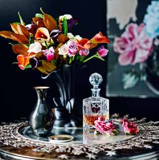
Ms Lucena-Orr says the bold new trends mean homeowners       “If you are thinking about using colour in an existing space,
                                                                   can use colour with confidence. “Anything goes! Be as        be mindful of other colours already in the space, but don’t let
                                                                   individual as you want to be when considering colours and    it limit your choice. Don’t be bogged down with conventional
                                                                   combinations of colour, design, finish and textures.”        views of what colours should or shouldn’t be schemed
                                                                                                                                together. Explore your insights and play with combinations of
                                                                   “Boundaries are limitless today with colour,” she says.      colour families, shades, tones, textures and finishes. Delight
                                                                   “We have so many choices and without the hindrance of        your senses with colour experiments. Use our inspirational
                                                                   traditional rules, creativity is shining through and we’re   images as a guide in your own inventive project.”
                                                                   seeing some truly inspirational interiors.”

                                                                   In the end, it’s all about personal taste.                                              - ENDS -

                                                                                                                                For more information, images or interviews, contact:
                                                                                                                                Alex Brudenell, Communicado
                                                                                                                                T: 03 9522 9909
                                                                                                                                M: 0402 442 721
                                                                                                                                E: alex.brudenell@communicado.com.au
                                                                                                                                Cristina Rudnicki, Communicado
                                                                                                                                T: 03 9522 9907
                                                                                                                                M: 0422 725 100
Styled by Wilhelmina McCarroll for Dulux                                                                                        E: cristina.rudnicki@communicado.com.au
The Precious Elementals

“Consumers can be adventurous with colour by painting
architraves and skirtings in different colours and adding
some of this season’s gorgeous warmer metallics, such as
copper and gold in a small way,” she says.

The Precious Elementals palette is influenced by the earth,
minerals, natural stones, and geographical formations,
while Digital Nomads draws on the global fusion of tribal
aesthetics resulting in an eclectic and exotic mix borrowed
from many cultures.                                                Styled by Bree Leech and Heather Nette King for Dulux
                                                                   The Digital Nomads
“I don’t think colour will ever go out of fashion,” Ms McCarroll
says. “We are seeing many colours being mixed and clashed
with fantastic results. There are no rules!”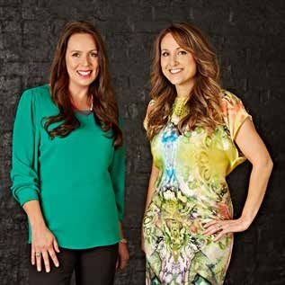
Backgrounder                                                                                                                                                                                                                                         August 2013

Community, sustainability and a global cultural fusion, which draw on the past in a technology-driven present, combine to inspire the 2014 Dulux Colour Forecast. These are the Future Tribes.

                  The Digital Nomads draw on the global fusion of tribal aesthetics resulting in an eclectic mix borrowed from many nations. Inspired by cultures such as, Morocco and
                 India, which thrive on colour and energy, pattern and vibrancy, the Digital Nomads allow you to travel the world without leaving the home. It draws from differing cultures
                   and the result is conventionally, clashing colours. Explore this extravagant and exotic collection in colours such as, Smoked Amethyst, Hot Chillie and Saturn Spirit.

                                                                                                                                                                                                                                                                DESIGN
                   DESIGN SUEDE                                                                                                                                                                             SMOKED                                             METALLIC
       CURD         SUEDE SAND     CROP CIRCLE       MID TAN               LIMONE            GOLDIE    COPPERSMITH   TANGERINE BLISS   HOT CHILLIE     BURNING BRIER      RED CLOWN       TANGO            AMETHYST             REGALIA    WATERWORLD        SATURN SPIRIT

         A quirky and energetic palette that looks to the future while drawing on the past, the Retro Visionaries combine bright, vivid colours with softer, pastel versions of primary colours.
      The palette is shaped by the 1950s and heavily influenced by birth of digital culture in the 70s, ’80s and ’90s. Inspirations include the design movements of the 1980s, block shapes,
    curved forms, graffiti and digital art and white spaces laden with colour. The future looks bright with the retro vibe of this palette in colours such as, Citrus Hit, Techno Green and Stella.

                                                                                                                                                                                                                                                            FRENCH BLUE
                                                                          MONDRIAN   DESIGN METALLIC                                                                                                    OONADATTA     EXTREME                             GLOSS POWDERAL-
   VIVID WHITE     BLUE LIMEWASH           BOYZONE        INTERNATIONAL     BLUE       COOL COMET        COLONY       TECHNO GREEN           PITAPAT              TANSY          STELLA    CITRUS HIT     TRACK         RED        GALAH   LICKEDY LICK       PHATEC™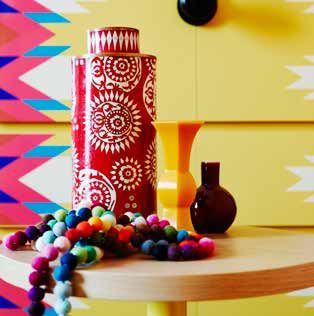
With its focus on the impact that civilisation has on our earth, the Precious Elementals are inspired by minerals, natural stones and geographical formations, such as seascapes and
  mountains. Mineral and metal colours – such as copper, silver and bronze – modernised pastels and soft greys are prominent. The palette borrows from crystals and ice formations, gems,
     stones and the natural patina of rust, concrete and petrified wood. Reconnect with our natural world in colours, such as, Antarctica Lake, Pipe Clay and Gardenia Frost Design Pearl.

                                                                                                                                                                                                                                      COPPER
                                                                                                                                    WHITE ATTIC                                                                                        PEARL
                                                                                                                                                ™ ICED WHITE                                   DESIGN METALLIC                         SATIN
                                                                                                                                  FEAST WATSON
                    GARDENIA FROST                                                                                     PEPPERCORN    CRACKLE      INTERGRAIN™                   SILVER SPOON     TEMPERERED        SUN SENSATION     POWDER
 WHISPER WHITE       DESIGN PEARL    ISSEY-SAN ANTARCTICA LAKE     PIPE CLAY       OHAI HALF   HAMMOCK   DESIGN RUST      RENT       LACQUER      NATURALSTAIN   LYTTLETON     DESIGN METALLIC     BRONZE         DESIGN METALLIC   ALPHATEC™          MALAY GREY         DOMINO

     The Romantic Spirits reminisce a time back to the expressive and decorative periods of Deco, Baroque and the 16th and 17th centuries. The palettes of master painters and dim light
      of the past influence its colours and mood: dark and dreamy, reflective and deep. This ornate and opulent palette seeks ways to incorporate romance, nostalgia and new antiquities
                   into a contemporary world dominated by technology. Experience patinas of the past brought into the present in colours such as Luck, Stellar Glow and Vintage Green.

                                                                                                                                                                                                                                                                          BURNISHED
                                                                                                                                                                                                                                                           BLACK JAPAN     COPPER
                                                                                                                                                                                                                                                                      ™
                 OPITO   COSMIC        STELLAR GLOW                                                 MOROCCAN                         HAZY DAZE                                                          VINTAGE                      DESIGN METALLIC     FEAST WATSON      POWDER
  FROCK                                                          TANGIER          RUSTED CRIMSON                  VELVET CAPE                                                                                                                                                     ™
                  BAY     AURA        DESIGN METALLIC                                                LEATHER                           HALF      SPEARMINT ICE    ANCHOR MAN              MUNDI          GREEN          LUCK           GABY’S GOLD          PROOFTINT     ELECTRO

For more information, samples, images or interviews, contact:
Alex Brudenell, Communicado                                                    Cristina Rudnicki, Communicado
T: 03 9522 9909 M: 0402 442 721                                                T: 03 9522 9907 M: 0422 725 100
E: alex.brudenell@communicado.com.au                                           E: cristina.rudnicki@communicado.com.au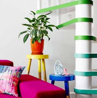
For immediate release                                                                                                                                                                  August 2013

                  Creative Direction Q & A: Heather Nette King & Bree Leech
How did you come to choosing these stylists? Why these           What was the key brief?                                            What do you think is going to the most influential colour
particular ones?                                                 B: To represent the trends in ways that inspire the use of         in 2014/15?
B: It was important for us to work with creatives that were      those colours in other people’s homes; or in the case of           B: 2014 will be about colour combinations rather than a
as excited about the project as we were. I personally had        design professionals, their projects. Each image needs to not      single colour. Growing colour confidence has seen us throw
been drawn to Rowena & Geoffrey’s work because of the            only use colours from the trend but also try and capture its       out the rule books and use instinct and exploration to create
use of colour in each piece and the emotion it sparked; and      essence and how it translates into an interior space.              exciting and inspiring colour schemes for interiors.
Wilhelmina is an inspiring furniture designer whose ‘classic
                                                                 H: I think it’s always tricky to distil and encapsulate very       H: It will be all about previously unseen colour combinations.
with modern twists’ design style has universal appeal.
                                                                 diverse and detailed trends, so by illustrating them through       My absolute favourite combination from the 2014 trend
H: With forecasting, I think it’s really important to achieve    beautiful imagery and inspirational paint applications was to      forecast comes from within the Digital Nomads trend (Curd,
a mix of imagination and practicality. Wilhelmina designs        me the key brief.                                                  Mid Tan and Tango).
beautiful, creative furniture and rooms, whilst dealing daily
with the realities of clients, budgets and deadlines. Geoffrey   This year’s forecast colours are very bold. How realistic is       Describe some of the key colours and elements of the trends?
and Rowena have incredible and very distinct styles of           it that home owners are going to use these colours in the          B: Mood is the key element to all the Future Tribes trends.
painting, but are also commercially successful artists.          home?                                                              In The Romantic Spirits the dark inky hues and rich rusts
                                                                 B: There is a good balance of muted and bold colour in the         or wines create a distinct sultry mood and the light pastel
                                                                 trends for 2014. The stylists have demonstrated the use of         colours create a light-hearted romantic mood. Being inspired
                                                                 dramatic colour well and how it can be used to define the          by earth’s elements, The Precious Elementals naturally
                                                                 look of an interior space. As for use in the home, there will be   create a more relaxed feel but with an edge of sophistication
                                                                 people that fall in love with a particular trend or colour and     through the addition of rich metallics. The block colour effect
                                                                 embrace it wholeheartedly and others that are inspired but         of The Retro Visionaries can create a more quirky yet modern
                                                                 choose to add it in much more controlled ways, for instance –      vibe; and The Digital Nomad demonstrates that bold colour
                                                                 to update their timber dining chairs or a bedside table.           can be used against softer tones to create an eclectic feel
                                                                                                                                    with a fun global influence.
                                                                 H: The great thing about forecasting colour trends is that
                                                                 people can pick and choose the strength with which they
                                                                                                                                    What is the predominant colour used in your home?
                                                                 would like to adopt the new ideas.
                                                                                                                                    B: I’m surrounded by colour all day in my work – it makes it
                                                                 Also it encourages people to think outside the box – you may       difficult for me to settle on one colour scheme for my home
                                                                 inject more impact by painting a few geometric shapes onto         as I often have ‘colour crushes’ that change daily! Right now
                                                                 a wall than by painting that whole wall. It doesn’t have to be     though, my yellow crush is continuing and not looking likely
                                                                 elaborate and time-consuming, you just need to be brave.           to fade anytime soon.
                                                                                                                                    H: I have loads of colour within my home and I change it
                                                                                                                                    regularly. Paint is the quickest and least expensive home
                                                                                                                                    décor tool and I love to mix things up and change them
                                                                                                                                    seasonally. No wall, floor or even furniture is safe from being
Heather Nette King & Bree Leech                                                                                                     painted here.
For immediate release August 2013
Stylist Q & A: Rowena Martinich (Artist) & Geoffrey Carran (Artist)
Other than colour, what ways can consumers express the What advice can you give people looking to experiment What are your go to online resources for inspiration?
trend in an interior? with colour and replicate/ incorporate the colours from the G & R: Online we tend to check out interior design and
R: Modern pieces of furniture are inspired by the same trend. trends? architecture projects from around the world.
Curved couches, geometric tables, shaped lights. Bold clean R: Select a few key colours to work with rather than trying to
lines with accessories to inject shape and form. work with too many colours. All of the palette colours work well What are your favourite colour schemes to partner
with white, so look at colour blocking as an option rather than together?
G: The Romantic Spirits trend can also be expressed through
covering the whole space with colour. G & R: Aqua and orange; French navy and white; fluoro pink
the use of accessories such as gold frames, artwork, vases,
and antique furniture as it leans towards the ornate and G: Be bold, try it out. It’s only paint and you may be pleasantly and anything, grey tones and khaki.
opulent. surprised by the results
What colours do you have within your home?
The forecast features emerging colours, many that haven’t How can consumers be creative using forecast colours G & R: We have a lot of natural timber, and large art works so
been seen for years – was this surprising and did you find outside of painting walls? the walls tend to be painted natural whites and dark blues such
it a challenge to embrace them? R: Consumers can be creative using the forecast colours in as Mundi.
R: It wasn’t surprising seeing these bright colours re-emerge many ways outside of painting walls. They can paint items
within interiors, especially looking at recent clothing fashions. of furniture, dipping the legs of tables or chairs, or painting
From my experience people actually really love colour, they just a table, or cupboard surface. If they don’t feel they can paint
need to be shown how to use it. the bedroom, they could paint the bed head; they can buy an
artwork that is colourful which can activate a space, or they
G: It was definitely a surprise, a pleasant one to see the
could select a couple of key colours and paint plant pots.
reintroduction of the deep reds like Moroccan Leather or even
that salon style Vintage Green. It brought me back to being G: Explore texture and surface application. There’s more to
a student, where one year I painted my room a very similar painting than simply rolling it on. The romantic Spirits Colour
colour. Trend can be replicated through selection of furniture, rugs and
fabrics.
Do you think colour trends are cyclical? What influences
this? What influences your use of colour?
G: Colour trends are definitely cyclical, especially the accent or R: I am greatly influenced by what is around me. I live down
feature colours. Just like fashion, people respond to change the coast and love the turquoises of the ocean, the bright
and painting your space is the easiest way to achieve this. fashion colours of surf culture and the ever changing pinks and
This is influenced by the desire to reengage with or change the oranges of seaside sunsets.
identity of your space
G: I pick up on colour combinations everywhere I go. One of
my main influences is the constantly shifting colours in the
morning and evening sky
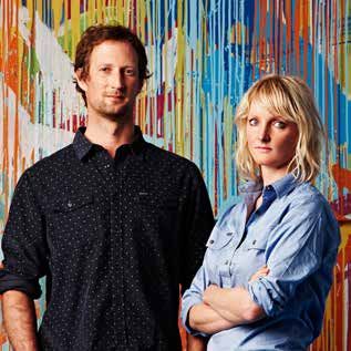
Rowena Martinich & Geoffrey Carran
Stylists for The Romatic Spirits and The Retro Visionaries palettes
For immediate release                                                                                                                                                                           August 2013

Stylist Q & A: Wilhelmina McCarroll (Head Designer/Director of Zuster)
How can consumers be really adventurous with the use                What colour inspires you?                                            How has ‘online’ or digital influenced/affected design
of colour?                                                                                                                               trends and colours?
                                                                    I live on a property in the Yarra Valley and I love natural tones.
Consumers can be adventurous with colour by painting                I am inspired by the light and dark shades of the changing           We live in a world where colour trends are available
architraves and skirtings in different colours and adding some      weather patterns and the shadows it casts on the landscape.          immediately due to online or digital influences! We are now
of these seasons’ gorgeous warmer metallics like copper and         I am also inspired by media fashion and what people are              more exposed to so many more cultural and fashion trends.
gold in a small way. I also like adding one dark feature wall in    wearing on the street. I also love the idea of muted tones
a room to ground and balance the whole interior.                    with bright colours. I also use tone on tone consistently in my      How do we borrow colour from cultures?
                                                                    designs and styling.
                                                                                                                                         We’ve seen many fashion and interior trends based on
What home in the room do you think is ideal for injecting
                                                                                                                                         cultures such as the vibrant colours of India, Mexico and
colour?                                                             In your opinion, will colour ever go out of fashion?
                                                                                                                                         Peru. By using these cultures as inspiration we can develop a
Kitchens and wall units can be great for injecting colour           I do not think colour will ever go out of fashion. We are            really authentic colour palette to work from.
through drawer and door fronts. Choose an interesting               currently seeing many colours being mixed and clashed
palette and put different colour panels together.                   with fantastic results! There are no rules anymore as to what        How can you use colour effectively alongside natural
                                                                    colours should go together, if it works it works!                    materials?
                                                                                                                                         Woodgrain is the perfect balance against vibrant colours.
                                                                    What are your go to on-line resources for inspiration?
                                                                                                                                         Colour can look great with wood grain and natural materials,
                                                                    My favourite on-line resources for inspiration are architectural     providing it is the right tone.
                                                                    and fashion blogs like dezeen.com, thecoolhunter.com,
                                                                    yatzer.com, layer.com. I also use Pinterest.                         For more information, images or interviews, contact:

                                                                                                                                         Alex Brudenell, Communicado
                                                                    What are your favourite colour schemes to partner
                                                                                                                                         T: 03 9522 9909
                                                                    together?                                                            M: 0402 442 721
                                                                                                                                         E: alex.brudenell@communicado.com.au
                                                                    Greens, greys, blonde timbers with a touch of warm copper
                                                                    metallic.                                                            Cristina Rudnicki, Communicado
                                                                                                                                         T: 03 9522 9907
                                                                    What colours do you have within your home?                           M: 0422 725 100
                                                                                                                                         E: cristina.rudnicki@communicado.com.au
                                                                    My house is a black box with a white interior. Black and white
                                                                    are always classic together.

                                                                    What is your single favourite colour?
                                                                    Green.

Wilhelmina McCarroll
Stylist for The Precious Elements and The Digital Nomads palettes
You can also read