Faceted search of heterogeneous geographic information for dynamic map projection
←
→
Page content transcription
If your browser does not render page correctly, please read the page content below
Faceted search of heterogeneous geographic information
                                                     for dynamic map projection

                                                   Noemi Mauroa , Ardissono Lilianaa,∗, Maurizio Lucentefortea
                                           a Dipartimento   di Informatica, Università degli Studi di Torino, Corso Svizzera 185,
                                                                            I-10149 Torino, Italy
arXiv:2005.03531v1 [cs.HC] 7 May 2020

                                        Abstract

                                        This paper proposes a faceted information exploration model that supports
                                        coarse-grained and fine-grained focusing of geographic maps by offering a graph-
                                        ical representation of data attributes within interactive widgets.                 The pro-
                                        posed approach enables (i) a multi-category projection of long-lasting geographic
                                        maps, based on the proposal of efficient facets for data exploration in sparse and
                                        noisy datasets, and (ii) an interactive representation of the search context based
                                        on widgets that support data visualization, faceted exploration, category-based
                                        information hiding and transparency of results at the same time. The integration
                                        of our model with a semantic representation of geographical knowledge supports
                                        the exploration of information retrieved from heterogeneous data sources, such
                                        as Public Open Data and OpenStreetMap.
                                           We evaluated our model with users in the OnToMap collaborative Web GIS.
                                        The experimental results show that, when working on geographic maps popu-
                                        lated with multiple data categories, it outperforms simple category-based map
                                        projection and traditional faceted search tools, such as checkboxes, in both user
                                        performance and experience.
                                        Keywords: faceted information exploration, dynamic projection of geographic
                                        maps, GIS, geographic information search

                                          ∗ This is to indicate the corresponding author.
                                           Email addresses: noemi.mauro@unito.it (Noemi Mauro), liliana.ardissono@unito.it
                                        (Ardissono Liliana), maurizio.lucenteforte@unito.it (Maurizio Lucenteforte)

                                        Preprint submitted to Journal of Information Processing and Management           May 8, 2020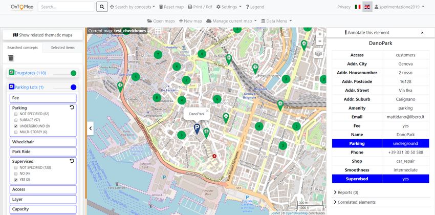
Declarations of interest: none.

Published in Information Processing & Management, Elsevier.
DOI: https://doi.org/10.1016/j.ipm.2020.102257.
Link to the page of the paper on Elsevier web site:
http://www.sciencedirect.com/science/article/pii/S0306457319311987
This work is licensed under the:
Creative Commons Attribution-NonCommercialNoDerivatives 4.0 In-
ternational License.
To view a copy of this license, visit http://creativecommons.org/licenses/
by-nc-nd/4.0/ or send a letter to Creative Commons, PO Box 1866,
Mountain View, CA 94042, USA.

1. Introduction

   Several works promote the development of faceted search interfaces (Hearst,
2006) to reduce information overload and keep users in control of the search
process in exploratory search (Marchionini, 2006). However, most of the existing
approaches support an individual user who inspects a single data category, e.g.,
documents or movies, while pursuing a short-term information goal. Similarly,
most research on geographic information search focuses on helping individual
users retrieve relevant data for particular short-term goals; e.g., finding the
available routes between two Points of Interest (Quercia et al., 2014), identifying
the 2-star hotels in a specific area (Lionakis & Tzitzikas, 2017), or studying the
relations among the items of an information category (Andrienko et al., 2007).
   Indeed, map management can go farther than that in order to provide long-
term representations of shared projects to users having different information
interests. For instance, in participatory decision-making (Coulton et al., 2011;
Brown & Weber, 2012), Hu et al. (2015) point out that 2D maps and 3D virtual
environments can facilitate participants’ learning and understanding, especially
as far as spatial decision-making processes are concerned; see also (Al-Kodmany,

                                        2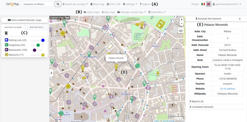
1999) and (Simpson, 2001). Moreover, maps can support information sharing
and collaboration in simpler and less formal scenarios. For example, if somebody
is planning a holiday, a custom map including selected Points of Interest, hotels,
and so forth, would provide a personalized projection of the area to be visited
that the user can consult and annotate before, during and after the trip, possibly
in collaboration with the other people travelling with her/him to gain a common
view of the vacation.
   These scenarios suggest the development of custom maps that define Per-
sonal Information Spaces (Ardito et al., 2013, 2016) useful to organize individual
and group activities. For this purpose, maps should be adapted to reflect tem-
porary information goals while persistently storing data in order to facilitate a
quick projection and resumption of the collaboration context.
   In this paper we present a faceted exploration model for the management
of this type of map. Our model supports a flexible, map-based visualization of
heterogeneous data and it enables map focusing to satisfy specific information
needs by offering two graphical interactive exploration functions:

   • The former enables coarse-grained map projection on data categories via
     opacity tuning, without taking the facets of items into account; all the
     items of a category are subject to the same visualization policy.

   • The latter combines opacity tuning with fine-grained faceted search sup-
     port to enable map projection at different granularity levels, by taking the
     properties of information items into account.

In both cases, the projection is only visual and the information stored in the
map is preserved. The work we present has the following innovative aspects:

   • Efficient multi-category faceted projection of long-lasting custom maps to
     answer temporary information needs in sparse and noisy datasets. Our
     model suggests information visualization constraints based on attributes
     of data which support an efficient exploration of the information items
     stored in the maps.

                                        3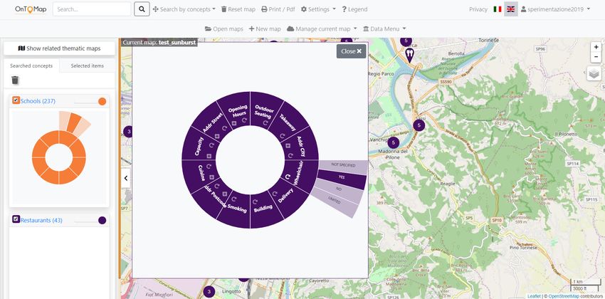
• Representation of the search context by associating each data category to
     a compact graphical widget that supports interactive data visualization,
     faceted exploration, category-based information hiding and transparency of
     results. The widgets of the categories searched by the user are located in a
     side bar of the user interface and play the role of breadcrumbs, representing
     the types of information that (s)he has explored during the interaction
     with the system and the applied visualization constraints.

Our model supports geographic information search within the OnToMap collab-
orative Web GIS (Ardissono et al., 2017, 2018). We tested the model in a user
study to assess User Experience and performance in exploratory search. For the
experiments we compared different graphical widgets supporting faceted explo-
ration, from traditional ones such as checkboxes, to space-filling ones based on
treemaps (Shneiderman, 1992) and sunburst (Stasko et al., 2000) diagrams. The
study showed that, when working on geographic maps populated with hetero-
geneous information, our model outperforms simple category-based map pro-
jection and traditional faceted search tools such as checkboxes. Specifically,
we obtained the best user performance and experience results using the wid-
get based on the sunburst diagram, which displays visualization criteria in a
compact structure.
   This article builds on the work described in (Ardissono et al., 2018), which
presents our first opacity tuning model. With respect to that work, the present
paper introduces graphical widgets that support fine-grained data management
and a novel approach to the selection of efficient facets for information explo-
ration in sparse and noisy datasets. The widgets extend the category hiding
function provided by the previous model with faceted data exploration to en-
hance information search and visualization. The present paper also provides an
extensive evaluation of the faceted exploration model.
   In the following, Section 2 presents our research questions. Section 3 outlines
the related research. Section 4 overviews OnToMap and Section 5 describes our
model. Section 6 presents the experiments we carried out and Section 8 discusses

                                        4
the evaluation results. Section 9 summarizes limitations and future work and
the Appendix reports a few tables of details.
2. Research questions
We designed the faceted search model presented in this paper after two pre-
liminary experiments with users carried out in the urban planning domain; see
(Voghera et al., 2016, 2018). In those experiments, the projection of long-lasting
maps on specific types of information emerged as a useful feature to support
data interpretation during project development. This feature was also requested
in the final analysis phase, in which human planners analyzed complex maps
obtained by integrating the students’ projects to identify the most recurring
represented territorial elements.
The present work describes the faceted search support offered by the current
version of OnToMap and investigates its usefulness to data search and interpre-
tation in a project map. We pose the following research questions:
RQ1: Does faceted exploration of map content help users in finding the needed
information in a geographic map that visualizes different types of data?
RQ2: How does a compact, graphical view of the exploration options available
to the user, which also shows the status of the information visualization
constraints applied to a map, impact on her/his efficiency and experience
in data exploration?
RQ3: How much does the user’s familiarity with the widgets for faceted explo-
ration impact on her/his efficiency in search and on her/his appreciation
of the exploration model they offer?
The experiments described in Section 6 are aimed at answering these questions.
3. Background and related work
Exploratory search of large information spaces challenges users in the spec-
ification of efficient queries because, as most people are hardly familiar with
5Table 1: Classification of information search models.
Visualization
Citations Model Facets Filters
of results
static list of terms buttons
(Ahlberg & Shneiderman, 1994) FilmFinder sliders, . . . scatterplot
3D diagram with
(Cao et al., 2010) FacetAtlas terms - multidimensional
relations
topic facets + document clusters +
(Cao et al., 2011) SolarMap terms keyword facets radial facet
visualization
ranked list +
(Chang et al., 2019) SearchLens terms lenses match to lenses
from stack-based
(Dachselt & Frisch, 2007) Mambo metadata attributes hierarchical facets +
zoom on data
from stack-based
(Dachselt et al., 2008) FacetZoom metadata attributes hierarchical facets +
zoom on data
from metadata text queries matrix view + miniatures
(Hearst et al., 2002) Flamenco hyperlinks
from RDF attributes + hierarchical +
(Hildebrand et al., 2006) /facet metadata hyperlinks facets + list
list + term distribution
(Hoeber & Yang, 2006) HotMap terms text queries with colors
Concept list + concept distribution
(Hoeber & Yang, 2006) Highlighter concepts text queries with colors
text query + matrix-based
(Lee et al., 2009) FacetLens attributes attributes bubbles by filter
from RDF attributes +
(Lionakis & Tzitzikas, 2017) PFSgeo metadata hyperlinks + ranked list
geo. dimension
from RDF attributes +
(Papadakos & Tzitzikas, 2014) Hippalus metadata hyperlinks ranked list
Topic-Relevance radial distance +
(Peltonen et al., 2017) Map terms text query relative distance
from RDF attributes + multiple
(Petrelli et al., 2009) - metadata hyperlinks visualizations
from RDF attributes + ranked list +
(Stadler et al., 2014) Facete metadata sem. relations + map-based
geo. dimension visualization
Thesaurus- Hierarchical bullseye
(Sutcliffe et al., 2000) Result Browser terms Thesaurus browser
the search domain, their information goals are often ill-defined (Marchionini,
2006; White & Roth, 2006). In this paper we focus on faceted search as an
alternative, or a complement, to query typing in order to use browsing-based
navigation as a proactive guide to information exploration, given the structure
of the information space.
Starting from the pioneer filtering model proposed by Ahlberg & Shnei-
derman (1994), both Sacco (2000)’s Dynamic Taxonomies and Hearst (2006)’s
faceted search model propose to use dynamic filters extracted from items meta-
data as constraints that the system can suggest to help the user identify relevant
6terms for information filtering and visualization of results. Specifically, Hearst
et al. (2002) present the Flamenco framework in which facet-based filtering is
based on the exposure of hierarchical faceted metadata that describes the items
of the search domain, i.e., apartments, or images (Yee et al., 2003).
Researchers also investigate ways to support the specification of the facets to
filter results, as well as the access to Semantic Web information and Linked Data
(W3C, 2018). As far as facet specification is concerned, new types of elements
are proposed to filter the set of results; e.g., keywords or terms extracted from
textual queries, as in HotMap (Hoeber & Yang, 2006), concepts extracted from
a document pool, as in Concept Highlighter (Hoeber & Yang, 2006), or terms
extracted from a thesaurus as in Thesaurus-Results Browser (Sutcliffe et al.,
2000). FacetLens (Lee et al., 2009) visualizes clickable facets in matrix-based
bubbles, each one associated with a different search filter. Moreover, FacetZoom
(Dachselt et al., 2008) proposes a stack-based visualization of hierarchical facets,
also applied in Mambo (Dachselt & Frisch, 2007) as a model to combine faceted
browsing with zoomable user interfaces. SearchLens (Chang et al., 2019) enables
users to define long-lasting composite facet specifications (denoted as lenses) to
support information filtering on multiple search sessions. In SearchLens, the
user can specify the importance of the selected facets; thus, filtering is based on
soft constraints used to rank search results.
In the faceted exploration of semantic data (Tzitzikas et al., 2017), search
interfaces expose rich metadata that support browsing the information space
through semantic relations. For instance, in the /facet browser, Hildebrand
et al. (2006) propose to combine hierarchical faceted exploration with keyword-
based search. Moreover, Petrelli et al. (2009) enables the user to search for
heterogeneous types of information about items (e.g., texts and images) linked
according to semantic relations, by extracting facets to guide exploration. Hip-
palus (Papadakos & Tzitzikas, 2014) introduces the Faceted and Dynamic Tax-
onomies to manage both hard and soft constraints in faceted filtering of semantic
data and PFSgeo (Lionakis & Tzitzikas, 2017) extends Hippalus to geographic
information management. Finally, focusing on geographic information, Stadler
7et al. (2014) propose a semantic navigation method for SPARQL-accessible data
(W3C, 2017a; OCG, 2017) in the Facete browser.
Similar to the cited works, our model exposes metadata derived from se-
mantic knowledge representation. However, it enables users to work on maps
populated with multiple data categories, i.e., with heterogeneous information,
as well as to focus the maps on temporary interests without losing the overall set
of data they contain. This is useful to answer information needs in long-lasting
user activities. Notice also that OnToMap does not assume to work on RDF data
in order to comply with more general data sources, like public crowdmapping
platforms, thanks to the mediation of its domain ontology. Moreover, it sup-
ports: (i) a browsing-based exploration guided by the structure of the domain
ontology, which makes it possible to search for information following both IS-A
and semantic relations; (ii) the semantic interpretation of free text queries to
identify the data categories (ontology concepts) of interest by abstracting from
the specific words occurring in the queries, via Natural Language Processing
(Ardissono et al., 2016; Mauro et al., 2017). More generally, OnToMap enables
search support over a configurable set of data categories; in this way, it enables
complex map development on different information domains. In contrast, most
of the previous systems work on a single data type or on a pre-defined set of
data categories, as in (Petrelli et al., 2009).
The dynamic extraction of facets can challenge the user with a large number
of browsing options. Oren et al. (2006) focus on the efficiency of exploration
and they promote the facets that enable the user to split the set of results
in balanced subsets in order to minimize navigation steps. In comparison, we
propose a facet selection policy suitable for sparse and highly unbalanced result
sets, such as those typically retrieved from crowdsourced data sources, in which
very few properties of items split results in subsets having similar cardinality.
Some works propose interactive graphical presentations of keywords to sup-
port sensemaking in the exploration of document sets. For instance, Peltonen
et al. (2017) propose the Topic-Relevance Map to summarize on a radial ba-
sis the keywords (filters) characterizing the result set, using distance from the
8center to represent relevance to the search query and angle between keywords
to denote their topical similarity. Moreover, FacetAtlas (Cao et al., 2010) re-
lates topics in a 3D diagram supporting the representation of multi-dimensional
relations among them, and SolarMap (Cao et al., 2011) combines topic-based
document clustering with a radial representation of facets to support a two-
level, topic-based document filtering. While these models are appropriate to
the representation of topics in datasets of unstructured information, they are
less relevant to OnToMap, which is fed with structured data and benefits from
its domain ontology to organize the presentation of information.
4. OnToMap overview
The OnToMap Web collaborative GIS supports the management of interac-
tive maps for information sharing and participatory decision-making (Ardissono
et al., 2017). A semantic representation of domain knowledge based on an OWL
ontology (W3C, 2017b) defines the structure of the information space and en-
ables data retrieval from heterogeneous sources by applying ontology mappings;
see (Mauro et al., 2019). This ontology currently makes it possible to query
a dataset of Public Open Data about Piedmont area in Italy and the Open-
StreetMap (OSM) server (OpenStreetMap Contributors, 2017); in this paper,
we focus on OSM data because it is a more general case than the other one.
The ontology also provides graphical details for map visualization, such as the
color and icon associated to each data category; e.g., drugstores are depicted in
light green and they are represented as icons marked by a cross.
OnToMap supports the creation of public and private custom geographic
maps to help project design and group collaboration. Search support is based
on free text queries and on category browsing. Textual queries are semantically
interpreted using Natural Language Processing techniques with Word Sense Dis-
ambiguation (Moro et al., 2014); see (Ardissono et al., 2016; Mauro et al., 2017).
Data categories can be browsed by means of a simple alphabetical menu with
auto-completion or by navigating a graphical representation of the taxonomy
9Figure 1: OnToMap user interface showing the widgets based on transparency sliders.
defined in the domain ontology.
Figure 1 shows the user interface of OnToMap. The top bar includes the
control panel that supports (A) free text search (“Search...”) and category
browsing (“Browse by concepts”), basic map management and user authentica-
tion; (B) map management tools available to authenticated users. The left side
bar (C) displays the widgets of the data categories that the user has searched
for during the interaction: a different widget is associated to each category in
order to regulate the visualization of its items in the map.
The main portion of the interface (D) contains the geographic map, which
displays information items as pointers with category-specific icons or as ge-
ometries, depending on the input data. Color coding (Hoeber & Yang, 2006)
visually connects the widgets representing data categories in the side bar with
the corresponding items in the map. Moreover, when several items of a category
are located in a restricted area, a cluster colored as the category is displayed
to avoid cluttering and, at the same time, provide visual information about the
grouped items. If the user clicks on the visual representation of an item, the
system generates a table (E) describing its details.
105. Information exploration model
Our information exploration model is integrated in the OnToMap system to
support information search and it includes two main types of functions, imple-
mented as interactive graphical widgets.
5.1. Exploration function 1: coarse-grained map projection by means of trans-
parency sliders
This function, introduced in (Ardissono et al., 2018), supports map projec-
tion via opacity tuning: for each searched category, a transparency slider enables
the user to assign different levels of opacity to its items; the widget also has a
checkbox to temporarily hide information by means of a click, without changing
the degree of opacity selected for the category.
The side bar of Figure 1 shows the widgets based on transparency slid-
ers. In the map, museums are visualized in full color because the slider of the
“Museums” category is selected and tuned to maximum opacity. Differently,
drugstores and restaurants are semi-transparent and the map hides the items of
the “Parking Lots” category because its slider is de-selected.
The transparency slider does not enable the specification of constraints on
facet values; i.e., it works at the granularity level of the represented category
and it uniformly tunes the opacity of items. Nevertheless, this widget supports
visual simplification by enabling the user to temporarily hide information by
type. Basically, opacity tuning enables her/him to highlight the information
in focus while maintaining an overview of what has been searched in the map.
This model is inspired by Colby & Sholl (1991)’s work on layers visualization
but it separately handles the opacity of items belonging to different categories;
moreover, it supports the visualization of multiple layers, as a generalization of
Translucent Overlay (Lobo et al., 2015).
5.2. Exploration function 2: faceted approach
This function combines coarse-grained and fine-grained specification of vi-
sualization constraints by integrating transparency sliders with faceted infor-
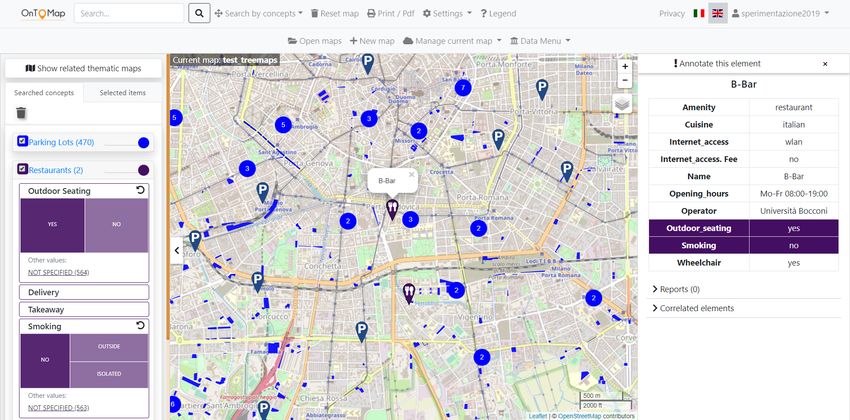
11Figure 2: User interface showing the widgets based on checkboxes.
mation exploration. The widgets implementing this function include a trans-
parency slider and an internal component showing the facets of the represented
category. The internal component can be a set of checkboxes, a treemap or a
sunburst diagram, depending on the layout selected for the user interface, and
it enables the user to specify visualization constraints based on facet values.
The transparency slider works in combination with facet selection and tunes
the opacity of the visualized items. The widgets are interactive and they can
be opened or closed by clicking on them; a closed widget only shows its own
transparency slider; e.g., see “Drugstores” in Figure 2, which shows the layout
based on checkboxes.
Let us consider a facet f of a category C and the set of retrieved items that
belong to C, henceforth denoted as EC , i.e., extension of C. The visualization
of the values of f in the widget is aimed at providing the user with a preview
of the corresponding items in the map. For this purpose we adopt a standard
approach to facet suggestion (Oren et al., 2006; Hearst, 2006):
• The widget only displays the values {v1 , . . . , vm } of f that have at least
one item in EC to prevent the user from following links to zero solutions.
• The values of f are sorted from the most frequent to the least frequent
12ones in EC . Moreover the widget shows, or makes available on mouse
over, the number of items corresponding to each value. Notice that the
widget may also show a “NOT SPECIFIED” value to represent the subset
of items in which f is not defined. This is aimed at providing the user
with a visual representation of the coverage of the facet in the results.
• In order to limit visual complexity, long lists of values are dropped, making
their tails available on demand by providing a “More...” link or a “+”
symbol, depending on the layout of the widget.
By default, none of the facets in the widget of a category C is selected. If
the user picks one or more values of the same facet, this is interpreted as an
OR constraint because (s)he has specified that all those values are eligible for
visualization. Conversely, the selection of values that belong to distinct facets
of C generates an AND constraint because it identifies the items having more
than one property restricted to specific values. For instance, if the user chooses
fi = vi1 , fi = vi2 and fj = vj1 , items {x ∈ EC | fi (x) ∈ {vi1 , vi2 } ∧ fj (x) = vj1 }
are shown and the other items are hidden.
We use color coding to link visualization constraints to map content: the
tables showing the details of items highlight the facets corresponding to the
selected visualization constraints in the color associated to the category. In this
way, the user can quickly identify the characteristics that make items eligible
for being displayed. For instance, the table of “DanoPark” in Figure 2 has the
“Parking” and “Supervised” facets highlighted in blue because they correspond
to the visualization constraints imposed on the “Parking Lots” widget.
5.2.1. Layouts of the widgets for faceted information exploration
Before providing details about how we select the facets to be included in the
widgets we present the layouts we developed.
• The widgets based on checkboxes contain a rimmed rectangle for each
facet to be shown. By clicking on a rectangle, the user expands (or closes)
the corresponding facet. An expanded facet shows values as checkboxes
13Figure 3: User interface showing the treemaps as faceted exploration widgets.
and offers a “More...” link to show the hidden ones. For instance, Figure
2 shows eight facets of widget “Parking Lots”: “Fee”, . . . , “Capacity”.
Users can select the checkboxes to impose visualization constraints in the
map. In the figure the user has expanded the “Parking” and “Supervised”
facets and (s)he has selected values “UNDERGROUND” and “YES”.
• The widgets based on treemaps include facets in rimmed rectangles
as well. However, when a facet is expanded, its values are displayed as
components of a treemap whose size depends on the cardinality of the
corresponding set of items (larger size means larger cardinality); see Figure
3. Long values are shortened but they can be visualized, together with
the cardinality of the corresponding sets of items, on mouse over. Only
the most frequent values are included in the treemap; the other ones are
available below it or on demand (“More...”) and the user can add them
to the treemap by means of a click. The user can (de)select values by
clicking on them. The selected values take the color of the category (e.g.,
“YES” in “Outdoor Seating” and “NO” in “Smoking”); the other ones
have a pale tone of the same color.
• The widgets based on the sunburst diagram show the facets of the
14Figure 4: User interface showing the sunburst as faceted exploration widgets.
represented category C in a ring having the color associated to C. The
diagram is visualized in a pop-up window that the user can open or close
by means of a click, and the side bar of the user interface only displays
the thumbnails of the sunbursts; see Figure 4. The user can expand each
facet by clicking on the portion of ring representing it: values are shown in
a second level, sorted clockwise by decreasing frequency in the extension
of C. Only the most frequent values are shown but the user can view and
add the other ones by clicking on the “+” button located in each portion
of the internal ring; the sunburst is extended by adapting the size of the
displayed values. The user can (de)select values by clicking on them and
color coding is applied to link visualization constraints to map content.
5.3. Selection of facets to be included in the information exploration widgets
The dynamic generation of widgets for the exploration of search results re-
trieved from open data sources is challenged by the amount and variability of
the information items to be managed. Facets have thus to be analyzed in order
to identify the most convenient ones for map content analysis.
155.3.1. Navigation quality in semantic data repositories
Oren et al. (2006) introduce the navigation quality of a facet f to describe
its efficiency in supporting information browsing of RDF data repositories. This
measure takes values in [0, 1] (where 1 is the best value) and is based on the
product of three metrics, which take values in [0, 1] as well:
1. The balance of f , i.e., its capability to split results in subsets having similar
cardinality; equally distributed facets have maximum balance.
2. An inverse measure of the number of distinct values of f occurring in the
results, denoted as “object cardinality”. The authors consider as accept-
able the facets that have between 2 and 20 values because they can be
displayed in a search interface without overloading the user.
3. The frequency of f in the results, i.e., the percentage of retrieved items in
which the value of f is specified.
Navigation quality cannot be applied in OnToMap because of its assumptions:
firstly, statistics about OSM data provided by TagInfo (OSM Contributors,
2019) show that most of the tags are hardly used.1 This can be explained
because crowdmappers tend to underspecify the items they map; moreover, they
sometimes define new tags instead of using the existing ones, thus generating
a plethora of synonyms which increase in an uncontrolled way the number of
distinct facets and values. This phenomenon is so widespread that several efforts
try to systematize OpenStreetMap through semantic knowledge representation;
e.g., see (Codescu et al., 2011; Ballatore et al., 2013). We also notice that several
results retrieved from OSM are unbalanced and can be split into (i) a large set
of items in which the facet is not available, (ii) a few values identifying sets of
items with reasonable cardinality, and (iii) a long tail of values represented by
1 For instance, by invoking https://taginfo.openstreetmap.org/tags/amenity=
restaurant#combinations it is possible to learn that “amenity=restaurant” has 178
different tags, only 36 of which occur in more than 2% of the items mapped in OSM
worldwide. Moreover, the most frequent tag is “name”, which is only defined in 90.92% of
items, in spite of its importance as a POI identifier.
16Table 2: Value distribution of facets “Cuisine”, “Outdoor Seating” and “Takeaway” (OSM
tag: “amenity=restaurant”) in Torino city bounding box; retrieved using Overpass Turbo
(OpenStreetMap Wiki contributors, 2019) on Sept. 20th, 2019. The results include 719 items,
out of which 432 specify the value of “Cuisine”, 92 specify the value of “Outdoor Seating”
and 76 specify the value of “Takeaway”.
Cuisine Count Outdoor Seating Count Takeaway Count
PIZZA 111 NO 59 YES 62
ITALIAN 74 YES 33 NO 10
REGIONAL 37 ONLY 4
CHINESE 28
JAPANESE 17
ITALIAN; PIZZA 15
SUSHI 11
ITALIAN; REGIONAL 10
PIZZA; ITALIAN 10
MEXICAN 9
KEBAB 7
INDIAN 4
ASIAN 3
CHINESE; JAPANESE 3
FISH 3
INTERNATIONAL 3
ITALIAN; PIZZA; REGIONAL 3
ITALIAN PIZZA 3
PERUVIAN 3
STEAK HOUSE 3
AMERICAN 2
CHINESE; PIZZA 2
GREEK 2
ITALIAN PIZZA; PIZZA 2
KEBAB; PIZZA 2
LOCAL 2
MEDITERRANEAN 2
PIZZA; KEBAB 2
REGIONAL; ITALIAN 2
AFRICAN 1
...
56 more values with Count=1.
one or two items. For instance, Table 2 shows the distribution of three facets
retrieved from OSM by searching for “amenity=restaurant” (which corresponds
to the “Restaurants” category of the OnToMap domain ontology) on Torino city
bounding box. The facets have fairly poor coverage and they are unbalanced:
“Cuisine” is specified in 432 items out of 719 and it exhibits a distribution with
a long tail; “Outdoor Seating” and “Takeaway” are specified in 92 and 76 items
respectively; “Name”, not shown, is balanced but it only occurs in 675 items.
17We thus define a novel approach to the computation of facet efficiency that
suits these types of distribution and is robust towards information lack. The
idea is that (i) coverage has to be taken into account as a separate factor to
select useful facets, and (ii) balance and number of values have to be controlled
by the cardinality of the sets of items identified by the facet.
5.3.2. Our approach: evaluating exploration cost in sparse, unbalanced datasets
When searching for information in crowdsourced data sources, the suggestion
of the most representative facet values in a result set is a primary goal because it
enables the system to provide the user with a relevant number of items to choose
from. Moreover, it can be complemented by free text queries that let the user
express specific information needs; e.g., in OnToMap free text queries support
the retrieval of very specific items, such as “Pediatric hospitals in Torino”. It
thus makes sense to propose facets that, regardless of balance, identify some
fairly large subsets of items, possibly leaving the long tail apart or making it
available on demand; e.g., consider the first values of “Cuisine” in Table 2.
Given these premises, we propose a two-step evaluation of facets efficiency to
exploration support.
1) In the first step, we consider frequency as a pre-filtering metric to exclude
from any further computation the facets that appear very rarely in the results.
Having sampled a set of queries to OSM and taking Taginfo statistics as a
baseline, we empirically set to 3% the minimal frequency threshold under which
a facet is considered as useless. Only the facets over this threshold are considered
for the evaluation of their efficiency.
2) In the second step, given the highly variable distribution of facets, we
consider balance and number of values in combination. We are interested in
facets that split EC in at least some portions having significant cardinality
because they identify homogeneous, relatively large sets of items to be analyzed.
These facets enable the system to propose visualization criteria that significantly
reduce the search space by showing the most representative values, leaving the
other ones on demand. Differently, in a small result set, as those typically
18retrieved when the selected bounding box is strict, there are few items; therefore,
the efficiency in splitting results is less important because the user can easily
analyze items one by one. In order to capture this intuition, we compute the
cost of exploring the extension EC of a category C by means of a facet f that
takes values in {v1 , . . . , vm } as follows:
m
P
− p(vj )log2 p(vj )
j=1
explorationCost(f ) = (1)
meanCard(f )
explorationCost(f ) takes values in IR+ . In the formula, p(vj ) is the probability
of vj in EC , computed by considering the values vj 6= “NOT SPECIFIED”.
Moreover, meanCard(f ) is the mean frequency of the values of f in EC , i.e.,
the mean cardinality of the subsets of results identified by f :
|EC |
meanCard(f ) = (2)
m
The components of Equation 1 have the following roles:
• The numerator represents the (not normalized) entropy of f , which takes
values in IR+ . The entropy of an information source is an average mea-
sure of the amount of uncertainty of its own m symbols; it is positively
influenced by both the number of values that the source can take and by
the balance of the corresponding subsets of items. For instance, given two
balanced facets f1 and f2 , if f2 has more values than f1 , f2 also has higher
entropy than f1 . Moreover, if two facets have the same number of values,
the most balanced one has the highest entropy. Finally, if all the items of
EC have the same value of f (e.g., all the schools located in the bounding
box are primary ones), the entropy is 0, meaning that the facet does not
help discriminate among the items of EC .
• The denominator of Equation 1 captures our interest in the facets that
split results in fairly large subsets: even though a facet f has high entropy
(e.g., because it has several values), its cost is smoothed if the subsets of
items it identifies have high mean cardinality, because f enables the user
to browse a large portion of results in few steps.
19Exploration cost (1 - navigation quality)
Outdoor Seating 0.0205 0.8924
Takeaway 0.0335 0.9497
Ex1 0.1500 0.8949
Cuisine 0.8738 1.0000
Ex2 1.0000 0.9842
Name 9.3987 1.0000
Figure 5: Exploration cost and complement of navigation quality of a set of facets. The color
scale varies from the lowest cost values, depicted in green, to the highest ones, in red. Notice
that colors are tuned to the values observed in this example; i.e., [0, 10] for exploration cost
and [0, 1] for the complement of navigation quality.
Figure 5 graphically compares the exploration cost of Equation 1 with Oren
et al. (2006)’s navigation quality on a few facets; see Tables 8 and 9 in the
Appendix for details. We consider “Cuisine”, “Takeaway”, “Outdoor Seating”
and “Name”, based on the data described in Table 2, and two toy examples:
• “Ex1”, specified in 160 items, has 8 distinct balanced values, with meanCard =
20.
• “Ex2”, specified in 24 items, has 8 distinct balanced values, with meanCard =
3.
Notice that Oren and colleagues compute a quality measure, i.e., the highest
values are the preferred ones; conversely, we compute a cost function that has
the opposite interpretation. In order to facilitate the comparison, Figure 5
graphically shows the complement of navigation quality in the [0, 1] interval and
it tunes the color scale to the values observed in this example; i.e., [0, 10] for
exploration cost and [0, 1] for the complement of navigation quality.2
2 Oren et al. (2006)’s model introduces the σ and µ parameters for the computation of
balance and object cardinality metrics but we could not find the exact values that they
applied in their experiments. We reproduced the expected behavior, following the indications
20• In both approaches “Name” has very high cost, which is desirable because
this facet identifies hundreds of subsets of items to be browsed one by one.
• According to (Oren et al., 2006), “Outdoor Seating”, “Ex1” and “Take-
away” are moderately inefficient, and “Takeaway” has higher cost than
the other ones; the reason is the low coverage of these facets and, with the
exception of “Ex1”, their lack of balance. Differently, our model attributes
low cost to these facets because they have few values which represent non
elementary sets of solutions to be inspected.
• The main disagreement is in the evaluation of “Cuisine” and “Ex2”. Ac-
cording to (Oren et al., 2006), “Cuisine” is totally inefficient because of
its partial coverage of items, lack of balance and high number of values.
Moreover, “Ex2” is penalized by the lack of coverage of results. In our
approach “Cuisine” has moderate cost, in spite of the many values it can
take, because it identifies a few large subsets that deserve attention when
browsing results, and the long tail of the facet can be ignored. “Ex2” has
higher cost than “Cuisine” because it identifies very small sets of items.
In summary, our approach supports the identification of facets which are not
“perfect” from the divide et impera viewpoint because they only occur in a
subset of results and/or they split data in an unbalanced way. However, it
works on realistic cases in which balanced, frequent facets are extremely rare.
Moreover, it promotes facets that split results in subsets having a significant
cardinality because they are valuable for browsing results.
5.4. Selection of facets to be included in the widgets
In order to select the facets to be shown in the widgets, we first exclude
those having cost(f ) = 0 because this means that they have a single value in
EC . Then, we sort facets by increasing cost and we include them in the widget
up to a maximum number of 12 to avoid cluttering the user interface.
given in the paper, by setting µ = 2 and σ = 4.9.
21By applying Equation 1 to the results of query “amenity=restaurant” on
Torino city bounding box, we obtain the following sorted list of facets: “Out-
door Seating”, “Takeaway”, “Wheelchair”, “Delivery”, “Addr city”, “Smok-
ing”, “Building”, “Addr postcode”, “Cuisine”, “Capacity”, “Addr street” and
“Opening hours”; see Figure 4. Almost all these facets correspond to semanti-
cally relevant dimensions. Only “Addr city” seems useless because the query is
bounded in Torino city; however, according to the geocoder we use, the area of
the map that is considered includes Torino and a few small cities in its bound-
ary. Other facets, such as “Name”, “Phone” and “URL”, are excluded from
the sunburst because they have very high cost (they are identifiers) and thus
take the final positions in the ranked list. Facets such as “Cuisine 1”, which
is redundant with respect to “Cuisine”, are excluded because they are below
the minimum coverage threshold. Indeed, “Cuisine 1” is the typical tag that
somebody has duplicated instead of using the main “Cuisine” one.
6. Validation of our faceted exploration model
6.1. Study design
We conducted a user study by exploiting OnToMap to evaluate the four
types of information exploration widgets described in Section 5, as far as data
interpretation in a geographic map is concerned. Specifically, we were interested
in comparing:
• The exploration model based on transparency sliders (which supports in-
formation hiding at the granularity level of the data category) to the more
expressive one that also supports faceted exploration.
• The alternative graphical models we defined for faceted information explo-
ration in order to understand which ones are more effective to help users
in the exploration of an information space via map projection.
For the experiment we defined a simple project planning scenario concerning the
preparation of a tourist trip in Torino city. We instructed each participant that
22(s)he should imagine to plan a tour with some friends in different areas of the
town. We also explained that, for each area, (s)he would find the information
about Points of Interest that might be visited (e.g., urban parks, monuments,
etc.), as well as travel facilities (e.g., parking lots), by exploring a custom ge-
ographic map focused on the specific area and previously prepared by her/his
friends. We aimed at separately evaluating the four widget types we defined
but we wanted to minimize the learning effect on participants. Therefore, we
prepared four maps, each one focused on a different geographic area of Torino
city. Each map was populated with multiple data categories representing Points
of Interest and travel facilities. We investigated participants’ performance and
User Experience in four map learning tasks, each one using a different type of
widget and map:
• Task1: question answering using checkboxes in combination with trans-
parency sliders.
• Task2: question answering using treemaps in combination with trans-
parency sliders.
• Task3: question answering using sunburst in combination with trans-
parency sliders.
• Task4: question answering using transparency sliders.
The study was a within-subjects design one. We considered each treatment
condition as an independent variable and every participant received the 4 treat-
ments. We counterbalanced the order of tasks to minimize the impact of result
biases and the effects of practice and fatigue. People participated in the user
study on a voluntary basis, without any compensation, and they signed a con-
sent to the treatment of personal data. The participation to the user study took
place live, i.e., we did not perform any online interviews.
6.2. The experiment
One person at a time performed the study which lasted about 30 minutes.
Before starting the user study, the participant watched a video describing the
23widgets and showing how they work. After that, (s)he interacted with OnToMap
on an sample map to get acquainted with the user interface of the system. We
did not impose any restrictions on this activity and we allowed the participant to
take as much time as (s)he needed in order to comply with diverse backgrounds
and levels of confidence with technology. Then, we asked her/him to answer
a pre-test questionnaire designed to assess demographic information, cultural
background, as well as familiarity with map-based online applications.
During the study, we asked the participant to use OnToMap in the context
of the organization of the trip. For each task (s)he had to look at the associated
map and (s)he had to answer two questions which required counting elements
that have certain properties, or identifying items given their descriptions. For
each specific map, all participants answered the same two questions. As far as
counting is concerned, we forced the participant to analyze the map by asking
her/him to answer the questions in a geographic area delimited by an orange
border. In this way, (s)he could not simply read the cardinality information
provided by the faceted exploration widgets, which work by taking the bounding
box of the map as a reference to specify how many items satisfy the selected
visualization constraints. The questions proposed to the participants had the
following templates:
• How many category name having characteristic1 and/or . . . and/or
characteristicn are visualized within the area delimited by the orange
line in the map?
For instance, “How many Christian churches accessible to wheelchairs are
visualized within the area delimited by the orange line in the map?”. In
the question, “Christian” is a value of facet “Religion” and wheelchair
accessibility corresponds to value “YES” of facet “Wheelchair”.
• Find category name having characteristic1 and/or . . . and/or
characteristicn within the orange line in the map, and list them.
E.g., find restaurants serving pizza or Italian food (values of “Cuisine”).
24Table 3: Post-task questionnaire (translated from the Italian language).
# Question
1 How familiar are you with the widget that you just used?
How much did the widget help you find the information that you were looking for in the
2
map?
3 How much did the widget help you save effort in answering the questions we asked you?
4 Please, rate the ease of use of the widget you just used.
5 Please, rate the novelty of the widget you just used.
Did you encounter any difficulties in finding the information that you were
6
looking for?
7 Is there any aspect of the widget you used that you particularly appreciated?
In Task1, Task2 and Task3, we proposed selective questions because we wanted
to understand whether the widgets helped participants satisfy specific informa-
tion needs by exploring the metadata of the searched categories and by project-
ing the maps accordingly. Differently, the questions of Task4 did not require the
imposition of any visualization constraints because participants only used the
transparency sliders; in this task we assessed the general usefulness of category-
based map projection in reducing the visual complexity of a map that includes
diverse types of information. This function was appreciated by users in a previ-
ous experiment (Ardissono et al., 2018) but we wanted to evaluate it extensively.
While the participant carried out a task, the experimenter took notes about
how much time (s)he used to answer the questions, sitting at some distance
from her/him. We did not put any time restrictions on question answering and
we allowed checking the answers multiple times.
As objective performance indicators, we measured task completion time and
the percentage of correctly answered questions. As a subjective measure, we
analyzed User Experience: after the completion of each task, the participant
filled in a post-task questionnaire to evaluate the type of widget (s)he had just
used. We were interested in evaluating the following traits of the facet-based
widgets: familiarity, helpfulness in finding information, effort saving in solving
25the task to be performed, ease of use and novelty. We defined the questions to
be posed by taking inspiration from NASA TLX questionnaire (NASA, 2019);
however, for simplicity, we kept a 5-points Likert scale for the expression of
ratings. Table 3 shows our questionnaire: for questions 1-5 the participant had
to provide values from 1, the worst value, to 5, the best one; questions 6 and 7
were open to free text comments.
After the completion of the four tasks the participant filled in a post-test
questionnaire to compare the widgets.3 We also asked her/him to provide feed-
back to improve the User Experience in OnToMap. For the experiments we
used a set of laptops with 15.6” display and 1920x1080 resolution.
7. Results
7.1. Demographic data and background
For the user study, we recruited 62 participants (32.3% women, 66.1% men
and 1.6% not declared). Their age is between 20 to 70 years, with a mean value
of 33.45. They are part of the University staff (researchers, professors and sec-
retaries) and students, as well as people working in the industry or retired. In
the pre-test questionnaire we analyzed their background and familiarity with
technology: 41.9% of participants have a scientific background, 29% a technical
one, 21% humanities and linguistics, 6.5% economics and law, 1.6% arts. Re-
garding the education level, 46.8% of them attended the high school, 45.2% the
university, 6.5% have a Ph.D and 1.6% attended the middle school. 41.9% of
people declared that they use e-commerce platforms or online booking services
monthly, 38.7% said one or two times per year and 19.4% weekly. Moreover,
56.9% declared that they often use online services based on geographic maps,
17.7% sometimes and 25.8% every day.
3 Also in this case, we took inspiration from User Experience Questionnaire and NASA
TLX.
26Table 4: Participants’ performance during the execution of individual tasks. Time is expressed
in seconds and the best values are in boldface. Significance is encoded as (**) p < 0.001 and
(*) p < 0.002.
Widget type Min time Max time Mean time Correct answers
1: Checkboxes 33 184 94.26 100.00%∗
2: Treemaps 33 180 77.39 98.39%
∗∗
3: Sunburst 20 149 55.94 100.00%∗
4: Transparency sliders 23 146 57.05 95.16%
7.2. User performance
Table 4 shows the results concerning participants’ execution time and per-
centage of correct answers for each task. A Friedman test on execution times
among the four tasks showed that there is a statistically significant difference
between them: χ2 (3) = 207.57, p < 0.001, Kendall’s W = 0.56. The percent-
ages of correct answers is statistically significant, too: χ2 (3) = 14.14, p < 0.002,
Kendall’s W = 0.04.
As shown in the table, people achieved the lowest mean execution time and
they correctly answered 100% of the questions when they used the widget based
on the sunburst diagram. In comparison, when they used the checkboxes, they
correctly answered all the questions but they spent the longest time to complete
the task. By using the treemaps, participants spent a long time to perform the
tasks (almost as long as with checkboxes) but they correctly answered 98.39%
of the questions. Finally, they spent relatively little time with transparency
sliders but they provided 95.16% correct answers. The high number of correct
answers should not surprise because people could check them more than once.
We observed that, in Task1, Task2 and Task3, almost all the participants
removed some irrelevant data categories using the transparency sliders to reduce
map cluttering; then, they used faceted exploration to analyze data. However,
they leaned to use the checkboxes embedded in the transparency sliders instead
of using the sliders to tune the opacity of items.
27Table 5: Results of the post-task questionnaire. The best values are shown in boldface.
Significance is encoded as (**) p < 0.001 and () p < 0.03.
Question # 1 2 3 4 5
Task1: Checkboxes
Mean 3.90∗∗ 4.03 3.77 4.02 2.94
Variance 1.40 1.08 1.39 0.84 1.31
St. Dev. 1.18 1.04 1.18 0.91 1.14
Task2: Treemap
Mean 3.32 4.00 3.95 3.98 3.48
Variance 1.21 0.66 0.87 0.84 0.84
St. Dev. 1.10 0.81 0.93 0.91 0.92
Task3: Sunburst
Mean 2.95 4.11 3.84 3.87 4.10∗∗
Variance 1.62 0.72 1.22 0.84 0.97
St. Dev. 1.27 0.85 1.10 0.91 0.99
Task4: Transparency sliders
Mean 3.79 3.85 3.69 4.31 3.02
Variance 1.28 1.21 1.20 0.87 1.52
St. Dev. 1.13 1.10 1.10 0.93 1.23
7.3. User Experience - post-task questionnaire
Table 5 shows the results of questions 1-5 of the post-task questionnaire and
Table 6 shows the results of a Friedman significance test applied to these results.
• Question 1 (familiarity): participants were most familiar with the wid-
gets based on checkboxes and, in second position, with the transparency
sliders. They were less familiar with the treemaps and much less with the
sunburst diagrams (p < 0.001).
• Question 2 (helpfulness): the results are not statistically significant but
the generally high ratings prove that participants perceived all the widgets
28Table 6: Statistical significance of the post-task questionnaire results.
Question # Friedman’s χ2 df p-value Kendall’s W
1 25.038 3 < 0.001 0.1346
2 4.6779 3 = 0.197 0.0251
3 1.4063 3 = 0.704 0.0076
4 9.4442 3 < 0.03 0.0508
5 43.611 3 < 0.001 0.2345
as helpful to find information items in the maps. The transparency sliders
received the lowest ratings.
• Question 3 (effort saving): the results are not statistically significant;
however, similar to Question 2, the transparency sliders are evaluated
worse than the other widgets. In this case, ratings show that participants
felt that the widgets helped them to save efforts during task execution but
values are a bit lower than those of Question 1.
• Question 4 (ease of use): participants perceived transparency sliders
as the easiest tool, followed by the checkboxes, treemaps and sunburst
diagram (p < 0.03). This finding is in line with the results of Question 1:
even though sliders and checkboxes are in a different preference order, the
Pearson Correlation between the answers to Question 1 and Question 4
shows that they are positively correlated both on checkboxes (ρ = 0.5015)
and on transparency sliders (ρ = 0.4802).
• Question 5 (novelty): participants perceived the widgets based on the
treemaps and sunburst diagrams as more innovative than the other ones;
they also evaluated the checkboxes as the least innovative one (p < 0.001).
The Kendall’s W value (0.2345) is the best one across the five questions.
This demonstrates that there is more agreement among participants about
the perception of novelty of widgets with respect to the other evaluation
dimensions, i,e., ease of use, and so forth.
29Table 7: Post-test questionnaire (translated from the Italian language).
# Question/statement
1 The widget was familiar to me.
2 The widget helped me find the information I needed.
3 The widget helped me to save effort in answering the questions.
4 The widget was easy to use.
5 The widget is novel.
Do you think that using transparency sliders in combination with checkboxes,
6
treemaps or sunburst diagram is useful?
7 Which information exploration widget would you use again in the future?
8 Why?
9 Which information exploration widget did you like the least?
10 Why?
About a quarter of the participants answered the free text questions; the per-
centages reported below refer to this set of people.
• Question 6 (difficulties): 50% of the participants who answered this
question declared that, due to the amount of textual information displayed
in the checkboxes, they had difficulties in the identification of the widgets
representing the categories of interest in the side bar. Some people pointed
out that the treemap and the sunburst were new visualization models;
thus, they initially had some difficulties in understanding how they worked.
A few participants complained about the shortening of facet values in the
treemaps because they had to move the mouse over their components to
read the information. The only observed limitation of the sunburst was
that it is visualized in a separate window, partially covering the map.
• Question 7 (appreciations): some participants liked the graphics of
the treemaps and declared that the size of the components representing
30You can also read