HOW TO MAKE AN ACCESSIBLE DOCUMENT - Florida Atlantic University
←
→
Page content transcription
If your browser does not render page correctly, please read the page content below

FLORIDA ATLANTIC UNIVERSITY
 STUDENT ACCESSIBILITY SERVICES & INSTRUCTIONAL TECHNOLOGIES

                                            Ally Resource Library

      HOW TO MAKE AN ACCESSIBLE DOCUMENT
This guide will show you step-by-step instructions and best practices to make your documents accessible.
When your documents are accessible, you unlock your content to everyone and people with differing abilities
can read your content and work with your files.
Key features to follow are:
    • Proper heading structure.
    • Write in simple sentences and plain language.
    • Use plain/common font and text size of at least 12-point.
    • Proper list formatting for numbered or bullet lists.
    • Add a detailed description of important images.
    • Use of Colors.
    • Avoid Flashing or Flickering Content.
    • Hyperlinks
    • Use Microsoft Word’s built-in accessibility checker.
    • Accessible PDF.

1. PROPER HEADING STRUCTURE
The use of appropriate heading structure for your documents means using a hierarchy of headings (For
example Heading 1, Heading 2, Heading 3, etc.). This allows the screen readers to identify headings for the
listener, and also helps with the navigation of the document using its headings.

The simplest way to add headings in Microsoft Word is by using the styles section.
   • First, select the text you want to use as a heading.
   • Then, on the home tab, move the pointer over different headings in the Styles gallery. Notice as you
       pause over each style, your text will change so you can see how it will look in your document. Click the
       heading style you want to use.

                       HOW TO MAKE AN ACCESSIBLE DOCUMENT? | Updated 3/25/2022
                                                                                                      1|P a g e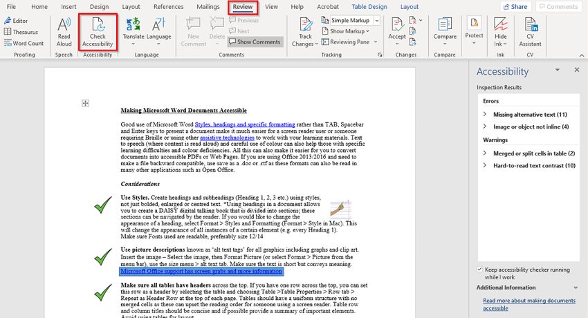
FLORIDA ATLANTIC UNIVERSITY
    STUDENT ACCESSIBILITY SERVICES & INSTRUCTIONAL TECHNOLOGIES

                                 Ally Resource Library
2. WRITE IN SIMPLE SENTENCES AND PLAIN LANGUAGE
It is important to use clear and simple language to communicate effectively. “Plain language” is a good way to
organize and display information, so it is easy to follow. This means that the listener or reader can easily
understand the first time they hear or read it. For example, using conversational style with everyday words
and active voice.
Other points to keep in mind while writing with “plain language” are:
     • Use short sentences, like 15 to 20 words per sentence.
     • Make sure that longer sentences do not have more than three items of information.
     • Use ‘active’ verbs mainly. For example, “The teacher always answers the students’ questions” (active),
         rather than “ The students’ questions are always answered by the teacher” (passive).
     • Try avoiding acronyms and lingos. If this cannot be avoided or there is a need to use uncommon terms,
         then include an explanation of them when they are first used.
     • Use bullet points to break complex information easily.

USEFUL RESOURCES.
For more “plain language” advice visit the Plain English Campaign website. (http://www.plainenglish.co.uk/.)

3. PRESENTATION AND LAYOUT
To help with the reading and comprehension of information use plain/common fonts and point sizes for the
presentation and layout of the documents.

-    FONTS
The recommended fonts are:
   • Arial
   • Calibri
   • Helvetica
   • Tahoma
   • Time New Roman
   • Verdana

IMPORTANT: LIGHT OR THIN FONTS SHOULD BE AVOIDED.

                      HOW TO MAKE AN ACCESSIBLE DOCUMENT? | Updated 3/25/2022
                                                                                                     2|P a g e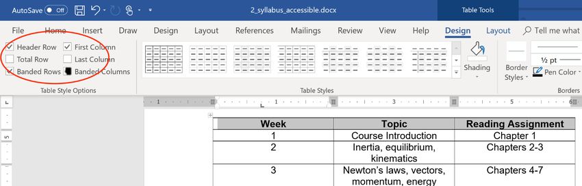
FLORIDA ATLANTIC UNIVERSITY
    STUDENT ACCESSIBILITY SERVICES & INSTRUCTIONAL TECHNOLOGIES

                                               Ally Resource Library
-    POINT SIZE
A text size of 12-point or higher will benefit the most users. It is recommended to make large print (like 16-
point or higher) versions of documents available on request. Also, keep in mind that point sizes can vary
between fonts.
For example:
    • This is 12-point text Arial
    • This is 12-point text Calibri
    • This is 12-point text Helvetica
    • This is 12-point text Times New Roman
    • This is 12-point text Verdana

-    OTHER CONSIDERATIONS
Other recommendations in making more accessible content are:
   • Avoid using capitals letters for continuous text, lowercases are easier to read.
   • High contrast makes documents more legible. Alternative color contrasts like including black text on
       yellow background can be beneficial for the readers.
   • Avoid using color-coding to convey information or meaning. If this format cannot be done, then make
       sure that each color-coding word is accompanied by its meaning.
   • The use of white space makes information easier to read. Make sure to leave enough space between
       paragraphs, and also, try increasing space between lines.
     •   Large and bold font is useful for highlighting and emphasizing the information.
     •   Numbers from one to nine are easier to read in the normal text if they are written in words. Any
         numbers after 10 should be written as numerals.
     •   Align the text to the left of the page. This makes it easier to find the start and end of each line and
         ensures an even gap between words.
     •   Do not hyphenate words at the end of lines.

4. TABLES
Tables in Microsoft Word need to have a simple structure and also give information to the column header. For
screen reader users, it is useful to add a short descriptive caption for each table. Microsoft Word’s tables must
not contain:
    • Split cells
    • merged cells
    • Completed blank rows or columns
    • Nested tables
USEFUL RESOURCES.
                         HOW TO MAKE AN ACCESSIBLE DOCUMENT? | Updated 3/25/2022
                                                                                                           3|P a g e
FLORIDA ATLANTIC UNIVERSITY
 STUDENT ACCESSIBILITY SERVICES & INSTRUCTIONAL TECHNOLOGIES

                                            Ally Resource Library
For more information visit the Microsoft Word Support Website. (https://support.microsoft.com/en-
us/office/video-create-accessible-tables-in-word-cb464015-59dc-46a0-ac01-6217c62210e5).

5. LISTS
Using numbered or bulleted lists in documents can be a very useful way of breaking up complex information
by making it easier to read and follow.
For the listing features to work with most screen reader programs/software, the author must create the list
using the built-in list formatting within Microsoft Word. Also, while using a screen reader, the list itself can
convey important information, for example:
    • Where the list starts and finish?
    • How many items are on the list?
    • What list item the user is on?

6. IMAGES
When using images in a document to help with the visualization of concepts, take into consideration their
placement on the page. If an image is placed randomly on the page this can interfere with the flow of the text
and make it harder to follow the context. The text should not be placed around the images. It is best to place
the images at the end of paragraphs and allow sufficient space between them. Also, avoid placing any text
over any background images.

                       HOW TO MAKE AN ACCESSIBLE DOCUMENT? | Updated 3/25/2022
                                                                                                        4|P a g e
FLORIDA ATLANTIC UNIVERSITY
 STUDENT ACCESSIBILITY SERVICES & INSTRUCTIONAL TECHNOLOGIES

                                              Ally Resource Library
For images to be readable with screen readers it needs to have alternative text. This can be done by using the
“Edit Alt Text” function which can be found by right-clicking on the images or in the “Picture Format” tab (it
will show after left-clicking on the image) in the accessibility section. When writing the images’ alt text take
into consideration what is the main idea of the image. This will help with the description of it so that all of the
information in the document will be consistent. Do not include words like “image of” in the description since
the screen reader will announce that it is an image. Try to limit the alt text to at least 150 characters. If the
image needs a longer description, it is best to include it in the paragraph related to the image. And last, if the
function of the image is just to decorate the page, it is best to mark it as such in the “Alt Text” option so that
the screen reader can ignore it.

USEFUL RESOURCES.
Benetech provides useful free tutorials for writing alternative texts. The website is Poet Training Tool
(http://diagramcenter.org/poet.html).

7. USE OF COLORS
There are two accessibility issues related to color options.
   • Avoid using color to communicate information. Since people perceive color in different ways, it is
       important to avoid using color alone to communicate information. For example, if a link text is blue, it
       should be also underlined so users who are unable to perceive the color differences and distinguish
       between regular text and links.
   • Choose colors with adequate contrast. Some users have difficulty perceiving texts if there is too little
       contrast between the words and the background. The Web Content Accessibility Guidelines 2.0
       (https://www.w3.org/TR/WCAG20/) require the color combination to meet defined contrast ratios. To
       meet the guidelines at level AA, text or image of text must have a contrast ratio of least 4.5:1 (or 3:1
       for large text) to meet the guidelines at stricter Level AAA, by contrast, the ratio must be at least 7:1
       (4.5:1 for large text).
                        HOW TO MAKE AN ACCESSIBLE DOCUMENT? | Updated 3/25/2022
                                                                                                           5|P a g e
FLORIDA ATLANTIC UNIVERSITY
STUDENT ACCESSIBILITY SERVICES & INSTRUCTIONAL TECHNOLOGIES
Ally Resource Library
USEFUL RESOURCES.
Several free tools have been developed that makes it easy to check for color combination for WCAG 2.0
compliance:
• Contrast Checker – Web AIM (https://webaim.org/resources/contrastchecker/)
• Designing for Web Accessibility (https://www.w3.org/WAI/tips/designing/)
8. AVOID FLASHING OR FLICKERING CONTENT
Content that flashes or flickers can trigger seizures in susceptible individuals. Therefore, this type of content
should be avoided. It not only can cause seizures, but it’s also likely to be annoying or distracting for users in
general. If it cannot be avoided, test the content to be sure it doesn’t flash or flickers at a safe level. The Web
Content Accessibility Guidelines 2.0 included specific technical requirements for determining whether the
content flashes or flickers at an unsafe level. In general, if content flashes more than three times per second, it
is unsafe.
USEFUL RESOURCES.
The W3C provides a more precise technical formula for calculating general flash and red flash thresholds
(https://www.w3.org/TR/UNDERSTANDING-WCAG20/seizure-does-not-violate.html).
9. HYPERLINKS
To add a hyperlink effectively in Microsoft Word, start by right-clicking on the word or group of words and
selecting the “Link” function. Another method is to do the selection and then go to the Insert tab, click on
“Links” to choose the weblink to add to the document. If you type a web address and hit space or return,
Microsoft Word will automatically format it as a link.
Keep in mind that the hyperlink has to make sense as standalone information. Meaning it needs to represent
clear and accurate information about what it links to. For instance, by including the full title of the destination
page and then using those groups of words to insert the hyperlink. It can also be useful to provide the full URL
in brackets after the description is done so that it is available if the document is printed or if the users wish to
cut and paste it to a web browser.
HOW TO MAKE AN ACCESSIBLE DOCUMENT? | Updated 3/25/2022
6|P a g eFLORIDA ATLANTIC UNIVERSITY
STUDENT ACCESSIBILITY SERVICES & INSTRUCTIONAL TECHNOLOGIES
Ally Resource Library
10. ACCESSIBILITY CHECKER
You can easily check the accessibility of your document by using the Microsoft Word building checker. To find
the “Accessibility Checker” go to the “Review” tab and you can click it in the accessibility section. This will
highlight any accessibility-related problems within your document. This section will describe why you should
fix them and also give you guidance on how to do so. You can also have the “accessibility checker” check your
work while you are writing by clicking the “Keep accessibility checker running while working” checkbox that is
available in this section.
11. CONVERTING TO PDF
To create an accessible PDF from Microsoft Word first make sure that the document is already accessible.
Starting with an accessible document ensures that when exported to a PDF will include the accessibility
features like headings structure, alternate text for images, appropriate lists, and table layout.
DO NOT PRINT TO PDF, THIS METHOD OF CREATING A PDF DOES NOT PRESERVE THE
DOCUMENT’S ACCESSIBILITY FEATURES.
Here are the steps to convert an accessible Microsoft Word into a PDF:
• First, click on “File”, then on “Save As…”, and select PDF from the choices provided. By default, this
produces a PDF that preserves the document’s accessibility features.
• When saving, select “Options” and be sure that “Document structure tags for accessibility” is checked.
HOW TO MAKE AN ACCESSIBLE DOCUMENT? | Updated 3/25/2022
7|P a g eFLORIDA ATLANTIC UNIVERSITY
STUDENT ACCESSIBILITY SERVICES & INSTRUCTIONAL TECHNOLOGIES
Ally Resource Library
• If you select “Minimize Size” to reduce the size of your PDF, be sure to repeat the preceding step, as
this option might uncheck the “Document structure tags for accessibility” checkbox.
USEFUL RESOURCES.
For more information about PDF accessibility, visit the Adobe website
(https://helpx.adobe.com/acrobat/using/create-verify-pdf-accessibility.html).
This website provides resources on making PDFs accessible, covering different versions of their PDF creator
software.
HOW TO MAKE AN ACCESSIBLE DOCUMENT? | Updated 3/25/2022
8|P a g eYou can also read