Laing O'Rourke Brand: our visual identity guidelines 2021 - version five - Laing O'Rourke
←
→
Page content transcription
If your browser does not render page correctly, please read the page content below
Laing O’Rourke
Brand: our visual identity guidelines

2021 – version five
Contents
Contents
Who we are                 3   How we look                7   Our toolkit                          8   In practice               34      Download centre                  41

• Who we are               3   •A
                                 simple, sophisticated   7   • Before we begin             9         • Our visual identity:   34      • Download all assets            41
                                visual identity                                                           in practice
• Our global mission       4                                  • Our logo                    10                                          • All logo options               41

• Our guiding principles   5                                  • Our motif                   16                                          • Colour palette                 41

                                                              •O
                                                                ur colours                  17                                          • Video pack                     41

                                                              • Our fonts (typefaces)       18                                          • Motif and Tagline               41

                                                              • Document grids              20                                          • Social and corporate icons     41

                                                              •G
                                                                raphic and                  22
                                                               typographical elements

                                                              •O
                                                                ur tagline and              23
                                                               web address

                                                              • Icons – social               24

                                                              • Icons – corporate           25

                                                              •P
                                                                hotography and video        26

                                                              • Graphics for online channels 32

                                                                                                                                 Visual identity guidelines. 2021 – version four   1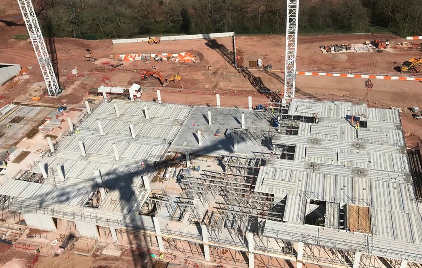
Who we are

2   Visual identity guidelines. 2021 – version four
Who we are

 Laing O’Rourke
 We are a globally diverse engineering and construction group with a commitment
 to delivering exceptional value, founded on 170 years of experience. Offering
 a true end-to-end service – we invest, define, design, manufacture, deliver and
 operate across a broad spectrum of exciting projects for our customers – providing
 the right environments to accommodate, educate, employ, transport, care for
 and sustain communities.

                                                                Visual identity guidelines. 2021 – version four   3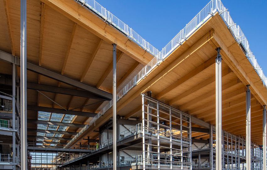
Our global mission

Deliver 2025
Over the last decade Laing O’Rourke has invested
significantly in moving the traditional process of
                                                            Our global mission
construction towards an engineering-led, advanced
manufacturing approach. It is this compelling
proposition, backed by our drive to provide certainty
                                                            To become the recognised
of delivery through people, technology and                  leader for innovation and
intelligent systems, that helps us deliver maximum
value for our clients.                                      excellence in the
Our priorities are clear. We will differentiate ourselves   construction industry
through a mature DfMA 70:60:30 and digital
engineering offer.

We will deliver on our commitments improving
productivity and profitability.

We will always develop, embedding innovation
and more sustainable approaches into our unique
offering.

Our mission is to become the recognised leader for
                                                             DfMA 70:60:30
innovation and excellence in the construction sector.
                                                             • 7
                                                                0% of the construction
When realised, this will bring about real change in
the industry, replacing old adversarial approaches
                                                               to be conducted offsite
with an energetic culture of early engagement,
resilience and genuine collaboration.                        • 6
                                                                0% improvement in
We are committed to maintaining the high standards
                                                               productivity
we have set ourselves. We will drive our work
winning efforts and project delivery, while attracting,      • 3
                                                                0% improvement in
developing and retaining the best talent.                      delivery schedule

4   Visual identity guidelines. 2021 – version four
Our guiding principles

   Our guiding principles
   People are the heart of our projects ensuring we deliver them safely, with
   certainty, and quality

                                             We work as one team by knowing and
   Absolute alignment                        understanding our people and their talents to
                                             deliver for our customers

                                             We look at projects in their entirety to ensure we
   Complete thinking                         bring together all the parts at the right time and in
                                             the right way for the customer and the business

                                             We aim to make our complex world feel simple,
   Sophisticated simplicity                  useable and inspiring

                                                                           Visual identity guidelines. 2021 – version four   5
How we look

6   Visual identity guidelines. 2021 – version four
A simple, sophisticated visual
identity                                                      Welcome to our visual identity guidelines
As the world changes, Laing O’Rourke is finding
smarter and more agile ways to meet its customers’            It’s vital that our communications reflect the innovation and consistency
needs – building high‑quality, complex structures with
ease, speed and precision. We create outstanding              we bring to our projects.
structures, and extraordinary spaces that improve
the way people live, work and play.                           These guidelines explain the principles that underpin our visual language
We bring together multidisciplinary engineering               and how it is applied in practice.
expertise to solve challenges faster, more efficiently
and with a more impactful end result.                         Applied consistently it will help us convey a strong, unified image, raise
We want to acknowledge our unique engineering                 our profile and clearly differentiate us from our competitors.
approach that brings components together on site
to save time, money and improve safety.                       We all have a part to play in achieving this so please familiarise yourself
We have captured the focus and clarity that drives            with these guidelines and use the examples as inspiration for creating
our approach to engineering in a visual identity that         bold, strong and consistent communications.
has simplicity, legibility and sophistication at its heart.

The clarity of our approach to engineering is                 If you have any queries, feel free to contact us at:
reflected in the bold and striking communications
that we design.
                                                              comms@laingorourke.com

                                                                                                                Visual identity guidelines. 2021 – version four   7
Our toolkit

8   Visual identity guidelines. 2021 – version four
Before we begin

A brief history of our logo                              In 1977 R O’Rourke and Son were incorporated.               and achievements that have shaped and influenced
                                                         Trading began in 1978. R O’Rourke and Son were              Laing O’Rourke today and the continued drive
It’s important to understand a little about our logo     soon involved in some of the major projects of the          towards innovation and changing and modernising
before you begin to plan how to apply it.                period and went on to deliver the first phase of            the industry is captured in our current logo.
                                                         Canary Wharf, the Reuters building and Broadgate
The logos on this page are directly linked to the        in London.                                                  That’s why it’s so important that we use the correct
evolution of Laing O’Rourke.                                                                                         logo and apply it consistently.
                                                         In 2001 R O’Rourke and Son acquired John Laing
In 1848 John Laing Construction was founded going        Construction, as a result Laing O’Rourke was born.          It not only says who we are now and what we stand
on to become a distinguished household name,                                                                         for, but where we have come from and what we
delivering Sellafield, the world’s first nuclear grade   The elements that formed these logos, the most              have achieved. It’s symbolic of our drive to be the
power station and the southern part of the M1,           important being the distinctive colours, remain an          recognised leader for innovation and excellence in
Britain’s first inter-urban motorway, among many         important and integral part of the current Laing            the construction industry.
other notable achievements.                              O’Rourke logo. This continued link to the businesses

1977                         2001                                  2001                                         2006                                 Deliver 2025
O’Rourke & Son               Laing Construction                    ...Laing O’Rourke                            Barclay Mowlem                       Deliver 2025 is our
formed                       acquired...                           formed                                       Australia acquired                   global mission
                                                                                                                                                     to become the
                                                                                                                                                     recognised leader
                                                                                                                                                     for innovation and
                                                                                                                                                     excellence in the
                                                                                                                                                     construction industry.

                                                                                                                                                     The logo above is the
                                                                                                                                                     correct one for use in all
                                                                                                                                                     our communications.

                                                                                                                                  Visual identity guidelines. 2021 – version four   9
Our logo Laing O’Rourke logos –
Essential – please note
multiple formats
Our logo in practice Primary logo
The bold red, yellow and black colour combination
in our logo is a strong differentiator within our sector. This is our primary logo.
You should use it at all
Correct and consistent application of our logo times.
is essential as external stakeholders are frequently
exposed to a range of Laing O’Rourke material
and collateral.
The elements
Our logo comprises several ‘elements’. They are:
• The black block
• The white lettering The full colour logo is our primary logo and is the
default logo to use on all communications.
• The red and yellow bars
These elements form our primary logo. None of the
elements can be removed, altered or repositioned.
X
The colours, relationships and proportions of these This is the wrong thing to do
elements are fixed. It is essential that you treat all of This is an old logo.
the elements as a single entity.
Do not use this logo.
A quick checklist – what to avoid
• Do not change any of the colours
• Do not remove any of the elements
• The proportions and relationships of the elements
cannot be changed – this is essential when
This is an old logo. We no longer use it in any
enlarging or reducing the logo
circumstances. We are gradually removing the old
• Never rotate or angle the logo logo from the business.
• Never compress the logo vertically
Please follow this simple rule, do not use this logo.
• Never extend the logo horizontally
• Never add any text or graphics to the logo
• Do not butt text or graphics directly against the
extremities of the black box element
10 Visual identity guidelines. 2021 – version fourOur logo Essential – please note
Bad practice
The examples on this page illustrate bad practice.
From time to time our logo does get abused
and is treated in a way that makes it illegible,
unrecognisable or it simply gets used in a way
that fails to reflect one of our basic principles -
sophisticated simplicity. Do not change any of the colours Do not remove any of the elements Never delete the black box element
Please avoid these common misunderstandings
and mistakes.
The proportions and relationships of
the elements cannot be changed -
this is essential when enlarging Never angle the logo Never rotate the logo
or reducing the logo
CONSTRUCTION CONSTRUCTION
CONSTRUCTION CONSTRUCTION
CONSTRUCTION CONSTRUCTION
Never compress the logo vertically CONSTRUCTION CONSTRUCTION
Never compress the logo horizontally Never add any text or graphics
to the logo
Do not butt text
or graphics
directly against
the extremities
of the black box
like this
Never trim the edges off the black box
to force the logo to fit
Visual identity guidelines. 2021 – version four 11Our logo
Acceptable variations Primary logo
There are occasions where it is not possible to
apply our primary logo. This is usually because the
circumstances in which the logo is applied imposes 20mm/75px
restrictions such as the use of a single colour or black
and white reproduction. This is the minimum acceptable size that our logo can
be reproduced. The elements that comprise the logo
On occasion our logo may appear alongside partner are still visible and recognisable. Reductions below this
or competitor logos, at a conference for instance, width render the logo illegible.
where the organiser states that all logos must be
reproduced in black so that they form a cohesive The full colour logo is our primary logo and is the
suite. default logo to use on all communications.
Although our default position is to use our primary
Secondary logo
logo wherever possible, we have created a set of
logos that adapt to accommodate these and similar
circumstances.
Before applying our logo you should consider the
following points to help you identity the correct form
of our logo to use:
• In all circumstances determine if it’s possible to use
the Primary logo. If this isn’t possible then; Use only when your reproduction method does not
• use the Secondary logo; support the ‘Primary logo’.
• If that isn’t possible, use the Reversed logo.
Reversed logo
The black area shown
indicates a typical
background and is for
illustration purposes,
It’s not part of the
‘Reversed logo’
The ‘Reversed logo’
comprises, the white
The reversed logo should only be considered if you block, rules and
are sure that the Primary and Secondary logo are lettering.
not appropriate. Its use should be avoided but it is
acceptable if your application means this is your only
viable solution.
12 Visual identity guidelines. 2021 – version fourOur logo
Clear space
To protect the visual integrity of our logos and allow
them presence, we allow a ‘clear space’ that
provides a margin between the logo and any other
elements such as graphics, text or imagery.
The clear space should increase and decrease in
direct proportion to any changes in logo scaling.
The clear space allows the logo to be visible and
identifiable among other competing graphics.
The clear space should be calculated like this:
• Decide on the size of your logo, this will vary The dashed red box illustrates the clear space margin. The three examples above illustrate how the clear space
depending on your particular application. It is shown here for illustrative purposes and is in reality margin increases and decreases in equal proportion to
an invisible guide. The three letter ‘K’ shown are only the logo when it is scaled.
• Note the height of the text character ‘K’ in the used to determine the clear space margin for each
lettering in the logo. side of the logo and are discarded once the margin is
determined.
• Set a margin around the logo equivalent to the
height of 3 times the height of K.
• If your application requires additional design assets
An example in practice
such as text or graphics, these cannot enter the
margin (clear space) on any side of the logo. Once you have
determined the ‘clear
• This is the expected minimum clear space margin, if space margin’ you can
your particular application means this is impractical place images, graphics
you should strive to create a margin as close to this or text anywhere outside
as possible. of the margin, but do
not allow them to cross
In some applications, exceptions can be made but over into it.
only if the design application means you have no
alternative. An example is our .com where limited
screen estate required a compromise. However
these exceptions and any usage that doesn’t feature
the defined clear space should be avoided and
must be authorised by Corporate Affairs.
Graphics and text can be placed around the logo, but
Contact: comms@laingorourke.com cannot enter the area determined by the clear space
margin.
Visual identity guidelines. 2021 – version four 13Our logo
Essential – please note
Our logo, contrast and Placing the logo on black
backgrounds This presents us with a unique challenge. By placing This is never acceptable
our logo which features a 100% black box on a
We place our logo on a great variety of backgrounds.
document with 100% black colouring, the black box
It’s essential that we consider how the visibility and merges and effectively disappears. The result is that
Placing our primary logo...
legibility of our logo is impacted when we do this. we then appear to be featuring our old logo.
Applying the logo to 100% black backgrounds
Consider your background should be avoided for this reason. In most situations
The black box can offer some challenges when you should be able to use one of our greys for your
placed on very dark colours, particularly black. background as an alternative to black. However
For maximum visibility please note: if your particular application demands the use of
a black background and you cannot utilise the
On images ‘Reversed logo’ (see page 10) then please note the
following:
When placing the logo on an image, always make
sure the image is light enough to ensure the logo is On a black background or black shape...
Print
clearly visible. If required, lighten the relevant part
of the image subtly or use a different crop to ensure If budget permits, spot varnish the entire footprint
sufficient contrast. of the logo including all elements. The varnish will
delineate the logo from the black background.
On colours A further option is to emboss or deboss the logo
to provide the required visual separation from the
Apart from the black, all of the colours in our core
background, although this can be an expensive
and secondary colour palettes have been carefully
process.
chosen so that they have sufficient contrast with our
logo, including the core greys.
Screen and mobile
Avoid black backgrounds where possible. If your
particular application means this is unavoidable and
you cannot use the ‘Reversed logo’ then consider
animating the logo so that for instance a subtle halo ...means the black box is hidden.
of light delineates the logo from the background.
This is not acceptable in any circumstances.
If you would like advice, please contact:
comms@laingorourke.com
14 Visual identity guidelines. 2021 – version fourOur logo
Logo positioning and size Logo positioning portrait Pop up banners
The margins shown on
Our logo should be positioned in the top left corner of this page are
the page or screen where possible. non-printing / non-
visible and are shown
On A4 documents, the height of the logo should be to illustrate desirable
20mm on A4 portrait with the depth in proportion and clear space margins in
each case.
25mm on A4 landscape with the depth in proportion.
For other International A4 sizes such as A1 or A0, the Typical pop-up
logo size should be scaled (increased or decreased) banner.
in proportion, using the rules above as a guide. For illustration
A4 portrait.
purposes only.
For illustration
It is not possible to foresee the full suite of documents The image is
purposes only.
and collateral that our logo will be applied to. proportionately
The image is
During application the designer will need to correct based
proportionately
determine if the size of the logo is sufficient for it to on 800mm x
correct but not
stand out and lead the document – it is acceptable 2000mm but
actual size.
to adjust the logo sizing visually until you feel you have not actual size.
met the correct compromise.
Centering the logo on ‘pop-up’ banners is
acceptable due to their pronounced portrait format.
Allowing a border around the document edge
If you are designing a document that will be printed
internally at Laing O’Rourke be aware that the estate
of colour photocopiers we use do not print to the Logo positioning landscape
page edges. Special care must be taken. See page18
for details.
A4 Landscape.
For illustration
purposes only.
The image is
proportionately
correct but not
actual size.
Visual identity guidelines. 2021 – version four 15Our motif Motif and Tagline –
multiple formats
This is our ‘motif’ What are the pre-agreed uses for The motif colours are unique
graphic designers? To allow the top bar of the motif to have sufficient
contrast when it is placed against a white
Our address block background, the yellow used differs from the colour
The motif appears as part of our contact / address used on the top bar in the Laing O’Rourke logo.
block on the very last page of our documents. This is
illustrated on this page.
When can I use the motif? Please note:
The motif is not a replacement for our logo and cannot Our tagline (Value Proposition) The colour breakdown for the yellow used in
be used as a substitute in any circumstances. The motif is an integral part of our tagline, illustrated our motif differs from the colour used for the
below. Further information about our tagline appears yellow bar in the Laing O’Rourke logo.
Application of the motif is undertaken by the on page 23. The motif yellow breakdown is:
Corporate Affairs team and is only used in very C0 M14 Y100 K0
specific circumstances.
Pantone 116 CP
There are several pre-agreed applications for R255 G205 B0
the motif that graphic designers preparing new #ffcd00
documents for Laing O’Rourke should observe.
These are illustrated to the right.
Laing O’Rourke staff should not apply the motif in any Our tagline. See page 23.
circumstances unless they have been agreed with the
Corporate Affairs team.
If you feel you have an application which would
benefit from the addition of the motif, contact the
Corporate Affairs team: comms@laingorourke.com
Laing O’Rourke | Bridge Place | Anchor Boulevard | Crossways | Dartford | Kent DA2 6SN
T +44 (0) 1322 296200 | F +44 (0) 1322 296262
Our address block see page 23.
16 Visual identity guidelines. 2021 – version fourOur colours Colour palette –
Adobe ASE file
Our colours Primary Secondary Secondary-Greys
Our colours are divided into three tiers. C0 M0 Y0 K100 C0 M14 Y100 K0 C6 M4 Y0 K0
Pantone Process Black CP Pantone 116 CP Pantone Cool Grey 1 CP
•Primary logo colours
•Secondary palette R0 G0 B0 R255 G205 B0 R242 G242 B242
•Tint values #000000 #ffcd00 #f2f2f2
Primary colours C0 M0 Y100 K0 C0 M65 Y100 K0 C12 M8 Y9 K0
Our logo uses our primary colours. These are Pantone Process Yellow CP Pantone Orange 021 CP Pantone Cool Grey 3CP
historically important to Laing O’Rourke and unite R255 G242 B0 R254 G80 B0 R230 G230 B230
colours associated with our journey, from Laing #fff200 #fe5000 #e6e6e6
Construction to the present day.
C0 M100 Y100 K0 C68 M0 Y100 K0 C23 M17 Y18 K1
We use our primary colours minimally in collateral and
Pantone 485 CP Pantone 369 cp Pantone Cool Grey 5 CP
do not use large areas of primary colour. We reserve
the use of these colours in documents for certain R227 G6 B19 R100 G167 B11 R204 G204 B204
elements such as underlining or emphasising text, key #e30613 #64a70b #cccccc
quotes or specific areas of information or statistics we
wish to draw attention to. C69 M0 Y54 K7 C41 M32 Y32 K11
Pantone 7723 CP Pantone Cool Grey 7CP
Secondary colours R80 G166 B132 R153 G153 B153
Our secondary colours consist of a number of grey #50a684 #999999
tones and some additional vibrant options.
C81 M0 Y23 K0 C62 M52 Y50 K48
Printed or screen based document covers should
Pantone 7710 CP Pantone Cool Grey 9CP
make significant use of the darker greys, using other
colours for minimal highlights. R0 G167 B181 R77 G77 B77
#00a7b5 #4d4d4d
Tints of our colours (not including greys)
C85 M21 Y0 K0 C71 M61 Y57 K70
These should be used at your discretion, although the
legibility of text and graphics impacted by tints is of Pantone 2925 CP Pantone Cool Grey 11 CP
paramount importance. If it’s not legible, adjust the R0 G156 B222 R45 G45 B45
tint or change the font colour until you are happy the #009cde #2d2d2d
information is crisp and clear.
C100 M69 Y0 K4 C75 M65 Y60 K80
If you use several tints grouped (a graph is a good
Pantone 293 CP Pantone 412 CP
example) ensure there is sufficient contrast between
tints by limiting use to the following values, 25%, 55% R0 G61 B165 R30 G30 B30
and 80%. #003da5 #1e1e1e
Visual identity guidelines. 2021 – version four 17Our fonts (typefaces)
Essential – please note
Introducing our fonts Century Gothic Working with font weights
As with images and colour, a font applied consistently Century Gothic is used across all communications Century Gothic REGULAR
provides another visual asset that helps link our material. This includes Microsoft Office and Office 365 This sentence is set in Century Gothic Regular. This
collateral so we deliver a consistent look and feel or applications, presentations – in fact any material that weight should be used for the main copy of your
‘visual identity’. you circulate internally or produce and provide to documents, especially if your document runs to
clients. multiple pages.
Our primary font is Century Gothic. This font should be
used across all our communications and replaces any The Century Gothic lower case alphabet looks like this. Century Gothic BOLD
existing advice regarding corporate fonts. In this example the spacing between the letters has This sentence is set in Century Gothic BOLD. This
been increased to improve clarity: weight should be used headings and subheadings.
Fonts come in varying weights, meaning that some You can change the point size (type size) to help
abcdefghijkl
are bold and some are visually lighter. Using a mixture create a hierarchy between two bold headings,
of weights can help lead the reader through a with the higher level heading being set in a larger
document, with bolder weights used for headings and point size.
lighter weights for the bulk of copy.
mnopqrstuvw Century Gothic ITALIC
xyz
In addition Corporate Affairs also use a font, ‘Ginger’, This sentence is set in Century Gothic ITALIC
this is not to be used by Laing O’Rourke staff in any This weight should be used for a lower level of
circumstances without the express permission of sub-heading or to place emphasis on sections of text,
Corporate Affairs. at your discretion.
The Century Gothic CAPITAL alphabet looks like this:
Century Gothic BOLD ITALIC
ABCDEFGHIJ
This sentence is set in Century Gothic BOLD ITALIC.
Provides a further option to place emphasis on text.
KLMNOPQRST
UVWXYZ Notes for Graphic Designers
• Leading should be set between 2-4 points
larger than the point size of the type you
The numerals look like this: are setting.
1 2 3 4 5 6 7 8 9 10
• Tracking should be set to zero to a
maximum of -20 if you need to the
alter spacing as a method of creating
additional text space in your document.
18 Visual identity guidelines. 2021 – version fourOur fonts (typefaces) Ginger cannot be used
by Laing O’Rourke staff
Capital or lower case?
Either are acceptable however the use of CAPITALS Ginger The Ginger Light lower case alphabet looks like this. In
should be constrained to the covers of documents, or this example the spacing between the letters has been
Ginger is an additional typeface that professional increased to improve clarity:
key headings at the starts of sections.
graphic designers may use.
Essentially the use of capitals should draw attention
to the opening of a document (a cover), signpost the
start of a new section (a divider, or start of a new topic
If you are a staff member of Laing O’Rourke you
cannot use Ginger in your documents.
abcdefghijkl
within a document) and should not be used for long
copy. If the text you are considering is longer than a
Application of the font and weight options follow the
same principles set out for Century Gothic.
mnopqrstuvw
short punchy statement or sentence, it shouldn’t be
set in capitals. The lighter weights of Ginger, such as the one being xyz
used in this sentence, Ginger Thin, are delicate and
The A4 and square document covers below show care should be taken using small point sizes for screen
the use of capitalised text to emphasise the core The Ginger Light CAPITAL alphabet looks like this:
and print use.
topics of the publication. The secondary explanatory
line is then set in upper and lower case so there is a
clear hierarchy between the text lines.
Ginger Thin is mostly applied as CAPITALS and at large
point sizes on document covers and as headings for ABCDEFGHIJ
instance. Due to its delicacy, designers should look to
apply it at 20 point and upwards, considering other
weights at point sizes below this.
KLMNOPQRS
Ginger Light, which this text is set in, should be used TUVWXYZ
for main copy.
DELIVER 2025 Ginger Bold should be used for sub-headings The numerals look like this:
CONFERENCE and quotations, to emphasise significant text or
statistics.
Introducing our speakers and coaches
Licensing rules prohibit us from copying fonts and
1 2 3 4 5 6 7 8 9 10
providing them to suppliers.
Graphic designers working on behalf of Laing O’Rourke
Where possible Ginger
SPECIALIST will need to purchase the font from here: should be set to outlines
BUSINESSES https://f37foundry.com/font-library/f37-ginger/
before export.
Our unique internal supply chain
2
Visual identity guidelines. 2021 – version four 19Document grids Note if printing
internally
Covers and document spreads Externally printed cover grid (A4) Internally printed cover grid (A4)
We have set some fundamental principles around the 12mm 12mm
layouts of our documents. Adhering to them will help
ensure our corporate collateral has a unified look
and feel.
Before a document is produced it’s important to
establish if the document is likely to be printed
using a photocopier, either within Laing O’Rourke or
elsewhere.
The majority of colour photocopiers do not print to the
page edges. If a document is designed so that colour
or imagery flows right up to the page edges (know
as ‘bleeding off’) at the point of print the copiers will
impose a thin white border effectively cropping your
work.
For this reason we have separate grids for documents
that are specifically designed for internal print which
includes a ‘designed in’ white margin around the page
edges.
Additional note:
• On internal pages a designer can use all the
columns for their design but can optionally
disregard the extreme left and right columns on a
page if they wish to create a much wider margins
at the page extremes.
12mm 8 column grid with 4mm gutters. 12mm 12mm 12 column grid with 4mm gutters. 12mm
Designing documents at A3
The same principles should be followed, with the
exception of the margins at the page edges. For both
covers and spreads these should be set to 20mm.
20 Visual identity guidelines. 2021 – version fourDocument grids
Externally printed spread (x2 A4 pages portrait) Internally printed spread (x2 A4 pages portrait)
12mm
12mm 8 column grid with 4mm gutters. 12mm 8 column grid with 4mm gutters. 12mm 12mm 12 column grid with 4mm gutters. 12mm 12 column grid with 4mm gutters. 12mm
Visual identity guidelines. 2021 – version four 21Graphic and typographical elements
Additional assets for layouts
In order for a designer to draw attention to key
pieces of information in a layout the following assets
may be considered for inclusion.
Introductory paragraphs
Copy can be emboldened and the point (type) size
increased by 2 points above your core body copy to
add emphasis.
Pull out quotes
Quotes may be set in a tint column, sub-divided by
0.5 mm / 2 pixels rules between the quotations.
Underlining headings
An underline rule such as the one used at the top of
this page may be applied.
Tint panels
Related information on a spread that forms
complementary text, such as a small case-study, can
be set in a separate tint column that can bleed off
the bottom, left or right of your layout – or stay within
the grid or your document.
Graphic underlines
Solid panels can be used at the page base or
footer to link the pages of a spread or balance the
composition.
Image captions Introductory paragraphs Pull out quotes Underlining headings Tint panels Graphic underlines
White text reversed from Can be set 2 points larger Can be set in a tint Consider underlining key Case studies or Heavier rules can be
a solid colour. Opacity than your main body panel that is the width headings to the length complementary employed to link the
is acceptable to reveal copy. An additional two of the type column it of the text or the total information can be set headers or footers of
the underlying image. points should be added to occupies. Rules should width of the columns on within tint panels. The pages.
the leading. be set between quotes a page. An additional tint panel should be set
for clarity. standalone rule in the to the width of the one
22 Visual identity guidelines. 2021 – version four page header can be or more grid columns.
considered.Our tagline and web address Motif and Tagline –
multiple formats
Integrating our tagline Integrating our web address
Our motif, tagline and corporate web address appear There are two options, a centred version
together in a set block. To ensure we apply them ‘Tagline-centred.ai’ and a ranged left version
consistently across our documents we have created a ‘Tagline-left.ai’. Each file contains a black and a white
single Adobe Illustrator .ai file to import. version on separate artboards.
L A I N G O R O U R K E .C O M
Our tagline, also referred to as our Value Proposition, Tagline centred.ai file graphic
is a succinct expression of our core objective as an scaled to the width of the
organisation. address block. The Social
media icons within the file are
THE POWER OF EXPERIENCE is our tagline. We sign cropped off the bottom in this
example. 2. …to this space
our documents off with this wording and along with
our corporate website address, it’s the last piece of 1. Match this space…
information on many of our documents.
Type size = 9pt . Leading = 12pt Laing O’Rourke | Bridge Place | Anchor Boulevard | Crossways | Dartford | Kent DA2 6SN
How do I apply our tagline? T +44 (0) 1322 296200 | F +44 (0) 1322 296262
Our tagline is available as Adobe Illustrator .ai files
that graphic designers can import into their software.
The image above is an example of the footer on the back page of a typical internal document.
• The proportions and relationships of the External documents should include the social media icons. Read more on the next page.
components of our tagline are fixed and
cannot be altered. Setting up your address block Notes
• Agree your type point/pixel size. • The tagline is centered and is set to the width of
• Our tagline is only used at the end of documents.
• Set the leading (distance between baselines) at the web address in centred layouts.
Examples are back covers of printed documents,
last panels or footers of exhibition systems, final 33% larger than your type size. • The address block, web address and tagline can
slides of screen-based presentations or closing • Import the Tagline centred.ai asset into a box be ranged left if that suits your document. Centred
sequences of videos. and scale it to the width of your address block as is preferred though. It must never be ranged right.
shown above. Use the Tagline-left.ai file for these purposes.
• Our tagline should be centred at the base of a
1. Match the space below the web address
screen or document or ranged left if that suits your
to the same as…
application’s style. It must never be ranged right.
2. …the space between the tagline and the web
• Our tagline is applied to documents with either address, see above.
white or black text, no other colours should be L A I N G O R O U R K E .C O M
considered.
Single line version
• The Motif (see page 16) is an integral part of The ‘Tagline-single.ai’ version can be used on some
our tagline, it cannot be omitted, recoloured or footers and web portals when space will not allow the
changed in any way. full web address/social media icon versions. See page
38 for some example applications. Visual identity guidelines. 2021 – version four 23Icons – social Social icons –
multiple formats
Social media icons
We promote our key social media channels on the
footer of documents on the back covers or final slide
of external facing presentations.
There is no requirement to include the icons on
presentations created for internal presentation
purposes.
Unlike our corporate icons, our social media icons Tagline centred.ai file graphic
scaled to the width of the
contain graphics that are familiar to users globally
address block, including the
which represent the particular social media channel social media icons.
they represent.
2. …to this space
How do I apply the icons?
For simplicity the social media icons are contained
within the same Adobe Illustrator files:
1. Match this space…
Centred version: Tagline-centred.ai Type size = 9pt . Leading = 12pt Laing O’Rourke | Bridge Place | Anchor Boulevard | Crossways | Dartford | Kent DA2 6SN
Ranged left version: Tagline-left.ai T +44 (0) 1322 296200 | F +44 (0) 1322 296262
• They appear centered below the tagline or
ranged left, depending on your application.
A typical back page footer integrating our social media icons, centered.
• When used in any online environment they
should be set us as hyperlinks, linking to the
relevant social channel.
• The look, feel and colouring of the icons cannot
be changed.
L A I N G O R O U R K E .C O M
Hyperlink information:
Laing O’Rourke
Bridge Place
Twitter @Laing_ORourke Anchor Boulevard
Crossways
Instagram https://www.instagram.com/laingorourke/
Dartford
Kent DA2 6SN
T +44 (0) 1322 296200
Linked In linkedin.com/company/laingorourke F +44 (0) 1322 296262
You Tube youtube.com/laingorourkeltd
A ranged left version is a acceptable if that suits your application better.
Note the space between baseline of the icons and the block of text is equal
24 Visual identity guidelines. 2021 – version four to the gap between the tagline and the laingorourke.com as shown.Icons – corporate Corporate icons –
multiple formats
Icons
Our icon style has been developed to reflect our
‘Sophisticated Simplicity’ approach. We use them to
symbolise many of our internal systems and platforms.
The icons are designed to follow a few simple rules:
• The icon should illustrate the service it depicts
• We use black, white and a specific green.
RAIL AVIATION RESIDENTIAL RETAIL DEFENCE
An element of each of these colours must be
present in an icon. Tints of the green can be used
• A 2D approach
The icons on this page show typical examples of
our icons.
RESOURCES HIGHER BUILDING ROADS AND HEALTHCARE
EDUCATION BRIDGES
Please note:
We use a specific colours from our palette for
icons. They are:
C69 M0 Y54 K7
Pantone 7723 CP
R80 G166 B132
#50a684 SCHOOLS WATER POWER SPORT AND OTHER
LEISURE
C0 M0 Y0 K100
Pantone Process Black CP
R0 G0 B0
#000000
Visual identity guidelines. 2021 – version four 25Photography and video
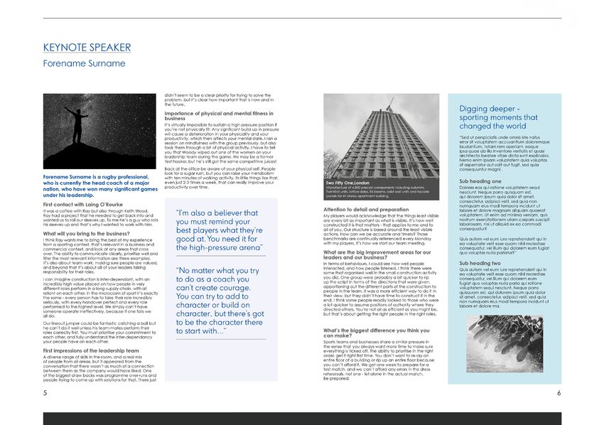
KEYNOTE SPEAKER
Forename Surname
Imagery and Laing O’Rourke innovation and excellence in the didn’t seem to be a clear priority for trying to solve the
problem, but it’s clear how important that is now and in
the future.
Digging deeper -
construction industry. Along with
Importance of physical and mental fitness in
business sporting moments that
It’s virtually impossible to sustain a high-pressure position if
you’re not physically fit. Any significant build up in pressure
changed the world
will cause a deterioration in your physicality and your
Our photography celebrates what we do and who our projects, we celebrate the skills
productivity, which then affects your mental state. I ran a “Sed ut perspiciatis unde omnis iste natus
session on mindfulness with the group previously, but also error sit voluptatem accusantium doloremque
took them through a bit of physical activity. I have to tell laudantium, totam rem aperiam, eaque
you that Woody wiped out one of the women on your ipsa quae ab illo inventore veritatis et quasi
leadership team during the game. He may be a former architecto beatae vitae dicta sunt explicabo.
Test hooker, but he’s still got the same competitive juices! Nemo enim ipsam voluptatem quia voluptas
we are. and dedication of our people,
sit aspernatur aut odit aut fugit, sed quia
Back at the office be aware of your physical self. People consequuntur magni .
look for a sugar rush, but you can raise your metabolism
Forename Surname is a rugby professional, with ten minutes of walking activity. Its little things like that,
who is currently the head coach of a major even just 2-3 times a week, that can really improve your Two Fifty One,London Sub heading one
productivity over time. Manufacture of 4,800 precast components including columns, Dolores eos qui ratione voluptatem sequi
nation, who have won many significant games
showing how a modern, diverse and
TwinWall units, lattice slabs, E6 beams, solid wall units and facade nesciunt. Neque porro quisquam est,
under his leadership. panels for 41-storey apartment building. qui dolorem ipsum quia dolor sit amet,
consectetur, adipisci velit, sed quia non
First contact with Laing O’Rourke numquam eius modi tempora incidunt ut
Attention to detail and preparation
We combine three topics that are driving forces within
labore et dolore magnam aliquam quaerat
It was a coffee with Ray but also through Keith Wood.
Ray had a project that he needed to get back into and “I’m also a believer that My players would acknowledge that the things least visible voluptatem. Ut enim ad minima veniam, quis
motivated team is delivering assets
wanted us to roll our sleeves up. To me he’s a guy who rolls
his sleeves up and that’s why I wanted to work with him. you must remind your are every bit as important as what is visible. It’s how well
constructed it is that matters - that applies to me and to
nostrum exercitationem ullam corporis suscipit
laboriosam, nisi ut aliquid ex ea commodi
What will you bring to the business?
best players what they’re all of you. Our structure is based around the least visible
actions. How can we be accurate and timely? Those
consequatur?
good at. You need it for
our business and that make us stand apart from our
I think Ray wants me to bring the best of my experience benchmarks are continually referenced every Monday Quis autem vel eum iure reprehenderit qui in
from a sporting context, that’s relevant in a business and with my players, it’s how we start our team meeting. ea voluptate velit esse quam nihil molestiae
for communities globally as well as
commercial context, and look at any areas that cross the high-pressure arena” consequatur, vel illum qui dolorem eum fugiat
over. The ability to communicate clearly, prioritise well and What are the big improvement areas for our quo voluptas nulla pariatur?”
filter the most relevant information are three examples. leaders and our business?
It’s also about team work, making sure people are valued, Sub heading two
competition:
In terms of behaviours, I could see how well people
and beyond that it’s about all of your leaders taking
“No matter what you try interacted, and how people listened. I think there were Quis autem vel eum iure reprehenderit qui in
the next generation of landmarks.
responsibility for their roles. some that organised well in the small construction activity ea voluptate velit esse quam nihil molestiae
I can imagine construction is inter-dependant, with an to do as a coach you you did. One group were probably a bit quicker to rip
up the script in terms of the directions that were given,
consequatur, vel illum qui dolorem eum
fugiat quo voluptas nulla paria qui ratione
incredibly high value placed on how people in very
different roles perform in a long supply-chain, with all can’t create courage. apportioning out the different parts of the construction to
people in the team. It was a more efficient way to do it in
voluptatem sequi nesciunt. Neque porro
quisquam est, qui dolorem ipsum quia dolor
reliant on each other. In the microcosm of sport it’s exactly
the same - every person has to take their role incredibly You can try to add to their view, but they didn’t have time to construct it in the
end. I think some people readily looked to those who were
sit amet, consectetur, adipisci velit, sed quia
seriously, with every handover perfect and every role non numquam eius modi tempora incidunt ut
performed to the highest level. We simply can’t have character or build on a lot quicker to assume positions of authority where they
directed others. You’re not all as efficient as you might be,
labore et dolore ma.
character, but there’s got
• Projects
someone operate ineffectively, because if one fails we
all do. but that’s about getting the right people in the right roles.
Our lineout jumper could be fantastic catching a ball but to be the character there
he can’t do it well unless his team-mates perform their
to start with...“
Innovation and engineering roles correctly first. You must prioritise your commitment to What’s the biggest difference you think you
each other, and fully understand the inter-dependancy can make?
your people have on each other. Sports teams and businesses share a similar pressure in
the sense that you always want more time to make sure
First impressions of the leadership team everything is ticked off. The ability to prioritise in the right
A diverse range of skills in the room, and a real mix order, get it right first time. You don’t want to re-lay an
• People
entire floor of a building or rip up an entire floor because
Showing the construction and installation techniques
of people from all areas, but it appeared from the
conversation that there wasn’t as much of a connection you can’t afford it. We get one week to prepare for a
between them as the company would have liked. One test match, and we can’t afford any errors in the dress
of the biggest draw backs was programme over-runs and rehearsals, not one - let alone in the actual match.
people trying to come up with solutions for that. There just Be prepared.
developed to optimise our DfMA 70:60:30 agenda in
5 6
• Innovation and engineering our photography and films helps our staff, clients and
other stakeholders understand the processes and
Projects – completed Indicative example using grey palette and black and
benefits of our innovative delivery model.
white imagery
Our projects are testimonies to our global mission.
They embody the approach we take and the skills We also promote early engagement
and dedication of the teams that create them and through the use of Digital Engineering
we reflect this by ensuring we show completed imagery, Digital modelling and
projects using sharp, contrasting high quality images emerging technologies such as how
that really impress. augmented reality is changing the
approach to modelling environments
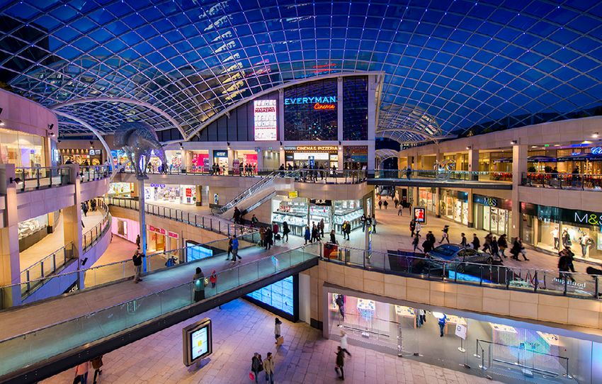
RETAIL
at the earliest stages of engaging
Trinity Leeds
Natural stone flooring, ceramic granite and GRC cladding,
Projects – during construction
landscaping (paving and cladding) and restoration works
with a client.
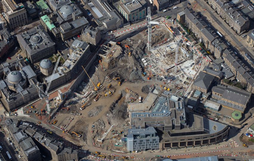
To help us highlight our DfMA 70:60:30 offsite
techniques during the construction phase, we MATERIAL SELECTION AND
SOURCING
Colour or black and white? The characteristics of any two pieces
of stone can vary greatly, even for the
showcase the management and installation of
same type of stone, dependent on
the location within the quarry and the
direction in which they are cut.
Images can be either colour or black
Our experts know and understand the
precast and preassembled components to help the
performance parameters for each
stone and, knowing a stone’s final
location and purpose, can recommend
the optimum stone for specific projects.
and white, but not mixed within the
Our extensive experience of
reader understand how they come together to form a
Terminal 2A | Heathrow Airport, HETCo
Tiling and floor screed for all front-of-house passenger routes - procurement in the global natural
check-in, security, retail, gates and baggage halls stone market, in addition to the strong
commercial relationships we have
built with quarry owners and suppliers
same document.
Vetter UK is one of the best known and highly-regarded around the world, means that we are
complete structure and how they are advancing and
companies in the UK stone industry with a reputation for able to select, source and procure
any type of stone, terracotta, granite,
delivering a first-class service for the design, manufacture, ceramic and terrazzo, in a range of
supply and installation of natural stone and other finishes.
hard-surface materials. MANUFACTURE
positively changing construction. As one of the largest specialist contractors servicing the
The production of our project materials
is undertaken by well-established
Corporate or board level documents
UK construction industry, with more than 150 years of and trusted stone/tile suppliers
experience, we can provide a complete package from and manufacturers with whom we
have long-standing relationships. All
concept to completion. We have forged strong relationships production is fully monitored by Vetter
with quarry owners and stone suppliers around the globe, UK to ensure the quality meets our
that primarily deliver statistical
exacting high standards.
allowing us to procure the very best materials for high-
quality facades, floors, internal fit out, urban landscaping DELIVERY AND INSTALLATION
People
and restoration/conservation. We have considerable experience in
the delivery and installation of projects
information are produced using greys from the colour
Vetter UK directly employs a team of more than 100 across the UK, from large new airport
highly-skilled operatives, including stonemasons, labourers concourses and shopping centres to
historic buildings and monuments.
and screeders, all of whom are available to work on
Our staff and workforce are highly skilled.
projects throughout the UK. We train our operatives Our reputation has been built over
many years by providing only the
palette with black and white imagery and some use
comprehensively, with strong health, safety and highest quality finished product. This is
environmental knowledge and awareness. something we take great pride in.
Our Apprentices and Graduates are learning and of additional highlight colours.
applying the new skills that are advancing and Manchester Town Hall Complex Transformation,
Restoration works to external and internal facades,
external paving and internal flooring
modernising construction. Our managers help However, collateral with a marketing focus designed
shape and nurture their teams based on years of to engage external audiences use more colours, more
experience. Collectively we are all contributing to frequently and make use of full colour images. Indicative example with a wider use of colour and
Laing O’Rourke being the recognised leader for colour imagery
26 Visual identity guidelines. 2021 – version fourPhotography and video
Completed projects
Our projects are the embodiment of everything we Want a good image?
stand for and there is no better way to illustrate the
Visit our online stills image library and register
skills of our people, our innovative techniques and our
engineering solutions. at www.lorimedia.co.uk
The structure is the subject matter at the heart of the
image; striking, carefully composed and presenting
the image as you would a portrait.
Visual identity guidelines. 2021 – version four 27Photography and video
Projects during construction What to avoid • S taff and operatives in shot are required to wear
• Avoid or crop out messy areas of sites at least the minimum level of Personal Protective
Construction images showcase our innovation and Equipment (PPE):
engineering expertise and provide the opportunity to • Plant on site should be branded with: – Gloves
illustrate our DfMA 70:60:30 agenda. – ‘Select’, ‘Explore’ – Protective eyeware
– ‘Explore Plant’ or – Appropriate footwear
Our sites are busy, active places and not all the – Hi-visibility clothing
– ‘Explore Transport’.
activity on site is ideal for photography, but inevitably
cameras can capture it. Please note the content of Where an image prominently features other branding,
the checklist to the right. find an alternative image.
28 Visual identity guidelines. 2021 – version fourPhotography and video
Our people
We celebrate the diversity of our people, who
contribute a broad range of skills and expertise
enabling our innovative approach to engineering.
Our imagery captures the movement, dynamism and
commitment of our people, helping us become the
recognised leader for innovation and excellence in
the construction industry.
Where people can be identified in an image or film please ensure you are GDPR-compliant with the correct permissions in place.
Visual identity guidelines. 2021 – version four 29Photography and video
Essential – please note
Correctly branded video
We have developed a kit in After Effects and Motion
Graphic Template (MOGRT) files for use in Adobe
Premiere Pro that video production companies can
download and incorporate into their films. The files
can be overwritten allowing you to apply the correct
graphics, while adding your own written content.
Adjustable parameters have been set up within
the MOGRT files, eg. opacity of lower thirds panels,
positioning of text in callouts, and scaling of boxes.
The download includes:
Title Card – 1 line Title Card – 2 lines
• AE master file used to create the MOGRT files to
enable additional fine-tuning not achievable using
the MOGRT files alone.
• PREMIERE master file with MOGRT file examples
• MOGRT files:
Callout – parameters allow for text positioning and box scale and opacity Caption – parameters allow for box size, opacity and positioning
Optional zoom/static intros are supplied according
to preference. The ‘VP21 Intro Logo’ can be also be
used for outros if desired.
Due to the large size of the Video template zip please
contact comms@laingorourke.com and request
access to download, or if you need to add further
graphics to your video project and would like
more advice.
Divider – Light Grey Divider – Black and Greys – parameters allow for grey background selection
30 Visual identity guidelines. 2021 – version fourPhotography and video Play MOGRT motion
graphic examples
Intro logo – static / zoom (static version shown) Outro logo – static / zoom (static version shown) Motif solo – outro
Lower third left Lower third right – parameters allow for repositioning Outro Motif – static
Quote – parameters allow for text positioning and box scale and opacity Basic transition – optional – editors can use other transitions according to film style Outro Motif – zoom
Visual identity guidelines. 2021 – version four 31CAROUSEL IMAGE
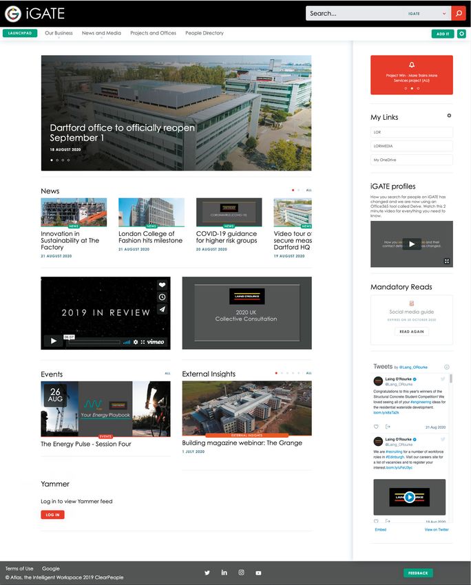
= 918 x 393 pixels NEWS IMAGE
= 962 x 412 pixels
Graphics for online channels CAROUSEL IMAGE
= 918 x 393 pixels
iGATE, our intranet 1 3
CAROUSEL IMAGE
= 918 x 393 pixels
CAROUSEL IMAGE
= 918 x 393 pixels
VIDEO IMAGE = 16:9 RATIO BANNER SPACE
iGATE, our intranet, offers several feature Please upload your video = 16:9 RATIO
opportunities to apply graphics or messages as to Vimeo at it’s original 960 x 540 pixels
standalone items or in support of news stories.
size and set the embed
NEWS IMAGE
The most regularly used locations are detailed on
NEWS IMAGE =code to
962 x 412 pixels
CAROUSEL ‘responsive’.
IMAGE
this page. All images should be exported at 72 dpi
= 962 x 412 pixels = 918 x 393 pixels
(screen resolution).
Carousel Video
NEWS IMAGE
• Dimensions:
NEWS IMAGE 918 pixels wide by 393 pixels high
= 962 x 412 pixels • Video must be 16:9 Ratio, eg. 1280 x 720 pixels
= 962 x 412 pixels VIDEO IMAGE = 16:9 RATIO BANNER SPACE
(720p)
Please or 1920
upload your xvideo
1080 pixels=(1080p)
16:9 RATIO
CAROUSEL IMAGE
1 • Formats: JPEG or PNG to Vimeo at it’s original 960 x 540 pixels
= 918 x 393 pixels
EVENTS
• Links
size andfrom IMAGE
Vimeo
set the
EXTERNAL INSIG
embedare ideal as embed codes can be
2 = 962 x 412 pixels
used
code to to implement
‘responsive’. directly to the intranet = 962 x 412 pixe
page
VIDEO IMAGE = 16:9 RATIO BANNER SPACE VIDEO IMAGE = 16:9 RATIO BANNER SPACE
Please upload your video = 16:9
VIDEO RATIO
IMAGE = 16:9 RATIO BANNER Please upload your video
SPACE
NEWS IMAGE
= 16:9 RATIO
= 962 x 412 pixels
4
to Vimeo at it’s original 960 x 540 pixels
Please upload your video = 16:9 to Vimeo at it’s original
RATIO 960 x 540 pixels
size and set the embed
to Vimeo at it’s original 960 x 540 pixels 4 4
size and set the embed code to ‘responsive’.
NEWS IMAGE
= 962 x 412 pixels
4 size and set the embed EVENTS IMAGE EXTERNAL INSIGHTS IMAGE
code to ‘responsive’.
code to ‘responsive’. = 962 x 412 pixels = 962 x 412 pixels
VIDEO IMAGE = 16:9 RATIO BANNER SPACE
Please upload your video = 16:9 RATIO 2 VIDEO IMAGE = 16:9 RATIO BANNER SPACE
to Vimeo at it’s original
size and set the embed
960 x 540 pixels
EVENTS IMAGE Please
EXTERNAL upload yourIMAGE
INSIGHTS video = 16:9 RATIO
code to ‘responsive’.
= 962 x 412 pixels to Vimeo
= 962
News x/412atpixels
it’s original
Events 960 x 540 pixels
/ External Insights
3 Banner space
EVENTS IMAGE EXTERNAL INSIGHTS IMAGE size and set the embed SPOTLIGHT
SQU
• All three of these asset types use the same
•= 962
Dimensions:
x 412 pixels960 pixels wide
=x 540
962 pixels
x 412 high
pixels code to ‘responsive’.
= 730 x 730 pixe
dimensions: 962 pixels wide x 412 pixels high
EVENTS IMAGE EXTERNAL INSIGHTS IMAGE SPOTLIGHT SQUARE IMAGE
= 962 x 412 pixels 4 = 962 x 412 pixels 4 • Ratio: 16:9 = 730 x 730 pixels
EVENTS IMAGE EXTERNAL INSIGHTS IMAGE • Formats: JPEG or PNG
= 962 x 412 pixels = Can
• 962bex 412 pixels
scaled from full HD 1920 x 1080 pixel
video (1080p) SPOTLIGHT SQUARE IMAGE Spotlight
EXTERNAL Square
INSIGHTS IMAGE
EVENTS IMAGE
SPOTLIGHT SQUARE IMAGE = 730
= 962 xx 730
412pixels
pixels = 962 x 412 pixels
• Dimensions:
= 730 x 730 pixels
• Formats: MP4 video, animated GIF (be mindful of
SPOTLIGHT SQUARE IMAGE 730 x 730 pixels.
file size not to be too large), JPEG, PNG
= 730 x 730 pixels
5
5 • Formats: JPEG or PNG
SPOTLIGHT SQUARE IMAGE
= 730 x 730 pixels
32 Visual identity guidelines. 2021 – version four SPOTLIGHT SQUARE IMAGE
= 730 x 730 pixelsYou can also read