Making A Great PowerPoint Presentation - Adapted from slides by: Jonathan M Flacker, MD Kimberly D Manning, MD
←
→
Page content transcription
If your browser does not render page correctly, please read the page content below
Making A Great
PowerPoint Presentation

   Adapted from slides by:

     Jonathan M Flacker, MD
     Kimberly D Manning, MD
  Deborah Baumgarten, MD, MPH
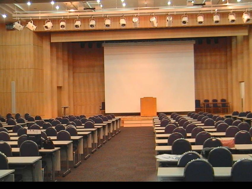
Consider Logistics:
How big is the room? How many people?

Small Group Setting?   Auditorium? Formal?
Key Slide Design Concepts
Large
Simple
Concise
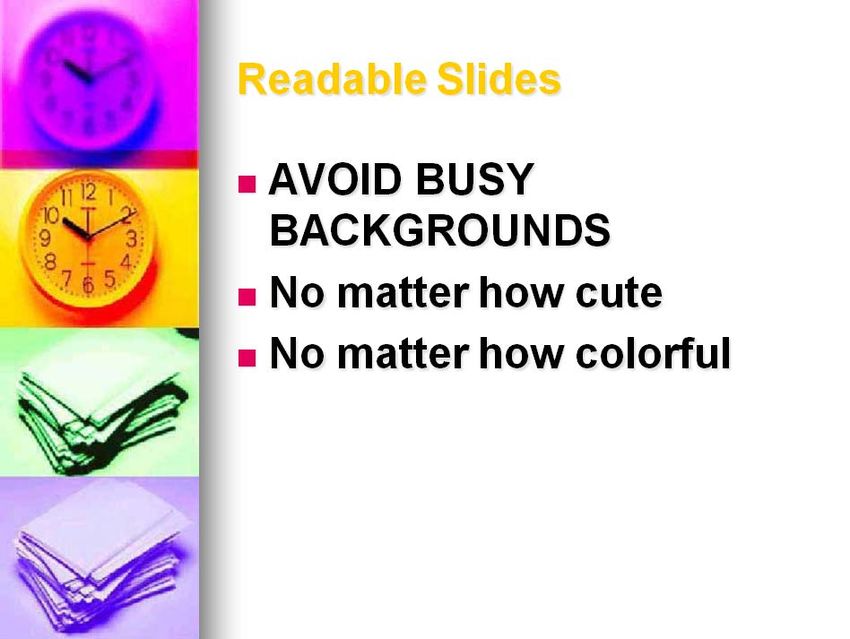
Common Slide Problems Too many colors Too crowded Too many symbols on graphs Too much animation Too many words
Font Style
Sans-serif (uniform width) fonts are easier
to read
Tahoma is a sans-serif font
So is Arial
Times New Roman is a serif font
So is Courier
Font Style Italics are hard to read on screen Normal or bold fonts read easier Underlines may signify hyperlinks Better to emphasize with colors

Font Style Rules Don’t change font styles mid talk ALL CAPITALS ARE HARD TO READ
Font Size Be sure it is big enough 48 pt. Be sure it is big enough 44 pt. Be sure it is big enough 36 pt. Stay Above Be sure it is big enough 32 pt. 32 pt.! Be sure it is big enough 28 pt. Be sure it is big enough 24 pt. Be sure it is big enough 16 pt. Be sure it is big enough 12 pt.
Lines on slides Limit bullets per slide Omit unnecessary words No full sentences Bullet points to prompt discussion Pay attention to you not slides
Bullet List For lists without Priority Sequence Hierarchy, …..
Number List
For lists with sequence or hierarchy

For example:

Things I’d like to do on a sunny day in August:

1. Go fishing
2. Nap outside in hammock
3. Give board review talk
Color Use
Use contrasting colours
Light on dark better than dark on light
Use complementary colours
Good!Color Use
Use contrasting colours
Light on dark better than dark on light
Use complementary colours
Not as GoodColor Use
Use contrasting colours
Light on dark better than dark on light
Use complementary colours
Not Good!Color Problems Be nice to colorblind people –No red-green combinations Be nice to everyone else –No red letters on a blue background –Leads to stereopsis You forget colors fade on big screen
Picture Limits Art/pictures may distract your audience 2 at most per slide Appearance should not supercede content
Focal Points Graphics direct attention
Layout
Be consistent with:
Alignment
Indenting
Line spacing
Bullets
Line transitionsConsistent Is Important
Differences draw attention
Use only to imply importance
Surprises to engage not distract
Do or don’t, but use consistent periods.
Good !Be Consistent
Differences draw attention
Differences may imply importance
Use surprises to attract not distract
Do or don’t, but use consistent periods.
Not Good !Be Consistent
Differences draw attention
Differences may imply importance
Use surprises to attract not distract
Do or don’t, but use consistent periods.
Helpful DifferenceIs It Legible? Rough Rule: – You Should Be Able To Read Computer Screen From a Distance of 8 x Width Of Slide – Usually this is about 2 meters
Line Transitions
Lines
– Use same style throughout
– “wipe” left to right
– Subdue previous bullet to emphasize next
oneSimple Slide Transition Fancy transition is annoying, not enhancing Again, be consistent I prefer none or "Appear" and "Disappear"
Slide Design Self Evident Rule – Slide should not need explanation Include only necessary information – Is your research a key teaching point? Avoid data-you-to-death (or sleep) slides No more than 2 graphics / slide – graphs should not show too much detail
Keep Text Content Simple
Recognizing that discovery and innovation in
basic, translational and clinical biomedical
Research form the foundation of excellence
and pre-eminence
              TooinMuch!
                       medical education and
health care, the faculty and leadership of
the School of Medicine (SOM) have
embraced the goal of achieving national and
international status as a leading biomedical
research institution over the next decade.
                From http://www.med.emory.edu/research/index.cfm
Keep Text Content Simple
Our goal:
– National/international status as leading
biomedical research institution
Our Foundation:
Much Simpler
– Basic, translational and clinical research
Our Result:
– Excellence in Medical Education
Adapted from http://www.med.emory.edu/research/index.cfmTables and Graphs
Too detailed
Mitchell et al. JAMA 291;22:2743-2740Tables and Graphs
Highlight to
draw attention
Mitchell et al. JAMA 291;22:2743-2740Tables and Graphs
or crop what you
don’t need
Adapted from Mitchell et al. JAMA 291;22:2743-2740How Much on One Slide?
One Major Point Per Slide
One Basic Thought Per Line
7x7 Rule: No more than 7 lines of 7 words
each
Not Every Word Need Be On Slide
– “The” can usually be deleted
– Expand orally on basic written conceptHow Many Slides? Rough Rule: No More Than 1 Slide Per Minute Of Talk
Laser basics
Use sparingly – Not a light show!
Guide audience
Move pointer to item of interest
– Keep it there or move completely off screen
– No circlingStyle
Find your style own but:
A really good talk is performance art
Be Enthusiastic
– If you don’t care why should they?
Be Case-BasedAnimation? SOME LIKE IT MOST DO NOT
Content Teach to the ABIM test – Your research is cool – That new paper is cool – But will it be on board exam? Review talk with someone who took test recently – Fellows are great for this! Humor helps only if it reinforces teaching
Content Consider making a second version for book Put detail you don’t have time for there Put figures that need some pondering there
Spell Check Spell check is your FREIND!
Ways to lose interest Reading slides Monotony Wordy slides Speaker is bored Poor timing
Ways to lose interest
Instead of: “ I know you can’t
read this but. . . .”
Try this: “Let me direct your
attention to this. . .”Know Your Talk PRACTICE!
Summary Keys to success Big Simple Clear Relevant Fun
You can also read