MODULE 1 COLOUR THEORY AND KITCHEN COLOUR SCHEMES - By Lucy Goffin

Page created by Lisa Schroeder
 
CONTINUE READING
MODULE 1 COLOUR THEORY AND KITCHEN COLOUR SCHEMES - By Lucy Goffin
MODULE 1
COLOUR THEORY AND KITCHEN COLOUR SCHEMES
              By Lucy Goffin
MODULE 1 COLOUR THEORY AND KITCHEN COLOUR SCHEMES - By Lucy Goffin
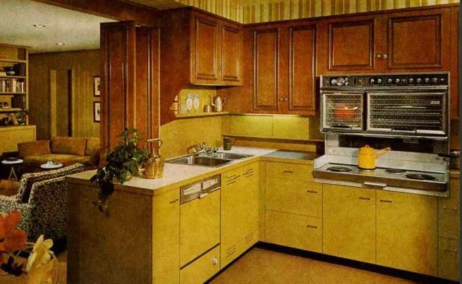
Resene Astronaut       Resene Brown         Resene Sputnik
       Blue               Bramble              10% LRV
     10% LRV              10% LRV            M37-031-265
   B38-052-231          B38-052-231       From the Metallics
From the Hamner      From the Hamner       & Special Effects
  Springs Palette      Springs Palette         Palette

   Resene Colins
                         Resene Turkish           Resene
       Wicket
                               Rose              Valencia
      31% LRV
                             31% LRV              31% LRV
    BR63-043-079
                          R62-042-014           R62-121-033
  From the Range
                         From the Multi          From the
  Whites & Neutral
                          Finish Range         BS5252 range
      Palette
MODULE 1 COLOUR THEORY AND KITCHEN COLOUR SCHEMES - By Lucy Goffin
Resene Rainee          Resene Wafer        Resene Paper
     58% LRV                58% LRV               Doll
   G81-014-144            O81-020-048           58% LRV
From the Multi-finish   From the BS5252       R81-030-026
      range                  range             From the
                                               Multi-finish
                                             range (2016)

 Resene Cut Glass          Resene Oscar          Resene
     72% LRV                  72% LRV           Sublime
   B85-012-208              Y88-042-074         72% LRV
     From the            From the Range       G88-121-108
 Multi-finish range     fashion colours 16      From the
       (2016)                                  Multi-finish
                                              range (2016)
MODULE 1 COLOUR THEORY AND KITCHEN COLOUR SCHEMES - By Lucy Goffin
Resene Gin Fizz         Resene Half     Resene Fair Pink
      85% LRV               Sea Fog           85% LRV
    Y94-028-083             85% LRV         O94-011-043
From the Multi-finish     N94-005-102         From the
   range (2008)         From the Whites   Multi-finish range
                           & Neutrals        (pre 2006)
                         (2015) Range
MODULE 1 COLOUR THEORY AND KITCHEN COLOUR SCHEMES - By Lucy Goffin
I feel this design demonstrates
                                                                                                                   the ‘wow factor’ really well.
                                                                       The ‘wow factor’… now this is
                                                                                                                   Although the copper splash
                                                     Splashback   complicated when it comes to design as
                                                      ‘Ragged
                                                                                                                 back may not be to everyone's
                                                                  everyone has there own version of what is
                                                      Copper’                                                       personal taste it is definitely
                                                                     ‘wow’ … especially in a good way.
                                                      by Prima                                                       something bold and eye
                                                                                                                              catching.
                                                                  “The wow factor has had designers going
                                                                  cross eyed for decades as it can either be
                                                                                                                 The Luna touch white worktop
                                                                   ‘wow’ in a good way or ‘wow’ in a bad
                                                                                                                 is extremely bright and bold so
                                                                           way”. (Steve Harrison, 2017)
                                                                                                                 when you walk into this kitchen
                                                                                                                 you are definelty going to feel
                                                                   Now, unless you have a detailed brief, a
                                                                                                                         the ‘wow factor’.
                                                                  good ‘wow’ factor is going to be different
                                                                                to everyone.
                                                                                                                   The Dark Walnut units have
                                                                  Therefore, what I think is ‘wow’ in a good
                                                                                                                 great detail in them, especially
                                                                  way, the person reading this may not. It’s
                                                                                                                 close up – therefore when you
                                                                            a complicated issue.
                                                                                                                 look at them you will definelty
                                                                                                                     get the ‘wow’ feeling.
                                                                   I personally think if something is ‘wow’ it
                     Photo by Lucy Goffin (Myself)                            grabs your attention.
                                                                                                                   I have used a simple white
Wall Paint Colour                                                     Weather it is a negative ‘wow’ or a
                                                                                                                 paint for this kitchen so that the
  ‘Alabaster’                                                         positive ‘wow’, either way it will be
                                     Wall & Base Units                                                            splash back, bench top and
   By Resene                                                          something that catches your eye.
                                      ‘Dark Walnut’                                                                units stand out even more.
                                      by Symphony                                                                Helping to achieve the ultimate
                 Bench Top                                        Hence this kitchen colour scheme I have
                                                                                                                           ‘wow factor’.
               ‘Luna Touch’                                                     come up with.
                 By Evolve
MODULE 1 COLOUR THEORY AND KITCHEN COLOUR SCHEMES - By Lucy Goffin
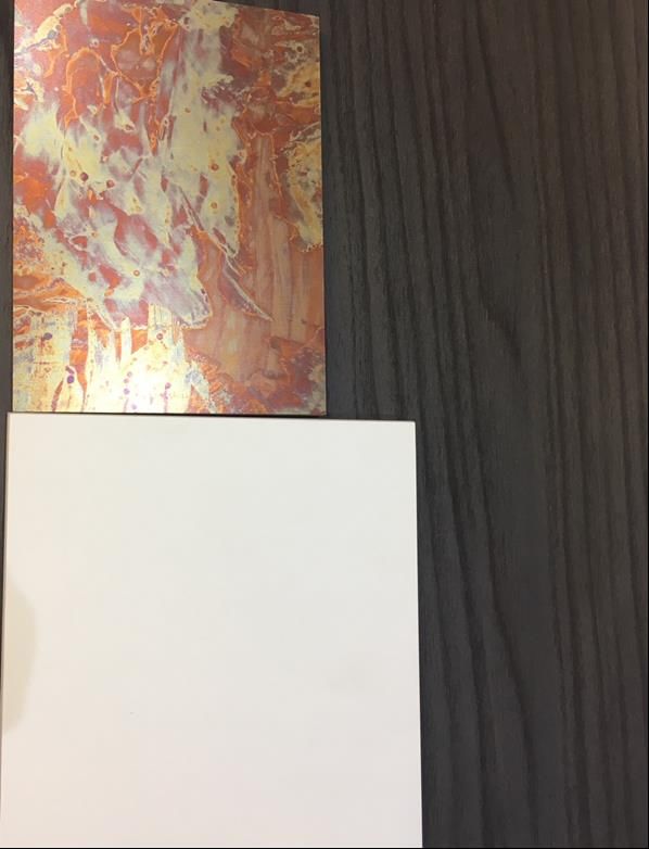
I have chosen this colour scheme as it contains the quality of ‘expression’.

                                                     Wall & Base units     The ‘Heather’ splash back and light ‘Ashen lavender’ wall were my main
                                                    ‘Gloss Cashmere’                                           focus.
                                                      by Symphony        I wanted this kitchen to feel like a high end but creative space, so I did some
                                                                         research and discovered that using shades & tones of the secondary colour
                                                                                                ‘purple’ would help express this.

                                                                           “Using a purple is a quick way to create a sense of elegance or high-end
                                                     Splashback           appeal, even if your product is budget-minded (an 'expensive' effect that's
                                                       ‘Heather’            quite the opposite of orange)”. (Orange is deemed a ‘cheap’ colour).
                                                    By Deco Glaze          “Lighter shades of purple – especially lavender – bring to mind spring and
                                                                             romance. Darker shades add more mystery, and can even symbolise
                                                                                                    creativity”. (Jerry Cao, n.d).

                                                                          Having a Darker shade of purple on the light tinted purple back ground will
                                                                          make the purple feel like a more dominant colour in this kitchen, which will
                                                                           give the kitchen a strong expression and a sense of creativity and good
                                                                                                           quality.

                                                                          The Gloss Cashmere gives off a grey-purple tone and the ‘sparkles’ in the
        Photo by Lucy Goffin (Myself)                                    white nova are quite reflective so the purple expression in this kitchen should
                                                                                                      definitely stand out!
    Wall Paint
‘Ashen Lavender’                                                         I was going to use a blue in this kitchen to give the kitchen a calm expression,
                                    Bench Top
    By Resene                                                              however, I discovered that blue foods are quite uncommon therefore the
                                   ‘White Nova’
                                 By Midland Stone
                                                                         colour blue can be quite an ‘appetite suppression’ which we don’t want in a
                                                                                                               kitchen!!
MODULE 1 COLOUR THEORY AND KITCHEN COLOUR SCHEMES - By Lucy Goffin
Bench Top
        ‘Walnut Butcher Block’ by
                 Omega
                                                                                                            I have used a wood worktop as it has
                                                                                                                very strong character by itself.
                                                                                                              Wood is a product with very strong
                                                                                                          characteristics, its texture, colour, density
                                                             I have chosen this colour scheme to          and weight make it a product of interest
                                                                   demonstrate character.                      and the perfect product to bring
                                                                                                           character into the kitchen, weather it is
                                                            For this scheme I have decided to use            real wood or a laminate ‘wood-look
                                                                       colours of the earth.                                  alike’.
                                         Wall Colour        The colours of the earth are part of our
                                        ‘Almond Frost’    natural environment therefore they make         Earthy colours can easily be quite muted
                                          By Resene      the perfect colour scheme/ background for          if there is no patterns in the room. So
                                                                       our every day living.               having a wooden or wood – look work
                                                                                                                   bench (or something with
                                                             Earth colours are derived from naturally      texture/pattern) adds character to the
                                                         occurring pigments in the ground - i.e. soils,                      room.
                                         Splashback                      leaves, rocks etc.
                                            ‘Zeus’       Brown & green are both great as there pure       “In character, rooms that are decorated
                                        By Deco Glaze       colours but also are the creators of many          with earth tones have a gentle,
                                                                            subtle hues.                       welcoming feel and a sense of
                                                         “These hues have formed a basic palette of            timelessness”. (Earth Tones, 2018).
Photo by Lucy Goffin (Myself)                             life for every culture of the world and were
                           Base Units                      even used for tempera murals, aboriginal        Earth tones are as far from the primary
                            ‘Pumice’                           war paint and Celtic pottery”. (Earth      colours as you can get and there origins
                                                                          Tones,2018).
                          by Symphony                                                                     root back to way before synthetic dyes
                                                                                                           and all the bright dazzling colours that
  Wall Units
    ‘Clay’                                                                                                        are available now a days.
By Symphony                                                                                                Hence, why I feel this particular colour
                                                                                                                 scheme is full of character.
MODULE 1 COLOUR THEORY AND KITCHEN COLOUR SCHEMES - By Lucy Goffin
The free dictionary describes the world subtle as
                                 Wall paint colour
                                                            “delicate or faint”, “a subtle shade” and “not
                                  ‘Barely There’              immediately obvious or comprehensible”.
                                    by Resene
                                                       I believe these colours achieve a ‘subtle’ effect because
                                 Base & Wall Units         they are all light colours and are not too invasive.
                                   ‘Dove Grey’                       They are quite delicate looking.
                                  by Symphony
                                                        There is a subtle contrast between the light greys and
                                                       whites but it is not too bold or dramatic. This contrast isn’t
                                                         something that you look at and feel is immediately
                                                                                  obvious.
                                       Bench Top
                                   ‘Bianco Assoluto’     The ‘Linen’ glass splash back is a good subdominant
                                   by Midland Stone    colour to help achieve this subtle look as it contrasts well
                                                       with the White worktops and grey toned white wall paint.
                                                       Even though it contrasts with the white it only offers a hint
                                Glass Splashback                   of colour, but nothing to vibrant.
                                      ‘Linen’
                                                          Also, if something is subtle, it will most likely be quite
                                 by Deco Glaze           calming to be around, lighter colours tend to have a
                                                                          more calming effect.
Photo by Lucy Goffin (Myself)
                                                        Therefore, I feel like these light, delicate colours are the
                                                                  perfect choice for a subtle kitchen.
MODULE 1 COLOUR THEORY AND KITCHEN COLOUR SCHEMES - By Lucy Goffin
Wall Colour          Base Units
‘Concrete’          ‘Anthracite’
 By Resene         By Symphony
                                                                            Sophistication isn’t about having golden stools at your bench top or
                                                                          really expensive art work hanging on the walls, it is about having a well
                                                                                           balanced room with balanced colours.

                                                         Wall Units        I have chosen to use a monochromatic colour scheme to display the
                                                        ‘Dusk Grey’                       quality of sophistication for this kitchen.
                                                       By Symphony        I have restrained myself from using any colours other than tints/shades
                                                                                                           of Grey.

                                                                          “Monochromatic colors are all the colors (tones, tints and shades) of a
                                                                                       single hue”. (Monochromatic Colour, 2018).

                                                                          I have chosen to do a monochromatic colour scheme for this kitchen
                                                                             as monochromatic colour schemes tend to feel clean, simple &
                                                                                                   sophisticated.

                                                                               This photo I have taken does not do these colours I have found
                                                                          justice… The dark anthracite is an extremely dark shade of grey on the
                                                                              verge of being black and the Dusk Grey is quite a dark grey. In a
                                                                           bigger slab the ‘Statuario’ bench top will have a lot more tinted grey
                                                         Splashback                            veins running through it as well.
                                                    ‘Brushed Aluminium’
                                                         By Formica        I feel that these colours contain the quality of sophistication as they
                    Photo by Lucy Goffin (Myself)                         all balance out really well as they are shades/tints that derive from the
         Bench Top                                                                                same Hue colour (Grey).
         ‘Statuario’
                                                                            I feel that balance in colour is the key to a sophisticated kitchen.
      By Midland Stone
MODULE 1 COLOUR THEORY AND KITCHEN COLOUR SCHEMES - By Lucy Goffin
Choosing my favourite colour scheme was not easy as I liked them all so much
                            for different reasons.

However, after staring at them for what felt like ages, I decided that my favourite
 colour scheme would have to be the colour scheme which contains the most
                   character (My Earth-toned colour scheme).

   I personally love being outdoors and surrounded by nature, so to bring this
       ‘earthy’ colour scheme inside my own kitchen would feel amazing.

   I personally love wood and wood-look work tops, I find wood patterns and
               textures interesting and pleasing to look at & touch.

I enjoy having visitors over and cooking for them and this colour scheme would
make the kitchen extremely welcoming as it contains colours that are common
                      and gentle to the eye for most people.

 I imagine standing in this kitchen, I would definitely feel a sense of timelessness
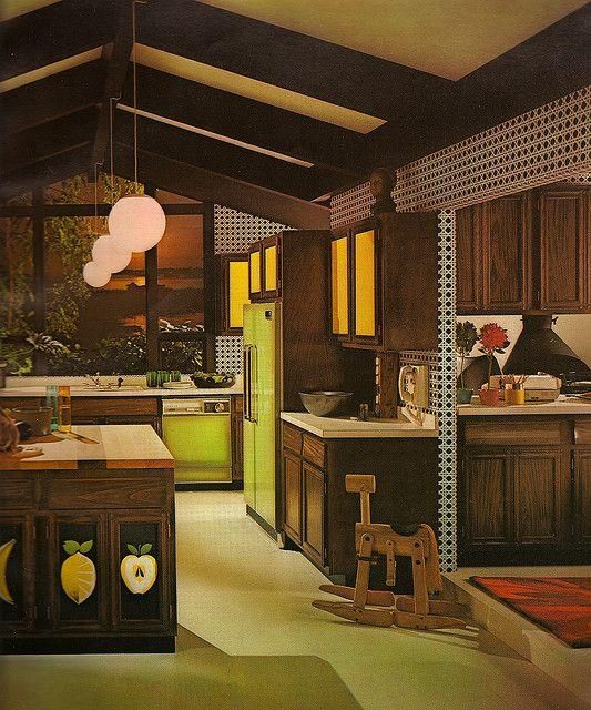
                    and peace, just like when I'm outdoors!
The 1960’s … a decade of radical change, rebellion, vibrancy and a
                                    desire for freedom – of any sort…. Including the colours in a kitchen.

                                      The feeling of freedom and spiritual liberation of the '60s most
                                     certainly made its way into kitchen colors, which were all about
                                                showing personality & breaking the ‘rules’.

                                           Home décor definelty became brighter in the 60’s!
                                     “Psychedelic hues like neon green, punchy turquoise and acid
                                   orange are now synonymous with this decade”. (Nancy Mitchell, 2017)
Image by Miss Vintage Love, 2011          Bright colours were used extensively (especially red).

                                   The real statement in the 60’s was the wallpaper, wall papers were
                                   bold with multi-coloured patterns which were sometimes metallic in
                                   design and usually included bright orange, yellow, green, and other
                                                        highly contrasting colours.

                                     Florals were very popular and this colourful wallpaper was often
                                                     made of vinyl for easy cleaning.

                                            Vivid accent colours were used amongst all the colour.
                                   It really is a decade known for ‘breaking the rules’ especially when it
                                                          came to colour schemes.

 Image by Regina Yunghans, 2009
The 1970’s came after the bold colour story called the 60s.

                                  “Wood replaced steel as the material of choice for cabinets in the 1960s,
                                     and in the '70s wood cabinets (often with laminate countertops)
                                                      dominated”. (Nancy Mitchell, 2017)

                                  70s kitchens were full of shades of orange and the Kitchen cabinets were
                                                                usually maple.

Image by Alexis Velez, 2016       The 70’s was plain compared to the 60’s - rather than using lots of bright
                                          contrasting colours the 70s used lots more ‘earthy’ tones

                                             Kitchen appliances were rarely white or off-white.
                                                  Instead, they were bright and colourful.
                                   Most 70s kitchens included refrigerators, ranges, and dishwashers that
                                   were featured in popular shades known as Harvest Gold, Avocado,
                                                            Bronze, or Pumpkin.

                                  Avocado green was at the forefront of colours used in the kitchens in the
                                                                  70’s.

                                       Today, it’s easy to spot a 70s kitchen – just look for the colourful
                                                                  appliances!
Image by Laura Williams, n.d  .
Kitchen designs in the early 80s responded to the floral designs of the 70s.
                              Out went floral prints and bright colours. Instead, homes were decorated in more
                                              neutral tones. Beiges, browns and natural greens.
                                                   Kitchens were being more ‘toned down’.

                              Kitchens from the 1980s ditched the harvest gold and avocado appliances that
                                             were popular in '70s, but kept the wood cabinets.
                                                    There was A LOT of wood in the 80s.
Image by Jim Edwards, 2015
                              Riddled with wood trims and laminate bench tops the 80’s kitchens were cream,
                                                    beige, brown and peach in colour.
                                            Floral patterns came back, but were used sparingly.

                             Pastels colours were also ‘in’ in the 1980s. Bold colours were used as accent colours
                                in 1980’s kitchens; hunter greens and bold reds were used to bring life to the
                                                      kitchen through bright accessories.

                              With more women setting out to make their millions in the corporate world in the
                             1980’s, kitchen spaces to entertain and socialise were becoming more important.

Image by Happily Décor
The 90’s, brought us the rise of the internet! We gained better
                                                        communication opportunities and the mobile phone was growing more
                                                                                       popular.

                                                              During the 90’s house sizes grew and so to did their kitchens.
                                                        The 90’s kitchen was seen as an entertaining space, often with an ‘open
                                                                 plan’ feeling, overlooking the living and dining spaces.
                                                          People really started to see the importance of the kitchen and how it
                                                         wasn't just a place to eat but a social area, so kitchens got larger and
Image by Kitchen Designs Through the Decades (Online)
                                                                      more spacious to fit in all the friends and family

                                                        The 90’s kitchen was designed for decent sized gatherings rather than a
                                                        place just to cook. It was minimalistic and simple containing warm toned
                                                                         colour palettes of browns and emeralds

                                                        Not a huge jump from kitchen design in the 80s. Neutral colours were still
                                                                      the ‘in thing’ with pale wooden cabinets.

                                                         The double door fridge, with ice making abilities and the dishwasher
                                                         were both causing a scene in the 90’s (both in a stainless steel finish).
                                                           The 90’s kitchens started the trend of stainless steel appliances.

                                                        Granite bench-tops, laminate cabinetry or blonde timbers such as pine
Image by 1990s Kitchen Cabinets (online)                                         were also popular.
After the 1990’s, kitchen design shifted focus.
                        Society had better access to latest designs and colours - like never before.
                        Wireless internet allowed people to connect to the rest of the worlds designs
                                                     and trends in seconds.

                        Various materials and varieties of products were at every bodies fingertips,
                         you could access colours, trends and products easier than ever before.

                         The continued influence of ‘simplicity’ allowed consumers to enjoy neutral
                          colours without being ‘boring’. Greys, Creams and even white became
                                popular and could now have hundreds of subtle variations.
Image by Domino, 2016
                           Granite bench tops, glass splash backs, feature walls and stainless steel
                                appliances completely took over the kitchen design scene.

                           "The biggest change from the 90s to the ‘noughties’ was the move from
                            minimalism to the use of much richer, deeper and interesting colours,"
                        explains Jan Janacek, a designer at interior design company Bentheim. "The
                        trend for this decade has been for comfort - people want to come home to
                          good, comfortable design which is still cutting edge.“ (Huma Qureshi, 2010).

Image by Lisa M, 2017
Alexis Velez, 2016. Groovy Kitchens from the 1970’s (online).
                                                      Available at:
                          https://doyouremember.com/5119/groovy-kitchens-from-the-1970s
                                               (accessed 2 October 2018)

                                          n.d. Colours of the 1960’s. (Online)
                                                    Available at:
                         http://www.resene.co.nz/homeown/use_colr/Colours-of-the-1960s.htm
                                             (accessed 5 October 2018)

                Colour Scheme photos by Lucy Goffin (Using the Buildbase Showroom in Norwich, England

                             Domino, 2016. How to update your early 2000s Kitchen. (Online)
                                                    Available at:
                      https://www.homepolish.com/mag/how-to-update-your-early-2000s-kitchen
                                             (Accessed 2 October 2018)

                                               2018, Earth Tones. (Online)
                                                      Available at:
                                       https://en.wikipedia.org/wiki/Earth_tone
                                              (Accessed 4 October 2018

                                            n.d. Happily Décor. (Online)
                                                   Available at:
http://www.crowellphoto.com/edit.php#SGFwcGlseSBEZWNvciBbfHxdaHR0cDovL2ltZy5oZ3R2LmNvbS9IR1RWLzIwMDgvMDEvMDk
      vaGR0czE2MDJfS2l0Y2hlbi1CZWZvcmVfdzYwOS5qcGdbfHxdODBzIFN0eWxlIFdoaXRlIEtpdGNoZW4gUmVtb2RlbGluZw==
                                               (Accessed 2 October)

                                     Huma Qureshi, 2010. Review of the decade
                                                   Available at:
                 https://www.theguardian.com/lifeandstyle/2010/jan/04/review-decade-interior-design
                                           (Accessed 5 October 2018).
Jerry Cao, n.d. 12 Colours and the emotions they evoke. (Online)
                                             Available at:
      https://www.creativebloq.com/web-design/12-colours-and-emotions-they-evoke-61515112
                                     (Accessed 3 October 2018)

       Jim Edwards, 2015. I found my mother’s hideous beige 1980s kitchen in a museum. (Online)
                                             Available at:
               http://uk.businessinsider.com/york-museum-1980s-kitchen-exhibit-2015-3
                                      (Accessed 2 October 2018)

                       Kelly Weimert , 2017. 100 Years in the Kitchen. (Online)
                                            Available at:
https://www.apartmenttherapy.com/the-most-popular-colors-for-kitchens-from-the-1920s-to-today-248036
                                  (accessed on 5 October 2018)

                                n.d. 1990s Kitchen Cabinets (online).
                                            Available at:
                    http://www.horoscopedujour.info/rslt/1/1990s-kitchen-cabinets/
                                     (Accessed 2 October 2018

                    Contributor, 2015. Kitchen Designs through the decades (online).
                                              Available at:
                 https://www.houseofhome.com.au/blog/kitchen-decades-1990-now
                                        (accessed 2 October 2018

                        Laura Williams, n.d. Pinterest – 1970’s Kitchens (online).
                                              Available at:
                          https://www.pinterest.nz/pin/397935317059226352/
                                     (accessed 2 October 2018)

                          Lisa M, 2017. Design through the decades. (Online)
                                              Available at:
                                   http://rwsbuild.com/blog/4423832
                                      (Accessed 2 October 2018).
Miss Vintage Love, 2011. Vintage Kitchen Inspirations – 1960’s (Online)
       Available at: http://vintageclothinglove.blogspot.com/2011/11/vintage-kitchen-inspirations-1960s.html
                                             (accessed 2 October 2018).

                                      2018. Monochromatic Colour. (Online)
                                                   Available at:
                               https://en.wikipedia.org/wiki/Monochromatic_color
                                          (Accessed on 5 October 2018).

                            Nancy Mitchell, 2017. 100 Years in the Kitchen. (Online)
                                                Available at:
         https://www.apartmenttherapy.com/brief-history-of-kitchen-design-from-the-1970s-to-1980s-247464
                                        (accessed 5 October 2018)

                            Regina Yunghans, 2009. Pinterest – 1960’s Kitchens (online).
                                                 Available at:
                               https://www.pinterest.nz/pin/526850856395364370/
                                          (accessed 2 October 2018

                                          n.d. Resene Colour Swatches
https://www.resene.co.nz/swatches/search.php?name=Fair+Pink&submit=Colour+search&chart=*&type=name&page=
                                             (Accessed 1 October)

                                       n.d. Resene. Downloadable LRV Sheet
                               https://www.resene.co.nz/swatches/reflectance.htm
                                               (Accessed 1 October).

                       Rhonda Morin, 2009. Decorating your home with Earth Tones. (Online)
                                                 Available at:
                          http://myinteriordecorator.com/decorating-earth-tones.html
                                           (Accessed 4 October 2018)
Steve Harrison, 2017. What is the Wow factor in web design. (Online)
                            Available at:
    https://www.hallaminternet.com/wow-factor-web-design/
                    (Accessed 4 October 2018)

             n.d. The Free Dictionary, Subtle. (Online)
                           Available at:
            https://www.thefreedictionary.com/subtle
                    (Accessed 4 October 2018).

                         n.d. 70’s Colours
                         Available at:
            http://classic70s.com/70s-colors.html
                 (Accessed 5 October 2018)
You can also read