MONTAGU EVANS PRESENTS... OUR BRAND GUIDELINES - V2.0 MARCH 2021
←
→
Page content transcription
If your browser does not render page correctly, please read the page content below
MONTAGU EVANS
PRESENTS...
OUR BRAND
GUIDELINES
V2.0 MARCH 2021
MONTAGU EVANS
EXPLAINS...
WHO WE ARE
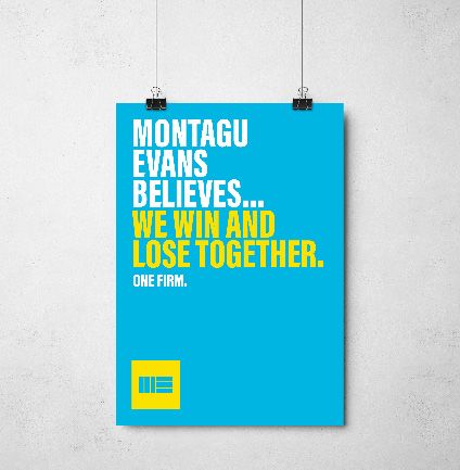
TOGETHER WE
ARE MONTAGU
EVANS
OUR BRAND, OUR STORY
“Montagu Evans is a property consultancy. A partnership, that means the
people that run the business do the work. That means we care. We’re a group
of people that are excellent individually and exceptional together. We’re people
that care about people, not just bricks and mortar. We care about our legacy.
About spaces that people use to live, work, communicate and connect.”

Together we are Montagu Evans.
MONTAGU EVANS
EXPLAINS...
HOW WE LOOK
THE
IDENT
This is our ident. It’s been at the heart of our
brand for decades and is something we now
use in isolation of the wordmark.
LOGO VS
IDENT
Our default is to always use the ident in any
                                                      Ident

communications unless there are specific guidelines
or formalities that requires our wordmark. We will
also use the combined ident and wordmark if
we’re concerned that the target market / recipient
doesn’t know us well enough so the wordmark is
necessary.

                                                              Logotype
IDENT FAMILY The Montagu Evans brand is unique because we’ve created an identity system that can be dialled up or down depending on the audience. This is a sophisticated way of approaching the market and offers a more tailored experience. The top two idents are the primary versions that we like to lead with. The other options are the secondary variations. The black and white idents are for times when you need a simple, yet high quality, mark.
LOGO
FAMILY
Like the ident, we have colour variations of the full
logo too.

The top two logos are the primary versions that we
like to lead with, while the black and white logos are
for times when you need a simple, yet high quality,
mark.
EXCLUSION
ZONE
We have restrictions around leaving plenty of space
around the idents to mantain quality and impact.
The exclusion zone is the equivalent height and
width of the 3 rectangles within the logo.

NB: We do not have set rules around the maximum
required amount of space around the idents.
MINIMUM
SIZE
We have restrictions around the minimum sizing
of our idents or logos to ensure quality across all
digital devices and print documents. We like to use
our idents at bigger sizes than the ones stated
below. These are for minimum size purposes only.
16px
12mm
16px
12mm
Digital useage
Print useage
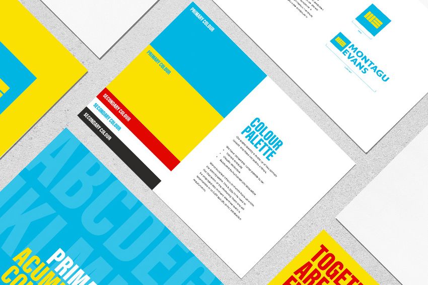
NB: We do not have set rules around the maximum size of the idents.MONTAGU EVANS EXPLAINS... OUR COLOUR PALETTE
PRIMARY COLOUR

                   COLOUR
                   PALETTE
                   Our brand identity is made up of two primary
PRIMARY COLOUR     colours and three secondary colours.

                   We have chosen this colour palette to be:
                   •   Vibrant and bold
                   •   Visually distinctive
                   •   Represent being human and accessible

                   We’ve included a black and white back-up within
                   our brand palette. This is only to be used at
                   the discretion of the Marketing Team and will
                   be employed into markets where we feel it is
                   appropriate or to fulfill specific print / production
                   requirements
SECONDARY COLOUR

SECONDARY COLOUR

SECONDARY COLOUR
R 0 G 181 B 226 HTML 00B5E2 C 75 M 0 Y 5 K 0 PANTONE 306 C R 250 G 225 B 0 HTML FAE100 C 0 M 0 Y 100 K 0 PANTONE PROCESS YELLOW C R 225 G 6 B 0 HTML E10600 C 0 M 88 Y 100 K 0 PANTONE 2347 C R 255 G 225 B 255 HTML FFFFFF C 0 M 0 Y 0 K 0 R 44 G 42 B 41 HTML 2C2A29 C 0 M 0 Y 0 K 1000 PANTONE PROCESS BLACK C
HEADING        HEADING       HEADING
                                                         EXAMPLE
                                                         SUB-HEADING
                                                                        EXAMPLE
                                                                        SUB-HEADING
                                                                                      EXAMPLE
                                                                                      SUB-HEADING

HOW WE USE                                               HEADING        HEADING       HEADING
COLOUR
Colour combinations
                                                         EXAMPLE
                                                         SUB-HEADING
                                                                        EXAMPLE
                                                                        SUB-HEADING
                                                                                      EXAMPLE
                                                                                      SUB-HEADING

                                                         HEADING        HEADING       HEADING
We have specific rules around which colours
are used for certain background colours due to
legibility. We do not like to mix the vibrant colours
with the black and white palette.
                                                         EXAMPLE
                                                         SUB-HEADING
                                                                        EXAMPLE
                                                                        SUB-HEADING
                                                                                      EXAMPLE
                                                                                      SUB-HEADING
In headlines
Where we have headlines across multiple lines, we
like to use two colours from our palette, depending      HEADING        HEADING       HEADING
on the background colour. This allows us to use the
colours to highlight important parts of the headline.
                                                         EXAMPLE
                                                         SUB-HEADING
                                                                        EXAMPLE
                                                                        SUB-HEADING
                                                                                      EXAMPLE
                                                                                      SUB-HEADING

                                                        HEADING        HEADING
Backgrounds
We use flat solid colours in large blocks. We never
use gradients.
                                                        EXAMPLE
                                                        SUB-HEADING
                                                                       EXAMPLE
                                                                       SUB-HEADING

                                                        HEADING
                                                        EXAMPLE
                                                        SUB-HEADING
MONTAGU EVANS EXPLAINS... OUR FONTS
ABCDEGH
JKLMNOP
   PRIMARY FONT...
 ACUMIN PRO EXTRA
 CONDENSED BLACK
PRIMARY
FONT                                                       ACUMIN
This is the font we predominantly use across our
brand and marketing materials. We use this font

                                                         PRO EXTRA
                                                        CONDENSED
for all headings, sub-headings, testimonials, call to
action links and text that we want to stand out.

The Acumin font family has multiple weights. We
only use Acumin Pro Extra Condensed Black in

                                                             BLACK
uppercase format. This is an Adobe Origianls
font that can be activated with a Creative Cloud
account. https://fonts.adobe.com/fonts/acumin.

Internal Montagu Evans staff should speak to the
marketing team before downloading this font.

                                                              Tracking 0
ABCD
EGHIJ
Secondary
font...
ArboriaSECONDARY
FONT
This is the font we use across our brand and
marketing materials for all body copy text, large
Arboria
Arboria
copy instances and for examples when we need
to balance smaller text against the larger, bolder
primary font.
The Acumin font family has multiple weights. We
only use Arboria Book and Aroria Bold, in sentence
case format. This is an Adobe font that can be
Tracking 0 or 20
activated with a Creative Cloud account.
https://fonts.adobe.com/fonts/arboria
Internal Montagu Evans staff should speak to the
marketing team before downloading this font.SYSTEM
FONT ARIAL
This is the microsoft font we use across our brand
and marketing material that is created internally, as
well as our formal and legal correspondences.
Headings and sub-headings sould be Arial Bold, in
uppercase format. All other copy should be Arial
Arial
Tracking 0
Regular in sentence case format.HEADING TYPOGRAPHY
EXAMPLE ONE Headings and sub-heading should always
be our primary font with the tracking set
as 0.
USAGE
HEADING
The leading depends on the size of the
heading but it should be kept tight.
EXAMPLE TWO
We have multiple colour options for
headings and sub-headings, depending
on the background. Please see the colour
section for more information.
SUB-HEADING EXAMPLE
Body copy example one
Body copy should always be our secondary font.
Lorem ipsum unde omnis iste natus error sit Tracking can be set as 0 or 20 to allow for better
legibility on smaller areas of copy.
voluptatem accusantium doloremque laudantium,
The leading depends on the size of the copy, but
totam rem aperiam, eaque ipsa quae ab illo for legibility purposes, we like to ensure there is
inventore veritatis et quasi architecto beatae vitae a good gap between the lines as the weight is
quite thin.
dicta sunt explicabo.
Sub-headings within body copy should be bold,
while the main body copy is the weight “book”.
Body copy example two We have some rules around colour variations for
• Lorem ipsum unde body copy, depending on the background:
• Black or blue on white backgrounds
• Omnis iste natus error sit voluptatem • White or black on blue background
• Black on yellow backgrounds
• Accusantium doloremque laudantium • White on blue or red backgrounds
• Totam rem aperiamFont
Acumin Pro Extra Condensed
Font weight
Black
Font size
106 pt
Tracking
0
Leading
80 ptFont Arboria Font weight Book Font size 106 pt Tracking 20 Leading 17 pt
QUESTIONS?
For any queries regarding the use of the
Montagu Evans Visual Identity please get in touch:
Kellie Laing
Senior Graphic Designer
Tel: 020 7312 7430
kellie.laing@montagu-evans.co.uk

WWW.MONTAGU-EVANS.CO.UK
LONDON | EDINBURGH | GLASGOW | MANCHESTER
You can also read


