REPORTING 101 - 2019 HOW TO SUCCESSFULLY BUILD A DASHBOARD IN 2019 - Toucan Toco
←
→
Page content transcription
If your browser does not render page correctly, please read the page content below

REPORTING
101 - 2019
HOW TO SUCCESSFULLY BUILD A
DASHBOARD IN 2019
Table of Contents

1.   Data Storytelling, the last mile of
     your data’s journey

2.   About Toucan Toco

3.   What is data visualisation ?

4.   Data Storytelling vs Data
     Exploration

5.   The 10 steps to creating an
     ef cient dashboard in 2018

6.   Reporting : how to choose the
     right graph for your data?

7.   Data storytelling: linking emotions
     and rational decisions

8.   Financial reporting: 5 rules to
     know to make it good !

9.   More information ?
Data Storytelling, the last
mile of your data’s journey

Today, small and large businesses collect more and more data. Decision-
makers can sometimes feel overwhelmed by this amount of data and the
critical information they need is often lost. As a result, the decision process is
impacted and loses its effectiveness.

It is then necessary to rethink how to read the data, to disseminate it so that it
is better used.

How to do ?

We've created this guide to give you tips and examples to create the most
efcient and easy-to-understand dashboard.
The data is only useful if it is clear and well understood. Through this white
paper, we will answer these three questions:
What is Dataviz and Data Storytelling? How to tell a story with your data?
What are the rules for building an ef cient dashboard?

Notes: We advise you to read it in digital format to take advantage of all
interactive elements.
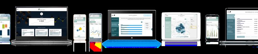
About Toucan Toco

Our mission
Our mission : tell Business Performance Stories through interactive Data and
Data Storytelling.

Our users : Marketing, Production, Finance, Human Resources, SalesForces
and Top management of Big Companies.

From 4 to 45 in 3 years, more than 90 clients, 200 projects among them :
Renault, Total, Axa, BPCE, EDF, JCDecaux, Téréos, Psa, Marques Avenue, lvmh,
Euler Hermes, Vinci, DCNS, BIC, sncf, seb, Moët Hennessy, La Banque Postale...

Small apps are mobile, easy to use, made for action and easy to setup in any
information system.

Toucan Toco's 5 pillars
- Mobility: accessible on mobile phone, tablet and PC. A published dashboard
is accessible on all the supports.

- Easy to set up: agile methodology is part of the company's DNA. This
working methodology stemming from the methodology SCRUM, allows us to
work in iterations. So a project can be industrialized and produced in 2 in 3
months.

- An exceptional and simple UX:: The care and concern of the nal user

experience is at the heart of Toucan Toco's strategy. This unique experience
for users is intuitive thanks to our data. We tell stories from your data to give
meaning to the reading of the user, depending on its position and job in the
company.

- Integrated in your Information System: our connectors aggregate the data

coming from your various Information System and Databases. So, we know
how to connect at les (Excel, Csv) and IT environment (BO, Qlik, SAP) at the
same time in the same app.

- We serve your operational excellence: Toucan Toco offers collaborative tools
in the software such as chats, recommandation, messages, glossaries ... Even
extract possibilities such as pdf & mails
What is data visualisation ?

Data visualisation can be summed up by this quote: “A picture is worth a
thousand words”.

When Confucius said this sentence back then, he didn’t have a computer..
Nowadays it is more true than ever when you look at all the data companies
are collecting. However they are still dif cult to analyze, explain and share.

0

“Data visualisation is the art of speaking about gures, in a creative and
playful way, where Excel les fail. It’s kind of putting music on encrypted
information” says Charles Miglietti, expert in data visualisation and

co-founder of Toucan Toco.

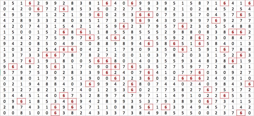
Let’s see a concrete example : how many “6” can you count ?

It’s long. Isn’t it?

Now let’s put the “6” into color: it’s way easier!

Data visualisation takes its roots from the Gestalt theory’s concepts. We are
talking about psychologic bias: human beings tend to organise visual things
by groups. It allows to see forms more easily thanks to colors and visual
processes.

Another more concrete example: analyzing an Excel le. You wish to point
the most visited countries. This table indicates values for each country. But is
this the best way to easily and quickly organize these countries? To explain
them to a public?

Now, if we put these data on a map, using a colour chart for visite rate, it’s so
much easier to understand:
When useful data are enlightened in an ergonomic and colorful way, it’s way
easier. Brains are visual, they understand 80% of information thanks to this.
We need to extract useful information from the superabundance of data and
erase excesses.

FOCUS ON THE ESSENTIAL, AND MAKE
DECISION-MAKING EASIER

Searching and interpret data from a table is often long and fastidious. Dataviz
offers a huge gain of time. The access to data is quick, precise and easy to
understand. Business data are often scattered on different mediums, which
leads to a more dif cult analyze. Dataviz allows you to gather them into one
screen with precise charts. These indicators are gathered into ergonomic
dashboards you can use in real time. They are showing you trends that
cannot be seen otherwise. So now, it’s easier to make informed decisions.
IMPROVE TRANSPARENCY AND
COMMUNICATION

The pros of using Dataviz in a company is that it allows regular people and
decision maker to manipulate data. This without being a expert or an analyst.
People who could have felt excluded from data, have now access to it. This is
a huge improvement for information transparency. Communication between
departments is easier as once complicated nance gures are now translated
into beautiful visuals.

DATA VISUALISATION: SHARE AN IDEA

Dataviz makes it easy to travel from an information to another while using
massive databases. You can show different type of data through graphics.

However, during a presentation, the goal isn’t only to speak about results. You
have to offer an overview of your whole activity; to make a funnel-shaped
analyze to understand a uctuation. Pedagogy should be applied to the whole
context so that the public gets the meaning of all data.
The Guardian is a good example on how you can use data storytelling to
simplify a dif cult matter. We all think our purchasing power decreased for
the past 30 years. Our incomes are higher today but the cost of living has
increased as well. The comparison is dif cult to make. This data visualisation
brings transparency and shows us that our standard of living actually is
increasing for some people.

This is a good example of storytelling. It visually explains the evolution by
comparing different countries, age categories and years. It comes here with
some short commentaries to guide the audience. That is a powerful way of
communication.

Either for HR and staff evolution or for nance and balance sheet
understanding and so on, each data brings a message. Each chart should
have a clear and precise message to facilitate understanding. This is data
storytelling.
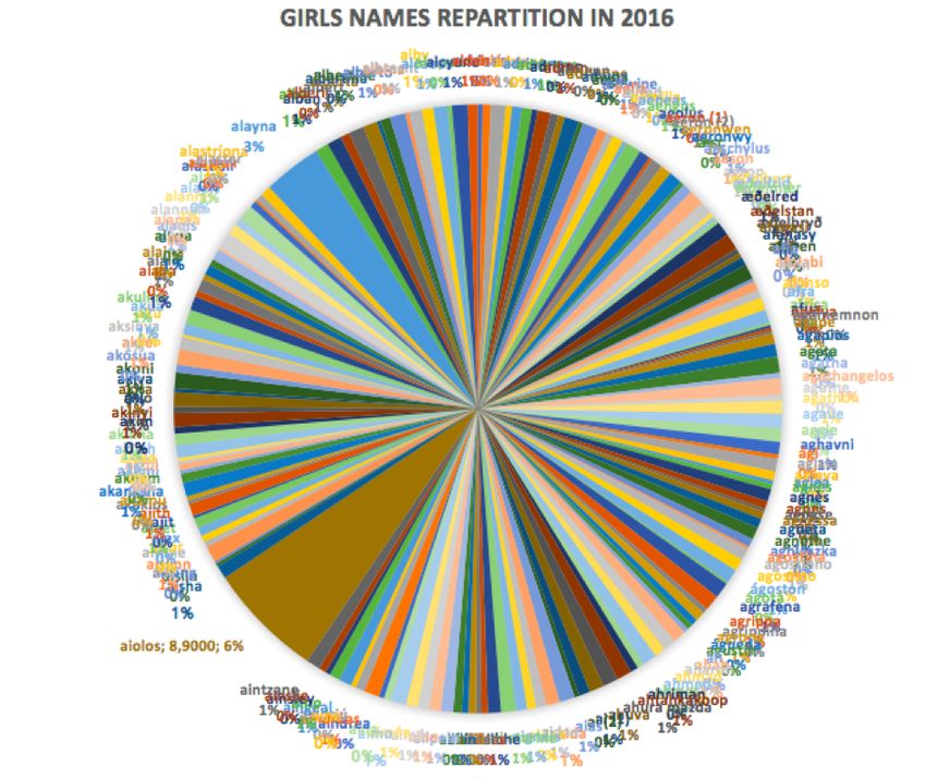
SOME EXAMPLES

Excel and PowerPoint charts are frequently used, but their functionalities are
limited and sometimes misused. For instance the famous pie chart becomes
useless with more than 3 or 4 values because it is hard to simply compare
which one is bigger than the other.

#Piechartfail

Companies and institutions are increasingly using data visualisation tools,
often presented as dashboards with varying degrees of precision.
Dataviz is also used for amusement. It’s easier to “read” news presented
through a beautiful visual form than through a never ending article. For
example, here is the CAC 40 participation per company on the French market
(see more here).

Beyond this example, we can even show data with animations, or even
videos. The most famous is Billion-Dollar-A-gram, by David McCandless, a
real master in this eld!

Esthetical, functional, easy to use: data visualisation is a power tool to
democratise access to data. It facilitate comprehension and analyze of gures
and helps bring transparency in companies.. When a story actually tells
something, dataviz is the best ally for decision-makers.
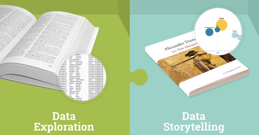
Data Storytelling vs Data
Exploration
One of the rst observations that we made was that there are two distinct
types of situations when it comes to analysing data.

00

Data analysts want to explore data while novice beginners want a quick
access to data. Since there isn’t a term to coin this concept, we have decided
to call it ‘Data Storytelling’. Let’s clear up some misconceptions between Data
Storytelling and Data Exploration.

These two photos show the remarkable distinction between Data Storytelling
and Exploration.

Data exploration is for data analysts
The analyst is the expert and knows how to use a unique tool. This analyst
might use the same tool intensely for many days in a row. He explores the
database thoroughly before communicating it to another person.

Excel can be used for data exploration
Other Business Intelligence tools such as Business Object, IBM Cognos,
Oracle BI, or even PowerBI, Qlik and Tableau Software can also be used for
data exploration. These software tools are used to explore the database to
answer complex questions.

Here is an example of Data Exploration
 For example, let’s say that you want to know how many women, between the
ages of 25 and 35, who belong to the same delity program, have purchased
an item from the meat section as well as a chocolate bar that was on sale
in the last 23 days.

This is clearly an analyst’s job.

Data Storytelling is for the novice beginner
Data storytelling lets a beginner easily use a tool and then apply it to a
situation.
A novice beginner might only use this tool a few minutes every week, but
must be able to use this tool instantly without help from an expert.

The data is accessed instantly and the information can be easily used for
buying, selling, managing, marketing or directing.

This type of user is more likely to be a salesman, a Human Resource Manager,
someone in Finance or Marketing or even a company Manager.

This is what Toucan Toco is dedicated to accomplish. Our main goal is to help
users who are unfamiliar with data analysis to make better decisions based
on their databases, thanks to Dataviz.

 Mobile Applications allow easy access to the company’s main information in
just a few clicks.

An example of Data Storytelling
 Let’s say you want to know the exact sales revenue per day, per month, per
year, for a certain department, as well as a comparison with the same results
for the previous year. This data query is clear and hierarchical.

Data Storytelling is the way to go here..

Taking care of our clients
 Comparing Data Exploration to Data Storytelling is like comparing ‘The
Collins Dictionary’ to an award winning piece of literature; or like comparing
IMDB’s database to The Game of Throne’s last season; or like comparing a 19th
century pictorial art dictionary to a temporary exposition at an Art Museum.

Would you rather take a dictionary or a novel to read the next time you went
on vacation?

Even though every word in your book is in that dictionary, the information
presented in the novel is destined for a reader, whereas, the dictionary is set
up so that a specialist can nd exactly what he is looking for.

This distinction describes what we are trying to achieve as a team.

Here at Toucan Toco, our 38-team members, 80 clients, as well as the 38,400
users believe in Data Storytelling.
The 10 steps to creating an
ef cient dashboard in 2018

The rst step to take when creating a dashboard, is to address your needs
with the data that you have. A dashboard has two functions. The creator of
the dashboard must be able to make the best decisions for his work, and
secondly his team members and managers must be able to understand these
decisions.

1. What is a dashboard?
Let’s start off by de ning what is a dashboard. For Business Intelligence
experts, dashboards are used to visualize raw data, making it more accessible
and comprehensive. Data just makes more sense when it is on a dashboard.
In order to make data easier to read, dashboards use different visual tools and
order the data in different ways.

Dashboards are practical when you want to see your data in real time or as
historical graphs and charts, depending on what you are working on. Key
data summaries allow you to be more ef cient and make better decisions.

The recent shift in technology has changed the way data is collected. And
with that, nowadays companies are lost in their data, storing thousands of

terabytes of useless data for analysts to plow through. For such companies,
dashboards are fundamentals as they provide a remedy. Visual
representation using graphs and charts offers an experience that can’t be
created otherwise.

Which brings us to ‘How to build a dashboard’. There isn’t any one dashboard
template that is suited for all organizations.

In order to create a successful dashboard, there a few steps to follow.

2. What methods should be used to create a
dashboard?
Step 1: Straight to the point
A dashboard is one single screen made up with the most important
indicators. Therefore, a dashboard should not show all the data points. It must
only cover essential information. It should be a selection of the most relevant
indicators to your business.

When looking at your dashboard, the rst thing you should see is a quick
presentation of the most important data related to your activity.

Excel tabs or other secondary menus created with other data visualization
tools will allow you to study your data more in depth.
Step 2: Addressing a problem related to your activity
You must start by identifying your operational needs, then understanding
your audience. You have to ask yourself: which data best addresses the

speci c questions of interest? As organizations and professional elds are
very diverse, the way the dashboard is con gured will have to accommodate
their different needs and backgrounds.

Create a screen or a tab for each data query. Too often dashboards are full of
irrelevant data. The problem with these dashboards are that they do not
portray a clear message. Your user doesn’t need to see all of datas which are
available. They only need to see information that they can use for their tasks.
Therefore it is your job to organize the data for them.

In order to do this, you must know what the board and your colleagues expect
to see.

Useful tip: a huge amount of public data is available on Of ce for National
Statistics’ website and on other public databases. With this data, you can give
your audience the big picture.
Step 3: Creating action points
Building a dashboard is a process that evolves constantly. Your projects will
evolve, and so will your company. An effective dashboard is one that you can
revise later if necessary. Meet with colleagues regularly and review the
objectives to make sure the selection of indicators still meets their needs.

Each indicator must represent an action for its users. To give an example, a
decline number of visitors for a website can alert the marketing department
to take immediate action. The data must generate an action; the data can
signal an anomaly. This is one important criteria that needs to be build into a
dashboard for it to be effective.

Step 4: De ning performance indicators
The wrong choice of indicators is a curse for the organization. Each indicator
must serve the company’s global strategy. Furthermore, it should be clear
what actions are required if there is a sudden change in the data.

If you choose the wrong indicator for your dashboard, you risk that your team
loses focus and takes the wrong decisions.
For an indicator to be on your dashboard, it needs to be comprehensible and
adapted to all the people that will have access to it. In addition, it must be
reliable and comparable contextually.

For example, it wouldn’t make sense to give the company’s annual revenue
without rst comparing it to the previous years’ revenues or to another
company’s revenues.
It is necessary to keep this logic with respect to the audience and for all
indicators.

Step 5: Creating a mobile dashboard
How does your audience use information? Most users like to use their
computers to look at reports. However some users might have a more mobile
pro le, like managers and salesmen. These users are always on the go.
Therefore it is important for them to be able to access the dashboard freely on
a mobile device.

Since dashboards are interactive tools, mobile compatibility allows the user
to interact with the data at his ngertips. You can touch your creations to
show

more detail, navigate through the main menu into different subcategories.
Most importantly, you can give a live demo when making a presentation to
clients.

3. How to tell a story with your dashboard
Our brains are comprised of three parts. When we listen to a story or
experience an event, the same part of our brain is stimulated. The neocortex
links the reasoning to the emotion. Our decisions are therefore in uenced by
our emotions.
The challenge is to create a dashboard that is clear, has impact and touches
on the reader’s emotions!

The worlds best speakers always talk about their past experiences and
feelings when they want to present a fact or a statistic. During your
presentation, don’t forget to give context to what you are presenting, it will
help you keep your audience focused on what you are saying. Give your data
a human touch.

How can you tell a story with data?

Step 6: Making your data more familiar
If your audience is knowledgeable about the data that you are presenting,
they will be more receptive to the message you are trying to relay.
It is your job to nd the best examples that relate to your audience. Try new
things, show not only your data but also why you are showing it. Give context
and illustrate your data with stories and experiences.

Step 7: Making it easy to read
Are you tired of not understanding someone else’s dashboard? Don’t make the
same mistakes.

The easier the data is to read, the quicker it will be understood. Decision
making is also effected by the clearness of your dashboard. If it is clear to the
reader, he can take instantaneous decisions on the outcome. Something to
keep in mind is that the user isn’t always familiar with the data format.
Therefore it is very important to give accessible information to the users.

A graph must convey a single message. Often, dashboards present dozens of
indicators and graphs which result in the loss of the users interest. Do not
overwhelm the audience by presenting graph after graph of information.
Present only one idea or visualization per screen. You can use many slides if
you have a lot of things to present.

Step 8: Plotting the data
To captivate your audience, narrate a story.

Data is used to add truth to what you are saying. It shouldn’t be the center of
your arguments. To tell a story, you must contextualize your data. Write a
story that evolves around your data.
Work on making your dashboard more colorful. Your comments and titles
should be easy to read. This allows your audience to follow and anticipate the
data that is being presented.

Step 9: Understanding your audience
When you are preparing your data analysis report, it is essential to answer the
right questions. To do this you must put yourself in the shoes of your
audience.

You have to ask yourself, ‘Do the reporting tools that I am using correspond to
the message I want to convey? Is the graph I am using intuitive enough for
my audience? Is this indicator comprehensive enough ?

Step 10: Presenting it smoothly
Fear of data and statistics is often an obstacle for the audience in
understanding a report. You can overcome this by visualizing the data. At
times, the audience needs you to guide them. The situation is to demonstrate
and use data storytelling.
Reporting : how to choose
the right graph for your
data?

Data gathering is already a habit to every company departments but data
analyses and the transmission of its results are still a pain in the neck to the
majority of the company workforce. Data storytelling offers a solution to
those problems for the whole company.

0

Data storytelling is the logical aftermath of several realisations made in the
Business Intelligence area. The rst one is about data visualisation, also
known as dataviz. For industrial needs, presenting data in a linear fashion as
it is done in an Excel sheet, is often limited. This is why data visualisation
becomes more and more mainstream. Indeed it can convert data into
interactive charts that make data visualisation easier and help for a better
and quicker understanding while allowing a simpler knowledge
transmission.

This practice is common in data journalism where the audience is the
general public. What is the next step? Adapting this practice to business users
within the company. Using charts in addition to the complete data journalism
and journalism methods, a new area of Business Intelligence is created: data
storytelling.

Once upon a time there were some data…
During the Middle Ages, street theaters used to complete the church’s
teachings of the illiterate people through tales. Storytelling helps break down
complex concepts into simple images that are better at passing key
information. Tales use this logic and enable the transmission of moral values
through stories. Children can easily take social re exes as such as ‘do not tell
lies’.

According to Jennifer Aaker, a social psychologist and professor of Marketing
at Stanford, stories are remembered up to 22 times more than facts alone.
Thus telling the story of the performance of a department makes sense.
Storytelling makes understanding easier the KPI and helps their
transmission to the whole audience.

With data storytelling, less is more
Data storytelling is not just adding up charts and indicators. It is a smart mix:
between an ancestral information and knowledge transmission method and
the most abstract and most serious by-product of modernity, meaning
company performance metrics. Data storytelling implies using the latter and

turning it into stories. Instead of building dashboards and adding up charts,
we build scenarii. In place of focusing on indicators and raw data structure,
our main concern is our audience’s expectation.

Though using the same data (as a starting point) you won’t tell the same story
to raise awareness among managers about the social assessment of the
company than you would to those in charge of human resources who run the
monitoring of the payroll.

The best way of nding operational excellence is telling your story depending
on the action you want you targeted audience to do. A raw gure is hard to
explain whereas a good story creates an impact.

The story created is impacting if you give some context: public data (INSEE:
The National Institute of Statistics and Economic Studies in France) or
market studies. Consequently automated entity comparisons, Business Units,
territories, products, competitors or clients are of course the main part of the
impact created by the stories. But that is not all: the clarity of the information
shown is key for you to order your priorities.

Data storytelling helps you order your
information

Would you rather read a whole encyclopedia or a good novel? Using
storytelling doesn’t mean that we give data back to the user saying ‘handle it
yourself’. It is quite the opposite. We meticulously sort and choose the data
 we want to present. The user is thankful for that. Data analysts have time,
training and prerogative to explore and exploit a database. Newbie users don’t
have what it takes to do such things (and don’t want to either). Every time a
data exploitation tool is made for a business user enabling them to “explore
100% of the database”, their needs are not taken into account. Because of

laziness, disappointment or lack of skill, the effort to hierarchise isn’t done.

Would you ever bring a dictionary with you on your summer holiday if you
are not an expert yourself? Of course not. Would you rather bring a well-
written novel? Yes, you would. Using the same words, the writer would have
chosen a way of putting the information whereas the encyclopedist lets the
user do the sorting. This is the image for a total access to a database VS a
storytelling app. The difference between the two is the work that has been
done sorting the information and structuring it.

The Dictionary Effect, exhaustive and impenetrable would be Dataviz

The Novel Effect, simple and hierarchised would be Data Storytelling

Rational and emotion-based decision-making

The decision-making process isn’t only rational. Neuro-scientists proved that
decisions are made by the prefrontal cortex that manages emotions. To
convey a message, one needs to address a person’s emotions. How? By telling
a story. Storytelling calls on imagination and emotions. Advertisement in the
consumer goods sector for instance uses it to create an emotional
connection. The product isn’t the main focus but the story and the experience
are. My last favourite ad: Nike, Madonna, 86 doing her 45th Ironman.

Using stories in your company presentation will help stir your audience’s
emotions, making it easier to convince them to make a decision or to take
action. Indeed people are more responsive to stories than facts. Unfortunately
most company meetings miss the point by focusing solely on factual
information. Data storytelling uses the language of stories to get the best

impact possible out of facts during company meetings.

If you would rather share a good novel to your coworkers than a dictionary. If
you get that you need to convince and talk them into taking action using
emotions: data storytelling is made just for you.
Data storytelling: linking
emotions and rational
decisions

Data gathering is already a habit to every company departments but data
analyses and the transmission of its results are still a pain in the neck to the
majority of the company workforce. Data storytelling offers a solution to
those problems for the whole company.

0

Data storytelling is the logical aftermath of several realisations made in the
Business Intelligence area. The rst one is about data visualisation, also
known as dataviz. For industrial needs, presenting data in a linear fashion as
it is done in an Excel sheet, is often limited. This is why data visualisation
becomes more and more mainstream. Indeed it can convert data into
interactive charts that make data visualisation easier and help for a better
and quicker understanding while allowing a simpler knowledge
transmission.

This practice is common in data journalism where the audience is the
general public. What is the next step? Adapting this practice to business users
within the company. Using charts in addition to the complete data journalism
and journalism methods, a new area of Business Intelligence is created: data
storytelling.

Once upon a time there were some data…
During the Middle Ages, street theaters used to complete the church’s
teachings of the illiterate people through tales. Storytelling helps break down
complex concepts into simple images that are better at passing key
information. Tales use this logic and enable the transmission of moral values
through stories. Children can easily take social re exes as such as ‘do not tell
lies’.

According to Jennifer Aaker, a social psychologist and professor of Marketing
at Stanford, stories are remembered up to 22 times more than facts alone.
Thus telling the story of the performance of a department makes sense.
Storytelling makes understanding easier the KPI and helps their
transmission to the whole audience.

With data storytelling, less is more
Data storytelling is not just adding up charts and indicators. It is a smart mix:
between an ancestral information and knowledge transmission method and
the most abstract and most serious by-product of modernity, meaning
company performance metrics. Data storytelling implies using the latter and
turning it into stories. Instead of building dashboards and adding up charts,
we build scenarii. In place of focusing on indicators and raw data structure,
our main concern is our audience’s expectation.

Though using the same data (as a starting point) you won’t tell the same story
to raise awareness among managers about the social assessment of the
company than you would to those in charge of human resources who run the
monitoring of the payroll.

The best way of nding operational excellence is telling your story depending
on the action you want you targeted audience to do. A raw gure is hard to
explain whereas a good story creates an impact.

The story created is impacting if you give some context: public data (INSEE:
The National Institute of Statistics and Economic Studies in France) or
market studies. Consequently automated entity comparisons, Business Units,
territories, products, competitors or clients are of course the main part of the
impact created by the stories. But that is not all: the clarity of the information
shown is key for you to order your priorities.

Data storytelling helps you order your
information

Would you rather read a whole encyclopedia or a good novel? Using
storytelling doesn’t mean that we give data back to the user saying ‘handle it
yourself’. It is quite the opposite. We meticulously sort and choose the data
 we want to present. The user is thankful for that. Data analysts have time,
training and prerogative to explore and exploit a database. Newbie users don’t
have what it takes to do such things (and don’t want to either). Every time a
data exploitation tool is made for a business user enabling them to “explore
100% of the database”, their needs are not taken into account. Because of
laziness, disappointment or lack of skill, the effort to hierarchise isn’t done.

Would you ever bring a dictionary with you on your summer holiday if you
are not an expert yourself? Of course not. Would you rather bring a well-
written novel? Yes, you would. Using the same words, the writer would have
chosen a way of putting the information whereas the encyclopedist lets the
user do the sorting. This is the image for a total access to a database VS a
storytelling app. The difference between the two is the work that has been
done sorting the information and structuring it.

The Dictionary Effect, exhaustive and impenetrable would be Dataviz

The Novel Effect, simple and hierarchised would be Data Storytelling

Rational and emotion-based decision-making

The decision-making process isn’t only rational. Neuro-scientists proved that
decisions are made by the prefrontal cortex that manages emotions. To
convey a message, one needs to address a person’s emotions. How? By telling
a story. Storytelling calls on imagination and emotions. Advertisement in the
consumer goods sector for instance uses it to create an emotional
connection. The product isn’t the main focus but the story and the experience
are. My last favourite ad: Nike, Madonna, 86 doing her 45th Ironman.

Using stories in your company presentation will help stir your audience’s
emotions, making it easier to convince them to make a decision or to take
action. Indeed people are more responsive to stories than facts. Unfortunately
most company meetings miss the point by focusing solely on factual
information. Data storytelling uses the language of stories to get the best

impact possible out of facts during company meetings.
If you would rather share a good novel to your coworkers than a dictionary. If
you get that you need to convince and talk them into taking action using
emotions: data storytelling is made just for you.
Financial reporting: 5 rules
to know to make it good !

When it comes to make a nancial reporting, you cannot improvise. There are
some rules to repeat and tricks to know to pull through. Let’s see how you can
make a good nancial dashboard!

Financial reporting is crucial because it allows companies – from the
medium-sized ones to the multinationals – to based the steering of the
activity on key indicators. Furthermore, the International Financial Reporting
Standards, IFRS, requires a general presentation of nancial status in addition
to changes in accounting methods.
Today, communication is fragmented in almost all the companies : nancial
communication for the investors, inclusion of new accounting methods,
supervision of management functions, accounting and nance… You can get
lost.

More and more nancial boards are thinking about creating an uni ed

reporting, and the nancial reporting has become the principal tool for
decision making.

Here are some key rules to know if you want to master nancial reporting.

#1. Understanding properly user’s needs
beforehand
Before you start, ask yourself about the nature of your company, the market

into which is it developing and about nal user’s needs. If you want to be able
to set up scenarios with the data you collected – which is essential to create
your nancial reporting

– you have to know the context and the use. Each company and nancial
function has a speci c use of its data.

To focus on the different professions allows you to identify the most
important data : main sources of income of the company – by product, area,
distribution channel… – main sources of costs – the value or percentage of
 xed costs, variable costs … – key resources of the company.

There is no xed pattern to make a nancial dashboard. Each department,
profession and industrie has its own codes and this plurality requires a high
level of personnalisation.
#2. A nancial reporting should not be
exhaustive
When you build a nancial dashboard, the main risk is to get drowned in a sea
of data. A rst way to avoid that is to focus on the information available at the
moment you do the job.

The second way is to prioritize your KPIs. There is one rule to respect: go
straight to the essential. Do not forget that a dashboard has two functions:
help decision-making and communication to your managers or your team.
We know that it can looks counter-intuitive.

Indeed, people who build reportings are always scared to miss crucial
information. However, nobody wants, neither can follow his company’s
activity by taking 20 factors into account.

Leonard de Vinci said: simplicity is the ultimate form of sophistication. A
clear view allows the audience to focus on data more than on the
understanding of a slideshow. The keys for a good presentation are : strong
message, contextualization and signi cative data.

#3. Pick up signi cative performance
indicators
What is you goal when you make a nancial reporting? Is it to support the
management of a speci c project, to provide an analytic view on the
company’s activity or just to have an overview of the main nancial
indicators at a precise moment?
New technologies of Data Visualisation give the opportunity to generate
graphics and interactive dashboards with entertaining designs. Dataviz

enables you to browse easily from a piece of information to another while
processing huge databases.

During a presentation, the goal is not just to read your results, it is to give an
overview of your activity and make your audience understand the causes of a
precise uctuation. For that, you have to build things in a pedagogic way and
contextualize data. It is called data storytelling.

Each KPI tells a story about the company’s activity. HR data can explain staff
evolutions, nancial data helps understanding statements… The thing is that
each piece of data holds a message that has to be understood. Confucius said :
an image worth a thousand words. Each graphic must hold a clear message to
help the understanding of complicated information.

#4. A dashboard is an evolutive tool
Your nancial reporting is not an end in itself. Consider it as a step in your
decision-making process. Thus, it is absolutely necessary to update it
periodically.

That will enable decision makers to synchronise decision cycles with release
of reporting – making dashboards real piloting tools for the company’s
performance.

Your environment, projects, goals and constraints are changing. A
goodreporting sustain those changes, or even direct them. Thus, you should
always make sure that your dashboard is made with indicators that
correspond to your needs and that push your team to act. An indicator that
triggers no action in case of sudden change is not a good one.

#5. One indicator by screen
Tired not to understand other people’s boards? Do not make the same
mistakes.

The easier data are to read, the faster they will be understood, and decision-
making will thus be facilitate. Furthermore, people are not always familiar
with the format you use and it is crucial to make information accessible.

A graphic must hold only one message. Dashboards are presenting dozens of
indicators and graphics too often, and that confuse the audience. Do not
overload your graphics. It is more impactful to present an idea with one
visualization on one screen. Then, present your ideas on distinct slides.

You have now understood that building a nancial reporting does not mean

compressing the more technical information you can on the shorter support

you can nd. Building a nancial dashboard means making those
information comprehensible for everyone.

Pick the most relevant information and try to see them through the eyes of
your audience. Your dashboard has to be meaningful without any
explanation. If you can send it to your recipient without any commentary, it
means that you did it well!
More information ?
Are you interested in a reporting solution?

            Request a free demo
You can also read