Incorporating Math and Statistics in AP/IB Science This curriculum is licensed to a single user - Kristen Daniels Dotti 2018 Catalyst Learning ...
←
→
Page content transcription
If your browser does not render page correctly, please read the page content below

Incorporating Math and Statistics in AP/IB Science       Kristen Daniels Dotti © 2018
This curriculum is licensed to a single user.        Catalyst Learning Curricula pg. 1

Incorporating Math and Statistics in AP/IB Science       Kristen Daniels Dotti © 2018
This curriculum is licensed to a single user.        Catalyst Learning Curricula pg. 2
Incorporating Math and Statistics in AP/IB Science
                                     Table of Contents
  (This sample contains Activity 2, 8 and 11 only, which do not correspond with the page numbers
   listed below. The full curriculum can be purchased at the Catalyst Learning Curricula website)

Activity 1:     Using Significant Figures and Reporting Uncertainty in Scientific Measurements pg. 4

Activity 2:     Identifying Strengths and Weaknesses of Commonly Used Data Descriptors                  pg. 12

Activity 3:     Other Ways to Describe Data: Variance, Standard Deviation and SEM                       pg. 19

Activity 4:     Reading, Interpreting and Creating Graphs                                               pg. 26

Activity 5:     Estimating Appropriate Sample Size and the Necessity of Repeated Trials                 pg. 47

Activity 6:     Writing a Null Hypothesis for Statistical Testing                                       pg. 54

Activity 7:     Using Error Bars to Reveal Uncertainty and Identifying Significant Differences          pg. 60

Activity 8:     Applying Chi-squared and Pearson’s Correlation Analysis to Test a Hypothesis            pg. 68
                (While Teaching the Phases of Mitosis and the Mitotic Index)

Activity 9:     Using the Student’s t-test to Compare Means and Test a Hypothesis                       pg. 82
                (While Teaching About Human Impact on the Environment)

Activity 10:    Creating a Dichotomous Key to Choose the Best Graph and Statistics                      pg. 90

Activity 11:    Writing Mathematical Expressions to Describe and Predict Data                           pg. 94
                (While Teaching Population Dynamics)

Activity 12:    Using Spreadsheets and Programming to Generate Large Data Sets                          pg.100
                (While Teaching Microevolution and Hardy-Weinberg Equilibrium)

Activity 13:    Extracting Data from a Public Database for Graphic Analysis                             pg.128
                (While Teaching Cladistics and Protein Sequence Comparisons)

Activity 14:    Using Simulations and Games for Open-ended and Interactive Data Analysis                pg.143
                (While Teaching About Pathogens and the Spread of Infectious Disease)

                          2
Appendix A:     Table of x -critical Values                                                             pg.147
Appendix B:     Table of t-critical Values                                                              pg.148
Appendix C:     Summary of Useful Parameters and Hypothesis Tests                                       pg.149
Appendix D:     Data Set for Activity 7                                                                 pg.150

Appendix E:     Alignment with Next Generation Science Standards (NGSS)                                 pg.153
                and Common Core State Standards

Incorporating Math and Statistics in AP/IB Science                      Kristen Daniels Dotti © 2018
This curriculum is licensed to a single user.                       Catalyst Learning Curricula pg. 3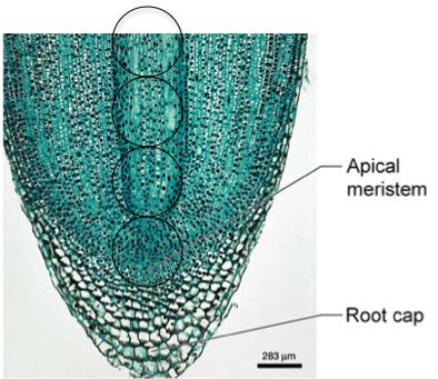
Incorporating Math and Statistics
                                in AP/IB Science

Activity Two: Identifying Strengths and Weaknesses of Commonly
Used Data Descriptors
Teaching time: 1-2 class periods of 50 minutes each

    Objectives:
       a) For students to understand the difference between normally distributed
          data and data that does not fit a normal Gaussian or bell-shaped
          distribution pattern.
       b) For students to recognize the utility of parameters that can be used to
          describe data.
       c) For students to learn how to choose the best parameters of central
          tendency to describe a data set.
       d) For students to broaden their ideas about what parameters or central
          tendency descriptors they may choose.
       e) For students to make conjectures and take calculated risks.

    Materials:
      For each student: a notebook for jotting down ideas and taking notes, one
      metric ruler, one calculator and one sheet of graph paper. For each group
      of 2-4 students: eight cat toys in the shape of a mouse, each with tails that
      have been modified per the instructions in Step 1 below, and two bowls,
      baggies or other containers, each to hold four of the mouse-shaped toys
      (see Step 4 below). Optional: if you have small animal cages, two water
      dispensers and food bowls to help create a convincing-looking experimental
      setup. For the class: one shared spreadsheet for collected data on mice
      tail measurements (see Step 6).

    Procedure:

    1. Prior to class, if you search “mouse cat toys” online, you can find a bulk
       supplier and pay a relatively inexpensive amount for a large quantity. Divide
       the toy mice in half to form two groups with an even number of mice in each
       group. Trim the tails on the mice in each group to make the mean tail length
       nearly identical for the two groups (the mean tail length in the first group
       should equal the mean tail length in the second group), however, you want
       all of the mice in the first group to have nearly identical tail length, and you
       want the mice in the second group to have two different tail lengths—some
       quite long and some quite short. Here is how to accomplish this:
           a. Make a quick estimate of the mean tail length of all the toy mice
                purchased by measuring the tails on about half of the toys. Use this
                number as the estimated mean tail length for the next step.
Incorporating Math and Statistics in AP/IB Science          Kristen Daniels Dotti © 2018
This curriculum is licensed to a single user.           Catalyst Learning Curricula pg. 4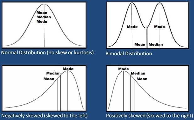
b. Calculate the length of a tail that would be 1/3 the estimated mean
                 length and calculate the length of a tail that would be 2/3 the
                 estimated tail length. For example, if the mean tail length of all the
                 toys is estimated to be ~6 cm, then 1/3 the estimated mean tail
                 length would be 2 cm and 2/3 the mean tail length would be 4 cm.
            c. Divide the toys into two groups, each with an equal number of toys,
                 but be sure all the toy mice in the first group have a tail that is at least
                 as long as the mean tail length of the group and place all toys with
                 the longest or shortest tails in the second group.
            d. For the first group, trim the tails on all the toy mice such that all toys
                 in this group have a tail that is 2/3 the length of the estimated mean
                 tail length with only +/- 0.2 cm of variation. In the example given
                 above, all the mice in this group would have their tails trimmed to 4.0
                 cm (+/- 0.2 cm).
            e. For the second group, trim the tails on all the toys such that half the
                 toys in this group have tails that are 1/3 the length of the estimated
                 mean tail length (+/- 0.2 cm) and the other half of the toys in this
                 group have tails that are very close to the estimated mean tail length.
                 For the example given above, this group would have mice with tails
                 that are either 2.0 cm (+/- 0.2 cm) or 6.0 cm (+/- 0.2 cm).
            f. After all the mouse tails have been trimmed, the mean for each group
                 should be nearly equal. For the example given above, the mean tail
                 length for the first group and the second group is now 4.0 cm (+/- 0.2
                 cm).
    2. If you have small animal cages in your classroom, place the mice from the
       first group all in the same cage and place the mice from the second group in
       a separate cage. Add a bottle of water and a dish of food to each cage to
       help make it a convincing experimental set-up. Label the first cage “Control
       Group” and label the second cage “Treatment Group.”
    3. When the students arrive, explain that you have been conducting an
       experiment to determine the impact of a particular mutagen on gene
       regulation. Show the students a mouse from the first cage, holding it up by
       its tail, and let the students know that the mice in this cage are in the control
       group and no mutagen was added to their food supply. Hold up a mouse
       from the second group and let the students know that the mice in this cage
       are in the treatment group and they have had a mutagen added to their food
       supply from weaning until now. Tell the students that it appears that the
       mutagen may have impacted the gene that regulates tail growth, but you are
       not sure if there is a measurable difference.
    4. Divide the students into groups of 2-4 (depending on the number of toy mice
       you have) and ask that a representative from each group retrieve four mice
       from each cage, as well as rulers and graph paper, to bring back to their
       group. Allow the students to each use a marked or colored bowl, baggie or
       other container to keep the mice from the control group separate from the
       mice in the treatment group.

Incorporating Math and Statistics in AP/IB Science              Kristen Daniels Dotti © 2018
This curriculum is licensed to a single user.               Catalyst Learning Curricula pg. 5
5. Ask the groups to each measure the tails of the mice and tabulate the mean
tail length for mice in each group. If you have not already done so, this is a
good time to review precision in measuring so all students use the same
number of significant figures and uncertainty for their measurements. Here
is a quick review to cover with your students:
a. If at all possible, measurements should include one digit beyond the
markings on the instrument being used. For example, if the students
are using a metric ruler that has increments for millimeters on the
minor scale, then the measurement that is one digit beyond the
millimeter marking would be the hundredths place if an estimate of
that place value is visible to the student. Ultimately the person
measuring must decide the level of uncertainty for their own
measurements.
b. Because the data point with the lowest number of significant figures
will limit all collected data to that number of significant figures, one
measurement can result in a loss of data for all other groups.
c. Researchers conducting the same experiment must agree upon the
measuring technique if data will be
compiled or compared. For
example, there should be a
discussion of the correct starting
point on the tail, in which the exact
placement of the ruler is determined,
as well as a consensus regarding the
ending point on the tail. (Will the
students measure from the top or
bottom of the mouse? Will they
include the fur on the tail? etc.)
6. Ask the students to report their
measurements on a shared spreadsheet
(see the example spreadsheet, above right).
7. Ask the students to calculate the mean or use a formula on the spreadsheet
to calculate the mean automatically.
8. Ask the students to make five written observations in their notes comparing
the mean of the control group to the mean of the treatment group. It will be
easy for the students to write 1-2 observations. However, pushing them to
write 4-5 observations will force them to think beyond the most obvious
ideas. Spot check work recorded in the students’ notebooks so they are
compelled to complete this type of low risk formative work now and for each
of the activities that follow in this curriculum.
9. Remind the students that the mean is a descriptor of central tendency, or a
way to describe data that is normally distributed. Explain that the mean is
not “raw data,” only the measured data points are considered to be “raw
data.” Instead the mean is a common form of anaylsis that can be used to
describe this data set.
Incorporating Math and Statistics in AP/IB Science Kristen Daniels Dotti © 2018
This curriculum is licensed to a single user. Catalyst Learning Curricula pg. 610. Ask the students if they think the mean is a good description of central
tendency for this data set. If another scientist were not given the raw data
but only saw the mean for each group, would the mean accurately reflect
the data? (The students will likely point out that the means are nearly
identical, but the mice in the treatment group differed from the mice in the
control group.)
11. Ask the students to think of other possible parameters or data descriptors.
Give them time to think of and talk about descriptors such as minimum,
maximum, range, median, mode, etc. Ask the students to define each of
the descriptors of central tendency they mention.
12. Ask the students to each silently decide for themselves which descriptor
they think would be best to describe the raw data set. Ask them to record
their choice in their notes and defend it using an explanation that includes
their raw data.
13. Ask the students to each share their choice with their group and discuss any
differences.
14. Draw a bell-shaped curve on the board and explain that the shape of this
curve is what statisticians call a Gaussian distribution or “normal
distribution.” Let the students know that this distribution pattern is what is
expected when all members of a population (called “N”) are measured for a
trait where measurements fall around the mean. The mean for an entire
population, “N,” is called mu (µ), which is different than the mean for a
sample of the population called, “x bar” (written as an x with a bar over it).
15. Give a familiar example of a data set that would have a normal distribution
such as human height, body temperature or life span. Ask where the mean
would fall in the example and ask the students why some data points would
fall above or below the mean.
16. Ask the students to make a rough graph of each data set (on separate
graphs or together), using any type of graph they choose. Below is a
histogram of both the control group and the treatment group for reference
(do not share this graph; ask the students to share the ones they’ve made).
Incorporating Math and Statistics in AP/IB Science Kristen Daniels Dotti © 2018
This curriculum is licensed to a single user. Catalyst Learning Curricula pg. 717. Ask the students to display the graphs they made, then have them walk
around the room to review the different variations created by their peers.
18. Ask the students to write 4-5 conclusions about the two distribution
diagrams that were created from the class data. After all students have
written conclusions in their notes, ask them to share their observations
within their small groups.
19. Ask the students what can be said about the distribution of the mouse tail
data? (They should observe that the control group has a normal distribution
but the treatment group is bimodal.) The students may not be familiar with
the term bimodal, so it would be good to discuss this term as a class.
20. Ask the students why the distribution is oddly shaped. (They should point
out that the tails were either long or short, and this caused two separate
data groups to form within the treatment group data set.)
21. Ask the students to indicate where the mean would be on the graphs for
each data set. Ask a follow-up question each time they indicate where the
mean would fall: “Is the mean a good descriptor of the central tendency of
this data set?” (The mean is a good descriptor for the control group since
all the data falls just above or below the mean in a normal distribution.
However, the mean is not a good descriptor for the treatment group since
the treatment data falls into two groups well above and well below the
mean.)
22. Ask the students where the median would fall on the graphs for each data
set. Ask the students if the median would be a better descriptor for these
data sets. (The median is a good descriptor for the control group since all
the data falls just above or below the mean in a normal distribution.
However, the median is not a good descriptor for the treatment group since
the treatment data falls into two groups well above and well below the
median.)
23. Ask the students where the mode would fall on the graphs for each data set.
Ask the students if the mode would be a better descriptor for these data
sets. (The mode is a good descriptor for the control group since all the data
falls just above or below the mean in a normal distribution. However, the
mode is not a good descriptor for the treatment group since it will fall either
with the low or the high data group.)
24. Ask the students where the range would fall on the graphs for each data set.
Ask the students if the range would be a better descriptor for these data
sets. (The range is a good descriptor for both the control and the treatment
group since it gives an indication that the data is cohesive for the control
group and spread out for the treatment group.)
25. Ask the students to draw 4-5 other diagrams of distributions in which mean
would not be a very good descriptor for the data collected (see some
example images below).
26. Ask the students to indicate the theoretical location of the mean, median,
mode, minimum and maximum on each distribution diagram they draw.
Some examples are given below to guide you. Do not give these examples
Incorporating Math and Statistics in AP/IB Science Kristen Daniels Dotti © 2018
This curriculum is licensed to a single user. Catalyst Learning Curricula pg. 8to the students. Instead, lead them to discover the information through their
own thinking and paired discussions.
D’Avello, Tom, and Sephen Roecker. “Chapter 4 – Exploratory Data Analysis.” Statistics for Soil Survey. March 1, USDA, 2017.
27. Make a chart on the board to record the strengths and limitations of the
central tendency descriptors discussed in this activity, then ask the students
to supply information to fill the chart. You may end up with a chart that
looks something like the one shown below. Do not simply give the students
this information or ask them to look for ideas online. Make them discover it
by asking leading questions or have them work in pairs to mull over one
aspect or another of the chart until they make their own determinations.
The example of the mouse tail data set serves to reveal the limitations of
each descriptor.
Strengths Weaknesses
Mean • Is commonly used and• Implies a normal
well understood distribution
• Is a good summary of• Does not describe any
data that is normally specific data point
distributed • Does not reveal bimodal
• Uses all data points or skewed distributions
• Can be greatly impacted
by outliers
Median • Is commonly used and • Implies a normal
well understood distribution
• Uses an actual data • Does not reveal bimodal
point to describe data (if distributions
there are an odd number • Does not indicate the
of data points) degree of variation in the
• Not greatly impacted by data set
outliers • Does not use all the data
in the set
Incorporating Math and Statistics in AP/IB Science Kristen Daniels Dotti © 2018
This curriculum is licensed to a single user. Catalyst Learning Curricula pg. 9Mode • Is commonly used and • Does not reveal the
well understood degree of variation
• Is useful when one • There may be more than
measurement is very one mode or none at all
common • Does not use all the data
• Hints at bimodal or in the set
atypical distributions
• Not greatly impacted by
outliers
• Can be used with non-
numerical data
Range (Min. - Max.) • Is commonly used and • Does not reveal the
well understood clustering of data
• Reveals outliers
• Indicates the degree of
variation
28. Typically the mean is an excellent descriptor for a normal distribution but it
is not as useful for data that lacks a normal distribution. In the case of data
that is not normally distributed, the scientist is better off using other
parameters that will be discussed in the next activity or using a graphic
representation of the data. Discuss these points briefly and consider using
a follow-up assignment for homework to determine how much your students
understand from this activity. Additionally, to analyze a set of data using a
statistical test, it must frist be confirmed to have a normal distribution.
29. To confirm that the skills from this lesson have been acquired and can be
applied independently, ask the students to do the following homework:
Application-based Homework:
Ask the students to generate a fake data set for a particular measurement that they
think would have a normal distribution in a sample population. Ask them to use an
original example that has not been used in class or by their peers. Ask them to
draw the expected distribution pattern with the mean, median, mode, minimum and
maximum clearly indicated.
In addition, ask the students to generate a fake data set for a particular
measurement that they think would not have a normal distribution in a sample
population. Ask them to use an original example that has not been used in class
or by their peers. Ask them to draw the expected distribution pattern with the
mean, median, mode, minimum and maximum clearly indicated, and have them
explain why certain data points diverge from the normal distribution curve.
Incorporating Math and Statistics in AP/IB Science Kristen Daniels Dotti © 2018
This curriculum is licensed to a single user. Catalyst Learning Curricula pg. 10Incorporating Math and Statistics
in AP/IB Science
Activity Eight: Applying Chi-squared and Pearson’s Correlation
Analysis to Test a Hypothesis (While Teaching the Phases of Mitosis
and the Mitotic Index)
Teaching time: 2 class periods of 50 minutes each
Objectives:
a) For students to review the parts of the microscope and its proper use.
b) For students to observe and identify cells in various stages of the cell
cycle.
c) For students to analyze the data they collect using chi-squared test and
Pearson’s test of correlation.
Materials:
For each student: one copy of the “Root Tip Cell Cycle Data Analysis”
handout that follows this lesson plan. For each pair of students: one light
microscope and one prepared onion root tip slide or similar sample of cells
in mitotic division.
Procedure:
1. Prior to class, review the Teacher’s Version of the data analysis for this lab
using the pages that follow titled, “Root Tip Data Analysis.” This example
data set will not be the data that your students collect but instead an
example of how to process the data collected and how to work through each
step of the two hypothesis tests that are being taught in this lesson.
Performing the example calculations prior to class will allow you to answer
questions more easily during class while the students complete their own
data collection and analysis. You may also want to project or share digitally
the image on the next page, to show the students an approach for collecting
their mitotic index data at the appropriate location on the roots. The black
circles represent the ocular field with the first field set just above the root
cap. If the students are unable to locate 100 cells within a single ocular
field, they may move the ocular field laterally while remaining at the same
distance from the root cap to reach a 100 cell count.
Incorporating Math and Statistics in AP/IB Science Kristen Daniels Dotti © 2018
This curriculum is licensed to a single user. Catalyst Learning Curricula pg. 112. If possible, prior to class, share a class data collection spreadsheet. For
example, you can create a Google Spreadsheet and share it with all of the
students in the class using Google Drive, allowing students editing
privileges so they can input their data during class time. Include several
copies of the “My Raw Data Chart of Root Tip Cell Cycle Counts” found at
the bottom of the first page of the student handout so each student or each
pair of students has a place to add their collected data during class. With
access to this shared spreadsheet, students will be able to add their name
and data to a chart, then use the collections made by other students to
compile the class data for Part 1 and Part 3 of the student handout.
3. This activity lends itself to an extension experiment that students can design
and carry out themselves in Step 6 of the student handout. If you choose to
do it, you will need to purchase pearl onions, garlic or other bulbs and allow
them to grow root tips under the influence of a chosen treatment. Root tips
can be grown by suspending dry bulbs root side down on three toothpicks
with the root ends covered in a few millimeters of water. Roots will take 3-7
days to emerge. Roots can be trimmed and treated with a nucleic acid stain
such as Feulgen or acetocarmine. Look up “how to” videos on use of these
stains if the process is not familiar and practice prior to class to ensure you
can adequately guide the students through their self-designed experiments.
For treatment, students may want to use fertilizers, nicotine, caffeine or
other stimulants, protease chemicals or other mitosis inhibition agents such
as UV radiation, vinca alkaloids, etc. Avoid known spindle or DNA
mutagens such as colchicine or ethidium bromide, and do the research
needed to become fully aware of safety considerations.
4. Allow students to follow the steps in the handout, counting cells in different
phases of the cell cycle using prepared slides and contributing their data to
a group data chart for all others to record. Students may find it more
accurate to perform cell counts from photos taken with their phone through
Incorporating Math and Statistics in AP/IB Science Kristen Daniels Dotti © 2018
This curriculum is licensed to a single user. Catalyst Learning Curricula pg. 12the ocular lens because they can increase the magnification and mark off
counted cells using a photo paint or edit program. If phase identification is
new or difficult for your students, they can get practice before beginning this
activity using the “Onion Root Tips” tutorial program and photos on the
University of Arizona Biology Project website (www.biology.arizona.edu).
5. Realize that the relevance of counting cells undergoing mitotic division may
not be very clear to students when using root tips. However, you can
connect this activity to cell counts of dividing cells used to diagnosis
disease, which may have more relevance. For example, a biopsy is a
common medical procedure used to compare the observed mitotic index to
the expected mitotic index for a given tissue type. Different tissues have
different expected rates of mitosis, just as the different parts of the root tip
have different expected rates of mitosis. The method the students are using
is similar to some cancer screenings that use mitotic indices to determine if
cells are growing more rapidly than expected.
6. Use this activity to review and reinforce the purpose of the null hypothesis
as a falsifiable statement that can be tested using statistical methods by
ensuring the students are able to write a conclusion statement from their
chi-squared and Pearson’s correlation results. Example statements are
given in the Teacher’s Version for the example data set provided.
7. Detailed steps are provided for both types of data anyalysis in the student
handouts and in the example data set rather than in this part of the lesson
plan so that you can jump right into the mitotic index activity when class
begins.
8. Appendix A (at the end of this curriculum) contains a more extensive chi-
squared critical values table which you may choose to share with the
students. The student handout contains an abbreviated version of this table
that will suffice for the degrees of freedom used in this activity.
9. Appendix C (at the end of this curriculum) contains a summary of the
parameters and hypothesis test equations. Although not all hypothesis tests
will be introduced in this activity, you may choose to share a copy of this
summary at the start of this activity so the students begin to use it as a
reference.
10. The number of data points used to teach chi-squared and Pearson’s
correlation are intentionally small so that all calculations can be performed
by hand. Although this is not a good example of a robust sample size, the
small sample size is useful for teaching the students how to perform the
algebraic steps of the two hypothesis tests. Guide the entire class through
the chi-squared and test of correlation calculations as a group, so that each
student is able to understand the source of each number and may even
begin to understand how the numbers are impacting the outcome of the
analysis.
Incorporating Math and Statistics in AP/IB Science Kristen Daniels Dotti © 2018
This curriculum is licensed to a single user. Catalyst Learning Curricula pg. 13Root Tip Cell Cycle Data Analysis
Part 1: Collection of Cell Cycle Data
1. Focus your field of vision on the lowest portion of the root tip so the round lower
arc of your field of vision as seen through the ocular lens lies just above the
waxy root cap.
2. Bring the magnification up to 100x and count at least 100 nucleated cells in
your field of vision, deciding which stage of the cell cycle each cell is in and
writing the number of cells in each phase in the appropriate box (interphase,
prophase, metaphase, anaphase, or telophase). Do not count cells in which
the chromosomes are either not visible or are out of focus, such that the phase
cannot be determined.
3. Move the field of vision up the root so cells that were at the top of your field of
vision are now at the very bottom of your field of vision, just out of sight.
4. Repeat steps 2 and 3 until you have collected data on at least 100 cells from
each of four fields of vision moving progressively away from the root cap for
each count.
5. Tabulate your individual data totals at the bottom of each column.
6. Share your individual data with your peers using a shared class data chart.
When you calculate the class data for yourself, do not include your own data.
You will be comparing your data to the class data in the next part of this activity.
My Raw Data Chart of Root Tip Cell Cycle Counts:
Phase of Cell Number of Cells Number of Cells Number of Cells Number of Cells Number of Cells
Cycle: in Interphase in Prophase of in Metaphase of in Anaphase of in Telophase of
(Not in Mitosis) Mitosis Mitosis Mitosis Mitosis
Field of vision:
st
1 field of
vision above
the root cap
nd
2 field of
vision above
the root cap
rd
3 field of
vision above
the root cap
th
4 field of
vision above
the root cap
Totals for each
phase:
Total number of cells counted in this data set:
Incorporating Math and Statistics in AP/IB Science Kristen Daniels Dotti © 2018
This curriculum is licensed to a single user. Catalyst Learning Curricula pg. 14Class Raw Data Chart of Root Tip Cell Cycle Counts:
Phase of Cell Number of Cells Number of Cells Number of Cells Number of Cells Number of Cells
Cycle: in Interphase in Prophase of in Metaphase of in Anaphase of in Telophase of
(Not in Mitosis) Mitosis Mitosis Mitosis Mitosis
Field of vision:
st
1 field of
vision above
the root cap
nd
2 field of
vision above
the root cap
rd
3 field of
vision above
the root cap
th
4 field of
vision above
the root cap
Totals for each
phase:
Total number of cells counted in this data set:
Part 2: Statistical Analysis of Mitotic Phases Using a Chi-squared Test
1. Using the chart below, calculate the expected number of cells in interphase and
in each phase of mitosis based on the class data (you can do this by using a
ratio of the total number of cells you counted compared to the total number of
cells counted by the class in each phase).
Expected Number of Cells in Each Phase of Mitosis as a Ratio of the Class Data:
Interphase Prophase Metaphase Anaphase Telophase
Total number of
cells from the last
row of class data
set in Part 1
Multiply the total % of cells % of cells % of cells % of cells % of cells
in each square expected to be expected to be expected to be expected to be expected to be
above by the in Interphase = in Prophase = in Metaphase = in Anaphase = in Telophase =
total number of
cells you counted
and then divide
by the total
number of cells
the class counted
to predicted the
expected number
for each phase.
Incorporating Math and Statistics in AP/IB Science Kristen Daniels Dotti © 2018
This curriculum is licensed to a single user. Catalyst Learning Curricula pg. 152. Analyze your phase data against the class data for the proportion of time cells
spend in each phase of mitosis. Use the class data as the “expected” count
and your data as the “observed” (actual) count.
Your null hypothesis (H0) in this case is: There is no difference in the number
of root tip cells in each phase of mitosis for my data set compared to that of the
rest of the class.
You will need to perform a chi-squared (x2) analysis to test the null hypothesis
and find out if your data are similar enough to the class data or if they are
clearly different than the class data according to the p < 0.05 that is accepted in
science. The instructions below will help guide you through this statistical test:
The chi-squared (x2) test is performed using the following equation:
Chi-squared = Sum of (observed - expected)2/expected
or, in mathematical terms this is written x2 = Σ ((o-e)2/e)
where “o” is the observed number of cells and “e” is the expected number of
cells for each phase of mitosis. Important: You must use count data, not
percentage data.
Chi-squared Data Categories = Phases of the Cell Cycle
Analysis Helper
Interphase Prophase Metaphase Anaphase Telophase Total
Observed Cell
Counts (o)
Expected Cell
Counts (e)
Difference Squared
(o-e)2
Difference Squared
Divided by
Expected (o-
e)2/e
The chi-squared
value is equal to
the sum of all
differences
squared:
x2 = Σ ((o-e)2/e)
Incorporating Math and Statistics in AP/IB Science Kristen Daniels Dotti © 2018
This curriculum is licensed to a single user. Catalyst Learning Curricula pg. 163. Using a chi-squared data table (such as the one shown below) and the degrees
of freedom, determine whether or not the difference between your data and the
class data is significant. Degrees of freedom would be defined as the number
of possible categories minus 1. In this case there were four phases of mitosis
plus interphase, so the degrees of freedom would be 5 - 1 = 4 degrees of
freedom. In science, the 5% (p < 0.05) column is the standard to which all
statistical tests are held. This data column reflects the assumption that there is
a less than 5% probability of the null hypothesis being falsely rejected.
If your chi-squared value is smaller than the number found on this chart under
the 5% column and across the row from 4 degrees of freedom, then you have
failed to reject your null hypothesis, meaning your data are not significantly
different from the class data. If your chi-squared value is larger (than the
number found on this chart under the 5% column and across the row from the 4
degrees of freedom), then you can reject your null hypothesis because the
amount of time your root tips spent in mitosis is significantly different from that
of your classmates or the method you used to count and categorize your cells
was significantly different from the method used by your peers.
Probability
Degrees of 0.90 0.50 0.25 0.10 0.05 0.01
Freedom
1 0.016 0.46 1.32 2.71 3.84 6.64
2 .0.21 1.39 2.77 4.61 5.99 9.21
3 0.58 2.37 4.11 6.25 7.82 11.35
4 1.06 3.36 5.39 7.78 9.49 13.28
5 1.61 4.35 6.63 9.24 11.07 15.09
4. Based on your chi-squared value, do you reject the null hypothesis or do you
fail to reject the null hypothesis? Explain your response.
5. The main thing to note about the chi-squared formula is that the value of x2
increases as the difference between the observed and expected values
increases. Explain the significance of getting a chi-squared value that is higher
than the number on the chi-squared value chart at the p < 0.05 level.
Incorporating Math and Statistics in AP/IB Science Kristen Daniels Dotti © 2018
This curriculum is licensed to a single user. Catalyst Learning Curricula pg. 176. If desired, you could conduct an experiment in which you treat your root tips
with a chemical or subject them to some environmental pressure that disrupts
the amount of time the root tip cells spend in each phase of the cell cycle. An
additional chi-squared analysis of your new data would reveal whether the
treatment you used on the root tips results in cells spending a significantly
different percentage of time in each phase of mitosis. Use the internet to
research what treatments may have an impact on the cell cycle. Write an
experiment with a root tip treatment that you suspect would alter the
percentage of time cells spend in each phase of mitosis:
Null Hypothesis:
Independent Variable:
Dependent Variable:
Procedure:
Part 3: Statistical Analysis of Mitotic Indices Using Pearson’s Test of Correlation
1. For the next analysis, you will be graphing the mitotic index against the
distance from the root cap for each field of vision using coordinate points. The
mitotic index (MI) is the percentage of cells in the process of mitosis divided by
the total number of cells counted. The chart below will guide you through this
calculation using data from Part 1 for cells counted in each field above the root
cap.
2. Before you begin, calculate the diameter of the field of vision for the
magnification you used in Part 1 to determine the actual distance from the root
cap in micrometers or millimeters (recall that 1mm = 1000 micrometers or µm).
Write the calculated distances in the first column of the chart below.
3. Calculate the mitotic index for each viewing for the class data using the 2nd-9th
columns of the chart below. You may add your individual data to the class data
Incorporating Math and Statistics in AP/IB Science Kristen Daniels Dotti © 2018
This curriculum is licensed to a single user. Catalyst Learning Curricula pg. 18if you found no significant difference between your data compared to the class
data in Part 2.
Class Data for Mitotic Index:
Interphase Prophase Metaphase Anaphase Telophase Total Total MI (cells in
number number mitosis/total
of cells of cells cells
in counted counted
mitosis *100)
st
1 field of
vision
distance
from root
cap:
nd
2 field
of vision
distance
from root
cap:
rd
3 field of
vision
distance
from root
cap:
th
4 field of
vision
distance
from root
cap:
4. Create a graph of the mitotic indices using your best scientific graphing skills
with the independent variable as the x-axis and the dependent variable as the
y-axis. The data in the 1st column of the chart above (distance from the root
cap) will be the y-coordinates for each x-coordinate in the 9th column of the
chart above (mitotic index).
5. Calculate the correlation coefficient (r) between the mitotic index and the
distance from the root cap by performing a Pearson’s test of correlation on
these coordinates. The steps needed to perform this calculation follow:
The equation used for a Pearson’s test of correlation:
rxy = Σ (x-x) (y-y) when sx = Σ (x-x)2 and sy = Σ (y-y)2
(n-1) sx sy (n-1) (n-1)
To begin this equation, you must first calculate the average of all x coordinates (the
average of all x coordinates is represented with the letter x with a bar over the top),
and the average of all y coordinates (the average of all y coordinates is represented
with the letter y with a bar over the top) then use those averages to calculate the
standard deviation of x (written as sx) and the standard deviation of y (written as sy) for
use in the ryx formula. The following chart will help you work through all the steps of
this calculation to reach the final r-value.
Incorporating Math and Statistics in AP/IB Science Kristen Daniels Dotti © 2018
This curriculum is licensed to a single user. Catalyst Learning Curricula pg. 19Test of Correlation Data x coordinate y coordinate
Analysis Helper calculations calculations
Average of all x Average of all
coordinates x = y coordinates y =
Using each x coordinate Using each y
one at a time, subtract the coordinate one at a
average of x and square time, subtract the
the difference, then add average of y and
that value to the next value square the difference,
to get: then add that value to
2
Σ (x-x) = the next value to get:
2
Σ (y-y) =
Divide the above number Divide the above
by (n-1) number by (n-1)
Take the square root of the Take the square root of
above number. This is the the above number.
standard deviation of x This is the standard
(written sx) deviation of y (or sy)
Write out the sum of all x
coordinates minus the
average of the x
coordinates times all y
coordinates minus the
average of the y
coordinates and solve
Or Σ (x-x)(y-y)
Divide the above result by
the number of coordinate
points minus 1 multiplied by
the standard deviation of x
and multiplied by the
standard deviation of y
Or (n-1)sxsy
The result will be your
r-value.
6. The “r-value” that is calculated using this equation will fall between 1.0 and -1.0,
indicating the relationship between the x and y data (i.e., the relationship between the
independent and dependent variables). If the r-value is near either 1.0 or -1.0, the
relationship is a strong positive correlation or a strong negative correlation. If the r-
value is closer to 0.0, this indicates there is little to no relationship between the
independent and dependent variables. What does the r-value of your data indicate?
Explain your response.
7. Research the anatomy of a root tip. Determine what factors may have contributed
errors and how this experiment could be improved to allow a more accurate statement
of the results. Write a full conclusion about the mitotic indices of root tips based on
your research and statistical analysis.
Incorporating Math and Statistics in AP/IB Science Kristen Daniels Dotti © 2018
This curriculum is licensed to a single user. Catalyst Learning Curricula pg. 20Root Tip Cell Cycle Data Analysis
Teacher’s Version
Below is an example data set with each calculation worked out in long form to help you
practice the calculations ahead of teaching this activity. The data on this example
calculations sheet is fabricated; your students will have different numbers and their
conclusions may be different based on the individual and class data collected. Only the
data charts are given here—please see the student’s version for instructions that
accompany each data table.
Student Worksheet Part 1: Collection of Cell Cycle Data
My Raw Data Chart of Root Tip Cell Cycle Counts:
Phase of Cell Cycle: Number of Cells Number of Cells Number of Cells Number of Cells Number of Cells
in Interphase in Prophase of in Metaphase of in Anaphase of in Telophase of
Field of vision: (Not in Mitosis) Mitosis Mitosis Mitosis Mitosis
st
1 field of vision above 74 19 2 4 1
the root cap
nd
2 field of vision 81 17 1 1 0
above the root cap
rd
3 field of vision above 90 9 0 1 0
the root cap
th
4 field of vision above 97 3 0 0 0
the root cap
Totals for each phase: 342 48 3 6 1
Total number of cells counted in this data set: 400
Class Raw Data Chart of Root Tip Cell Cycle Counts:
Phase of Cell Cycle: Number of Cells Number of Cells Number of Cells Number of Cells Number of Cells
in Interphase in Prophase of in Metaphase of in Anaphase of in Telophase of
Field of vision: (Not in Mitosis) Mitosis Mitosis Mitosis Mitosis
st
1 field of vision above 1690 370 210 150 80
the root cap
nd
2 field of vision 1770 440 100 90 100
above the root cap
rd
3 field of vision above 1980 400 50 40 30
the root cap
th
4 field of vision above 2130 310 20 30 10
the root cap
Totals for each phase: 7570 1520 380 310 220
Total number of cells counted in this data set: 10,000
Incorporating Math and Statistics in AP/IB Science Kristen Daniels Dotti © 2018
This curriculum is licensed to a single user. Catalyst Learning Curricula pg. 21Student Worksheet Part 2: Question 1
Class Data for the Percentage of Root Cells in Each Phase of Mitosis:
Interphase Prophase Metaphase Anaphase Telophase
Total number of cells 7570 1520 380 310 220
from the last row of
class data set in
Part 1
Multiply the total in % of cells % of cells % of cells % of cells % of cells
each square above expected to be expected to be expected to be expected to be expected to be
by the total number of in Interphase = in Prophase = in Metaphase = in Anaphase = in Telophase =
cells you counted and
then divide by the (7570*400) (1520*400) (380*400) (310*400) (220*400)
total number of cells
the class counted to /10,000 = /10,000 = /10,000 = /10,000 = /10,000 =
predicted the
expected number for 303 61 15 12 9
each phase.
Student Worksheet Part 2: Question 2
Chi-squared Data Categories = Phases of Mitosis
Analysis Helper
Interphase Prophase Metaphase Anaphase Telophase Total
Observed Cell Counts (o) 342 48 3 6 1 400
Expected Cell Counts (e) 303 61 15 12 9 400
Difference Squared 1521 169 144 36 64
(o-e)2
Difference Squared 5.02 2.77 9.60 3.00 7.11
Divided by Expected
(o-e)2/e
The chi-squared value is 27.50 is larger than
equal to the sum of all 9.49, the chi-
differences squared: squared critical
value, therefore you
x2 = Σ ((o-e)2/e)
should reject the H0
Incorporating Math and Statistics in AP/IB Science Kristen Daniels Dotti © 2018
This curriculum is licensed to a single user. Catalyst Learning Curricula pg. 22Student Worksheet Part 2: Question 4
Based on your chi-squared value, do you reject the null hypothesis or do you fail to reject
the null hypothesis? Explain your response.
“At this time, given this set of data, I reject the null hypothesis because my
calculated chi-squared value (27.50) is larger than the chi-squared critical value
(9.49) at 4 degrees of freedom and a pStudent Worksheet Part 3: Questions 5-6
Test of Correlation Data x coordinate y coordinate calculations
Analysis Helper calculations
Average of all x coordinates If I use (1mm+3mm Average of all (32.4+29.2+20.8+14.8)/4
(x)= +5mm+7mm)/4 y coordinates ( y ) = = 24.3%
= 4 mm
2
Using each x coordinate one Sum of squared Using each y coordinate = (32.4-24.3) + (29.2-
2 2
at a time, subtract the differences: one at a time, subtract 24.3) + (20.8-24.3) +
2 2 2
average of x and square the = (1-4) + (3-4) + the average of y and (14.8-24.3)
2 2
difference, then add that (5-4) + (7-4) square the difference,
= 65.61 + 24.01 + 12.25 +
value to the next value to then add that value to
= 9 + 1+ 1+ 9 90.25
get: the next value to get:
2
Σ (x-x) = = 20 2
Σ (y-y) =
= 192.12
Divide the above number by = 20/(4-1) Divide the above number = 192.12/(4-1)
(n-1) by (n-1)
= 6.67 = 64.04
Take the square root of the Take the square root of
above number. This is the sx = 2.582 the above number. This sy = 8.00
standard deviation of x (or is the standard deviation
sx). of y (or sy)
Write out the sum of all x
coordinates minus the = (1-4)(32.4-24.3) + (3-4)(29.2-24.3) + (5-4)(20.8-24.3)
average of the x coordinates + (7-4)(14.8-24.3)
times all y coordinates
minus the average of the y = (-3)(8.1) + (-1)(4.9) + (1)(-3.5) + (3)(-9.5)
coordinates and solve
= (-24.3) + (-4.9) + (-3.5) + (-28.5)
Or Σ (x-x)(y-y)
= -61.2
Divide the above result by
the number of coordinate r-value = (-61.2) / (4-1)(2.582)(8)
points minus 1 multiplied by
the standard deviation of x
and multiplied by the
r-value = (-61.2) / 61.968
standard deviation of y,
or (n-1)sxsy r-value = -0.988
The result will be your
r-value. (highly correlated x and y with a negative slope)
Incorporating Math and Statistics in AP/IB Science Kristen Daniels Dotti © 2018
This curriculum is licensed to a single user. Catalyst Learning Curricula pg. 24Incorporating Math and Statistics in
AP/IB Science
Activity Eleven: Writing Mathematical Expressions to Describe and
Predict Data (While Teaching Population Dynamics)
Teaching time: 2 class periods of 50 minutes each
Objectives:
a) For students to improve upon the design of a simulation so the data
produced are more accurate.
b) For students to describe a biological relationship with multiple variables
using a mathematical equation.
c) For students to understand the processes that increase or decrease the
number of individuals in a population.
d) For students to understand how population equilibrium changes in a
predator-prey scenario.
e) For students to predict the outcome of a process when it is out of
balance with other processes.
f) For students to generate a defensible formula that can be used to
describe and predict the population of two interacting species.
Materials:
For each pair of students: one “Foxes and Rabbits” game board (which
follows this lesson plan) printed in color and, preferably, laminated, a cup of
~100 white beans, and a cup of ~100 black beans.
Procedure:
1. Prior to class, gather the materials above.
2. Once the class is ready to begin this activity, ask the paired students to
each send a representative to gather the supplies for the game.
3. Walk through one round of Steps 1-5 from the Foxes and Rabbits game
board together as a class to ensure the students are all playing the game in
the same manner. Because this is a simulation, the directions act as the
procedure and the students carrying out the procedure are the scientists. In
order to pool the data, it is essential that all the scientists carry out the
procedure in the same manner.
4. Ask the students to play a total of 20 rounds of the game or until both
species have a population of 0.
5. Create a data chart on a shared spreadsheet or on a white board to tabulate
the data from each pair of students.
6. Ask the students to add their data to the board or to the shared spreadsheet
as they conclude their 20 rounds of the game. If the data chart is on the
board, students will need to record the data when it is completed.
Incorporating Math and Statistics in AP/IB Science Kristen Daniels Dotti © 2018
This curriculum is licensed to a single user. Catalyst Learning Curricula pg. 257. Ask the students to work in pairs to synthesize the data so it is easy to see
the trends. What you are asking is for the students to determine the best
use of one or more of the central tendencies (mean, median, mode,
minimum/maximum, variance, standard deviation, standard error of the
mean, etc.) for each round of the game or to choose one or more central
tendencies to describe the totals at the end of the game. The students will
have choices to make since there is no one perfect way to organize and
describe this data set. Some pairs may choose one way to describe the
data, others will use different parameters entirely, and others may choose to
create a graphic description. Learning to describe data that is not perfectly
suited to a particular method is one of the main objectives of this activity, so
give the students time and support while they try to do this. They may feel
frustrated that they do not know the “right” answer. They may be concerned
that if they decide independently they’ll make the wrong choice, so inform
them that different scientists see data differently and that this is a chance for
them to simply describe the data as they see it.
8. Once the paired students have settled on some synthesis of the data, ask
the students to each describe the following in their notes, supporting their
statements with data:
a. What is the main trend they see in the data?
b. What is a secondary trend they see in the data?
c. Are there any outliers to the main or secondary trend?
9. Ask the students to each share their observations with another student in
the room who was not their partner for the game.
10. Discuss the main trend, secondary trend and outliers as a class. As
students contribute to the conversation, ask them to continuously use data
from the shared spreadsheet to support their observations.
11. Ask the students if the game was a realistic simulation of the interaction of
foxes and rabbits. If your students have no knowledge of actual fox or
rabbit behavior, ask them to think about it more broadly as a predator and
prey interaction. It is very likely several students will see flaws in this
simulation, as the rules were purposefully written to have inherent problems
that will likely be noticed during game play, even if the students have not
studied the topic of predator and prey interactions.
12. Choose a specific flaw in the simulation that the students have identified
and ask them to work in pairs to each come up with a new rule that can be
added to the game in step 3 to improve the simulation.
13. Ask the paired students to each share their rule by having one person from
each pair write theirs on the board. Discuss the rules as a class, deciding
together on the best wording for the new rule and erasing all other
variations.
14. Ask the students to write three sentences on how this rule will impact the
data generated in the game. They may want to devote one sentence to
each of the following:
a. How will the main trend be impacted?
b. How will the secondary trend be impacted?
Incorporating Math and Statistics in AP/IB Science Kristen Daniels Dotti © 2018
This curriculum is licensed to a single user. Catalyst Learning Curricula pg. 26c. How will outliers be impacted?
15. Ask the students to play the game again for 20 rounds with the new rule
incorporated, to generate a new set of data.
16. Share the data in a new chart or new tab on the existing spreadsheet.
17. Repeat the steps of asking the students to synthesize and describe the new
data. Ask the students to discuss, using data-supported answers, whether
their predicted data was consistent with the data produced when the new
rule was incorporated.
18. Ask the students if the simulation was more accurate with the new rule in
place, if the new rule needs to be improved, or if an additional rule is
needed.
19. Repeat the steps 10-18 above for generating a new or improved rule and
ask the students to predict the data they will see before playing the game
again for another 20 rounds.
20. You can repeat this process as many times as needed to create a
simulation that the students feel is consistent with their understanding of
how predator and prey populations interact. Students can defend their
position on whether or not they feel the simulation is accurate by citing
support from their textbook or other sources that explains what is
understood about predator-prey interactions. If the students do not feel they
are knowledgeable enough to decide whether this simulation is accurate,
ask them to further research predator-prey relationships until they can
defend their assertions.
21. Once the students feel the game play and outcomes can be defended as
accurately representing the interactions of predator and prey populations,
ask them to work in pairs to build a mathematical equation for the increase
and decrease in the population of these two interacting species based on
the final rules they created for this game. To help the students build a
formula, ask them to first answer the following questions individually, on
paper, then with a partner, and then with the entire class:
a. Consider the rules listed on the Foxes and Rabbits game board and
any new rules your class added. What is the mathematical result of
each ecological process listed in the rules? (For example, rule #3a
on the Foxes and Rabbits game board concerns the birth of new
rabbits, so the mathematical result is an increase in the population by
1 in each case.)
b. How many variables are represented by this game? (For example, in
this game, the birth rate for a species is a variable that can either go
up or down based on chance positioning and the rules that govern
the occurrence of a birth.)
c. Which mathematical functions increase the total, and which
mathematical functions lead to a decrease in the total? (For example,
the multiplication by numbers greater than 1 result in an increase in
the total, while division by numbers greater than 1 result in a
decrease.)
d. How is probability represented in this simulation?
Incorporating Math and Statistics in AP/IB Science Kristen Daniels Dotti © 2018
This curriculum is licensed to a single user. Catalyst Learning Curricula pg. 27e. How will probability be used in the mathematical equation?
f. These two populations are interdependent. How will you show that in
your mathematical equation?
22. Ask the paired students to each share what they have created with another
pair of students, defending their ideas.
23. Each pair is likely to write their equation in a different way. They may write
the rabbit population as a factor of the fox population or the other way
around. Point this out and give the students time to determine the
differences and similarities between their ideas and their peers’. Within
each group of four students, one student should write down the similarities
and differences in what they have created.
24. Allow the students time to continue working in groups of four to improve
their mathematical equation. Ultimately they should come to a consensus
on an equation they feel describes the population dynamics between the
two interacting species.
25. Break the class into groups of 12 or 16, but have the groups of four remain
in tact within the larger groups. Have each group of four present their
mathematical equation to the other four-person teams in their group. Allow
time for clarifying questions so students can determine how the presenters’
equation is similar to or different from the one they created in their group.
26. Ask the students to use their equation to predict the ratio of foxes to rabbits
at different populations or at different times. For example, you may ask
them to create a spreadsheet of different sequential data points or you may
ask questions such as:
a. What would you predict the fox population to be if the rabbit
population is 35?
b. At what point would the fox population be over 100?
c. What would you predict the rabbit population to be if the fox
population fell to 0?
27. Ask the students to compare their predicted values for the rabbit and fox
population numbers to those that resulted from the game data during the
last 20 rounds of the game (after all the rules had been added or improved).
28. Predicted values for the rabbit and fox populations will not match the game
data perfectly. Ask the students why this is so and then ask them to discuss
what values would be considered close enough to the actual values to be
within an acceptable range. This discussion is about uncertainty and
defining what is and is not a “significant difference” in observed versus
expected data. Review Activities 1 and 7 as needed.
29. To confirm the skills from this lesson have been acquired and can be
applied independently, ask the students to do the following homework:
Application-based Homework:
Ask the students to write down five additional relationships that they feel could be
captured in a mathematical equation. You may allow this assignment to include
Incorporating Math and Statistics in AP/IB Science Kristen Daniels Dotti © 2018
This curriculum is licensed to a single user. Catalyst Learning Curricula pg. 28You can also read