Review of "Shape Your NHS" community branding - Healthier Wigan Partnership
←
→
Page content transcription
If your browser does not render page correctly, please read the page content below
Review of
       “Shape Your NHS”
      community branding

              SURVEY RESULTS
               February 2020

If you would like any of this information in a different way (such
   as Large Print, Audio, Easy Read or Braille) or in a different
       language, please call us on 01942 482711 or email
           shapeyournhs@wiganboroughccg.nhs.uk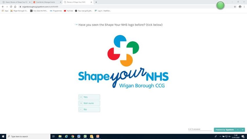
Contents

Section                             Page Number

Introduction                        2

Full survey results                 3-7

Respondents between the age of 25   8
– 54
Respondents who hadn’t heard of     8
“Shape Your NHS” before
Equality Monitoring Information     9

Recommendations                     10

Contact Us                          10

Appendix 1: list of comments from   11 - 17
the “open text” questions

                                                  Page 1
Introduction

In January 2020 we launched a survey about our “Shape Your NHS”
engagement brand.

We wanted to gather people’s views on the current brand and ask questions
that may help us to improve this brand in the future.

We had a total of 75 responses. There was a mix of responses completed
online, via post and in person.

This report outlines the response to the survey, our recommendations and
next steps.

Thanks to everyone who took the time to complete the survey.

                                                                       Page 2
Full Survey Results
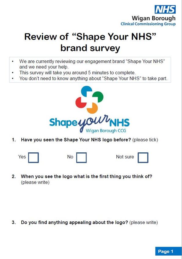
Question 1: Have you seen the Shape Your NHS logo before?
74 out of 75 responded.
Question 2: When you see the logo, what’s the first thing you think of?
72 out of 75 responded.
We had a whole range of answers here. The most popular colours were around
how the logo is colourful (8) and looks like Pacman (8). Some people told us the
logo reminds them of fitness and dieting (4).
A number of people (7) associated the logo with helping to shape, steer and
influence the NHS or being associated with the NHS (5).
Some people (7) said the logo doesn’t really make them think of anything.
A list of all the comments can be found on page XXX.
Question 3: Do you find anything appealing about the logo?
71 out of 75 responded.
A large number of people (23) said they found nothing appealing about the logo.
Those that did find something appealing about the logo said it was colourful (21),
eye catching (7) and clear (5).
A list of all the comments can be found on page XXX.
Page 3Question 4: Is there anything you dislike about the logo?
68 out of 75 responded.
A large number of people (26) said there was nothing they disliked about the logo.
Some people (4) didn’t know what it means. Some people (4) mentioned again that it
looks like Pacman and that it doesn’t “scream” the NHS (4).
A list of all the comments can be found on pages XXX.
Question 5: If we changed the logo, how important do you think it
would be for us to mention the name of our organisations, i.e. Wigan
Borough CCG?
73 out of 75 responded.
Average 8.2
Page 4Question 6: Select the terms you find most appealing?
74 out of 75 responded.
NHS 49 responses - 66.2%
Health and wellbeing 46 responses - 62.2%
Health and care 30 responses - 40.5%
Healthcare 21 responses - 28.4%
Wellbeing 16 responses - 21.6%
Healthy 13 responses - 17.6%
Question 7: Out of those, which did you find most appealing and
why?
68 out of 75 responded.
Those who said “NHS” Those who said “health and care”
• Pour of NHS • Sounds like both as important as
• Don’t privatise it each other
• Immediately recognisable • Covers health and social care
• Who we are • Health and care go hand in hand
• We use NHS services on a regular
basis Those who said “healthy”
• Gives confidence and assurance • Fits purpose of NHS
• Easily recognisable • Focus on keeping people healthy
• Amazing NHS
• Means so much to so many Those who said “healthcare”
• Important to be healthy and see your
Those who said “ health and GP
wellbeing”:
• Most informal Those who said “wellbeing”
• Covers prevention and cure • It’s about the whole person
• Broad definition of health • Lots of talk in the media about it
• Health problems and encouraging
people to be healthy
• Encompasses all aspects
• Sounds caring
• Covers mental and physical health
• Overview of NHS
• Whole person
• What we should all be concerned with
• Prevention agenda
• Fresh and appealing
Page 5Question 8: Select the words you find most appealing?
74 out of 75 responded.
Support 50 responses - 67.6%
Community 48 responses - 64.9%
Involve 36 responses - 48.6%
Help 32 responses - 43.2%
Engage 28 responses - 37.8%
Friend 19 responses - 25.7%
Shape 12 responses - 16.2%
Question 9: out of those, which did you find most appealing and
why?
72 out of 75 responded.
Those who selected “support” Those who selected “involve”
• Implies care linked to individual • Implies active participation
need • People like to be included
• Its what people need • People need to feel empowered to
• Its what is being done in the NHS support them to make healthy
• Covers all forms of help and choices
assistance • Makes a person feel valued
• Not condescending, dictatorial or • My heart is for inclusion
charity • Listen to people’s opinions
Those who selected “community” Those who selected “friends”
• It’s a service for all • Everyone needs them
• Joining together • A true friend would provide the
• This is the NHS support needed
• In this one word you’ll experience
the others Those who selected “help”
• Feels inclusive • It is what people need
• Community should always be part of
the NHS
Page 6Question 10: How important would it be for us to refer your specific
town or community in our brand?
74 out of 75 responded.
Average 8
Question 11: When you hear the phrase “friends of”…what does it
make you think of?
68 out of 75 responded.
The most popular comments here were that it reminds people of community
volunteers (15) or people who help and support the community (9). People also
mentioned friendship (8) and charity /fundraising (8).
A few people weren’t sure how to answer this (9)
A list of all the comments can be found on page XXX.
Question 12: Thinking about where you live in the Borough, do you
feel part of Ashton, Leigh or Wigan?
71 out of 75 responded.
Most people (60) said they felt part of Ashton, Leigh or Wigan.
A smaller number (9) said they did not feel part of Ashton, Leigh or Wigan. 2 of
those people mentioned their specific area; Springview and Golborne.
Page 7Respondents between the age of 20- 54
This is one of our target audiences.
This demographic made up a small number of our respondents (23 out of 75). Only a
small number (4) had heard of “Shape Your NHS” before.
They liked the use of colour in the “Shape Your NHS” logo and one person pointed
out that it was Autism Friendly. Some people in this group said that they didn’t
connect with the logo and it wasn’t obvious it was associated with the NHS.
The terms “health and wellbeing” was the most appealing to this group (17) followed
by “NHS” (15). Some of the comments around “health and wellbeing were that it
incorporates the whole person and it what we should be striving for.
This group prefer the terms “community” (16) and “support” (15), closely followed by
“involve” (14) and “engage” (11). Some of the comments from this demographic were
around inclusion and being part of the NHS.
This demographic mainly made positive comments about the “friends of” phrase.
All but one of this group feel part of Ashton, Leigh and Wigan .
Respondents who hadn’t heard of “Shape
Your NHS” before
This is one of our target audiences.
More than half (43 of 75) of the total respondents had not heard of “Shape Your
NHS” before.
There was no particular difference in the feedback about the “Shape Your NHS” logo
or what they think of “friends of”. The comments overall were varied.
The term “NHS” is most appealing to this group (29), closely followed by “health and
wellbeing” (28)
This group prefer the terms “community “(31) and “support” (30).
Page 8Equality Monitoring Information
We collected some limited demographic information from people who
completed the survey.
The first 3 digits of your postcode?
70 out of 75 responded.
M28 1 WN3 3
M29 1 WN4 7
PR6 1 WN5 5
WA3 4 WN6 19
WN1 3 WN7 14
WN2 10
What is your gender?
71 out of 75 responded.
Female 45
Male 24
Prefer not to say 2
How old are you?
70 out of 75 responded.
20 – 24 6
25 – 34 3
35 – 44 4
45 – 54 10
55 – 64 19
65 – 74 17
75+ 8
Prefer not to say 3
Page 9Next Steps
Thanks to everyone who took the time to complete this survey for us.
This results were discussed at the Wigan Borough Engagement Group
meeting on Tuesday 4th February 2020. This group is made up of patients
and residents that are interested in how local people can influence health
and social care services across the Borough.
As a next step we will set up a working group made up of volunteers. They
will help us to develop ideas and designs for the future of the brand.
These results will certainly be taken into account when we decide what to
do in the future.
Contact Us
If you have any questions about this piece of work, or if you want to be
involved as a volunteer, please don’t hesitate to get in touch with us.
Call: 01942 482711
Email: shapeyournhs@wiganboroughccg.nhs.uk
Page 10Appendix 1
list of comments from the “open text” questions
When you see the Shape Your NHS logo what comes to mind? (full
data)
It appears like a fitness club/ gym logo Nothing springs to mind
Nothing comes to mind The Health Service
Opportunity to help shape and possibly
steer the NHS in Wigan & Leigh Fitness drive
Waste of money better spent on funding
NHS Doctors and Nurses etc. Invitation to participate.
Political parties with the colours used in the
A place where you can influence the NHS logo
It's colourful. Health
Shapes Jigsaw puzzle
I just see the coloured circles. The logo
What do the different colours represent? doesn't mean anything and I don't recognise
Why is that a white cross? it
Interesting NHS
Happy and keen to help Cake
I Thought it was about keeping fit or doing
exercise. it reminds me of a children's toy Pacman
Pac man The colours
Prescribing / pharmacy Friendly and equality
The four shapes of different colours
represent agencies that work alone and
Hospital / Doctors together.
NHS Pharma company
Medical help ??
Chemist pacman
It's impressive as it immediately draws your
attention to it. PAC man
Page 11When you see the Shape Your NHS logo what comes to mind? (full
data) … CONTINUED
What do the circles and colours represent? It doesn’t make me think anything
The 80's Pac Man computer game. Not a great deal
Firstly the coloured disks, only afterwards
do you see the cross GP PRACTICE
Pacman A gap in services
nothing that someone cares
The cross shape in the centre, red cross,
Medical green cross
Clever and inclusive Is it something to do with dieting
strange Pac Man
PACMAN Does bring anything to mind
Public involvement in shaping change
Collaboration
pattern signifies most areas covered within
Distinctive the conurbation
I think that I will be provided with the latest
information about the free NHS courses. Eaten biscuits
Missing parts and disconnected Attractive
events taking place The cross to me denotes health
I immediately feel there is support 'out
4 circles and a cross. What does it mean? there'!
news about new public events What do the different colours denote?
A jigsaw Inclusivity
Nothing, as we have experience of
attempting to improve our local Doctors
and have been very unimpressed with any
CCG efforts. We now have a far worse
practice than a year ago. Changes afoot
Page 12Do you find anything appealing about the “Shape Your NHS” logo?
Clear print and easy to read. Colour and handwriting font
Use of different fonts It’s simple but effective and It’s autism friendly
The 4 circle logo with white cross is
Modern and refreshing overpowering
It’s good It’s attractive to the eye
Use of word "your" which stands out. Use of
colour. White cross links to health services. Bright
The Medical cross and Your no it doesn't connect with me
No no
eager to learn more No
lots of colours no
I don’t know what CCG stands for No
no Colourful
yes colourful The cross to me denotes health
I like this logo because it is immediately
Noticeable recognisable and stands out.
Everything except the coloured shapes which
NHS Concerns form the white cross .
Colourful It is noticeable
The colours of the logo! Clear and colourful
Clear and compelling It’s none descript
Yes. It stands out and is different to any
other logo I've seen. No
Colourful IT'S OK
the colours are eye catching Colourful
not really not really
Not really its bright and cheerful
The colours No
Nothing No, too busy
Looks friendly and inviting and non-officious Bright Colours
It's brightly coloured No it’s just too neutral doesn’t stand out
Bright colours, think that the 'THINK' should
be in another colour Not really
No. If it had a more NHS type logo more or less
blue it would be recognised to be for NHS and
Yes it’s fine health
no CCG
Looks clean and clinical No
the design works well with health being at
the centre Nice colours
no Bright and attractive.
The block text is fine Like the tag line
Nice colour scheme, simple design Bright and colourful
It’s eye catching No
Not really
Page 13Is there anything you dislike about the “Shape Your NHS” Logo?
Blond colours they could be more varied Logo
The different coloured circles look cheap The "your" text style
No dislike but if the coloured circles are The logo looks like Pac Men chasing each
meant to be background for the cross then other.
the cross does not stand out. Another image came to mind too, which was
Baby Bell cheese.
No As before, it doesn't really speak NHS. There
are too many colours involved
No NA
The cross in the middle does not sum up all Looks like 4 hungry mouths racing to eat each
that the NHS does. Medical cross is a first other. Don't like the font or colour change in
aid symbol but the NHS does more than the word 'your'. Don't like the use of the word
that, 'your'. The NHS is 'ours'.
I ca No
no is great No
Waste of NHS Money The only thing I would suggest is to maybe
outline the cross in black to make it stand out
more.
no The 4 circle logo
Should be bigger It may not necessarily be clear to everyone
what it represents.
No Unless you read the text, it doesn't scream
NHS
No it doesn't connect
Too much going on the pacman plus the typeface's are not good
I would only mention that the 'cross' is not No
immediately recognisable.
No eyes drawn to coloured discs, rather than the
white 'health cross'
No All of it
See answer to first question No
no Not at all. As soon as I see this logo I know
who it is.
No .Does it mean first aid for the health The top half. It’s almost an optical illusion.
service? Sometimes I’m seeing four incomplete circles
of bright random colours, other times I see a
white cross.
Not really No
No No
Why is a Logo so important? Why don't you I’m neutral but it doesn’t make me think of
just get things right instead of worrying health
about this?
It's nice but not sure what circles and It's not really obvious what it's for
colours represent
The (incomplete circles) look like Pac Man IT'S OK
(80s cult computer game).
Page 14Is there anything you dislike about the “Shape Your NHS” Logo?...
COTINUED
As above remark Looks like you know there are significant
gaps in services!
No, no
not particularly no
No It is very bland
font on "your" Too busy, don’t see the point of the four
shapes fonts do not work together
looks like pacman All the writing is the same colour,.
Not eye catching It’s just non dis script
No Doesn’t mean anything- drab
There is no NHS logo on it No.
Page 15When you heard the phrase “friends of” what does it make you think of?
People who are passionate or care of
something. Try a logo of "friends of Wigan
CCG." As a group a people who are
passionate about changing services in the
Community groups / groups for people to NHS to suit the individual communities in
reach out to. their local borough
Charity Insignificance. Not powerful.
Helpers Charity
Nothing People who are associated with a group?
I think it makes it so more personal, and
leagues of friends of hospitals more warm and welcoming.
I know what it means but if I was naive, I’d
think of smiling, often patronising elderly
people just a courtesy name
Support That it’s reaching out to you, personally
Be like too cheesy
People from communities that volunteer friends
Nothing really family
Friendship Company - Help support Nothing to do with healthcare
Help nothing in the professional field
A friendly organisation Group of social do-gooders
Church community Community
Close support within the organisation! Community and care
Community group Not sure of the question.
I assume it refers to volunteers who are giving Depends on the context! In terms of
their time to help the local community in some Organisations I find it very obscure and
way. would prefer “supporters of”.
Volunteers raising money Overused cliché
that they are friend of someone you y volunteers
Someone who takes an interest and time to
support something. Very informal in its approach
Volunteers nothing
Not much. You find out who are your friends in
time of need NOTHING
lackeys who want to feel important People who raise funds
Volunteers who raise money and generally
help not sure
Page 16When you heard the phrase “friends of” what does it make you think
of?... CONTINUED
Charity EXACTLY THAT , FRIENDS OF WHOM
nothing in particular Nothing in particular. Too general.
Volunteers Personal friends
help is close at hand OAP social club
In association with.... Charity or old pals act
Facebook Not sure within this context.
Supporters A support group
Support Community group
A ready formed group that may not be all
Community, caring, respectful that welcoming to new people/members
A charity Middle aged church goers
Page 17You can also read