SolarMap: Multifaceted Visual Analytics for Topic Exploration
←
→
Page content transcription
If your browser does not render page correctly, please read the page content below
SolarMap: Multifaceted Visual Analytics for Topic Exploration

                             Nan Cao∗ , David Gotz† , Jimeng Sun† , Yu-Ru Lin‡ and Huamin Qu∗
                                    ∗ Hong Kong University of Science and Technology
                                             † IBM TJ Watson Research Center
                                     ‡ Harvard University and Northeastern University

   Abstract—Documents in rich text corpora often contain           world use cases require this sort of multi-relational, multi-
multiple facets of information. For example, an article from       scale analysis.
a medical document collection might consist of multifaceted           For example, consider an analysis of a collection of
information about symptoms, treatments, causes, diagnoses,
prognoses, and preventions. Thus, documents in the collection      articles about various diseases. It is not enough for an
may have different relations across each of these various          analyst to see which diseases fall into a given cluster. A
facets. Topic analysis and exploration for such multi-relational   detailed analysis requires that the visualization convey why
corpora is a challenging visual analytic task. This paper          two diseases may fall into the same cluster (e.g., shared
presents SolarMap, a multifaceted visual analytic technique        symptoms or treatments) or what overlap may exist between
for visually exploring topics in multi-relational data. SolarMap
simultaneously visualizes the topic distribution of the underly-   two different yet nearby clusters.
ing entities from one facet together with keyword distributions       To support the type of analysis described above, we
that convey the semantic definition of each cluster along a        propose SolarMap, a new interactive visualization technique
secondary facet. SolarMap combines several visual techniques       that combines a labeled contour-based cluster visualization
including 1) topic contour clusters and interactive multifaceted   with a novel radially-oriented tag cloud technique. SolarMap
keyword topic rings, 2) a global layout optimization algorithm
that aligns each topic cluster with its corresponding keywords,    enables multi-relational visualization of document collec-
and 3) 2) an optimal temporal network segmentation and layout      tions at both the cluster and individual document scales.
method that renders temporal evolution of clusters. Finally, the      As temporal dependent data such as social media, publi-
paper concludes with two case studies and quantitative user        cations become upiquitous, topic evolution becomes an im-
evaluation which show the power of the SolarMap technique.         portant problem for data mining community. There are many
   Keywords-Visual Analytics, Multifaceted Information Visu-       temporal topic discovery methods: some assume smooth
alization, Temporal topic visualization                            topic evolution over time [1], [2]. However, less attention
                                                                   has made to provide visual interactive mechanisms to detect
                     I. I NTRODUCTION                              and explore the topics in the data in an effective manner.
   Text mining techniques have been developed and applied             To address these challenges, we propose SolarMap, a
to identifying patterns such as topics from large corpus           visual analytic technique with the following key features:
in various domains. However, those topics need to be               A cluster-aligned multifaceted radial tag-cloud tech-
understood by domain users in order to be useful. In               nique. SolarMap employs a novel tag-cloud display of mul-
recent years, a number of visualization techniques have been       tifaceted textual metadata that is arranged radially around
developed to assist in this challenge. Topic discovery and         an interior cluster-based context preserving rendering of the
visualization in particular has received significant attention     dataset. Color coding and optimized radial alignment are
with several systems designed to mine and render clusters          used to tie tags to corresponding clusters without the need
of related documents. A commonly followed approach is to           for visually distracting edges. Multifaceted information is
use some variation of spatially arranged clusters, rendered        laid out on to different radial rings of which one is shown
for example as a density map or an elevation map. The              at any given time.
spatial arrangement of these maps is used to represent             Rich coordinated interaction for visual analysis. So-
the relationship between clusters according to some metric,        larMap provides a rich set of interaction tools coordinated
while labels or tag-clouds can be added to convey some             across all visual elements of the visualization to enable
aspect of information associated with each cluster.                detailed analysis at document and cluster scale. Dynamic
   While effective at showing an overview of a document            highlighting and edges are used to selectively pinpoint
collection, the conventional approach is limited in its ability    relationships as users interact with visual objects. Controls
to show multiple dimensions of information about the doc-          are also provided for users to switch between radial tag
ument clusters simultaneously. In addition, these techniques       rings to focus on facets of interest during the analysis of
often make it difficult (if not impossible) to visually identify   multidimensional datasets.
relationships between individual documents, or how a doc-          Optimal temporal segmentation and layout method To
ument fits within a given cluster. Unfortunately, many real-       detect and visualize topic evolution, SolarMap detects signif-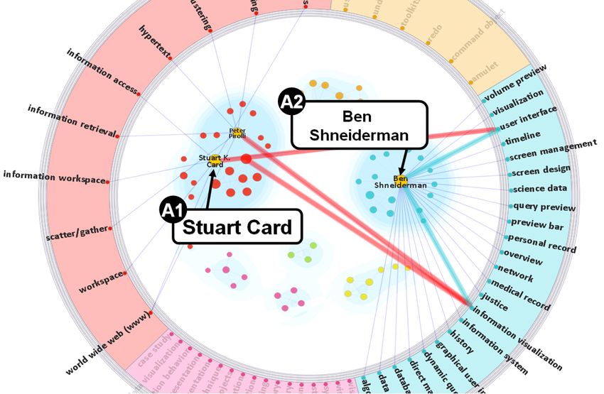
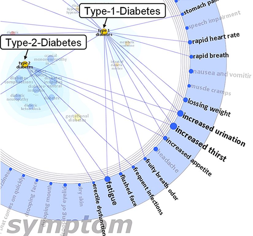
Figure 1.   Overview of SolarMap. The InfoVis research communities and their research topics in the year 1994.

icant changes of the clusters across different time segments               lection. Perhaps most common is the tag cloud [3] which
based on a hierarchical network sequence segmentation.                     displays a set of words arranged in rows with font sizes
A dynamic visualization is developed to represent topic                    that correspond to statistics such as term frequency. More
distribution with smooth transition over time.                             advanced tag clouds, such as Wordle [4] and Word Cloud
   In this paper, we describe both the design and implemen-                [5], enhance the appearance through more sophisticated
tation of SolarMap. In addition, we demonstrate the power                  layouts. In other work, document cards [6] present the
of our approach through a case study and formal user study.                content of a document collection using summary cards that
The results from our evaluation confirm the effectiveness                  include highlighted figures and content topics. The Topic
and general applicability of SolarMap for exploring multi-                 Islands [7] approach uses wavelets to summarize the the-
dimensional relational datasets.                                           matic characteristics of a single document. ThemeRiver [8]
   The rest of paper is organized as follows: Section II                   visualizes topic evolution using a temporal plot showing the
reviews several areas of related work; Section III presents the            ebb and flow of topic themes over time.
visualization design of SolarMap including the data model,                    Some techniques attempt to augment the contents of a
visual encoding and layout; Sections IV and V present a                    document with limited relationship information. For exam-
case study and evaluation. Finally, the paper concludes in                 ple, WordTree [9] and PhraseNet [10] focus on relational
Section VI with a review and discussion of future work.                    word patterns within a given text. In particular, WordTree
                    II. R ELATED W ORK                                     considers the prefix relation between words at the syntax
                                                                           level. PhraseNet allows user defined relationships.
   This section highlights a number of related text visualiza-
                                                                              In contrast with this prior work, SolarMap combines con-
tion techniques. Topics most relevant to SolarMap include
                                                                           tent visualization techniques with visual cues that represent
document content visualization, techniques for conveying
                                                                           cross-document relationships across multiple facets.
document relationships, and multifacet visualization tech-
niques.                                                                    B. Visualizing Document Relationships
A. Visualizing Document Content                                               Other text visualization techniques focus on displaying
  Many conventional text visualizations are designed to                    relationships between documents in a collection. For exam-
summarize the content of a document or document col-                       ple, many visualizations [11], [12], [13] work by mapping a
set of documents to a 2D display according to document           multifaceted entity relational data model to represent this
similarity. Other projections, such as probabilistic latent      information in a structured way. Figure 2 illustrates the pro-
semantic model [14], can reveal topic clusters. However,         cessing pipeline used to transform a set of raw unstructured
because of information lost when projecting from a high          documents into our data model.
dimensional space to 2D coordinates, it is often hard for           The first stage in the transformation pipeline is facet
users to understand the semantic meaning of the resulting        segmentation. During this stage, each document is seg-
clusters. SolarMap employs its own projection technique          mented into facet snippets. While various techniques could
to create document clusters. However, these clusters are         be used, we typically employ a topic modeling technique
augmented with significant additional information designed       such LDA [18] and treat each topic as a facet. When pro-
to convey more clearly what each cluster represents.             cessing documents with a well defined structure (e.g. online
   In other work, Collins et al. [15] introduce parallel tag     Google Health documents which have standard sections for
clouds (PTCs) to visualize text along multiple facets ar-        symptoms, treatments, etc.), we directly use the sections to
ranged as columns of words. Links across columns rep-            define facet snippets.
resent co-occurrence relationships. This technique can be           Entity extraction is the second transformation pipeline
very powerful but is limited to word-level relationships.        stage. In this step, a named entity recognition algorithm is
In contrast, SolarMap can visualize more complex latent          applied to each facet’s document snippet to generate a set of
relationships between documents.                                 typed entities. Domain-specific ontology models are used to
                                                                 recognize meaningful entities for each facet. For example,
C. Multifaceted Text Visualization                               in Google Health documents, entities in the symptom facet
   Most recently, a number of systems targeting multifaceted     could include “increased thirst” or “blurred vision”, while
text corpora have been proposed. These designs combine           “type 1 diabetes” and “type 2 diabetes” are entities in the
multiple visual techniques to depict information about both      disease facet.
document content and inter-document relationships. For ex-          The third and final stage in the processing pipeline is
ample, ContexTour [16] and FacetAtlas [17] are two systems       relation building. In this stage, connections between ex-
in this category. ContexTour uses a multi-layer tag cloud        tracted entities are established using two types of relations:
design that combines clusters with their layered tag clouds      internal relations and the external relations. An internal
which use one layer to represent the content of a cluster        relation connects entities within the same facet. For exam-
for each facet. However, this “content-focused” design users     ple, the entities “type-1-diabetes” and “type-2-diabetes” are
does not convey any information about individual docu-           connected within the disease facet by an internal relation.
ments/entities or their individual relationships. In contrast,   An external relation is a connection between entities from
FacetAtlas provides a query based interface which focuses        different facets. For example the disease “type-2-diabetes”
specifically on visualizing complex multifacet relationships.    is connected to the symptom “increased thirst” by an ex-
However, FacetAtlas shows no information about the actual        ternal relation because “increased thirst” is a symptom of
contents of the documents.                                       “diabetes-type-2”.
   SolarMap captures the advantages of both ContexTour and
FacetAtlas within a single integrated visualization technique.   B. Design Principles and Visual Encoding
To highlight the benefits of our approach, Section V provides       The visual encoding used to represent the information in
the results from a formal user study which compares the          the SolarMap data model is motivated by several key design
ContexTour and FacetAtlas techniques with SolarMap in an         principles.
objective task-oriented evaluation.                                 Focus + Context. In SolarMap, there is one facet selected
                                                                 at any given time to serve as the topic facet. Entities in the
                       III. M ETHOD                              topic facet (which we call topic entities) are considered in
   This section describes the details of the SolarMap visual-    focus and are rendered as nodes arranged within the central
ization technique. We first review the SolarMap data model       region of the visualization. The topic entities are clustered
and describe how document corpora are transformed to fit         by their internal relations to determine the nodes’ spatial
into this model. We then define the visual encodings and         positions. Contours are then rendered to further highlight the
layout algorithm used to render the transformed data for         cluster structures. The value of each topic entity is rendered
display.                                                         on top of the node, resulting in a clustered tag cloud of topic
                                                                 entity labels.
A. Data Model and Transformation                                    All other facets in the data model are considered keyword
  Documents are typically unstructured in nature. Visualiz-      facets. Keyword facets are visually encoded as surrounding
ing the content of a document corpus and the relationships       rings that circle around the central topic cluster region.
between documents requires that these unstructured artifacts     Entities within a keyword facet are called keyword entities.
be transformed into a structured form. SolarMap uses a           Only keyword entities from a single selected keyword facet
Figure 2.   Data transformation process and the multifaceted entity-relational data model.

                                                                              entities appear in the blue wedge of the symptom ring
                                                                              because they are common symptoms for diseases in the blue
                                                                              cluster found in the center of the figure.

                                                                                 Content + Relations. SolarMap is designed to provide
                                                                              a unified visualization of both content entities and the rela-
                                                                              tionships between them. As mentioned above, topic entities
                                                                              and keyword entities are rendered as clustered tag clouds
                                                                              and radial tag clouds, respectively. Internal relations in the
                                                                              topic facet are encoded by screen distance between primary
                                                                              entities. External relations are encoded as lines that each
                                                                              primary entity with related keyword entities in the selected
                                                                              facet ring. Each line is colored by its topic entity’s cluster
                                                                              and line thickness represents the number of topic entities
                                                                              related to the same keyword entity.

                                                                                 Rich Interaction. SolarMap includes a number of inter-
                                                                              active features to enable rich data exploration. In addition to
                   Figure 3.     Visual Encoding                              traditional tools like dynamic query and filtering, two more
                                                                              sophisticated interactions are supported. First, SolarMap’s
                                                                              context switch capability allows users to change both the
are rendered at any given time. Keyword entities are dis-                     center topic facet and the surrounding keyword facets. Users
played as radial tag clouds and provide secondary contextual                  can change the facet assigned to be the topic facet by double-
information about each cluster. The radial tags are grouped                   clicking on any keyword facet ring. Users can change the
based on the clusters identified along the primary topic                      selected keyword facet by single-clicking on a facet ring.
facet. This forms wedge-shaped sections along each ring
which one wedge for each cluster. The size of each wedge                         The other powerful interactive feature provided by So-
indicates the size of the corresponding topic cluster, and the                larMap is relation highlighting. By default, the lines repre-
correspondence between cluster and wedge is captured using                    senting relations are not rendered to limit visual complexity.
both color and position.                                                      Moving the mouse over any entity selectively displays the
   For example, in Figure 3, Disease is selected as the                       lines representing its external relations. The textual tags for
topic facet with “Type-1-Diabetes” being one topic entity.                    connected entities are also highlighted. Multiple selection,
Symptoms and Treatments are both keyword facets. In this                      via mouse clicks, is also possible to highlight relations
example, Symptoms is the selected keyword facet resulting                     across multiple entities simultaneously. This technique is
in keyword entities such as “blurred vision” and “increased                   very effective at supporting entity comparison across various
thirst” being visualized along the corresponding ring. These                  keyword facets.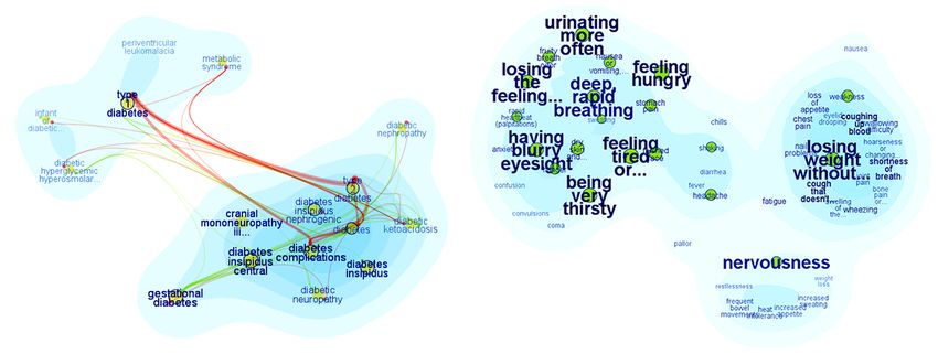
(a)                                                 (b)                                          (c)

                 Figure 4.          SolarMap Layout. (a)cluster center detection, (b)keyword wedge reordering, (c)optimized cluster alignment

C. Layout                                                                               algorithm places a Gaussian kernel over each entity and
   The design outlined above introduces several constraints                             uses the joint distribution f (x, y) of these kernels as the
on the SolarMap layout. Fortunately, some of the constraints                            approximated information density. We adjust the bandwidth
are well studied problems where existing techniques can                                 of each kernel to get distribution with a high degree of
be leveraged. For example, the radial tag cloud layout can                              smoothness. Finally, contour lines are generated using a
utilize prior designs such as TextArc1 . However, there are                             contour plotting algorithm [21]. The details of this approach
also some new layout challenges. In particular, we must align                           are described in [17].
topic clusters with their corresponding keyword ring wedges                                2) Keyword Cluster Layout: After the topic clusters are
to help users map between these two facets of information.                              positioned, this step positions the color-coded keyword
   Generally speaking, the SolarMap layout algorithm has                                wedges on the surrounding facet ring next to their corre-
two major steps. In the first step, we arrange topic entities in                        sponding topic clusters. The wedges within the ring are first
the central area of the visualization using a stabilized graph                          reordered based on the centroid of each topic cluster. This
layout algorithm. The positions are then used to generate                               reduces line crossings when external relations are displayed.
contours using a kernel density estimation technique. In                                Then, a force based optimization model is used to rotate the
the second step, keyword clusters are positioned on the                                 ring such that the distances between the wedges and their
surrounding ring within wedges that are ordered to reduce                               related topic clusters is minimized.
                                                                                           Cluster Center Detection. Center detection for each topic
line crossings and positioned align with their corresponding
                                                                                        facet cluster Ci begins by first extracting its kernel set Ci0 .
topic clusters.
                                                                                        Using the kernel set we detect and remove any outlier
   1) Topic Cluster Layout: The set of topic entities are
                                                                                        entities that are far away from other cluster members.
connected via internal relations to form a graph as illustrated
                                                                                        Then, the convex hull P of Ci0 is computed and used as
in Figure 2. During topic cluster layout, a stabilized graph
                                                                                        cluster boundary. Finally, a center of mass is computed
layout algorithm [19] applied to this graph. It minimizes the
                                                                                        by considering the joint kernel density distribution f (x, y)
following energy metric:
                                                                                        within the boundary P using the following formula:
                                                                                                          R                      R
                 1                                                                                         x f (x, y)dx          y f (x, y)dy
        min( ∑ 2 (||Xi − X j || − di j )2 + ∑ ||Xi − Xi0 ||2 )              (1)                    Cx = R               , Cy = R                 (2)
                d
            i< j i j                        i< j
                                                                                                            f (x, y)dx            f (x, y)dy
                                                                                           To accelerate the layout process, we treat the density
   The first term in this equation places pairs of strongly-                            distribution as a constant. This approach reduces the above
connected entities next to each other by minimizing the                                 formulas to the following:
difference between screen layout distance (||Xi − X j ||) and
graph distance (di j ). The second part of the equation is a
smoothness term which minimizes the change in distance                                                     1 N−1
                                                                                                   Cx =      ∑ (xi + xi+1 )(xi yi+1 − xi+1 yi )
                                                                                                          6A i=0
between an entities position at sequential time-steps during
                                                                                                                                                    (3)
animation.                                                                                               1 N−1
   After laying out the entities, we render contours to                                            Cy =    ∑ (yi + yi+1 )(xi yi+1 − xi+1 yi )
                                                                                                        6A i=0
highlight clusters using kernel density estimation [20]. This
                                                                                          where A is the area of P, (xi , yi ) is the ith vertex of
  1 http://www.textarc.org/                                                             polygon P.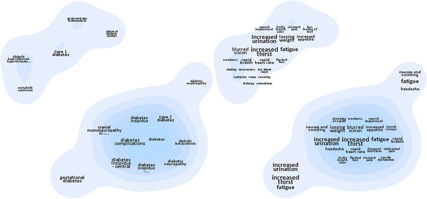
Keyword Wedge Ordering. To reduce line crossings and
minimize the distances between keyword wedges and their
associated topic clusters, we organize the wedges based on
the angular position of the topic clusters using a projection
line technique. We first project the center of each topic
cluster’s contour Ci out to the surrounding ring by using
a projection line that starts at the center of the visualization
canvas. The projection line for Ci intersects the facet ring at
point pi as shown in Figure 4(b). The radial order of these
positions are then used to order the keyword wedges.
   Optimized Cluster Alignment. After ordering the wedges,
the final step is optimized cluster alignment which rotates
the keyword facet ring to an angle that best aligns each
wedge with its corresponding topic cluster. The alignment
                                                                       Figure 5. Graph sequence segmentation and the context preserving layout
is accomplished through the force-based optimization model             algorithms.
defined below.

                    min ∑( fi × r × cos(αi ))                   (4)    problem of finding the best k-partitioning of GS such that the
                          i                                            total error ∑1≤i≤k sse(Si ) is minimized. We define the cost
   The model minimizes the sum of the computed forces                  function F(T, k) as the minimal cost of partitioning graph
for all external relations i between the topic entities and            sequence GS = {G1 , . . . , GT } into k segments. The following
the displayed keyword entities. The force equation is based            recursion defines the optimal substructure for the dynamic
on the moment of force where fi is a spring-force equation             programming:
based on the distance between the pair of related entities,
r is the radius of the ring, and αi is the angle of the                              F(T, k) = min(F(t, k − 1) + sse(Sk ))                (6)
                                                                                                 t
symptoms such as “increased urination” and “fatigue”, as
well as similar complications such as “kidney disease ” and
“Stroke”. However, they do not share any common causes.
This case study demonstrates the capability of SolarMap to
explain clusters through the links between topic clusters and
keyword clusters.
B. Case Study Two: DBLP
Figure 6. SolarMap visualization of the Google Health library.
(a)
Figure 7. Case Study on Diabetes
(b)
Figure 8. Case study on DBLP data. (a) In 1996, visualization communities
A. Case Study One: Healthcare were rather isolated but began to study similar topics. (b) By 1999, the
communities were collaborating more closely and had even more research
The Google Health data has several facets. For our initial topics in common.
exploration, we selected disease name as the topic facet. The
diseases appear as topic clusters in the center of Figure 6. Time plays an important role in the DBLP dataset as it
Other facets are visualized using the surrounding keyword captures the evolution of research topics and teams over
rings. several years. This case study examined changes in the
A key strength of SolarMap is the ability to explain InfoVis community from 1992 through 2002. As illustrated
relations between entities. For example, SolarMap can easily in Figure 1 and Figure 8, we use author names as the topic
explain how two diseases are related to each other. To do facet, and paper keywords grouped by year as the keyword
that, we double click on the diseases we wish to compare facets. The years are ordered allowing easy navigation
to select them. This highlights the external relations for the through time using the keyword rings.
selected diseases as as shown in Figure 7. By switching Exploring the data year by year, we found some inter-
through different keyword facets (e.g, symptom, complica- esting evolution patterns. In the first years, such as 1994
tion, and cause), we can easily observe that Type-1-Diabetes (see Figure 1), several isolated author clusters emerged. The
and Type-2-Diabetes are related because they share similar largest were led by Ben Shneiderman and Stuart K. Card.Shneiderman’s cluster focused most on interaction designs • T1: Identify all clusters of diseases that match the
such as “dynamic query” and information exploration such query term ”diabetes”. This task tests a tool’s ability
as “information seeking and retrieval”. In contrast, Card’s to convey clusters.
group focused more on “graphical representation” and “ex- • T2: Identify the top 3 symptoms for a specified disease
plorative data analysis”. cluster. This task tests how well a tool allows users to
In 1996, researchers in both clusters began working on interpret of clusters.
a few similar topics such as “Information Visualization” • T3: Identify the top 3 symptoms shared between two
and “User Interface”, as indicated by the common links specified disease clusters. This task tests a tool’s ability
to those keywords on Figure 8(a). However, as shown by to compare clusters across specific facets.
the author clusters, the research communities were still not These tasks increase in complexity from relatively simple
directly collaborating. However, by 1999, the clusters begin (T1) to complex (T3). The tasks were chosen to simulate a
to merge. This merger, as shown in Figure 8(b), occurs common self-care education scenario for chronic diabetic
around the time that Card and Shneiderman join as two of patients. Together, these three tasks represent a concrete
the co-authors on the book “Using Vision to Think”. use-case of analyzing the Google Health library for self
V. E VALUATION diagnosis.
In addition to the case studies described above, our system Participants and Methodology. We recruited 15 partici-
was evaluated quantitatively through a formal user study. pants for our study (9 researchers and 6 students majoring in
This section describes the study’s design and presents both computer science, psychology and mathematics). Inspired by
objective and subjective results. the repeated-measures study methodology [22], we divided
the participants into three groups of 5. The first group
used FacetAtlas for task T1, ContexTour for task T2, and
SolarMap for task T3; the second group used the ContexTour
for task T1, SolarMap for task T2 and FacetAtlas for task
T3; finally the third group used SolarMap for task T1 and
FacetAtlas for task T2 and ContexTour for task T3. At the
beginning of each user session, We gave a brief tutorial of all
three systems. The participants were then asked to complete
the three assigned tasks.
We recorded two objective measures: task completion
(a) time (the time spent on each task, measured in seconds), and
task success rate (the percentage of assigned tasks completed
successfully). We computed the mean and standard deviation
of task completion time and task success rate across all users
and tasks.
We also recorded subjective measures via user surveys.
We compared SolarMap with the two baseline systems on
aesthetics, ease of use and usefulness. To further evaluate the
design of SolarMap, we asked users to score specific aspects
(b) of the visualization in terms of (1) usefulness (how useful a
system is for solving a specific task) and (2) usability (how
Figure 9. Baseline systems in our user study. (a) ContexTour, the disease
tag clouds (left) and related symptoms tag clouds (right). (b) FacetAtlas,
easy the system was to use for a specific task).
the disease view (left) and Type-1-Diabetes’ symptoms view (right).
B. Objective Results
A. Study Setup As shown in Figure 10(a), the baselines systems (Con-
To evaluate the effectiveness and efficiency of SolarMap texTour and FacetAtlas) both exhibit an increasing trend
in support of multifaceted data analysis, we conducted a in task completion time from T1 to T3. This confirms the
comparison study. Our study compared SolarMap with two increasing complexity across tasks. For the relatively simple
baseline systems: ContexTour [16] and FacetAtlas [17]. task T1, all three visualizations perform equally well with
See Section II-C for a comparison of features in these two less than 4 seconds spent on the task on average. For the
baselines with the features of SolarMap. medium difficulty task T2, SolarMap shows a small advan-
Tasks. We applied all three systems to the same Google tage when compared to baseline methods while FacetAtlas
Health dataset and and users in our study to perform a series requires significantly more time. This is because FacetAtlas
of analysis tasks. The tasks in our study were as follows: requires an context switch to view individual symptoms,lower success rates on both tasks T2 and T3. We believe the
drop in accuracy was due to the need for a context switch
between diseases and symptoms when using FacetAtlas
which may have forced users to lose the context of the
original clusters. This is further evidenced by the fact that
these least accurate tasks (FacetAtlas T2 and T3) were also
the ones that users spent the most time completing.
C. Subjective Results
Figure 10. Study results comparing (a) task completion time and (b) task
success rate.
while ContexTour and SolarMap can directly present the
Figure 11. (a) Comparison of ratings for aesthetics, ease of use, and
related symptoms on the same view. usefulness of the three designs. (b) Usability feedback for SolarMap’s key
For the most complex task T3, SolarMap outperforms features.
both baselines significantly. Interestingly, SolarMap requires
less time on T3 than T2, despite T3 being the most complex In addition to the quantitative results presented above,
task for both baseline systems. We believe that the major we gathered subjective feedback through user surveys. All
reasons for this are that (1) the relation highlighting fea- participants were asked to compare SolarMap with Contex-
ture of SolarMap helps users to quickly identify common Tour and FacetAtlas in terms of aesthetics, ease of use and
symptoms, and (2) the shorter list of shared symptoms in usefulness. The survey asked users to score each method
T3 (compared to the longer list of symptoms in T2) makes from 1 (lowest) to 5 (highest) in each of these dimensions.
it easier to identify the top thee symptoms. The results are shown in Figure 11(a). In terms of aesthet-
These results show that SolarMap provides a strong re- ics, users liked both FacetAtlas and SolarMap more than
duction in task completion time for more complex tasks. In ContexTour. Ease of use scores were relatively even across
particular, a two-way repeated measures ANOVA analysis all three tools. However, when considering usefulness, users
shows that when compared with the FacetAtlas system felt that SolarMap was the most useful visualization among
on T2, both SolarMap and ContexTour yield a significant three.
efficiency improvement (T2, SolarMap p = 0.014 < .05, Finally, we collected qualitative user feedback on the key
ContexTour p = 0.018 < .05). Similarly, the performance capabilities of SolarMap. For each of four capabilities (find
improvement on T3 is also significant (T3, SolarMap p = entity related topics, find cluster related topics, find topic
0.005 < .05, ContexTour p = 0.014 < .05). In both cases overlaps of entities, and find topic overlaps of clusters) we
SolarMap performs best, and for task T3 SolarMap is had users provide scores (from 1 to 5) for usefulness and
significantly better than ContexTour (p = 0.003 < .05). ease of use. Figure 11 summarizes the results. All features
We also compared task success rates as shown in Fig- exhibited fairly high scores for both usefulness and ease of
ure 10(b). Both SolarMap and the ContexTour achieve use. This confirms that users felt comfortable with SolarMap
similarly high accuracy levels. Only one error was observed and were confident in its ability to support the assigned
for each of these systems. In contrast, the FacetAtlas yielded analysis tasks.VI. C ONCLUSION [10] F. van Ham, M. Wattenberg, and F. Viégas, “Mapping text
with phrase nets.” IEEE transactions on visualization and
This paper presents SolarMap, a multifaceted visual ana- computer graphics, vol. 15, no. 6, p. 1169, 2009.
lytic technique for visually mining and exploring topics in
temporally evolving multi-relational data. SolarMap simul- [11] K. Andrews, W. Kienreich, V. Sabol, J. Becker, G. Droschl,
taneously visualizes the topic distribution of the underlying F. Kappe, M. Granitzer, P. Auer, and K. Tochtermann, “The
entities from one facet together with keyword distributions infosky visual explorer: exploiting hierarchical structure and
document similarities,” Information Visualization, 1, vol. 3,
that convey the semantic definition of each cluster along a no. 4, pp. 166–181, 2002.
secondary facet, and also provides smooth visual transition
of temporal evolution of topic clusters. As described in this [12] Y. Chen, L. Wang, M. Dong, and J. Hua, “Exemplar-based Vi-
paper, SolarMap combines several visual techniques includ- sualization of Large Document Corpus (InfoVis2009-1115),”
ing 1) topic contour clusters and interactive multifaceted IEEE Transactions on Visualization and Computer Graphics,
vol. 15, no. 6, pp. 1161–1168, 2009.
keyword topic rings, 2) a global layout optimization algo-
rithm that aligns each topic cluster with its corresponding [13] J. Wise, J. Thomas, K. Pennock, D. Lantrip, M. Pottier,
keywords and 3) optimal temporal segmentation of evolving A. Schur, V. Crow, and W. Richland, “Visualizing the Non-
topic sequences. Visual: Spatial analysis and interaction with information from
We also described two use cases where SolarMap can be text documents,” Proceedings, information visualization: Oc-
tober 30-31, 1995, Atlanta, Georgia, USA, p. 51, 1995.
applied and conducted a formal user study to compare our
new technique with two competing baseline systems. Both [14] T. Iwata, T. Yamada, and N. Ueda, “Probabilistic latent se-
the objective and subjective results from our study show mantic visualization: topic model for visualizing documents,”
that SolarMap outperforms the baseline systems in many in Proceeding of the 14th ACM SIGKDD international con-
areas. In future work, we plan to apply SolarMap to more ference on Knowledge discovery and data mining. ACM,
2008, pp. 363–371.
applications, to conduct more thorough user studies.
R EFERENCES [15] M. W. Christopher Collins, Fernanda B. Viegas, “Parallel Tag
Clouds to Explore and Analyze Faceted Text Corpora,” in
[1] D. M. Blei and J. D. Lafferty, “Dynamic topic models,” in IEEE Symposium on Visual Analytics Science and Technology
Proceedings of the 23rd international conference on Machine (VAST). IEEE, 2009, pp. 91 – 98.
learning, ser. ICML ’06, 2006, pp. 113–120.
[16] Y.-R. Lin, J. Sun, N. Cao, and S. Liu, “Contextour: Con-
[2] J. Sun, C. Faloutsos, S. Papadimitriou, and P. S. Yu, “Graph- textual contour visual analysis on dynamic multi- relational
scope: parameter-free mining of large time-evolving graphs,” clustering,” in SIAM Data Mining conference, accepted, 2010.
in KDD, 2007, pp. 687–696.
[17] N. Cao, J. Sun, Y.-R. Lin, D. Gotz, S. Liu, and H. Qu,
[3] Y. Hassan-Montero and V. Herrero-Solana, “Improving tag- “Facetatlas: Multifaceted visualization for rich text corpora,”
clouds as visual information retrieval interfaces,” in Interna- IEEE Transactions on Visualization and Computer Graphics,
tional Conference on Multidisciplinary Information Sciences vol. 16, pp. 1172–1181, 2010.
and Technologies, 2006, pp. 25–28.
[18] D. Blei, A. Ng, and M. Jordan, “Latent dirichlet allocation,”
[4] F. Viégas, M. Wattenberg, and J. Feinberg, “Participatory Vi- The Journal of Machine Learning Research, vol. 3, pp. 993–
sualization with Wordle,” IEEE Transactions on Visualization 1022, 2003.
and Computer Graphics, vol. 15, no. 6, pp. 1137–1144, 2009.
[19] N. Cao, S. Liu, L. Tan, and X. Zhou, “Interactive Poster :
[5] J. Clark, “http://neoformix.com/,” Neoformix Blog, March Context-Preserving Dynamic Graph Visualization,” in IEEE
2009. Symposium on Information Visualization, 2008.
[6] H. Strobelt, D. Oelke, C. Rohrdantz, A. Stoffel, D. Keim, and [20] B. Turlach, “Bandwidth selection in kernel density estimation:
O. Deussen, “Document Cards: A Top Trumps Visualization A review,” CORE and Institut de Statistique, pp. 23–493,
for Documents,” IEEE Transactions on Visualization and 1993.
Computer Graphics, vol. 15, no. 6, pp. 1145–1152, 2009.
[21] C. Singh and D. Sarkar, “A simple and fast algorithm for
[7] N. Miller, P. Wong, M. Brewster, and H. Foote, “TOPIC the plotting of contours using quadrilateral meshes,” Finite
ISLANDS - a wavelet-based text visualization system,” in Elements in Analysis and Design, vol. 7, no. 3, pp. 217 –
Visualization’98. Proceedings, 1998, pp. 189–196. 228, 1990.
[8] S. Havre, B. Hetzler, and L. Nowell, “ThemeRiver: Visual- [22] R. Bakeman and B. Robinson, Understanding statistics in the
izing theme changes over time,” in Proceedings of the IEEE behavioral sciences. Lawrence Erlbaum, 2005.
Symposium on Information Vizualization, 2000, pp. 115–123.
[9] M. Wattenberg and B. Fernanda, “The word tree, an interac-
tive visual concordance,” IEEE Transactions on Visualization
and Computer Graphics, vol. 14, no. 6, pp. 1221–1228, 2008.You can also read