What explains differences in social distancing in the UK? - Professor Ben Ansell Nuffield College, University of Oxford
←
→
Page content transcription
If your browser does not render page correctly, please read the page content below
What explains
differences in social
distancing in the UK?

Professor Ben Ansell
Nuffield College, University of Oxford

                       1

                                         28 April 2020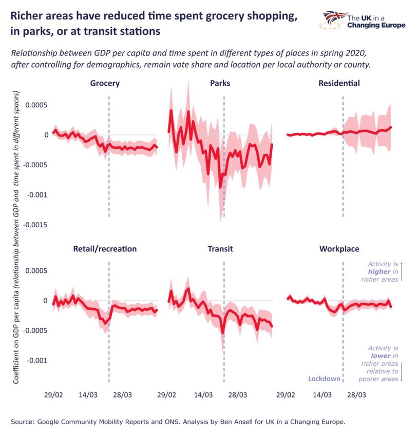
Executive Summary

• Google’s data shows that the British public took the lockdown very
  seriously and, in many cases, were acting ahead of the official
  government ruling.

• However, some places have locked down more than others. These
  differences can be explained by income, geography and (more
  surprisingly) politics.

• There is a difference between Remain and Leave-voting places in the level
  of social distancing taking place, even when controlling for income,
  demographics and population density.

• Places that are more ‘Remainy’ than you’d expect given their income,
  location and demographics are also more likely to have seen reduced
  workplace activity.

• This difference in the politics of places, with higher Leave vote correlating
  with lower levels of distancing, exists across and within all regions of
  Great Britain.

                                     2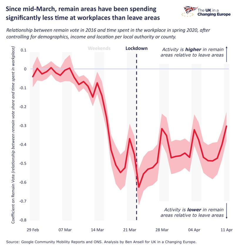
The coronavirus has led to the greatest change in everyday life for Britons – and
citizens around the world – since the Second World War. Governments have almost
universally employed lockdowns, preventing citizens from leaving their homes except
for specifically approved reasons.
But no lockdown is 100% enforced. It is both impossible and undesirable to have the
police monitor every movement or every citizen. And in most countries the rules
around social distancing have some wriggle room. In England, for example, the
government advice is to exercise only once daily but this does not have an explicit
basis in law. In any case, some people are essential workers and must continue their
daily travel and interaction through the lockdown.
In other words, we should expect some variation across people – and maybe places
– in how much social distancing is going on. But other than anecdotal snapshots of
people in London parks – and the ensuing moral outrage in the media – how can we
tell how much social distancing is going on?
One possibility is to ask people in surveys. A number of polling companies have done
so and found relatively little difference in people’s claims about their social distancing
behaviour in terms of personal hygiene, avoiding crowded places, etc. There are some
emerging differences in whether people have been able to work from home.
YouGov found that 45% of people in social grades ABC1 have avoided going to work
to protect themselves from coronavirus, compare to only 29% of social grades C2DE.
Even still, self-reported behaviour is prone to so-called ‘social desirability’ bias –
people tell survey companies what they think they want to hear.
To get around this problem we could look at people’s actual social distancing
behaviour, as opposed to their claims about it. To do so at an individual level would
require Big Brother style monitoring that few of us would be comfortable with (at least
yet!).
However, we can look at aggregated data on the amount of ‘activity’ going on in
different types of places. Google’s Community Mobility Reports provides just this kind
of data. It is constructed from people’s ‘Location History’ in their Google Accounts –
so this will be sent to Google from people’s smartphones as they move around.
Google keeps this data anonymous but can aggregate it at the regional level, showing
how much activity is going on in various types of locations.
Google uses six location types: groceries, parks, residential, retail and recreation,
transit stations, and workplaces. The data quality varies across categories, and is
especially weak for parks and residential. But it provides, for each category, a helpful
account of how much activity has changed since 29 February.

                                            3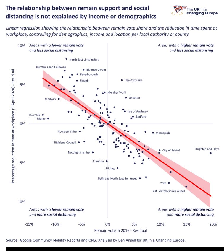
In the UK, we are fortunate that Google provides this data at a quite disaggregated
level – with 150 different geographical units covered. The good news is that these
cover the whole of the UK. The bad news is that sometimes they are local authorities,
such as Reading or Thurrock, and other times they are counties, such as Oxfordshire.
Even worse, there is just one observation for London. So we need to be a bit careful
about this data since it is not always comparing apples with apples.
We can match this data, more or less well, to other data collected at the local authority
level. The good people in the ONS Data Science Campus have scraped the Google
data and added population demographics. To this I have further added economic data
drawn from the ONS – gross domestic product per person and its growth over the past
year – and political data, specifically the voting record of the local authority in the Brexit
Referendum of 2016. Together with the data on the population’s demographics this
gives us the ability to see how demographic, economic, and political factors might be
shaping people’s activity during the lockdown.
So, what do we find? First off, the most important – and impressive – thing to note is
just how much social distancing has been going on. In the first two weeks of March,
even as the virus had clearly ravaged Northern Italy – workplace activity in the UK
was indistinguishable from normal. But around 15 March we see a sharp drop of
around 25% compared to normal activity. And following the lockdown this reduced to
50% and then by Easter weekend almost 75% in some places. The British public
clearly took the lockdown very seriously and indeed in many cases were acting ahead
of the official government ruling.
We see a similar pattern for activity at transit stations and retail and recreation. At the
same time, activity in residential areas – i.e. at home – increased. This is great news
for the government’s lockdown strategy. People are largely following the advice and
we have not had the same agitation we see in a number of US states.
The second thing to note is that different places have seen quite starkly different
changes in activity. Not everywhere has shut down equally. Some localities, such as
North East Lincolnshire have reduced workplace activity by just over half. Others, such
as Edinburgh, by 80%. Now these are percentage changes so it’s possible this is
produced by having different baselines. But as we shall see, there does seem to be
something systematic to this.
All three types of regional factors – demographic, economic, and political – appear to
matter in explaining differences across places. Surprisingly, the latter is the strongest
predictor, even taking into account the other forces and regional differences.

                                              4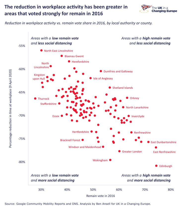
Let’s begin with three figures showing the change in workplace activity on Thursday 9
April, just before the Easter weekend. This first figure shows the population density of
the region plotted against workplace activity versus its pre-COVID level. The lower the
dot, the greatest reduction in activity within the local authority area; the further right
the dot, the more densely populated it is. There is a slight negative relationship:
Greater London, Edinburgh, and Reading are dense and have greatly reduced
workplace activity; Dumfries and Galloway, Powys and Herefordshire are sparsely
populated and have less reduction. But it’s all pretty messy. Demographics aren’t
destiny.

                                            5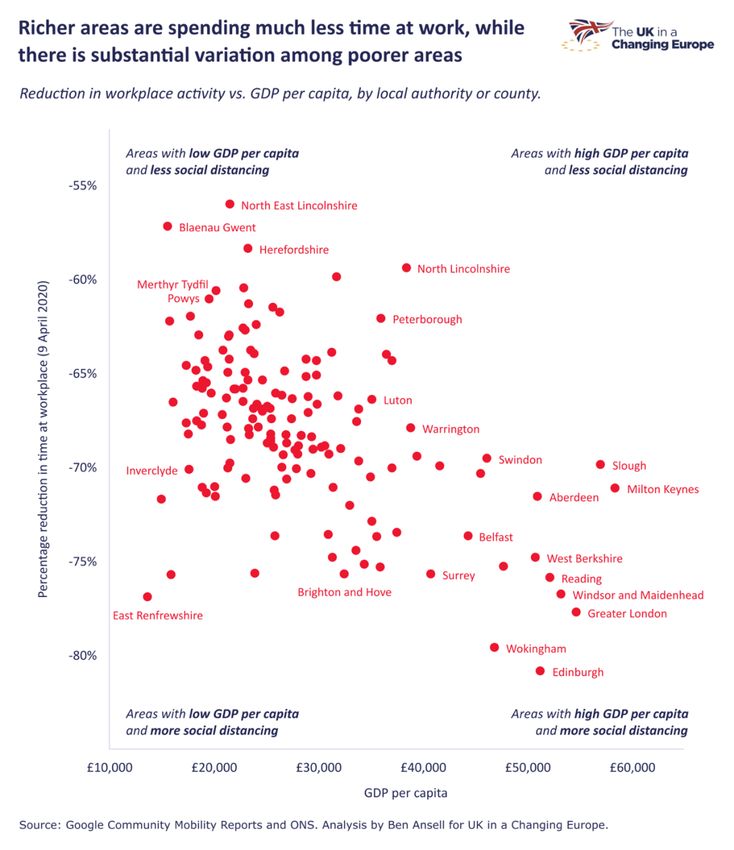
So it’s not just cities versus the rest. What about income? After all, wealthier
professionals find it easier to stay at home to work than people in manual professions,
or indeed many less well-off key workers, from nurses to grocery workers. We now
plot GDP per capita (i.e. personal income) by area. The lower the dot, the greatest
reduction in activity within the local authority area; the further right the dot, the richer
it is.

Again we see a negative relationship. The richest parts of the country have all had a
reduction in workplace activity of more than two-thirds. But there is substantial
variation among poorer and more middle-income areas (i.e. the left half of the graph).
So economics matters, but again can’t tell the whole story.

                                             6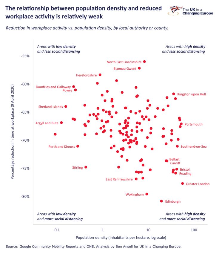
What about politics? I now match each area to its voting pattern in the Brexit
referendum, using the proportion voting Remain.

Here we see a very tight negative relationship between the Remain vote and
workplace activity. It is partly driven by Scottish regions that were very anti-Brexit and
where workplace reduction has been especially strong. We also see wealthy pro-
Remain areas in the South East with a similar pattern. And at the top-left we see areas
in the East Midlands, Yorkshire, and Wales – the bedrock of Leave support – have
less (though of course still substantial) workplace activity reduction.

                                            7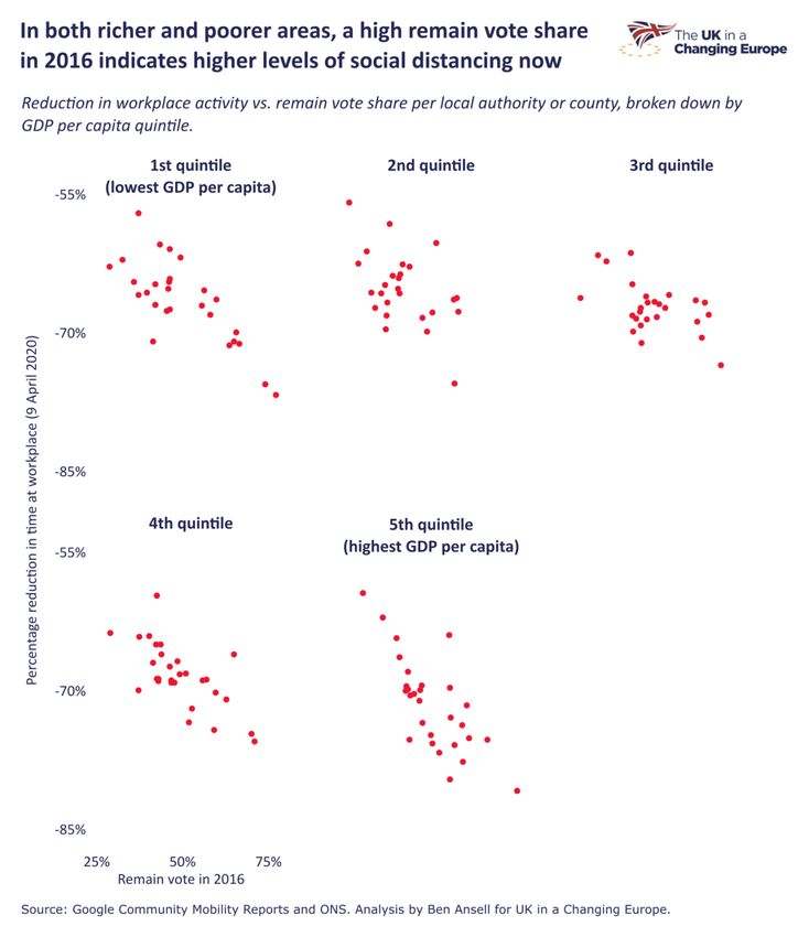
However, it is also true that, again looking at 9 April, we see the same negative
relationship between Remain vote and workplace activity in every UK region.

                                        8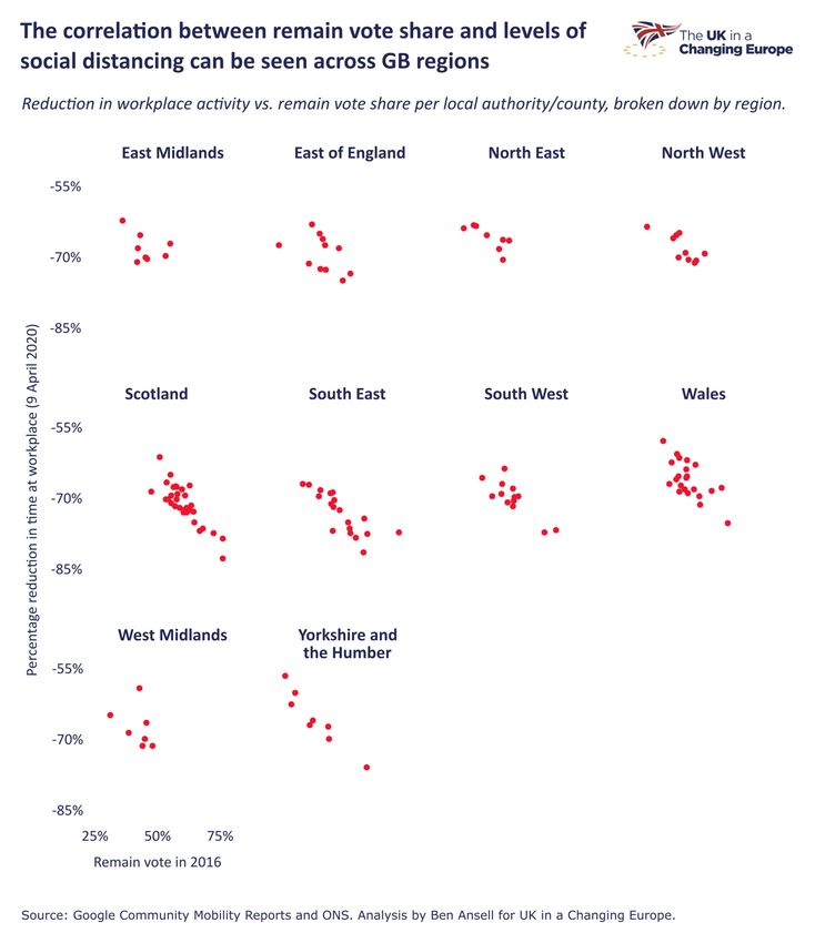
Furthermore, if we split the UK into five income ‘quintiles’ we see a negative pattern
in each of them. This figure shows that, in both the poorest and richest places, the
more Remain-voting areas have distanced more.

                                          9
When I showed this research on Twitter a week ago I met with an understandable
pushback that this political relationship was because Leave voters find it harder to
work from home or are key workers. That is indeed the most likely reason for this
relationship, though it is no easy task to get comparable occupational data at this level
across the UK to fully adjudicate that. However, this occupation link ought to be being
picked up by the income data we do have – and have seen also seems to matter.
So this raises the obvious question. Is the Brexit relationship simply about economics?
Or is there something additional going on?
The simplest way to get at this is to run linear regression models. What these do is
predict the relationship between one variable (say Brexit support) and another (say
workplace activity) while ‘controlling’ for (or netting out) the effects of other variables
(say income or population structure). So that’s what we will do.
Now it’s worth noting that this is just about correlations across variables, not causation.
I can’t and won’t prove any causation here – in any case, there is no ‘shock’ to political
behaviour that would allow us to do so. Think of this as a good way of predicting the
behaviour in each area, not as a full explanation.
I ran a linear regression model that includes measures for income, income growth,
population density, proportion of people aged over 70, proportion under 30, and an
indicator for each UK region. What, if anything, is left of the relationship between Brexit
and workplace activity after that? As it turns out, quite a lot.
This next graph shows this relationship once all those other factors have been netted
out. I show the line of best fit and 95% confidence intervals around that line. Whichever
way you cut it, this is a pretty strong result. Places that are more ‘Remainy’ than you’d
expect given their income, location, demographics, etc, are also more likely to have
reduced workplace activity.
10Maybe this is all about 9 April? Maybe that’s a weird day. What does the pattern look
like over time? We can do the same analysis for each day since February 29 th and
see whether it is consistent. Here I use code developed by Robert Hickman to plot
each coefficient – that’s the estimated slope of the line of best fit as we saw above –
for every day. It’s easy to see that there was no difference in behaviour between Leave
and Remain areas at all in the first week of March. But after 15 March a massive gap
opens up and remains roughly consistent since then. We can also see the date of the
lockdown, the blue dashed line, doesn’t particularly matter.
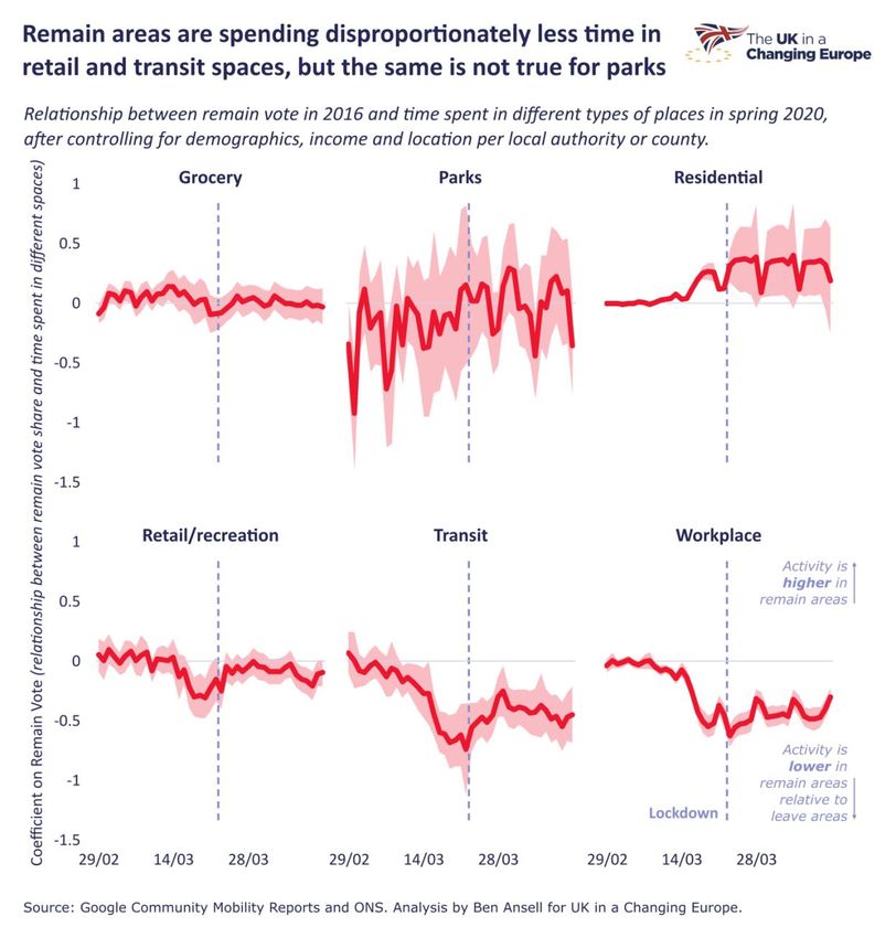
11What about other forms of activity? Is this about Remain areas being more likely to
social distance, or just working from home more easily? The answer is maybe a bit of
both.
We can do this same time series analysis and separate each of the six measures of
activity provided by Google. If we do that we see that for transit and retail/recreation
there is a difference, where Remain areas have less activity after around 15 March
15th. We also see more residential activity, which you would expect if more people
were at home. But for groceries and parks, no such relationship exists.
12So, it’s not the case – as those photos of London parks indicate – that people in
Remain areas are staying in much more than everyone. But they are at work less and
perhaps avoiding city centres and transit stations more.
13Finally, it’s worth showing the same set of analyses for income. Here we see that
richer areas have reduced shopping, going to the park, and going to transit stations
more than have poorer areas.
As with the earlier graphs, this is netting out all other effects (including the Brexit vote),
so this is the ‘pure’ income relationship. So both Brexit vote and income tested
independently show significant differences in activity.
14OK those graphs got quite complex. What did we learn? As before, it's really important
to note that everywhere has social distanced dramatically. There are no bad actors
here. But there are differences in the degree of social distancing, at least relative to
the baseline. That could be because of different levels of starting activity. But it could
also be related to demographic, economic, and political factors. The Brexit divide that
has shaped much of British life over the past half-decade is indeed showing up here.
What are the implications? If Remain areas are able to social distance more – likely
due to being able to work from home more easily, but potentially also related to
different underlying attitudes – this could widen Britain’s social divisions. It is not hard
to imagine resentment building over the fact that in some places everyone seems to
be working from home, whereas in others people have to head into work, putting
themselves at risk. Or viewed the other way, there could be resentment that some
people feel they are abiding by the lockdown, whereas others are following it more
loosely.
There is no right or wrong here. Most people are doing their very best. But we have
already seen from media coverage that mixed compliance with the lockdown leads to
moral outrage. And the economic shocks from Covid-19 are likely to regionally very
unequal, just as were the effects of the credit crisis. Anything that further widens
Britain’s already sharp divides should give us cause for concern.
15You can also read