Winter 2020-2021 - Rochester Institute of Technology
←
→
Page content transcription
If your browser does not render page correctly, please read the page content below

Winter 2020–2021
About RIT Press
    RIT Press is the not-for-profit scholarly book publishing enter-
    prise at Rochester Institute of Technology (RIT). RIT Press is
    dedicated to the innovative use of new publishing technology
    while upholding high standards in content quality, publication
    design, and print/digital production. The Press offers special-
    ized titles for niche academic audiences, trade editions for
    mass-market audiences, books on subjects of regional interest,
    occasional limited editions with unique aesthetic standards, as
    well as gift items.

    Established in 2001 as RIT Cary Graphic Arts Press, the Press
    initially focused on publishing titles documenting graphic
    communication processes, printing history, and bookmaking.
    As RIT Press’s editorial scope evolved, the Press broadened its
    reach to include content supporting all academic disciplines           CONTENTS
    offered at RIT. These include business, applied science and            NEW RELEASES .  .  .  .  .  .  .  3
    technology, graphic arts, deaf studies, and liberal arts. In 2007,     BOOKBINDING .  .  .  .  .  .  .  . 11
    an additional imprint, RIT Press, was established for all titles not   PRINTING HISTORY  .  .  .  . 11
    related to the graphic arts. Beginning in 2013, all publications
                                                                           FINE EDITIONS  .  .  .  .  .  .  . 12
    carry this imprint.
                                                                           CALLIGRAPHY .  .  .  .  .  .  .  .13
                                                                           TYPOGRAPHY .  .  .  .  .  .  .  .13
    The Alexander S. Lawson Publishing Center
    Our office space, the Alexander S. Lawson Publishing Center,           PRINTING  .  .  .  .  .  .  .  .  .  .  .14
    opened in 2007. The striking design of the facility is based on        BUSINESS .  .  .  .  .  .  .  .  .  .  .14
    the golden section, a schema that figured in historical book           TECHNOLOGY  .  .  .  .  .  .  .  .14
    design. Glass walls enclose a sales area, conference room,             POPULAR CULTURE .  .  .  .15
    and gallery. Hermann Zapf designed the typography for some             LOCAL INTEREST .  .  .  .  .  .15
    30 stimulating quotations that adorn the glass. The Lawson             DESIGN .  .  .  .  .  .  .  .  .  .  .  .  .16
    Center is located on the second floor of the Wallace Center at         CRAFT + VISUAL ARTS  .  .18
    RIT, adjacent to the Melbert B. Cary, Jr. Graphic Arts Collection.     PHOTOGRAPHY .  .  .  .  .  .  20
    Visitors are welcome; we are typically open 9:00–4:30
                                                                           RIT  .  .  .  .  .  .  .  .  .  .  .  .  .  .  .  22
    Monday through Friday, but feel free to call ahead to ensure we
                                                                           DEAF STUDIES  .  .  .  .  .  .  . 22
    will be available.
                                                                           LIBERAL ARTS .  .  .  .  .  .  .  23
    To Place an Order                                                      SPORTS .  .  .  .  .  .  .  .  .  .  .  . 24
    For secure online credit card orders 24 hours a day, please visit      GIFT ITEMS .  .  .  .  .  .  .  .  .  25
    our website. To order by mail or fax, printable order forms are        COMING SOON  .  .  .  .  .  .  . 27
    available online. A full publication list is available through our
    website. Prices subject to change.
    PHONE: (585) 475–6766
    FAX: (585) 475–4090
    WEB: WWW.RIT.EDU/PRESS

    Forthcoming Titles
    Preview a selection of our forthcoming book titles on the inside
    back cover of this catalog.

    Follow us! @ritpress

    COVER IMAGE
    Denis Defibaugh, photographer. Uummannaq, Greenland,
    2017. A Sunday family stroll on the fjord. Sunny days make
    for a beautiful time to enjoy the promenade. Featured in
    North by Nuuk (see page 7).

2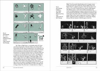
NEW RELEASE

The Path to Paradise
Judith Schaechter's
Stained-Glass Art
Jessica Marten
From her start in the 1980s, Judith Schaechter
(b. 1961) has stretched the medium of stained
glass into an incisive art form for the twenty-first
century, boldly paving her path in the diverse arena          PUBLISHED BY RIT PRESS
of contemporary art. With deep respect for history,           AND MEMORIAL ART
a provocative rebelliousness, and a feminist sensi-           GALLERY (1/2020)
                                                              176 PAGES
bility, Schaechter has aptly been called a “post-punk
                                                              112 ILLUSTRATIONS
stained-glass sorceress.” This catalog accom-                 9 × 11 IN.
panies The Path to Paradise: Judith Schaechter’s
                                                              HARDCOVER: $49.95
Stained-Glass Art, the first survey and major schol-          ISBN 978-1-939125-73-6
arly assessment of this groundbreaking artist’s               SOFTCOVER: $40.00
37-year career. The essays explore the range of               ISBN 978-1-939125-80-4
critical registers Schaechter’s work spans, illumi-
nating and contextualizing the artist’s unique contri-        ABOUT THE AUTHORS
butions to the contemporary canon.                            Jessica Marten is Curator in
                                                              Charge/Curator of American
Exhibition dates: Memorial Art Gallery of the University of
                                                              Art at the Memorial Art Gallery
Rochester, February 16 to September 13, 2020
Toledo Museum of Art, October 3, 2020 to January 3, 2021      of the University of Rochester.
Des Moines Art Center, February 12 to May 23, 2021            In her curatorial practice,
                                                              Marten is particularly inter-
                                                              ested in exploring historically
                                                              marginalized artists and lesser-
                                                              known histories.
                                                              Glenn Adamson (foreword)
                                                              is a curator, writer, and historian
                                                              who works at the intersection
                                                              of craft and contemporary art,
                                                              and currently Senior Scholar at
                                                              the Yale Center for British Art.
                                                              Virginia Chieffo Raguin,
                                                              PhD, Yale University (essay),
                                                              is Distinguished Professor
                                                              of Humanities at the College
                                                              of the Holy Cross. She has
                                                              published widely on religion,
                                                              stained glass, and architecture.
                                                              Diane C. Wright (essay)
                                                              is the Senior Curator of Glass
                                                              and Decorative Arts at the
                                                              Toledo Museum of Art, where
                                                              she explores the infinite world
                                                              of glass within the context
                                                              of Toledo’s encyclopedic art
                                                              collection.

                                                              RELATED TITLES:
                                                              CRAFT AND VISUAL ARTS
                                                              (PAGES 18–19)                    3
NEW RELEASE
Printing-Process
Control and
Standardization
Robert Y. Chung
Accurate, precise color reproduction on paper has
long been a challenge. In his new book, Printing-
Process Control and Standardization, Robert Chung
demystifies and explains the process. A veteran
PUBLISHED BY RIT PRESS
technical expert and university professor, Chung
(9/2020)
offers educators and industry professionals some ISBN 978-1-939125-74-3
guidance and instructional tools for teaching SOFTCOVER
print media and graphic communication. This 200 PAGES
book provides color reproduction strategies 127 ILLUSTRATIONS
for traditional offset and modern digital print 7 × 10 IN.
$44.95
production and includes color examples to illustrate
measurement tools, process-control, color ABOUT THE AUTHOR
management and standardization. Robert Y. Chung is Professor
Emeritus of the Rochester
Institute of Technology
School of Media Sciences.
He has published more than
100 technical papers on
The eye works in the same way as a camera. The front part of the eye, How do we know that biological differences contribute to variation
including the cornea, pupil, and lens, allows light to pass through. The in color vision? We can test the observers using the Ishihara’s test for
back inside wall of the eye is called the retina. The retina is like the film color blindness. Notice that the term “color blindness“ means “abnormal
or CCD sensors of the camera. The light reaches the center of the retina, color vision” in people who see color distorted. The test uses random-
printing process control and
called the fovea, which has three types of sensors (red-sensitive cones, ized color dots, having similar chroma, but different hues to differen-
green-sensitive cones, and blue-sensitive cones). In daylight, we rely on tiate between figure and ground. Color-normal individuals may recog-
the fovea to see details and color. The light also reaches to the periphery nize the figure as a number, where color-deficient individuals would not.
of the retina, called rods. At night, we rely on the periphery of the retina As shown in Figure 2.3, a color-normal individual sees the number 3 as a
to see the general shape of things and detect movements. green figure against the red and orange background. But an individual
2.3. Organizing Color
Imagine a sailor was trapped on a deserted island, surrounded by peb-
bles of all colors. To keep his sanity, the sailor decided to rearrange the
with red–green deficiencies sees the test plate differently (Ishihara, 1962).
color management. Chung
was active in the U.S. and
pebbles from their random order into a visual order. He proceeded to
sort pebbles with different color names (hues) like red, green, and blue,
into separate piles. He recognized that the leftover pile had no distinct
hue (i.e., achromatic), but varied from white to light gray to dark gray to
international printing standards
black (lightness). When he examined the red pile more closely, he could
further separate the pebbles into bluish-red, red, and yellowish-red piles.
By sorting other colored piles, he discovered the opponent color pairs
of red–green and yellow–blue that described hue-to-hue relationships. Figure 2.3.
Finally, he was able to organize pebbles of the same hue with varying An Ishihara test plate
lightness (value) and colorfulness (chroma).
This story illustrates the work of Albert H. Munsell (1858–1918), an
American art teacher and the inventor of the Munsell color system.
for color blindness.
(Retrieved with
permission from the
development activities. He
Figure 2.2 shows that color has three dimensions: hue, value (lightness), Science Museum,
received the Michael H. Bruno
and chroma and can be organized in a three-dimensional space. London, https://com-
mons.wikimedia.org/
wiki.)
Technical Association of
We can also tell that biological differences contribute to variation
in color vision by using the Farnsworth-Munsell 100 hue test. The test
includes four wooden cases. Each case consists of 21 color caps that are
removable and two fixed caps, situated at either end of the case (Figure 2.4).
the Graphic Arts Award for
Figure 2.2.
Munsell color tree.
(Retrieved with per-
Outstanding Contribution to
the Graphic Arts Industry in
mission from Hannes
Grobe, https://com-
mons.wikimedia.org/
wiki.) Figure 2.4.
2006, and the Kagy/Prust
Farnsworth-Munsell
2.4. Observer Variation 100 hue test. (Pub-
Assuming that lighting and an object are fixed, color may be perceived lished with permission
differently by different people. This is because color perception is influ- from X-Rite Inc.)
enced by biological differences among observers.
20 Printing-Process Control and Standardization Colorimetry 21
Life Achievement Award from
the Graphic Communication
Education Association in 2007.
or less blue than the reference. If we know the CIELAB values of the 2.24. Color Constancy
sample, we have the hue angle of the color, and that will further deter- If we photograph an object under three different lighting conditions and
mine whether a color is redder or less green, and so on. view the three pictures simultaneously, we may be surprised how differ-
ent the color of the same object is. As shown in Figure 2.21, the letter-size
Table 2.4. Interpreting ∆L*, ∆a*, and ∆b* between a sample and a reference board in the outdoor lighting with shade appears bluish gray; the same
(sample − reference). board in the tungsten lighting appears reddish gray; and the board in
When The sample is the standard graphic arts viewing booth appears neutral.
∆L* is positive Lighter
∆L* is negative Darker
∆a* is positive Redder or less green
∆a* is negative Less red and greener
∆b* is positive Yellower or less blue
∆b* is negative Less yellow or bluer
Figure 2.21.
2.23. Viewing and Describing Color Photographing an
Our visual system sees the color of interest in the context of its surround- object in different
ings. A color-measuring instrument, however, measures color through light sources.
an aperture. Thus, it excludes the influence of the surround. The two
yellow patches shown in Figure 2.19 measure equally but appear to be If we examine an object under a single light source, our visual system
different. The left patch with a green surround appears warmer and tends to discount the color and the intensity of the light. The discounting
darker than the right patch with a blue surround. The phenomenon of of the color or intensity of the light source in our visual system is called
“making one color looks like two” is called simultaneous contrast. In chromatic adaptation or lightness adaptation. The visual effect, or the
other words, “perception is reality” literally means that two colors, mea- tendency for objects to retain their color despite changes in illumination,
sured the same, are seen differently. is called color constancy (Hunt, 1987). The color constancy demonstra-
tion can be explained using the photograph of four women below.
Figure 2.22 (left) is a photograph of four women dressed in black,
cyan, magenta, and yellow. If we want to change the color of the dress of
the second woman from the left from cyan to green, we need to use the
Figure 2.19. Selection Tool in Photoshop to isolate the color of the cyan dress in the
An example of a image (Figure 2.22 right).
simultaneous contrast.
Our visual system is very sensitive to small color differences when
the colors of interest are viewed simultaneously. As shown in Figure 2.20,
the color difference between Pantone 3955 and Pantone 3965 is hardly
noticeable in the Adobe Color Picker when they are displayed next to
each other with a gap (circled at left) but more noticeable when the two
colors are juxtaposed (circled at right) without a gap.
RELATED TITLES:
Overprinting yellow ink in the selection changes the dress from Figure 2.22.
cyan to green (Figure 2.23 left). However, if we print the entire image An example of the
with yellow ink, the dress remains as cyan, not green (Figure 2.23 right). chromatic adaptation.
TEST TARGETS,
Printing the entire image with the yellow ink is analogous to viewing (Image courtesy of
or photographing the entire image in a yellowish lighting. The visual Erwin Widmer.)
Figure 2.20. system adapts to the yellowish white point and never questions that the
Pantone 3955 and wall is not white. As a result, the dress remains as cyan. Chromatic adap-
Pantone 3965 in
Color Picker.
tation happens very fast when the eye scans back and forth between the
two images in Figure 2.23. PRINTING (PAGE 14)
34 Printing-Process Control and Standardization Colorimetry 35
4
NEW RELEASE
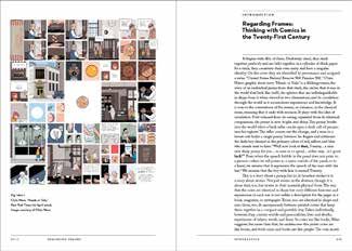
Regarding Frames
Thinking with Comics in the
Twenty-First Century
Shiamin Kwa
Part interpretive criticism, part philosophical medi-
tation, Regarding Frames: Thinking with Comics
in the Twenty-First Century explores the ways
that literary comics engage readers in the mutual
construction of meaning. Kwa draws from a wide
range of philosophical, critical, and theoretical PUBLISHED BY RIT PRESS
(2/2020)
texts to analyze the visual and verbal narrative
ISBN 978-1-939125-64-4
strategies that artists use. She examines the work SOFTCOVER
of comic artists Gabrielle Bell, Michael DeForge, 238 PAGES
Kevin Huizenga, Laura Park, and Dash Shaw who 62 ILLUSTRATIONS
construct their particular visions of the world. 7 × 10 IN.
These creators’ experiments with form pose ques- $29.95
tions about the difference between how things
ABOUT THE AUTHOR
appear to be and how they are. Regarding Frames Shiamin Kwa is associate
makes a case for the rewards of close reading at professor of East Asian
the surface. Languages and Cultures and
Comparative Literature at
Bryn Mawr College, Bryn
Mawr, Pennsylvania.
RIT Press is pleased to
announce Regarding Frames
as the fiifth book published in its
Comics Studies Monograph
Series. The series editor is
Terrence Wandtke, Professor
of English & Communication at
East/West University.
RELATED TITLES:
COMICS STUDIES MONO-
GRAPH SERIES (PAGE 15)
5
NEW RELEASE
Late Harvest
Late Harvest
Forest McMullin
Foreword by Nancy McCrary Late Harvest
Forest McMullin
Forest McMullin
Vast as it is varied, the American South has a quality
of light that uniquely illuminates its structures,
landscapes, and people. Photographer Forest
Proof Copy: Not optimized for high quality printing or digital distribution
McMullin traveled rural back roads from North
PUBLISHED BY RIT PRESS
Carolina to Arkansas, including Georgia, Florida, (1/2020)
Alabama, Mississippi, and Louisiana. Late Harvest ISBN 978-1-939125-77-4
documents his journey and stories of the people HARDCOVER
and places he visited. McMullin’s 79 photographs 112 PAGES
capture the colors and textures emblematic of the 79 ILLUSTRATIONS
11 × 11 IN.
region and pay tribute to its unique identity and the
$60.00
people who live there.
ABOUT THE AUTHOR
2020 PX3 – Prix de la Photographie, Forest McMullin is a free-
Paris: Silver award winner in lance photographer, artist, and
Book / Fine Art photographic educator based
in Atlanta, Georgia. Currently
a full time Professor of
Photography at the Savannah
College of Art and Design’s
Atlanta campus, he is repre-
sented by Thomas Deans Fine
Art in Atlanta. McMullin’s work
in the permanent collections of
Hunter Museum of American
Art, The George Eastman
Museum, Georgia Council for
the Arts, American Society of
Media Photographers, Visual
Studies Workshop, Rochester
Institute of Technology, The
Buffalo Museum of Science,
Savannah College of Art and
Design, and Southern Poverty
Law Center.
Foreword by Nancy McCrary,
founding editor of South x
Southeast photo magazine
(www.sxsemagazine.com),
and director of the South x
Southeast photo gallery.
RELATED TITLES:
PHOTOGRAPHY
(PAGES 20–21)
6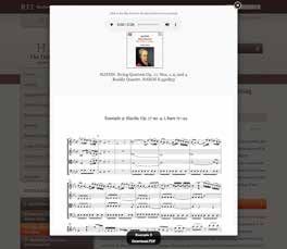
NEW RELEASE

North by Nuuk
Greenland After Rockwell Kent
Denis Defibaugh
North by Nuuk is an intimate, contemporary look at
the people and the social and primal geographic
landscapes of Greenland. Photographer Denis              PUBLISHED BY RIT PRESS
Defibaugh presents his journey from Nuuk to the          (11/2019)
settlement of Illorsuit, 300 miles north of the Arctic   ISBN 978-1-939125-70-5
Circle, following Rockwell Kent’s earlier footsteps      HARDCOVER
                                                         200 PAGES
and offering a fresh look at timeless Greenland.
                                                         124 ILLUSTRATIONS
Defibaugh’s revealing documentary photographs
                                                         11 × 10 IN.
made during 2016–17 introduce a changing                 $60.00
country and its cultural continuity in response to
Kent’s 1930s historic writings and hand-tinted           ABOUT THE AUTHOR
lantern slide images made during his residence in        Denis Defibaugh is a
Greenland. The innovative documentary project,           Rochester, New York based
                                                         photographer and professor
supported by a National Science Foundation
                                                         at Rochester Institute of
award, weaves Defibaugh’s stunning photographs           Technology for more than
through past and present daily life while linking        30 years. His photographic
Greenlanders with their pristine and revered land-       projects include explorations
scape. Foreword by Gretel Ehrlich; essays by Axel        of Oaxaca, Mexico’s The Day
Jeremiasson and Denis Defibaugh.                         of the Dead, extinct species
                                                         in Afterlifes of Natural History,
                                                         and Tlacotalpan, Mexico’s
                                                         Candelaria Festival.

                                                         RELATED TITLES:
                                                         PHOTOGRAPHY (PAGES 20–21)
                                                         GREENLAND GREETING
                                                         CARDS (PAGE 25)
                                                                                             7
NEW RELEASE

     Images from
     Science 3
     An Exhibition of Scientific Images
     Organized by the School of Photographic
     Arts and Sciences, Rochester Institute of
     Technology; and Johns Hopkins University                PUBLISHED BY RIT PRESS
     and School of Medicine                                  (11/2019)
                                                             ISBN 978-1-939125-67-5
     Images from Science 3 (IFS 3) is the companion          SOFTCOVER
                                                             216 PAGES
     text to an exhibition showcasing full color scien-
                                                             86 ILLUSTRATIONS
     tific images ranging from the intricate beauty of
                                                             8½ × 8½ IN.
     a frozen snow crystal to the interaction of T-cells     $29.95
     fighting cancer. The images invite readers to view
     examples of wide-ranging techniques in science          ABOUT THE ORGANIZERS
     photography, videography, and illustration that         Images from Science 3 was
     reveal science in unique new ways. IFS 3 presents       organized by Norm Barker
                                                             (of Johns Hopkins University
     71 image makers whose work was selected by an
                                                             and School of Medicine),
     international panel of judges. Each image is accom-     and Chris Jackson, Ted
     panied by a brief description of the technical equip-   Kinsman, Michael Peres,
     ment and process used to capture it.                    and Bob Rose (of Rochester
                                                             Institute of Technology).
     Exhibition schedule: https://images.cad.rit.edu/

                                                             RELATED TITLES:
                                                             PHOTOGRAPHY
                                                             (PAGES 20–21)

8
NEW RELEASE
Finding Our Place
in Nature
Aristotle for Environmental
Scientists
Richard Lynn Shearman
Finding Our Place in Nature argues that Aristotelian
philosophy provides a much needed ethical
foundation for the environmental sciences and for
our daily commitment to practices of sustainability. PUBLISHED BY RIT PRESS
Shearman challenges previously held interpreta- (10/2019)
tions of Aristotle’s value to the grounding of environ- ISBN 978-1-939125-62-0
SOFTCOVER
mental ethics. He demonstrates that Aristotelian
260 PAGES
philosophy is a valuable and under-appreciated 6 × 9 IN.
resource for any student-citizen who requires $29.95
ethically persuasive reasons—both for pursuing
environmental science in the first place and for ABOUT THE AUTHOR
grounding our social practices as citizens. The Richard Shearman is
professor emeritus in the
author clarifies sustainability as a moral concept—
Science, Technology, and
this supplies the underlying purpose to the applied Society Department of
environmental sciences and to living the good life. the College of Liberal Arts
Aristotle without contemporary environmental at Rochester Institute of
science is inadequate; more importantly, the envi- Technology. His research
ronmental sciences without the ethical grounding focuses on the development
of an Aristotelian approach
provided by Aristotle are incomplete and unable to
to environmental philosophy
motivate us. and an examination of the
challenges associated with
Finalist for the 2020 PROSE Award interdisciplinary problem
solving in the area of conserva-
for Physical Sciences and Math:
tion of biodiversity.
Environmental Science
RELATED TITLES:
PHILOSOPHY SERIES
(PAGE 23)
9NEW RELEASE
HAYDN
Edited by Michael E. Ruhling
HAYDN, the journal of the Haydn Society of
North America, is dedicated to the dissemination ONLINE JOURNAL
of all areas and methodologies of research and WWW.HAYDNJOURNAL.ORG
performance considerations regarding the music, ISSN 2163-2723
culture, life and times of Joseph Haydn and his circle. ISSUE 10.2: FALL 2020
Each semiannual issue includes large and small
CONTENTS
articles, reviews, reactions to previous articles, and
Articles
other new and pertinent information. Its Web-based
Approaches to Performance
format is intended to take full advantage of current
and emerging electronic media. Work In Progress
Rediscovered & Important
. Documents
Reviews & Reactions
Winner of the 2018 PROSE Award News From Our Colleagues
for Innovation in Journal Publishing: Articles from Previous
Humanities & Social Sciences Volumes
10BOOKBINDING / PRINTING HISTORY
Bookbinding 2000 Bookbinding 2000
Proceedings Demonstrations
Edited by David Pankow These six videos present the
In June 2000 the RIT Cary demonstrations delivered at
Graphic Arts Collection hosted Bookbinding 2000. Along with their
a conference, exhibition, and companion publication, Bookbinding
gala in honor of Bernard C. 2000 Proceedings, they provide a
Middleton’s contributions to complete record of the conference.
the art of bookbinding, and Gold Tooling
RIT’s acquisition of Middleton’s outstanding book Michael Wilcox (113 Minutes)
collection. Some of the world’s foremost scholars
and bookbinders presented a series of stimulating Fully Dressed In Leather:
talks and detailed demonstrations at the event. Conservation Style
This publication gathers the content of the six Don Etherington (68 Minutes)
conference lectures into a fine volume with full- Edge-To-Edge Doublure
color illustrations. Monique Lallier (110 Minutes)
7½ × 10 IN., 110 PAGES, SOFTCOVER, $21.99
A Decorative Leather Covering Technique
Anthony Cains (125 Minutes)
Highlights from the
Middleton Collection of The Concave Spine: Rigid Flexibility
Books on Bookbinding James Brockman (110 Minutes)
Bernard C. Middleton
The Exposed Spine Binding
This elegant cloth-bound, full- Louise Genest (122 Minutes)
color catalog accompanied an
ALL-REGION DVD, $40 EACH, OR $200 FOR 6
exhibition of rare items from the
Bernard C. Middleton Collection
and was published to coincide
with the Bookbinding 2000 conference at RIT.
It includes illustrations and explanatory texts of
the rarities on display—from historical ephemera Highlights of the Cary
to masterpieces of the binder’s art. A selection of Graphic Arts Collection
some of Middleton’s most celebrated essays on at Rochester Institute of
bookbinding is also featured in this work. Technology
7 × 10¾ IN., 124 PAGES, HARDCOVER, $50 Steven K. Galbraith,
Amelia Hugill-Fontanel,
Edges of Books: Kari Horowicz
Specimens of Edge Since its founding in 1969,
Decoration from RIT Cary the Cary Graphic Arts Collection at Rochester
Graphic Arts Collection Institute of Technology has grown from the
Steven K. Galbraith personal library of its namesake Melbert B. Cary Jr.,
Edges of Books examines a familiar form from an to one of the nation’s premier libraries on graphic
unfamiliar perspective. When books are on display, communication history. Highlights of the Cary
it is usually their spines, covers, text, or illustrations Graphic Arts Collection brings this history to life
that are featured. These are the familiar parts of with a selection of items that not only exemplify the
the books—the parts that modern readers have scope and mission of the library, but are treasures
come to interact with the most. Edges of Books in their own right. The catalog features milestones
takes a different approach, uncovering a tradition in the history of printing, diverse examples of fine
that extends back centuries in which the edges of press printing, artists’ books, and rare artifacts
books were important sites for information from The New York Times Museum of the
and decoration. Recorded Word.
10 × 7 IN., 68 PAGES, SOFTCOVER, $16.99 8 × 10 IN., 90 PAGES, SOFTCOVER, $22.95
11FINE EDITIONS
Manuale Calligraphicum
Examples of Calligraphy by Students of Hermann Zapf
Of all his contributions to the graphic arts, Hermann Zapf’s (1918–2015)
dedication to sharing his knowledge may be regarded as one of his most
enduring achievements. At Rochester Institute of Technology, in 1979, he
began to teach a series of summer classes in Advanced Calligraphy. The
classes attracted an international group of accomplished graphic artists
whose hours spent with Zapf became treasured memories. This new
book was conceived as a way to honor Zapf’s legacy at RIT by offering
a select group of accomplished former students an opportunity to share, through their art, what those
classes meant to them. The Cary Collection is proud to present this selection of 19 works from 15 calligra-
phers as their tribute to a master teacher and dear friend. Limited edition of 325 copies, published by the
RIT Cary Graphic Arts Collection and distributed by RIT Press.
11½ × 9 IN., 60 PAGES, HARDCOVER, $195
Manuale Zapficum Melbert B. Cary, Jr.
Typographic Arrangements and the Press of the Woolly
of the Words By and About Whale
the Work of Hermann Zapf & David Pankow, Carl Purington
Gudrun Zapf Von Hesse Rollins, Kenneth Auchincloss
This book commemorates There is no doubt that Melbert
the Zapfs' ninetieth birthdays B. Cary, Jr. reflected on what the
through beautiful typeface books produced at his Press of
specimens set in homage to the the Woolly Whale might mean
classic design of Hermann Zapf's masterpiece, his to those who acquired them. In the preface of his
1968 Manuale Typographicum. The 20 specimen first book, The Vision of Sir Launfal, he declared,
designs in the book are based upon quotes about “Our intention [is] to publish only those text which
the couple's oeuvre, each typeset in Zapf faces appeal strongly to us, excluding those accepted
and letterpress printed by friends and colleagues. classics, so completely accepted that they are
Contributors include Jill Bell, Rick Cusick, Jerry never opened. Our interest lies only with those
Kelly, Nancy Leo-Kelly, David Pankow, and Doyald who read their books, cherishing them because
Young. The Manuale Zapficum's innovative of the enjoyment gained from using them.” The
specimen pages employ timeless Zapf faces such essays and bibliography that follow document the
as Diotima, Optima, Palatino, and Zapfino, while life and work of a man who loved books and who
including fresh uses of proprietary typefaces such loved the making of books, from the formal to the
as Hallmark Uncial and Hallmark Textura. Each ingenious and daring. Designed by Jerry Kelly,
is printed in red and black on Hahnemühle Biblio bound by Judi Conant, printed in letterpress and
paper. The Campbell-Logan Bindery bound an offset in an edition of 120 copies. Winner of AIGA
edition of 100 copies in vellum and Fabriano paper. 50 Books/50 Covers of 2002.
8¼ × 12½ IN., 24 PAGES, HARDCOVER, $180 6 × 8¼ IN., 80 PAGES, HARDCOVER, $200
Alphabet Stories: The Aries Press of Eden,
A Chronicle of Technical New York
Developments Richard Kegler
Hermann Zapf The Aries Press was an American
After a complete sell-out of private press founded by Spencer
the American edition, RIT Cary Kellogg, Jr., in the 1920s. A
Graphic Arts Press presents second-generation millionaire
a second edition of Alphabet and supporter of the arts, Kellogg
Stories. This book is enhanced was influenced by the Arts and
by a letterpress-printed broadside designed by Crafts movement. Though little known today, the
Zapf. Written as an anecdotal first-person account, Aries Press produced exceptional examples of
the reader is treated to Zapf’s recollections of fine printing. Richard Kegler documents its colorful
technical breakthroughs. Reproductions of his history accompanied by fine illustrations and
calligraphy, proofs, typographic specimens, and samples from the Press.
photographs complete the story. 6 × 9 IN., 96 PAGES, HARDCOVER
7½ × 11 IN., 150 PAGES, HARDCOVER, $65 STANDARD EDITION: $49.95 $29.95
DELUXE EDITION: $200.00
12CALLIGRAPHY / TYPOGRAPHY
The Work of Ismar David The Book Jackets of
Selected by Helen Brandshaft, Ismar David
Edited by David Pankow Misha Beletsky
Ismar David made his career This book rediscovers an
over a broad spectrum of important contribution to a
applied art: calligraphy, book arts, popular field of graphic design
typography, and architectural and suggests that Ismar David's
design. The Work of Ismar David calligraphic book jackets present
collects the designer’s lifework, a viable alternative to the current design approach.
following his training in Berlin through his career in David’s style is informed by a thorough mastery
Jerusalem and New York. His archives are held in of the typographic tradition yet looks remarkably
the Cary Collection at RIT. fresh, even today.
8 × 11 IN., 160 PAGES, SOFTCOVER, $29.95 6 × 9 IN., SOFTCOVER, 48 PAGES,$24.95
$14.00
What Our Lettering Needs The Bentons
Rick Cusick Patricia A. Cost
This book is a thorough account Foreword by Matthew Carter
of Hermann Zapf’s contributions The story of the lives and work
to the artistry and success of of Linn Boyd Benton and Morris
Hallmark Cards, an experience Fuller Benton is an important
that is now fully blended into the chapter in the history of type,
company’s rich heritage. Since the recalling a time in American
late ‘70s, designer Rick Cusick has provided, in history when men quietly worked
articles and presentations, most of what has been at developing and improving mechanical
written about the Hallmark/Zapf association. This technologies that they thought would continue
beautifully illustrated book is a tribute to Zapf’s own evolving incrementally into the future. Includes
philosophy that the artist’s challenge is “to ensure, a comprehensive listing of Morris Benton’s
typefaces.
despite technology and mass production, that
beauty is never lost." 7 × 10 IN., 400 PAGES, SOFTCOVER, $24.95
6¾ × 10 IN., SOFTCOVER, 136 PAGES, $24.95 $18.95
What Is Reading For? A Specimen Portfolio
Robert Bringhurst of Wood Type
This succinct and thoughtful in the Cary Collection
essay is the text of a talk Melbert B. Cary, Jr. Graphic
commissioned for the Future Arts Collection
of Reading symposium in June Foreword by R. Roger
2010. Written and designed by Remington
Robert Bringhurst, this limited Wood type in myriad designs—
edition is carefully crafted and from stark condensed sans
letterpress printed. Special serifs to bizarre ornamental scripts—created
edition is printed on imported mould-made paper variety in commercial advertising more than
and signed by the author. 180 years ago, and continues today to influence
5 × 9 IN., 40 PAGES, SOFTCOVER, modern signs, posters, and billboards. The Cary
STANDARD EDITION: $29.95, Collection maintains an impressive collection of
DELUXE EDITION: $99.95 wood type, numbering over 300 fonts. This book
showcases over 250 of our best wood type speci-
mens, including many complete fonts and samples
from unusual designs. All specimen reproductions
were printed from the original wood type blocks,
some distressed with 100 years of use and abuse.
8½ × 11 IN., 305 PAGES, SPIRAL BOUND, $19.95
13PRINTING / BUSINESS / TECHNOLOGY UnSquaring the Wheel: Test Targets Comprehensive & Scalable RIT School of Print Media Transformation Test Targets is a collection Chris Bondy, Wayne Peterson, of scholarly papers contrib- Joe Webb uted by faculty, students, and This is a crucial time for graphic alumni of Rochester Institute of communications businesses. , Technology. It is a collaborative RIT's Chris Bondy, Wayne effort exploring the use of Peterson of the Black Canyon Consulting Group, scientific method for color and Dr. Joe Webb of Strategies for Management imaging and process control. Published by RIT began the examination of business models, tech- School of Media Sciences (formerly the School of nology, marketing, and management. The result Print Media). was a new process to assess and understand the VOLUMES 3.0–11.0 AVAILABLE condition of a complete business enterprise. 8½ × 11 IN., SOFTCOVER, $24.95 EACH 6 × 9 IN., 317 PAGES, HARDCOVER, $34.99 The School of Hard Knocks: It Isn't Just Business, The Evolution of Pension It's Personal Investing at Eastman Kodak Arunas A. Chesonis Russell L. Olson and David Dorsey Olson, a consultant on institu- Rochester-based PAETEC tional investing, retired in 2000 as Communications CEO Arunas director of pension investments, Chesonis and his people tell how, worldwide, for Eastman Kodak by following a handful of basic Company. He had overseen ethical principles, their company Kodak's pension funds since 1972. Over the 1980s has emerged as an example of how to succeed in and 1990s (and through 2004) Kodak's pension the twenty-first century, not just in telecom, but in fund was one of the best performing pension any industry. funds in the country. 6 × 9 IN., 172 PAGES, SOFTCOVER, $8.99 6 × 9 IN., 114 PAGES, SOFTCOVER, $29.99 Introduction to Audio Printing History Signal Processing back issues Warren L. G. Koontz Printing History, the biannual Audio signal processing is at the journal of the American Printing heart of recording, enhancing, History Association, publishes storing and transmitting audio scholarly articles on the history content. It is used to convert of printing, publishing, books, between analog and digital type, typography, paper and formats, to cut or boost selected related industries. Befitting a frequency ranges, to remove unwanted noise, to publication devoted to this subject it is beautifully add effects and to obtain other desired results. designed, printed and illustrated, of course, and is Koontz provides an introduction to this topic with available only in paper format. See our website for an emphasis on digital audio signal processing. available issues. Using exercises with MATLAB scripts and func- AMERICAN PRINTING HISTORY ASSOCIATION tions, students will be able to process audio in real 10¼ × 7½ IN., SOFTCOVER, PRICES VARY time on their own PC. 7 × 10 IN., 184 PAGES, SOFTCOVER, $39.95 14
POPULAR CULTURE / LOCAL INTEREST

Narrative Structure in                                    Superheroes in Crisis:
Comics: Making Sense of                                   Adjusting to Social Change
Fragments                                                 in the 1960s and 1970s
Barbara Postema                                           Jeffrey K. Johnson
In Narrative Structure in Comics:                         As the founding fathers of
Making Sense of Fragments,                                the superhero comic books,
Barbara Postema seeks to explain                          Superman and Batman have
how comics communicate and                                defined a genre of American
create meaning, with an emphasis on two aspects           mythology from the mid-twentieth
of comics. She first examines the pictorial quality       century to the present. The author describes how
of comics, which receives more emphasis than              the Man of Steel and the Dark Knight dealt with
verbal/textual elements. Her second focus is upon         their midlife crises brought on by the cultural and
the storytelling and narrative qualities of comics,       social changes of the 1960s and 1970s. Johnson
as well as the literary explorations they provide.        describes how the superheroes’ problems and
The “narrative structure” refers to the potential of      adaptations mirror much of American societal
images, the story telling capacities of panels, and       changes during that time.
the sequence of panels, in addition to the more           7 × 10, 142 PAGES, SOFTCOVER, $29.95
traditional narratological concepts.
7 × 10 IN., 188 PAGES, SOFTCOVER, $29.95

The Dark Night Returns:                                   The Comics Scare Returns:
The Contemporary                                          The Contemporary
Resurgence of                                             Resurgence of Horror
Crime Comics                                              Comics
Terrence R. Wandtke                                       Terrence R. Wandtke
Crime comic books in the                                  The popularity of horror comics
1950s caused controversy                                  in the 1950s was curtailed
leading to their suppression                              by a suppression of popular
and near extinction. Twenty-                              horror stories by those concerned with juvenile
five years later, the dark hero, femme fatale, and        delinquency and bad taste. Thirty years later,
bleak outlook of crime story comic books are even         creators Alan Moore and Neil Gaiman produced
more striking and subversive. Wandtke traces the          popular and artful comics like Swamp Thing and
history of crime comics from their beginnings to          The Sandman that took advantage of the new
the current resurgence and analyzes the cultural          shape of American culture in the 1980s. Terrence
forces that gave rise to works like Miller’s Sin City,    Wandtke details the history and re-shaping of
Azzarello’s 100 Bullets, and Brubaker’s Criminal.         horror comics and its relevance to popular series
7 × 10, 206 PAGES, SOFTCOVER, $29.95                      such as Hellboy, The Goon, and The Walking Dead.
                                                          7 × 10 IN., 344 PAGES, SOFTCOVER, $29.95

The Old Bank:                                             The Life and Letters of
The Rochester Savings                                     Kate Gleason
Bank and its Presidents and                               Janis F. Gleason
Trustees From 1831 to 1983                                Kate Gleason (1865–1933),
James C. Duffus                                           groundbreaking nineteenth-
This book chronicles the dynamic                          century industrialist, mechanical
life span of an important Rochester                       engineer, and real estate
institution, a mutual savings bank,                       developer, was her own best
that by definition, was owned                             invention. The truth of her dynamic
by its depositors and operated for their benefit.         life, in all of its complexity, is revealed in
It also chronicles the contribution of some of            Janis Gleason’s biography of this legendary
the Presidents and Trustees to the Rochester              American woman.
community.                                                6 × 9 IN., 204 PAGES, SOFTCOVER: $17.95,
6 × 9 IN., 108 PAGES, SOFTCOVER, $19.95                   HARDCOVER: $24.95

                                                                                                            15
DESIGN
Vignelli: From A to Z
Massimo Vignelli, Lella Vignelli
This superbly presented volume is a treasure trove of the
thoughts of internationally acclaimed designers Lella and
Massimo Vignelli. For ten years, Massimo Vignelli taught a
summer course at the School of Design and Architecture
at Harvard on subjects that were initially alphabetised for
convenience, but now form the basis of this unprecedented
and highly entertaining publication. Beginning with the
intriguing 'A for Ambiguity', it continues through the alphabet,
describing their approach to subjects as diverse as book
design, discipline, furniture, garment design, interior design and lighting, newspapers, packaging and
typography. It offers a rare insight into the minds of two exceptional modernist designers. First published in
Australia in 2007 by The Images Publishing Group Pty Ltd.; first U.S. edition published by RIT Press in 2017.
6½ × 8½ IN., 196 PAGES, HARDCOVER: $60.00, SPECIAL EDITION IN RED SLIPCASE: $115.00
The Art of the Book Vignelli Transit Maps VignelliTransit Maps
VignelliTransit Maps
in the Twentieth Century Peter B. Lloyd with Mark
The story of New York subway maps follows the story
VignelliTransit Maps
About the Authors About this Book
of this city’s transportation growth from independent lines
Peter B. Lloyd worked for thirty years in the In Peter Lloyd’s thoroughly d
software design industry and has a passion for collecting to one system. Each time, people have tried their best to the history of the Vignelli m
subway maps from around the world. He obtained a created and promoted this N
c Hons in Mathematics from Cardiff University convey the intricacies and complexities of the system in the people who hastened its dem
Jerry Kelly Ovenden
and a Certificate in Philosophy from Oxford University. detail Vignelli’s dealings with
He is the co-editor of Paris Métro Style in Map and clearest way possible. principal at Unimark, the pre
Station Design () and the author of several books agency that won the commis
on the philosophy of George Berkeley. system signage and map. Thi
players, illuminating their co
This book is also an opportunity to celebrate the work
Peter B. Lloyd with Mark Ovenden
Mark Ovenden is a broadcaster and author philosophies, is invaluable fo
who specializes in the subjects of graphic design, design. Lloyd shows, for the
cartography and architecture in public transport, done a long time ago by my collaborators at Unimark sketches of the famed map a
with an emphasis on underground rapid transit. Rarely seen and graphically i
He is the author of Metro Maps of the World (, ), and that done by my associates more recently. I feel it is created by Unimark for the t
Transit Maps of the World (, ), Paris Metro Style , Metro are a valuable add
(, ), Paris Underground (, ), important from a historical point of view to establish
Through the selection of Vignelli Transit Maps describes
and London Underground by Design (, ). Eddie Jabbour
the proper credits to all who have made contributions to
our design for the New York subway diagrams.
Massimo Vignelli
eleven master designers, Kelly the history of the New York Peter B. Lloyd
with Mark Ovenden
illustrates a wide range of subway maps and follows this
styles: from classically inspired city’s transportation growth RIT CARY RIT CARY
design and historical revival, from separate, independent
GRAPHIC ARTS GRAPHIC ARTS
PRESS PRESS
to novel and modern layouts. lines to one large system. Peter B. Lloyd uncovers
He describes the care with which each designer the history of the Vignelli map that includes the
combined typographic elements in his own unique legacy of the people who created and promoted
way. The selection of these designers, ranging this New York icon—as well as those who
from Updike to Zapf, is only a sampling of the hastened its demise. The book includes a first
practitioners that the twentieth century produced, glimpse at original, early development sketches of
but they are indicative of the range of book design the famed map and of its recent successors.
styles achieved during this dynamic century. 9 × 12 IN., 128 PAGES, SOFTCOVER, $39.99
9 × 12 IN., 200 PAGES, HARDCOVER, $39.95
$15.00
Where Would the Button Lella and Massimo Vignelli:
Be Without the Button Two Lives, One Vision
Hole? . . . by Jan Conradi
George Tscherny Lella and Massimo Vignelli: Two
This book is about designs Lives, One Vision is a portrait of
born of necessity; often two important twentieth-century
spontaneously, always designers whose careers
pragmatically. It is also about intertwined since the 1950s. The
the particular sensibility of Vignellis promote a modernist
graphic designer George Tscherny and his philosophy of designing for a better society:
ability to find beauty or art in the most ordinary resourceful use of space and materials, clear
things, and to communicate this appreciation to communication, lasting quality, and logical func-
others. Experience his infectious enthusiasm for tionality. With wit, grace, focus, and finesse, the
“anonymous,” “ad hoc,” or “vernacular” design, for Vignellis’ sustained pattern of working and living
objects that have an aesthetic appeal in spite of has influenced, and continues to inspire, genera-
themselves, for creations that are both ingenious tions of designers worldwide.
and ingenuous. 6 × 9 IN., 176 PAGES, SOFTCOVER, $34.99
8 × 11 IN., SOFTCOVER, 32 PAGES, $19.95 $5.00
16DESIGN
Lenses for Design
Josh Owen
Lenses for Design describes and explains the unique, creative process of
American industrial designer and educator, Josh Owen. Project by project, Owen
illustrates and decodes his philosophy and approach to design invention and
problem solving. His designs combine clarity of purpose and functional efficacy
with emotive and tactile qualities that will prove instructive and inspirational.
About the author: Josh Owen is a designer and professor of Industrial Design
at RIT. His work has been featured at the Venice Biennale and is in the permanent
design collections of the Centre Georges Pompidou, Chicago Athenaeum, Musée
des Beaux-Arts de Montreal, National Museum of American Jewish History,
Philadelphia Museum of Art, and the Taiwan Design Museum, among others. Significant manufacturers in
the U.S. and Europe produce his home/design, furniture, and office products, which are regularly featured
in design books, periodicals and in critical design discourse. Owen’s “Build” and “Meta” design academic
projects have successfully pioneered integrated practice pedagogy for the field of Industrial Design.
7 × 10 IN., 252 PAGES, HARDCOVER, $49.95
No Words Posters: From the Eye
One Image Is Enough to the Heart:
Armando Milani 50 Logos /
Armando Milani has curated a 50 Posters /
collection of nearly 200 posters 1 Book
that deliver a unique perspective Armando Milani
on social issues. Nearly 100 Renowned Italian graphic designer Armando
internationally acclaimed graphic Milani specializes in branding programs and
designers are featured — many contribute their posters for humanistic causes. This catalog shows
personal artist statements. Includes a foreword by the two sides of Milani’s profession, facing 50
R. Roger Remington. logos with 50 posters.
6¼ × 9¼ IN., 252 PAGES, HARDCOVER, $49.95 ARMANDO MILANI/VIGNELLI DESIGN
12 × 8½ IN., SPIRAL BOUND, $24.95
The Graphic Design Archives Chapbook Series celebrates the achievements of key design pioneers
whose work is held in the Cary Collection at RIT Libraries. From the inaugural acquisition in 1986,
RIT’s holdings have grown to include the work of 36 designers.
EACH 7½ × 7½ IN., SOFTCOVER, ILLUSTRATED (MOSTLY COLOR). SET OF 6 CHAPBOOKS: $99.99
George Giusti: The Idea Is Elaine Lustig Cohen:
the Heart of the Matter Modernism Reimagined
Ned Drew, Brenda McManus, by Aaris Sherin
Paul Sternberger
66 PAGES, $21.95
88 PAGES, $21.95
Will Burtin: The Display of Purity of Aim:
Visual Knowledge The Book Jacket Designs
R. Roger Remington, Amy J. Vilz of Alvin Lustig
Ned Drew, Paul Sternberger
40 PAGES, $15.99
88 PAGES, $21.95
Lester Beall: Cipe Pineles:
Space, Time & Content Two Remembrances
R. Roger Remington, Estelle Ellis, Carol Burtin Fripp
Massimo Vignelli
44 PAGES, $15.99
36 PAGES, $15.99
17CRAFT AND VISUAL ARTS
Crafting Democracy: Fiber Arts and Activism
Edited by Juilee Decker and Hinda Mandell
Crafting Democracy: Fiber Arts and Activism calls upon craft, during an era of
political disruption, as a creative force to voice dissent, express hope, critique
the curtailment of civil rights, and to restore dignity to the human experience.
The essays and artwork featured in this exhibition catalogue are framed within
the context of American democracy and disclose how we, as individuals and as
a culture, “craft democracy” and ultimately question what democracy means
today. Foreword by Betty M. Bayer. Essays by Juilee Decker, Hinda Mandell,
Beth McLaughlin, Alena Amato Ruggerio, Kate Bonansinga, and Margo Smith.
Afterword by Sarah Parrish. Includes works by over 30 artists.
Exhibition schedule: https://www.craftingdemocracy.com/
5¼ × 7 IN., 128 PAGES, SOFTCOVER, $34.95
Art for the People: Arthur Singer:
Decorated Stoneware from The Wildlife Art of an
the Weitsman Collection American Master
John L. Scherer Paul Singer and
A copiously illustrated and Alan Singer
scholarly analysis of the single Singer was an American
most important collection of 19th wildlife artist specializing
century American decorated in bird illustration. In a
stoneware. The book is a careful career spanning five decades, he illustrated more
study of ordinary forms and their humble, utilitarian than 20 books, including his masterpiece, Birds of
purposes that became vessels for an expres- the World, as well as the classic bird guides: Birds
sion of a person, of a place, or of an event. What of Europe, The Hamlyn Guide to Birds of Britain and
started out as an everyday ware was transformed Europe, and Birds of North America. During the
into a work of art and the decorative designs in 1980s, Singer’s paintings of state birds were seen
cobalt blue afford insight into and reflect life in 19th by millions when the USPS issued the State Birds
century America. Sometimes commemorative and & Flowers postage stamps. He received the Hal
other times humorous, whimsical, or provocative, Borland Award in 1985 from the National Audubon
the book's 230 examples and 340 color photo- Society. His paintings are represented in many
graphs fully illustrate the variety of decorative folk public and private collections in the United States
art imagery, the range of potters and potteries, and Europe. Since his death in 1990, retrospec-
the broader historical context of manufacturing tives of Singer’s work have been presented in
and transportation, and an important American several museums and art galleries. Most recently,
tradition with regional practices. Senior historian Singer’s watercolors painted during his army years
emeritus John L. Scherer's engaging and authori- have appeared in the documentary and book
tative text, in tandem with the illustrations, leads to entitled The Ghost Army of World War II, which has
greater understanding of these remarkable works. helped generate a new interest in the artwork of
NEW YORK STATE MUSEUM the 603rd Camouflage Unit.
10½ × 14½ IN., 296 PAGES, HARDCOVER, $75 11 × 11 IN., 198 PAGES, HARDCOVER, $60.00
With Fire: Richard Hirsch Sentinel: The Design,
A Life Between Fabrication, and
Chance and Design Installation of the
Scott Meyer Monumental Sculpture
With Fire is the story of by Albert Paley
ceramic artist Richard Edited by James Yarrington,
Hirsch, and an examination with Sam Hunter, Frank Cost
of the work for which he is Paley’s Sentinel transformed
so widely celebrated. This the face of RIT: a dramatic focal
richly illustrated book presents the life of an artist point in the heart of campus, the largest sculpture
whose career spans some of the most important at any American university. This book chronicles
developments in the American Clay Movement. all aspects of Sentinel’s inception, through essays
9 × 11 IN., 160 PAGES, SOFTCOVER, $24.99 and an interview with the artist.
9 × 11½ IN., 128 PAGES, SOFTCOVER, $35.99
$15.00
18CRAFT AND VISUAL ARTS
The Surreal Visions of Josephine Tota
Jessica Marten, essay by Janet Catherine Berlo
Tota (1910 –1996) was a seamstress and amateur artist who lived a conven-
tional life among the Italian immigrant community in Rochester, New York. In
her seventies, she spent countless hours painting in the privacy of her home,
where she imbued over ninety small jewel-like paintings with the richness of
her strange imagination. Tota captured and condensed anxieties accumulated
over a lifetime. Her works reference myriad art-historical and popular culture
sources — medieval illuminated manuscripts, early Renaissance panel paintings,
the work of Frida Kahlo and Salvador Dalí, fairy tales, and children’s book illustra-
tions — into private images of startling immediacy and timelessness.
RIT PRESS AND THE MEMORIAL ART GALLERY
8½ × 10 IN., 120 PAGES, SOFTCOVER, $24.95
Monet’s Waterloo Art for the People:
Bridge: Carl W. Peters and the
Vision and Process Rochester WPA Murals
Nancy Norwood Jessica Marten
Impressionist master Between 1935 and 1943 the
Claude Monet began government-funded Federal Art
over forty versions Project of the Works Progress
of Waterloo Bridge Administration (WPA) sought to
during his three London sojourns between 1899 keep artists throughout the country
and 1901. He viewed his paintings both individu- working by creating projects that would benefit the
ally and as an ensemble, collectively expressing public. In 1937, Rochester’s WPA art project was
the atmosphere and colors of the fog-bound called “the most interesting and effective outside
landscape of London’s Thames River. The 2018 of New York City” by the regional director of the
exhibition of the same name at Memorial Art Federal Art Project. Rochester’s model program—
Gallery brought together eight paintings from the hosted and administered by the Memorial Art
famous London series. Scholarly essays and an Gallery—funded several mural groups by the
in-depth technical study of the MAG’s Waterloo artist Carl W. Peters. This is the catalog for a 2015
Bridge, Veiled Sun (1903) explore Monet’s artistic exhibition of the same name at the Memorial Art
vision as well as the process by which he struggled Gallery of the University of Rochester.
to achieve that vision. THE MEMORIAL ART GALLERY
RIT PRESS AND THE MEMORIAL ART GALLERY 8 × 12 IN., 96 PAGES, SOFTCOVER, $19.95
10 × 9 IN., 104 PAGES, SOFTCOVER, $34.95
Savage Impressions:
An Aesthetic Expedition Through the Archives of
Independent Project Records & Press
Bruce Licher is a musician, artist, and designer who founded Independent
Project Press after learning the art of letterpress printing at the Women's
Graphic Center in downtown Los Angeles at the beginning of 1982. His initial
projects centered around creating album covers, postcards, and promo-
tional stamps for his band Savage Republic. It didn't take long before he was
producing work for other Los Angeles underground music groups, along
with a growing number of clients in the Los Angeles design community. With
the current explosion of interest in letterpress printing, many are looking to
see how new work can be influenced by the past. Active since 1982, Licher’s
Independent Project Press is a contemporary studio that has bridged
technological eras and produced an unparalleled body of work. It has culled
from the past while simultaneously turning it on its head with a distinct visual
vocabulary that continues to influence current aesthetics. This book stands
as a major documentation of one of the most influential letterpress studios
currently in existence.
P22 PUBLICATIONS
12 × 12 IN., 240 PAGES, HARDCOVER, $79.95
19PHOTOGRAPHY
Sutures and Spirits: "Whose Streets? Our
The Photographic Streets!" New York City:
Illustrations 1980–2000
of Lejaren à Hiller Edited by Tamar W. Carroll
Douglas Manchee “Whose Streets? Our Streets!”:
Lejaren à Hiller (1880–1969) New York City 1980-2000
pioneered advertising photog- showcases the work of 37
raphy for an industry domi- independent photojournalists
nated by text and an occasional line drawing. An who documented ordinary New
advertising and editorial photographer in early Yorkers as they rallied, marched and demon-
twentieth-century America, Hiller began his career strated in response to social issues including race
as an illustrator. He first recognized photography’s relations, police brutality, housing and gentrifi-
potential as a persuasive method to sell products cation, labor, education, the environment, war,
and services, as well as illustrating magazine LGBTQ rights, HIV/AIDS, feminism, reproductive
stories. Best known for his large and exquisitely rights, and art and censorship. Contributors:
detailed studio sets that often depicted historical Tamar W. Carroll, Meg Handler, Josh Meltzer,
scenarios or exotic foreign lands, Hiller produced Michael Kamber, and Victoria W. Wolcott.
thousands of photographs for a variety of clients. Distributed by RIT Press.
The author includes examples from all aspects of 8 × 11 IN., 96 PAGES, SOFTCOVER, $24.95
Hiller’s career, and he examines two of Hiller’s most
recognizable projects: the 87 Lands campaign for
Canadian Club Whisky, and Surgery Through the
Ages, commissioned by Davis and Geck.
8 × 10 IN., 208 PAGES, SOFTCOVER, $39.95
Jeannette Klute: The Albumen & Salted
A Photographic Paper Book:
Pioneer The History and Practice
Therese Mulligan of Photographic Printing
The focus of Jeannette 1840–1895
Klute’s career at Eastman James M. Reilly
Kodak Company was on The Albumen and Salted Paper
new discoveries in color Book is a descriptive history
photography, in particular, the Dye Transfer color of the major photographic
process. Klute used the laborious Dye Transfer printing processes that were used between
process in the interest of highlighting landscape the years 1840-1895. These first 50 years of
and natural settings. The release of this new title photography established a tradition of individual
illuminates a particular period in twentieth-century experimentation and craftsmanship where each
American photography, accompanied by fine photographer participated in the manufacture of
examples of Klute’s work. Her photographs are the printing materials that were used. Albumen
held by a small number of American collections in print and salted paper print were the ordinary,
the U.S., and the RIT Archive Collections contains all-purpose materials of the time—albumen print
the largest holding of her lifelong work. is the second most common type of photograph
8½ × 8½ IN., 72 PAGES, SOFTCOVER, $21.95 ever made.
6 × 9 IN., 188 PAGES, HARDCOVER, $34.99
Rochester Panorama
Frank Cost
Inspired by a 1906 panoramic photo of Rochester,
New York, Frank Cost captured numerous panoramas
of modern-day Rochester over a ten-year period
(2002–2011) using a variety of digital technologies.
This oversized book contains over twenty of these
stunning images. This edition is published and distributed by RIT Press through a special arrangement with
Fossil Press.
22 × 7.5 IN., 56 PAGES, SPIRAL BOUND, $75.00
20You can also read