Visual identity and WordPress site for an artist - CASE: Art Studio Kirstu Hanna Harjula - Theseus
←
→
Page content transcription
If your browser does not render page correctly, please read the page content below
Visual identity and WordPress site for an
artist
CASE: Art Studio Kirstu
Hanna Harjula

Bachelor’s Thesis
May 2021
Information and Communication Technologies
Bachelor’s Degree Programme in Information and Communication Tech-
nology
(Media Technology)
Description

Harjula, Hanna

Visual identity and WordPress site for an artist. CASE: Art Studio Kirstu

Jyväskylä: JAMK University of Applied Sciences, May 2021, 65 pages.

Information and Communication Technologies. Bachelor’s Degree Programme in Information and Commu-
nication Technology. Bachelor´s thesis.

Permission for web publication: Yes

Language of publication: English

Abstract

The thesis was a development project assigned by an artist Krista Uusivirta, increasing visibility as the main
goal. The first task was to create a visual identity for Uusivirta as an artist including a color palette, logo,
and typography. The second task was to build her a responsive portfolio website with a webstore in Word-
Press. The third task was to launch an advertising campaign on her Instagram account.

The psychological aspects of colors and shapes were studied to achieve appropriate effects and consistency
on all the elements in visual identity. The logo was designed utilizing golden ratio. WordPress site was built
using a child theme and contents compiled together with the assignor. Three different eCommerce plugins
were compared to find a suitable one for selling her art directly on the website. WooCommerce was proven
significantly better than the other two, thus brought into use. A month after publishing the site and collect-
ing feedback the Instagram campaign, an art giveaway promoting the website, was launched.

The results were a consistent visual identity, fitting the artist and her audience, as well as a coherent web-
site with a functioning webstore. Number of followers on Instagram as well as web traffic increased in con-
sequence of the campaign.

Keywords/tags (subjects)

Visibility, visual identity, branding, logo design, web design, WordPress, eCommerce, WooCommerce

Miscellaneous (Confidential information)
Kuvailulehti

Harjula, Hanna

Visuaalinen identiteetti ja WordPress-sivusto artistille. Case: Art Studio Kirstu

Jyväskylä: Jyväskylän ammattikorkeakoulu. Toukokuu 2021, 65 sivua.

Tietojenkäsittely ja tietoliikenne. Insinööri (AMK), tieto- ja viestintätekniikka. Opinnäytetyö AMK.

Julkaisun kieli: englanti

Verkkojulkaisulupa myönnetty: kyllä

Tiivistelmä

Opinnäytetyö oli taiteilija Krista Uusivirralle toteutettu kehittämistyö, jonka tavoitteena oli kasvattaa näky-
vyyttä. Ensimmäinen tehtävä oli luoda hänelle visuaalinen identiteetti sisältäen värimaailman, logon ja ty-
pografian. Toinen tehtävä oli rakentaa responsiivinen portfoliosivusto ja verkkokauppa WordPressiin. Kol-
mas tehtävä oli käynnistää Instagram-kampanja verkkosivujen ja Instagram-tilin näkyvyyden
kasvattamiseksi.

Haluttuja tunnereaktioita herättävien ja yhtenäisten visuaalisen identiteetin elementtien luomiseksi opis-
keltiin värien ja muotojen psykologiaa. Logon suunnittelussa hyödynnettiin kultaista leikkausta. WordPress-
sivusto rakennettiin lapsiteemaa käyttäen ja sisältö luotiin yhdessä toimeksiantajan kanssa. Sopivan
WordPressiin integroitavan verkkokauppa-alustan löytämiseksi vertailtiin kolmea eri verkkokauppalisäosaa.
WooCommerce todettiin kahta muuta vaihtoehtoa huomattavasti paremmaksi ja otettiin käyttöön Uusivir-
ran taiteen myymiseksi suoraan verkkosivuilla. Julkaistuista verkkosivuista kerättiin palautetta kuukauden
ajan, minkä jälkeen käynnistettiin Instagram-kampanja. Kampanja oli verkkosivuja mainostava arvonta,
josta palkintona oli tilaustyö Uusivirran taidetta.

Opinnäytetyön tuloksena saatiin aikaan yhtenäinen, Uusiviralle ja hänen kohderyhmälleen sopiva visuaali-
nen identiteetti, sen raameja noudattava verkkosivusto ja toimiva verkkokauppa. Instagram-seuraajien
määrä ja liikenne verkkosivuilla lähtivät kasvuun kampanjan myötä.

Avainsanat (asiasanat)

Näkyvyys, visuaalinen identiteetti, brändäys, logot, verkkosivut, WordPress, verkkokauppa, WooCommerce

Muut tiedot (salassa pidettävät liitteet)
1

Contents

1       Introduction................................................................................................................... 7
    1.1 Background of the project ...............................................................................................7
    1.2 Assignor ...........................................................................................................................8
    1.3 Objectives and methods ..................................................................................................8
2       Visual identity................................................................................................................ 9
    2.1 Artist identity...................................................................................................................9
    2.2 Color theory ....................................................................................................................9
       2.2.1        Basics of color theory .............................................................................................9
       2.2.2        RGB and CMYK .....................................................................................................10
       2.2.3        Psychology of colors .............................................................................................10
    2.3 Basics of typography......................................................................................................12
       2.3.1        Terminology of typography ..................................................................................12
       2.3.2        Font types ............................................................................................................13
    2.4 Logo design....................................................................................................................14
       2.4.1        Principles of logo design.......................................................................................14
       2.4.2        Psychology of shapes ...........................................................................................15
       2.4.3        Negative space .....................................................................................................16
       2.4.4        Golden ratio .........................................................................................................17
       2.4.5        Colors and typography in logo design ..................................................................19
3       WordPress for business ............................................................................................... 20
    3.1 Why should a business choose WordPress ....................................................................20
    3.2 Security in WordPress ...................................................................................................22
    3.3 Hosting a WordPress site...............................................................................................22
    3.4 WordPress site’s structure and themes .........................................................................23
4       Artist visibility on the internet ..................................................................................... 25
    4.1 Social media visibility.....................................................................................................25
       4.1.1        From DeviantArt to Instagram .............................................................................25
       4.1.2        Features of Professional Instagram Profile...........................................................26
    4.2 SEO in WordPress ..........................................................................................................27
5       Visual identity for Art Studio Kirstu ............................................................................. 28
    5.1 Art Studio Kirstu ............................................................................................................28
    5.2 Color palette ..................................................................................................................29
    5.3 Logo ...............................................................................................................................32
    5.4 Typography....................................................................................................................37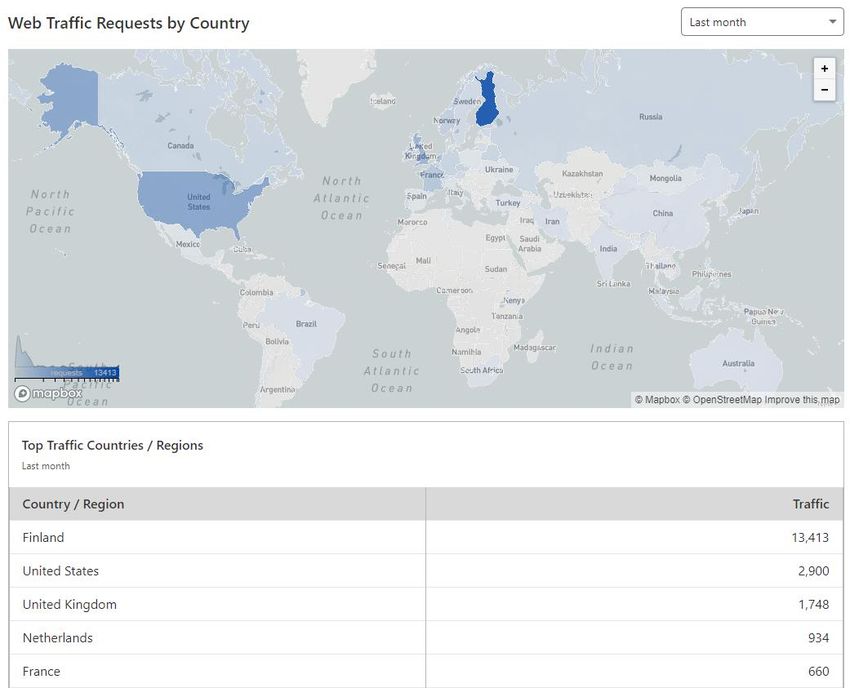
2
6 WordPress site for Art Studio Kirstu ............................................................................ 37
6.1 Webstore plugins in comparison ...................................................................................37
6.1.1 Required features.................................................................................................37
6.1.2 WP Simple PayPal Shopping Cart .........................................................................38
6.1.3 Ecwid Ecommerce Shopping Cart .........................................................................39
6.1.4 WooCommerce ....................................................................................................41
6.2 Hosting in Altervista with CloudFlare ............................................................................43
6.3 Content, site structure and theme ................................................................................45
6.3.1 Responsive design ................................................................................................45
6.3.2 Structure and navigation ......................................................................................47
6.3.3 Content ................................................................................................................48
6.3.4 Child theme customizations .................................................................................53
7 Analytics ...................................................................................................................... 55
7.1 Analytics tools ...............................................................................................................55
7.2 Visibility of Art Studio Kirstu ..........................................................................................56
8 Conclusions.................................................................................................................. 58
References .......................................................................................................................... 61
Figures
Figure 1. Serif and sans serif .....................................................................................................13
Figure 2. Examples of font categories .......................................................................................14
Figure 3. Golden Ratio...............................................................................................................17
Figure 4. Golden Circles.............................................................................................................18
Figure 5. Twitter logo and Golden Circles .................................................................................19
Figure 6. WordPress dashboard ................................................................................................21
Figure 7. Post management in WordPress ................................................................................24
Figure 8. Original color palette by Uusivirta ..............................................................................29
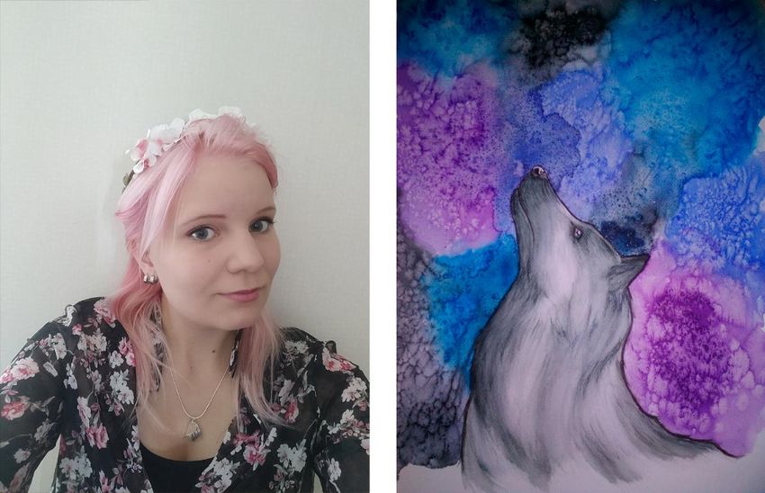
Figure 9. Krista Uusivirta & her painting 'Silver Wolf'................................................................30
Figure 10. Color Blind Simulator by Adobe Color ......................................................................31
Figure 11. Color schemes with #BF69A8 by ColorHexa .............................................................31
Figure 12. Final color palette.....................................................................................................32
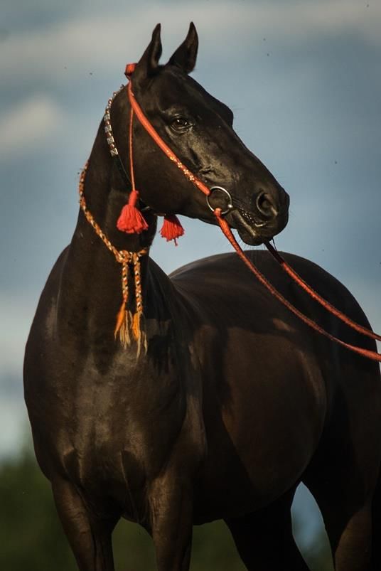
Figure 13. An Akhal-Teke horse wearing a bridle, neck collar and an alaja. Photo by Eetu Autere /
haukkaleva.net ..........................................................................................................................33
Figure 14. First logo sketches by Hanna Harjula (on the left) & the detailed sketch by Krista
Uusivirta (on the right) ..............................................................................................................34
3

Figure 15. Logo made with golden circles .................................................................................35
Figure 16. Color variations of the logo ......................................................................................36
Figure 17. Fonts for Art Studio Kirstu ........................................................................................37
Figure 18. WP Simple PayPal Shopping Cart..............................................................................39
Figure 19. Product editor in Ecwid control panel ......................................................................41
Figure 20. Edit Product in WooCommerce ................................................................................42
Figure 21. CloudFlare Dashboard ..............................................................................................44
Figure 22. Mobile views of Art Studio Kirstu website ................................................................46
Figure 23. Tablet view of a post on Art Studio Kirstu website ...................................................47
Figure 24. Website stucture ......................................................................................................48
Figure 25. Landing page of Art Studio Kirstu .............................................................................49
Figure 26. FiboSearch - AJAX Search for WooCommerce ..........................................................50
Figure 27. Yoast SEO: Google Preview of the artist page ..........................................................52
Figure 28. Mik by Shark Themes ...............................................................................................53
Figure 29. Query for showing the latest commissions ..............................................................54
Figure 30. Child theme files .......................................................................................................55
Figure 31. Unique visitors from 15th March to 26th April 2021 ................................................57
Figure 32. Cloudflare Analytics: Web Traffic Requests by Country ...........................................58
4

Abbreviations and terminology

AJAX                    Asynchronous JavaScript and XML. Technique for creating fast and dy-
                        namic web pages, with no need to reload the page to change the con-
                        tent.
API                     Application Programming Interface. A computing interface defining
                        software application’s interaction with external software components,
                        operating systems or microservices.
CDN                     Content Delivery Network. A network of servers dispersed around the
                        world caching static content from websites. The cached data is deliv-
                        ered to user from the server located closest to them.
CMS                     Content Management System. A computer software used to create and
                        modify digital content, typically used for managing enterprise and web
                        content.
CMYK                    Cyan, Magenta, Yellow, Key. A color profile which uses cyan, magenta
                        and yellow as primary colors. The fourth plate ‘key’ aligns the primary
                        colors and holds the most detail in the image. This color profile is used
                        for printing.
(Web) Crawler           A computer program (bot) that automatically searches documents on
                        the Web, typically operated by search engines for the purpose of Web
                        indexing.
CRM                     Customer Relationship Management. A process of managing organiza-
                        tion’s relationships and interactions with existing and potential custom-
                        ers.
CSS                     Cascading Style Sheets. A style sheet language which describes how ele-
                        ments in web documents written in a markup language such as HTML
                        should be displayed.
CSV                     Comma-separated Values. A simple file format used to store tabular
                        data.
CTA                     Call to Action. A marketing term for a design element that invites the
                        user to take some desired action.
DOM                     Document Object Model. Interface that represents an XML or HTML
                        document with a logical tree structure.
EMEA                    Europe, the Middle East and Africa. A designation given to a set of
                        countries in these regions, most commonly used for marketing pur-
                        poses.
FTP                     File Transfer Protocol. A standard communication protocol used to
                        transfer files between the server and the client.
5

GDPR         General Data Protection Regulation. European privacy law setting
             guidelines for user content and giving people rights over their personal
             data. Effective since May 25, 2018.
GLS          General Logistics Systems B.V. A British-owned logistics company oper-
             ating also in Finland.
(GNU) GPL    (GNU) General Public License. Free software license that allows soft-
             ware to be freely used, modified, and redistributed by anyone. Written
             by Richard Stallman of Free Software Foundation for GNU Project.
HTML         Hyper Text Markup Language. Standard markup language for web
             pages.
HTTP         Hypertext Transfer Protocol. Application layer protocol for transmitting
             hypermedia documents such as HTML. Originally designed for commu-
             nication between web browsers and web servers but can also be used
             for other purposes.
HTTPS        Hypertext Transfer Protocol Secure. Extension of HTTP using TLS/SSL to
             encrypt the data transfer for more secure connection. Website needs a
             TLS/SSL certificate for authentication to use HTTPS.
IG           Instagram. Social media platform owned by Facebook.
IP address   Internet Protocol Address. Identifier attached to a device, contains loca-
             tion information, and makes the device accessible for communication
             on the computer network.
JS           JavaScript. A lightweight programming language used to make web
             pages interactive. Used both on the client-side and server-side.
MySQL        An open-source relational database management system based on SQL
             aka Structured Query Language.
PCI DSS      The Payment Card Industry Data Security Standard. A set of security
             standards formed in 2004 by Visa, MasterCard, Discover Financial Ser-
             vices, JCB International and American Express, aiming to secure credit
             and debit card transactions against data theft and fraud.
PHP          Hypertext Preprocessor. A server scripting language embedded in HTML
             used to make dynamic and interactive web pages.
QUIC         Quick UDP Internet Connections. A transport layer network protocol
             which improves performance of connection-oriented web applications
             by using UDP (User Datagram Protocol) instead of TCP (Transmission
             Control Protocol).
RGB          Red, Green, Blue. Color profile which uses red, green and blue as pri-
             mary colors. This color profile is used for screen display.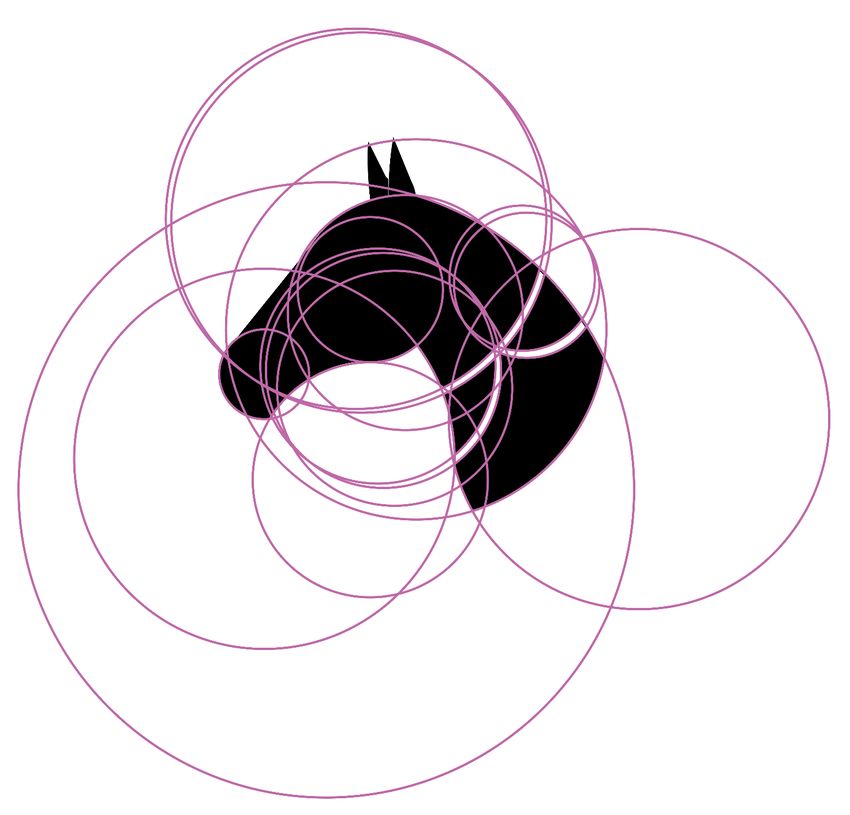
6

SEO        Search Engine Optimization. A strategy used on websites to get more
           site traffic by ranking higher in search engines.
TLS        Transport Layer Security. A protocol used for encrypting the data sent
           from the browser to the server and vice versa as well as authenticating
           the website. Evolved from previous encryption protocol called Secure
           Sockets Layer (SSL).
UI         User Interface. The means in which user interacts with a software appli-
           cation or a hardware device.
URL        Uniform Resource Locator. Colloquially termed a web address; a refer-
           ence to a web resource, most commonly to a web page, that specifies
           its location on a computer network and a mechanism for retrieving it.
VDP        Vulnerability Disclosure Policy. Guidelines for ethical hackers and secu-
           rity researchers for reporting security vulnerabilities to organizations.
Viewport   The visible area of a web page to user.
W3C        World Wide Web Consortium. The main international standards organi-
           zation for the World Wide Web.
WP         WordPress. An open-source content management system (CMS).
XML        Extensible Markup Language. Defines rules for encoding documents in a
           format which is readable for both humans and machines; designed for
           storing and transporting data.
7

1 Introduction

1.1 Background of the project

The internet is overflowing with talented artists. According to Statista Research Department
(2020), online sales in the global art market are increasing. The question is, how to be one of the
artists that can get their art sold? By getting exposure and recognition, which can be achieved with
an effective branding strategy, says Campbell (2020). Branding is about creating a strong, positive
image of the entrepreneur and their products or services, a “brand”. It helps art entrepreneurs dif-
ferentiate themselves from their competitors and build a loyal customer base. (Branding, n.d.).

According to Demand Metric Research Corporation (2016), consistently presented brands are
three to four times more likely to possess excellent brand visibility, while inconsistency might cre-
ate confusion and damage credibility. Visual identity is the cornerstone in making the brand con-
sistent and recognizable. It defines use of brand’s visual elements including logo, colors, typogra-
phy, and photography (Anderson, 2020). All online platforms and real-life implementations of the
brand should follow these guidelines the visual identity provides.

Then, where to gain visibility as an art entrepreneur on the internet? Social media channels might
be the most important ways to gain visibility in the modern world, for artists like any entrepre-
neurs. An NY Collector stated in Artsy.net survey (Soboleva, 2015), “if your artwork isn’t repre-
sented on Instagram these days, do you exist?”

In addition to social media presence, a website is always a good idea. Entrepreneur’s own website
is all about them, without unwanted third-party ads or any other distractions. On the contrary, a
post in social media feed is easily lost in the crowd and at the mercy of constantly changing algo-
rithms. A website, however, can be optimized for search engines so it’s easier to find. A website
can be the place for all important information of one as an art entrepreneur, a portfolio for art-
work, and a way to sell art directly – everything under one web address. What’s more, it has no
limits for customization and is therefore the best way to bring out the brand and its visual identity.
A good website creates a sense of professionalism. (Gale, 2021; Rogers, 2018).
8

1.2 Assignor

The assignor for the thesis is Krista Uusivirta, a self-taught Finnish artist. Currently she’s mainly
working with model horses – in addition to unique repaints, she’s experimenting on sculpting and
creating accessories from old jewelry. She also paints with acrylics on canvas and creates home
decor. Inspired by nature, her main theme in art has always been equine, especially Turkmen
Akhal-Teke horses. During past years she´s been doing commissions for international customers
via social media channels such as Instagram and DeviantArt, going by name Kirstu.

1.3 Objectives and methods

Thesis was a development project in which the goal was to answer following questions:

    1. On which platforms would one increase art entrepreneur’s visibility on the internet?
    2. What are the aspects of visual identity and how to make them consistent and appropriate?
    3. Why and how would one make a WordPress site with a webstore for an art entrepreneur?

Source materials for the theoretical foundation were research reports, articles, and videos by the
professionals of these fields as well as the official websites, wikis and forums of WordPress and
other services used in the practical implementation. Prior experience and skills on visual design
and web development were also utilized.

In the practical implementation, the first task was to build a visual identity for Uusivirta as an artist
including a logo, color palette and typography. The second task was to build her a responsive port-
folio website in WordPress; consistent with the visual identity and easy for her to maintain with no
coding knowledge. Three different webstore plugins for WordPress were compared to find the
suitable one for selling her art directly on the website. After publishing the site, the third task was
to launch an Instagram campaign to increase visibility and analyze the subsequent web traffic sta-
tistics.
9 2 Visual identity 2.1 Artist identity The art itself is obviously on the limelight here, but potential customers are also interested in who is behind it, their personality. In the start of the branding process, it´s important to get to know the artist themselves. Who are they? What is their passion, what inspires them? What are their values? What is their vision, what do they want to say with their art? Answering these questions and more, there are two useful text types to write and include on the website: an artist biography and an artist statement. While the artist biography is about the artist as a person, the artist statement is focused on the art itself. The artist statement is a short text, ideally between 150-200 words, answering these three simple questions: what, how and why. (How To Write An Artist Statement: Tips From The Art Experts, 2016). Hotchkiss (2018) says that the statement can help someone gain a deeper understanding of the art, feel more connected to that art and, ultimately, value it. For visual identity, these texts give a good base to build on. After all, visual identity is a part of the artist identity – the part that’s shown to the world. 2.2 Color theory 2.2.1 Basics of color theory Knowing the basics of color theory is important to be able to use colors efficiently in branding (Hauff & Neidlinger, 2018). Red, blue, and yellow are often referred as primary colors which make all the other colors. By mixing two primary colors you get secondary colors which are purple, green, and orange. Tertiary colors are made by mixing secondary colors. These are called pure or saturated colors. By adding white to a pure color, you get tints, by adding black you get shades and by adding gray you get tones. (Hauff & Neidlinger, 2018). The easiest way to make a color stand out is pairing it with a complementary aka opposite color in the color wheel. For example, orange is the opposite of blue since it’s made of yellow and red. Split complementary colors mean the colors beside the complementary color, e.g., yellow-orange and red-orange are split complementary colors for blue. Another way to make a good color palette
10

is using a triangle or square: three or four colors evenly spaced around the color wheel. Tetradic
(rectangle) is a color combination using two complementary pairs. (Hauff & Neidlinger, 2018).

2.2.2 RGB and CMYK

This theory about primary colors explained before is correct when talking about material things
e.g., traditional painting. When talking about light, it´s not. According to Konstantinovsky (2019)
Professor Westland explains it this way: "Light enters our eyes in two ways: (1) directly from a light
source; and (2) reflected from an object. This leads to two types of colour mixing, additive and sub-
tractive.". In additive color mixing the primary colors are red, green and blue. Simply put, color
profile on screen is RGB.

In subtractive color mixing the primary colors are cyan, magenta, and yellow, which leads us to
color profile CMYK. This color profile is used on prints. The letter ‘K’ stands for key plate which is
usually black ink. Key plate holds the most detail in the image and other plates (C, M, Y) are
aligned with it. (Coale, 2014). Both color profiles are obviously needed in art industry – for printed
and digital media – which is why the color codes for a brand are usually declared in both RGB and
CMYK.

2.2.3 Psychology of colors

When choosing brand colors, it´s good to know about their psychological effects on people in dif-
ferent cultures. Like Hauff and Neidlinger state in their article (2018), “in content marketing, color
is an emotional cue.” While people often respond to certain colors in similar ways, it is important
to remember that the psychology behind any color can depend upon many different factors, e.g.,
past experiences, cultural influences, and personal taste, says Cherry (2020).

Red is usually seen as the most powerful color there is. Red is associated with excitement and pas-
sion but also danger and aggression. Red tends to encourage appetite hence why a lot of fast-food
chains and e.g. Coca Cola use red in their branding. In YouTube’s logo there is a red play button – a
call to action. (Martins Ferreira, 2019). At its best, red is a very energizing color (Hauff & Neid-
linger, 2018).
11

Yellow is a happy color. It´s often associated with sunshine and positivity. (Martins Ferreira 2019).
In great quantities, however, yellow can be frustrating. Yellow is the most visible color and there-
fore attention-grabbing but also most fatiguing to the eye. (Cherry, 2020). It´s important to
knowledge colors can have totally different associations in different cultures. For example, in
Egypt and much of Latin America yellow is linked to death. In many countries yellow is a mark of
success and money. (How Translating Colors Across Cultures Can Help You Make a Positive Impact,
2020). Some of the most known brands using yellow in their logos are McDonalds’ and Ferrari.

Orange is a strong and energetic color that encourages appetite like red, and friendly and fun like
yellow. Fanta logo reminds us of the fruit carrying the same name as the color. Orange portrays
physical comfort, warmth, and enthusiasm. (Hauff & Neidlinger, 2018; Cherry, 2020). Orange is of-
ten associated with Halloween and prison uniforms in the U.S. (Cherry, 2020) but considered sa-
cred in India – think about Buddhist monks (How Translating Colors Across Cultures Can Help You
Make a Positive Impact, 2020).

Green reminds us of the nature and thus usually described as a refreshing, healthy and tranquil
color (Cherry, 2020). Therefore, green is often used by organizations that want to portray them-
selves close to nature and environmentally friendly, e.g., Vegan Society. On the contrary, in China
green is associated with infidelity (How Translating Colors Across Cultures Can Help You Make a
Positive Impact, 2020).

Blue is one of the most liked colors. Compared to red, its effect tends to be more mental than
physical. Blue is usually seen as a calming and trustworthy color. That´s why a lot of companies
that want to project an image of security use blue in their branding. This can be seen in social me-
dia giants Twitter, Facebook and Skype. On the other hand, blue can also be seen as a sad, distant
and cold color, and it’s one of the least appetizing. (Cherry, 2020; Hauff & Neidlinger, 2018; Mar-
tins Ferreira, 2019).

In comparison to other colors, purple occurs rarely in nature, thus it´s often seen as a mysterious
and intriguing color. For the same reason it´s a symbol of royalty and wealth (Cherry, 2020), but
also creativity (Hauff & Neidlinger, 2018). Consisting of red and blue, purple is also described as a
12

sensual and soothing color (Cherry, 2020). Some popular brands with purple as their main color
are Yahoo! and Twitch.

Pink is usually seen as a feminine color and associated with qualities such as softness, kindness,
nurturance, and compassion (Cherry, 2020). Because of that, pink is a popular color for brands tar-
geting female audience e.g. Victoria’s Secret and Barbie (Martins Ferreira, 2019). Pink is a symbol
of romance. On the other hand, pink can also be seen as a childish and immature color since it’s so
overused in all things for little girls. (Cherry, 2020).

2.3 Basics of typography

2.3.1 Terminology of typography

Typography is often overlooked but an essential part of the brand’s visual identity. Like color
choices, typography choices influence decision making. “Typography is the art of arranging letters
and text in a way that makes the copy legible, clear, and visually appealing to the reader”, sums
Hannah in her article (2020). Good typography encourages the reader to continue reading.

Typeface means the design of letters. “The word ‘typeface’ historically refers specifically to the
shape and style of the letters, organized into a set based on the alphabet, numbers, and punctua-
tion needed to completely express language”, says Crider (2017). For example, Arial is a typeface.
A font is a particular set of glyphs within a typeface (Keung, 2020b), in modern world a computer
file. In the original publishing sense, a font meant a collection of metal casts that contained glyphs
in specific sizes and weights. There would be two different fonts for ‘Arial, size 12, regular’ and
‘Arial, size 16, bold’. A font family is a collection that includes more than one specific style of font,
e.g., Arial Regular, Arial Bold and Arial Italic. However, the words ‘font’ and ‘typeface’ are com-
monly used interchangeably. (Crider, 2017).

Web safe fonts are the default fonts, pre-installed by many operating systems and devices. Web
fonts are downloaded by the user’s web browser while rendering the webpage, and then applied
to the text. This slows the site’s load time. Web fonts require CSS3 to work, and in older browsers
there is limited support for it. That´s why you should always use web safe fallback fonts as well
13

when using web fonts. (CSS Font Stack, n.d.; Mistry, 2019). There are a lot of services offering web
fonts for free, e.g. Google Fonts, and for subscription, e.g. Adobe Fonts.

2.3.2 Font types

When it comes to design, font types are divided into two main categories: serif and sans serif. The
names are self-explanatory: a serif is a decorative stroke that finishes off the end of a letters stem.
Sans is French for ‘without’, so a sans serif font doesn´t have serifs. The serif fonts often use
strokes that vary in weight meaning some areas of a letter may be thick while others are thin. Sans
serif fonts on the other hand tend to use simple, clean lines and be the same width throughout.
(Rinaldi, 2019). The difference between these two main font types can be seen in Figure 1.

Figure 1. Serif and sans serif

Serif fonts’ history dates all the way back to 18th century thus they are seen as traditional, trust-
worthy and elegant. Businesses that want to appear reputable and serious often use serif fonts.
Some well-known brands using serif fonts are Burberry, Vogue and The New York Times. Sans serif
fonts on the other hand are simple and modern. They give more casual feeling, so they are often
used by brands aiming to be easily approached, relatable and youthful (Rinaldi, 2019). Facebook
and Adidas are some good examples of this.
14

Another way to divide font types is by their character width compared to each other. Monospaced
letters and characters are all the same width or have the same amount of horizontal space; pro-
portionally set vary in width and only take the space needed. Numerals work well in monospace –
they are also known as Tabular Figures. What comes to body text, it´s easier for our brain to recog-
nize different characters when they are proportional, in their natural width. (Keung, 2020a).

Some other common categories for fonts are script, calligraphic and handwritten. They are more
decorative and harder to read than basic serif and sans serif fonts, and thus not the best choice for
longer texts. Instead, as headlines etc. they are vibrant and eye-catching. Script fonts are based on
the flow of cursive handwriting. Script fonts can be divided into two subcategories: formal and cas-
ual. Formal script fonts are elegant, inspired by handwriting from the 17th 18th century, while cas-
ual ones are more relaxed, inspired by wet brush strokes. Calligraphic fonts also mimic brush and
nib strokes but tend to be more contemporary. Handwritten fonts are a newer category, imitating
modern-day handwriting. (Keung, 2020c). See examples of each in Figure 2.

Figure 2. Examples of font categories

2.4 Logo design

2.4.1 Principles of logo design

Logo is an essential part of any brand. It’s the main graphic symbol of business and its visual iden-
tity (Anderson, 2020). According to Airey and Carson (2020), the logo is the business’ first point of
contact with the outside world. “It´s important to remember that when we look at something, we
don’t read first. Before anything else we see shape, we see color, and if that´s enough to hold our
15

attention, then we´ll read”, says Airey (2020). According to him, the logo should aim for easy re-
call. Too much detail is not a good idea. When we think about popular brands such as Nike,
Adidas, or Apple, they all have this in common. Like Airey and Carson (2020, 4) sum it up, “the sim-
pler a logo design, the more memorable it will be.” Pentagram’s high-profile rebrands for e.g.,
Windows, MasterCard and Warner Bros have all done the same thing: simplified the design. (Pen-
tagram, 2021).

In addition to simplicity, another golden rule in logo design is versatility of scale. The logo should
work in the tiniest sizes as well as scaled huge, e.g., as a favicon of the website and printed on the
office wall. (Airey & Carson, 2020). For this reason, the final logo should always be vectorized. A
vector graphic is made of points, lines and curves based upon mathematical equations, not col-
ored square pixels like normal images. Therefore, it never gets pixelated when scaled. (Shayla,
n.d.)

2.4.2 Psychology of shapes

Colors have their own psychology, like described in chapter 2.2, but so do shapes. “Just like fonts
and colors, shapes are an important aspect of design, capable of symbolizing ideas, expressing
moods, and leading the eye”, says Peate (n.d.). Round shapes such as circles, ovals and ellipses are
soft shapes without harsh angles, thus seen as positive, welcoming, and comforting. Circle is asso-
ciated with unity, commitment, and love since it reminds us of rings, a symbol of marriage. Circle is
also seen as stable and reliable for its consistent shape. Some well-known brands embracing cir-
cles are NASA and the Olympic rings. (Christie, 2017; Peate, n.d.). Curves are often seen as femi-
nine and describe motion, happiness, rhythm, or pleasure (Shapes in logo design, 2016). One good
example is the Coca Cola logo.

Squares and other rectangles are symbols of trust, order, and balance. This might be because
things we regard secure in our lives are often rectangular in shape, such as a safe or a house.
(Peate, n.d.; Shapes in logo design, 2016). According to Christie (2017), “straight lines and precise
logo shapes also impart strength, professionalism and efficiency.” Some simple logo designs based
on squares are BBC’s and Microsoft’s.
16

Triangles are not as popular shapes in logo design as circles and rectangles, which is understanda-
ble as triangle does not give the same safe and comforting feeling. Triangles can, however, suggest
dynamic power and continuous motion or improvement. Masculine with strong edges, the triangle
shape is commonly used in the motor, construction, scientific and legal industries, e.g., Mitsubishi
Motors and CAT construction. (Peate, n.d.) What comes to the direction, the triangle might be saf-
est to point upwards or to the right, since in our Western culture a triangle pointing left or down-
wards indicates negative associations. (Peate, n.d.). Our reading direction is from left to right,
which gives the impression of movement forward being indeed to the right, and the past being in
the left. This is opposite in cultures where the reading direction is from right to left, e.g., Arabic
speaking countries. (Reading direction, n.d.; Vincent, 2013). However, facing left is not necessarily
always bad: it attracts customers whose temporal focus is on the past, tell Jeong, Kwak, Puzakova
and Zhang in their research on advertising (2018).

Like triangles, vertical lines are seen as masculine and powerful, even aggressive. Like Peate (n.d.)
says, “they draw the eye of the viewer downwards, often directing the eye towards the brand
name.” SoundCloud logo is a good example of this as well as combining strong vertical lines with
soft curves. On the contrary, horizontal lines appear calm and tranquil, making you feel settled
and protected. A famous example of this is IBM. (Christie, 2017; Peate, n.d.).

2.4.3 Negative space

One way to make logo design intriguing is to utilize negative space. Creative Bloq Staff (2019) ex-
plains negative space as the space between, within and surrounding an object. In graphic design,
negative space is often used to form another shape or object. Award-winning FedEx logo is a clas-
sic example of this: negative space between the letters ‘E’ and ‘X’ creates an arrow. It´s important
to evaluate every detail in logo design – unintentional hidden shapes might endanger the intended
brand message (Peate n.d.).

Closure is a technique in which an object is incomplete, but there is enough detail for the human
eye to make the whole picture. (Christie, 2017). A good example of this technique used in logo de-
sign is World Wildlife Fund’s panda. Closure is one of the Gestalt Principles, a series of theories of
17

visual perception by German psychologists in the 1920s. Gestalt means ‘unified whole’ which de-
scribes well the essence of the Gestalt Theory: when looking at a group of objects, we will see the
whole before individual parts. (Hampton-Smith, 2018).

2.4.4 Golden ratio

It´s commonly believed the Golden Ratio makes the most visually pleasing shape. It´s seen every-
where in the nature from seashells to human body. Many artists and architects throughout ages,
e.g., Leonardo da Vinci have used it in their compositions. The Golden Ratio describes a perfectly
symmetrical relationship between two proportions. (Creative Bloq Staff, 2019). The Golden Ratio
is derived from the Fibonacci sequence, in which the next number in the sequence is a total of it-
self and the previous number, starting from zero: 0, 1, 1, 2, 3 and so on. The actual ratio in Fibo-
nacci sequence is an irrational number that never resolves, but it can be reduced to 1:1.618. The
ratio is mathematically also known as Φ (Phi). The Golden Ratio is usually illustrated with a rectan-
gle which edges are in that ratio. Practically, when you draw a square inside that rectangle, the re-
maining space is in the same ratio as the original rectangle. Likewise, the Golden Spiral’s growth
factor is Φ. (TipTut, 2017). See the Golden Spiral inside the rectangle in Figure 3.

Figure 3. Golden Ratio

Golden Circles are following the same ratio, like seen in the Figure 4.
18

Figure 4. Golden Circles

In logo design, Golden Circles are often used by multiplying and overlapping them to create the
logo’s lineart. This way the logo has mathematically perfect shapes and consistent lines. Twitter is
a good example of this: they renewed their logo in 2012, and it´s heavily based in three Golden Cir-
cles, like seen in the Figure 5. Twitter even demonstrates this in their brand guidelines. Only the
bird’s head is not exactly following the Golden Circles, but that doesn´t really matter. Like Johnson
(2012) says, “This strategy is meant to be a tool to help refine your work, not inhibit your creativ-
ity.”
19

Figure 5. Twitter logo and Golden Circles

2.4.5 Colors and typography in logo design

For consistency, the logo should match the brand’s color palette – or the other way around. Black
and white might not be a bad idea either: once again, think about Apple or Adidas. Even if the pri-
mary logo design isn´t monochrome, it should work effectively in black and white for different ap-
plications (Airey & Carson, 2020). It´s not a bad idea to have two or three variations of the logo:
one for black background, another for white background and optionally third in color.

If the logo contains letters, the next question is whether to use an existing typeface or illustrate it
yourself. Coca Cola is a great example of timeless illustration – the logo has stayed the same since
late 1800s (Airey & Carson, 2020). If the brand name has multiple words on it, one option is to cre-
ate a monogram of its initials: two or more letters combined or interlaced. Some popular brands
using monogram logos are Yves Saint Laurent and Louis Vuitton.

What comes to font types (described in chapter 2.3.2), sans serif fonts – like minimalism alto-
gether – have been dominating logo design in recent years. Like mentioned in chapter 2.4.1, a lot
of companies have gone through simplifying rebranding, which can be seen in typography, too.
20

One of the most famous cases is Google exchanging its longstanding serif logotype for sans serif in
2015. (Airey & Carson, 2020).

3 WordPress for business

3.1 Why should a business choose WordPress

WordPress is an open-source platform powering 40% of all sites across the web thus being the
most popular CMS in the world, according to Gelbmann (2021). Safe to say it´s a reasonable option
for any kind of business, and here´s why. WordPress is simple to set up – many web hosts offer a
one-click WP installer. It´s also possible to import your existing website from different publishing
system, e.g. Drupal or Blogger, to WordPress (Importing Content, n.d.). Updating is just as simple.
It´s not even needed to be fluent in English, since WordPress is available in more than 70 lan-
guages, including Finnish (Translation Teams – Translate WordPress, n.d.). WordPress’ graphic UI
makes it easy to use with zero coding knowledge. See Figure 6 for WordPress dashboard.
21

Figure 6. WordPress dashboard

On the other hand, WordPress is flexible to modify however you like. WordPress is licensed under
General Public License (GPLv2), which means you are free to run the program for any purpose,
change it as well as redistribute it and its modified versions (About Us: Our Mission, n.d.). In con-
sequence, there are tons of themes and plugins for different functions available to choose from
and ready to use, as well as support for making your own. See chapter 3.4 for details. What´s
more, WordPress is optimized for search engines and in full compliance with the standards set by
the W3C (Features, n.d.).
22

3.2 Security in WordPress

WordPress is a secure option since high security is one of the program’s top priorities. The Word-
Press project is a meritocracy run by a core leadership team consisting of core developers and led
by its co-creator and lead-developer Matt Mullenweg. In addition, WordPress has a security team
of approximately fifty experts, of which about a half are employees of Automattic, people behind
WordPress.com (the earliest and largest WP hosting platform). These teams work together to
identify and resolve security issues in the core software as well as document recommended prac-
tices for third-party theme and plugin authors. The global WP community plays a great role in se-
curity, too. The Security Team can be alerted of potential security vulnerabilities via HackerOne, a
platform with pioneering VDP structure according to their website (Response, n.d.). All reports are
acknowledged, and after verifying and determining its severity the patch is planned.

WordPress is constantly developing and frequently updated, however strongly committing to
backwards compatibility. Major releases possibly containing new user features and developer APIs
are aimed to launch every 4-5 months. Minor releases are launched when needed. They are re-
served for fixing security vulnerabilities and critical bugs only. Beginning with version 3.7, all minor
releases are updated automatically. This means security fixes can be done immediately without
needing any action from the site’s administrator.

What comes to plugins and themes contributed by third parties, they are manually reviewed by
volunteers before they are available on the WP repository. The security team contacts the author
if they discover a vulnerability to work together to fix it. The plugin or theme can be pulled from
the public directory if the author is not responding, or the vulnerability is severe. Available up-
dates to plugins and themes appear on the WP control panel. They can also be set to update auto-
matically. (Rosso, 2015).

3.3 Hosting a WordPress site

WordPress-powered website requires a host that supports at least PHP version 7.4, MySQL version
5.6 or MariaDB version 10.1 and HTTPS. WordPress recommends Apache or Nginx as the HTTP
server software. What comes to legacy environments, WordPress also works with PHP 5.6.2 and
MySQL 5.0, but these outdated versions are exposed to security vulnerabilities. (Requirements,
23

n.d.). Since WordPress is the most common CMS, a lot of host providers today offer hosting ser-
vices pre-configured specifically for hosting WordPress, called “WordPress Hosting” (Shivar,
2021b). It’s usually used to simplify, secure, and speed up a WP site compared to WP site on a typ-
ical web server (Shivar, 2021a). Some companies do exclusively WP installs, e.g., WP Engine
(Shivar, 2021b).

Another important thing to consider when choosing the host is the locations of its data centers.
The data center’s location affects the website’s performance in specific geographic location. The
website’s data center should be where its major audience is. (Editorial Staff, 2021a). Because of
this, international businesses should use CDN to improve their website’s performance. CDN does
not only speed up the website’s loading time, but also improves crash resistance since the load is
distributed to multiple servers around the world. (Editorial Staff, 2019).

3.4 WordPress site’s structure and themes

WordPress is originally a blogging platform; hence its basic functionality consists of publishing
tools for blog posts and pages as well as comments. Posts of similar subjects can be grouped into
hierarchal categories. Tags can be used to sort the posts even more specifically, into micro-catego-
ries. Variety of contributors with different levels of access to the site can be added and edited in
the built-in user management system. Core functionality of WordPress can be extended with tons
of plugins: add-ons that offer specific features like contact forms, spam protection and SEO. See
post management view in Figure 7. The four symbols on the right have been added with Yoast SEO
plugin and describe SEO score, readability score and internal links. See chapter 6.3.2.
24

Figure 7. Post management in WordPress

A WordPress Theme controls the appearance of content stored by WordPress (Theme Handbook,
n.d.). Users can change some aspects of the theme, like site icon and text colors in Customizer, a
part of WP’s graphic UI. The customization options are defined by the theme. WordPress publishes
one default theme every year, but there are thousands of free, user-made custom themes availa-
ble for use. WordPress encourages the users to create their own custom themes: there is an ex-
tensive Developer Resources library within WordPress’ official website, including a Theme Hand-
book.
25

Themes are built of Template files which are used to display a certain part of the website, such as
header.php and index.php. Different Post Types are displayed by different Template files. The de-
fault Post Types in WordPress are post, page, attachment, revision and menu. It´s also possible to
make your own Custom Post Types. Template tags are WP functions used in Template files to re-
trieve content from the database, e.g. the_title() retrieves the title of the page. The main mecha-
nism in WordPress is the Loop, which loops through the posts retrieved for the current page and
displays them according to theme settings. For additional features and functionality in theme
there is a file called functions.php which can be edited to call WP functions and define your own.
(Theme Handbook, n.d.).

Because the themes distributed in WordPress’ free theme repository are licensed under GPL, they
are free to modify and redistribute. This allows creating child themes – themes that are based on a
complete theme but partly modified. Customizations are done in child theme files, separated from
the parent theme files. This way, updating the parent theme doesn´t affect the customizations
done in the child theme. Using a child theme instead of building a whole new custom theme can
save a lot of time. (Theme Handbook, n.d.).

4 Artist visibility on the internet

4.1 Social media visibility

4.1.1 From DeviantArt to Instagram

Social media presence is essential for any modern entrepreneur, like mentioned in chapter 1.1.
Artists have been on the internet since it’s been possible to upload images to websites from the
1990s (Ables, 2019). Naturally, the platforms have changed in over twenty years.

DeviantArt is said to be the first large-scale online art community, launched in 2000. It was devel-
oped by three people – Stephens, Scott Jarkoff and Angelo Sotira – who met in a chat room online
and shared interest in digital art. DeviantArt used to be the most popular platform for artists to
share their work and get genuine engagement, amassing one million artworks in the first three
years. (Ables, 2019; Christopher, 2021). DeviantArt was bought by Wix for 36 million dollars in
2017 (Ables, 2019). Googling ‘DeviantArt’ today, the first asks displayed in the search results are ‘is
DeviantArt a bad website’, ‘is DeviantArt dead’ and ‘is DeviantArt still popular 2020’. According to
26

Christopher (2021), one of the biggest reasons for people leaving the site was vastly increasing
amount of explicit content and lack of properly working mature content filters.

On the other hand, with mass adoption of smartphones new social media platforms took the spot-
light in 2010s. The culture changed. No more in-depth feedback in admiration of detailed artworks
but endless scrolling and clicking ‘like’ on image after image. Instagram reached one hundred
thousand users in one week and one million in less than three months after launching in 2010.
Two years in, Facebook bought Instagram for one billion dollars. (Ables, 2019). In 2021, over one
billion people use IG every month. What comes to mobile apps, IG has 4th-most users, outranked
only by Facebook, WhatsApp, and Facebook Messenger. (Newberry, 2021). According to Facebook
IQ (2019), “simply by being on Instagram, brands can make a positive impression”. Surveyed peo-
ple around the globe described brands on IG as popular, creative, entertaining, and relevant in
2018. Of course, IG is not a platform exclusively for artists, but for the same reason it’s a place to
reach even more people – both potential customers and other artists.

Like briefly mentioned in chapter 1.1, visibility of posts in social media platforms like Instagram is
dependent on algorithms that are constantly changing. The bottom line is simply the more fre-
quently you post, the more visibility you get.

4.1.2 Features of Professional Instagram Profile

Instagram offers three profile options for free: personal, creator and business. For an artist, Insta-
gram suggests a creator account. On the other hand, business account is suggested for local busi-
nesses and brands. Professional profiles, meaning creator and business, can have more infor-
mation in the profile as well as more tools in use. In personal profile there are slots for a website
address and a short bio text, meanwhile in professional profile there are also categories, contact
information and cta buttons. Business profiles can also set location with map and directions. In-
sights offers detailed analytics. With Promote, posts can be turned into paid ads. (Read, 2016;
Vamp, 2021).

Professional profiles have more ways to create content. All profiles can create regular posts, Sto-
ries that are visible for 24 hours and Reels for short videos of max 30 seconds length as well as
host live videos of max 60 minutes length. There is low threshold to post more casual content in
You can also read