You've got my attention. Please, don't repeat yourself!
←
→
Page content transcription
If your browser does not render page correctly, please read the page content below
You’ve got my attention.
Please, don’t repeat yourself!
By Guillermo Franco

The bad use of print design resources to present text on
the Internet is negatively affecting usability of many
homepages, particularly those of newspapers, thus making
information delivery inefficient. Usability is a term that refers
to easiness and efficiency of use.

When I say print design resources I refer, in the first place,
to using the subhead, headline, summary and decks -as they
were designed for print publications- along with texts that
make use of the inverted pyramid structure.

In an article published in Poynteronline on January 17th,
2002, renowned newspaper designer Mario Garcia explains
the logic and benefits of using some of these resources in
printed products, assuring that “The single headline is
becoming a thing of the past.”

“For headlines to work more effectively – for the scanning
process to be accelerated and the storytelling enhanced – it is
best to add "decks" or "extra thoughts" to them… Historically,
headlines rarely appeared as single units. The New York
Times, and especially the Wall Street Journal, have always
used multi-deck headlining. There is an art to doing this
properly”, says Garcia.

Later in the article it was explained how to use them:

“Multi-deck headlines must flesh out the story they
accompany, while adding new information with each deck.
The first line gets into the story; subsequent decks detail
further aspects of the story.”

But when it comes to content that uses the inverted pyramid
style (start the article by telling the reader the conclusion,
followed by the most important supporting information –which
explains or amplifies the lead- and ending with context
information), the net effect of using these resources in
web pages, as they were conceived for printed
publications, leads into repetition of information and the
unnecessary increase, even if minimum, of vertical scroll. In
other words, it’s an inefficient way of presenting content. An
unfortunate result if we take into consideration the difficulties
of online reading.

“Reading on computer screens is 25 per cent slower than
doing it on paper. Even users who are not aware of the
research done on these human factors usually express feeling
uncomfortable when reading online texts. As a result, people
don’t want to read a large amount of text on their computer
screens”, writes Jakob Nielsen, a guru on web usability
(Alertbox, May 15th, 1997).

Let’s take a look at a series of examples to illustrate the initial
statement and propose a journalistic debate on the subject.
The value of the following examples (elmundo.es, elpais.es,
washingtonpost.com, lanacion.com.ar, eltiempo.com
and nytimes.com) lies in that they represent models and
trends.

The inefficient           Spanish        model.       Case      1:
elmundo.es
The most dramatic examples of the negative effect obtained
from using printed media resources are presented by the
homepages of two of the major Spanish newspapers:
elmundo.es and elpais.es.

(Depending on the country or region, particularly those where
Spanish is spoken, the subheads, headlines, decks,
summaries and leads receive different names. For that
reason, we suggest the reader that he or she do the
concerning adjustments and adapting. In this article, we’ll
show what name we give to each one of them.)

Elmundo.es homepage is also inefficient due to the length of its texts. When you access the
page, the user is barely able to see more than one article. Additionally, why should the first
headline be larger than the others? It’s just another negative legacy of printed media design
that makes no sense here. The location itself indicates it’s the most important piece of news.
The graphic elements, right above the first headline, are also typical printed media resources
that take space away from important information, which could otherwise appear on the first
screen.

This is a translation of the article shown in the image:
Subhead: THEY HAD TWO BOMB LETTERS READY TO BE
SENT

Headline: ETA militants arrested in France kept material to
assemble 20 bomb cars

Lead: Alleged ETA militants arrested this morning in French
area of Cahors stored, in the facilities they had rented, 448
kilos of sodium chlorate to make chloratite plus different
substances with which they could have prepared 20 bomb
cars. They also had two bomb letters ready to make attempts
with, according to sources of the antiterrorist forces.

In this case, the editors at elmundo.es repurpose the first
paragraph of the full article, known as lead, which appears on
an inside page. (since it’s located in the homepage it might be
referred to as “deck” or “summary”).

Even though there are new elements, the repetition of others
is obvious:

  1. They had two car bombs ready to be sent.
  2. The alleged terrorists had been arrested in France.
  3. They could have prepared 20 car bombs.

The question is: Was it necessary to repeat information
elements to deliver new ones? The answer is no.

Given the way information elements are distributed
throughout the subhead, the headline and the lead within the
homepage, it is clear the editors of elmundo.es presume
users read word by word and, in that order, each one of those
elements to eventually obtain an overall picture of what the
information is about.
Nevertheless, this type of behavior, according to usability
studies by Jakob Nielsen and his colleague John Morkes, is not
the most common.

“…users tend not to read streams of text fully. Instead, users
scan text and pick out keywords, sentences, and paragraphs
of interest while skipping over those parts of the text they
care less about. In a study by John Morkes and myself, we
found that 79 percent of our test users always scanned any
new page they came across; only very few users would read
word-by-word –16 percent-.” (Book: ‘Designing Web
Usability’).

Whatever the user’s behavior might be –scan or read word by
word- elmundo.es editors punish him by reiterating
information.

Notwithstanding, in the case of the user that scans the effect
is more dramatic: once his attention is captured by the
headline bearing a heavier typographic weight, he is “awarded
with” the same information, should he choose to continue
reading. Once again: this is not an efficient way of presenting
web content, even less in the homepage.

The inefficient Spanish model, case 2: elpais.es

Only occasionally does elpais.es use the subhead resource to
present their articles in the homepage. Let’s see an example
of these: “El Pentágono concluye que sus soldados mataron a
Couso en “defensa propia”.
Partial view of elpais.es’ homepage

Let me offer an English version of this news:

Subhead: POSTWAR IN IRAQ

Headline: The Pentagon claims their soldiers killed Couso in
“self defense”.

Lead or deck: The investigation carried out by the Pentagon
regarding the decease in Bagdad of Spanish cameraman José
Couso ended up in that the tank which opened fire against
Hotel Palestina, where Couso was staying, did it in “self
defense”. The soldiers had reasons to believe they were being
attacked by snipers from the hotel.

Even though they deliver new information elements, the
editors of elpais.es repeat in the lead or deck information of
the headline. The underlined sentences highlight the
information that is partially o totally repeated.

Was it necessary to repeat this information to deliver new
one? The answer is no.
In this case, they use the subhead as a reference to orient the
reader: IRAQ’S POSTWAR.

While elmundo.es does it when presenting content in this
fashion, elpais.es presumes the user will read the three
elements of the news in order –sunhead, headline and lead,
which sometimes becomes a deck in the home page- to
inform himself. Once again, either the user reads word-by-
word or scans the text, the same information is once more
delivered to him: another inefficient model of presenting
content in a homepage.

Additionally, the way the news about the Spanish cameraman
is headlined reveals another concept error: they presume
their readers are aware of who Couso is. That’s why he’s
identified by his last name only. This mistake is magnified if
we take into account that, most probably, elpais.es site has
a large international audience, who presumably doesn’t know
who the dead character is. In this case, the text following
the headline solves the lack of context encountered in
the headline. It would have been possible to rewrite the
headline to give it a minimum indispensable amount of
context.

Paradoxically, the best model of what a good headline should
be, one that bears information, is offered by the print version
of El País. Its headlines are, indeed, leads with full sense. If
they could just transfer this quality of writing to their
homepage, the latter would be much more efficient.

Let’s take a look at this news, which does not use subhead:
Screenshot of elpais.es’s home page

If you read the headline “Al menos 35 muertos en un
atentado en un hospital militar cercano a Chechenia”, the
following paragraph says the same, save a few additional
facts.

Let me offer an English versión:

Headline: At least 35 dead in an attack on a military hospital
near Chechenia

Lead or deck: At least 35 people have died and tens more
were injured in an attack carried out by means of a bomb
truck against the military hospital in the city of Mozdok, in the
Caucasian republic of North Ossetya, which shares its borders
with Chechenia.

The same information:

1. There were 35 dead.
2. The attempt happened near Chechenia.

Was it necessary to repeat this information to deliver new
one? The answer is no.

You may do this exercise yourself at e l p a i s . e s and
elmundo.es on a daily basis to detect repetition.
The right question is, are there other more efficient ways to
present content in homepages?
Yes, there are. Websites such as washingtonpost.com,
lanacion.com.ar and eltiempo.com have different models.

More   efficient  h o me            pages,       case         3:
washingtonpost.com

Homepage of washingtonpost.com

washingtonpost.com manages the concept of headline and
deck in their homepage better than anyone else. It almost
never repeats information, which makes it very efficient.

Let’s see the first news:

Headline: Bush Takes ‘Personal’ Responsibility on Iraq Info
Deck: In first news conference since the war, president says
he still believes Hussein had weapons program.

There is no reiteration. However, when the user reaches the
inside page he finds the text as if were going to appear in its
printed form, bearing a different headline and summary.
Likewise, one finds streams of text written with the inverted
pyramid structure (Also, linear blocks-of-text layouts, no
hyperlinks, no scannability –that may use techniques breaking
the text uniformity: subtitles, lists, and so on). Obviously, in
the inside page there is also reiteration due to the utilization
of these print structures. But that problem is of minimum
importance if compared to the benefit of having such an
efficient homepage at presenting information. Additionally, we
presume that when a user gets to this level, he or she is
ready to put up with such reiteration.
The inside page of washingtonpost.com has a writing structure typical of that in printed
press: linear text block, non-scannable designs.

Let’s see the second headline in their homepage:

Headline: Search for Hussein Intensifies

Deck: U.S. general downplays predictions leader’s capture or
death is imminent

Information here is not repeated, either.

Very occasionally does washingtonpost.com lose efficacy at
presenting content in its homepage due to information
reiteration. It is obvious that when this happens the reasons
have more to do with an error made by an editor than due to
doubts about homepage conception.
Here’s an example (August 16):
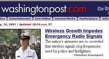
Headline: Former Dictator Amin Dies

Deck: Idi Amin, who ruled Uganda for much of the 1970s,
died Saturday.

Was it necessary to iterate the fact that he had died to add
information about when he ruled Uganda and his complete
name? The answer is no.

One version without repetition could be:

Headline: Former Dictator Idi Amin Dies

Deck: Ruled Uganda for much of the 1970s.

The following is another, less obvious, example. Essentially, it
says the same in different words (August 18):
Headline: Wireless Growth Impedes Emergency Radio
Signals

Deck: The nation’s airwaves are so crowded that wireless
signals clog frequencies used by police and firefighters

More    efficient         h o me      pages,       case      4:
lanacion.com.ar

Lanacion.com.ar is the website of La Nación, one of the
major newspapers in Argentina, South America. By the
amount of news it exhibits in the first screen and for not
repeating the information in both headlines and decks,
lanacion.com.ar could be categorized as very effective.
However, it has elements that still tie them to the print way of
presenting text, which somewhat limits such lofty
effectiveness. The inside pages, which are also linked to the
print model, deserve their own analyses.

In the first place, lanacion.com.ar intensively uses subheads
in its homepage. It is probably the most remarkable legacy of
the print design and allows us to deduct that the editors of
lanacion.com.ar take for granted their users read each news
unit in their homepage word-by-word. This is, and in that
order, the subhead, the headline and the deck. As mentioned
above, this behavior is not typical of web users. To make
things clear, readers are used to scanning and most surely,
due to their heavier typographic weight, they might read
headlines first.

Another fact that reinforces this conclusion is the sole
referential or expository nature of many of the subheads,
which identify the topics that will be dealt with.

I picked out a few examples of subheads from the August 23,
2003 issue:

Homepage of lanacion.com.ar

“The intellectuals and today’s country”.

“24 hours to elections in Buenos Aires”.

“In a world ranking”.
“The pre-olympics”.

To offer clarity, the opposite of a subhead that acts as a
simple reference is one that works as a full unit of information
or, in other words, a sentence with full sense.

To notice this difference, I mention other subheads in the
same issue that are indeed full-sense sentences. Oddly
enough, they also include a referential or expository
ingredient:

“Conflict in the government”: Buenos Aires PJ tied bonds with
the President.

Here’s another example from the same issue:

“The stock market pace: demand for currencies continues to
be abundant.”

The underlined sentences highlight the part in the subhead
that acts as a referent. Following the colon are full-sense
sentences.

In terms of effectiveness, what’s the difference between using
one or another type of subhead?

Expository or referential subheads are tied to the headline
that follows. Again, this treatment presumes the reader will
read word-by-word and, in this same order, the subhead, the
headline and the deck in order to fully know what the content
being offered to him is about.

If we concentrate in the headlines and paragraphs that follow
(decks), lanacion.com.ar is perfectly comparable with
washingtonpost.com for not repeating information. A wise
move, indeed.
Let’s take a look at an example of their home page from a
different date, one in which the subhead resource has not
been used:

Screenshot of lanacion.com.ar’s homepage

Let me offer an English version:

Headline: “Fernandez stated that Congress may “revise”
amnesties”

Deck: The Minister of the Interior said this option will be
discussed by legislators while amnesty laws are analyzed.

It is obvious there is no reiteration of the information, since
the reader is given new elements.

But the efficiency accomplished by not repeating content in
the home page of lanacion.com.ar comes a high cost: in the
same way of elpais.es, lanacion.com.ar sometimes err
when eliminating the minimum indispensable context in their
headlines, or by presuming their readers already know certain
aspects of the news. For instance, in the headline “Fernandez
stated Congress may “revise” amnesties” it is -wrongly- taken
for granted that the reader is aware of who Fernandez is (and
knows his complete name). This mistake becomes more
evident for those who are part of an international audience.
In this case, lanacion.com.ar has already repurposed, from
their inside page, both headline and summary, which
constitutes a double error. In this manner, the lines that
follow the headline end up filling the information gaps
the headline has.

Inside page screenshot presenting the news

This way of presenting information in an inside page is also
typical of printed publications: the user is forced to reading
elements of the information over again. To prove this, read
the lead -the paragraph after the deck that follows the
headline.

Let me offer an English versión:

Headline:           Fernandez stated Congress may “revise”
amnesties

Deck: The Minister of the Interior said this option will be
discussed by legislators while amnesty laws are analyzed.

The lead says: The Minister of the Interior Anibal Fernandez
ratified today that the alternative to the laws of ‘Punto Final’
and ‘Obediencia Debida’ (two amnesty laws ) being discussed
by the Congress might comprise presidential amnesties; even
those granted by ex-mandatary Eduardo Duhalde to Mohamed
Alin Seineldin and Enrique Gorriarán Merlo, among others.

Some other times, lanacion.com.ar repurposes the subhead
and the headline, subtly modified, and creates a different
deck for the home page but systematically avoids repeating
information elements (another great move).

Let’s take a look at one of these examples:

In this case, lanacion.com.ar reproduces in its homepage the headline in the inside page but
it creates a different deck that doesn’t reiterate information (“aged between 15 and 24 and
none of them is searching for employment; the worst scenario is in the capital city”).

Subhead: Labor crisis: a private study on official data

Headline: There are 1.272.000 youngsters that neither work
nor study

Deck: They’re aged between 15 and 24 and none of them is
searching for employment; the worst situation is in the capital
city.
If you reed the following inside article, you can notice how
both subhead and headline are repurposed, in a very subtle
form.

Screenshot of an inside page of lanacion.com.ar, with a text presentation structure typical of
that in print press. Here, they work with resources taken from the subhead, the headline, and
a text that, judging for its location, might be acting as a summary and that, after two more
decks, starts with the black bullets and contributes with new information. The fundamental
piece of information -the number of unemployed youngsters- is given to the user again less
than 10 lines later: almost 1.3 million or 1,272,000.

Subhead: Labor crisis: a private study on official data

Headline: There are almost 1.3 million youngsters that
neither work nor study

Summary: Last year, 127.000 individuals added to this
situation, a 38.4 percent more than four years ago

Deck 1: In the capital city and its surroundings, almost 60
per cent of the inhabitants aged between 20 and 24 didn’t
finish high school
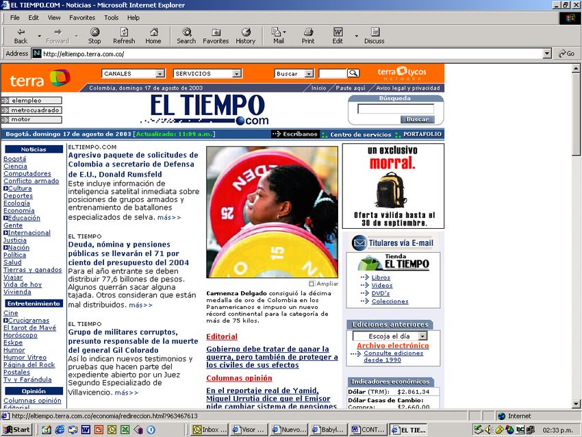
Deck 2: Specialists agree that the social ascent model is
endangered

Lead: Lack of labor opportunities, discourage and a poverty
environment, capable of hampering whatever school or
academic effort, have turned into the main problems
Argentine youth face. Today in the country, according to the
latest poll carried out at Indec homes, 1.272.000 young
people aged between 15 and 24 in total inactivity, do not
work, study or search for employment.

More efficient home pages, case 5: eltiempo.com

A different approach is offered by eltiempo.com, the site of
El Tiempo, the leading newspaper in Colombia, South
America.

Eltiempo.com creates one sole version of each news, written
according to the principle of the inverted pyramid and
typographically differentiates the first sentence of the first
paragraph, thus turning it into the headline. If the news is
properly written, according to the inverted pyramid principle,
the second sentence will never reiterate information of the
first one; it will only be a complement of it. In the home page,
this second sentence acts as a deck.

In reality, this means eliminating the headline and the deck or
summary, as they are conceived in printed media. Likewise, it
means that it repurposes the first and second sentences in
the first paragraph of the whole article.

When it comes to feature stories that utilize summaries or
delayed leads, if it is not possible to rewrite them,
eltiempo.com creates a headline and a deck that provides
the user with the essence of the information in the homepage,
in the same way as the washingtonpost.com does.
When we say eltiempo.com has only one version of each
story, it means that users find the same content when
accessing an inside page. It is an efficient way of presenting
online content.

Eltiempo.com’s home page

Let’s take a look at the first news:
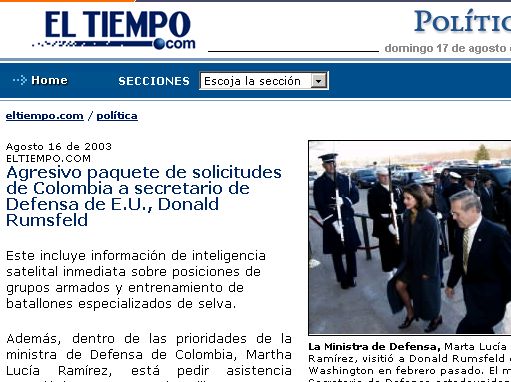
Screenshot of an inside page at eltiempo.com

Let me offer an English version:

The first sentence of the lead works as a headline:

Colombia’s aggressive request package to U.S. Minister of
Defense Ronald Rumsfeld

Second sentence of the lead works in the home page as
deck:

It consist of immediate satellite intelligence-related data on
the location of armed groups as well as training for the
soldiers in the jungle.

Notice there is no reiteration of the information.

At present, eltiempo.com rewrites most of the texts it gets
from the printed version. Although very frequently our editors
don’t get it right, they are instructed to structure text in this
manner (we’re in the learning process).

This is the first version of a piece of news (August 26) that
repeats information:

In this case, the writer changed the subject (the High Court
for Court) and the verb (confirms for ratifies) to introduce the
fact that Fabio Ochoa had been found guilty of cocaine
trafficking.

Let me offer an English version:

Headline: Miami’s Hight Court Confirms a 30 Years Sentence
for Drug Traffiker Fabio Ochoa

Deck: Miami’s Court ratifies the sentence given last May in
which he was found guilty of cocaine trafficking to the United
States

In the second version, the editor eliminated the repetition:
Headline: Miami’s High Court Confirms a 30-Year sentence
for drug trafficker Fabio Ochoa

Deck: Last May, the Colombian was found guilty of cocaine
trafficking to the United States.

This ‘refining’ work between versions is carried out throughout
the day.

Now, editors try to be more strict when reducing length and
they also break the uniformity of text to make it more scan
“friendly” (usage of secondary headlines, lists, etc.).
An additional benefit of texts written in this manner is that
they may be easily repurposed to be sent to mobile devices
such as PDA and WAP telephones. We simply define the
number of paragraphs for each one of them.

A hybrid or           transition      model,       case     6:
nytimes.com

The homepage of The New York Times (nytimes.com) offers
what could be called a hybrid or a transition model. Some
months ago, its homepage systematically repeated the
information contained in the headline and in the first
paragraph or deck. Now, there are coexisting articles that
repeat information, along with others that don’t.

If you see the article that says "U.S. Soldier and Iraqi
Interpreter killed in Baghdad Attack" and carry on reading,
the next paragraph offers the same information in a
somewhat different fashion, plus some additional fact.
Headline: U.S. Soldier and Iraqi Interpreter Killed in Baghdad
Attack.

Deck: An American soldier and an Iraqi interpreter were killed
today, when vehicle hit an explosive and came under fire.

U.S. Soldier and Iraqi Interpreter Killed... = An American
soldier and Iraqi interpreter were killed

The new information:

“Today” and “when vehicle hit an explosive and they came
under fire”.

The right question is: Was it necessary to repeat the
information?
The answer is no.

Here's another example:
The headline and the following paragraph essentially offer the
same information in a different way, with some additional
elements:

Headline: House approves Bill Easing Imports of Less
Expensive Drugs=

Deck: The House voted early Friday morning to approve a
measure that would make easier for Americans to import
inexpensive prescription medicines from Canada and Europe.

It is obvious that the headline and the next paragraph
essentially offer the same information in a subtly different
manner, with a few new additional elements:

  -   early Friday morning
  -   for Americans
  -   prescription
  -   from Canada and Europe

To deliver the new underlined information, was it necessary to
iterate the fundamental fact?

Again, the answer is no.

Here's another example:

September 17:
Headline 1: Head of New York Stock Exchange Resigns

Headline 2: Grasso Leaves After Furor Over Pay

Deck: Richard A. Grasso resigned this evening after three
weeks of mounting criticism of his $140 million compensation
package.

Even though there are new elements, the repetition of other
ones are obvious. You can read twice that he (Richard Grasso:
Head of the New York Stock Exchange) resigned. Also, you
can read twice the reaction that there was “mounting criticism
of his $140 million compensation package” or “furor over
pay”.

Was it neccesary to repeat information to deliver new one?
The answer is no.

Here's another example:

September 18:

Headline: U.S. Is Speeding Up Plan For Creating a New Iraqi
Army
Deck: A senior official said the U.S. had shortened the
timetable for setting up a new Iraqi army, with plans for
40,000 troops in field by next year.

It is obvious that the headline and the next paragraph offer
the same information in a slightly different manner.
The new additional elements: the source (A senior official)
and the number of troops (40,000).
To deliver that information, was it necessary to iterate the
fundamental fact (the underlined sentences)? The answer is
no.

Headline: Three U.S. Soldiers Killed in Iraq Ambush

Deck: Iraqi guerrillas killed three U.S. soldiers and wounded
two others in an ambush near Saddam Hussein’s hometown
of Tikrit late Thursday

The fundamental fact is repeated (the underlined sentences).
The new information:
  - wounded two others
  - near Saddam Hussein’s hometown of Tikrit late Thursday

Let’s see the same information in the
washingtonpost.com’s homepage
Headline: 3 Soldiers Die in Ambush

Deck: Iraqi guerrillas engaged U.S. troops near Hussein’s
hometown of Tikrit

There was no repetition of information.

Another example (September 19)

Headline: Iraq’s Ex-Defense Minister Turns Himself in to U.S.
Forces

Deck: Gen. Sultan Hashem Ahmed, No. 27 on the list of most
wanted government officials, turned himself in to U.S. forces
today.

The fundamental fact is repeated (the underlined sentences).

The new information: the name of the Iraq’s Ex-Defense
Minister and the fact he was No.27 on the list of most wanted
government officials
Was it neccesary to repeat information to deliver new one?
The answer is no.

But some other times The New York Times offers, in the
paragraph following the headline, additional information
without repetition.

Let’s see this example (September 19)

Headline: Millions Without Power as Flagging Heads
Northward

Deck: The storm was responsible for at least 14 deaths,
according to reports.

There was no repetition.

Let’s see another examples:

If you see the first news (Car bomb in Indonesia's Capital kills
13 and injures over 100), there's no information repeated.
Headline: Car bomb in Indonesia's capital kills 13 and injures
over 100.

Deck: The explosion took place in final days of trial against
the man accused of carrying out bomb attacks in the island of
Bali.

Later that day, The New York Times updated their version of
the attempt and, once again, didn't repeat information.
Headline: Deadly Car Bombing Shakes Marriot Hotel in
Jakarta

Deck: The explosion seriously damaged the lower floors of
the 33-floor hotel, killed at least 10 people and injured nearly
150.

Here's another example:

if you take a look at the news that says "Episcopal Leaders
Delay Vote on Gay Bishop" as well as the subsequent
paragraph, you'll find no iteration of the facts, either.
Headline: Episcopal Leaders Delay Vote on Gay Bishop

Deck: A church spokesman said the move was made after
allegations of misconduct emerged against the clergyman.

Conclusion

If you want to come up with a conclusion, I’d be pleased to
show you a two-paragraph, modified version of a recent
feature by Dan Willis, published in the American Press
Institute (API) website, headlined ‘Tradition Kills Usability’.

“As the newspaper industry redirects its content to the Web,
the print resources to present content that made the paper
model effective are killing the usability of the Web model and
limiting the potential of online journalism”.

“Tied too tightly to the conventions of print, most World
online newspaper operations are stranded between the past
and the future. These organizations put a great deal of energy
and creativity into developing wonderful content that expands
the boundaries of traditional journalism, then they trap that
trailblazing content in conventions that were created to solve
print newspaper challenges”.

That’s the reason why, if tradition kills usability, then let’s kill
tradition. Sites such as w a s h i n g t o n p o s t . c o m ,
lanacion.com.ar and eltiempo.com try, each one in its own
style, to do so by getting away from printed models.

Quoting Mario García, when referring to printed media and
transferring it onto the online world: “In a (almost, should I
say) perfect world (washingtonpost.com’s homepage,
lanacion.com.ar’s homepage or eltiempo.com’s homepage,
I say), multi-deck headlines are written in such a way that the
scanner, who does not wish to read the text of the story, still
can feel like he knows the "essence" of its content (when
presented in the homepage).”

Finally, I would like to quote the following paragraph by Jakob
Nielsen and Marie Tahir in their book ‘Homepage Usability, 50
Websites Deconstructed’, which makes recommendations to
improve homepages in any site and that can also be applied
t o                     n e w s                     o n e s .

“In order for news stories and press releases to be effective
on your homepage, you need to craft effective headlines and
decks (the summary of the story below the headline). This
applies to either the company news that you show on your
homepage, or any news that your site delivers as content.
Headlines and decks should actually give users information,
rather than merely trying to tantalize them into clicking
through to the real information. It’s just as important to help
users know when not to click something, if they’re truly not
interested. You can only get so many wasted clicks from users
before they give up.”
How can homepage effectiveness be improved? Avoid
repeating information along the headline and the
subsequent paragraphs (decks, leads or summaries).
That would be a great start.

Since journalistic know-how is being used to present content
in any type of site, the recommendation would also go on to
them.

And remember: The first thing most users see when they
access a site is the text, as stated by Nielsen and an eyetrack
study by Poynter Institute: don’t punish them with repetition…
don’t punish them with repetition… don’t punish them with
repetition…: don’t puni…

(Translation support: Mauricio Romero).

* Guillermo Franco Morales is a Content Manager of New
Media of Casa Editorial El Tiempo (CEET), in Colombia, South
America and the Editor of eltiempo.com.
Franco is a teacher for postgraduate programs in Colombia
regarding online journalism.
You can also read