2021 STYLE GUIDE - Community First Foundation

Page created by Brad Leonard
 
CONTINUE READING
2021 STYLE GUIDE - Community First Foundation
2021 STYLE GUIDE
2021 STYLE GUIDE - Community First Foundation
01

Table of Contents
01   Brand Messaging
02   Primary Logos
04   Alternate Logos
06   Clear Space and Sizing
08   Logo Usage
10   Brand Colors
12   Brand Patterns
14   Brand Typography
16   Alternate Typography
18   Design Examples
2021 STYLE GUIDE - Community First Foundation
02   Brand Purpose, Vision, Mission                                                                            03
     WHO WE ARE AND WHAT WE STAND FOR

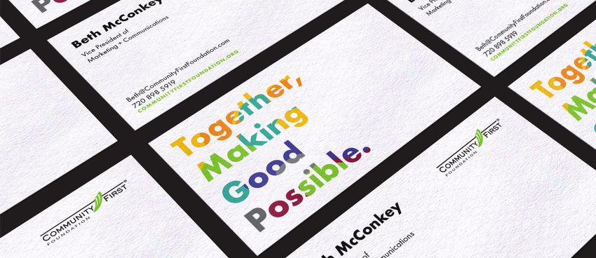
     Brand Purpose                                                Together, Making Good Possible.
     Why we exist

     Brand Vision                                                 All communities in Jeffco have the
     The difference we’ll create in our customers’ lives or the
     larger world when we ultimately realize our purpose
                                                                  opportunity to thrive.

     Brand Mission                                                We achieve the extraordinary by activating
     How we will obtain our vision, what we do and for whom

                                                                  ideas, people and resources.
2021 STYLE GUIDE - Community First Foundation
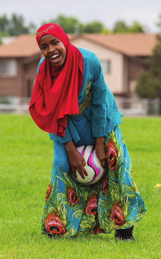
04   Key Differentiators                                                                                                05
     WHAT MAKES US UNIQUE

     We are relentless listeners.   At Community First Foundation, we’re changing what it means to listen. We
                                    believe that engaged and active listening is only the beginning and having
                                    real conversations is the best way to build the collaborative, supportive
                                    relationships we need to succeed. When you work with Community First
                                    Foundation, you can trust us to be your unwavering partner — to learn what
                                    you need and do what it takes to make something better everyday.

     We are local champions.        As the go-to organization for giving in Jefferson County, our efforts are focused
                                    on giving locally to solve important issues and celebrate opportunities within
                                    our communities. By connecting generous donors with impactful nonprofits,
                                    we activate ideas, people and resources to fulfill our mission. Together, we
                                    make a difference where it matters most — at home.

     We are fearless innovators.    We move fast and love to get things done — and we’re not afraid to do
                                    things differently. By striking the ideal balance between strategy and speed,
                                    our organization has the energy it takes to engage quickly. To think big, be
                                    daring, explore ideas in new ways and do the right thing, even when it’s hard.
                                    Cultivating this adventurous, innovative and inclusive mentality within our
                                    organization is vital to the success of our work. Here we push up our sleeves,
                                    get creative and look beyond the expected approach to giving in order to work
                                    across a variety of different sectors and make good possible.
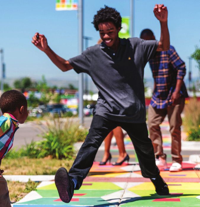
2021 STYLE GUIDE - Community First Foundation
06   Voice                                                            Tone                                                                 07
     VOICE REFLEC TS OUR PERSONALITY, WHAT IT IS AND WHAT IT ISN’T.   TONE IS THE EMOTIONAL INFLEC TION APPLIED TO OUR VOICE. IT ADJUSTS
     IT IS CONSISTENT AND UNCHANGING.                                 TO WHAT ’S SUITABLE FOR A PARTICULAR PIECE OR MESSAGE.

     Bold but not reckless                                            Inclusive and Welcoming

     Informed but not arrogant                                        Familiar and Human

     Fun but not inappropriate                                        Engaging and Motivating

     Transparent but not overly complicated                           Original and Smart

     Inspiring but not insincere                                      Original and Smart
2021 STYLE GUIDE - Community First Foundation
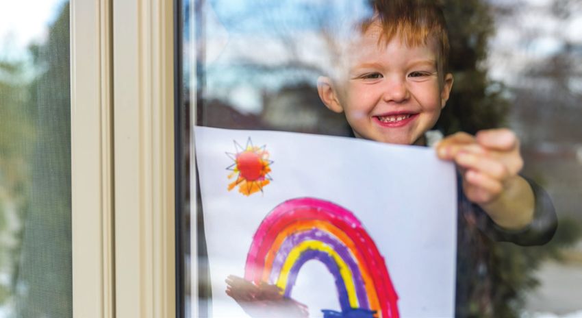
08   Logos                                    Primary Logo                                                                          Secondary Logo                                 09
     THE CORE OF THE VISUAL IDENTITY          The primary logo should be used whenever possible on light                            The secondary logo provides an option of
                                              backgrounds in all digital, screen and 4-color print applications.                    the primary logo without the tagline. This
                                                                                                                                    logo should be used on smaller applications
                                                                                                                                    where the tagline is illegible due to space.

                                       Primary Logo                                                                Secondary Logo
2021 STYLE GUIDE - Community First Foundation
10   Alternate Logos                             Color Reversed and Black Tagline Logos                       Black Logos                                              White Logos                                  11
     SECONDARY AND SPECIALTY LOGOS               Use on neutral gray backgrounds at full or partial opacity   Use single or limited color applications, such           Use on backgrounds when the color logo
                                                 that provide enough contrast for the icon and logotype.      as black and white. Its opacity may also be              does not provide enough contrast with
                                                 The ripple should be the only item that is bright green in   reduced atop any brand color, provided the               its background. Its opacity may also be
                                                 color reversed application.                                  opacity does not fall below 20 percent.                  reduced atop any brand color, provided the
                                                                                                                                                                       opacity does not fall below 20 percent.

                                      Primary Reversed                                                                                                         Secondary Black

                                     Primary Black Tagline                                                                                                     Secondary White
2021 STYLE GUIDE - Community First Foundation
12   Clear Space and Sizing   Logo Clear Space                                                   Sizing                                                                                                      13
     SAFE ZONES               Always try to maintain the designated clear space when using any   Whenever possible, the logo should be no smaller than the
                              part of the logo system. The minimum clear space should be the     minimum size to ensure legibility. In instances where the minimum
                              width of the logo icon (C) in any application.                     size cannot be achieved, make the logo as large as possible within
                                                                                                 the available space, taking clear space into account.

                                                                                                 2.75 Inch Width Minimum Print Size                                   245 Pixels Width Minimum Print Size

                                                                                                 2.25 Inch Width Minimum Print Size                                   200 Pixels Width Minimum Screen Size
2021 STYLE GUIDE - Community First Foundation
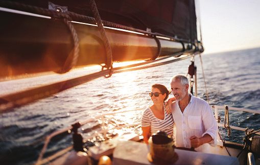
14   Logo Usage                   The following rules are applicable to any of the logos within      1.   2.   3.   15
                                  the Community First Foundation visual brand system.
     IMPROPER USAGE OF THE LOGO
                                  Please see illustrations of improper usage on the opposite page.

                                  DO NOT:
                                  1.   Scale the logo disproportionately.

                                  2.   Alter the placement or size of any logo elements.

                                  3.   Use unapproved colors.

                                  4.   Rotate the logo less than 90°.

                                  5.   Apply shadows or effects.
                                                                                                     4.   5.   6.
                                  6.   Use a different typeface in the logo.

                                  7.   Place the logo atop busy photos.

                                  8.   Place the logo on backgrounds with
                                       insufficient contrast.

                                  9.   Place the logo on clashing backgrounds.

                                                                                                     7.   8.   9.
2021 STYLE GUIDE - Community First Foundation
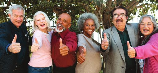
16   Brand Colors                                               Color Builds                                                                Tints                                        17
     FILE TYPES AND USAGE                                       Community First Foundation colors are determined by RGB values,             Any color in the brand palette may be used
                                                                then reduced to the corresponding HEX and CMYK colors before                in tints from 10–100 percent to extend the
                                                                finding the closest Pantone equivalent.                                     palette range.

      RGB      141  198  63                                      RGB         35  31  32
      CMYK     50  0  100  0                                     CMYK        0  0  0  100
      HEX      #8DC63F                                           HEX         #000000
      PMS      376 C                                             PMS         Black C
                                                                                                                                     100%

                                                                                                                                     80%

                                                                                                                                     60%
      RGB      109  110  113                                     RGB         167  169  172
      CMYK     0  0  0  70                                       CMYK        0  0  0  40
      HEX      #6D6E71                                           HEX         #A7A9AC
      PMS      Black C 70%                                       PMS         Black C 40%
                                                                                                                                     40%

      RGB      148  28  60    RGB    248  151  40   RGB    255  196  37       RGB          0  170  173   RGB     67  64  144
      CMYK 31  100  70  22    CMYK   0  48  95  0   CMYK   0  24  94  0       CMYK       100  0  40  0   CMYK   85  85  0  10   20%
      HEX        #941C3C      HEX       #F89728     HEX       #FFC425         HEX          #00AAAD       HEX       #434090
      PMS            1955     PMS             715   PMS            123        PMS                7467    PMS            7672

                                                                                                                                     10%
18   Brand Graphics                    Line Art                                                             Pattern                                                                19
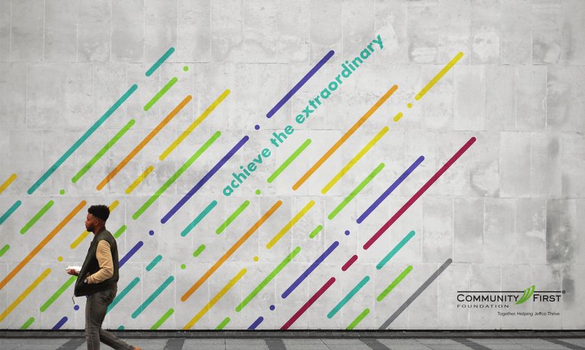
     SECONDARY DESIGN ELEMENTS         Multicolor line art can be developed to abstractly represent         An organic, multicolor pattern may be used as a fill within text
                                       ideas within the Community First Foundation brand. Maintain a        applications. Distribute colors as evenly as possible, avoid placing
                                       consistent look throughout the line art library by using various,    too much of one color within the application and leave zero white
                                       random line lengths, ensuring proper white spacing between lines     space within the text.
                                       and refraining from overlapping colors within designs. For a clean
                                       look, all line segments within the same visual line should be the
                                       same color. Line art may be used with photos, can interplay with
                                       text and can be used as a watermark element at a lower opacity.

              Ripple Effect      Upward Momentum                            Human Touch
20   Brand Graphics Tutorial            Rules of Pattern Creation                                   How to Create The Pattern                                                                         21
     C R E AT I N G T H E PAT T E R N   The following rules are applicable any time when creating   Follow these steps below:
                                        and using the pattern.

                                        •   Ensure all colors except for gray are present in the
                                            design and balanced.

                                        •   Only use organic lines when creating the pattern.
                                                                                                     Together,                   Toge
                                                                                                                                 Togeth
                                                                                                                                      ther
                                                                                                                                        er,,                             Together,
                                        •   The foreground color must always be white.               Making                      Making                                  Making
                                        •   Use only the bold weight of the brand font.              Good                        Good                                    Good
                                        •   Only use the pattern in headlines.                       Possible.                   Possible.                               Possible.
                                                                                                    1. Type out the headline.   2. Outline the text.                     3. Create a compound path.

                                                                                                                                 Together,
                                                                                                                                 Making
                                                                                                                                 Good
                                                                                                                                 Possible.

                                                                                                    4. Create organic shapes.   5. Place compound path overtop shapes.   6. Create a clipping mask.
22   Brand Typography                                           Primary Typeface                                           Weights and Styles                         Google and System Font Substitutes                                 23
     FONTS AND USAGE                                            Calibri is a humanist sans serif typeface, known for its   Use any of these weights and styles from   If Calibri is not available via Adobe Fonts, substitute the free
                                                                warmth and rounded lines.                                  the Calibri family.                        Google fonts Opens Sans or Arial. Please adhere to the same
                                                                                                                                                                      weights and styles usage for these substitution fonts.

     Calibri
     For promotional use, please use Futura.                                                                               Sync from Fonts.com ›                      Sync from Google Fonts ›

     Margins                                                    Example                                                    Calibri Bold                               Open Sans
     .75 inch at top, .5 inch at the bottom and 1 inch left                                                                Calibri Bold Italic                        Preferred system substitute
     and right                                                                                                             Calibri Regular
                                                                                                                                                                      Open Sans Bold
                                                                Headline goes right here.                                  Calibri Regular Italic
     Title/Headlines                                                                                                       Calibri Light                              Open Sans Bold Italic
                                                                Subheader right here                                       Calibri Light Italic                       Open Sans Regular
     Font: Calibri Bold, 18 pt Color: Title can be black or
     Foundation green, [R=141 G=198 B=63] Align: Flush Left,    Lorem ipsum dolor sit amet, consectetur                                                               Open Sans Italic
     Upper and Lower Case                                       adipiscing elit, sed do eiusmod tempor
                                                                incididunt ut labore et dolore magna                       ABCDEFGHIJKLN OPQRSTUVWXYZ               Open Sans Light
                                                                aliqua. Ut enim ad minim veniam, quis                      abcdefghijklnopqrstuvwxyz                Open Sans Light
     Subheads                                                   nostrud exercitation ullamco laboris nisi
     Font: Calibri Bold, 14 pt Color: Black Align: Flush Left   ut aliquip ex ea commodo consequat. Duis                   abcdefghijklnopqrstuvwxyz
                                                                aute irure dolor in reprehenderit in volupt                ABCDEFGHIJKLN OPQRSTUVWXYZ
                                                                ate velit esse cillum dolore eu fugiat nulla               abcdefghijklnopqrstuvwxyz                Arial
     Body Copy
                                                                pariatur. Excepteur sint occaecat cupidatat                abcdefghijklnopqrstuvwxyz                Alternate system substitute
     Calibri, 12 pt Color: Black Align: Flush Left              non proident, sunt in culpa qui officia
                                                                deserunt mollit anim id est laborum.                       ABCDEFGHIJKLN OPQRSTUVWXYZ               Arial Bold
     Page Numbers                                                                                                          abcdefghijklnopqrstuvwxyz                Arial Bold Italic
     Calibri, 10 pt Color: Black Numerals to be placed                                                                     abcdefghijklnopqrstuvwxyz                Arial Regular
     in the bottom right hand corner
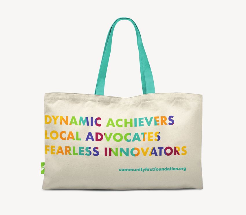
                                                                                                                                                                      Arial Italic
24   Design Examples         25
     SWAG, COLLATERAL, OOH
26   Photography Style         Photography Guidelines                                          Photography to Avoid                                               27
     PHOTOGRAPHY LOOK + FEEL   Please use only bright, energetic, welcoming photography that   Please avoid photography that feels very stock, poorly lit, high
                               emulates happiness and diversity across all ages.               contrast or that is lacking human elements.
C O M M U N I T Y F I R S T F O U N D AT I O N . O R G   |   D E S I G N E D A N D P R E PA R E D BY A O R
You can also read