4th Quarter Commentary - January 2021 - MARKET COMMENTARY - Horizon Kinetics
←
→
Page content transcription
If your browser does not render page correctly, please read the page content below
MARKET COMMENTARY

4th Quarter Commentary
January 2021

MARKET COMMENTARY
4th Quarter 2020                                                                               January 2021

 A Moment of Transition, From the Last 10 and 20
 Years to the Next (and New Asset Classes!)                   Page 1:    The Way Things Have Been, The Way
                                                                         They Will Be
 The Way Things Have Been vs. the Way They Will Be
                                                              Page 2:    What’s Not Going to Work: The Cash
 Most people are unprepared for large-scale changes                      and Bond Asset Classes
 to the accepted order or way of doing things. The            Page 5:    The CPI is 2%, Why is Excess Money
 accepted way in the financial markets has been going                    Supply a Problem?
 on for a decade, if we’re discussing indexation and
 market concentration; for a good two decades if              Page 8:    Still, How Does Money Supply Link to
 discussing money creation; and three decades if                         Inflation? (The Inflation We Don’t
 we’re talking interest rates. Even those of us who                       Understand)
 develop great competence within the established              Page 9:    The Stock Market You’re Celebrating
 rules and routines might not know how to cope                Page 15: The Inflation We Do Understand
 during the disruptive period after the rules change
                                                              Page 20: Outside the Hood: What You Can’t Find
 but before new lane markers are drawn. Even fewer                     in the Index
 are able to observe the early signs that prefigure an
                                                              Page 21: Non-Debasable Money and Crypto-
 upheaval, so they can’t even know to prepare.
                                                                        currency Exchange Rates
 For some time, we have described historical-scale            Page 23: A New Asset Class: True (Asset-Light)
 stresses and the crossing of various limits that should                 Inflation Beneficiaries
 frighten anyone who has savings, anyone who earns            Page 25: Another Uncorrelated (Temporary)
 money and has living expenses. Unfortunately, the                       Asset Class – In Japan
 discussion has occurred while the asset prices that          Page 26: An Improved ESG Index (With Benefits)
 are symptomatic of these stresses continued rising.          Page 28: What is NOT Research
 The satisfaction and the confirmation bias of rising
 prices dull the senses to assertions of danger,
 irrespective of their analytical vigor, if there are no observable price declines to confirm the warnings. Of
 course, by the time that price declines can be observed, it is too late to prepare.

                                            Likewise, the types of securities and assets that might protect or
   “When prices are up…it is always said    benefit in such an environment had been in decline or had yet to
   that while preceding booms have not      appreciate, so these proposals also lacked the credibility of price
   lasted, there are                        confirmation.
   circumstances…which make it unlike
   its predecessors and give assurance of   Very lately, though, prices of some of these alternative asset
   permanency.                              classes have begun to change in the observable way that so many
   There is always a disposition in         of us require – in the confirmation of what other people pay. In
   people’s minds to think the existing     this instance, we’ll adjudge such price-checking to be welcome if
   conditions will be permanent. The fact   it lends greater credence to the data, if it’s in furtherance of taking
   pertaining to all conditions is that     appropriate action. Some of those changes and alternative assets
   they will change.”                       will be described here – some of which we’ve not discussed
   (Excerpted, Charles Dow, 1900)
                                            before, both publicly traded and private – because major, long-

© 2021 Horizon Kinetics LLC ®                                                                             Page | 1 of 33
MARKET COMMENTARY
4th Quarter 2020                                                                             January 2021

 term shifts are underway, and people are unfamiliar with the possibilities that exist outside the major index-
 based choices. We’ve been identifying and allocating capital to a number of them.

 Although I’m preceding myself – for this will be discussed
 later – I’ll quote Michael Saylor, the CEO and primary            “For the times, they are a-changin’…”
 shareholder of MicroStrategy, who recently said, ‘Until                                     (Bob Dylan, 1964)
 people see the price change, they don’t really believe it.’

 For reference, MicroStrategy is an enterprise software company, and this past August and September, Mr.
 Saylor directed it to use $425 million of its $500 million of balance sheet cash to purchase bitcoin. That
 amounted to about 30% of the company’s stock market value at the time. In December, just last month,
 the company bought another $650 million of bitcoin, with cash raised through the sale of convertible notes.
 Curiously, it was precisely this past New Year’s Eve that Morgan Stanley filed a report with the SEC that it
 increased its shareholdings in MicroStrategy from 2% to 11%, at which moment MicroStrategy’s market
 cap was 2.6x higher than in September. Morgan Stanley and most other major brokerage firms do not yet
 permit their clients to purchase bitcoin or even a fund that holds bitcoin.

 Again, I put the cart before the horse. We should first address, in brief, the essential nature of a couple of
 the systemic risks facing us all, and which induced Mr. Saylor to make what to most people must have
 seemed a bizarre and dangerous choice, yet to him was the height of conservative, well considered balance
 sheet management, even a necessity.

 What’s Not Going to Work – The Ties that Impoverish

 The Cash and Bonds Asset Classes: FGLPs (Federally Guaranteed Loss Programs)
 Cash and bonds are supposed to provide a ‘guaranteed’ return. And they do. It’s just that they now
 guarantee a negative return. This loss is assured by the Federal Reserve achieving its official monetary policy
 goal (i.e., the FGLP).

  A 3-month Treasury Bill, as of January 11th, yields 0.08%, and a 10-year Treasury pays 1.13%. The Federal
 Reserve, meanwhile, has just stated that it intends to achieve inflation at or above 2% for an extended and
 indefinite period of time. That instructs you that your cash will decline in value or purchasing power by 2%
 each year, and that your 10-year Treasury Note will have a real return, through its maturity date, of just
 about negative 1% per year.

© 2021 Horizon Kinetics LLC ®                                                                          Page | 2 of 33
MARKET COMMENTARY
4th Quarter 2020 January 2021
Bond Yield-to-Maturity and Inflation
20
US Aggregate US 10 Year Government Bonds US 3 mo T Bill Annual Inflation
15
10
5
0
-5
Nov-65
Nov-88
Nov-11
Oct-67
May-77
Apr-79
Dec-63
Aug-71
Jul-73
Oct-90
Jan-62
Sep-69
Jun-75
Mar-81
Feb-83
Dec-86
Aug-94
Jul-96
May-00
Apr-02
Oct-13
Jan-85
Sep-92
Jun-98
Mar-04
Feb-06
Dec-09
Aug-17
Jul-19
Jan-08
Sep-15
Source: Bloomberg
That’s if the Federal Reserve M2 Money Stock YoY Growth
achieves its goal. It might 30%
not. It could be worse. 2020
Inflation could be higher. In Money
2020, the supply of dollars in Supply
25%
Rose
the U.S. increased by 24.4%. 1972-1982 24.4%
How high is that? It’s a CPI rose
quarter more money than 20% 131%, or
there was a year ago, even 8.7% per
though the amount of goods year
and services in the economy 15%
didn’t change much, nor did
the amount of cash in a
10%
savings account if it was left
alone. In that sense, that
savings account cash has 5%
20% less purchasing power
for that same quantity of
goods and services. 0%
Apr-05
Oct-13
Aug-16
Oct-62
Apr-71
Oct-79
Apr-88
Oct-96
Aug-99
Feb-08
Dec-10
Aug-65
Aug-82
Dec-59
Feb-74
Dec-76
Feb-91
Dec-93
Jun-02
Jun-19
Jun-68
Jun-85
In the 60-plus years that
such records have been
kept, the largest previous one-year money supply increase was about 13.4%, achieved in 3 separate years
during the 1972 – 1982 inflation decade. In those 10 years, the Consumer Price Index 1 increased by 2.3x.
1
https://www.bls.gov/cpi/tables/supplemental-files/historical-cpi-u-202011.pdf
© 2021 Horizon Kinetics LLC ® Page | 3 of 33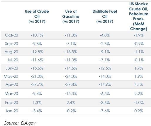
MARKET COMMENTARY
4th Quarter 2020 January 2021
Someone who had bought $10,000 of 10-Year Treasuries would have needed over $23,000 of Treasuries
in order to buy the same amount of goods and services just one decade later. That’s what inflation of
8.7% per year for 10 years looks like.
Annual Inflation Rate
14.0%
12.0%
10.0%
8.0%
6.0%
4.0%
2.0%
0.0%
1960
1962
1964
1966
1968
1970
1972
1974
1976
1978
1980
1982
1984
1986
1988
1990
1992
1994
1996
1998
2000
2002
2004
2006
2008
2010
2012
2014
2016
2018
Source: St. Louis Fed Consumer Price Index: Total All Items for the U.S., Growth Rate Previous Period, Monthly
Inflation of the 8 or 9% level is devastating if an investment can’t appreciate, or if the income level it
provides was struck at pre-inflation rates and can’t rise or can’t rise at the same pace. There are large-scale
transfers of wealth between different sectors of society; many winners and losers trade places.
Rental and Median Home Price
350,000 140
Median Home Price Rental of tenant-occupied nonfarm housing
1973-1982 S&P 500 Return
300,000 Pre-inflation: 19.1% cumulative, 1.8% yearly 120
After-inflation: -48.8% cumulative, -6.5% yearly
Rental Index of Tenant Occupied Nonfarm Housing
250,000 1973-1982 Home Prices 100
145% cumulative increase
9% yearly increase
Median Home Price
200,000 80
1973-1982 Rental
105% cumulative increase
7.4% yearly increase
150,000 60
1982:
$71,600
100,000 40
1972:
$29,200
50,000 20
- 0
1963
1965
1967
1969
1971
1973
1975
1977
1979
1981
1983
1985
1987
1989
1991
1993
1995
1997
1999
2001
2003
2005
2007
2009
2011
2013
2015
2017
2019
Source: St. Louis Fed, Bloomberg, Factset
Median Sales Price of Houses Sold for the United States, Dollars, Quarterly, Not Seasonally Adjusted
© 2021 Horizon Kinetics LLC ® Page | 4 of 33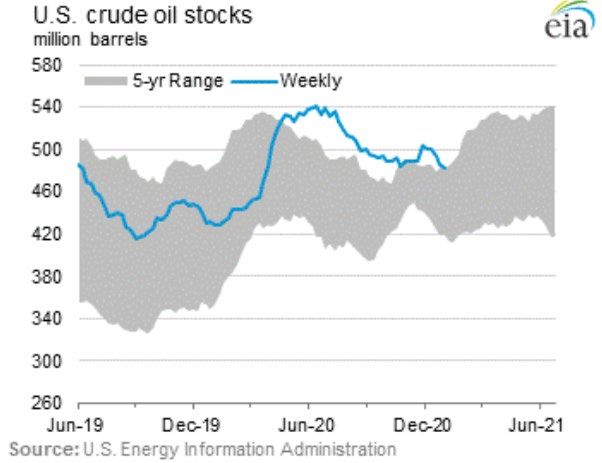
MARKET COMMENTARY
4th Quarter 2020                                                                                  January 2021

 It is well-known that in the first portion of 2020, extraordinary measures were required to keep the
 economy afloat, so it might be misleading to make over much of the 24% increase in money supply. Yet,
 in the 2nd half of 2020, the nation’s money supply increased at a 9.2% annual rate. And even in the 4th
 quarter of 2020, the money supply also increased at a 9.2% annual rate. Other than the 1972 – 1982
 inflation decade and its immediately surrounding years 2, there have only been 5 years in the past 61 years
 with a 9%-plus money supply increase.

 These cards suggest say that inflation via excess money creation is coming our way. It doesn’t mean it will,
 but there are credible reasons to believe it will. Should one not have some portfolio stance that will protect
 against such an outcome? The unquestioned problem, though, is that even without a rising inflation
 environment, the government’s FGLP insures a negative return on cash and bonds.

 Still, the CPI is 2%, so Why is Excess Money Supply a Problem?
 Many people are curious about the CPI, though, since it has only risen at a 2.0% rate over the past 20 years,
 while the money supply has risen at a 7.0% rate. They conclude – those are certainly a lot of observation
 points – that there is no worrisome linkage between a rising money supply and inflation or the economy.
 Nevertheless, it is a historically exceptional divergence, and there are a variety of factors that explain it,
 and which we’ve discussed previously.

 Rather than repeat them, let’s look at a real economic linkage that has occurred during this period, between
 money supply and, as attorneys might say, our joint and several financial wellbeing. This linkage has
 approached a dangerous tipping point and is one of the change threats to the past decade or two of
 financial stability to which we’ve become accustomed.

 In the past 20 years, GDP grew at a
 4.21% annual rate, if we look at the
 period to January 2021, and 3.66%
 if through July 2020. 3 Not so
 robust, considering that it was a
 period of perpetually declining
 interest rates and the longest
 economic and stock market
 recoveries in history.

 During these 20 years, the Federal
 debt increased by 8.20% per year.

 2
     The year preceding and the three years following.
 3
     Figures through 1/11/21 from https://usdebtclock.org, and through 7/31/20 from https://fred.stlouisfed.org/

© 2021 Horizon Kinetics LLC ®                                                                                Page | 5 of 33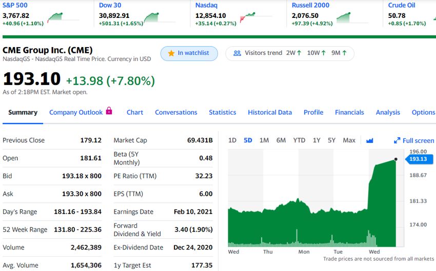
MARKET COMMENTARY
4th Quarter 2020                                                                                            January 2021

 The amount of Federal debt per U.S. taxpayer has increased at a 6.81% annual rate, from $55,796/taxpayer
 in 2000 to $222,191 now. Aren’t those figures remarkably closer to the 7.01% annual increase in money
 creation than to the 2.0% CPI figures?

 The Federal debt was 60% of GDP 20 years ago; today it’s 130%. That is the product of excess money
 creation and debt accumulation, to support excess spending, excess meaning above the growth rate of the
 economy. Ok, so there’s more debt, but how does that impact the economy or GDP growth?

 Source: St. Louis Fed.
 Gross Domestic Product, Billions of Dollars, Quarterly, Seasonally Adjusted Annual Rate
 Federal Debt: Total Public Debt, Millions of Dollars, Quarterly, Not Seasonally Adjusted
 Federal Debt: Total Public Debt as Percent of Gross Domestic Product, Percent of GDP, Quarterly, Seasonally Adjusted

 The GDP figure, as presented, is typically misunderstood to represent the nation’s economic capacity or
 output. It does, but with a caveat. Like one’s take-home compensation. What if you take home $50,000 a
 year, but also have $10,000 of credit card interest expense? You might say you have $50,000 of spending
 capacity, but your mortgage lender would say $40,000. They say that you don’t really have $50,000 to
 spend. And they’re right.

 That debt impinges on your ability to enjoy or improve your life. Say that you spend $25,000 per year on
 mortgage, health insurance and car payments, which is not so far from the national average. That’s only
 50% of your take-home income. You might be thinking of allocating some of what’s left to your savings
 account, or to roof repair to maintain the value of your home, or to building a patio to improve the value
 of your home, or to a professional degree program to improve your job market value. Except you really
 have only $40,000 of income, because the credit card interest has to get paid. Those potential investments
 are going to be constrained by $10,000 of prior obligations. They might not happen.

 Moreover, debt leverage can have a disproportionate see-saw impact on finances. After the interest
 expense, your basic fixed expenses are not 50% of your available income, but 63%. Alternatively, the
 interest expense, at $10,000, is not 20% of your take-home pay after your most basic fixed expenses, but
 40%. And that doesn’t count food or utilities, or medicine and medical co-pays, or gasoline and tolls.

 Federal tax revenue is about $3.453 trillion. Take away the mandatory expenditures on Medicare/
 Medicaid, Social Security, and Defense spending, and there’s $369 billion left before interest expense. If
 that sounds like a lot, the Federal interest expense, at $392 billion is actually a touch more than that, so
 there’s nothing left for anything else at all. But there’s plenty of additional expense, including other

© 2021 Horizon Kinetics LLC ®                                                                                           Page | 6 of 33
MARKET COMMENTARY
4th Quarter 2020                                                                          January 2021

 mandatory spending programs. The additional unfunded expense is the federal budget deficit, which is now
 $4.422 trillion. That’s a historical record in more ways than one.

 Source: St. Louis Fed, Percent of GDP, Annual, Not Seasonally Adjusted

 But the situation is likely to get worse. That deficit means the government has to borrow $4.422 trillion
 more, which will be a 15.9% increase in the total Federal debt. The current Federal debt figure of $27.781
 trillion is now, as shown earlier, 30% larger than GDP, which is a historical first.

 It doesn’t stop there, though, because in order to borrow the $4.4 trillion deficit, the government has to
 create that much more money. One sees the frightening prospect: that the size of the debt and its rate of
 increase are now beyond the ability of the economy to outgrow, since we know that GDP expanded, even
 during these beneficent last 20 year, at only a 4% rate. And with more debt, additional interest expense.

 If the economy cannot expand sufficiently to allow the debt/GDP ratio to gradually subside to a sustainable
 level, the government’s only politically realistic option –a timeworn solution – is to actually continue
 printing more money. By expanding the money supply sufficiently over enough years or decades, the
 government arranges that there will be more dollars in everyone’s pockets (each one worth less, but more
 of them). The borrowers within society are thereby enabled to gradually pay off their fixed obligations –
 meaning the bonds or bond ETFs that you as an investor might hold – in the ever more plentiful dollars,
 while the holders of those obligations are stuck with the same value as last year or 10 years ago.

© 2021 Horizon Kinetics LLC ®                                                                      Page | 7 of 33
MARKET COMMENTARY
4th Quarter 2020                                                                            January 2021

 It’s devastating to savers and investors and people on fixed or quasi-fixed incomes, but governments
 historically prefer to impose the devastation slowly over time rather than suddenly and openly by, say,
 cutting services and social support programs.

 Still, How Does Money Supply Link to Inflation? (The Inflation We Don’t Understand 4)
 This is the cycle we might have tipped into. Still, we’ve been asked, how specifically, does money growth
 cause inflation?

 Inflation is a dangerously misunderstood term. For Americans it tends to conjure memories of grocery
 prices rising by the month in the 1970s. That’s a natural reference to a prior pattern – one that feels like a
 cost-push pattern, as when the price of a commodity like oil or wheat suddenly rises. It would not be the
 reference point for someone who spent a lifetime in Italy or Greece or Venezuela or scores of other
 countries. Through repeated experience they understand that their money’s purchasing power can be
 destroyed by its dilution or debasement – and that this is measured relative to other countries’ currencies.
 They know that if they have 1,000 Bolivars in the bank and that the government is printing up 100% more
 money this year, then their 1,000-Bolivar share of the total money in that country is going to shrink by 50%,
 that their money will lose 50% of its purchasing power. That they’ll need twice as much to buy the same
 liter of milk.

 Importantly, they understand that the milk itself didn’t go up in price, but that their money went down in
 value. It’s why they know that to save their purchasing power, they have to exchange some of their
 debasing currency, whenever they have extra in hand, for a stronger one, like the U.S. dollar. A year later,
 their dollars might be worth twice as much if measured in their local currency.

 As Americans, we have no domestic frame of reference for that. Having lived with the reserve currency of
 the world, most of us have not had to contemplate the exchange value of the dollar in our day to day lives.
 We think that inflation means that the price of milk went up – that somehow, the process of raising and
 feeding and milking a cow became more effortful or consumed more resources than before and therefore
 must ‘cost’ more – when, really, it was that the value of the dollar declined because there were too many
 more of them. The dairy farmer’s problem is that it requires more dollars in order to buy the same amount
 of hay.

 If the money supply increases 6% or 8% or 10% more rapidly than the goods and services we produce, then
 the share of the total pie of money supply that is represented by your Treasuries or bond ETF will be
 diminished by that rate. In 10 years, its value would halve, in 15 or 20 years, well… That’s inflation via
 monetary debasement.

 So, cash and bonds are now a dangerous place to be for the long term. If this made sense to you, then
 Michael Saylor’s desire to protect the value of the cash on MicroStrategy’s balance sheet should be more
 understandable – whether his allocation choice, bitcoin, sits well with you or not.

 4
     The form of inflation we do understand is highlighted on Page 15.

© 2021 Horizon Kinetics LLC ®                                                                         Page | 8 of 33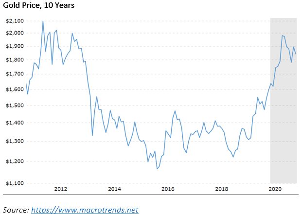
MARKET COMMENTARY
4th Quarter 2020 January 2021
Under the Hood: The Stock Market You’re Celebrating; What’s in It, What’s Not
Investors have been quite pleased if they’ve owned any growth stock indexes these past 10 years. Even
mainstream indexes like the S&P 500 are so concentrated in the mega-cap growth companies that they
have become growth-stock index proxies. The satisfaction is fortified by the fact that those companies
whose share prices have outperformed all others have been the largest and are high-quality businesses. It
is natural, when investing is done via baskets of stocks, that perceptions of performance or risk center more
on the basket overall than on the individual stocks within it.
But since people have gotten so accustomed to looking at the summary index-level figures, not at the
companies themselves, we thought we’d provide a closer look, so you more fully appreciate what you own,
if you own ‘the market.’
Here are 10 stocks at the top of the S&P 500. They are a generous mix of the more successful. They rank
from #1 to #58. This last, Starbucks, is an outlier in that it has only a $120 billion stock market value. All the
rest, even #40, Nike, have market caps of $200 billion or more, while Apple and Google are 10x larger than
that.
With such massive numbers, how to judge how big $200
billion is? Well, the $200 billion market cap border in the
S&P 500 is roughly around ranking #30, although there are
variations when some companies have high levels of inside
ownership, since the index is float-adjusted. In order, Pfizer
(PFE), Salesforce.com (CRM) and AbbVie (ABBV) have
market caps 5 of $204 billion, $196 billion and $195 billion.
They are ranked #28, 30 and 31. The remaining 470 or so
companies, 94% of the total, are smaller than that.
How much smaller? What’s a characteristic size? The
company at the mid-point of the index weightings, #250, has a $25 billion market cap. That’s Delta Airlines.
U.S. airlines directly employ about 0.5% of the nation’s workforce. The S&P 500 companies employ roughly
27 million workers, but many of these work in other countries, not the U.S., so their U.S. workforce is
smaller. Even taking all 27 million, that’s about 20% of the U.S. workforce, in which case the airline
companies, very roughly, account for about 2.5% of all the employees of all the S&P 500 companies.
Interestingly, U.S. airlines also account for about just about the same proportion, 2.6%, of all the revenues
of the S&P 500 companies. In economic terms, then, the airline industry is a significant portion of the
gigantic U.S. economy and, again in economic terms, about 2.5% of the S&P 500.
This can be a very useful exposure in an index risk/return context. Though I don’t have much interest in
how the stocks in this industry will do, it’s quite plausible that airlines will be one of the sectors of the
economy that will begin to recover later this year, which would benefit the index. It’s just as plausible that,
at the same time, some social media stocks might suffer due to political efforts toward increased regulation,
which would harm the index. That scenario doesn’t have to happen, but it very well could; would it really
5
As of Jan 15th.
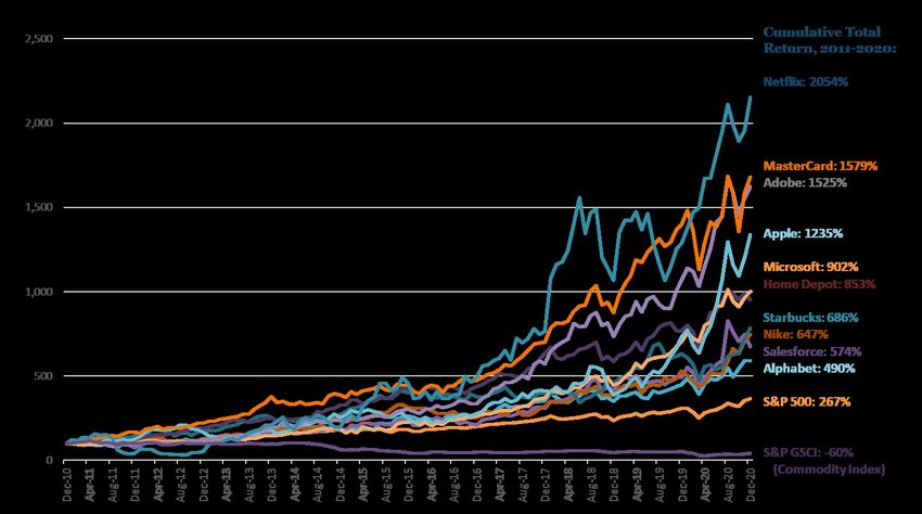
© 2021 Horizon Kinetics LLC ® Page | 9 of 33MARKET COMMENTARY 4th Quarter 2020 January 2021 shock anyone? One of indexation’s central ideas is resilience and risk reduction through the idea that the index captures different industries that exhibit different price behaviors or correlations. Consider that Delta is up 60% from its mid-year low, and it would rise another 50% if it simply returns to its mid-2019 price before the Covid-19 pandemic began. Unfortunately, Delta’s weight in the S&P 500 is only 0.08%. Even extreme appreciation would amount to a rounding error, at best. In pragmatic terms, Delta does not even exist in the S&P 500. Total all of the airline companies in the S&P 500, and that’s only 0.26%. As far as index exposure, that is about one-tenth of the airline industry’s economic presence in the U.S. One half of the S&P 500 companies are at or lower than Delta’s 0.08% weight. They are what, in practical terms, the index is not providing exposure to. Over one-third of the companies in the S&P 500 have a weight of 0.05% or less. If that’s what you don’t have exposure to, what does one have exposure to in the S&P 500? The aggregate weight of all the companies from the midpoint ranking of #250, Delta Airlines, down to the smallest, is 11.73%. The aggregate weight of the #1 and #2 ranked companies, Apple and Microsoft, is 11.44%. In the index construction sense, these two companies purport to have the same exposure to and representation in the economy as one-half of the 500 companies in the index. They implicitly purport to provide the same exposure to changes in economic growth, accounting and tax regulations, interest and currency exchange rates, competitive and technological developments, employment costs, raw materials and energy and electricity costs, international trade relations, anti-trust regulations, what have you. In any event, they have been very successful stock investments, as can be seen in this chart. The chart is a bit busy, but the S&P 500 is easily distinguishable: it’s the 2nd bottom-most line that looks as if it’s hardly risen. That’s only comparatively, of course, because on a price basis, the index has returned 13.9% per year, and that’s with the benefit of the growth companies at the top. In the past 10 years, these 10 companies at the top of the S&P 500 have appreciated by anywhere from 5x more than the entire index to 20x more. As a group, using a simple average, they have outperformed the index by almost 4x. © 2021 Horizon Kinetics LLC ® Page | 10 of 33
MARKET COMMENTARY
   4th Quarter 2020                                                                       January 2021

Source: Bloomberg

    Excluding the largest 25 companies, 5% of the names, the S&P’s rate of return would have been 10.3%, not
    13.9%. Excluding the largest 50, 10% of the names, the return was 8.4%.
                                  iShares Core S&P 500 ETF       Annualized
                                  1/01/2011 to 12/31/2020          Return
                                  Total                            13.9%
                                  Excluding the 25 Highest*        10.3%
                                  Excluding the 50 Highest*         8.4%
                                  *Return calculated by avg.
                                  weight
                                  Source: Factset

    It is naturally presumed that the appreciation of the growth stocks simply reflects their robust growth,
    whether in sales or earnings. As a group, these 10 companies appreciated at an annualized rate of 26.7%.
    We should see something similar in their financial results.

  © 2021 Horizon Kinetics LLC ®                                                                    Page | 11 of 33
MARKET COMMENTARY
4th Quarter 2020 January 2021
Revenues of these companies grew at a 14.4% rate. That’s quite superior to the average company, but it is
only about half what their share price appreciation was.
It’s possible that their earnings expanded much faster than the Change in
revenues, through the benefit of scale-economies. This could Operating Margin,
Company 10 Yrs to 2020
be confirmed by looking at their operating margins.
Apple -4.0%
The average operating margin for these 10 companies – the Microsoft -1.4%
amount of operating profit they generate per dollar of sales – Google -15.1%
actually contracted at an annual rate of -1.6%. Lest one think Home Depot 5.8%
that this result was overly influenced by a retailer like Nike, MasterCard 4.3%
whose operating margin did contract by a total of 3.8% points Adobe 6.8%
over the 10 years, Home Depot’s margin expanded by 5.8%. Netflix 5.2%
Among the information technology companies, Apple’s margin Salesforce.com -6.8%
contracted by 4.0% points, Google’s margin contracted by Nike -3.8%
15.1%, and Microsoft’s by 1.4%. Starbucks -6.6%
With the lower average profitability, operating income rose by
Change in ROA,
only 11.5% per year, under one-half the rate of share price
Company 10 Yrs to 2020
appreciation. The profitability of their assets declined as well.
Apple -6.3%
The average return on assets of this sample contracted by
Microsoft -7.2%
2.30%, annualized, albeit with plenty of variation between
Google -4.6%
firms.
Home Depot 13.7%
MasterCard 0.7%
Adobe 13.3%
Netflix -11.8%
Salesforce.com -3.0%
Nike -5.4%
Starbucks -12.0%
Source: Bloomberg
© 2021 Horizon Kinetics LLC ® Page | 12 of 33MARKET COMMENTARY
4th Quarter 2020 January 2021
Then, as far as sales growth over the past 10 years, 6 of the Avg. Year/Year Sales Growth
10 companies in this list have obviously slower growth in for the 5-Year Periods:
the past five years than the first five. 12/10– 12/15 –
Company 12/15 12/20
Some might ask for the benefit of the doubt to exclude last Apple 25.2% 3.2%
year, since 2020 was so anomalous. But, 2020 didn’t stop Microsoft 6.2% 10.3%
their stocks from rising. Google 20.7% 18.0%
Home Depot 5.2% 7.7%
One might think that companies with contracting operating
MasterCard 11.8% 10.0%
margins and return on assets would suffer from a reduction
Adobe 4.8% 21.8%
in their valuation multiples; investors might question
Netflix 25.7% 29.8%
whether negative competitive or other forces are
Salesforce.com 32.3% 26.3%
impacting those businesses.
Nike 9.6% 4.1%
Starbucks 13.0% 3.6%
Source: Bloomberg
S&P 500 Growth Leaders, The Price/Sales ratio expanded by 9.0% per year. The
10-Co. Sample, 10 Years to 2020 P/E ratio rose by 9.2% per year. That’s the other half
Changes in: Total Annualized that’s missing. Multiply these out over the course of 10
Revenue 4.8x 14.4% years and, basically, people paid 3.1x more for every
Operating margin (1.6)% dollar of sales and every dollar of net income that these
Return on assets (2.3)% companies produced. Without that, their share prices
Operating income 4.0x 11.5% would have tracked their net income growth, roughly a
13% rate.
Price/Sales Ratio 2.6x 9.0%
P/E Ratio 2.6x 9.2% What’s this all about, then? It’s one way of trying to
Share price 10.7x 25.5% show how lopsided, concentrated and extremely
expensive the stock market has become – just a look under the hood.
Now for the Equity Asset Class: Balancing Growth and Valuation
Yet, there are a great many more analysts and investment strategists who would firmly assert that the
above observations, as colorful as they might be, do nothing to refute the thesis that their rapid growth will
ultimately fully justify the leading companies’ valuations. I know this, because there are people who share
research with me from other firms, research that heartily recommends such stocks, ranging from
MasterCard to Peloton, the interactive exercise equipment company. Peloton stock is up about 5x in the
past year; it has twice the market cap of Delta Airlines.
Perhaps the simplest way to respond to the power-of-growth argument in respect of this type of pricing is
with what might be the least disputable measure of equity valuations: the total market value of the U.S.
stock market relative to GDP. There cannot be a more complete measure; it requires no expert
intermediary to make calculations or introduce assumptions. Anyone can calculate it. The relationship
between the two figures is clear, and they are economically tethered to one another: investors price
© 2021 Horizon Kinetics LLC ® Page | 13 of 33MARKET COMMENTARY 4th Quarter 2020 January 2021 companies in some relation to the sales and earnings they produce or are expected to produce; those sales and earnings are produced within, contribute to and are representative of the totality of the economy. In 2010, the U.S. stock market cap/GDP ratio was 1.15, that is 15% greater than GDP. The 48- year average through 2019 was 1.05, and generally ranged between 0.6 and 1.5. The prior highest level achieved during those 40 years for which records are readily available was at year- end 1999, the end of the Internet Bubble, when the figure was 1.83. Following the collapse from that bubble-level valuation, it took 7 ½ years, until mid-2007, for the S&P 500, on a price basis, to return to the December 1999 level. Only several months later, though, by early 2008, it collapsed again and didn’t achieve the Dec 1999 price again until Feb 2013 – it took 14 years. Where are we now? At year-end 2020, the stock market was valued at 2.37x the GDP of 2019. GDP for 2020 has not yet been reported, but because it is a recession year, the ratio for 2020 will be above 2.4x. Call it a third higher than the market valuation at the Internet Bubble peak. To return to the average ratio of stock market value to GDP of 1.05 would require a contraction of 56% in that ratio. If GDP growth for the next 10 years were to match the 4.02% annual rate of the past 10 years, then GDP will have increased by 1.48x and, all else equal, the stock market cap/GDP ratio will have contracted from 2.4x to 1.6x. It would still be overvalued, relative to the 40-year average, by 53%. And that’s assuming that the stock market does not appreciate at all during those 10 years. If the economy expands at 4% for 20 years, and the stock market produces zero appreciation, then the ratio will contract to 0.85x, which is within the average range of its long-term valuation. If this seems an outrageous proposition, 20 years is not much more than the 14 years of zero point-to-point appreciation of the S&P 500 after the Internet Bubble peak, and this market is one-third more expensive than that one © 2021 Horizon Kinetics LLC ® Page | 14 of 33
MARKET COMMENTARY
4th Quarter 2020                                                                              January 2021

 was. There are other valuation gauges, of course, and robust debate can be had about their relative
 advantages and efficacies, but this is about the simplest and most comprehensive.

 So, that’s what you own, more or less, in the S&P 500, and that’s a good idea of the prospects for
 conventional indexed equities. What you don’t own is just as important, and that’s next.

 What’s Left, Then?
 The aim, to this point, was to demonstrate that even before any potential upsurge in inflation – for who
 really knows what will happen? – two of the three major asset classes, cash and bonds, already guarantee
 a loss. They cannot be a suitable long-term core holding.

 The third major asset class, conventional indexed equities, poses the greatest valuation risk in 48 years and
 the possibility of one or two decades of near-nil nominal return. After inflation, possibly negative. Must
 that be in the cards? No. But if the goal is to construct a portfolio with an equal eye toward both the
 expected return and the risk of not earning it, then the risk of not having exposure to investments outside
 these three conventional indexed asset classes must weigh very heavily.

 The Inflation We Know and Understand
 The type of inflation people are more familiar with – rising commodity prices – is another threat that should
 be factored into portfolio construction. Global reserves of key commodities have been declining for years.
 The inevitable conclusion is that there will be a distinct supply deficit at some point, one that is not quickly
 correctable, with markedly higher prices and a strong inflationary impact. One should take advantage of
 the good fortune of being able to measure and anticipate the eventuality by including such exposure in a
 portfolio.

 Lately, there have been some changes in
 the years’ long depression in commodity
 prices. As far as oil goes, the first
 accompanying table shows the year-
 over-year changes in total consumption
 of crude oil in the U.S. this past year. It’s
 measured, month by month, beginning
 last January. The first two months of the
 year, which preceded the pandemic,
 were approximately equal to the prior
 year. By April, crude oil use had
 plummeted by almost 28%, a simply
 unheard-of and shocking collapse in
 demand. That is what we remember.
 What is not so publicly noticed is that
 almost every month since then has seen
 an improvement in demand, from down
 21% to down 16%, down 12%, and as of October down 10% versus the prior year.

© 2021 Horizon Kinetics LLC ®                                                                          Page | 15 of 33
MARKET COMMENTARY
4th Quarter 2020                                                                               January 2021

 Gasoline use was down even more, reflecting the impact of the pandemic on discretionary travel. Gasoline
 use plummeted by 38%, but by October was down only 11%.

 A component of crude oil that is less discretionary than gasoline is distillate fuel oil, which is primarily used
 for diesel trucks, but also for farm equipment, trains and home heating. Demand for this fuel dropped by
 15% as of April, but by October was down only 5%.

 Then there is the matter of oil inventories, which built up to extreme excess in early 2020. Until those are
 drawn down to normal working levels, there remains excess usable supply. Since June, though, U.S.
 inventories have been gradually subsiding, every month.

 On a global basis, oversupply in April was so extreme that the excess had to be held in offshore tanker ships.
 The accompanying chart shows floating storage spiking from 50 million barrels to over 200 million, then
 receding to 100 million by the beginning of December. It is now estimated to be below 80 million.

© 2021 Horizon Kinetics LLC ®                                                                           Page | 16 of 33
MARKET COMMENTARY
4th Quarter 2020                                                                              January 2021

 Even during the midst of the global pandemic
 and recession, even before a recovery in
 normal travel activity, oil and gas demand is
 recovering and excess supply is being drawn
 down. This can be seen in the accompanying
 chart that tracks the weekly volume of U.S.
 crude oil stocks against the 5-year average.
 The excess beginning last April is clear, just as
 it’s clear that the levels are now at the border
 of the historically average range.

 There is little doubt that once demand and
 supply do come into balance, whenever that
 might be, there will be a supply deficit once
 demand thereafter increases further.

 There is a great debate, today, about fossil fuel use in the coming 10 and 20 years. In the 3rd Quarter
 Review, which was almost exclusively about the future of energy, it was pointed out that the different long-
 term global energy consumption models by various world government agencies and privately funded
 cohorts all projected continued use of oil and natural gas, despite allowance for rapid expansion of solar
 and wind power. The primary confounding factor in these outcomes was the rising standard of living in the
 most populous developing nations. Here’s why.

 A rising standard of living is tied to the key commodity in
 every nation, which is oil. Per-capita energy consumption
 is one of the defining differences between developed and
 developing nations. It is one of the most intractable
 elements of the global energy demand equation. In the last
 5 years, oil consumption in the U.S. increased by a
 cumulative 7%. India’s consumption rose by 35%, and
 China’s by 26%.

 My colleague Murray Stahl recently made this point more starkly:
      −    In 2019, Japan used about 3.8 million barrels of oil per day. It has a population of 127 million.
      −    India used a bit more, 5.3 million barrels/day. Its population of 1.366 billion people, is 11x larger.
      −    On a per-capita basis, Japan uses 1.26 gallons of oil per person per day. This is 8x more than the
           0.16 gallons/day that the Indian population uses.
      −    If Indians were to have the standard of living of Japan, they would consume 7.8x more oil per day
           per person, or another 36 million barrels of oil per day.
      −    In 2019, the world consumed just under 100 million barrels/day, so India alone, on a standard-of-
           living parity basis with Japan, would increase world demand by 36%. That’s 36%.
      −    Then there’s China. Add in China, and parity with the U.S. would, along with Indian demand, more
           than double the current world oil consumption.

© 2021 Horizon Kinetics LLC ®                                                                          Page | 17 of 33
MARKET COMMENTARY 4th Quarter 2020 January 2021 Oil has had a special year. The Covid-19 pandemic and global recession is not over, yet demand is recovering despite the historically severe global recession and patchwork of enforced activity restrictions. The price has already recovered to its pre-pandemic level. A price that had induced years of underinvestment and reserve depletion by the oil companies, a price that is setting the stage for supply shortages that cannot yet be seen. Oil is a special case, yet other hard commodities can now be seen to be rising as well. Gold is rising, but that might be explainable as reflecting renewed investor interest in inflation hedges. © 2021 Horizon Kinetics LLC ® Page | 18 of 33
MARKET COMMENTARY
4th Quarter 2020                                                                          January 2021

 But silver and iron are and copper are industrial commodities, and their price behavior is the same.

© 2021 Horizon Kinetics LLC ®                                                                      Page | 19 of 33
MARKET COMMENTARY
4th Quarter 2020                                                                               January 2021

 It’s not just metals. In the past 12 months, despite the global recession, most basic commodities other than
 energy, are up, and by much more than the 2% CPI target of the Federal Reserve.

 Outside the Hood – What You Can’t Find in the Index
 I’d like to regroup for a moment. Setting aside the overload of the preceding statistics, there really were
 only a few points.

      −    First, that the conventional asset classes, particularly via the indexed instruments used to access
           them, are either already wasting assets – cash and bonds – or are in great danger of becoming so
           – stocks. Cash and bonds are extraordinarily overvalued, at near-zero yields that are exceeded by
           the current inflation rate; stocks, by some measures, are overvalued beyond historical precedent.

      −    Second, that’s at the current published inflation rate of 2%. The possibility of a true inflationary
           period, whether through the vector of excess money creation or structural commodity shortages,
           or both is, at the least, a credible possibility. Whether the probability is considered low or high, it
           can hardly be thought so low as to be an ignorable risk.

      −    If points one and two are considered valid, any portfolio comprised of those assets should seek to
           incorporate, as a protective measure, some other asset classes or modes of investing that don’t
           share the same systemic risks: that might benefit from, or at least not be damaged by, an
           inflationary environment; that might correlate to different variables in the economy and manifest
           different return patterns.

 Now, then, some discussion or mention of some alternative instruments and methods.

© 2021 Horizon Kinetics LLC ®                                                                           Page | 20 of 33
MARKET COMMENTARY
4th Quarter 2020 January 2021
A Non-Correlated Asset Class, Non-Debasable Money: Fixed-Issuance Cryptocurrency and Exchange Rates
Since this review is aimed toward the prices of things and the confirmation of other people, it is fitting that
we start with cryptocurrency because, in one sense, all one needs to know about money throughout history
is that it is what other people confirm it to be. If people accept something to be money, it is. Contrarily,
irrespective of government dictates, if they don’t trust a coin or currency, it stops being used.
Probably the single greatest risk to bitcoin’s success is lack of acceptance. An exceedingly small percentage
of the world’s population and an exceedingly small percentage of financial institutions and private sector
retail companies have yet accepted or transacted in bitcoin. The converse statement is that all that is
required for bitcoin’s success is a continuation the incremental acceptance that has been ongoing. If the
following sampling of recent announcements is representative, institutional acceptance appears to now be
happening on a weekly basis.
− For the year 2020, Grayscale Bitcoin Trust (GBTC), the only U.S. traded bitcoin fund, had cash
inflows of $4.7 billion. This would have ranked in the top 1%, of all U.S. ETFs, according to
Bloomberg. During the final 3 months, institutional investors accounted for 93% of the inflows.
− This past October (reprising the same mention in the 3rd quarter commentary), PayPal announced
the launch of a service allowing clients to buy, hold, and sell cryptocurrency in their PayPal account.
This year, it will allow customers to use their cryptocurrency holdings to make purchases.
− In December, Vias Inc. announced a new credit card that rewards purchases with bitcoin rather
than airline miles or cash. This follows Visa’s debit card offering earlier in 2020 that allows users to
spend bitcoin using the card.
− In December, CME bitcoin futures volume hit new highs, with almost $30 billion notional in bitcoin
futures traded.
− Also in December, MassMutual, the 170-year old life insurance and investment services company,
purchased $100 million of bitcoin for its general investment account.
− On January 4th, the Office of the Comptroller of the Currency issued a statement allowing national
banks and federal savings associations to use blockchains and stablecoins for payment and
settlement activities.
− Also this month, Intercontinental Exchange (ICE), one of the two largest U.S. securities exchanges,
announced that it would bring its digital assets/cryptocurrency subsidiary public. It is expected to
have a $2.1 billion market value. This division, known as Bakkt, began trading physical bitcoin
futures and options in 2019.
These institutional activities appear to be having an impact on the price of bitcoin. But I don’t wish to say
that the price of bitcoin rose, or even refer to a bitcoin price. That is a mistake in understanding. I should
say ‘the exchange rate’ of bitcoin.
© 2021 Horizon Kinetics LLC ® Page | 21 of 33MARKET COMMENTARY
4th Quarter 2020 January 2021
That dovetails precisely with the earlier example about debasement-based inflation and the cost of milk:
that the cost of producing milk did not rise, as the cow did not eat more, nor the farmer hire more workers,
but that the value of the money decreased. You would never think to say that your $10 bill increased in
price. It’s always $10. Its value changes only in relation to how much of something else it might be
exchanged for: it might come to be exchanged for more or fewer Euros than it used to, but it is still $10.
Likewise, one bitcoin is still one bitcoin. The first chart below seems to show that it skyrocketed from
$10,000 in recent months to $35,000. But it’s still one bitcoin, just as $10 is still $10. It’s just that it is now
exchangeable for more dollars, because more dollars are flowing into it than are flowing from bitcoin to
dollars. The proper way, then, to look at the bitcoin price is that the dollar and other currencies have
depreciated versus bitcoin. The bitcoin chart should be inverted and shown in relation not just to dollars
but to other countries’ currencies as well. The chart then becomes a picture not of bitcoin rising but of fiat
currencies’ exchange rates collapsing against bitcoin.
Source: worldcoinindex.com
Fiat Money v. Bitcoin
400.00
350.00
300.00
Growth of 100
250.00
200.00
150.00
100.00
50.00
0.00
6/9/2014 6/9/2015 6/9/2016 6/9/2017 6/9/2018
USD/BTC AUD/BTC EUR/BTC JPY/BTC CHF/BTC
Source: Bloomberg, www.coingecko.com. Chart: The amount of bitcoin that 100 units of major currencies can buy
© 2021 Horizon Kinetics LLC ® Page | 22 of 33MARKET COMMENTARY
4th Quarter 2020 January 2021
Why the difference in day-to-day volatility between bitcoin and the fiat currencies? There are tens of
trillions of dollars of fiat currency in the world, and $650 billion of bitcoin, an ocean and a pond. Until the
two volumes are more equal, small trickles from the ocean of fiat currencies, small enough as to be
statistically insignificant, are very large flows in relation to bitcoin, creating waves in the bitcoin pond if I
press on with the metaphor.
New Asset Class: True (Asset-Light) Inflation Beneficiaries
A very important piece is missing from the available selection of asset allocation building blocks: an
organized, accessible way to get exposure to publicly traded entities that, by the nature of their business
structure, are expected to actually benefit from inflation.
Among the impediments to achieving such exposure from passive investment funds, two stand out. First,
companies that are classically considered to be inflation beneficiaries 6 now account for less than 3.5% of
the S&P 500 by weight. They have been marginalized.
Second, as traditional business models, while they have appreciated during brief bouts of inflation, they
have done poorly during extended periods of inflation. This is because they are asset intensive businesses,
both as to physical capital and human capital. Over time, inflation acts upon the cost of replacing
equipment, of purchasing and developing new reserves, and of retaining and compensating employees.
This erodes both profit margins and the stock valuations.
In contradistinction, there is a limited universe of business models that are asset-light, rather than asset
intensive, and which derive their revenues from assets that tend to be inflation vectors or from activities
that tend to increase during such periods. Many are service sector businesses, not merely physical resource
businesses.
One example of an asset-light physical resource business is a precious metals royalty company, which we’ve
explained often enough in past reviews. Royalty companies don’t require capital equipment or property;
neither do they have any operations per se, just administrative staff. Therefore, they benefit fully from any
increase in the price and volume of the underlying commodity in which they have a royalty interest.
Importantly, they have very high profit margins and, not having to maintain plant and equipment,
extraordinarily high free cash flow margins. For that reason, they are profitable even when there is no
inflation in the price of the underlying commodity. They are profitable even if the commodity price is
declining. That makes them unique in the universe of commodity sector companies – they can continue to
generate and compound earnings even during severe downturns.
Here is the return chart for a gold royalty company (FNV), a silver royalty company (WPM) and an iron ore
royalty company (MSB). During this 9-year period from Dec 2011 to today, the prices of the assets from
which these companies derive their revenues and earnings were as follows:
6
Energy, precious metals, other metals miners.
© 2021 Horizon Kinetics LLC ® Page | 23 of 33MARKET COMMENTARY
4th Quarter 2020 January 2021
− Gold, after declining by 35% over the course of many years, is now only 5% higher.
− Silver first declined by 55%, and remains 20% lower.
− Iron ore first declined by 70%, and is now 25% higher than 9 years ago.
The company results versus the stock market may be seen below. Also included are the results for the
largest U.S. gold miner and largest iron ore miner. The royalty company results are rather extraordinary,
considering that this was an exceedingly unfavorable time – a depression, basically, for the commodities
themselves and for the mining companies. That is the power of a royalty business model. One might
imagine how they would fare when those metals prices and production are actually rising.
Cumulative Total Return (12/31/2011-1/21/2021)
500
450
400
FNV: 269.1%
350 S&P 500: 259.4%
300
250
MSB: 140.3%
200
150 WPM: 59.9%
NEM: 22.5%
100
50
CLF: -69.1%
0
Dec-11 Dec-12 Dec-13 Dec-14 Dec-15 Dec-16 Dec-17 Dec-18 Dec-19 Dec-20
S&P 500 (SP50) Cleveland-Cliffs Inc (CLF-US)
Newmont Corporation (NEM-US) Mesabi Trust (MSB-US)
Wheaton Precious Metals Corp (WPM-CA) Franco-Nevada Corporation (FNV-CA)
Source: Factset, Indexed Cumulative Total Return
There are many other types of companies with similarly fascinating or distinctive aspects to their business
models and valuations, such as marine shipping brokers, that qualify as asset light inflation beneficiaries.
We have developed specific strategies and products around this attribute.
© 2021 Horizon Kinetics LLC ® Page | 24 of 33MARKET COMMENTARY 4th Quarter 2020 January 2021 Another Uncorrelated (Temporary) Asset Class – Japan Special Opportunity Strategy Periodically, but very rarely, an investment opportunity in a non-U.S. stock market arises because of a regulatory or cultural change unique to that nation and to that time. It cannot be recreated anywhere else, not even on Wall Street. It typically has the character of some industry or sector that was artificially constrained for a long period of time, until the regulation or limitation outlived its usefulness or the economic distortions it created began to interfere with other policy goals. By their nature, these instances are characterized by deeply discounted valuations of the companies in question. They also are characterized by an active value realization catalyst, namely the regulatory and policy change. That makes them high-return, low-risk possibilities and also, being so idiosyncratic, uncorrelated with other asset classes. Such a process is occurring now in Japan. Japan has become of increasing interest to activist investors. They are attracted by the almost singularly low valuations and high cash balances of the publicly traded companies there. These reflect generations of cross-ownership arrangements between corporations as a defense against takeovers, as well as a proliferation of publicly listed subsidiaries that served a corporate culture of lifetime employment. It made for very inefficient operations and low returns on capital. Ownership structures are opaque, and managements have not been accountable to shareholders for capital allocation decisions, performance, or information disclosure. These practices were in fact successful: the incidence of hostile acquisitions in Japan is very, very low. Beginning several years ago, the government determined to revitalize the private corporate sector, including forcing publicly traded companies to gradually tear down the barriers to change they had built up. Since 2013, year by year, additional regulatory directives have been enacted, ranging from the inclusion of outside directors on corporate boards, to tax law changes, to a change in the market structure of the Japan Stock Exchange. These effectively place both pressure and financial incentives on public companies to eliminate their publicly traded subsidiaries, either by spin-off or by acquiring them. The government’s efforts are clearly bearing fruit, with corporate restructurings on the rise, along with hostile takeovers and the incidence of parent companies acquiring subsidiaries. A recent rule change at the Tokyo Stock Exchange can seriously impact the listing status of both a parent company that has subsidiary and cross-holding ownership, and the subsidiary itself. This rule change has a time component to it that is intended to play out over the coming year or so. Accordingly, we expect the rate of corporate restructuring activity to accelerate. In every market, there are swathes of inefficiency. Sometimes it is information- and analysis-based, and often it is the liquidity divide – as between large companies and those of insufficient scale to interest institutional or activist investors. There are almost 4,000 listed companies in Japan, hundreds of listed subsidiaries, and a wealth of return-on-research-effort possibilities. In that regard, our Japan team, my colleagues Aya Weissman (co-Portfolio Manager and Director of Asia Strategy) and Utako Kojima (Portfolio Analyst), have been engaged in company-specific research and novel strategy development for a decade. © 2021 Horizon Kinetics LLC ® Page | 25 of 33
MARKET COMMENTARY
4th Quarter 2020                                                                            January 2021

 This particular strategy they developed – the Japan Special Opportunity Strategy – is fascinating on both a
 sociological and investment basis, but it won’t be done justice here. It is another tool, let’s call it asset
 class, that can add functional, not merely semantic, diversification to a conventionally structured portfolio.

 A Transactional Inclusion Index (With ESG Benefits), OR
    An Improved ESG Index (With Diversification Benefits)
 ESG investing (in deference to environmental, social and governance considerations) has become a
 mainstream class within indexation. Every sort of major equity index now has an ESG version. It has some
 serious challenges, though, for someone who desires fidelity to a socially responsible investing goal.

 One challenge is that despite a set of 10 governing ESG principles, these leave sufficient uncertainty about
 the actual implementation that there is very wide variation between different ESG indexes, even those
 managed by the same advisor.

 iShares has an MSCI USA ESG Select ETF with a 2.3% energy weighting, and it also has an ESG Advanced
 MSCI USA ETF with a 0% energy weighting. The 2.3% energy weight in the first ETF may be compared with
 the S&P 500 energy weight on that same day, which was 2.5%. Would anyone concerned about holding or
 not holding energy stocks consider the difference between 2.3% and 2.5% to mean anything at all?

 There is the question of whether energy should even be a weighting. But the answer to that is not as
 obvious as it might seem, because some energy companies are at the forefront of large-scale carbon
 capture technology projects, any of which, if successful, could be carbon-emission game changers.

 Another problem is the appearance in ESG indexes of companies that wouldn’t be thought to be associated
 with environmental damage, yet in practice are. Perhaps surprisingly, Hershey Company and Tootsie Roll
 are associated with significant greenhouse gas emissions, water pollution via fertilizer and soil run-off, and
 significant habitat loss and land erosion in biodiverse regions via land-clearing. That’s because their
 business is dependent upon sugar cane cultivation.

 One reason for these often paradoxical results is because of the methodology of ESG index creation, which
 is based on an exclusionary approach: one must review a variety of variables, yet for which there are not
 necessarily objective criteria. One starts with the entire universe of stocks and must then exclude. This can
 become exceedingly complex. For instance, Hershey and Tootsie Roll do not actually produce sugar, yet
 they create demand for sugar. If creating demand for sugar is bad, neither is the purchase and use of sugar
 illegal, so that there can be no governmental pressure to address the sugar pollution issue. Questions like
 this can dog almost any potential security selection for ESG indexes.

 An alternative approach would be to develop a set of ESG inclusionary principles in which all members of
 an index are selected because they already follow a set of universally applied standards. This would
 dispense with competing arguments that ultimately require so many different ESG indexes.

 We’re developing just such an index, a Transactional Inclusion Index, and it has many intriguing and
 beneficial characteristics, both from an ESG perspective and also from a diversification and correlation
 perspective. These characteristics derive from four inclusion criteria, one of which is that the business must

© 2021 Horizon Kinetics LLC ®                                                                        Page | 26 of 33
You can also read