Algorithmic Amplification of Politics on Twitter
←
→
Page content transcription
If your browser does not render page correctly, please read the page content below
Algorithmic Amplification of Politics on Twitter
                            ,†,a,b,c                         ,‡,a
           Ferenc Huszár               , Sofia Ira Ktena            , Conor O’Brien ,a , Luca Belli†,a , Andrew Schlaikjera , and Moritz Hardt§,d

                                                  a
                                                      Twitter, 1355 Market St San Francisco, CA 94103, USA.
                                           b
                                               Computer Laboratory, University of Cambridge, Cambridge, UK.
                            c
                                Gatsby Computational Neuroscience Unit, University College London, London, UK.
              d
                  Department of Electrical Engineering and Computer Sciences, University of California, Berkeley, CA, USA.

                                                                                Abstract

          Content on Twitter’s home timeline is selected and ordered by personalization algorithms. By consistently ranking
          certain content higher, these algorithms may amplify some messages while reducing the visibility of others. There’s
          been intense public and scholarly debate about the possibility that some political groups benefit more from algorithmic
          amplification than others. We provide quantitative evidence from a long-running, massive-scale randomized experiment
          on the Twitter platform that committed a randomized control group including nearly 2M daily active accounts to a reverse-
          chronological content feed free of algorithmic personalization. We present two sets of findings. First, we studied Tweets
          by elected legislators from major political parties in 7 countries. Our results reveal a remarkably consistent trend: In
          6 out of 7 countries studied, the mainstream political right enjoys higher algorithmic amplification than the mainstream
          political left. Consistent with this overall trend, our second set of findings studying the U.S. media landscape revealed
          that algorithmic amplification favours right-leaning news sources. We further looked at whether algorithms amplify far-
          left and far-right political groups more than moderate ones: contrary to prevailing public belief, we did not find evidence
          to support this hypothesis. We hope our findings will contribute to an evidence-based debate on the role personalization
          algorithms play in shaping political content consumption.

         Political content is a major part of the public conversation on Twitter. Politicians, political organizations, and
news outlets engage large audiences on Twitter. At the same time, Twitter employs algorithms that learn from data
to sort content on the platform. This interplay of algorithmic content curation and political discourse has been the
subject of intense scholarly debate and public scrutiny [5, 9, 11, 13, 19, 20, 23–25, 30, 32, 34–37]. When first
established as a service, Twitter used to present individuals with content from accounts they followed, arranged in a
reverse chronological feed. In 2016, Twitter introduced machine learning algorithms to render Tweets on this feed
called Home timeline based on a personalized relevance model [38]. Individuals would now see older Tweets deemed
relevant to them, as well as some Tweets from accounts they did not directly follow.
         Personalized ranking prioritizes some Tweets over others on the basis of content features, social connectivity, and
user activity. There is evidence that different political groups use Twitter differently to achieve political goals [4, 12, 21,

 equal contribution
† corresponding    authors, email: fhuszar@twitter.com, lbelli@twitter.com
‡ now   at DeepMind
§ MH    was a paid consultant at Twitter. Work performed while consulting for Twitter.

                                                                                    1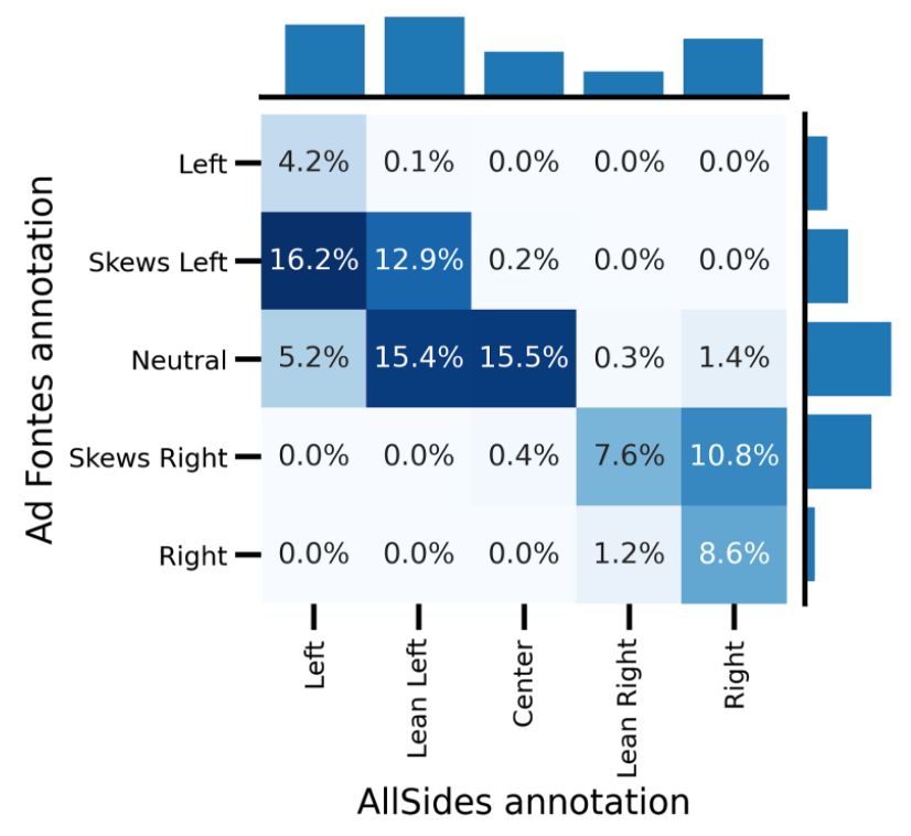
40]. What has remained a matter of debate, however, is whether or not any ranking advantage falls along established
political contours, such as, the left or right [23, 36], the center or the extremes [25, 37], specific parties [23, 36], or
news sources of a certain political inclination [7]. In this work, we provide the first systematic quantitative insights
into this question based on a massive scale randomized experiment on the Twitter platform.

Experimental Setup
      Below we outline this experimental setup and its inherent limitations. We then introduce a measure of algorithmic
amplification in order to quantify the degree to which different political groups benefit from algorithmic personalization.
      When Twitter introduced machine learning to personalize the Home timeline in 2016, it excluded a randomly
chosen control group of 1% of all global Twitter users from the new personalized Home timeline. Individuals in this
control group have never experienced personalized ranked timelines. Instead their Home timeline continues to display
Tweets and Retweets from accounts they follow in reverse-chronological order. The treatment group corresponds to a
sample of 4% of all other accounts who experience the personalized Home timeline. However, even individuals in the
treatment group do have the option to opt out of personalization (SI Section A).
      The experimental setup has some inherent limitations. A first limitation stems from interaction effects between
individuals in the analysis [3]. In social networks, the control group can never be isolated from indirect effects of
personalization as individuals in the control group encounter content shared by users in the treatment group. Therefore,
although a randomized controlled experiment, our experiment does not satisfy the well-known Stable Unit Treatment
Value Assumption (SUTVA) from causal inference [14]. As a consequence, it cannot provide unbiased estimates of
causal quantities of interest, such as the average treatment effect (ATE). In this study, we chose to not employ intricate
causal inference machinery that is often used to approximate causal quantities [17], as these would not guarantee
unbiased estimates in the complex setting of Twitter’s home timeline algorithm. Building an elaborate causal diagram
of this complex system is well beyond the scope of our observational study. Instead, we present findings based on simple
comparison of measurements between the treatment and control groups. Intuitively, we expect peer effects to decrease
observable differences between the control and treatment groups, thus, our reported statistics likely underestimate the
true causal effects of personalization.
      A second limitation pertains to the fact that differences between treatment and control group were previously used
by Twitter to improve the personalized ranking experience. The treatment, i.e., the ranking experience, has therefore
not remained the same over time. Moreover, the changes to the treatment depend on the experiment itself.

Measuring Amplification
      We define the reach of a set T of Tweets in a set U of Twitter users as the total number of users from U who
encountered a Tweet from the set T 1. Think of T, for example, as Tweets from a group of politicians in Germany and
the audience U as all German Twitter users in the control group. We always consider reach within a specific time
window, e.g., a day.

1A Tweet is counted as "encountered" by user A when 50% of the UI element containing the Tweet is continuously visible on the user’s device for
500ms. See SI Materials and Methods for details.

                                                                       2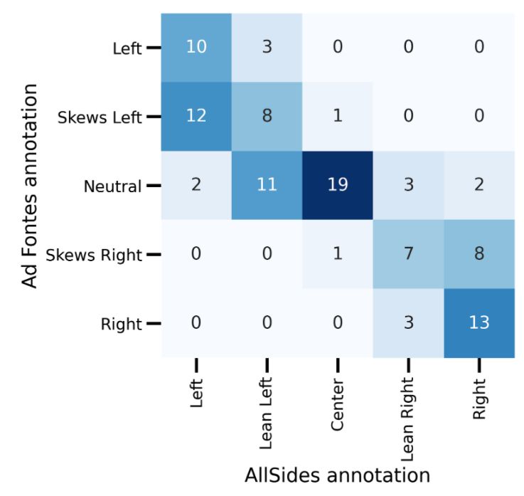
Measuring Algorithmic Amplification
We define the amplification ratio of set T of Tweets in an audience U as the ratio of the reach of T in U intersected
with the treatment group and the reach of T in U intersected with the control group. We normalize the ratio in such
a way that amplification ratio 0% corresponds to equal proportional reach in treatment and control. In other words, a
random user from U in the treatment group is just as likely to see a Tweet in T as a random user from U in the control
group. An amplification ratio of 50% means that the treatment group is 50% more likely to encounter one of the
Tweets. Large amplification ratios indicate that the ranking model assigns higher relevance scores to the set of Tweets,
which therefore appear more often than they would in a reverse-chronological ordering.
We often study the amplification ratio in cases where T is a set corresponding to Tweets from a single Twitter
account (individual amplification). When considering how groups of accounts are amplified we have the choice
between reporting distribution of amplification ratios of the individual accounts in the group, or to consider a single
aggregate amplification ratio (group amplification), where T contains all Tweets authored by any member of the group.
We generally report both statistics. More detail on how we calculate amplification and a discussion of the difference
between individual and group amplification is found in Section D of SI.
Results
We divide our findings into two parts. First, we study Tweets by elected politicians from major political parties in
seven countries which were highly represented on the platform. In the second analysis, which is specific to the United
States, we study whether algorithmic amplification of content from major media outlets is associated with political
leaning.
We first report how personalization algorithms amplify content from elected officials from various political parties
and parliamentary groups. We identified Twitter account details and party affiliation for currently serving legislators
in 7 countries from public data [8, 26, 39, 41] (SI Section B). The countries in our analysis were chosen on the basis
of data availability: these countries have a large enough active Twitter user base for our analysis, and it was possible to
obtain details of legislators from high-quality public sources. In cases where a legislator has multiple accounts—for
example, an official and a personal account—we included all of them in the analysis. In total we identified 3,634
accounts belonging to legislators across the 7 countries (the combined size of legislatures is 3,724 representatives).
We then selected original Tweets authored by the legislators, including any replies and quote Tweets (where they
retweet a Tweet while also adding original commentary). We excluded retweets without comment, as attribution is
ambiguous when multiple legislators retweet the same content. When calculating amplification relating to legislators,
we considered their reach only within their respective country during the time period between 1 April 2020 and 15
August 2020.
To compare the amplification of political groups, we can either calculate the amplification of all Tweets from the
group (group amplification, Fig. 1A-B, or calculate amplification of each individual in the group separately (individual
amplification, Fig. 1C). The latter yields a distribution of individual amplification values for each group, thus revealing
individual differences of amplifying effects within a group.
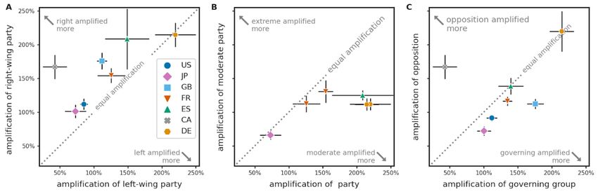
Fig. 1A compares the group amplification of major political parties in the countries we studied. Values over
0% indicate that all parties enjoy an amplification effect by algorithmic personalization, in some cases exceeding
200%, indicating that the party’s Tweets are exposed to an audience three times the size of the audience they reach
3Figure 1: Amplification of Tweets from major political groups and politicians in 7 countries with an active Twitter user base.
A: Group amplification of each political party or group. Within each country, parties are ordered from left to right according to
their ideological position based on the 2019 Chapel Hill Expert Survey [6]. A value of 0% indicates that Tweets by the group
reach the same number of users on ranked timelines as they do on chronological timelines. A value of 100% means double the
reach. Error bars show standard error estimated from bootstrap. Bootstrap resampling was performed over daily intervals as well
as membership of each political group. B: Pairwise comparison between the largest mainstream left and right-wing parties in
each country: Democrats vs Republicans in the U.S., CDP vs LDP in Japan, Labour vs Conservatives in the U.K., Socialists vs
Republicans in France, PSOE vs Popular in Spain, Liberals vs Conservatives in Canada and SPD vs CDU/CSU in Germany. In 6
out of 7 countries, these comparisons yield a statistically significant difference with right being amplified more, after adjusting for
multiple comparisons. In Germany, the difference is not statistically significant. C: Amplification of Tweets by individual left- and
right-wing politicians in the U.S., U.K. and Canada. Violin plots illustrate the distribution of amplification values within each party,
solid and dashed lines within show the median, 25th and 75th percentiles, respectively. There is substantial variation of individual
amplification within political parties. However, there is no statistically significant dependence between an individual’s amplification
and their party affiliation in either of the four comparisons.
on chronological timelines. To test the hypothesis that left-wing or right-wing politicians are amplified differently,
we identified the largest mainstream left or centre-left and mainstream right or centre-right party in each legislature,
and present pairwise comparisons between these in Fig. 1B. With the exception of Germany, we find a statistically
4significant difference favoring the political right wing. This effect is strongest in Canada (Liberals 43% vs Conservatives
167%) and the United Kingdom (Labour 112% vs Conservatives 176%). In both countries the Prime Ministers and
members of the Government are also Members of the Parliament and are thus included in our analysis. We therefore
recomputed the amplification statistics after excluding top government officials. Our findings, shown in SI Fig. S2.,
remained qualitatively similar.
When studying amplification at the level of individual politicians (Fig. 1C), we find that amplification varies
substantially within each political party: while Tweets from some individual politicians are amplified up to 400%, for
others amplification is below 0%, meaning they reach fewer users on ranked timelines than they do on chronological
ones. We repeated the comparison between major left-wing and right-wing parties, comparing the distribution of
individual amplification values between parties. When studied at the individual level, a permutation test detected no
statistically significant association between an individual’s party affiliation and their amplification.
We see that comparing political parties on the basis of aggregate amplification of the entire party (Fig. 1A-B) or
on the basis of individual amplification of their members (Fig. 1C) leads to seemingly different conclusions: while
individual amplification is not associated with party membership, the aggregate group amplification may be different
for each party. These findings are not contradictory, considering that different politicians may reach overlapping
audiences. Even if the amplification of individual politicians is uncorrelated with their political affiliation, when we
consider increases to their combined reach, group-level correlations might emerge. For a more detailed discussion
please refer to SI Section 1.E.3.
Our fine-grained data also allows us to evaluate whether recommender systems amplify extreme ideologies, far-left
or far-right politicians, over more moderate ones [37]. We found that in countries where far-left or far-right parties
have substantial representation among elected officials (e.g. VOX in Spain, Die Linke and AfD in Germany, LFI and
RN in France) the amplification of these parties is generally lower than that of moderate/centrist parties in the same
country (see Fig. S1). Finally, we considered whether personalization consistently amplifies messages from governing
coalition or the opposition, and found no consistent pattern across countries. For example, in the United Kingdom
amplification favors the governing Conservatives, while in Canada the opposition Conservative Party of Canada is
more highly amplified.
Tweets from legislators cover just a small portion of political content on the platform. To better understand the
effects of personalization on political discourse, we extend our analysis to a broader domain of news content [18, 28].
Specifically, we extend our analysis to media outlets with a significant audience in the U.S. [27]. While the political
affiliation of a legislator is publicly verifiable, there is no single agreed-upon classification of the political orientation
of media outlets.
To reduce subjectivity in our classification of political content, we leverage two independently curated media bias
rating datasets from AllSides [1] and Ad Fontes Media2 [29], and present results for both. Both datasets assign labels
to media sources based on their perceived position on the U.S. media bias landscape. The labels describe the overall
media bias of a news source on a 5-point scale ranging from partisan Left through Center/Neutral to partisan Right. We
then identified Tweets containing links to articles from these news sources shared by anyone between 1 April 2020 and
15 August 2020. We excluded Tweets pointing to non-political content such as recipes or sports. Wherever possible,
we separated editorial content from general news coverage as in some cases these had different bias ratings (SI Section
1.C). The resulting dataset contains AllSides annotations for 100,575,284 unique Tweets pointing to 6,258,032 articles
2Ad Fontes Media Bias Chart 5.0
5Figure 2: Amplification of news articles by Twitter’s personalization algorithms broken down by AllSides (A) and Ad Fontes (B)
media bias ratings of their source. Blue squares denote the mean estimate of group amplification for each group of content, error
bars show the standard deviation of the bootstrap estimate. Individual black circles show the amplification for the most significant
positive and negative outliers within each group. For example, content from AllSides ’Left’ media bias category is amplified 12%
by algorithms. The most significant negative outlier in this group is BuzzFeed, with an amplification of 2% compared to the
chronological baseline. By contrast, Vox is amplified 16%. Negative and positive outliers are selected by a leave-one-out procedure
detailed in SI Section 1.E.4.
and Ad Fontes annotations for 88,818,544 unique Tweets pointing to 5,100,381 articles.
We then grouped Tweets by media bias annotation of their source and calculated the aggregate amplification of
each bias category (Fig. 2) based on impressions over the time period between 15 April and 15 August 2020. When
using AllSides bias ratings (Fig. 2A), two general trends emerge: The personalization algorithms amplify more partisan
sources compared to ones rated as Center. Secondly, the partisan Right is amplified marginally more compared to
the partisan Left. The results based on Ad Fontes bias ratings (Fig. 2B) differ in some key ways. Most notable is
the relatively low, 10.5%, amplification of the partisan Left compared to other categories. Among the remaining
categories, the differences are not substantial, although the Neutral category is amplified significantly less than other
categories.
6Leave-one-out analysis of each media bias category (described in detail in SI Section 1.E.4) allows us to identify
the most significant outliers in each category, also shown in Fig. 2. This analysis identified BuzzFeed News, LA
Times and Breitbart (based on both AllSides and Ad Fontes ratings) as negative outliers in their respective categories,
meaning the amplification of their content was less than the aggregate amplification of the bias category they belong
to. Meanwhile, Fox News and New York Post were identified as positive outliers. These outliers also illustrate that,
just as we saw in the case of legislators, there is significant variation among news outlets in each bias category.
The fact that our findings differ depending on the media bias dataset used underlines the critical reliance of this
type of analysis on political labels. We do not endorse either AllSides or Ad Fontes as objectively better ratings, and
leave it to the reader to interpret the findings according to their own assessment. To aid this interpretation, we looked
at how AllSides and Ad Fontes ratings differ, where both ratings are available. We found that while the two rating
schemes largely agree on rating the political right, they differ most in their assessment of publications on the political
left, with a tendency for Ad Fontes to rate publications as being more neutral compared to their corresponding AllSides
rating. Details are shown in Supplementary Figs. S3, S4 and Table S1.
Discussion
We presented a comprehensive audit of algorithmic amplification of political content by the recommender system in
Twitter’s home timeline. Across seven countries we studied, we found that mainstream right-wing parties benefit at least
as much, and often substantially more, from algorithmic personalization as their left-wing counterparts. In agreement
with this, we found that content from U.S. media outlets with a strong right-leaning bias are amplified marginally
more than content from left-leaning sources. However, when making comparisons based on the amplification of
individual politician’s accounts, rather than parties in aggregate, we found no association between amplification and
party membership.
Our analysis of far-left and far-right parties in various countries does not support the hypothesis that algorithmic
personalization amplifies extreme ideologies more than mainstream political voices. However, some findings point at
the possibility that strong partisan bias in news reporting is associated with higher amplification. We note that strong
partisan bias here means a consistent tendency to report news in a way favouring one party or another, and does not
imply the promotion of extreme political ideology.
Recent arguments that different political parties pursue different strategies on Twitter [19, 32] may provide an
explanation as to why these disparities exist. However, understanding the precise causal mechanism that drives
amplification invites further study that we hope our work initiates.
Although it is the first systematic and large-scale study contrasting ranked timelines with chronological ones
on Twitter, our work fits into a broader context of research on the effects of content personalization on political
content [7, 30, 36, 37] and polarization [10, 16, 31, 33]. There are several avenues for future work. Apart from the
Home timeline, Twitter users are exposed to several other forms of algorithmic content curation on the platform that
merit study through similar experiments. Political amplification is only one concern with online recommendations. A
similar methodology may provide insights into domains such as misinformation [15, 22], manipulation [2, 42], hate
speech and abusive content.
7References
[1] AllSides (2020). How AllSides Rates Media Bias. [Online; retrieved August-2020].
[2] Aral, S. and Eckles, D. (2019). Protecting elections from social media manipulation. Science, 365(6456):858–861.
[3] Aronow, P. M., Samii, C., et al. (2017). Estimating average causal effects under general interference, with application to a social network
experiment. The Annals of Applied Statistics, 11(4):1912–1947.
[4] Badawy, A., Ferrara, E., and Lerman, K. (2018). Analyzing the digital traces of political manipulation: The 2016 russian interference twitter
campaign. In ACM Int. Conf. on ASONAM, pages 258–265. IEEE.
[5] Bail, C. A., Argyle, L. P., Brown, T. W., Bumpus, J. P., Chen, H., Hunzaker, M. F., Lee, J., Mann, M., Merhout, F., and Volfovsky, A.
(2018). Exposure to opposing views on social media can increase political polarization. Proceedings of the National Academy of Sciences,
115(37):9216–9221.
[6] Bakker, R., Hooghe, L., Jolly, S., Marks, G., Polk, J., Ronvy, J., Steenbergen, M., and Vachudova, M. A. (2020). 2019 Chapel Hill Expert
Survey, version 2019.1., available on chesdata.eu.
[7] Bakshy, E., Messing, S., and Adamic, L. A. (2015). Exposure to ideologically diverse news and opinion on facebook. Science, 348(6239):1130–
1132.
[8] Ballotpedia (2020). List of Current Members of US Congress. [Online; accessed June-2020].
[9] Barberá, P., Jost, J. T., Nagler, J., Tucker, J. A., and Bonneau, R. (2015). Tweeting from left to right: Is online political communication more
than an echo chamber? Psychological science, 26(10):1531–1542.
[10] Boxell, L., Gentzkow, M., and Shapiro, J. M. (2017). Greater internet use is not associated with faster growth in political polarization among
us demographic groups. Proceedings of the National Academy of Sciences, 114(40):10612–10617.
[11] Bozdag, E. and van den Hoven, J. (2015). Breaking the filter bubble: democracy and design. Ethics and Information Technology, 17(4):249–265.
[12] Conover, M. D., Gonçalves, B., Flammini, A., and Menczer, F. (2012). Partisan asymmetries in online political activity. EPJ Data Science,
1(1):6.
[13] Conover, M. D., Ratkiewicz, J., Francisco, M. R., Gonçalves, B., Menczer, F., and Flammini, A. (2011). Political polarization on twitter.
ICWSM, 133(26):89–96.
[14] Cox, D. R. (1958). Planning of experiments. Wiley.
[15] Del Vicario, M., Bessi, A., Zollo, F., Petroni, F., Scala, A., Caldarelli, G., Stanley, H. E., and Quattrociocchi, W. (2016a). The spreading of
misinformation online. Proceedings of the National Academy of Sciences, 113(3):554–559.
[16] Del Vicario, M., Vivaldo, G., Bessi, A., Zollo, F., Scala, A., Caldarelli, G., and Quattrociocchi, W. (2016b). Echo chambers: Emotional
contagion and group polarization on facebook. Scientific reports, 6:37825.
[17] Eckles, D., Karrer, B., and Ugander, J. (2016). Design and analysis of experiments in networks: Reducing bias from interference. Journal of
Causal Inference, 5(1).
[18] Flaxman, S., Goel, S., and Rao, J. M. (2016). Filter bubbles, echo chambers, and online news consumption. Public opinion quarterly,
80(S1):298–320.
[19] Freelon, D., Marwick, A., and Kreiss, D. (2020). False equivalencies: Online activism from left to right. Science, 369(6508):1197–1201.
[20] Gillespie, T. (2010). The politics of ‘platforms’. New media & society, 12(3):347–364.
[21] Graham, T., Broersma, M., Hazelhoff, K., and Van’T Haar, G. (2013). Between broadcasting political messages and interacting with voters:
The use of twitter during the 2010 uk general election campaign. Information, communication & society, 16(5):692–716.
[22] Grinberg, N., Joseph, K., Friedland, L., Swire-Thompson, B., and Lazer, D. (2019). Fake news on twitter during the 2016 us presidential
election. Science, 363(6425):374–378.
[23] Hasson, P. J. (2020). The Manipulators: Facebook, Google, Twitter, and Big Tech’s War on Conservatives. Regnery Publishing.
[24] Himelboim, I., McCreery, S., and Smith, M. (2013). Birds of a feather tweet together: Integrating network and content analyses to examine
cross-ideology exposure on twitter. Journal of computer-mediated communication, 18(2):154–174.
[25] Hong, S. and Kim, S. H. (2016). Political polarization on twitter: Implications for the use of social media in digital governments. Government
Information Quarterly, 33(4):777–782.
[26] House of Commons Canada (2020). Current Members of Parliament. [Online; accessed June-2020].
[27] Institute, A. P. (2014). The personal news cycle: How americans choose to get their news. [Online; retrieved October-2020].
[28] Messing, S. and Westwood, S. J. (2014). Selective exposure in the age of social media: Endorsements trump partisan source affiliation when
selecting news online. Communication research, 41(8):1042–1063.
[29] Otoro, V. (2020). How Ad Fontes Ranks News Sources - Methodology Summary. [Online; retrieved August-2020].
[30] O’Callaghan, D., Greene, D., Conway, M., Carthy, J., and Cunningham, P. (2015). Down the (white) rabbit hole: The extreme right and online
8recommender systems. Social Science Computer Review, 33(4):459–478.
[31] Pariser, E. (2011). The filter bubble: What the Internet is hiding from you. Penguin UK.
[32] Parmelee, J. H. and Bichard, S. L. (2011). Politics and the Twitter revolution: How tweets influence the relationship between political leaders
and the public. Lexington Books.
[33] Perra, N. and Rocha, L. E. (2019). Modelling opinion dynamics in the age of algorithmic personalisation. Scientific reports, 9(1):1–11.
[34] Ribeiro, M. H., Ottoni, R., West, R., Almeida, V. A., and Meira Jr, W. (2020). Auditing radicalization pathways on YouTube. In Proceedings
of FAT*, pages 131–141.
[35] Shirky, C. (2011). The political power of social media: Technology, the public sphere, and political change. Foreign Affairs, 90(1):28–41.
[36] The Economist (2020). Twitter’s algorithm does not seem to silence conservatives. [Online; posted 01-August-2020].
[37] Tufekci, Z. (2018). Youtube, the great radicalizer. [Online; posted 10-March-2018].
[38] Twitter (2016). Never miss important tweets from people you follow. [Online; accessed 01-August-2020].
[39] UK Parliament (2020). MPs and Lords. [Online; accessed June-2020].
[40] Vergeer, M., Hermans, L., and Sams, S. (2013). Online social networks and micro-blogging in political campaigning: The exploration of a
new campaign tool and a new campaign style. Party politics, 19(3):477–501.
[41] VrandeÃi∆, D. and Krötzsch, M. (2014). Wikidata: a free collaborative knowledgebase. Communications of the ACM, 57(10):78–85.
[42] Woolley, S. C. (2016). Automating power: Social bot interference in global politics. First Monday, 21(4).
9Supplementary Information for
Algorithmic Amplification of Politics on Twitter
Ferenc Huszár, Sofia Ira Ktena, Conor O’Brien, Luca Belli, Andrew Schlaikjer and Moritz Hardt
SI 1 Materials and Methods
SI 1.1 The Timelines Quality Holdback Experiment
Twitter has maintained the randomized experiment described in this paper, known as the timelines quality holdback
experiment, since June 2016. The experiment allocates accounts to either a control (1% of users) or treatment (4%)
group completely at random.
SI 1.1.1 Assignment to Treatment or Control
Accounts were randomly assigned to treatment or control either at the experiment’s onset (if the account existed
at the time), or at the time the account was created (if the account was created since the experiment started). In both
cases inclusion in the experiment and assignment to treatment or control were determined completely randomly. The
assignment is maintained over the lifespan of the account, although users in the treatment group have the liberty to
temporarily switch off algorithmic recommendations (as explained below). For the purposes of this study, individuals
who voluntarily turn off algorithmic recommendations continue to be identified as being in the treatment group.
SI 1.1.2 Number of users in the Experiment
The experiment included 5% of all accounts globally, of which 20% are assigned to control, and 80% are assigned
to the treatment group. This amounts to tens of millions of unique user ids including those of dormant accounts and
bots, only a fraction of which correspond to active users who used the product during the time period we studied. In
the second quarter of 2020, Twitter reported 186 million monetizable daily active users (mDAU) [5] of which about
5% (9.3 million) were included in our study.
SI 1.1.3 Tweet Selection and Presentation in Control Group
Users assigned to the control group experience the Twitter home timeline much the same way it worked before
the introduction of algorithmic ranking in 2016 1. The timeline displays Tweets authored by accounts the individual
follows (referred to as in-network Tweets) or Tweets reTweeted by accounts the individual follows (ReTweets). Tweets
are ordered in reverse chronological order, showing the latest Tweet first, taking into account the timestamp of either
Tweet creation (for original Tweets) or reTweet time (for ReTweets). A heuristic de-duplication logic is applied to
1https://help.twitter.com/en/using-twitter/twitter-timeline
SI page 1Tweets which are reTweeted by multiple accounts the individuals follow. Due to the simplicity of Tweet selection and
ranking logic, this version of the timeline is often referred to as the non-algorithmic timeline.
SI 1.1.4 Tweet Selection and Ranking in Treatment Group
Users in the treatment group for this experiment experience the Twitter Home Timeline the same way that
the majority of Twitter users - not included in the experiment - do. Being included in the treatment bucket of this
experiment has an influence on whether the same user can be selected as part of the treatment group in other randomized
experiments in which related features are tested.
Treatment users who use the Twitter app on iOS or Android devices can choose between viewing the “top Tweets
first” or the “latest Tweets first” in their Home timeline2. By default, the “top Tweets first” option is enabled and the
setting reverts back to this default after a period of inactivity. On other platforms, users do not have an option to view
latest Tweets first. When the Home timeline is set to display ‘latest Tweets first’, it works similarly to the traditional
reverse chronological timeline which users in the control group experience. When ‘top Tweets first’ mode is selected,
the Tweets are algorithmically selected, filtered and ranked. The selection and ranking of Tweets is influenced, in part,
by the output of machine learning models which are trained to predict whether the user is likely to engage with the
Tweet in various ways (like, reTweet, reply, etc). The machine learning methods and ranking algorithms make these
predictions based on a combination of content signals such as the inferred topic of the Tweet as well as behavioural
signals such as past engagement history between the user and the author of the Tweet.
In addition to Tweets and ReTweets from accounts the individual follows, the personalized timeline may also
contain ‘injected’ content from outside the user’s immediate network. A common type of such injected content are
Tweets liked by someone the individual follows. Such Tweets would not appear on chronological timelines, only if
someone the user follows ReTweets (rather than just likes) the Tweet in question.
SI 1.1.5 Services influencing Content in both Control and Treatment
Several services and products might influence content displayed on both Control and Treatment Timelines.
Promoted Tweets: The timeline might contain Promoted Tweets, a form of advertisement, which are marked by
a label “Promoted by [advertiser account]” making them clearly distinguishable from organic content. These Tweets
are not usually from accounts the individual follows. These promoted Tweets are selected by algorithms which rely
on machine learning algorithms and a generalized second price auction mechanism. Although the ad models might
behave differently for ranking and control users, the algorithms selecting content have no explicit knowledge of whether
a user is in either group.
Restricted or Removed content: content deemed to violate Twitter’s Terms and Conditions, pornographic content,
content displaying gore and violence, spam and fraudulent content, Tweets containing misleading or false information
might be completely hidden, displayed with a warning label, or remain hidden until the user dismisses a warning
message. These limitations tend to apply to individual Tweets or all Tweets from certain Twitter accounts, and apply
the same way every time the Tweet.
Blocking and Muting: Users have the ability to Mute or Block one another. Individuals who Mute another account
will no longer see Tweets from the muted account, even when it is reTweeted or replied to by someone they follow.
2https://blog.twitter.com/official/en_us/a/2016/never-miss-important-Tweets-from-people-you-follow.html
SI page 2Blocking works the other way around, if an individual is blocked by an account, they can no longer see or interact with
content from that account.
SI 1.1.6 Machine learning models used for ranking
The ranking content on the Home timeline is influenced by the output of deep learning models, trained to predict
various types of engagements with Tweets (likes, reTweets, replies, etc) 3. The models receive as input various signals
which broadly fall into the following categories: content features (such as the inferred topic area of the Tweet, whether
it contains an image), about the engaging user (such as their engagement history or users they follow), about the Tweet
author (such as engagements with their past Tweets), and about the relationship between the user and the Tweet’s author
(such as frequency of past engagements between them). In addition to the predictions made by these machine learning
models, the final ranking of Tweets is influenced by heuristics and the output of other machine learning algorithms.
The models are trained on data from users in this experiment’s treatment group as well as most users outside of
this experiment (the remaining 95% of accounts). Data from individuals in the control group are not part of the training
dataset of these models. However, the predictions the algorithms make are routinely evaluated on data from control
users, and this is used to inform decisions about the deployment of certain features.
SI 1.1.7 Other forms of personalization users are exposed to
Being assigned to the control or treatment group of this experiment only affects algorithmic personalization of
the Home timeline. Users receive content recommendations or are served personalized results in other product surface
areas including the “Explore” tab, Search, Trends, Events, push notifications and Tweet or conversation detail pages.
In addition to this, users might receive personalized content recommendations via email or push notifications, as well
as ‘Who to follow’ account recommendations. Therefore, it is incorrect to say that the control group received no
algorithmic recommendations. Assignment to control only restricts the use of personalization in the Home timeline,
which is the component users spend most active minutes in.
SI 1.2 Obtaining Legislators’ Twitter details
SI 1.2.1 Selection criteria for countries
When studying amplification of content from national legislators, our aim was to include data relating to as many
legislatures globally as possible. We identified countries to include in our analysis based on the availability of data, in
particular based on the following criteria:
Availability of data on politicians’ Twitter accounts: It was possible for us to identify Twitter usernames and asso-
ciated party affiliations for a large number of current legislators using either official government sources, Wikidata [6],
or publicly available Twitter lists curated by the corresponding political parties or other official accounts. We used the
following Wikidata query to list the number of Twitter accounts associated with each legislature.
Sufficient Twitter user base in the country: The number of unique Twitter accounts in the control group which
had the relevant country code associated with their account at the time of entering the experiment was at least 100,000
supporting robust statistical analysis.
3Using Deep Learning at Scale in Twitter’s Timelines.
SI page 3Screening for the above two criteria we identified the following list of countries (in decreasing order by number of
unique users in our experiment) United States, Japan, United Kingdom, France, Spain, Canada, Germany, and Turkey.
Further analysis of Wikidata entries for legislators in Turkey showed that while there was almost complete data on
legislators serving in the previous, 26th term, for the current, 27th term, we were only able to identify 110 usernames
for a total of 600 members. Thus we did not include Turkey in our analysis. The following countries met the first, but
not the second selection criterion, and were thus not included: Sweden, Denmark and the Netherlands. The following
countries met the second, but not the first requirement and were thus not included: India, Brazil, Mexico, Saudi Arabia,
Indonesia.
We excluded federal or international bodies such as the European Union Parliament from our analysis and focussed
on national legislatures only. Members of the EU legislature Tweet in different languages and address audiences in
different countries whose activity and usage of Twitter may not be homogeneous enough, complicating the analysis
and interpretation of findings.
SI 1.2.2 Collecting data from Wikidata
To identify members of the current legislative term in each country we followed a variation of the following process:
We identified the appropriate subclass of the ‘legislator’ Wikidata entity (Q4175034) which describes membership in
each legislature we studied. For example, the Wikidata entity Q3044918 denotes the position “member of the French
National Assembly”. These entities linked to the Wikidata entity of each person who have held the title via the Wikidata
property P39. “position held”. This allows us to identify Wikidata entities of all current and past members of the
legislature.
In countries where such Wikidata entities are available, we identified the entity describing the current term of
legislature. These entities are linked to the title held via the Wikidata qualifier P2937. For example the Wikidata entity
describing the 15th, current, term of the French legislature is Q24939798. These entities can then be used to identify
current members of the legislature.
We additionally discarded individuals whose membership of the corresponding legislature had an “end date”
(P582) qualifier, as this indicates that the person no longer holds the position. In some countries, like the United States,
this is the only way to find current members of the Senate as there are no Wikidata entities for legislative terms. Where
available, we can retrieve legislators’ Twitter screen names which are linked to the individual’s Wikidata entity via the
P2002 Wikidata property. In some cases, it was also possible to retrieve numerical Twitter identifiers. Where available,
numerical IDs are more reliable as users can change their screen names. We found that legislators change their twitter
screennames quite often, for example, to include “mp” or “MdB” signifying their membership of Parliament or the
German Bundestag as they are elected.
We also retrieved individuals’ gender or sex, which is linked to a person’s entity via the Wikidata property P21.
We only used gender information to ensure that members of all genders are fairly represented in our sample of Twitter
accounts.
Examples of SQPARQL queries we used in each country can be accessed here: Germany, Spain, France and
Sweden.
SI page 4SI 1.2.3 Collecting data from public Twitter lists
In addition to Wikidata, we have obtained lists of Twitter accounts of legislators in the United States and Germany
from publicly available Twitter lists curated by Twitter (@TwitterGov) or political parties and political organizations in
Germany (US House, US Senate, Bundestagsabgeordnete, CSU MdBs, MdBs 19.WP, MdB DIE LINKE 19. WP). We
manually verified that the lists we chose were of high quality, accurate and up-to-date. We removed accounts which
belong to parties, local party organisations or campaign groups rather than individual legislators.
SI 1.2.4 Collecting data from official government websites
To obtain a high-quality list of Twitter handles for Members of the United Kingdom Parliament we scraped the
official Parliament website (UK Parliament: MPs and Lords). The contact page of each MP may contain their Twitter
handle, as well as their party affiliation. For the United States we also accessed a list of representatives and senators
from Ballotpedia (Ballotpedia “List of Current Members of US Congress”). We used this list to associate the accounts
found on the Twitter lists to their political parties. The Ballotpedia information was also used to identify a handful of
accounts that were not already included in the curated lists. For Canada, a CSV of current MPs was downloaded from
the official House of Commons website (House of Commons Canada: Current Members of Parliament). The accounts
were then manually annotated resulting in a very high quality dataset in terms of coverage and accuracy.
SI 1.2.5 Manual data validation and annotation
While in most countries we were able to identify Twitter details of over 70% of all representatives following the
automated methods described above, and in some countries this coverage was particularly high, we cannot be certain
that we did not miss individuals. Our goal was to ensure that when we miss accounts, these do not result in poor
representation of certain minority groups in our dataset. We have therefore focussed manual annotation effort on
ensuring that accounts of legislators who belong to certain underrepresented groups, such as women, and people of
colour, are included in our dataset. In most countries, we were able to retrieve gender labels from Wikidata to aid with
his process.
SI 1.2.6 Groupings of parties
To test various hypotheses about the types of political parties algorithms might amplify more, we make some direct
comparisons between parties in each country. The first comparison we present in Fig. S1. A compares the mainstream
political left with the mainstream political right. We used a number of heuristics to determine how to make this
comparison in each country. In all countries except France, the parties being compared have the largest representation
in their corresponding legislature. We rely on the 2019 Chapel Hill Expert Survey [2] and Wikidata annotations to
determine the ideological position of each party. Typically, Wikipedia and other public sources describe one of these
parties as left-wing or centre-left, and the other as right-wing or centre-right, making the comparison unambiguous.
In France, the largest parliamentary group, the governing LREM is a centrist, big-tent parliamentary group, while the
parties more traditionally considered as France’s left-wing and right-wing (Socialists and Republicans) are currently
both in opposition. In Continental European countries, the left-wing parties compared (SPD, Parti Socialiste and
PSOE) are all members of the Progressive Alliance of Socialists and Democrats in the European Parliament. Likewise,
the right-wing parties (CDU/CSU, les Républicains and Partido Popular) are part of the European People’s Party.
SI page 5In Fig. S1B we compare far-left and far-right political parties with mainstream political parties from the same
country. We selected political parties where Wikipedia entries mentioned an association with far-left or far-right
ideologies, or where the 2019 Chapel Hill Expert Survey [2] indicated an extreme ideology (above 9 or below 2).
These were the Japanese Communist Party (Japan far-left), La France insoumise (France far-left), Rassemblement
National (France far-right, represented together with associates as Non-Inscrits in the French National Assembly),
VOX (Spain, far-right), Die Linke (Germany far-left) and AfD (Germany far-right). We compared each of these parties
or parliamentary groups to the largest mainstream right-wing or left-wing political party in their respective countries.
In Fig. S1C we compare governing vs opposition parties. In the United States, we consider Republicans to be the
governing party and Democrats (and democratic-aligned independents like Bernie Sanders) as opposition. In Japan,
the government is formed by LDP and Komeito, all other parties are considered opposition. In the United Kingdom
we compare the Conservative Party against the Labour Party, according to their official designation as Her Majesty’s
Government and Her Majesty’s Most Loyal Opposition, respectively. In France we consider LREM as well as their
confidence-and-supply partners MoDem and Agir as the government, and all other representatives except EDS, which
Wikipedia lists as neutral, as opposition. In Spain we consider PSOE, Unidas Podemos and their supporting Basque
Nationalist Party as governing, and Partido Popular, ERC and VOX as opposition. In Germany we consider CSU/CDU
as governing and everyone else as opposition. In Canada we compare the Liberal Party against the Conservative Party
according to their official designation as Her Majesty’s Government and Her Majesty’s Loyal Opposition, respectively.
SI 1.2.7 Political changes
It is common for individual legislators’ party or parliamentary group affiliation changes during a legislative term.
This can be due to individual resignations, party mergers or the formation of new parliamentary groups or parties. For
example, the French Écologie Democratie Solidarité (EDS) parliamentary group was formed in May 2020 by members
of the governing La République En Marche! (LREM) [3]. In the Japanese House of Representatives, the Party of
Hope (Kibō no Tō) merged with the Democratic Party to form a new party called DPFP in 2018, the majority of DPFP
representatives then joined the Constitutional Democratic Party (CDP) in September 2020, while a smaller DPFP
continues to exist. Where possible we validated and updated party membership data so as to best reflect major parties
throughout the study period (1 April - 15 August 2020). In France, we considered EDS as separate from LREM. We
repeated our analysis considering EDS representatives as members LREM, but findings do not change qualitatively.
As can be seen in Fig. S1A, EDS and LREM are very similar in terms of group amplification.
SI 1.3 Media bias ratings
SI 1.3.1 AllSides Media Bias Ratings
To study exposure to politically biased media sources we obtained media bias ratings for news sources from
AllSides [1]. While the AllSides dataset includes news sources with a global audience (such as the BBC, Guardian, Al
Jazeera, etc) it focuses primarily on the U.S. media landscape, and the media bias ratings relate to how the media bias of
these sources are perceived in the United States. This dataset assigns each publication or media source into one of ‘Left’,
‘Lean Left’, ‘Center’, ‘Mixed’, ‘Lean Right’ and ‘Right’. The data we had also contained crowdsourced judgments as
well as confidence ratings which were ignored. We discarded the ‘Mixed’ category as it included aggregator websites
and media bias rating platforms (like AllSides.com itself) rather than media sites creating original content. We have
SI page 6further excluded sites like Yahoo News, Google News, as well as podcasts, content studios and activist groups whose
original content was not clearly identifiable or attributable. To qualify for our analysis, the content from the publication
source had to be clearly identifiable on the basis of URLs shared by users on the platform, we discarded publications
without a clearly identifiable URL structure.
SI 1.3.2 Ad Fontes Media Bias ratings
We also obtained Media Bias ratings from Ad Fontes Media [4]. This dataset contained a numerical media bias
rating for each news source ranging between -38.5 (most extreme left bias) and 38.5 (most extreme right bias). In line
with how the data is presented on the media bias chart 4 we discretized these numerical values into 5 intervals: Left
(x < 16.5), Skews Left ( 16.5 < x < 5.5), Neutral ( 5.5 < x < 5.5), Skews Right (5.5 < x < 16.5) and Right
(16.5 < x). We excluded news sources such as TV channels or programs whose content was not clearly identifiable as
URLs shared on Twitter. We found that, with a few exceptions, the set of publications with an Ad Fontes rating was a
subset of those with an AllSides rating.
SI 1.3.3 Mapping domain names and URLs
The AllSides dataset contains websites (domain names) as well as details of Twitter accounts (usernames)
associated with most publications they rated. One could therefore study exposure to Tweets from the official Twitter
accounts (i.e. Tweets by @foxnews or @nytimes) or exposure to Tweets containing a link to content from each
publication (i.e. Tweets containing a link to a Fox News of New York Times article). We chose to focus on URLs,
because publications use their official Twitter accounts in different ways, and because Tweets from these official
accounts are responsible for only a small fraction of all content impressions on Twitter. Thus, we chose to use domain
names as the primary identifier of each publication. We manually added missing domain names and updated or
corrected outdated entries to ensure that all major news sources had an up-to-date domain name.
SI 1.3.4 Regular expressions
To identify URLs that link to articles from each publication, we created regular expressions , which were matched
against the text of the URL (not the text of the website). For the majority of publications these regular expressions were
based on the domain name only, catching any link to any content on the corresponding website. Several news sources
publish large volumes of non-politicised content such as sports, recipes, games or weather forecasts. To filter these out
and focus our analysis on news and politicised content only, we created custom regular expressions, which select only
articles from certain sections of each publication only.
While the naming of sections and the URL template changed from publication to publication, we aimed at including
sections which most likely contained coverage of local and global news, global health, COVID-19, politics, elections,
climate, science and technology. Similarly, we excluded sports, wellness, food, or weather related sections. Custom
regular expressions also allowed us to distinguish between editorial and news articles from the same publisher. These
often had different AllSides media bias ratings for the same newspaper group. For example, in the AllSides dataset, the
online news from Fox News is rated ‘Lean Right’ while Fox News opinion pieces are rated ‘Right’. Similarly, the New
York Times news section is rated ‘Lean Left’ while New York Times opinion section is rated ‘Left’. For publications
4https://www.adfontesmedia.com/interactive-media-bias-chart/
SI page 7where editorial content was rated differently, we tried to identify editorial content based on the URL string, using
regular expressions. Unfortunately, this was not always possible. For example, all URLs for the Wall Street Journal
were of the form ‘wsj.com/articles/[a-z0-9-]+‘, making it impossible to identify opinion pieces based on the URL text
only. In such cases, we did not distinguish between Editorial and News content, used all articles from the domain in
our analysis, and assigned them to the AllSides rating of the non-editorial content (which tended to be less partisan).
We then identified Tweets with content from these publications by screening public Tweets created between 1 April
and 15 August 2020, and matching any URLs these Tweets contained against the regular expressions we curated. The
resulting dataset contained AllSides annotations for 100,575,284 unique Tweets pointing to 6,258,032 different articles
and Ad Fontes annotations for 88,818,544 unique Tweets pointing to 5,100,381 different articles. When calculating
amplification on this data, we considered impressions within the time period 15 April – 15 August 2020.
SI 1.3.5 Comparison of AllSides and Ad Fontes ratings
To aid the interpretation of data, we have compared AllSides and Ad Fontes ratings for sources where we had
both ratings available. Figure S3 shows the number of news sources for each pairing of Ad Fontes and AllSides rating.
Figure S4 shows the breakdown in terms of number of Tweet impressions. Table S1 gives examples of specific news
sources that have a certain combination of Ad Fontes and AllSides rating.
SI 1.4 Measuring amplification
SI 1.4.1 Impression events
Our measures of amplification are based on counting events called “linger impression”: these events are registered
every time at least 50% of the area of a Tweet is visible for at least 500 ms (including while scrolling). We note that
these impression events are different from what is often called a ‘render impression’ in the context of online media,
which is registered every time the Tweet is rendered in the user’s client, or every time a Tweet is fetched by the client
on the user’s device. For example, when the user scrolls through a large volume of Tweets in rapid succession, without
stopping to allow time to read or see any of the Tweets, several render impressions would be registered, while few or no
linger impressions are logged. Linger impressions are the best proxy available to us to tell if a user has been exposed
to the content of a Tweet. We note that this definition of a linger impression is not the authors’ choice, and since it is
hard-coded into the client software, it was not possible for us to consider alternative definitions of impression.
For the purposes of this paper we considered linger impressions registered on Android, iOS, desktop web clients.
The timeline’s behaviour is implemented similarly in these platforms, and together they represent the overwhelming
majority of user activity. We only considered linger impressions registered in the Home timeline component (the
same users might encounter Tweets in other product areas such as Search, Trends, etc, but these impressions are not
considered here). For each linger impression a country code is inferred from the user’s IP address at the time the
event is registered. When analysing content from legislators, we further restrict impressions from the relevant country
(for example when considering impressions of Tweets of French legislators, we only count impressions from France).
When analysing content from publishers included in the AllSides media bias ratings, we restrict impression events
from the United States.
SI page 8You can also read