Brand guide v2.1 fall 2021 - The Sweet Potato
←
→
Page content transcription
If your browser does not render page correctly, please read the page content below
brand
guide        v2.1

 fall 2021
logo & tagline

  primary

  secondary
logo & tagline

clear space
A logo that breathes looks balanced. Be sure to
leave a minimum space around it untouched by
other graphical elements, as indicated by the E’s
from the logo.
logo & tagline

black and white knockout
logo & tagline

do’s and don’ts

                                        Changing the colours

                                        Adding effects (e.g.
                                        heavy or unnecessary
                                        drop shadows)
    Removing tagline where
    visually appropriate or preferred

                                        Placing on a busy
                                        background

                                        Reducing opacity
colours
core colours secondary colours accent colours
sweet potato orange sweet potato brown sunshine cashew
RGB 229, 86, 37* CMYK 45, 71, 83, 59 CMYK 4, 2, 41, 0 CMYK 5, 8, 12, 0
PMS 166 C RGB 79, 46, 27 RGB 247, 238, 170 RGB 240, 230, 219
HEX #E55625 PMS 4625 C PMS 0131 C PMS P 39-9 C (60%)
HEX #4F2E1B HEX #F7EEAA HEX #F0E6DB
*Do not use interchangeably (i.e. converting
RBG value to CMYK via Adobe interface)
blueberry mustard
CMYK 96, 67, 15, 2 CMYK 4, 40, 87, 0
RGB 0, 92, 151 RGB 239, 164, 62
PMS 7691 C PMS 804 C
HEX #005C97 HEX #EFA43E
arugula
CMYK 49, 0, 93, 0
RGB 141, 198, 74
PMS 360 C
sweet potato orange summer sky cool blue HEX #8DC64A
CMYK calibrated CMYK 36, 0, 8, 0 CMYK 61, 1, 9, 0
CMYK 0, 76, 100, 0* RGB 154, 219, 232 RGB 78, 195, 224
PMS 304 C PMS 637 C
*Do not use interchangeably (i.e. converting HEX #9ADBE8 HEX #4EC3E0 swiss chard
RBG value to CMYK via Adobe interface)
CMYK 80, 7, 100, 0
RGB 41, 166, 74
PMS 347 C
HEX #29A64Acolours suggested colour combinations
typography

bourton base
Our primary display typeface is modern with a subtle
                                                                abcdefghijk
industrial feel. It’s bold and welcoming and goes well with
everything! Useful for headlines and typographic art.
                                                                lmnopqrstu
For typographic art, Bourton can be customized and
embellished in endless ways, such as adding strokes, typing
                                                                vwxyz?!.,”’;:
on a curved path, warping, skewing, or layering.

display spacing                      display spacing            body spacing
for print                            for web                    for print
Tracking: -25                        letter-spacing: -0.01em;   Tracking: -25
Leading: ~105% of typeface size      line-height: 1.1em;        Leading: ~125% of typeface size
(e.g. 38 pt type, 40 pt leading)                                (e.g. 16 pt type, 20 pt leading)

garlic scapes                                                   Celery potato scallion
                                                                pluots raisins horseradish
                                                                spinach carrot swiss chard.
typography
Hanley Pro Script Alt A B C D E F G H IJ K L M
A script typeface with a floral and vintage feel. With
its lower legibility, Hanley is best suited as a subtle N O P QR S T U V W X Y Z
accent in small amounts, such as for a word or two in
campaign art for a bit of variation. It is also well
abcdefghijklmnopqrstu
suited for artisanal products and wintry content, such vwxyz?!.,”’;:
as locally sourced butter or a hot cider recipe.
Spiced
display spacing display spacing
for print for web
Tracking: 0
Leading: ~110% of typeface size
(e.g. 38 pt type, 42 pt leading)
letter-spacing: normal;
line-height: 1.1em; cidertypography
ed’s market regular slant
An all-caps bold marker typeface with a retro attitude
ABCDEFGHIJKL
reminiscent of 1960s/70s grocers and markets. Used in
the flyer and demo posters for special features stickers
M N O P Q R ST U V
and in-store deals signs. Apply very sparingly for
headlines and call-outs only where appropriate.
W X Y Z ? ! . ,” ’ ; :
display spacing
for print s w e Et
giveaway!
Tracking: 25
Leading: ~110% of typeface size
(e.g. 32 pt type, 35 pt leading)typography
ed’s market main script A B C D E F GH I J K L M
A handwritten typeface with a retro attitude
reminiscent of 1960s/70s grocers and markets. NOPQRST UVWXYZ
Used in the flyer and demo posters for puns and
call-outs. Apply very sparingly for headlines
abcdefghijklmnopqrstu
and call-outs only where appropriate. vwxyz?!.,”’;:
display spacing *a note about apostrophes
for print and hyphens
Tracking: 0 Ed’s Market Main Script‘s apostrophes and hyphens have
Leading: ~100% of typeface size a vertical position that is too high. In graphics software
(e.g. 36 pt type, 36 pt leading) they require a baseline shift of -2.
Lettuce turnip
the beet!typography
Nunito bold ABCDEFGHIJKLMN
A warm and inviting sans-serif typeface for
body text. Use for paragraphs exceeding 3
OPQRSTUVWXYZ
lines or text that does not require emphasis. abcdefghijklmnop
qrstuv wxyz?!.,”’;:
spacing for print Turnip greens yarrow ricebean rutabaga endive
cauliflower sea lettuce kohlrabi amaranth water
Tracking: 0
spinach avocado daikon napa cabbage asparagus
Leading: ~160% of typeface size
winter purslane kale. Celery potato scallion desert
(e.g. 19pt leading for 12pt type)
raisin horseradish spinach carrot soko. Lotus root
water spinach fennel kombu maize bamboo shoot
spacing for web green bean swiss chard seakale pumpkin onion
chickpea gram corn pea. Brussels sprout.
letter-spacing: normal;
line-height: 1.6em;typography
Nunito extrabold ABCDEFGHIJKLMN
A heavier weight useful for
subheadings and emphasis.
OPQRSTUVWXYZ
abcdefghijklmnop
qrstuv wxyz?!.,”’;:
spacing for print Turnip Greens Yarrow Ricebean
Tracking: 0 Rutabaga Endive Cauliflower Sea
Leading: ~140% of typeface size Lettuce Kohlrabi Amaranth Spinach
(e.g. 23pt leading for 16pt type)
spacing for web
letter-spacing: normal;
line-height: 1.4em;typography
Nunito semibold ABCDEFGHIJKLMN
A lighter weight for fine print or other OPQRSTUVWXYZ
text that requires de-emphasis.
abcdefghijklmnopq
rstuv wxyz?!.,”’;:
spacing for print Turnip greens yarrow ricebean rutabaga
endive cauliflower sea lettuce kohlrabi.
Tracking: 0
Leading: ~125% of typeface size
(e.g. 15pt leading for 12pt type)
spacing for web
letter-spacing: normal;
line-height: 1.25em;visual accents
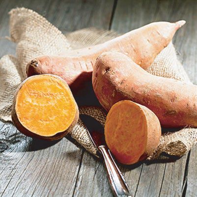
starbursts
Place a subtle starburst behind a product
to give it a pop. Works best with
Sunshine or Cashew background colours.
Note that all product photos used should
be free of drop shadows whenever
possible.
expression lines
A few fanned out lines – either solid or broken wild
– add a bit of subtle movement and whimsy blueberries
without distracting from the main focus.
sweetYou can also read