Cabinet Configurator Masaryk University - Faculty of Informatics - IS MUNI
←
→
Page content transcription
If your browser does not render page correctly, please read the page content below
Masaryk University
  Faculty of Informatics

Cabinet Configurator

     Bachelor’s Thesis

     Martin Bebjak

      Brno, Spring 2021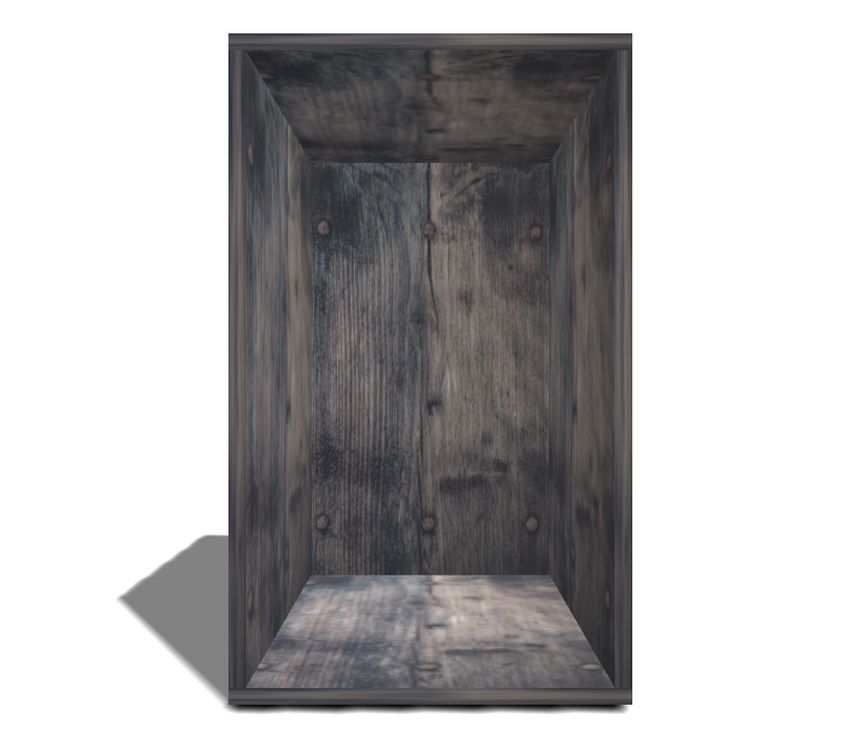
Masaryk University
  Faculty of Informatics

Cabinet Configurator

     Bachelor’s Thesis

     Martin Bebjak

      Brno, Spring 2021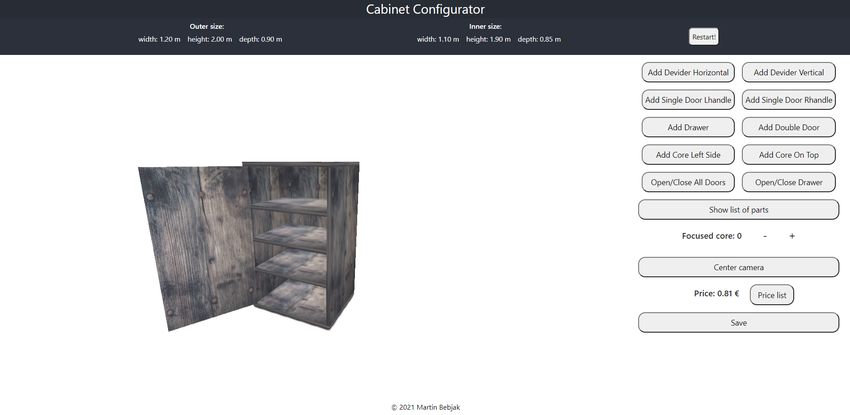
This is where a copy of the official signed thesis assignment and a copy of the
Statement of an Author is located in the printed version of the document.
Declaration
Hereby I declare that this paper is my original authorial work, which
I have worked out on my own. All sources, references, and literature
used or excerpted during elaboration of this work are properly cited
and listed in complete reference to the due source.

                                                      Martin Bebjak

Advisor: Ing. Lukáš Grolig

                                                                    i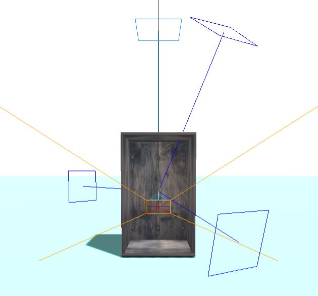
Acknowledgements
I would like to thank my advisor Ing. Lukáš Grolig, for his help, con-
sultations, and feedback.

                                                                    ii
Abstract
The thesis aims to create a cabinet configurator as a web component.
In the first part the thesis describes what the cabinet configurator
web component is. The second part describes technologies used for
application development. The third part describes the implementation,
and the last part describes possible improvements and future use.
iiiKeywords
react, three.js, 3D models, cabinet creator, GraphQL, 3D Web
ivContents
Introduction 1
1 Cabinet 2
1.1 Materials . . . . . . . . . . . . . . . . . . . . . . . . . . . 2
1.2 Material Processing . . . . . . . . . . . . . . . . . . . . . 4
2 Configurator and Web Component 5
2.1 Configurator . . . . . . . . . . . . . . . . . . . . . . . . . 5
2.2 Web Component . . . . . . . . . . . . . . . . . . . . . . 5
2.2.1 Cabinet Configurator Web Component . . . . . 6
3 Used Technologies 7
3.1 JavaScript . . . . . . . . . . . . . . . . . . . . . . . . . . . 7
3.1.1 React . . . . . . . . . . . . . . . . . . . . . . . . . 7
3.1.2 Three.js . . . . . . . . . . . . . . . . . . . . . . . . 8
3.1.3 Typescript . . . . . . . . . . . . . . . . . . . . . . 9
3.2 Hasura Cloud . . . . . . . . . . . . . . . . . . . . . . . . 10
3.2.1 GraphQL . . . . . . . . . . . . . . . . . . . . . . . 10
3.2.2 Postgres . . . . . . . . . . . . . . . . . . . . . . . 10
3.3 HTML . . . . . . . . . . . . . . . . . . . . . . . . . . . . 11
3.4 CSS . . . . . . . . . . . . . . . . . . . . . . . . . . . . . . 11
3.5 Others . . . . . . . . . . . . . . . . . . . . . . . . . . . . 12
4 Application Implementation 13
4.1 Application Components . . . . . . . . . . . . . . . . . . 13
4.1.1 Application Structure . . . . . . . . . . . . . . . 13
4.1.2 Structure . . . . . . . . . . . . . . . . . . . . . . . 17
4.2 Scene Layout . . . . . . . . . . . . . . . . . . . . . . . . . 19
4.2.1 Scene Base . . . . . . . . . . . . . . . . . . . . . . 19
4.2.2 Additional Objects . . . . . . . . . . . . . . . . . 20
4.2.3 Camera Centering . . . . . . . . . . . . . . . . . 21
4.2.4 Model Textures . . . . . . . . . . . . . . . . . . . 21
4.3 Database . . . . . . . . . . . . . . . . . . . . . . . . . . . 21
4.4 User Interface . . . . . . . . . . . . . . . . . . . . . . . . 22
4.4.1 On Start . . . . . . . . . . . . . . . . . . . . . . . 23
4.4.2 Material Picker . . . . . . . . . . . . . . . . . . . 23
v4.4.3 Cabinet Building . . . . . . . . . . . . . . . . . . 24
5 Improvements and Future Use 26
5.1 Possible Improvements . . . . . . . . . . . . . . . . . . . 26
5.2 Usage . . . . . . . . . . . . . . . . . . . . . . . . . . . . . 27
5.2.1 Interior Design . . . . . . . . . . . . . . . . . . . 27
5.2.2 Cabinet Manufacture . . . . . . . . . . . . . . . . 28
5.2.3 Online Store . . . . . . . . . . . . . . . . . . . . . 28
5.2.4 Standalone Application . . . . . . . . . . . . . . 29
6 Conclusion 30
Bibliography 31
viList of Figures
4.1 Diagram of CabinetConfigurator frontend structure 18
4.2 3D Scene 19
4.3 Cabinet with all extra parts. 20
4.4 ERD Diagram of CabinetConfigurator database 22
4.5 Start interface 23
4.6 Material selection interface 23
4.7 Cabinet configurator main page 24
viiIntroduction
Human dwellings are significant. Everyone aims to make their place
of living as pleasant as possible for the residents. Thanks to modern
technologies and the conveniences of the Internet, most of the home
is shared on social networks. This results in the fact that not only com-
fort but also aesthetic appearance plays a significant role in choosing
interior furniture.
During a coronavirus pandemic, when interest in real estate invest-
ments is growing, it is often difficult, sometimes impossible, to visit a
store and choose the ideal piece of furniture there. Online store offers
are often confusing, and illustrative photos are misleading.
This thesis deals with the creation of an Internet component that
will help customers choose furniture. It will give manufacturers the
opportunity to create new and better models.
Specifically, the realized component is a cabinet configurator, an
online tool for modeling and modifying the cabinet. This component
displays the cabinet model in 3D space, and using various tools allows
users to interact with it.
The first part of the thesis is a description of the cabinet, the process
of its manufacture, and the materials, which are used to create it. It
further describes the benefits and features of the configurator. The
second part describes the technologies used to develop this component.
The third part explains the implementation. It starts with front-end
components, which are followed by database and user interface. The
final section offers a list of possible improvements and uses of this
component.
11 Cabinet
A cabinet is a furniture used to store or display items. The cabinet
contains shelves, drawers, or doors. It is commonly used everywhere
and is mass-produced – by big companies like Ikea, CB2, Target, or
Burrow. The creation of a cabinet takes multiple steps:
1. Measure size of the cabinet.
2. Design cabinet.
3. Manufacture cabinet parts.
4. Construct cabinet.
The price depends on size and materials.
1.1 Materials
Wood The most used material for cabinets is wood, mainly because
of its workability, strength, structure, and appearance. While easy to
acquire, wood is hard to maintain mainly because of its vulnerability
to moisture. Protective coatings or thin plastic plates on surfaces are
used to avoid damage [1].
Materials used for wooden cabinets:
• Solid wood
• Particleboard (wood particles held together by adhesives and
compressed to form a board)
• Medium density fiberboard (same as particleboard but instead
of particles, wood fibers are used)
• plywood (slices of wood united with an adhesive, orientation
of slices is varied to increase product stability)
21. Cabinet
Metal The material is used primarily because of its strength, dura-
bility, and low maintenance requirements. While very strong, metal is
volatile to rust. Protective coatings are applied mainly zinc or chrome)
to avoid this chemical process. Because of modern processing, metal
can be very light while still firm. It is mainly used for outside furniture
(can last up to 30 years without the need for maintenance). Metal
cabinets are often used by medical facilities such as hospitals, phar-
maceutical research labs, biosafety labs, and more because they have
excellent bacterial, fungal, chemical, and moisture resistance. They
are recyclable.
Most used metals:
• Steel – It is an expensive, high-quality metal, which keeps very
low maintenance. It can often use chromium coating.
• Stainless Steel – It is very heavy and volatile to rust, is rarely
used, and almost exclusively for garden furniture because of
its look.
• Aluminum – Is most common. Do not rust, but oxidizes. It is
lighter than steel, but has to be thicker to have as much strength.
Synthetic materials Synthetic materials are at this moment the cheap-
est variant. They offer a wide selection of textures and colors, the widest
of all materials. They are very durable, can withstand heavy objects.
On the other hand, these materials are easily damaged, vulnerable
to excessive heat or moisture. Another problem is that synthetic ma-
terial is tough to repair. Once damaged, the only option is to buy a
replacement. They are the least environmentally friendly [1].
Most used synthetic materials:
• Laminate – It is made by the fusion of polymer resins and paper
through heat and pressure.
• Melamine – Used as a cover for particleboard making it wa-
terproof. It is manufactured from melamine resins and paper,
which are fused into sheets.
• Thermofoil – Is a vinyl film also used as a cover for particleboard.
It Is highly susceptible to heat and moisture.
31. Cabinet
1.2 Material Processing
The process of changing raw materials to furniture–in the case of this
work cabinets–can be done by hand, but nowadays, machines do most
of the work. In cabinet manufacturing first step is the production of
planks. Wooden logs are cut into planks–side products and waste
materials are used for particleboards or play woods. Planks are then
cut and shaped into respective cabinet parts. Each part and material
combination usually has a unique code name. At the start, the machine
takes a list of orders—the list of code names of parts. Then planks go
into the machine, which saw the respective shape, and the cabinet part
comes out of the machine. The metal is in the form of metal sheets,
which are then shaped. Synthetic materials are created and shaped
by heat and pressure into boards. After they are made, three more
processes must take place:
• sawing – The board is cut into smaller parts (according to the
parameters of the part they form).
• edging – It is a process in which a protective tape is glued to
the edges of the board. Its appearance is similar or identical to
the appearance of the board.
• doweling – It is a process in which holes are drilled into the
board. The holes are usually at the edges and along the edges
of the board. The pegs are then put into the holes. Two boards
are then connected with pegs.
These parts are then sent with a build manual to the customers, or they
are build and send as a full cabinet. More information about wood
processing can be found in Primary Wood Processing by John C. F.
Walker [2] and about cabinet manufacture in Illustrated Cabinetmak-
ing by Bill Hylton [3].
42 Configurator and Web Component
2.1 Configurator
Configurators can be described as tool kits or design systems. The pri-
mary purpose is to create or configure the desired item. It gives the
user the ability to be part of the production process and helps him
visualize the product. Nowadays, they are mainly utilized as online
web tools -more in Section 2.2- or desktop applications [4]. Configu-
rators enable mass customization, each product can have a different
shape, color, material, but these products can be mass-produced by
machinery. This attribute also allows the build-to-order principle, and
products are not built until the order is placed. In simple words, a
configurator can be described as a middle stage between customer
and manufacturer, which helps the customer customize the product
as wanted and allows the manufacturer to manufacture only ordered
products. It helps the manufacturer with the design of new products
and the calculation of their price. Price is determined according to the
material and parameters of the model created by the configurator.
2.2 Web Component
Web component is a collection of web APIs for the creation of new,
custom, reusable HTML tags. Their functionality is encapsulated from
the rest of the code. They are use-able in web applications, work in
modern browsers. The three main technologies are [5]:
• Custom elements are the base for web components. They are
a set of JavaScript APIs, which define custom elements. Their
usage: in user interface, to create new HTML elements, extend
existing HTML elements [5].
• Shadow DOM (Document Object Model) is added to web ele-
ment. It is rendered separately from the main document object
model, and its features are private, can not run into collision
with the main document [5].
52. Configurator and Web Component
• HTML templates are used to write markup templates, which
are not displayed on the rendered page. They use
and HTML elements. They are the basis of a custom
element structure. Templates are used for reuse-able HTML
code, which is shown after users input and not immediately [5].
With web components, web development was significantly simpli-
fied. Their main advantage to the full web is reuse-ability. A single
component can be used in countless websites without conflicts with
other codes. A simple example can be a login form. For example one
login component can be used in many sites which need authentication.
2.2.1 Cabinet Configurator Web Component
It is a web component for configuration of cabinets. This component
can create cabinets with drawers, dividers and doors. It shows the
cabinet in 3D space and calculates its price.
It provides options to choose cabinet material. The customer is
able to create a cabinet according to his needs while having the price
in check. He can also check the price of individual parts. These can
be displayed thanks to the priceList feature. The configurator can
generate a list of cabinet parts, generally with default naming. The
name of the parts is set in code. Still, it can be changed to another
value decided by the operator of this component so that the machine
cutting and shaping materials could take information directly from
this component. The size of the part is included in this list.
The component has multiple uses such as part of the order system,
or design tool (more in Section 5.2).
63 Used Technologies
3.1 JavaScript
JavaScript (further referred to as JS) is an object-oriented program-
ming language. It is primarily known as a scripting language for web
development. It runs on the client side and is used to handle events
and to control the behavior of the web. Word “Java” in the name of this
language was used for commercial purposes. JS is not similar to Java,
although Java and C++ inspired its syntax. It supports prototype-
based object construction. The created object can be a prototype for
other objects. It can also work as a procedural language [6]. Currently,
2nd May 2021, JS has 1,444,231 libraries [7], and new ones are being de-
veloped. It has become the most widely used programming language
and the primary tool for front-end development.
3.1.1 React
React is a JavaScript library for the development of user interfaces [8].
It was developed by Facebook and is used in many websites (e.g.,
Facebook, Instagram, WhatsApp, Uber). Similar libraries are Angular
and Vue. The author decided to use React because, thanks to support
from Facebook, long-term stability and development are expected, and
he has previous experience with React. React declares states, which,
when updated, are rendered by React. It uses a component-based
system, where each component is an independent part. Components
manage their own state and together create a user interface. There are
two types of components:
Class component Also known as the Stateful component. This com-
ponent extends the “React.Component” class and is a regular ES6 class,
JavaScript simulation of inheritance [9]. Class component proprieties
(from now on referred to as props) are declared in the parent compo-
nent and can not be changed. The state is declared in the constructor,
is necessary if the component has any state, and can be changed in-
side the component. The component requires a render method, which
73. Used Technologies
needs return with an HTML element. Props and state are accessed
with “this” preposition (this.props.name and this.state.name) [10].
Functional component Also known as the Stateless component. It
is a JavaScript function, which returns HTML. Props are declared
in parent component and can not be changed, does not have state.
State in functional components can be replaced with hooks. Hooks
are functions, which let the programmer simulate the state life-cycle
and can not be used in class components [11]. Functional components
are used because they are more general, easier to read and test, and
have less code [10].
The best way to start with React is to download and install Nodejs
and run command npx create-react-app [name]. This will create a
directory structure for the website frontend with a default setup. It is
possible to change this setup according to template, with --template
[template-name] switch. One of the popular templates is typescript.
The --use-npm command will select npm1 as a default package man-
ager instead of yarn2 , which is default. When everything is set, an
open directory with the application in preferred IDE3 and start coding.
Then npm start opens React project in web explorer, and npm run
build builds application to the build folder [12].
Apollo Client – JavaScript library for management of remote and
local data with GraphQL.
3.1.2 Three.js
Three.js is an open-source JavaScript library and API4 . This library is a
general 3D library, which is easy-to-use and cross-browser compatible.
It uses mainly WebGL renderer. The source code is on GitHub[13].
Three.js let developers create their own 3D objects or load existing
3D objects from external sources. It is added to websites as a part of
1. node package manager
2. package and project manager, see https://yarnpkg.com/
3. Integrated Development Environment
4. Application Programming Interface
83. Used Technologies
HTML in tag into which the DOM5 created by rendering6 is
inserted.
A common approach is first to create a scene into which a cam-
era is added, and then objects and lights. The scene is then rendered
repeatedly after each change. Common geometries are already rep-
resented in the library as independent classes (e.g., BoxGeometry,
SphereGeometry), but it is possible to create custom shapes using
BufferGeometry, ShapeGeometry classes. These shapes are inserted
together with the material as parameters for the Mesh class, which
creates an object according to the geometry and material, which is
then added to the scene using the add method. Lights are also added
to the scene. There are several types. For beginners, it is ideal to use
HemisphereLight for its simplicity and clarity. The final step is to cre-
ate an animation loop. The simplest example [14]:
function animate () {
requestAnimationFrame ( animate ) ;
renderer . render ( scene , camera ) ;
}
animate () ;
More information about Three.js can be found in a detailed and
high-quality documentation [14].
3.1.3 Typescript
Typescript is an open-source language that is an extension of Javascript
by adding static type definitions and other OOP7 attributes. The type-
script code is compiled into JavaScript. Therefore any code written in
JavaScript is valid in typescript as well, but type errors can be encoun-
tered. Typescript files have the extension .ts and .tsx instead of .js
ans .jsx which is used for JavaScript files. It allows the programmer
to define custom data types, interfaces, classes. It also supports the
use of generics, for example Array. The main advantage of
typescript is typing, which makes understanding the code easier and
speeds up the process of finding and correcting errors [15].
5. Document Object Model
6. process of generating object from 3D or 2D model
7. Object Oriented Programming
93. Used Technologies
3.2 Hasura Cloud
Hasura cloud is a service that offers secure data access using the
GraphQL API. It was created by Hasura Inc. based on their Hasura Pro
project. It is the GraphQL engine that helps generate GraphQL queries,
mutations, and subscriptions while taking care of safety, performance,
and reliability.
Hasura cloud allows monitoring and tracking of data, connections,
events, actions. It also supports query and dynamic data caching. Us-
ing rate limiting prevents DoS attack8 and abuse of the GraphQL API.
Teamwork is also supported. Each member has their own login with
defined privileges (run GraphQL queries, view analytics, and metrics,
manage team members). The Hasura website offers a number of tutori-
als, so even beginners will quickly become familiar with the operation
of the service. With the Docker service, it is also possible to use the
Hasura cloud locally. So far, only the Postgres database (described
in Section 3.2.2) is supported. After connecting the database to this
service, a console is available. It offers precise work with data, creat-
ing, editing, deleting, linking tables in the database. Hasura cloud is a
service that makes backend development simple and clear [16].
3.2.1 GraphQL
GraphQL is a query language and a new, more flexible, and efficient
alternative to the REST API9 that has become the standard in creating
web APIs. It uses queries to request data, mutations to create, edit
and delete data, and subscriptions to track data. They all send a query
to the server with their requests and wait for a response. In case of
success, they return the required return. Otherwise, an error is thrown.
Even mutations that do not return data must contain a return value,
most often the id of the affected elements.
3.2.2 Postgres
Postgres (or PostgreSQL) is an open-source object-relational database
system. It has been developed for over 30 years, during which it has
8. Denial of Service (too many requests)
9. Representational State Transfer Application Programming Interface
103. Used Technologies
gained a strong reputation, thanks to its architecture, reliability, data
integrity, and large open source community. It uses and extends SQL10
and safely stores complicated data. It runs on all major operating
systems. Thanks to high extensibility, developers can define their own
data types, build custom functions. Another advantage is complex
documentation [17].
3.3 HTML
HTML (Hypertext markup language) is a markup language used to
create web pages.
HMTL defines the structure of the page. It uses elements for this,
they are usually formed by two tags (opening and closing) between
which the content of the element is defined. Each element indicates
to the browser something about its content. Each html document
starts with a element. Important is the element, which
contains information about the content of the page, and the
element, which contains the real content of the page. Example:
< html >
< head >
< title > Name of web page
< body >
This is the main Heading
Some paragraph text
3.4 CSS
CSS (Cascading Style Sheets) is a language used to define the display
of website content. Together with HTML, they form the basis of web
design.
CSS defines how individual HTML elements will be displayed. It
describes the layout of elements on a page, background colors, text col-
10. Structured Query Language
113. Used Technologies
ors, font, and other visual properties of the elements. It can be written
as part of an HTML element , or in a separate document with the .css exten-
sion. From the CSS point of view, each element is perceived as a box for
which it defines what it will look like. It can define the arrangement
of the inner elements (horizontal or vertical). It does not affect the
content and order of the elements, and it is defined in HTML [18].
There are many external resources with ready-made CSS templates.
One of the most popular is the free and open-source framework boot-
strap. Its templates are often used, so the look of web pages is often
similar. This creates a kind of “standard” that users are used to and is
easy for the programmer to implement.
3.5 Others
These are some of the less significant but necessary parts of the cabinet
configurator project technologies.
Docker – It is an open platform for deployment of applications inside
containers. The project uses it to run individual parts of the program
(front-end, database, Hasura cloud) in separate containers.
Node.js – It is a popular JavaScript run time environment. It is used
to create the environment and install the libraries needed to run the
application.
GitLab – It is a web Git repository similar to GitHub. Thanks to
GitLab, both the author and the advisor had access to the developed
code from any machine with access to the internet.
124 Application Implementation
This chapter will describe the implementation of the cabinet configu-
rator application. The first part describes the React components, their
content, and structure. The following section deals with the 3D scene
part of the application and the layout of objects in it. Next will be
a description of the database, its data, and tables. The last part is a
description of the user interface.
4.1 Application Components
4.1.1 Application Structure
This section will explain the individual React components from which
the application is built. It summarizes their states and props and how
they affect the content of the page.
App and index – Default components that serve as the basis of the
React application. In index, App is rendered into ReactDOM. App is
the root component of the application.
Header, Footer – Basic components, the header contains the name
of the application and is located at the top of the page. The Footer
contains the author’s copyright and is at the bottom.
Main – This component contains the main content of the page. De-
cides which components will be displayed, using the following states:
• started – It is boolean value with information if necessary fields
have been filled.
• cabinet parameters – 4 states with cabinet data (width, height,
depth, material).
The NavigationBar is always displayed at the top of the main. If started
is false, nothing else will be displayed. Otherwise, it displays Materi-
alListQuerry and, when the material is selected, hides it and displays
CabinetCore.
Apollo client for database connection is created in main.
134. Application Implementation
NavigationBar – This component first acts as a filling form for in-
formation about the cabinet (height, width, depth). Once filled, they
are stored in states. After the start button is pressed, it displays this
information and offers the option to restart the application. Its only
prop is the Main component so that the content of the page can be
adjusted according to the current state of the NavigationBar. It is hid-
den (empty HTML tag is returned) when selecting a material in the
MaterialsListQuerry.
MaterialsListQuerry – This component retrieves all materials data
from a database, using this GraphQL querry:
query MaterialsQuerry {
materials ( order_by : { thickness :
asc_nulls_last }) {
description
id
price
textureLink
thickness
}
}
MaterialsList – It gets a data array as a prop and, using the map
function, passes individual elements to the Material component. Then
renders a list of Material components.
Material – It gets single material information and renders it in a
user-friendly fashion with a button. This button allows the user to
choose this material as a material for the cabinet. Once selected, it
adjusts the material state in the Main component.
CabinetCore – It is the most significant component in the applica-
tion. As props, all pieces of information about the cabinet from Main,
which must first be obtained from the NavigationBar and the Material
component (only then is the component rendered), are received. It
144. Application Implementation
consists of a 3D scene where the cabinet is displayed and buttons for
editing it.
The props used are:
• width (number), height (number), depth (number), thickness
(number)– cabinet parameters data
• material (THREE.MeshStandardMaterial), materialId (num-
ber) – cabinet material data
• price (number) – price for 1 m2 of material
These props are mainly used in the ComponentDidMount function,
in which a 3D scene is created with the basic skeleton of the cabinet.
The CabinetCore component has the following states:
• scene (THREE.Scene) – 3D scene object
• cabinet (THREE.Object3D) – A 3D object containing the en-
tire cabinet model, individual parts are added to it during the
application run.
• width (number), height (number) – hold information about
cabinet width an height, which can change during application
run.
• other states – boolean and number states used for handling
pop-up modals.
The states of this component are used to edit the 3D scene and the
cabinet model in it. They are also used in functions that manage events
that occur.
It manages the 3D scene, controls the movement of the camera
in the scene, the relocation of parts of the cabinet, and their removal.
In addition to 3D scenes and events, it also renders various Modal
components (see Section 4.1.1). It obtains the necessary additional
information from them or uses them to display information according
to the event triggered by the application. Finally, it renders the Save
component, to which it passes the entire cabinet object.
154. Application Implementation
Save – It has a 3D cabinet object and a material id like props. These
are stored in the database in case of a save event. This event also
triggers a modal component with a decision to continue working or
start over.
Modal – This component acts as a pop-up window. When active, it is
not possible to interact with other components. From the component
in which it is rendered, it receives a function that is executed after it
is closed (close anchor is pressed). In addition, it may receive HTML
code to display as part of it.
Cabinet part components – The following components are used to
create parts of the cabinet, which are then added to the 3D scene. Their
return value is an empty HTML element. In the states, the 3D object
of the cabinet part and its price are stored.
• Core – An empty cabinet core is created here. If it is not the
primary core, it takes into account the shared walls. The object
is created by five Box geometries.
• DoubleDoor – Openable double door, consisting of two boxes
and two sphere geometries.
• SingleDoor – Openable single door, consisting of boxes and
sphere geometry. With the option to choose the side on which
the handle will be.
• Drawer – Drawer created from five boxes and one sphere geom-
etry. It is possible to move it in the scene. The height is obtained
from the modal component.
• HorizontalDevider and VerticalDevider – Box geometry that
is movable in a scene. Two different components, one for vertical
and the other for horizontal orientation of divider.
All cabinet component parts take as props all material data and
parameters that are either calculated from the core into which they
are inserted or are obtained from user input.
164. Application Implementation
4.1.2 Structure
The components in this application are functional independently, but
thanks to their interconnection, they create a complete application.
This section will describe the structure and connections of individual
components. Figure 4.1 shows a diagram of the structure of the React
components in this project.
Starting from the top, the App component renders the Header,
Footer, and Main components. Since these components have no props,
the App does not have to pass any parameters to them. Header and
Footer do not render any other components.
Main renders the NavigationBar, giving it a reference to itself as a
parameter. It then decides according to its states whether it renders
MaterialsListQuerry, or CabinetCore, or none of them (mentioned in
Section 4.1.1). MatrialsListQuerry gets a reference to Main as a param-
eter, CabinetCore gets all the cabinet parameters (width, height, depth,
thickness, material, price, materialId). NavigationBar does not render
other components. It changes the state of Main using the reference.
MaterialsListQuerry renders MaterialsList, giving a reference to Main
and raw material data. The MaterialsList then renders the Material,
with a link to the Main and the parsed data as parameters. Material
only changes the state of the Main.
CabinetCore renders Save and Modal. The parameters given to
the Save component are the cabinet model as THREE.Object3D and
the id of the material from which the cabinet is created. Modal gets
function and HTML element. CabinetCore also uses all cabinet part
components. They are not rendered. They are just created, and from
their states, mainly a 3D object of a given part is used. Save renders
Modal, pass it the same props as CabinetCore. Neither Modal nor
CabinetParts render other components.
174. Application Implementation
Figure 4.1: Diagram of CabinetConfigurator frontend structure
184. Application Implementation
4.2 Scene Layout
The next part will deal with the 3D scene in which the cabinet is
displayed. It will describe the basis of the scene, its objects and shows
some code snippets.
4.2.1 Scene Base
The base scene is created in the CabinetCore component in the Com-
ponentDidMount function, which is called automatically after the
component is rendered. The scene occupies more than half of the page
area. It has a white background and is shown in Figure 4.2b.
As a basis, a plain mesh is added to it, which serves as a floor on
which the cabinet stands and casts a shadow. It is white as well as the
background. Next, four lights are added, three with an intensity of
1, the leading lights, creating a shadow of the cabinet, and one with
an intensity of 0.5, ensuring sufficient brightness. An empty cabinet
base is also added. The scene is rendered using PerspectiveCamera.
Its field of view and aspect are set at initialization. Its position is
calculated according to the size of the cabinet. It can be changed using
OrbitControls. Its movement is restricted, and panning is disabled.
(a) Scene with object helpers. (b) Scene base
Figure 4.2: 3D Scene
194. Application Implementation
All parts of the scene base are in Figure 4.2a. The camera is repre-
sented by a red cross, with orange lines defining the field of view and
a white line indicating the direction of the camera’s view. Directional
lights are shown in dark blue. The square indicates their position,
and the line shows the direction in which they shine. Light blue is an
additional light of lower intensity. Plane geometry is white, but for
illustration, it is colored into light turquoise in this Figure.
4.2.2 Additional Objects
Figure 4.3: Cabinet with all extra parts.
In addition to the base, parts of the cabinet (drawers, dividers,
and doors) can be added to the scene (like in Figure 4.3). They are
made up of one or more meshes. DragControls are used to move
them around the scene. The doors are immovable, the drawers and
204. Application Implementation
horizontal dividers can be moved up and down, the vertical dividers to
the right and left. Individual parts can be removed by double-clicking.
4.2.3 Camera Centering
By default, the camera is in front of the cabinet, as shown in Figure 4.2a.
However, the cabinet object changes its size, so the position of the
camera also has to changes. The camera pan is disabled. Its position is
calculated automatically each time the size of the cabinet is changed
or when the centering button is pressed using the formulas:
• When the ratio of the width of the camera field of view to
the cabinet width is greater than the ratio of the height of the
camera field of view to the cabinet height:
z = (h/2 + n) ∗ sin(π ∗ 55/180)/sin(π ∗ 35/180)
Where h is the height of the cabinet, and n is offset constant (so
that there are also pieces of the background on the edges).
• Otherwise:
z = (w/2 + n) ∗ sin(π/2 − ( f /2))/sin( f /2)
Where w is the width of the cabinet and n is offset constant, and
f is the width of the field of view.
The formulas for z were derived from the official three.js forum [19].
The position of x is calculated as a center of cabinet width, and y is
the center of its height, so the camera captures whole cabinet model.
4.2.4 Model Textures
Textures for the cabinet model are loaded using the textureLoader
object, part of the three.js library. It takes an URL as a parameter of its
load function. Material texture URLs are stored in a database.
4.3 Database
This project works with a Postgres database using the Hasura cloud
service. There are two tables in the database. The first is materials. It
214. Application Implementation
contains materials from which it is possible to create a cabinet. It has
the following columns:
• id - Is the primary key, unique for each material. It is of the
integer type.
• price - A numeric value describing the price of the material per
cubic meter.
• thickness - Integer value of the material thickness.
• textureLink - String with a URL link to the material texture.
• description - String with the name of the material.
The second cabinet table is used to store cabinets created in the appli-
cation. It consists of the following columns:
• id - Is the primary key, integer type, unique for each cabinet.
• model - It is a JSON object that describes the entire 3D model
of the cabinet created in the application.
• materialsId - It is a foreign key. It contains the id of the material
that was used on the cabinet.
The ERD-Diagram of the database is shown in Figure 4.4.
Figure 4.4: ERD Diagram of CabinetConfigurator database
4.4 User Interface
This chapter will describe the user interface and the possibilities of
user interaction with the environment.
224. Application Implementation
4.4.1 On Start
In the beginning, the UI1 is very small. One line with the name of
the application and a line with a form for filling in the parameters
(width, height, depth) of the cabinet. The form is initialized with
default values: width 120 cm, height 200 cm and depth 50cm. Behind
it is a start button.
Figure 4.5: Start interface
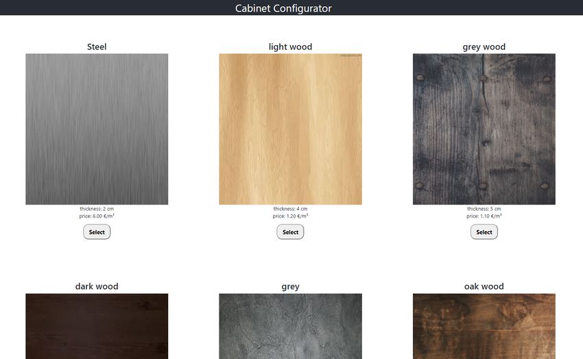
4.4.2 Material Picker
After filling in the form of clicking on the start, the user will be shown
a selection of materials. Each material has a displayed name, texture
(material image), thickness, price, and finally, a select button.
Figure 4.6: Material selection interface
1. User Interface
234. Application Implementation
4.4.3 Cabinet Building
After selecting the material, the main page is available to the user. At
the top, under the site name, there is a specification bar, which shows
the parameters of the cabinet. On the left are the outer parameters, on
the right are the inner ones. To the left of them is the restart button.
Below them are two parts. On the left is a 3D scene (described in 4.2),
and on the left are buttons. These are divided into four parts. At the
top, there are six buttons for adding parts to the cabinet. Next, display
a list of cabinet parts and a list of prices for individual parts. When
pressed, a pop-up window will appear with the information. Finally,
there is a save button.
Figure 4.7: Cabinet configurator main page
The application sets reasonable limits for the user. Inputs from him
for which the cabinet could not be created are blocked. The application
is set for a maximum size of 650 * 350 * 150 cm.2 The maximum height
is set at 3.5 m because it is the height of old houses with high ceilings.
The width is set at 6.5 m to allow kitchen cabinets creation. These
values are stored in the code as constants and can be changed. They
can be set differently in different application versions. The cabinet
boundary can be set differently for the developer in the company than
2. width: 600 cm, height: 350 cm, depth: 150 cm
244. Application Implementation
for the customer using the website. It also blocks the insertion of parts
that are mutually exclusive in one core (e.g., drawer and door).
255 Improvements and Future Use
The application was created without cooperation with potential cus-
tomers. Their comments can improve the application and move it
to higher quality and usability. Feedback from users would help in
finding potential bugs, improving the user interface, and possibly
extending the functionality.
5.1 Possible Improvements
1. Current Database – In cooperation with companies producing
cabinets, the database of materials would be expanded accord-
ing to offers from material dealers. This would help expand the
possibilities for users. In the database of cabinets, depending on
the needs of companies, there could be a possible reduction and
saving of stored data or an extension of the columns needed to
record orders.
2. Database extension – Add a table with finished cabinets that
could serve as a basis for modifications or as a finished product.
The user would not have to start from an empty cabinet, just
modify existing popular pre-created cabinets.
3. Model loading – The entire 3D cabinet model is stored in the
database. Adding the ability to load saved models would al-
low for a breakdown of cabinet modeling work. The usage of
pre-modeled cabinets, or the possibility of the development
continuation in an unfinished project of another person, would
reduce the time and effort required for the user to create the
desired cabinet.
4. User Interface – The UI can be customized based on customer
and user requirements. Change of the color palette, arrange-
ment of components, and their elements. Customize the visual
part of the application to the rest of the page on which it will be
used. The addition of pictures to the buttons for adding parts
of the cabinet to the scene or a visual display of parts and the
option to drag and drop them to the scene would improve UI.
265. Improvements and Future Use
5. Other furniture – Since the application already works with the
database of materials, it is possible to create configurators for
other furniture than the cabinet. Similar are, for example, office
desks and hanging shelves. Their development would expand
the functionality and use of the application.
6. Custom parts – Creating a table in the database for 3D models of
custom parts for a greater variety of cabinet parts. The created
models would fall into some already created categories (doors,
drawers, handles, dividers), according to which it would have
defined position limitations, possible displacements, detection
of collisions with other parts, and interactions with the rest
of the environment. The custom parts could also serve as in-
spiration to expand the assortment for companies using the
component on their sites.
7. Scene editing – At this current stage, the scene is very simple
and singular, with no other objects than the cabinet. For a better
appearance, the scene could be customized according to the
users’ feedback. The addition of a back wall, lighting objects,
and other interior-like elements could positively affect the over-
all impression of using the application. Adding the possibility
to switch between scenes where the cabinet model would re-
main the same, but the environment around it would change
(e.g., office, living room, kitchen, blank).
5.2 Usage
This chapter describes the possible uses of the Cabinet configurator
web component. It is expected to be used as a part of the web pages
of companies producing furniture or web pages for creating graphic
designs of interior spaces.
5.2.1 Interior Design
3D models of cabinets created in the program can be used as part of
larger software for interior display. Such an application would work
275. Improvements and Future Use
with a cabinet table in a database, from which it would insert the
created models into a larger scene.
Possible problems, which can occur and their solutions:
• The size of the model from the cabinet configurator would
be in different units of length than the whole interior model.
For adjustment, it would be necessary to correct the parsing
of inputs, outputs, and possible necessary adjustment of the
position of non-cabinet parts of the scene.
• The cabinet model can be stored with open doors and drawers.
Such a model would be disturbing. The solution is to run the
function to close doors and drawers if they are open when
saving to the database.
5.2.2 Cabinet Manufacture
In cabinet manufacture, the primary application use is the function to
generate a list of parts, which the cabinet is created from. In the case
of manual production, this list can be used to purchase boards from
which the cabinet is made. For machine production, it is possible to
name each board in the cabinet in its own name (naming by machine
designation, mostly bar code). Simple software that would parse a list
of named parts and their sizes and return a list that a board processing
machine would be able to process and then cut parts of the exact
size and type. This method could simplify the production of custom
cabinets.
5.2.3 Online Store
The application calculates the price according to the amount of mate-
rial needed. This functionality can be used as part of web stores, where
it offers the customer the opportunity to build their own cabinet while
constantly informing him about the price. The page in which it would
be used would take care of processing the price list and adding it to
the virtual cart. After confirming the order, a production request will
be sent according to the part list.
285. Improvements and Future Use
5.2.4 Standalone Application
Cabinet configurator can also serve as a standalone application. It
would be used to create and display cabinet designs. Created 3D mod-
els would serve as samples. They would help companies decide on
the correct design of products, which they would then produce. The
application would be design software for cabinet producing compa-
nies.
296 Conclusion
This thesis dealt with the implementation of the cabinet configurator
web component. The first part describes the cabinet, the materials used
for its production, and its processing. Next, in the first chapter, we will
find a description of web components and configurators. The second
chapter describes the technologies used to develop the component.
The third chapter is about implementation, starting with the front-
end, describing the created React components. Then the database is
described, and the last part shows the user interface. The last chapter
describes possible improvements and use of the application.
The application development was a complicated process, as the au-
thor did not have much experience with 3D graphics and the JavaScript
library three.js. After the author familiarized with used frameworks, a
web component that can be used in a web environment and meets the
required functionality was created. The use is expected on the small
companies’ websites that can not afford the development of their own
application. After the first deployment, bug fixes and functionality
improvements, according to user requirements, are expected. The re-
sulting component can be a common part of a design or furniture
website.
30Bibliography
1. A Rundown of Common Materials for Kitchen Cabinet [online]. Cab-
inets City, 2018-06-27 [visited on 2021-04-22]. Available from:
https://cabinetscity.com/a-rundown-of-common-materials-
for-kitchen-cabinet-materials/.
2. WALKER, John C. F. Primary Wood Processing: Principles and Prac-
tice. 2nd ed. Springer-Verlag New York Inc., 2006. isbn 1402043929.
3. BILL, Hylton. Illustrated Cabinetmaking: How to Design and Con-
struct Furniture That Works. Fox Chapel Pub Co Inc, 2008.
4. What is a Desktop App? [Online]. V2 Cloud Solutions, Inc. [vis-
ited on 2021-04-28]. Available from: https : / / v2cloud . com /
glossary/what-is-a-desktop-app.
5. Web Components [online]. MDN Web Docs [visited on 2021-04-
26]. Available from: https : / / developer . mozilla . org / en -
US/docs/Web/Web_Components.
6. About JavaScript [online]. MDN Web Docs, 2021-03-29 [visited
on 2021-04-21]. Available from: https://developer.mozilla.
org/en-US/docs/Web/JavaScript/About_JavaScript.
7. JavaScript homepage [online]. JavaScript.com, 2016/2021 [visited
on 2021-04-29]. Available from: https://www.javascript.com/.
8. React [online]. Facebook Inc., 2013/2021 [visited on 2021-04-27].
Available from: https://reactjs.org/.
9. FRANCOIS, beaufort; POSNICK, jeff. Classes (ES6) Sample [on-
line]. GitHub, Inc. [visited on 2021-04-26]. Available from: https:
//googlechrome.github.io/samples/classes-es6/.
10. BHANDARI, bikash. React Functional Components VS Class Com-
ponents [online]. wesionaryTEAM [visited on 2021-04-27]. Avail-
able from: https : / / medium . com / wesionary - team / react -
functional-components-vs-class-components-86a2d2821a22.
11. React [online]. Facebook Inc. [visited on 2021-04-27]. Available
from: https://reactjs.org/docs/hooks-overview.html.
31BIBLIOGRAPHY
12. Getting Started [online]. Facebook Inc., 2020-07-02 [visited on
2021-04-27]. Available from: https://create-react-app.dev/
docs/getting-started/.
13. Threejs source code [online]. GitHub, Inc., 2010/2021 [visited on
2021-04-29]. Available from: https : / / github . com / mrdoob /
three.js/tree/master.
14. Getting Started [online]. three.js authors, 2010/2021 [visited on
2021-04-12]. Available from: https://threejs.org/docs/.
15. Typescript homepage [online]. Redmond, Boston, SF & Dublin:
Microsoft, 2012/2021 [visited on 2021-04-18]. Available from:
https://www.typescriptlang.org/.
16. Hasura Cloud [online]. Hasura Inc., 2021 [visited on 2021-03-28].
Available from: https://hasura.io/cloud/.
17. Postgresql homepage [online]. The PostgreSQL Global Develop-
ment Group, 1996/2021 [visited on 2021-04-17]. Available from:
https://www.postgresql.org/.
18. DUCKETT, Jon. HTML and CSS. 1st ed. New York, United States:
John Wiley & Sons, 2011. isbn 1118008189.
19. Camera Zoom To Fit Object [online]. threejs.org [visited on 2016-
01-04]. Available from: https://discourse.threejs.org/t/
camera-zoom-to-fit-object/936.
32You can also read


