CHAPTER 12: LINEAR REGRESSION AND CORRELATION - Cabrillo College
←
→
Page content transcription
If your browser does not render page correctly, please read the page content below
CHAPTER 12: LINEAR REGRESSION AND
CORRELATION
 A vacation resort rents SCUBA equipment to certified divers. The resort charges an
Exercise 1. up-front fee of $25 and another fee of $12.50 an hour.
 What are the dependent and independent variables?

Solution dependent variable: fee amount; independent variable: time

Exercise 2. A vacation resort rents SCUBA equipment to certified divers. The resort charges an
 up-front fee of $25 and another fee of $12.50 an hour.

 Find the equation that expresses the total fee in terms of the number of hours the
 equipment is rented.

Solution y = 25 + 12.50x

Exercise 3. A vacation resort rents SCUBA equipment to certified divers. The resort charges an
 up-front fee of $25 and another fee of $12.50 an hour.

 Graph the equation from Exercise 12.2.

Solution

 A credit card company charges $10 when a payment is late, and $5 a day each
Exercise 4. day the payment remains unpaid.

Solution y = 10 + 5x
A credit card company charges $10 when a payment is late, and $5 a day each
Exercise 5. day the payment remains unpaid.
 Graph the equation from Exercise 12.4.

Solution

Exercise 6. Is the equation y = 10 + 5x – 3x2 linear? Why or why not?

Solution No, the equation is not linear because there is an exponent greater than one, and
 the graph is therefore not a straight line.

 Which of the following equations are linear?
Exercise 7. a. y = 6x + 8
 b. y + 7 = 3x
 c. y – x = 8x2
 d. 4y = 8

Solution y = 6x + 8, 4y = 8, and y + 7 = 3x are all linear equations.

Exercise 8. Does the graph show a linear equation? Why or why not?

Solution No, the graph does not show a linear equation because the graph is not a straight
 line.

Exercise 9. Table 12.26 contains real data for the first two decades of AIDS reporting
 Year #AIDS cases diagnosed #AIDS deaths
 Pre-1981 91 29
 1981 319 121
 1982 1,170 453
 1983 3,076 1,482
 1984 6,240 3,466
 1985 11,776 6,878

 1986 19,032 11,987
 87 28,564 16,162
 1988 35,447 20,868
 1989 42,674 27,591
 1990 48,634 31,335
 1991 59,660 36,560
 1992 78,530 41,055
 1993 78,834 44,730
 1994 71,874 49,095
 1995 68,505 49,456
 1996 59,347 38,510
 1997 47,149 20,736
 1998 38,393 19,005
 1999 25,174 18,454
 2000 25,522 17,347
 2001 25,643 17,402
 2002 26,464 16,371

 Total 802,118 489,093
 Use the columns "year" and "# AIDS cases diagnosed. Why is “year” the
 independent variable and “# AIDS cases diagnosed.” the dependent variable
 (instead of the reverse)?

 The number of AIDS cases depends on the year. Therefore, year becomes the
Solution independent variable and the number of AIDS cases is the dependent variable.

 A specialty cleaning company charges an equipment fee and an hourly labor fee.
Exercise 10. A linear equation that expresses the total amount of the fee the company charges
 for each session is y = 50 + 100x.
 What are the independent and dependent variables?
The independent variable (x) is the number of hours the company cleans. The
Solution dependent variable (y) is the amount, in dollars, the company charges for each
 session.

Exercise 11. A specialty cleaning company charges an equipment fee and an hourly labor fee.
 A linear equation that expresses the total amount of the fee the company charges
 for each session is y = 50 + 100x.

 What is the y-intercept and what is the slope? Interpret them using complete
 sentences.

 The y-intercept is 50 (a = 50). At the start of the cleaning, the company charges a
Solution one-time fee of $50 (this is when x = 0). The slope is 100 (b = 100). For each
 session, the company charges $100 for each hour they clean.

 Due to erosion, a river shoreline is losing several thousand pounds of soil each
Exercise 12. year. A linear equation that expresses the total amount of soil lost per year is y =
 12,000x.
 What are the independent and dependent variables?

 The independent variable (x) is the number of years gone by. The dependent
Solution variable (y) is the amount of soil, in pounds, the shoreline loses each year.

Exercise 13. Due to erosion, a river shoreline is losing several thousand pounds of soil each
 year. A linear equation that expresses the total amount of soil lost per year is y =
 12,000x.

 How many pounds of soil does the shoreline lose in a year?

Solution 12,000 pounds of soil

Exercise 14. Due to erosion, a river shoreline is losing several thousand pounds of soil each
 year. A linear equation that expresses the total amount of soil lost per year is y =
 12,000x.

 What is the y-intercept? Interpret its meaning.

 The y-intercept is zero. This means that there was no fixed amount of soil that
Solution was lost before erosion began, which makes sense because the river shoreline
 wouldn’t lose any soil if there were no erosion occurring.

 The price of a single issue of stock can fluctuate throughout the day. A linear
Exercise 15. equation that represents the price of stock for Shipment Express is y = 15 – 1.5x

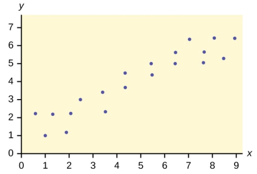
where x is the number of hours passed in an eight-hour day of trading.

 What are the slope and y-intercept? Interpret their meaning.

 The slope is -1.5 (b = -1.5). This means the stock is losing value at a rate of $1.50
Solution per hour. The y-intercept is $15 (a = 15). This means the price of stock before the
 trading day began was $15.

Exercise 16. The price of a single issue of stock can fluctuate throughout the day. A linear
 equation that represents the price of stock for Shipment Express is y = 15 – 1.5x
 where x is the number of hours passed in an eight-hour day of trading.

 If you owned this stock, would you want a positive or negative slope? Why?

 If I owned the stock, I would want a positive slope, because that would mean the
Solution value was increasing, and I would be

 gaining money. A negative slope means I would be losing money.

Exercise 17. Does the scatter plot appear linear? Strong or weak? Positive or negative?

Solution The data appear to be linear with a strong, positive correlation.

Exercise 18. Does the scatter plot appear linear? Strong or weak? Positive or negative?
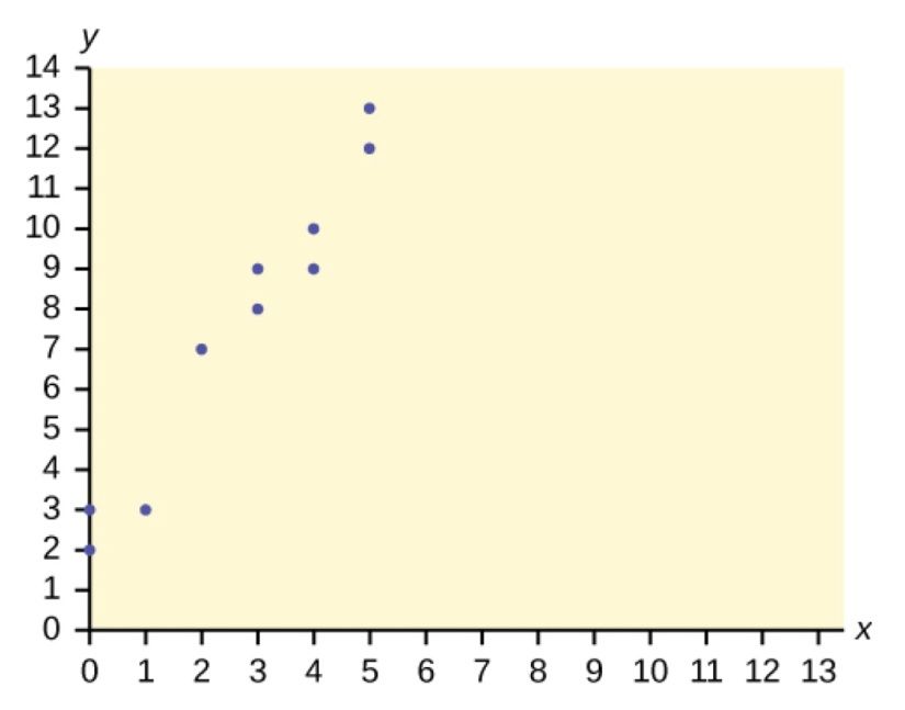
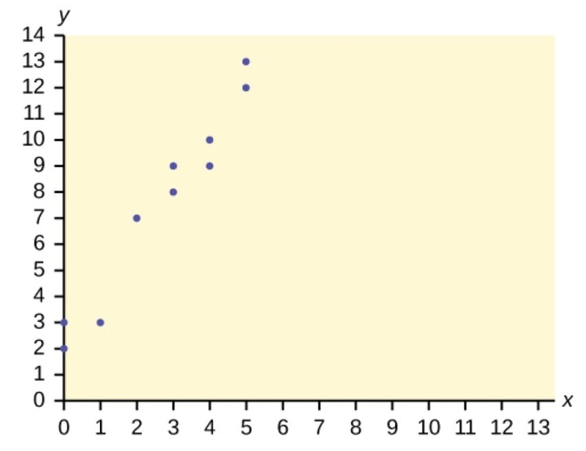
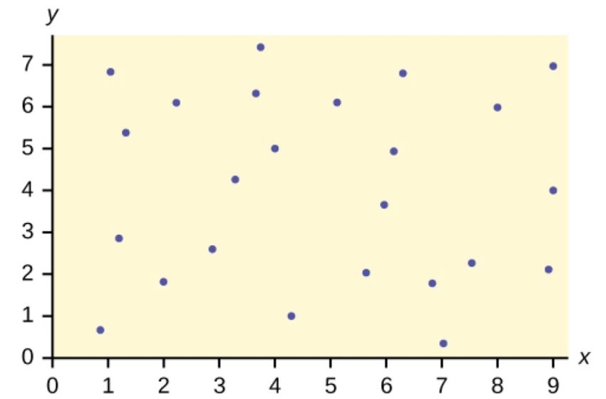
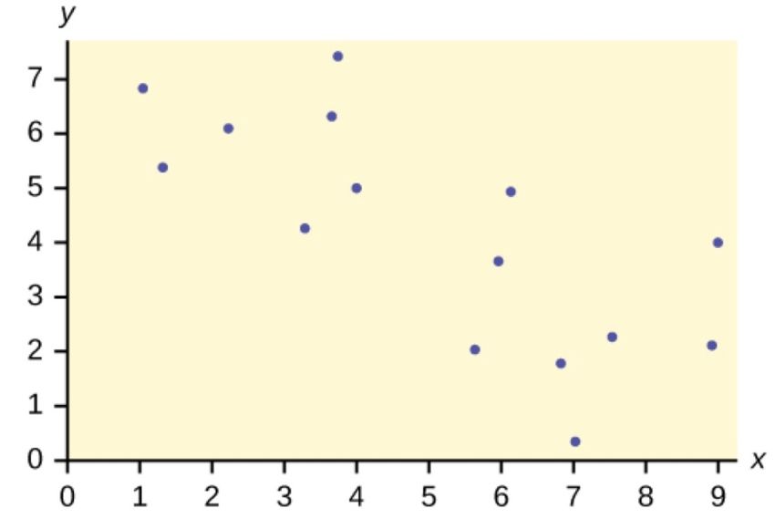
Solution The data appear to be linear with a weak, negative correlation.

Exercise 19. Does the scatter plot appear linear? Strong or weak? Positive or negative?

Solution The data appear to have no correlation.

 A random sample of ten professional athletes produced the following data where
Exercise 20. x is the number of endorsements the player has and y is the amount of money
 made (in millions of dollars).
 x y x y
 0 2 5 12
 3 8 4 9
 2 7 3 9
1 3 0 3
 5 13 4 10
 Draw a scatter plot of the data.

Solution

 A random sample of ten professional athletes produced the following data where
Exercise 21. x is the number of endorsements the player has and y is the amount of money
 made (in millions of dollars).
 x y x y
 0 2 5 12
 3 8 4 9
 2 7 3 9
 1 3 0 3
 5 13 4 10

 Use regression to find the equation for the line of best fit.

Solution ŷ = 2.23 + 1.99x

 A random sample of ten professional athletes produced the following data where
Exercise 22. x is the number of endorsements the player has and y is the amount of money
 made (in millions of dollars).
 x y x y
 0 2 5 12
 3 8 4 9
 2 7 3 9
 1 3 0 3
 5 13 4 10

Draw the line of best fit on the scatterplot.

Solution

 A random sample of ten professional athletes produced the following data where
Exercise 23. x is the number of endorsements the player has and y is the amount of money
 made (in millions of dollars).
 x y x y
 0 2 5 12
 3 8 4 9
 2 7 3 9
 1 3 0 3
 5 13 4 10

 What is the slope of the line of best fit? What does it represent?

 The slope is 1.99 (b = 1.99). It means that for every endorsement deal a
Solution professional player gets, he gets an average of another $1.99 million in pay each
 year.

 A random sample of ten professional athletes produced the following data where
Exercise 24. x is the number of endorsements the player has and y is the amount of money
 made (in millions of dollars).
 x y x y
 0 2 5 12
 3 8 4 9
 2 7 3 9
 1 3 0 3
5 13 4 10

 What is the y-intercept of the line of best fit? What does it represent?

Solution The y-intercept is 2.23. It means that on average, players with no endorsements
 earn $2.23 million each year.

Exercise 25. What does an r value of zero mean?

Solution It means that there is no correlation between the data sets.

Exercise 26. When n = 2 and r = 1, are the data significant? Explain.

 No because the number of data points is small. In fact, when there are only two
Solution data points, r will always be 1 or –1, because the pattern is always linear.

Exercise 27. When n = 100 and r = –0.89, is there a significant correlation? Explain.

 Yes, there are enough data points and the value of r is strong enough to show
Solution that there is a strong negative correlation between the data sets.

Exercise 28. When testing the significance of the correlation coefficient, what is the null
 hypothesis?

Solution H0: ρ = 0

Exercise 29. When testing the significance of the correlation coefficient, what is the alternative
 hypothesis?

Solution Ha : ρ ≠ 0

Exercise 30. If the level of significance is 0.05 and the p-value is 0.04, what conclusion can you
 draw?

 We reject the null hypothesis. There is sufficient evidence to conclude that there
Solution is a significant linear relationship between the third-exam score (x) and the final-
 exam score (y) because the correlation coefficient is significantly different from
 zero.
An electronics retailer used regression to find a simple model to predict sales
Exercise 31. growth in the first quarter of the new year (January through March). The model is
 good for 90 days, where x is the day. The model can be written as follows:

 ŷ = 101.32 + 2.48x where ŷ is in thousands of dollars.

 What would you predict the sales to be on day 60?

Solution $250,120

 An electronics retailer used regression to find a simple model to predict sales
Exercise 32. growth in the first quarter of the new year (January through March). The model is
 good for 90 days, where x is the day. The model can be written as follows:
 ŷ = 101.32 + 2.48x where ŷ is in thousands of dollars.
 What would you predict the sales to be on day 90?

Solution $324,520

 A landscaping company is hired to mow the grass for several large properties. The
Exercise 33. total area of the properties combined is 1,345 acres. The rate at which one person
 can mow is as follows:

 ŷ = 1350 – 1.2x where x is the number of hours and ŷ represents the number of
 acres left to mow.

 How many acres will be left to mow after 20 hours of work?

Solution 1,326 acres

 A landscaping company is hired to mow the grass for several large properties. The
Exercise 34. total area of the properties combined is 1,345 acres. The rate at which one person
 can mow is as follows:

 ŷ = 1350 – 1.2x where x is the number of hours and ŷ represents the number of
 acres left to mow.

 How many acres will be left to mow after 100 hours of work?

Solution 1,230 acres

 A landscaping company is hired to mow the grass for several large properties. The
Exercise 35. total area of the properties combined is 1,345 acres. The rate at which one person
 can mow is as follows:
ŷ = 1350 – 1.2x where x is the number of hours and ŷ represents the number of
 acres left to mow.

 How many hours will it take to mow all of the lawns? (When is ŷ = 0?)

Solution 1,125 hours, or when x = 1,125

Exercise 36. Table 12.14 contains real data for the first two decades of AIDS reporting.
 Year #AIDS cases diagnosed #AIDS deaths
 Pre-1981 91 29
 1981 319 121
 1982 1,170 453
 1983 3,076 1,482
 1984 6,240 3,466
 1985 11,776 6,878
 1986 19,032 11,987
 1987 28,564 16,162
 1988 35,447 20,868
 1989 42,674 27,591
 1990 48,634 31,335
 1991 59,660 36,560
 1992 78,530 41,055
 1993 78,834 44,730
 1994 71,874 49,095
 1995 68,505 49,456
 1996 59,347 38,510
 1997 47,149 20,736
 1998 38,393 19,005
 1999 25,174 18,454
 2000 25,522 17,347
 2001 25,643 17,402
 2002 26,464 16,371

 Total 802,118 489,093

 Graph “year” versus “# AIDS cases diagnosed.” Then plot the scatter plot. Do not
 include pre-1981 data.

Solution The graph should be drawn using technology. It is intended to help answer some
 of the other questions.
Exercise 37. Table 12.14 contains real data for the first two decades of AIDS reporting.
 Year #AIDS cases diagnosed #AIDS deaths
 Pre-1981 91 29
 1981 319 121
 1982 1,170 453
 1983 3,076 1,482
 1984 6,240 3,466
 1985 11,776 6,878
 1986 19,032 11,987
 1987 28,564 16,162
 1988 35,447 20,868
 1989 42,674 27,591
 1990 48,634 31,335
 1991 59,660 36,560
 1992 78,530 41,055
 1993 78,834 44,730
 1994 71,874 49,095
 1995 68,505 49,456
 1996 59,347 38,510
 1997 47,149 20,736
 1998 38,393 19,005
 1999 25,174 18,454
 2000 25,522 17,347
 2001 25,643 17,402
 2002 26,464 16,371

 Total 802,118 489,093

 Perform linear regression. Do not include pre-1981 data. What is the linear
 equation? Round to the nearest whole number.

Solution Check student’s solution.

Exercise 38. Table 12.14 contains real data for the first two decades of AIDS reporting.
 Year #AIDS cases diagnosed #AIDS deaths
 Pre-1981 91 29
 1981 319 121
 1982 1,170 453
 1983 3,076 1,482
1984 6,240 3,466
 1985 11,776 6,878
 1986 19,032 11,987
 1987 28,564 16,162
 1988 35,447 20,868
 1989 42,674 27,591
 1990 48,634 31,335
 1991 59,660 36,560
 1992 78,530 41,055
 1993 78,834 44,730
 1994 71,874 49,095
 1995 68,505 49,456
 1996 59,347 38,510
 1997 47,149 20,736
 1998 38,393 19,005
 1999 25,174 18,454
 2000 25,522 17,347
 2001 25,643 17,402
 2002 26,464 16,371

 Total 802,118 489,093
 Write the equations:
 a. Linear equation: __________
 b. a = ________
 c. b = ________
 d. r = ________
 e. n = ________

 a. linear equation: ŷ = –3448225 + 1750x
Solution b. a = –3,448,225
 c. b = 1750
 d. r = 0.4526
 e. n = 22

Exercise 39. Table 12.14 contains real data for the first two decades of AIDS reporting.
 Year #AIDS cases diagnosed #AIDS deaths
 Pre-1981 91 29
 1981 319 121
 1982 1,170 453
 1983 3,076 1,482
 1984 6,240 3,466
 1985 11,776 6,878
1986 19,032 11,987
 1987 28,564 16,162
 1988 35,447 20,868
 1989 42,674 27,591
 1990 48,634 31,335
 1991 59,660 36,560
 1992 78,530 41,055
 1993 78,834 44,730
 1994 71,874 49,095
 1995 68,505 49,456
 1996 59,347 38,510
 1997 47,149 20,736
 1998 38,393 19,005
 1999 25,174 18,454
 2000 25,522 17,347
 2001 25,643 17,402
 2002 26,464 16,371

 Total 802,118 489,093
 Using the regression equation, find these values:
 a. When x = 1985, � = _____
 b. When x = 1990, � =_____
 c. When x = 1970, � =______ Why doesn’t this answer make sense?

 a. When x = 1985, � = 25,525
Solution b. When x = 1990, � =34,275
 c. When x = 1970, � = –725 Why doesn’t this answer make sense? The range of x
 values was 1981 to 2002; the year 1970 is not in this range. The regression
 equation does not apply, because predicting for the year 1970 is extrapolation,
 which requires a different process. Also, a negative number does not make sense
 in this context, where we are predicting AIDS cases diagnosed.

Exercise 40. Table 12.14 contains real data for the first two decades of AIDS reporting.
 Year #AIDS cases diagnosed #AIDS deaths
 Pre-1981 91 29
 1981 319 121
 1982 1,170 453
 1983 3,076 1,482
 1984 6,240 3,466
 1985 11,776 6,878
 1986 19,032 11,987
 1987 28,564 16,162
1988 35,447 20,868
 1989 42,674 27,591
 1990 48,634 31,335
 1991 59,660 36,560
 1992 78,530 41,055
 1993 78,834 44,730
 1994 71,874 49,095
 1995 68,505 49,456
 1996 59,347 38,510
 1997 47,149 20,736
 1998 38,393 19,005
 1999 25,174 18,454
 2000 25,522 17,347
 2001 25,643 17,402
 2002 26,464 16,371

 Total 802,118 489,093

 Does the line seem to fit the data? Why or why not?

 Looking at the scatter plot, you would not think a linear fit is best. Using an
Solution appropriate test (LinRegTTest for the TI-83+, 84, 84+ calculators or another test),
 you would think otherwise. LinRegTTest shows that the line fits the data (pvalue =
 0.0344; If alpha = 0.05, then reject the null hypothesis). However, the scatter plot
 really shows otherwise

Exercise 41. Table 12.14 contains real data for the first two decades of AIDS reporting.
 Year #AIDS cases diagnosed #AIDS deaths
 Pre-1981 91 29
 1981 319 121
 1982 1,170 453
 1983 3,076 1,482
 1984 6,240 3,466
 1985 11,776 6,878
 1986 19,032 11,987
 1987 28,564 16,162
 1988 35,447 20,868
 1989 42,674 27,591
 1990 48,634 31,335
 1991 59,660 36,560
 1992 78,530 41,055
 1993 78,834 44,730
1994 71,874 49,095
 1995 68,505 49,456
 1996 59,347 38,510
 1997 47,149 20,736
 1998 38,393 19,005
 1999 25,174 18,454
 2000 25,522 17,347
 2001 25,643 17,402
 2002 26,464 16,371

 Total 802,118 489,093
 What does the correlation imply about the relationship between time (years) and
 the number of diagnosed AIDS cases reported in the U.S.?

 Also, the correlation r = 0.4526. If r is compared to the value in the 95% Critical
Solution Values of the Sample Correlation Coefficient Table, because r > 0.423, r is
 significant, and you would think that the line could be used for prediction. But the
 scatter plot indicates otherwise.

Exercise 42. Plot the two points on the following graph. Then, connect the two points to form
 the regression line.

Solution Check student’s solution.

Exercise 43. Write the equation: � = ____________

Solution � = −3,448,225 + 1750x

Exercise 44. Hand draw a smooth curve on the graph that shows the flow of the data.
Solution Check student’s solution.

Exercise 45. Does the line seem to fit the data? Why or why not?

 There was an increase in AIDS cases diagnosed until 1993. From 1993 through
Solution 2002, the number of AIDS cases diagnosed declined each year. It is not
 appropriate to use a linear regression line to fit to the data.

Exercise 46. Do you think a linear fit is best? Why or why not?

Solution No, since the association between year and # AIDS cases diagnosed is not linear.

 What does the correlation imply about the relationship between time (years) and
Exercise 47. the number of diagnosed AIDS cases reported in the U.S.?

 Since there is no linear association between year and # of AIDS cases diagnosed,
Solution it is not appropriate to calculate a linear correlation coefficient. When there is a
 linear association and it is appropriate to calculate a correlation, we cannot say
 that one variable “causes” the other variable.

Exercise 48. Graph “year” vs. “# AIDS cases diagnosed.” Do not include pre-1981. Label both
 axes with words. Scale both axes.

Solution For graph: check student’s solution. Regression equation: �(#AIDS Cases) =

 –3,448,225 + 1749.777 (year)
 Coefficients
 intercept –3,448,225

 X variable 1 1,749.777

 Enter your data into your calculator or computer. The pre-1981 data should not
Exercise 49. be included. Why is that so?

 We don’t know if the pre-1981 data was collected from a single year. So we don’t
Solution have an accurate x value for this figure.

 Calculate the following:
Exercise 50. a. a = _____
 b. b = _____
 c. correlation = _____
 d. n = _____
a. a = –3,488,225
Solution b. b = 1,750
 c. correlation = 0.4526
 d. n = 22

 The scatter plot below shows the relationship between hours spent studying and
Exercise 51. exam scores. The line shown is the calculated line of best fit. The correlation
 coefficient is 0.69.

 Do there appear to be any outliers?

Solution Yes, there appears to be an outlier at (6, 58).

 The scatter plot below shows the relationship between hours spent studying and
Exercise 52. exam scores. The line shown is the calculated line of best fit. The correlation
 coefficient is 0.69.

 A point is removed, and the line of best fit is recalculated. The new correlation
 coefficient is 0.98. Does the point appear to have been an outlier? Why?

 Yes, the point appears to be an outlier because the strength of the line increased
Solution dramatically, meaning it is a better estimation for the data. But, to be sure, a test
 should be run.
The scatter plot below shows the relationship between hours spent studying and
Exercise 53. exam scores. The line shown is the calculated line of best fit. The correlation
 coefficient is 0.69.

 What effect did the potential outlier have on the line of best fit?

 The potential outlier flattened the slope of the line of best fit because it was
Solution below the data set. It made the line of best fit less accurate is a predictor for the
 data.

 The scatter plot below shows the relationship between hours spent studying and
Exercise 54. exam scores. The line shown is the calculated line of best fit. The correlation
 coefficient is 0.69.

 Are you more or less confident in the predictive ability of the new line of best fit?

Solution I am more confident in the predictive ability because it shows a much stronger
 correlation.

 The scatter plot below shows the relationship between hours spent studying and
Exercise 55. exam scores. The line shown is the calculated line of best fit. The correlation
coefficient is 0.69.

 The Sum of Squared Errors for a data set of 18 numbers is 49. What is the
 standard deviation of the residuals?

Solution s = 1.75

 The scatter plot below shows the relationship between hours spent studying and
Exercise 56. exam scores. The line shown is the calculated line of best fit. The correlation
 coefficient is 0.69.

 The Standard Deviation for the Sum of Squared Errors for a data set is 9.8. What is
 the cutoff for the vertical distance that a point can be from the line of best fit to
 be considered an outlier?

Solution 19.6 units up or down

 For each of the following situations, state the independent variable and the
Exercise 57. dependent variable.
 a. A study is done to determine if elderly drivers are involved in more motor
 vehicle fatalities than other drivers. The number of fatalities per 100,000 drivers is
compared to the age of drivers.
 b. A study is done to determine if the weekly grocery bill changes based on the
 number of family members.
 c. Insurance companies base life insurance premiums partially on the age of the
 applicant.
 d. Utility bills vary according to power consumption.

 e. A study is done to determine if a higher education reduces the crime rate in a
 population.

 a. independent variable: age; dependent variable: fatalities
Solution b. independent variable: # of family members; dependent variable: grocery bill
 c. independent variable: age of applicant; dependent variable: insurance
 premium
 d. independent variable: power consumption; dependent variable: utility
 e. independent variable: higher education (years); dependent variable: crime
 rates

 Piece-rate systems are widely debated incentive payment plans. In a recent study
Exercise 58. of loan officer effectiveness, the following piece-rate system was examined:
 % of goal < 80 80 100 120
 reached
 Incentive n/a $4,000 with $6,500 with $9,500 with
 an additional an additional an additional
 $125 added $125 added $125 added
 per per per
 percentage percentage percentage
 point from point from point starting
 81–99% 101–119% at 121%

 If a loan officer makes 95% of his or her goal, write the linear function that applies
 based on the incentive plan table. In context, explain the y-intercept and slope.

 The linear function for making 95% of the goal is f (x) = 4,000 + 125x. The y-
Solution intercept of 4,000 means that the loan officer has a base salary of $4,000 at this
 level. The slope indicates that for every additional percentage point, $125 is
 added to the plan.

 The Gross Domestic Product Purchasing Power Parity is an indication of a
Exercise 59. country’s currency value compared to another country. The table below shows the
 GDP PPP of Cuba as compared to US dollars. Construct a scatter plot of the data.
 Year Cuba’s PPP Year Cuba’s PPP
 1999 1,700 2006 4,000
2000 1,700 2007 11,000
 2002 2,300 2008 9,500
 2003 2,900 2009 9,700
 2004 3,000 2010 9,900
 2005 3,500

Solution Check student’s solution.

 The following table shows the poverty rates and cell phone usage in the United
Exercise 60. States. Construct a scatter plot of the data
 Year Poverty Rate Cellular Usage per
 Capita
 2003 12.7 54.67
 2005 12.6 74.19
 2007 12 84.86
 2009 12 90.82

Solution Check student’s solution.

 Does the higher cost of tuition translate into higher-paying jobs? The table lists
Exercise 61. the top ten colleges based on mid-career salary and the associated yearly tuition
 costs. Construct a scatter plot of the data.
 School Mid-Career Salary (in Yearly Tuition
 thousands)
 Princeton 137 28,540
 Harvey Mudd 135 40,133
 CalTech 127 39,900
 US Naval Academy 122 0
 West Point 120 0
 MIT 118 42,050
 Lehigh University 118 43,220
 NYU-Poly 117 39,565
 Babson College 117 40,400
 Stanford 114 54,506

Solution For graph: check student’s solution. Note that tuition is the independent variable
 and Salary is the dependent variable.

Exercise 64. What is the process through which we can calculate a line that goes through a
 scatter plot with a linear pattern?
Solution linear regression

Exercise 65. Explain what it means when a correlation has an r2 of 0.72.

 It means that 72% of the variation in the dependent variable (y) can be explained
Solution by the variation in the independent variable (x).

Exercise 66. Can a coefficient of determination be negative? Why or why not?

 No, because it is a square value, so it will always be positive. Also, it does not
Solution make sense to say that a negative percent of variation of the dependent variable
 is explained by the variation in the independent variable.

Exercise 67. If the level of significance is 0.05 and the p-value is 0.06, what conclusion can you
 draw?

 We do not reject the null hypothesis. There is not sufficient evidence to conclude
Solution that there is a significant linear relationship between x and y because the
 correlation coefficient is not significantly different from zero.

Exercise 68. If there are 15 data points in a set of data, what is the number of degree of
 freedom?

 13
Solution

 Recently, the annual number of driver deaths per 100,000 for the selected age
Exercise 69. groups was as follows:
 Age Number of Driver Deaths per 100,000
 16–19 38
 20–24 36
 25–34 24
 35–54 20
 55–74 18

 75+ 28

 a. For each age group, pick the midpoint of the interval for the x value. (For the
 75+ group, use 80.)
 b. Using “ages” as the independent variable and “Number of driver deaths per
 100,000” as the dependent variable, make a scatter plot of the data.
c. Calculate the least squares (best–fit) line. Put the equation in the form of: ŷ = a
 + bx
 d. Find the correlation coefficient. Is it significant?
 e. Predict the number of deaths for ages 40 and 60.
 f. Based on the given data, is there a linear relationship between age of a driver
 and driver fatality rate?
 g. What is the slope of the least squares (best-fit) line? Interpret the slope.

Solution a.
 Age Deaths
 17.5 38
 22 36
 29.5 24
 44.5 20
 64.5 18
 80 28

 b. Check student’s solution.
 c. � = 35.5818045 – 0.19182491x
 d. r = –0.57874
 For four df and alpha = 0.05, the LinRegTTest gives p-value = 0.2288 so we do
 not reject the null hypothesis; there is not a significant linear relationship
 between deaths and age.
 Using the table of critical values for the correlation coefficient, with four df,
 the critical value is 0.811. The correlation coefficient r = -0.57874 is not less
 than -0.811, so we do not reject the null hypothesis.
 e. if age = 40, ŷ (deaths) = 35.5818045 – 0.19182491(40) = 27.9
 if age = 60, ŷ (deaths) = 35.5818045 – 0.19182491(60) = 24.1
 f. For entire dataset, there is a linear relationship for the ages up to age 74. The
 oldest age group shows an increase in deaths from the prior group, which is not
 consistent with the younger ages.
 g. slope = –0.19182491

Exercise 70. Table 12.20 shows the life expectancy for an individual born in the United States
 in certain years.
 Year of Birth Life Expectancy
 1930 59.7
 1940 62.9
 1950 70.2
 1965 69.7
1973 71.4
 1982 74.5
 1987 75
 1992 75.7

 2010 78.7
 Table 1.20
 a. Decide which variable should be the independent variable and which should be
 the dependent variable.
 b. Draw a scatter plot of the ordered pairs.
 c. Calculate the least squares line. Put the equation in the form of: ŷ = a + bx
 d. Find the correlation coefficient. Is it significant?
 e. Find the estimated life expectancy for an individual born in 1950 and for one
 born in 1982.
 f. Why aren’t the answers to part e the same as the values in Table 1.34 that
 correspond to those years?
 g. Draw the least squares line on your scatterplot.
 h. Based on the above data, is there a linear relationship between the year of
 birth and life expectancy?
 i. Are there any outliers in the above data?
 j. Using the least squares line, find the estimated life expectancy for an individual
 born in 1850. Does the least squares line give an accurate estimate for that
 year? Explain why or why not.
 k. What is the slope of the least-squares (best-fit) line? Interpret the slope.

 a. Birth year will be the independent variable and y will be the life expectancy
Solution b. Check student’s solution.
 c. �(life expectancy) = –377.243 + 0.22748x
 d. r = 0.9612
 For seven df and alpha = 0.05, using LinRegTTest, the p-value = 0.00004 so we
 reject the null hypothesis; there is a significant linear relationship between
 deaths and age.
 Using the table of critical values for the correlation coefficient, with seven df,
 the critical value is 0.666. The correlation coefficient r = 0.9612 is greater than
 0.666 so we reject the null hypothesis.
 e. prediction for person born in 1950: 66.343 years 1982: 73.622 years
 f. The linear regression line is the line of best fit; all data points are not expected
 to fall on the regression line unless the correlation is perfect (r = +1 or –1).
 g. The scatter plot shows a linear relationship between year of birth and life
 expectancy. The correlation coefficient is significant.
 h. 1850: 43.6 years. We used 1930 through 2010 to calculate the regression
 equation. Making a prediction for a person born in 1850 is extrapolation, which
 requires a different process. The linear relationship may not exist outside of
the range of values used to create the regression equation, so we should not use this regression equation to predict the life expectancy for someone born in 1850. It might be reasonable, but we have no way to verify that with our data. i. slope = 0.22748 For each year that a person is born after 1930, their life expectancy increases by 0.22748 years. The maximum discount value of the Entertainment card for the “Fine Dining” Exercise 71. section, Edition ten, for various pages is given below. Page number Maximum value ($) 4 16 14 19 25 15 32 17 43 19 57 15 72 16 85 15 90 17 a. Decide which variable should be the independent variable and which should be the dependent variable. b. Draw a scatter plot of the ordered pairs. c. Calculate the least-squares line. Put the equation in the form of: ŷ = a + bx d. Find the correlation coefficient. Is it significant? e. Find the estimated maximum values for the restaurants on page ten and on page 70. f. Does it appear that the restaurants giving the maximum value are placed in the beginning of the “Fine Dining” section? How did you arrive at your answer? g. Suppose that there were 200 pages of restaurants. What do you estimate to be the maximum value for a restaurant listed on page 200? h. Is the least squares line valid for page 200? Why or why not? i. What is the slope of the least-squares (best-fit) line? Interpret the slope. a. We wonder if the better discounts appear earlier in the book so we select page Solution as X and discount as Y. b. Check student’s solution. c. ŷ = 17.21757 – 0.01412x d. r = –0.2752 For seven df and alpha = 0.05, using LinRegTTest p-value = 0.4736 so we do not reject; there is a not a significant linear relationship between page and discount.
Using the table of critical values for the correlation coefficient, with seven df,
 the critical value is 0.666. The correlation coefficient xi = –0.2752 is not less
 than 0.666 so we do not reject.
 e. page 10: 17.08 page 70: 16.23
 f. There is not a significant linear correlation so it appears there is no relationship
 between the page and the amount of the discount.
 g. page 200: 14.39
 h. No, using the regression equation to predict for page 200 is extrapolation.
 i.
 slope = –0.01412
 As the page number increases by one page, the discount decreases by
 $0.01412

 The following chart gives the gold medal times for every other Summer Olympics
Exercise 72. for the women’s 100-meter freestyle (swimming).

 Year Time (seconds)
 1912 82.2
 1924 72.4
 1932 66.8
 1952 66.8
 1960 61.2
 1968 60.0
 1976 55.65
 1984 55.92
 1992 54.64
 2000 53.8
 2008 53.1
 a. Decide which variable should be the independent variable and which should be
 the dependent variable.
 b. Draw a scatter plot of the data.
 c. Does it appear from inspection that there is a relationship between the
 variables? Why or why not?
 d. Calculate the least squares line. Put the equation in the form of: ŷ = a + bx.
 e. Find the correlation coefficient. Is the decrease in times significant?
 f. Find the estimated gold medal time for 1932. Find the estimated time for 1984.
 g. Why are the answers from part f different from the chart values?
 h. Does it appear that a line is the best way to fit the data? Why or why not?
 i. Use the least-squares line to estimate the gold medal time for the next Summer
 Olympics. Do you think that your answer is reasonable? Why or why not?
a. Year is the independent or x variable; time is the dependent or y variable.
Solution b. Check student’s solution.
 c. There appears to be a linear relationship between year and time.
 d. ŷ = 603.43 – 0.2756 (year)
 e. r = -0.951
 For nine df and alpha = 0.05, using LinRegTTest the p-value is 0.000006 so we
 reject; there is a significant linear relationship between year and time.
 Using the table of critical values for the correlation coefficient, with nine df,
 the critical value is 0.602. The correlation coefficient r = -0.951 is less than -
 0.602 so we reject.
 f. 1932: 70.97 seconds; 1984: 56.64 seconds
 g. The linear regression line is the line of best fit; all data points are not expected
 to fall on the regression line unless the correlation is perfect (r = +1 or -1).
 h. Yes, there appears to be a linear relationship between year and time. The
 correlation coefficient is significant.
 i. Estimate for 2012 and 2016: 2012: 48.92 sec 2016: 47.82 sec
 No, using the regression equation to predict for the future Olympics is
 extrapolation.

 State # letters in Year entered Rank for Area (square
Exercise 73. name the Union entering the miles)
 Union
 Alabama 7 1819 22 52,423
 Colorado 8 1876 38 104,100
 Hawaii 6 1959 50 10,932
 Iowa 4 1846 29 56,276
 Maryland 8 1788 7 12,407
 Missouri 8 1821 24 69,709
 New Jersey 9 1787 3 8,722
 Ohio 4 1803 17 44,828
 South 13 1788 8 32,008
 Carolina
 Utah 4 1896 45 84,904
 Wisconsin 9 1848 30 65,499
 We are interested in whether or not the number of letters in a state name
 depends upon the year the state entered the Union.
 a. Decide which variable should be the independent variable and which should be
 the dependent variable.
 b. Draw a scatter plot of the data.
 c. Does it appear from inspection that there is a relationship between the
 variables? Why or why not?
 d. Calculate the least-squares line. Put the equation in the form of: � = a + bx.
 e. Find the correlation coefficient. What does it imply about the significance of the
relationship?
 f. Find the estimated number of letters (to the nearest integer) a state would have
 if it entered the Union in 1900. Find the estimated number of letters a state would
 have if it entered the Union in 1940.
 g. Does it appear that a line is the best way to fit the data? Why or why not?
 h. Use the least-squares line to estimate the number of letters a new state that
 enters the Union this year would have. Can the least squares line be used to
 predict it? Why or why not?

 a. Year is the independent or x variable; the number of letters is the dependent
Solution or y variable.
 b. Check student’s solution.
 c. no
 d. ŷ = 47.03 – 0.0216x; states that entered later have fewer letters in their name.
 e. -0.4280
 f. 6; 5
 g. No, the relationship does not appear to be linear; the correlation is not
 significant.
 h. current year: 2013: 3.55 or four letters; this is not an appropriate use of the
 least squares line. It is extrapolation.

 The height (sidewalk to roof) of notable tall buildings in America is compared to
Exercise 74. the number of stories of the building (beginning at street level).
 Height (in feet) Stories
 1,050 57
 428 28
 362 26
 529 40
 790 60
 401 22
 380 38
 1,454 110
 1,127 100
 700 46
 Table 1.24
 a. Using “stories” as the independent variable and “height” as the dependent
 variable, make a scatter plot of the data.
 b. Does it appear from inspection that there is a relationship between the
 variables?
 c. Calculate the least squares line. Put the equation in the form of: ŷ = a + bx
 d. Find the correlation coefficient. Is it significant?
 e. Find the estimated heights for 32 stories and for 94 stories.
 f. Based on the data in Table 12.24, is there a linear relationship between the
number of stories in tall buildings and the height of the buildings?
 g. Are there any outliers in the data? If so, which point(s)?
 h. What is the estimated height of a building with six stories? Does the least
 squares line give an accurate estimate of height? Explain why or why not.
 i. Based on the least squares line, adding an extra story is predicted to add about
 how many feet to a building?
 j. What is the slope of the least squares (best-fit) line? Interpret the slope.

 a. Check student’s solution.
Solution b. yes
 c. ŷ = 102.4287 + 11.7585x
 d. 0.9436; yes
 e. 478.70 feet; 1,207.73
 f. yes
 g. yes; (57, 1050)
 h. 172.98; no
 i. 11.7585 feet
 j. slope = 11.7585
 As the number of stories increases by one, the height of the building tends to
 increase by 11.7585 feet.

 Ornithologists, scientists who study birds, tag sparrow hawks in 13 different
Exercise 75. colonies to study their population. They gather data for the percent of new
 sparrow hawks in each colony and the percent of those that have returned from
 migration.
 Percent return: 74; 66; 81; 52; 73; 62; 52; 45; 62; 46; 60; 46; 38
 Percent new: 5; 6; 8; 11; 12; 15; 16; 17; 18; 18; 19; 20; 20
 a. Enter the data into your calculator and make a scatter plot.
 b. Use your calculator’s regression function to find the equation of the least-
 squares regression line. Add this to your scatter plot from part a.
 c. Explain in words what the slope and y-intercept of the regression line tell us.
 d. How well does the regression line fit the data? Explain your response.
 e. Which point has the largest residual? Explain what the residual means in
 context. Is this point an outlier? An influential point? Explain.
 f. An ecologist wants to predict how many birds will join another colony of
 sparrow hawks to which 70% of the adults from the previous year have returned.
 What is the prediction?
a. and b. Check student’s solution. c. The slope of the regression line is -0.3179
Solution with a y-intercept of 32.966. In context, the y-intercept indicates that when there
 are no returning sparrow hawks, there will be almost 31% new sparrow hawks,
 which doesn’t make sense since if there are no returning birds, then the new
 percentage would have to be 100% (this is an example of why we do not
 extrapolate). The slope tells us that for each percentage increase in returning
 birds, the percentage of new birds in the colony decreases by 0.3179%. d. If we
 examine r2, we see that only 50.238% of the variation in the percent of new birds
 is explained by the model and the correlation coefficient, r = 0.71 only indicates a
 somewhat strong correlation between returning and new percentages. e. The
 ordered pair (66, 6) generates the largest residual of 6.0. This means that when
 the observed return percentage is 66%, our observed new percentage, 6%, is
 almost 6% less than the predicted new value of 11.98%. If we remove this data
 pair, we see only an adjusted slope of -0.2723 and an adjusted intercept of
 30.606. In other words, even though this data generates the largest residual, it is
 not an outlier, nor is the data pair an influential point. f. If there are 70%
 returning birds, we would expect to see y = -0.2723(70) + 30.606 = 0.115 or 11.5%
 new birds in the colony.

 The following table shows data on average per capita wine consumption and
Exercise 76. heart disease rate in a random sample of 10 countries.
 Yearly wine 2.5 3.9 2.9 2.4 2.9 0.8 9.1 2.7 0.8 0.7
 consumption in
 liters
 Death from heart 221 167 131 191 220 297 71 172 211 300
 diseases
 Table 1.25
 The following table shows data on average per capita wine consumption and
 heart disease rate in a random sample of 10 countries.

 a. Check student’s solution.
Solution b. Check student’s solution.
 c. The slope,–23.809 indicates that for each additional liter of wine consumed per
 capita, the heart disease death rate will decrease by 24 deaths per 100,000
 people. The y-intercept, 265.43, indicates that if no wine is consumed, we should
 expect 265.43 heart disease deaths per 100,000 persons.
 d. The correlation coefficient is 0.84 (–0.84) and r2 is 0.70. Both these indicate a
 fairly strong association with 70% of the variation in death rates explained by this
 regression equation.
 e. We see the largest residual with (0.7, 300). The calculated residual is 51.24.
 This tells us that the observed value of 300 deaths is 51 more than expected. If
 this point is removed, we see our correlation coefficient only decrease to 0.83
 and the coefficient of variation decrease to 0.69. It is safe to state that this point
is not an influential point.
 f. At the 0.05 significance level, we obtain a p-value of p = 0.0025. Since the p-
 value is less than the significance level, we reject the null hypothesis. Thus, there
 is enough evidence to support the claim that there is a linear association between
 wine consumption and heart disease death rates.

 The following table consists of one student athlete’s time (in minutes) to swim
Exercise 77. 2000 yards and the student’s heart rate (beats per minute) after swimming on a
 random sample of 10 days:
 Swim Heart
 Time Rate
 34.12 144
 35.72 152
 34.72 124
 34.05 140
 34.13 152
 35.73 146
 Table 1.26
 a. Enter the data into your calculator and make a scatter plot.
 b. Use your calculator’s regression function to find the equation of the least-
 squares regression line. Add this to your scatter plot from part a.
 c. Explain in words what the slope and y-intercept of the regression line tell us.
 d. How well does the regression line fit the data? Explain your response.
 e. Which point has the largest residual? Explain what the residual means in
 context. Is this point an outlier? An influential point? Explain.

 a. Check student’s solution.
Solution b. Check student’s solution.
 c. We have a slope of –1.4946 with a y-intercept of 193.88. The slope, in context,
 indicates that for each additional minute added to the swim time, the heart rate
 will decrease by 1.5 beats per minute. If the student is not swimming at all, the y-
 intercept indicates that his heart rate will be 193.88 beats per minute. While the
 slope has meaning (the longer it takes to swim 2,000 meters, the less effort the
 heart puts out), the y-intercept does not make sense. If the athlete is not
 swimming (resting), then his heart rate should be very low.
 d. Since only 1.5% of the heart rate variation is explained by this regression
 equation, we must conclude that this association is not explained with a linear
 relationship.
 e. The point (34.72, 124) generates the largest residual of –11.82. This means that
 our observed heart rate is almost 12 beats less than our predicted rate of 136
 beats per minute. When this point is removed, the slope becomes 1.6914 with
 the y-intercept changing to 83.694. While the linear association is still very weak,
we see that the removed data pair can be considered an influential point in the
 sense that the y-intercept becomes more meaningful.

 A researcher is investigating whether non-white minorities commit a
Exercise 78. disproportionate number of homicides. He uses demographic data from Detroit,
 MI to compare homicide rates and the number of the population that are white
 males.
 White Homicide rate per
 Males 100,000 people
 558,724 8.6
 538,584 8.9
 519,171 8.52
 500,457 8.89
 482,418 13.07
 465,029 14.57
 448,267 21.36
 432,109 28.03
 416,533 31.49
 401,518 37.39
 387,046 46.26
 373,095 47.24
 359,647 52.33
 Table 12.27
 a. Use your calculator to construct a scatter plot of the data. What should the
 independent variable be? Why?
 b. Use your calculator’s regression function to find the equation of the least-
 squares regression line. Add this to your scatter plot.
 c. Discuss what the following mean in context.
 i. The slope of the regression equation
 ii. The y-intercept of the regression equation
 iii. The correlation r
 iv. The coefficient of determination r2.
 d. Do the data provide convincing evidence that there is a linear relationship
 between the number of white males in the population and the homicide rate?
 Carry out an appropriate test at a significance level of 0.05 to help answer
 this question.
a. White males should be the independent variable (x) and homicides should be
Solution the dependent variable (y).
 b. Check student’s solution. For this scatter plot, we need to set the number of
 white males as the independent variable, because our assumption is that as the
 white male population changes, this will affect the homicide rate.
 c. We have a negative slope, which indicates that as the number of white males
 increased, the number of homicides decreased. The value of 0.0002 tells us that
 for each additional white male, the murder rate will decrease by 0.0002, or for
 every 10,000 additional white males, the murder rate decreases by 2. For this
 scatter plot, we have a correlation coefficient of 0.95 and a coefficient of
 determination of 0.91. With r = 0.95, we see a very strong association between
 the number of white males in the population and the murder rate. The r2 = 0.91
 indicates that 91% of the variation in murder rates can be explained by this
 regression equation.
 d. For the regression test, we obtain a p-value of p = 5.08 x 10-7 = 0.0000005.
 Since this is well below the significance level, we can state there is enough
 evidence to support the claim that there is a correlation between the number of
 white males in the population and the homicide rate.

 School Mid-Career Yea
Exercise 79. Salary (in rly
 thousands) Tuit
 ion
 Princeton 137 28,5
 40
 Harvey Mudd 135 40,1
 33
 CalTech 127 39,9
 00
 US Naval Academy 122 0
 West Point 120 0
 MIT 118 42,0
 50
 Lehigh University 118 43,2
 20
 NYU-Poly 117 39,5
 05
 Babson College 117 40,4
 00
 Stanford 114 54,5
 06
 Table 12.28
 Using the data to determine the linear-regression line equation with the outliers
removed. Is there a linear correlation for the data set with outliers removed?
 Justify your answer.

 If we remove the two service academies (the tuition is $0.00), we construct a new
Solution regression equation of y = –0.0009x + 160 with a correlation coefficient of
 0.71397 and a coefficient of determination of 0.50976. This allows us to say there
 is a fairly strong linear association between tuition costs and salaries if the service
 academies are removed from the data set.

 The average number of people in a family that received welfare for various years
Exercise 80. is given in Table 12.29
 Year Welfare family size
 1969 4.0
 1973 3.6
 1975 3.2
 1979 3.0
 1983 3.0
 1988 3.0
 1991
 a. Using “year” as the independent variable and “welfare family size” as the
 dependent variable, draw a scatter plot of the data.
 b. Calculate the least-squares line. Put the equation in the form of: ŷ = a + bx
 c. Find the correlation coefficient. Is it significant?
 d. Pick two years between 1969 and 1991 and find the estimated welfare family
 sizes.
 e. Based on the data in Table 12.29, is there a linear relationship between the
 year and the average number of people in a welfare family?
 f. Using the least-squares line, estimate the welfare family sizes for 1960 and
 1995. Does the least-squares line give an accurate estimate for those years?
 Explain why or why not.
 g. Are there any outliers in the data?
 h. What is the estimated average welfare family size for 1986? Does the least
 squares line give an accurate estimate for that year? Explain why or why not.
 i. What is the slope of the least squares (best-fit) line? Interpret the slope.
a. Check student’s solution.
Solution b. ŷ = 88.7206 − 0.0432x
 c. –0.8533; yes
 d. 1970: 3.62 1980: 3.18 Answers will vary.
 e. There appears to be a linear relationship, and the correlation is significant.
 f. 1960; 4.05 1995; 2.54
 g. no
 h. 2.93; yes
 i. slope = –0.0432.
 As the year increases by one, the welfare family size tends to decrease by 0.0432
 people.

 The percent of female wage and salary workers who are paid hourly rates is given
Exercise 81. in Table 12.30 for the years 1979 to 1992.
 Year Percent of workers paid
 hourly rates
 1979 61.2
 1980 60.7
 1981 61.3
 1982 61.3
 1983 61.8
 1984 61.7
 1985 61.8
 1986 62.0
 1987 62.7
 1990 62.8
 1992 62.9
 Table 12.30
 a. Using “year” as the independent variable and “percent” as the dependent
 variable, draw a scatter plot of the data.
 b. Does it appear from inspection that there is a relationship between the
 variables? Why or why not?
 c. Calculate the least-squares line. Put the equation in the form of: ŷ = a + bx
 d. Find the correlation coefficient. Is it significant?
 e. Find the estimated percents for 1991 and 1988.
 f. Based on the data, is there a linear relationship between the year and the
 percent of female wage and salary earners
 who are paid hourly rates?
 g. Are there any outliers in the data?
 h. What is the estimated percent for the year 2050? Does the least-squares line
 give an accurate estimate for that
 year? Explain why or why not.
 i. What is the slope of the least-squares (best-fit) line? Interpret the slope.
a. Check student's solution.
Solution b. yes
 c. ŷ = −266.8863+0.1656x
 d. 0.9448; Yes
 e. 62.8233; 62.3265
 f. yes
 g. yes; (1987, 62.7)
 h. 72.5937; no
 i. slope = 0.1656.
 As the year increases by one, the percent of workers paid hourly rates tends to
 increase by 0.1656.

 The cost of a leading liquid laundry detergent in different sizes is given in Table
Exercise 82. 12.31.
 Size (ounces) Cost ($) Cost per ounce
 16 3.99
 32 4.99
 64 5.99
 200 10.99
 Table 12.31
 a. Using “size” as the independent variable and “cost” as the dependent variable,
 draw a scatter plot.
 b. Does it appear from inspection that there is a relationship between the
 variables? Why or why not?
 c. Calculate the least-squares line. Put the equation in the form of: ŷ = a + bx
 d. Find the correlation coefficient. Is it significant?
 e. If the laundry detergent were sold in a 40-ounce size, find the estimated cost.
 f. If the laundry detergent were sold in a 90-ounce size, find the estimated cost.
 g. Does it appear that a line is the best way to fit the data? Why or why not?
 h. Are there any outliers in the given data?
 i. Is the least-squares line valid for predicting what a 300-ounce size of the laundry
 detergent would you cost? Why or why not?
 j. What is the slope of the least-squares (best-fit) line? Interpret the slope.

 a. Check student’s solution.
Solution b. yes
 c. ŷ = 3.5984 + 0.0371x
 d. 0.9986; yes
 e. $5.08
 f. $6.93
 g. no
 h. no
 i. not valid, becuase 300 ounces is outside of the range of x
j. slope = 0.0371
 As the number of ounces increase by one, the cost of liquid detergent tends to
 increase by $0.0371 or is predicted to increase by $0.0371 (about four cents).

 a. Complete Table 12.31 for the cost per ounce of the different sizes.
Exercise 83. b. Using “size” as the independent variable and “cost per ounce” as the
 dependent variable, draw a scatter plot of the data.
 c. Does it appear from inspection that there is a relationship between the
 variables? Why or why not?
 d. Calculate the least-squares line. Put the equation in the form of: ŷ = a + bx
 e. Find the correlation coefficient. Is it significant?
 f. If the laundry detergent were sold in a 40-ounce size, find the estimated cost per
 ounce.
 g. If the laundry detergent were sold in a 90-ounce size, find the estimated cost
 per ounce.
 h. Does it appear that a line is the best way to fit the data? Why or why not?
 i. Are there any outliers in the the data?
 j. Is the least-squares line valid for predicting what a 300-ounce size of the laundry
 detergent would cost per ounce? Why or why not?
 k. What is the slope of the least-squares (best-fit) line? Interpret the slope.

 a.
Solution Size (ounces) Cost ($) Cost per ounce
 16 3.99 24.94
 32 4.99 15.59
 64 5.99 9.36
 200 10.99 5.50
 b. Check student’s solution.
 c. There is a linear relationship for the sizes 16 through 64, but that linear trend
 does not continue to the 200-oz size.
 d. ŷ = 20.2368 – 0.0819x
 e. r = –0.8086
 f. 40-oz: 16.96 cents/oz
 g. 90-oz: 12.87 cents/oz
 h. The relationship is not linear; the least squares line is not appropriate.
 i. no outliers
 j. No, you would be extrapolating. The 300-oz size is outside the range of x.
 k. slope = –0.08194; for each additional ounce in size, the cost per ounce
 decreases by 0.082 cents.
According to a flyer by a Prudential Insurance Company representative, the costs
Exercise 84. of approximate probate fees and taxes for selected net taxable estates are as
 follows:
 Net Taxable Estate ($) Approximate Probate Fees
 and Taxes ($)
 600,000 30,000
 750,000 92,500
 1,000,000 203,000
 1,500,000 438,000
 2,000,000 688,000
 2,500,000 1,037,000
 3,000,000 1,350,000
 Table 12.32
 a. Decide which variable should be the independent variable and which should be
 the dependent variable.
 b. Draw a scatter plot of the data.
 c. Does it appear from inspection that there is a relationship between the
 variables? Why or why not?
 d. Calculate the least-squares line. Put the equation in the form of: ŷ = a + bx.
 e. Find the correlation coefficient. Is it significant?
 f. Find the estimated total cost for a next taxable estate of $1,000,000. Find the
 cost for $2,500,000.
 g. Does it appear that a line is the best way to fit the data? Why or why not?
 h. Are there any outliers in the data?
 i. Based on these results, what would be the probate fees and taxes for an estate
 that does not have any assets?
 j. What is the slope of the least-squares (best-fit) line? Interpret the slope.

 a. Net taxable estate is x, the independent variable; probate fees is y, the
Solution dependent variable.
 b. Check student’s solution.
 c. yes
 d. ŷ = –337,424.6478 + 0.5463x
 e. 0.9964; yes
 f. $208,875.35: $1,028,325.35
 g. yes
 h. no
 i. $ –337,424.6478
 j. slope = 0.5463
 As the net taxable estate increases by one dollar, the approximate probate fees
 and taxes tend to increase by 0.5463
 dollars (about 55 cents).
The following are advertised sale prices of color televisions at Anderson’s.
Exercise 85. Size (inches) Sale Price ($)
 9 147
 20 197
 27 297
 31 447
 35 1177
 40 2177
 60 2497
 Table 12.33
 a. Decide which variable should be the independent variable and which should be
 the dependent variable.
 b. Draw a scatter plot of the data.
 c. Does it appear from inspection that there is a relationship between the
 variables? Why or why not?
 d. Calculate the least-squares line. Put the equation in the form of: ŷ = a + bx
 e. Find the correlation coefficient. Is it significant?
 f. Find the estimated sale price for a 32 inch television. Find the cost for a 50 inch
 television.
 g. Does it appear that a line is the best way to fit the data? Why or why not?
 h. Are there any outliers in the data?
 i. What is the slope of the least-squares (best-fit) line? Interpret the slope.

 a. Size is x, the independent variable, price is y, the dependent variable.
Solution b. Check student’s solution.
 c. The relationship does not appear to be linear.
 d. ŷ = –745.252 + 54.75569x
 e. r = 0.8944, yes it is significant
 f. 32-inch: $1006.93, 50-inch: $1992.53
 g. No, the relationship does not appear to be linear. However, r is significant.
 h. yes, the 60-inch TV
 i. For each additional inch, the price increases by $54.76

 Table 12.34 shows the average heights for American boy s in 1990.
Exercise 86. Age (years) Height (cm)
 birth 50.8
 2 83.8
 3 91.4
 5 106.6
 7 119.3
 10 137.1
 14 157.5
 Table 12.34
a. Decide which variable should be the independent variable and which should be
 the dependent variable.
 b. Draw a scatter plot of the data.
 c. Does it appear from inspection that there is a relationship between the
 variables? Why or why not?
 d. Calculate the least-squares line. Put the equation in the form of: ŷ = a + bx
 e. Find the correlation coefficient. Is it significant?
 f. Find the estimated average height for a one-year-old. Find the estimated
 average height for an eleven-year-old.
 g. Does it appear that a line is the best way to fit the data? Why or why not?
 h. Are there any outliers in the data?
 i. Use the least squares line to estimate the average height for a sixty-two-year-
 old man. Do you think that your
 answer is reasonable? Why or why not?
 j. What is the slope of the least-squares (best-fit) line? Interpret the slope.

 a. age is x, the independent variable; height is y, the dependent variable.
Solution b. Check student’s solution.
 c. yes
 d. ŷ = 65.0876 + 7.0948x
 e. 0.9761; yes
 f. 72.2 cm; 143.13 cm
 g. yes
 h. no
 i. 505.0 cm; no
 j. slope = 7.0948; as the age of an American boy increases by one year, the
 average height tends to increase by 7.0948
 cm.

 State # letters Year Ranks Area
Exercise 87. in name entered for (square
 the Union entering miles)
 the
 Union
 Alabama 7 1819 22 52,423
 Colorado 8 1876 38 104,100
 Hawaii 6 1959 51 656,424
 Iowa 4 1846 29 56,276
 Maryland 8 1788 7 12,407
 Missouri 8 1821 24 69,709
 New Jersey 9 1787 3 8,722
 Ohio 4 1803 17 44,828
 South 13 1788 8 32,008
Carolina
 Utah 4 1896 45 84,904
 Wisconsin 9 1848 30 65,499
 Table 12.35
 We are interested in whether there is a relationship between the ranking of a
 state and the area of the state.
 a. What are the independent and dependent variables?
 b. What do you think the scatter plot will look like? Make a scatter plot of the
 data.
 c. Does it appear from inspection that there is a relationship between the
 variables? Why or why not?
 d. Calculate the least-squares line. Put the equation in the form of: ŷ = a + bx
 e. Find the correlation coefficient. What does it imply about the significance of the
 relationship?
 f. Find the estimated areas for Alabama and for Colorado. Are they close to the
 actual areas?
 g. Use the two points in part f to plot the least-squares line on your graph from
 part b.
 h. Does it appear that a line is the best way to fit the data? Why or why not?
 i. Are there any outliers?
 j. Use the least squares line to estimate the area of a new state that enters the
 Union. Can the least-squares line be
 used to predict it? Why or why not?
 k. Delete “Hawaii” and substitute “Alaska” for it. Alaska is the forty-ninth, state
 with an area of 656,424 square
 miles.
 l. Calculate the new least-squares line.
 m. Find the estimated area for Alabama. Is it closer to the actual area with this
 new least-squares line or with the
 previous one that included Hawaii? Why do you think that’s the case?
 n. Do you think that, in general, newer states are larger than the original states?

 a. Let rank be the independent variable and area be the dependent variable.
Solution b. Check student’s solution.
 c. There appears to be a linear relationship, with one outlier.
 d. ŷ (area) = 24177.06 + 1010.478x
 e. r = 0.50047, r is not significant so there is no relationship between the
 variables.
 f. Alabama: 46407.576 Colorado: 62575.224
 g. Alabama estimate is closer than Colorado estimate.
 h. If the outlier is removed, there is a linear relationship.
 i. There is one outlier (Hawaii).
 j. rank 51: 75711.4; no
You can also read