Communicating Uncertainty - Charlotte Boys Scientific Computing MSc March 12, 2020
←
→
Page content transcription
If your browser does not render page correctly, please read the page content below
Communicating Uncertainty
   Lessons from Risk Communication

           Charlotte Boys
     Scientific Computing MSc

          March 12, 2020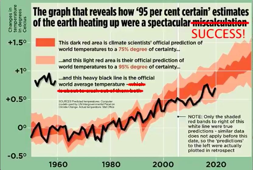
Abstract
In this seminar report, our focus is on communicating uncertainty as scientists to
nonspecialist audiences. To do so, we will lean heavily on lessons learned over recent
decades in the field of risk communication, as the two fields are inevitably connected.
We will start by considering the definitions and sources of uncertainty given by Prof.
David Spiegelhalter in his 2017 review “Risk and Uncertainty Communication”. We’ll
see some examples of how uncertainty has been miscommunicated, touch on some
philosophical ideas about trust and information, and work through some practical ways
of communicating uncertainty to a lay audience, before looking at two current case studies.
The ideas we’ll cover are not only relevant to the field of uncertainty communication,
but many are more widely applicable to communicating risk and indeed statistical
information in general.
Contents

Contents                                                                                     iii

1   Introduction                                                                              1
    1.1 Sources of uncertainty . . . . . . . . . . . . . . . . . . . . . . . . . . . . . .    1
    1.2 How to Lie with Uncertainty . . . . . . . . . . . . . . . . . . . . . . . . . .       1

2 Lessons from Risk Communication                                                             5
  2.1 In Theory . . . . . . . . . . . . . . . . . . . . . . . . . . . . . . . . . . . . .     5
  2.2 In Practice . . . . . . . . . . . . . . . . . . . . . . . . . . . . . . . . . . . .     7

3 Case Studies                                                                               10
  3.1 Climate and Weather Forecasting . . . . . . . . . . . . . . . . . . . . . . .          10
  3.2 Coronavirus . . . . . . . . . . . . . . . . . . . . . . . . . . . . . . . . . . .      13

4 Conclusion                                                                                 17

Bibliography                                                                                 18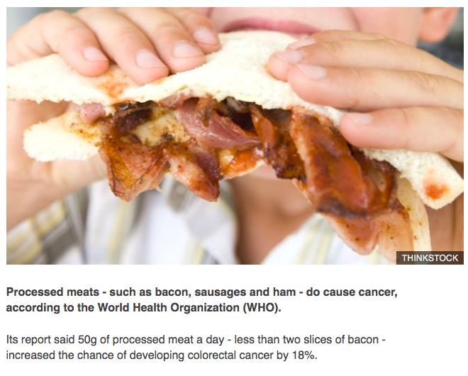
Introduction                     1
1.1 Sources of uncertainty

Before discussing how to communicate uncertainty, let us first consider
how uncertainty arises in the scientific process in the first place. We
look to Prof. David Spiegelhalter’s 2017 review of Risk and Uncertainty
Communication [1] , where he refers to three sources of uncertainty. The         [1]: Spiegelhalter (2017), ‘Risk and
                                                                                 uncertainty communication’
first two categories are the types of uncertainty regularly referred to in
the wider literature around Uncertainty Quantification [2] :                     [2]: Eldred et al. (2011), ‘Mixed aleatory-
                                                                                 epistemic uncertainty quantification with
                                                                                 stochastic expansions and optimization-
Aleatoric Uncertainty                                                            based interval estimation’

Inevitable unpredictability of the future due to unforeseeable factors,
fully expressed by classical probabilities.
Epistemic Uncertainty                                                              Epistemic
Modelled and quantified uncertainty about the structure and parameters
                                                                                   Relating to knowledge or the study of
of statistical models, expressed, for example, through Bayesian probability
                                                                                   knowledge.
distributions or sensitivity analyses.
Finally, Spiegelhalter includes a third category which is less often dis-
cussed:
Ontological Uncertainty                                                            Ontological
Uncertainty about the ability of the modelling process to describe reality,
which can only be expressed as a qualitative and subjective assessment of          Relating to the part of philosophy that
                                                                                   studies what it means to exist.
the model, conveying with humility the limitations of our knowledge.
As indicated in the above descriptions, different types of uncertainty can
be expressed in different ways, and so naturally they can be communicated
using different means. These means will be discussed in upcoming
chapters, but first, and following the name of the seminar, we’ll take
a look at some motivating examples of how uncertainty can be mis-
communicated.

1.2 How to Lie with Uncertainty

In 1969, the tobacco industry was facing a growing body of evidence
linking their product with the development of lung cancer in smokers.
In response to a looming advertising ban, the Brown and Williamson
Tobacco company released an internal memo. A much-quoted section
reads:

 Doubt is our product, since it is the best means of competing with the ‘body
 of fact’ that exists in the mind of the general public. It is also a means of
 establishing controversy. [3]                                                   [3]: (),
1 Introduction            2

In other words, the company wished to leverage the uncertainty around
the causal link between smoking and lung cancer to play down worries
and bring the evidence into dispute. This was a strategy readily recycled
by the fossil fuel industry. Indeed, as early as the 1950s, both industries
hired the same public relations firms, the same institutes and the same
researchers [4] . Figure 1.1 shows part of an internal document stating an    [4]: Hulac (2016), Tobacco and Oil Industries
                                                                              Used Same Researchers to Sway Public
aim to make the public and the media ‘understand’ the uncertainties in
climate science. Of course, the note goes on to reveal that the concern
over public understanding of uncertainty is primarily so that the industry
might be better placed to shape climate policy and assert the promotion
of the 1992 Kyoto treaty as “out of touch with reality". Such a strategy
successfully allowed the fossil fuel industry to keep profiting from oil
and gas extraction while ‘debate’ over the science of climate change
continued, resulting in decades of lost time and an ever smaller window
of opportunity to keep global heating to below 1.5C [5, 6] .                  [5]: Rich (2018), Losing Earth: The Decade
                                                                              We Almost Stopped Climate Change
                                                                              [6]: McGrath (2018), Final call to save the
                                                                              world from ’climate catastrophe’

                                                                                Figure 1.1: An internal memo from the
                                                                                American Petroleum Institute, 1998.
                                   [7]
                                                                              [7]: Admin (2019), 1998 American Petroleum
                                                                              Institute Global Climate Science Communica-
A third example of uncertainty miscommunication can be seen in a              tions Team Action Plan

2013 article from the UK publication The Daily Mail. Figure 1.2 shows a
somewhat loose adaptation of a graph originally published by researcher
Ed Hawkins [8] . Firstly, the graph misquotes the uncertainty ranges          [8]: Hawkins (2013),
as being 95% and 75% rather than the true 90% and 50% respectively.
Secondly, it and extrapolates from a short-term trend to assert that the
IPCC projections of mean global surface temperature increase were a
“spectacular miscalculation”. In the article, they write:

 The graph shows a world stubbornly refusing to warm. Indeed, it shows the
 world is soon set to be cooler.[9]                                           [9]: Rose (2013), The great green con no.
                                                                              1: The hard proof that finally shows global
                                                                              warming forecasts that are costing you billions
In fact, the graphic demonstrates that the uncertainty ranges given by        were WRONG all along

the IPCC are well-calibrated; for instance it can be seen that in the 50
year period from 1950 to 2000, the yearly temperature measurements
leave the 90% uncertainty range on five occassions - or 10% of the time -
as should be expected. As for the second claim, updating the graph to
include data from recent years shows that temperatures have remained
within the projected range after all.
Uncertainty communication can also found to be lacking outside of the
realm of industry public relations and tabloid publications. In an article
reporting the latest UK labour market figures from the Office for National
Statistics in January 2018, the BBC ran with the leader: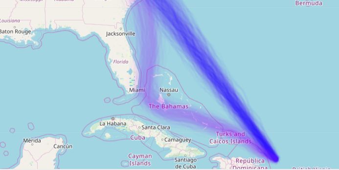
1 Introduction             3

                                                                                    Figure 1.2: Top: Daily Mail, March 16.
                                                                                    2013. Bottom: Updated graph. Kevin
                                                                                    Pluck, December 17. 2019.
                                    [9, 10]
                                                                                  [9]: Rose (2013), The great green con no.
                                                                                  1: The hard proof that finally shows global
                                                                                  warming forecasts that are costing you billions
 UK unemployment fell by 3,000 to 1.44 million in the three months to             were WRONG all along
                                                                                  [10]:
                                                                                  [11]: Pluck
                                                                                        (2018),(2019), Hey DailyMailUK         I’ve
 November, official figures show [11] .                                                         UK unemployment      falls to 1.44
                                                                                  updated your graph which shows that it was
                                                                                  million
                                                                                  a spectacular miscalculation to publish it!
                                                                                  pic.twitter.com/p34mIyJQ2y
It is only upon closer inspection of the ONS report [12] (which is not            [12]: Clegg (), UK labour market: January
                                                                                  2018
linked to within the article) that one can find information about the
uncertainty surrounding this figure. The following can be found in
Section 17, Quality and Methodology:

 The estimated change in the number of unemployed people [...] was a small fall
 of 3,000, with a 95% confidence interval of plus or minus 77,000. This means
 that we are 95% confident the actual change in employment was somewhere
 between an increase of 74,000 and a fall of 80,000 [...] the estimated fall in
 unemployment is said to be‘not statistically significant’

The ONS report itself warns against focusing on changes over short time
periods, reminding readers that long-term trends are more meaningful,
and especially so where uncertainty is concerned. In this respect, it can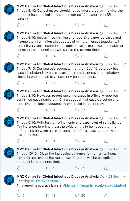
1 Introduction   4

be argued that although the BBC article concerned could have benefited
from including information about uncertainty, the message of decreasing
unemployment is not misleading as the short-term estimate from the
ONS agrees with a long-term trend of decreasing unemployment in the
UK.
Lessons from Risk
Communication 2
When considering best practice in the communication of scientific un-
certainty, it is helpful for us to lean on the more developed field of risk
communication. When we talk about risk, we refer to the more daily
usage of the term as the probability that an undesirable event will come
to pass.
We also need an aim for our communication of risk and uncertainty, and
since the topic of this report falls in the ‘How to do better’ section of
the seminar series, we’ll set ourselves the aim of informing decision-
making. In view of this goal, we’ll first discuss the more philosophical
theory behind risk communication, whose ideas can be readily appled to
uncertainty.
2.1 In Theory
We look to Leiss’s Phases of Risk Communication [13] to understand [13]: Leiss (1996), ‘Three phases in the
evolution of risk communication practice’
the development of the field over the last few decades in meeting this
goal. In the first phase, it was thought that the key to getting the public
to understand the risk given an intervention or event, and make good
decisions on that bases, was simply to give them more information.
Unfortunately, human beings are not always rational actors and the
context of such an event or intervention plays a heavy role in how we
perceive risk.
So-called fear factors [14] are said to affect our ability to keep risk and un- [14]: Slovic (2000), Risk, society, and policy
series. The perception of risk
certainty in perspective. These include events or outcomes which:
I are uncontrollable, novel or not yet understood
I have catastrophic potential or dreadful consequences such as
fatality
I have risks and benefits which are unequally distributed
I are delayed in their manifestation of harm
It is instructive to think about how many of the above fear factors are
fulfilled by an issue such as climate change.
In Phase II, the tools of marketing were leveraged so that information
about risk was not merely communicated, but communicated persuasively.
However, not all groups are easily persuaded to trust information: some
highly politicised topics suffer a strong correlation between the politics
held by an individual and their beliefs about the risks posed by that issue.
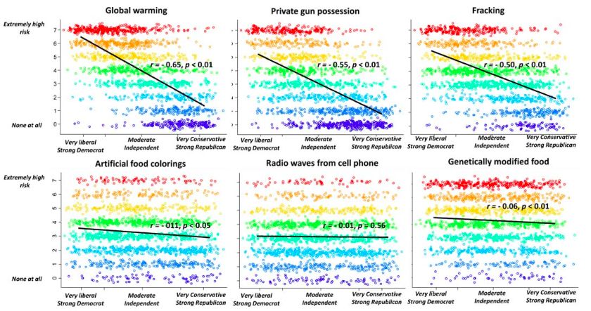
Figure ?? comes from a study in the United States and shows that in the
perception of risk for polemic issues such as private gun ownership are
correlated with an individuals’ position on the political spectrum.
As for the implications for uncertainty communication, we might expect
a kind of multiplying effect, where uncertainty surrounding an issue is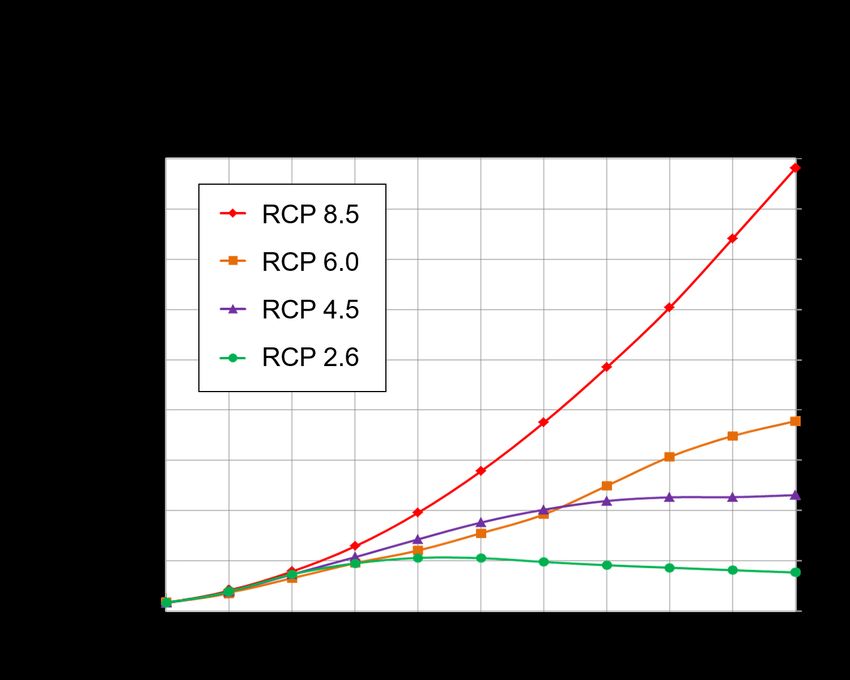
2 Lessons from Risk Communication                 6

                                                                                Figure 2.1: Correlations between risk
                                                                                perception and position on the US
                                                                                political spectrum.
                                   [15]
                                                                              [15]: Kahan (2015), ‘Climate-science
                                                                              communication and the measurement
                                                                              problem’
either used to play up or play down the associated risk, depending on
the political values of an individual.
In Phase III, the search has been on for a communication approach which
establishes trust between experts and target audiences. Baroness Onara
O’Neill, philosopher and member of the UK House of Lords, speaks
critically about the push for increased transparency as the latest attempt
at building trust [16] .                                                      [16]: (2017),

She argues that this transparency has come in the form of ever more
guidelines to be met, ever more paperwork to be filled out by professionals
(taking them away from their work), and ever more information entering
the public sphere. As such, along with ‘greater transparency’ there has
come an expectation, either implicit or explicit, that the public have the
time and inclination to search out and digest all this new information as
it is released. With the ‘more transparency’ approach, communication
efforts stop with making information available, and the onus is on the
audience to understand it.
O’Neill argues that the key to trust is not more transparency, but rather
intelligent transparency. Under the notion of intelligent transparency, she
defines four main characteristics [17] . Information should be:               [17]: Spiegelhalter (2019), Why I like the Code

     I Accessible: People should be able to get to the information
       easily.
     I Comprehensible: The target audience should be able to under-
       stand the information.
     I Usable: It should suit the needs of the target audience.
     I Assessable: Those interested should be able to look behind the
       information given, or be able to access a hierarchy of greater
       detail and evaluate its quality.

In this way, O’Neill argues, communicators can demonstrate trustworthi-
ness rather than simply demand to be trusted. They are principles to be
kept in mind in the two case studies which will be discussed later. First
though, it is beneficial to work through some more practical tips on the
effective communication of statistics in general.
2 Lessons from Risk Communication 7
2.2 In Practice
The communication of uncertainty necessarily overlaps with the com-
munication of statistics in general. The following section will highlight
a number of pitfalls to be aware of, which will hopefully help us to
illuminate good practice.
Probability words and phrases
It is important to be aware that words and phrases surrounding proba-
bility can be interpreted in a variety of ways. A recent study among 881
native Dutch speakers [18] found that there was a wide variability in the [18]: Willems et al. (2019), ‘Variability in
the interpretation of Dutch probability
interpretation of probability phrases, even within individual cohorts of
phrases-a risk for miscommunication’
statisticians and non-statisticians, men and women. Note that this study
didn’t examine the effect of the politicisation of events on interpretation
of probabilities, but rather the interpretation of phrases in a neutral
context.
Further, data shows an asymmetry between terms, with English speakers
holding unlikely and probable as synonyms of low chance, but very likely
and very probable as synonyms of high chance. Meanwhile, the above study
showed that Dutch speakers, like English speakers, give unlikely as a
synonym for low chance, but put high chance somewhere between likely
and very likely. This shows that not only is there a perhaps unexpected
asymmetry when we interpret probability phrases, but also that there is
variation when that information is translated between different languages.
There are further studies comparing English with French, German and
Chinese [19–21] , providing more evidence that interpretation of verbally- [19]: Davidson et al. (1994), ‘Translations
of uncertainty expressions in Canadian
provided probabilistic information differs between languages.
accounting and auditing standards’
Naturally, there is more consensus around words on the extremes: always, [20]: Doupnik et al. (2003), ‘Interpre-
tation of uncertainty expressions: a
certain, never, impossible. This is to be expected as these words leave cross-national study’
little room for interpretation compared to words like likely and unlikely. [21]: Harris et al. (2013), ‘Lost in transla-
However, this insight mightn’t be very helpful as it is rare that scientists tion? Interpretations of the probability
have such extreme results to communicate. phrases used by the Intergovernmental
Panel on Climate Change in China and
When asked what percentage of people taking a drug can expect to the UK’
experience a ‘common’ side effect, the mean estimate given in a study
of 120 people was 34% [1] . In fact, the true pharmacological definition [1]: Spiegelhalter (2017), ‘Risk and
is that a common side effect is one that affects 1 − 10% of patients, and uncertainty communication’
the recommended formulation for communicating this risk is: "Common:
may affect up to 1 in 10 people".
Key advice
The advice is clear: reporting probabilities verbally can lead to misin-
terpretation, especially in the case of translation between languages,
so numerical values or a combination of representations is preferable.
Numerical probabilities
It is important to be aware that comparisons between natural frequencies
(1 in x) can easily cause confusion. Amongst 1000 respondents for the
following question:2 Lessons from Risk Communication 8
Which of the following numbers represents the biggest risk of getting a
disease? 1 in 100, 1 in 1,000, or 1 in 10?
only 72% of participants in the US and 75% of participants in Ger-
many could answer the question correctly. Trevena et al. conclude that
risks should either be compared with simple percentages or by using a
frequency format where the denominator is kept fixed [22] . [22]: Trevena et al. (2013), ‘Presenting
quantitative information about deci-
Although natural frequencies are preferred in the field of medical risk sion outcomes: a risk communication
communication (although there is still some dispute)[1] , for chance of primer for patient decision
[1]: Spiegelhalter aid ‘Risk
(2017), developers’
and
uncertainty
[23]: Joslyncommunication’
rain forecasts, conditional probabilities (10%) are preferable [23] . A et al. (2009), ‘Probability
or frequency? Expressing forecast
good example, which combines conditional probability with a phrasal
uncertainty in public weather forecasts’
interpretation and a pictorial illustration can be seen in Figure ??.
Absolute risk vs. relative risk
Yet another thing to keep in mind is the framing of risk. In his review,
Spiegelhalter gives the example of a BBC article from 2015, seen in Figure
2.2.
Here, the absolute risk framing provides an eye-catching statistic - less
than two slices of bacon per day increases the chance of developing
colorectal cancer by 18% - but in its relative framing the result is much
less alarming: the relative increase turns out to be just 1%. That is to say,
of 100 people who don’t eat bacon, 6 can be expected to develop bowel
cancer over the course of their lifetimes. Of 100 people who eat 50g of
bacon or some other processed meat every day of their lives, 7 can be
expected to develop bowel cancer, amounting to a relative increase of 1
in 100. Such a statistic can be intuitively communicated in infographic
like the one in Figure 2.3.
The graphic provides an easy part-to-whole comparison, and the random
placement of the filled-in figures helps to communicate the aleatoric
uncertainty of the disease.
Positive and negative framing
Another choice in the communication of probabilistic information is the
use of positive and negative framing. An example of positive framing
would be to say that, when using a medication, “roughly 10% of patients
get a blistering rash". Whereas the negative framing would read “roughly
90% of patients do not get a blistering rash". Despite having the same
outcome, the first framing, which states the risk of an unwanted event2 Lessons from Risk Communication 9
Figure 2.2: BBC, 26. October 2015
[24]
[24]: Gallagher (2015), Processed meats do
cause cancer - WHO
happening, is was rated higher on a risk scale of 1 - 5 (1.82 vs. 1.43)[1] . [1]: Spiegelhalter (2017), ‘Risk and
uncertainty communication’
Although in this case (especially considering there is no absolute zero
given on this risk scale) there was only a small increase in the perception
of risk, we shall see in the a case study later on how, in the early weeks
of the Coronavirus outbreak, positive framing was leveraged by one
publication to create a dramatic and arguably misleading headline.
Spiegelhalter argues that in the case of positive vs. negative framing,
the most balanced communication method would be to present both The reference class
cases. Indeed, providing both positive and negative framing not only When the forecast says there’s a 80%
helps avoid the varying interpretations which can arise when only one chance of rain today, what exactly does
of the two is used, but also assists with the understanding of the correct it mean? Rather than rain 80% of the
time today, or rain over 80% of the area
reference class. In weather forecasting, including the chance of rain today, in fact the true interpretation is
alongside the chance of no rain significantly reduced the number of on days with conditions like this (that’s
people making reference class errors [25] . the Stephens
[25]: reference etclass) there is‘Communi-
al. (2012), an 80%
chance
cating that there will
probabilistic be some rain.
information from
However,
climate modelin this case understanding
ensembles—lessons from
the reference
numerical weatherclass is not important
prediction’
as long as the forecast is enough to
inform you that you might need an
umbrella!
Figure 2.3: A pictorial visualisation of
relative risk increase.
[1]
[1]: Spiegelhalter (2017), ‘Risk and
uncertainty communication’Case Studies 3
3.1 Climate and Weather Forecasting
Climate and weather modelling hold all the sources of uncertainty we
discussed in the Introduction. Of course, any real-world process has an
element of aleatoric uncertainty. Meanwhile, epistemic uncertainty comes
from choices of boundary and initial conditions, model parameters, as
well as model structure. In this case, the model structure encompasses
things like grid resolution, or whether all relevant processes are included
and accurately represented in the model.
Depending on the context, some of these sources of epistemic uncertainty
are more important than others. For instance, the long time scales in
climate modelling mean that boundary conditions are more important
than initial conditions. An example of a boundary condition in this case
would be an emissions scenario, which sets the amount of greenhouse
gases flowing into the atmosphere. On the other hand, the chaotic systems
of weather mean that initial conditions play a greater role in this type of
forecasting.
Climate modelling in particular not only has all the standard epistemic
uncertainties involved in mathematical modelling, but is fundamentally
indeterminate insofar as future boundary conditions depend on future
behaviour and policy decisions not yet made - ontological uncertainty.
As a result, we can only produce models for ‘what would happen if’
scenarios - provide projections, rather than predictions.
Ensemble predictions (EPs) are groups of model simulations which
produce a range of predictions designed to explore the effect of one or
more sources of uncertainty. There are different types of ensemble to
explore different uncertainties; structural uncertainty can be explored
using multimodel ensembles (MMEs) whereas parameter uncertainty is
explored with perturbed parameter ensembles (PPEs).
Although, as we shall see, ensemble models can certainly help us to
understand, visualise and communicate uncertainty, their use is not
without challenges. Climate EPs often use the representative concentra-
tion pathways (RCPs), seen in Figure ??, which describe several possible
‘climate futures’, and to which no relative probability can be assigned,
thus carrying a large amount of ontological uncertainty. As a result,
there is fierce debate over how such models should be interpreted and
communicated.
In analogy to the four characteristics of intelligent transparency espoused
by O’Neill, Stephens et al. 2012 state three properties by which efforts to
visualise and communicate EPs could be evaluated:
I Richness: The amount of information communicated. In this
respect, the needs of non-technical users must be balanced with3 Case Studies 11
Figure 3.1: Wikipedia: Representative
Concentration Pathways.
[26]
[26]: (2020), Representative Concentration
Pathway
the risk of oversimplification.
I Robustness: Refers to the fidelity of the EP and the extent
to which this trustworthiness is communicated. Robustness
of communication can be increased by adding information
richness, as in examples we’ll see later where colour grading is
added to visualisations of EPs to indicate quality of prediction.
I Saliency: The interpretability and usefulness of communication
for the target audience.
Setting aside the complexity of communicationg uncertainty in climate
modelling (which could be an entire report in itself) we will instead
demonstrate the communication of uncertainty using EPs by looking at
the example of tropical storm forecasting.
Figure 3.2 shows the shows the US National Hurricane Center’s fa-
mous cone of uncertainty. The correct interpretation of the cone is as
follows:
The tropical cyclone can be expected to remain within the cone roughly
60 − 70% of the time [27] . [27]: (), About the Cone
Some viewers misunderstand the graphic, thinking themselves to be out
of harm’s way if they reside outside of the cone [25] . However, the cone [25]: Stephens et al. (2012), ‘Communi-
cating probabilistic information from
merely represents the uncertainty range for the path of the tropical storm,
climate model ensembles—lessons from
and gives no information about wind speed, storm surges or the wider numerical weather prediction’
area outside of the path which might feel the effects, and in particular
gives no guidance on who should or should not evacuate.
One alternative, for better saliency of communication, is to use so-called
spaghetti plots, which more clearly show the variety of possible paths
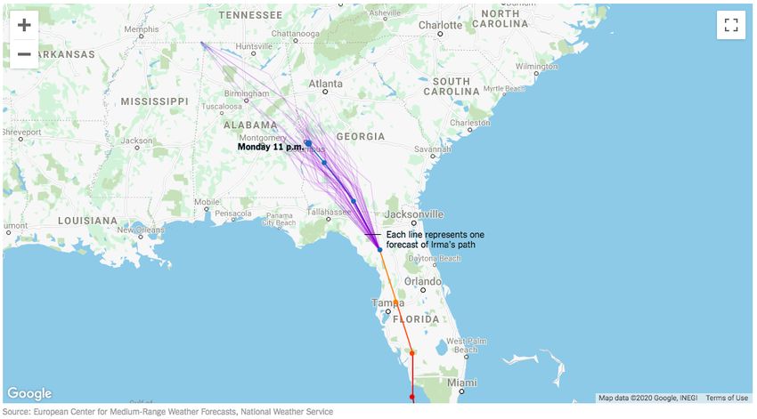
a tropical storm might take. A spaghetti plot showing 50 realisations3 Case Studies 12
Figure 3.2: National Hurricane Center,
US.
[27]
[27]: (), About the Cone
of path predictions for Hurricane Irma in September 2017 is shown in
Figure 3.3.
Increasing the robustness of uncertainty communication can be done
by adding richness of information in the form of heatmaps and colour
grading. Heatmaps are useful for indicating areas where many model
realisations are concentrated. Colour grading can be utilised for more
subjective, qualitative uncertainty information, such as if there were two
sets of EPs from two research institutes, one of which has an excellent track
record of producing accurate predictions. The predictions of the more
trusted predictions could be shaded darker. An example of heatmaps
and colour grading can be seen in Figure 3.4.
Tropical storm and weather forecasting are topics with great potential for
visualising uncertainty. In fact, it has been shown that greater richness
of information about uncertainty leads to forecasts which are rated as
more trustworthy than deterministic forecasts alone [30] , meaning good [30]: Joslyn et al. (2012), ‘Uncertainty
forecasts improve weather-related
uncertainty communucation can in turn inform good decision-making.
decisions and attenuate the effects of
forecast error.’3 Case Studies 13
Figure 3.3: Hurricane spaghetti plot from
the New York Times, September 5. 2017
[28]
[28]: Almukhtar (2017), Maps: Tracking
Hurricane Irma’s Path Over Florida
Figure 3.4: There is potential in the use of
spaghetti plots combined with heatmaps
and colour grading to communicate
uncertainty. Hugo Bowne-Anderson,
September 18. 2017.
[29]
[29]: (), Spaghetti Plots and Hurricanes’ Paths
3.2 Coronavirus
Our second and final case study is the recent Coronavirus outbreak.
We look at epidemiological modelling from the early months of the
outbreak, and how uncertainty around the number of people infected
was communicated at the time.
There are several ways of communicating uncertainty around such a
modelling process:
I Precision: Numbers can be given at a level of precision which
reflects our certainty about them (20.2% implies a greater level
of confidence in the figure than 20%, and likewise writing 20%
rather than 22% might be appropriate depending on the level
of epistemic uncertainty).
I Confidence Intervals: A confidence interval can be provided,
or measure of statistical significance (p-value or a range within
2 or 3 standard errors).
I Verbal qualifiers: Verbal qualifiers such as ‘best estimate’ are
often appropriate. If evidence is lacking, it might be appropriate
to not give a number at all.
I Qualitative scales of evidence: An often recommended way of3 Case Studies 14
communicating uncertainty arising from the scientific process,
especially around health, but any public-facing area where
facilitators use evidence-based interventions, is to use qualitative
scales to express the strength of evidence.
I Acknowledge limitations: It is also recommended to acknowl-
edge limitations, advise caution around which conclusions can
be drawn from the data, model or evidence, and acknowledge
unknown unknowns.
Many of these strategies can be found in the uncertainty modelling
and communicaiton from the MRC Center for Global Infectious Disease
Analysis at Imperial College, London, released on January 22. 2020.
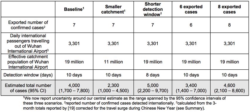
Figure 3.5 shows a summary table from their main report. The team used
a negative binomial model to infer the number of patients infected given
the number of confirmed cases internationally, outside of the Wuhan
area where the virus first originated.
The table explores epistemic uncertainty by varying model parameters:
giving a baseline estimate, assuming a smaller catchment population for
Wuhan International Airport, shortening the virus’ window of detection,
as well as smaller and greater numbers of international cases. The
aleatoric uncertainty is expressed using 95% confidence intervals for the
estimated total number of cases. Note also the precision of the figures,
which are given to the nearest 100. The analysis gives a central estimate
of 4000, and an uncertainty range of 1000 - 9700. The uncertainty range is
a combination of the epistemic and aleatoric uncertainties, taken from
the highest and lowest confidence interval bounds across all parameter
sets respectively.
The MRC summarised their report in a thread on Twitter, and we provide
it here in the margin of the following page as an example of excellent
uncertainty communication.
Figure ??
Figure 3.5: Summary table of estimates from epidemiological models of Coronavirus from the MRC Centre for Global Infectious Disease
Analysis at Imperial College, London.3 Case Studies 15
The opening tweet of the thread gives the central estimate of 4000 cases,
and immediately provides a link to the original report. Two of O’Neill’s
properties are fulfilled here: by putting the information on social media,
it becomes more accessible. Those who wish to assess the information
further can easily click through to read the report. The first tweet also
clarifies what can not be concluded from the modelling - although the
estimate had doubled from a previous report, there was no implication
that the outbreak had doubled in size in that time.
In the following tweets, the uncertainty range is clearly stated, and the
results are made comprehensible with further explanation. The report
was provided in both English and Mandarin, making it usable for a
larger number of people in the affected area.
However, researchers can only do so much to influence how uncertainty
is communicated. We finish this seminar report with a comparison of
how epidemiological modelling of Coronavirus spread was reported in
two different media publications, namely The Sun and the New York
Times.
Figure 3.6 shows the headline reporting the modelling referenced above.
Although the uncertainty range extended 9,700, the headline reads that
the virus ‘coud’ve infected 10,000 already‘. Note the use of positive
framing to create a more dramatic headline. A more balanced (but
admittedly less catchy) framing would be to say that the number of
people infected by Coronavirus could be as high as, but is unlikely to be
greater than, 9700.
The New York Times reported on separate but similar modelling from
the MOBS lab at North Eastern University in the United States. This team
used Bayesian inference to reach their results, and Figure 3.6 shows the
posterior distribution of the number of cases. The graphic is annotated
to show that although it was likely the true number of cases was much
greater than the number of confirmed cases at the time, the likelihood
of there having been more than 6,000 cases is low. The source of the
uncertainty information is also provided. Further explanation within
the article advises caution in interpreting the estimates, and quotes
an epidemiologist to advise that, given the uncertainties involved, the
estimates were not “truth – they’re just one step in trying to better
understand this outbreak”.
[31]
[31]: Global Infectious Disease Analysis
(2020), UPDATE: Report estimates 4000 cases3 Case Studies 16
Figure 3.6: Top: Headline from the Sun,
January 22. 2020. Bottom: Figure from the
New York Times showing the posterior
distribution of the number of Coronavirus
cases. January 23. 2020.
[32–34]
[32]: Wooller (2020), Coronavirus ’could
have infected 10,000’ amid warning it’s ’as
deadly as Spanish flu’
[33]: Rebecca (2020), Wuhan Coronavirus
Map: Tracking the Spread of the Outbreak
[34]: Chinazzi et al. (2020), ‘Preliminary
assessment of the International Spreading
Risk Associated with the 2019 novel
Coronavirus (2019-nCoV) outbreak in
Wuhan City’Conclusion 4 In this seminar report, we’ve explored the topic of communicating uncertainty from a number of angles. We started by discussing the Spiegelhalter’s three sources of uncertainty: aleatoric, epistemic and ontological. We saw several examples of how uncertainty can be commu- nicated badly, as in the example of ONS unemployment figures, or with an aim to mislead, as in the tobacco and fossil fuel industries. In Chapter 2 we reviewed decades of research in Risk Communication, looking at the theory and practice and finding lessons which are applica- ble not only to the communication of uncertainty, but to communicating statistical information in general. Key takeaways are that probability phrases alone can be misinterpreted, and a combination of numbers, words and graphics can help aid understanding. We considered how statistics can be framed, finding that relative risk and the use of both positive and negative framing allows more balanced communication. In Chapter 3 we looked at two case studies of uncertainty communication. The case study of climate and weather forecasting allowed us to see sources of uncertainty in context, and through tropical storm forecasts we explored best practise in visualisation as a method of uncertainty communication. In particular, we saw how heatmaps and color grading could be used in conjunction with spaghetti plots to improve the richness, robustness and saliency of uncertainty communication. Finally, in the Coronavirus case study we saw several uncertainty communication strategies put into practise: adjusting precision, providing confidence intervals and acknowledging limitations of the modelling process. A final comparison of subsequent reporting by The Sun and the New York Times ends this report on a more sobering note. When researchers communicate uncertainty well, it can certainly lead to some balanced and informative journalism. Unfortunately, not all media outlets exist for balanced and informative reporting!
Bibliography

 [1]   David Spiegelhalter. ‘Risk and uncertainty communication’. In: Annual Review of Statistics and Its
       Application 4 (2017), pp. 31–60 (cited on pages 1, 7–9).
[2]    Michael S Eldred, Laura Painton Swiler, and Gary Tang. ‘Mixed aleatory-epistemic uncertainty
       quantification with stochastic expansions and optimization-based interval estimation’. In: Reliability
       Engineering & System Safety 96.9 (2011), pp. 1092–1113 (cited on page 1).
 [3]   url: https://www.industrydocuments.ucsf.edu/tobacco/docs/#id=psdw0147 (cited on page 1).
 [4]   Benjamin Hulac. Tobacco and Oil Industries Used Same Researchers to Sway Public. July 2016. url:
       https://www.scientificamerican.com/article/tobacco-and-oil-industries-used-same-
       researchers-to-sway-public1/ (cited on page 2).
 [5]   Nathaniel Rich. Losing Earth: The Decade We Almost Stopped Climate Change. Aug. 2018. url: https://
       www.nytimes.com/interactive/2018/08/01/magazine/climate-change-losing-earth.html
       (cited on page 2).
 [6]   Matt McGrath. Final call to save the world from ’climate catastrophe’. Oct. 2018. url: https://www.bbc.co.
       uk/news/science-environment-45775309 (cited on page 2).
 [7]   Admin. 1998 American Petroleum Institute Global Climate Science Communications Team Action Plan. Oct.
       2019. url: http://www.climatefiles.com/trade-group/american-petroleum-institute/1998-
       global-climate-science-communications-team-action-plan/ (cited on page 2).
 [8]   Ed Hawkins. May 2013. url: http : / / www . climate - lab - book . ac . uk / 2013 / comparing -
       observations-and-simulations-again/ (cited on page 2).
 [9]   David Rose. The great green con no. 1: The hard proof that finally shows global warming forecasts that are costing
       you billions were WRONG all along. May 2013. url: https://www.dailymail.co.uk/news/article-
       2294560/The-great-green-1-The-hard-proof-finally-shows-global-warming-forecasts-
       costing-billions-WRONG-along.html (cited on pages 2, 3).
[10]   Kevin Pluck. Hey DailyMailUK I’ve updated your graph which shows that it was a spectacular miscalculation
       to publish it! pic.twitter.com/p34mIyJQ2y. Dec. 2019. url: https://twitter.com/kevpluck/status/
       1206860922263941120 (cited on page 3).
[11]   UK unemployment falls to 1.44 million. Jan. 2018. url: https://www.bbc.com/news/business-42802526
       (cited on page 3).
[12]   Richard Clegg. UK labour market: January 2018. url: https://www.ons.gov.uk/employmentandlabourmarket/
       peopleinwork/employmentandemployeetypes/bulletins/uklabourmarket/january2018 (cited
       on page 3).
[13]   William Leiss. ‘Three phases in the evolution of risk communication practice’. In: The Annals of the
       American Academy of Political and Social Science 545.1 (1996), pp. 85–94 (cited on page 5).
[14]   Paul Slovic. Risk, society, and policy series. The perception of risk. 2000 (cited on page 5).
[15]   Dan M Kahan. ‘Climate-science communication and the measurement problem’. In: Political Psychology
       36 (2015), pp. 1–43 (cited on page 6).
[16]   Sept. 2017. url: https://www.youtube.com/watch?v=RadbDHMjPVk (cited on page 6).
[17]   David Spiegelhalter. Why I like the Code. Feb. 2019. url: https://www.statisticsauthority.gov.
       uk/why-i-like-the-code/ (cited on page 6).
[18]   Sanne JW Willems, Casper J Albers, and Ionica Smeets. ‘Variability in the interpretation of Dutch
       probability phrases-a risk for miscommunication’. In: arXiv preprint arXiv:1901.09686 (2019) (cited on
       page 7).
[19]   Ronald A Davidson and Heidi Hadlich Chrisman. ‘Translations of uncertainty expressions in Canadian
       accounting and auditing standards’. In: Journal of International Accounting, Auditing and Taxation 3.2
       (1994), pp. 187–203 (cited on page 7).
[20] Timothy S Doupnik and Martin Richter. ‘Interpretation of uncertainty expressions: a cross-national
study’. In: Accounting, Organizations and Society 28.1 (2003), pp. 15–35 (cited on page 7).
[21] Adam JL Harris et al. ‘Lost in translation? Interpretations of the probability phrases used by the
Intergovernmental Panel on Climate Change in China and the UK’. In: Climatic change 121.2 (2013),
pp. 415–425 (cited on page 7).
[22] Lyndal J Trevena et al. ‘Presenting quantitative information about decision outcomes: a risk communi-
cation primer for patient decision aid developers’. In: BMC medical informatics and decision making 13.2
(2013), S7 (cited on page 8).
[23] Susan L Joslyn and Rebecca M Nichols. ‘Probability or frequency? Expressing forecast uncertainty in
public weather forecasts’. In: Meteorological Applications: A journal of forecasting, practical applications,
training techniques and modelling 16.3 (2009), pp. 309–314 (cited on page 8).
[24] James Gallagher. Processed meats do cause cancer - WHO. Oct. 2015. url: https://www.bbc.co.uk/
news/health-34615621 (cited on page 9).
[25] Elisabeth M Stephens, Tamsin L Edwards, and David Demeritt. ‘Communicating probabilistic in-
formation from climate model ensembles—lessons from numerical weather prediction’. In: Wiley
interdisciplinary reviews: climate change 3.5 (2012), pp. 409–426 (cited on pages 9–11).
[26] Representative Concentration Pathway. Mar. 2020. url: https://en.wikipedia.org/wiki/Representative_
Concentration_Pathway (cited on page 11).
[27] About the Cone. url: https://www.nhc.noaa.gov/aboutcone.shtml (cited on pages 11, 12).
[28] Sarah Almukhtar. Maps: Tracking Hurricane Irma’s Path Over Florida. Sept. 2017. url: https://www.
nytimes.com/interactive/2017/09/05/us/hurricane-irma-map.html (cited on page 13).
[29] Spaghetti Plots and Hurricanes’ Paths. url: https://www.datacamp.com/community/blog/how-not-
to-plot-hurricane-predictions (cited on page 13).
[30] Susan L Joslyn and Jared E LeClerc. ‘Uncertainty forecasts improve weather-related decisions and
attenuate the effects of forecast error.’ In: Journal of experimental psychology: applied 18.1 (2012), p. 126
(cited on page 12).
[31] MRC Centre for Global Infectious Disease Analysis. UPDATE: Report estimates 4000 cases. Jan. 2020. url:
https://twitter.com/MRC_Outbreak/status/1219943424285081602 (cited on page 15).
[32] Lizzie ParryShaun Wooller. Coronavirus ’could have infected 10,000’ amid warning it’s ’as deadly as Spanish
flu’. Jan. 2020. url: https : / / www . thesun . co . uk / news / 10794530 / coronavirus - as - deadly -
spanish-flu-killed-millions/ (cited on page 16).
[33] K. K. Rebecca. Wuhan Coronavirus Map: Tracking the Spread of the Outbreak. Jan. 2020. url: https:
//www.nytimes.com/interactive/2020/01/21/world/asia/china- coronavirus- maps.html
(cited on page 16).
[34] Matteo Chinazzi et al. ‘Preliminary assessment of the International Spreading Risk Associated with
the 2019 novel Coronavirus (2019-nCoV) outbreak in Wuhan City’. In: Lab. Model. Biol. Soc.–Techn. Syst
(2020) (cited on page 16).You can also read


