Communication Design Quarterly - Association ...
←
→
Page content transcription
If your browser does not render page correctly, please read the page content below
CDQ Volume 8 Issue 1
                                                                                                                                                             2020

                                                          Communication
                                                          Design
                                                          Quarterly
Published by the Association for Computing
                                      VolumeMachinery
                                             1 Issue 1
Special Interest Group for Design of Communication
                                      January 2012
ISSN: 2166-1642

Editorial: Updates from SIGDOC and CDQ
       Daniel P. Richards and Derek G. Ross...................................................................................................................... 4
Story Mapping and Sea Level Rise: Listening to Global Risks at Street Level
       Sonia H. Stephens and Daniel P. Richards...............................................................................................................5
Social Media in Professional, Technical, and Scientific Communication Programs: A Heuristic to Guide Future Use
       Jennifer Roth Miller, Brandy Dieterle, Jennifer deWinter, and Stephanie Vie................................................ 19
Book Review: Design, Ecology, Politics: Towards the Ecocene
       Ryan Cheek................................................................................................................................................................. 35
Book Review: Bodies in Flux: Scientific Methods for Negotiating Medical Uncertainty
       Ella Browning............................................................................................................................................................. 37

Communication Design Quarterly
https://sigdoc.acm.org/publication/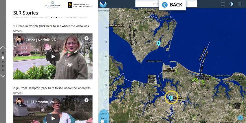
Communication Design Quarterly
Communication Design Quarterly (CDQ) is the peer-reviewed research publication of the Association for Computing Machinery (ACM) Special
Interest Group on Design of Communication (SIGDOC). CDQ is in the ACM Digital Library.

We invite you to contribute in any of the following areas:
    •     Original research. Articles that cross disciplinary boundaries as they focus on effective and efficient methods of designing and
          communicating information.
     •    Experience reports. Reports presenting project- or workplace-focused summaries of important technologies, techniques, methods,
          pedagogies, or product processes.
     •    Book reviews. Short reviews of books you think may be of interest to the communication design field. Please query ahead of time
          before sending.
All submissions except book reviews are peer-reviewed. Book reviews are reviewed by the Book Review Editor.

By submitting your work for distribution in this Special Interest Group publication, you hereby grant to ACM the following non-exclusive, perpetual,
worldwide rights:
    •   to publish in print on condition of acceptance by the editor
     •    to digitize and host your work on the CDQ website
     •    to digitize and post your work in the electronic version of this publication
     •    to include the work in the ACM Digital Library and in any services related to the Digital Library
     •    to allow users to make a personal copy of your work for noncommercial, educational or research purposes
As a contributing author, you retain copyright to your article or review, and ACM will refer requests for republication directly to you. ACM asks
all authors to include their contact information in their submissions. Opinions expressed in published works are those of the author(s) and do not
necessarily express the opinions of the ACM or SIGDOC. Author(s) should be contacted for reprint authorization. For more information, please see
the ACM notice to contributing authors at http://authors.acm.org.

Special Issues
We are also interested in proposals for guest editing special issues. As a guest editor, you would be responsible for soliciting three to five peer-
reviewed articles on a specific topic along with an article-length introduction to the issue’s topic. You may propose a special issue individually, or as
a group. Your proposal should demonstrate expertise on the topic being proposed and demonstrate the topic’s current interest to members of the
communication design community. Each proposal should include a résumé/CV for proposed guest editors and a draft call for submissions. Guest
editors are responsible for publicizing calls for papers, recruiting subject matter experts as peer reviewers, coordinating double-blind peer reviews,
corresponding with authors and reviewers, editing final drafts, and submitting final drafts and any necessary forms to the CDQ editor.

Communication Design Quarterly’s Statement on Inclusivity and Ethical Data Visualization

Communication Design Quarterly invites work by authors of all ethnicities, colors, faith identifications, genders and sexualities, abilities, and
levels of academic and professional expertise. Work will be considered for publication based on its potential value to our readership population,
as primarily illustrated by members of the Association for Computing Machinery’s Special Interest Group for Design of Communication (ACM
SIGDOC), and the article’s methodological, intellectual, and ethical rigor, as appropriate. Submissions will be assessed by peer-reviewers chosen by
the Editor based on how potential reviewer’s expertise relate to the submitted work’s area of focus.

Communication Design Quarterly is committed to publishing inclusive and ethical work, and expects that any work on or with human subjects meets
Institutional Review Board or Ethics Board approval, as appropriate. We also respectfully request that authors consider the ethical implications
of data visualization, including accessibility issues. Many articles in Communication Design Quarterly are fundamentally based in examination
of visuals created by a person or persons external to the author(s), contain visuals created by a person or persons external to the author(s), contain
visuals created by the author(s) or in service to the author(s) work, or some combination of the above. We ask that, as authors, you please respect
the rights, needs, and expectations of those whom you portray in your work. We also ask that you respect the rights, needs, and expectations of
your audience. We at Communication Design Quarterly recognize that this statement cannot address all potential vulnerabilities, but ask that you,
as readers, authors, and editors in your own right, carefully consider the implications of your work for those whom it engages as both subject and
audience.

    2                                                                                                   Communication Design Quarterly, 8.1 2020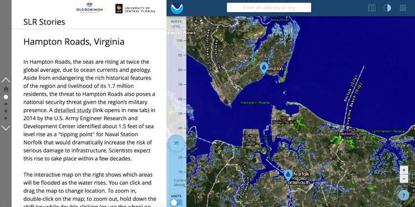
Communication Design Quarterly
CDQ Editors

Editor                                                             Book Review Editor
Derek G. Ross                                                      Avery Edenfield
Auburn University                                                  Utah State University
derek.ross@auburn.edu                                              avery.edenfield@usu.edu

Editorial Assistant
Sahajiya Nath
Auburn University

Editorial Board

Godwin Agboka                    Rebekka Andersen                  J.D. Applen                     Jeff Bacha
University of Houston-           University of California, Davis   University of Central Florida   University of Alabama,
Downtown                                                                                           Birmingham
Marina Bondi                     Eva Brumberger                    Yvonne Cleary                   Alice Daer
Università di Modena e Reggio    Arizona State University          University of Limerick          Quick Brown Fox Consulting
Emilia
Menno de Jong                    Clarisse de Souza                 Danielle DeVoss                 Jennifer deWinter
University of Twente             Pontifical Catholic University    Michigan State University       Worcester Polytechnic
                                 of Rio de Janero                                                  University
Huiling Ding                     Carlos Evia                       T. Kenny Fountain               Erin Frost
North Carolina State             Virginia Tech                     Case Western Reserve            East Carolina University
University
Meredith Johnson                 Constance Kampf                   Miles Kimball                   Charlie Kostelnick
University of South Florida      Arhaus University                 Rensselaer Polytechnic          Iowa State University
Claire Lauer                     Tim Lockridge                     Ed Malone                       Natalia Matveeva
Arizona State University         Miami University                  Missouri S & T                  University of Houston-
                                                                                                   Downtown
Lisa Melonçon                    Scott Mogull                      Kathryn Northcut                Brett Oppegaard
University of South Florida      Texas State University            Missouri S & T                  University of Hawai’i Mānoa
Laura Palmer                     Ashley Patriarca                  Stacy Pigg                      Liza Potts
Kennesaw State University        West Chester University           North Carolina State            Michigan State University
                                                                   University
Cody Reimer                      Daniel Richards                   Michael Salvo                   Geoffrey Sauer
University of Wisconsin-Stout    Old Dominion University           Purdue University               Iowa State University
Stuart Selber                    Darina Slattery                   Madeleine Sorapure              Jan Spyridakis
Pennsylvania State University    University of Limerick            UC Santa Barbara                University of Washington
Kirk St. Amant                   Huatong Sun                       Binod Sundarajan                Christa Teston
Louisiana Tech                   University of Washington,         Dalhousie University            The Ohio State University
                                 Tacoma
Gustav Verhulsdonck              Ryan Weber                        Sean Zdenek                     Pinfan Zhu
Central Michigan University      University of Alabama,            University of Delaware          Texas State University
                                 Huntsville

   Communication Design Quarterly, 8.1 2020                                                                                    3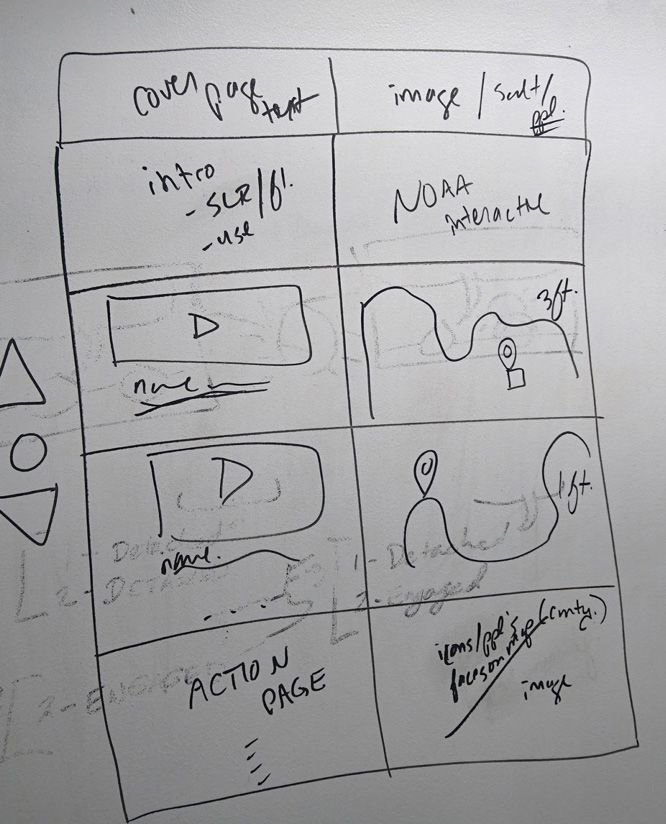
Editorial: Updates from SIGDOC and CDQ

         Daniel P. Richards                                                                                 Derek G. Ross
      Old Dominion University                                                                             Auburn University
         dprichar@odu.edu                                                                               derek.ross@auburn.edu

UPDATES FROM SIGDOC AND CDQ                                                  diligently in the midst of the pandemic.
On behalf of SIGDOC and CDQ, we wanted to reach out to all                   CDQ will continue to publish as often as we are able. We understand
of you and thank you for all you do in this difficult time. Our              that our workflows have changed, dramatically for some of us. So
organization’s greatest strength is in its members, and we hope              while it may be that extra time is occasionally needed for a review,
you are all staying as safe and sane as possible while COVID-19              we remain committed to providing you as rapid turnaround as we
changes the way we work and play.                                            can, and publishing cutting-edge research on communication design
SIGDOC has yet to reach an official decision on the viability or             through our original articles, experience reports, and book reviews.
nature of our 2020 Conference in Denton, TX, but the Executive               In this issue, for example, we are pleased to share with you Sonia
Committee along with this year’s Conference Committee, lead                  Stephens and Dan Richards’ “Story mapping and sea level rise:
by Stacey Pigg, are in consistent contact and weighing options.              Listening to global risks at street level,” and Jennifer Roth Miller,
Above all else, our decision will be informed by the values that             Brandy Dieterle, Jennifer deWinter, and Stephanie Vie’s “Social
we have articulated as an organization, which are: valuing human             media in professional, technical, and scientific communication
well-being; engaging in financial stewardship; respecting labor;             programs: A heuristic to guide future use.” These two excellent
foregrounding accessibility; supporting early-career scholars;               articles are accompanied by reviews of Jonanna Boehnert’s
establishing continuity; managing community and network-                     Design, ecology politics: Towards the ecocene, reviewed by Ryan
building; supporting innovation; valuing industry practices; and             Cheek, and Christa Teston’s Bodies in flux: Scientific methods for
maintaining and facilitating interorganizational and international           negotiating medical uncertainty, reviewed by Ella Browning.
relationships. The option for SIGDOC 2020 that best addresses                Take care and stay safe,
these core values will be the option we select. For now, we have
confirmation that the proceedings publications will be moving
forward and supported by ACM and included in the Digital Library
                                                                             Daniel P. Richards, SIGDOC Chair
regardless of the decision we make on the conference. This is great
news, and fulfills our values in supporting scholarship and valuing          Derek G. Ross, Editor in Chief, Communication Design Quarterly
the labor done by our authors, reviewers, and our program co-
chairs, Josephine Walwema and Daniel Hocutt, who have worked

Permission to make digital or hard copies of all or part of this work for
personal or classroom use is granted without fee provided that copies are
not made or distributed for profit or commercial advantage and that copies
bear this notice and the full citation on the first page.
Communication Design Quarterly. ACM SIGDOC, New York, USA.
Copyright 2020 by the authors.

CDQ 10.1145/3375134.3375139
Story Mapping and Sea Level Rise: Listening to Global Risks at
                         Street Level

                   Sonia H. Stephens                                                             Daniel P. Richards
               University of Central Florida                                                  Old Dominion University
                sonia.stephens@ucf.edu                                                           dprichar@odu.edu

ABSTRACT                                                                               “Spaces are produced only by narrating them…
While interactive maps are important tools for risk communication,                     Only narration can transmit the quality of the everyday.”
most maps omit the lived experiences and personal stories of the
community members who are most at risk. We describe a project to                       —Wladimir Fischer-Nebmaier, 2015, p. 33
develop an interactive tool that juxtaposes coastal residents’ video-
recorded stories about sea level rise and coastal flooding with an           INTRODUCTION
interactive map that shows future sea level rise projections. We             Those tasked with communicating environmental risks have long
outline project development including digital platform selection,            grappled with how to most effectively engage public audiences
project design, participant recruitment, and narrative framing, and          on risks that have global, national, or local consequences. The
tie our design decisions to rhetorical and ethical considerations of         traditional information deficit model of science communication,
interest for others developing interactive tools with community              which posits that public audiences do not understand science data
participation.                                                               simply because they do not have enough scientific training, has been
                                                                             recognized as insufficient for communicating complex subjects,
CCS Concepts                                                                 including environmental risk (Bucchi, 2008). Moreover, where
Human-centered computing →                 Collaborative and social
                                                                             risk has traditionally been defined by experts as the probability
computing
                                                                             of a hazard’s occurrence times the size of its impact (Okrent,
Keywords                                                                     1980), contemporary research shows that public perception of risk
Narrative, risk communication, sea level rise, story maps                    is multidimensional (Slovic, 2010) and includes a risk’s impact,
                                                                             an individual’s confidence in scientific understanding of the risk,
                                                                             and perceived dread (Fischhoff, 2009). Peter Sandman (1993)
                                                                             captures this complexity succinctly in his definition: risk = hazard
                                                                             + outrage. In light of this movement towards public inclusion in
                                                                             risk assessment and rhetorical framing of risk perceptions, the
                                                                             challenges of risk communication have become more clear: the data
                                                                             need not only merely be accessible and available but need to matter
                                                                             in a way that relates to people and their mental schemas (Lakoff,
                                                                             2010), their environmental frames (Nisbet, 2009), their worldviews
                                                                             (Akerlof et al., 2016), and their sense of place (Scannell & Gifford,
Permission to make digital or hard copies of all or part of this work for    2013)—in essence, their lived experiences.
personal or classroom use is granted without fee provided that copies are
not made or distributed for profit or commercial advantage and that copies   The shift from the information deficit model to more direct, critical,
bear this notice and the full citation on the first page.                    rhetorical public engagement models (Grabill & Simmons, 1998)
Communication Design Quarterly. ACM SIGDOC, New York, USA.                   has spurred a considerable number of on-the-ground studies and
Copyright 2020 by the authors.                                               projects with residents in vulnerable areas, often taking form
                                                                             through ethnographies, case studies, interviews, and surveys (e.g.,
Manuscript received August 15, 2019; revised January 9, 2020; accepted       Covi & Kain, 2016; DeLorme et al., 2018). These productive
February 7, 2020. Date of publication February 25, 2020.                     studies then iterate back and inform communication strategies in
                                                                             more tailored, localized ways. The limitations of more on-the-
CDQ 10.1145/3375134.3375135
ground, conversational research projects are that they are resource-     technological advances should not preclude a situatedness in the
intensive and difficult to generalize beyond the local scene, given      lives and livelihoods of those most at risk. In other words, what is
the need to attend to rhetorical contexts. In part because of these      ironically missing from much interactive, engagement-driven risk
limitations, deficit models are still a part of science communication    communication technologies are people and their stories.
strategies (Suldovsky, 2016).
                                                                         This paper describes a project that demonstrates how narratives—
Resource limitations also help explain, in part, the excitement          specifically experiential stories from those in vulnerable
and optimism around advances in interactive technologies that            regions—can be combined with map-based sea level rise (SLR)
let communicators engage more actively with audiences with               risk visualizations to create an interactive, visual tool that gives
whom they are not having a conversation in person. Technology            more context or nuance to the risk. In essence, the project seeks
has advanced to the point where those tasked with communicating          to combine the interactive potential of GIS-based tools with the
risks have the available technological means to meet people              importance of using individual resident stories to help frame the
where they live, often literally, without themselves going there.        messaging. Exposure to risk narratives in multimedia forms (e.g.,
Smartphones have enabled significant progress in citizen science         interactive simulations) has been shown to increase audience
initiatives, including image collections of affected areas; modeling     engagement with complex environmental issues (Vervoort et
and simulation technology has enabled people to envision future          al., 2010), and communication about the risks and uncertainty
scenarios of their neighborhoods; and GIS software has enabled           surrounding climate change via place-based scenarios has been
computer users the opportunity to explore data in their own way          shown to motivate concern and willingness to take mitigative
through layered visualizations, allowing residents to overlay a          actions (e.g., Shackley & Deanwood, 2002). As a complementary
data set onto a region, neighborhood, or even residence of their         way to communicate about hazards, stories of individual
own choosing. The presumption driving these advances is that             experiences with environmental risks can also help develop and
equipping vulnerable residents with varying degrees of scientific        historicize the local risk experiences of a given community (Lejano
agency will translate into a sense of political agency, driven by a      et al., 2013), adding a significant level of detail and relatability to
resident-user’s newfound ability to intersect science, place, and a      the larger risk narratives. In light of this research, we ask: What if
sense of investment.                                                     data-centered interactive SLR maps could also provide access to
                                                                         community stories from long-term residents who have personally
What we see, however, is that such advances in technology do not
                                                                         experienced the effects of water inundation? How do we design
automatically spur political action, do not necessarily engender a
                                                                         such tools, and what rhetorical and ethical considerations should be
spirit of environmental urgency just by their very use (Richards,
                                                                         taken into account? And might this add a powerful layer of context
2019). An increase in user agency does not necessarily lead to an
                                                                         and potentially persuasion to risk visualization technologies? This
increase in political agency, which we define here for our purposes
                                                                         final question about persuasion, and potentially social action,
as voluntary involvement in community-based, national, or global
                                                                         is still speculative; more user experience research, such as the
programs aimed at environmental resilience. Communication
                                                                         type conducted by Retchless (2018), is needed in exploring the
designers and technical communicators might theorize this
                                                                         relationship between rhetorical design choices made within the
disconnect as stemming from the continued technocratic design
                                                                         tool and the subsequent actions sought by users outside of use of
of the very risk communication technologies intended to engage
                                                                         the tool. For this project, we focus more modestly on the specific
(Stephens et al., 2015). A user might actively geolocate their
                                                                         decisions made within a specific technological tool with the goal of
picture of a flooded neighborhood, experience a dramatic projected
                                                                         merging map data with affected human voices.
visualization, or explore open data sets, but the main if not sole
rhetorical interaction—facilitated as it is through impressive           This article begins by positioning interactive SLR visualizations as
technology—is still with data. The rhetorical encounter with the         part of the larger communication genre of interactive risk maps. We
technology might still be siloed from the greater social situation of    then discuss narrative and its role in communication design, in part
the risk at hand, with the technology able to visualize risk scenarios   as a follow-up critique of the limitations of what we see in many
but less able to contextualize which communities are most affected       technocratic interactive risk maps. From there, we then describe
and what might be done about it. The technology may have changed         the origin and development of a story map project focusing on
shape from a one-dimensional message to a two-dimensional                two regions along the east coast of the United States. We describe
map or even a three-dimensional simulation, but the primacy of           in detail the rhetorical design decisions (by which we mean the
technology-driven data collection and distribution often remains.        choices we made within the available means—affordances and
Despite the interactive, rhetorical potential imbued in twenty-first     constraints—of the story mapping application) in constructing
century risk communication technologies, technocratic design             a story map that combines the data exploration capabilities of an
structures reminiscent of information deficit models of old still        interactive risk map with visual stories of residents located on the
remain.                                                                  map. We end with a discussion of the potential results and further
                                                                         directions of this approach of combining data with narrative on
Given that levels of skepticism towards human factors in climate
                                                                         SLR risk maps.
change continue to remain high (Marlon et al., 2018), and that at
least some level of climate destabilization is now irreversible (IPCC,   Interactive Risk Maps
2018), we are not arguing for the complete dismissal of public           Interactive maps are widely used to communicate about complex
engagement of data but rather that such public engagement with           environmental risks, such as SLR (e.g., the U.S. National Oceanic
data happens alongside the lives, stories, and communities being         and Atmospheric Administration [NOAA]’s Sea Level Rise Viewer,
represented. What we are arguing is that advances in public-facing       https://coast.noaa.gov/slr/ and Climate Central’s Surging Seas
risk communication technologies cannot leave behind the advances         Risk Zone Map, https://ss2.climatecentral.org), storm surge (e.g.,
in our understanding of the role of emotions, public perceptions,        NOAA’s National Storm Surge Hazard Maps, https://www.nhc.
community, and story. The excitement and availability of profound        noaa.gov/nationalsurge/#map), or wildfire (the Southern Group
6                                                                                                Communication Design Quarterly, 8.1 2020
of State Foresters’ Southern Wildfire Risk Assessment Portal, to some traditional drawbacks of information-deficit models
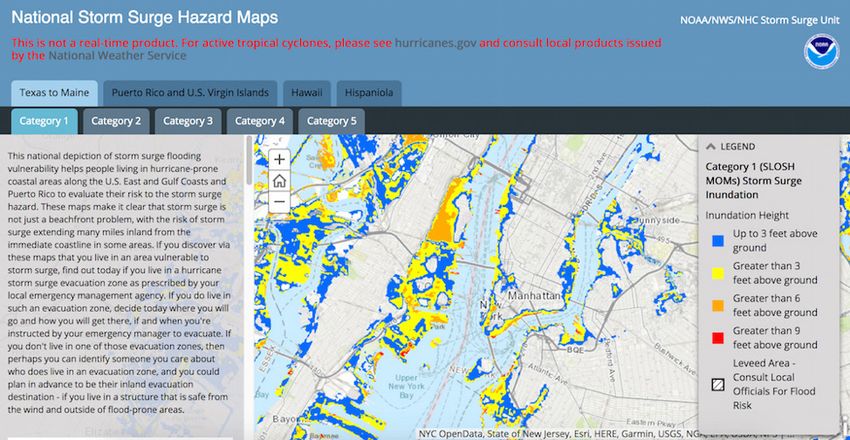
https://southernwildfirerisk.com/). Broadly, these visualizations of communication. They might overload users with data, have
project different risk scenarios onto a background map (Figure high technical learning curves, or simply suffer from incomplete
1). Depending on specific functionality, users may select different audience awareness and adequate user testing. Interactive risk
scenario options, zoom to a desired location, and read explanatory maps can, from our standpoint, be read as microcosms of the
text about the risk (Stephens et al., 2014). The information contained ideological design conflicts described above in that they offer rich
in risk maps tends to consist of quantifiable, georeferenced data, affordances in appeals to place and personal relevance but remain
such as the probability that a specific area will flood at a particular largely technocratic because they are often designed by experts for
sea level and the projected amount of inundation that would occur experts, with “the public” as a decidedly-untested upon and absent
there, or locations of vulnerable public infrastructure such as secondary audience. When lay users interact with such maps, they
hospitals or coastal vegetation zones. can have a “personalized” user experience in that they are able to
interact with the data in a customized way. Nevertheless, interactive
Figure 1. Example of an interactive risk viewer. Screenshot from NOAA’s National Storm Surge Hazard Maps, showing the projected
storm surge resulting from a Category 1 hurricane in New York City, NY, U.S.A.
Interactive SLR maps are both popular with the general public
risk maps may still present risk in ways that are too complex for lay
(Preston et al., 2011) and a powerful communication tool for
users (Richards, 2016; 2019) or lack humaneness.
understanding personal exposure to risk (Monmonier, 2008).
Multiple actors produce SLR maps, including government One way to help lay audiences connect with mapped information
agencies, non-governmental organizations, academics, and news is by adding qualitative information, such as narratives, that relate
organizations (e.g., Davidson & Miglarese, 2003; Wong-Parodi the lived experiences or concerns of affected communities. Our
& Strauss, 2014; Stephens et al., 2015). Research has shown that project draws inspiration from work in participatory GIS and
maps can be more engaging than text alone for communicating risk critical cartography, which combine narrative and mapping in
(Retchless, 2014), and more familiar to novice users than graphs various ways that may facilitate a more dialogic process of science
(Schnotz, 2002), but might not necessarily be more comprehensible communication (Sieber, 2006). For example, participatory GIS is
(Covi & Kain, 2016; Richards, 2019). Given that the audiences used to engage communities in mapping projects in order to support
for these tools are diverse, ranging from the general public to local knowledge-making and politically empower groups (Jelks et
specialist users like community planners and land managers al., 2018). Critical cartography research points to the potential for
(Davidson & Miglarese, 2003; Monmonier, 2008; Kostelnick et al., participatory mapping projects to engage local communities (Lung-
2013), designing maps that both engage users as well as clearly Amam & Dawkins, 2019) and empower them to, for example, re-
communicate a risk and its uncertainty to users with multiple levels envision natural resource management frameworks (Hayman et al.,
of domain and cartographical expertise is a complex challenge 2017).
(Kostelnick et al., 2013).
The significance of our project lies within its expansion of the work
Our own research on and experience with interactive SLR viewers of communicating complex, map-based SLR risk information to be
has led us to believe that these environmental risk communication more inclusive of human stories in a way that situates or localizes
technologies, despite their leaps in capabilities, may be subject visualization tools by both geographic region and by narrative
Communication Design Quarterly, 8.1 2020 7voices. To date, published research on interactive SLR risk and analysis. In ethnographic studies, researchers must choose
visualizations has tended to focus on data exploration and the use to what extent to present their own interpretations of a situation
of mapping and other simulations to engage users in exploring their versus presenting the individual narratives of the people who they
own local communities (e.g., Davidson & Miglarese, 2003; Shaw are studying, as those narratives are described to them (Blyler,
et al., 2009; Stephens et al., 2015). While some organizations have 1996). Relatedly, narrative can be a valuable method for sharing
developed narratives to communicate about environmental risks, the individual and situated concerns of community members. For
these efforts often do not connect to the everyday lived experiences example, Lejano et al. (2013) use narrative analysis to understand
of audiences (Lejano et al., 2013), despite preliminary research the lived experiences of individuals as they grapple with the effects
revealing that there is a user preference for narrative within such of climate change. Finally, Jones (2016) advocates for a process of
tools (Richards, 2016). There are only a few examples of projects narrative inquiry during participatory design projects to support the
that incorporate both risk mapping and explicitly narrative elements inclusion of marginalized users’ voices and support social justice
(see Nettley et al., 2014). aims.
While SLR maps afford users the opportunity to localize data to In this project, our decision to gather street-level stories from
a neighborhood or even a specific building, such interactive maps affected individuals originated primarily from a gap both authors
are not fully “personalized” in that they exclude human subjects identified after studying and conducting testing on existing
from the purview of visualization and engagement (Stephens et al., interactive risk maps, and secondarily from a commitment to
2014)—an important consideration from both ethical and rhetorical environmental justice and interest in deep mapping. Despite the
design perspectives (Dragga & Voss, 2001). We thus approach this efforts of the creators of interactive risk maps to design a tool
project as an opportunity to collect, curate, and share community that engages the public in an effective and affective way, both
stories about coastal risks to help contextualize impersonal map- authors have found that lay users were still by and large walking
based scientific information, and develop a more community- away from their use of the tool with an equal sense of confusion or
oriented, locally-focused narrative about SLR. disconnect. Therefore, the exigence for this project arose out of our
own research and our wish to explore how narrative elements and
Narrative in Communication Design interactive maps may be combined.
Maps as a mode of visual communication have long been of
interest to researchers in technical communication, with notable Story Maps
attention brought to the ideological (Barton & Barton, 2004), While narrative in the technical communication field has largely
persuasive (Propen, 2007), political, (Kimball, 2006), and public focused on verbal stories, other fields such as archaeology and
health (Welhausen, 2015) properties of cartographic design. As digital history have explored the potential of map-based texts for
maps have become interactive, however, technical communication conveying narrative (Ridge et al., 2013; Early-Spadoni, 2017). Thus,
and communication design scholars face a new research challenge this project builds on the work of researchers who have explored
of building knowledge about maps in newer, more interactive mapping as an avenue for combining the perspectives of members
contexts that focus on decision-making, personalization, and open of the general public with spatial data through “story mapping.”
data exploration. When it comes to thinking about interactive risk Story mapping, or spatial narrative, is a technique that introduces
maps, we argue that emphasizing the narrative aspects and potential elements of “a specified point of departure, a particular pathway,
of risk maps can be a productive way forward. We also contend and a known end point” to a map-based visualization in order to tell
that the interactive nature of maps and visualizations present an a story (Ridge et al., 2013; 178). Spatial narratives can potentially
exigency to take stock of how sufficient our extant theoretical and capture complexity in ways that linear narratives cannot, such as by
methodological approaches to thinking rhetorically about maps are helping communicators display social interactions with and within
for tackling these new advances and demands for interactivity and geography (Bodenhamer, 2015). Critical cartographers describe
cartographic design. maps that incorporate the lived experiences of communities in
a place—as opposed to simply recording the physical features
Narrative is used in several ways in technical and scientific
of a space—as “deep maps” (Harris, 2015). This project draws
communication. It is often employed in an outward-facing sense
from the concept of a deep map to combine the recorded stories
for communication between experts and laypeople. Psychological
of community members with what we know about the rhetoric of
research highlights the use of narrative in communication design
maps and interactive risk visualization. Thus, we introduce story
to make complex information relatable to a lay audience, stimulate
mapping into the conversation about communicating sea level rise
audience interest, and persuade laypeople to support specific
risks to public audiences.
policies or to change their behavior (Dahlstrom, 2014). Narrative
can also be harnessed to demonstrate expertise of the speaker A story map is, in a way, profoundly simple: a map that tells a story;
(Van Ittersum, 2014). In outward-facing narratives, there are an interactive artifact that uses the affordances of cartography to
ethical concerns about the appropriate level of accuracy, ends of guide the user through a narrative (see Figure 2). While not the
persuasion versus comprehension, and whether the use of narrative proprietor of the term or concept, Esri, the builder of ArcGIS
by scientists is philosophically acceptable in a particular context (which they themselves describe as “the world’s most powerful
(Dahlstrom & Ho, 2012). Nevertheless, the use of narrative has mapping and spatial analytics software”), has been a frontrunner
been explicitly encouraged in order to promote public engagement in the development and popularity of story maps. Their highly-
with climate change (van der Linden et al., 2015). usable, template-driven story map tool is flexible enough to allow
for a variety of stories but structured enough to make composition
A different use of narrative in technical communication is within
technically easy on the authors.
the context of a project or study as a method or tool to gather
and analyze data. Ethnographic case study research in particular But a story map is, in another way, profoundly complex. While
relies heavily on narrative as a technique for thick description blending of stories and maps can increase user engagement with a
8 Communication Design Quarterly, 8.1 2020then, is a highly-reflexive example of the rhetorical decision points
made by designers—us—of a story map right from the genesis of
the project all the way to its public-facing stage. This reflexivity is
done with the intention of highlighting the rhetorical decisions that
can be made when designing story maps.
PROJECT DEVELOPMENT
The two main phases of this project were: (1) recruiting and
interviewing coastal residents about their experiences with and
concerns about coastal flooding and (2) building the risk map
interface using the Esri Story Map platform. Both phases took place
simultaneously and across two geographic regions: The Space
Figure 2. Example of a story map. Screenshot from “Mapping Coast in eastern Florida, USA, and the Hampton Roads region in
Lambert’s Point” (http://www.mappinglambertspoint.org) southeast Virginia, USA (Figure 3).
topic, issue, or region, the baggage that comes with both narrative
and cartography as intellectual fields of study does not simply
get left at the door. Blending maps with stories does not render
maps less ideological or narratives less about power. There is
still a person who gets to tell the story and a person who gets to
decide how to represent space and place. While story maps have
the potential to engage users in a specific topic—for example, to
“inform, educate, and inspire decision-makers” (Wright, 2016)—
they still also have the potential, if created without care, to replicate
the same problems. As Harris (2016) argues, “The power of GIS
lies in…its ability to reduce complex information to meaningful
and understandable forms and yet this reductionism can also
act against the multivalence of local knowledge and the need to
maintain contradictions, arguments, and multiple perspectives” (p.
319). Figure 3. Location of study regions: Hampton Roads, VA,
While there have been ample numbers of story maps created, there USA, and Space Coast, FL, USA
has been less attention paid to the rhetorical considerations of
Projects that collect oral histories or experiences and that do not
the discrete, granular design decisions that go into composing a
seek to develop generalizable research results are exempted from
story map. Story maps have been used for outreach and education
IRB review, according to U. S. federal guidelines (White, 2017).
(Sinclair et al., 2018), to represent the history of marginalized
We collected narratives in order to illustrate residents’ concerns
communities within a landscape (Alemy et al., 2017), and to
about SLR on the risk map interface, and our intent was not to
articulate residents’ visions for the future of their communities
generalize from their responses. Prior to beginning the project,
(Lung-Amam & Dawkins, 2019), among other purposes. Research
we contacted an IRB coordinator at the first author’s institution to
on story mapping and related participatory mapping projects
inquire whether our interpretation of the guidelines was appropriate.
(e.g., Brennan, 2018; Jelks et al., 2018) largely focuses on the
Based upon our description of this project, they agreed that it was
participatory process itself as a site of community engagement
appropriate to consider this use of personal narratives to be exempt
or empowerment. For example, Brennan (2018) positions a
from IRB review. We therefore followed best practices for ethical
participatory mapping project as a mechanism to inform natural
conduct in oral history projects as outlined by the Oral History
science-driven management of a marine protected area about
Association (2009) for participant recruitment, video recording,
residents’ lifestyle and cultural heritage concerns. While all worthy
and dissemination of results. Prior to interviews, participants
story maps playing vital roles in specific communities, none focus
were given a written description of the project; we discussed any
on how their specific design choices made within the application
questions they had about the project’s goals and how their interviews
connect to their larger rhetorical goals. The design choices of these
might be used; and each participant signed a release form giving us
maps are black-boxed to a certain extent.
permission to use their recorded interviews and statements on the
The fields of technical communication and communication design website and in other media such as this publication.
are well-equipped to pick up this mantle and theorize the rhetorical
construction of story maps from a design standpoint, given our Recruitment and Interviewing
field’s history in attention to both maps and narrative as powerful Our goal was to identify and interview at least three residents
and persuasive. As we make the transition from static to interactive in each of the two study locations who could speak about their
maps, we must be sure to take Barton and Barton’s (1993) truism experiences of past coastal flooding and concerns about future
that all maps are ideological with us. The continued technocratic SLR-related inundation. We ended up with nine total participants,
predilections of cartographic design in the context of risk maps and resulting in nine separate videos (one participant did two videos
visualizations insist upon continued attention to representation, and one video contained two participants). The number of
power, and bodies. The increasing interactivity of maps does not participants was less important than the depth of content because
automatically mean they are democratic. What we present below, (a) our main goals for testing the effect of including the narratives
on users in the future do not relate to quantity, and (b) we envision
Communication Design Quarterly, 8.1 2020 9this as a long-term project where we continually add participants’ or a static image, and the smaller left panel contains text and the
narratives. We wanted the interviews to focus on the details of participant videos. Figure 4 shows our initial rough wireframe
the participants’ lived experiences and the connections they see sketch of the overall project design. In the sketch, text and videos
to larger conversations about SLR. By presenting the stories of are on the left side of each panel pair, while photos or interactive
residents of two different regions, we hoped to show both the maps are on the right. Each horizontal pair of panels corresponds
similarities and the unique situations of these communities when to a story segment, which in this draft included: two introductory
it comes to coastal risk. segments; the maps and videos for each location; and a concluding
page orienting users towards action.
Participant recruitment was accomplished via snowball sampling.
Each author contacted potential participants via a combination of:
(1) direct contact with personally-known coastal residents who
live in the study areas of interest, (2) reaching out to colleagues
(e.g., researchers who have local contacts) who might know
such individuals, and (3) contacting officers of environmental
organizations to inquire whether any of their members might be
such individuals. We explicitly tried to contact individuals who
might have a diversity of perspectives on the issue, including retired
contractors, naval officers, business owners, community planners,
affected and concerned residents, and environmental activists.
Potential participants were initially contacted via email with
follow-up phone conversations to discuss the project’s goals and
scope and assess whether they were interested in participating.
During these phone conversations, we discussed their specific
experiences with and concerns for coastal flooding and described
the purpose of the project as being to collect their individual stories.
Most participants (five in Hampton Roads and four on the Space
Coast) were interviewed in March 2018 with both authors present.
Interviews lasted between 10 and 25 minutes per participant, and
were conducted either at participants’ residences (in Hampton Figure 4. Initial wireframe sketch of the project design
Roads) or at public parks or community centers near the coast (on
the Space Coast). The goal was to have the background of each
Text and images were uploaded directly to the Story Maps website,
interview video reflect the nature of their concerns so as to help
which hosts the project (readers can access the project by visiting
“localize” the stories. For example, one participant was filmed
https://tinyurl.com/slr-stories). The participants’ videos were edited
next to a boat launch destroyed by a hurricane—a result that would
for length and content and posted to YouTube, then were embedded
affect her restaurant business, located just down the road. Another
into the project via linking. The interactive map, NOAA’s Sea
participant was filmed in the space between her residence and the
Level Rise Viewer, was also embedded as a live (i.e., interactive)
creek that floods and encroaches upon her property.
feature; the Hampton Roads segment begins with the map centered
At each interview, we prompted the participant by asking them to on Hampton Roads, and the Space Coast map begins with the map
tell a personal story about their experiences with coastal flooding centered on that region.
or sea level rise, as well as their concerns going forward. In some
Due to the overall structure of the Story Maps template, the project
cases, we asked participants to expand on a point or prompted
has a narrative structure that was linear overall, with participants
them to talk about an issue or concern that we had previously
able to either scroll or jump between story segments or interact
discussed on the phone. After the interviews, participants were
with videos or maps within segments. It consists of:
given a gift card for an online retailer as a token of appreciation
for their participation. After we completed the risk map interface, 1. An introduction, with text explaining the project purpose and
we emailed each participant the link to the project and requested basic navigation and photos of the two study locations.
that they let us know about any questions, comments, or concerns
2. The Hampton Roads segment, with two parts: 1) a brief
they had about the project and their representation. The participants
introduction to the region, instructions for using the interactive
who replied all had positive comments about the project, and no
map, and an interactive map of SLR projections centered on
concerns were raised about their representation.
the region (Figure 5); and 2) videos of the Hampton Roads
Building The Risk Map Interface project participants and a static map showing the location in
We constructed the SLR visualization tool using Esri’s Story Map which we had filmed them (Figure 6).
interface (https://storymaps.arcgis.com/en/), which is a free online 3. The Space Coast segment, with two parts as above.
platform that enables users to combine interactive maps, text,
videos, and static images into interactive templates that provide 4. A messaging page, with text suggesting actions users can take
a pre-set overall narrative structure (Appendix A). In our project, to understand and respond to SLR, and a landscape photo.
we selected the “Journal” template, which divides the page into 5. A concluding page with contact information and a second
a left and right panel. Each page consists of a story segment that landscape photo.
the viewer can scroll vertically through along the left-hand side.
In general, the larger right panel contains either an interactive map
10 Communication Design Quarterly, 8.1 2020the presence of flooding and the voices of residents. Essentially, we
wanted to add stories on top of the existing exploratory tools. Our
previous research on interactive SLR viewers led us to believe that
adding personal stories directly to the map would be more effective
than redirecting users to a separate page of stories, which would
hinder usability. However, we learned that this design would require
a more advanced understanding of ArcGIS than we possessed.
One strength of Esri’s Story Map application is that its template-
based approach to narrative affords researchers, practitioners,
and journalists with varying technical backgrounds to produce
high-quality, engaging stories. While higher degrees of technical
Figure 5. Screenshot of the introduction to the Hampton proficiency allow more opportunities for modification (e.g.,
Roads segment. Left side: text introducing the region and designing your own tool from scratch from more tailored data sets),
explaining how to use the interactive map. Right side: interac- no GIS background is required, nor is previous experience with
tive SLR map centered on Hampton Roads, with sea level set coding or web development. While we still believe that our initial
at 3 feet above current mean higher high water (MHHW; de- vision for a co-located layout would be ideal, constraints of time,
fined as the average height of the highest high tide in an area resources, and our technical backgrounds made it infeasible. Thus,
over several years [NOAA Tides and Currents, 2018]) we selected a two-columned as opposed to overlaid approach to
the risk map interface (see our Figure 4 initial wireframe sketch).
The participant videos were edited for time and also to create a The pre-construction of Esri’s templates also played a considerable
single cohesive narrative for each video. This entailed making part in our decision of how to combine narrative with the map. Esri
editorial decisions about including specific content, as well as titles their template gallery (https://storymaps-classic.arcgis.com/
cutting out long speaking pauses, street noise, loud bird calls, and en/app-list/) as such: “What Kind of Story Do You Want to Tell?”
the like. In the Discussion, we talk about our editorial decisions This title is invitational and undoubtedly motivates prospective
with regards to the videos, images, and text in the project, and make creators to get started, but it also reveals a way of thinking about
connections to the broader field of technical communication theory. digital storytelling. The categories Esri has produced (Appendix
A) are in our estimation dynamic and diverse enough to meet a
variety of project needs, but also introduce constraints to the kinds
of stories being told. As with any template-driven application, the
designer is given the opportunity to either negotiate their intended
design within the affordances of the application or use the template
gallery as an inventive space to get ideas about how they wish to
tell their story.
The notion of template-driven design will not be new to any
communication designer, especially those doing audio digital
storytelling (Hart, 2012). Templates have unburdened professionals
in non-technical areas from the labor of coding for quite some
time and all trends are pointing to their continued popularity. For
us, the templates were convenient and sufficient for our adjusted
Figure 6. Screenshot showing the participant videos from goals; they unburdened us from doing high-level GIS work, and
Hampton Roads. Left side: personal videos. Right side: a non- allowed us to spend more time contacting participants and curating
interactive map with a circle around the approximate filming and editing the videos. That said, the very presence of such savvy
location. Users can switch to the interactive map using the templates adjusted our goals by serving as a type of middleware,
“Back” button at the top of the map meaning software that organizes and presents information in
a fashion that is invisible to the end-user (Drucker & Svensson,
2016). The convenience of templates, as is the case with genre
DISCUSSION (Bazerman, 1988), also brings about the potential of narrative
In this section, we discuss the larger implications for communication
calcification. Over time, as templates become more and more
design and technical communication of the decisions we made when
popular, and their dissemination extends further and further, our
designing the risk map and conducting and editing the interviews.
notions of what can constitute interactive digital storytelling might
The Stories We (and Esri) Wanted To Tell become overly-constrained, framed only within a preset number of
The process of selecting a template involved an in-depth narrative structures. Communication designers should always be
conversation, primarily focusing on how the affordances of the aware of available templates at their disposal, and how they do or
template would allow us to achieve our goal of combining narrative do not constrain the types of stories we see valuable for a given
videos with SLR mapping. Our initial vision for the layout was to community, a given risk, or a given topic.
begin with a full-screen interactive SLR map, and then add links to
the videos in the places that they had been recorded. In this vision,
Structuring the Story/Stories: Approaching
clicking on a given link would cause a video to “pop up” so that the Great Divide
users could simultaneously explore the effects of SLR and flooding In the specific context of climate change communication, like
in a given region, establishing a more direct connection between with most global risks, there already exists a grand narrative (see
Communication Design Quarterly, 8.1 2020 11Lyotard, 1979) around the climate science: the world is getting Despite these concerns, we believe that adding personalization to
warmer, we as humans caused much of it, and, if we don’t act soon, SLR risk maps and interactive viewers adds value. The diversity
what we once deemed as progress will be the cause of our demise. of types of stories, from individuals with diverse backgrounds
The “stories” of individual residents experiencing flooding are tiles and careers, opens up more opportunities for user engagement
on the mosaic of the metanarrative of climate change. The stories of by providing more diversity of worldviews about the same issue.
short-term local flooding, and thus long-term SLR inundation, and As Akerlof et al. (2016) discuss, “cultural worldviews which
thus climate change, reveal the potential for intertextuality between contribute to politically polarized beliefs about climate [are]
the grand narrative of global climate change and the local narratives predictive of perceptions of sea level rise risk” (p. 314). If an SLR
of not being able to get to work because a local road was flooded. tool can include voices from cultural worldviews of eight people in
Embedding visual stories of affected residents within the most up- two locations, (see Table 1), the data might be seen in a different
to-date oceanographic projections offers a unique opportunity for frame. The stories of the participants with relatable concerns frame
communication designers to more closely align our shared global the data, as opposed to the data being itself the frame. The tool also
future with our everyday activities, personal health, and finances. gains credibility when the data reflect the stories of individuals (e.g.,
As such, the “story” of climate change and its contribution to SLR one participant’s account of wading through water up to her waist is
is presumed. The challenge when designing this story map, then, reflected in the 3-foot SLR projections in her neighborhood).
was: How to embed and structure the video recorded stories in
Our decision to film our project participants outside (save one, who
relationship to the SLR viewer within the Esri template? Having
was filmed during inclement weather) was intentional. We wanted
chosen the Story Map Journal template, how would we structure
the participants’ stories to take place in an area of relevance to
the user experience within it?
their story. For some, this meant actually being filmed along the
The main challenge in working towards some sort of intertextuality causeway which, if inundated, would affect industry and recreation.
between the grand narrative of climate change—as depicted in For others, this meant standing in between the space separating
the interactive SLR map itself—and the stories of residents is the their home from the encroaching body of water. The visual co-
division of the screen for the user. On the left side of the interface, the locating of story and body in situ helps, from a design perspective,
user can scroll down and sequentially view the videos of residents, with appeals to place. Previous research has shown that levels of
starting with Norfolk, Virginia and ending in Cocoa Beach, Florida. engagement and risk perception are tied to one’s sense of place
The videos were not sequenced in any specific order other than to (Scannell & Gifford, 2013) though personal concern does not
have those from Virginia first and Florida second. This reflects the necessarily lead to willingness to act at a community level (Akerlof
actual order in which the interviews were conducted, and more than et al., 2016), and also that risk messages are more effective when
anything else reflect our travel from Virginia south to Florida. localized (van der Linden et al., 2015). Therefore, aligning the
visual of the SLR map with the potential for evocation of emotion
On the interface’s right side, the user can explore NOAA’s Sea
from familiarity of place might be an effective rhetorical technique
Level Rise Viewer, embedded as it is within the tool, and pre-
to make more concrete connections between the grand narrative of
framed for the specific region (either Hampton Roads, VA, or the
climate change and the stories of vulnerable residents.
Space Coast in Florida). Users can also click a button to reveal
a yellow circle on a static map to help them locate the precise Curating Stories of Residents
location in which the respective video was filmed. Users can also Before pressing record on our camera, we simply instructed
toggle between the static image and the interaction SLR map in participants to tell us a story about flooding or SLR in their
order to draw a closer connection between the participants being community. We did not want to overdetermine the nature or type of
filmed and their actual vulnerability based on the latest climate and story that the project participants presented, but rather wanted them
oceanographic projections. to discuss what first came to their minds when they were prompted
While the goal of this arrangement from a design standpoint was as such. Were these stories of their own personal experience?
to draw a link between each resident’s lived story and the location- Stories about their community? A family member? Stories based on
specific data in the interactive SLR viewer, we also acknowledge science, or based on historical experience? The participants shared
that the division of the screen is potentially a disruptive user a variety of different types of stories; we present a brief overview
experience. First, users are invited to watch the video while of each story in Table 1.
simultaneously or afterwards exploring the interaction SLR map, We edited the videos for length, noise interruptions, moments
which is only granted about half a screen of digital real estate. where we conversed with the participants, and content. The
Second, while NOAA’s Sea Level Rise Viewer affords free participants all had varying degrees of confidence and comfort in
exploration of flooding projections, the overall sequencing of our front of a camera, so some brought notes, some wanted prompting,
website has resulted in an experience of linear scrolling through the and others could have talked for hours. From a user experience
videos. We are left with this question: Does our attempt to merge standpoint, we wanted each story to be about three minutes long.
stories with data produce a disjointed user experience that requires This necessitated making difficult editorial decisions about what
too much technical effort to allow for the stories to have emotional to cut. The three main reasons for cutting the clips were time
impact? In our initial envisioning of the project, we wanted users considerations, relevance of story, and tone. This was a balance
to be able to play the individual videos as they explored an area, between our editorial hand and the real, felt perspectives of the
but our technical backgrounds and the template of choice restricted participants. For example, in one video the participant was very
this method of juxtaposition. Thus, we have questions about the outspoken and critical about their city’s handling of stormwater
integration of stories and map and whether or not they are tightly and lack of attention to critical infrastructure. This of course is
connected enough to be effective, or if they perhaps distract from an understandable emotion that an affected resident would have;
one another. however, the tone of this critique, we think, would add an overtly-
political (in the partisan sense) layer to the tool, and our intention
12 Communication Design Quarterly, 8.1 2020You can also read