Cultural Perception of Colour in Film - Timothy Dignam Submitted to the Faculty of Film, Art and Creative Technologies in candidacy for the BA ...
←
→
Page content transcription
If your browser does not render page correctly, please read the page content below
Cultural Perception of
Colour in Film
Timothy Dignam
Submitted to the Faculty of Film, Art and Creative Technologies in candidacy for the BA
(hons) Degree in 3D Design, Modelmaking and Digital Art DL828
10/02/2021
Declaration of Originality

This dissertation is submitted by the undersigned to the Institute of Art Design
& Technology, Dun Laoghaire in partial fulfilment of the examination for the BA
(Honours) 3D Design, Modelmaking and Digital Art DL828. It is entirely the au-
thor’s own work except where noted and has not been submitted for an award
from this or any other educational institution.

___________________________________ Signature here

Timothy Dignam

                                                                       1|Page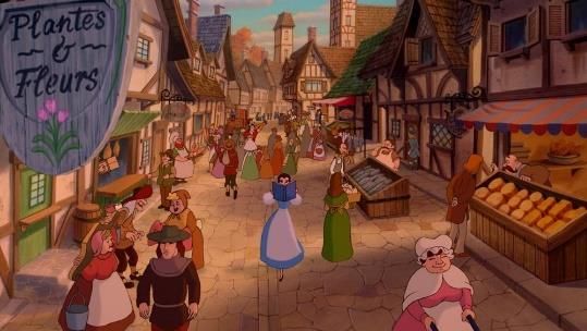
Acknowledgments

I would like to thank all of the IADT staff for their continued support and help
along my academic journey, my family for their support and patience, my
brother for giving advice on my thesis, Sherra Murphy for her organisation of
our fourth year class and a special thanks to Ruth Moran for her patience, sup-
port and feedback throughout this challenging year.

                                                                         2|Page
Abstract

The difference in the perception of colour based in culture you grew up in and
the language that you speak has an impact on the way you view media and the
way media is created for or by you and differs largely from the perception and
use of colour in a different culture. The world is a diverse place with many
different cultures, languages and environments that mould us into the people
we are today. Depending on where you grew up, what language you speak and
the media that you are exposed to, your perception will often differ from those
who grew up in a different location with a different language and different
culture to your own. This perspective on the world is often unique to the culture
and these differences can be seen in how we perceive and relate certain
emotions to different colours. The aim of this thesis is to critically analyse two
animated films from similar companies with similar goals from two different
parts of the world and compare and contrast how they use colour, when they
use colour, how much they use colour, why they have chosen to use a specific
colour, how that relates to their target audience’s cultural perception of colour
and what the differences between them are. The two films are Beauty and the
Beast by Disney and Princess Mononoke by Studio Ghibli. These two films were
chosen for their setting, the year they came out and the differences in culture,
one being between a western animated film aimed at western audiences the
other being a Japanese animated film aimed at Japanese audiences. This thesis
argues that these two film studios rely on their viewer’s perception of colour to
imply alignment, meaning and emotions of scenes and characters and that these
differences are based on the unique history and culture of their respective
target audience and the studio who created them.

                                                                          3|Page
Table of Contents

Introduction: pg. 6

Chapter One: pg. 8

The Use of Colour in Princess Mononoke

Chapter Two pg.15

The Use of Colour in Beauty and the Beast

Chapter Three: pg. 22

Comparing the Use of Colour in Beauty and the Beast and
Princess Mononoke

Conclusion: pg. 39

Works Cited: pg. 32

                                                   4|Page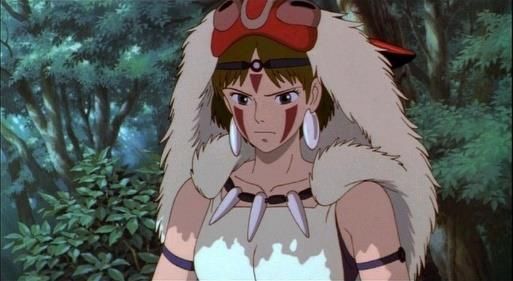
List of Figures

Fig 1: Bollback, Melissa. Evolution of Colour Terminology. www.people.vcu.edu.
N.p. 2004. P. 6
Fig 2: Beauty and the Beast. Dir Gary Trousdale, Kirk Wise. Walt Disney Pictures.
United States. 1991. P. 9
Fig 3: Blue and White Logo. Logodix.com, February 13th, 2019. P. 10
Fig 4: Sassoferrato. Blessed Virgin Mary. 1650. P. 10
Fig 5-6: Beauty and the Beast. Dir Gary Trousdale, Kirk Wise. Walt Disney
Pictures. United States. 1991. P. 11, 12
Fig 7: Picasso, Pablo. Le Soupe. 1902 P. 13

Fig 8-9: Beauty and the Beast. Dir Gary Trousdale, Kirk Wise. Walt Disney
Pictures. United States. 1991. P. 13
Fig 10-16: Miyazaki, Hayao. Princess Mononoke. Toho, 1997. P. 17, 19, 20, 23

Fig 17: Beauty and the Beast. Dir Gary Trousdale, Kirk Wise. Walt Disney
Pictures. United States. 1991. P. 24
Fig 18: The D Continumm. ‘’Disney Colour Palettes’’ thedcontinumm. WordPress,
May 10th, 2015. P. 25
Fig 19: Buonocore, Tommaso. ‘’Exploring chromatic storytelling in movies with
R’’ towards data science, April 8th, 2019. P. 25
Fig 20: Bosch, Hieronymus. Hell, 1500-1504. P. 26
Fig 21: Utagawa(shunsai), Tasimasa. Iwato kagura no kigen, 1887. P. 26

Fig 22-23: Miyazaki, Hayao. Princess Mononoke. Toho, 1997. P. 26

                                                                       5|Page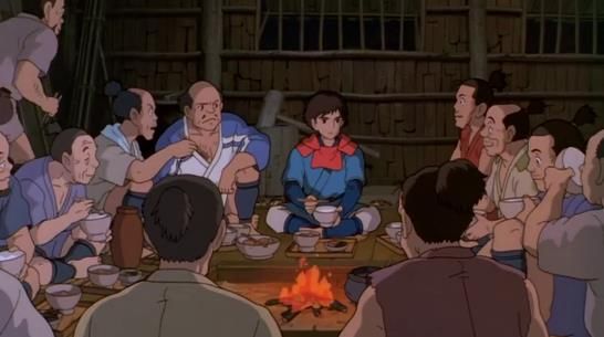
Introduction

The inspiration for writing this thesis was when listening to Stephan Fry’s book
Mythos (2017) he takes a chronological approach to telling the ancient stories of
the Greek Gods and their many decedents. It was something Fry mentioned off
hand in his book that was interesting, he said that the ancient Greeks didn’t
have a word for the colour of the sea and simply referred to it as “wine dark”.
Perceiving that the
ocean was a shade of
wine was strange to
                        Figure 1: Beriln and Kay's Basic colour term evolution stages.
a native English
speaker. After further investigation there are many different languages that
lacked term for blue and other colours, the Himba People in Namibia have 12
words for the colour green and blue is considered part of the green hue, it seems
strange to native English speakers but after looking into this topic most
languages lacked some basic colour terms and that there was an order that most
language followed as they developed as to which colour names are created first
and last, as shown by Brent Berlin and Paul Kay’s work although there are many
exceptions to this finding and critics of their work. This is a hugely debated topic
in linguistics as to whether nor not the differences in how colour is defined in
language has an impact on if we see actually see the colour differently or not,
some suggest that there is a feedback loop after you have a new colour name
and you can spot the colour out more easily than others after you have a name
for it. This never-ending spiral of research into colour and the scientific
background to it was fascinating but found that the meaning other cultures put
on colours was more interesting. For example, yellow is associated with royalty
and luck in China not cowardness as the west would perceive it as.

To investigate these differences in colour Princess Mononoke (1997) and Beauty
and the Beast (1991) were chosen. Both these films came out at a similar time,
they are both animated, have similar in design elements, target audience and
realise date and have used similar colours in similar ways but for different
reasons. They were also made by two similar studios at the time with both
Studio Ghibli and Disney producing the most popular animated films in their

                                                                                         6|Page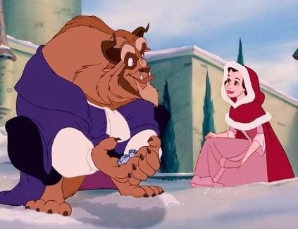
country. Beauty and the Beast was chosen because it was set in France in the
1700’s so the colours used would not be influence by Disney trying to emulate
another culture like Mulan (1998) or Pocahontas (1995) and chose Princess
Mononoke for similar reasons, its set somewhere between 1336 and 1573 in
Japan and not trying to emulate a culture like in Porco Rosso (1992) nor is it too
fantasy themed like Nausicaa (1984), Both these films are representative of the
cultures they are portraying.

These two films were also created before Japanese media was popular in the
western world and vice versa, there was not the same mix of cultures and
Japanese wasn’t was as anglicised as it is in modern day with as many alternate
anglicized colour terms for Japanese colour as investigated by James Stanlaw, a
professor of anthropology in the University of Illinois, in his book Japanese
English: Language and Cultural Contact (2004). Princess Mononoke was also
made for the Japanese audience with no consideration for other cultures, British
author Helen Mcarthy references a CNN interview with Hayo Miyazaki in her
book Hayao Miyazaki Master of Japanese Animation (1999), he states “I’m only
worried about how my film would be viewed in Japan. Frankly, I don’t worry too
much about how it plays elsewhere”1

All these reasons made it clear that these two films are ideal to compare and
illustrate the idea of the differences in the use of colour and the colours chosen
being quite different to each other. After learning about Japanese’s colour
meanings Princess Mononoke becomes a more engaging film as a result and
there is subtitle meanings that and a western viewer would not pick up on
without this cultural knowledge and the same can be said of Beauty and the
Beast for native Japanese speakers.

1McCarthy, Helen. Hayao Miyazaki: Master of Japanese Animation: Films, Themes, Artistry.
Berkeley, Calif: Stone Bridge Press, 1999. Print.

                                                                                  7|Page
Chapter One
The use of colour in Beauty and the Beast

                                     8|Page
Introduction

Beauty and the Beast (1991) uses colour to tell large amounts about the
characters and settings. The colours used are straight forward and easy to
understand to many audiences and especially small children which in turn
shapes how those kids will relate colours with emotions. The colours in this film
are mostly different shades of red and blue and are used in different ways to tell
us about the tone, Red is used as an evil or negative colour and blue is used
often to show danger or sadness but this is not always the case as the shade of
the colour has a huge impact on its meaning in the film. Each character will be
discussed with reference to their colour palette, the colour palette of the
environment and how these colours tell us about their characters. Dr Amy
Davis’s books Good Girls and Wicked Witches (2006) and Handsome Hero’s and
Vile Villains (2013) along with David Scott Kastan’s book On Colour (2018) will
be key in the discussion of topic of the western perception of colour.

                             Contrasting red and blue

Disney uses colour in a way that informs
the viewer of the feelings, themes of the
characters and film. Colour is imbedded in
every scene of the film and enhances the
viewing experience. In beauty and the
                                                Figure 2: Still Taken from Disney’s Beauty and
beast, the colours can be primarily be just     the Beast (1991). Bella standing out from the
                                                rest of the village.
two colours red and blue. Red is used as a
contrast colour and to define the villainous characters in the film i.e. Gaston and
things that Gaston is associated with in contrast with the light blue, blue and
white colours that Bella is dressed in throughout most of the film. It is seen in
the introduction song at the start of the movie how this is used effectively as the
whole village is dressed in warm ochre tones with a few greens and the same
can be said about the village itself with all the buildings and the road adopting a
similar colour scheme with exception to our first introduction to Gaston and Le
fool who are dressed in Bright red to distinguish them from the villagers and
give them an evil look. This use of red tones tells us that the villagers and the
village itself are one with Gaston and while they are different characters the

                                                                                  9|Page
pallet tell us their actions align with Gaston, shown in Gaston’s song, as LeFou
puts it best in the opening of the song “There's no man in town as admired as
you, you're everyone's favourite guy, everyone's awed and inspired by you”2.
The use of contrast also shows the Beast’s transformation throughout the film in
this wardrobe, going from red cloak when he is without Belle to bright blue
when they are together showing Disney use of contrasting colours to highlight
important themes in the film.
Bella and light blue
Reds and oranges used on Gaston and the village are in contrast to Belle who is
seen in her light blue dress witch not only tells us that she is different to all the
other villagers but also that she is more passive and a bit brighter not only in
colour but in intelligence. The choice of a light blue gives Bella a more vibrant
look as dark blue is associated with the Beast and his castle it shows that while
they are different, they are both just different shades of the same hue. This
choice of colours nicely sets up the world, who the protagonists are and who the
villain is. The light blue of Belle’s dress signifies her difference from the rest of
the characters in the film and the background, she is always standing out when
in a scene even when she is in an area with the same colour palette like the
forest or the castle. This shows Disney’s use of colour to aid in visually
juxtaposing characters to highlight their inherent differences.
Light blue in western culture is seen as calming and
trustworthy colour largely seen in many business
logos as seen in figure 3. These characterises shown
by the colour choice are the same characteristics that
Figure 3: Various popular
are associated with belle, she is a company logos
clam, intelligent, loyal and trustworthy character which is
seen when she returns to the beast to help save him and the
colour choice reflects that as light blue is traditional a colour
Figure 4: Blessed Virgin
of good in western culture. Historically seen in artwork of
Mary, Sassoferrato,
1650.
2
Beauty and the Beast. Dir Gary Trousdale, Kirk Wise. Walt Disney Pictures. 1991. Film.
10 | P a g ereligious icons such as many depictions of the virgin Mary in combination with
white, Dr Amy Davis points out when she talks about Belle as a good daughter,
in her book Good girls & Wicked Witches (page 193), that it is Belle praying that
brings the Beast back at the end of the film “It is at the end, when she thinks first
of herself – praying for the Beast not to die because she loves him – that Belle’s
good works are able to set the world to rights. This idea, however, is somewhat
underplayed in the film. Her one “selfish” act – to think of her own sorrow if the
Beast died rather than thinking about the impact of his death on his servants
and the tragedy of his losing his life – is rewarded by the Beast’s transformation
from beast to human and his being returned to life.”3 This is an interesting
association between Belle and prayer and highlights the selflessness of the
character, and how she only thinks of others throughout the film, Davis goes on
to criticise this scene for the downplaying of this theme.
Light blue also has associations with femininity primarily before WWII but as
the film is set loosely around 18th century France Disney would have used this
cultural association with the colour combination to emphasize Belle’s femininity
in the film and while modern culture would associate pink more closely with
femininity than light blue within the context and
setting of the film light blue reads to the viewer as
being a feminine colour along with the fact that
using the more cultural accepted pink for Belle
would have removed the contrast and associations
with red that the film uses to contrast the Figure 5: Still Taken from Beauty
and the Beast (1991).
characters. Later on when the Beast and Bella are
Getting to know each other better Bella’s dress has changed to a dark red/pink
dress and the beast has changed to a blue suit, This has no underlining meaning
other than the palette swap of the two characters signifies the progression of
their relationship and their similarity of situations, both being an outcast for
being different reasons and both going through transformations throughout the
film both literal and figuratively.
3Davis, Amy M. Good Girls & Wicked Witches: Women in Disney's Feature Animation, Indiana
University Press, 2007. Print
11 | P a g eRed and Gaston
Gaston is the direct opposite to Belle, where she is kind
he is ruthless when she is brave he is cowardly and
where she is clam he is angry and this is clearly show
throughout the film in the actions he takes and the
mistakes he makes, Gaston is one of the classic Disney
Figure 6: Still Taken from villains. Gaston wears bright red throughout the film
Beauty and the Beast (1991).
without changing colour once unlike Bella or the Beast.
This bright red helps define his character from the start, he is angry, violent,
strong and driven by his love and passion for, these are all characteristics that
red commonly defines in western media and we would associate with this
character.
While red is known for passion or desire in his film its more sinister with Gaston
being more predatory in his nature rather than just in love. Red is used is show
us the villain in this film because red is very much a colour associated with evil
in the western world as well as passion and strength. Dr Amy Davis, a lecturer
and author working in University of Hull, writes in her book, Handsome Heroes
& Vile Villains about Gaston as a comic villain and his treatment towards Belle
being that of a sexual predator. She writes this about their first encounter
together saying that “When we first see Gaston interacting with Belle, he circles
Belle, dominating the shot and her with his bulky frame and his bright red shirt
(Belle, in a more sedate blue dress, is also significantly smaller than Gaston: he
is about a head taller, and his shoulders and chest seem almost twice as wide
has hers)”4 we can see Gaston’s passion in relation to red as well as his anger
and strength, Gaston is the personification of the colour red in western culture.
4
Davis, Amy M. Handsome Heroes & Vile Villains: Men in Disney's Feature Animation, Indiana
University Press, 2014. Print
12 | P a g ePeople in the English language go “red with anger”, they “paint the town red”,
get “caught red handed”, go “red with passion” and people decent into the “red
mist” when angry. Disney uses this cultural perception to show and enhance
Gaston’s character. Gaston and the villagers show us clearly how colour is used
as a device to show alignment and ideals with one side of the film being clearly
defined as the villains through the use of good world building, character
development and importantly Gaston and the villagers show us how colour is
used as a device to show alignment and ideals with one side of the film being
defined as the villains.
Blue/Red and the Beast
Similar phrases as the ones talked about for red exist
for blue too for example: “feeling blue”4 or “blue
devils”4, David Scott Kastan, professor of English in
Yale University talks more in his book, On Color, about
the historic relationship that English/Europeans have
with depression and phrases associated with the Figure 9: Picasso, Pablo. Le
Soupe. 1902.
colour blue stating that “But blue had already come to
seem so inevitable in its connection to various intensities of unhappiness that it
could retire as an adjective and be reborn as a noun, no longer an attribute of a
feeling but the feeling itself. It became what you feel, not how. You were no
longer in a blue mood; you were just blue”5 Kastan uses artwork from Picasso’s
blue period to highlight his point about blue and depression later in the chapter
and this cultural connection to blue Kastan has
describes has been used by Disney to enhance
scenes where unhappiness and loneliness are
Figure 7: Still Taken from Beauty prominent themes i.e. the Beast’s castle and the
and the Beast (1991).
surrounding woods. environment reflects the
Beast’s emotions by animating in a dark blue/navy
colour this helps us understand the turmoil that the
Beast is in without the need to directly tell the
Figure 8: Still Taken from Beauty viewer, again showing that Disney mastery and
and the Beast (1991).
5 Kastan, David. On Colour. New Haven: Yale University Press, 2018. Print
13 | P a g eunderstanding over the use of colour to show us in a visual way the character
and emotion of their protagonists.
The Beast himself wears a dark red cape in the first half of the film to signify, in
much the same way as red is used for Gaston, his angry, strong and terrifying
appearance he puts on. In a way the colours of the castle are representative of
the true feelings of the Beast and the colour of his cape represents a kind of
mask he wears to hide his true loneliness from others. Later on in the film when
Bella and the Beast are getting to know each other and becoming more friendly
the beast changers to a blue suit in contrast to Belles red dress to make the
Beast feel not as Beast-like and more human-like but that is to signify their
relationship as talked about when discussing Bella’s colours. The castle itself
also has a brighter colour palette to show the Beast opening up to another
person for the first time and shunning the dark blue shadows of loneliness only
to have them return again when Bella leaves again and they return along with
the Beast’s red cloak.
Conclusion
Disney uses colour to set the themes of the film and their characters, alignments
and ideals. They do this through the use of contrasting blues and reds to set a
clear definition between the villains of the film, Gaston and the villagers, and the
protagonists, Belle and the Beast. Using red and ochre tones to display Gaston’s
passion, strength and anger at the Beast and the Beasts anger at Bella, Morrice
and the villagers for invading his castle. Various dark blues are used to highlight
the Beasts loneliness and depression in his life as well as the ominous cold
forest that surrounds his castle. Light blue is used on Belle exclusively to show
her contrast in personality to those around her and to display her alignment to
the good side of the film, being one of two protagonists. These uses of colour
show that Disney relies on our western perception of colours to effectively use
colour as a storytelling device, without the cultural knowledge of blue being
associated with depression or red being associated with passion and anger that
English speakers and Europeans have. Disney knowingly or unknowingly
heavily rely on western perception of colour to show themes and emotions that
are absent when colour is removed from the film as a factor.
14 | P a g eChapter Two
The use of colour in Princess Mononoke
15 | P a g eIntroduction
The use of colour in Princess Mononoke (1998) and in many of studio Ghibli
films is quite literal and what is meant by that is it is closer to how we see the
real world, the sky is always blue, the grass green and objects are coloured they
way that you would expect them to be. When you look at the choices that the
studio has made in terms of colour it is best to keep this in mind as most of the
colour is used to simulate reality rather than a thematic use to give a scene a
particular feel or convey an emotion. In this chapter will be focused on
discussing how Studio Ghibli uses colour in their film Princess Mononoke and to
show how their colour choices are made with respect to their culture. The film
is broken down into colours and each area will be talked about in relation to
colour as it is the best way to discuss this topic. The discussion is separated into
sections focused on realism of colour that Studio Ghibli uses, the use of reds and
blues on characters and finally the supernatural and use of black and white in
this film. The key texts used for this chapter are Colours of Japan (2000) written
by Kunio Fukuda a professor in colour theory in Japan, Japanese Mythology in
Film (2015) by Yoshiko Okayana a professor of Japanese culture in the
University of Hawaii and Hu Tze-Yue’s book Frames of Anime (2010).
Studio Ghibli’s use of realism in animation
Studio Ghibli’s use of colour is quite literal. The choice to emulate reality is
chosen to enhance the theme and message of the story which is of the
destruction of the natural world for the sake of human progress and that the
emulation of reality is a significantly harder thing to achieve in an animation.
Realism has always been a large part of Studio Ghibli’s practices, Tze-Yue G. Hu,
an author and independent educator focused on the study of Japanese
animation, writes in her book about the extent that Studio Ghibli goes through
to get a sense of realism and how unique this approach is; “What distinguishes
the works of Miyazaki and Takahata from other run-of-the-mill manga-anime in
Japan and Disney-like animation feature films is their approach and emphasis
on realism. It is realism that has become a major, if not primordial, ideological
backbone of their animation aspirations. The constant desire and struggle to
16 | P a g eportray reality, often at all costs, are
reflected in their storytelling process,
especially in the thematic contents
and technical expressions.”6 It is
evident in their use of colour
throughout their films and through
their animation that they have an
obsession with the emulation of
Figure 10: Still taken from Studio Ghibli’s Princess
reality, enhancing the film’s visual Mononoke (1997), director: Hayao Miyazaki. Intense
detail for a scene only shown for a few seconds.
appeal.
The green and light blue in contrast to the dark grey/black used in the burnt
areas of the forest enhances the central colours used on the characters which
typically are reds, oranges, a variety of shades of darker blue and the white.
These colours all assist in grounding the film to reality and giving the film a
natural feel, assisting in drawing the eyes to the important colours used in the
main characters while simultaneously setting the whole theme of the natural
world in conflict with the human created world by having the natural green and
light blue colours in direct conflict with the dark areas of the village and the
burnt forest which continues throughout the whole film. While the use of colour
may seem simplistic its quite an important stylistic choice for the films themes
as well as green being such an important colour in Japan.
How red and blue are used on
characters
Many of the characters outfits feature
a predominantly red or blue clothing
and if not, they are usually a
secondary colour apart from the Iron
Town Guard who wear orange tunics.
Figure 11: Still taken from Princess Mononoke (1997).
The protagonist Ashitaka Wears a
blue tunic like the ones his tribe wears in addition to some red elements like his
6Hu, Tze-Yue G. Frames of Anime: Culture and Image-Building, Hong Kong University Press,
2010. Print.
17 | P a g ehood and the red elk Yakul. Red and blue are contrasting colours, red meaning
passion, anger and strength and blue usually meaning stability, trust, loyalty or
intelligence, of course this depends on the shade, a lighter blue tends to be
associated with purity and a darker blue is associated with sadness and
depression. While Ashitaka is all the things we would associate with blue, apart
from depression, in Japan blue is seen symbolising passivity, neutrality and a
clam soul which is more in line with the character of Ashitaka and his tribe. The
red represents his strength and passion again highlighting his character of being
predominately passive and negotiable but becomes fierce and powerful when
the situation needs it. The character of Ashitaka is quite simple, he is calm, open
and listens to everything that is said to him and listens to all sides equally.
Ashitaka has a goal of trying to undo the curse that was put on him by the giant
boar seen at the start of the film but this is not his main concern, he is more
concentrated on sorting out the conflict in the film listening to both side equally
and making an educated conclusion on what the right thing to do is. This again
is shown in the colour that he wears; the neutral blue symbolises his neutrality
and passivity, not choosing a side until he has heard both arguments.
There is another kind of blue that is used often which is indigo and while there
is a large amount of people who wear it indigo does not have the same meaning
behind it like bright blue does. Indigo in Japan was worn by most people
throughout its history and was a very common colour to see on clothing. Kunio
Kukuda, a professor of colour theory at Joshibi University of Art and Design
talks about the history of indigo in Japan in the book Colours of Japan stating
that “It was traditional believed in Japan that the smell of indigo was efficacious
in warding off insects and poisonous snakes, and indigo dyeing was and
indispensable feature of everyday Japanese apparel”7 which is why it was used
for background characters to, as discussed previously, emulate reality which
again is a key part of Studio Ghibli’s animation style and would have been seen
by Japanese people as a separate colour from the blue that Ashitaka wears.
7 Hibi, Sadao and Fukuda, Kunio. The Colours of Japan. Kodansha International Ltd, 2 Feb.
1999. Print.
18 | P a g eIn comparison to Ashitaka, Lady Eboshi wears a red under
shirt with a dark blue cloak showing her strong and
passionate soul and the peaceful cloak she wears as a leader
willing to negotiate but force is her main method. Although
Lady Eboshi represents the human side of conflict she is not
Figure 12: Still taken
the villain, there is no defined villain in the film with exception
from Princess
Mononoke (1997).
to maybe Jiko but he is just doing as commanded to, and this is
shown in her outfit, her blue cloak of peace worn when it is
suitable but discarded when needed, highlighting her fierce, passionate red side
when she gets the opportunity. The Iron Town Guard who make, maintain and
protect the village are all shown in orange clothing, which typically in Japan
represents knowledge and happiness. This is quite a nice choice for these people
given their situation, them being lepers usually outcast from civilisation but
given a new fulfilling propose by Lady Eboshi.
How black and white are used in the supernatural
What is important to understand for these spirts
and demons is that it is a miscommunication of
Japanese terms for their deities and they do not
work as the English translation would imply.
Yoshiko Okuyama, a professor of Japanese
studies at the University of Hawaii at Hilo,
Figure 13: Still taken from Princess
describes in her book Japanese Mythology in Mononoke (1997).
Film “What is unique in the Japanese cultural context is that the kami manifests
itself in one of four types, or shi-kon (lit., four souls). 15 A kami may appear as
an ara-mitama (angry soul), a nigi-mitama (peaceful soul), a saki-mitama
(blessing soul), or a kushi-mitama (miracle-giving soul).” This is an important
distinction as Nago is not seeking revenge, his ara-mitama has taken control and
needs to be tamed or as Okuyama puts it “Labeling Naga “a demon,” as
translated in the film, is misleading; Nago is the god of the mountain whose ara-
mitama (angry soul) was triggered by the human-caused destruction of his
territory and the iron bullet shot by a hunter. These human indiscretions turned
19 | P a g eNago into an araburu-kami (raging god).”8 While this difference is subtle it gives
context as to why Ashitaka tries to calm him rather than fight and to why he
started on the quest to find who made the bullet that shot Nago, This entity is
not evil rather the evil part that has been unlocked.
White and black are two important colours in this film, they represent the purity
of nature and the taint humanity leaves on nature. In Japan the colour of white,
much like that of the western world, considers white to be associated with
purity and holiness, it’s clean colour fitting for Kami of the forest and contrasts
well with their environment. Black is usually associated with malice, mourning
and criminal activity, well suited to it use in the film being used for the burnt
forests and forest shojo (the monkey spirts) that have turned vengeful. The
turning of the Kami of the forest into black versions of themselves is a simple
way of showing the viewer instantly what has happened to the spirts and what
their purpose is, this is most obvious for when Lord Okkoto is injured and turns
demonic near the end of the film and in the
beginning of the film the God boar Nago who taints
Ashitaka has turned black and demonic from the
Figure 14: Still taken from Princess Iron bullet that was used to try kill him.
Mononoke (1997).
The use of these two different colours is
enhanced by the environment they live in, we see
the forest spirits and the wolves are a pure white
and stand out quite clearly from their
environment giving them an other worldly Figure 15: Still taken from Princess
Mononoke (1997).
presence as they don’t fit in or seem to belong
with any environment that they appear in. The character of San who also wears
mainly white but in combination with red takes on a different meaning in Japan.
In the Shinto religion the combination of white and red symbolises purity and
the ability to ward off demons as Yoshiko Okuyama says while discussing a
similar outfit in the film Onmyōji one and two “What is the semiotic significance
of the paired colors, red and white? Red is believed to have power against evil
8
Okuyama, Yoshiko. Japanese Mythology in Film: A Semiotic Approach to Reading Japanese Film and
Anime, Lexington Books, 2015. Print
20 | P a g ewhile white represents purity. As Miyata (2006a) has pointed out, Japanese
culture has an abundance of red and white items. Such examples include ko ¯
haku-mochi (a pair of pink and white rice cakes), akagumi-shirogumi (a
traditional method of making a match between two groups, “red team” and
“white team,” in sporting events or other competitions), and ko ¯ haku-utagassen
(a popular annual television contest between two groups of famous singers
sponsored by the Japanese national broadcast network, NHK, and aired on New
Year’s Eve).”9 The use of these two contrasting colours is quite simple and
straight forward but they are used sparingly and effectively.
Conclusion
Studio Ghibli has a unique use of colour throughout their films, this is clearly
shown through the film with their choice to use colour to subtly imply a
character’s position in the world, their outlook and their story. They use colour
not as a device to show emotions within the story but to inform the viewer
certain themes withing the film. The decision to use the same colours in human
character’s with conflicting beliefs and goals tells us that while these characters
are fundamentally different from one another they have similar ways of
achieving their goals. The use of black and white also shows us the clear
difference between the good of nature and the natural spirits versus the evil
destruction and effects that come about when the natural world is affected so
greatly in a negative way. The characters and themes exist in a grey area with no
good or evil side. The spirits are in conflict with the humans for destroying their
forest and want what they see as rightfully theirs and the humans are doing the
best they can to make a home and a livelihood with those in the community that
are traditionally looked down on like lepers and prostitutes and to defend that
home front things that will destroy it like the spirts. While colour is not the main
device for character development or storytelling it helps the viewer understand
the characters and themes better. It is also evident that Studio Ghibli relies on
the cultural perception that their target audience has on colour, using colour in
a way that make cultural sense to the viewer.
9
Okuyama, Yoshiko. Japanese Mythology in Film: A Semiotic Approach to Reading Japanese Film and
Anime, Lexington Books, 2015. Print
21 | P a g eChapter Three
Comparing the use of colour in Beauty and
the Beast and Princess Mononoke.
22 | P a g eIntroduction
The basis for this chapter is to take the points that have made about each of
these individual films and compare and contrast their methods and reasons why
they choose to use colour in the way that they did and what the differences are
between their choices in regard to the meaning of the colour in their respective
cultures. The choices that these studios have made differ from each other in a
variety of areas including the cultural differences talked about earlier but also in
their individual usage of colour. Disney primarily uses the same colour in the
whole environment that a character is currently occupying to describe their
emotions and traits to the viewer i.e. the whole castle reflects the Beasts
emotions not just the way he acts and the colour of his outfit. Studio Ghibli uses
colour in a more subtle way by use of a variety of colours to describe each
setting and using a realistic interpretation of the world to draw us into the
setting and help us understand the environment. These differences will be
discussed in relation to how it was used in the environments, how it is used in
the design of the characters and how culturally the use of these colours differs
from each other. This chapter will be comparative and focuses on images/stills
from both films to compare them as well as references from Tze-Yue’s book
Frames of Anime (2010), artwork from both cultures and Tommaso Buonocore’s
article on chromatic storytelling (2019).
Difference in colours used in the environments/backgrounds
These two studios have different ways of using colour in their backgrounds. By
putting two stills from each film next to one another the different approaches to
the colours used in each background will become clear.
As discussed about in chapter two, Studio Ghibli has a realistic approach to their
backgrounds, trying to get as much detail and real colour as they can into each
scene which in a primary philosophy in
Studio Ghibli’s films shown in the
animation of their film Omohide Poro
Poro (1991) as said by independent
Figure 16: Still taken from Princess Mononoke educator and author Hu Tze-Yue G in
(1997).
23 | P a g eher book Frames of Anime: “Intrinsic in any animated mise-en-scene is the
treatment of color. Both Miyazaki and Takahata are known to have spent a
considerable amount of time discussing with their chief colorists so that they
could find the best colors. For example, in the making of Omohide Poro Poro
(Only Yesterday [1991]), in order to achieve reality, 450 different colors were
used. As the scenery of the film is based on a farm community in Yamagata
Prefecture, it was reported that the color department took a year to find the
right shade of “red” that looked like the bright flowers blooming during the
summer time.”10 This shows the extent Studio Ghibli would go through to
achieve a realistic background for Omohide Poro Poro and they would go
through similar processes for all their films. The use of real, bright colours of the
forest in contrast to darks browns seen in the other areas of the film serves to
set the films main theme of human progress versus the natural environment.
The background also serves to contrast the colours used on characters as no
character wears green or brown cloths so they will always stand out from the
detailed environments as we can see when Ashitaka is taking the wounded men
through the forest.
Disney has a different and opposite
approach to using colour in their
environments. As can be seen in
Beauty and the Beast (1991) the
backgrounds blend in with the
characters themselves and are
Figure 17: Still Taken from Beauty and the Beast (1991). often used to set the tone of the
scene. For example, in Gaston’s
scene where he sings ‘’Gaston’’ the whole scene is tinted with reds and oranges
to help set tone of passion, pride and strength that Gaston emanates. It is also
seen in the beginning song with Belle where the villagers and the village itself is
coloured in various shades of orange and ochre in contrast to Belle wearing a
white and light blue outfit which sets her apart from the whole environment to
show us that she is different and that she does not fit in with her surroundings.
10Hu, Tze-Yue G. Frames of Anime: Culture and Image-Building, Hong Kong University Press,
2010. Print.
24 | P a g eThese two examples show how Disney uses colour in the environment to help
inform the viewer of character traits and themes in the film. This does however
mean that the film itself lacks the kind of detail that Studio Ghibli has ,although
Beauty and the Beast is one of Disney’s most detailed films, but Disney does not
have the same obsession with emulating the real world that Studio Ghibli has.
Difference in colour palettes
Figure 19: Colour palette of Princess Mononoke (1997).
Figure 18: Colour palette of Beuaty and the Beast (1991).
Tommaso Buonocore, an author for the website Towards Data Science, writes
about using AI program’s to get a colour palate for a film in an article he has
written called “Exploring chromatic storytelling in movies with R” and comments
on the differences between colour choice in Wes Anderson, Christopher Nolan
and Hayao Myazaki’s films, “With a great love for pastel tones, Anderson puts
these kinds of colours into almost every element of the scenery. This allows him
a complete monopoly over the meaning and subtext of his films. There are many
conscious and unconscious bias that lead a director to choose similar palettes
over his/her career. For instance, nature and ecology are the milestones of
Miyazaki’s mindset, and this is clearly reflected in the color palette he uses in
the vast majority of his masterpieces.”11 Taking Tommaso’s colour palate of
Princess Mononoke (1998), editing it and comparing it to a similar edited one for
Beauty and the beast the two as Tommaso has done with Anderson and
Myazaki, shows the difference in the way that Disney used colour in Beauty and
the Beast, the film heavy on contrast between red/blue while Princess Mononoke
is more varied in colour. Studio Ghibli uses a large variety of colour to achieve
11Buonocore, Tommaso. Exploring chromatic storytelling in movies with R, Towards Data
Science, April 8th, 2019. Web
25 | P a g etheir desired affect with mostly greens, spots of red and patches of dark blue
and light blue showing up as night and the sky.
Differences in use of red and blue
Red and blue are two common colours in both of these films and are used in a
similar way however not only have a different meaning depending on the
culture they are viewed by but also the reasons for their use and the extent of
their use differ greatly from Princess Mononoke to Beauty and the Beast.
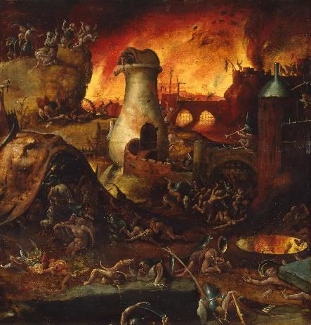
Red in both cultures is seen as representing
strength and passion however we might see it as
an eviller colour associated mainly with fire, blood
and hell in the catholic religion as seen in
Hieronymus Bosch’s depictions of hell in the late
fourteenth century. Red in Beauty and the Beast is
used predominately as an evil colour, used on
Gaston, Le Fool and the village who, as said in Figure 20: Bosch, Hieronymus. Hell
1500-1504.
chapter one, is an extension of Gaston’s character
rather than their own characters. Red is seen most often as a background colour
when the focus is on Gaston and the Beasts cape at the beginning of the film to
show his anger at Belle and Maurice. The colour red is used on characters to show
their alignment and predominant emotions.
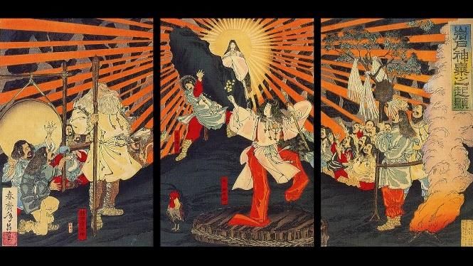
In Japan however red is associated
more with the repelling of spirits
rather than the representation of
them which is why many shrines
and temples in Japan are painted
red/vermilion. Therefore, Studio
Ghibli uses red in the way that they Figure 22: Utagawa(shunsai), Tasimasa. Iwato kagura no
kigen, 1887.
do. An intense red or vermillion is
used sparingly and only in places where it
would make scene to use it in a spiritual way
i.e. as a secondary colour in Ashitaka’s design,
Figure 21: Still taken from Princess
Mononoke (1997).
26 | P a g eon San’s mask as she is trying to fit in with the wolf spirits and red is often
depicted on sprints and god robes in the Shinto religion and art work as seen in
this artwork, Iwato kagura no kigen, by Utagawa(shunsai) Tasimasa in 1887 gods
are often depicted wearing red and white, on Jijo’s robes who is pretending to be
a monk and thus wears the tradition red and white robes and places where red is
suited to achieve realism like blood, scratches and sunsets.
Disney tends to use Blue more often and
dominate whole scenes with it while studio
Ghibli saves it for use on characters, sky’s
and rivers. The use of dark blue in Beauty
and the Beast is primarily on the character
Figure 23: Still taken from Princess Mononoke
of the Beast and his castle giving the castle a (1997).
cold and depressing atmosphere which is akin to how the Beast feels for the first
half of the. Blue is also used as a contrasting colour to show the two different sides
of the film, Belle and the Beast in blue and Gaston in red. Blue is used in a similar
way but a different tone in Princess Mononoke. Ashitaka and his village are the
only characters to wear bright blue in the film, the lighter tone suggests a neutral,
cool and passive personality. While the cultural symbolism of these two colours
has similar in both the west and Japan it is interesting that they have saved this
shade of bright blue for just Ashitaka, the environment and the forest spirit. This
was done to link Askitaka to the natural world and to make him stand out in
scenes in which he is an outsider like when he is in Iron town and stands out from
the people around him as well as not to have him blend in with any environment,
Ashitaka is a neutral character for the viewer to see the world through and having
bright blue as his primary colour not only infers that but sets him out from any
other character in the film. As mentioned previously the indigo colour worn by
many of the villagers is more representation of reality rather than an intentional
colour choice used to define traits and themes.
Conclusion
These two studios have two unique ways of using colour to enhance the story
and the themes in their respective films. The cultural differences between each
studio makes a significant difference in the choice of colours and the way that
27 | P a g ethey are used. Disney uses contrasting colours and will change the whole
environment’s colour palate to display the emotions of characters and the
themes in the film, using largely blues and reds to represent depression and
hatred respectively. Studio Ghibli uses colour to inform on a character’s
personality traits in a similar way Disney does, with different meanings and use
in the case of red and blue, but they use a larger amounts of different colours to
show good, evil, the natural world and the influence humanity has on the
natural world. A deep visual analysis of the colour palates of the films
emphasises this difference in the use of colour. Each studio uses their
perception of colour, influenced by their unique histories, to impart emotions
and themes however the way in which they are used, and the colours chosen to
represent the themes and emotions are fundamentally different in many
examples.
28 | P a g eConclusion
29 | P a g eThe question is whether the culture you grew up in has an impact on the way
you perceive and use colour in relation on film. By comparing two similar films
by two similar studios from the same time by largely different cultures we can
see that there is a difference in how colour is used and when it is used. In
critically analysing Beauty and the Beast (1991) and Princess Mononoke (1998)
with research from a variety of sources and then comparing the differences in
these two films in relation to colour it is clear to see that the way colour is used
in these films are representative of their unique and different cultures. While
the enjoyment of either film is not hampered by the lack of cultural knowledge it
does bring more life and meaning to each of the films after learning about why
colours are used and how.
In the first two chapters the use of colour in Beauty and the Beast and Princess
Mononoke was analysed. The use of colour, how it was used, when it was used
and why it was used was investigated thoroughly in relation to each culture’s
history and art. Through an analyses of Beauty and the beast it was found that
Disney uses large swathes of colour to dominate backgrounds and scenes
assisting in setting the tone of the scene and using it to show the alignment and
emotions of a character through their costume choice, having Gaston and the
village dressed in bright reds to show his evil passionate nature, Belle in a white
and blue dress to show her kindness juxtaposed against Gaston and the Beast
wearing red when he is angry, blue when he is bonding with Belle and having
his whole castle in blue tones to symbolise his depressive, lonely state. In
chapter one these were discussed and investigated through the eyes of the west
and its history, showing that Disney relies on our cultural perception of colour
to assist in storytelling.
In chapter two Princess Mononoke was analysed in the same way Beauty and the
Beast was analysed by looking at when the colour is used and why it is used and
investigating what meaning those colours have in Japan and why they have that
meaning. After research into Japanese history and culture it is now clear that
studio Ghibli has a greater amount of detail, uses less colour, mostly reserving
the bright colours for use on characters and that the colours chosen for certain
scenes and characters have a different connection in Japan and using the green
30 | P a g enatural environment in contrast to the black burnt forests to show the human vs
nature theme in the film but also to make the colour of the character’s costumes
stand out in their environment rather than blend in like in Beauty and the Beast.
Studio Ghibli relies on the Japanese perception of colour and their history with
colour to achieve all these themes.
In chapter three, after analysing both films in chapter one and two, they were
compared with each other to highlight the differences in the use of colour. After
thoroughly comparing both films and analysing the why and how they have
used colour it is clear that the difference in culture has a large impact on the
way that the films are perceived, messages that you might not have understood
or gotten confused are clearer when shown why they have been chosen and the
history behind their choice. The context in which colours are chosen and
displays a significant difference in the meaning of colours between these two
cultures.
These two films are different and similar in many aspects but the approach to
colour in these films is different and after a through breakdown of the use of
colour in both films it is clear to see that the history and culture of both studios
makes the use and choice of colour unique to their respective cultures and that
the location you grew up in has a significant impact on way you perceive colour
in media as a whole.
31 | P a g eWorks Cited:
Berlin, Brent, and Paul Kay. Basic Color Terms: Their Universality and Evolution.
Berkeley: University of California Press, 1969. Print.
Buonocore, Tommaso. Exploring chromatic storytelling in movies with R,
Towards Data Science, April 8th, 2019. Web
Davis, Amy M. Handsome Heroes & Vile Villains: Men in Disney's Feature
Animation, Indiana University Press, 2014. Print
Fry, Stephen. Mythos. Penguin UK. 2017. Print.
Hibi, Sadao and Fukuda, Kunio. The Colours of Japan. Kodansha International
Ltd, 2 Feb. 1999. Print.
Hu, Tze-Yue G. Frames of Anime: Culture and Image-Building, Hong Kong
University Press, 2010. Print.
Kastan, David. On Colour. New Haven: Yale University Press, 2018. Print
McCarthy, Helen. Hayao Miyazaki: Master of Japanese Animation: Films, Themes,
Artistry. Berkeley, Calif: Stone Bridge Press, 1999. Print.
Okuyama, Yoshiko. Japanese Mythology in Film: A Semiotic Approach to Reading
Japanese Film and Anime, Lexington Books, 2015. Print
Princess Mononoke. Dir Hayao Miyazaki. Studio Ghibli. 1997. Film.
Stanlaw, James. Japanese English: Language and Culture Contact, Hong Kong
University Press, 2004. Print
Beauty and the Beast. Dir Gary Trousdale, Kirk Wise. Walt Disney Pictures. 1991.
Film.
32 | P a g eYou can also read