Exploring books for children: words and pictures - The Open ...
←
→
Page content transcription
If your browser does not render page correctly, please read the page content below
Exploring books for children: words
and pictures

This item contains selected online content. It is for use alongside, not as a replacement for the module website, which
is the primary study format and contains activities and resources that cannot be replicated in the printed versions.
About this free course
This free course is an adapted extract from the Open University course EA300 Children’s literature:
www.open.ac.uk/courses/modules/ea300.
This version of the content may include video, images and interactive content that may not be optimised
for your device.
You can experience this free course as it was originally designed on OpenLearn, the home of free
learning from The Open University -
www.open.edu/openlearn/history-the-arts/exploring-books-children-words-and-pictures/content-sec-
tion-0
There you’ll also be able to track your progress via your activity record, which you can use to
demonstrate your learning.
Copyright © 2017 The Open University
Intellectual property
Unless otherwise stated, this resource is released under the terms of the Creative Commons Licence
v4.0 http://creativecommons.org/licenses/by-nc-sa/4.0/deed.en_GB . Within that The Open University
interprets this licence in the following way:
www.open.edu/openlearn/about-openlearn/frequently-asked-questions-on-openlearn . Copyright and
rights falling outside the terms of the Creative Commons Licence are retained or controlled by The Open
University. Please read the full text before using any of the content.
We believe the primary barrier to accessing high-quality educational experiences is cost, which is why
we aim to publish as much free content as possible under an open licence. If it proves difficult to release
content under our preferred Creative Commons licence (e.g. because we can’t afford or gain the
clearances or find suitable alternatives), we will still release the materials for free under a personal end-
user licence.
This is because the learning experience will always be the same high quality offering and that should
always be seen as positive – even if at times the licensing is different to Creative Commons.
When using the content you must attribute us (The Open University) (the OU) and any identified author in
accordance with the terms of the Creative Commons Licence.
The Acknowledgements section is used to list, amongst other things, third party (Proprietary), licensed
content which is not subject to Creative Commons licensing. Proprietary content must be used (retained)
intact and in context to the content at all times.
The Acknowledgements section is also used to bring to your attention any other Special Restrictions
which may apply to the content. For example there may be times when the Creative Commons Non-
Commercial Sharealike licence does not apply to any of the content even if owned by us (The Open
University). In these instances, unless stated otherwise, the content may be used for personal and non-
commercial use.
We have also identified as Proprietary other material included in the content which is not subject to
Creative Commons Licence. These are OU logos, trading names and may extend to certain
photographic and video images and sound recordings and any other material as may be brought to your
attention.
Unauthorised use of any of the content may constitute a breach of the terms and conditions and/or
intellectual property laws.
We reserve the right to alter, amend or bring to an end any terms and conditions provided here without
notice.
All rights falling outside the terms of the Creative Commons licence are retained or controlled by The
Open University.
Head of Intellectual Property, The Open University

2 of 42      http://www.open.edu/openlearn/history-the-arts/words-and-pictures-exploring-books-children/content-section-0   Thursday 8 July 2021
Contents
Introduction                                                                                                              4
Learning Outcomes                                                                                                         5
1 Words and pictures in children’s fiction through the ages                                                               6
2 Making sense of pictures                                                                                                8
3 Combining words and pictures                                                                                           11
4 Book design and intended readership                                                                                    14
    4.1 Appealing to different age groups                                                                                14
    4.2 Clues for readers of different ages and genders                                                                  17
    4.3 Marketing to different readerships                                                                               21
5 Illustration                                                                                                           24
6 Illustration as interpretation: the example of Alice                                                                   26
    6.1 Interpreting Alice                                                                                               28
7 Analysing images: composition and symbolism                                                                            31
    7.1 Decoding pictures                                                                                                33
8 An authorstrator comments on his craft                                                                                 38
Conclusion                                                                                                               40
References                                                                                                               41
Acknowledgements                                                                                                         41

3 of 42   http://www.open.edu/openlearn/history-the-arts/words-and-pictures-exploring-books-children/content-section-0        Thursday 8 July 2021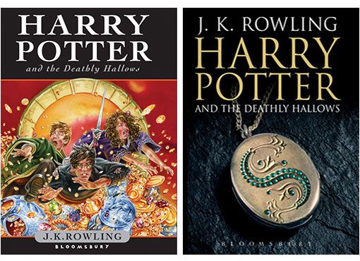
Introduction

Introduction
Pictures have played an important role in books for children ever since there have been
publications produced particularly with children in mind. But how do stories and
picturebooks encountered in childhood fire young imaginations? In this free course
Exploring books for children: words and pictures you will learn how children’s fiction,
ranging from classics such as Beatrix Potter to contemporary authors like Anthony
Browne, combines images and text in remarkably sophisticated ways to communicate
with young and old.
This free course is an adapted extract from the Open University course
EA300 Children’s literature .

4 of 42   http://www.open.edu/openlearn/history-the-arts/words-and-pictures-exploring-books-children/content-section-0   Thursday 8 July 2021
Learning Outcomes
After studying this course, you should be able to:
●    understand how images communicate meanings to the readers of children’s books
●    understand the role of cultural knowledge in making sense of images
●    understand how words and pictures can reinforce or contradict one another in a text, with interesting results
●    recognise the work of some famous illustrators for children
●    understand how the use of images in children’s books has changed over time and what it means to create books
    for the specific audiences of children and their carers.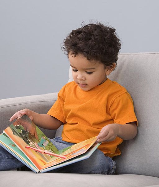
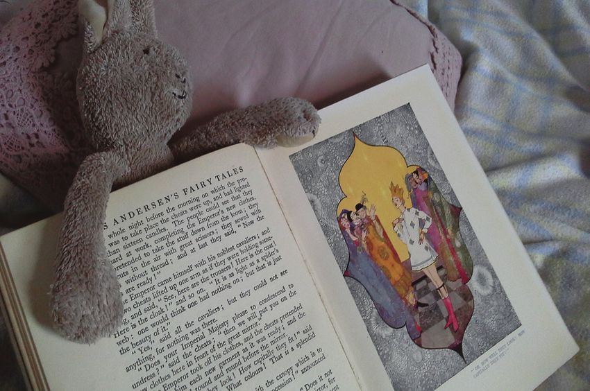
1 Words and pictures in children’s fiction through the ages

1 Words and pictures in children’s fiction
through the ages
There is evidence that children were reading books in English with pictures from as early
as the sixteenth century: for example, an illustrated 1503 edition of a crusader adventure
story, Bevis of Hampton, by Richard Pynson, shows pencil doodlings in the margins that
suggest a child’s hand. The earliest known illustrated book specifically produced for
children was a Latin text book, dating from the seventeenth century and translated into
English in 1659. In the first activity for this course you will watch a video which explores
the history of children’s book illustrations.

  Activity 1
  Iona and Peter Opie’s famous collection of children’s books was acquired by the
  Bodleian Library in 1988 and contains approximately 20 000 books printed for children
  between the sixteenth and twentieth centuries. Watch the following video that features
  a visit to this collection at the Bodleian’s Weston Library in Oxford and think about how
  have pictures in books for children changed over the years, and why?

   Video content is not available in this format.
   The history of picture books for children

  Discussion
  The video gives a brief glimpse of the history of pictures in children’s books, and how
  they changed over the centuries as a result of changing techniques, attitudes and
  markets. Illustrations in early books designed for children were often crude, cheaply

6 of 42   http://www.open.edu/openlearn/history-the-arts/words-and-pictures-exploring-books-children/content-section-0   Thursday 8 July 2021

1 Words and pictures in children’s fiction through the ages

  produced wood cuts, since it was not considered necessary to invest effort or money in
  more sophisticated illustrations for children. The frontispieces were sometimes more
  expensively produced as these were on display in shop windows. As attitudes towards
  childhood and child readers changed, pictures in children’s books reflected a gradual
  decline in moral instruction and a growing emphasis on fun and entertainment. New
  technologies such as engraving and then lithography emerged and became cheaper,
  and the quality of illustrations in books for children gradually improved. Colour became
  affordable: some of the cruder examples of colouring shown would have been carried
  out by young children in cottage industry settings. Intensely coloured editions, such as
  the 1863 edition of Red Riding Hood shown in the video, became increasingly
  common and affordable for the middle classes.
  By the late nineteenth and early twentieth century, much work of high quality was in
  circulation: this period has been called a golden age for children’s literature. The rise of
  mass education in Britain – specifically as a result of the 1870 Education Act – also
  created a growing new market of young readers at that time. Later in the course you
  will learn more about some of the famous golden age illustrators such as Walter
  Crane, Randolph Caldecott, John Tenniel, Arthur Rackham and Kate Greenaway.
  However, in the next section we focus on the way in which words and pictures work
  together to create engaging children’s stories, both classic and contemporary.

7 of 42   http://www.open.edu/openlearn/history-the-arts/words-and-pictures-exploring-books-children/content-section-0   Thursday 8 July 2021
2 Making sense of pictures

2 Making sense of pictures

Figure 1 Small child ‘reading’ a picturebook independently
‘A picture tells a thousand words’, or so the saying goes. But how does this happen?
Perhaps to an even greater degree than we do with words, we make sense of images by
drawing on existing knowledge and experience. As discussed in the introductory video,
images become particularly important in the context of books for children. As anyone who
has watched a small child ‘reading’ a picture book will know, young children are able to
derive a great deal of meaning and pleasure from the activity, even when they cannot yet
decode the letters and words. They are able to make connections between the pictures
and the words of the story, which have become familiar when read aloud to them by adults
and older children. These connections play an important role in helping children learn to

8 of 42   http://www.open.edu/openlearn/history-the-arts/words-and-pictures-exploring-books-children/content-section-0   Thursday 8 July 2021
2 Making sense of pictures

read. They are also able to draw on their expanding knowledge of other stories, and of life
in their culture more generally, to make sense of pictures that they’ve never seen before.

  Activity 2
  Consider the illustration below (Figure 2). Can you name the fairy tale it is depicting?
  How did you arrive at your answer?

  Figure 2 A fairy tale. Illustration by Molly Bang (2000, p. 17)

      Provide your answer...

  Discussion
  The illustration represents the story of Little Red Riding Hood (although other
  interpretations are certainly possible, such as Hansel and Gretel). You may have made
  some of the following observations:

  ●       The small red triangle stands out because of its colour and positioning, even
          though it is smaller than the black lines surrounding it. A hood or cape may take a
          similar triangular shape; so, aided by the colour red, we can make the link to Red
          Riding Hood using our background cultural knowledge.
  ●       The strong black vertical lines have an air of permanence and stability, as do
          trees. Their position, number and different sizing may well suggest a ‘forest’ to
          you, even though the illustration is actually just an arrangement of two-
          dimensional geometric shapes. The location of the red triangle amongst ‘trees’
          strengthens the link with the fairy tale, if we know the story about Red Riding
          Hood walking to her grandmother’s house through the wood.
  ●       If the black lines can be interpreted as ‘trees’, it might be possible to see the red
          triangle as ‘hiding behind a tree’. If we see it this way, it may look small, wary,
          vulnerable. Again, we can interpret this image in the light of our knowledge of the
          story, but also in the light of broader cultural associations (in European contexts at
          least) of woods and forests as potentially dangerous and scary places to be
          alone.

9 of 42    http://www.open.edu/openlearn/history-the-arts/words-and-pictures-exploring-books-children/content-section-0   Thursday 8 July 2021
2 Making sense of pictures

Molly Bang is an American illustrator and a teacher of illustration. In the book from which
this image comes, she shows how a fairy tale can be constructed visually using a series of
shapes (Bang, 2000).

Figure 3 A fairy tale (A on the left, B on the right). Illustration by Molly Bang (2000,
pp. 24, 40)
She starts with a simple red triangle, and adds ‘trees’ (Figure 2). As the scene progresses,
Bang resizes Little Red Riding Hood to make her smaller, places her further from the
foreground to emphasise her vulnerability, and tilts a ‘tree’ onto the diagonal to add a
sense of threat. Starting with three black triangles, she begins to make the wolf (Figure 3
A). Finally, she darkens the background to portray a more threatening sense of darkness
and night-time, and adds more geometric shapes to develop the wolf further (Figure 3 B).
What Bang does in this series of illustrations is bring to the fore much of the background
knowledge we already have, making this explicit by showing at once the surface simplicity
and the deeper complexity of the knowledge that we need in order to read, see and
understand picturebooks. In the next section, we will look at the various ways in which
texts produce meaning when words and images are combined.

10 of 42   http://www.open.edu/openlearn/history-the-arts/words-and-pictures-exploring-books-children/content-section-0   Thursday 8 July 2021
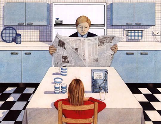
3 Combining words and pictures

3 Combining words and pictures
So what happens when we put words and pictures together? Illustrations can often be an
integral part of literary texts for children and can convey important aspects of the meaning
of the text. In some instances, the use of illustration is mostly decorative, but in others it
can be a key element of the narrative itself. In fact, literature for children is a field in which
the potential of the mixture of words and images is exploited to the full.
One important role of images in a children’s text may be to echo or reinforce the story as
conveyed in words. Alternatively, the image may add something more substantial in terms
of detail or atmosphere. It may even suggest additional storylines, subplots or a backstory.
However, the relationship between word and image may be even more complex and even
contradictory. Figure 4 below shows a double-page spread that occurs early on in the
book The Tale of Peter Rabbit (1902) by Beatrix Potter. The next activity asks you to think
about the ways in which these words and images relate to each other.

Figure 4 Double page spread from The Tale of Peter Rabbit by Beatrix Potter
We know from the words on the left that Mrs Rabbit is issuing instructions and a kindly but
stark warning to her children. The image on the facing page, however, alerts us to the fact
that, as in all the best stories, things are unlikely to be straightforward, and something will
go wrong. Mrs Rabbit is fully focused on her children, who are, in turn, attentive to her
words – at least, three of them are. Peter has his back to his mother and is clearly not
listening. His coat is a different colour from that of the others – another clue that he is
different, in attitude as well as gender. He seems impatient to leave (and his eye direction
leads us to turn the page ourselves). Potter is, therefore, providing visual clues for the
reader that foreshadow Peter’s disobedience and its almost fatal consequences. This
unspoken tension – between the image of the rebellious child hero on one hand and the
words which emphasise the parental voice requiring obedience on the other – may be an
important part of the thrill for a young reader.

11 of 42   http://www.open.edu/openlearn/history-the-arts/words-and-pictures-exploring-books-children/content-section-0   Thursday 8 July 2021
3 Combining words and pictures

  Activity 3
  Look at this series of images from children’s books. As you browse through the slide
  show, consider the following:

  1.       What role is the image playing in the story?
  2.       How fundamental is the image to the story? (Would the story stand alone without
           the pictures?)
  3.       What kind of audience were the images designed for?
  4.       What can you tell about the historical era in which the book was produced,
           judging by the images?

   Interactive content is not available in this format.

   Figure 5 Series of images from children’s books

       Provide your answer...

  Discussion
  1.       The images play a variety of different roles. In some cases, they are purely
           decorative, as in the case of Walter Crane’s front cover design for Little Red
           Riding Hood. Some illustrations enhance the text, but the words could stand
           alone – the example from Alice in Wonderland is a case in point. Others add a
           significant dimension to the words. The cover illustration of The Best Bat in the
           School is a good example of this. It depicts a schoolgirl batting energetically in a
           cricket match; not only is it clearly designed to appeal to female readers, but it
           also makes a statement about girls being heroic, strong and sporty. In many
           cases, the visual aspect is fundamental to the text – in the Asterix the Gaul comic
           book, for example. This image also combines words and graphic techniques – for
           example, large bold letters for shouting – as a narrative technique. There are
           other examples of this; for example, the string of words used as a dog lead in
           Charlie and Lola: We Honestly Can Look After Your Dog .
  2.       In some of the examples for younger children, the visual and material aspects of
           book design are completely fundamental to the reading of the story – The Very
           Hungry Caterpillar is a well-known example of this, where a small child’s fingers
           become the caterpillar. On the In the Night Garden web page, interactive circles
           of colour are used to guide the reader’s pathway through the story.
  3.       We can infer quite a lot about the type of audience these books are intended for,
           simply from the way they look. Images aimed at younger children tend to have
           bright colours and bold lines. It is interesting to note the contrast in the use of
           colour between Inquisitive Peter and other Funny Tales and the Walter Crane
           Red Riding Hood. The latter’s sophisticated colours and detailed drawing seem to
           be aimed at the purchasing adult, while the bright colours and humorous images
           of the former seem designed to entice the child reader. The Wolves in the Walls,
           aimed at readers of 7+ years, provides an interesting contrast: its colours are
           muted and even sombre, reflecting the sometimes darker content of con-
           temporary fiction for this age group.

12 of 42    http://www.open.edu/openlearn/history-the-arts/words-and-pictures-exploring-books-children/content-section-0   Thursday 8 July 2021
3 Combining words and pictures
4. The images also give a lot of clues about the historical era when they were
produced. They show that styles of illustration have changed over the years, as a
result of evolving tastes and book production technologies. For example, the
colour palette of The Best Bat in the School has definite echoes of Britain
between the two World Wars, and Rackham’s fine line drawings in the Alice in
Wonderland example are typical of the nineteenth and early twentieth century.
13 of 42 http://www.open.edu/openlearn/history-the-arts/words-and-pictures-exploring-books-children/content-section-0 Thursday 8 July 20214 Book design and intended readership
4 Book design and intended readership
As you saw in Activity 3, not only do images play an important role in storytelling in
children’s books, they are also important in appealing to and addressing particular
readers, especially when they are on the front cover. You were probably able to make
some guesses about the historical period of a particular book, partly based on your own
cultural knowledge about how children, childhood and child readers have been
understood differently at different times and in different cultural contexts, and partly based
on broader cultural clues. Books for children are also tailored to appeal to children of
different age groups, and sometimes of different genders, and again, pictures and the
material design of a book play a major role. This is explored further in the activities in this
section.
4.1 Appealing to different age groups
When browsing the children’s section of a book shop, most people would fairly quickly be
able to identify the titles aimed at younger children. What is more, young children
themselves will generally need no assistance in finding the books they like, long before
they become readers in the conventional sense. So, what visual clues might readers be
responding to that draw them to ‘age-appropriate’ fiction?
Activity 4
Have a look at the three book covers below (you can enlarge them by clicking on each
image). Then answer the multiple choice questions about them.
Figure 6 Front cover of Where’s Spot?
What age range do you think this book is aimed at?
o 0–4
o 5–8
o 9–12
o teenagers
o other
Answer
The correct answer is 0–4.
Is it specifically for boys or girls?
o boys
14 of 42 http://www.open.edu/openlearn/history-the-arts/words-and-pictures-exploring-books-children/content-section-0 Thursday 8 July 20214 Book design and intended readership
o girls
o both
Answer
The correct answer is ‘both’.
Figure 7 Front cover of Beware of the Storybook Wolves, by Lauren Child
What age range do you think this book is aimed at?
o 0–4
o 5–8
o 9–12
o teenagers
o other
15 of 42 http://www.open.edu/openlearn/history-the-arts/words-and-pictures-exploring-books-children/content-section-0 Thursday 8 July 20214 Book design and intended readership
Answer
The correct answer is 5–8.
Is it specifically for boys or girls?
o boys
o girls
o both
Answer
The correct answer is ‘both’.
Figure 8 Front cover of Red Shift, by Alan Garner
What age range do you think this book is aimed at?
o 0–4
16 of 42 http://www.open.edu/openlearn/history-the-arts/words-and-pictures-exploring-books-children/content-section-0 Thursday 8 July 20214 Book design and intended readership
o 5–8
o 9–12
o teenagers
o other
Answer
The correct answer is ‘teenagers’.
Is it specifically for boys or girls?
o boys
o girls
o both
Answer
The correct answer is ‘both’.
Discussion
You may already be familiar with these books, or the titles may have contributed to
your answers. But the visual look of the book also conveys much of the information
about their intended readership, as well as other things, such as genre.
None of these books is aimed specifically at either boys or girls. They are, however,
aimed at specific age groups. The first book is part of the Where’s Spot? series for very
young children. This intended audience is reflected in the design of the cover, which
consists of simple, clear illustrations, a plain font and bold use of colour.
The second book, Beware of the Storybook Wolves by Lauren Child, is a retelling of
classic fairy tales but with a slight twist. It is probably aimed at 4–6 year olds. Although
the design is not quite as simple as Where’s Spot?, the illustration is still colourful and
cartoon-like, with a quirky font.
The third book, Red Shift by Alan Garner, is a rather dark narrative about three
teenagers. The mood of the book is indicated by the enigmatic image of Mow Cop
castle on the front cover. The colours in the design are not as vivid as those in the
books for younger children. The choice of a photograph rather than an illustration also
suggests an older intended readership.
4.2 Clues for readers of different ages and genders
It is sometimes not even necessary to look at entire images in order to pick up visual clues
about the intended readership of a children’s book. Even quite small details on front
covers may signal to the potential parent or child buyer (or library customer) who the book
is aimed at. The next activity provides some examples for you to explore.
Activity 5
Below are fragments from the covers of two children’s books: answer the multiple-
choice questions for each.
17 of 42 http://www.open.edu/openlearn/history-the-arts/words-and-pictures-exploring-books-children/content-section-0 Thursday 8 July 20214 Book design and intended readership
Note: When choosing between answers you may feel that, for certain of the books,
more than one category is appropriate (for example, ‘young teenagers’ and ‘older
teenagers’). If this is the case, you can select multiple answers.
Figure 9A Children’s book cover fragment
What age range do you think this book is aimed at?
o 0–4
o 5–8
o 9–12
o young teenagers
o older teenagers
o other
Answer
The correct answers are ‘young teenagers’ and ‘older teenagers’.
Is it specifically for boys or girls?
o boys
o girls
o both
Answer
The correct answer is ‘girls’.
What genre do you think the book is?
o adventure
o romance
o fantasy
o realism
18 of 42 http://www.open.edu/openlearn/history-the-arts/words-and-pictures-exploring-books-children/content-section-0 Thursday 8 July 20214 Book design and intended readership
Answer
The correct answer is ‘romance’.
This is the cover for The Princess Diaries: After Eight by Meg Cabot, one in a series of
books telling the story of Mia, a ‘totally normal Manhattan 14-year-old’ who finds out
one day that she’s heir to the throne of a small European country. The series
chronicles the various adventures that Mia has dealing with being a teenager while
adapting to her new role as a princess.
The books in this series are very much aimed at a readership of girls in their early
teens. This is indicated on the cover by the use of the colour pink, the cursive font used
for the title, and the imagery, which is full of graphic representations of hearts and
perfume bottles. The full front cover is shown below:
Figure 9B Front cover of The Princess Diaries © Meg Cabot, Macmillan Children’s
Books, 2007. Cover illustration by Nila Aye.
Figure 10A Children’s book cover fragment
What age range do you think this book is aimed at?
o 0–4
o 5–8
o 9–12
o young teenagers
o older teenagers
o other
19 of 42 http://www.open.edu/openlearn/history-the-arts/words-and-pictures-exploring-books-children/content-section-0 Thursday 8 July 20214 Book design and intended readership
Answer
The correct answers are 9–12 and ‘young teenagers’.
Is it specifically for boys or girls?
o boys
o girls
o both
Answer
The correct answer is ‘boys’.
What genre do you think the book is?
o adventure
o romance
o fantasy
o realism
Answer
The correct answer is ‘adventure’.
This is the cover for Skeleton Key by Anthony Horowitz. Again, this is part of a series –
in this case, the Alex Rider books relating the adventures of a teenage spy.
These are very much ‘books for boys’. Again, the cover design suggests this, with the
skull-and-cross bones image dominating the picture (providing a visual pun with the
title), the clean contrast between silver and green, the bold but simple font and the
silhouette of the boy shining his torch towards us. The design is far more austere than
the ornate and decorative cover of The Princess Diaries, and suggests a world of
danger, secret formulas and intrigue. The full front cover is shown below.
Figure 10B Front cover of Skeleton Key © 2005 Walker Books Ltd. Boy with torch logo
™ & © 2005 Stormbreaker Productions Ltd. Reproduced by permission of Walker
Books Ltd, London SE11 5HJ.
20 of 42 http://www.open.edu/openlearn/history-the-arts/words-and-pictures-exploring-books-children/content-section-0 Thursday 8 July 20214 Book design and intended readership
4.3 Marketing to different readerships
Of course, just because a book is aimed and marketed at a particular age-group or
gender, doesn’t mean that other children won’t or can’t read and enjoy it. It is interesting to
reflect on the extent to which children’s reading choices are influenced by images and
other aspects of visual design. Are children’s reading choices unnecessarily restricted by
such non-verbal messages? For example, interviews with children conducted for the
Open University course EA300: Children’s Literature revealed that boys are reluctant to
read books which feature the colour pink on the cover. To what extent might they be
missing out on stories that they might enjoy just as much as a girl would? Research by
Edward Salmon (1888) showed that even in the nineteenth century girls were often willing
or keen to read books which appear to be intended for boys. Nevertheless, some may still
be put off by imagery such as the skull and crossbones above. The visual elements are. in
these cases. being used to appeal to particular markets, and thus provide an
interpretation of the verbal story that is likely to be popular with certain readers. This point
is further illustrated in the next activity.
Activity 6
Here are two more fragments from the covers of children’s books. Please answer the
multiple-choice questions for each. Again, more than one category may be
appropriate, and you can select multiple answers.
Figure 11A Front cover fragment 1
What age range do you think this book is aimed at?
o 0–4
o 5–8
o 9–12
o young teenagers
o older teenagers
o other
Answer
The correct answers are 5–8, 9–12 and ‘young teenagers’.
Is it specifically for boys or girls?
o boys
o girls
21 of 42 http://www.open.edu/openlearn/history-the-arts/words-and-pictures-exploring-books-children/content-section-0 Thursday 8 July 20214 Book design and intended readership
o both
Answer
The correct answer is ‘both’.
What genre do you think the book is?
o adventure
o romance
o fantasy
o realism
Answer
The correct answer is ‘fantasy’.
Figure 11B Front cover fragment 2
What age range do you think this book is aimed at?
o 0–4
o 5–8
o 9–12
o young teenagers
o older teenagers
o other
Answer
The correct answers are ‘older teenagers’ and ‘other’.
Is it specifically for boys or girls?
o boys
o girls
o both
Answer
The correct answer is ‘both’.
What genre do you think the book is?
o adventure
o romance
o fantasy
22 of 42 http://www.open.edu/openlearn/history-the-arts/words-and-pictures-exploring-books-children/content-section-0 Thursday 8 July 20214 Book design and intended readership
o realism
Answer
The correct answer is ‘fantasy’.
These two covers are for the same book: Harry Potter and the Deathly Hallows. The
difference is that one is the version marketed for children, and the other is the one
marketed for adults. The contents of the books themselves are exactly the same, but
the front covers are quite different. Even the font used in the title is a little different, with
the one in the adult version being thinner and more elongated. Likewise, the overall
colour scheme is far more muted in the adult version, while the children’s version is full
of bright colours.
The use of a hand-drawn illustration in contrast to the stylised photographic image is
another notable difference. The children’s version offers an image bursting with action
and featuring characters from the story, while the adult version has a far more
enigmatic and abstract image of a pendant.
The book appears to be marketed to the widest possible audience. According to the
educational company Scholastic (2006), the average age at which children start
reading the Harry Potter books is nine, and they are slightly more popular with girls
than with boys. However, they have been exceptionally popular with both boys and
girls, and both children and adults. These two covers suggest how the publishers are
attempting to build on this wide readership in the way they present the book.
Figure 11C Two different front covers for Harry Potter and the Deathly Hallows. Harry
Potter and the Deathly Hallows: (children’s version) cover image by Jason Cockcroft;
(adult version) cover image by Michael Wildsmith. Reproduced with permission of
Bloomsbury Publishing.
23 of 42 http://www.open.edu/openlearn/history-the-arts/words-and-pictures-exploring-books-children/content-section-0 Thursday 8 July 20215 Illustration 5 Illustration Illustration is increasingly recognised as an integral part of children’s book production, playing a role equally, if not more, important than the words of a story. This increased recognition is demonstrated by the fact that, since 1955, the Chartered Institute of Library and Information Professionals, or CILIP, has awarded the Kate Greenaway Medal for ‘distinguished illustration in a children’s book’, alongside the more longstanding Carnegie prize for a work of children’s fiction (inaugurated in 1936). The Greenaway Medal has been awarded to well-known illustrators such as Shirley Hughes, Raymond Briggs, Quentin Blake and Anthony Browne. Another sign of the growing acknowledgement of the artistry and importance of pictures alongside words in children’s fiction is the now quite common use of the term ‘authorstrator’. This term was first coined by illustrator Martin Salisbury to emphasise that the illustrator needs to have an authorial voice in the finished text, as the job of the pictures is just as much a storytelling one as that of the words. In the next activity you will hear Salisbury discussing illustration. Activity 7 Watch the following video featuring Martin Salisbury, who introduces the work of some well-known and historically important illustrators of children’s books. We have included some examples from these illustrators for you to consider as you listen; you may wish to look on the internet for more. As well as being an illustrator, Martin Salisbury teaches children’s book illustration at Anglia Ruskin University, Cambridge. As you listen, reflect on what the images, and Salisbury’s commentary on them, tell us about changing ideas about childhood and the child. What do you learn about the complexity of children’s books? Video content is not available in this format. Illustrators of children’s books 24 of 42 http://www.open.edu/openlearn/history-the-arts/words-and-pictures-exploring-books-children/content-section-0 Thursday 8 July 2021
5 Illustration

  Discussion
  This tour of the work of famous illustrators enables us to see how picture books have
  evolved according to the social and historical context in which they were produced.
  Kate Greenaway’s idyllic imagery, for example, suggests that the 1880s were a time of
  nostalgia in Britain, dominated by an idea of childhood as safe, innocent and carefree.
  The style, words and imagery of the Smith/Scieszka/Leach partnership, on the other
  hand, suggest that a certain amount of mischief – even anarchy – is normal and
  acceptable in a young child. Salisbury’s in-depth knowledge of illustration enables him
  to present a nuanced assessment of the work of a wide range of children’s illustrators.
  His commentary shows how complex this field is. For example, illustration is at the
  heart of debates about what is ‘suitable’ for children, and the level of sophistication that
  they can cope with. Salisbury appears to be of the view that children can absorb and
  enjoy very sophisticated images, and that the British market, at least, tends to be
  rather conservative in this regard.

25 of 42   http://www.open.edu/openlearn/history-the-arts/words-and-pictures-exploring-books-children/content-section-0   Thursday 8 July 2021
6 Illustration as interpretation: the example of Alice

6 Illustration as interpretation: the example
of Alice
Another way that illustrations can play an important part in a text is by providing a specific
interpretation of elements of the verbal narrative.
The illustration below is by John Tenniel, the illustrator for the original editions of Alice’s
Adventures in Wonderland and Through the Looking-glass. For many people, this has
become the classic image of Alice. If you are familiar with the books containing Tenniel’s
illustrations, this may well be the image you have in your mind’s eye when you think of
Alice.

Figure 12 Alice with ‘Drink me’ bottle as portrayed by John Tenniel
But this is just one particular illustrator’s interpretation of the character, and some people
feel that it does not represent the character created by Lewis Carroll’s narrative. For
example, in the words of one commentator, Tenniel’s drawings make Alice look ‘overly
serious and expressionless’ (Davis, 1979, p. 6).

26 of 42   http://www.open.edu/openlearn/history-the-arts/words-and-pictures-exploring-books-children/content-section-0   Thursday 8 July 2021
6 Illustration as interpretation: the example of Alice

  Activity 8
  Click on the link to view four more illustrations of Alice, and then pass the mouse over
  each illustration to reveal details about its illustrator. In what ways do you feel that
  these artists have interpreted Alice’s character differently from Tenniel?

   Interactive content is not available in this format.

   Figure 13 Different interpretations of Alice

    Provide your answer...

  Discussion
  The images show different interpretations of Alice by four illustrators: Lewis Carroll,
  Mabel Lucie Attwell, Arthur Rackham and Peter Blake.
  The first illustration is by Lewis Carroll. It is a black-and-white drawing of a young girl
  with long dark wavy hair. Only her upper body is depicted. She is facing front-right, and
  is wearing a top with short sleeves and a v-neck. She is shown pushing aside a curtain
  with her left hand as she looks at a key that she is holding up in front of her in her right
  hand. The caption just below the illustration says, ‘Lewis Carroll, 1886’. When the
  mouse cursor is held over the image, it enlarges slightly and text appears saying, ‘This
  is an illustration by Lewis Carroll himself, from 1886. In Davis’s words, “Carroll’s Alice
  is a serious-minded little girl quite capable of coping with the illogical wonderland”
  (Davis, 1979, page 9)’.
  The second illustration is a black-and-white line drawing by Mabel Lucie Attwell. She
  portrays Alice as a tall, slender, slightly awkward young girl, with shoulder-length fair
  hair and long thin legs. She is shown standing, facing frontwards, and holding a fan
  open in front of her with both hands. She is wearing a short polka-dot puffball of a
  dress, cinched in at the hips and with oversize sleeves, and dark stockings and white
  buckled shoes. When the mouse cursor is held over the image, it enlarges slightly and
  text appears saying, ‘This is an illustration by Mabel Lucie Attwell, from 1910. Attwell
  was a very popular illustrator in the 1920s and 30s, and was known for her rather cute
  and nostalgic depictions of children, of which Alice is an example’.
  The third illustration of Alice is by Arthur Rackham. Again, Alice is shown as a tall,
  slender girl. She is standing with her arms behind her back, her body turned towards
  the right, although her face is looking frontwards, at the viewer. She has long dark hair
  and rosy cheeks. She is wearing a long-sleeved, full-skirted dress with a pattern of
  flowers on it, and dark stockings and shoes. The colours in the illustration are very
  subtle, reminiscent of a charcoal drawing on beige paper with highlights of red chalk. In
  the top left corner is the word ‘Alice’, while Rackham’s signature and the date are in the
  bottom left corner. When the mouse cursor is held over the image, it enlarges slightly
  and text appears saying, ‘Arthur Rackham’s Alice is considered by some to be
  “maturer” than Tenniel’s (Davis, 1979, page 11). Again there is a seriousness of
  character to her, which is quite different from the stylised, almost cartoon-quality of
  Atwell’s interpretation’.
  The fourth image is of a watercolour painting by Peter Blake. The colours are clear and
  vivid, and Alice is portrayed as a modern little girl with long straight brown hair, brown
  eyes and freckles. Only her head and shoulders are depicted, and she is looking

27 of 42   http://www.open.edu/openlearn/history-the-arts/words-and-pictures-exploring-books-children/content-section-0   Thursday 8 July 2021
6 Illustration as interpretation: the example of Alice
directly out at the viewer, with a serious expression. She is wearing a white top with a
red trim bordering the neckline and the top of the sleeves. On her head is what looks
like a gold paper crown. Directly behind her is a mass of red, white, pink and yellow
flowers, and beyond them are green fields and, in the distance, the outline of green
hills. When the mouse cursor is held over the image, it enlarges slightly and text
appears saying, ‘Peter Blake, who is most famous for his pop art, created a series of
watercolours based on the Alice books in 1970. These have more of a realist element
to them than the other illustrations, and show a pensive young girl’.
6.1 Interpreting Alice
Illustrations may play a particularly important role in children’s fiction because of its often
fantastic and improbable subject matter. Alice in Wonderland again provides us with a
good example of this. You may recollect some of the following words that occur at the
beginning of Carroll’s famous poem ‘Jabberwocky’, which appears in the novel:
’Twas brillig, and the slithy toves
Did gyre and gimble in the wabe;
All mimsy were the borogoves,
While it is possible to gain some meaning from the verbal text of Lewis Carroll’s poem
‘Jabberwocky’ despite the fact that it consists mostly of newly invented words, it would be
very difficult to describe exactly what the Jabberwock looks like based only on the details
given in the verbal text.
Activity 9
Part 1
Look at the first four stanzas of the poem, and highlight the words used in it to describe
the Jabberwock itself. For words that are in standard English, use the first highlighting
tool (by clicking on the yellow button and then highlighting your chosen words). For
words that are invented words, use the second highlighting tool (by clicking on the
green button before highlighting them). There are six words or phrases to highlight
in all.
Interactive content is not available in this format.
Answer
Interactive content is not available in this format.
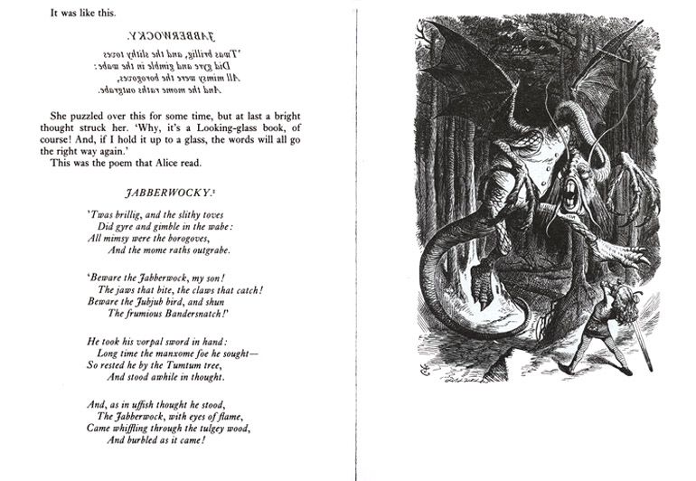
28 of 42 http://www.open.edu/openlearn/history-the-arts/words-and-pictures-exploring-books-children/content-section-0 Thursday 8 July 20216 Illustration as interpretation: the example of Alice Part 2 Based on this slight description, what do you imagine the creature would look like? The image below is how John Tenniel, the book’s original illustrator, portrayed the scene described in ‘Jabberwocky’. Is Tenniel’s representation similar to how you imagined it from your reading of these lines of the poem? Point the mouse cursor at different parts of the image to reveal details from the poem that Tenniel has included in his illustration. Interactive content is not available in this format. Figure 14 Illustration of the Jabberwock from the book Through the Looking-glass, by John Tenniel Discussion The image shows John Tenniel’s illustration of the Jabberwock from Chapter 1 of the book Through the Looking-glass. It is a black-and-white engraving which is very densely drawn and atmospheric. Emerging from a dark wood of tall straight trees with thickly tangled upper branches is a strange and gigantic creature. It is dragon-like, with scales, a long tail and two large bat-like wings on its back. It is moving forward on two hind legs that resemble those of a giant turkey. It seems to be half flying, half leaping. Its two huge forelegs are held in front of its body, and from the ends of each are four long vicious-looking talons. Two long, wavy antennae emerge from the top of its head, above glaring bulbous eyes. A pair of catfish-like feelers straddles each side of its snarling mouth. The teeth are large and rabbit-like. Its neck is long and serpentine, and extends out in front of the creature at around shoulder-height. In the bottom right part of the illustration is a young man who is standing with his back to the viewer, his legs apart, wielding a large sword. He has long fair hair and is dressed in doublet and hose. He is small in comparison to the creature, reaching around the height of its knee. When the mouse is passed over five specific areas of this image, a text box is revealed, each containing the following phrases: jaws that bite, claws that catch, eyes of flame, tulgey wood, vorpal sword. The rest of the image is Tenniel’s own interpretation of the scene. For example, the scale of the creature, which completely dwarfs the diminutive protagonist, is part of this interpretation. In this respect, the image uses similar techniques to those you saw in Section 1, where you came across images in which Molly Bang had manipulated size and positioning of shapes to suggest a particular interpretation. The creature’s shape is also part of the interpretation, as are its various features and its position in the composition. In this way, the raw ingredients are blended to create an image that both complements the verbal text but also extends its meaning. 29 of 42 http://www.open.edu/openlearn/history-the-arts/words-and-pictures-exploring-books-children/content-section-0 Thursday 8 July 2021
6 Illustration as interpretation: the example of Alice

Below is the poem ‘Jabberwocky’ as it appears on the page of the original text. Although
the poem is often taken out of context, as you can see, it occurs in the narrative alongside
the illustration and as part of the wider narrative.

Figure 15 The poem ‘Jabberwocky’ as it appears in the original text
One important aspect from the original context, for example, is that the first stanza is first
printed backwards, but Alice then reads it by holding it up to a looking-glass. This element
is lost if the poem is taken out of its original context, as is the added meaning and
interpretation that comes from the illustration itself. In this example, therefore, we can see
that the combination of word, image and context all contribute to the overall effect of
reading the text.

30 of 42   http://www.open.edu/openlearn/history-the-arts/words-and-pictures-exploring-books-children/content-section-0   Thursday 8 July 2021
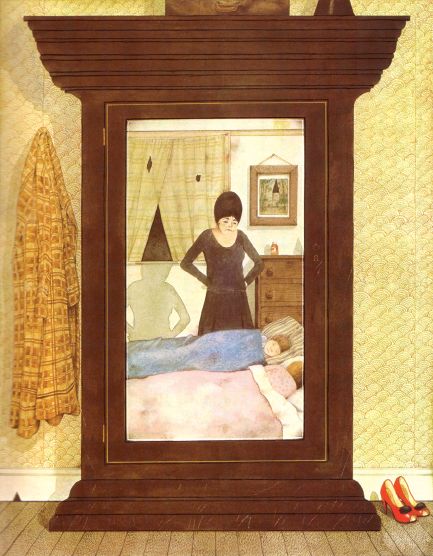
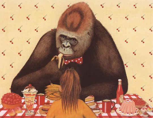
7 Analysing images: composition and symbolism

7 Analysing images: composition and
symbolism
The author of Hansel and Gretel, Anthony Browne, is well known for his stories which
depict gorillas in human roles. The gorilla motif recurs throughout Browne’s work, gorillas
being a long-term passion of his. The next activity looks at how mood and relationships
may be conveyed to the reader in pictures, using two pages from Anthony Browne’s
Gorilla (2002). This is the story of a young girl, Hannah, living with her father who is too
busy to pay her much attention. She longs for a gorilla; when given a toy one, it comes to
life and takes her off on a series of nocturnal adventures, bringing warmth and security
into her life. Her relationship with her father also improves as a result.

  Activity 10

  Part 1
  The illustration below is from Anthony Browne’s book Gorilla, and shows the central
  character, Hannah, having breakfast with her father.

  Figure 16 Hannah and her father. Illustration: Copyright © 1983 Anthony Browne.
  From GORILLA by Anthony Browne. Reproduced by permission of Walker Books Ltd,
  London SE11 5HJ.
  Based on this illustration, what kind of relationship do you think exists between father
  and daughter?

31 of 42   http://www.open.edu/openlearn/history-the-arts/words-and-pictures-exploring-books-children/content-section-0   Thursday 8 July 2021
7 Analysing images: composition and symbolism

    Provide your answer...

  Consider how the illustration conveys the relationship between Hannah and her father.

   Interactive content is not available in this format.

  What aspects of the way it is drawn, the use of colour and the composition do you think
  express the mood of the relationship between father and daughter? Write down three
  aspects of the picture that you think contribute to the overall effect.
  Hold the mouse cursor over each number on the illustration to see some of the ways
  that it might tell the story of the relationship between Hannah and her father.

    Provide your answer...

  The illustration below comes later in the book Gorilla. It shows Hannah sitting opposite
  her toy gorilla, who has come to life.

  Figure 17 Hannah and the gorilla. Illustration: Copyright © 1983 Anthony Browne.
  From GORILLA by Anthony Browne. Reproduced by permission of Walker Books Ltd,
  London SE11 5HJ.
  How do you think the mood differs in this picture compared to the previous one? What
  would you say is the relationship between Hannah and the gorilla?

32 of 42   http://www.open.edu/openlearn/history-the-arts/words-and-pictures-exploring-books-children/content-section-0   Thursday 8 July 2021
7 Analysing images: composition and symbolism
Answer
At this stage in the story, the gorilla has taken Hannah on an outing to the zoo and then
to the cinema. They have had a wonderful time. The relationship between them
appears to be far warmer than that between Hannah and her father.
Part 2
Now compare the two illustrations.
Figure 18 Illustration from the book Gorilla, by Anthony Browne
What differences are there in (1) the use of colour, (2) the use of composition, and (3)
the symbolism of objects?
Provide your answer...
Click on the link to ‘Next’ to see how colour, composition and symbolism feature in the
two illustrations.
Interactive content is not available in this format.
Discussion
The meanings readers take from any text – whether children or adults – may vary
according to their own experience, knowledge, cultural background and so on. The
meanings of an image can never be pinned down with 100% accuracy (and some
would say that this is true of the meaning of words too). However, these examples do
seem to show that the choices of illustrators have a very important role to play; not just
in conveying mood and atmosphere, but also in suggesting relationships and plot
developments, enhancing and interpreting the story as told in words.
7.1 Decoding pictures
In this section, we use the ideas of scholars of children’s literature who have tried to look
more systematically and in depth at the ways in which children’s books communicate with
33 of 42 http://www.open.edu/openlearn/history-the-arts/words-and-pictures-exploring-books-children/content-section-0 Thursday 8 July 20217 Analysing images: composition and symbolism
the reader visually as well as in words. One such scholar, William Moebius, wrote that ‘we
can pour emotion and affection’ into the pages of children’s picturebooks and the lovable
creatures which inhabit them, reliving a kind of second childhood, or we can choose to
‘watch more closely … and attend to elements of design and expression’ (1986, 142).
Moebius draws on, among others, Maurice Sendak’s Where the Wild Things Are, a book
widely analysed in the academic literature on picturebooks. Sendak gained critical
acclaim for Where the Wild Things Are – a tale of a young boy, Max, who, having been
sent to his room for his wild behaviour, embarks on a fantasy voyage to the land of the
Wild Things, where he is made king. You can find out more about this book and see
images from it in 10 wild facts about Maurice Sendak’s Where The Wild Things Are .
Moebius, in this reading, looks at how images and text work together to create
communicative meaning, breaking this down into different aspects of visual commu-
nication which he called codes. He identifies these, broadly, as falling into five categories,
as shown in Table 1 below. Alongside each code, features which can vary are listed.
These are expressed as questions that you can ask about any image.
Table 1 Drawn from Moebius’s codes for interpreting images in children’s
books.
Code
position and Is the subject positioned centrally or in the margins?
size
How big or small are figures in relation to others, and to the image as a whole?
Are figures on the left or right of the page? (Left = safe, secure, known, given;
right = less secure, unknown, new, unexpected)
perspective Are there horizons in the image or not?
Is the image flat or does it have depth?
What appears in the foreground, and what in the background?
framing Are there boundaries around the whole image and/or around parts of it (for
example strong horizontal or vertical lines ‘framing’ a figure)?
Are images spilling or pushing outside their frames, or are they contained?
line Are lines vertical and horizontal (stability), or on the diagonal (unsettling,
dynamic, indicating movement or change)?
Are lines sketchy (movement) or thick and intense (intensity, paralysis or stasis)?
Are they smooth and parallel (indicating order) or jagged, angular (spelling
trouble, danger, conflict)?
Are there lots of lines and squiggles (energy, anxiety) or few (calm)?
colour Are colours warm or cool? (Suggesting feelings, relationships)
Bright or dark? (Suggesting feelings of fear or optimism, sadness or happiness)
According to Moebius, these features have the potential to convey specific meanings, due
to the cultural associations that they have, at least for Western readers. In the next activity
you have the opportunity to try out this kind of analysis for yourself.
34 of 42 http://www.open.edu/openlearn/history-the-arts/words-and-pictures-exploring-books-children/content-section-0 Thursday 8 July 20217 Analysing images: composition and symbolism
Activity 11
Study Figure 19 below; the text and the illustration are on two facing pages in Anthony
Browne’s picturebook version of Hansel and Gretel (1981). As you observe details,
make a note of the following:
● What details do you notice in terms of Moebius’s codes listed above?
● How might these details be significant for the story?
Don’t worry if you find some codes more difficult to identify than others.
At daybreak, before the sun had risen, the woman came and wakened the
children. ‘Get up, you lazybones, we must go to the forest to fetch wood.’
She gave them each a small piece of bread, saying, ‘Here’s something for
your dinner, but don’t have it too soon, for you’ll get nothing else.’ Gretel put
the bread inside her coat, and Hansel put all the pebbles into his trouser
pockets. Then they set out together for the forest.
(Hansel and Gretel, 1981)
35 of 42 http://www.open.edu/openlearn/history-the-arts/words-and-pictures-exploring-books-children/content-section-0 Thursday 8 July 20217 Analysing images: composition and symbolism Figure 19 Text and an illustration from Hansel and Gretel (Browne, 1981) Discussion Position and size: Note the prominence of the wardrobe and its occupation at the centre of the image. Within the bold frame created by the wardrobe, the woman standing over the sleeping children is also central. The children are shown lower down on the page than the woman, and Moebius would see this as evidence of their lesser social status or lower degree of power. Perspective: This image is quite complex in terms of perspective; there is no horizon per se, but there are horizontal lines, made by the wardrobe and by the windowsill and chest of drawers shown in the mirror. There is a window at the back, but the shape made by the almost-closed curtains (and the way that the woman’s shadow falls to 36 of 42 http://www.open.edu/openlearn/history-the-arts/words-and-pictures-exploring-books-children/content-section-0 Thursday 8 July 2021
7 Analysing images: composition and symbolism

  meet this shape) hints at sinister developments to come (the shape of a black
  witch’s hat).
  Framing: This is achieved quite clearly by the large, imposing wardrobe: Moebius says
  that rectangular shapes often indicate problems or encounters with discipline. The
  window provides another rectangle, and we know from the shadow and the black
  triangle formed by the curtains that this is unlikely to improve security for the children.
  Line: Both verticals and horizontals are present, but also some unsettling diagonals
  and several triangular shapes.
  Colour: This is clearly significant; not only is black used significantly in terms of
  foreshadowing the woman as ‘witch’, but the colours as a whole are muted and drab.
  What each colour means is to some extent a question for the viewer’s interpretation,
  but it seems reasonable to surmise that this is not a happy home.
  You could also consider the following questions in relation to this image

  ●        Why are the characters shown reflected in a mirror? (What do mirrors signify in
           fairy tales? There is no single answer, of course.)
  ●        Why is a wardrobe shown?
  ●        How might the image have been done differently? Perhaps you have another
           version of Hansel and Gretel at home, to compare?
  ●        Does the transposition of the story into a modern setting disturb or delight
           you? Why?

  The illustrator Martin Salisbury, whom you heard in Activity 8, has expressed
  scepticism about this kind of visual analysis of children’s picturebooks. He feels that
  academic interest in these images has been driven mainly by an interest in the
  educational role of children’s books, whereas he prefers to understand them as art.
  Rather than looking for non-visual ‘meanings’ behind the pictures, he comments that in
  many cases ‘very often, the meaning simply is the pictures’ (Interview with Martin
  Salisbury, 2009).
  Having had an opportunity to try out this kind of analysis for yourself, what do you
  think?

37 of 42    http://www.open.edu/openlearn/history-the-arts/words-and-pictures-exploring-books-children/content-section-0   Thursday 8 July 2021
You can also read