FASHION COLOR REPORT SPRING 2015 - A PUBLICATION OF THE Dennis Basso
←
→
Page content transcription
If your browser does not render page correctly, please read the page content below
FASHION COLOR REPORT SPRING 2015

                                A PUBLICATION
                 Dennis Basso   OF THE

Volume 42
September 2014
FASHION COLOR REPORT
SPRING 2015
NEW YORK FASHION WEEK
SEPTEMBER 4-11, 2014

TOP 10 WOMEN’S COLORS                                                                    3

TOP 10 MEN’S COLORS                                                                     15

WOMEN’S DESIGNERS                                                                       27

MEN’S DESIGNERS                                                                         56

THE INFLUENCERS                                                                         60

WORKSPACES                                                                              66

COLOR LISTING & VALUES                                                                  85

PANTONE FASHION COLOR REPORT SPRING 2015 A publication of the PANTONE COLOR INSTITUTE
NEW YORK FASHION WEEK • SEPTEMBER 4-11, 2014 • pantone.com/spring2015
TOP 10

                            WOMEN’S COLORS
                            An Eclectic, Ethereal Mix

PANTONE FASHION COLOR REPORT SPRING 2015 A publication of the PANTONE COLOR INSTITUTE   3
NEW YORK FASHION WEEK • SEPTEMBER 4-11, 2014 • pantone.com/spring2015
SPRING 2015: EN PLEIN AIR
Top 10 Women’s Colors

This season there is a move toward the cooler and            qualities, is perceived as thoughtful and introspective.
softer side of the color spectrum. An eclectic, ethereal     Bringing balance to the coolness of the Spring/Summer
mix of understated brights, pale pastels and nature-like     color range, Toasted Almond, a sun-tanned neutral,
neutrals take center stage as designers draw from            offers timeless, comforting warmth.
daydreams of simpler times. Remembrances of retro
delights, folkloric and floral art, and the magical worlds   Reminiscent of the sun on our skin in the spring and
of tropical landscapes restore a sense of well-being as      summer months, Toasted Almond pairs well with both
we head into warmer months.                                  Strawberry Ice, a light, nurturing coral tone, and
                                                             Tangerine, an energizing, non-jarring take on orange
“Many feel compelled to be connected around the              that adds a bold pop of color for spring. Combine all
clock because we are afraid we’ll miss something             three for a delicious, almost retro-inspired look.
important. There is a growing movement to step out
and create ‘quiet zones’ to disconnect from technology       Emanating warmth and happiness, Custard serves as
and unwind, giving ourselves time to stop and be still,”     an all-encompassing yellow for the spring palette, which
said Leatrice Eiseman, executive director of the             can be combined with Classic Blue for a maritime
Pantone Color Institute®. “Color choices follow the          look. Much like the fortified wine that gives Marsala its
same minimalistic, ‘en plein air’ theme, taking a cue        name, this compelling and cordial hue incorporates the
from nature rather than being reinvented or mechanically     satisfying richness of a tastefully fulfilling meal while its
manipulated. Soft, cool hues blend with subtle warm          grounding red-brown roots point to a sophisticated,
tones to create a soothing escape from the everyday          natural earthiness. Marsala works well with Glacier
hustle and bustle.”                                          Gray, a timeless and unobtrusive gray that adds a
                                                             sense of graceful relaxation as another practical neutral.
On one end of the women’s palette sits Aquamarine,           Bring Marsala and Glacier Gray together with Aquamarine
an airy, ethereal blue with a cool, dreamy feel that mixes   for an unexpected and exciting pairing that is perfect
well with the other blues and greens in the Top 10.          for spring.
Evoking thoughts of soothing, tropical waters, Scuba
Blue restores our sense of carefree playfulness, while       For more than 20 years, Pantone, the global authority
invigorating the body and mind, and Lucite Green, a          on color, has surveyed the designers of New York
soft, serene green offers a fresh sense of clarity.          Fashion Week and beyond to bring you the season’s
                                                             most important color trends. This report previews the
Pair Lucite Green with bold Classic Blue for a balanced      most prominent hues for spring 2015.
and refreshed look. As the name implies, Classic Blue
is a strong and reliable anchor and, with its waterborne

PANTONE FASHION COLOR REPORT SPRING 2015 A publication of the PANTONE COLOR INSTITUTE                                        4
NEW YORK FASHION WEEK • SEPTEMBER 4-11, 2014 • pantone.com/spring2015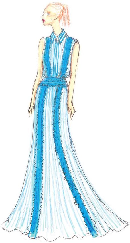
TOP 10 WOMEN’S COLORS

The lead color for women for the Spring/
Summer 2015 season, PANTONE 14-4313
Aquamarine is an airy blue with a dreamy
feel. Cool and calming, ethereal Aquamarine
is a shade with a wet and watery feel. Open
and expansive, this restful blue also acts as
a stress reducer.

Leatrice Eiseman
Executive Director, Pantone Color Institute

Pairs Well With:
PANTONE 14-4102 Glacier Gray
PANTONE 18-1438 Marsala

                                                                     Designers using Aquamarine

                    p. 29               p. 30     p. 34           p. 36            p. 54

AQUAMARINE
PANTONE 14-4313

PANTONE FASHION COLOR REPORT SPRING 2015 A publication of the PANTONE COLOR INSTITUTE        5
NEW YORK FASHION WEEK • SEPTEMBER 4-11, 2014 • pantone.com/spring2015
TOP 10 WOMEN’S COLORS

An invigorating turquoise, PANTONE
16-4725 Scuba Blue conveys a sense of
carefree playfulness. Even though a cool
shade, the vibrancy of Scuba Blue adds a
splash of excitement to the palette.
Scuba Blue offers a feeling of escape as it
is reminiscent of a tropical ocean. This stirring
and energizing shade takes us off to an
exotic paradise that is pleasant and inviting,
even if only a fantasy.

Leatrice Eiseman
Executive Director, Pantone Color Institute

Pairs Well With:
PANTONE 19-4052 Classic Blue
PANTONE 14-5714 Lucite Green

                                                                      Designers using Scuba Blue

                                        p. 31       p. 32         p. 37            p. 38

SCUBA BLUE
PANTONE 16-4725

PANTONE FASHION COLOR REPORT SPRING 2015 A publication of the PANTONE COLOR INSTITUTE         6
NEW YORK FASHION WEEK • SEPTEMBER 4-11, 2014 • pantone.com/spring2015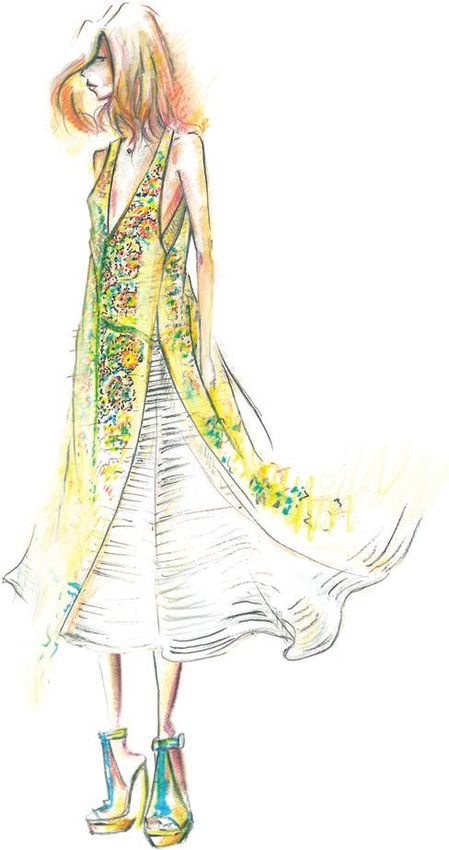
TOP 10 WOMEN’S COLORS

Generally not thought of as a fashion color,
though it does come back from time to
time, PANTONE 14-5714 Lucite Green is
a soothing green shade whose time has
really come again. Fresh and clarifying,
cool and refreshing, Lucite Green has a
minty glow. Light in weight and also in tone,
Lucite Green seems almost transparent.

Leatrice Eiseman
Executive Director, Pantone Color Institute

Pairs Well With:
PANTONE 19-4052 Classic Blue
PANTONE 16-4725 Scuba Blue

                                                                    Designers using Lucite Green

                                                  p. 43           p. 46            p. 49

LUCITE GREEN
PANTONE 14-5714

PANTONE FASHION COLOR REPORT SPRING 2015 A publication of the PANTONE COLOR INSTITUTE         7
NEW YORK FASHION WEEK • SEPTEMBER 4-11, 2014 • pantone.com/spring2015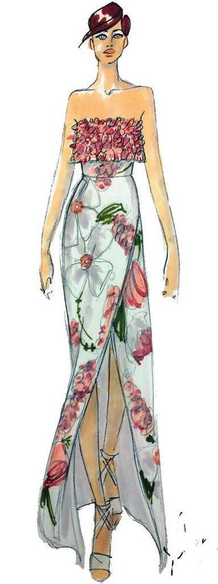
TOP 10 WOMEN’S COLORS

Reliable and thoughtful, PANTONE
19-4052 Classic Blue inspires calm,
confidence and harmony. Serving as an
anchor to the Spring/Summer 2015 palette,
Classic Blue is a shade that is strong and
reliable. Just as with the sea, because of
its waterborne qualities, this Classic Blue
is perceived as thoughtful and introspective.

Leatrice Eiseman
Executive Director, Pantone Color Institute

Pairs Well With:
PANTONE 14-5714 Lucite Green
PANTONE 16-4725 Scuba Blue
PANTONE 13-0720 Custard

                                                                     Designers using Classic Blue

                                                                  p. 48            p. 55

CLASSIC BLUE
PANTONE 19-4052

PANTONE FASHION COLOR REPORT SPRING 2015 A publication of the PANTONE COLOR INSTITUTE          8
NEW YORK FASHION WEEK • SEPTEMBER 4-11, 2014 • pantone.com/spring2015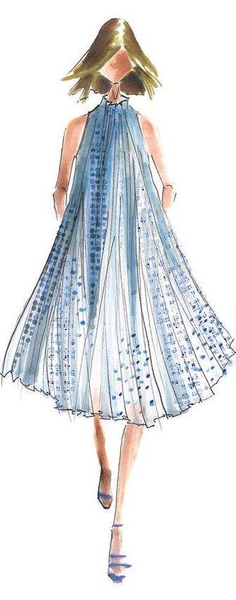
TOP 10 WOMEN’S COLORS

Bringing balance to the coolness of the
Spring/Summer 2015 color range is
PANTONE 14-1213 Toasted Almond. A
sun-tanned neutral, Toasted Almond
offers comforting warmth and is indicative
of a spontaneous spring, summer feeling.
Timeless and versatile, Toasted Almond is
an organic shade that speaks to authenticity
and all that is natural.

Leatrice Eiseman
Executive Director, Pantone Color Institute

Pairs Well With:
PANTONE 16-1720 Strawberry Ice
PANTONE 15-1247 Tangerine

                                                                 Designers using Toasted Almond

                                                  p. 33           p. 35            p. 40

TOASTED ALMOND
PANTONE 14-1213

PANTONE FASHION COLOR REPORT SPRING 2015 A publication of the PANTONE COLOR INSTITUTE        9
NEW YORK FASHION WEEK • SEPTEMBER 4-11, 2014 • pantone.com/spring2015
TOP 10 WOMEN’S COLORS

Aptly named, PANTONE 16-1720 Strawberry
Ice is suggestive of a cooling and refreshing
delicacy, yet its warmth as a color is quite
appealing. Subtle and charming, Strawberry
Ice is an ideal shade for Spring/Summer
2015. Both tasty and tasteful, Strawberry
Ice is a confection color that evokes a
feeling of being “in the pink,” emitting a
flattering and healthy glow.

Leatrice Eiseman
Executive Director, Pantone Color Institute

Pairs Well With:
PANTONE 14-1213 Toasted Almond
PANTONE 15-1247 Tangerine

                                                                  Designers using Strawberry Ice

                                                  p. 41           p. 45            p. 52

STRAWBERRY ICE
PANTONE 16-1720

PANTONE FASHION COLOR REPORT SPRING 2015 A publication of the PANTONE COLOR INSTITUTE         10
NEW YORK FASHION WEEK • SEPTEMBER 4-11, 2014 • pantone.com/spring2015
TOP 10 WOMEN’S COLORS
Spontaneous and gregarious, PANTONE
15-1247 Tangerine is a juicy orange
shade that is energizing, yet not jarring
to the eye. Versatile Tangerine is striking
enough to stand on its own and adds vitality
to a printed pattern. Good natured and
friendly, but with a tangy edge, this fun-
loving color invites a smile.
Leatrice Eiseman
Executive Director, Pantone Color Institute
Pairs Well With:
PANTONE 14-1213 Toasted Almond
PANTONE 16-1720 Strawberry Ice
Designers using Tangerine
p. 53
TANGERINE
PANTONE 15-1247
PANTONE FASHION COLOR REPORT SPRING 2015 A publication of the PANTONE COLOR INSTITUTE 11
NEW YORK FASHION WEEK • SEPTEMBER 4-11, 2014 • pantone.com/spring2015TOP 10 WOMEN’S COLORS
Just as the name implies, PANTONE
13-0720 Custard is a delicious and
delectable yellow. Sweet and sunny,
Custard is a cheering tone that brings
thoughts of pleasant relaxation and comfort
food. Engaging with its soft and mellow
warmth and full of good feelings, subtle
Custard has an affable and easy disposition.
Leatrice Eiseman
Executive Director, Pantone Color Institute
Pairs Well With:
PANTONE 19-4052 Classic Blue
Designers using Custard
p. 42 p. 44 p. 47
CUSTARD
PANTONE 13-0720
PANTONE FASHION COLOR REPORT SPRING 2015 A publication of the PANTONE COLOR INSTITUTE 12
NEW YORK FASHION WEEK • SEPTEMBER 4-11, 2014 • pantone.com/spring2015TOP 10 WOMEN’S COLORS
Interesting on its own and a wonderful
contrast for other hues, PANTONE 18-1438
Marsala serves as the foundation to the
Spring/Summer 2015 palette. Sensual and
bold, delicious Marsala is a daringly inviting
tone that nurtures; exuding confidence and
stability while feeding the body, mind and
soul. Much like the fortified wine that
gives Marsala its name, this robust shade
incorporates the warmth and richness
of a tastefully fulfilling meal, while its
grounding red-brown roots point to a
sophisticated, natural earthiness.
Leatrice Eiseman
Executive Director, Pantone Color Institute
Pairs Well With:
PANTONE 14-4102 Glacier Gray
PANTONE 14-4313 Aquamarine Designers using Marsala
p. 39 p. 50
MARSALA
PANTONE 18-1438
PANTONE FASHION COLOR REPORT SPRING 2015 A publication of the PANTONE COLOR INSTITUTE 13
NEW YORK FASHION WEEK • SEPTEMBER 4-11, 2014 • pantone.com/spring2015TOP 10 WOMEN’S COLORS
More dominant for men than women in
Spring/Summer 2015, PANTONE 14-4102
Glacier Gray is an unobtrusive gray that
contrasts and enhances; bouncing off
other shades without taking away from
them as it slips into the background to
allow other colors to take center stage.
Nature’s most perfect neutral, Glacier Gray
is a shade that is timeless. Quietly assuring
and peacefully relaxing, Glacier Gray is,
above all, constant.
Leatrice Eiseman
Executive Director, Pantone Color Institute
Pairs Well With:
PANTONE 18-1438 Marsala
PANTONE 14-4313 Aquamarine
Designers using Glacier Gray
p. 28 p. 51
GLACIER GRAY
PANTONE 14-4102
PANTONE FASHION COLOR REPORT SPRING 2015 A publication of the PANTONE COLOR INSTITUTE 14
NEW YORK FASHION WEEK • SEPTEMBER 4-11, 2014 • pantone.com/spring2015TOP 10 MEN’S COLORS Uncontrived Natural + Deeper Tones PANTONE FASHION COLOR REPORT SPRING 2015 A publication of the PANTONE COLOR INSTITUTE 15 NEW YORK FASHION WEEK • SEPTEMBER 4-11, 2014 • pantone.com/spring2015
SPRING 2015: EN PLEIN AIR
Top 10 Men’s Colors

For spring 2015, the men’s palette takes a surprising      Masculine and solid, Titanium is a gray that speaks
turn, deviating from the women’s palette more than we      to timelessness and exudes strength, while Marsala
have seen in recent seasons. The menswear colors           offers a robust and rich contrast to the other colors in
emphasize the need for uncontrived hues, where             the palette and combines dramatically with other deep
natural tones are interspersed with deep, foundational     tones like Classic Blue, as well as neutral Sandstone.
colors for an unassuming and sophisticated Top 10.
                                                           Create a charming mélange with Woodbine, Titanium
A perennial favorite for men, dependable Dusk Blue         and Lavender Herb, the palette’s most fashion-
offers a cool, calm serenity, representative of the sky.   forward and spirited color. As purple hues continue to
Juxtapose it with Glacier Gray, a masculine and            gain popularity in men’s fashion, Lavender Herb’s
practical neutral, or Treetop, nature’s healthy,           mid-tone offers a retro and almost nostalgic element
harmonious green for a happy marriage of adaptable         in the men’s palette.
cool, warm and neutral tones.
                                                           For more than 20 years, Pantone, the global authority
Classic Blue remains a core anchoring hue that is          on color, has surveyed the designers of New York
powerful in tailored suits or casual sportswear, while     Fashion Week and beyond to bring you the season’s
Toasted Almond continues to serve as another               most important color trends. This report previews the
essential neutral. With its yellow-green tint, Woodbine    most prominent hues for spring 2015.
is a tropical green best described as nature’s neutral
that pairs well the earthy and rugged associations of
Sandstone.

PANTONE FASHION COLOR REPORT SPRING 2015 A publication of the PANTONE COLOR INSTITUTE                                 16
NEW YORK FASHION WEEK • SEPTEMBER 4-11, 2014 • pantone.com/spring2015
TOP 10 MEN’S COLORS PANTONE 16-4120 Dusk Blue is perennially a favorite shade for men. Reminiscent of the blue sky above, Dusk Blue is ultimately dependable and faithful. In a world that has become increasingly chaotic, the nostalgic Dusk Blue enables us to retreat into a safe place of quiet blue calm. Leatrice Eiseman Executive Director, Pantone Color Institute Pairs Well With: PANTONE 14-4102 Glacier Gray PANTONE 18-0135 Treetop DUSK BLUE PANTONE 16-4120 PANTONE FASHION COLOR REPORT SPRING 2015 A publication of the PANTONE COLOR INSTITUTE 17 NEW YORK FASHION WEEK • SEPTEMBER 4-11, 2014 • pantone.com/spring2015
TOP 10 MEN’S COLORS

More dominant for men than women in
Spring/Summer 2015, PANTONE 14-4102
Glacier Gray is an unobtrusive gray that
contrasts and enhances; bouncing off
other shades without taking away from
them as it slips into the background to
allow other colors to take center stage.
Nature’s most perfect neutral, Glacier Gray,
is a shade that is timeless. Quietly assuring
and peacefully relaxing, Glacier Gray is,
above all, constant.

Leatrice Eiseman
Executive Director, Pantone Color Institute

Pairs Well With:
PANTONE 18-0135 Treetop
PANTONE 16-4120 Dusk Blue

GLACIER GRAY
PANTONE 14-4102

PANTONE FASHION COLOR REPORT SPRING 2015 A publication of the PANTONE COLOR INSTITUTE   18
NEW YORK FASHION WEEK • SEPTEMBER 4-11, 2014 • pantone.com/spring2015
TOP 10 MEN’S COLORS

Speaking to restoration and new beginnings,
PANTONE 18-0135 Treetop is a natural
and fertile green. Ideal when used as a
background to other shades, Treetop is
a healthy harmonious green from nature
which offers a reassuring presence.
Physiologically affecting the nervous system,
this soothing green hue causes us to breathe
slowly and deeply, helping the heart to relax
by slowing the production of stress hormones.

Leatrice Eiseman
Executive Director, Pantone Color Institute

Pairs Well With:
PANTONE 14-4102 Glacier Gray
PANTONE 16-4120 Dusk Blue

                                                                          Designers using Treetop

                                                                                   p. 57

TREETOP
PANTONE 18-0135

PANTONE FASHION COLOR REPORT SPRING 2015 A publication of the PANTONE COLOR INSTITUTE          19
NEW YORK FASHION WEEK • SEPTEMBER 4-11, 2014 • pantone.com/spring2015
TOP 10 MEN’S COLORS
Reliable and thoughtful, PANTONE 19-4052
Classic Blue inspires calm, confidence and
harmony. Serving as an anchor to the
Spring/Summer 2015 palette, Classic
Blue is a shade that is strong and reliable.
Just as with the sea, because of its
waterborne qualities, this Classic Blue is
perceived as thoughtful and introspective.
Leatrice Eiseman
Executive Director, Pantone Color Institute
Pairs Well With:
PANTONE 18-1438 Marsala
PANTONE 16-1328 Sandstone
Designers using Classic Blue
p. 58 David Hart
CLASSIC BLUE
PANTONE 19-4052
PANTONE FASHION COLOR REPORT SPRING 2015 A publication of the PANTONE COLOR INSTITUTE 20
NEW YORK FASHION WEEK • SEPTEMBER 4-11, 2014 • pantone.com/spring2015TOP 10 MEN’S COLORS
Bringing balance to the coolness of the
Spring/Summer 2015 color range is
PANTONE 14-1213 Toasted Almond. A
sun-tanned neutral, Toasted Almond offers
comforting warmth and is indicative of a
spontaneous spring, summer feeling.
Timeless and versatile, Toasted Almond
is an organic shade that speaks to
authenticity and all that is natural.
Leatrice Eiseman
Executive Director, Pantone Color Institute
Pairs Well With:
PANTONE 16-3310 Lavender Herb
Designers using Toasted Almond
David Hart
TOASTED ALMOND
PANTONE 14-1213
PANTONE FASHION COLOR REPORT SPRING 2015 A publication of the PANTONE COLOR INSTITUTE 21
NEW YORK FASHION WEEK • SEPTEMBER 4-11, 2014 • pantone.com/spring2015TOP 10 MEN’S COLORS PANTONE 18-0538 Woodbine is a tropical green that could best be described as nature’s neutral. A classic yellow-green that could be used with anything and everything, Woodbine is a hue of foliage, grass and growing plants. Inexorably linked to our sense of smell, Woodbine is evocative of a freshly mown lawn or a flourishing palm frond. Leatrice Eiseman Executive Director, Pantone Color Institute Pairs Well With: PANTONE 17-4014 Titanium PANTONE 16-3310 Lavender Herb WOODBINE PANTONE 18-0538 PANTONE FASHION COLOR REPORT SPRING 2015 A publication of the PANTONE COLOR INSTITUTE 22 NEW YORK FASHION WEEK • SEPTEMBER 4-11, 2014 • pantone.com/spring2015
TOP 10 MEN’S COLORS

PANTONE 16-1328 Sandstone is a stable
and grounded shade. Rugged and
woodsy, Sandstone is a complex neutral
that has a warming presence. Earthy and
real, Sandstone provides us with a return
to nature and what is beautiful, simple
and memorable.

Leatrice Eiseman
Executive Director, Pantone Color Institute

Pairs Well With:
PANTONE 18-1438 Marsala
PANTONE 19-4052 Classic Blue

SANDSTONE
PANTONE 16-1328

PANTONE FASHION COLOR REPORT SPRING 2015 A publication of the PANTONE COLOR INSTITUTE   23
NEW YORK FASHION WEEK • SEPTEMBER 4-11, 2014 • pantone.com/spring2015
TOP 10 MEN’S COLORS

Strong, masculine and solid, PANTONE
17-4014 Titanium is a gray shade that
speaks to timelessness. Classic and
tasteful, there is an implied quality
attached to anything so long lasting.
Durable and practical, this basic gray
shade has classic appeal.

Leatrice Eiseman
Executive Director, Pantone Color Institute

Pairs Well With:
PANTONE 16-3310 Lavender Herb
PANTONE 18-0538 Woodbine

                                                                        Designers using Titanium

                                                                                   p. 59

TITANIUM
PANTONE 17-4014

PANTONE FASHION COLOR REPORT SPRING 2015 A publication of the PANTONE COLOR INSTITUTE         24
NEW YORK FASHION WEEK • SEPTEMBER 4-11, 2014 • pantone.com/spring2015
TOP 10 MEN’S COLORS Interesting on its own and a wonderful contrast for other hues, PANTONE 18-1438 Marsala serves as the foundation to the Spring/Summer 2015 palette. Sensual and bold, delicious Marsala is a daringly inviting tone that nurtures; exuding confidence and stability while feeding the body, mind and soul. Much like the fortified wine that gives Marsala its name, this robust shade incorporates the warmth and richness of a tastefully fulfilling meal while its grounding red-brown roots point to a sophisticated, natural earthiness. Leatrice Eiseman Executive Director, Pantone Color Institute Pairs Well With: PANTONE 19-4052 Classic Blue PANTONE 16-1328 Sandstone MARSALA PANTONE 18-1438 PANTONE FASHION COLOR REPORT SPRING 2015 A publication of the PANTONE COLOR INSTITUTE 25 NEW YORK FASHION WEEK • SEPTEMBER 4-11, 2014 • pantone.com/spring2015
TOP 10 MEN’S COLORS

PANTONE 16-3310 Lavender Herb is a
shade rich in nostalgia. A unique shade
that adds a surprise to the Spring/Summer
2015 palette, Lavender Herb is a shade
that intrigues the eye. Lavender Herb is
also a creative shade; one that will add
a distinctive color pop whether worn on
its own or combined with the other top
Spring/Summer 2015 colors.

Leatrice Eiseman
Executive Director, Pantone Color Institute

Pairs Well With:
PANTONE 14-1213 Toasted Almond

LAVENDER HERB
PANTONE 16-3310

PANTONE FASHION COLOR REPORT SPRING 2015 A publication of the PANTONE COLOR INSTITUTE   26
NEW YORK FASHION WEEK • SEPTEMBER 4-11, 2014 • pantone.com/spring2015
WOMEN’S DESIGNERS
                   reveal their inspiration and must-have items for Spring 2015.

PANTONE FASHION COLOR REPORT SPRING 2015 A publication of the PANTONE COLOR INSTITUTE   27
NEW YORK FASHION WEEK • SEPTEMBER 4-11, 2014 • pantone.com/spring2015
WOMEN’S DESIGNERS
DENNIS BASSO
Glacier Gray
PROMINENT COLORS
Apricot, Blushy Nudes, Olive, Avocado Green, Pale Sherbet
(Orange), Pearl Cool Gray, Charcoal, Soft Whites and Ivories,
and Dusty Rose.
INSPIRATION
International resorts and women in the ‘60s.
SIGNATURE COLOR
Apricot – It lends as a subtly neutral shade of Nude and a
soft warm palette.
MUST-HAVE ITEM FOR SPRING 2015
A strapless silk cloqué gown with hand-embroidered flowers
in shades of Avocado and Cool Gray.
HOW HAS THE GROWING ACCEPTANCE OF SEASONLESS
COLOR IMPACTED OR INSPIRED YOUR DESIGN AND COLOR
CHOICES?
The collection focuses on neutral and soft tones of Grays,
Nudes, Dusty Rose, and Whites, creating an easily
seasonless palette, especially for eveningwear.
SEE DENNIS BASSO’S WORKSPACE
on page 83.
CONNECT WITH DENNIS BASSO
Website: www.Dennisbasso.com
Facebook: facebook.com/dennisbasso
Twitter Handle: @DennisBasso
Instagram: @Dennisbasso
Glacier Marsala Strawberry
Gray Ice
®
PANTONE FASHION COLOR REPORT SPRING 2015 A publication of the PANTONE COLOR INSTITUTE 28
NEW YORK FASHION WEEK • SEPTEMBER 4-11, 2014 • pantone.com/spring2015WOMEN’S DESIGNERS
CYNTHIA STEFFE
Aquamarine
PROMINENT COLORS
Blue Tide, Ice Sky, Frozen Aqua and Violet Cream.
INSPIRATION
The romantic scenery of Provence, France. From the warm
lavender fields in the countryside to the cool waters by
the coast, Provence invokes a subtle, yet vibrant romance
within us.
SIGNATURE COLOR
Ice Sky. It is a refreshing and ethereal shade of Blue and is
a perfect pairing for our entire spring palette.
MUST-HAVE ITEM FOR SPRING 2015
A pleated trapeze dress that interplays our prominent
colors with polka dots that stream through the pleats in a
feminine and playful gesture – it is the perfect day to night
dress.
HOW HAS THE GROWING ACCEPTANCE OF SEASONLESS
COLOR IMPACTED OR INSPIRED YOUR DESIGN AND COLOR
CHOICES?
The fact that color is no longer bound by seasonality allows
us to magnify our palette – our options become limitless.
SEE CYNTHIA STEFFE’S WORKSPACE
on page 78.
CONNECT WITH CYNTHIA STEFFE
Website: www.cynthiasteffe.com
Facebook: facebook.com/cynthiasteffe123
Twitter Handle: @cynthiasteffe
Pinterest: pinterest.com/cynthiasteffe
Instagram: @cynthiasteffe
Blog: cynthiasteffe.com/blog/index.php
Aquamarine Classic
Blue
PANTONE FASHION COLOR REPORT SPRING 2015 A publication of the PANTONE COLOR INSTITUTE 29
NEW YORK FASHION WEEK • SEPTEMBER 4-11, 2014 • pantone.com/spring2015WOMEN’S DESIGNERS
BANJANAN
Aquamarine
by Caroline Weller
PROMINENT COLORS
Tones of the earth and sky: Cool and clear Sky Blues,
Warm Tan and Honey neutrals and warm earth tones such
as Deep Scarlet and Blood Red.
INSPIRATION
Imagining Georgia O’Keeffe’s life on Ghost Ranch, a fantasy
about the American Southwest and a love of birds and
flowers imagined in that landscape.
SIGNATURE COLOR
Crystal Blue. It’s a lovely clear Sky Blue, and it is a perfect
ground for my multi-color prints.
MUST-HAVE ITEM FOR SPRING 2015
The buffalo maxi dress in silk chiffon, in my tree of life print. It
is Sky Blue with shades of Caramel, Imperial and Navy Blues.
HOW HAS THE GROWING ACCEPTANCE OF SEASONLESS
COLOR IMPACTED OR INSPIRED YOUR DESIGN AND COLOR
CHOICES?
I always include a neutral story in the collection as a
complement to the main color palette. I know that it can
be bought by all my international customers that may
have a different climate or season. I also make sure that I
have classic design pieces that can carry forward into the
coming season.
SEE BANJANAN’S WORKSPACE
on page 70.
CONNECT WITH BANJANAN
Website: www.banjanan.com
Instagram: @banjanan
Aquamarine Classic Toasted
Tumblr: banjanan.tumblr.com Blue Almond
PANTONE FASHION COLOR REPORT SPRING 2015 A publication of the PANTONE COLOR INSTITUTE 30
NEW YORK FASHION WEEK • SEPTEMBER 4-11, 2014 • pantone.com/spring2015WOMEN’S DESIGNERS
BARBARA TFANK
Scuba Blue
PROMINENT COLORS
Mediterranean Blue, Blush, Lime, Silver and Black, and
Black and White.
INSPIRATION
The colors of nature.
SIGNATURE COLOR
I love the Mediterranean Blue for summer, as it reminds me
of the ocean where we spend quite a bit of time in summer
months. The color is cool and refreshing.
MUST-HAVE ITEM FOR SPRING 2015
Mediterranean Blue off-shoulder slim dress in silk cloque.
HOW HAS THE GROWING ACCEPTANCE OF SEASONLESS
COLOR IMPACTED OR INSPIRED YOUR DESIGN AND COLOR
CHOICES?
It has opened up more possibilities for use of color year
round, which is great for me as I love using color.
CONNECT WITH BARBARA TFANK
Website: www.btfank.com
Instagram: @barbaratfank
Scuba Blue
PANTONE FASHION COLOR REPORT SPRING 2015 A publication of the PANTONE COLOR INSTITUTE 31
NEW YORK FASHION WEEK • SEPTEMBER 4-11, 2014 • pantone.com/spring2015WOMEN’S DESIGNERS
WHIT NY
Scuba Blue
PROMINENT COLORS
Red, Blue and Yellow. Bright Whites and pops of pastels
such as Minty Blues and Pink.
INSPIRATION
A remix of my teenage obsessions; I was channeling my
years of reading Sassy and Mademoiselle in my bedroom.
I wanted to capture the excitement when everything was
fresh to me. I picked really bright and contrasting colors to
bring up the energy.
SIGNATURE COLOR
Neon Cobalt in the Yves Klein world.
MUST-HAVE ITEM FOR SPRING 2015
A clean shift dress in a spin-art print, utilizing most of the
bright colors in the collection.
HOW HAS THE GROWING ACCEPTANCE OF SEASONLESS
COLOR IMPACTED OR INSPIRED YOUR DESIGN AND COLOR
CHOICES?
We always have a lot of color in the line and create WHIT to
be really mix-and-match. Seasons can be all in the styling,
and we believe in color year-round.
SEE WHIT NY’S WORKSPACE
on page 83.
CONNECT WITH WHIT NY
Website: www.whit-ny.com
Facebook: facebook.com/whitnewyork
Twitter Handle: @whit_ny
Pinterest: pinterest.com/whitnewyork
Instagram: @whit_ny
Tumblr: whit-ny.tumblr.com
Scuba Blue Custard Classic
Blue
PANTONE FASHION COLOR REPORT SPRING 2015 A publication of the PANTONE COLOR INSTITUTE 32
NEW YORK FASHION WEEK • SEPTEMBER 4-11, 2014 • pantone.com/spring2015WOMEN’S DESIGNERS
Toasted Almond
NONOO
by Misha Nonoo
PROMINENT COLORS
Cool White Mist, Icy Blue and Aquatint transition into warm
tones such as Moroccan Navy, Metallic Rose Gold and
Radiant Orchid. Color is always a key component for
Nonoo – this dynamic flow of hues is inspired by nature
coupled with contemporary art.
INSPIRATION
Contemporary artist Dustin Yellin’s 3D psychogeography
collages.
SIGNATURE COLOR
Metallic Rose Gold, as it unifies the prints with the solid hues.
MUST-HAVE ITEM FOR SPRING 2015
Our colorful monofilament knitwear. I am most excited
about the Moroccan Navy and Crimson combination.
HOW HAS THE GROWING ACCEPTANCE OF SEASONLESS
COLOR IMPACTED OR INSPIRED YOUR DESIGN AND COLOR
CHOICES?
Mint has really become my seasonless go-to color. Mint
acts as neutral working with natural hues as well as vibrant
tones. I wear Mint all year round; it’s my new winter (and
summer) White.
SEE MISHA NONOO’S WORKSPACE
on page 81.
CONNECT WITH MISHA NONOO
Website: www.nonoony.com
Facebook: facebook.com/NonooNY
Twitter Handle: @Nonoo_NY
Pinterest: pinterest.com/nonoony
Instagram: @Nonoo_NY Toasted
Almond
PANTONE FASHION COLOR REPORT SPRING 2015 A publication of the PANTONE COLOR INSTITUTE 33
NEW YORK FASHION WEEK • SEPTEMBER 4-11, 2014 • pantone.com/spring2015WOMEN’S DESIGNERS
RACHEL PALLY
Aquamarine
PROMINENT COLORS
Pastels! From Bellini Orange and Ice Blue, to Pastel Pink and
Chamomile Yellow – colors that are a little lighter and brighter.
INSPIRATION
The beauty of California in the spring, the golden hour at
the end of a warm day, the Southwest as painted by Georgia
O’Keeffe and the architecture of Frank Lloyd Wright.
SIGNATURE COLOR
Orange – Bellini Orange is what we’ve called it. It’s the
second color of the Chakra and is associated with
happiness, confidence and resourcefulness.
MUST-HAVE ITEM FOR SPRING 2015
Jumpsuits and rompers! We have a new crisscross back
jumpsuit with a plunging neckline in our stencil print – which
consists of Succulent Green, Dutch Blue and Ice Blue and
Mesa Pink pastels – that I can’t wait to get my hands on.
HOW HAS THE GROWING ACCEPTANCE OF SEASONLESS
COLOR IMPACTED OR INSPIRED YOUR DESIGN AND COLOR
CHOICES?
We’ve always had a seasonless approach to color in our
collections and don’t adhere to guidelines of only using
certain colors at certain times. For example, our fall 2014
collection had rich Samba Reds and dark Hunter Greens,
but also a Dusty Lotus Pink and a Cerulean-like Aquarius
Blue throughout, which may not typically be thought of as
‘fall colors.’ Past and present we try to choose colors that
feel fresh, look beautiful, and tell the story of that season.
SEE RACHEL PALLY’S WORKSPACE
on page 80.
CONNECT WITH RACHEL PALLY Aquamarine Tangerine
Website: www.rachelpally.com
Facebook: facebook.com/RachelPally
Twitter Handle: @RachelPally
Pinterest: pinterest.com/rachelpallyinc
Instagram: @RachelPally
Tumblr: rachelpally.tumblr.com
PANTONE FASHION COLOR REPORT SPRING 2015 A publication of the PANTONE COLOR INSTITUTE 34
NEW YORK FASHION WEEK • SEPTEMBER 4-11, 2014 • pantone.com/spring2015WOMEN’S DESIGNERS
Toasted Almond
JAY GODFREY
PROMINENT COLORS
The collection explores the contrast between the raw and
the refined – the color scheme is a blend of tea stained
neutrals, bold prints, embellished fabrics, Burnt Oranges
and Teals. Key colors include Pearled Ivory, Mint Leaf, Sunny
Lime, Caviar, Apricot Wash and Living Coral.
INSPIRATION
Classic rock musicians and their infusion of western music
in the late ‘60s and early ‘70s was a key inspiration for the
collection. Similar to The Rolling Stones’, Bob Dylan’s, and
Jimi Hendrix’s interpretation of the glamorous life of the
cowboy culture, Jay Godfrey offers a refined take on the
relaxed and casual silhouettes of the time while staying true
to his New York City aesthetic.
SIGNATURE COLOR
Pearled Ivory – the color is prominent throughout as the
“tea stained” color inspiration. This is the most important
color in the collection; stringing together the storyline of the
Jay Godfrey girl. A consistent color throughout, it grounds
the bolder patterns and colors of the collection.
MUST-HAVE ITEM FOR SPRING 2015
The jumpsuit. It is effortless and transitions easily from day
to night. The jumpsuit is a signature Jay Godfrey piece,
offered each season in various fabrications and colors. It
best exemplifies the JG girl’s effortlessly chic approach to
fashion. Specifically, Pearled Ivory, Caviar and Mint Leaf
were used in jumpsuits in the collection.
HOW HAS THE GROWING ACCEPTANCE OF SEASONLESS
COLOR IMPACTED OR INSPIRED YOUR DESIGN AND COLOR
CHOICES?
The neutrality of this season’s inspiration color allows for
the pieces to be intermixed practically throughout the year.
Cool in the summer, yet an appropriate alternative to Black
for the winter, the tea stained color styles offer a great
investment in versatility. Additionally, the seasonless color
choice reflects the timelessness of Western Americana and
its influence on Rock ’n’ Roll music.
Toasted Marsala
SEE JAY GODFREY’S WORKSPACE Almond
on page 84.
CONNECT WITH JAY GODFREY
Website: www.jaygodfrey.com
Facebook: facebook.com/JayGodfreyPage
Twitter Handle: @JayGodfrey_NYC
Instagram: @JayGodfreynyc
PANTONE FASHION COLOR REPORT SPRING 2015 A publication of the PANTONE COLOR INSTITUTE 35
NEW YORK FASHION WEEK • SEPTEMBER 4-11, 2014 • pantone.com/spring2015WOMEN’S DESIGNERS
BCBGMAXAZRIAGROUP
BCBGMAXAZRIA
Aquamarine
Submission by Lubov Azria, Chief Creative Officer
PROMINENT COLORS
Soft shades of Warm Dusty Pinks and Cool Blues are
highlighted by Fresh Aqua and White.
INSPIRATION
The idea of recycling and reclaiming antique rugs and
textiles. The treatments used lend a beautiful patina effect
that influenced our palette and prints, lending a sun-
bleached softness and richness of color that speaks to the
marriage of modern and traditional techniques.
SIGNATURE COLOR
Blue Haze – this Pale Aqua shade is light and airy, bringing
a freshness to the collection.
MUST-HAVE ITEM FOR SPRING 2015
A maxi dress in a muted shade of Aqua.
HOW HAS THE GROWING ACCEPTANCE OF SEASONLESS
COLOR IMPACTED OR INSPIRED YOUR DESIGN AND COLOR
CHOICES?
People are drawn to color, so the freedom of color choices
really lets us express the mood and emotion that we want
to draw people in, regardless of the season. We love the
idea of diversity in color.
CONNECT WITH BCBGMAXAZRIA
Website: www.bcbg.com
Facebook: facebook.com/BCBGMAXAZRIA
Twitter Handle: @BCBGMAXAZRIA
Pinterest: pinterest.com/bcbgmaxazria
Instagram: @BCBGMAXAZRIA
Blog: www.bonchicblog.com Aquamarine
PANTONE FASHION COLOR REPORT SPRING 2015 A publication of the PANTONE COLOR INSTITUTE 36
NEW YORK FASHION WEEK • SEPTEMBER 4-11, 2014 • pantone.com/spring2015WOMEN’S DESIGNERS
Scuba Blue
DEGEN
PROMINENT COLORS
Various shades of Ocean Blues, from Seafoam to Deep
Blue. Bright Orange and Yellow, as well as a Dusty
Pink-Purple.
INSPIRATION
Psychedelic prints, hot dogs and the ocean.
SIGNATURE COLOR
The Seafoam Green-Blue is the most important color in the
collection – it grounds the other colors.
MUST-HAVE ITEM FOR SPRING 2015
A basic knitted Seafoam Green-Blue T-shirt with eyelet lace
details.
HOW HAS THE GROWING ACCEPTANCE OF SEASONLESS
COLOR IMPACTED OR INSPIRED YOUR DESIGN AND COLOR
CHOICES?
I think my colors this season are very summery, but I would
still wear all of this in the winter.
SEE DEGEN’S WORKSPACE
on page 72.
CONNECT WITH DEGEN
Website: www.degen-nyc.com
Facebook: facebook.com/DegenNYC
Twitter Handle: @DegenNYC
Pinterest: pinterest.com/degennyc
Instagram: @lindsaydegen
Tumblr: degen-nyc.tumblr.com
Scuba Blue Glacier Tangerine
Gray
PANTONE FASHION COLOR REPORT SPRING 2015 A publication of the PANTONE COLOR INSTITUTE 37
NEW YORK FASHION WEEK • SEPTEMBER 4-11, 2014 • pantone.com/spring2015WOMEN’S DESIGNERS
But Sou Lai
TADASHI SHOJI
PROMINENT COLORS
Scuba Blue
Ocean Mist – a rich, mid-tone Blue.
INSPIRATION
The Grand Canal in Venice.
SIGNATURE COLOR
Ivory looks beautiful shown in a variety of fabrics and in
both monochrome and contrasting looks. It is clean
and effortless.
MUST-HAVE ITEM FOR SPRING 2015
A Navy Rose-motif embroidered lace on Ivory neoprene
collared sheath dress.
HOW HAS THE GROWING ACCEPTANCE OF SEASONLESS
COLOR IMPACTED OR INSPIRED YOUR DESIGN AND COLOR
CHOICES?
It has given me the creative freedom to work with any color
necessary to portray my inspiration, rather than feeling
confined to use colors based on the particular season.
SEE TADASHI SHOJI’S WORKSPACE
on page 69.
CONNECT WITH TADASHI SHOJI
Website: www.tadashishoji.com
Facebook: facebook.com/tadashishoji
Twitter Handle:@TadashiShoji
Pinterest: pinterest.com/tadashishoji
Instagram: @TadashiShoji
Blog: tadashishoji.com/blog
Scuba Blue Aquamarine
PANTONE FASHION COLOR REPORT SPRING 2015 A publication of the PANTONE COLOR INSTITUTE 38
NEW YORK FASHION WEEK • SEPTEMBER 4-11, 2014 • pantone.com/spring2015WOMEN’S DESIGNERS
Marsala
DANIEL SILVERSTAIN
PROMINENT COLORS
Lychee, Blush, Terracotta, Rio Red, Bordeaux, Merlot, Ice
Blue, Crystal Blue, Levis, Lavender, Arctic Blue, Iron Gray
and Navy.
INSPIRATION
Images of tourists in Brazil from 1960s, modern architecture
images from Brazil, and retro anaglyph 3D techniques.
SIGNATURE COLOR
Icy Blues are the main focal point of the collection. They
bring a fresh, cool air to the palette and give natural, warm
colors a twist when combined together.
MUST-HAVE ITEM FOR SPRING 2015
A sheer nylon parka mixed with a 3D floral jacquard. It’s
a perfect combination of clear and opaque, street and
elegant, day and evening.
HOW HAS THE GROWING ACCEPTANCE OF SEASONLESS
COLOR IMPACTED OR INSPIRED YOUR DESIGN AND COLOR
CHOICES?
The whole collection has been designed from a seasonless
point of view. Each garment is a timeless piece, with a
soft-luxury color combination.
SEE DANIEL SILVERSTAIN’S WORKSPACE
on page 71.
CONNECT WITH DANIEL SILVERSTAIN
Website: www.danielsilverstain.com
Facebook: facebook.com/pages/DanielSilverstain/599329153414692
Twitter Handle: @DSilverstainNYC
Pinterest: pinterest.com/danielsilver
Instagram: @danielsilverstain
Marsala Aquamarine
PANTONE FASHION COLOR REPORT SPRING 2015 A publication of the PANTONE COLOR INSTITUTE 39
NEW YORK FASHION WEEK • SEPTEMBER 4-11, 2014 • pantone.com/spring2015WOMEN’S DESIGNERS
Toasted Almond
DAVID TLALE
PROMINENT COLORS
A mixture of Vlisco prints and garments with Warm Paradise
Peach and Papaya hues; a touch of Apricot in cool fabrics
with a powdery effect.
INSPIRATION
A mere observation of life. It comes from watching joyful
women and the exuberant feeling of rebirth and being
given another chance to start a new life.
SIGNATURE COLOR
Paradise Peach. It’s a happy, vibrant color.
MUST-HAVE ITEM FOR SPRING 2015
Bum shorts, or a full circle skirt. David Tlale Vlisco prints
and a White power blouse.
HOW HAS THE GROWING ACCEPTANCE OF SEASONLESS
COLOR IMPACTED OR INSPIRED YOUR DESIGN AND COLOR
CHOICES?
People want timeless pieces and invest in classical pieces
that do not go out of style or season. While we’re dealing with
austerity, women still want to feel sexy and beautiful. So our
collection caters exactly to that desire for renewed femininity.
SEE DAVID TLALE’S WORKSPACE
on page 72.
CONNECT WITH DAVID TLALE
Website: www.davidtlale.com
Facebook: facebook.com/davidtlale
Twitter Handle: @Tlale_large
Pinterest: pinterest.com/davidtlale
Instagram: @davidtlale
Toasted Strawberry
Almond Ice
PANTONE FASHION COLOR REPORT SPRING 2015 A publication of the PANTONE COLOR INSTITUTE 40
NEW YORK FASHION WEEK • SEPTEMBER 4-11, 2014 • pantone.com/spring2015WOMEN’S DESIGNERS
Strawberry Ice
BIBHU MOHAPATRA
PROMINENT COLORS
Dusty Rose, Ivory, Stone Gray, Sage, Sky Blue and Coral.
INSPIRATION
Historic eras, such as 1930s Europeans in America.
SIGNATURE COLOR
Rose – it is a color that is both ethereal and confident.
MUST-HAVE ITEM FOR SPRING 2015
Coral and Stone Gray day dress.
HOW HAS THE GROWING ACCEPTANCE OF SEASONLESS
COLOR IMPACTED OR INSPIRED YOUR DESIGN AND COLOR
CHOICES?
The world has become a smaller place. People travel a lot,
they chase the season they want by traveling around, so
colors are really seasonless.
SEE BIBHU MOHAPATRA’S WORKSPACE
on page 72.
CONNECT WITH BIBHU MOHAPATRA
Website: www.bibhu.com
Facebook: facebook.com/bibhumohapatra
Twitter Handle: @bibhumohapatra
Pinterest: pinterest.com/bibhumohapatra
Instagram: @bibhumohapatra
Blog or Tumblr: Bibhu.tumblr.com
Strawberry Glacier
Ice Gray
PANTONE FASHION COLOR REPORT SPRING 2015 A publication of the PANTONE COLOR INSTITUTE 41
NEW YORK FASHION WEEK • SEPTEMBER 4-11, 2014 • pantone.com/spring2015WOMEN’S DESIGNERS
NICOLE MILLER
PROMINENT COLORS
Papaya and Pineapple, Lime and Plum, Lemon
and Blueberry.
INSPIRATION
I am very inspired by Brazil this year, and tropical fruit.
Custard
SIGNATURE COLOR
Papaya is the newest and freshest shade in my collection
this season. It is an off-shade and not as obvious.
MUST-HAVE ITEM FOR SPRING 2015
A wrap crop top in Berry.
HOW HAS THE GROWING ACCEPTANCE OF SEASONLESS
COLOR IMPACTED OR INSPIRED YOUR DESIGN AND COLOR
CHOICES?
Actually I don’t agree with it – I really don’t see people
wearing a lot of summer colors in the fall. I do see a lot
of Black year round but I think pastels for fall was just all
wrong. Pastels anytime are not my favorite.
SEE NICOLE MILLER’S WORKSPACE
on page 74.
CONNECT WITH NICOLE MILLER
Website: www.nicolemiller.com
Facebook: facebook.com/nicolemiller
Twitter Handle: @NicoleMillerNYC
Pinterest: pinterest.com/nicolemillernyc
Instagram: @nicolemillernyc
Blog: www.leblogue.nicolemiller.com
Custard Strawberry Lucite
Ice Green
PANTONE FASHION COLOR REPORT SPRING 2015 A publication of the PANTONE COLOR INSTITUTE 42
NEW YORK FASHION WEEK • SEPTEMBER 4-11, 2014 • pantone.com/spring2015WOMEN’S DESIGNERS
MONIQUE LHUILLIER
Lucite Green
PROMINENT COLORS
I was inspired by the pastel shades in a sunrise sky and
the metallic reflections it creates. Soft muted hues of Pink,
Blue, Mint Green, Lavender and Yellow are used in many of
the prints, as well as solids in many of the spring silhouettes.
The colors are all combined taking on an iridescent
dreamlike quality. To create modern elements, I used Black
accents as well as metallic fabrics, keeping the collection
youthful and edgy.
INSPIRATION
The first few moments of sunrise, the instant right before
the sun rises and paints the sky with luminous shades of
pastels. Additionally, the reflection of the sun hitting the
water creates a visual landscape that inspired the iridescent
metallic undertones in my collection. This beauty of nature
shaped my color palette and fabric selection.
SIGNATURE COLOR
I love the color combination of all muted pastel shades
for spring 2015. A color standout is definitely Mint Green.
I love this shade of Green – it’s subtle and can act as a
neutral. It is refreshingly airy and quite feminine.
MUST-HAVE ITEM FOR SPRING 2015
A layered voluminous skirt in any shade of pastel or for a
bolder look in a shimmery iridescent fabric. It’s so versatile
and can be paired with everything from a cropped jacket to
a tailored shirt.
HOW HAS THE GROWING ACCEPTANCE OF SEASONLESS COLOR
IMPACTED OR INSPIRED YOUR DESIGN AND COLOR CHOICES?
I have always believed there are no concrete rules in fashion
when it comes to the use of color. You just need to feel
what is right and matches up to your mood. Growing up in
California, I’m inspired by brightness and visual landscapes
and incorporate it into all my collections. I think color can
be worn all year round, if done tastefully! My job as a designer
is to give my customer variety and make it exciting to
update their wardrobe.
SEE MONIQUE LHUILLIER’S WORKSPACE Lucite
on page 81. Green
CONNECT WITH MONIQUE LHUILLIER
Website: www.moniquelhuillier.com
Facebook: facebook.com/officialmoniquelhuillier
Twitter Handle: @M_Lhuillier
Pinterest: pinterest.com/mrslhuillier
Instagram: @moniquelhuillier
Blog: www.moniquelhuillier.com/journal
PANTONE FASHION COLOR REPORT SPRING 2015 A publication of the PANTONE COLOR INSTITUTE 43
NEW YORK FASHION WEEK • SEPTEMBER 4-11, 2014 • pantone.com/spring2015WOMEN’S DESIGNERS
NANETTE LEPORE
Custard
PROMINENT COLORS
Clear Sky Blues and Sunny Yellows with striking accents
of Creamsicle are set against a Pale Heather-Gray base,
evoking coastal France and coastal California in the early
‘60s.
INSPIRATION
I want to see what it would look like to juxtapose the early
‘60s California free-spiritedness with the elegance and
bodylines of the south of France at the same moment
in time.
SIGNATURE COLOR
Sunny Yellow – I want the collection to look happy, and to
make cool, feminine women feel good when they wear
my clothes.
MUST-HAVE ITEM FOR SPRING 2015
It’s all about the Sunny Yellow dress.
HOW HAS THE GROWING ACCEPTANCE OF SEASONLESS
COLOR IMPACTED OR INSPIRED YOUR DESIGN AND COLOR
CHOICES?
The acceptance of seasonless color has given me the
opportunity to create new and exciting combinations.
SEE NANETTE LEPORE’S WORKSPACE
on page 76.
CONNECT WITH NANETTE LEPORE
Website: www.nanettelepore.com
Facebook: facebook.com/nanettelepore
Twitter Handle: @nanettelepore
Pinterest: pinterest.com/NanettePins
Instagram: @nanettelepore
Tumblr: nanettelepore.tumblr.com Custard Lucite Scuba Blue
Green
PANTONE FASHION COLOR REPORT SPRING 2015 A publication of the PANTONE COLOR INSTITUTE 44
NEW YORK FASHION WEEK • SEPTEMBER 4-11, 2014 • pantone.com/spring2015WOMEN’S DESIGNERS
Danielle Kosann, The New Potato
Strawberry Ice
REBECCA MINKOFF
PROMINENT COLORS
Marshmallow White and Sherbet Pink.
INSPIRATION
I wanted to emulate the colors prominent in the ‘70s
photography of Deborah Turbeville, who is the inspiration
behind the entire collection. Much of her work during the
boho chic era of fashion included soft faded hues and
sepia tones, and you’ll see colors similar to these on the
spring ready-to-wear and handbags.
SIGNATURE COLOR
White – spring is always fresh and I like the idea of
new beginnings.
MUST-HAVE ITEM FOR SPRING 2015
Jumpsuits! We’re showing a great one in Pink.
HOW HAS THE GROWING ACCEPTANCE OF SEASONLESS
COLOR IMPACTED OR INSPIRED YOUR DESIGN AND COLOR
CHOICES?
I love the idea of playing around with color every season,
and I never feel tied to show light colors for spring and
dark colors for fall. For my show last season, I showed lots
of lighter colored coats for fall. This season, you’ll have to
watch to find out! Stay tuned!
CONNECT WITH REBECCA MINKOFF
Website: www.rebeccaminkoff.com
Facebook: facebook.com/rebeccaminkoff
Twitter Handle: @rebeccaminkoff
Pinterest: pinterest.com/RebeccaMinkoff
Instagram: @rebeccaminkoff
Tumblr: rebeccaminkoff.tumblr.com
Blog: rebeccaminkoff.com/rmedit
Strawberry
Ice
PANTONE FASHION COLOR REPORT SPRING 2015 A publication of the PANTONE COLOR INSTITUTE 45
NEW YORK FASHION WEEK • SEPTEMBER 4-11, 2014 • pantone.com/spring2015WOMEN’S DESIGNERS
BETSEY JOHNSON
Lucite Green
PROMINENT COLORS
A fun mix of cool tone pastels. Think of a bag of Jordan
Almonds mixed with Ivory and White.
INSPIRATION
Imagine a bowl of mints at your best reception or a bag of
Jordan Almonds in your Easter basket. Old movies on TCM
always inspire ideas and colors for my shows as well.
SIGNATURE COLOR
Mint Julep. Beautiful pastels for social occasion dressing,
and who doesn’t love a good cocktail that freshens
your breath?!
MUST-HAVE ITEM FOR SPRING 2015
A neoprene babydoll dress in White.
HOW HAS THE GROWING ACCEPTANCE OF SEASONLESS
COLOR IMPACTED OR INSPIRED YOUR DESIGN AND COLOR
CHOICES?
I’ve always loved all colors for all seasons and have tried
not to stick to the industry standard for color palettes. I like
making my own color rules.
SEE BETSEY JOHNSON’S WORKSPACE
on page 82.
CONNECT WITH BETSEY JOHNSON
Website: www.betseyjohnson.com
Facebook: facebook.com/xobetseyjohnson
Twitter Handle: @xobetseyjohnson
Pinterest: pinterest.com/xobetseyjohnson
Instagram: @xobetseyjohnson
Lucite
Green
PANTONE FASHION COLOR REPORT SPRING 2015 A publication of the PANTONE COLOR INSTITUTE 46
NEW YORK FASHION WEEK • SEPTEMBER 4-11, 2014 • pantone.com/spring2015WOMEN’S DESIGNERS
Custard
ALICE & TRIXIE
by Angela George
PROMINENT COLORS
Bright Sunshine Yellow, Neon Pink, along with Jade Green
and cool, refreshing shades of Purple and Turquoise.
INSPIRATION
We are ever-inspired by the past – pulling from vintage
shops and works of art – but for spring 2015 our inspiration
was really drawn specifically from Capri, Italy in the ‘60s.
SIGNATURE COLOR
Sunshine Yellow – it adds a distinguishing characteristic to
different palettes throughout the entire collection.
MUST-HAVE ITEM FOR SPRING 2015
Since we can only choose one – we would have to say our
must-have piece for spring 2015 is the Riviera Maxi. This
piece is the epitome of all of our inspiration and incorporates
all of our prominent colors – not to mention the body, which
is a column tank maxi dress that stuns with beautiful cut
outs on the back.
HOW HAS THE GROWING ACCEPTANCE OF SEASONLESS
COLOR IMPACTED OR INSPIRED YOUR DESIGN AND COLOR
CHOICES?
It’s exciting to see that the industry is beginning to accept
a practice that we have followed since I first began Alice &
Trixie. We have always been seasonless in our color palettes
and our customers expect, and come to us, for bold designs
that are bright and energetic year round!
SEE ALICE & TRIXIE’S WORKSPACE
on page 78.
CONNECT WITH ALICE & TRIXIE Custard Lucite Tangerine
Green
Website: www.aliceandtrixie.com
Facebook: facebook.com/AliceandtrixieNYC
Twitter Handle: @aliceandtrixie
Pinterest: pinterest.com/aliceandtrixie
Instagram: @Aliceandtrixie
Tumblr: Aliceandtrixie.tumblr.com
PANTONE FASHION COLOR REPORT SPRING 2015 A publication of the PANTONE COLOR INSTITUTE 47
NEW YORK FASHION WEEK • SEPTEMBER 4-11, 2014 • pantone.com/spring2015WOMEN’S DESIGNERS
TiA CiBANi
Classic Blue
PROMINENT COLORS
Spice Saffron, Inky Indigo, Taro Red, Purple Orchid,
Antique White, Tangy Tangerine, Ripe Apricot, Earthy
Tamarind, Warm Cocoa, and Deep Java.
INSPIRATION
Glamorous ‘70s, Bianca Jagger, Bali, Java, Batik, and
Indonesia exoticism.
SIGNATURE COLOR
Inky Indigo in solid form and as a placement dip-dye
technique, representing traditional treatment.
MUST-HAVE ITEM FOR SPRING 2015
A bandeau ruffled and tiered asymmetric gown in
stamped-jacquard linen, layered over Indigo taffeta. The
combination makes it light and breezy, as well as richly
textured through hand-applied dip dye.
HOW HAS THE GROWING ACCEPTANCE OF SEASONLESS
COLOR IMPACTED OR INSPIRED YOUR DESIGN AND COLOR
CHOICES?
Seasonless color has impacted my design inspiration in
that I use bright colors through all of the seasons. The
consumer has embraced color all year around, not just for
the spring or summer collections.
SEE TiA CiBANi’S WORKSPACE
on page 84.
CONNECT WITH TiA CiBANi
Website: www.tiacibani.com
Facebook: facebook.com/tiacibani
Twitter Handle: @TiA_CiBANi
Instagram: @TiACiBANi
Classic Glacier
Blue Gray
PANTONE FASHION COLOR REPORT SPRING 2015 A publication of the PANTONE COLOR INSTITUTE 48
NEW YORK FASHION WEEK • SEPTEMBER 4-11, 2014 • pantone.com/spring2015WOMEN’S DESIGNERS
CHRISTIAN SIRIANO
Lucite Green
PROMINENT COLORS
Blue Seafoam, Cool Aqua, Icy Blue, crisp and clean White
and Deep Navy.
INSPIRATION
The glass sculptures of Sergio Redegalli. I was drawn to
the diffusion of light and reflective transparency of his work
installed at the Adelaide Botanic Garden, where his
sculptures have an almost long, liquid quality to them atop
the dark water on which they sit. This is echoed in the
collection in the form of reflective fabrication. Inspired by
the glass itself are some of the icy arctic Blues and Greens,
the sharp laser cut patterns and intricate, sometimes
voluminous, crystal embroidery. I wanted this collection to
feel light, clean, and crisp – tranquil like a Japanese Zen
rock garden, modern for today’s woman. The collection
combines simple elegant separates for day, and lustrous,
long dresses for evening, to outfit the Christian Siriano
customer with something light, feminine, clean and crisp.
SIGNATURE COLOR
Blue Seafoam and Serenity, as they represent the tone from
my inspiration.
MUST-HAVE ITEM FOR SPRING 2015
A Blue Seafoam strapless crystal embroidered dress with a
Cool Aqua, Turquoise silk flounce collar coat.
HOW HAS THE GROWING ACCEPTANCE OF SEASONLESS
COLOR IMPACTED OR INSPIRED YOUR DESIGN AND COLOR
CHOICES?
When working on a collection the first thing we think about
is how to use color and how our customer can wear it.
Seasonless colors are so important to our consumer who
is investing in luxury eveningwear. She needs to be able to
wear something from the collection that is new and fresh,
but will be timeless in years to come.
SEE CHRISTIAN SIRIANO’S WORKSPACE
on page 67. Lucite
Green
CONNECT WITH CHRISTIAN SIRIANO
Website: www.christiansiriano.com
Facebook: facebook.com/christiansiriano
Twitter Handle: @CSiriano
Pinterest: pinterest.com/csiriano
Instagram: @csiriano
Tumblr: csiriano.tumblr.com
PANTONE FASHION COLOR REPORT SPRING 2015 A publication of the PANTONE COLOR INSTITUTE 49
NEW YORK FASHION WEEK • SEPTEMBER 4-11, 2014 • pantone.com/spring2015WOMEN’S DESIGNERS
BCBGMAXAZRIAGROUP
HERVÉ LÉGER by Max Azria
Submission by Lubov Azria, Chief Creative Officer
Marsala
PROMINENT COLORS
Hibiscus Coral Pink.
INSPIRATION
Cultures and undertones from the East that are captured in
the use of color and surface details.
SIGNATURE COLOR
Like its inspiration, the collection is a mix of colors and
hues in a palette that evokes glamour and sensuality.
MUST-HAVE ITEM FOR SPRING 2015
The Hervé Léger iconic bodycon dress.
HOW HAS THE GROWING ACCEPTANCE OF SEASONLESS
COLOR IMPACTED OR INSPIRED YOUR DESIGN AND COLOR
CHOICES?
Seasonality of shape and color is transcended by our
iconic and exclusive design.
SEE HERVÉ LÉGER’S WORKSPACE
on page 76.
CONNECT WITH HERVÉ LÉGER
Website: www.herveleger.com
Facebook: facebook.com/herveleger
Twitter Handle: @herverleger
Instagram: @herveleger
Pinterest: pinterest.com/herveleger
Marsala Strawberry
Ice
PANTONE FASHION COLOR REPORT SPRING 2015 A publication of the PANTONE COLOR INSTITUTE 50
NEW YORK FASHION WEEK • SEPTEMBER 4-11, 2014 • pantone.com/spring2015WOMEN’S DESIGNERS
M.PATMOS
Glacier Gray
by Marcia Patmos
PROMINENT COLORS
We have folkloric brights, such as a super bright almost
fluorescent Hot Pink, Bright Poppy, Sunshine Yellow,
Mango, and Pale Aqua offset by easy summery shades of
Indigo and Ivory and accented by hints of Metallic Copper,
Silver and Gold.
INSPIRATION
Color and pattern mixing in central and eastern Asian
textiles – folkloric patterns and colorways from Uzbekistan,
Turkistan, Kazakhstan, Vietnam, and Japan. We are also
doing a collaboration with artist Ryan McGuinness, so I
was looking at his art and color combos and thinking about
it all together.
SIGNATURE COLOR
Hot, almost fluorescent, Pink and Indigo – we have shades
from Deep Ink to Pale Chambray that look fresh and
summery against any color combo.
MUST-HAVE ITEM FOR SPRING 2015
A fluorescent Hot Pink featherweight cashmere crew neck
– we are using a fun and crazy color in an updated classic
style.
HOW HAS THE GROWING ACCEPTANCE OF SEASONLESS
COLOR IMPACTED OR INSPIRED YOUR DESIGN AND COLOR
CHOICES?
It makes it fun and not constrained. I always love chic base
neutrals with a pop of color – what they are changes from
season to season.
SEE M.PATMOS’ WORKSPACE
on page 77. Glacier Custard Aquamarine
Gray
CONNECT WITH M.PATMOS
Website: www.mpatmos.com
Facebook: facebook.com/mpatmos
Twitter Handle: @mpatmos
Pinterest: pinterest.com/marciapatmos
Instagram: @mpatmos
Tumblr: mpatmos.tumblr.com
PANTONE FASHION COLOR REPORT SPRING 2015 A publication of the PANTONE COLOR INSTITUTE 51
NEW YORK FASHION WEEK • SEPTEMBER 4-11, 2014 • pantone.com/spring2015You can also read