Graphical Excellence in Scientific Presentations and Papers
←
→
Page content transcription
If your browser does not render page correctly, please read the page content below
Graphical Excellence in Scientific
           Presentations and Papers
                 Constance Biegel and Prashant V. Kamat
                 University of Notre Dame

Disclaimer: The views presented here are based on our opinion and does not represent
the publication policy of any specific journal. The graphs cited in this presentation have
not been cited deliberately to avoid any specific criticisms of a publication. These are
presented only as examples. -C. Biegel and P. Kamat
Graphical Excellence*
•    Is the well‐designed presentation of
     interesting data – a matter of substance, of
     statistics, and of design

•    Consists of complex ideas communicated
     with clarity, precision, and efficiency

*pg. 51, Tufte, Edward R. The Visual Display of Quantitative
     Information; Graphics Press: Cheshire, CT, 1983; pp 1‐197.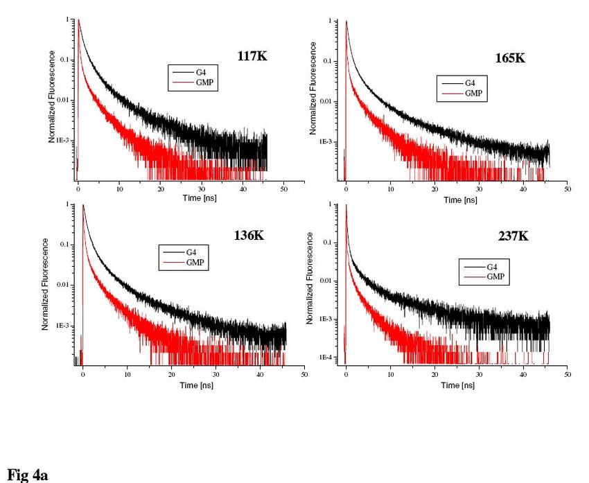
Graphical Excellence*
• Is that which gives to the viewer the greatest
  number of ideas in the shortest time with the
  least ink in the smallest space

• Is nearly always multivariate

• Requires telling the truth about the data

*pg. 51, Tufte.
What are Good Graphics?
Graphics that communicate ideas
  with:
  – Clarity
     • Lack of ambiguity and confusion
  – Precision
     • Truthful results
     • Distortion‐free presentation
  – Efficiency
     • Minimal “chartjunk”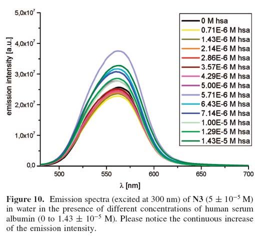
1. Figure Captions
How to phrase good figure captions?
  – Describe “(Vertical axis quantity) vs. (Horizontal axis
    quantity)” for Experiment
  – Include all important experimental details
  – Identify multiple curves or traces
  – Match the graphic
Describe what is graphed
“(Vertical axis quantity) vs. (horizontal axis quantity) for (experiment)”
Include important experimental details
Identify multiple curves or traces
Can you tell which traces are
for the uncrosslinked or
Crosslinked SPEEK?

 Figure 2. The FTIR spectrum of (A) Ba, ABa and SBa (B) uncrosslinked and crosslinked SPEEK with Ba and
 SBa membranes, respectively.
Caption should match the graphic
Different symbols in graph and caption
Caption should match the graphic
             (ex. 2)
2. Good Readability
• Good resolution
• Clear, concise, complete
• Font is legible (size, boldness, font choice)
• Colors enhance the graphic not detract
– Reproducibility (quality doesn’t improve upon
reproduction
– Color blindness and deficiencies
• All parts of figure are identified or explained
• Figure are proofed carefullyResolution Can you tell what you are looking at? Image is clear
Another example of poor
               resolution
What can you make out of these AFM figures?
Be concise (save ink)
Quickly, can you
describe Fig. d?
Where is description for (d)
…or even for (j)
• Figure 2, a) Photo induced absorption (PIA) spectra for 1.4 μm thick mesoporous TiO2 films sensitized with Ru‐bpy‐
TPA (circles) and Ru‐bpy‐Me (lines), pumped at 488 nm with an intensity of 128 mWcm‐2 and a frequency of 200
Hz. The open circles and the dashed line correspond to the out‐of‐phase signals for the Ru‐bpy‐TPA and Ru‐bpy‐Me
respectively. b) The frequency dependence of the PIA signal (dr = (dx2+dy2) at 800 nm (1.55 eV) under the same
pump beam conditions as above. c) Transient absorption spectroscopy (TAS) of two similar samples to above, Ru‐
bpy‐TPA (dark solid circles, solid line) and Ru‐bpy‐TPA (gray open circles, dashed line)of the transient absorption
signal at 650 nm (~1.9 eV absorption of the oxidized dye species). The pump was at 600nm with a pulse width of ~ 5
ns with 35 μJ/pulse and a repetition rate of 30 Hz.Be concise (ex. 2) Could this have been presented in a better way?
Be concise (ex. 3)
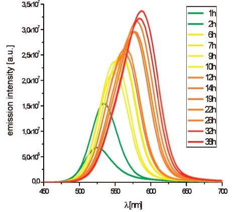
Can you distinguish these curves?
Clear, concise, easy to readLegible Font Size Font too small Adequate font size
Legible Font – Avoid bolding the entire
                graphic
Bolding all characters often makes it more difficult to read.
Use bolding only for emphasis.
Legible Fonts • Use bolding selectively • Use large font size • Use both upper and lower case letters • Use serif font
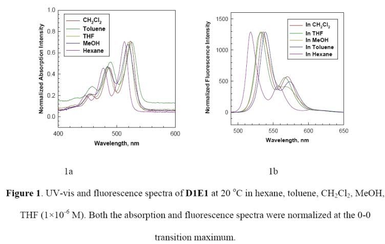
Color can enhance a graphic

   Can you distinguish the
   individual spectra?

Proper use of color would have
improved the readability.
Color can enhance a graphic
    Hard to distinguish multiple                            Use of color, different data
    data series in B&W                                      point symbols greatly improves
                                                            readability

Figure 2. Normalized absorption spectra of commercial
AuNP solution ([AuNP]=1.13 nM) (continuous black line)
and of Az+AuNP solutions at [AuNP]=1.02nM and various
Az concentrations: 0 μM (continuous gray line), 0.7 μM
(dash‐dotted black line), 2.8 μM (dotted black line), 11
μM (dashed black line line). Inset: Plasmon peak position
dependence on Az concentration as obtained by multi‐
peak Gaussian fitting procedure.
Avoid colors that don’t reproduce well Dark backgrounds Yellow (or other light colors)
Avoid colors that are difficult to distinguish
 Similar looking colors
Consider readers with color blindness
              or deficiencies
Would a color blind/deficient   In a B&W printout, could you
person be able to distinguish   distinguish the different traces ?
these curves?
Help readers with color blindness or
deficiencies
Identify individual traces with tags (a,b,c…)Proof the final version carefully
Part of text hidden Axis label has rotated 90o
Watch for formatting changesAll parts of figure
should be identified
or explained
To what are these normalized?
No axis titleUnidentified Features (ex. 2)
What is the significance of colors?
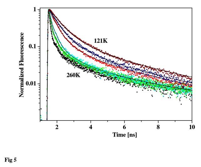
Note: 80-280K in caption
Figure 5 ‐ Model fitting (solid line) of the experimental time‐resolved emission data
(dots) of G4 wires at several temperatures in the range of 80‐280 K.Unidentified Features (ex. 3) Which is a? b?
Unidentified Features (ex. 4)
Don’t forget to check the footnotes

              ?
Unidentified Features (ex. 5) What are A, B, C?
Unidentified Features (ex. 6)
What is the red line?

                Figure 5 Decay curves of YOSG550 sample.
Unidentified Features (ex. 7) What are these points? (Don’t forget to What unit of concentration? identify the insets.) Figure 4. I‐V plots under chopped‐illumination at (PDDA/Q‐ CdS)n bilayers by dip‐spin SA with n = 2, 4, 6, 8 in deoxygenated 0.1 M Na2S/0.2 M NaOH at 20 mV/s (a), anodic and cathodic photocurrents vs. n measured from I‐V plots at 75‐110 mV, and –630‐–665 mV, respectively (inset of a), and photocurrent action spectra (% IPCE vs. wavelength) at bilayers n = 2, 4, 6 in the same electrolyte (b).
3. Label Axes Clearly
Axis not labeled         Axes clearly labeled
Include a y‐axis
y-axis is missing
Use the Correct Unit
Wrong Units on Y axis      Correct Y axis
Identify the Variable

??

           ??
Use the Correct (!) Variable The X-axis should be time
Use the same format
Different formats      Consistent format
Avoid only symbols with less
         common variables
No description       Variable is described
4. Include a Scale or Scale Bar (if
appropriate)
No scale (or units) on y-axis Scale provided
Note: Molar absoptivity has units of M-1cm-1
Absorbance has no units.How to Present the Scale for Multiple
Spectra
Wrong Way
Right WaySelect scale wisely What can you conclude from this graph?
Scale bars in Micrographs
Illegible scale bars are a   Scale bar clearly indicated
common problem
Scale bars in Micrographs
If font quality cannot be improved the size of the scale bar can be
indicated in the caption. (Just don’t forget to include it.)
5. Check for Accuracy
   (Proof your work! Typos can change the meaning.)
Author actually studied dGMP, a different chemical than GMP

     Figure 4a. A semilog plot of the time resolved emission of G4 wires and dGMP
     in frozen aqueous solution at several temperatures.
Accurate Labeling
Which is the Na0.7CoO2 series? Do not “invent” new
scientific terms (What is
absorptance?)Graphics Disguised as Figures
There is no causality“Graphs” that aren’t graphs
Is there a relationship The right way to present
between X and Y? non-causal data
A bar diagram can be used when
comparing the performance of
different samplesSummary (adapted from Tufte, pg 183)
Good graphic Bad graphic
• Terms are spelled out • Excessive abbreviations to decode
• Text runs left to right • Text in vertical or multiple directions
• Data are clarified with small notes • Graphic requires repeated references
to scattered text
• Legends vs. labels –decide which • Repeated back and forth between
one is appropriate legend and graphic required
• Graphic attracts viewer • Graphic is repellent, filled with
chartjunk
• Color choices (blue ‐ good) • Dark letters on dark contrast (Red &
green)
• Font type is clear, precise, modest • Type is dense, heavy, overbearing
• Upper & lower case, with serifs • All upper case, sans serif
• Graphics should tend toward the
horizontal, greater in length than
height.You can also read