GraVVITAS: Generic Multi-touch Presentation of Accessible Graphics
←
→
Page content transcription
If your browser does not render page correctly, please read the page content below
GraVVITAS: Generic Multi-touch Presentation of
                 Accessible Graphics

                              Cagatay Goncu and Kim Marriott

                Clayton School of Information Technology, Monash University
               cagatay.goncu@monash.edu.au, kim.marriott@monash.edu.au

       Abstract. Access to graphics and other two dimensional information is still
       severely limited for people who are blind. We present a new multimodal
       computer tool, GraVVITAS, for presenting accessible graphics. It uses a multi-
       touch display for tracking the position of the user’s fingers augmented with
       haptic feedback for the fingers provided by small vibrating motors, and audio
       feedback for navigation and to provide non-geometric information about
       graphic elements. We believe GraVVITAS is the first practical, generic, low
       cost approach to providing refreshable accessible graphics. We have used a
       participatory design process with blind participants and a final evaluation of the
       tool shows that they can use it to understand a variety of graphics – tables, line
       graphs, and floorplans.

  Keywords: graphics, accessibility, multi-touch, audio, speech, haptic

1 Introduction

   Graphics and other inherently two dimensional content are ubiquitous in written
communication. They include images, diagrams, tables, maps, mathematics, plots and
charts etc. They are widely used in popular media, in workplace communication and
in educational material at all levels of schooling. However, if you are blind or suffer
severe vision impairment your access to such graphics is severely limited. This
constrains enjoyment of popular media including the web, restricts effective
participation in the workplace and limits educational opportunities.
    There are a number of different techniques for allowing people who are blind to
access graphics, the most common being tactile graphics presented on swell or
embossed paper. We review these in Section 3. However, it is fair to say that none of
these are widely used and that currently there is no reasonably priced technology or
tool which can be effectively used by someone who is blind to access graphics, tables
and other two-dimensional content. This is in contrast to textual content, for which
there exist computer applications widely used by the blind community. For instance,
DAISY provides access to textbooks and other textual material using speech or
refreshable Braille displays and Apple’s VoiceOver screen reader provides accessible
access to the text in webpages.
    The main contribution of this paper is to present the design and evaluation of a
new tool for computer mediated access to accessible graphics. The great advantages
of our tool are that it is relatively cheap to construct and costs virtually nothing to
operate, provides a generic approach for presenting all kinds of 2-D content, can
support dynamic, interactive use of graphics and could be integrated with existing
applications such as DAISY.
GraVVITAS (for Graphics Viewer using Vibration, Interactive Touch, Audio and
Speech) is a multi-modal presentation device. The core of GraVVITAS is a touch
sensitive tablet PC. This tracks the position of the reader’s fingers, allowing natural
navigation like that with a tactile graphic. Haptic feedback is provided by small
vibrating motors of the kind used in mobile phones which are attached to the fingers
and controlled by the tablet PC. This allows the user to determine the position and
geometric properties of graphic elements. The tool also provides audio feedback to
help the user with navigation and to allow the user to query a graphic element in order
to obtain non-geometric information about the element.
We have used a user-centered and participatory design methodology,
collaborating with staff from Vision Australia 1 and other relevant organizations and
blind participants at all stages in the design and development of the tool. We believe
participatory design with blind participants is vital for any project of this kind since
our experiences, and previous research suggest that people who have been blind from
an early age may have quite different strategies for understanding graphics to people
who are sighted [25]. The results of our evaluation of GraVVITAS are very positive:
our blind participants learnt to use the tool to understand a variety of graphics
including tables, line graphs and floorplans.
2 Design Requirements
In this section we detail our three initial design requirements. These were
developed in collaboration with staff at Vision Australia. The first design requirement
is that the computer tool can be used effectively by people who are blind to read an
accessible version of a wide range of graphics and 2D content. This means that the
accessible version of the graphic should contain the same information as the original
visual representation. However simple information equivalence is quite a weak form
of equivalence: a table and a bar chart presenting the same data are equivalent in this
sense. We require a stronger form of equivalence in which the spatial and geometric
nature of the original graphic is maintained, so that the blind viewer of the accessible
version builds up an internal spatial representation of the graphic that is functionally
equivalent to that of the sighted viewer. Such functional equivalence is important
when graphics are being used collaboratively by a mixture of sighted and blind
people, say in a class room or workplace, or when contextual text explains the graphic
by referring to the graphic’s layout or elements.
Functional equivalence also means that the accessible graphic is more likely to
maintain at least some of the cognitive benefits that sighted readers obtain when using
a graphic instead of text. Starting with Larkin and Simon [21] many researchers have
investigated the differences between graphics and text and the benefits that can make
graphics more effective than text [31, 33, 30]. Such benefits include: geometric and
topological congruence, homomorphic representation, computational off-loading,
indexing, mental animation, macro/micro view, analogue representation and graphical
1 Vision Australia is the primary organization representing people with vision impairment in
Australia and a partner in this project.constraining. While it is unlikely that all of these benefits will be displayed by the
accessible representation we believe that many will be [14].
The second design requirement is that the tool is practical. This means that it has
to be inexpensive to buy and to operate, can be used in classrooms, home and work
environments, and can be integrated with other applications such as screen readers.
The final design requirement is that the tool supports interactive, active use of
graphics. This means that the tool must have a rapidly refreshable display so that it
supports the kind of interactive use of graphics that sighted users now take for
granted: interactive exploration of a graphic at different levels of detail; creation and
editing of graphics; and dynamic presentation of graphics created by applications like
graphing calculators or spreadsheet tools.
3 Background
We now review the main previous approaches to accessible graphics and evaluate
them with respect to our three design requirements. As a first step it is useful to
review different characteristics of the relevant human perceptual subsystems [6, 16].
The visual subsystem has sensors that receive light and provide visual information
such as shape, size, colour, intensity and position. It needs no physical contact with
objects to acquire this information. It has a wide area of perception that provides
parallel information in a continuous flow and within this is a narrow area (the fovea)
which can detect highly detailed information.
The haptic subsystem requires physical contact with objects to acquire
information. Cutaneous sensors on the skin detect touch and temperature, while the
kinesthetic sensors on the muscles and joints of the body sense motion. The haptic
subsystem can provide much of the same information as the visual subsystem (shape,
size, texture and position) and haptic input can lead to internal spatial representations
that are functionally equivalent to those obtained from visual input [4].
The aural subsystem has sensors that receive aural information such as audio, and
speech. It is more effective in acquiring sequential stimuli. Since the aural subsystem
provides binaural hearing it can also locate the source of a stimulus. It does not need
to have a physical contact with the objects to acquire this information.
Tactile graphics are probably the most frequently used approach to accessible
graphics and are commonly used in the education sector. They allow the viewer to
feel the graphic and have been in use for over 200 years [10]. Tactile graphics are
usually displayed on embossed tactile paper in which embossers punch the paper with
varying height dots to create raised shapes or thermo-form (swell) paper which
contains thermo capsules that rise when heat is applied. Both of these are non-
refreshable media.
Much less commonly, tactile graphics can be displayed on electro-mechanical
refreshable displays [36]. These have multiple lines of actuators that dynamically
change in time. When the display is activated, the user traces the area to feel what is
on the display. These refreshable displays are primarily designed for presenting
Braille. Larger displays suitable for presenting tactile graphics are expensive (e.g. A4
size displays are around US $20,000) and have quite low resolution.
One limitation of a pure tactile presentation is that text must be presented as
Braille. This takes up considerable space and many blind users cannot read Braille. It
can also be difficult to use easily distinguishable textures when translating a graphicthat makes heavy use of patterns and colour. From our point of view, however, the
main limitation of tactile graphics is that they are typically created on request by
professional transcribers who have access to special purpose paper and printers. As a
result they are expensive and time consuming to produce. For instance, transcription
of the graphics in a typical mathematics textbook takes several months and is
estimated to cost more than US $100,000. Furthermore non-refreshable media do not
support interactive use of graphics.
TGA [19] overcomes the need for professional transcribers by using image
processing algorithms to generate tactile graphics. Text in the image is identified and
replaced by the Braille text and the visual properties such as colours, shading, and
textures are simplified. The image is then uniformly scaled to satisfy the required
fixed size of the Braille characters. However, it still requires access to expensive
special purpose paper and printers or a refreshable display. Furthermore, because of
the large amount of scaling that may be required to ensure that the Braille text does
not overlap with other elements the results are sometimes unsatisfying.
Touch sensitive computing devices like the IVEO [13] and Tactile Talking Tablet
(TTT) [20] are a relatively new development. These allow a tactile graphic to be
overlaid on top of a pressure-sensitive screen. When reading the user can press on an
element in the tactile overlay to obtain audio feedback. The main advantage is that
audio feedback can be used instead of Braille. However, the use of these devices is
limited, requires expensive tactile overlays and does not support interactive use of the
graphic.
To overcome the need for expensive tactile overlays some tools have been
developed that rely on navigation with a joystick or stylus. A disadvantage of such
approaches is that unlike tactile graphics, they do not allow multi-hand exploration of
the graphic since there is a single interaction point for navigation.
One of the most mature of these is TeDub (Technical Drawings Understanding for
the Blind) [27]. It is designed to present node-link diagrams such as UML diagrams.
TeDub uses an image processing system to classify and extract information from the
original drawing and create an internal connected graph representation through which
the user can navigate with a force feedback joystick by following links. Speech is
used to describe the node’s attributes. A key limitation from our point of view is that
the navigation and interaction is specialized to node-link diagrams and is difficult to
generalize to other kinds of graphics.
The VAR (Virtual Audio Reality) [12] tool also provides a joystick for
navigation. It allows the user to perform tasks on a graphical user interface. The
elements in the visual interface are represented by short audio representations placed
in a 3D space. The user navigates in this 3D space using the joystick. During the
tracing, audio associated to elements are played through the headphones. In MultiVis,
which has a similar design, the authors used a force-feedback device and non-speech
audio to construct and provide quick overviews of bar charts [23]. A key limitation of
VAR and MultiVis is that they are specialized to a particular kind of application.
In another study, a tool using a graphics tablet and a VTPlayer tactile mouse is
evaluated [37] for the presentation of bar charts. The user explored a virtual bar chart
on a graphics tablet using a stylus. Based on the position of the stylus, the two tactile
arrays of Braille cells on the mouse, which was held in the other hand, were activated.
The activation of the pins in these cells was determined by the pixel values pointed by
the stylus. Speech audio feedback was also provided by clicking the button on the
stylus. The tool had the advantage that it was inexpensive to buy and cheap to run.
Although designed for bar charts it could be readily generalised to other graphics.However, we believe that because the interaction is indirect (through a mouse
controlling a curser that the user cannot see) it would be quite difficult to learn to use.
Another limitation is that it provides only a single point of interaction.
In [22] a tool for navigating line graphs was presented. This used a single data
glove with four vibrator motors. The motors were not used to provide direct haptic
feedback about the graphic but rather were used to inform the user on which direction
to move their hand in order to follow the line graph.
A hybrid tactile overlay/haptic approach was employed in a networked
application that allowed blind people to play a board game called Reversi (also called
Othello)[26]. This used a touch screen with a tactile overlay to present the board and
dynamic haptic and audio feedback to present the position of the pieces on the board.
Layered audio description of the graphic and its content is a reasonably common
technique for presentation of graphics to blind people. This is typically done by
trained transcribers and so is expensive and time consuming. It also has the great
disadvantage that functional equivalence is lost. Elzer et al [9] have developed an
application for automatically generating an audio description of a bar chart
summarizing its content. This overcomes the need for a trained transcriber. While
clearly useful, for our purposes the disadvantages are that the application is
specialized to a single kind of information graphic and that it does not preserve
functional equivalence.
Thus we see that none of the current approaches to presentation of accessible
graphics meet our three design requirements: there is a need for a better solution.
4 Design of GraVVITAS
We used a participatory design approach in collaboration with blind participants
to design our tool. We initially planned to use a more formal usability testing
approach but we found that we were often surprised by what our blind participants
liked or disliked, and so found it difficult to foresee some of the problems in the
interface. Therefore we instead used a participatory design process [18] in which the
design evolved during the course of the usability study and was sometimes changed
during the user evaluations because of participant feedback.
It is worth pointing out that all approaches to presenting accessible graphics,
including tactile graphics, require the blind user to spend a considerable amount of
time learning to use the approach. This is a significant difficulty when evaluating new
tools since it is usually not practical to allow more than a few hours training before a
participant uses the tool. We partially overcame this problem by using the same
participants in multiple user studies meaning that they had more experience with the
tool.
Since there are relatively few blind people and it is often hard for them to travel, it
is quite difficult to find blind participants (also pointed out in [32, 28]). Hence the
number of participants was necessarily quite small–between 6 and 8 for each usability
study. Participants were recruited by advertising the study on two email lists for print-
disabled people in Australia, and we used all who responded. They were all legally
blind and had experience reading tactile graphics. They were aged between 17 and
63. Participants were asked to sign a consent form which had previously been sent by
email to them and which they were given a Braille version of on the day. This alsoprovided a short explanation of the usability study and what type of information
would be collected.
4.1 Basic design
One of the most important design goals for GraVVITAS was that it should allow,
as far as possible, the blind user to build a functionally equivalent internal spatial
representation of the graphic. We have seen that a haptic presentation allows this [4].
Previous studies have shown that blind participants prefer tactile presentations to
audio [15] and audio is preferred in exploration and navigation tasks. All of our
participants felt that tactile graphics were the most effective way that they knew of for
presenting graphics to the blind.
We believe that one reason for the effectiveness of tactile graphics is that they
allow natural navigation and discovery of geometric relationships with both hands
and allow the use of multiple fingers to feel the geometric attributes of the graphic
elements. The use of both hands allows semi-parallel exploration of the graphic as
well as the use of one hand as an anchor when exploring the graphic. Both of these
strategies are common when reading Braille and tactile graphics [11, 8].
However as we have noted, tactile graphics or overlays are expensive to produce
and are non-refreshable so they do not support interactive use of the graphic. What is
required is a low-cost dynamic tactile display that supports exploration with multiple
hands and fingers. Recent advances in touch screen and haptic feedback devices
finally allow this.
Our starting point was a touch sensitive tablet PC which tracks the position of the
reader’s fingers. We used a Dell Latitute XT 2 which is equipped with NTrig
DuoSense dual-mode digitizer3 which supports both pen and touch input using
capacitive sensors. The drivers on the tablet PC allowed the device to detect and track
up to four fingers on the touchscreen. We allowed the user to use the index and
middle finger of both the left and right hand.
A key question was how to provide haptic feedback to the reader’s fingers so that
they could feel like they were touching objects on the touchscreen. In recent years
there has been considerable research into haptic feedback devices to increase realism
in virtual reality applications including gaming, and more recently to provide tactile
feedback in touch screen applications [2]. The main approaches are electromechanical
deformation of the touch screen surface, mechanical activation applied to the object
(stylus or finger) touching the surface, and electro-vibration of the touch screen, e.g.
see [1]. In the longer term (i.e. 2+ years) there is a good chance that touch screens
will provide some sort of dynamic tactile feedback based on electromechanical
deformation or electro-vibration. However, during the time we have been developing
GraVVITAS, mechanical activation applied to the fingers touching the screen was the
most mature and reliable technology for supporting multi-touch haptic feedback.
We therefore chose to provide haptic feedback by using a kind of low cost data
glove with vibrating actuators. To do so we attached small vibrating motors of the
kind used in mobile phones to the fingers and controlled these from the tablet PC
through an Arduino Diecimila board 4 attached to the USB port. Since the
2 http://www.dell.com
3 http://www.n-trig.com
4 http://arduino.cctouchscreen could track up to four fingers there were four separately controlled
motors. The amount of vibration depended on the colour of the graphic element under
the finger and if the finger was over empty space there was no vibration.
One difficulty was that when there are more than four fingers on the touch screen
the device behaved inconsistently and fingers touching the touchscreen were not
always detected. To shield unwanted fingers, we used a cotton glove. The tool is
shown in Figure 1. Detection of fingers remained an issue for some users who needed
to be trained to flatten their finger tips to be properly detected by the touchscreen.
During the training session we suggested that users lift their fingers up and put them
down again to reset the finger assignment if they suspected one of their fingers was
not properly detected. This meant that it took some time for some participants to get
used to the tool.
Probably the most
technically challenging
part of the implementation
was determining in real-
time which fingers were
touching the tablet and
which finger corresponded
to which touchpoint on the
device. Knowing this was
necessary for us to provide
the appropriate haptic
feedback to each finger.
We stored the maximum
and average vector
difference between the
stroke sequences on the
device. Based on these
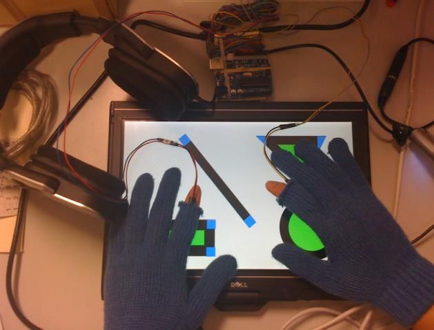
differences we used a Fig. 1. Using GraVVITAS to view a diagram
Bayesian approach which
chose the most probable feasible finger configuration where a finger configuration is
a mapping from each stroke sequence to a particular finger. A configuration was
infeasible if the mapping was physically impossible such as assigning the index and
middle finger of the same hand to strokes that were sometimes more than 10cm apart.
There was a prior probability for each finger to be touching the device and a
probability of a particular finger configuration based on an expected vector difference
between each possible pair of fingers. We also used the area of the touch points, and
the angle between them in the calculations. The approach was quite effective.
One disadvantage of using a haptic presentation of a graphic is that because of the
sequential movement of hands and fingers involved in perception, acquisition of
information is slower and less parallel than vision. Also, because there is no haptic
equivalent of peripheral vision, the position of previously encountered objects must
be stored in memory [34]. To partially address this problem, we decided to provide
audio feedback in order to help the user with navigation and to obtain an overview of
the graphic and its layout. The use of audio means that the user can obtain an
overview without having to physically touch the elements.
Another disadvantage of a purely haptic presentation is that it is difficult to
represent non-geometric properties of elements and text. While Braille can be used it
takes up a lot of space and cannot be read by many users. To overcome this wedecided to provide audio feedback when the viewer queries graphic elements on the
display. This was similar to TTT or IVEO.
The tool displays graphic content specified in SVG (the W3C standard for
Scalable Vector Graphics) on a canvas which is implemented using Microsoft
Windows Presentation Framework. The canvas loads a SVG file and use the metadata
associated with the shapes to control the tool behaviour. The metadata associated with
a shape is: its ID, the vibration level for the edges and audio volume level for the
interior of the shape and for its boundary, the text string to be read out when the shape
is queried, and the name of a (non-speech) audio file for generating the sound
associated with the shape during navigation. The SVG graphics could be constructed
using any SVG editor: we used Inkscape 5. The only extra step required was to add the
metadata information to each shape. We did this using Inkscape’s internal XML
editor.
4.2 Haptic vs audio feedback
In our first trials with the tool we experimented with the number of fingers that we
attached the vibrating motors to. We tried: (a) only the right index finger, (b) the left
and right index fingers, and (c) the left and right index and middle fingers. Our
experience, corroborated by feedback from a single blind participant, was that it was
beneficial to use fingers on both hands but that it was difficult to distinguish between
vibration of the index and middle finger on the same hand. We first tried attaching the
vibrating devices to the underside and then to the top of the finger but this made little
difference. Our experience is that, with enough practice, one can distinguish between
vibration on all four fingers but this takes many hours of use. We therefore decided to
use the tool with two fingers—the left and right index fingers—as we would not be
able to give the participants time to learn to use four fingers when evaluating the tool.
Given that we decided only to provide haptic feedback for the left and right index
finger, a natural question to investigate was whether stereo audio feedback might be
better. To determine this we implemented an audio feedback mode as an alternative to
haptic feedback. This mode was restricted to the use of one finger or two fingers on
different hands. In audio mode if the user touches an object on the screen then they
will hear a sound from the headphones. If they use one finger they will hear a sound
coming from both headphones while if they use two fingers then they will hear a
sound on the left/right headphone if their left/right finger is on an element. The
sounds associated with objects were short tones from different instruments played in a
loop. They were generated using the JFugue library.
We conducted a usability study to investigate whether audio or haptic feedback
was better for determining the geometric properties (specifically position and shape)
of graphic elements. The study used simple graphics containing one to three
geometric shapes (line, triangle, rectangle and circle) such as those shown in
Figures 2, and 3. Each shape had a low intensity interior colour and a thick black
boundary around it. This meant that the intensity of the haptic or audio feedback was
greater when the finger was on the boundary.
We presented the graphics to each participant in the two different modes–audio
and haptic–in a counterbalanced design. For each mode the following two-step
procedure was carried out. First we presented the participant with one training
5 www.inkscape.orggraphic that contained all of the
different shapes. In this step we
told them what shapes were on
the screen and helped them to
trace the boundaries by
suggesting techniques for doing
so and then letting them explore
the graphic by themselves.
Second, the participant was
shown three graphics, one at a
time and asked to explore the
graphic and let us know when
they were ready to answer the
questions. They were then asked Fig. 2. Example graphic used in haptic vs audio
to answer two questions about feedback usability study.
the shapes in the graphic:
1. How many objects are there
in the graphic?
2. What kind of geometric
shape is each object?
The times taken to explore the
graphic and then answer each
question were recorded as well as
their answers. After viewing and
answering questions about the
graphics presented with the audio
and haptic interaction modes the
participants were asked which
they preferred and invited to give
comments and explain the
features that influenced their Fig. 3. Example graphic used in audio interface design
preference. usability study.
Eight participants completed
the usability study. We found that 6 out of 8 participants preferred haptic feedback.
Error rates with audio and haptic feedback were very similar but the time to answer
the questions was generally faster with haptic feedback. These results need to be
considered with some care because they were not statistically significant because of
the small number of participants.
Another caveat is that we slightly modified the presentation midway through
usability study. This was because the first three participants had difficulty identifying
the geometric shapes. The reason was that they found it difficult to determine the
position and number of vertices on the shape. To overcome this in subsequent
experiments object vertices were given a different color so that the audio and haptic
feedback when touching a vertex differed from that for the boundary and the interior
of the shape. This reduced the error count to almost zero in the subsequent
participants.
We observed that participants used two quite different strategies to identify
shapes. The first strategy was to find the corners of the shapes, and then to carefully
trace the boundary of the object using one or two fingers. This was the strategy we
had expected.The second strategy was to use a single finger to repeatedly perform a quick
horizontal and/or vertical scan across the shape, moving the starting point of the
finger between scans slightly in the converse direction to that of the scan. Scanning
gives a different audio or haptic pattern for different shapes. For instance, when
scanning a rectangle, the duration of a loud sound on an edge, a soft sound inside the
shape, and another loud sound on the other edge are all equal as you move down the
shape. In contrast for a triangle the duration of the soft sound will either increase or
decrease as you scan down the shape. This strategy was quite effective and those
participants who used it were faster than those using the boundary tracing strategy.
As a result of this usability study we decided to provide haptic feedback (through
the vibrating motors) rather than audio feedback to indicate when the user was
touching a graphic element. The choice was because of user preferences, the slight
performance advantage for haptic feedback, because haptic feedback could be more
readily generalized to more than two fingers, and because it allowed audio feedback
to be used for other purposes.
4.3 Design of the audio interface
The next component of the interface that we designed was the audio interface. We
investigated the use of audio for two purposes: to provide non-geometric information
about a graphic element and to help in navigation.
The initial interface for obtaining non-geometric information about a graphic
element was similar to that used in IVEO or TTT. If a finger was touching a graphic
element the user could query the element by ―twiddling‖ their finger in a quick tiny
circular motion around the current location without lifting it up. This would trigger
the audio (speech or non-speech) associated with the element in the SVG file. Audio
feedback could be halted by lifting the finger from the tablet. Audio feedback was
triggered by whichever finger the user twiddled and could come from more than one
finger.
Designing the interface for determining the position of elements in the graphic
using audio was more difficult and we developed two quite different techniques for
doing this.
The first technique was to generate a 3D positional audio based on the location of
one of the fingers on the touchscreen. This use of 3D audio was based on initial
conversations and studies with blind people who said they liked the use of 3D audio
in computer games [35]. When the user was not touching an element, they would hear
through the headphones the sound associated with the graphic elements within a fixed
radius of the finger’s current position. The sound’s position (in 3D) was relative to
the finger’s position. So if there was an object on the top right of the finger, the
associated audio would sound as if it comes from the top right of the user.
The 3D positional audio navigation mode was initiated by triple tapping one of
the fingers and stopped when either the user lifted the finger or they triple tapped
their other finger initiating 3D positional audio relative to that finger. We wondered if
receiving audio and haptic feedback for the same finger could be confusing so we
allowed the user to turn the 3D positional audio off temporarily by triple tapping the
active finger when receiving haptic feedback–it resumed when the haptic feedback
stopped.
In the second technique, stereo audio was generated for all objects that intersected
the scanline between the two fingers touching the screen. Thus if there was an objectbetween the two touch points then the user would hear its associated sound. This
audio was positioned relative to the mid point of the scanline. The use of the scanline
was suggested by how blind users read Braille or use a quick horizontal scanning to
discover the objects in a tactile graphic [17, 24] The scanline navigation mode was
initiated by tapping both fingers and stopped by lifting one of the fingers from the
screen. Triple tapping could also be used to temporarily turn it off.
We were not sure how effective these two navigation modes would be and so we
conducted a second usability study to investigate this. The study was similar to our
first study. We used graphics with 2-4 geometric shapes like the graphic in Figure 3.
One shape in each graphic was significantly larger than the other shapes. Different
colours were used for object boundaries, interiors and vertices. This time we
associated the name of an object’s geometric shape, i.e. circle, triangle, line or
rectangle, with the object and this was read out when the object was queried.
For each of the two navigation modes (3D positional audio and scanline) the
following two-step evaluation procedure was carried out. First we presented the
participants with training graphics one at a time for that mode, which was initially on.
In this part we told them which shapes were on the screen and helped them to use the
mode to navigate through the shapes. We also taught them how to turn the navigation
mode on and off. Second, the participant was shown one experimental graphic at a
time and asked to explore the graphic and to let us know when they were ready to
answer the questions. They were then asked to answer three questions about the
shapes in the graphic:
1. How many objects are there in the graphic?
2. What kind of geometric shape is each object?
3. Which is the largest shape?
The time taken to initially explore the graphic and then answer each question was
recorded as were their answers.
We used 6 participants in the study, some of whom had completed the first
experiment. For those who had not done the first study, we had an additional training
session for the haptic interaction.
Audio feedback combined with different sounds for each shape allowed
participants to quickly obtain an overview of the graphic and after a first scan in most
cases they correctly inferred the number of graphic elements. We found there was a
slight performance benefit for the 3D positional audio mode and that there were very
few errors for either mode. While participants successfully used the twiddling gesture
to query objects, two of them complained that twiddling was difficult to use. All
participants kept audio feedback turned on for both navigation modes, with only one
person turning it off temporarily.
As expected, the scanline method was used to get an overview of the graphic.
Interestingly, some of the participants also used it to get the size of the shape rather
than using the haptic feedback. They started the scanning at the top with the widest
scanline and narrowed the scanline to the left or to the right depending on which
object they wanted to see. When they felt a haptic feedback from the vibrator motors
they knew that they had touched the edges of the shape and so they could estimate the
width of the shape. After this they went up and down with both fingers to find out the
height of the shape. This was quite effective.
The preferences were split evenly between the two navigation modes and 4 of the
6 participants suggested that we provide both. Support for providing both also came
from observation and comments by the participants suggesting that the modes were
complementary: the scanline being most suited to obtaining an initial overview of thegraphic and the 3D positional audio being suited to finding particular graphic
elements.
4.4 Final design
Based on the user evaluations and participant feedback we decided on the
following design for the user interface for GraVVITAS. We allowed the user to feel
graphic elements on the display with their left and right index fingers using haptic
feedback to indicate when their finger was touching an element. Both 3D positional
audio and scanline navigation modes were provided. These were controlled using
triple taps and which mode was entered was dependent on how many fingers were
touching the display when the mode was turned on. Graphic elements could be
queried by either a twiddle or double tap gesture.
5 Evaluation
After finalizing the design we conducted a user evaluation designed to test whether
GraVVITAS met our original design goal and could be used by our blind participants
to effectively read and understand a variety of graphics. We tested this using three
common kinds of 2D content that were quite different to each other: a table, a floor
plan, and a line graph.
5.1 Design of the graphics
An important factor in how easily an accessible graphic can be read is the layout
and design of the graphic. In order to conduct the user evaluation we first needed to
decide how to present the graphics to be used in the study. Our starting point were
guidelines developed for tactile graphics. These included guidelines developed by
tactile transcribers which were quite low-level, giving advice on which textures are
easily distinguishable, how thick lines need to be etc [29, 8]. We also referred to the
higher-level design principles developed for touch screen applications with a static
tactile overlay by Challis and Edwards [5]. Based on these we proposed some general
principles for designing graphics for use with GraVVITAS.
The first principle was that the layout of the accessible graphic should preserve
the basic structure and geometry of the original visual graphic. This was to ensure
functional equivalence between the two representations and corresponds to the
foundation design principle of Challis and Edwards that ―A consistency of mapping
should be maintained such that descriptions of actions remain valid in both the visual
and non-visual representations.‖
However, this does not mean that the design of the accessible graphic should
exactly mirror that of the original graphic. One reason for this is that the resolution of
touch is much less than sight, and so tactile graphics need to be cleaner and simpler
than the original graphic. This is even more true for graphics viewed with
GraVVITAS because it is difficult to distinguish objects smaller than about 5mm.
Thus our second design principle was that the shapes should be simple and readily
distinguishable at a 5mm resolution.In tactile graphics the height of the tactile object is often used to distinguish
between different kinds of elements, similarly to the use of colour or style in visual
graphics. In the case of GraVVITAS, the choice of vibration level is the natural
analogue. We determined that users could distinguish three different levels. Our
design principle was that: the vibration level should be used to distinguish different
kinds of elements, with the same level used for similar kinds of objects.
Blind users often find it difficult when encountering an unfamiliar kind of tactile
graphic to gain an understanding of its structure and purpose. One of Challis and
Edwards’ principles was that the design should ―whenever possible encourage a
specific strategy for the exploration of a particular (kind of) display.‖ Reflecting this
principle we developed the following generic strategy for reading a graphic with
GraVVITAS.
We provided at the top left corner of each graphic a ―summary‖ rectangular shape
which, when queried, would provide a short spoken description of the graphic’s
purpose and content (without giving specific answers to the questions used in the
usability study). For consistency we decided that the summary shape should have the
same audio sound associated with it in all graphics, making it easier for the user to
identify and find it.
Our suggested reading strategy was to first use scanline navigation to traverse the
graphic from the top of the screen to the bottom to obtain an overview of the
elements. Then to use the 3D positional audio navigation to find the summary
rectangle, and use the query gesture to hear the summary. Then repeatedly to use 3D
positional audio to navigate through the graphic to find the other elements. And, for
each element, using the query gesture to find what each element is and to use haptic
feedback to precisely locate the element and understand its geometric shape.
The other aspect we had to consider in the presentation was the design of the
audio feedback provided in the navigation mode. The human perceptual subsystem
groups audio streams by using different characteristics of audio such as frequency,
amplitude, temporal position, and multidimensional attributes like timbre, and tone
quality [7]. Humans can differentiate about five or six different simultaneous sounds.
Thus, we felt that associating audio with all elements in a complex graphic would end
up being quite confusing. Instead we decided to associate audio feedback with those
graphic elements that were particularly important (possibly emphasized in the original
visual graphic) and objects that were natural navigational landmarks. Of course if an
object had no associated audio it still has haptic feedback associated with it. We
chose to use the same audio for the same kind of objects.
Using these guidelines we designed the three example graphics shown in Figures
4, 5, and 6 for the usability study. Note that the red square at the top left corner of
each graphic is the summary rectangle.
For the table, the cells were represented as squares and aligned in rows and
columns. We did not associate audio with the cells because we though the regular
layout of a table would make navigation straightforward. Querying a cell gave its
value as well as the name of the row and column it was in. We used different
vibration levels to differentiate between row headers, column headers and cells. We
used thin lines to connect the headers and the cells so that it would be easier to find
the neighbouring cells. The table gave the average distances ran by three different
runners in three different months. We asked the following questions:
(T1) Who ran the maximum distance in February? (T2) What is the distance ran by John in March? (T3) How was the performance of Richard? For the floor plan we used audio feedback for the doors but not for the rooms. The idea being that this would aid understanding how to ―walk‖ through the floorplan. The rooms were represented with filled rectangles which had two different vibration levels corresponding to Fig. 4. Table their border and interior, and the doors had one strong vibration level. The doors and the rooms also had associated text information that could be queried. The floor plan was of a building with one entrance and seven rooms connected by six doors. We asked the following questions: (F1) Where is room 4? (F2) How do you go to room 7 from the entrance? (F3) How many doors does room 6 have? For the line graph the axes and Fig. 5. Floor Plan – room numbers are not shown labels were represented as rectangles in the actual graphic. which have their value as the non- geometric information. The lines in the graph belong to two datasets so they had different vibration levels. Small squares were used to represent the exact value of a line at a grid point. Their non-geometric information was the name of the dataset and their value on the horizontal and vertical axis. These squares also had audio associated with them so that the user could hear them while using the 3D positional mode. The line graph showed the average points scored by two Fig. 4. Line graph different basketball teams during a seven month season. We asked the following questions: (L1) What is the average score of Boston Celtics in September? (L2) Have the Houston Rockets improved their score? (L3) Which team generally scored more during the season?
5.2 Usability study

   We used 6 participants all of whom had completed the second usability study. All
had spent at least 4 hours using variants of the tool before the study. The primary
purpose of the study was to determine if they could successfully use GraVVITAS to
answer the questions about the three kinds of graphic. A secondary purpose was to
obtain feedback about the drawing conventions and the interface of GraVVITAS.
   We did the following for each kind of graphic: table, floor plan, and line graph.
First we presented the participant with an example graphic of that kind on
GraVVITAS, walking them through the graphic so as to ensure that they understood
the layout convention for that kind of graphic and were comfortable using the tool.
Then we presented the experimental graphic and asked them to explore it and answer
the three questions about it. We recorded the answers as well as the time to answer
the questions. After presenting the three kinds of graphics we asked for feedback
about the tool.
    All 6 participants were able to read the example graphics and answer most of the
questions correctly – two incorrect answers for F2. Participant P3 could not
understand the table because of the lines connecting the cells. As a result of feedback
from P3 we removed the lines from the table graphic for the remaining three
participants to avoid possible confusion. Question F2 was answered incorrectly by
two participants because they became confused by the geometry of the floorplan.
    In Table 1, we give the time in seconds taken by each participant to answer each
question and the median time. The initial exploration took only a few seconds. The
times vary considerably between participants. In part this is because we had not told
participants to hurry and so they often checked and rechecked their answer or simply
spent time ―playing‖ with the graphic in order to better understand how to use
GraVVITAS. With more experience one would expect the times to significantly
reduce.

   Participant           Table                   Floorplan                  Line graph
                   T1     T2       T3     F1       F2        F3       L1        L2       L3
   P1              67     40       45     110     1058        49      266      301       393
   P2              462    45       37     50       420       300      142       80        70
   P3              n/a    n/a      n/a    120      300       285      326      242       219
   P4              100    92       36     62       210       360      350      158       141
   P5              113    20       78     102      370       225       80      131        29
   P6              121    16       35     55       388       155      180       96       159
   Median          113    40       37     82       379       255      223      145       150

Table 1. Time taken in seconds to answer each question for the three kinds of graphic.

    All participants said they liked the tool and said that with enough training they
would be more than comfortable using the tool. The error and timing data, backed by
participant comments, suggests that 5 out of 6 participants found the floorplan the
most difficult graphic to understand, followed by the line graph, and then the table.
This is not too surprising: one would expect that graphics with a more predictable
layout structure are going to be easier to read by blind people.
    Most participants used a reading strategy similar to the one we suggested. 4 of
them started with moving a scanline from the top of the graphics to the bottom so that
they could determine the location of the components. They then used one finger with
3D audio navigation mode to find the exact location of each component. When they
found a component (indicated by vibration) they almost always used the query
gesture to get its associated information. They repeated this process for each
component.
Usually the first component they looked for was the summary object which they
queried once. 4 of the participants queried this summary component a second time
during the interaction but none of them a third time. 2 of the participants started by
placing their fingers in the middle of the graphic and querying the objects, but later
decided to query the summary shape so as to perform a more systematic exploration.
5 of the participants used the 3D audio all the time, only 1 of them turned it off
saying that s/he could remember where each component was. When reading the line
graph, 5 of them used two fingers to answer the trend question, and 1 of them
preferred to read each individual data point.
3 of the participants had problems with double tapping to query an object because
our implementation required both taps to intersect with the object and if the user was
tapping on the border of the object then they were quite likely to miss the object on
the next tap, meaning that the tool would not provide the expected query information.
Several participants suggested that rather than having to explicitly query an object the
associated audio description should be triggered when the user first touches the
object. This seems like a good improvement. Other suggestions were to provide more
meaningful audio with objects for the navigation mode.
6 Conclusion
We have described the design and evaluation of a novel computer tool,
GraVVITAS, for presenting graphics to people who are blind. It demonstrates that
touch-screen technology and haptic feedback devices have now reached a point where
they have become a viable approach to presenting accessible graphics. We believe
that in the next few years such an approach will became the standard technique for
presenting accessible graphics and other two dimensional information to blind people,
much as screen readers are now the standard technique for presentation of textual
content. While touch screens and SVG are still not widely used, we believe that in a
few years they will be mainstream technology.
We had three design requirements when designing GraVVITAS. The first was
that it could be used effectively by people who are blind to read an accessible version
of a wide range of graphics and 2D content. Our user studies provide some evidence
that this is true, allowing the participants to answer questions about different kinds of
graphics. We observed that in all of the user studies the participants referred to the
shapes in terms of their relative position to each other and their position overall in the
graphic. This provides additional evidence that the tool allows the blind user to build
an internal representation that is functionally similar to that of the sighted user
looking at the original graphic. A limitation of the current evaluation is its small size
and that the same participants were used in several studies. In the future we plan to
conduct an evaluation with a larger set of participants.
The second design requirement was that the tool is practical. The tool is
inexpensive to buy and to operate: it was built from the off-the-shelf components with
a total cost of US $2,508 of which nearly $2,000 was for the Dell Latitude XT TabletPC (with multi-touch screen). It costs virtually nothing to operate for the end user
although there are still time costs involved in the creation of the graphics for the
effort of transcribers. Its size and design mean that it could be used in classrooms,
home and work environments, and it could be integrated with other applications such
as DAISY to read graphics contained in books etc. The main limiting factor is that it
currently requires a human to produce the accessible graphic. This can be done using
freely available SVG editors such as Inkscape so is an improvement on the need for
access to special purpose printers and paper when producing tactile graphics.
However, our longer term goal is to automate this process, along the lines of TGA, by
automatically generating accessible graphics from SVG.
The final design requirement was that the tool supports interactive, active use of
graphics. In principle because the display is refreshable GraVVITAS supports this.
However the current software does not yet take advantage of this. We plan to explore
how best to provide user-guided zooming and panning. This will help us overcome
the low resolution of the graphics displayed on the screen. We will also explore how
to support creation of graphics by blind users through applications like graphing
calculators and also with a generic graphics authoring tool.
Finally, we would like to further investigate the design of our system. First we
want to examine how non-blind users in limited situations can also benefit from it [3].
Second, we want to explore whether blind users with concerns about wearable
systems can prefer to use other devices such as electro-vibration surfaces where the
feedback is produced on the device.
Acknowledgements: We thank the participants for their effort and great feedback.
We also thank the Vision Australia transcription department, especially Peter Szikla,
for their support for the project and user studies. We thank Michael Wybrow for his
insightful comments. We also acknowledge the support of the ARC through
Discovery Project Grant DP0987168. Finally, we thank Chongqing Linglong
Electronics Co.,Ltd. (http://en.lnlon.com) for providing the vibrator motors.
References
[1] O. Bau, I. Poupyrev, A. Israr, and C. Harrison. TeslaTouch: electrovibration for touch
surfaces. In Proc. of the UIST, pages 283–292. ACM, 2010.
[2] M. Benali-Khoudja, M. Hafez, J. Alexandre, and A. Kheddar. Tactile interfaces: a state-of-
the-art survey. In Int. Symposium on Robotics, 2004.
[3] B. Buxton and W. Buxton. Sketching user experiences: getting the design right and the
right design. Morgan Kaufmann, 2007.
[4] Z. Cattaneo et al. Imagery and spatial processes in blindness and visual impairment.
Neuroscience and Biobehavioral Reviews, 32(8):1346–1360, 2008.
[5] B. Challis and A. Edwards. Design principles for tactile interaction. Haptic Human-
Computer Interaction, pages 17–24, 2001.
[6] S. Coren, L. Ward, and J. Enns. Sensation and perception. Wiley, 2004.
[7] D. Deutsch. The psychology of music. Academic Pr, 1999.
[8] P. Edman. Tactile graphics. American Foundation for the Blind, 1992.
[9] S. Elzer et al. A probabilistic framework for recognizing intention in information graphics.
In Proc. of the Int. Joint Conf. on AI, volume 19, pages 1042–1047, 2005.
[10] Y. Eriksson. Tactile Pictures: Pictorial Representations for the Blind 1784-1940.
Gothenburg Uni. Press, 1998.
[11] E. Foulke. Reading braille. In Tactual perception, pages 223–233. Cambridge Uni Press,
1982.[12] C. Frauenberger and M. Noisternig. 3D Audio Interfaces for the Blind. Workshop on Nomadic Data Services and Mobility, pages 11–12, 2003. [13] J. Gardner and V. Bulatov. Scientific Diagrams Made Easy with IVEO. Computers Helping People with Special Needs, 4061:1243–1250, 2006. [14] C. Goncu, K. Marriott, and F. Aldrich. Tactile Diagrams: Worth Ten Thousand Words? Diagrammatic Representation and Inference, pages 257–263, 2010. [15] C. Goncu, K. Marriott, and J. Hurst. Usability of Accessible Bar Charts. Diagrammatic Representation and Inference, pages 167–181, 2010. [16] Y. Hatwell. Images and Non-visual Spatial Representations in the Blind, pages 13–35. John Libbey Eurotext, 1993. source: http://books.google.com. [17] Y. Hatwell and F. Martinez-Sarrochi. The tactile reading of maps and drawings, and the access of blind people to works of art. In Touching for knowing: cognitive psychology of haptic manual perception. John Benjamins B.V., 2003. [18] F. Kensing and J. Blomberg. Participatory design: Issues and concerns. Computer Supported Cooperative Work (CSCW), 7(3):167–185, 1998. [19] R. Ladner et al. Automating tactile graphics translation. Proc. of the 7th International ACM SIGACCESS Conference on Computers and Accessibility, pages 150–157, 2005. [20] S. Landau and K. Gourgey. Development of a Talking Tactile Tablet. Information Technology and Disabilities, 7(2), 2001. [21] J. Larkin and H. Simon. Why a Diagram is (Sometimes) Worth Ten Thousand Words. Cognitive Science, 11(1):65–100, 1987. [22] M. Manshad and A. Manshad. Multimodal Vision Glove for Touchscreens. In Proc. of ACM ASSETS, pages 251–252. ACM, 2008. [23] D. McGookin and S. Brewster. MultiVis: Improving Access to Visualisations for Visually Impaired People. In CHI’06 Extended Abstracts, pages 267–270. ACM, 2006. [24] S. Millar. Reading by touch. Routledge, 1997. [25] S. Millar and M. Ltd. Space and sense. Psychology Press/Taylor & Francis, 2008. [26] D. Nagasaka et al. A Real-Time Network Board Game System Using Tactile and Auditory Senses for the Visually Impaired. Computers Helping People with Special Needs, pages 255–262, 2010. [27] H. Petrie et al. TeDUB: A Aystem for Presenting and Exploring Technical Drawings for Blind People. Computers helping people with special needs, pages 47–67, 2002. [28] H. Petrie, F. Hamilton, N. King, and P. Pavan. Remote usability evaluations with disabled people. In Proc. of the SIGCHI conference on Human Factors in computing systems, pages 1133–1141. ACM, 2006. [29] Purdue University. Tactile Diagram Manual, 2002. [30] M. Scaife and Y. Rogers. External cognition: how do graphical representations work? International Journal of Human-Computer Studies, 45(2):185–213, 1996. [31] A. Shimojima. The graphic-linguistic distinction: Exploring alternatives. Artificial Intelligence Review, 13(4):313–335, 1999. [32] H. Takagi, S. Saito, K. Fukuda, and C. Asakawa. Analysis of navigability of Web applications for improving blind usability. ACM Trans. on Computer-Human Interaction, 14(3):13, 2007. [33] B. Tversky. Spatial schemas in depictions. In Spatial schemas and abstract thought, pages 79–111. MIT Press, 2001. [34] S. Ungar. Cognitive Mapping without Visual Experience. Cognitive mapping: Past, Present and Future, pages 221–248, 2000. [35] E. Velleman, R. van Tol, S. Huiberts, and H. Verwey. 3D Shooting Games, Multimodal Games, Sound Games and More Working Examples of the Future of Games for the Blind. In Computers Helping People with Special Needs, pages 257–263, 2004. [36] F. Vidal-Verdu and M. Hafez. Graphical Tactile Displays for Visually-Impaired People. IEEE Transactions on Neural Systems and Rehabilitation Engineering, 15(1):119–130, 2007. [37] S. Wall and S. Brewster. Feeling What You Hear: Tactile Feedback for Navigation of Audio Graphs. In Proc. of the SIGCHI Conference on Human Factors in Computing Systems, pages 1123–1132. ACM, 2006.
You can also read