GROWENS BRAND BOOK - MAILUP GROUP
←
→
Page content transcription
If your browser does not render page correctly, please read the page content below
Growens
Brand Book
Growens
Trademarks &
Brand Guidelines

These guidelines have been created to help our employees,
customers, partners, licensees, outside vendors, and other
third parties understand how to use Growens brand features
correctly, including Growens logos and trademarks. You are
permitted to use the Growens name, logos, artwork, and
other brand features only in accordance with our Trademark
Guidelines. Any use of Growens brand features contrary to our
guidelines is prohibited.

The Growens name, logos, artwork, and other brand features
are valuable Growens intellectual property. It is important to
use them properly. By using Growens brand assets, you agree
to these trademark guidelines, as may be updated from time to
time, and you acknowledge that Growens is the sole owner of
the Growens trademarks and service marks, and all goodwill
derived from their use accrues only to Growens.

Growens may review use of our brand assets at any time and
reserves the right to terminate or modify any use.


Table of Contents

Logo                          05
Colours                       07
Graphic Pattern               10
Typography                    13
Icons                         18
Social Network Images         20
Buttons                       24
Hyperlinks                    26
Charts                        32
Email                         34
Email Signature               37
Slide Decks & Presentations   39
Logo
1. Logo            Brand Guidelines                                                              02

The Logo           We are very proud of our logo, and we require that you follow
                   the following guidelines to ensure it always looks its best.
                   The logo comes in two versions - please choose carefully which
                   one to use according to the below specifications.

Left Version       To be use left aligned or centered to the page, as the example below shows.

Centered Version   To be use only centrally when the space is square-shaped , as the example
                   below shows.

                   @2021 All Rights Reserved               Growens S.p.A.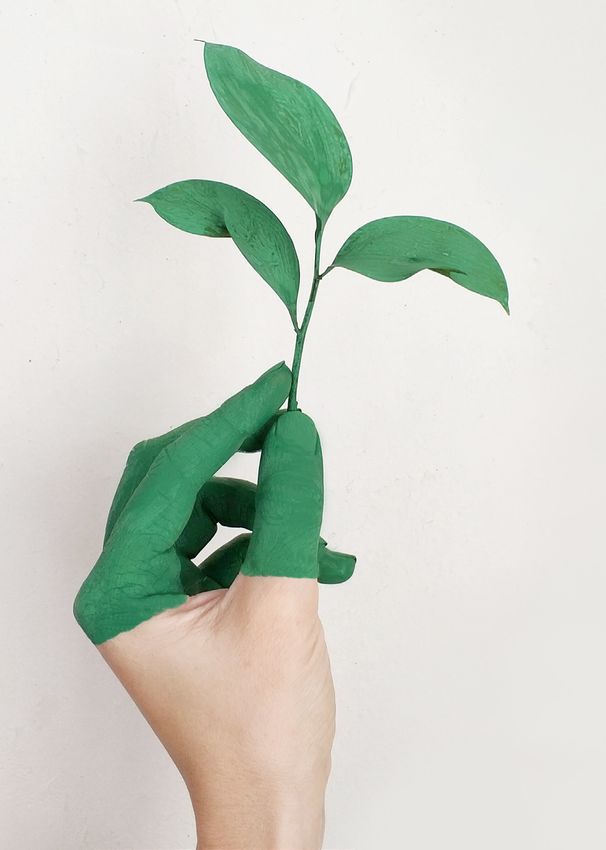
1. Logo                       Brand Guidelines                                                03

Clearspace                    Our logo should always have space to breathe. We have two
                              clear zones. The minimum clear space is highlighted in red -
                              never place anything in it. The optimal clearspace equals the
                              logo’s height.

          X                                                                         X
              1/2 X                                                       1/2 X

          X                                                                         X

              1/2 X                                                       1/2 X
          X                                                                         X

                X                                                               X

                      1/2 X                                   1/2 X

                X                                                               X

                      1/2 X                                   1/2 X

                X                                                               X

                              @2020 All Rights Reserved         MailUp S.p.A.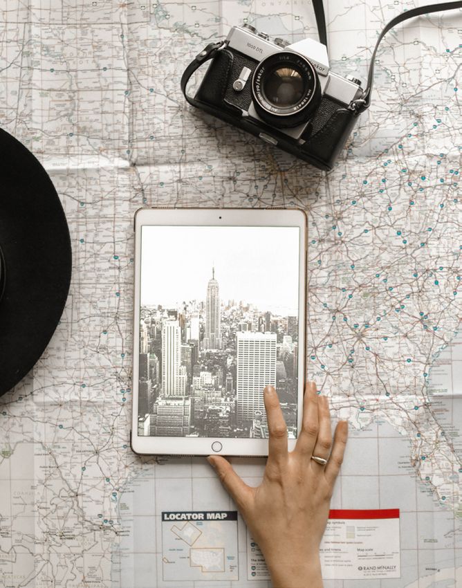
1. Logo                   Brand Guidelines                                               04

Logomark                  In cases when the Growens brand has already been established,
                          the logomark can be used on its own - e.g. on the second and
                          following pages of a PPT presentation.

Logomark Clearspace

                      X                                       X
                             1/2 X                    1/2 X

                      X                                       X

                             1/2 X                    1/2 X
                      X                                       X

                          @2021 All Rights Reserved               Growens S.p.A.
1. Logo      Brand Guidelines                                                  05

Colour       When on dark background or on image, the all-white logo

Variations   variation must be preferred. On white or light gray colour, the
             all-black logo can be used as a variation of the main logo, but
             only when the full-colour logo has already been used. Always be
             sure to give the right contrast to ensure maximum readability.

             @2021 All Rights Reserved          Growens S.p.A.
1. Logo                   Brand Guidelines                                                         06

Logo Misuse               It is important that the appearance of the logo remains
                          consistent. The logo should not be misinterpreted, modified, or
                          added to. No attempt should be made to alter the logo in any
                          way. Its orientation, colour and composition should remain as
                          indicated in this document — there are no exceptions.

NO                        NO                                 NO
Do not rotate the logo    Do not change the logo colour or   Do not distort or warp the logo in
                          tone                               any way

NO                        NO                                 NO
Do not reverse the logo   Do not manipulate the logo         Do not use unofficial colour combi-
                                                             nations

                          @2021 All Rights Reserved          Growens S.p.A.
Colours
2. Colours                           Brand Guidelines                                                          08

Colour Palette                       Our colour palette can be divided in two groups: primary and
                                     secondary. The first includes white, black and two shades of gray.
                                     The second group contains four of the five logo colours.

Primary Colours                                                  Secondary Colours

                  NAMING    White                                              NAMING           Rubine Red
                  CMYK      0, 0, 0, 0                                         CMYK             0, 97, 28, 0
                  RGB       255, 255, 255                                      RGB              230, 20, 105
                  HEX       ffffff                                             HEX              e61469
                  PANTONE   -                                                  PANTONE          Rubine Red C

                  NAMING    Gray                                               NAMING           Violet
                  CMYK      10, 0, 0, 40                                       CMYK             56, 87, 0, 0
                  RGB       164, 172, 177                                      RGB              138, 60, 143
                  HEX       a4acb1                                             HEX              8a3c8f
                  PANTONE   429 C                                              PANTONE          254 C

                  NAMING    Cool Gray                                          NAMING           Pacific
                  CMYK      12, 0, 0, 72                                       CMYK             71, 0, 0, 22
                  RGB       96, 102, 105                                       RGB              0, 156, 199
                  HEX       606669                                             HEX              009cc7
                  PANTONE   Cool Gray 10 C                                     PANTONE          801 C

                  NAMING    Black                                              NAMING           Persian
                  CMYK      0, 0, 0, 100                                       CMYK             81, 6, 46, 0
                  RGB       29, 29, 27                                         RGB              0, 164, 154
                  HEX       1d1d1b                                             HEX              00a49a
                  PANTONE   Neutral Black C                                    PANTONE          3272 C

                                     @2021 All Rights Reserved                 Growens S.p.A.
2. Colours Brand Guidelines 09
Colour Corporate colours are selected to work on all media.
Proportions White should be used for backgrounds (about 90% of the
available space). Black and Cool Gray should be used for all
information (about 8%). Rubine Red can be used for highlighting
(about 1.5% of space). Violet, Pacific and Persian can be used for
0.5% of the space.
White (90%) Black / Gray Rubine Red Other
(8%) (1.5%) (0.5%)
Please note: these proportions are a recommendation, percentages are approximated and provide a general
indication. Circle sizes have a representative ratio for an illustration purpose.
@2021 All Rights Reserved Growens S.p.A.Graphic Pattern
5. Graphic Pattern                      Brand Guidelines                                                  11

Composition                             Our graphic pattern - nicknamed “bit” - is derived from the
                                        graphic traits that make our logo. It is composed of 3 elements
                                        with alternating colours. The model is built on a regular grid.

Graphic elements are always mixed
in size and colour to create pleasant
and non-repetitive horizontal blocks.

Allow at least 3 columns between
the graphic blocks on the same row.

Always put the elements on
alternate rows and don’t overcrowd
them.

                                        @2021 All Rights Reserved          Growens S.p.A.
5. Graphic Pattern Brand Guidelines 12
Usage Our pattern is our hallmark in our communication. We can use it
in any official and non-official communication, in advertising and
in publications. In any case, it should not be overused and should
only be included on the main pages. It can cover the whole page
or only part of it.
@2021 All Rights Reserved Growens S.p.A.Typography
8. Typography        Brand Guidelines                                                               14

Typography           Our brand is modern and young, but also sophisticated and
                     high-end. Typography reflects such concepts and is designed to
                     maintain this perfect balance.

Primary Typeface     Montserrat

AaBb
                     The Montserrat project is led by Julieta Ulanovsky, a type designer based in
                     Buenos Aires, Argentina.
                     Montserrat is a free Google Font with an Open Font License.

                     Download:
                     https://fonts.google.com/specimen/Montserrat

Secondary Typeface   Lato

AaBb
                     Lato is a sans serif typeface family started in the summer of 2010 by Warsaw-
                     based designer Łukasz Dziedzic. The Lato family is published under the Open
                     Font License by his foundry tyPoland, with support from Google.

                     Download:
                     https://fonts.google.com/specimen/Lato

                     @2021 All Rights Reserved                Growens S.p.A.
8. Typography Brand Guidelines 15
Numbers Font Roboto Mono
0123
Roboto Mono is a monospaced addition to the Roboto
type family. The fonts are optimized for readability on
screens across a wide variety of devices and reading
environments
Download:
https://fonts.google.com/specimen/Roboto+Mono
@2021 All Rights Reserved Growens S.p.A.8. Typography Brand Guidelines 16
Font Weights Montserrat Bold must be used as the main font for headings and
& Use titles. For body text, prefer Lato Regular.
Hero Title Montserrat Bold - Type 60pt / Leading 72pt
Lorem ipsum
dolor sit amet
Big Title Montserrat Bold - Type 30pt / Leading 36pt
Lorem ipsum dolor sit amet
@2021 All Rights Reserved Growens S.p.A.8. Typography Brand Guidelines 17
Title Montserrat Bold - Type 20pt / Leading 24pt
Lorem ipsum dolor sit amet
Big Body Text Lato Regular - Type 12pt / Leading 20pt
Lorem ipsum dolor sit amet, consectetur adipiscing elit, sed do eiusmod tempor incididunt ut
labore et dolore magna aliqua. Ut enim ad minim veniam, quis nostrud exercitation ullamco laboris
nisi ut aliquip ex ea commodo consequat. Duis aute irure dolor in reprehenderit in voluptate velit
esse cillum dolore eu fugiat nulla pariatur. Excepteur sint occaecat cupidatat non proident, sunt in
culpa qui officia deserunt mollit anim id est laborum.
Body Text Lato Regular - Type 10pt / Leading 16pt
Lorem ipsum dolor sit amet, consectetur adipiscing elit, sed do eiusmod tempor incididunt ut labore et dolore magna
aliqua. Ut enim ad minim veniam, quis nostrud exercitation ullamco laboris nisi ut aliquip ex ea commodo consequat.
Duis aute irure dolor in reprehenderit in voluptate velit esse cillum dolore eu fugiat nulla pariatur. Excepteur sint
occaecat cupidatat non proident, sunt in culpa qui officia deserunt mollit anim id est laborum.
@2021 All Rights Reserved Growens S.p.A.Icons
7. Icons                  Brand Guidelines                                                     19

Colours &                 Icons are useful to better visualise concepts in presentations

Use                       and emails. Their use is encouraged, provided that it is compliant
                          with the official guidelines. Our official icon set is outlined and in
                          Rubine Red C, White or Cool Gray colour.

Main features             Rubine Red version                   White version

- 2 pt thickness          To be used on white background       To be used on coloured backgrounds
- Rubine Red colour

Icon misuse

NO                        NO                                   NO
Do not reverse the icon   Do not distort or warp the icon in   Do not use any other colour
                          any way

                          @2021 All Rights Reserved            Growens S.p.A.
Social Network Images
10. Social Network Images Brand Guidelines 21
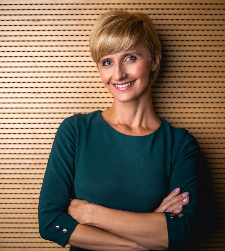
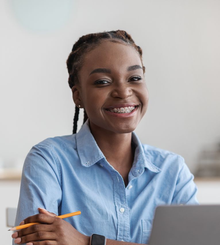
People / We prefer high-quality portraits in which the subject is posing
Moodboard on a flat white / light background, relaxed or smiling. The main
colours of the image should be as neutral as possible, but
complementary or analogous colours to the ones of our logo are
also acceptable.
@2021 All Rights Reserved Growens S.p.A.10. Social Network Images Brand Guidelines 22
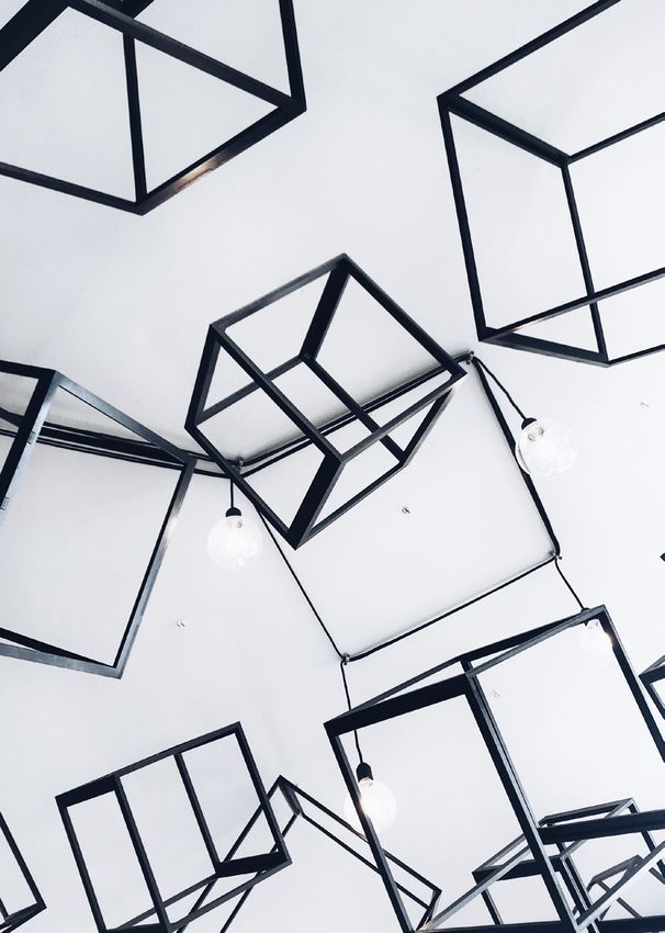
Other / Generally speaking, the right images to be used in our
Moodboard social feeds or on our website have a white (or light) colour
prominence. Images with a spot of one or more brand colours
are also permitted. Avoid pictures with a high level of noise.
Always prefer a minimalist style.
@2021 All Rights Reserved Growens S.p.A.10. Social Network Images Brand Guidelines 23
Instagram The portraits are distinguished by a white frame and a pattern
Template for overlay.
Portraits
Template
Growens
Growens
@2021 All Rights Reserved Growens S.p.A.Buttons
7. Buttons                        Brand Guidelines                                               25

Buttons                           Buttons use a consistent style across media and channels. There
                                  should always be one primary CTA, with the addition - if needed
                                  - of one or more secondary CTAs.

                                  For all types of buttons, two rules must be followed:
                                  1. Button text must never span more than 1 line
                                  2. Button height must be consistente with font size

Primary button
Primary buttons are used for the most prominent CTA (call-to-action) in the page or communica-
tion, usually by position and importance. They toggle among three states and can be resized based
on text length.

Properties

             Default                                 Hover                         Disabled

Secondary button
Secondary buttons are used for any additional CTAs in the page or communication.
They toggle between two different states and can be resized based on text length.

Properties
Font-family: Lato Regular    Font-size: 16px / 12pt           max-width: 350 px

                        Default                                       Hover

If you would like to know more about buttons, check our pattern library here.

                                  @2021 All Rights Reserved              Growens S.p.A.
Hyperlinks
8. Hyperlinks                      Brand Guidelines                                                   27

Hyperlinks                         A hyperlink (or a link) is a reference to specific data that an
                                   user can find by clicking (or tapping). The font size can change
                                   accordingly to the typography and the text part where it can be
                                   found. Other properties must not change.

     Default properties                                        Hover properties

     Font-family: Lato Regular                                 Font-family: Lato Regular
     Colour: Rubine Red                                        Colour: Violet
     Text-decoration: Underlined                               Text-decoration: Underlined

If you would like to know more about hyperlinks, check our pattern library here.

                                   @2021 All Rights Reserved                    Growens S.p.A.
Charts
9. Charts                 Brand Guidelines                                                                      29

Pie Chart                 Pie charts are to be used wherever the sum of data points in
                          100. In case of two shares, use Rubine Red for the main share
                          and Gray for the lesser. For further shares, please refer to the
                          Colour Palette. Do not use any colours outside of the official
                          Colour Palette.

Chart Title                                           Colours
                                                      Please refer to the official Colour Palette

                   19%
                                                      Fonts
                                                      Title: Lato 11 pt Rubine Red colour
                                                      Labels: Lato 9 pt Cool Gray colour
       81%
                                                      Key: Lato Black 10 pt Cool Gray colour (use a circle to
                                                      show the colour)

            Text   Text

                          @2020 All Rights Reserved                        Growens S.p.A
9. Charts Brand Guidelines 30
Histogram Histogram charts are to be used to visualise the distribution of numerical
data. Bars can be simple or combined (as shown below).
Colours
Please refer to the official Colour Palette
Fonts
Titles: Lato 11 pt Rubine Red colour
X Axis Labels: Roboto Mono 11 pt Cool Gray colour
Y Axis Labels: Roboto Mono 11 pt Gray colour
Key: Lato 10 pt Black (use a circle to show the colour)
Text Text
Text
Text
2019 2018 2019 2018
@2021 All Rights Reserved Growens S.p.A.9. Charts Brand Guidelines 31
Comparative For comparative histograms, the same rules apply although with a different
set of colours. Comparative histograms should be used to compare data
Histogram related to business units, for instance, across a certain time range. Any data
projections should use a lined rather than a full-colour background.
Colours
Please refer to the official Colour Palette
Fonts
Titles: Lato 11 pt Rubine Red colour
Text: 11 pt Cool Gray colour
3 2.8
2.5
2,5 2.3 2.3
2
1,5 1.4 1.3
1
0,5 0.4 0.7
0.3 0.2
0.2 0 0 0
0
-0,5
(0.6)
-1 2017 2018 2019
@2021 All Rights Reserved Growens S.p.A.9. Charts Brand Guidelines 32
Colour If you need to signify a positive or negative trend, result or data
Significance point in your chart, colours can help. Green and red generally
stand respectively for positive and negative results: we respect
such universal significance in our representations.
Further colour subsets, as shown below, can be used to integrate
charts when more colours are needed.
Positive significance Negative significance
NAMING Persian NAMING Rubine Red
CMYK 81, 6, 46, 0 CMYK 0, 97, 28, 0
RGB 0, 164, 154 RGB 230, 20, 105
HEX 00a49a HEX e61469
PANTONE 3272 C PANTONE Rubine Red C
Colour subset 1 Colour subset 2
CMYK 56, 87, 0, 0 CMYK 71, 0, 0, 22
RGB 138, 60, 143 RGB 0, 156, 199
HEX 8a3c8f HEX 009cc7
PANTONE 254 C PANTONE 801 C
CMYK 45,73,0,0 CMYK 70,5,15,0
RGB 160,90,168 RGB 47,180,211
HEX 2583 C HEX 2fb4d3
PANTONE Rubine Red C PANTONE 298 C
CMYK 31, 54,0,0 CMYK 58,0,15,0
RGB 192,135,201 RGB 96,2017,226
HEX c087c9 HEX 60cfe2
PANTONE 258 C PANTONE 310 C
@2021 All Rights Reserved Growens S.p.A.9. Charts Brand Guidelines 33
Tables For tables, you can choose between two styles according to
your needs. Use these styles on all supports - spreadsheets,
presentations, Word documents, etc.
Type 1
2019 2018
Text Text Total Text Text Total
Text 00 00 00 00 00 00
Text 00 00 00 00 00 00
Total 00 00 00 00 00 00
Colours Fonts
Rubine Red & Gray Titles: Lato Black 11 pt bold Rubine Red
Text: Lato Regular 11 pt Cool Gray
Type 2
Colours Fonts
Rubine Red, Gray, Cool Gray Titles: Lato Bold 10 pt White
Text: Lato Regular 10 pt Black
@2021 All Rights Reserved Growens S.p.A.10. Email Brand Guidelines 35
Email Internal and external emails share the same style, while differing
Template in their headers and footers. White is predominant, with Rubine
Red accents. The Bit graphic pattern is used to add personality
and occasionally as a divider between sections.
Internal Email
Header
Please do not edit or change the
header in any way
Department
Montserrat Bold 15 px
Each department has its own colour
Title
Montserrat Bold 24 px
Body Text
Lato Regular 15 px
Hyperlinks
Colour: Rubine Red
Font: underlined
Buttons
Border radius: 50
Background: Rubine Red
Text: Lato 16 px, White colour
Footer
Please do not edit or change the
footer in any way
@2021 All Rights Reserved Growens S.p.A.10. Email Brand Guidelines 36
External Email
Header
Please do not edit or change the
header in any way
Preheader
Montserrat Bold 15 px
Title
Montserrat Bold 24 px
Body Text
Lato Regular 15 px
Buttons
Border radius: 50
Background: Rubine Red
Text: Lato 16 px, White colour
Hyperlinks
Colour: Rubine Red
Font: underlined
Footer
Please do not edit or change the
footer in any way
@2021 All Rights Reserved Growens S.p.A.Email Signature
11. Email Signature   Brand Guidelines                                                 38

Employee              Employee email signature includes a Bit divider, employee’s first

Email Signature       and last name, job position, contact information, company logo
                      and links to social channels.

                      First & Last name: Arial Bold 11pt #1b1b1b
                      Job Position: Arial 11pt #606669
                      Contact Information: Arial 11pt #1b1b1b

                      @2021 All Rights Reserved             Growens S.p.A.
Slide Decks & Presentations
12. Slides Decks & Presentations   Presentation Template                                             40

Google                             All Group presentations - both for internal and external use -

Presentation                       must be based on the official Growens template, available in
                                   Google Presentations, PowerPoint and Keynote formats.
Template
                                   You can find the template on Drive, on our Intranet or by
                                   selecting New Presentation > From a template on Google Drive.

                                   For presentations fonts and colours, general brand rules apply.

                                   @2021 All Rights Reserved         Growens S.p.A.
12. Slides Decks & Presentations Brand Guidelines 41
Alignment & Spacing
Please use the text placeholders you’ll find in
the presentation template to properly insert
texts and images.
All titles and texts should be left aligned.
Please avoid stuffing slides with too much
content, and allow plenty of white space.
Bits
Bits are the signature graphic pattern of our
brand. Their shape and irregular distribution
along horizontal lines recalls computer “bits”
or Morse code. Use them as suggested in the
template as dividers, cover elements and colour
accents for otherwise blank slides.
Do not change their orientation (e.g. vertically).
Icons & Images
At the end of the presentation template you
will find a gallery of on-brand icons to choose
from. Icons should always be outlined and
Rubine Red in colour. Please refer to the
Icons chapter of this Brand Book for more
information.
When using images, please refer to the Images
chapter to know which ones are suitable.
@2021 All Rights Reserved Growens S.p.A.MILANO | Via Pola 9 | 20124 Milano | + 39 02 710 40485 CREMONA | Via dell’Innovazione Digitale 3 | 26100 Cremona | +39 0372 24525 growens.io corporate.communication@growens.io
You can also read