BRAND GUIDELINES - VERSION 1.3 | 2021 - Busch Systems
←
→
Page content transcription
If your browser does not render page correctly, please read the page content below
VERSION 1.3 | 2021

BRAND
GUIDELINES                   1
INSIDE
TH E B R A N D
This guidebook outlines the written, visual
and graphic elements that comprise the
Busch Systems® brand. Following these
guidelines will ensure aesthetic standards
are upheld - keeping the brand looking
professional and consistent.

VISION                     1
MOODBOARD
& MISSION                 2
VOICE & TONE               4
LOGO & USAGE              6
COLOR USAGE              10
TYPOGRAPHY                11
PHOTOGRAPHY              12
ICONOGRAPHY              14
BRAND EXECUTION          16

                                              1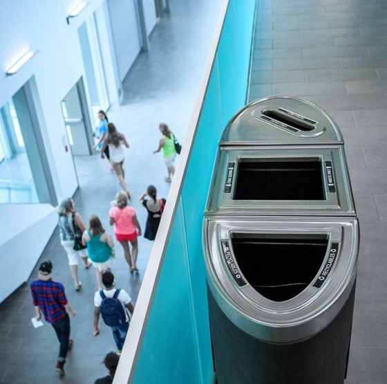
MOODBOARD

       The inspiration for Busch Systems® is clean and modern       MISSION STATEMENT
       with a playful energy. Pops of color and graphic elements
       amongst the refreshing whitespace keep the brand feeling
                                                                    To support everyone who cares
       lively, friendly and approachable.
                                                                   about waste diversionwith leading
       All of the elements that tie the brand together are          edge products and services that
       designed to communicate Busch Systems’® vision,             maximize the quantity and quality
       mission and core values.                                       of their recycling program.

2   MOODBOARD & MISSION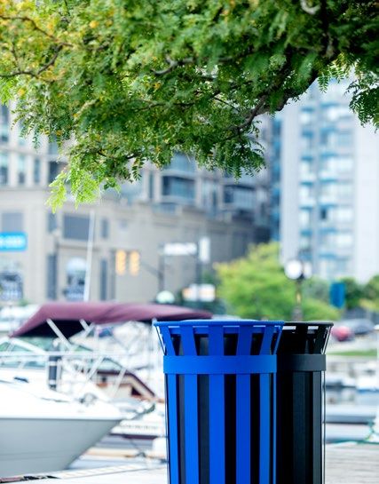
VOICE & TONE
The voice of Busch Systems® is consistently friendly, casual, aims to inspire familiarity and is occasionally
quirky! We aim to be informative and direct about our products and environmental goals without being
stuffy or ‘corporate’ and use industry recognized terminology without being overbearing. We focus on
optimistic, helpful and confident language across all mediums and avoid excessive formality, preferring
more relaxed phrasing. Often, we like to use a bit of humor to display our personality but not in a way
that impedes the intention or delivery of the message.
“ABOUT US “CREATIVITY IS THINKING UP “LIFE AT BUSCH SYSTEMS ®
Who are we? We’re an NEW THINGS. INNOVATION IS It’s pretty awful to work here.
innovative, passionate, DOING NEW THINGS. Awesome people, beautiful
EMPOWERING CREATIVE APPROACHABLE LIVELY knowledgeable group of We believe that the fun of office space and having
ECO-RESPONSIBLE PROGRESSIVE ALTRUISTIC ENERGETIC individuals who treat our innovating should not be our head office in Barrie,
EDUCATIONAL FORWARD-THINKING AUTHENTIC ENGAGING clients and each other with left just to the tech giants Ontario only 10 minutes from
KNOWLEDGEABLE TECH-SAV Y FRIENDLY UPLIFTING respect and enthusiasm. We’re of the world. Innovation is Kempenfelt Bay is pretty tough.
IMPACTFUL RELIABLE PL AYFUL a company who thinks about the by-product of creativity Along with the fact we make
TRUST WORTHY PEPPY the environment every day and regardless of industry, is amazing recycling bins that
SUPPORTIVE TASTEFUL and designs, recommends essential for evolution. Thirty help organizations all over
and customizes waste and years ago, we began with one the world be sustainable...
recycling solutions for (good lookin’!) blue bin and an yup… pretty awful.
collection programs across all innovative spirit. That attitude Wait…what?!
industries. We’re dedicated has served us well as we have Of course it’s not awful!
to our philanthropic efforts evolved alongside the recycling Working at Busch Systems® is
ARROGANT CHEESY and activities on and off the industry to design collection pretty GREAT and we have the
AGGRESSIVE TACK Y company clock. Every day we solutions that are ahead of team to prove it! Thirty years
FL ASHY OLD SCHOOL try our best to say ‘thank you’ to the stream. Our Research & of employee satisfaction and
GREEDY CLUNK Y our colleagues and customers, Design team is comprised of engagement are testament to
BORING DULL while sharing a laugh too, that’s big personalities with bigger our company culture and we’re
STIFF SLOPPY just who WE are!
“ ambitions to create the best
products for our clients. They
just getting better.Think you
might have what it takes to
eat innovation for breakfast and join our team?
“
we’re sure glad they do!
“
4 VOICE & TONE 5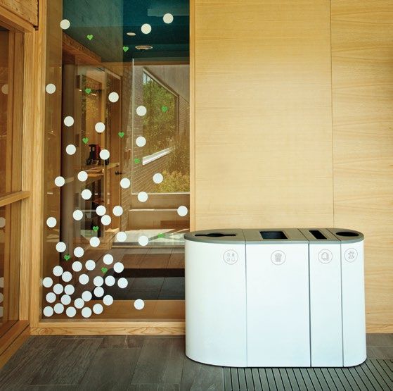
PORTRAIT A - Landscape Variation
A. D.
B - Landscape Variation
LANDSCAPE SYMBOL
B. IMPROPER
LOGO USAGE
Rules are necessary for maintaining
the integrity of the Busch Systems®
PRIM ARY LOGO SECONDARY LOGOS brand. The following examples outline
unacceptable ways of using the logo.
Re-designed in 2015, the Busch Systems® Busch Systems® secondary marks can A. Don’t Rotate the Logo.
logo is rooted in company heritage, taking be used instead of the primary logo (but
inspiration from the original mark. should never be used directly next to the B. Don’t Stretch, Alter, Distort or
C.
primary logo). Always choose the best logo Resize All of or Part of the Logo.
This is the main logo to be used across all orientation to fit the available space.
primary brand applications. C. Don’t Rearrange Parts of the
The monogram can be used in cases Logo or Create Compositions
The mark helps the audience to easily where the brand name is already displayed That are Not Already Provided.
identify the Busch Systems® presence. It in plain text. For example, the monogram
is essential to the success of the brand could be used as a profile picture on social D. Don’t Add Filters, Effects or
that the logo always be applied with care, media since the username will be adjacent Strokes to the Logo.
respect, and in accordance with these to it in plain text.
guidelines for every application.
6 LOGO USAGE 7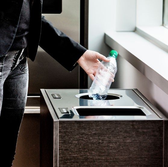
LOGO COLOR USAGE LOGO & TYPE ON PHOTOGR APHY
& CLEAR SPACE
Use the ‘H’ from the When the logo or typography are used on any photo, pattern or color
logo to determine the background it is important to make sure that there is ample clear space
There are 3 color forms for the Busch Systems® logo:
minimum breathing for it to reside.
Full color, White, or Dark Gray. The logo should
pop against the contrasting background. Full color room required.
Be mindful when selecting an image - ensure the photo is not busy or
is the preferred choice when used on a white or light overcrowded. Color contrast is important as well. Make sure the logo is
background. White is the preferred choice when used on against a background that does not distract or blend in with the logo.
a color or dark background. Dark gray is an alternative Apply the same principles from the “Logo Color Usage & Clear Space”
to the color logo on a light background. section of this guidebook (Page 8). If necessary, scale or manipulate the
image to provide the proper clear space and required level of contrast.
To ensure legibility, always keep a minimum clear space
around the logo. This space isolates the mark from any
competing graphic elements that might conflict with,
overcrowd, and lessen the impact of the mark.
8 LOGO USAGE 9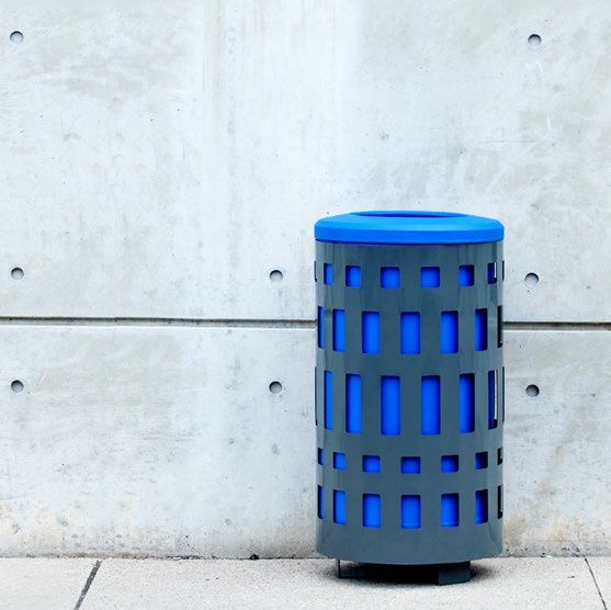
COLOR USAGE
The subtle vibrancy of the color palette evokes the playful vibe that is essential to the
Busch Systems® brand. The primary colors are variations of blue, green and turquoise.
These tones serve a psychological purpose by provoking a particular feeling to the
audience. Blue tones are linked to creativity and inspire safety and calmness, while
                                                                                                                                            TYPOGR APHY
green and turquoise tones are lively and symbolize renewal, growth and harmony.
                                                                                                                   Consistent use of this set of typefaces across all print
Shades of gray serve as a background palette. Avoid the use of black.                                                   and web applications reinforces brand identity.

PRIMARY PALETTE                                                                                                                                PRIMARY TYPEFACE               FUTURA BT
                                                                                                                                                                              Use Light or Book for
       PMS     286 C                   PMS      355 C                   CMYK    82.26.35.2    CMYK   70.0.20.0                                                                Body Copy and Any
       CMYK    100.75.0.0              CMYK     99.12.100.2             RGB     12.144.157    RGB    22.190.207                                                               Weight for Headlines.
       RGB     0.51.160                RGB      0.150.76                HEX     #0C909D       HEX    #16BECF
       HEX     #0033A0                 HEX      #00964C

       CMYK    38.0.100.0              CMYK     69.6.55.0               CMYK    77.14.29.0    CMYK   46.2.11.0
       RGB     171.208.55              RGB      74.178.145              RGB     14.165.179    RGB    131.204.221                          SECONDARY TYPEFACE                  THE BOLD FONT           Mark My Words
       HEX     #ABD037                 HEX      #4AB291                 HEX     #0EA5B3       HEX    #83CCDD                                                                  Alternate Option        Alternate Option
                                                                                                                                                                              for Short Headlines.    for Short Headlines.
       CMYK    52.10.100.0             CMYK     76.21.53.3              CMYK    73.33.2.0     CMYK   20.0.4.0                                                                 Always in All Caps.     Always in Title Case.
       RGB     138.181.63              RGB      57.150.135              RGB     62.144.201    RGB    200.233.241
       HEX     #8AB53F                 HEX      #399687                 HEX     #3E90C9       HEX    #C8E9F1

                                                                                                                                             TYPEFACES FOR WEB                DROID SANS              ARIAL
GRAY PALETTE                                                                                                                                                                  Use Regular for         Substitute font for when
                                                                                                                                                                              Body Copy and Bold      Droid Sans is unavailable.
       CMYK    66.59.55.36             CMYK     0.0.0.50                CMYK    0.0.0.30      CMYK   17.12.12.0                                                                                       Regular for Body Copy
                                                                                                                                                                              for Headlines on all
       RGB     77.77.79                RGB      147.149.152             RGB     178.178.178   RGB    209.211.212
                                                                                                                                                                              web applications.       and Bold for Headlines.
       HEX     #4D4D4F                 HEX      #939598                 HEX     #B2B2B2       HEX    #D1D3D4

10 COLOR USAGE                                                                                                                                                                                                      TYPOGRAPHY 11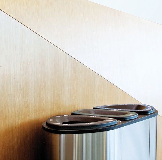
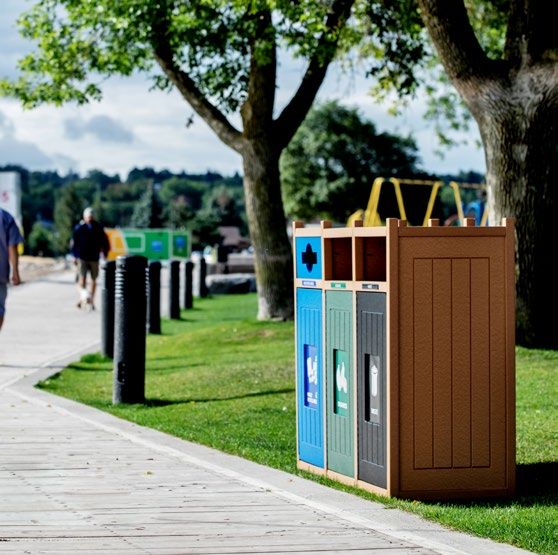
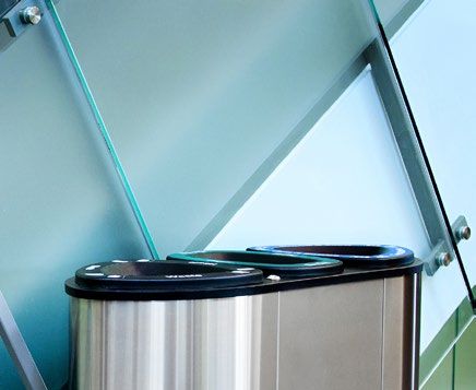
PHOTOGR APHY STYLE
GENRE:
 • Product Lifestyle / Contextual

COMPOSITION:
 • Minimalistic, Product-Focused
 • Good Use of Negative Space
 • Complementary to Brand Color Palette
 • Left, Right and Center Frame Positioning
 • Mixture of Angles and Close-ups of
   Product Features

ENVIRONMENT:
 • Intended Environment per Product

MODELS:
 • Contextually Appropriate per Location
   and Target Audience

FOCAL LENGTH & LIGHTING:
 • Medium to Large Aperature
 • Shallow Depth of Field for Close-ups
 • Broad Lighting
 • Natural Light Preferred

SATURATION:
 • Medium to High Contrast and Saturation
 • Lower Saturation on Stainless Steel and
   Neutral Colored Products

12 PHOTOGRAPHY
ICONOGR APHY                                                                            The Busch Systems® color bar is made up of
                                                                                            complimentary colors from the primary palette.
                                                                                            It is used as a main graphic element on various mediums.
    Iconography is the collection of graphic
    elements that contribute to brand
    identification. These graphic elements
    help to visually communicate the
    Busch Systems® brand and can be used
    in many ways, across all applications.
                                                CONTACT & NAVIGATIONAL ICONS   LINE ICONS                                  FULL COLOR ICONS

     Rules for Use of Icons:
       •   A mixture of line icons and
           full color icons is ideal.
       •   Limit the number of icons in
           a composition so as not to
           overwhelm or create clutter.
       •   Icons should never be placed
           ontop of a photograph (except for
           the color bar or a banner).

     Rules for Creation of New Icons:                     BANNERS

       •   Only use flat color.
           No gradients or drop shadows.
       •   Line icons should be consistent
           in weight. Gray is ideal, although
           they can be in any color from the
           brand color palette.
       •   Use colors from the brand
           color palette and/or colors
           that compliment the brand
           color palette.

14 ICONOGRAPHY                                                                                                                                         15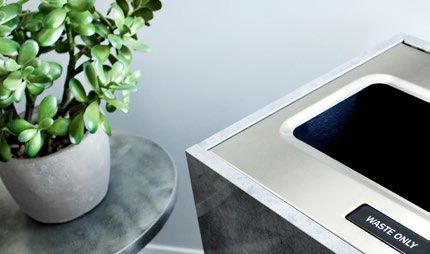
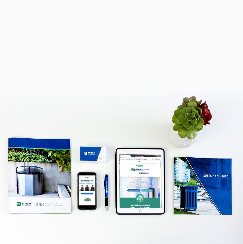
Establishing a strong and consistent brand
       is essential in making a first impression.
       Below are some examples of how the principles
       in this guideline are executed across various
       mediums to produce a uniform brand.

                                                              END NOTE

                                                        Be Creative and Have Fun!
                                                       If ever you are in doubt, just
                                                          refer back to this guide.
                                                          Any questions? Feel free
                                                             to reach out to us!

16 BRAND EXECUTION
Questions or Inquiries: 1.800.565.9931 | 705.722.0806 graphics@buschsystems.com
You can also read