Interactive Visualization Applications in Population Health and Health Services Research: Systematic Scoping Review
←
→
Page content transcription
If your browser does not render page correctly, please read the page content below
JOURNAL OF MEDICAL INTERNET RESEARCH                                                                                                           Chishtie et al

     Review

     Interactive Visualization Applications in Population Health and
     Health Services Research: Systematic Scoping Review

     Jawad Chishtie1,2,3,4, MSc, MD; Iwona Anna Bielska5, PhD; Aldo Barrera6, BS, MSc; Jean-Sebastien Marchand7,
     PhD; Muhammad Imran8, MSc; Syed Farhan Ali Tirmizi4, MSc, MD; Luke A Turcotte9, PhD; Sarah Munce1,2,10,11,
     PhD; John Shepherd1, MBA, MSc; Arrani Senthinathan11, BSc, MSc; Monica Cepoiu-Martin12, MD, PhD; Michael
     Irvine13,14, PhD; Jessica Babineau15,16, MLIS; Sally Abudiab1, BSc, MSc; Marko Bjelica1, MSc; Christopher Collins17,
     PhD; B Catharine Craven1,18, MSc, MD; Sara Guilcher1,11,19, MScPT, MSc, PhD; Tara Jeji20, MD; Parisa Naraei21,
     PhD; Susan Jaglal1,2,11,22, PhD
     1
      Rehabilitation Sciences Institute, Faculty of Medicine, University of Toronto, Toronto, ON, Canada
     2
      Toronto Rehabilitation Institute, University Health Network, Toronto, ON, Canada
     3
      Center for Health Informatics, University of Calgary, Calgary, AB, Canada
     4
      Alberta Health Services, Edmonton, AB, Canada
     5
      McMaster University, Hamilton, ON, Canada
     6
      Simon Fraser University, Burnaby, BC, Canada
     7
      Universite de Sherbrooke, Quebec, QC, Canada
     8
      Allama Iqbal Open University, Islamabad, Pakistan
     9
      University of Waterloo, Waterloo, ON, Canada
     10
          Department of Occupational Science and Occupational Therapy, University of Toronto, Toronto, ON, Canada
     11
          Institute of Health Policy, Management and Evaluation, University of Toronto, Toronto, ON, Canada
     12
          University of Calgary, Calgary, AB, Canada
     13
          Department of Mathematics, University of British Columbia, Vancouver, BC, Canada
     14
          British Columbia Centre for Disease Control, Vancouver, BC, Canada
     15
          Library & Information Services, University Health Network, Toronto, ON, Canada
     16
          The Institute for Education Research, University Health Network, Toronto, ON, Canada
     17
          Faculty of Science, Ontario Tech University, Oshawa, ON, Canada
     18
          KITE, Toronto Rehabilitation Institute, University Health Network, Toronto, ON, Canada
     19
          Leslie Dan Faculty of Pharmacy, University of Toronto, Toronto, ON, Canada
     20
          Ontario Neurotrauma Foundation, Toronto, ON, Canada
     21
          Department of Computer Science, Ryerson University, Toronto, ON, Canada
     22
          Department of Physical Therapy, University of Toronto, Toronto, ON, Canada

     Corresponding Author:
     Jawad Chishtie, MSc, MD
     Rehabilitation Sciences Institute
     Faculty of Medicine
     University of Toronto
     500 University Ave
     Toronto, ON, M5G 1V7
     Canada
     Phone: 1 6479756965
     Fax: 1 416 946 8582
     Email: jac161@gmail.com

     Abstract
     Background: Simple visualizations in health research data, such as scatter plots, heat maps, and bar charts, typically present
     relationships between 2 variables. Interactive visualization methods allow for multiple related facets such as numerous risk factors

     https://www.jmir.org/2022/2/e27534                                                                       J Med Internet Res 2022 | vol. 24 | iss. 2 | e27534 | p. 1
                                                                                                                            (page number not for citation purposes)
XSL• FO
RenderX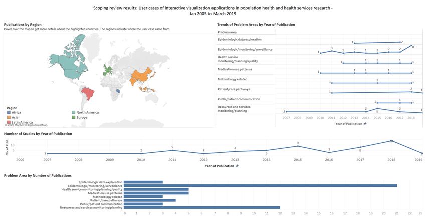
JOURNAL OF MEDICAL INTERNET RESEARCH                                                                                                 Chishtie et al

     to be studied simultaneously, leading to data insights through exploring trends and patterns from complex big health care data.
     The technique presents a powerful tool that can be used in combination with statistical analysis for knowledge discovery, hypothesis
     generation and testing, and decision support.
     Objective: The primary objective of this scoping review is to describe and summarize the evidence of interactive visualization
     applications, methods, and tools being used in population health and health services research (HSR) and their subdomains in the
     last 15 years, from January 1, 2005, to March 30, 2019. Our secondary objective is to describe the use cases, metrics, frameworks
     used, settings, target audience, goals, and co-design of applications.
     Methods: We adapted standard scoping review guidelines with a peer-reviewed search strategy: 2 independent researchers at
     each stage of screening and abstraction, with a third independent researcher to arbitrate conflicts and validate findings. A
     comprehensive abstraction platform was built to capture the data from diverse bodies of literature, primarily from the computer
     science and health care sectors. After screening 11,310 articles, we present findings from 56 applications from interrelated areas
     of population health and HSR, as well as their subdomains such as epidemiologic surveillance, health resource planning, access,
     and use and costs among diverse clinical and demographic populations.
     Results: In this companion review to our earlier systematic synthesis of the literature on visual analytics applications, we present
     findings in 6 major themes of interactive visualization applications developed for 8 major problem categories. We found a wide
     application of interactive visualization methods, the major ones being epidemiologic surveillance for infectious disease, resource
     planning, health service monitoring and quality, and studying medication use patterns. The data sources included mostly secondary
     administrative and electronic medical record data. In addition, at least two-thirds of the applications involved participatory
     co-design approaches while introducing a distinct category, embedded research, within co-design initiatives. These applications
     were in response to an identified need for data-driven insights into knowledge generation and decision support. We further discuss
     the opportunities stemming from the use of interactive visualization methods in studying global health; inequities, including
     social determinants of health; and other related areas. We also allude to the challenges in the uptake of these methods.
     Conclusions: Visualization in health has strong historical roots, with an upward trend in the use of these methods in population
     health and HSR. Such applications are being fast used by academic and health care agencies for knowledge discovery, hypotheses
     generation, and decision support.
     International Registered Report Identifier (IRRID): RR2-10.2196/14019

     (J Med Internet Res 2022;24(2):e27534) doi: 10.2196/27534

     KEYWORDS
     interactive visualization; data visualization; secondary health care data; public health informatics; population health; health
     services research

                                                                           Population health research involves the study of data related to
     Introduction                                                          health outcomes and determinants of population health [6,7],
     Background                                                            whereas health services research (HSR) studies the health system
                                                                           in relation to access, quality, costs, and patient outcomes [8,9].
     As digital medicine advances, visualization applications in           Both fields involve the analysis of large secondary data sources
     population health increasingly provide ways for researchers and       such as clinical databases, administrative data sets, and
     practitioners to explore and communicate findings [1],                electronic medical records (EMRs) [10-12]. In a prior review,
     supporting knowledge discovery from disparate large data              we summarized evidence on VA applications in these
     sources [2]. Visual analytics (VA) has been defined as the            interrelated fields of health care [13]; this review complements
     “science of analytics reasoning facilitated by visual interfaces”     it by reviewing the evidence on interactive visualization
     [3], and it is an interdisciplinary field combining visualization,    applications in population health and HSR.
     statistical analysis, and advanced analytics such as machine
     learning and cognitive sciences [4]. A specific approach within       Recent systematic reviews have summarized visualization
     VA is the use of interactive visualization, which Ola and Sedig       methods in varied areas of health care. Among the most cited
     [2] define as computational tools that store, process, and visually   reviews, the study by West et al [1] synthesized literature on
     represent data, to facilitate interactive exploration. Interactive    the use of visualization approaches for exploratory analysis of
     visualization increases the potential for big data use in health      electronic health records (EHRs). Similarly, another well-cited
     care by supporting sense making, knowledge discovery, and             review by Carrol et al [14] summarized the literature on
     hypothesis generation [2,5]. Simple visualizations such as scatter    visualization and analytics tools used in infectious disease
     plots, heat maps, and bar charts typically present 2 facets of the    epidemiology, particularly in relation to geographic information
     data, displaying attributes and relationships between 2 variables     systems (GIS), molecular epidemiology, and social network
     such as a disease condition and risk factors. Interactive             analysis methods. Islam et al [15] offered a comprehensive view
     visualization methods allow for presentation of multiple related      on data mining and theoretical approaches in health care. Wu
     facets such as risk factors to be studied simultaneously, leading     et al [16] summarized evidence on visualization and analytic
     to insights through exploring trends and patterns [2,5].              technologies for characterizing evaluation methods in health

     https://www.jmir.org/2022/2/e27534                                                             J Med Internet Res 2022 | vol. 24 | iss. 2 | e27534 | p. 2
                                                                                                                  (page number not for citation purposes)
XSL• FO
RenderX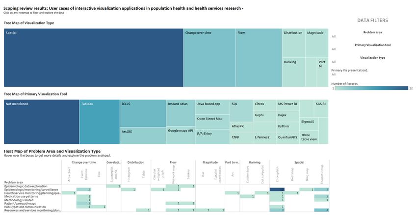
JOURNAL OF MEDICAL INTERNET RESEARCH                                                                                               Chishtie et al

     informatics, an area primarily concerned with clinical care. The    researchers, practitioners, and decision-makers to understand
     most recent related review by Chung et al [17] focused on visual    and adopt visualization-based data analysis.
     approaches in mental health care policy and systems. To our
     knowledge, interactive visualization applications have not been
                                                                         Objectives
     studied as a body of literature separate from data visualization    The primary objective of this scoping review is to describe and
     and VA; hence, this review is the first systematic synthesis on     summarize the evidence on interactive visualization applications,
     the subject.                                                        methods, and tools being used in population health and HSR
                                                                         and their subdomains in the last 15 years, from January 1, 2005,
     Rationale for a Companion Review                                    to March 30, 2019. Our secondary objective is to describe the
     This companion review is our second synthesis of literature on      use cases, metrics, frameworks used, settings, target audience,
     visualization and analytics tools, techniques, and approaches       goals, and co-design of applications.
     in population health and HSR. Our first publication focused on
     VA methods in these areas, where we offered an updated              Methods
     definition of VA in health care as “an approach, method, or
     application for analytic reasoning, exploration, knowledge          Review Methodology and Protocol
     discovery, and sense making of complex data, using one or           Scoping reviews outline the size and scope of available literature
     more interactive visual interfaces, employing analytic and visual   and identify the quality and extent of research evidence [21].
     engines” [13]. As part of VA applications, analytic engines         We briefly describe the methodological processes relevant to
     involve advanced machine learning, database querying, and           the second part of the review in this section, whereas further
     manipulation.                                                       details can be found in the published protocol [22]. We primarily
     Interactive visualization applications typically engage a           followed the guidance provided by the Joanna Briggs Institute
     front-end visual engine such as Tableau [18], Qlik [19], and        [23], as well as the framework for conducting scoping reviews
     PowerBI [20]. Although all VA methods carry a visualization         described by Arksey and O’Malley [24], with improvements
     component, which may or may not be interactive, interactive         suggested by Levac et al [25] and Peters et al [26], while using
     visualization applications typically do not involve or report an    the PRISMA-ScR (Preferred Reporting Items for Systematic
     analytic component. Hence, this companion review on                 Reviews and Meta-Analyses Extension for Scoping Reviews)
     interactive visualization applications illustrates the state of     checklist provided by Tricco et al [27] for reporting. The major
     evidence in population health and HSR, focusing on                  steps were as follows: determining the research question,
     contemporary methods, approaches, tools, and co-design from         identifying relevant studies, abstracting data, and summarizing
     real-world use cases. This review will be helpful for health care   and reporting the results. The operational concepts and
                                                                         definitions are presented in Textbox 1.

     https://www.jmir.org/2022/2/e27534                                                           J Med Internet Res 2022 | vol. 24 | iss. 2 | e27534 | p. 3
                                                                                                                (page number not for citation purposes)
XSL• FO
RenderX
JOURNAL OF MEDICAL INTERNET RESEARCH                                                                                                              Chishtie et al

     Textbox 1. Operational concepts and definitions.
      Concepts and definitions

      •    Population health, adapted from Kindig and Stoddart [6] and Kindig [7]

           •     “The health outcomes of a group of individuals, including the distribution of such outcomes within the group,” includes “health outcomes,
                 patterns of health determinants, and policies and interventions that link these two”

      •    Health services research, adapted from the Canadian Institutes of Health Research [8] and National Libraries of Medicine filters for health services
           research [28]

           •     Research with the “goal of improving the efficiency and effectiveness of health professionals and the health care system”

           •     Access to services

           •     Utilization of services

           •     Cost of services

      •    Domains of population health and health services research, adapted from Islam et al [15]

           •     Clinical populations include a health condition

           •     Epidemiologic includes disease distribution and dynamics

           •     Demographic includes population-related characteristics such as age and gender

           •     Spatiotemporal includes events over time and space

      •    Problem categories, based on subject area and the aim or aims of the application

           •     Epidemiologic monitoring or surveillance

           •     Resources and services monitoring and planning

           •     Medication use patterns

           •     Visualization methodologies

           •     Epidemiologic data exploration

           •     Health service monitoring, planning, and quality

           •     Patient or care pathways

           •     Public or patient communication

      •    Interactivity, adapted from Ola and Sedig [29] and Pike et al [30]

           •     Ability to reflect changes in the visual representation, based on one or more variables available on the analytic interface

           •     Tasks such as filtering, determining ranges, and finding anomalies, clusters, and the like by providing menus, dropdowns, and other options
                 on the visualization interface

      •    Tools

           •     Software for developing an application

      •    Use case

           •     Use of the application or method to one or more data sets

      •    Goal of the application, adapted from Islam et al [15]

           •     Whether the application was meant for decision support, knowledge discovery, or both

      •    Analytic capability, adapted from Islam et al [15]

           •     Descriptive or predictive analytics or visual exploration of data

      •    Functions of the visualization presentations from the Graphic Continuum by Schwabish and Ribecca [31]

           •     Spatial

           •     Change over time

           •     Flow

     https://www.jmir.org/2022/2/e27534                                                                          J Med Internet Res 2022 | vol. 24 | iss. 2 | e27534 | p. 4
                                                                                                                               (page number not for citation purposes)
XSL• FO
RenderX
JOURNAL OF MEDICAL INTERNET RESEARCH Chishtie et al
• Distribution
• Ranking
• Magnitude
• Correlation
• Part to whole
• Co-design, adapted from Ward et al [32]
• Encompasses the partnership of health workers, patients, and designers who aspire toward change, depending on shared knowledge to
achieve “better outcomes or improved efficiency”
• Whether any participatory approach toward co-design was reported by the authors
• Embedded research: applications developed in response to an expressed need within a health care organization
• Settings and target audience
• On the basis of the location of the application developed and the overall objectives of the reported application
• Categories include academia, government health care units, and industry
• Subject of applications
• Exploratory word frequency analysis of included articles to yield major subject areas for which applications were developed or any other
related finding using a word cloud
• Applications in current use, public availability, innovation, and limitations
• For ascertaining whether the application could be adapted or replicated in future
• Public availability to ascertain whether the application was developed for the public
because these were outside the scope of the research objectives.
Eligibility Criteria Similarly, we did not include articles on human-computer
Eligible articles included peer-reviewed published journal and interaction, user design, and articles without a use case.
full conference papers in English related to use cases of Non–peer-reviewed work such as editorials, conference
interactive visualization in population health and HSR. We abstracts, and short articles were excluded. The eligibility
included articles on spatiotemporal visualization but excluded criteria are presented in Textboxes 2 and 3.
articles presenting cartographic methods and tools for GIS
Textbox 2. Inclusion criteria.
Inclusion criteria
• Peer reviewed journal or full conference papers
• From January 1, 2005, to March 30, 2019
• Population health or health services research related
• Articles with population level or health services research metrics: incidence, prevalence, events over time, and space, access, cost, utilization,
disease or condition distribution, as well as social or multiple determinants of health
• Interactive visualization used for a use case with one or more data sets
Textbox 3. Exclusion criteria.
Exclusion criteria
• Articles not in English
• Editorials, projects, reviews, book chapters, short papers, or reports
• Articles on computer vision and medical imaging
• Studies conducted in clinical settings without a population level or health services component, such as from a single hospital or unit
• Articles on device or sensor data, without a population level or health services research component
• Studies reporting a visual analytics component or analytic engine
https://www.jmir.org/2022/2/e27534 J Med Internet Res 2022 | vol. 24 | iss. 2 | e27534 | p. 5
(page number not for citation purposes)
XSL• FO
RenderXJOURNAL OF MEDICAL INTERNET RESEARCH Chishtie et al
Sources of Evidence and Search Strategy related concepts of population health, HSR, visualization,
The search strategy, its conceptualization, and steps for analytics, and interactivity [22]. The 6 databases searched, their
operationalization are detailed in the review protocol [22]. The platforms, and results are summarized in Table 1. We further
search was externally peer reviewed using the Peer Review of hand searched 10 relevant journals, in addition to internet
Electronic Search Strategies Guideline [33] and included an searches [22]. We used the Covidence (Veritas Health
extensive list of search terms and their variants to cover all Innovation Ltd) platform for screening citations [34] and
EndNote (Clarivate) for reference management [35].
Table 1. Databases and search results (N=14,099).
Database name Search results, n (%)
MEDLINE (life sciences and biomedicine) 4633 (32.86)
Embase (life sciences and biomedicine) 1880 (13.33)
Web of Science (multidisciplinary) 5396 (38.27)
Ei Compendex (engineering and technology) 1267 (8.99)
IEEE Xplore (engineering and technology) 151 (1.07)
Inspec (engineering and technology) 772 (5.48)
and removed 2078 (14.74%) duplicates, comparing the title,
Data Charting and Synthesis of Results identifiers, publication platforms, and abstracts. From the
In all, 2 independent reviewers screened articles at each stage remaining 12,021 articles, another 711 (5.91%) duplicates were
of the review, including title and abstract screening, full-text removed after importing into Covidence [34]. We excluded
screening, and data abstraction. A third reviewer acted as an 96% (10,819/11,310) of the references during the title and
arbiter in case of conflicts and for validating the data abstracted abstract screening and 89% (435/491) of the articles during the
for their content and level of detail. full-text screening. We did not find additional articles from
The data abstraction encompassed the major concepts in 6 major reference lists of recent systematic and narrative reviews, hand
themes: (1) study characteristics (country, problem category, searches of individual journals, and internet searches. Hence,
settings, and target audience), (2) tools and techniques used, of the initially identified 14,099 articles, we have summarized
(3) data type and visualization methods, (4) domains of 56 (0.39%) for reporting in this review. The reasons for
population health and HSR, (5) innovation of the application exclusion during the full-text-screening are detailed in the
and its current availability and use, and (6) if the application PRISMA (Preferred Reporting Items for Systematic Reviews
was co-designed with the target audience. and Meta-Analyses) diagram (Figure 1), whereas the Preferred
Reporting Items for Systematic Reviews and Meta-Analyses
Results Extension for Scoping Reviews reporting checklist is presented
in Multimedia Appendix 1.
Selection of Sources and Presentation of Results We have also summarized our results in a visual format using
We identified 14,099 articles from the 6 databases searched. a publicly accessible Tableau dashboard, a screenshot of which
Given the varied sources of the articles, we adapted the method is presented in Figure 2 [37]. The abstracted data and complete
described by Bramer et al [36] for removing duplicate references workbook are available to support replication, adaptation, and
using EndNote X9 [35]. Among the 14,099 articles, we further analysis. Operational concepts for each category and
considered major citation details and identified, double-checked, reported theme are detailed in the Methods section (Textbox 1).
https://www.jmir.org/2022/2/e27534 J Med Internet Res 2022 | vol. 24 | iss. 2 | e27534 | p. 6
(page number not for citation purposes)
XSL• FO
RenderXJOURNAL OF MEDICAL INTERNET RESEARCH Chishtie et al
Figure 1. PRISMA (Preferred Reporting Items for Systematic Reviews and Meta-Analyses) flowchart for article selection. VA: visual analytics.
Figure 2. Screenshot of the results presented as a Tableau dashboard.
Multimedia Appendix 2 [38-93], whereas these are summarized
Study Characteristics, Settings, and Target Audience in Tables 2 and 3. Study settings included government ministry
The 56 articles summarized were from 21 countries, including or health unit (39/56, 70%), academia (18/56, 32%), and industry
the United States (30/56, 54%), the United Kingdom (4/56, 7%), (2/56, 4%). There was overlap between the government health
India (2/56, 4%), Indonesia (2/56, 4%), and Canada (2/56, 4%). unit and academia (1/56, 2%) and between the government
Of the 56 articles, there was 1 (2%) each from the Netherlands, health unit and industry (2/56, 4%).
Spain, Puerto Rico, Czech Republic, Malaysia, France, Portugal,
Tanzania, Slovenia, China, Germany, Brazil, Italy, Japan, and The included studies often had more than one target audience.
Korea, whereas 1 (2%) study included a comparison of health These were population or public health practitioners (53/56,
indicators from the United States, the United Kingdom, Costa 95%), clinicians (24/56, 43%), policy makers and
Rica, Sweden, Croatia, Japan, Hong Kong, and China. Details decision-makers (21/56, 38%), public and patient groups (12/56,
on countries, settings, and target audiences are presented in 21%), data scientists (5/56, 9%), and industry (2/56, 4%).
https://www.jmir.org/2022/2/e27534 J Med Internet Res 2022 | vol. 24 | iss. 2 | e27534 | p. 7
(page number not for citation purposes)
XSL• FO
RenderXJOURNAL OF MEDICAL INTERNET RESEARCH Chishtie et al
Table 2. Settings of the studies (N=56).
Setting Values, n (%) Study
Government; ministry; 39 (70) Alibrahim et al (2014) [38], Barrento and De Castro Neto (2017) [39], Basole et al (2015) [40], BenRa-
health department madan et al (2017) [43], BenRamadan et al (2018) [44], Bjarnadottir et al (2016) [46], Brownstein et al
(2010) [47], Henley et al (2018) [52], Hosseinpoor et al (2018) [53], Jia et al (2015) [56], Kirtland et al
(2014) [58], Ko and Chang (2018) [59], Kubasek et al (2013) [61], Lanzarone et al (2016) [62], Lopez-
DeFede et al (2011) [63], Mahler et al (2015) [64], Marshall et al (2017) [65], Mitrpanont et al (2017)
[67], Moni et al (2015) [68], Monsen et al (2015) [69], Monsivais et al (2018) [70], Mozumder et al
(2018) [71], Pachauri et al (2014)[73], Palmer et al (2019) [74], Pike et al (2017) [76], Podgornik et al
(2007) [77], Pur et al (2007) [78], Raghupathi and Raghupathi (2018) [79], Ratwani and Fong (2015)
[80], Rodriguez-Fernandez et al (2016) [81], Rowlingson et al (2013) [82], Shen et al (2018) [84], Sims
et al (2011) [85], Sopan et al (2012) [86], Toyoda and Niki (2015) [87], Valdiserri and Sullivan (2018)
[89], van der Corput et al (2014) [90], Wang and Yao (2018) [92], and Zhang et al (2011) [93]
Academia 18 (32) Becnel et al (2019) [41], Benítez et al (2017) [42], Bieh-Zimmert et al (2013) [45], Bjarnadottir et al
(2016) [46], Cesario et al (2012) [48], Chui et al (2011) [49], Haque et al (2014) [50], Happe and Drezen
(2018) [51], Hsu et al (2018) [54], Iyer et al (2017) [55], Kaushal et al (2018) [57], Krause (2015) [60],
Martinez et al (2016) [66], Ortiz-Zuazaga et al (2015) [72], Pickle and Carr (2010) [75], Semple et al
(2013) [83], Tsoi et al (2018) [88], and Wang et al (2011) [91]
Industry 2 (4) Ratwani and Fong (2015) [80] and Shen et al (2018) [84]
Table 3. Target audience of the included studies (N=56).
Target audience Values, n (%) Study
Population or public 53 (95) Alibrahim et al (2014) [38], Barrento and De Castro Neto (2017) [39], Becnel et al (2019) [41], Benitez
health practitioners et al (2017) [42], BenRamadan et al (2017) [43], BenRamadan et al (2018) [44], Bieh-Zimmert et al
(2013) [45], Bjarnadottir et al (2016) [46], Brownstein et al (2010) [47], Cesario et al (2012) [48], Chui
et al (2011) [49], Haque et al (2014) [50], Happe and Drezen (2018) [51], Henley et al (2018) [52],
Hosseinpoor et al (2018) [53], Hsu et al (2018) [54], Iyer et al (2017) [55], Jia et al (2015) [56], Kaushal
et al (2018) [57], Kirtland [58] 2014, Krause (2015) [60], Kubasek et al (2013) [61] , Lopez-DeFede et
al (2011) [63], Mahler et al (2015) [64], Marshall et al (2017) [65], Martinez et al (2016) [66], Mitrpanont
et al (2017) [67], Moni et al (2015) [68], Monsen et al (2015) [69], Monsivais et al (2018) [70], Mozumder
et al (2018) [71], Ortiz-Zuazaga et al (2015) [72], Pachauri et al (2014) [73], Palmer et al (2019) [74],
Pickle and Carr (2010) [75], Pike et al (2017) [76], Podgornik et al (2007) [77], Pur et al (2007) [78],
Raghupathi and Raghupathi (2018) [79], Ratwani and Fong (2015) [80], Rodriguez-Fernandez et al
(2016) [81], Rowlingson et al (2013) [82], Semple et al (2013) [83], Shen et al (2018) [84], Sims et al
(2011) [85], Sopan et al (2012) [86], Toyoda and Niki (2015) [87], Tsoi et al (2018) [88], Valdiserri and
Sullivan (2018) [89], van der Corput et al (2014) [90], Wang et al (2011) [91], Wang and Yao (2018)
[92], and Zhang et al (2011) [93]
Clinicians 24 (43) Basole et al (2015) [40], Becnel et al (2019) [41], BenRamadan et al (2017) [43], BenRamadan et al
(2018) [44], Bjarnadottir et al (2016) [46], Brownstein et al (2010) [47], Haque et al (2014) [50], Happe
and Drezen (2018) [51], Henley et al (2018) [52], Jia et al (2015) [56], Kaushal et al (2018) [57], Kirtland
et al (2014) [58], Ko and Chang (2018) [59], Lanzarone et al (2016) [62], Marshall et al (2017) [65],
Mitrpanont et al (2017) [67], Monsen et al (2015) [69], Mozumder et al (2018) [71], Palmer et al (2019)
[74], Pike et al (2017) [76], Ratwani and Fong (2015) [80], Rodriguez-Fernandez et al (2016) [81],
Semple et al (2013) [83], and van der Corput et al (2014) [90]
Policy makers and deci- 21 (38) Alibrahim et al (2014) [38], Becnel et al (2019) [41], Hsu et al (2018) [54], Jia et al (2015) [56], Lanzarone
sion-makers et al (2016) [62], Mahler et al (2015) [64], Marshall et al (2017) [65], Moni et al (2015) [68], Monsen
et al (2015) [69], Monsivais et al (2018) [70], Pike et al (2017) [76], Podgornik et al (2007) [77], Pur et
al (2007) [78], Raghupathi and Raghupathi (2018) [79], Rowlingson et al (2013) [82], Semple et al
(2013) [83], Sims et al (2011) [85], Sopan et al (2012) [86], Toyoda and Niki (2015) [87], Valdiserri
and Sullivan (2018) [89], Wang (2018) [92], and Zhang et al (2011) [93]
Public and patient 12 (21) Barrento and De Castro Neto (2017) [39], Bieh-Zimmert et al (2013) [45], Brownstein et al (2010) [47],
groups Hosseinpoor et al (2018) [53], Hsu et al (2018) [54], Jia et al (2015) [56], Kubasek et al (2013) [61],
Mozumder et al (2018) [71], Ortiz-Zuazaga et al (2015) [72], Semple et al (2013) [83], Tsoi et al (2018)
[88], and van der Corput et al (2014) [90]
Data scientists 5 (9) BenRamadan et al (2017) [43], Pickle and Carr (2010) [75], Tsoi et al (2018) [88], Valdiserri and Sullivan
(2018) [89], and Wang et al (2011) [91]
Industry (software, 2 (4) Kaushal et al (2018) [57] and Toyoda and Niki (2015) [87]
pharmaceutical, and in-
surance)
https://www.jmir.org/2022/2/e27534 J Med Internet Res 2022 | vol. 24 | iss. 2 | e27534 | p. 8
(page number not for citation purposes)
XSL• FO
RenderXJOURNAL OF MEDICAL INTERNET RESEARCH Chishtie et al
Health Care Domains, Metrics, and Categories of The problem categories addressed by the applications included
Problems Addressed by the Applications epidemiologic monitoring or surveillance (21/56, 38%),
resources and services monitoring or planning (12/56, 21%),
Among the domains of health, the categories overlapped, with
health service monitoring or planning or quality (5/56, 9%),
articles falling under population health (38/56, 68%), HSR
medication use patterns (5/56, 9%), patient or care pathways
(29/56, 52%), and both population health and HSR (11/56,
(4/56, 7%), visualization methodologies (3/56, 5%),
20%). Among the articles in the population health category,
epidemiologic data exploration (3/56, 5%), and public or patient
their subdomains included clinical populations with 1 condition
communication (3/56, 5%).
of interest (23/56, 41%), demographic population (28/56, 50%),
epidemic monitoring and modeling (11/56, 20%), and Application’s Analytic Capability, Goal, and
spatiotemporal (16/56, 29%). For HSR, these included access Frameworks Used
to services (16/56, 29%), utilization (23/56, 41%), and costs
There was overlap in the analytic capability of the tools with
(4/56, 7%).
applications capable of descriptive analytics (53/56, 95%),
The visual applications for these health care areas used different predictive analytics (4/56, 7%), and visual exploration of
metrics in combination with the major categories, including complex data sets (37/56, 66%). Regarding the goal of the
prevalence (23/56, 41%), space and time (20/56, 36%), visualization application, there was overlap between knowledge
incidence (19/56, 34%), resources (6/56, 11%), mortality (4/56, discovery (56/56, 100%) and decision support (47/56, 84%).
7%), hospitalization (1/56, 2%), events over time (1/56, 2%), Of the 56 articles, 6 (11%) used a framework in their methods
and air quality (1/56, 2%). for developing the application. These frameworks are
summarized in Table 4. Multimedia Appendix 3 [38-93] lists
the analytic capability and goals of each application.
Table 4. Articles mentioning the use of methodological frameworks (N=6).
Author and year Methodological frameworks used in developing interactive visualization applications
Alibrahim et al (2014) [38] Display principles for visual monitoring by Few et al [94]
Bieh-Zimmert et al (2013) [45] Ten guidelines by Kelleher and Wagener [95]
Monsen et al (2015) [69] Followed the Omaha System [96]
Ratwani et al (2015) [80] Visualization principles (overview, zoom and filter, and details on demand) based on theories from Shneiderman
[97] and Chen [98]
Semple et al (2013) [83] For developing the web app, the 5-stage user-centered design model described by Kinzie et al [99] was used
Wang et al (2011) [91] Align, Rank, and Filter Framework used for user interaction by Wang et al [100]
area chart (1/56, 2%), parallel coordinates (1/56, 2%), column
Data Characteristics: Source, Structure, Type, and bars (1/56, 2%), circular weighted graph (1/56, 2%), line (1/56,
Use Cases 2%), dot strip plot (1/56, 2%), ring map (1/56, 2%), table (1/56,
Data sets used in the visualization applications were single 2%), scatterplot matrix (1/56, 2%), bar (1/56, 2%), histogram
(40/56, 71%) or multiple (16/56, 29%), and they were structured (1/56, 2%), arc (1/56, 2%), and heat map (1/56, 2%). The
(48/56, 86%) or semistructured (8/56, 14%). The sources of relative distribution of visual presentations and software tools
data included administrative (45/56, 80%), spatiotemporal by problem category is provided in Figure 3. For details on the
(17/56, 30%), EMR or EHR or medical records (15/56, 27%), functional types and visual presentations included in each article,
registry (10/56, 18%), web or social media (2/56, 4%), and please refer to Multimedia Appendix 5 [38-93].
sensor data (1/56, 2%). Multimedia Appendix 4 [38-93] details
The different visualization software tools used included Tableau
the data types and sources with the primary tools used to develop
(7/56, 13%); D3.JS (5/56, 9%); ArcGIS and Instant Atlas (3/56,
the application.
5% each); R/R-Shiny, Open Street Map, Google Maps
Visualization: Primary Types, Presentation, and Tools application programming interface (API), SQL, and Java-based
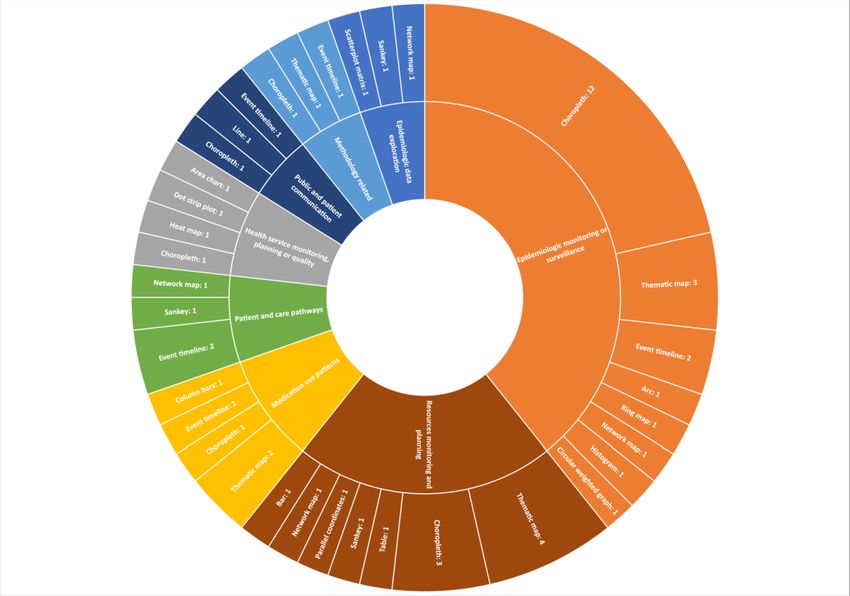
Regarding the functional aspects of the interactive visual application (2/56, 4% each); and MS Power BI, SigmaJS,
presentations, the categories included spatial (31/56, 55%), RESTful API, CNGI, Lifelines2, AtlasPR, Circos, IBM Watson
change over time (9/56, 16%), flow (8/56, 14%), distribution Analytics, SAS BI, Pajek, Gephi, pChart, Three Table View,
(2/56, 4%), ranking (2/56, 4%), magnitude (2/56, 4%), Python, and QuantumGIS (1/56, 2% each). Some articles did
correlation (1/56, 2%), and part to whole (1/56, 2%). not mention the visualization tool (13/56, 23%). Figure 4 shows
a screenshot from the Tableau results dashboard with the
The primary visual presentations included choropleth map primary visualization tools and heat map of problem category
(19/56, 34%), thematic map (10/56, 18%), event timeline (7/56, and visual presentation. This interactive dashboard is also
13%), network map (4/56, 7%), Sankey diagrams (3/56, 5%), available on the Tableau results dashboard [37].
https://www.jmir.org/2022/2/e27534 J Med Internet Res 2022 | vol. 24 | iss. 2 | e27534 | p. 9
(page number not for citation purposes)
XSL• FO
RenderXJOURNAL OF MEDICAL INTERNET RESEARCH Chishtie et al
Figure 3. Types of visualizations, primary software tool, and visualization type by problem area (screenshot).
Figure 4. Primary visualization presentations by health care problem area.
mention this aspect. Application co-design was found in the
Application Co-design problem categories of epidemiologic monitoring or surveillance
For participatory approaches to application development, some (13/56, 23%), resource and service monitoring and planning
articles (35/56, 67%) mentioned co-design. Among these (20/35, (8/56, 14%), medication use patterns (4/56, 7%), visualization
57%) were applications that were part of embedded research at methodology (3/56, 5%), epidemiologic data exploration (2/56,
health care organizations. Other articles (20/56, 37%) did not 4%), health service monitoring or planning or quality (2/56,
https://www.jmir.org/2022/2/e27534 J Med Internet Res 2022 | vol. 24 | iss. 2 | e27534 | p. 10
(page number not for citation purposes)
XSL• FO
RenderXJOURNAL OF MEDICAL INTERNET RESEARCH Chishtie et al
4%), patient or care pathways (2/56, 4%), and public or patient co-designed applications and embedded research.
communication (1/56, 2%). Figure 5 shows a tree map of
Figure 5. Co-designed applications and related health care areas (screenshot).
techniques have been used and identified trends and
Applications in Current Use and Public Availability opportunities for the use of these applications.
Most of the applications were mentioned as being currently
available and in use (31/56, 55%). Related to public access, a As population health and health services researchers and
third of the applications were available to the public (18/56, practitioners, our perspective and interest in pursuing this
32%). There were applications using free or open source tools research question were based on developing an in-depth
(18/56, 32%) and those using proprietary tools (19/56, 34%), understanding of the state of evidence on the use of
or the tools were not mentioned (18/56, 32%). visualization-based approaches for big health care data analyses.
We anticipated that the review would help diverse audiences in
Discussion population health and HSR learn from practical applications,
inform future research endeavors, and help introduce the analytic
Significance of the Review method to researchers and students. We discuss our findings in
this section with these overarching aims, contrasting the findings
Data visualization in health has a lengthy history going back to
from previous reviews in other areas of health care using
the influential work of John Snow and Florence Nightingale in
visualization approaches.
the 19th century. The field of interactive visualization has
developed in parallel with computing power and the availability Gaps and Opportunities for Application Co-design
of large, complex health care data sets for diverse audiences Data visualization aims to convey information at a glance,
such as clinicians, public health researchers, practitioners, and although it assumes that the audience has expertise and visual
decision-makers [1,41], with considerable progress made in literacy on the subject matter [101]. In their review of
design methodologies [14]. Our review is a novel synthesis and visualization-based applications in infectious disease
summary of the literature from a vast body of research that had epidemiology, Carrol et al [14] summarize the audience’s
not previously been covered. information needs and learning behavior and point to 3 important
In this methodological review, we aim to capture the current barriers to relaying information to target audiences: (1) time
state of knowledge and evidence on the topic of interactive constraints, (2) prior knowledge, and (3) cognitive load [14].
visualization applications in population health and HSR, Hence, the design process is imperative for an effective
distinguishing them from conventional graphical presentations application that allows the user to successfully understand the
in health care and the related field of VA. We explored areas presented data. Various methodologies outlining effective design
in population health and HSR to ascertain where these requirements and experiences from stakeholders to create new
products and solutions have been explored [102-104]. For our
https://www.jmir.org/2022/2/e27534 J Med Internet Res 2022 | vol. 24 | iss. 2 | e27534 | p. 11
(page number not for citation purposes)
XSL• FO
RenderXJOURNAL OF MEDICAL INTERNET RESEARCH Chishtie et al
scoping review, we opted to use the term co-design, which is techniques. In another distinction, most VA applications were
more commonly used in health care literature, as opposed to prototypes, whereas most interactive visualization applications
design thinking and other related terms [13]. were developed for knowledge generation and decision support
[13].
In this review, we found that at least two-thirds of the
applications involved co-design approaches, involving Both the VA and interactive visualization techniques seem to
stakeholders for developing interactive visualization have originated from North America and Europe [13]. The top
applications. This was in contrast to a smaller proportion of 3 countries identified for VA applications were the United States
co-designed VA applications (18%), which were mostly (24/55, 44%), Canada (5/55, 9%), and Germany (3/55, 5%).
prototypes developed by and for data scientists at academic The top countries for interactive visualization applications were
centers [13]. In line with this finding, more than half of the the United States (30/56, 54%), the United Kingdom (4/56, 7%),
interactive visualization applications were developed in-house and Canada and Indonesia (2/56, 4% each). Both our reviews
within health care organizations. We termed these initiatives indicated that most of the applications for both methods were
embedded research as part of co-designed applications to descriptive analytics, with an overlap with exploratory analyses
indicate that these were initiated within the organizations in of complex data sets (23/55, 42% for VA and 37/56, 66% for
response to an identified data-driven need for knowledge interactive visualization), and a small proportion for predictive
generation and decision support. We could not find such analytics. The application goals were comparable, with most
applications in the VA literature [13]. This indicates an being knowledge discovery (35/55, 80% for VA and 56/56,
important trend because participatory design and development 100% for interactive visualization) or decision support (44/55,
in health has proven to be a key element in better viability and 80% for VA and 47/56, 84% for interactive visualization), with
uptake in planning and implementation of services [105,106]. considerable overlap (29/55, 53% for VA and 47/56, 84% for
interactive visualization). The data sets used for both types of
Notably, a third of the articles in this review did not mention a
applications were single (32/55, 58% for VA and 40/56, 71%
co-design method, which could be due to authors either opting
for interactive visualization) and structured (40/55, 73% for VA
to omit it or because these were covered elsewhere. We
and 48/56, 86% for interactive visualization). There were no
recommend that future research indicate whether the application
unstructured data sets used for interactive visualization
used co-design approaches. It is important to describe the
applications. Both types of applications used a small number
context in adequate detail to appreciate stakeholder needs,
of semistructured data sets (5/55, 9% for VA and 8/56, 14% for
experience, and satisfaction. Furthermore, to map and present
interactive visualization).
methods in sufficient detail, we suggest using established
frameworks such as the Munzner Nested Process [107] or As population health and HSR are overlapping concepts, many
Design Thinking for Visualization [108] as reporting tools. articles in both reviews overlapped with their foci, methods,
and the metrics studied. Among the VA articles, almost all
Contrasting Interactive Visualization and VA (54/55, 98%) had a population health focus, whereas a third
Applications (18/55, 33%) were on HSR. There was a smaller overlap among
Through our recent work in studying visualization methods and the interactive visualization applications, with approximately
applications in population health and HSR, we establish that two-thirds (38/56, 68%) focusing on population health and
the fields of interactive visualization and VA share communities approximately half (29/56, 52%) on HSR.
of practice, methods, and approaches, but they are conceptually
Comparing the subdomains of population health and HSR, the
separate with important differences. We highlight the major
2 major categories of articles in the VA review focused on
ones here.
spatiotemporal aspects (27/55, 49%) compared with
We found that interactive visualization applications were approximately a third (16/56, 29%) for interactive visualization
initiated by and targeted at researchers and practitioners within applications. The next largest subdomains in VA included
government health care organizations tasked with health services clinical populations focusing on a condition or cluster of
delivery, planning, and policy advice. In contrast, most of the conditions (17/55, 31%) or epidemic monitoring and modeling
VA applications were from and developed for data scientists (18/55, 33%). Among the HSR articles for VA, these were
[13]. In addition, most interactive visualization applications mostly for health services’ utilization (15/55, 27%), access to
were developed using front-end engines, especially proprietary care (10/55, 18%), or costs (2/55, 4%). Conversely, in the
tools not requiring an advanced knowledge of coding [13]. Most interactive visualization literature, the most common subdomain
VA methods and applications were prototypes developed using for population health was the study of a demographic population
different combinations of tools, with a very small number using (28/56, 50%), followed by a clinical population (23/56, 41%),
proprietary software [13]. Related to theoretical or conceptual and epidemic monitoring and modeling (11/56, 20%). There
frameworks, VA applications offered 13 different frameworks, was a similar trend toward the use of both interactive
whereas we could not identify any of these in this review of visualization in HSR, with the most common subdomains being
interactive visualization applications. However, the latter health services’ utilization (23/56, 41%), followed by access
applications mentioned the use of frameworks at different stages (16/56, 29%) and costs (4/56, 7%).
of developing the applications. VA applications also expressly
The categories of problems have important similarities and
mentioned statistical and machine learning techniques as part
variations with epidemiologic surveillance for infectious disease
of the analytic engine, whereas interactive visualization
being the major category that the applications targeted (38%
applications mostly used simple descriptive aggregative
https://www.jmir.org/2022/2/e27534 J Med Internet Res 2022 | vol. 24 | iss. 2 | e27534 | p. 12
(page number not for citation purposes)
XSL• FO
RenderXJOURNAL OF MEDICAL INTERNET RESEARCH Chishtie et al
for both VA and interactive visualization). The next problem visual engines such as Tableau were used by only 1 VA
categories for VA applications were medical record pattern application in combination with Weka as the analytic engine.
identification (20/55, 36%), population health monitoring (9/55,
Finally, an issue that we identified in both our reviews was the
16%), and health system resource planning (2/55, 4%). For
lack of reporting detail in the articles, which is important for
interactive visualization applications, these included resources
the replicability and adaptation of the methods used in
and services monitoring or planning (12/56, 21%), health service
developing applications. We suggest using part of the VA
monitoring or quality (5/56, 9%), and medication use patterns
Reporting Checklist that we presented in our previous work on
(5/56, 9%).
VA, particularly around the details on the visualization engine
Interactive visualization applications mostly used administrative for the standard reporting of interactive visualization
and EMR or EHR data sources. This can be attributed directly applications [13].
to the availability of data within health care organizations. VA
applications were developed using varied data sources, including
Recent Trends of Using Interactive Visualization
administrative (19/55, 35%), EMR or EHR (17/55, 31%), Methods
spatiotemporal (16/55, 29%), social media (8/55, 15%), and Our results showed that thematic mapping, including choropleth
simulation data (6/55, 11%); for interactive visualization maps, was the most common visual presentation across all
applications, the data sources were secondary administrative problem categories of population health and HSR. This was
data (45/56, 80%), social media (2/56, 4%), and sensor data particularly the case for epidemiologic monitoring and
(1/56, 2%). surveillance. The recently created COVID-19 dashboards fall
into the same category of applications [109]. Mapping also
Comparing tools in current use, about a third (21/55, 38%) of
surfaced as a popular method for health resource monitoring,
the VA applications were in use at the time of publication,
particularly for the planning of health care services
whereas others were either not available or were prototypes.
[41,56,62,64,67,73,77,78,80,87,110,111].
Moreover, a few (7/56, 13%) applications were accessible for
public use, while less than a third were developed using free Among different conditions of interest, a significant number of
open source tools (13/56, 24%). Among the interactive applications were developed for studying trends in cancer
visualization applications, more than half (31/56, 55%) were [43,44,52,61,71,88]. Being a worldwide population health issue,
mentioned as being in current use, whereas about a third (18/56, the greater use of interactive visualization methods in cancer
32%) were available to the public, and the same proportion were could be due to the availability of dedicated registries and
developed using free or open source tools. There was a greater secondary administrative data [88]. In global health, applications
proportion of use of proprietary tools (19/56, 34%) for focused on surveillance of communicable diseases [47], outreach
interactive visualization applications compared only a 10th of campaigns [64], methods to examine health inequalities [53],
VA applications (5/55, 10%). and effects on health from global climate change [61]. In HSR,
6 applications directly or indirectly highlighted inequities in
The trend for the use of visual presentations was toward the use
health, particularly in regard to effective planning and advising
of different maps in both applications. Choropleth maps were
policy [43,53,63,70,82,89]. There was 1 article examining social
the most frequently used for interactive visualizations (13/56,
determinants of health in HIV [63].
24%), followed by thematic maps (10/56, 18%), event timelines
(7/56, 13%), and network maps (4/56, 7%). VA applications As two-thirds of the applications were focused on the visual
showed a similar trend with thematic maps (17/55, 31%), exploration of complex data sets, this indicated a clear trend
timelines (8/55, 15%), and heat or choropleth maps (6/55, 11%). toward the use of this technique for exploratory analyses.
This corresponds to the findings of the review by Chung et al Although most applications were meant for descriptive analytics
[17] on visualization methods in the area of mental health and visual exploration of complex data sets, of the 56
systems, which indicated that the most common means of applications, 4 (7%) were also capable of predictive analytics
presenting data was through maps [17]. [39,68,71,93]. The methodological frameworks that were applied
to developing the applications pertained to visual monitoring
Because of the differences in the methods involved in
[38], level of detail in visual presentation [80], use of scientific
developing the applications, software tools varied greatly. VA
publication visualizations [45], information management [69],
tools were a mix of software tools used for the analytic and
user-centered web-based applications [83], and user interaction
visual engines, whereas interactive visualization applications
[91].
reported visual engines alone. However, there were still
similarities in the use of tools. Tableau was the most frequently Opportunities for Future Applications and Research
reported tool for interactive visualization applications (7/56, Experts highlight the preference of researchers for interactive
13%), followed by D3.JS (5/56, 9%); ArcGIS and Instant Atlas graphics to facilitate data exploration and abstraction, and they
(3/56, 5% each); and R/R-Shiny, Open Street Map, Google suggest greater, varied learning opportunities from the use of
Maps API, SQL, and Java-based applications (2/56, 4% each). interactive visualization tools [14].
The most common tools found for VA applications were
R-based tools (7/55, 13%), followed by D3.JS (4/55, 7%); SQL In comparison with standard, traditional statistical analyses,
(4/55, 7%), Java-based tools (3/55, 5%); and Python-based tools, interactive visualization techniques can play an important
HTML 5, or Google Maps API (2/55, 4% each). Front-end complementary role through knowledge generation as well as
establishing associations and causality. Interactive visualization
https://www.jmir.org/2022/2/e27534 J Med Internet Res 2022 | vol. 24 | iss. 2 | e27534 | p. 13
(page number not for citation purposes)
XSL• FO
RenderXJOURNAL OF MEDICAL INTERNET RESEARCH Chishtie et al
methods enable a data discourse, leading to in-depth data-driven data for exploring trends and patterns in care and its provision
insights, while having the advantage of improved perception with the advantage of capturing quality of care measures
with reducing cognitive load [2,5]. This interplay of direct data involving prescriptions and investigations [121].
manipulation and analysis allows simultaneous study of trends
In a recent review on visualization approaches for supporting
and patterns in the analytic process, while formulating and
mental health systems and policy research, Chung et al [17]
testing hypotheses [13,112]. Furthermore, these methods are
indicate that there is a gap in studies that influence policy.
considered apt for studying correlations in high-dimensional
Although policy was not our main area of focus for this review,
data with a large number of time points [112]. This translates
the work indicates that there is an opportunity for informing
into a powerful technique for using big health care data, allowing
and advising policy based on the use of big data, especially in
a deep exploratory dive without an a priori hypothesis to identify
the important area of mental health services.
data-driven trends and patterns.
Although the potential for the use of interactive visualization
In this review, although we observed various applications of
tools for bringing together disparate data sources is valued, there
interactive visualization, we found limited evidence of its use
are related concerns for data interpretation, quality, accuracy,
in global health. Given the massive open access data sets
and handling [1,14]. Meeting the needs of diverse users and
available from agencies such as the World Bank and the World
interdisciplinary teams as well as promoting the understanding
Health Organization (WHO), research can focus on studying a
of visual approaches are 2 related and important challenges to
plethora of population health and HSR indicators [113,114].
be cognizant of [1,14]. Researchers indicate that understanding
The WHO’s Global Health Observatory provides population
the value of these techniques among health care organizations
health–related data and statistics from 194 member states,
and public health agencies is key to realizing the potential of
particularly on nutrition, virological surveillance, workforce,
these methods regarding decision support [17].
and health systems, whereas the World Bank’s open data
repository features macroeconomic and social indicators such Implications and Value-add From the Review
as gender and aid effectiveness. The methods can be helpful in Our work is unique in several respects. Complementing our
ecologic studies, such as those comparing indicators across and work on VA applications in population health and HSR [13],
within nations. this review amalgamates the findings from studies on interactive
Related to this is another major opportunity for the use of visualization applications, while delineating the literature to
interactive visualization in studying inequities, especially those construct a holistic picture on the use of visualization approaches
rooted in social determinants of health. Although the social in these areas of health care. Interactive visualization is an
determinants of health have become a major focus for increasingly popular method, especially for embedded research
investigating structural inequities, we found only 1 article within health care organizations. Although traditional statistical
examining related aspects in the HIV sector [63]. Social methods inform causality and associations of various conditions,
determinants of health are defined by the WHO as “conditions interactive visualization presents a complementary opportunity
in which people are born, grow, live, work and age...shaped by for knowledge discovery, hypotheses generation, and decision
the distribution of money, power and resources at global, support using big health care data.
national and local levels” [115]. This is especially relevant for As a novel method, we present findings from both our scoping
investigating structural inequities related to issues of access and reviews on VA and interactive visualization in a dynamic,
use based on race, gender, disability, income distribution, and interactive, and visual format using Tableau dashboards
indigenous populations [116,117]. Taking Canada’s example, [37,122]. In the interest of greater transparency and replicability,
investigating proximal factors for health among indigenous we provide the abstraction database with relevant fields for
populations is one of the priority areas for improving health adaptation and further analysis [37].
care [116]. Furthermore, high-quality Canadian data can be used
to investigate inequities to better understand gaps in access and We highlight opportunities in areas of research that could benefit
use of services by underserved populations. This can be done from visualization-based methods to promote the understanding
through national administrative data sources such as the and uptake of the methods among the communities of research
Canadian National Ambulatory Care Reporting System, and practice. This work would also prove useful in further
Discharge Abstract Database, and Hospital Morbidity Database, developing visualization-related analytic methods.
which store data for emergency and ambulatory care [118], as
Limitations
well as hospital inpatient discharges and day surgery [119].
Although there are several important limitations that we are
Another major opportunity comes from the extension of using cognizant of in reporting this review, we made extensive efforts
multiple data sources for studying patient journeys and care to identify relevant literature, delineate the body of literature
pathways. With the increasing use of EMR and EHR on interactive visualization applications, incorporated rigor in
technologies, especially in primary care, there is an opportunity our methods through all stages, and went through extensive
for researching patient populations along the continuum of care. steps toward validation to present our findings.
Another such example is from the United Kingdom’s Clinical
Practice Research Datalink database, which forms the largest We cast a wide net in our literature search covering 6 databases,
collection of anonymized primary care patient records [120]. published the study protocol, and had our search strategy
In Ontario, Canada, the Electronic Medical Record externally peer reviewed. However, we may have missed
Administrative Data Linked Database offers high-quality linked relevant literature residing in subject-specific databases such
https://www.jmir.org/2022/2/e27534 J Med Internet Res 2022 | vol. 24 | iss. 2 | e27534 | p. 14
(page number not for citation purposes)
XSL• FO
RenderXYou can also read