Introduction to iOS 8 Xamarin Beta Required
←
→
Page content transcription
If your browser does not render page correctly, please read the page content below
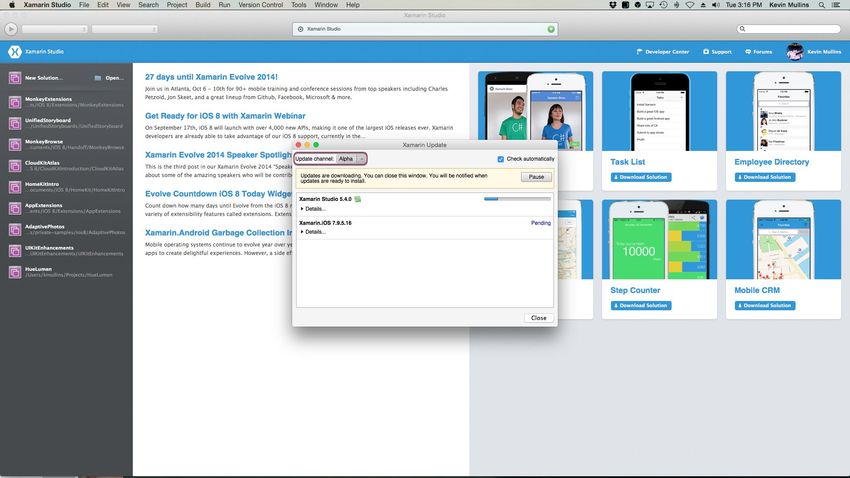
Introduction to iOS 8

Xamarin Beta Required
The Beta Update Channel version of Xamarin Studio and the Golden Master release of Xcode 6 and iOS 8 are
required to use this guide. To install the Beta version of Xamarin Studio, please do the following:

   1. Start Xamarin Studio.
   2. Open the Xamarin Studio menu and select Check for Updates...
   3. In the Xamarin Update dialog box, select Beta from the Update Channel dropdown box:

   4. Allow the updates to download.
   5. Click the Restart and Install Updates button.

You are now ready to use the Beta version of Xamarin Studio to explore our iOS 8 guide and all of the new and
enhanced features that Apple has provided.

Overview
iOS 8 introduces a large set of APIs and services that allow the developer to create new categories of
applications and features. Deeper integration with iOS means an application can extend the reach of its content
and functionality. Along with new technologies, iOS 8 makes several adjustments to existing iOS technologies
and features.

This article will cover the major additions provided by iOS 8 along with several of the more significant changes to
existing features and technologies.

                App Extensions

iOS 8 lets the developer extend select areas of the system by supplying an app extension - code that enables
custom functionality within the context of a user task.

iOS 8 supports the following types of app extensions:

      Share - By providing more sharing options, iOS 8 enables an application to share photos, videos, websites,
      and other content with social websites and other entities.
      Storage Provider - The developer can now provide a document storage location that can be accessed by
      other applications. Applications that use a document picker view controller can open files managed by the
      storage provider or move files into the storage provider.
      Photo Editing - Embed custom filters and editing tools directly into the Photos application, so users can
      easily apply those effects to images and videos without having to import them into another application.
      Document Picker - The document picker view controller grants users access to files outside an
      application's sandbox. Documents are easily shared between apps, enabling users to edit a single
      document in multiple places.
      Custom Actions - The developer can create their own custom action buttons in the Action sheet to let
users perform custom tasks such as: watermark documents, add something to a wish list, translate text to a
      different language, etc.
      Custom Keyboards - With iOS 8, the developer can provide custom keyboards with different input
      methods and layouts for users to install and use system wide.
      Today - Applications can now display widgets in the Today view of Notification Center, providing quick
      updates or enabling brief tasks - for example, posting updates on package deliveries, the latest surf
      reports, or breaking news stories.

To learn more about developing App Extensions with Xamarin for iOS 8, see the Introduction to App Extensions
guide.

                Touch ID Authentication

In iOS 8, an application can now use Touch ID to authenticate the user. Some apps may need to secure access
to all of their content, while others might need to secure certain pieces of information or options. In either case,
the developer can require the user to authenticate before proceeding.

An app can use the Local Authentication Framework to display an alert to the user with an application-specified
reason for why the user is authenticating. When the app gets a reply, it can react based on whether the user was
able to successfully authenticate.

To learn more about using TouchID in a Xamarin iOS 8 Application, see the Introduction to TouchID guide.

                HealthKit

HealthKit allows applications providing health and fitness services to access shared health-related information in
one place. A user's health information is stored in a centralized and secure location and the user decides which
data should be shared with an application.

An application can access any shared health-related information and can provide information about the user
without the developer needing to implement support for specific fitness-tracking devices. Information can come
from devices connected to an iOS device or manual entry by the user.

To learn more about using HealthKit in a Xamarin iOS 8 Application, see the Introduction to HealthKit guide.

                HomeKit
HomeKit

This is a new framework for communicating with and controlling connected devices in a user's home.
Applications can enable users to discover devices in their home and configure them, or the developer can create
actions to control those devices. Users can group actions together and trigger them using Siri.

HomeKit provides seamless integration between accessories that support Apple's Home Automation Protocol
and iOS devices, allowing for new advances in home automation. With HomeKit, the mobile application that a
user controls their home with doesn't have to be provided by the vendor that created their home automation
accessories.

By promoting a common protocol for home automation devices and making a public API available, HomeKit
allows home automation accessories from multiple vendors to be integrated into a single coherent whole, without
those vendors having to coordinate directly with each other.

To learn more about using HomeKit in a Xamarin iOS 8 Application, see the Introduction to HomeKit guide.

                CloudKit

Leverage the full power of iCloud and build applications with the new CloudKit Framework. Now the developer
can easily and securely store and efficiently retrieve application data like structured data in a database or assets
right from iCloud. CloudKit also enables users to anonymously sign in to applications with their iCloud Apple IDs
without sharing their personal information.

With CloudKit, the developer can focus on their client-side application development and let iCloud eliminate the
need to write server-side application logic. CloudKit provides authentication, private and public databases, and
structured and asset storage services.

Apple is initially providing CloudKit for free with a high limit on both bandwidth and storage capacity. For larger
projects or applications with a large user base, Apple has hinted that an affordable pricing scale will be provided.

To learn more about using CloudKit in a Xamarin iOS 8 Application, see the Introduction to CloudKit guide.

                Document Picker

The document picker view controller (UIDocumentPickerViewController) grants users access to files
outside an application's sandbox. It is a simple mechanism for sharing documents between applications. It also
enables more complex workflows, because users can edit a single document from within multiple applications.

The document picker lets the developer access files from a number of document providers. For example, the
iCloud document provider grants access to documents stored inside another application's iCloud container.
Third-party developers can provide additional document providers by using the Storage Provider extension.

To learn more about using the Document Picker in a Xamarin iOS 8 Application, see the Introduction to the
Document Picker guide.

                Handoff

Handoff is a feature in OS X and iOS that extends the user experience by providing continuity across devices.
Handoff enables users to begin an activity on one device, then switch to another device and resume the same
activity on the other device.

For example, a user who is browsing a long article in Safari moves to an iOS device that's signed into the same
Apple ID, and the same webpage automatically opens in Safari on iOS, with the same scroll position as on the
original device. Handoff makes this experience as seamless as possible.

To participate in Handoff, an application adopts a small API in the Foundation Framework. Each ongoing activity
in an application is represented by a user activity object that contains the data needed to resume an activity on
another device. When the user chooses to resume that activity, the object is sent to the resuming device. Each
user activity object has a delegate object that is invoked to refresh the activity state at opportune times, such as
just before the user activity object is sent between devices.

If continuing an activity requires more data than is easily transferred by the user activity object, the resuming
application has the option to open a stream to the originating app. Document-based apps automatically support
activity continuation for users working with iCloud-based documents.

To learn more about using Handoff in a Xamarin iOS 8 Application, see the Introduction to Handoff guide.

                Unified Storyboards for Universal Apps

iOS 8 makes dealing with screen size and orientation much more versatile. Using Unified Storyboards, the
developer can create a single interface for an application that works well on both iPad and iPhone devices by
adjusting easily to orientation changes and different screen sizes as needed.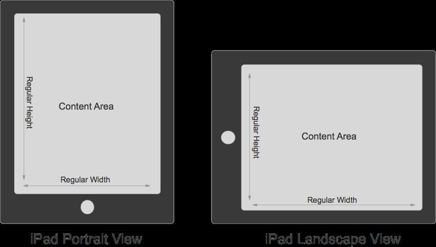
Since the developer no longer needs to create separate and specific storyboard for iPhone and iPad devices,
they have flexibility to design applications with a common interface and then customize that interface for different
size classes. In this way, an application can be adapted to the strengths of each form factor and tune the user
interface to provide the best experience.

Every device is defined by a size class, both vertically and horizontally, and there are two types of size classes in
iOS 8:

      Regular - Denotes either a large amount of screen space, such as on an iPad, or a commonly adopted
      paradigm that provides the illusion of a large amount of screen space, such as scrolling on an iPhone.
      Compact - Denotes a small amount of screen space, such as on an iPhone and is based on the orientation
      of the device.

iPad Size Classes

Because of the amount of screen space available, the iPad has a regular size class in the vertical and horizontal
directions in both portrait and landscape orientations.

iPhone Size Classes

The iPhone has different size classes based on the orientation of the device: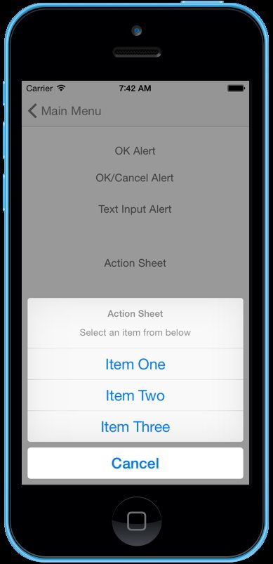
In portrait, the screen has a compact size class horizontally and a regular size class vertically. This corresponds
to the common usage paradigm of scrolling vertically for more information. When the device is in landscape, it
has a compact size class both horizontally and vertically.

iPhone 6 Plus Size Classes

Are the same as the iPhone in the Portrait orientation, but different in Landscape:

Because the iPhone 6 Plus has a large enough screen, it is able to have a Regular Width Size Class in the
Landscape mode.

Support for a New Screen Scale
The iPhone 6 Plus uses a new Retina HD display with a screen scale factor of 3.0 (three times the original
iPhone screen resolution). To provide the best possible experience on these devices, include new artwork
designed for this screen scale. In Xcode 6, asset catalogs can include images at 1x, 2x, and 3x sizes; simply add
the new image assets and iOS will choose the correct assets when running on an iPhone 6 Plus.

The image loading behavior in iOS also recognizes an @3x suffix on image files. For example, if the developer
includes an image asset (at different resolutions) in the application's bundle with the following file names:
MonkeyIcon.png, MonkeyIcon@2x.png, and MonkeyIcon@3x.png. On the iPhone 6 Plus the
MonkeyIcon@3x.png image will be used automatically if the developer loads an image using the following
code:

UIImage icon = UIImage.FromFile("MonkeyImage.png");

Or if they assign the image to a UI element using the iOS Designer as MonkeyIcon.png, the
MonkeyIcon@3x.png will be used, again automatically, on the iPhone 6 Plus.

Designing the User Interface Using Size Classes

Every view has a size class associated with it that the developer can change. This flexibility is especially useful
when a smaller view is contained within a larger view. The developer can use the default size classes to arrange
the user interface of the larger view and arrange information in the subview based on a different size class
combination.

The following additions and modifications to UIKit have been made to support size classes:

        UITraitCollection - The UITraitCollection class is used to describe a collection of traits assigned to
        an object. Traits specify the size class, display scale, and idiom (iPhone or iPad) for a particular object.
        Classes that support the UITraitEnvironment protocol (such as UIViewController and UIView )
        own a trait collection. The developer can retrieve an object's trait collection and perform actions when those
        traits change.
        UIImageAssest - The UIImageAsset class is used to group like images together based on their traits.
        Combine similar images with slightly different traits into a single asset and then automatically retrieve the
        correct image for a particular trait collection from the image asset. The UIImage class has been modified
        to work with image assets.
        UIAppearance - Classes that support the UIAppearance protocol can customize an object's appearance
        based on its trait collection.
        UIViewController - The UIViewController class adds the ability to retrieve the trait collection for a child
        view. The developer can also lay out the view by changing the size class when calling the
        ViewWillTransitionToSize method.

Dynamic Launch Screens
The launch screen file is displayed as a splash screen while an iOS application is launching to provide feedback
to the user that the app is actually starting-up. Prior to iOS 8, the developer would have to include multiple
Default.png image assets for each device type, orientation and screen resolution that the application would be
running on.

New to iOS 8, the developer can create a single, atomic .xib file in Xcode 6 that uses Auto Layout and Size
Classes to create a Dynamic Launch Screen that will work for every device, resolution and orientation. This not
only reduces the amount of work required of the developer to create and maintain all the required image assets,
but it reduces the size of the application's installed bundle.

To learn more about using Size Classes, Unified Storyboards and Dynamic Launch Screens with Xamarin for iOS
8, see the Introduction to Unified Storyboards guide.

Photos
With the improvements that Apple has added to iOS 8, the developer can enable the end user to take better
photos in their applications, provide new editing capabilities to the Photos app, and create new, more efficient
workflows that access the user’s photo and video assets.

                 PhotoKit

PhotoKit provides new APIs for working with photo and video assets, including iCloud Photos assets (managed
by the Photos application) so an application can edit photos directly in the Camera roll without having to import
them first.

Key features include a thread-safe architecture for fetching and caching thumbnails and full-sized assets,
requesting changes to assets, observing changes made by other applications, and resumable editing of asset
content.

For a quick example of using the PhotoKit framework in Xamarin, see Mike Bluestein's Build Great Photo
Experiences in iOS 8 with PhotoKit blog post.

                 Manual Camera Controls

The AVFoundation Framework makes it easier than ever for users to take great photos. An application can take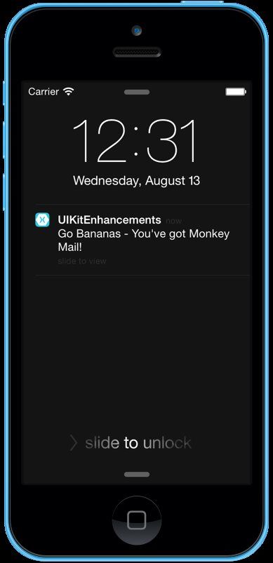
direct control over the camera focus, white balance, and exposure settings. An app can also use bracketed
exposure captures to automatically capture images with different exposure settings.

To learn more about using Manual Camera Controls in a Xamarin iOS 8 Application, see the Introduction to
Manual Camera Controls guide.

                Improved Camera Functionality

The developer can use the following APIs to discover and enable new camera features found on the iPhone 6
and iPhone 6 Plus:

      A new property (VideoHDRSupported) can determine whether a capture device supports high dynamic
      range streaming.
      A new video stabilization mode (AVCaptureVideoStabilizationModeCinematic) provides more cinematic
      results in the captured video.
      A new property (HighResolutionStillImageOutputEnabled) can be used to set an
      AVCaptureStillImageOutput object to capture still pictures at a higher resolution.
      A new property (AutoFocusSystem) can be used to determine how the camera performs auto focusing.

Games
Technology improvements in iOS 8 make it easier than ever to implement game graphics and audio features.
Take advantage of high-level frameworks for ease-of-development, or use new low-level enhancements to
harness the power of the GPU.

                SceneKit

SceneKit is a high-level 3D graphics framework that helps the developer create 3D animated scenes and effects
in their applications. It incorporates a physics engine, a particle generator, and easy ways to script the actions of
3D objects so the developer can describe the scene in terms of its content — geometry, materials, lights, and
cameras — then animate it by describing changes to those objects. SceneKit’s 3D physics engine enlivens an
application or game by simulating gravity, forces, rigid body collisions, and joints. It’s also completely integrated
with SpriteKit, so the developer can include SpriteKit assets in 3D games.

To learn more about SceneKit, see Apple’s SceneKit Framework Reference document. For a quick example of
using the SceneKit framework in Xamarin, see Mike Bluestein's Lights, Camera, Action – 3D in iOS 8 with Scene
Kit blog post.
SpriteKit
The SpriteKit framework adds new features to make it easier to create high-performance, battery-efficient 2D
games. With support for custom OpenGL ES shaders and lighting, integration with SceneKit, and advanced new
physics effects and animations, the developer can add force fields, detect collisions, and generate new lighting
effects in their games. Xcode 6 also incorporates new shader and scene editors that save time when creating
games. Create a scene’s contents, specifying which nodes appear in the scene and characteristics of those
nodes, including physics effects. The scene is then serialized to a file that the game can easily load.
To learn more about SpriteKit, see Apple’s SpriteKit Framework Reference document. For a quick example of
using the SpriteKit framework in Xamarin, see Mike Bluestein's New Sprite Kit Physics Features in iOS 8 blog
post.
Metal
With extremely low-overhead access to the A7 GPU, Metal enables incredibly high performance for sophisticated
graphics rendering and computational tasks. Metal eliminates many performance bottlenecks that are found in
traditional graphics APIs. It’s specifically designed to exploit modern architectural considerations, such as
multiprocessing and shared memory, to make it easy to parallelize the creation of GPU commands. Metal offers a
streamlined API, a unified graphics and compute shading language, and Xcode-based tools.
To learn more about Metal, see Apple’s Metal for Developers Guide. For more information on using the Metal
framework in Xamarin, please see our Metal API Documentation.
Additional Framework Changes
In addition to the major additions and changes to existing features described above, iOS 8 includes several
changes and improvements to exist iOS features.This section will cover the most significant changes in iOS 8 and will provide the information required update
existing or create new Xamarin mobile applications to take advantage of these features.
Core Image Framework
Core Image is an image processing and analysis technology designed to provide near real-time processing for
still and video images. In iOS and OS X you can use Core Image classes to:
Process images using the many built-in image filters.
Chain together filters and then archive them for later use.
Detect features (such as faces and eyes) in still and video images, and track faces in video images.
Analyze images to get a set of auto adjustment filters.
Create custom filters for use in your app.
iOS 8 adds the following new features to the Core Image framework:
Detect rectangular regions inside images.
Detect QR Codes embedded inside images.
For a quick example of using the new Core Image framework features in Xamarin, see Mike Bluestein's Image
Detection in iOS 8 blog post.
AV Foundation Framework
The AV Foundation framework (AVFoundation) enables the developer to capture metadata over time while
shooting video. Arbitrary types of metadata can be embedded with a video recording at various points in time. For
example, the developer might record the current physical location in a video created by a moving camera device.
For information about the using the AV Foundation framework in Xamarin, see Apple's AV Foundation
Framework Reference and our AVFoundation API Documentation.
AVKit Framework
The AVKit framework (AVKit) previously introduced on OS X is now available in iOS 8. The developer should
use this framework instead of Media Player framework when they need to display a video.
For more information on using the AVKit Framework in Xamarin, please see our AVKit API Documentation.
CoreAudioKit Framework
The new CoreAudioKit framework (CoreAudioKit) simplifies the effort required by the developer to create userinterfaces for applications that take advantage of inter-app audio.
For more information on using the CoreAudioKit framework in Xamarin, please see our CoreAudioKit API
Documentation.
Core Location Framework
The Core Location framework (CoreLocation) has the following changes:
The developer can determine which floor the device is on, if the device is in a multistory building.
The Visit Service provides an alternative to the Significant Location Change service for applications that
need location information about interesting places visited by the user.
For information about the Core Location framework in Xamarin, see Apple's Core Location Framework Reference
and our CoreLocation API Documentation.
Core Motion Framework
Core Motion provides two new classes (CMAltimeter and CMAltitudeData) which allows the developer to access
the barometer on the iPhone 6 and iPhone 6 Plus. On these two devices, the developer can also use a
CMMotionActivity object to determine whether the user is on a bicycle.
Foundation Framework
The Foundation framework (Foundation) includes the following enhancements:
The NSFileVersion class provides access to past versions of iCloud documents. These versions are
stored in iCloud, but can be downloaded on request.
The NSURL class supports storing document thumbnails as metadata.
The NSMetadataQuery class can search for external iCloud documents that your app has opened.
To learn more about using these enhancements with CloudKit in a Xamarin iOS 8 Application, please see our
Introduction to CloudKit guide.
Game Controller Framework
The Game Controller framework (GameController) has the following changes:
If the controller is attached to a device, the developer can now receive device motion data directly from the
Game Controller framework.
If the developer is working with button inputs and do not care about pressure sensitivity, a new handler can
call their game only when the button’s pressed state changes.GameKit Framework
The GameKit framework (GameKit) has the following changes:
Features that were added in iOS 7 are available on OS X 10.10, making it easier to use these features in a
cross-platform game.
The new GKSavedGame class and new methods in GKLocalPlayer make it easy to save and restore a
user’s progress. The data is stored on iCloud; GameKit does the necessary work to synchronize the files
between the device and iCloud.
Methods and properties that use player identifier strings are now deprecated. Instead, use GKPlayer
objects to identify players. Replacement properties and methods have been added that take GKPlayer
objects.
iAd Framework
The iAd framework (iAd) adds the following new features:
If the developer is using the AVKit framework to play a video, they can play preroll advertisements before
the video is played.
The developer can look up more information about the the effectiveness of advertisements for their
applications.
For information about using the iAd framework in Xamarin, see Apple's iAd Framework Reference and our iAd
API Documentation.
Media Player Framework
The Media Player framework (MediaPlayer) has been extended with new metadata information.
For information about using the Media Player framework in Xamarin, see Apple's Media Player Framework
Reference and our MediaPlayer API Documentation.
SpriteKit Framework Changes
The SpriteKit framework (SpriteKit) adds many new features:
An SKShapeNode object can specify textures to be used when the shape is either stroked or filled.
The SKSpriteNode, SKShapeNode, SKEmitterNode, and SKEffectNode classes include support for
custom rendering. Use the SKShader and SKUniform classes to compile an OpenGL ES 2.0-based
fragment shader and provide input data to the shader.
SKSpriteNode objects can provide lighting information so that SpriteKit automatically generates lightingeffects and shadows. Add SKLightNode objects to the scene to specify the lights, and then customize the
properties on these lights and any sprites to determine how the scene is lit.
The SKFieldNode class provides physics special effects the developer can apply to a scene. For
example, create magnetic fields, add drag effects, or even generate randomized motion. All effects are
constrained to a specific region of the scene, and the developer can carefully tune both the effect’s strength
and how quickly the effect is weakened by distance. Field nodes make it easy to drop in an effect without
having to search the entire list of physics bodies and apply forces to them.
A new SK3DNode class is used to integrate a SceneKit scene into a game as a sprite. Each time that
SpriteKit renders a scene, it renders the 3D scene node first to generate a texture, then uses that texture to
render a sprite in SpriteKit. Creating 3D sprites can help the developer avoid creating dozens of frames of
animation to produce an effect.
New actions have been added, including support for inverse kinematic animations.
A new system of constraints has been added to scene processing. SpriteKit applies constraints after
physics is simulated, and the developer use them to specify a set of rules for how a node is positioned and
oriented. For example, the developer can use a constraint to specify that a particular node in the scene
always points at another node in the scene. Constraints make it easier to implement rendering rules in a
game without having to tweak the scene manually in the event loop.
A scene can implement all of the run-loop stages in a delegate instead of subclassing the SKScene class.
Using a delegate often means that the developer can avoid needing to subclass the SKScene class.
The SKView class provides more debugging information. The developer can also provide more
performance hints to the renderer.
The developer can create normal map textures for use in lighting and physics calculations (or inside their
own custom shaders). Use the new SKMutableTexture class when the developer needs to create
textures whose contents are dynamically updated.
The developer can generate texture atlases dynamically at runtime from a collection of textures.
Xcode 6 also incorporates many new SpriteKit editors. Create or edit the contents of scenes directly, specifying
the nodes that appear in the scene as well as their physics bodies and other characteristics. The scene is
serialized to a file and can be loaded directly by the game application. The editors save the developer time
because often they don’t need to implement their own custom editors to create the game’s assets.
For information about using the SpriteKit framework in Xamarin, see Apple's SpriteKit Framework Reference and
SpriteKit Programming Guide.
UIKit Framework
Several enhancements have been made to the UIKit framework to both support new features added by iOS 8
(as described in detail above) and to improve existing features.
The following changes and modification have been made:Alert Controller
The new UIAlertController class replaces the UIActionSheet and UIAlertView classes as the
preferred way to display alerts in an iOS application. By using the UIAlertController, complex Alerts or
Action Sheets can be created quickly.
The follow code can be used to display a simple Alert with an OK button:
public static UIAlertController PresentOKAlert(string title, string description,
UIViewController controller) {
// No, inform the user that they must create a home first
UIAlertController alert = UIAlertController.Create(title, description,
UIAlertControllerStyle.Alert);
// Configure the alert
alert.AddAction(UIAlertAction.Create("OK",UIAlertActionStyle.Default,(action)
=> {}));
// Display the alert
controller.PresentViewController(alert,true,null);
// Return created controller
return alert;
}
...
// Display the Alert
AlertView.PresentOKAlert("OK Alert","This is a sample alert with an OK
button.",this);The follow code can be used to display an Alert with an OK and Cancel button:
public delegate void AlertOKCancelDelegate(bool OK);
...
public static UIAlertController PresentOKCancelAlert(string title, string
description, UIViewController controller, AlertOKCancelDelegate action) {
// No, inform the user that they must create a home first
UIAlertController alert = UIAlertController.Create(title, description,
UIAlertControllerStyle.Alert);
// Add cancel button
alert.AddAction(UIAlertAction.Create("Cancel",UIAlertActionStyle.Cancel,
(actionCancel) => {
// Any action?
if (action!=null) {
action(false);
}
}));// Add ok button
alert.AddAction(UIAlertAction.Create("OK",UIAlertActionStyle.Default,(actionOK)
=> {
// Any action?
if (action!=null) {
action(true);
}
}));
// Display the alert
controller.PresentViewController(alert,true,null);
// Return created controller
return alert;
}
...
partial void OKCancelAlert_TouchUpInside (UIButton sender)
{
AlertView.PresentOKCancelAlert("OK/Cancel Alert","This is a sample alert with
an OK and a Cancel button.",this, (bool OK) =>{
// Was the OK button pressed
if (OK) {
Console.WriteLine("OK button pressed.");
} else {
Console.WriteLine("Cancel button pressed.");
}
});
}The follow code can be used to display a Text Input Alert with an OK and Cancel button:
public delegate void AlertTextInputDelegate(bool OK, string text);
...
public static UIAlertController PresentTextInputAlert(string title, string
description, string placeholder, string text, UIViewController controller,
AlertTextInputDelegate action) {
// No, inform the user that they must create a home first
UIAlertController alert = UIAlertController.Create(title, description,
UIAlertControllerStyle.Alert);
UITextField field = null;
// Add and configure text field
alert.AddTextField ((textField) => {
// Save the field
field = textField;// Initialize field
field.Placeholder = placeholder;
field.Text = text;
field.AutocorrectionType = UITextAutocorrectionType.No;
field.KeyboardType = UIKeyboardType.Default;
field.ReturnKeyType = UIReturnKeyType.Done;
field.ClearButtonMode = UITextFieldViewMode.WhileEditing;
});
// Add cancel button
alert.AddAction(UIAlertAction.Create("Cancel",UIAlertActionStyle.Cancel,
(actionCancel) => {
// Any action?
if (action!=null) {
action(false,"");
}
}));
// Add ok button
alert.AddAction(UIAlertAction.Create("OK",UIAlertActionStyle.Default,(actionOK)
=> {
// Any action?
if (action!=null && field !=null) {
action(true, field.Text);
}
}));
// Display the alert
controller.PresentViewController(alert,true,null);
// Return created controller
return alert;
}
...
// Display the alert
AlertView.PresentTextInputAlert("Text Input Alert","This is a sample text input
alert","(type something)","",this, (bool OK, string text) => {// Was the OK button pressed
if (OK) {
Console.WriteLine("The user entered '{0}'.",text);
} else {
Console.WriteLine("The user canceled text input.");
}
});
Finally, the follow code will display an Action Sheet with three choices and a Cancel button:// Create a new Alert Controller
UIAlertController alert = UIAlertController.Create("Action Sheet", "Select an item
from below", UIAlertControllerStyle.ActionSheet);
// Add items
alert.AddAction(UIAlertAction.Create("Item One",UIAlertActionStyle.Default,(action)
=> {
Console.WriteLine("Item One pressed.");
}));
alert.AddAction(UIAlertAction.Create("Item Two",UIAlertActionStyle.Default,(action)
=> {
Console.WriteLine("Item Two pressed.");
}));
alert.AddAction(UIAlertAction.Create("Item Three",UIAlertActionStyle.Default,
(action) => {
Console.WriteLine("Item Three pressed.");
}));
alert.AddAction(UIAlertAction.Create("Cancel",UIAlertActionStyle.Cancel,(action) =>
{
Console.WriteLine("Cancel button pressed.");
}));
// Required for iPad - You must specify a source for the Action Sheet since it is
// displayed as a popover
UIPopoverPresentationController presentationPopover =
alert.PopoverPresentationController;
if (presentationPopover!=null) {
presentationPopover.SourceView = this.View;
presentationPopover.PermittedArrowDirections = UIPopoverArrowDirection.Up;
presentationPopover.SourceRect = ActionSheet.Frame;
}
// Display the alert
this.PresentViewController(alert,true,null);See the UIKitEnhancements iOS 8 Project attached to this article for an example of using the Alert Controller in Xamarin.iOS. Collection View Changes iOS 8 adds some nice enhancements to Collection Views, including the ability to self-size cells without the need for using a delegate. Likewise, the layout attributes of individual cells can now be adjusted directly from within the cell class without delegation as well. This makes it easier to make small layout changes that are related to a particular cell. For a quick example of working with the new collection view sizing features in Xamarin, see Mike Bluestein's New
Collection View Features in iOS 8 blog post.

Navigation Controller

The UINavigationController class has new options for changing the size of the navigation bar or hiding it
altogether by using gestures. The following properties have been added to the UINavigationController to
control the Navigation Bar's availability:

      HidesBarsOnTap - A Boolean value indicating whether the Navigation Controller allows hiding of its bars
      using a tap gesture. When the value of this property is true , the Navigation Controller toggles the hiding
      and showing of its Navigation Bar and Toolbar in response to an otherwise unhandled tap in the content
      area. The default value of this property is false .
      HidesBarsOnSwipe - A Boolean value indicating whether the Navigation Controller hides its bars in
      response to a swipe gesture. When this property is set to true , an upward swipe hides the Navigation Bar
      and Toolbar. A downward swipe shows both bars again. If the Toolbar does not have any items, it remains
      visible even after a swipe. The default value of this property is false .
      HidesBarsWhenVerticallyCompact - A Boolean value indicating whether the Navigation Controller
      hides its bars in a vertically compact environment. When the value of this property is true , the Navigation
      Controller hides its Navigation Bar and Toolbar when it transitions to a vertically compact environment.
      Upon returning to a vertically regular environment, the Navigation Controller automatically shows both bars
      again. In addition, unhandled taps in the content area cause the Navigation Controller to show both bars
      again. The default value of this property is false .
      HidesBarsWhenKeyboardAppears - A Boolean value indicating whether the Navigation Controller hides
      its bars when the keyboard appears. When this property is set to true , the appearance of the keyboard
      causes the Navigation Controller to hide its Navigation Bar and Toolbar. The default value of this property
      is false .
      NavigationBarHidden - A Boolean value that indicates whether the Navigation Bar is hidden. If true ,
      the Navigation Bar is hidden. The default value is false . Setting this property changes the visibility of the
      Navigation Bar without animating the changes. To animate the change, use the
      SetNavigationBarHidden(hidden,animated) method instead.
      BarHideOnTapGestureRecognizer - [Read-Only] The gesture recognizer used to hide and show the
      Navigation Bar and Toolbar. This property contains the gesture recognizer used to hide or show the bars.
      The gesture recognizer is inactive unless the HidesBarsOnTap property is true . The developer can
      make changes to the gesture recognizer as needed but must not change its delegate and must not remove
      the default target object and action that come configured with it.
      BarHideOnSwipeGestureRecognizer - [Read-Only] The gesture recognizer used to hide the
      Navigation Bar and Toolbar. This property contains the gesture recognizer used to hide and show the
      Navigation Bar and Toolbar. The gesture recognizer is inactive unless the HidesBarsOnSwipe property is
      true . The developer can make changes to the gesture recognizer as needed but must not change its
delegate and must not remove the default target object and action that come configured with it.
The following code allows the user to adjust the availability of the Navigation Bar by allowing for tap or swipe
gestures:
public override void ViewWillAppear (bool animated)
{
base.ViewWillAppear (animated);
// Set the default mode
this.NavigationController.HidesBarsOnTap = true;
// Wireup segment controller
NavBarMode.ValueChanged += (sender, e) => {
// Take action based on the selected mode
switch(NavBarMode.SelectedSegment) {
case 0:
this.NavigationController.HidesBarsOnTap = true;
this.NavigationController.HidesBarsOnSwipe = false;
break;
case 1:
this.NavigationController.HidesBarsOnTap = false;
this.NavigationController.HidesBarsOnSwipe = true;
break;
}
};
}
See the UIKitEnhancements iOS 8 Project attached to this article for an example of using the Navigation
Controller in Xamarin.iOS.
Notification Settings
A UIUserNotificationSettings object encapsulates the types of notifications that can be displayed to the
user in an application. Applications that use visible or audible alerts in conjunction with a local or push notification
must register the types of alerts they employ. UIKit correlates the information the developer provides with the
user's preferences to determine what types of alerts the application is allowed to employ.
Use UIUserNotificationSettings class to encapsulate the initial registration request and to view the
request results. After creating an instance of this class and specifying the preferred settings, call the
RegisterUserNotificationSettings method of the UIApplication class to register those settings:// Set the requested notification types
UIUserNotificationType type = UIUserNotificationType.Alert |
UIUserNotificationType.Badge;
// Create the setting for the given types
UIUserNotificationSettings settings =
UIUserNotificationSettings.GetSettingsForTypes(type, new NSSet(new string[]{}));
// Register the settings
UIApplication.SharedApplication.RegisterUserNotificationSettings (settings);
After checking the request against the user preferences, the application delivers the results to the
DidRegisterUserNotificationSettings method of its AppDelegate. The object passed to that method
specifies the types of notifications that the application is allowed to use:
public override void DidRegisterUserNotificationSettings (UIApplication
application, UIUserNotificationSettings notificationSettings)
{
// Use notificationSettings.Types to test for allowed types
}
The first time the application registers for Notification Settings, the application will present an alert asking the user
if they would like to allow the application to send them notifications:The user can change the state of the Notification Settings at any time, even when the application is in the background. The application can check the current setting state with the following code: // Get the current state of the notification settings var settings = UIApplication.SharedApplication.CurrentUserNotificationSettings; Note: The application should always check the current Notification Settings state before attempting to send a Notification. See the UIKitEnhancements iOS 8 Project attached to this article for an example of using Notification Settings in Xamarin.iOS. Notification Actions In addition to registering the application's alert types, the developer can also use the UIUserNotificationSettings class to register groups of custom actions to display in conjunction with local or push notifications. Custom actions represent immediate tasks the application can perform in response to the notification. The developer defines groups of actions and associates the entire group with a given notification. When the corresponding alert is displayed, the system adds buttons for each action specified. When the user taps the button for one of the actions, the system wakes the application and calls the HandleAction method with either the Local Notification or the NSDictionary data (for a Remote Notification) of its AppDelegate. The developer will use those methods to perform the requested action. The following code will create a new Notification Action: // Create a Accept action
UIMutableUserNotificationAction acceptAction = new UIMutableUserNotificationAction
(){
        Identifier = "ACCEPT_ID",
        Title = "Accept",
        ActivationMode = UIUserNotificationActivationMode.Background,
        Destructive = false,
        AuthenticationRequired = false
};

The code provides a unique Identifier for the new action and the Title that will be displayed to the user. The
Activation Mode determines if the application will be brought to the foreground (required if the app needs to show
UI) or run in the background. If running in the background, the application is give a few seconds to complete the
task.

If the Action is destructive, the action will be shown in red in the Notification. If Authentication is required and the
Notification is on the Lock Screen, the user will be required to enter their passcode before the Action will be
activated.

Note: If the Action is a Background Action, the device is not actually unlocked. If the Action will be modifying any
files on disk, the developer must ensure that they are in the correct Data Protection Class.

Now that the Actions have been defined, they need to be grouped into a Category. A Category is a type of
Notification with associated actions. The following code will create three Actions and group them into a
MonkeyMessage category:

// Create a Accept action
UIMutableUserNotificationAction acceptAction = new UIMutableUserNotificationAction
(){
        Identifier = "ACCEPT_ID",
        Title = "Accept",
        ActivationMode = UIUserNotificationActivationMode.Background,
        Destructive = false,
        AuthenticationRequired = false
};

// Create a Reply action
UIMutableUserNotificationAction replyAction = new UIMutableUserNotificationAction
() {
        Identifier = "REPLY_ID",
        Title = "Reply",
        ActivationMode = UIUserNotificationActivationMode.Foreground,
Destructive = false,
AuthenticationRequired = true
};
// Create a Trash action
UIMutableUserNotificationAction trashAction = new UIMutableUserNotificationAction
(){
Identifier = "TRASH_ID",
Title = "Trash",
ActivationMode = UIUserNotificationActivationMode.Background,
Destructive = true,
AuthenticationRequired = true
};
// Create MonkeyMessage Category
UIMutableUserNotificationCategory monkeyMessageCategory = new
UIMutableUserNotificationCategory ();
monkeyMessageCategory.Identifier = "MONKEYMESSAGE_ID";
monkeyMessageCategory.SetActions (new UIUserNotificationAction[]{ acceptAction,
replyAction, trashAction }, UIUserNotificationActionContext.Default);
First, assign a unique Identifier to the new Category. The Category Identifier will be included in the Notification
created later. Next, provide a list of Actions that belong to the Category for a given Action Context.
There are two Action Contexts:
Default - Supports up to four Actions.
Minimal - Supports only two Actions.
Without setting a Minimal Action Context the above Category would show the first two actions (Accept and Reply)
on the devices lock screen. To specifically set what actions would be display, set a Minimal Context as follows:
monkeyMessageCategory.SetActions (new UIUserNotificationAction[]{ acceptAction,
trashAction }, UIUserNotificationActionContext.Minimal);
Once the Categories have been defined, they need to be grouped into a set and passed to the application's User
Notification Settings, which are then registered with the Shared Application Instance:
// Create a category group
NSSet categories = new NSSet(monkeyMessageCategory);
// Set the requested notification typesUIUserNotificationType type = UIUserNotificationType.Alert |
UIUserNotificationType.Badge;
// Create the setting for the given types
UIUserNotificationSettings settings =
UIUserNotificationSettings.GetSettingsForTypes(type, categories);
// Register the settings
UIApplication.SharedApplication.RegisterUserNotificationSettings (settings);
With the Actions and Categories created and registered, the Application can now define Local or Remote
Notifications that use them. In Remote (or Push) Notifications, the developer will include the Category. For
Example:
{
"aps": {
"alert" : "Go Bananas - You've got Monkey Mail!",
"category": "MONKEYMESSAGE_ID"
}
}
The previous size limit of 256 bytes for a Push Notification Payload has been increased to 2K max size.
In the Local Notification case, the developer creates the Notification as normal and sets the category of the
Notification. For Example:
// Get the current state of the notification settings
var settings = UIApplication.SharedApplication.CurrentUserNotificationSettings;
// Wireup button
SendButton.TouchUpInside += (sender, e) => {
// Create a new local notification
UILocalNotification notification = new UILocalNotification(){
AlertBody = "Go Bananas - You've got Monkey Mail!",
AlertAction = null,
ApplicationIconBadgeNumber = 1,
Category = "MONKEYMESSAGE_ID",
FireDate = NSDate.FromTimeIntervalSinceNow(15) // Fire message in 15
seconds
};// Schedule the notification
UIApplication.SharedApplication.ScheduleLocalNotification(notification);
Console.WriteLine("Notification scheduled...");
};
// Enable the button if the application has been allowed to send notifications
SendButton.Enabled = ((settings.Types & UIUserNotificationType.Alert) ==
UIUserNotificationType.Alert);
Override the HandleAction method of the AppDelegate to handle any actions the user selects from the
Notification:
public override void HandleAction (UIApplication application, string
actionIdentifier, UILocalNotification localNotification, Action completionHandler)
{
// Take action based on the notification and the action selected
Console.WriteLine ("User selected Action '{0}' for Notification:
{1}",actionIdentifier,localNotification.AlertBody);
}
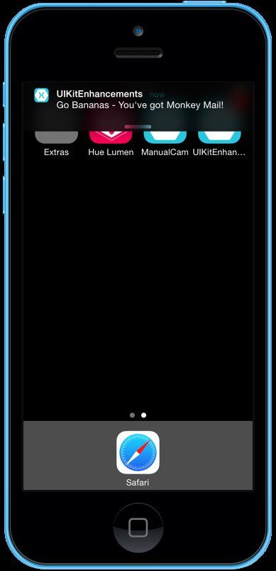
When the application is run and a Notification occurs with the iOS Device unlocked the notification will be
displayed:If the user swipes down on the Notification the Actions defined in the Category will be made available:
If the iOS Device is locked, the Notification will appear on the Lock Screen:

If the user swipes right to left on the Notification, the Actions defined in the Category will be displayed:
If the user selects an Action from the Notification, the HandleAction Method of the AppDelegate will be called
with the Local Notification and the Action Identifier. From there it's up to the application to process the Action and
take the necessary steps to fulfill it.

See the UIKitEnhancements iOS 8 Project attached to this article for an example of using Notification Actions in
Xamarin.iOS.

Popover Presentation Controller
A UIPopoverPresentationController object manages the display of content in a popover. From the time a
popover is presented until the time it is dismissed, UIKit uses an instance of this class to manage the
presentation behavior. The developer uses instances of this class as-is to configure aspects of the popover
appearance and behavior for view controllers whose presentation style is set to
UIModalPresentationStyle.Popover.

In nearly all cases, use this class as-is and do not create instances of it directly. UIKit creates an instance of
this class automatically when presenting a view controller using the UIModalPresentationPopover style.
The developer can retrieve that instance from the presented view controller's
PopoverPresentationController property and use it to configure the popover behavior.

The following code will create a new View Controller and configure it to be used as a popover:

// Wireup Show button
ShowButton.TouchUpInside += (sender, e) => {
     // Create a UIImage view to show in the popover
     UIImageView       monkeyIcon = new UIImageView(new RectangleF(0,0,256,256));
     monkeyIcon.Image = UIImage.FromFile("MonkeyIcon.png");
     monkeyIcon.UserInteractionEnabled = true;

     // Create a view controller to act as the popover
     UIViewController popover = new UIViewController();
     popover.View = monkeyIcon;
     popover.ModalPresentationStyle = UIModalPresentationStyle.Popover;

     // Add a close button
     UIButton closeButton = new UIButton( UIButtonType.RoundedRect);
     closeButton.Frame =new RectangleF(20,0,256,32);
     closeButton.SetTitle("Close", UIControlState.Normal);
     closeButton.SetTitleColor(UIColor.White, UIControlState.Normal);
     monkeyIcon.AddSubview(closeButton);

     // Wireup the close button
     closeButton.TouchUpInside += (s, evnt) => {
           popover.DismissViewController(true,null);
     };

     // Present the popover
     PresentViewController(popover,true,null);
// Configure the popover for the iPad, the popover displays as a modal view on
the
// iPhone
UIPopoverPresentationController presentationPopover =
popover.PopoverPresentationController;
if (presentationPopover!=null) {
presentationPopover.SourceView = this.View;
presentationPopover.PermittedArrowDirections = UIPopoverArrowDirection.Up;
presentationPopover.SourceRect = ShowButton.Frame;
}
};
It creates a new UIImageView, configures it, creates a UViewController to act as a Popover and attaches
the Image View to it. It sets the Presentation Style of the View Controller to
UIModalPresentationStyle.Popover and presents it.
If the code is running on an iPad, the PopoverPresentationController property of the View Controller can
be used to configure the Popup. If run on an iPhone, the PopoverPresentationController property will be
null.
If running on an iPhone, the popover will be displayed as a normal Modal view, filling the screen. On an iPad, it
will display as a Popover using the settings configured above:See the UIKitEnhancements iOS 8 Project attached to this article for an example of using the Popover
Presentation Controller in Xamarin.iOS.
Search Controller
The UISearchController class replaces the UISearchDisplayController class for managing the display
of search-related interfaces. The UISearchController class defines an interface that manages the
presentation of a Search Bar in concert with the search results controller's content. The search results controller,
a UIViewController object specified by the SearchResultsController property, manages the results of
the search.
The developer creates a new Search Controller using the UISearchController
(searchResultsController) constructor, passing in the view controller that manages the contents to be
displayed.
The SearchResultsUpdater property contains the object that is responsible for updating the results. The
following helper class can be used as a Search Results Updater:
using System;
using MonoTouch.Foundation;
using MonoTouch.UIKit;
using System.CodeDom.Compiler;
using System.Collections.Generic;
using System.Drawing;
namespace UIKitEnhancements
{
public class SearchResultsUpdator : UISearchResultsUpdating
{
#region Constructors
public SearchResultsUpdator ()
{
}
#endregion
#region Override Methods
public override void UpdateSearchResultsForSearchController
(UISearchController searchController){
// Inform caller of the update event
RaiseUpdateSearchResults (searchController.SearchBar.Text);
}
#endregion
#region Events
///
/// Update search results delegate.
///
public delegate void UpdateSearchResultsDelegate(string searchText);
public event UpdateSearchResultsDelegate UpdateSearchResults;
///
/// Raises the update search results event.
///
/// Search text.
private void RaiseUpdateSearchResults(string searchText) {
// Inform caller
if (this.UpdateSearchResults != null)
this.UpdateSearchResults (searchText);
}
#endregion
}
}
It defines a UpdateSearchResults event that can be monitored when the Search Results SearchBar
requests the Search Results Content be updated. The searchText property will contain the text that the user is
searching for.
Given that the Parent Table View Controller's Data Source exposes its data using the following Computed
Properties:
private List _items = new List();
...
public MenuItem this[int index]
{
get
{return _items[index];
}
set
{
_items[index] = value;
}
}
public int Count {
get { return _items.Count; }
}
A UITableViewSource is created with a public Search method that takes the parent Data Source and searches
for the text the user entered to create a Search Results List:
private List _items = new List();
...
public void Search(string searchText) {
// Clear existing items
_items.Clear ();
// Look for the search text in the parent list
for (int i = 0; i < _controller.DataSource.Count; ++i) {
// Grab the current item
var item = _controller.DataSource [i];
// Does the item contain the search text?
if (item.Title.Contains (searchText)) {
// Yes, add it to the collection
_items.Add (item);
}
}
}
With the above code in place, the Parent Table View Controller can be modified to create a Search Controller
and display it when the Table loads:
public UISearchController SearchController { get; set;}...
public override void ViewDidLoad ()
{
base.ViewDidLoad ();
// Register the tableview's datasource
TableView.Source = new MainMenuTableSource (this);
// Create a search results table
var searchResultsController = new UITableViewController
(UITableViewStyle.Plain);
var searchSource = new SearchResultsTableSource (this);
searchResultsController.TableView.Source = searchSource;
// Create search updater and wire it up
var searchUpdater = new SearchResultsUpdator ();
searchUpdater.UpdateSearchResults += (searchText) => {
// Preform search and reload search table
searchSource.Search(searchText);
searchResultsController.TableView.ReloadData();
};
// Create a new search controller
SearchController = new UISearchController (searchResultsController);
SearchController.SearchResultsUpdater = searchUpdater;
// Display the search controller
SearchController.SearchBar.Frame = new RectangleF
(SearchController.SearchBar.Frame.X, SearchController.SearchBar.Frame.Y,
SearchController.SearchBar.Frame.Width, 44f);
TableView.TableHeaderView = SearchController.SearchBar;
DefinesPresentationContext = true;
}
When the application is run and the User enters text in the Search Bar, the Search Controller displays the results:See the UIKitEnhancements iOS 8 Project attached to this article for an example of using the Search Controller in Xamarin.iOS. Split View Controller The UISplitViewController class is a Container View Controller that presents a master-detail interface. In a master-detail interface, changes in the primary view controller (the master) drive changes in a secondary View Controller (the detail). The two View Controllers can be arranged so that they are side-by-side, so that only one at a time is visible, or so that one only partially hides the other. In iOS 8 and later, the UISplitViewController class can be used on all iOS devices; in previous versions of iOS, the class is available only on iPad. When building an application's user interface, the Split View Controller is typically the root View Controller of the app's window. The Split View Controller has no significant appearance of its own. Most of its appearance is
You can also read


