Less (context) is more? Evaluation of a positioning test feedback dashboard for aspiring students - STELA project
←
→
Page content transcription
If your browser does not render page correctly, please read the page content below
Companion Proceedings 9th International Conference on Learning Analytics & Knowledge (LAK19)

    Less (context) is more? Evaluation of a positioning test feedback
                     dashboard for aspiring students.

                                   Author(s): Please Leave This Section Blank for Review
                                                        Institution
                                                           Email

                                   Author(s): Please Leave This Section Blank for Review
                                                        Institution
                                                           Email

                                   Author(s): Please Leave This Section Blank for Review
                                                        Institution
                                                           Email

             ABSTRACT: Aspiring engineering students profit from feedback regarding how their
             mathematical skills compare to the requirements and expectations of an engineering bachelor
             program. The positioning test is a non-binding test used in Flanders, Belgium assessing the
             mathematical skills of aspiring students. This paper elaborates on the research on and
             development of a learning analytics dashboard (LAD) that provides feedback on a participants’
             obtained results. Its objective is to provide actionable insights and to raise awareness and
             reflection about the participants’ strengths and weaknesses, and subsequently their choice of
             study. To reach the final dashboard, the design passed six iterations, 662 students were
             surveyed and 60 persons were thoroughly interviewed, including study advisors, students, and
             visualization experts. The final dashboard was evaluated using the EFLA, SUS, and a custom-
             made questionnaire, and a framework of factual, interpretative, and reflective insights. The
             results shows that the developed dashboard is a considerable improvement over a
             comparable state-of-the-art dashboard. Furthermore, results show that a more visual
             representation, confined to only the most essential information, provides a better overview,
             leads to more and deeper insights while displaying less information and context, and has
             better usability and attractiveness scores than a more textual version.

             Keywords: learning analytics, information visualization, student dashboard, positioning test,
             learning technologies

1            INTRODUCTION

The first bachelor year is often cited as the most essential to future academic success [1, 2, 11, 28]. A
wide range of research focuses on identifying predictors of academic success in the first bachelor year,
before students enroll in university programs, as this would shed light on the skills and knowledge
students need to be successful. Apart from the obtained grade-point average in secondary education
[3, 29], literature often describes mathematical ability as the most significant predictor of persistence
and attainment in STEM fields [18, 20, 22, 23]. Starting mathematical competences is identified as one
of the primary factors determining whether a student will continue studying in a STEM field, and
certainly for engineering [21, 27]. Once the relevant skills are identified, learning analytics dashboards
Creative Commons License, Attribution - NonCommercial-NoDerivs 3.0 Unported (CC BY-NC-ND 3.0)
                                                                                                                         1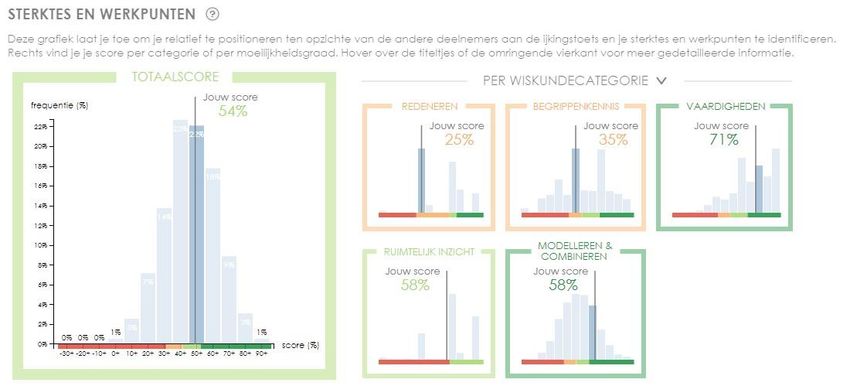
Companion Proceedings 9th International Conference on Learning Analytics & Knowledge (LAK19)

(LAD) can be developed to provide aspiring students with feedback, hereby supporting them in the
transition from secondary to higher education (HE). LADs are an effective and commonly used tool in
learning analytics (LA) to visualize information [5, 7, 14, 15, 26]. Just like the general objective of
information visualization, they allow representing and reporting large and complex quantities of data
in a simple matter [15, 19]. Few [16] defines a dashboard as ‘a visual display of the most important
information needed to achieve one or more objectives; consolidated and arranged on a single screen
so the information can be monitored at a glance’. Unlike most other countries, students in Flanders
do not have to complete any formal application procedure or test in order to enroll in a university
program. Furthermore, the tuition fee of EUR 922 per year is relatively low compared to other nations.
Consequently, students are free in their choice of program, resulting in a large degree of heterogeneity
in the first bachelor year regarding knowledge, skills, and educational background. This results in a
drop-out of 40% in STEM fields. Since 2011, the Flemish universities offering engineering bachelor
programs have joined efforts for organizing the ‘positioning test’, a non-obligatory and non-binding
diagnostic test for the candidate students’ ability to solve math problems [31]. The focus on
mathematics is not surprising considering the importance of mathematical ability as a predictor for
student success in STEM [18, 20, 22, 23]. The positioning test typically contains 30 multiple choice
questions and is organized in the summer between the end of secondary education and the start of
higher education.

This paper presents the research that aimed at developing a LAD that provides aspiring engineering
students with feedback on their mathematical problem solving skills, based on their results on the
positioning test. The developed LAD aims at visually triggering insights in the obtained results. More
specifically, the LAD should provide actionable insights, making students more aware of their
strengths and weaknesses, and allowing students to reflect on their study choice. The objective of the
LAD is similar to that of the positioning test itself, in that it tries to encourage and motivate students
that do well on the positioning test (score > 14/20) to consider engineering as a viable and interesting
study option, participants who obtain a low score (score < 8/20) to reflect on their study choice, and
support the middle group to take remedial actions (e.g. a summer course) to improve their
mathematical abilities in order to successfully attain an engineering degree. To achieve these
objectives, the research ran through all phases of a user-centered design process, including a
preliminary data-analysis, a large survey of 622 endusers, pilot testing, and 55 in-depth interviews.
Different evaluation metrics were used to assess the developed dashboard: EFLA [24, 25], SUS [4], and
a custom-made questionnaire, and the framework of factual, interpretative, and reflective insights
[10]. Finally, this paper compares the developed dashboard with an existing feedback dashboard [6]
for the positioning test.

2            RELATED WORK

The literature describes several guidelines for developing effective LADs. For example, Few [16]
describes thirteen commonly made mistakes when developing dashboards. Together with the general
graphical integrity and design aesthetic principles defined by Tufte and Graves-Morris [30], they serve
as the basis for the development of the dashboard. The most commonly used visualization types in
LADs are bar charts, line graphs, tables, pie chart, scatterplot, simple text, world clouds and traffic
lights. De Laet [12] however warns not to use traffic lights, and also mentions how wording is essential
in LA applications. Predictive LA applications have uncertainty and it is important this uncertainty is
Creative Commons License, Attribution - NonCommercial-NoDerivs 3.0 Unported (CC BY-NC-ND 3.0)
                                                                                                                         2
Companion Proceedings 9th International Conference on Learning Analytics & Knowledge (LAK19)

also displayed [12]. LADs should avoid to speak too much in terms of “chances of failure” and “success”
[12]. Two additional relevant guidelines are defined by Charleer et al. [8]. They recommend that LADs
should be sufficiently aggregated or abstract as an uncluttered representation incites more detailed
explorations of the LA data. Secondly, they recommend that LADs should provide functions that
increase the level of detail in the data [8].

The LAD of this paper focuses on the transition from one education system to the other (secondary to
HE), while most examples in the literature are more concerned with monitoring study progress during
an educational programme, either for a student or a tutor. Several LAD were used as an inspiration
for the LAD of this paper, such as the OLI dashboard [13], the Course Signals dashboard [1], the Student
Activity Meter (SAM) [17], and the LISSA-dashboard [9]. The most related dashboard is that state-
ofthe-art dashboard by Broos et al. [6] , which also aims at providing feedback after the positioning
test. This LAD, referred further on to as the “reference dashboard” provides, beside feedback on the
mathematical problem solving skills of students, feedback on learning and studying skills, and the prior
education of students [6]. The reference dashboard by Broos et al. contains elaborate textual
explanations and feedback to contextualize the participants’ obtained result.

LADs can incorporate insights of other research while visualizing data. Vanderoost et al. [31] analyzed
the predictive power of the positioning test for engineering studies in [BLINDED]. More specifically,
the research examines whether it is possible to “predict” first-year academic achievement using the
results of the positioning test. More specifically, the goal is to identify three distinct groups of
students: group A are students who perform well in their first bachelor year, achieving a study
efficiency of over 80% after the first exam period in January; group C are with a study efficiency below
30%5; group B are students with a SE between 30 and 80 %. Earlier research [31] showed that
participants obtaining a high score on the positioning test (>13/20) more often obtain good study
results (study efficiency (SE) >80%) in the first semester (51%), while students with a low score on the
positioning test (
Companion Proceedings 9th International Conference on Learning Analytics & Knowledge (LAK19)

through a feedback email, typically three days after completing the test. Apart from these aspiring
engineering students, other stakeholders are also involved. The Tutorial Services of the Faculty of
[BLINDED] heavily participates in the development of the LAD.

They are represented by the head of the unit and two study advisors (SAs), who from their pedagogical
experience and educational expertise give feedback on content and design. SAs are concerned with
guiding and helping students with any questions they might have. They can also be considered end-
users of the dashboard, as they use the LAD to start the conversations with participants that need
more feedback and advice during a private meeting. LA researchers and visualization specialists,
represented by three experts of the [BLINDED] research group, evaluate the quality of the design.

4            DESIGN

Design process. A user-centered design process was followed to develop the dashboard. The design
passed six iterations before reaching its final state. Throughout the iterations, the design principles by
Tufte and Graves-Morris [30], the commonly defined dashboard mistakes by Few [16] and a set of
self-defined design requirements served as guidelines for the development of the dashboard. The self-
defined design requirements are formal specifications of the general objective described in Section 1
identified based on interviews with the involved stakeholders. They consist of eight functional
requirements and six non-functional requirements. An example of a functional requirement is: ‘the
ability to compare your own result with the results of other participants’. An example of a non-
functional requirement is: ‘a good balance between textual and visual elements’.

In total the dashboard was developed and improved in six iterations. Each iteration is characterized
by a different objective, format, and evaluation method. The first iterations focused more on
functional requirements, finding out expectations, and determining the right content. Later iterations
focused more on non-functional requirements and correctly choosing and improving the
visualizations. The final design was programmed using D3.js. Different methodologies were used for
creation and evaluation of the dashboard, such as co-designing, rapid prototyping, guidelines and
general principles, the EFLA and SUS questionnaire, formal presentations with feedback, and semi-
structured as well as informal interviews, based on distinct protocols, for instance scenario-based with
concurrent

The content of the dashboard has changed throughout the six iterations. We conducted semi-
structured interviews with the two study advisors of the bachelor of Engineering Science at [BLINDED],
informal interviews with the head of Tutorial Services of the Engineering Science Faculty at
[BLINDED]and a questionnaire among 662 students . In the questionnaire, students scored 14 different
content part suggestions on a 7-point Likert scale for relevance and usefulness to include in a feedback
system after participation in the positioning test. Results show that students like to see their total
score, a comparison to other participants, and the typical performance (in terms of SE) of first-year
bachelor students that obtained a similar score on the positioning test the previous year. They also
liked to see the aggregated score per mathematical category and the score and original assignment
per question. Students were divided when it comes to displaying the typical performance (in terms of
grades on the course) on each individual course of first-year bachelor students who obtained a similar
score on the positioning test previous year. They also disagreed regarding the presence of a specific,
personalized, pre-defined study choice advice, due to insufficient face validity. Confirmed by the
Creative Commons License, Attribution - NonCommercial-NoDerivs 3.0 Unported (CC BY-NC-ND 3.0)
                                                                                                                         4
Companion Proceedings 9th International Conference on Learning Analytics & Knowledge (LAK19)
results of a data-analysis, which showed a lack of predictive power for these features, we decided to
remove them from the dashboard. The conclusions of the interviews with the study advisors (SAs) are
similar to those of the survey. Examples of features that were added throughout the iterative process
are the aggregated score per degree of difficulty and a picture of the original question of the
positioning test, as both study advisors and students reacted positively to these suggestions.
Final design. The final design of the dashboard exists in two variants, differing in one part. Fig. 1
displays the first variant and consists of five major parts. Each part has a tooltip presenting more
detailed information, following the general guidelines proposed by Charleer et al. [8], described in
Section 2. Fig. 3 shows the tooltips for part A and B of Fig. 1. Furthermore, a help icon on the top right
corner of each graph contains more context and explanation, e.g. explaining the color of a graph. The
five major parts of the LAD (Fig. 1) and its tooltips allow students to:
(A) review their obtained total score and compare themselves to the other participants by
showing the general score distribution of all participants ;
(B) review each question, its difficulty, its mathematical category, its original assignment, the
answer they submitted and the correct answer;
(C) review their aggregated obtained score per mathematical category or degree of difficulty,
allowing them to find their strengths and weaknesses and see whether they score well/bad
on certain categories or easier/harder questions, permitting them to discover whether they
lack basic knowledge or only more advanced skills;
(D) compare themselves to other participants for each mathematical category and degree of
difficulty, by plotting the score distribution per topic ;
(E) view the typical first-year academic achievement, in terms of SE, of students in earlier cohorts
based on their total positioning test score, via a Sankey diagram.
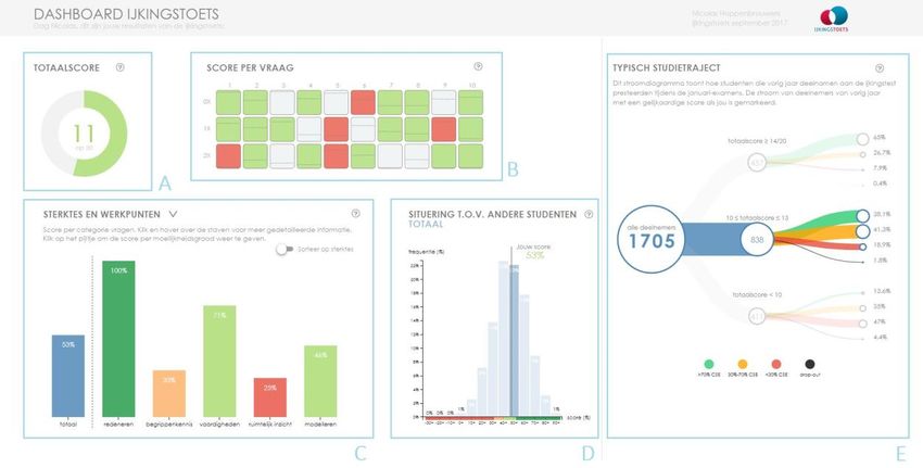
The second variant, in part displayed in Fig. 2, differs only on the strengths & weaknesses section (part
C and D in Fig. 1). It combines the information of these two parts in on large histogram, displaying the
distribution of the total positioning test score of all participants, and five small histograms, displaying
the score distribution per category or degree of difficulty. The objective of the two separate variants
is to see which visualisation leads to more insights and whether the click functionality of the first
variant is intuitive.
Creative Commons License, Attribution - NonCommercial-NoDerivs 3.0 Unported (CC BY-NC-ND 3.0)
5Companion Proceedings 9th International Conference on Learning Analytics & Knowledge (LAK19)
Figure 1: Feedback dashboard for future students after positioning test: first variant of final design. Corresponding to the
displayed letters: (A) Donut chart showing the obtained total score on the position test. (B) Matrix showing the score and
difficulty per question. (C) Bar chart illustrating the participant’s strengths and weaknesses, by showing the score per
mathematical category and per degree of difficulty. (D) Histogram showing performance of peers for each mathematical
category and degree of difficulty. (E) Sankey diagram showing performance of previous students in the first bachelor year with
a comparable total score on the positioning test.
Figure 2: An alternative visualization for the score per category in the final dashboard, substituting part C and D of the
dashboard.
Creative Commons License, Attribution - NonCommercial-NoDerivs 3.0 Unported (CC BY-NC-ND 3.0)
6Companion Proceedings 9th International Conference on Learning Analytics & Knowledge (LAK19)
Figure 3: Two examples of tooltips in the final dashboard.
5 EVALUATION
Both variants, described in Section 4, are evaluated and compared to the reference dashboard [6],
described in Section 2.
Evaluation of the two final variants of the dashboard and reference dashboard [6] is based on 48 in-
depth interviews (16 per dashboard), each lasting between 40 minutes and 1 hour. Each interview
consists of four stages. The first phase of the interview is scenario-based, using the concurrent think-
aloud protocol. End-users have to imagine having participated in the positioning test and now getting
their result. Three scenarios are possible. Either they get a score in which they belong to group A (total
score of 15/20), either group B (12/20) or group C (6/20). Anonimized data is used from the dataset
described in Section 4. Each test user says out loud the insights they obtain upon visualization of the
dashboard. The framework by Claes et al. [10] is used to measure these insights. The framework
defines three levels of insights: 1) factual insights: simple, objective statements or questions that are
triggered by the dashboard, e.g. “I obtained a total score of 14/20.”; 2) interpretative insights:
interpretation of the displayed data, relying on the participant’s knowledge and experiences, e.g. “I
mainly score well on the easier questions.”; 3) reflective insights: subjective, emotional and personal
connotations triggered by the dashboard, leading to further awareness and reflection, e.g. “I feel like
I did not do well enough at this test, making me doubt about whether I should go for another study
programme.”. Each insight is categorized into one of these levels. The test user can also mention when
something in the dashboard is unclear, but the monitor of the test does not intervene and only writes
down all statements made by the test person.
In the second phase, the interview switches to a task-based interview with active intervention. The
monitor gives the test persons tasks based on the information or insights they missed during the first
phase and finds out why these parts and insights have been missed. This phase tries to examine
whether the dashboard is intuitive and has any shortcomings.
Creative Commons License, Attribution - NonCommercial-NoDerivs 3.0 Unported (CC BY-NC-ND 3.0)
7Companion Proceedings 9th International Conference on Learning Analytics & Knowledge (LAK19)
In the third phase, the test person fills in the SUS, the EFLA and a custom-made questionnaire, which
verifies whether design requirements have been met. The EFLA questionnaire has been translated to
Dutch and adapted to reflect the topic of the dashboard, identical to the evaluation of the dashboard
of Broos et al. [6]. The design requirements questionnaire test consisted of 21 statements, to which
the user could “Strongly disagree” or “Strongly agree”, using a 5-point Likert scale.
Finally, in the fourth phase the test persons gets to see the two other dashboards and can express
their preference. This last phase was optional.
6 RESULTS
Based on the recorded insights during the interviews 13 types of factual, 11 of reflective, and 8 types
of interpretative insights were identified. All types of insights occurred more often with the
participants for the LAD developed in this research compared to the reference dashboard (Table 1).
Table 1: Subset of the 13 types of factual (F), 11 types of reflective (R), and 8 types of interpretative (I) insights identified
during the interviews and the number of interviewees in which these insights were found for the reference dashboard (B) of
[6] and the two variants described in this paper.
Description insight B V1 V2
(F1) My total score on the positioning test was ... 100 100 100
(F2) My total score placed me in group A/B/C ... 100 94 94
(F3) I answered X questions correct/wrong/blank 75 100 100
(F4) I replied he question correct/wrong/blank 81 100 100
(F5) On average this question was replied well/badly 56 88 94
(I1) My total score compared wrt other participants 100 100 100
(I2) This question was difficult/easy 56 88 81
(I5) I score especially well in easy/difficult questions 56 56 63
(R1) Reflection on total score 100 100 100
(R2) Reflection on comparison wrt peers 69 100 94
(R3) I guessed/left blank too many questions 44 56 63
(R4) Reflection on particular question 56 88 81
(R10) Reflection on future academic achievement 69 88 94
(R11) Reflection on study choice 75 100 94
Fig. 4 shows the total SUS and EFLA score and the score per EFLA-dimension. The first variant has an
overall average SUS-score of 81, the second variant 76, both statistically significant (p0.2). The total EFLA-score of the first variant is 74 and of the second variant is 70. Only
the EFLA score of the first variant is statistically significantly higher than the one of the reference
dashboard score of 59.
4
Creative Commons License, Attribution - NonCommercial-NoDerivs 3.0 Unported (CC BY-NC-ND 3.0)
8Companion Proceedings 9th International Conference on Learning Analytics & Knowledge (LAK19)
Figure 4: The total SUS and EFLA score and the score per EFLA-dimension: the data dimension (questions D1+D2), the
awareness and reflection dimension (A1-A4) and the impact dimension (I1+I2). Gray boxplots (‘B’) denote the reference
dashboard [6], blue box-plots (‘1’) denote the first variant of the final design of this paper and green (‘2’) the second variant.
The results of the design requirements questionnaire showed that each of the three dashboards
successfully helps participants in understanding whether their current mathematical skills are
matched with the expected mathematical skills and incites users of the LAD to awareness and
reflection. Both variants, however, scored significantly better than the reference dashboard on the
ability to use the dashboard independently, give a better overview of strengths and weaknesses, give
a better detailed overview of the obtained result and allow participants to compare themselves more
to the other participants. The users also indicated that these dashboards are better at displaying only
factual, objective information, without giving interpretations or conclusions, but indicated that the
dashboards can also be more confronting. Furthermore, they found that the two variants were more
personalized, immediately gave an indication of the most important information, were better at
showing only information that is relevant, were better at providing context, were more aesthetically
pleasing, add less ambiguity and have a better balance between textual and visual elements,
compared to the reference dashboard. For most design requirements, the differences between the
two variants are not statistically significant.
7 DISCUSSION AND CONCLUSION
7.1 Implications for LAD design
This dashboard provides feedback to participants of the positioning test for the engineering
programme, inciting awareness and reflection about their strengths and weaknesses, and
consequently their choice of study. The results of this LAD are interesting, as it focuses on the
transition from secondary school to higher education, while most LADs in the literature focus on
monitoring students when they are already at university or college. Furthermore, a comparison has
been made with the reference dashboard [6] that is currently used for feedback to the participants of
the positioning test. The LADs developed in this research are more visual compared to the reference
dashboard. Following thorough evaluation of the six iterations of the dashboard, the most important
advantages of the more visual dashboards in this paper are that they have better usability scores,
Creative Commons License, Attribution - NonCommercial-NoDerivs 3.0 Unported (CC BY-NC-ND 3.0)
9Companion Proceedings 9th International Conference on Learning Analytics & Knowledge (LAK19)
provide a better overview of the obtained results and a participant’s strengths and weaknesses and
visualise only relevant and objective information. A surprising result is that, while the visual
dashboards contain less context and explanation, they still lead to more interpretative and reflective
insights. Users declare that they think the layering of detail is better in the more visual dashboards.
The main screen provides a good overview and immediately gives an indication of the essence, while
the tooltips allow for more detailed information, consistent with the guidelines of Charleer et al. [8].
According to the tests, the reference dashboard of Broos et al.[6] has too much unnecessary
information and text, which leads to users getting lost and not knowing what they should learn as
take-away message. Some test persons also admit skipping parts of this dashboard because they “do
not want to read so much text”, causing them to miss out on important information.
The first most important general conclusion is that confining LADs to the most essential information,
not displaying an overload of context and explanations, but using intuitive and simple visualisations,
displaying less information, may lead to more awareness and reflections. An important part of LA
applications is to make sure the end-users cannot get the incorrect interpretation, often leading to a
lot of textual clarification. This research tries to convey to the designer that more text not necessarily
means better insights, but well-designed and intuitive visualisations do.
Secondly, many test users mention how the dashboards of this paper are aesthetically pleasing and
“fun to play with”. Animations direct the user’s attention to the most important information but are
also specifically included to make the dashboard more aesthetically pleasing and show that the data
is dynamic and interactive. While this result seems only of minor importance, it be should not be
underestimated. Several users mention how the aesthetics make them want to play more with the
dashboard and spend more time with the dashboard. This eventually leads to more insights, which is
essentially the final goal of this LAD. A lot of LADs do not spend enough time on the aesthetics of the
dashboard, underestimating the effect this has on the effectiveness of the dashboard.
Finally, another objective was to see which of the two variants is more effective. The differences in
the results are however not statistically different. Most users prefer the first variant, as it seems less
cluttered at first sight, but end-users often miss some of the functionality in this variant. Further
iterations should combine the best elements of both visualizations.
7.2 Future work and limitations of the study
The more visual dashboards however also have several disadvantages and pose new challenges. As all
information is displayed on a single screen, some users observe the dashboard in an unstructured
way, sometimes leading to less interpretative or reflective insights and confusion. Most participants
observed the dashboard in a structured manner, but further research could examine whether a
different arrangement of the various graphs could resolve this issue, keeping the visual character of
the dashboard. Suggestions are a more sequential ordering of the graphs, similar to a grade report in
high school, or to use a guided tour to force the correct logical flow. Secondly, extra care is needed
for the placement and highlighting of text. Because the visual dashboard looks more intuitive, users
are less inclined to read any text at all, acknowledged by several test persons. While the graphs are
mostly clear by themselves and lead to more interpretative and reflective insights, this a real concern
for the development of a dashboard. Further research should examine how to highlight text to force
the user’s attention to the surrounding text, even if they already understand the graph.
Creative Commons License, Attribution - NonCommercial-NoDerivs 3.0 Unported (CC BY-NC-ND 3.0)
10Companion Proceedings 9th International Conference on Learning Analytics & Knowledge (LAK19)
This study presents both qualitative and quantitative results of thorough four-stage evaluations with
test users. It must be noted that the evaluation of the LADs happened with more experienced students
asked to imagine being in the randomly assigned scenario of a student in transition from secondary to
higher education. Test users completed the SUS, EFLA and custom questionnaires after an in-depth
and a task-based interview (see Section 6). This may contribute to the explanation of inter-study
differences between results reported previously [6] for the reference LAD (overall EFLA score of 72)
and those reported in this paper (overall EFLA score of 59). In the former study, the actual target group
of the reference LAD was surveyed using an on-screen questionnaire available within the dashboard
itself. Further work is necessary to assess if, once accounted for methodological influence, outcome
differences indicate that experienced students have different needs and preferences for LADs than
newcomers.
REFERENCES
[1] Arnold, K. E., & Pistilli, M. D. (2012, April). Course signals at Purdue: Using learning analytics to
increase student success. In Proceedings of the 2nd international conference on learning analytics
and knowledge (pp. 267-270). ACM.
[2] Besterfield‐Sacre, M., Atman, C. J., & Shuman, L. J. (1997). Characteristics of freshman engineering
students: Models for determining student attrition in engineering. Journal of Engineering Education,
86(2), 139-149.
[3] Bridgeman, B., McCamley‐Jenkins, L., & Ervin, N. (2000). Predictions of freshman grade‐point average
from the revised and recentered SAT® I: Reasoning Test. ETS Research Report Series, 2000(1), i-16.
[4] Brooke, J. (1996). SUS-A quick and dirty usability scale. Usability evaluation in industry, 189(194), 4-7.
[5] Broos, T., Peeters, L., Verbert, K., Van Soom, C., Langie, G., & De Laet, T. (2017, July). Dashboard for
actionable feedback on learning skills: Scalability and usefulness. In International Conference on
Learning and Collaboration Technologies (pp. 229-241). Springer, Cham.
[6] Broos, T., Verbert, K., Langie, G., Van Soom, C., & De Laet, T. (2018, March). Multi-institutional
positioning test feedback dashboard for aspiring students: lessons learnt from a case study in
flanders. In Proceedings of the 8th International Conference on Learning Analytics and Knowledge
(pp. 51-55). ACM.
[7] Broos, T., Verbert, K., Langie, G., Van Soom, C., & De Laet, T. (2017). Small data as a conversation
starter for learning analytics: Exam results dashboard for first-year students in higher education.
Journal of Research in Innovative Teaching & Learning, 10(2), 94-106.
[8] Charleer, S., Klerkx, J., Duval, E., De Laet, T., & Verbert, K. (2016, September). Creating effective
learning analytics dashboards: Lessons learnt. In European Conference on Technology Enhanced
Learning (pp. 42-56). Springer, Cham.
[9] Charleer, S., Moere, A. V., Klerkx, J., Verbert, K., & De Laet, T. (2018). Learning analytics dashboards
to support adviser-student dialogue. IEEE Transactions on Learning Technologies, 11(3), 389-399.
[10] Claes, S., Wouters, N., Slegers, K., & Vande Moere, A. (2015, April). Controlling in-the-wild evaluation
studies of public displays. In Proceedings of the 33rd Annual ACM Conference on Human Factors in
Computing Systems (pp. 81-84). ACM.
[11] Crisp, G., Nora, A., & Taggart, A. (2009). Student characteristics, pre-college, college, and
environmental factors as predictors of majoring in and earning a STEM degree: An analysis of
students attending a Hispanic serving institution.
[12] De Laet., T (2018). The (non)sense of “chances of success” and predictive models.
http://blog.associatie.kuleuven.be/tinnedelaet/ the-nonsense-of-chances-of-success-and-predictive-
models/. Accessed 4 April 2018.
[13] Dollár, A., & Steif, P. S. (2012). Web-based statics course with learning dashboard for instructors.
Proceedings of computers and advanced technology in education (CATE 2012), Napoli, Italy.
[14] Duval, E. (2011, February). Attention please!: learning analytics for visualization and
recommendation. In Proceedings of the 1st international conference on learning analytics and
knowledge (pp. 9-17). ACM.
[15] Elias, T. (2011). Learning analytics. Learning, 1-22.
Creative Commons License, Attribution - NonCommercial-NoDerivs 3.0 Unported (CC BY-NC-ND 3.0)
11Companion Proceedings 9th International Conference on Learning Analytics & Knowledge (LAK19)
[16] Few, S. (2006). Information dashboard design.
[17] Govaerts, S., Verbert, K., Duval, E., & Pardo, A. (2012, May). The student activity meter for awareness
and self-reflection. In CHI'12 Extended Abstracts on Human Factors in Computing Systems (pp. 869-
884). ACM.
[18] Green, A., & Sanderson, D. (2018). The roots of STEM achievement: An analysis of persistence and
attainment in STEM majors. The American Economist, 63(1), 79-93.
[19] Khalil, M., & Ebner, M. (2016). What is learning analytics about? A survey of different methods used
in 2013-2015. arXiv preprint arXiv:1606.02878.
[20] Kokkelenberg, E. C., & Sinha, E. (2010). Who succeeds in STEM studies? An analysis of Binghamton
University undergraduate students. Economics of Education Review, 29(6), 935-946.
[21] Leuwerke, W. C., Robbins, S., Sawyer, R., & Hovland, M. (2004). Predicting engineering major status
from mathematics achievement and interest congruence. Journal of Career Assessment, 12(2), 135-
149.
[22] Moses, L., Hall, C., Wuensch, K., De Urquidi, K., Kauffmann, P., Swart, W., ... & Dixon, G. (2011). Are
math readiness and personality predictive of first-year retention in engineering?. The Journal of
psychology, 145(3), 229-245.
[23] Pinxten, M., Van Soom, C., Peeters, C., De Laet, T., & Langie, G. (2017). At-risk at the gate: prediction
of study success of first-year science and engineering students in an open-admission university in
Flanders—any incremental validity of study strategies?. European Journal of Psychology of Education,
1-22.
[24] Scheffel, M (2018). Evaluation Framework for LA (EFLA). http://www.laceproject.eu/evaluation-
framework-for-la , Accessed 1 March 2018.
[25] Scheffel, M., Drachsler, H., & Specht, M. (2015, March). Developing an evaluation framework of
quality indicators for learning analytics. In Proceedings of the Fifth International Conference on
Learning Analytics And Knowledge (pp. 16-20). ACM.
[26] Schwendimann, B. A., Rodriguez-Triana, M. J., Vozniuk, A., Prieto, L. P., Boroujeni, M. S., Holzer, A., ...
& Dillenbourg, P. (2017). Perceiving learning at a glance: A systematic literature review of learning
dashboard research. IEEE Transactions on Learning Technologies, 10(1), 30-41.
[27] Tinto, V. (2005). College student retention: Formula for student success. Greenwood Publishing
Group.
[28] Solberg Nes, L., Evans, D. R., & Segerstrom, S. C. (2009). Optimism and College Retention: Mediation
by Motivation, Performance, and Adjustment 1. Journal of Applied Social Psychology, 39(8), 1887-
1912.
[39] Stumpf, H., & Stanley, J. C. (2002). Group data on high school grade point averages and scores on
academic aptitude tests as predictors of institutional graduation rates. Educational and Psychological
Measurement, 62(6), 1042-1052.
[30] Edward Tufte and P Graves-Morris. 1983. The visual display of quantitative information. Vol. 2.
Cheshire, CT Graphics press.
[31] Vanderoost, J., Van Soom, C., Langie, G., Van den Bossche, J., Callens, R., Vandewalle, J., & De Laet, T.
(2015, June). Engineering and science positioning tests in Flanders: powerful predictors for study
success?. In Proceedings of the 43rd Annual SEFI Conference (pp. 1-8).
Creative Commons License, Attribution - NonCommercial-NoDerivs 3.0 Unported (CC BY-NC-ND 3.0)
12You can also read