Precepts for the design of a New Australian National Flag - Alternative ...
←
→
Page content transcription
If your browser does not render page correctly, please read the page content below
Precepts for the design of a New Australian National Flag
  Advice for Oz flag designers and for Oz flag referendum committees, circa 2021, from oz.flagalternatives.com                           page 1 of 7

        For a probable majority of Australians, the two best things about the current national flag are its depiction of
        the Southern Cross and its visually attractive red-white-and-blue colour-scheme.
        For a probable majority of Australians, the two worst things about the current national flag are its Union Jack
        and its sometimes problematic resemblance to the flag of New Zealand.
        If any new flag design does not sufficiently reconcile these four pros and cons, preserving all that is loved
        whilst discarding only that which is loathed, then it will have little chance of ever being embraced.
        Moreover, if any new flag design cannot be effectively adapted into the thirty or more major derivative flags
        and ensigns of Australia, then it shouldn't be embraced. Practicality is every bit as important as aesthetics.

Eleven guidelines:     These guidelines are reasoned opinions, not 'rules'. If you feel that you should ignore any or all of them, you should do so.

         (1) The dimensional ratio should be 1:2 (the length of the flag should be twice its height)
All Australians have lived their entire lives under a national flag with this dimensional ratio. Virtually without
exception, all of the rest of the major flags of Australia have this dimensional ratio as well, including all of Australia's
civil and Defence Forces ensigns. Any new flag design with another dimensional ratio would not only intuitively look
wrong and intuitively wave wrong in the eyes of every Australian, but it would inevitably be difficult to adapt for all of
the other flags and ensigns of the nation. There is only one Australian flag that requires a different dimensional ratio
than 1:2, and that is Australia's United Nations ensign. The United Nations mandates that the outdoor flags of all of its
Member States have a dimensional ratio that is equal to 2:3, with a length that is 1.5 times the flag's height. However,
a flag of any other dimensional ratio can always be easily adapted to suit UN requirements (see the separate PDF
entitled 'Australia's UN ensign'). Emasculating the Australian national flag and all of its other thirty or so major
derivative flags into the dimensional ratios of United Nations flags would be tantamount to the tail wagging the dog.
Last but certainly not least, a 1:2-ratio flag can properly drape over a coffin as a pall, whereas a 2:3-ratio flag cannot.
There are no logical nor aesthetic reasons for the Australian national flag to have any other dimensional ratio than 1:2.

        (2) The fly of the national flag should not be red, white, or azure (light) blue
These fly colours are permanently reserved for Australian civil and Defence Forces ensigns, so they should generally
not be used for the fly of the national flag, and designs that do have a red, white, or light blue fly may deserve rejection.
Guideline (3) explains why simply reducing such designs into the cantons of the ensigns may often prove problematic.

         (3) The fly of the flag should be capable of becoming blue, red, white, or azure blue
In order to be easily adapted into all of the Australian civil and Defence Forces ensigns, the design of the flag should
allow for these colour changes to its fly area. Flag designs with flys that cannot become these colours without some
drawback would need to be reduced to the canton of the flag or ensign in question. This may not seem like a major
problem, but the area of a canton is only one-quarter that of a full flag, so reducing a national flag to canton-size will
usually make it considerably more difficult to recognise for any given distance. Designs that have such iconic patterns
that they remain highly recognisable at almost any size are rare. Moreover, the reduction of a flag to canton-size may
result in visually problematic colour clashes with the field colours of the flag or ensign in question. Also, the current
flys and lower cantons of Australia's civil and Defence Forces ensigns include the Southern Cross, the Commonwealth
Star, and other established patterns, and they are unlikely to default to solid field colours if the national flag has been
designed in such a way that it must be shrunk into their cantons. This means that for certain designs, the resultant
ensigns may clumsily show two depictions of either the Southern Cross or the Commonwealth Star, or even both.
These are the sorts of conundrums that would pervade most or all of the thirty or more derivative flags of Australia,
should the requirements of those flags not be taken fully into account in the design of any new Australian national flag.
Consider the problematic designs to the left below, none of which would be able to remain full-size for their ensigns.
Note especially that none can be properly adapted into red civil ships ensigns, and refer back to guideline (2).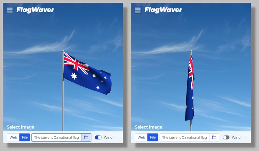
Precepts (advice for Australian flag designers and for Australian flag referendum committees, cont'd)             page 2 of 7

         (4) The Southern Cross should be included in its current size, shape, and orientation
In its current size, shape, and orientation, centred horizontally and vertically in the fly of the national flag, the five-star
Southern Cross is an iconic symbol of Australia. It has appeared on the flag for well over 100 years, so it may even be
Australia's most internationally-recognised symbol, surpassing both the kangaroo silhouette and the Commonwealth
Star. It is also an essential design element in seven other major Australian flags: the government ships ensign, the civil
ships ensign, the naval ships ensign, the civil aviation ensign, the Army ensign, the Air Force ensign, and the Border
Force ensign. In these ensigns as well as in the current national flag, the Southern Cross is a primary and arguably
indispensable symbol (see the separate PDF entitled 'The Southern Cross'). For a majority of Australians, moreover,
the Southern Cross is the most-loved element of the current flag. There may be some rationale for changing the
colours of the Cross or of its field or position, but there is no valid rationale for its omission or for any change to its
basic design. The observance of this guideline will automatically prevent all of the problems discussed in guidelines
(2) and (3). Allowing the Southern Cross to continue to appear on Australia's national flag and ensigns, as illustrated
in the examples below, will allow changes to ensign fly colours as needed, eliminating any requirement to shrink the
flag to canton-size. Note that even the narrower fly of the UN ensign can easily accommodate the Southern Cross.

        (5) The design should probably have plenty of blue, some (or plenty of) red, and some white
Arguably the world's most popular colour-scheme for national flags is red-white-and-blue, and no doubt a majority of
Australians find the red-white-and-blue colouring of their current national flag to be one of its best qualities, perhaps
second only to its Southern Cross. Additional colours are by no means forbidden, but no new flag design that is
without some red-white-and-blue will be likely to pass muster. The Australian government has specified official
Pantone® C (coated) values of red and blue for the current flag, based on what is called the Pantone Matching System
(PMS), a proprietary and mostly standardised colour reproduction system that is used in many industries, including
flag manufacture. It would therefore make sense to use the official red and blue as a starting point for new flag
designs, but the red and blue specified by the government are for use on flag fabrics, not on paper or on computer
screens and websites. Sadly there are no official paper or display-screen equivalents for any Pantone colours, so
unofficial equivalents are necessary. Reasonably good equivalents have been gathered together in the image below.
For the official Australian Pantone C values of red and blue, close-equivalent RGB, HSL, and Hex values are listed for
graphics software. Additional colours are shown with Pantone C values and with their equivalent Hex values. There
are no Pantone values for white or black, so they are 'safe'. Flag designers who reckon they will need more Pantone
colours will find hundreds at http://www.pantone-colours.com/ and at http://www.pantone.com/color-finder.

        (6) Indigenous symbols, icons, motifs, and art forms should not be included in the flag design
Australia's Indigenous cultures have always been rich wellsprings of vibrant arts and crafts. Indigenous creations have
therefore provided an abundant source of low hanging fruit for would-be Australian flag designers, who in the past
have presumptuously incorporated everything from boomerangs and hand prints to dot paintings and Dreamtime
motifs into their designs, euphemistically characterising such ripoffs as 'reconciliation'. Consider the Aboriginal flag,
which any number of insensitive Aussies have repeatedly championed as a replacement for the Union Jack in a new
national flag, rarely with even a passing thought for the wishes of the flag's creator, the Luritja artist Harold Thomas.
Mr. Thomas created the flag in “passionate times” as a symbol of Aboriginal land rights. As regards its incorporation
into a national flag, he says that it is “not a secondary thing” and that it is “not to be placed as an adjunct to any other
thing.” For the design of a new national flag, these attitudes should be applied to all Indigenous creations and motifs.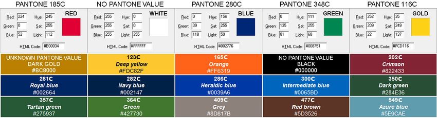
Precepts (advice for Australian flag designers and for Australian flag referendum committees, cont'd) page 3 of 7
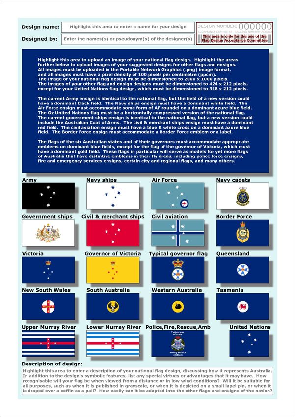
(7) Designers should show the full impact of their design on the other major flags of Australia
Contestants should be required to enter their designs on a standard form, showing not only their national flag design
but its probable impact on the other major flags and ensigns of the nation, including civil and Defence Force ensigns,
the flags of the states and governors, and the Oz UN ensign. A suggested format for such a form is depicted below.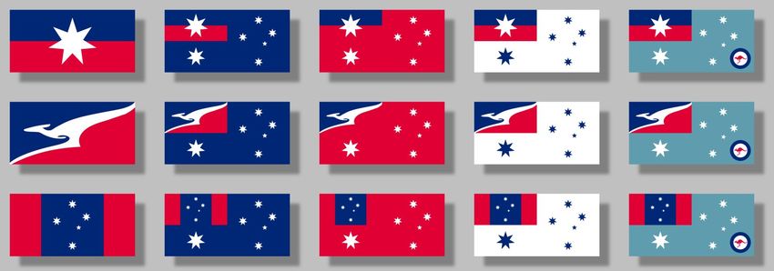
Precepts (advice for Australian flag designers and for Australian flag referendum committees, cont'd)          page 4 of 7

         (8) Australian national flag candidates should not be obliged to have simple designs
There are many good flags that have simple designs, but it would be nonsense to maintain that all good flags have
simple designs, or even that most good flags have simple designs, when the world is chocka with complex flag designs
that are (1) widely recognised and (2) widely loved by the people that they represent.

Any flag design that satisfies those two criteria is by any logical definition 'good', regardless of its complexity, number
of colours, or difficulty in being drawn by children. The case for simplicity in flag design is rooted in a nineteenth
century mentality, when flags could only be made from simple-to-cut and simple-to-sew pieces of fabric. In view of
the sophisticated advancements in twenty-first century flag manufacture, simplicity should never be listed as a
criterion for a good flag design, let alone as its major criterion. By the same token, flag designs do not need to be
limited to those that children can draw from memory. Insisting that designs must be 'child-level' is an insipid
holdover from the nationalist sentiments of the 19 th and early 20th centuries, when children were compelled to take
irrational pride in the locational circumstances of their births or of their upbringings. To assert that children cannot
recognise their national flag unless they can crayon a reasonable facsimile thereof is as ludicrous as claiming that they
cannot recognise their own families until they can produce realistic portraits of them rather than stick figures. There
is not even a valid argument for adults to be able to draw their national flag, whether from memory or not. For a
broader perspective see the PDF entitled 'The Complexities of Simplicity'.

         (9) The process of deciding whether Australia will adopt a new national flag should be based
             upon, yet improve upon, New Zealand's 2015/2016 flag referendum process
A wheel can always be made better, but it should not be reinvented. The details of the 2015/2016 New Zealand flag
referendum process have been presented at http://www.dpmc.govt.nz/dpmc/publications/nzflag-process, providing a
reasonable starting point for conducting a future Australian flag referendum. Granted, the New Zealand process made
several mistakes along the way, but as long as any Australian flag referendum process is structured to avoid those
mistakes, it should do well. Particular attention should be paid to the learning experiences of the New Zealand Flag
Consideration Panel, summarised in a PDF at: https://www.dpmc.govt.nz/sites/default/files/2017-03/nzflag-process-
panel-report-may2016.pdf. However, there should not even be a future flag referendum unless a well-structured, full-
nation flag survey has revealed majority public receptiveness to the idea. Only after that prerequisite should the
specifics of an Australian flag referendum be hashed out, but some revisions to New Zealand's 2015/2016 process
should be obvious. For example, the authority to select the flag design candidates and to winnow them down to one or
more final alternatives to the current flag should not be vested in the biases of a small committee but in the full
Australian populace, through an online rating process. A committee should only have the authority to eliminate
designs that are overtly absurd, offensive, political, religious, or amateurish, as well as those that do not meet clearly
established entry criteria. If the design entries number in the thousands, there may be a need to allow a committee to
do more extensive filtering, but ideally all of the acceptable designs will be simultaneously presented online, with every
Australian elector afforded the opportunity to rate each design for a certain period of time. However, in order to
prevent public outcry, the current flag should be included in the online rating process. If the current flag garners the
highest rating amongst all of the initial contenders, the matter should be at an end. If not, then from the initial pool of
submissions, perhaps fifty designs with the highest ratings should once more be presented to the public, again
including the current flag. If at this point the current flag scores the highest rating, again no further action should be
taken. If not, then one binding formal vote should be held between the single most popular alternative flag and the
current flag. If the current flag receives more than fifty percent of the vote, the referendum should end, with the result
to be binding for a minimum duration, also to be determined by a public vote. If the current flag receives less than
fifty percent of the vote, the alternative should become the new national flag of Australia. A clean, fair process, with a
maximum cost, interpolating from New Zealand's experience, of perhaps a dollar or two per Australian.

          (10) Preferable features of a flag design submission website and of a flag design ratings website
Flag manufacturers prefer that designs be in a 'vector' graphics format like '.svg' (Scalable Vector Graphics), but for
purposes of a design contest only 'raster' graphics images should be required. Rather than dealing with multiple
raster graphics formats of widely varying quality, the contest should be standardised to the lossless image format '.png'
(Portable Network Graphics). The design submission website should present a standard, two-page entry form as a
'fillable' PDF form. Logged-in contestants would upload their national flag designs directly into the first page of the
online fillable form, including their suggested designs for civil and Defence Forces ensigns, the flags of the states and
of their governors, and the United Nations ensign, and they would fill out all text fields, saving interim versions of the
form as needed. All uploaded PNG images should be required to have a pixel density of 100 pixels per centimetre, as
well as uniform pixel dimensions to suit the requirements of the entry form. For example, if the suggested entry form
in this Precepts PDF is used as a guide, the upload dimensions for the national flag design might be 2000 x 1000
pixels, whilst the upload dimensions for the civil and Defence Forces ensign designs might be 424 x 212 pixels. These
references to graphics formats and to their particulars may seem burdensome, but the reality is that the majority of
designs will be submitted by entrants who are conversant with graphics software. They need not be professional
graphics designers, but if they cannot work with PNG files they should not be suffered. Again, the first page of the
online fillable entry form would include the designer's title for the design, the designer's name or alias, the required
Precepts (advice for Australian flag designers and for Australian flag referendum committees, cont'd)         page 5 of 7

flag images, and the designer's description of the design, all of which would fit on a single A4 sheet, as exemplified by
the PDFs that are linked to from this web page. The second page of the online fillable entry form, which would only be
privy to the submission committee, would contain the designer's full contact details, assurance of copyright surrender,
acknowledgement of the designer's understanding of the official flag design guidelines and of the official terms and
conditions for flag design submissions, and any other needed details or tracking information. Only fully completed
forms would be capable of being submitted to the committee, which would notify entrants of acceptance or rejection of
their design forms. Once the submission period ends, all accepted flag designs would be simultaneously posted online
for public rating. They could be presented in grids of numbered thumbnail images, which when selected could lead to
downloadable PDFs of the first pages of the entry forms. Additional provisions could let the public observe the designs
either waving in the wind or hanging limply, as at the website https://krikienoid.github.io/flagwaver/.

Consider the flag design above, for example. If it were a new design for the Australian national flag, a design that you
had never seen before, what might you learn from the simulation above? When the flag waves in the wind, you might
observe its attractive colours and its three easily identifiable symbols, one for the UK and two for Australia. With the
wind switched off, you might observe that the draped flag shows only a bit of the UK symbol, although it is still
identifiable. The Australian symbols, however, have become almost completely obscured within the folds of the flag.
The draped flag could be a British blue ensign, or it could be the New Zealand flag with its own obscured stars. You
might also observe that more than three-quarters of the total area of the flag is blue, such that the flag becomes almost
totally blue when it is limp, seemingly the flag of no nation at all. You might wonder why the designer did not put a
symbol of Australia in the canton as well as in the fly and in the lower canton, or even a symbol spanning the entire
hoist, so that the draped flag might be as likely as the waving flag to identify the nation that it represents. If flag
designs were available that performed better in both a wind and a lack thereof, would you champion the flag above?

The insights that the public could gain from being able to observe a given flag design in this way are so valuable that
the flag design rating website should have this feature built in, so that visitors can simply select a link to immediately
see how a given flag design will actually appear when it is waving in the wind or when it is draped in windless
conditions, revealing virtues and flaws that would otherwise be difficult or even impossible to anticipate. The
complete coding for the 'online flag waver' shown above is freely available at https://github.com/krikienoid/flagwaver,
so any competent website designer should be able to easily embed a flag waving feature for every displayed flag design.

         (11) Designers and committees should be sceptical of every so-called 'rule' of good flag design
Care has been taken in this PDF to characterise the advice that it offers as guidelines rather than rules, because the
word 'rule' implies a certain inviolability. Lest you think this point trivial, consider that the official flag design
guidelines for the 2015/2016 New Zealand flag referendums flatly stated, “Flag designs that include…complex objects
will not be considered.” This illustrates that what is typically listed as the first rule of good flag design, namely
simplicity, can be taken far too literally and to detrimental effect, as in the case of NZ's referendums, notwithstanding
that 'simplicity' and 'complexity' are completely subjective terms, and thus are open to widely disparate interpretation.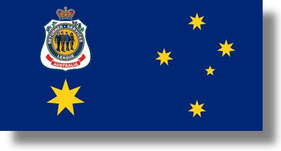
Precepts (advice for Australian flag designers and for Australian flag referendum committees, cont'd)          page 6 of 7

The obstinate insistence that simplicity is an unbreakable rule of good flag design can even be institutionalised, as has
been the case for Ausflag, which for decades has been Australia's main lobbying group for flag change. During its long
existence, Ausflag has myopically solicited and promoted only the simplest of alternative Australian flag designs.
Guideline (8) has already explained why a good flag does not need to be simple, but many other typical flag design
rules are begging to be broken. One such rule posits that a flag design should be limited to only two or three colours.
For example, some will claim that flags of two or three highly-contrasting colours are always 'bolder', but it is equally
valid to dismiss such flags as being 'starker'. Given that subjective adjectives can always be chosen to have either
positive or negative connotations, they can never serve as objective arguments, one way or the other. What is
objectively true is that some of the world's greatest flags contain a dozen colours or more, so it would be mindless to
insist that Australia's flag have a maximum of three. Additional arguments for limited colours tend to be either
specious or simply false. One such assertion is that more than four colours are hard to distinguish, which is absurd.
Another premise is that flag fabrics come in only a limited number of colours, but a simple Internet search will reveal
that such fabrics are available in a full spectrum of over 70 shades, which means that there is no reason to limit even a
sewn-together flag to three colours, much less a printed flag, for which hundreds of colours of ink are available. You
may also hear a last-ditch argument about limited colours reproducing better in greyscale, as though this should be a
critical concern in an age when virtually every remaining newspaper and magazine on earth is published in full colour.
Even if this were not the case, choosing colours that maintain a high contrast in both colour and greyscale can be
virtually impossible, as is easily demonstrated by reproducing the the colour palette from guideline (5) in greyscale:

Highly-contrasting colours such as red-and-green, orange-and-azure blue, gold-and-grey, and other combinations do
become harder to distinguish in greyscale, but that is perfectly alright, because none of the shades are exactly the
same, and the human eye can still distinguish between them. This tends to mean that no matter how many colours a
flag design has, its greyscale representation will not become unrecognisable. Lastly, it may be true that a limited
number of colours can make the manufacture of a flag slightly easier, quicker, and less expensive, but these should not
be primary design concerns. Modern flag production methods are simply not greatly affected by flag designs with
many colours, whether in difficulty of manufacture, speed of production, or pricing, so let's make 'em fab, not drab.

A remaining assortment of typical flag design rules also do not stand up well to scrutiny. Like simplicity and limited
colours, they are really only suitable as suggestions, and they should never be thought of as criteria for rejection. It is
true that flags tend to wear out from their fly edges, but anyone who says that the patterns of a flag design should
never extend to the fly edge must be oblivious to the UK's Union Jack and to any number of other famous flags. If a
flag fabric has been subjected to heat, cold, wind, rain, and the sun's radiation long enough to deteriorate at its fly,
then the rest of it is not far behind. Although it may be theoretically easier to hem a fly edge that has a solid colour
with no patterns, it will probably be better in most cases to heed the biblical admonition of not mending old garments
with new cloth, and to instead simply replace flags when they have worn out. Usually, of course, that is exactly what is
done, at least by anyone with actual respect for the
flag that they are flying. Should a flag design not
include curves because those can be harder to sew?
Oh, do me a favour. Should lettering, seals, and
coats of arms be forbidden? Rubbish, because there
are any number of well-known and well-loved flags
that have all of these things. Go tell Mexico that the
fabulous COA on their flag violates a heap of rules,
but you'd better be ready to run for your life, gringo.

Additional resources for Australian flag designers and for Australian flag referendum committees:

Those who are unfamiliar with flag nomenclature may want to review the PDF entitled 'Flag Terminology.' Australian
symbolism is explored in the PDF entitled 'Symbols'. Several other 'resource' PDFs have been gathered together here.
The most-often recommended flag design guideline PDF is entitled 'Good Flag, Bad Flag', and it is widely available
online, including at http://nava.org/digital-library/design/GFBF_English.pdf. Whilst GFBF is not entirely devoid of
useful advice, it puts an infuriatingly dogmatic emphasis on simplicity in flag design, and not until its very last page

Precepts (advice for Australian flag designers and for Australian flag referendum committees, cont'd)           page 7 of 7

does it even admit (in passing) that all of the flag design rules that it champions have exceptions. A far better flag
design guideline PDF is entitled 'The Commission's Report on the Guiding Principles on Flag Design', which is
available here. Unlike Good Flag, Bad Flag, it sets forth useful flag design generalities without stooping to the
pretence of criticising existing flags. Flag designers and flag referendum committees should also consider the advice of
the well-known design guru Roman Mars, who is enthusiastic about all forms of good design, including good flag
design. A website in support of his insightful statement, “Loving your flag is the only rule that really matters”, can be
found at http://ideas.ted.com/7-fantastic-flags-that-break-every-design-rule/.

An Australian flag survey summary can be found at http://www.ausflag.com.au/preferred_colours_and_symbols.asp.
A historical perspective can be found at https://en.wikipedia.org/wiki/Australian_flag_debate.

Free raster graphics software can be downloaded from https://www.gimp.org/ and https://www.getpaint.net/, and
free vector graphics software can be downloaded from https://inkscape.org/en/.

Experimenting with the online Scrontch's Flag Designer can be fun. It is very basic, but it may nevertheless yield some
insights into standard flag divisions and patterns, and it allows you to save your work in a vector graphics format.

At http://www.wpmap.org/wp-content/uploads/2015/01/All_Flags_of_the_World_5024x3757.jpg, there is a very
good chart of national flags.

An article about Harold Thomas can be found at https://en.wikipedia.org/wiki/Harold_Thomas_(activist )).

Every would-be flag designer in the world should ponder all of the charts that are shown on the website Flag Stories.

If you download this 'Precepts' PDF and view it with Adobe Acrobat Reader, you can use the 'selection tool' (arrow
icon) to highlight any of the images that it contains. You can then right click the images for copying and pasting into
graphics programs for possible further use. For example, the Pantone colour chart may prove especially handy for
designers with graphics programs that feature a 'colour picker' tool, generally depicted as an eyedropper icon. The
suggested flag design contest entry form could also prove useful. Whether you are viewing this PDF with Acrobat
Reader or on the Internet, all of its Web links can be opened with a click. On the Internet, a right-click will allow the
links to be opened either in new tabs or in new windows.

Parting thoughts:

Harold Thomas was once quoted as saying, “The problem with the Australian flag is that although it looks good, it does
not feel good.” Possibly no one has ever expressed the quandary more succinctly.

The flag of the United Kingdom is an amalgam of the flags of England, Scotland, and Northern Ireland. If Scotland
and/or Northern Ireland leave the UK due to Brexit, the Union Jack will become anachronistic, a flag without a future.

Australians and New Zealanders fought and died in two world wars, largely on behalf of the UK, yet afterwards they
were left holding the wrong end of the economic stick, when in 1973 the UK secured the EU membership that it had
sought since the early 1960s, drastically reducing its imports from Down Under. By then, in concerted protest, most of
the other 53 Commonwealth nations had already freed their flags of the symbolic shackle of the Union Jack, so that
nowadays only two major nations and former colonies obstinately retain the Jack in the cantons of their national flags.

               “The Australian National Flag may be used to cover the coffin of any deceased Australian citizen at
               their funeral. The canton should be draped over the ‘left shoulder’ of the coffin, representing the
               heart.” (from the booklet “Australian Flags” – Part 2: protocols for appropriate use of the flag,
               Australian government). The Union Jack may soon cease to exist, so one wonders how much longer, in
               life and even in death, that its echo of colonialism will be allowed to continue to dominate Australians.

                   Lastly it is interesting, to say the least, that the official flag of the Returned and Services League of
                   Australia does not include a Union Jack. One might say that the RSL has thus set a good example
                   for all Australians to follow when they consider designs for a new Australian national flag.

Shown to the right, a bonus:
Colour swatches from one of the
Pantone websites mentioned in
this PDF. These are graphics
software close-equivalents for
several of Australia's various
official colours. You may prefer
them to some of the equivalents
presented earlier in this PDF.
You can also read