SAMUEL MCSHERRY PORTFOLIO 2021 - UX, UI, XR - DUBLIN
←
→
Page content transcription
If your browser does not render page correctly, please read the page content below
Samuel McSherry Portfolio 2021
UX, UI, XR

                                 1/44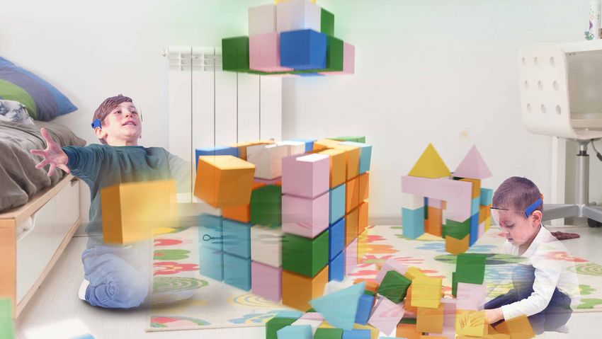
Contents

           1. Mendit
             AR, UX & UI Design

           2. Playvroom
             XR, UX & UI Design

           3. Diving Ireland
             UX, UI & Web Design

           4. Bonus Project
             VR, 3D Printing

                                   2/47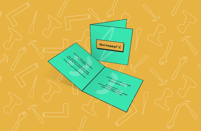
1. Mendit
 AR, UX & UI Design

 Mendit is my current final year major project. It all started with looking at the growing
 problem of E-waste, then looking at Right to Repair as an important social cause that I
 wanted to raise awareness around. From this I realized that a better way to get people
 interested in repair and fixing was to show them how to do, the idea of working with your
 hands and fixing something yourself is something I believe that is lost on my generation.

 From that, Mendit was born. It’s an app for your smartphone that uses augmented reality
 to guide you through repairs for all you gadgets and home appliances, ranging from
 rewiring a plug to repairing that leaky tap. Mendit empowers you with the tools you
 need to learn those skills.

                                                                                             3/47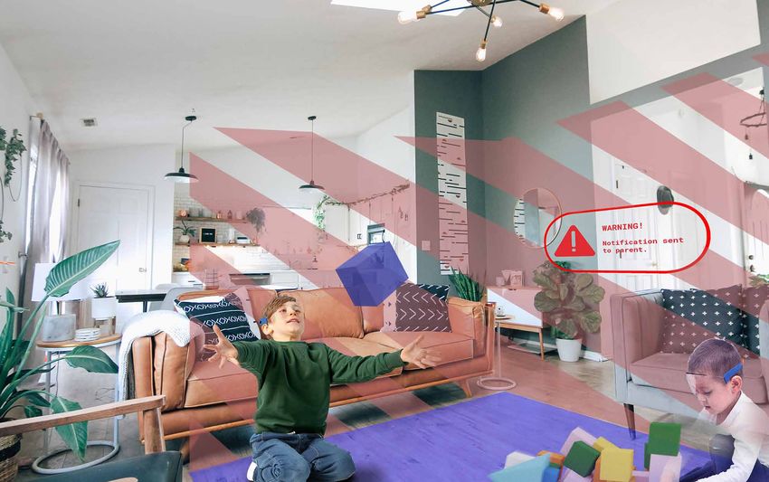
UX Research - Personas

Initially, the target audience centered around the younger
generation (18-25). As the project progressed and I
surveyed a larger audience, I realized that a more suitable
audience was that of the young homeowner/ long term
renter in the 25+ age bracket.

There was also the audience of the experienced fixer, as an
ambassador of the community, someone who create guides
for the less experienced users to follow.

The core audience for Mendit became new, young
homeowners/long-term renters. It aims to show them the
value of repair through learning to fix the basics around
their home.

                                                              4/47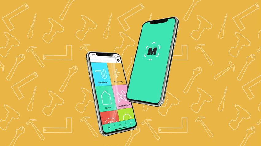
UX Research - User Journeys

When it came to site mapping the app itself, I used key
user journeys to begin to understand what was necessary
for the features of the app. Some of the key users journeys
included things like onboarding for the service, following
a repair guide for the first time and browsing community
posts within the app.

                                                              5/47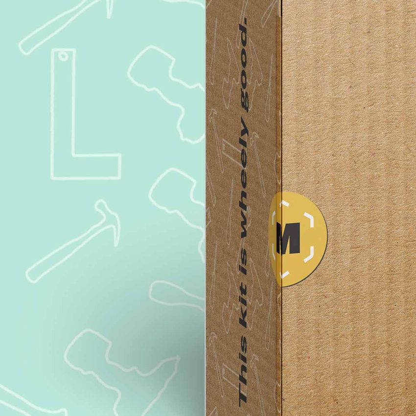
UX Research - Key Insights

From surveying my classmates, I found a few key insights
when it came to how the service itself would function.
Namely that for someone to use the service, the guides
themselves would need to be supremely easy to follow,
this is where the idea of using AR and animated sequences
in the AR component of the app came from.

I also knew that in order to keep people coming back and
engaged, you’d have to give them a win in order to make
them excited about completing a repair.

                                                            6/47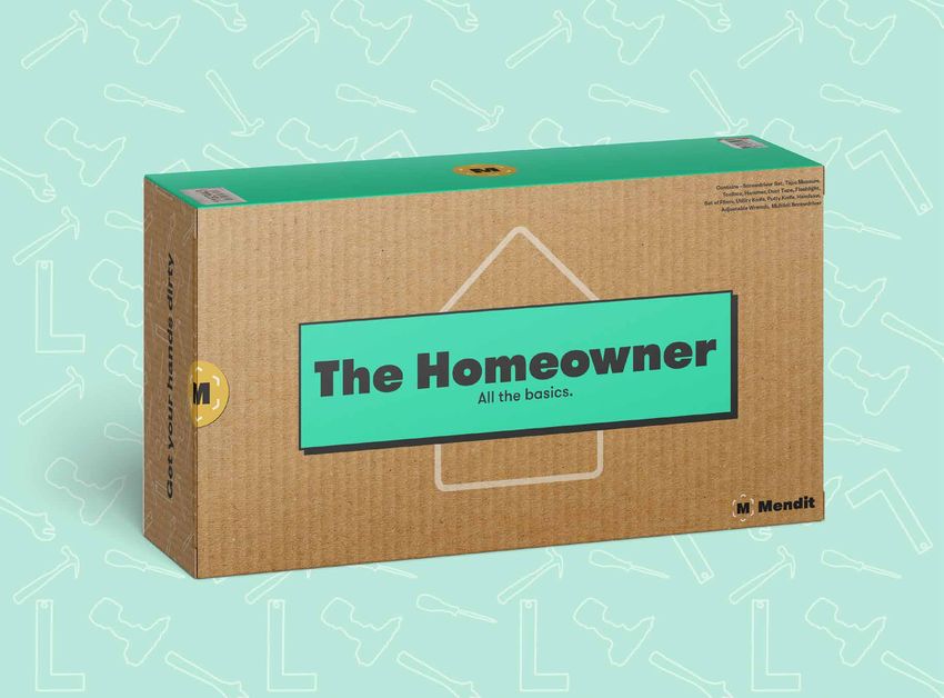
7/47
App - Design Outcomes

                        8/47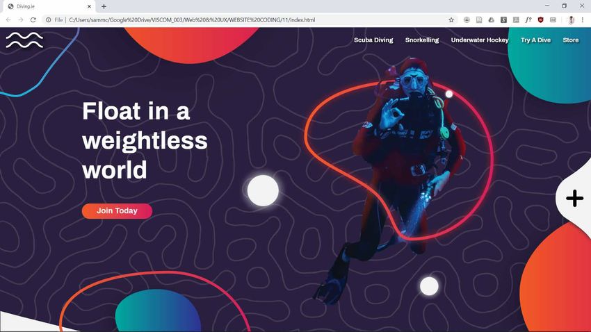
App - Design Outcomes

Figma link - https://www.figma.com/proto/ZzCvJNfcsgbJza7C1CZGsy/
Mendit-App?page-id=0%3A1&node-id=1%3A3&viewport=-5331%2C-73%
2C1.5307505130767822&scaling=scale-down                            9/47
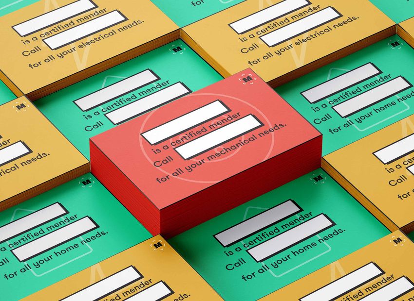
Packaging - Design Outcomes

                              10/47
Packaging - Design Outcomes
11/47Packaging - Design Outcomes
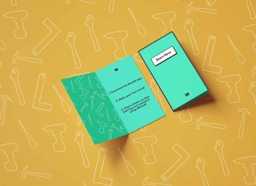
12/47Ephemera - Design Outcomes
13/47Ephemera - Design Outcomes
14/47Ephemera - Design Outcomes
15/47Ephemera - Design Outcomes
16/47Social Media - Design Outcomes
17/47Social Media - Design Outcomes
18/47Social Media - Design Outcomes
19/47Exhibit - Design Outcomes
20/472. Playvroom
21/472. Playvroom
XR, UX, UI & Speculative Design
Playvroom was a speculative design module that I undertook at the start of my final year in
September. It was a group project undertook by myself and three of my classmates.
We were looking at future problems under the scope of the continuation of education from
home. Based on our research we found that isolation and loneliness was to be a continued
problem in the future as more and more common daily tasks are done remotely, primarly
early childhood education.
Playvroom is a service that allows children to interact with their peers where they otherwise
would miss out on key social developmental moments on their early lives. Using the XR
glasses that we designed with young children in mind specifically, they can play with their
friends using a multitude of XR toys in the Playvroom sandbox.
22/47UX Research - World Building
Being a speculative design project, Playvroom started out
in the world building phase, trying to define where Ireland
would be in around the 20 year mark.
A few key insights we gained from this, was that we
would definitely see an increase in the loneliness in a
increasingly online/digital world.
This was intially the problem that we set out to solve.
23/47UX Research - Personas
As we began working out proto personas of different age
brackets, and looking at the problem of digital loneliness.
Our research led us towards a younger audience,
specifically early childhood. This led us to designing a
service for children to engage with their peers using XR
technologies that would have progressed dramatically by
2040 according to our world building research.
24/47UX Research - Key Insights/ Goals
Once we knew who our audience was, we began to define
the key problems that we were trying to address for them.
Lack of social interaction and increased isolation was the
key problem. The main goal of the service was the build
confidence in the userbase, as an aid to get them to be
comfortable with social interaction in person.
25/47Mendit - Hero Image
26/47Mendit - Product Image
27/47Mendit - Product Mockup
28/47Playvroom has a parental control element where the virtual
playdates are arranged between the parents of the children.
29/47Mendit - Parental UI Mockup
30/47Mendit - Parental UI Mockup
31/47Mendit - Parental UI Mockup
32/47Mendit - Parental UI Mockup
33/47Safety Zone Mockup
Playvroom has a play area
defined by the parent or
guardian in order to keep the
child safe from harm whilst
using the prodtuct.
34/47Safety Zone
Mockup cont’d
35/47From the child’s perspective they have an unlimited number of
toys available to them in a digital toybox.
36/47Mendit - Child UI Mockup
37/47Mendit - Child UI Mockup
38/47Mendit - Child UI Mockup
39/47Mendit - Child UI Mockup
40/473. Diving Ireland
41/473. Diving Ireland
UX, UI, Web Design
As part of my third year web design module, two of my classmates and I redesigned the
website for Diving Ireland, also known as the Underwater Council of Ireland. They are
responsible for the governing all underwater sports in Ireland.
A few key insights we had from a survey of their userbase was that there was really two key
users that we had to keep in mind. Firstly we had the experienced diver/member of of the site
that wanted to do specific tasks like check data via the site or manage their membership.
We also had the second type of user that was new to diving and just wanted to learn more
about the sport in Ireland and how they could get involved.
This insight was key to how we broke up the different sides of the site.
You can also see a short video of how the website flows from the QR code or URL below.
https://youtu.be/TqcobfOkozU
42/47UX Research - Personas
When it came our proto personas, they were based on
a small survery of their user base, from this we defined
two key users. First we had the long term user who was
already a member of diving ireland, who came to the site
for tidal info, calender events and checking up on their
membership status. The second type of user was that of an
unexperienced diver who was just getting into the sport,
wanting to learn more about the community, what geat
they might need and all levels of beginner info.
43/47UX Research - sitemap
The sitemap was where we started when it came to the
first steps of redesigning the diving ireland website. Their
old system was cluttered, things weren’t where you’d
expect them to be, and generally it wasn’t very user
friendly with long drop down menus.
Our proposed site map split the site into two main sections
based on our user research.
44/47UX Research - Usability Heuristics Analysis
We also did a usability heuristic evaluation of the website,
in order to ascertain what was working and what wasn’t
when it came to usability. It was a very useful exercise
for us, and all though the website failed in nearly all
categories it gave us examples of what not to do.
45/47Diving Ireland Homepage
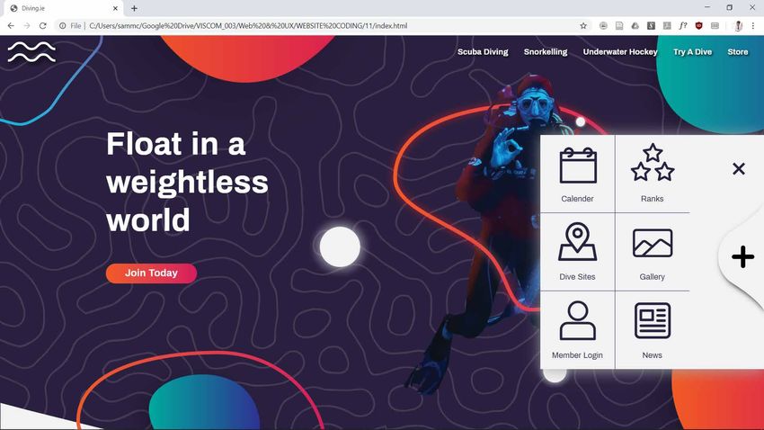
46/47Diving Ireland - Quicklinks
47/47Diving Ireland - Store Page
48/47Diving Ireland - Mobile UI
49/47Thanks for looking!
Contact me at:
Sammc1999@gmail.com
0833282219
bonus project on the next page!
50/474. Bonus Project!
VR development & 3d Printing
51/47VR Development - Learning Unity
I’m also really interested in the development of future tech
and the implications that these technologies would have
on UX and UI design. Specifically I’ve been learning how to
develop for unity and VR.
52/473d Printing - Problem Solving & Prototyping
Recently I’ve been learning 3D modelling for use in 3D
printing, solving little problems around my house, fixing or
repairing stuff that would be otherwise unrepairable.
53/47The end,
For real this time!
54/47You can also read