Search Opinions on corporate and brand identity work. A division of UnderConsideration - Honeycomb
←
→
Page content transcription
If your browser does not render page correctly, please read the page content below
Opinions on corporate and brand identity work.
A division of UnderConsideration.

Search

Browse
Submit Tips/Work

Join Mailing List
About

Search
Submit Tips/Work

About
Join Mailing List

By Industry
 Travel
 Advertising
 Advocacy
 Architecture
 Automobile
 Aviation
 Charity
 Consumer products
 Corporate
 CRM
 Culture
 Destinations
 Development
 Education
 Entertainment
 Environment
 Fashion
 Finance
 Food
 Government
 Graphics Industry
 Health
 Hospitality
 Insurance
 Lifestyle
 Logistics
 Lottery
 Media
 Non-Profit
 Nutrition
 Politics
 Publishing
 Real Estate
 Religion
 Restaurant
 Retailers
 Software
 Sports
 Technology
 Telecom
 Transportation
 Web Publication
 Web Service
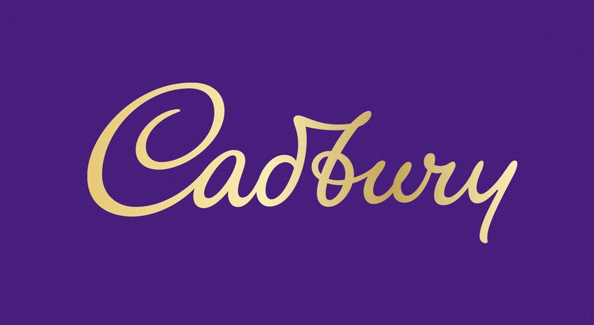
By Tag
 Top 10 Tags
 sans serif (1091)
 blue (790)
 uppercase (491)
 red (484)
 monogram (425)
 black (414)
 custom (414)
 icon (405)
 lowercase (394)
 packaging (381)
 See all tags

By Project Type
 Before-After
 Follow-up
 Friday Likes
 New

By Editorial Category
 Reviewed
 Noted
 Spotted
 Linked
 Announced
 Sponsored

Everything ever!
What would you like to fi Go Clear

Share ›
 Facebook 539 Twitter Email Pinterest 39 More 56

New Logo, Identity, and Packaging for Cadbury by Bulletproof

Reviewed

Signature Purple
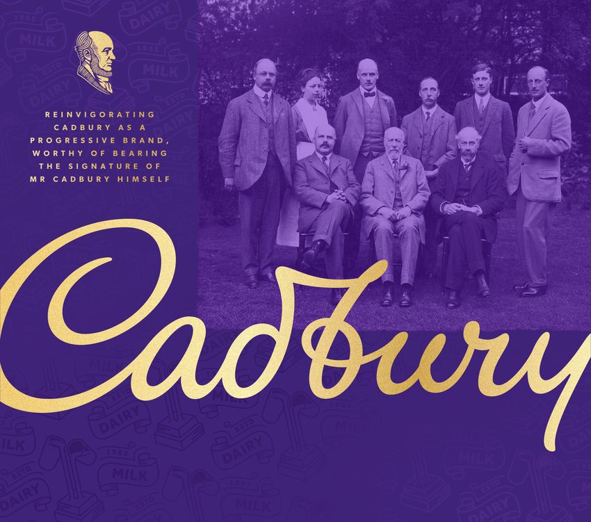
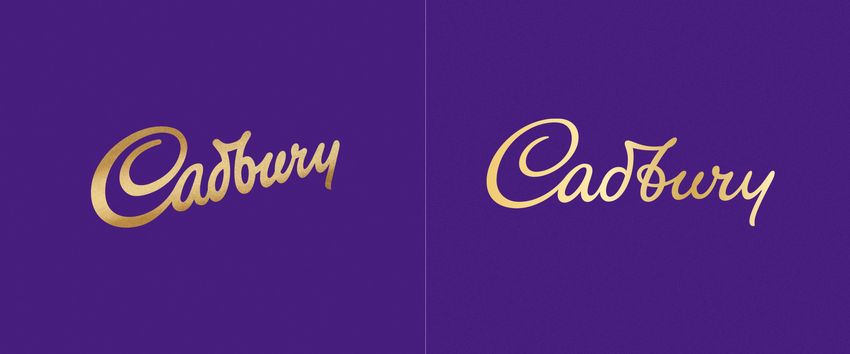
before

after

Reviewed Apr. 15, 2020 by Armin Comments (93)
Industry / Consumer products Tags / #bulletproof#chocolate#gold#packaging#pattern#script#signature#uk

Established in 1824, Cadbury is one of the most well-known chocolate brands in the world and the second largest confectionery brand in
the world after the U.S.-based Mars. Cadbury started as a single grocer’s store owned by John Cadbury in Birmingham where they sold tea,
coffee, and drinking chocolate, introducing its signature dairy milk chocolate bar in 1905 — the company (wholly owned by Mondelez
International) is now headquartered in Uxbridge, west London, and operates in more than 50 countries worldwide. This coming May, a new
identity and packaging, designed by London-based Bulletproof is launching in Australia, followed by South Africa and Malaysia later in the
year, with further markets, including the UK and Ireland, launching at the beginning of 2021.

 The revitalisation of the Cadbury wordmark drew inspiration from the hand of founder John Cadbury himself, to create a
 beautifully crafted signature with a more contemporary feel.

Bulletproof provided text
Logo detail with fine gentlemen and lady.
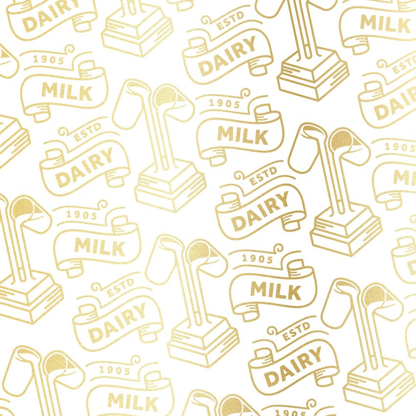
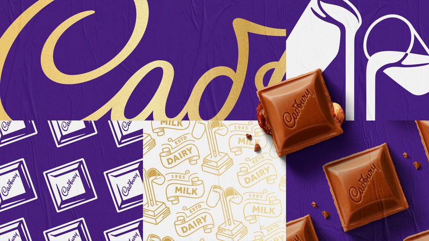
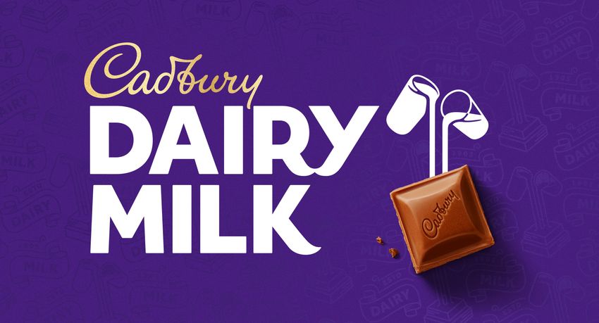
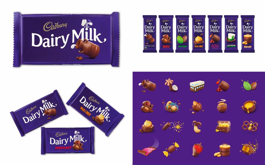
Logo.

The old logo was nice, globally recognizable, and hard to disagree with as it perfectly embodies the product — I’m happy to argue, though,
its setting at an angle as it defeats the purpose of an italic script wordmark, taking the leaning motion out of it but I wouldn’t go to war with
anyone about it. The new logo is a lovely evolution that presents a thinner, more elegant iteration that most people will likely not notice — a
good thing in this case. The new logo is also more true to John Cadbury’s signature as it first appeared for the brand, which features a tasty
loop in the “b” and a slightly more swash-y “y”. The new logo feels more open and airy and its normal baseline alignment better showcases
the newly reworked curves. In short, I really like the update.

 Taking cues from the archives, the Dairy Milk logotype has been recrafted and a distinctive Dairy Milk pattern based on the
 original 1905 pack has been created, which gives greater depth and purpose to the iconic Cadbury purple and provides an
 element of discovery on the packaging.

Bulletproof provided text
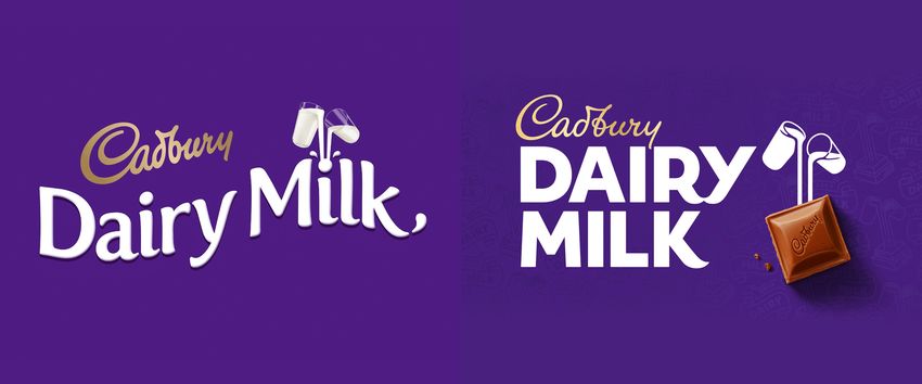
Dairy Milk logo, before and after.
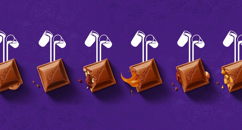
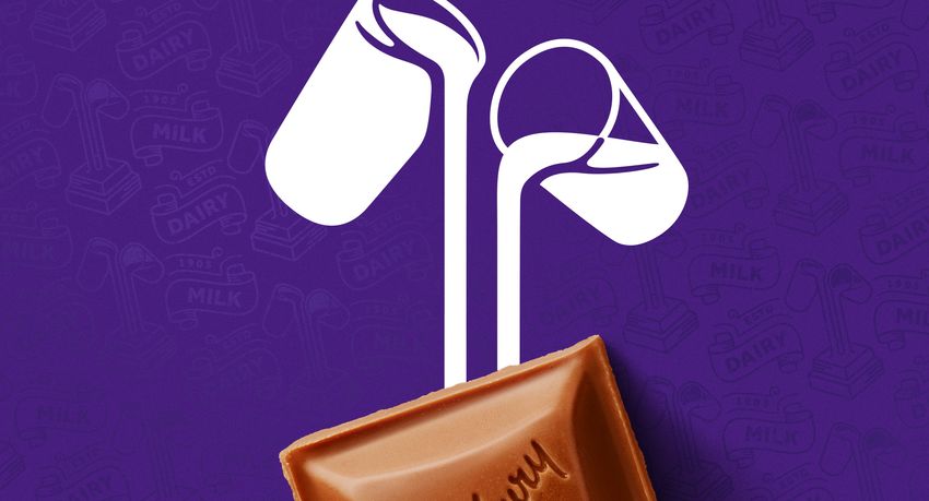
Dairy Milk logo.

Both old and new Dairy Milk logos are fine in their own right. I’m not particularly passionate of either, either negatively or positively. I think
both are fine interpretations. If I had to choose, I would go with the new one because it provides a better contrast with the main logo,
whereas before the two elements were maybe a little too in synch. On the new one, the “RY” ligature and the “K” stand out oddly from the
rest of the letters as the only ones with curvy, swash-y elements but, at the same time, those are the details that make the DAIRY MILK
type interesting. I also prefer the vector milk glasses much more than the realistic approach of the old logo.

 The iconic Glass and a Half logo has also been redesigned so that it links directly with the chocolate chunk, further emphasizing
 the quality of the ingredients and the classic creamy taste of Cadbury Dairy Milk that the nation loves.

Bulletproof provided text
Glass and a Half logo
Identity elements.
Pattern.

My favorite element of the identity is the new pattern, bringing back the ribbons used in the packaging during the first half of the 1900s but
rendered in a crisp, contemporary way. I would go as far as saying that these are some of the best ribbons I have seen, just very nicely
executed and curvy and flow-y.
PREVIOUS Dairy Milk packaging.
Plain Dairy Milk (UK).
Various flavors (UK).

The old Dairy Milk packaging, designed by Pearlfisher, was pretty nice and had those fun flavor illustrations that were maybe a little too
playful but definitely enjoyable. The new packaging is a little busier as it introduces the pattern in the background which I am guessing will
be some kind of varnish in real life, which will make the effect a little more subtle than in the renderings above. I do like the simplicity of the
previous packaging more than the new ones and I think part of it is the left-aligned arrangement of the Dairy Milk logo in the horizontal UK
packaging because it looks so much better and cleaner in the vertical Australian packaging — like, those I really like. In general, though, I
do like the richer, textured new packaging.
Marble Dairy Milk (Australia).
Various flavors (Australia).
Various, whackier flavors (Australia).
Sample flavor title treatment.

 New Logo, Identity, and Packaging for Cadbury by Bulletproof
Advertising.
Swag.
Totes.

 New look presentation video.

Perhaps swayed by the tight video above, I do think that this is a great evolution that keeps what’s known and recognized about the brand
— purple + signature logo — while dipping into its archives to unearth some treasures that have been very nicely modernized and add a
more premium but still accessible aesthetic to the comforting appeal of mainstream milk chocolate.

Your opinion…

On Main Logo
 Great
 Fine
Bad Total vote view results close / back to vote On Dairy Milk Logo Great Fine Bad Total vote view results close / back to vote On Packaging Great Fine Bad Total vote view results close / back to vote See what else happened on Brand New each year since publication began in 2006 Comments 93 Comments Brand New Disqus' Privacy Policy 1 Login Recommend 6 t Tweet f Share Sort by Oldest Join the discussion… LOG IN WITH OR SIGN UP WITH DISQUS ? Name Aaron • 17 days ago Maybe it's just change in general, but a lot of this doesn't sit right for me, bits of it look so crafted and refined and look great then other parts look unfinished or forgotten. A lot of useless apps in the launch video too 7 △ ▽ 1 • Reply • Share › gffrd > Aaron • 17 days ago Yeah, I'm having the same reaction. On the wordmark: the new reads as a more literal translation of a signature … not necessarily more _refined_, just more literal. I'm not sure if it's the the variable stroke weight combined with the additional flourishes and overall lighter weight, but it just doesn't feel together. And while there were some heavy-handed elements on the previous packaging, it reads as more confident and singular. The new elements don't quite feel in-balance or like they came from the same family. 1 △ ▽ 1 • Reply • Share › E. Comabella • 17 days ago They won me over with the presentation video... and of course the socks. 5 △ ▽ • Reply • Share › Brandon Detherage • 17 days ago That tote bag with the two white straps (cup and a half?) is brilliant! 9 △ ▽ • Reply • Share › KansasZeke > Brandon Detherage • 17 days ago
??
 △ ▽ 4 • Reply • Share ›

Alex Christian • 17 days ago
I’m not that into the redrawn wordmark. The old one was thick like dripping melted chocolate, whereas the new one is fine, like drizzled
melted chocolate. To me, Cadbury’s chocolate isn’t the kind of artisan product that has a drizzle of contrasting chocolate on top – it’s one of
the default factory brands of chocolate, albeit the tastiest of the lot. That’s fine! Live up to it! I know they’re going for a ‘signature’
approach, but I’d never thought of Cadbury’s products as the work of a specific chocolatier, but as the taste of Dairy Milk.

PS: Cad bury
PPS: That RY ligature makes me uncomfortable. There’s something... licky about it.
13 △ ▽ 1 • Reply • Share ›

Joe Baglow • 17 days ago
WOW
△ ▽ • Reply • Share ›

jason • 17 days ago
the packaging and other applications look great, but the redrawn logo creates problems. the “db” ligature got more complex and awkward.
it looks fine full-bleed on the side of a building but turns into a garbled glob when it’s reduced and imprinted on the chocolate.
10 △ ▽ • Reply • Share ›

 Tom Swinnen > jason • 17 days ago
 I wanted to reply the exact same thing. Absolutely fantastic packaging, love those, but would have worked equally well (maybe even
 better) with the old logo instead of this thinned out awkwardness.
 △ ▽ • Reply • Share ›

 Nathan Cavanaugh > jason • 17 days ago
 The old one wasn't great either. The db looked like a weird music note. The new db ligature however is too gap-y.
 3 △ ▽ • Reply • Share ›

Brian • 17 days ago
I can't stop reading it as Cadbwiy... Somehow the old logo didn't have the same problem - probably the fact the main letters strokes were
much thicker than the connectors. Also they seem to have put a dark emphasis on that part of the logo which makes it even more like a
"w"....
3 △ ▽ • Reply • Share ›

 JS > Brian • 14 days ago
 That's how little children say it!
 △ ▽ • Reply • Share ›

duster • 17 days ago
This update is really making me appreciate how tight and concise the old logo is. This doesn’t even feel like a logo, it’s just script
3 △ ▽ • Reply • Share ›

Steve Wiskowski • 17 days ago
I love the rebranding, but the original logo was fine as is. Like everyone says, that db ligature has issues. The previous logo's db ligature
was symmetrical and the spacing between was more comfortable.
3 △ ▽ • Reply • Share ›

GraphicDough • 17 days ago • edited
I've always thought Cadbury was in a unique position in the chocolate world. Not too over the top serious but not super serious either. This
moves them into the 'fun/whimsical' sphere where I don't think they belong. They go right from the seriousness of Mr Cadbury and the logo
to the wackiness flavors and packaging. While all of the packaging looks good, they are missing all the extra stuff you have to put on the
packaging such as weight. It all reads more akin to ceral packaing.
△ ▽ • Reply • Share ›

Art of Jeff Epp • 17 days ago
When you have a rich history, look to the past. Some gorgeous stuff in ye olden days.
2 △ ▽ • Reply • Share ›

OriginalAustin • 17 days ago
I don't have the cultural or nostalgic connection to Cadbury as many of the other commenters here, and maybe that's why I think this is
really amazing. Everything just looks great.
1 △ ▽ • Reply • Share ›

Kane • 17 days ago
The new packaging is great, and the presentation video was brilliant. However, as many others have stated here - the new Cadbury
wordmark doesn't sit right with me in terms of its legibility. Its definitely the added complexity to the 'b' due to the new ligature between
the 'b' and the 'u'. You know shrinkflation in the chocolate sector is bad when even the wordmarks are losing weight.
2 △ ▽ • Reply • Share ›

minima • 17 days ago
y g
Everything about this is great, no doubt.
Anyone like me, why that Caramel pack looks so weird?
1 △ ▽ • Reply • Share ›

 Ben > minima • 17 days ago
 I think it's because in the UK Cadbury Caramel was historically a completely separate brand - with a yellow pack - before being
 brought under the Dairy Milk banner so the pack is an amalgam of both, In Australia, Cadbury Dairy Milk Caramello is the same
 product but the packaging is far more cohesive and part of the overall family. It's just a historical quirk in the UK/Ireland.
 1 △ ▽ • Reply • Share ›

 minima > Ben • 17 days ago
 Thanks for your helpful info. But I still think that curvy yellow looks not ok.
 △ ▽ • Reply • Share ›

Federico Butler • 17 days ago
uou!!!!! for the presentation video ⛺ Chandler Bing Applause GIF - Find & Share on GIPHY — disq.us
1 △ ▽ • Reply • Share ›

Valark • 17 days ago • edited
When I was a kid someone pointed out to me that the Cadbury DB ligature looked like a snail, and I've never been able to unsee it. The
illustration updates are nice, but I'm just happy to be finally free of that particular mind virus.

⛺ View — uploads.disquscdn.com
10 △ ▽ 1 • Reply • Share ›

 ThisIsChris > Valark • 17 days ago
 Think of it now as the two pouring glasses of milk upside down.
 △ ▽ • Reply • Share ›

 James Slevin > Valark • 17 days ago
 You monster. 36 years on this earth munching my way through their products - which have degraded under Mondelez's
 Americanisation of the chocolate - and I never saw that snail. And now I will always see that snail. COVID19 might delay it's roll out
 someohat in Ireland.
 1 △ ▽ • Reply • Share ›

 Chris Colouryum > Valark • 16 days ago
 WHY WOULD YOU DO THIS TO ME!
 △ ▽ • Reply • Share ›

 Caligari > Valark • 13 days ago
 ⛺ View — uploads.disquscdn.com
 △ ▽ • Reply • Share ›

Pat • 17 days ago
The revised delicate looking identity looks really awkward having to work alongside such a heavy typeface for the product names; and looks
completely out of place with all of the other added elements on the packaging.
3 △ ▽ • Reply • Share ›

gborz • 17 days ago • edited
I really don't like how the new 'flat' glasses work with the photorealistic chocolate tiles. The socks have strong Milka (the sister brand) vibes,
especially the colors.
△ ▽ • Reply • Share ›

Vincent Biss • 17 days ago • edited
I know it's a branding website and I may get a couple downvotes to this comment, but I don't think that making "dairy milk" stand out so
much is very 2020. Intelligent design must be about predicting the near future and trying to understand what will be important for people in
5 or 10 years. Dairy industry is all about animal suffering, pollution and unhealthy habits. This industry is slowly but certainly dying, and I
don't understand what Cadbury is trying to show with their "pride" of dairy.

Sorry if you think that design is about visual esthetics, but for me ethics are really important too.
3 △ ▽ 4 • Reply • Share ›

 ben > Vincent Biss • 17 days ago
 Are indigneous people unethical because they eat animals?
 △ ▽ 1 • Reply • Share ›

 Bruno Halúzska > ben • 17 days ago
 No. What a weird question.
 2 △ ▽ 1 • Reply • Share ›

sarago • 17 days ago
I can understand and appreciate the rationale for the new horizontal / flat wordmark, just wish it was a liiiiiiiiitle thicker / gloopier like the
old one to give off that rich chocolate vibe
old one to give off that rich chocolate vibe.
2 △ ▽ • Reply • Share ›

Karl Nilsson • 17 days ago
i want a non-cadbury branded tshirt of someone pouring milk into my pocket
3 △ ▽ • Reply • Share ›

 Lewis Copland > Karl Nilsson • 17 days ago
 Oh god yes, a black tee with white milk glasses please. I'd be all over that.
 △ ▽ • Reply • Share ›

Jeremy W. • 17 days ago
The pattern is the strongest element in this, for me.
△ ▽ • Reply • Share ›

dezebel • 17 days ago
Much like the addition of other ingredients or existing products to create new flavoured bars (will the fusion trend in food ever end?) there is
too much going on visually with the new packaging. As an established mainstream chocolate brand they could look more like a premium
brand with a little restraint. I wonder, with new packaging comes reformulation or a smaller size? I suspect new flavours are created to save
Cadbury a percentage in the cost of chocolate used in their bars by introducing cheaper ingredients, or in combination with a recognized
product, like Oreo, that will attract consumers of that brand. Lots going on here!
△ ▽ • Reply • Share ›

jsnflo • 17 days ago
There's a lot of great thinking evident in this work, and a few nit-picky things as well, such as: Why does the Caramel packaging have a
wavy, solid-color fill at the bottom?
2 △ ▽ • Reply • Share ›

 James Slevin > jsnflo • 17 days ago
 Yellow packaging for Cadbury's Caramel is standard and ubiquitous over here in Ireland (and the UK). It would be weird if it wasn't
 yellow. In fact there's too much purple for my liking. It should have a yellow top half too. And the "caramel should follow the curve
 and not be straightl like it is.
 1 △ ▽ • Reply • Share ›

Ben • 17 days ago
I love most of this: A+. But the one thing that kinda bugs me is the solid yellow on the caramel one. I love the caramel dot period thing, but
the solid yellow doesn't seem to go with the rest of the theme. Everything else is fantastic!
1 △ ▽ • Reply • Share ›

 James Slevin > Ben • 17 days ago
 Yellow packaging for Cadbury's Caramel is standard and ubiquitous over here in Ireland (and the UK). It would be weird if it wasn't
 yellow. In fact there's too much purple for my liking. It should have a yellow top half too. And the "caramel should follow the curve
 and not be straight like it is.
 1 △ ▽ • Reply • Share ›

 Ben > Ben • 17 days ago • edited
 As below, it's an historical quirk of Cadbury Caramel once being a separate brand in the UK/Ire that has been brought under the Dairy
 Milk banner so it still has some of that brand history that sets it apart.
 △ ▽ • Reply • Share ›

Michael Gilbert Beard • 17 days ago
The more I see, the more I like. Beautiful, all around.
△ ▽ • Reply • Share ›

Patrick Jungnick • 17 days ago
So much to love about this project for me, but the font and kerning of Dairy Milk seems off from the rest of the project. Tote bag for the
WIN!
△ ▽ • Reply • Share ›

Phi • 17 days ago
Cadbury rightly has serious trust issues with the UK public since being taken over by Kraft/Mondelez who have cut quality and stripped out
the worker-first values it used to be famous for. If I were them I'd be very careful before discarding any more of the brand history. Also any
idiot can see that db ligature is dreadful.
1 △ ▽ 1 • Reply • Share ›

 Art of Jeff Epp > Phi • 17 days ago
 The brand history involves the db ligature.
 ⛺ View — uploads.disquscdn.com
 1 △ ▽ • Reply • Share ›

 Ben > Phi • 17 days ago
 Although I believe the ligature is closer to the original signature of Mr Cadbury. Not that that is the reason you should keep it!
 △ ▽ • Reply • Share ›
Reply Share ›

 JustJoeDesign • 17 days ago
 Almost everything about the rebrand is really nice. It’s just the new Cadbury logotype that is off the mark due to the “b” construction and
 “u-r” pair that is legibly weak. However, items like the the pouring milk glasses on the pocket-tee and chunky sans (which is at least
 interesting) on the packaging are all making me want to get a bar of Cadbury Whole Nut...
 △ ▽ • Reply • Share ›

 Murad Alshawareb • 17 days ago
 Brilliant!
 △ ▽ • Reply • Share ›

 Sherif Tariq • 17 days ago
 The new packaging looks pretty and very clean. I wonder how well it holds up with some of the more unusual packaging, like Cadbury flakes
 (a long thin cylindrical roll). I don't know like some of the additions: Oreo!? Peanut Brittle!!! WTF?! Cadbury for me has always represented a
 very British brand. To see these American additions feels almost repulsive :-P
 1 △ ▽ • Reply • Share ›

 Load more comments

✉ Subscribe d Add Disqus to your siteAdd DisqusAdd ⚠ Do Not Sell My Data

Logo Before & After

Packaging

Share ›
 Facebook 539 Twitter Email Pinterest 39 More 56

Spotted Around the web

New Logo and Identity for Apex by Underexposed
Spotted May. 1, 2020
Comments (7)

New Logo for Optimal Workshop
Spotted Apr. 30, 2020
Comments (3)

New Name and Logo for Shop
Spotted Apr. 30, 2020
Comments (6)

New Logo and Identity for Dynamixyz by Atelier Julian Legendre
Spotted Apr. 29, 2020
Comments (6)

New Logo and Identity for Wanda Diamond League by Works
Spotted Apr. 29, 2020
Comments (7)

New Name, Logo, and Livery for Breeze
Spotted Apr. 28, 2020
Comments (15)

Pinned Recent, Big Stories

New Logo and Identity for GoDaddy done In-house
Posted Jan. 15, 2020
Comments (200)

New Logo and Identity for Warner Bros. by Pentagram
Posted Nov. 18, 2019
Comments (151)

New Logo and Identity for Reebok done In-house with Darrin Crescenzi
Posted Nov. 12, 2019
Comments (97)

New Logo and Identity for Kroger by DDB
Posted Nov. 7, 2019
Comments (194)

New Logo for Facebook, Inc. done In-house with Dalton Maag and Saffron
Posted Nov. 5, 2019
Comments (132)

New Logo and Identity for Staples
Posted Apr. 2, 2019
Comments (187)

Curated SIGNATURE STYLE

New Logo and Identity for True Ventures by Ueno
Posted May. 22, 2019
Comments (29)

New Logo and Identity for Fremantle by venturethree
Posted Sep. 19, 2018
Comments (30)

New Logo and Identity for Truly by Proxy and Rob Clarke

Posted Dec. 14, 2016
Comments (55)

New Logo and Packaging for From Roy by Base Design
Posted Jan. 28, 2016
Comments (36)

News: News Corp New Corporate Logo

Posted May. 29, 2013
Comments (82)

Beam me up, Jim

Posted Oct. 12, 2011
Comments (19)

About
Brand New, is a division of UnderConsideration, displaying opinions, and focusing solely, on corporate and brand identity work. More…

UnderConsideration is a graphic design firm generating its own projects, initiatives, and content while taking on limited client work. Run by
Bryony Gomez-Palacio and Armin Vit in Bloomington, IN.

Contact
E-mail (preferred)

Twitter

Follow
Many Thanks to our Advertisers
When choosing between competing products and services, please consider our advertisers, who help support Brand New.

Typography
Brand New uses Mercury Text ScreenSmart and Operator ScreenSmart from Hoefler & Co.

Join our Mailing List
 First Name

 Email Address

 Subscribe
You can also read