State of the Art of Sports Data Visualization - Romain Vuillemot
←
→
Page content transcription
If your browser does not render page correctly, please read the page content below
EUROVIS 2018                                                                                                                    Volume 37 (2018), Number 3
R. S. Laramee, G. E. Marai, and M. Sedlmair                                                                                   STAR – State of The Art Report
(Guest Editors)

                                 State of the Art of Sports Data Visualization

                                   C. Perin1,2 , R. Vuillemot3 , C. D. Stolper4 , J. T. Stasko5 , J. Wood1 , and S. Carpendale2

                                                     1 Departmentof Computer Science, City, University of London, UK
                                                      2 Departmentof Computer Science, University of Calgary, Canada
                                                          3 École Centrale de Lyon, Université de Lyon, France
                                           4 Department of Mathematics and Computer Science, Southwestern University, USA
                                                5 School of Interactive Computing, Georgia Institute of Technology, USA

        Abstract
        In this report, we organize and reflect on recent advances and challenges in the field of sports data visualization. The
        exponentially-growing body of visualization research based on sports data is a prime indication of the importance and timeliness
        of this report. Sports data visualization research encompasses the breadth of visualization tasks and goals: exploring the
        design of new visualization techniques; adapting existing visualizations to a novel domain; and conducting design studies and
        evaluations in close collaboration with experts, including practitioners, enthusiasts, and journalists. Frequently this research
        has impact beyond sports in both academia and in industry because it is i) grounded in realistic, highly heterogeneous data,
        ii) applied to real-world problems, and iii) designed in close collaboration with domain experts. In this report, we analyze
        current research contributions through the lens of three categories of sports data: box score data (data containing statistical
        summaries of a sport event such as a game), tracking data (data about in-game actions and trajectories), and meta-data (data
        about the sport and its participants but not necessarily a given game). We conclude this report with a high-level discussion of
        sports visualization research informed by our analysis—identifying critical research gaps and valuable opportunities for the
        visualization community. More information is available at the STAR’s website: https://sportsdataviz.github.io/.

1. Introduction                                                                         Sports visualization offers new approaches to exploring, making
                                                                                     sense of, and communicating sports data. As visualizations can be
Sports have a long tradition of data collection and reporting. In the                more accessible and more meaningful than traditional statistical
eighth century BCE, spectators recorded the results of the Ancient                   analysis [Ber15, JSS∗ 14], the number of visualizations of sports
Olympic Games. In the 1870s, Henry Chadwick introduced the                           data has grown rapidly over the past decades. Print and online
baseball scorecard for collecting statistical information about                      media companies, including The New York Times (e.g., [QW14,
baseball games beyond simply team runs scored that is still in use                   AQ16, AQ14, Tim07, DQ14, QR16a]), present sports data using
(with some minor adjustments) today [Dic97].                                         infographics and interactive visualizations. Dedicated blogs such as
                                                                                     FiveThirtyEight have become extremely popular for their analyses
   There is ample evidence that successful analysis of sports data
                                                                                     of sports events, players, and economics using visualizations.
can result in better performances of a team [Lew04, MW12,
                                                                                     Television broadcast and betting websites increasingly use statistics
Win12] and can have notable positive economic impact [OJK13].
                                                                                     and graphics to evaluate and predict sports events.
Scouts use data to find talented players; trainers to improve
player performances; analysts to find even the slightest edge over
their rivals. Journalists report on sports using data meticulously                      In visualization research, there has been a similarly growing
maintained by warehousers such as the Elias Sports Bureau, STATS                     interest in sports data over the past 20 years. The increasing
LLC, and Opta. Their reporting in the past decade has included the                   numbers of publications related to the field at leading conferences
design of intricate and informative infographics of this data. Fans                  such as IEEE VIS, EuroVis, and ACM CHI demonstrate this
follow their favorite teams and players using statistics, once using                 interest. The MIT Sloan Sports Analytics Conference has been
newspaper box scores and now utilizing free sources such as the                      gathering professionals and academics since 2007. In 2013, the
Sports Reference family of sites [Spo16a] and Fangraphs [Fan16].                     first workshop on sports data visualization was organized at the
Beyond the realm of professional sports, individuals actively                        IEEE VIS Conference [BCC∗ 13]. In 2016, an IEEE Computer
participate in a recreational facet of sports data by collecting                     Graphics & Applications special issue was dedicated to sports
statistics on their own activities to track, maintain, and improve                   visualization [BS16]. Figure 1 shows the distribution, by year, of
their performance.                                                                   published research articles on sports visualization we gathered.

 c 2018 The Author(s)
Computer Graphics Forum c 2018 The Eurographics Association and John
Wiley & Sons Ltd. Published by John Wiley & Sons Ltd.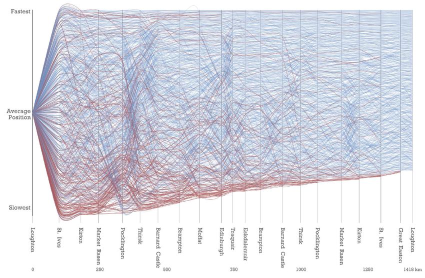
C. Perin & R. Vuillemot & C. D. Stolper & J. Stasko & J. Wood & S. Carpendale / Sports Data Visualization STAR

                                                                              2. Methodology and Scope
                                                                              Before diving into the review of sports data visualization, in this
                                                                              section we describe our methodology for building our collection of
                                                                              related research papers and newspaper and blog articles. We then
                                                                              explain the main dimensions that emerged from our analysis of the
                                                                              literature and form the high-level structure of this report.

                                                                              2.1. Building the Collection
                                                                              To review the state of the art in sports data visualization, we started
                                                                              with personal collections of seed papers and links to infographics.
                                                                              Authors of this report had been building these collections over
                                                                              several years, in some cases from their previous work on sports
                                                                              data visualization or in others from their interest in a particular
                                                                              sport or player. The duplicates that resulted from merging these
Figure 1: The 98 sports data visualization articles from both                 personal collections were important as these were cues of particular
academics and practitioners we collected, grouped by year. This               relevance of the contribution, sport, or event.
chart emphasizes the recent growth in research surrounding sports
                                                                                 The second step was to expand the collection in order to remove
data.
                                                                              biases on favorite sports and expand the scope of sports and events.
                                                                              We primarily used Google Scholar, the ACM DL Library, and
                                                                              IEEEXplore in this phase. We used keywords such as sports
                                                                              visualization and sports data visualization to
                                                                              search for recent papers that we did not know of and to reach other
   While many academic papers, including other state of the art               communities.
reports, include sports visualizations, sports as an application
domain has not yet been the subject of a review from a                            We further reviewed hundreds of infographics as they are a
visualization perspective. Visualization of team sports has recently          significant driver of advances in sports visualization. This review
been surveyed [GH17], however, this previous survey focuses                   made it possible to contrast the work in the research community and
solely on team sports and takes a fully spatio-temporal lens to               the work from sports practitioners. For selecting these newspaper
looking at visualizations used in this context. Our paper differs in          and blog articles among the thousands that exist, we decided to go
both aspects as we integrate both team sports and individual sports           for broadness and diversity and include any new visualization that
and discuss box-score data and meta-data in addition to (spatio-              seemed to offer a new perspective on sports data visualization. We
temporal) tracking data.                                                      also searched on the Web for non-research sports visualization that
                                                                              already had a citation entry. Google Images was also helpful for
   Existing sports visualization research stems from passionate,              filtering out non-visual entries.
often distributed, communities working on sports data analysis and
communication. With the increasing interest in sports visualization              A third step was collection completion. As we identified
from both sports practitioners and visualization researchers,                 authoritative sources of publications and newspapers (e.g. New
there is a need to document and analyze these efforts. In our                 York Times sports infographics), as well as the most prolific sports
review we identify three types of sports data that are used in                data sources and tracking technologies, we visited websites to
sports visualizations: box score data (data containing statistical            browse complete collections of articles in conferences or tagged
summaries of a sport event such as a game), tracking data (data               articles on newspapers websites (e.g. data-visualization
about in-game actions and trajectories), and meta-data (data about            on FiveFirthyEight and olympics on FlowingData).
the sport and its participants but not necessarily a given game).                The fourth and final step was to reduce the collection. In
Using these three data types, we structure our collection of 98               this step, we discarded fringe articles and infographics whose
works from both academics and practitioners in the space and                  contribution was below average, such as by: not making a strong
lay out the opportunities and challenges for the future of this               contribution to sports data analysis; not providing a novel lens on
fascinating subfield.                                                         sports data (e.g., simply using standard charts and not providing
                                                                              any particular insight); or not describing the underlying process
   We start by describing the methodology and scope of our review
                                                                              enough to understand the data or the context sufficiently. We also
in section 2. Then, in section 3, we introduce box-score data,
                                                                              discarded academic papers without a visual contribution (e.g., data
tracking data and meta-data, the three types of sports data we
                                                                              mining and algorithmic papers that are related to sports data but do
extracted from analyzing the literature in sports data visualization.
                                                                              not contribute to visualization research). We also discarded papers
Sections 4, 5, and 6 then organize the literature using these three
                                                                              that are about a generic visualization technique and use a sport as
types of sports data. Finally, we reflect on our review to discuss
                                                                              an example scenario (e.g., [JSSS16]).
both core and under-explored topics in sports data visualization,
unveiling challenges for the area of sports visualization in particular         This process resulted in 281 initial papers and articles, out of
but also for information visualization in general.                            which we selected 98 for review in this report.

                                                                                                                                                  c 2018 The Author(s)
                                                                                 Computer Graphics Forum c 2018 The Eurographics Association and John Wiley & Sons Ltd.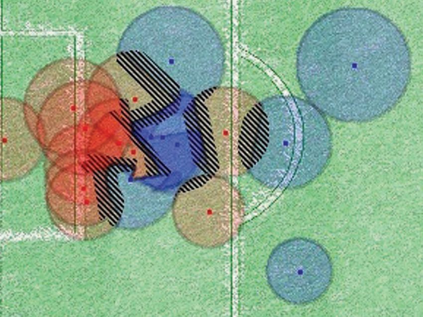
C. Perin & R. Vuillemot & C. D. Stolper & J. Stasko & J. Wood & S. Carpendale / Sports Data Visualization STAR
rs ) )
to of ed d
ac xt e s lv lve
rts is nte us t or nvo vo
i in
o
sp aly
s co n ac rs s
e
tio rts to tor
es an th ue
po ac ac
o lv ts
n n to niq ue lora s t s s
nv e
i
el is ch ni xp
q
ith or ort dy
ta -i m od f v te ch e e w sp (sp Stu
da data y ire n
ll ud qu /m n o ion n te ac io no y e
e
or ing dat
a y
ll ba ke ll g st Re hm my tio izat tio sp rat udy io ( tud ativ
c
s k er is ba et oc ba ing y in r n / t o a
ig ks ori on egr ual era sig
c n bo d st nar e s ntit
o x- rac eta o cc nn ase ask e h oot ycl ugb unn the e s s g x t s t e o l l a
e l e as u a
year B T M e
S T B B I c F C R R O D Ta Al Ta In Vi In D C Fi Sc C Q
PBV16 2016
PVF14 2014
VP15 2015
AAB*17 2017
JB97 1997
PYHZ14 2014
CS06 2006
Tur94 1994
Met16 2016
OJK13 2013
Won13 2013
CF13 2013
Bes16 2016
Woo15 2015
SJS*17 2017
PVF13a 2013
SJL*16 2016
RSB11 2011
SJB*16 2016
JSS*14 2014
AAB*16 2016
SHJ*15 2015
SSN*16 2016
SJL*18 2018
CEGH17 2017
MLM*17 2017
ACADEMICS
SAMS*17 2017
GH17 2017
HZ16 2016
Dem13 2013
BJM02 2002
POJC01 2001
LOC*16 2016
DKVS14 2014
MB13 2013
PM07 2007
CM13 2013
Gol12 2012
MCHD12 2012
CLX*16 2016
BEA16 2016
PSBS12 2012
KYY*16 2016
WWM13 2013
BBW16 2016
MWA*01 2001
LCP*12 2012
CPG*16 2016
CLP*15 2015
CMHD10 2010
STS*14 2014
WLS*18 2018
LCN15 2015
DWA10 2010
PVF13b 2013
BLC*14 2014
VP16 2016
FMBG15 2015
TSLR07 2007
STL09 2009
DMS12 2012
PM06 2006
LTB16 2016
CONTRIBUTION EVALUATION
Lov15 2015
Won16 2016
CW06 2006
Tim07 2007
CQW11 2011
LSS13 2013
AQ16 2016
Pea17 2017
Gol17a 2017 In rows the reviewed literature both from academics
AQ14 2014 and practitioners, grouped by sports data type.
PRACTITIONERS
QR16 2016
CNW08 2008
Con16 2016
DQ14 2014 Black circles indicate:
Gol17b 2017
QW14 2014 - In DATA, which sports data section the work is
Sus06 2006 discussed in,
ySSS13 2013
Art16 2016
- In SPORT, which sport the work is about,
RCW10 2010
Tim17 2017
Mor16a 2016 - In CONTRIBUTION, if the work is academic,
TKW*16 2016 what are the main research contributions,
Are17 2017
BC16 2016 - In EVALUATION, if the work is academic, which
The16 2016
evaluation methods are reported.
Spo16b 2016
Ais14 2014
Ais17 2017
Fry05 2005
Mor16b 2016
Sil16 2016
Jos14 2014
NFL15 2015
MLBG16 2016
DATA SPORT
Figure 2: The 98 articles we reviewed described in terms of sport, sports data type, contribution type and evaluation method.
c 2018 The Author(s)
Computer Graphics Forum c 2018 The Eurographics Association and John Wiley & Sons Ltd.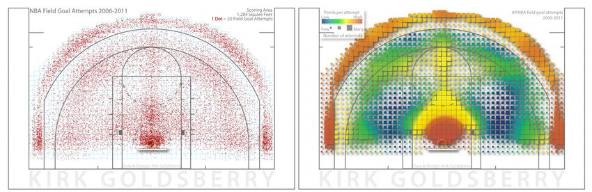
C. Perin & R. Vuillemot & C. D. Stolper & J. Stasko & J. Wood & S. Carpendale / Sports Data Visualization STAR

2.2. Analyzing the Collection
Two researchers independently open-coded a dozen elements of the
collection with which they were the most familiar. After several
iterations and refinements, we identified three overarching sports
data types we review in this STAR and that we introduce in
section 3:
  Box score data corresponds to discrete, in-game event data and
  is detailed in section 4,
  Tracking data corresponds to continuous spatio-temporal
  motion data and is detailed in section 5, and
  Meta-data corresponds to discrete data beyond a specific game
  and is detailed in section 6.
   In section 7 we further discuss trends that emerge from the
research papers we reviewed in terms of contribution type and
evaluation method. These descriptors make it possible to grasp
the breadth and depth of contributions that emerge from sports
data visualization, as well as extract the various strategies for
conducting research in this area.
  Figure 2 presents a summary of the 98 articles and research
papers we analyzed in terms of the aforementioned descriptors.

3. Types of Sports Data
As explained in the previous section, we structure our survey based
on the three types of sports data we derived from related papers              Figure 3: Example of scorecard notation that captures events
analysis: box-score data, tracking data and meta-data.                        (e.g. errors, hits) in baseball. By Synaptidude at English Wikipedia
                                                                              [Public domain], via Wikimedia Commons.
   One could apply almost any visualization to the sports domain,
and many visualization types (e.g., node-link diagrams, time series
line plots, and heatmaps) have been applied to sports. What makes
sports a unique domain of interest is the variety and specificity of          tracked by sport officials, journalists, and fans, using scorecards
the data it generates. Thus, to discriminate the techniques used              (see Figure 3). Such scorecards capture the structure of the game as
to visualize sports data, we look into the types of data that are             discrete events such as substitutions, hits, and fouls by players over
visualized. In particular, while trajectory information and meta-             the course of the game.
data are often of a similar nature across sports, box-score data                 The term box-score designates the statistical summary of a
are highly sport-specific. The combination of these three types of            game. Although this term was originally used in baseball, it has
sports data results in a rich and wide space of sports visualization.         been adopted by many sports including basketball and hockey. We
   We note ahead of time that these three data types are not                  use the term to describe any discrete data referencing in-game
perfectly orthogonal—the line between these data types is not                 events. This can include both summary statistics (3 hits, 1 walk,
always completely clear. For example, some professional sports                1 strikeout) as well as finer-grained event data (goal in the 83rd
leagues now use tracking data to compute box-score data and                   minute). We mentioned that the line between categories can be
meta-data usually requires box-score and/or tracking data to be               blurry. We tended to not consider any discrete data that had a spatio-
put in perspective. Manually collected event data with additional             temporal aspect to it (such as where on a court a tennis shot landed)
qualitative descriptors (e.g. location and speed of a shot on goal)           as box-score data and instead categorized them as tracking data.
could fit into either box-score data or the tracking data categories.         Note that despite advances in technology, as of today most of these
The height of a baseball player or soccer goalie, which we consider           events and statistics are still generated by humans in sometimes
to be meta-data, could also be considered tracking data as height             quite tedious processes.
can affect the size of the batters’ box or the free space on goal.
However, most data falls squarely into one of the three categories.           3.2. Tracking Data
                                                                              Recent development in tracking and sensing technologies now
3.1. Box-Score Data                                                           enable collecting and analyzing new classes of data beyond the
                                                                              traditional box-score.
Sports have a long and constant tradition of recording critical
observations. Spectators have been tracking the history of sports               This tracking data contrasts with the box-score approach as the
dating to very early competitions, such as the Ancient Olympic                volume, variety, and precision grow exponentially and at cheaper
Games in 776 BCE. Since then, game results and details have been              costs. Most tracking data is collected by utilizing machine vision

                                                                                                                                                  c 2018 The Author(s)
                                                                                 Computer Graphics Forum c 2018 The Eurographics Association and John Wiley & Sons Ltd.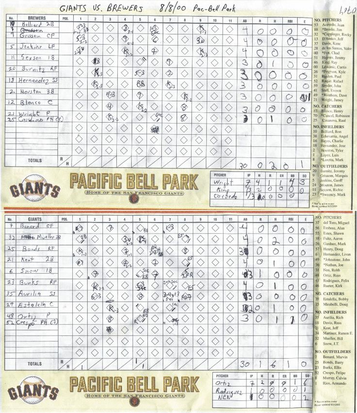
C. Perin & R. Vuillemot & C. D. Stolper & J. Stasko & J. Wood & S. Carpendale / Sports Data Visualization STAR
EventPlayer
+time
EventPlayerAction EventPlayerPosition
+outcome (0/1) +x
+y
Shot Pass Offensive Defensive Error
+shotType1ID +passType1ID +offensiveTypeID +defensiveTypeID +errorTypeID
+shotType2ID +passType2ID
+shotType3ID +passType3ID
+shotType4ID +bodyPartID
+shotOriginX +isOffside (0/1)
+shotOriginY
+shotDestinationY passType1ID: offensiveTypeID: defensiveTypeID: errorTypeID:
+shotDestinationZ
+bodyPartID 000: short 000: dribble (0/1) 000: tackle (0/1) 000: bad control
+isOwnGoal (0/1) 001: long 001: aerial (0/1) 001: aerial (0/1) 001: dispossessed
+strength [0,1] bodyPartID: 002: cross 002: good skill 002: interception 003: loose ball
shotType1ID: shotType2ID: shotType3ID: shotType4ID: 003: switch of play 003: dribbled
000: right foot 004: through 004: touched the ball
001: left foot 005: clearance
000: free kick 000: volley 000: saved 000: rising 002: right leg
001: penalty 001: overhead 001: post 001: dipping passType2ID: 006: ball out of field
003: left leg 007: blocked cross
002: direct corner 002: half volley 002: missed 002: with bounces 004: head
003: from corner 003: diving head 003: goal 000: on air 008: blocked shot
005: chest 001: on ground 009: corner given
004: from free kick 004: post and goal 006: shoulder
005: from throw in 005: GK touch and goal 007: back passType3ID:
006: from GK release 006: deflected 008: right back heel
007: from pass 007: deflected and goal 009: left back heel 000: back
008: from personal action 001: corner
009: from cross 002: free kick
010: from scramble 003: throw in
Figure 4: Taxonomy of detailed soccer data used to collect and structure spatio-temporal events [PVF13a], based on Opta’s data scheme.
Image courtesy of the authors, used with permission.
to gather precise spatio-temporal information about the players and From an information visualization perspective, this type of data
equipment in real-time during the course of play. A variety of is different from for example, spatial data, as it is usually more
multi-camera tracking systems such as Hawk-Eye, K2 Panoramic abstract and strictly follows rules that define the types of events
Video system, Sportvision RACEf/x [Spo16b], PITCHfx/Statcast, and occurrences recorded during a sports events. Sports rules are
SportVU, SportsCode, Catapult Sports’ OptimEye S5 [Cat18], indeed the backbone of sports data, since tracking and meta-data (as
and Dartfish collect this form of data. (See [DKVS14] for defined in this paper) may be considered, in a sense, independent
a comprehensive list and comparison). A common underlying from the sport itself. Rules are, on the whole, stable over time
motivation for sports visualization research is to make use of the but do occasionally change slightly—often driven by needs from
unprecedentedly detailed datasets generated by these technologies. media, TV broadcasting, and advertising—such as MLB’s changes
Figure 4 demonstrates the complexity of the data with a taxonomy in 2015 [MLB15] to increase the pace of baseball games.
of soccer tracking data provided by one of the major sports data We separate the visualization of box-score data into two main
collection companies [PVF13a]. categories: time-evolving championship tables and rankings relate
to the explicit importance of time in sports and scores, goals, and
3.3. Meta-Data points relate to the general sports rules.
Box-score and tracking data capture specific matches and events in
those matches. Beyond this, there is additional data that surrounds 4.1. Time-Evolving Championship Tables and Rankings
sports that can add context to these events. Such data might concern Sport competitions can span over long periods of time. Typically,
rules, stadium capacities, physical characteristics of players, kit team sports such as soccer, football, ice hockey, and basketball
colors, team badges, and sponsor information to name a few. The are played in championships, or leagues, every year. Teams play
data may also come from less sports-exclusive domains such as against each other two times or more over the course of several
social media activity during a game. months. In some leagues this is either the entire competition
Meta-data can also generate meta-data, for example correlations (e.g., for European soccer championships) or the first phase of
between box-score and tracking data or factors such as stadium the competition (e.g., for the NBA and the NHL). The results
formats (see Figure 5), players’ diets, or weather conditions. of these games build standing tables, which determine who wins
the competition, who is demoted to a minor league, and/or who
progresses to a highly anticipated playoff stage.
4. Visualization by type: Box-Score Data
Ranking (or standing) tables have been the standard way of
We start our review with box-score data. 26 / 98 articles in our representing and analyzing championships. They typically consist
review focus solely on this type of sports data. The popularity of of vertical lists of teams’ names and indicators of success such as
box-score data, in particular among practitioners, can be explained wins and losses, points earned for victories, and/or the number of
by its cheap and technology-independent means of acquisition. goals scored and conceded. The teams are ordered by rank, which
Although box-score data is often simple and small-scale, it is is a derived index usually based on their number of points or ratio
diverse and results in a wide variety of visualization approaches. of wins to games played.
c 2018 The Author(s)
Computer Graphics Forum c 2018 The Eurographics Association and John Wiley & Sons Ltd.
C. Perin & R. Vuillemot & C. D. Stolper & J. Stasko & J. Wood & S. Carpendale / Sports Data Visualization STAR
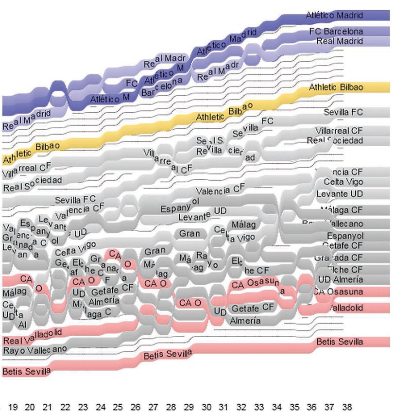
Figure 6: The second half of the 2013–2014 Spanish Liga,
visualized using GapChart [PBV16]. At each matchday, the lines
representing the teams do not overlap. Teams that have the same
number of points at a given time are shown with no white space
between them. Thin gray lines indicate 3-point differences between
two consecutively ranked teams. Image courtesy of the authors,
Figure 5: Visual comparison of baseball stadium used with permission.
dimensions [Lou15] is an example of using meta-data to
understand the influence of a baseball game’s environment on
teams’ play. Image courtesy of the author, used with permission.
time with a line graph then results in either a rank chart—where
Allowing to navigate in the time dimension of tables. Because the y axis is an ordinal axis that conveys rank—or a score chart—
standard ranking tables do not convey the time-evolving aspect where the y axis is a quantitative axis that conveys the result of the
of championships [PVF14], existing work has looked into ways score function used to determine the rankings [PBV16].
of combining the well-established and widely used ranking tables
with visualizations that convey the changes over time. While rank charts do not convey the magnitude of the gaps (or
score differences) between teams, score charts convey these scores
In a series of works, Perin and Vuillemot [PVF14, VP15]
but result in overplotting and overlapping lines. A way of tackling
explored new interaction techniques for navigating into the
this issue is to change the mapping on the y axis to convey not the
temporal dimension of ranking tables. Based on an analysis of
rank or score of each team over time but the relative distances that
tasks that soccer journalists and enthusiasts seek to perform, they
separate the teams. This is particularly important when looking at
proposed a way of interacting with the rank domain (such as the
championship data as the gaps between teams has more importance
number of points of a team at a given time) to explore the time
than the absolute score a team has. This technique facilitates: more
domain. They also proposed integrating a line chart visualization
accurate predicting of the final championship rankings; reflection
into the table and offered a way of transitioning between the two
on the full course of the competition; and comparison between the
views [PVF14]. The authors further refined the technique to make
variability of different leagues. Both gap charts [PV13,PBV16] (see
it possible to navigate into ranking tables at different points in
Figure 6) and Standings Tracer [Won16] (see Figure 7) take the
time by navigating directly along the trajectory of the rank of a
approach of conveying the relative score differences between teams
team [VP15].
over time (note that their formulae for determining the mapping
Showing relative gaps. Ranking tables have historically laid out on the y axis differ slightly). Both techniques also feature a focus
all teams of a championship on a linear scale, i.e. with rows (teams) interaction to select a team and explore that team within the broader
being simply ordered by rank. Showing rankings that evolve over context of a season (see Figure 8).
c 2018 The Author(s)
Computer Graphics Forum c 2018 The Eurographics Association and John Wiley & Sons Ltd.
C. Perin & R. Vuillemot & C. D. Stolper & J. Stasko & J. Wood & S. Carpendale / Sports Data Visualization STAR

                                                                                            Many infographics from online newspapers create comparisons
                                                                                         of players and teams by using multiple line charts. This is the case
                                                                                         with The New York Times’ Peyton Manning’s touchdown passes
                                                                                         record [AQ14]; Paths to the Top of the Home Run Charts [Tim07];
                                                                                         comparison of baseball players who reached 3000 hits in their
                                                                                         career [CQW11] or of NBA players in terms of number of points
                                                                                         scored during playoffs [Pea17]; and with the comparison of NBA
                                                                                         players performances in terms of points, rebounds, and assists
                                                                                         per game over the season [Gol17a]. One notable example of this
                                                                                         technique is Five Thirty Eight’s sumo project [Con16], showing
                                                                                         the history of sumo from 1761 to 2017, using overplotting of
                                                                                         line graphs with color coding and annotations. The density of
Figure 7: Standings Tracer [Won16] showing the relative points
                                                                                         information in those visualizations creates a baseline that usually
of all teams in a championship over time. Image courtesy of the
                                                                                         gathers the majority of players from which a select few top
author, used with permission.
                                                                                         performers visually stand out.
                                                                                            Other visualizations besides line charts make use of overplotting,
                                                                                         such as scatterplots. For example, by overplotting all swimming
                                                                                         world records over time [Are17] one can explore how swimming
                                                                                         world records evolved across history, paces of change, and outliers.
                                                                                         The Berlin 2016 marathon visualization [TKW∗ 16] is another
                                                                                         example that shows all the runners participating in the race on a
                                                                                         single map. It is also possible to establish a goal and see where in
                                                                                         the pack of runners one would need to be to achieve that goal.
                                                                                            Visualizing all statistics. In the visualization community, some
                                                                                         complex exploratory tools support the analysis of scores, goals,
                                                                                         and points in sports. SportsVis’s baseline bar display [CS06]
                                                                                         makes it possible to explore the performance of baseball teams
Figure 8: Standings Tracer’s [Won16] focus interaction. Selecting                        or players over the course of one season. NBAVis [LSS13]
a team shows details about each game the team played during the                          consists of a scatterplot with multiple dimensions such as team,
championship. Color indicates the outcome of the game (win, loss,                        rebounds, assists, points, and blocks to explore NBA data. With
draw) and vertical lines connect the focus team’s line graph to                          Buckets [Bes16] and BKViz [LTB16], it is possible to explore
their opponent for each match day. This creates a fishbone of the                        the points a basketball team scored against each other team in
team that shows the “gaps” between the focus team and each of its                        the league, among many other facets of the data. Chung et al.’s
opponents. Image courtesy of the author, used with permission.                           knowledge-based ranking system features multiple coordinated
                                                                                         views to explore the multiple facets of rugby games [CPG∗ 16].
                                                                                         These approaches result in powerful tools in which many
                                                                                         dimensions can be explored simultaneously—as opposed to more
4.2. Scores, Goals, and Points                                                           static infographics—but at the cost of being more complex to use.
Whether or not sports are framed within competitions, they obey                             Laying out in context. Often, sports visualizations that show
specific rules. In many sports, teams or players participating in a                      scores, goals, or points show these values within the broader
game or competition need to score points to win each game (e.g.,                         context of sport events (e. g., full games). For example, some sports
score goals in soccer, score points in tennis). Within a competition,                    like tennis have their scoring structured hierarchically. A tennis
points may be attributed according to their performance towards                          match consists of several sets, each set consists of several games,
the competition (e.g., three points for a victory in most soccer                         and each game consists of several points. The outcome of a game
championships and points given to each participant in a decathlon                        (who wins and who loses) follows this hierarchy, and the player
after each of ten events).                                                               who scored the most points is not guaranteed to win the match. To
                                                                                         convey the bigger picture in which points are scored, treemaps have
   Contextualizing by overplotting. Many visualizations are
                                                                                         been used for visualizing this natural hierarchy [JB97].
dedicated to record-breaking points and scores. For example,
Stephen Curry’s 3-point record was put in context in one of The                             As another example, Chris Love used Tableau to show all the
New York Times’ infographics [AQ16]. This line chart shows one                           shots on goal for all games of a Premier League’s championship
line for each of the 752 players who finished in the top-20 in 3-                        day [Lov15] (see Figure 10). The visualization shows a bar chart
point attempts at the end of each season between 1980 and 2016.                          where the x axis represents time and each bar represents a 5 minute
This visualization clearly shows how Stephen Curry is an outlier                         interval. The y axis—the length of each bar—encodes the shots
compared to the rest of the players, as he goes “off the charts”.                        on goal. This visualization conveys the dynamics of each game by
A similar and at least as famous infographic shows Barry Bonds’s                         showing important events (shots and goals) in the context of the
progress towards breaking the career home run record [CW06].                             timeline of the game.

 c 2018 The Author(s)
Computer Graphics Forum c 2018 The Eurographics Association and John Wiley & Sons Ltd.
C. Perin & R. Vuillemot & C. D. Stolper & J. Stasko & J. Wood & S. Carpendale / Sports Data Visualization STAR

                                                                             Figure 10: Small multiples of football games putting the shots and
                                                                             goals in the context of soccer game timelines [Lov15] (cropped).
                                                                             Image courtesy of the author, used with permission.

Figure 9: A History of Sumo [Con16] is a stylized interactive
visualization that presents the history of sumo using storytelling
and exploration capabilities. Image courtesy of the author, used
                                                                             Figure 11: Relative time differences between each cyclist
with permission.
                                                                             participating in the race and the top performer at that
                                                                             moment [Woo15]. Red lines encode cyclists who did not finish the
                                                                             race. Image courtesy of the author, used with permission.
   Showing relative differences rather than absolute values.
In sports such as skiing, running, and racing, time is what
matters most. The New York Times showed how close to                            In the context of golf, multiple Slope Graphs [Tuf01] have
winning participants were for each final of alpine skiing [Bou47],           been used to show Tiger Woods’s difference in performance
bobsled, luge, speed skating, and skeleton for the 2014 Winter               compared to the rest of the world’s top golfers in non-major and
Olympics [DQ14]. Instead of showing the absolute times of                    major tournaments [CNW08]. Once again, what matters is the
participants, they show the time difference relative to the winner.          relative difference between Woods and the other players rather than
Relative times are particularly important in such sports where               absolute numbers of strokes.
differences are often matters of milliseconds. For such short
                                                                                In the context of cyclist group racing, Wood created graphs (such
intervals, a sonification approach was used in the 2010 Winter
                                                                             as the one shown in Figure 11) showing the relative difference
Olympics to grasp the scale of infinitesimal differences between
                                                                             between each cyclist and the top performer at each point in time
finish times [Ama10].
                                                                             of the race [Woo15].
   The New York Times also created an image showing all fastest
men in the world by year, since 1896, with their position on
                                                                             5. Visualization by type: Tracking Data
the track at the time of the current world record [QR16a]. By
representing each data point with a sprinter, the image looks like           Sports tracking data is a natural evolution of box-score data that
a photograph from the top of the track and the differences in                has become increasingly available due to recent advances in sensor
performances are easily apparent to the reader.                              and video motion detection technologies [GH17]. The majority

                                                                                                                                                 c 2018 The Author(s)
                                                                                Computer Graphics Forum c 2018 The Eurographics Association and John Wiley & Sons Ltd.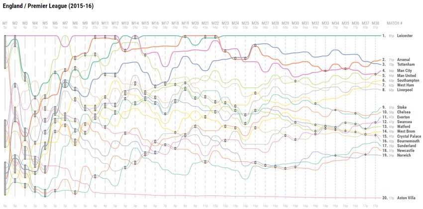
C. Perin & R. Vuillemot & C. D. Stolper & J. Stasko & J. Wood & S. Carpendale / Sports Data Visualization STAR

Figure 12: Shot distribution and density in CourtVision [Gol12]. Sweet spots usually are below the hoop or behind the 3-point line. Image
courtesy of the author, used with permission.

of the articles we collected (55 / 98) make use of tracking data,                           While these aggregations approximate otherwise accurate data
for example to track player positions on a field, ball speed, and                        (e.g. shots), they have been used to identify players’ roles and
path after a shot. Tracking data usually consists of series of                           teams’ systems. For instance, “spray charts” [DKVS14] show
spatio-temporal events at a very fine grain of detail, with multiple                     where balls have been hit to—creating spatial groupings of hits that
dimensions such as player identities and type of action. The data                        highlights areas of the field where events happen frequently.
scales with the number of games or players or by adding more
                                                                                            Other variants of density maps include radial heatmaps to show
sensors and cameras.
                                                                                         ice hockey shots [PSBS12]. Density maps are often decorated
   Because the data is spatio-temporal, it is not necessarily directly                   with landmarks from the field of play—such as formalized line
governed by the rules of the game. This is the primary difference                        schemes—to provide scale and contextualize the data within the
as compared with box-score data which are summaries of events                            game’s rules. In some cases, landmarks visually emerge on their
dictated by sports rules. Notably, new box-score data metrics—                           own due to data distribution. In CourtVision [Gol12], the 3-point
e. g., “Contested Points” and “Expected Goals”—can be derived                            line appears due to the lack of shots just inside it (see Figure 12).
from tracking data like shot attempts, player movements without                             Events representation. Despite events having strong ties with
the ball, or ball trajectories that did not result in a score change.                    their (x, y) position, they are often best represented with position
   The richness and density of tracking data raises other challenges                     in the display encoding task-dependent attributes. For example,
than the ones of box-score data, often involving some combination                        baseball hit analysis has found that the combination of ball exit
of algorithms, data mining, and visualization. In this section we                        velocity and launch angle determines whether a hit will likely be a
separate general work in visualization of events and trajectories                        home run [Art16] (see Figure 13). A connected scatterplot by time
(often adopting a third-person perspective on the data) from work                        allows the visualization’s user to easily detect increases in average
dedicated to representing the data from the players’ point of view                       kick distance and field-goal percentage of kickers in American
(often adopting a first-person perspective on the data).                                 Football [Mor16a] (see Figure 14). GameFlow provides a grouping
                                                                                         of events over time [CLX∗ 16] to reveal patterns and similarities in
                                                                                         sequences and sub-sequences. Events can also be locally grouped,
5.1. Events and Trajectories                                                             such as using a K-means algorithm to group Rodger Federer’s
Event density map. The most straightforward way to plot raw                              similar tennis shots [Dem13]. Passes can be represented as a
tracking data is as events on a dot map, such as hit balls on                            network such as for the 2012 NFL championship [Gol13]. Cycling
a baseball pitch [DKVS14, MB13, LOC∗ 16]. Although simple,                               time trials have been represented using a matrix to visually compare
dot maps provide enough details to characterize players’ abilities                       time series [BBW16].
and are a natural representations of ball trajectory origins or                             Trajectories. Trajectories result from the connection of discrete
targets. Interestingly, they are commonly used as a visual signature                     spatio-temporal events of the same entity. For instance, they might
characterizing a player or a team [Bes16] for complex play                               represent the spatio-temporal movement of players, balls, or other
analysis [DKVS14].                                                                       equipment during a game.
   Variations of density maps include using spatial binning [Gol12]                         Trajectories are the second most frequent way of plotting raw
to generate discretized heat maps using a preset color scale. The                        tracking data and conveying the temporal and sequential structure
field is partitioned into regular areas which are each assigned a                        of events [POJC01, MCHD12, SSN∗ 16, JSS∗ 14]. In their raw
color according to the number of events that occurred in that area.                      format, players’ trajectories resemble random scribble. However,

 c 2018 The Author(s)
Computer Graphics Forum c 2018 The Eurographics Association and John Wiley & Sons Ltd.
C. Perin & R. Vuillemot & C. D. Stolper & J. Stasko & J. Wood & S. Carpendale / Sports Data Visualization STAR

                                                                             Figure 14: A connected scatterplot shows trends over time. In
                                                                             this case, it emphasizes that kickers are taking longer attempts
                                                                             than ever. From Five Thirty Eight [Mor16a]. Image courtesy of the
                                                                             author, used with permission.

Figure 13: A sweet spot appears when coloring ball hits by scoring
value, which reveals the right trade off between ball velocity and
angle. From Five Thirty Eight [Art16]. Image courtesy of the
author, used with permission.

some specific events are already recognizable, such as corner
kicks in soccer [Sus06]. T-patterns [BJM02] aim at enhancing
the presentation of spatial events by grouping them as zones.
                                                                             Figure 15: Soccer pressure is illustrated by trails showing the
Interesting patterns are frequent connections of zones by the same
                                                                             pressure zone of the defense against the opponents [AAB∗ 16].
player. Shorter trajectories (trails) also aim at reducing visual
                                                                             Image courtesy of the authors, used with permission.
clutter, and are used in sports when entities are simultaneously
moving such as during boat races [BC16], soccer games [AAB∗ 16]
(see Figure 15), or swimming races [CM16]. Trajectories are often
used as visual signatures of phases of play [MLM∗ 17, PVF13b].               between players of two opposite teams [SJB∗ 16] (see Figure 16)
These small multiples can represent segmented and abstracted                 and pressure against adversaries [AAB∗ 16, SJL∗ 18, AAB∗ 17]. It
sports events, such as football catches [Tim17], which then act as           also makes it possible to classify the types of passes that soccer
small visual summaries of particular game events.                            players make during a game [CEGH17].
   Trails can convey movement in motion charts [MMZ17], and                     A particular use of trajectories is for movement deconstruction,
further be used as visual signatures of teams tactics [SJL∗ 16].             following a step-by-step analysis of complex sequences of actions
Based on these trajectories, it is possible to compute and visualize         such as those of a basketball rebound [MCHD12]. In a similar
new data such as players’ “interaction spaces”—“duel areas”                  fashion, trails can emphasize a single movement. During the

                                                                                                                                                 c 2018 The Author(s)
                                                                                Computer Graphics Forum c 2018 The Eurographics Association and John Wiley & Sons Ltd.
C. Perin & R. Vuillemot & C. D. Stolper & J. Stasko & J. Wood & S. Carpendale / Sports Data Visualization STAR
levels of spatio-temporal abstraction to simplify smoothing the
trajectories [SAMS∗ 17] (see Figure 18).
Detailed events with context. Besides space and time data,
complex descriptors such as the ones listed in Figure 4 provide
hundreds of ways a ball can be kicked or a player can behave
with it. SoccerStories [PVF13b] (see Figure 19) represents complex
multivariate records of each time the ball is kicked. While most
visualizations apply the same representation to an entire dataset,
their approach is to simplify such data using visual aggregation,
where different visualizations are used piece-wise. Visualizations
are organized on a spatial layout, and are centered where actions
from the subsets spatially occur.
Real-time. As tracking technologies offer a real-time data feed,
player position tracking can be broadcasted and analyzed live.
Both Matchpad [LCP∗ 12] and the exploration of the design space
of glyphs in rubgy [CLP∗ 15] summarize players’ events in a
Figure 16: Each circle represents a player. The radius of a circle compact display using glyphs to track and categorize plays. Both
represents the player’s “interaction space”, and the color of the approaches provide a more effective sequence of events than the
circle encodes the team of the player. Hatching patterns show the more standard textual play-by-play sequences of game events. In
potential “duel areas” of several players [SJB∗ 16]. Image courtesy particular, it requires less attention when monitoring and provides
of the authors, used with permission. compact game summaries. Major League Baseball Advanced
Media’s Gameday technology [MLB17] allows fans to see the
trajectory and type of each pitch in real-time, and recent work
augments the video stream of a soccer game with visualizations
to convey the dynamics of the game [SJL∗ 18].
5.2. Players’ Point of View
First-person. While trajectories offer a bird’s eye view on players,
changing the point of view to the players’ one allows viewers
to understand the difficulty of a shot or a hit. A first-person
point of view—such as a soccer goalkeeper’s [RSB11], a baseball
hitter [RCW10], or a baseball catcher [MLB17]—changes the
camera and perspective on the data to orient the viewer to the
way players experience the event. Events appear either as animated
playback to re-create an actual play or as static heat maps
with shot distributions such as tennis ball trajectories [ySS13].
First-person points of view usually include 3D objects such
as a goalkeeper [RSB11] or a batter’s silhouette and stadium
Figure 17: A penalty shooter’s point of view is reconstructed
features [MLB17] to suggest a more realistic environment.
in 3D, showing her favorite target areas around the
goalkeeper [RSB11]. Image courtesy of the authors, used Embedded tracking and visualization. Short feedback loops
with permission. are important during any learning process. Several efforts have
been made to provide those to players during training routines.
Kaplan et al. display pedal pressure on training bikes [KYY∗ 16]
to optimize effort and prevent injuries. Treadmill screens can also
provide real-time feedback to runners [CMHD10]. The use of
2016 Olympics, Simone Biles’s complex and fast-paced gymnastic
small, portable devices such as wrist-bands to detect activity in
movements [The16] were highlighted using a trails overlay atop the
basketball [BEA16] also provides individual feedback. Equipment
original video footage enabling visual persistence of multiple parts
can also be used as a ubiquitous mechanism to broadcast game-
of her body during her routine.
related data, such as heart rate data on a bicycle helmet [WWM13].
Finally, one of the challenges with spatio-temporal trajectories Most of these visualizations display data as numbers using no
within a bounded area such as a pitch is that representing an encoding. Besides performance indicators, traditional events such
entire game or even just a subset of a game quickly results in as scores on a display on a basketball hoop [CM13] or win/loss on
overplotting, or ‘spaghetti’ representations. Tackling this issue is a jerseys [PM07] have been shown to provide better competition and
hot topic in sports visualization, in particular, but also in visualizing engagement among players. GPS systems in racing cars [Spo16b]
spatio-temporal trajectories in general. For example, using different now collect speed, acceleration, time behind leader, amongst other
c 2018 The Author(s)
Computer Graphics Forum c 2018 The Eurographics Association and John Wiley & Sons Ltd.C. Perin & R. Vuillemot & C. D. Stolper & J. Stasko & J. Wood & S. Carpendale / Sports Data Visualization STAR
Figure 18: Representing spatio-temporal trajectories of soccer players in detail, after simplification and aggregation [SAMS∗ 17]. Image
courtesy of the authors, used with permission.
type of sports data the least represented among of the three.
However, because meta-data is also very diverse, visualizations
of meta-data vary a lot. We structure our discussion of sports
meta-data along three categories. First we discuss the visualization
of sports, players and games characteristics such as physical
landmarks on a pitch; then the visualization of players and teams
performance such as team tactics; and then the visualization of
competition structure and the thoroughly studied visualization of
tournament brackets, in particular.
6.1. Sports, Players, and Game Characteristics
Meta-data plays an important role to convey a sport’s identity and
rules. Such information is needed to understand the importance
Figure 19: SoccerStories [PVF13b] is the spatial connection of some events. For example, during a soccer game a foul in the
of charts for the visual decomposition of a soccer phase. Image penalty area has the risk of resulting in a penalty shot for the other
courtesy of the authors, used with permission. team. Thus, such visual cues such as the boundaries of a field
that players experience in reality are often replicated within the
visualizations using the same codes.
data that together provide monitoring data for mechanical assistants Sport recognition. As we previously discussed, event data alone
to anticipate repairs and prevent accidents. is sometimes enough to distinguish the sport itself. For example,
this is the case for shots around a basketball hoop [Gol12]. The
background pitch with recognizable landmarks is probably the
6. Visualization by Type: Meta-Data
most common way to tell which sport has been picked if this cannot
Sports meta-data provides content and context details for the two simply be inferred. Additional landmarks can be added, such as
sports data types, box-score and tracking data. Meta-data can those specific to sport events like a trophy showing for the UEFA
be closely related to the sport event. This includes the physical Champion’s League [Won13] or the FIFA World Cup [VP16].
characteristics of players or the dimensions of the grounds. Meta-
Players and Teams Differentiation. Differentiating teams
data can also be loosely related to the main sport activity. This
and players is crucial. In sports with two opponents, a
includes Tweets or TV programs, which provide a proxy for sport
differential color scheme can be used to differentiate entities.
activities. Sports meta-data does not have a particular data type, but
When multiple teams or players are involved, teams’ semantic
has to be related to other data, which could include player identities,
colors [Won13, PVF14] are used. These semantic colors originate
time, or location.
from commonly associated colors (like the blues of Chelsea in
Meta-data goes beyond just providing context: it is often soccer) or as representative colors from the badges that are teams’
the object of research itself as it provides interesting data symbols [SM14]. Meta-data can also be used to critically discuss
structures (e. g., trees, graphs) that require new visualizations and a sport in the context of more general topics. For example,
interactions. Meta-data can also be seen as an empty shell, similar showing the nationality of athletes for major sports league in North
to an empty box score paper, that is filled with observed or America and Europe over time shows how the sports have evolved
predicted data. throughout history [Ais17].
22 / 98 articles we collected visualize meta-data, making this Game highlights. Sports events rarely are distributed uniformly
c 2018 The Author(s)
Computer Graphics Forum c 2018 The Eurographics Association and John Wiley & Sons Ltd.C. Perin & R. Vuillemot & C. D. Stolper & J. Stasko & J. Wood & S. Carpendale / Sports Data Visualization STAR
over time, and not all events are of equal interest, or value. An
important body of research, especially in computer vision, uses
video footage to detect potentially interesting sequences or errors.
These algorithms are based on action detection [HBC09]—which is
classic tracking data—but also using other individuals than players
such as the referee of a game [CVS16]. Twitter can also be a
proxy to quantify excitement during soccer games [Won13]. Peaks
on social media usually reflect important events such as shots or
missed shots. Using the volume of tweets over time has been
used to plot sentiment changes in Tweets [HHEM∗ 16] or to create
physical data sculptures to convey the popular response to Olympic
Games in The Emoto exhibit [DMS12].
6.2. Players’ and Teams’ Performance
Meta-data may augment sports data with details that are not
captured by collected data and that can be used to create
performance indicators.
Player performances. A player’s physical abilities can be
a predictor of performance for individual sports. However,
team sports require additional skills such as synchronization, Figure 20: Breakthrough champions are getting older. From Five
communication, and anticipation. The plus-minus indicator Thirty Eight [Mor16b]. Image courtesy of the authors, used with
quantifies the positive or negative intervention on a field by permission.
visualizing the change of score when a player is in the game or
not [Jos14]. Such indicator is helpful but requires alignment with
other data sources such as game recaps to identify if the player is
actually involved or not in the score change. A team’s performance characteristic inside teams. However, these affinities may not only
versus adversaries can be represented as temporal glyphs in a stem from the team they are evolving, for example when players
soccer matrix [CF13], which is a permutation of all possible games evolve with their national team for international competitions but
showing both results and progress of a championship. with their club for the majority of their playing time [Ais14].
Further connections between teams’ popularity and spectators can
It is sometimes necessary to add an additional entity that was be deduced from which games are televised in prime time in which
not directly involved in a game as baseline for comparison. For locations [Gol15].
example, using an ordinary, non-professional human [NFL15] or
animal for speed scale. While this scale anchoring mechanism Expected performance. Meta-data include predictors of
is recommended to grasp magnitudes variations and complex someone’s ability to perform well at a given sport. Several
units [CVG13], especially by using physical objects from a visualizations show how NFL teams perform in terms of draft
similar domain, in sport it can be confusing to scale one picking. Some compare the position in the draft (the earlier picked,
sport using elements from another. For example, basketball the most successful the player is expected to be) and actual
landmarks have been used for scale to compare men’s long jump (subjective) career success estimation [MLBG16]. Others provide
medalists [QR16b]. This results in a confusing visualization as means of discussing successes and failures using storytelling
it makes it look like basketball shots are plotted and compared strategies [Gol17b].
when this is not the case. Another type of baseline is referring Players’ age is a powerful predictor of within what range players
to world-class sportsmen and sportswomen such as Stephen will display their full abilities. Figure 20 shows the age of tennis
Curry [AQ16], Simone Biles [The16], Mariano Rivera [RCW10], tournament winners in relation with expected performances for a
or Tony Parker [Gol14] as ceilings or outliers for performance given age [Mor16b]. Salary is also an indicator of the magnitude of
indicator values. expectation for a given team at a given time, as one might expect
Team tactics and affinities. Each team has its own fashion of the market value of a player or team to be proportional to their or
play. The most famous case is the Brazilian men’s national soccer its current or potential performance [Fry05]. Surprisingly, although
team with high-skilled players who, without playing a particular betting is an important activity around sports, we did not find any
system, have a unique and enjoyable play signature. Many efforts sports data visualization making use of betting picks to visually
have been devoted to identifying team styles [BLC∗ 14] and track a player or a team outcome.
spatial structures [FMBG15] using non-play events such as coach
decisions, changes during games, and inter-individual patterns such
6.3. Competition Structure
as positioning or marking. Networks of passes [DWA10] also
provide indicators on the team’s structure while also showing Tournament trees describe competitions and are the second-most
success probability. Affinities between players is an important widely used competition structure behind rankings. A tournament
c 2018 The Author(s)
Computer Graphics Forum c 2018 The Eurographics Association and John Wiley & Sons Ltd.C. Perin & R. Vuillemot & C. D. Stolper & J. Stasko & J. Wood & S. Carpendale / Sports Data Visualization STAR
Wongsuphasawat [Won13] designed a tree visualization of a
soccer tournament based on Twitter data (see Figure 22). The
New York Times infographics “Mapping Every Path to the NFL
Playoffs” [QW14] uses trees to show all the possible paths of
NFL teams that were in the race to the playoffs in 2014. This
infographics was used to explain the many ways a team can reach
the playoffs such as teams that get a week of rest and teams that
host the first of their playoff game.
Supporting tournament predictions. Tournament trees have
been used for supporting predictions. With iSee [STL09]
and AdaptiviTree [TSLR07], researchers have investigated
space-efficient tree visualizations for tournament-style brackets.
Figure 21 shows an AdaptiviTree of teams participating in
the NCAA men’s basketball tournament. This visualization was
designed to convey additional information on top of the tournament
bracket. Specifically, in the context of online pick’em games,
people predict the outcomes of games. AdaptiviTree shows the
correctness of the predictions with colored bars on top of a
tournament bracket.
Five Thirty Eight published an interactive visualization of
tournament brackets and forecast [Sil16] that shows the round-
by-round probabilities of teams to win the 2016 NCAA men’s
basketball tournament (see Figure 23).
Making tournament predictions has also been investigated from
an input perspective. Vuillemot and Perin [VP16] explored the
direct manipulation of tournament brackets to support people
making their predictions using a visualization interface (see
Figure 24). Instead of specifying with text or standard widgets
Figure 21: AdaptiviTree [TSLR07] for visualizing prediction which team progresses to the next stage of the tournament, users
correctness on top of a tournament bracket using colored bars. directly drag and drop teams to any stage of the tournament bracket.
Image courtesy of the authors, used with permission. The visualization also shows all the possible paths for each team in
the bracket.
7. Discussion and Perspectives
(not a tournament tree) may start with a first phase, which is a mini-
In addition to coding for the sports and data types, we identified
championship where small numbers of teams play against each
the types of contribution and the evaluation methods of research
other in a preliminary phase. In a tournament tree, or knock-out
papers. This provided a starting point for identifying emerging
phase, two teams face each other at each stage of the tournament
trends. Further, we discuss points that are raised by our review
and only the winner progresses to the next stage.
of the literature through the dual lens of sports data and research
Typical examples of tournament trees are tennis tournaments contributions and evaluations. We go on to emphasize challenges
and NBA playoffs. Note that while in tennis tournaments, players of sports data visualization, limitations in existing research, and
play only one game to determine who progresses to the next stage, opportunities for future work for sports data visualization in
other formats exist. For example, in the NBA playoffs, teams particular and for visualization in general.
face each other several times until one of the two teams wins a
pre-determined number of games. In the European Champions’
7.1. Contributions and Evaluations
League, teams face twice—one home game and one away game for
each team—and a set of rules determines which team progresses to The research contribution columns of Figure 2 lists the types
the next stage. of research contributions we found in the research papers, based
on the IEEE Infovis 2017 paper types [IEE17]. The evaluation
Visualizing the tree structure of tournaments. Tournament
columns of Figure 2 lists all the evaluation methods we found
trees have historically been represented graphically in their
when reviewing the research literature. Note that the contribution
simplest form and printed on paper. While the structure is
and evaluation categories are not mutually exclusive, as a
not space-efficient, it makes it possible to show both the
research paper in sports data visualization usually makes several
individual games and the different stages of the tournament in one
contributions and can contain several evaluation methods.
visualization. This enables tracking the path of a specific player or
team. Maybe the most valuable aspect of sports data for the research
c 2018 The Author(s)
Computer Graphics Forum c 2018 The Eurographics Association and John Wiley & Sons Ltd.You can also read