The Treasury Market in Spring 2020 and the Response of the Federal Reserve
←
→
Page content transcription
If your browser does not render page correctly, please read the page content below
The Treasury Market in Spring 2020 and the Response of the Federal Reserve

 Annette Vissing-Jorgensen, University of California Berkeley, NBER and CEPR 1
 April 5, 2021
 First version: August 26, 2020

Abstract: This paper studies Treasury market dislocations during the initial phase of the COVID crisis in
March 2020. Despite a deteriorating economy, the 10-year yield increased by 64 bps from March 9 to 18.
This was not due to higher expected inflation or increased default risk for government debt. In response,
the Federal Reserve purchased over $1T of Treasuries in the first quarter of 2020, more than in either of the
QE1, QE2, or QE3 programs. I argue that Fed purchases were causal for driving down yields by
documenting the timing of Fed purchases (which were increased sharply on March 19, the same day the
yield spike started to reverse) and the timing of yield reversals and Fed purchases in the MBS market, as
well as by providing evidence against confounding factors. The Fed’s “market-functioning” QE during
COVID appears to have worked more via purchase effects than announcement effects, in contrast to earlier
QE programs and in contrast to corporate bond purchases during the COVID crisis. I propose that the
importance of purchase effects for market-functioning QE is due to the Treasury yield spike being driven
by immediate liquidity needs that were unaffected by the initial Treasury purchase announcement on March
15. I document that the main sellers of Treasuries were mutual funds, foreign official agencies, and hedge
funds, and argue that urgent liquidity needs were relevant for sellers within these sectors.

1
 I thank Carol Bertaut, Michael Johannes, Jay Kahn, Hyun Shin, and conference and seminar participants at
Columbia University, London School of Economics, University of California Berkeley, University of Toronto,
Tinbergen Institute, ECB, Board of Governors of the Federal Reserve, Federal Reserve Bank of San Francisco, BIS,
Bank of Canada and the Riksbank for helpful comments. All errors are my own.

 1
1. Introduction
In March 2020, as the COVID crisis intensified, unprecedented stressed emerged in the market for Treasury
securities. Treasury yields spiked sharply, leading the Federal Reserve to buy large amounts of Treasuries,
over $1T in 2020Q1. This episode is still not well understood. In this paper, I seek to contribute new facts
and new analysis to improve our understanding of it.
 Figure 1, Panel A documents the fact that motivates this paper. It graphs the S&P500 index level
and the 10-year Treasury yield over the first half of 2020. Up until March 9, the series move down together
as news about the COVID crisis becomes increasingly negative. This is what one would expect if negative
news about the economy leads bond investors to expect lower short rates going forward or to reduce the
term premium, fleeing to the safety and liquidity of Treasuries in crisis. The surprising part of the figure is
the March 9 to March 18 period during which the 10-year yield spikes sharply (64 basis points) while the
stock market keeps falling. The yield spike then reverts quickly over the following week. What caused the
Treasury yield spike over the March 9-18 period? Was the intervention by the Federal Reserve central for
bringing Treasury yields back down? What lessons does this episode provide for investors and for monetary
policy?
 I begin my analysis with an asset-pricing decomposition of Treasury yield movements. I document
that Treasury yields did not spike because of a loss of confidence in Treasury fundamentals in the sense of
higher expected inflation or increased default risk. Based on market measures, inflation expectations fell as
yields spiked, implying that real yields increase even more than nominal yields. The 10-year real (and
default-adjusted) rate increases by about 100 bps over the March 9 to 18 period. While liquidity in the
Treasury market deteriorated, I estimate that this can only account for a few basis points of the yield spike,
given the price of liquidity (estimated from the cross-section of Treasury notes and bonds) and the
deterioration in liquidity over time.
 With default risk, inflation and illiquidity unable to explain the increase in Treasury yields, the
natural explanation is a negative demand shock for Treasuries, necessitating a fall in prices for markets to
clear. I provide evidence supporting this hypothesis, documenting large sales of Treasury securities by some
investor groups: Foreigners, mutual funds, and the household sector (which includes hedge funds). Sales
were large in historical terms, at $287B, $266B, and $194B respectively for the three groups in 2020Q1.
Notably, neither of these sectors sold many Treasuries at the peak of the financial crisis 2008Q4.
 A central part of my analysis is to study the Federal Reserve’s intervention in the Treasury market
in response to the spike in yields. I document that Treasury yields start falling on March 19 and March 20,
lining up well with a large increase in the Federal Reserve’s daily Treasury purchases on March 19. This is
unlike to be due to confounding stabilizing factors since corporate yields increase on March 19-20 and the
stock market falls. Furthermore, in the MBS market, the spike in yields started reversing a day later than in

 2
the Treasury markets, and the Federal Reserve increased its daily MBS purchases a day later than in the
Treasury market, consistent with a causal link from purchases to yields. This reduces the likelihood that
confounding factors drove the reversal of Treasury yields since one would expect these to affect MBS
markets at the same time.
 The Federal Reserve’s Treasury purchases during the COVID crisis thus appears to have had large
effects on asset prices at the time of purchase, as opposed to have large effects on announcement dates as
the prior literature has found (e.g. Krishnamurthy and Vissing-Jorgensen (2011)). I argue that large
purchase effects are consistent with some sellers having immediate liquidity needs. If liquidity needs do
not change as a result of the Federal Reserve’s purchase announcements, then asset prices may not change
fully until the announced purchases are implemented, especially in situations where other investors are
unwilling or reluctant to buy at announcement in expectation of selling to the Federal Reserve later. I
emphasize the “if liquidity needs do not change” part of the argument. In sharp contrast to the importance
of large purchases in the Treasury market, corporate markets stabilized in March and April 2020 around
Federal Reserve corporate bond purchase announcements. This happened without immediate purchases and
purchases made have been delayed and modest. Prior work on the impact of Federal Reserve asset purchases
during the COVID crisis by Haddad, Moreira and Muir (2020) study dislocations in corporate bond markets
and find large announcement effects on corporate bond yields. 2 They also show that the announcements
affected corporate fundamentals in the sense of reducing credit default spreads. Falato, Goldstein and
Hortacsu (2020) argue that Federal Reserve announcements helped reverse outflows from mutual funds
holding corporate bonds. Therefore, in the corporate market, announcements did change liquidity needs (of
mutual funds in particular) and thus led to large announcement effects, presumably because investors
expected that the Fed’s intervention would stem the selling. That was not the case in the Treasury market,
where an announcement on March 15, 2020, that the Federal Reserve would buy at least $500B worth of
Treasury securities was insufficient to stop the yield increase. Only actual purchases turned the Treasury
market around. A simple way of summarizing the differing mechanics of Federal Reserve purchases across
markets is that corporate announcements improved perceived corporate fundamentals enough to stop the
selling, implying that only small amount of actual purchases were needed. By contrast, in the Treasury
markets the spike in yields was not due to problems with Treasury fundamentals (inflation, credit risk) but
rather driven by massive selling due to liquidity needs that remained important, Treasury purchase
announcement or not. In that sense, providing liquidity requires large purchases (the Treasury market) but

2
 Gilchrist, Yue, Wei and Zakrajsek (2020) also document announcement effects of Federal Reserve corporate bond
interventions though these take several weeks after the announcements to fully emerge in the market for individual
corporate bonds, presumably related to infrequent trading of corporate bonds. They exploit a regression
discontinuity research design based on maturity restriction on corporate bond eligibility for Fed purchase.

 3
one can stabilize a market with few purchases if the announcement itself moves fundamentals (perceived
credit risk) enough to stop investor selling (the corporate market).
 Drawing on a series of data sets, I seek to understand drivers of selling by each of the sectors
mentioned, in order to argue that urgent liquidity needs was relevant for selling by both mutual funds,
foreign official agencies, and hedge funds. I document large outflows from bond mutual funds in 2020Q1
and show that funds with outflows account for the mutual fund sector’s overall selling. Consistent with a
link between outflows and Treasury selling, I find that in the cross-section of funds in 2020Q1, funds with
outflows on average sold more of their Treasury holdings. Furthermore, increased holdings of Treasury
securities by mutual funds since the financial crisis, especially for bond mutual funds, explain why funds
did not sell Treasuries in 2008Q4, despite the fact that they had similar outflows then measured in quarterly
data and scaling flows by the size of fund assets. In terms of why investors pulled money out of bonds
(during both crises), I hypothesize that as default risk increases, bond funds seize to satisfy the demand by
unsophisticated investors for safe assets. This “safety effect” – investor willingness to pay more for low-
risk assets than their default risk and the price of default risk for higher risk assets would imply – was
proposed by Krishnamurthy and Vissing-Jorgensen (2012). I interpret bond fund outflows in crisis as a
disappearance of the safety attribute and provide asset pricing evidence consistent with this idea.
 Turning to foreigners, I find that about 2/3 of Treasury sales by foreigners were from foreign
official agencies (including governments and central banks), with the foreign private sector accounting for
the rest. Foreign official agencies appear to have sold Treasuries both for immediate cash needs (having net
sales of U.S. assets overall), in expectation of future cash needs (increasing holdings of currency and
deposits), and for higher expected returns (buying agency debt, corporate bonds, as well as stocks and
investment fund shares). Consistent with the first motive, in the cross-section of countries, foreign net
purchases of Treasuries are positively related to the change in foreign reserves. Countries that are hedge
fund domiciles sell more Treasuries, suggesting that hedge funds may be a driver of foreign private sales. I
provide an estimate of Treasury sales by U.S. and foreign domiciled hedge fund that report to the Securities
and Exchange Commission of $183B in 2020Q1, enough to account for a the majority of Treasury sales by
foreign private and the U.S. household sector. Prior work link hedge fund Treasury selling to unwinding of
the Treasury basis trade, see Barth and Kahn (2020) and Schrimpf, Shin and Sushko (2020).
 While I focus my analysis on Federal Reserve purchases and on sectors with large sales, other
papers have emphasized the role of broker-dealers and the fact that they did not increase their balance sheets
sufficiently in response to selling by other sectors, see He, Nagel and Song (2020) and Duffie (2020).

 4
2. Decomposing Treasury yields
To understand how broad based the Treasury yield curve spike in March was across the maturity spectrum,
Figure 1, Panel B graphs Treasury yields for various maturities. The yield spike is stronger for longer
maturities but visible even for the 2-year bond. To assess possible drivers of the yield spike, Figure 1, Panel
C provides a yield decomposition. The nominal yield can be decomposed as

 Nominal yield=Real yield+expected inflation+credit risk (1)

I focus on the 10-year maturity. I proxy expected inflation by the rate on inflation swaps and use the credit
default swap (CDS) rate to measure credit risk. The inflation swap rate drops by 42 bps over the March 9-
18 period, while there is little change in the CDS rate. The March yield spike in Treasury yields is therefore
not driven by a deterioration in inflation or credit risk fundamentals but rather by an increase in the real
yield. The real yield on 10-year Treasuries implied by the decomposition, the nominal yield minus expected
inflation minus credit risk, increases by 103 bps from March 9 to 18. This increase is similar to that for
(CDS-adjusted) Treasury inflation-protected securities.
 For comparison, Figure 1, Panel D illustrates the same time series for the second half of 2008 during
the financial crisis. There is no sudden spike in the Treasury yield as the stock market falls sharply in
October 2008. A more slow-moving increase in the two measures of the riskless real yield is visible in the
bottom figure. However, this increase reverses in the last quarter of 2008 before any purchases of Treasury
securities by the Federal Reserve. Such purchases were announced only on March 18, 2009.
 During the COVID crisis, Treasury liquidity deteriorated during around the same time yields
spiked, see Fleming and Ruela (2020) and Board of Governors of the Federal Reserve (May 2020).
Deteriorating Treasury liquidity could by itself lead to increased Treasury yields as the liquidity benefits of
holding one of the normally most liquid asset classes are reduced. To quantify the illiquidity component of
yields, I estimate the price of liquidity in the cross-section of Treasury securities and multiply this price by
the bid-ask spread for a given security. In the above decomposition, the illiquidity component is part of the
real yield component.
 To illustrate the link between liquidity and yields, Figure 2, Panel A, graphs the bid yield in percent
and the bid-ask spread measured in $ per $100 face value across the term structure, as of March 12, 2020
(using data from Bloomberg). I use March 12 because it is the last day before the Federal Reserve starts
purchasing Treasuries to stabilize the market but the cross-sectional price of liquidity estimate below is
similar if using March 9 or March 18 data. I use the bid-ask spread in dollars to avoid any mechanical
correlation between the bid yield and the bid-ask spread that could emerge if scaling the latter by the price.
For readability, I graph Treasuries that have remaining maturities between 1 and 10 years and that are still
in their original ``maturity bucket”. Securities between 7 and 10 years in the graph were thus all issued as

 5
10-year bonds and have at least 7 years of remaining life. In the >1 to 10 year range, the Treasury issues
securities with initial maturities of 2, 3, 5, 7 and 10. 3 The label along the bid yield line indicates the age of
the bond in its maturity bucket. The label 1 denotes the most recently issued security in the bucket (the ``on-
the-run”), 2 is the second most recently issued security in the bucket (the ``first off-the-run”), and so on.
The graph documents a much lower bid-ask spread and much lower bid yield for on-the-run bonds, and to
a lesser extent for the first off-the-run bonds, relative to other bonds that are close in terms of remaining
maturities. This makes the yield curve very unsmooth and indicates that investors were willing to pay a
substantially higher price for more liquid bonds. This contrasts with Figure 2, Panel B which graphs the
same series for January 6, 2020 (first Monday of the year) and shows much lower bid-ask spreads and a
much smoother yield curve.
 To estimate the cross-sectional price of liquidity, I regress the bid yield on the bid-ask spread along
with a cubic in the remaining time to maturity (results are similar using a Nelson-Siegel functional form to
relate yields to remaining time to maturity). Since the analysis is for coupon bonds, I also control for the
coupon rate (which affects the duration, given the term). Table 1, column 1 estimates this relation for the
sample of 76 bonds graphed in Figure 2, Panel A. The cross-sectional price of liquidity is 0.213 meaning
that an increase in the dollar bid-ask spread of $0.1 translates into a bid yield that is 2.13 bps higher. The
estimated cross-sectional price is a bit higher at 0.299 when I include all bonds with terms between 1 and
10 years (as opposed to only those still in their original maturity bucket). Columns 3 and 4 show that
differences in liquidity appear to fully explain yield differences across on and off-the-run bonds. Column
(3) includes dummies for being on-the-run, first off-the-run etc. The coefficient on the on-the-run dummy
imply that on-the-run securities have 9 bps lower yields than securities older than the fourth off-the-run.
This coefficient goes to approximately zero in column 4 when including the bid-ask spread as a regressor
(I return to the remaining dummies in column 3 and 4 related to futures contracts below). Column 5 repeats
the regression from column 1 using data from January 6, 2020. The cross-sectional price of liquidity is
0.235, quite similar to that in column (1). This suggests that the much larger yield differences between on-
and off-the-run securities in Figure 2, Panel A than Figure 2, Panel B is primarily driven by larger liquidity
differences across securities in March than in January, not by a changing cross-sectional price of liquidity.

3
 For bonds issued with an initial term of 30 years, bid-ask spreads and yields are also lower for the on-the-run and
first few off-the-run bonds than for slightly older issues. I exclude 30-year bonds because they appear to have higher
bid-ask spreads than other bonds even controlling for term and coupon, perhaps because many are purchased by
long-term buy-and-hold investors. I similarly do not include bonds with less that one year of remaining maturity.
The bid-ask spread in dollars (or in pct of the price) is fairly stable across off-the-run 2-year bonds. For terms close
to zero, a given difference between bid and ask prices translates to a very large difference between bid and ask
yields with very high bid yields and very low ask yields.

 6
The estimates from Table 1 imply that cross-sectional differences in Treasury liquidity in March
was sufficiently important to cause major ``wiggles’’ along the yield curve. However, they also imply that
deteriorating Treasury liquidity is unlikely to explain a large part of the March 9 to March 18 spike in
Treasury yields. Figure 2, Panel C shows the estimated illiquidity component of bid yields on the on-the-
run, first off-the-run and fourth off-the-run 10-year bonds over time. I estimate this component as 0.213
(the cross-sectional price of liquidity from Table 1, column 1) times the bid-ask spread (in $ per $100 face
value). The figure shows that the illiquidity component of the on-the-run bond yield never exceeds more
than few basis points. The illiquidity component is larger for the off-the-run bonds (consistent with the
visible wiggles in Figure 2, Panel A), but does not exceed 10 bps for the first off-the-run and 20 bps for the
fourth off-the-run bond. Furthermore, part of the increase in the illiquidity component for the first and
fourth off-the-run bond take place before March 9. Relating back to the 64 bps yield spike in the 10-year
yield in Figure 1, Panel A, the rise in the illiquidity component of bond yields can only explain a couple of
basis points of this spike. The series in Figure 1, Panel A is from the Federal Reserve’s FRED database and
comes from the U.S. Department of the Treasury. This curve is based on bid yields on on-the-run securities
and as shown in Figure 1, Panel C, the illiquidity component of on-the-run yields is never large. 4
 With illiquidity effects explaining little of the March yield spike in on-the-run bond yields, I turn
to quantity data. A simple explanation for the yield spike would be a negative demand shock for Treasuries,
necessitating an increase in yields to clear the market. In order for a demand shock to be reflected in
equilibrium quantities, the shock needs to be heterogeneous across groups of investors such that we can
infer demand changes from reallocation of ownership. I therefore exploit data on group level holdings and
transactions from the U.S. Financial Accounts.

3. Buyers and sellers of Treasuries in 2020Q1
Table 2 documents who owned Treasuries before the COVID crisis hit and how that changed over the first
quarter of 2020. As of the end of 2019Q4, about $19T of Treasuries were outstanding. Column 4, which is
based on the ``flow” table from the U.S. Financial Accounts, accounts for valuation changes in order to
assess the net change in holdings due to purchases and sales.
 The Federal Reserve purchased $1.019T worth of Treasuries in 2020Q1 ($863B of notes and bonds,
$156B of bills; this detail is not included in the table as it is only available for some sectors). The only other
major buyer of Treasuries was money market funds who bought Treasuries worth $231B, mostly bills
($36B of notes and bonds, $195B of bills). Figure 3, Panel A illustrates the unprecedented nature of the
Federal Reserve’s Treasury purchases in 2020Q1. The Federal Reserve purchased heavily again in 2020Q2.
In 2020Q1 alone, Federal Reserve purchases of Treasuries exceeded purchases under each of the QE1,

4
 https://www.treasury.gov/resource-center/data-chart-center/interest-rates/Pages/yieldmethod.aspx

 7
QE2, and QE3 programs, which are the visible three sets of positive bars in earlier years in the graph.
Summing up quarterly data, purchases were $301B for QE1 (2009Q1-2009Q4), $853B for QE2 (2010Q4-
2011Q3) and $811B for QE3 (2012Q4-2014Q3).
 Holdings of foreigners (the rest of the world) increased to from $6.691T at the end of 2019Q4 to
$6.950T by end of 2020Q1, an increase of $259B. However, these holdings are at market value and the
Treasury return over 2020Q1 was positive as yields fell for the quarter as a whole. Accounting for valuation
changes, foreigners sold $287B worth of Treasuries in 2020Q1, making them the sector with the largest
sales. Foreign sales of notes and bonds were $300B, while foreigners purchased $13B worth of bills. The
second largest sellers were U.S. mutual funds, with sales of $266B (of which notes and bonds $260B and
bills $6B). The household sector was the third largest seller, selling $194B worth of Treasuries. This sector
includes domestic hedge funds.
 To assess the extent to which the sales by foreigners, mutual funds, and the household sector are
large relative to typical time series fluctuations, Figure 3, Panel B graphs the time series of quarterly net
purchases by these three sectors back to 2000Q1. For foreigners and mutual funds, the 2020Q1 treasury
sales exceed sales in any prior quarter by large amounts. For the household sector, net purchases are more
volatile over time, likely because this category is calculated as the residual in the U.S. Financial Accounts.
Nonetheless, net sales by the household sector are also at their largest value in 2020Q1. Comparing the
COVID crisis to the financial crisis, the three sectors with the largest sales in 2020Q1 were net buyers in
the second half of 2008, suggesting that something novel was at play during the COVID crisis.
 I next argue that the Federal Reserve purchases were essential for reversing the yield spike and then
seek to understand what drove the negative demand shocks for Treasuries for foreigners, mutual funds, and
the household sector.

4. The role of Federal Reserve purchases in reversing the Treasury yield spike
As the COVID crisis intensified, the Federal Reserve took a series of steps to stabilize the economy and
financial markets. Table 3 lists the main policy changes and programs announced during March and April
of 2020. The Federal Reserve reduced the Federal funds target, the primary credit rate, and the rate on its
dollar swap facilities with five foreign central banks (Bank of Canada, Bank of England, Bank of Japan,
ECB and the Swiss National Bank). It also restarted/introduced facilities to stabilize money markets
following outflows from prime money market funds. In addition, a series of bond purchases was announced,
covering Treasuries, MBS, corporate bonds, municipal bonds, and ABS. On March 15 at 5 p.m. (a Sunday
before the open of futures markets), the Federal Reserve announced that it would buy at least $500B of
Treasuries and at least $200B of mortgage-backed securities. On March 23 at 8 a.m., the Federal Reserve
announced that it would “purchase Treasury securities and agency mortgage-backed securities in the amounts
needed to support smooth market functioning and effective transmission of monetary policy to broader financial

 8
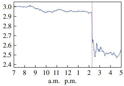
conditions and the economy”. Furthermore, bond purchases were expanded to include investment grade
corporate bonds. On April 9 at 8:30 a.m., it was announced that corporate bond facilities would be expanded in
size and extended to fallen angels (bonds that were investment grade as of March 22, but were since downgraded
below investment grade) and high yield ETFs with broad corporate bond market exposure. Purchases were also
expanded to include municipal bonds.

4.1 Announcements do not line up with the yield spike reversal
Figure 4, Panel A, adds vertical lines to Figure 1, Panel A to indicate the three dates with announcements
regarding bond purchases. Since March 15 was a Sunday it is not possible to assess whether this
announcement helped lower Treasury yields as markets reopened after the weekend. However, it is clear
that the announcement was insufficient to stop the yield spike. The 10-year yield rose by 45 bps on March
17 and 18 combined. Then, on March 19 and 20, it dropped by 26 bps, dropping a further 16 bps on March
23. The majority of the drop on March 23 was not around the 8 a.m. announcement. Treasury markets were
closed at the time of the 8 a.m. announcement, but Figure 5, Panel A graphs the cumulative return on the
10-year and 30-year Treasury futures (TY and US) from March 16 to 23. Treasury futures are traded all
hours of the day except for 5 to 6 pm on weekdays and weekends until 6 pm Sunday. I graph the cumulative
return since the start of the day on March 16 (futures are quoted as a price, not a yield, so no yield is
available). A yield spike is thus a futures return trough. The figure shows the reversal of the return trough
on March 19 and 20, with only a modest positive return on the 10-year future around the March 23
announcement and only a short-lived positive return spike on the 30-year future around that announcement.
 The simple message from Figure 4, Panel A and Figure 5, Panel A is therefore that the reversal of
the yield spike on March 19 and 20 does not line up well with Federal Reserve announcements. This stands
in sharp contrast to experiences from earlier QE announcements where the literature has documented large
yield changes following announcements. In the history of Federal Reserve QE, the most dramatic
announcement effect for the Treasury market occurred following the Federal Reserve’s March 18, 2009
announcement which stated that Treasuries would be included in QE1. This episode is illustrated in Figure
5, Panel B which is taken from Krishnamurthy and Vissing-Jorgensen (2011). The 10-year Treasury yield
drops over 30 basis points in the minutes after the announcement.

4.2 The yield spiked reversed as Fed purchases were sharply increased
Do these facts mean that the Federal Reserve’s Treasury purchases were not important for reversing the
Treasury yield spike in March 2020? No. I will argue that “market functioning” QE (using the Fed’s
terminology from above), involving purchases of Treasuries during the COVID crisis worked by affecting
yields mainly at the time of purchase, rather than primarily at the time of announcement of purchase. If
some investors are selling due immediate liquidity needs, an announcement of purchases by itself (the

 9
March 15, 2020 announcement) may have little effect on yields. An announcement effect on yields would
require either that liquidity seeking investors stop selling, or that others start buying, in expectation of later
being able to sell the securities at a profit to the Federal Reserve. However, if liquidity needs are immediate
and potential buyers are constrained (or see better opportunities elsewhere) a Federal Reserve
announcement may by itself have little effect, with the policy instead lowering yields only as announced
purchases are implemented. Evidence from the cross-section of Treasury securities is consistent with
balance sheet capacity being strained in March. In Table 1, I include dummy variable for securities being
cheapest to deliver (CTD) into Treasury futures contracts (a given futures contract allows for delivery of
one of a set of securities). On March 12, 2020, CTD securities trade at yields that are 10-20 bps lower than
other securities, controlling for maturity. 5 The CTD security prices were pushed up by high prices of
Treasury futures contracts. These contracts allow buyers of long Treasury futures positions exposure to
Treasury yields, without a need for balance sheet capacity (aside from margin to be posted). High futures
prices – and therefore high CTD Treasury prices – are thus an indicator of tight balances sheets. 6
 An alternative mechanism for yields to move at the time of Federal Reserve purchases is that the
purchase turned out larger than expected based on prior announcements, with the purchase thus effectively
containing an unspoken announcement element. This may have played a role but probably only modestly
so given that the Federal Reserve was far from the initially announced $500B of Treasury purchases when
it increased purchases on March 19. This increase thus did not necessarily signal that purchases would
exceed $500B.
 To document how yields fell at the time of purchase, Figure 4, Panel B graphs the 10-year yield
along with daily Treasury purchases by the Federal Reserve. I calculate daily Treasury purchases by
summing purchases across Treasury auctions held on a given day, using data from the website of the Federal
Reserve Bank of New York. The Federal Reserve’s daily Treasury purchases were minor until March 13,
then around $40B/day on March 13, 16, 17 and 18, before increasing to around $70B/day from March 19
to April 1. The increase in daily purchase amount on March 19 lines up perfectly with the yield spike
starting to reverse and yields revert to almost their March 9 level by April 1. The large daily purchases from
March 19 to April 1 imply that $723B of the Federal Reserve’s total quarterly net purchases of $1.019T
were purchased over a period of just 12 days.
 To argue that Federal Reserve Treasury purchases were causal for reversing the yield spike it is
important to rule out potential confounding factors. Perhaps other events calmed the market, unrelated to

5
 I obtain information on which securities are cheapest to deliver from Bloomberg.
6
 Fleckenstein and Longstaff (2020) argue that one can think of the Treasury futures market as way for balance-sheet
constrained investors to effectively rent a Treasury security from the institution taking the short side of the futures
trade (and buying the CTD Treasury security to hedge the short position).

 10
the Federal Reserve’s purchases. Counter to this possibility, the yield on corporate bonds kept increasing
on March 19 and 20. The yield on investment grade corporate bonds went up 53 bps over these two days
and the yield on high yield corporate bonds increased 78 bps. The S&P500 index lost 3.9% over these two
days. These facts suggest that markets other than the Treasury market kept deteriorating even as Treasury
yields started falling. Another central piece of evidence for arguing causality from the Fed’s market
functioning bond purchases to yields is that in the MBS market, yields start falling and Fed purchases
increase one day later than in the Treasury market. This provides one more example linking yield reversal
to Fed purchases. Facts about the MBS market are shown in Figure 6. Panel A shows the yield on the
Bloomberg Barclays US MBS Index (for fixed-rate agency-backed MBS) and the corresponding option-
adjusted spread (OAS), a measure of the risk-premium required by MBS investors. Both peak on March
19, a day later than the peak in the 10-year Treasury yield. Panel B lines up the reversal in MBS OAS (and
yield) starting on March 20 to a sharp increase in daily MBS purchases by the Federal Reserve on March
20. The fact that yields fall and Fed purchases increase a day later in the MBS market suggest that
confounding factors are not driving the Treasury and MBS yield reversal. Stabilizing factors would be
expected to affect both the Treasury and MBS market on the same day.
 Liquidity provided by the Fed’s dollar swaps lines may have played a complementary role to the
Fed’s Treasury purchases in stemming market dislocations. The first auctions of dollar liquidity to foreign
financial institutions via dollar swap lines with foreign central banks settled on March 19, as illustrated in
Appendix Figure 1. A total of $162B was borrowed, of which $112B through the ECB. The settlement date
of March 19 lines up with the start of the Treasury yield reversal. It is difficult to assess how many foreign
Treasury sales may have been averted by foreign financial institutions borrowing dollars rather than having
to sell dollar-denominated assets. In terms of where the substantial foreign demand for dollars came from,
it may relate to large outflows from prime money market funds in the US, who had net outflows of $139B
in March 2020 (Table 4). Prime funds lend some of their funds to financial institutions by buying financial
commercial paper and certificates of deposits, with investments both in the US and abroad. 7
 Perhaps the simplest argument that Federal Reserve purchases led to the reversal of the yield spike
is that there is substantial amounts of evidence that Treasury sellers faced immediate liquidity needs. I
consider each of the three sectors selling large amount Treasuries. Bond mutual funds faced large outflows
leaving them little choice but to liquidate securities and Treasuries were -- despite the Treasury market

7
 The Federal Reserve were able to reduce its daily purchases on April 2 without yields rebounding. The reduction in
daily Fed purchases happened shortly after the Fed introduced a repo facility for foreign central banks to prevent
them from having to sell Treasuries to obtain dollars (on 3/31) and after the Fed removed Treasuries and reserves
from leverage calculations under the Supplementary Leverage Ratio (on 4/1). These initiatives may thus also have
contributed to stabilizing the Treasury market but this is hard to assess as markets had materially improved when
these changes were made.

 11
liquidity deterioration -- still among the most liquid securities they held (in a relative sense). Foreign official
holders faced immediate liquid needs from FX intervention (leading to reduced dollar reserves) and
precautionary liquidation of Treasuries in case of future need for intervention. Foreign private holders
include hedge funds who, like the domestic hedge funds included in the U.S. household sector, faced
liquidity needs from the unwinding of trades related to the Treasury futures market. 8

5. Drivers of mutual fund Treasury selling in 2020Q1
This section documents the extent of outflows from mutual funds in the first quarter of 2020, links Treasury
selling to these outflows and lays out a possible reason for why investors pulled money out of their mutual
funds.
5.1 Fund outflows
The large sales of Treasuries by mutual funds in 2020Q1 coincide with large mutual fund outflows. Table
4 documents mutual fund flows. The table is based on monthly data from the Investment Company Institute,
obtained from Bloomberg. This is the same data source as is used for mutual funds by the U.S. Financial
Accounts. Bond funds faced outflows in March 2020 of $257B, corresponding to 5.6% of total net assets
(TNA). Outflows were also substantial for hybrid funds (investing in a mix of stocks and bonds), at 3.1%
of TNA. Equity funds faced only modest fund outflows relative to their large size, with outflows of 0.4%
of TNA. Within bond funds, all subsectors had outflows. Due to its large size, the investment grade sector
accounted for the largest dollar outflows at $89B. In contrast to mutual funds, money market funds saw
large inflows of $688B, with prime funds (which invest in riskier securities) the main exception. Figure 7
graphs the time series of fund flows to assess how abnormal March 2020 was. Panel A shows fund flows
as a percent of total net assets, monthly back to 2000M1. The 5.6% outflows in March 2020 were the largest
over this sample, but bond funds also faced outflows at the peak of the financial crisis, with outflows of
2.7% of TNA in October 2008. Percentage outflows for hybrid funds in March 2020 were also the largest
on record, but these funds had large outflows at the peak of the financial crisis as well, with outflows of
2.4% of TNA in October 2008. Inflows to money market funds in March 2020 were several times the size
of any prior percentage inflow. What stood out in the COVID crisis was more the speed than the magnitude
of bond fund outflows. Accounting for events moving slower during the financial crisis, Figure 7, Panel B
(left) shows that in quarterly data, bond fund outflows were similar as a percent of TNA in 2008Q4 and
2020Q1. Conversely, Figure 7, Panel B (right) shows in weekly data how the bond fund outflows during

8
 In the interest of space, I do not study the factors underlying the spike in MBS yields in detail. MBS selling was
driven by mortgage real estate investment trusts (REITs) who are highly levered investors using repo funding to
invest in mortgage-related securities. They faced difficulties during the COVID crisis due to losses on their assets
(with increased prepayment risk likely playing a central role), and sold $124B of agency & GSE backed securities in
2020Q1, reducing their repo funding accordingly. See U.S. Financial Accounts Table FU.129.m and the discussion
in Board of Governors of the Federal Reserve (2020).

 12
the COVID crisis were concentrated over just a couple of weeks, with outflows of $93B in the week ending
March 18, 2020 and $91B in the following week.

5.2 Linking outflows to Treasury sales
The overlapping timing of mutual fund Treasury sales and fund outflows during the COVID crisis does not
necessarily imply that the outflows drove the sales. As we have seen (Figure 3), mutual funds did not sell
substantial amounts of Treasuries in 2008Q4, despite the fact that this was also a period of large fund
outflows. However, three simple arguments (on which I elaborate below) can be made for fund flow to
have been a central driver of mutual fund Treasury sales in March 2020. First, in contrast to the financial
crisis, funds facing outflows had many more Treasuries to sell. This reconciles the different selling behavior
across crises. In order for flows to induce Treasury selling, funds need to have Treasuries to sell. Second,
the extent to which funds sold their Treasuries was strongly dependent on whether they had outflows. Third,
Treasury sales by fixed income index funds were substantial and are mechanically linked to flows given
the indexing.
 Providing more detail on each of these arguments, Figure 8 shows the evolution of mutual fund
holdings of Treasuries and other bonds over time based on data from the U.S. Financial Accounts. The left
graph shows dollar amounts and documents a large increase in mutual fund holdings of corporate bonds,
Treasury bonds, and municipal bonds after the financial crisis. Over this period, the supply of corporate
bonds and especially of Treasuries grew dramatically, as shown in the middle graph. The right graph
illustrates mutual fund holdings as a percentage of the total supply of bonds in a given bond category. There
are sharp increases for corporate bonds, Treasury bonds, and municipal bonds, despite the much larger
supply of corporates and Treasuries. Falato, Goldstein and Hortacsu (2020) document the increase in total
bond fund asset relative to the size of the corporate market. Figure 8 here expands on that fact by showing
that increased total bond fund assets led to increased holding not only of corporate bonds but notably also
of Treasuries, a central fact for understanding Treasury market dislocations in March 2020. By the end of
2019 funds had lots of Treasuries to sell, with holdings of $1.311T, more than five times the holdings of
just $173B at the end of 2008Q2 going into the financial crisis. By contrast, when mutual funds had large
outflows in 2008Q4 ($132B across all funds types), they met these outflows by selling agency debt/MBS,
municipal bonds, corporate bonds, and equities, with sales of Treasuries of only $4B (U.S. Financial
Accounts, Table FU.122).
 Linking mutual fund Treasury sales 2020Q1 to fund outflows, Table 5 studies the relation between
Treasury selling, initial Treasury holdings, and fund flows. I use data from the CRSP Survivor-Bias-Free
US Mutual Fund Database. I aggregate different share classes for a given fund into one and perform the

 13
analysis at the level of a fund. 9 I manually code whether a given fund holding is a Treasury security based
on security names and include STRIPS securities (but not long positions in Treasury futures since these do
not represent ownership of any particular security). I omit exchange-traded funds since the prior analysis
reveal large Treasury sales by mutual funds but not ETFs. Panel A documents Treasury holdings and selling
in this database. Total Treasury holdings at the end of 2019 were $1.085T, somewhat lower than the
$1.311T in the U.S. Financial Accounts. 10 Net sales of Treasuries by mutual funds are $132B in 2020Q1 in
the CRSP data are lower than sales of $266B in the U.S. Financial Accounts. With that qualifier, Panel B
decomposes mutual fund Treasury selling in 2020Q1. Consistent with outflows driving Treasury selling,
funds with inflows were overall buyers of Treasuries. By contrast, funds with outflows had net sales of
$140B of Treasuries. For funds with outflows, Treasury sales not in excess of outflows amounted to $103B.
As noted, while Treasuries were much less liquid that usual during this time, they were likely still more
liquid than most other securities funds held. If funds sold Treasuries first to meet outflows, most Treasury
sales may thus have been directly flow-driven. 11 For funds with outflows, even sales in excess of the
outflows could indirectly be due to outflows in that fund may sell extra to prepare for potential future
outflows. Schrimpf, Shim and Shin (2021) document a negative relation between investor flows and funds’
change in cash holdings (both as a percent of total net assets) in March 2020 and argue that this is due to
managers anticipating possible future outflows. In the context of US funds, my calculations imply that
direct flow-driven sales (sales up to outflow) at $103B were about twice as large as more discretionary sales
(sales in excess of outflow) amounting to $54B, as shown in Table 5, Panel B.
 Panel C takes a regression approach to link fund sales of Treasury securities to fund flows. Focusing
on funds with positive Treasury holdings at the end of 2019, I estimate the following relation:

 ℎ 2020 1
 2019 4 2020 1
 = 0 + 1 ∗ � ℎ � ∗ � � ��

 + 2 ∗ � ℎ 2019 4 � + 3 ∗ � � 2020 1 �� + (2)
 2020 1
where � � is a dummy equal to one for funds with outflows and f denotes a given fund.
The coefficient of interest is 1 which measures whether funds with outflows were more or less likely to
sell their Treasuries than funds without outflows. In the baseline regression in column 1, initial Treasury
holdings have no explanatory power for flows and neither does the flow dummy itself. However, the

9
 The CRSP dataset uses the label funds for shareclasses and portfolios for funds. I follow the more standard
terminology here.
10
 The Financial Accounts’ mutual fund tables are based on data from the Investment Company Institute (ICI). I
have unsuccessfully reached out to ICI to reconcile differences across datasets. Total fund outflows are fairly similar
across datasets with outflows of $347B in the CRSP data and $290B in the ICI data in 2020Q1.
11
 See Ma, Xiao and Zeng (2021) for an analysis of funds’ liquidation preferences.

 14
interaction term is highly significant. In economic terms, the interpretation of the regression coefficient of
-0.180 is that a fund facing outflows sold 18 cents more of Treasury securities per dollar of initial Treasury
holdings than a fund with similar Treasury holdings that did not face outflows. Column 1 does not use any
weights. In column 2 I show that the coefficient on the interaction term is similar when weighting
observations by their initial Treasury holdings (to understand how the typical mutual fund Treasury dollar
reacted, as opposed the typical mutual fund). Column 3-5 show that the negative coefficient on the
interaction term is present, with similar economic magnitudes, for bond funds (taxable), hybrid funds and
equity funds, though not for a smaller set of various other funds in column 6 (these account for only $27B
of initial Treasury holdings). These regressions suggest a link between fund flows and Treasury sales. For
bond index funds, this link is even clearer, as funds have little flexibility in what they sell in response to
outflows. In the CRSP database, Treasury sales by bond index funds (taxable) in 2020Q1 amount to $25B.

5.3 Who sold bond funds and why?
As documented in Table 3 and Table 4, Panel A, bond funds faced large outflows and account for the
majority of mutual fund Treasury sales.
 Who took money out of bond funds? The vast majority of mutual fund redemptions across the
overall mutual fund sector were from households. According to the U.S. Financial Accounts (Table
FU.122), mutual fund outflows were $290B in 2020Q1 (a bit smaller than the outflow for March 2020 in
Table 3 due to inflows earlier in the quarter). Households including non-profits accounted for almost all of
these outflows, withdrawing a total of $280B from mutual funds in 2020Q1.12 Separate data by fund type
are not available, but based on Investment Company Institute (2020, Table 60), households own over 90%
of both equity funds, hybrid funds and bond funds, making it highly likely that the vast majority of bond
fund outflows were also from households.
 It is unlikely that households sold bond funds mainly because of liquidity needs (even though their
fund sales of course led to liquidity needs for the funds). First, the lockdown of the economy was only just
starting in March and household increased their investment in money market funds by $214B over the
quarter 2020Q1 in addition to increasing holdings of time and savings deposits by $346B (U.S. Financial
Accounts, Table FU.101). Thus suggests a reallocation towards safer securities as opposed to a liquidity
crunch. Second, household sales of mutual funds stopped in 2020Q2 as household mutual fund outflows
turned to inflows, despite a sharp deterioration of the economy.
 Household sales of mutual funds in 2020Q1 thus appears to be part of a reallocation to safe, short-
maturity assets. What is puzzling is that this de-risking involved disproportionate sales of bond funds

12
 The $280B is comprised of redemptions of $236B from mutual funds held outside retirement accounts (FU.101)
and $46B from mutual funds held in defined contribution retirement plans (tables FU.118.c, FU.120.c).

 15
compared to stock funds, with March 2020 redemptions from bond funds of 5.6% of total net assets,
compared to only 0.4% for equity funds. A possible explanation is what one could refer to as a “disappearing
safety effect”. Krishnamurthy and Vissing-Jorgensen (2012) argue that investors are willing to pay extra
for very safe and liquid assets. Figure 9, Panel A illustrates the idea. The security price is a decreasing
function of default risk but with a higher slope for very low risk, as illustrated by the price lying on the
curved segment from A and B, rather than being on the dotted line. Safety effects are described based on
default risk (as opposed to duration risk), because the framework addresses yield spreads between similar-
maturity bonds with different credit risk. Krishnamurthy and Vissing-Jorgensen (2012) document this effect
for Treasuries, showing that yield spreads between Aaa-rated corporate bonds and Treasuries were large,
despite Aaa’s having only slightly higher default risk. Furthermore, they showed that changes in Treasury
supply is strongly negatively related to the Aaa-Treasury yield spread, thus effectively tracing out a demand
curve for the safety/liquidity of Treasuries. They argued that the safety effect was present to some extent
also for Aaa corporate bonds, showing that the spread between Baa and Aaa-rate corporate bonds also
relates negatively to Treasury supply (a liquidity price premium is less relevant for corporate bonds which
all tend to be much less liquid than Treasuries). A possible explanation for large household redemptions
from bond funds in 2020Q1 is that these funds initially had safety attributes but lost these as their risk
increased. I have indicated this hypothesis with a bond fund sliding down the price-risk curve in Figure 9
Panel A from the top-left green point to the bottom-right green point. In the context of households, a
willingness to accept lower yields on investment-grade bonds (beyond what their low credit risk and credit
risk pricing for riskier securities would imply) could stem from saved information costs. Investing in an
investment-grade mutual fund with low initial risk and daily liquidity does not require a sophisticated
understanding of credit risk, but may result in large outflows in response to increased credit risk. The
framework applies to the COVID crisis to the extent that the bond funds experiencing withdrawals were
funds with low but increasing credit risk. From Table 4 and 5, about half of bond mutual funds (by total net
assets) are investment-grade funds and these account for 35% of outflows. Multisector, world and municipal
bond funds are harder to classify in terms of credit risk as are government funds which hold Treasuries but
also MBS. The literature on safety effects is still relatively new and it is unclear how high default risk needs
to be before the safety price premium disappears. Less than 10% of bond mutual funds are high-yield funds
that are unlikely to have any safety attributes.
 Testing the disappearing safety hypothesis based on flows is difficult. While a disappearing safety
attribute may be one reason for mutual fund withdrawals, households may also reallocate funds out of bonds
that had lost their safety attribute even before COVID but now became even riskier (high-yield funds).
Instead, I provide evidence from asset prices that is consistent with the nonlinearity in the price-credit risk
relation from Figure 9, Panel A. In Figure 9, Panel B, I graph corporate bond yield spreads over 5-year

 16
Treasury yields and 5-year credit defaults swap rates for corporate bonds. Investment grade bonds are
illustrated in the left graph and high yield bonds in the right graph. The yield spread for investment grade
bonds increases much more than one-for-one with the investment-grade CDS rate, consistent with the
nonlinearity of the safety demand framework. By contrast, for high yield bonds, the yield spread and CDS
rates move by similar amounts, consistent with such bonds not having a safety attribute. 13 Table 6 presents
results from regressing corporate bond yield spreads on CDS rates. For 2020H1, the regression coefficient
for investment grade bonds is 2.6, much above one and thus consistent with such bonds sliding down the
price-default risk curve describing the safety effect. By contrast, the regression coefficient is close to one
for high yield bonds. Results are similar for a longer period going back to 2013 (with the sample length
determined by data availability).

6. Drivers of Treasury selling by foreigners in 2020Q1
Turning to sales by the rest of the world, I decompose these into foreign official sales and private sales. I
then study drivers of Treasury sales by each of these groups.
6.1 Foreign official and foreign private Treasury sales
Foreigners sold $287B of Treasuries in 2020Q1 thus exceeding even the large Treasury sales by mutual
funds. To start understanding possible drivers of this selling, Table 7 decomposes foreign sales into sales
by foreign official agencies (including foreign governments and central banks) and foreign private sales. 14
About 2/3 of Treasury sales were from foreign official agencies and 1/3 from the foreign private sector.
The data used in the table is from the Bureau of Economic Analysis (BEA). For a given asset class, the
BEA calculates foreign net purchases of US securities from changes in holdings (using Treasury
International Capital (TIC) data), combined with assumptions about returns earned on the asset category.
The assumed return is based on a combination of market indices, weighted to account for the portfolio
composition of foreign holdings (known from reporting in the TIC data, including information about
maturity structure). This approach to calculating foreign net purchases from TIC holdings data is preferable
to using TIC data on transactions. As described by Bertaut and Judson (2014), the TIC transactions data are
recorded according to the country of the first cross-border counterparty, not the country of the ultimate
buyer or seller (or issuer) of the security. This leads to a bias toward financial centers in the transactions
data. Importantly, the TIC transactions data gives the opposite (and incorrect) conclusion about the relative
importance of foreign official and foreign private sales since foreign official agencies accounted for only
$83B of total net foreign sales of $280B in the transactions data.

13
 Haddad, Moreira and Muir (2020) also document corporate bonds spreads and CDS rates but do not link these to a
disappearing safety effect.
14
 I thank Carol Bertaut from the Board of Governors of the Federal Reserve for help with this table.

 17
6.2 Foreign official agencies’ holdings and portfolio changes
Focusing on foreign official agencies, Table 8 Panel A documents how their portfolio of U.S. holdings
changed from just before the financial crisis to just before the COVID crisis. Like mutual funds, foreign
official agencies increased their reliance on Treasuries. Their total U.S. holdings increased by about $3T of
which $2.1T was an increase in Treasury holdings. The portfolio weight for Treasuries increased from 45%
to 56.3%. 15 Equity and investment fund shares increased by $0.9T, likely via sovereign wealth fund
investments since most central banks do not hold stocks. Table 8, Panel B documents net purchases of U.S.
assets overall and by asset class. Foreign official agencies had net sales of $51B overall, suggesting that
their sales of Treasuries was partly motivated by a need for dollars for foreign exchange intervention.
Currency and deposits increase by $60B, likely in expectation of possible future need for cash. Of the total
Treasury sales by foreign official agencies of $182B, the $111B ($51B plus $60B) are thus likely due to
liquidity needs. A smaller part was used to reallocate portfolios toward higher yielding assets, with
purchases of $43B of mortgage-related securities and corporate bonds and purchases of $36B worth of
equities and investment fund shares.
 As described above, foreigners did not sell Treasuries at the peak of the financial crisis in 2008Q4.
In fact, they purchased $278B worth of Treasuries in that quarter. Table 8, Panel B shows that this was
driven mainly by purchases of $214B of Treasuries by foreign official holders, almost all Treasury bills.
This was funded by large sales of long and short-term agency securities for a total of $174B. The contrast
between large foreign official Treasury purchases in 2008Q4 and large foreign Treasury sales in 2020Q1
thus appears to be driven by a combination of factors: (1) a larger cash need in 2020Q1, leading to net sales
of U.S. holdings overall, (2) increased reliance on Treasuries in foreign portfolios, resulting in sales of
Treasuries rather than mortgage-related securities in the face of liquidity needs, (3) “precautionary”
reallocations going into currency and deposits in 2020Q1 rather than Treasury bills in 2008Q4, and (4)
Treasury sales for return-seeking purposes in 2020Q1.

6.3 Insights into foreign private sales from the cross-section of countries

To gain insights into the $105B of foreign private Treasury sales, it is informative to study the cross-section
of countries. In Appendix Table 1, I document Treasury holdings and net purchases by country for foreign
and private holders combined (country-level data does not distinguish between these two groups). I
calculate net purchase of Treasuries in 2020Q1 from the change in holdings from 2019Q4 to 2020Q1 and
assumed returns. The table is based on Treasury International Capital (TIC) data, which has some
information about maturity composition, dividing Treasury holdings into securities with below one year

15
 As a percent of total Treasuries outstanding, the foreign official agency share decreases since Treasury supply
increased by a factor of three over this period.

 18
You can also read